
Chapter 18
PerformancePoint Dashboards
WHAT’S IN THIS CHAPTER?
- Exploring Microsoft’s approach to business intelligence
- Configuring PerformancePoint Services
- Building a dashboard
- Extending PerformancePoint with custom data sources
WROX.COM CODE DOWNLOADS FOR THIS CHAPTER
The wrox.com code downloads for this chapter are found at www.wrox.com/remtitle.cgi?isbn=1118495829 on the Download Code tab. The code is in the chapter 18 download and individually named according to the names throughout the chapter.
BUSINESS INTELLIGENCE
Data is the blood and heart of any organization. Businesses need data to help determine where to spend the next dollar, which customer to chase first, and which server is out of disk space. Business Intelligence (BI) is the organization’s capability to convert its data outputs into knowledge that can be used to identify new opportunities and competitive strategies.
BI technologies provide historical, current, and predictive views of business operations. Common functions of BI technologies include reporting, analytics and data mining, performance management, and more. These technologies come together to support better decision making.
Given the relative importance of data to an organization, how can Microsoft and SharePoint assist in the delivery of data to assist people in making effective business decisions? Microsoft approaches the BI conversation with a stack of tools aimed at enabling end users and enterprises. These tools range in complexity of configuration and execution from the familiar and simple Microsoft Excel to the complex and specialized Microsoft SQL Server Analysis Services.
The business intelligence stack from Microsoft is one of the world’s most popular and widely deployed suites of BI tools. Both Forrester and Gartner recognize Microsoft as a leader in the space, with Microsoft coming in at #3 in Gartner’s Feb 6, 2012 BI Platform Magic Quadrant (http://www.gartner.com/technology/reprints.do?id=1-196VVFJ&ct=120207&st=sb) and #2 in Forrester’s 2012 BI Wave (http://download.microsoft.com/download/8/F/F/8FFFD378-159C-4107-898C-B60835D85384/The_Forrester_Wave_Self-Service_BI_Platforms_Q2_2012.pdf). This strong showing across the two most recognizable technology industry analyst firms is a result of Microsoft’s investment in Office (especially Excel), SQL Server, and SharePoint, and the power of these tools, combined with the undeniable value proposition and lowest in class total cost of ownership (TCO). The next section looks at the history of Microsoft BI, the integration of BI into SharePoint products and technologies, and how Microsoft addresses the major complexities of building quality BI solutions with a do-it-yourself toolkit, which doesn’t force every problem to require an enormous solution.
History
Until recently, the greatest challenge in many organizations was that accessing data for the purpose of analysis was restricted to certain groups of people using specialized tools. With only a handful of staff members using the BI solutions, business users would come with ad hoc inquiries for information resulting in highly qualified BI experts focusing on tactical report generation rather than delivering value for an organization’s long-term business intelligence strategy.
Furthermore, it was difficult to give the company leaders the ability to gauge the state of their business at a glance, so they could make agile decisions to keep the business moving forward. In many cases, delivering timely and accurate reports to key decision makers that summarized strategic and operational data has been done in unbelievably inefficient ways, such as manually assembled PowerPoint and Excel files delivered via e-mail and file shares, which contribute to report proliferation and an inability to understand which version of a report is the accurate version.
This combination of scarce skillsets and inefficient reporting processes left the door open for developers and third-party vendors to build custom applications that delivered reports to key decision makers efficiently, which in turn translated into more upfront and maintenance costs as well as brittle data dependencies.
From the hardware perspective, building a decent BI solution in the not too distant past required assembling the right hardware, compression algorithms, and networking components that constitute the solution. The challenge for many organizations extending the reach of their BI solutions to broader sets of users was the storage and the computing power that was required to host decent BI solutions and make them available to the masses.
BI is not only for answering the questions that users may have in mind. The more important part of BI is to help users ask the right questions, and also to guide them through an often resource-intensive process to get the insights they need. The types of questions may not necessarily be anticipated or pre-aggregated into the BI solutions, so the hardware, software, and bandwidth specifications for hosting those solutions must be powerful enough to respond to such on-demand queries in a reasonably fast manner.
Like many other BI vendors at the time, Microsoft started its significant BI investment with the same limitations in adoption, lacking must-have functionalities and requirements for strong computing power. The problem was that most Microsoft BI solutions were strongly tied to SQL Server technology, and SQL Enterprise Manager was the primary interface to interact with those solutions. Again, unless you knew how to work with SQL Server and its set of BI-related specialized domain-specific languages, the chances that you were just a bystander in the whole BI world were high.
Soon, Microsoft realized that the value of its BI platform would not become apparent until a paradigm shift occurred in its approach to doing traditional BI. Looking for a way to excel, Microsoft developed a new vision in the year 2000, which looked at things differently than before.
The new vision was based on taking BI to the masses, using it to connect people to each other and to connect people to data more easily than ever before. The key area of focus was to take the BI out of the realm of specialty and niche tools and turn it into something mainstream. There were two primary justifications for the new vision. First, it would hide the difficulties of the underlying platform from the general public. Second, it would make the adoption of the platform much easier because when more people use a platform, the more valuable it becomes and the more quickly it is adopted by others.
Following the overall vision of “BI for everyone” and starting with SharePoint Portal Server 2003, Microsoft fostered this notion of integrating some aspects of its BI offering into its Information Portal technology. Theoretically, because SharePoint brings people together to work and make decisions collaboratively, it could have been the right starting point. However, this integration never extended beyond a couple of web parts natively rendering BI artifacts that are stored outside SharePoint content databases, in products such as Microsoft SQL Server Reporting Services 2000 and Microsoft Business Scorecard Manager 2005.
Fortunately, Microsoft learned three lessons as a result of this approach. First, separation of data objects and the point of user experience mean that IT is required to deal with a minimum of two separate products and repository frameworks to implement a single BI solution, which means more administrative effort. Second, due to the distributed environment, users have to go through at least two server authentications or hops to get to the back-end data source. For the environments without Kerberos delegation in place, this double-hop model causes authentication issues. The double-hop (one hop from the client browser to the SharePoint server and another hop to the BI server) problem is not a bug; rather it is an intentional security design to restrict identities from acting on behalf of other identities. Third, because the SQL Server-based BI products and SharePoint Portal Server 2003 were using different security models, it was difficult to map SharePoint roles and permission levels directly to the roles and permissions understandable by the BI product. In other words, it was difficult to apply a unified authorization model across the products.
In 2006, Microsoft acquired analytics vendor ProClarity, and soon Business Scorecard Manager 2005 and ProClarityAnalytics products were merged and formed a new product named Microsoft PerformancePoint Server 2007, offered as a separate SKU that could operate on top of SharePoint 2007.
Later, with the release of Microsoft Office SharePoint Server 2007, Microsoft’s BI offering turned into something that was more than just a couple of integration hooks, as is the case with SharePoint Portal Server 2003. In Microsoft Office SharePoint Server 2007 (MOSS 2007), Microsoft made major improvements in four different areas: the Report Center template, full integration with SQL Server Reporting Services (SQL Server 2005 SP2), new Excel Services, and a Business Data Catalog for integration with line-of-business (LOB) applications.
Fortunately, Microsoft didn’t stop there; it released more features that could change the way people build dashboard-style applications. Customers could use PerformancePoint Scorecard Builder 2007 and put together their own dashboards and publish them to the PerformancePoint monitoring server. After the dashboards are published, customers could then use the Dashboard Viewer web part to integrate the dashboard into SharePoint pages. Again, the integration is just a web part that calls into PerformancePoint Server 2007 functioning as a standalone server. Both products were sold separately and they had different management environments and operations.
Even though the attempts Microsoft made to bring the best of both the SharePoint and BI worlds together in MOSS 2007 were great, it was still not enough to call it a full-fledged integration. The separate pricing structure, on top of the enterprise client access license required by SharePoint 2007, turned a number of customers off from the product. In addition, PerformancePoint 2007 did not eliminate many of the dual maintenance tasks previously identified. The team that was building SharePoint Server 2010 made significant changes based on the customer feedback and the lessons learned in MOSS 2007. Starting with SharePoint Server 2010 Server, PerformancePoint is designed as a service application on top of the SharePoint 2010 Server platform. What is important about the new design is that PerformancePoint and SharePoint are no longer two separate products. Instead, both are finally offered as an integrated product on the Enterprise CAL. The biggest advantage of this move is that PerformancePoint contents are all stored and secured within SharePoint libraries, and they can benefit from the new features and enhancements made to the core SharePoint platform. PerformancePoint got many new features and enhancements.
In addition to the enhancements made in SharePoint 2010 and its newly native PerformancePoint Services Application, Microsoft enhanced the self-service BI capabilities of Excel 2010 with PowerPivot and Access 2010 with the introduction of Access Services. With the addition of IT-centric SQL Server Reporting Services enhancements such as the SSRS integration local mode, Microsoft rounded out its investment in SharePoint as the front end for business intelligence interactions.
Microsoft has not stopped the investment in BI technologies since moving from SharePoint 2010 to SharePoint 2013. The rest of this chapter reviews those enhancements and improvements.
SharePoint 2013 Business Intelligence Components
Microsoft has invested in several areas of the SharePoint 2013 BI toolkit including Microsoft Access 2013, Access Services, Microsoft Excel 2013, Excel Services, PerformancePoint Services, SharePoint Server 2013, Visio Services, SQL Server 2012, and more. The three-pronged sets of technologies that make up the BI components are represented in Figure 18-1.
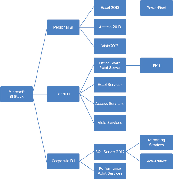
Consider the target use cases for Microsoft’s suite of business intelligence tools. Some users are focused on understanding data that they will used for individual decisions, and no sharing of reports is necessary. These users are concerned with themselves and need a personal business intelligence solution. Other users are participants in a team or department’s BI-related decision-making as part of a larger organization. These users need to be able to share queries and results in a flexible manner as the nature of these team reports is frequently quite fluid. Team business intelligence solutions are aimed at solving data-related problems for “we, the team.” Finally, a level of consistency is required for corporate-level reporting, which necessitates a strong centralized presentation platform. In this sense, personal BI can be considered “BI for Me,” team BI can be considered “BI for We,” and corporate reporting can be considered “BI for the World.”
Personal BI
Microsoft uses the term Personal BI to describe technologies that deliver information to people when they need it, and in the formats they are comfortable with. The majority of Personal BI solutions are independent of a connected data source such as a self-contained spreadsheet. Personal BI is usually completely independent from IT services and support.
Access 2013
Access 2013 is a powerful tool that enables business users and subject matter experts to independently build database-backed applications accessible to numerous concurrent users. Access 2013 delivers applications capable of adhering to code-free embedded business logic, report on embedded data, and which can be shared on the desktop or on the web.
Excel 2013
Microsoft Excel is the world’s most widely utilized BI tool for a reason: It provides users the ability to analyze and explore data of any size, to visualize that data, and to integrate disparate data sources through live connections to data stores as well as fully self-contained operational capabilities. Excel 2013 offers the following new features, which support Personal BI solutions.
- In-Memory Analytics — Excel 2013 builds in the local Analysis Services xVelocity in-memory analytics engine (VertiPaq), which manages the compression and DAX querying of millions of rows of data. Excel 2010 offered VertiPaq as an optional download included in the PowerPivot add-in.
- Power View for Excel — Power View enables users to see and interact with data through interactive graphics and animations. Users can present and share insights with others through rich storyboard presentation capabilities. Power View is powered by the BI Semantic Model and the VertiPaq engine.
- Decoupled PivotChart and PivotTable reports — Users can now create PivotChart reports without including a PivotTable report on the same page.
- JavaScript user-defined functions — Whether sharing a workbook via SharePoint and Excel Services or via SkyDrive, JavaScript UDFs enable the creation of custom functions that can be called from inside formulas in the Excel web app.
Team BI
Considering the hierarchical self-identification of Me, We, and World, people don’t work just as individuals but in teams to accomplish tasks. Microsoft uses the term Team BI to represent the BI solutions that deliver information that focuses on accountability to promote collaboration, and rapid sharing of information to drive to a common decision.
Access Services
Access 2013 desktop databases have not significantly changed, but Access Services has gone through a significant evolution in functionality. Access Services provides a new web interface for Access applications that enable rapid development of scalable applications without IT. New features in Access Services include:
- New application model — On-premise Access 2013 web applications are now backed by SQL Server and hosted by SharePoint. Office 365 cloud-based Access web applications are backed by SQL Azure for global scalability. Being backed by SQL Server not only improves scalability, but also improves IT manageability of Access applications due to centralization of data into SQL Server.
- Views — Web applications developed in Access automatically generate high-quality HTML5 user interfaces that focus application developers on business problems.
Excel Services
Excel Services enables users to view and work with Excel spreadsheets and workbooks that have been published to SharePoint sites. Users can explore data and conduct analysis in a browser window just as they would by using the Excel client because of the new Excel Interactive View. Building on the successes of Excel Services in SharePoint 2010, Excel Services 2013 offers the following new capabilities:
- Data exploration improvements — It is now easier to explore and analyze data in Excel Services reports because of SQL Server Analysis Services and PowerPivot data models. PivotCharts and PivotTables now suggest ways users can view individual values as hover tips. Analysis commands such as Drill Down are now available with a single mouse-click.
- Calculated measures and members — Excel Services supports calculated measures and calculated members that are created in Excel.
- Analysis Services support — Administrators can specify SQL Server Analysis Services servers to support more advanced analytic capabilities in Excel Services.
- Trend analysis — Excel Services supports the ability to conduct trend analysis from cells in PivotTable reports that use OLAP data, such as Analysis Services cubes or PowerPivot data models.
- Updated APIs — The JavaScript Object Model (JSOM) API and Excel Services REST API have been updated to enable more control and better access at more granular levels.
- Power View for SharePoint — Similar to the technology embedded in Excel 2013, Power View for SharePoint is available as part of the SQL Server 2012 Service Pack 1 Reporting Services Add-In for SharePoint 2013 Enterprise Edition.
Visio Services
Visio Services is a service application that enables users to share and view Microsoft Visio Drawing and Visio 2010 web drawing files. 2013 ushers in the ability to refresh data-connected Visio drawings which support automated data refreshes in addition to the following new features:
- Maximum Cache Size — A new service parameter designed to enable administrators to improve Visio web access experiences. Configuration settings to update the default value from 5120 MB are found in Central Administration or via a new PowerShell cmdlet, Set_SPVisioPerformance.
- Health Analyzer rules — New corresponding Health Analyzer rules have been added to reflect the new Maximum Cache Size parameter.
- Commenting on drawings — Users can add meaningful comments to a Visio Drawing (*.vsdx) collaboratively on the web via Visio Services in full-page rendering mode.
Corporate BI
Considering once again the Me, We, World personal relationship hierarchy, people work as part of an enterprise to meet strategic objectives. Microsoft refers to Corporate BI as a set of tools that help people align their objectives and activities with overall company goals, objectives, and metrics. This is BI that helps synchronize individual efforts by using scorecards, strategy maps, and other tools that connect to corporate data.
PerformancePoint Services
PerformancePoint Services enables users to create interactive dashboards that display key performance indicators (KPIs) and data visualizations in the form of scorecards, reports, and filters. In SharePoint Server 2013, PerformancePoint Services have been updated with the following new capabilities and features:
- Dashboard migration — Users can copy entire dashboards and dependencies, including the .aspx file, to other users, servers, or site collections. This feature also enables the ability to migrate single items to other environments and migrate content by using Windows PowerShell commands.
- Filter enhancements and filter search — The UI has been enhanced to enable users to easily view and manage filters including giving users the ability to search for items within filters without navigating through the tree.
- BI Center update — The new BI Center is cleaner and easier to use with folders and libraries configured for easy use.
- Support for Analysis Services Effective User — This new feature eliminates the need for Kerberos delegation when per-user authentication is used for Analysis Services data sources. By supporting the Analysis Services Effective User feature, authorization checks can based on the user specified by the EffectiveUserName property instead of using the currently authenticated user.
- PerformancePoint support on iPad — PerformancePoint dashboards can now be viewed and interacted with on iPad devices using the Safari web browser.
Important BI Terms and Concepts
Because BI developers may be confused when they first hear commonly used terms in SharePoint, such as site and site collection, there are some BI terms that may sound a bit vague to SharePoint developers with no BI background. Many BI techniques share terminology, and some terms are used interchangeably. In the interest of clarity, some of these terms are defined in this section and then referenced later.
If you are a SharePoint developer, you are most likely familiar with flat, table-style data structures because lists in SharePoint mimic the same data storage format. Relational database management systems (RDBMSs), such as the SQL Server database engine, also use tables for storing data. Although storing data in tables has its own advantages, browsing through rows and columns rarely leads to useful analysis, especially when someone is looking for patterns and relationships that lie hidden in huge piles of data and information.
For instance, if you were analyzing Internet sales information of Microsoft’s fictional AdventureWorks company over the past few years, you would be more interested in the sums of sales per product, per country, and per quarter than in an analysis of the individual sales. Aggregating data at this level, although possible with most RDBMS engines, isn’t the most optimized process.
Online Analytical Processing (OLAP) is a technology that tends to remove any granularity in the underlying data and focuses on enhanced data storage, faster data retrieval, and more intuitive navigational capabilities in large databases. Typically, OLAP’s information comes from a database, referred to as a data warehouse. Compared to a relational database, a data warehouse requires much tighter design work upfront for supporting analyses and data aggregation, such as summed totals and counts.
Because the storage unit used in OLAP is multidimensional, it’s called a cube instead of a table. The interesting aspect of OLAP is its capability to store aggregated data hierarchically and give users the ability to drill down or up aggregates by dimensional traits. Dimensions are a set of attributes representing an area of interest. For example, if you are looking at sales figures generally, you would be interested in geography, time, and product sales, as shown in Figure 18-2.

Dimensions give contextual information to the numerical figures, or measures, that you are aggregating on; for example, Internet sales amount, Internet gross profit, and Internet gross profit margin. OLAP calls each of these a measure. Because the measures are always pre-aggregated and anticipated by the cube, OLAP makes navigation through the data almost instantaneous.
If you want to look at a particular region that had a good quarter of sales, OLAP’s navigational feature enables you to expand the quarterly view to see each month or day of the quarter. At the same time, you can also drill down into the region to find the cities with major increases in sales.
There are two more terms that need to be mentioned:
- Multidimensional Expressions (MDX) — MDX is the query language that enables you to query cubes and return data.
- Data source — A data source is a stored set of information, such as a tabular database, OLAP cube, Excel spreadsheet, SharePoint list, or any other data object that contains the actual data.
The Business Intelligence Center
Business Intelligence as a core capability of SharePoint has evolved since its introduction in SharePoint 2007. Beginning with the Report Center, SharePoint 2010 introduced the Business Intelligence Center. SharePoint 2013 updates the Business Intelligence site template with streamlined language and emphasis on the visual language conveyed through images, as shown in Figure 18-3.

The SharePoint 2010 Business Intelligence Center is a site template designed to provide a central location for teams and departments within your organization to store, retrieve, and modify shared reports. The focus of the 2010 update over 2007 was the inclusion of samples and guidance intended to accelerate users with links to articles and preconfigured special-purpose libraries:
- Dashboards Document Library — A library that contains exported PerformancePoint dashboards organized in folders
- Data Connections Document Library (DCL) — A library that contains ODC Office Data Connection (ODC) files, UDC Universal Data Connection (UDC) files, and PerformancePoint data connections
- PerformancePoint Content List — A list that contains PerformancePoint content and OOB views for organizing content
The Microsoft SharePoint Server 2013 Enterprise Edition BI Center site has again evolved. The focus of this new version is to make the site template easier to use and to explicitly highlight capabilities using action verbs such as:
- Explore and Analyze Data with PowerPivot.
- Design Interactive Reports with Excel and Power View.
- Share Dashboards with Excel Services.
The emphasis on separated graphics and action words helps to reduce the complexity of the page, and lead users through the process of SharePoint-hosted BI.
Creating a Business Intelligence Center
To begin creating and using the Business Intelligence Center, you must first enable a few site collection scoped features. To enable these features, perform the following steps:
To properly examine the capabilities of the Business Intelligence Center in SharePoint Server 2013, create a new site with this template by clicking Site Contents ⇒ New Sub site and then choosing the Business Intelligence Center template from the Enterprise templates tab, as shown in Figure 18-4. View an example page by navigating to /Pages/ppssample.aspx.

Just like any other site template, the customizable Business Intelligence Center includes several features that can help you organize dashboards, reports, and the connections to external data sources in one centralized and standardized place.
INTRODUCING PERFORMANCEPOINT 2013
As previously discussed, PerformancePoint Services are the technologies that enable IT departments to design compelling and interactive dashboards that consolidate data from numerous data sources into charts, graphs, and tables. The intent of PerformancePoint Services is to grant businesses the capability to see how their enterprise is performing and to react quickly. The visibility to monitored performance imparted by PerformancePoint Services helps to increase accountability. The interactive components enable aggregation of data into elegant charts that enable deep levels of drill-down and root cause analysis.
PerformancePoint Services leverages its unique SharePoint web parts and tools including Key Performance Indicators (KPIs), Analytic Charts and Grids, Reports, and Filters. These components are configured and combined into Scorecards and Dashboards with the WYSIWYG Dashboard Designer. The Dashboard Designer, combined with PowerPivot’s capability to create data models enables rapid development of BI solutions.
PerformancePoint Services Architecture
The fundamental architecture of PerformancePoint Services has not changed between 2010 and 2013. A front-end web server is used to serve content to the browsing user and to the Dashboard Designer. An application server runs the PerformancePoint Services service application, which makes use of the Secure Store service. A database server is required to host the SharePoint databases, including the PerformancePoint Services service database. PerformancePoint Services connects to data sources (OLAP, OLTP, Excel, and so on) through the unattended service account. Although a single server installation is supported, it is not recommended. The traditional multitier server farm configuration is generally represented, as shown in Figure 18-5.

The functionalities that PerformancePoint Services offer are handled in three tiers of a SharePoint Server farm topology: SQL Server, Application Server, and Web Front End (refer to Figure 18-5).
The Web Front End server hosts the Dashboard Designer application, PerformancePoint web parts, PerformancePoint web services, and the service application proxy that is required to communicate with the PerformancePoint Services application installed on the application server. Like all other service application proxies, the PerformancePoint proxy talks to the PerformancePoint Services application using claims, so even the environments without a Kerberos implementation are not affected by the double-hop security issue.
In the middle tier, two service applications make the integration happen:
- Secure Store Service — This service application stores the password for the PerformancePoint Services unattended account. The unattended service account is covered in the next section.
- PerformancePoint Services — This service application stores the settings needed for the instance.
In the database layer, most of the configurations required for PerformancePoint service applications are stored in the PerformancePoint service database.
Refer to Figure 18-5, which not only depicts the various server roles and component placements, but also denotes the types of custom extensions that take place on either the web server or app server. Customizations that run on the front-end web server include custom editors, which are typically .aspx pages installed in the Layouts directory of the 15 Hive. Customizations that run on the application server include custom transforms and providers/renders that provide custom business logic. Additional detail concerning customizing PerformancePoint Services follows in the “Extending PerformancePoint” section later in this chapter.
Changes in PerformancePoint 2013
PerformancePoint Services, built on the same architecture as the 2010 edition, offers the following new enhancements over the previous version.
EffectiveUsername
A pain point of both PerformancePoint and Excel Services 2010 was the requirement that SharePoint administrators must set up Kerberos-constrained delegation to leverage per-user authentication with SQL Server Analysis Services. Turning to a service account and launching without per-user authentication means that content couldn’t be secured at a cell level and BI solutions ran the risk of exposing data to unauthorized users.
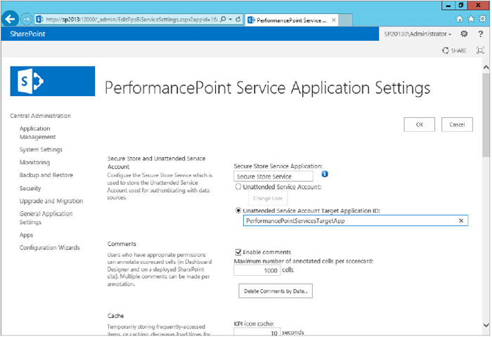
The EffectiveUsername feature reduces complexity by eliminating the need for Kerberos constrained delegation and works with both Excel Services and PerformancePoint Services in SharePoint 2013. The EffectiveUsername is essentially a query parameter passed to Analysis Services. When the query with this parameter is executed, Analysis Services will security trim the result set before returning the query results. Enabling EffectiveUsername is as simple as checking a box in the PerformancePoint Service’s service application configuration screen in Central Administration.
Custom Target Applications from Secure Store
Another security enhancement, PerformancePoint Services 2013 now supports targeting applications with secure store credentials like Excel Services 2010 did. The secure store defines the set of credentials used to access a back-end data source. Before this change, PerformancePoint did not have the same level of administrative manageability because users were effectively required to use the same set of credentials for all target applications. Now users can be provided with a number of different target applications, each with different credential sets that map correctly to the authorization allowed by the back-end data source. This secure store credential can be configured when defining a data source in the dashboard designer or for an entire service in Central Administration.
Filters
Filters are leveraged by PerformancePoint to create a link between web parts to synchronize the data. SharePoint 2013 leverages six different filter types, including the Custom Table, MDX Query, Member Selection, Named Set, Time Intelligence, and Time Intelligence Connection Formula. Although none of these filter types are new since the 2010 version, SharePoint 2013 improves the user experience with better performance and more intuitive filter actions.
The most significant enhancement made to filters is the capability to do a filter search, as shown in Figure 18-6. A filter search enables users to:
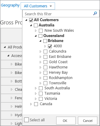
- Search within single-select and multiselect tree filters
- Search Analysis Services/PowerPivot data sources
- Search Member Selection, MDX Query, and Named Set filters
Server Side Migration
PerformancePoint 2010 was a big change from the 2007 version in that all of the components were finally stored inside of SharePoint, leveraging versioning, consistent backups, and so on. Unfortunately, the content types that drove PerformancePoint Services 2010 were not supported by the content deployment functionality or publishing infrastructure. This has now changed in 2013. Appropriately permissioned end users can now leverage the Ribbon to migrate PerformancePoint components anywhere inside of a farm. This capability has been added to support the enterprise IT and regulatory controls that dictate split development ⇒ test ⇒ production environments.
Themes
The PerformancePoint user experience team worked overtime during the development of SharePoint 2013 to enable support of SharePoint 2013’s new Change the Look theming capability. Figure 18-7 shows how effectively this change punches up a dashboard. It is important to note that the only two PerformancePoint components that do not support themes are the Analytic Charts and Decomposition trees (which always pop up a new window with a white background).
USING PERFORMANCEPOINT 2013
The following sections walk you through the steps required to correctly configure PerformancePoint Services, create a sample dashboard based on the freely downloadable AdventureWorks database, and finally to extend PerformancePoint Services.
Configuring PerformancePoint Services
The following sections cover how to ensure PerformancePoint Services has been installed and configured for the purposes of creating a simple dashboard based on the AdventureWorksDW Analysis Services sample downloaded and installed in the previous steps.
Using the AdventureWorks Sample Databases
The database source for examples provided in this chapter is the AdventureWorks data warehouse for SQL Server 2012. You can download this sample data warehouse, AdventureWorksDW2012 from CodePlex at http://msftdbprodsamples.codeplex.com. It’s worth mentioning that a link to the installation instructions on TechNet is also available on the CodePlex download page.
If the installation goes smoothly, you should be able to start SQL Server Management Studio, connect to the Database Engine, and see the new AdventureWorks databases in your SQL Server 2012 instance.
Unfortunately, the installation package does not automatically deploy the Analysis Services database. The quickest path to deploying the Analysis Services database is to leverage the Analysis Services Tutorials available on the same CodePlex download page as the AdventureWorksdw2012 Data File.
Before you can start the following instructions, ensure that the SSAS service account has permission to the SQL Server instance where the AdventureWorksDW2012 sample database exists. In addition, ensure that the SSAS service account has permission to access the databases and is at least a member of the db_datareader role for the AdventureWorksDW2012 database.
To deploy this database, you need to perform the following steps:

At this point, you should be able to start SQL Server Management Studio, if it’s not already open, connect to the Analysis Services, and see the new AdventureWorks databases, which are inside of the Data Sources folder of the new Analysis Services Tutorial database.
Unattended Service Account
PerformancePoint Services 2010 introduced per data source authentication to restrict end users from inadvertently accessing unauthorized databases such as the SharePoint content databases. As mentioned in the “Changes in PerformancePoint 2013” section, SharePoint 2013 enhances the potential of the unattended service account by allowing truly targeted security configurations from inside of the Secure Store Service.
An unattended account can be created using directly in the secure store service or directly in the PerformancePoint Service Application using the following steps:
Claims Authentication and BI Solutions
In SharePoint Server 2013, there are some important considerations related to authentication and authorization, which affect all of the services running on the top of the new platform. These changes are particularly important for BI solutions deployed to SharePoint and when SharePoint plays the role of middleman in accessing the back-end data. Perhaps the most important impact involves the way claims-based identity has been plugged into the SharePoint authentication and authorization semantics through a new service called Security Token Service (STS).
Introduced in SharePoint 2010, when a user authenticates to a claims-aware web application, regardless of identity system or authentication type, a claims identity is issued by STS and then it’s translated into a SPUser object. This identity is issued based on the standard protocols (SAML, WS-Trust, and WS-Federation) and works with any corporate identity system, such as Active Directory, WebSSO, Live ID, LDAP, SQL, or Custom. Without any special configuration, the claims identity flows along with the request through the server tiers (service applications) in a SharePoint farm.
In terms of the authorization semantics, things haven’t changed much in SharePoint 2010, with one exception. With the claims authentication infrastructure, you can now leverage claims attributes during the authorization process, reducing the need to proliferate role-based security groups for every imaginable security permutation. You can also use the claim provider APIs and augment the existing claims for handling your custom authorization scenarios. For more information, see the official documentation at http://www.devhorizon.com/go/23.
Although the service application infrastructure in SharePoint is claims-aware, many external data sources are still not claims-aware. In many scenarios, such as the following, claims cannot be used for the end-to-end solution:
- Scenario 1 — In this scenario, an Excel workbook or PerformancePoint scorecard is used against an Analysis Services cube that has role-based security (that is, every role has its own view of the data). This requires Windows authentication for Analysis Services and, thus, a way to pass the identity for every user from SharePoint to Analysis Services. SQL Server Analysis Services is not claims-aware and has no idea who or what the SharePoint user is. Before the advent of the SharePoint 2013 EffectiveUsername feature, administrators were required to configure Kerberos or the unattended service account and add an authenticated username in the connection string. In this scenario, the EffectiveUsername connection to Analysis Services saves a tremendous amount of complex configuration!
- Scenario 2 — Front-end web servers, the Excel Calculation Services application, and the SharePoint database servers run on different computers. In this scenario, if Excel Calculation Services is opening workbooks stored in SharePoint content databases, you should use Kerberos or the unattended account.
- Scenario 3 — In this scenario, Excel Calculation Services is opening a workbook from non–Microsoft SharePoint Foundation trusted file locations, such as UNC shares or HTTP websites. The authentication method used in this scenario is to use impersonation or process an account.
- Scenario 4 — A common scenario in which Kerberos is needed is when there are multiple machine hops from mid-tier to the last data source, as shown in Figure 18-10. Remember, the minute an identity leaves the boundary of the service application tier; the claims identity may no longer be meaningful if a data source doesn’t understand the compliant SAML protocol.

The scenario depicted in Figure 18-11 shows how the combination of claims and the unattended account can help you properly authenticate to the back-end data source. In this scenario, the claims identity flows between multiple service applications, and the Analysis Services engine impersonates the unattended account to connect to the external data source.

Creating a Dashboard
Now that PerformancePoint Services has been properly configured with secure access through the EffectiveUsername and Unattended Service Account, it is time to kick the tires and create an actual dashboard.
Launching the Dashboard Designer
In this section, you kick off PerformancePoint dashboard designer by following these steps:

Assembling a Dashboard
Now that you have created a PerformancePoint workspace, you are ready to create your first dashboard, which displays historical and real-time information as an asymmetrical report and compares it to an established goal. And with that, it’s time to build the actual dashboard from the ground up.
Dashboard Data Source
As with any other BI solution, the first thing that you want to do is to go after data. To create the data source used for this dashboard, follow these steps:

At this point, you have successfully created the dashboard’s main data source and it’s been uploaded to the Data Connections Document Library by the Dashboard Designer.
Data Source Authentication Types
There are three authentication types available for the data source you are building (refer to Figure 18-13).
The unattended service account option has been previously discussed, and by now you should know what it does, but the other two options and the checkbox deserve more attention:
- Use a stored account — By leveraging a pre-configured secure store target application, administrators can centrally control a service account that all end users use to connect to the database.
- Per-user identity — There are cases that may not require you to create the unattended service account. Picture this: Your back-end data source supports Windows authentication, and user identities must be delegated all the way down to the back-end data source when they access the PerformancePoint dashboards. In PerformancePoint, this authentication type is known as per-user identity, and only Kerberos enables it.
- Provide the authenticated user name in as the value of the connection string property — This checkbox is available to any authentication selection. If this option is selected, PerformancePoint supplies the SharePoint authenticated provider and username (Forms, SAML, Windows, and so on) as a string in the CustomData field in Analysis Services. You can then create a role (or set of roles) and write MDX queries using the CustomData string to dynamically restrict access to the cube data. The main challenge of this solution is that you need to modify the cube data to include the users of the system and their relationships to the data; this can be somewhat difficult to maintain.
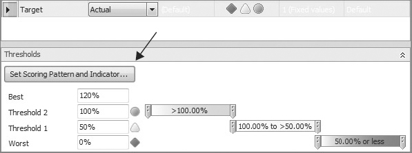
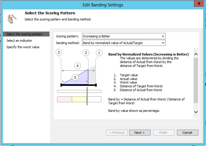
Tracking Performance Using KPIs
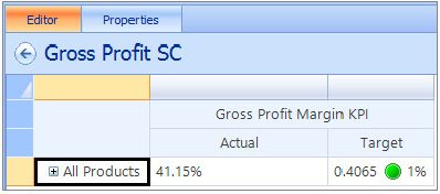
How can you measure success? How can the measurement of success be implemented in a dashboard? Success (or the goal) in a certain area of the business is defined by someone in your organization who knows the business inside and out. In PerformancePoint, a primary metric used to implement and measure this success is a key performance indicator (KPI). The KPI measures progress toward a goal and as such readily lends itself to representation with the classic Red/Yellow/Green indicator as to the status of current progress towards the goal. After a KPI is defined and implemented, it can be used to monitor the organization’s progress in a specific area, such as gross profit margin per product category earned from Internet sales.
To create a new KPI to track gross profit margin for Internet sales, you need to follow these steps:

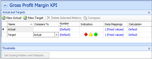
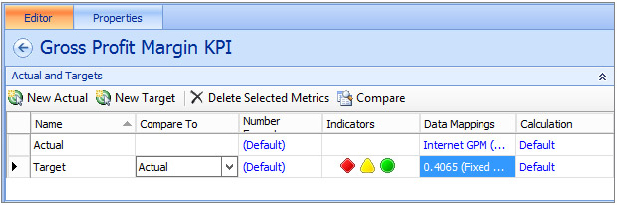
At this point, your new KPI should look like Figure 18-18. Notice on the Details pane that you have all available information about the KPI, such as related data sources.
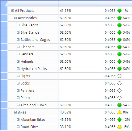
Building the Scorecard
With the dashboard’s data source and KPI complete, you have all the elements that you need to build the scorecard. This scorecard will contain the Gross Profit Margin KPI, show all sales across all years, and is broken down by product category.

Native Reporting
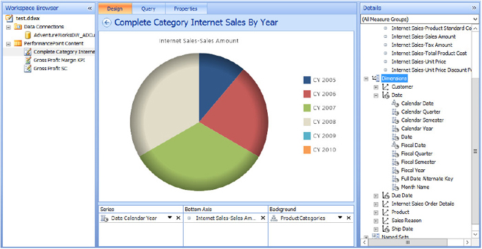
In this section, you create a report that connects to the scorecard you created in the previous section and display Internet sales for all years grouped by product category.


Putting Everything Together
Now that you have gone through all the steps of building different pieces of the dashboard, it’s time to put all the pieces together. In this section, you create a dashboard that displays the scorecard and the report and connects them. This connection enables filtering of the report (the pie chart) using the currently selected category from the scorecard.

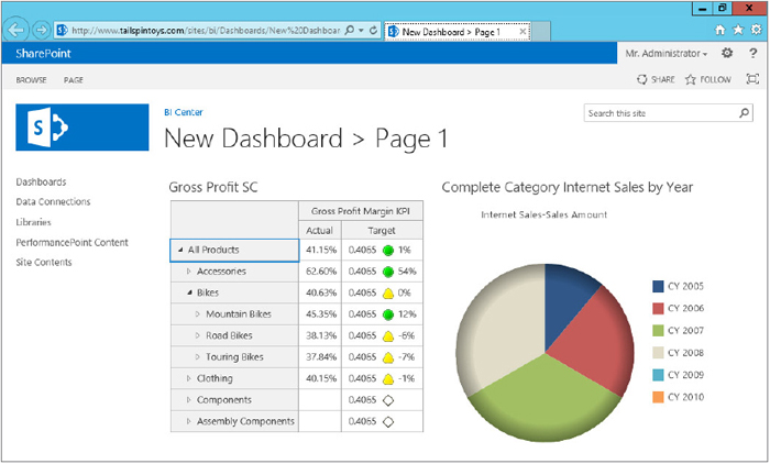
Publishing to SharePoint
With the dashboard layout completed, the next step is to make it available in SharePoint for online viewing. Remember, the dashboard contents are already stored in the BI Center site, so publishing here means creating an instance of the dashboard definition and dumping it as an .aspx page (an exported dashboard) in a dashboard’s document library.
You can publish your dashboard to any document if the following two conditions are met:
- The page is in a document library with PerformancePoint content types.
- The page has access to the dashboard elements in the BI Center.
Publishing the dashboard to SharePoint is relatively straightforward:
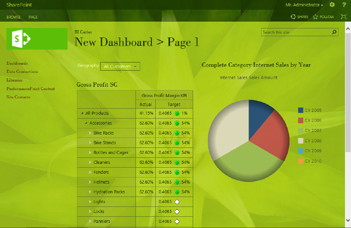
When the deployment is completed, you are redirected to a page (see Figure 18-26) where your dashboard is rendered with 100 percent fidelity to what you experienced in the authoring environment.
What Else Is in the Box?
The dashboard that you just published is nothing more than a web part page, two web parts, and a web part connection, which were all set up automatically as part of the dashboard-publishing process.
These connections are not exclusive to PerformancePoint web parts. Using the web part connection, you can take your dashboard design to the next level by adding more web parts to the page representing more complex analytical scenarios. You can examine the content of the dashboard by switching the page to edit mode, as shown in Figure 18-27.

There are many functionalities available on the chart. Suppose that, for the purpose of trend analysis, you need to change the type of the chart. To do so, right-click underneath the chart’s legend, and from the context menu, select Report Type ⇒ Pie Chart, as shown in Figure 18-28.

If you right-click the analytic chart, you can see that there are plenty of helpful built-in functionalities at your fingertips, as shown in Figure 18-29.
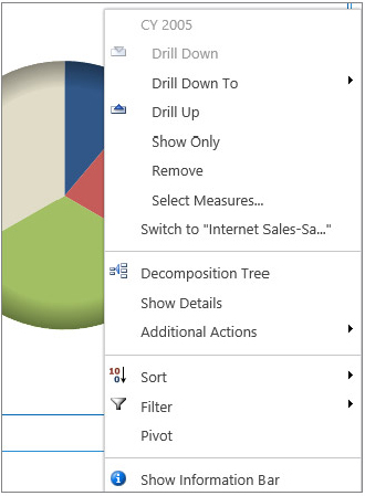
There are three options in this menu that need to be highlighted:
- Drill Down To or Drill Up — These options enable you to drill down or up to see different levels of detail presented by the chart element.
- Select Measures — If the measure that the report represents is not enough for your analysis, click Select Measures, and select one or more items from the list of all measures that exist in the perspective.
- Decomposition Tree — This option offers another interactive way of navigating your dashboard. An advantage of using the Decomposition Tree is that it keeps the report sorted and places insignificant contributors at the bottom of the hierarchy (see Figure 18-30). Of course, if you want to analyze negativity (that is, cities with worse sales amounts), you can always flip the default sorting style using the drop-down list on the top of each level. Decomposition Tree is a Silverlight application and requires the Microsoft Silverlight 3 framework to be installed on the client machine.

Finally, if you ever decide to show a dashboard element in a completely new page to have more real estate, from the web part that hosts the element, modify the properties, and select Open in New Window, as shown in Figure 18-31. You can also reset the view to the element’s original state.

Time Intelligence Filtering
In your analysis, you are often required to base your time formulas and functions on a time dimension such as your company’s fiscal year. In such scenarios, if your data source is not aware of the time dimension you use, you get the error message that says the data source has an invalid time intelligence configuration, as shown in Figure 18-32.

As suggested by the error message, setting the time intelligence configuration in your data source prepares the groundwork for time intelligence. To configure the time intelligence in your data source, follow these steps:
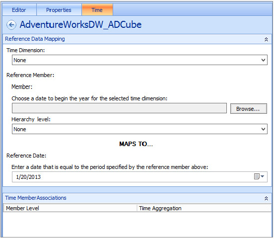
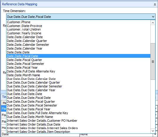

Now you can go ahead and create any formulas or filters that are based on this intelligent time dimension, such as [Date.Fiscal].[FY 2006 to Date by Day].
Strategy Maps
Another requirement for understanding the performance of an organization is the ability to understand the relationship between strategic business objectives and the various KPIs that measure progress toward those strategic goals. In PerformancePoint, a strategy map is composed of a Visio services hosted diagram, which works in mobile browsers and is touch-enabled, which means that PerformancePoint dashboards and strategy maps natively support the iPad and other tablet devices. In a PerformancePoint dashboard, a scorecard monitoring performance may make more sense to users if placed on the page next to a strategy map.
PerformancePoint does not restrict the format of the shapes in the Visio diagram to a hierarchical diagram. Actually, any shape can be used because the process of adding a strategy map to the Dashboard Designer links each shape in the drawing to a KPI in the Strategy Map Editor dialog, as long as the shape is a simple shape (excluding grouped objects). This connection enables each shape in the diagram to represent a KPI by changing color to reflect the performance of that particular KPI. For instance, in the previous example, several of the shapes reflect that the KPI is on track with the green color while a few items are in trouble and are shaded red.
Although strategy maps can be anything the dashboard designer wants, there is a management science technique known as the Balanced Scorecard framework that uses four dimensions to define organizational performance
- Financial — This dimension measures the financial metrics such as revenue, cost, and profit.
- Customer — This dimension measures customer satisfaction and includes metrics such as customer counts, market share, and number of complaints.
- Internal process — This dimension measures an organization’s operational metrics including time to market for new products, service error rates, and quality control measures.
- Learning and growth — This dimension focuses on the people side of an organization, watching metrics such as employee turnover rates, the number of new employees, and hiring data.
The Balanced Scorecard framework is a useful strategic performance management tool that has been adopted worldwide to keep track of organizational effectiveness and to monitor the results of employee actions. The strategy map component of the Balanced Scorecard framework, introduced in the mid-1990s, enables a great deal of contextual justification when determining which measures and metrics to monitor because the strategy map enable business leaders to understand the relationships between metrics.
EXTENDING PERFORMANCEPOINT
PerformancePoint Services does support customization through a number of different vectors. Enterprising developers can take advantage of the available APIs to hook custom reports, filters, tabular data sources, and scorecard transforms into the application. The following sections discuss the three required components to create custom reports, filters, and tabular data sources: a renderer/provider, an editor, and the extension meta data.
Extensibility Targets in PerformancePoint 2013
Earlier in this chapter, the “PerformancePoint Services Architecture” section introduced you to the numerous approaches to customizing PerformancePoint Services in SharePoint 2013. See Figure 18-36 for a refresher of the PerformancePoint Services architecture.

As previously noted, customizations that run on the front-end web server include custom editors. Custom editors enable end users to define property settings on custom reports, filters, and tabular data sources. Custom editors are essentially .aspx pages installed in the Layouts directory of the 15 Hive. As you can see, custom editors are built on top of the BIMonitoringServiceApplicationProxy class, which handles data source CRUD, rendering, and processing.
Customizations that run on the middle-tier application server include custom scorecard transforms and renders/providers that provide custom business logic. Custom scorecard transforms are used to change the appearance and content of scorecards before rendering.
Custom Data Sources
Consider the following scenario: A SharePoint development team has been asked by the TailSpin Toys business leadership to create an integrated dashboard reflecting the performance of the marketing team’s investments in various campaigns. To successfully accomplish this task, the SharePoint developer must first understand which metrics are important and then work backward to discover the data integration requirements.
In the example scenario, business owners want to understand at what rate a direct marketing campaign, and the sales and marketing team’s marketing platform convert into sales. When a campaign is launched from the marketing platform, a special offer is delivered via e-mail to the prospective customer. This offer is a call to action, a call for the customer to click a link to view the deal and receive the discount. This offer link contains a special code, called a response attribution code, which enables the sales team to track the sale back to the originating campaign. Considering that the TailSpin Toys sales and marketing teams are aggressive overachievers who launch hundreds of targeted campaigns a year, this measurement must take the following shape:
- Understand for all campaigns the rate of views of offers. This can measure whether or not the e-mail containing the offer was viewed or deleted without being opened.
- Understand for all campaigns the rate of clicks on offers. This can measure whether or not the recipient of the e-mail clicked the link to open the TailSpin Toys’ e-commerce site.
- Understand for all campaigns the rate of conversion of offers. This can measure whether or not the recipient of the e-mail actually purchased a product using the campaign’s suggested offer (normally a discount or an offer of free shipping).
- Drill down in each of the preceding aggregate measures. This can help to understand the rates for each individual campaign.
The intent here is to enable PerformancePoint’s decomposition tree component to highlight especially effective and ineffective campaigns for more intelligent marketing investments. This scenario is a fairly common set of metrics with which the performance of sales and marketing organizations can be measured.
If TailSpin Toys leveraged Microsoft Dynamics CRM, the easy approach would be to connect the Dashboard Designer to the CRM database directly. Unfortunately for the SharePoint developer, TailSpin Toys leverages Salesforce.com as a marketing platform, so all CRM details such as direct marketing campaign metrics are contained there. Fortunately, the e-commerce website is based on a custom ASP.Net Web Forms application, which leverages a SQL Server back end.
The solution approach in this scenario would weigh the following options:
- Should the data from Salesforce.com be downloaded to a SQL Server OLTP database for easy reporting purposes?
- Should the data from Salesforce.com be downloaded to an enterprise Data Warehouse (EDW) hosted by SQL Server Analysis Services for deep analytical understanding and coincidentally easy reporting via PerformancePoint?
- Does the business require a near real-time view of the data, which requires direct read access of the Salesforce.com data?
For the purposes of this example, the near real-time requirements are going to require that the SharePoint developer connect directly to the Salesforce.com platform via web services to retrieve the data.
PerformancePoint Services can use the following as tabular data sources for reporting purposes: Excel and Excel Services worksheets, SharePoint lists, and SQL Server tables. Leveraging data from web services is not available out-of-the-box, so what is the fictitious SharePoint developer to do? Why, create a custom tabular data source, of course! The other custom back-end options, creating custom reports and filters, don’t apply to this specific example.
Salesforce.com offers a SOAP API Developers Guide, available at http://www.salesforce.com/us/developer/docs/api/index.htm. The full exploration of interconnecting .NET and Salesforce.com data is beyond the scope of this chapter, but the code snippet that appears later in this section reveals an approach to creating a custom tabular data source. The specific Salesforce.com objects worth investigating in the dashboard are the Campaign, CampaignMember, Lead, and Opportunity objects. The Lead object tracks inside of Salesforce.com whether or not that lead has been converted into an Account, Contact, or Opportunity. The query() method of the connection object enables the retrieval of data from an object and works with a SQL-like syntax and can be paged if multiple results occur. Figure 18-37 reflects this subset of the Salesforce.com Sales objects data model.

The code snippet that appears later in this section can retrieve Opportunities and turn that data into a tabular data source. Before this code can be created, a WSDL must be generated inside of Salesforce.com. To generate a WSDL, click Account Name ⇒ Set Up ⇒ Develop ⇒ API ⇒ Generate enterprise WSDL ⇒ Generate. After the WSDL has been created and saved to the developer’s hard drive, add a service reference to that WSDL in Visual Studio.
To create a custom tabular data source, you must first create the properly configured solution in Visual Studio.
- Microsoft.PerformancePoint.Scorecards.Client.dll
- Microsoft.PerformancePoint.Scorecards.DataSourceProviders.Standard.dll
The code snippet that appears later in this section represents an extremely simplified approach to creating a tabular data source from Salesforce.com data. This code does the following things when executed:
- Defines a Salesforce Object array to store results from the Salesforce.com web service query.
- Validates that the data source object is correctly configured with dimension and fact tables. This step effectively ensures that PerformancePoint Services can use the output of the custom code as it would an Analysis Services cube. The pertinent functions are the overridden SetDataSource() and the internal CreateDataColumnMappings() functions.
- Fills the tabular data source with data retrieved from Salesforce.com. This step (abbreviated to serve as an example) queries the Salesforce.com Opportunities object with the following chain of functions:
- The overridden GetDataSet() defines the data table to be mapped to the tabular data source and then calls FillResultTable().
- FillResultTable() is an internal function that first checks the cache for archived results and then calls queryRecords() to get actual data from the Salesforce.com web service.
using System;
using System.Data;
using System.IO;
using System.Linq;
using System.Xml.Linq;
using Microsoft.PerformancePoint.Scorecards;
using Microsoft.PerformancePoint.SDK.Samples.SampleDataSource;

namespace TailSpinToys.Wrox.Samples.ExampleTabularDataSource
{

  // Represents the class that defines the sample data source provider.
  // It inherits from the BasicTabularDataSourceProvider class, which
  // contains overridden abstract methods that are not implemented.  The
  // BasicTabularDataSourceProvider class and the SampleDSCacheHandler class
  // are provided in the Microsoft PerformancePoint Services SDK Reference
  // Sample (available http://archive.msdn.microsoft.com/ppsSdkRefSample)

  // Code also requires access to SalesForce.com WSDL and generated proxy classes
  // before this code will compile
  public class SFDCTabularDataSourceProvider : BasicTabularDataSourceProvider
  {

    #region Properties

    // This property stores the array of results from
    // the queried SFDC Web service.
    private Object[] OpportunitiesArray
    {
      get;
      set;
    }

    #endregion

    #region Overridden methods

    // The source name for your data source. This value must match the key
    // attribute that is registered in the web.config file.  Modifying the
    // web.config file is discussed in the deployment section of this chapter
    public override string GetId()
    {
      return "SFDCTabularDataSource";
    }

    // Add column mappings for the sample columns if they do not exist.
    // Column mappings may be missing if the custom data source has never
    // been edited or if the workspace was not refreshed, which saves
    // changes to the server.
    public override void SetDataSource(DataSource dataSource)
    {

      base.SetDataSource(dataSource);

      // Check whether column mappings exist. Do not overwrite them.
      if (dataSource.DataTableMapping.ColumnMappings.Count == 0)
      {
        dataSource.DataTableMapping = CreateDataColumnMappings();
      }
    }

    // Get the data from the data source.
    // GetDataSet contains the core logic for the provider.
    public override DataSet GetDataSet()
    {

      // Create a dataset and a data table to store the data.
      DataSet resultSet = new DataSet();
      DataTable resultTable = resultSet.Tables.Add();

      // Define column names and the type of data that they contain.
      resultTable.Columns.Add("OpportunityId", typeof(string));
      resultTable.Columns.Add("StageName", typeof(string));
      resultTable.Columns.Add("CampaignId", typeof(string));

      FillResultTable(ref resultTable);

      return resultSet;
    }
    #endregion

    #region Internal methods

    // Fill the data table with the retrieved values from
    // the Salesforce.com Web service
    protected void FillResultTable(ref DataTable resultsTable)
    {

      // Check the sematic validity of symbols (out of scope for this sample).
      if (null != OpportunitiesArray &&
        OpportunitiesArray.Length > 0 &&
        !string.IsNullOrEmpty(SampleDSCacheHandler.CacheFileLocation))
      {
        try
        {
          if (!File.Exists(SampleDSCacheHandler.CacheFileLocation))
          {

            // Create the cache file.
            XDocument doc = SampleDSCacheHandler.DefaultCacheFileContent;
            doc.Save(@SampleDSCacheHandler.CacheFileLocation);
          }

          // Get values and update cache file.
          queryRecords();

          SampleDSCacheHandler.UpdateXMLCacheFile(wsResult);

          // Check if a valid cache file location exists, which SHOULD exist
          // given that it was just filled from a query of the web service.
          if (SampleDSCacheHandler.CacheFileContent != null)
          {
            var query = from c in SampleDSCacheHandler.CacheFileContent.Elements("Opportunities").Elements("Opportunity")
                  select c;

            foreach (var opportunityInstance in query)
            {
              DataRow row = resultsTable.NewRow();
              row["OpportunityId"] = opportunityInstance.Attribute("OpportunityId ").Value;
              row["StageName"] = opportunityInstance.Element("StageName").Value;
              row["CampaignId"] = opportunityInstance.Element("CampaignId").Value;

              resultsTable.Rows.Add(row);
            }
          }
        }
        catch (Exception ex)
        {
          // Insert proper exception handling
        }
      }
    }

    // Get real-time data from the Salesforce.com Web service.
    // requires access to Partner WSDL files to work
    public void queryRecords()
    {
      QueryResult qResult = null;
      try
      {
        // this sample code deliberately ignores the
        // code required to connect to SFDC
        String soqlQuery = "SELECT Id, StageName, CampaignId FROM Opportunity";
        qResult = connection.query(soqlQuery);
        Boolean done = false;
        if (qResult.size > 0)
        {
          while (!done)
          {
            // grab the results and store them in the
            // OpportunitiesArray property
            OpportunitiesArray = qResult.records;

            // check to see if this set of results contains the final result
            if (qResult.done)
            {
              done = true;
            }
            else
            {
              // SFDC uses paging to prevent timeouts
              qResult = connection.queryMore(qResult.queryLocator);
            }
          }
        }
        else
        {
          Console.WriteLine("No records found.");
        }
        Console.WriteLine("Query succesfully executed.");
      }
      catch (Exception e)
      {
        Console.WriteLine("An unexpected error has occurred: " +
                       e.Message + "
" + e.StackTrace);
      }
    }

    // Create the column mappings.
    // Notice that the table below contains only dimension fields and no
    // fact data.  This will obviously limit the practical application but
    // suffices for this demonstration
    internal static DataTableMapping CreateDataColumnMappings()
    {
      DataTableMapping dtTableMapping = new DataTableMapping();

      // Define the data in the ID column as dimension data.
      dtTableMapping.ColumnMappings.Add(new DataColumnMapping
      {
        SourceColumnName = "Id",
        FriendlyColumnName = "OpportunityId",
        UniqueName = "OpportunityId",
        ColumnType = MappedColumnTypes.Dimension,
        FactAggregation = FactAggregations.None,
        ColumnDataType = MappedColumnDataTypes.String
      });

      // Define the data in the StageName column as dimension data.
      dtTableMapping.ColumnMappings.Add(new DataColumnMapping
      {
        SourceColumnName = "StageName",
        FriendlyColumnName = "StageName",
        UniqueName = "StageName",
        ColumnType = MappedColumnTypes.Dimension,
        FactAggregation = FactAggregations.None,
        ColumnDataType = MappedColumnDataTypes.String
      });

      // Define the data in the CampaignId column as dimension data.
      dtTableMapping.ColumnMappings.Add(new DataColumnMapping
      {
        SourceColumnName = " CampaignId ",
        FriendlyColumnName = " CampaignId ",
        UniqueName = " CampaignId ",
        ColumnType = MappedColumnTypes.Dimension,
        FactAggregation = FactAggregations.None,
        ColumnDataType = MappedColumnDataTypes.String
      });


      return dtTableMapping;
    }
    #endregion
  }
}
Notable in the code are the following items:
- Add using directives for the following PerformancePoint Services namespaces:
- Microsoft.PerformancePoint.Scorecards
- Microsoft.PerformancePoint.Scorecards.ServerCommon
- Add the BasicTabularDataSourceProvider and SampleDSCacheHandler classes from Microsoft’s PerformancePoint Services SDK Reference Sample available at http://archive.msdn.microsoft.com/ppsSdkRefSample.
- Override the GetId() method with the key attribute registered in the web.config.
- Override the SetDataSource() method to define column mappings.
- Override the GetDataSet() method to create the DataSet object, which acts as the tabular data source.
The preceding code fulfills part of the requirements in the scenario. Now that the SharePoint developer can see data from Salesforce.com, the next tasks are to integrate this data with data from the e-commerce platform to match conversions (orders) to campaigns. Finishing up the scenario is an exercise for you.
Custom Reports, Filters, and Transformations
Given the ability to create custom data sources, it becomes easy to see how flexible PerformancePoint is with the integration of disparate data. But what happens if the data elements don’t converge naturally into a single set of numbers? In this case a custom report experience may be required. Imagine creating specialized reports for specific vertical industries. Perhaps a custom report could be presented to end users in the form of an infographic with numerous data points dynamically updating images, maps, and data bars. The possibilities are endless because custom reports are nothing more than web server controls that write HTML based on incoming report parameters.
Should an entirely custom report be more than is necessary, a custom scorecard transformation offers developers the ability to inject code into the PerformancePoint Services page rendering pipeline to impact a change to rendered data. An example scenario is to apply a heat-map–style color coding to cells in a grid in the event of high or low values.
To handle a user’s need to slice and dice the data, PerformancePoint offers the SharePoint developer a custom filter development target. A filter data provider understands the underlying data source and leverages DataTable objects to organize data for consumer objects.
Of course, any self-respecting SharePoint component requires an in-browser editor experience. Custom reports, filters, and tabular data sources are no exception. Custom PerformancePoint editors inherit from the Page, UserControl, or WebPart class and are thoroughly documented in MSDN (http://msdn.microsoft.com/en-us/library/ee559635(v=office.15).aspx) with fully functional sample editors that Microsoft recommends using as templates.
Deploying Customizations
The deployment process for custom functionality is no different than any other farm deployment of custom DLLs to the environment except that a web.config modification is necessary. Naturally, the requirement of server-side code deployment and modification of core files means that Office 365 will probably never enable PerformancePoint Services extensions. web.config files can be modified via PowerShell scripts, timer jobs, or feature receivers, which identify and modify every instance of PerformancePoint Services in the farm.
You can find the PerformancePoint Services web.config in the 15 Hive at C:Program FilesMicrosoft Office Servers15.0WebServicesPpsMonitoringServer.
The first customization must add a <CustomFCOGroup></CustomFCOGroup> element inside of the Bpm element to register the following new section group:
<section name="CustomFCOGroup"
  type="Microsoft.PerformancePoint.Scorecards.Common.Extensions.CustomFCOSection,
  Microsoft.PerformancePoint.Scorecards.Common, Version=15.0.0.0,
  Culture=neutral, PublicKeyToken=71e9bce111e9429c" allowLocation="true"
  allowDefinition="Everywhere" />
After the section group has been added, update the previously added CustomFCOGroup element (inside of Bpm) with the following code snippet:
<CustomFCO type="[The object type: ReportView, Filter, or DataSource.]"
  subType="[The unique identifier for your custom ReportView, Filter, or
  DataSource object.]" >
  <Resources assemblyName="[The fully qualified name of the resources assembly.]"
    resourcesName="[The fully qualified name of the resources file.]"
    FCOName="[The display name for the custom object.]"
    FCODescription="[The description for the custom object.]"
    FCOTemplateIcon="[The image resource to use as the icon for the custom
    object.]"/>
  <RendererClass name="[The fully qualified name of the renderer class in the
    format:
    Namespace.Class name, DLL name, DLL version number, DLL culture, DLL public
    key token.
    Applies to ReportView and Filter objects only.]" />
  <EditorURI uri="[The URI of the custom editor.]" />
</CustomFCO>
You can find detailed schema explanations on MSDN at http://msdn.microsoft.com/en-us/library/ee556434(v=office.15).aspx.
SUMMARY
PerformancePoint Services in SharePoint Server Enterprise 2013 is a minor evolution in functionality, improving slightly over previous versions. As an element in the suite of portal-based BI technologies including Excel Services, Visio Services, and Access Services, the native components that make up PerformancePoint Services round out Microsoft’s vision of Business Intelligence for Me, We, and the World. In the Me category of personal BI, Microsoft Office products such as Excel and Access enable individualized tracking and reporting capabilities. In the We category of team BI, SharePoint 2013 hosts Office applications such as Excel Services and Visio Services to distribute self-service BI capabilities to wider audiences. In the World category of corporate BI, PerformancePoint scorecards and dashboards monitor an organization’s progress toward its goals via highly graphical representations of numbers.
This chapter delved deep into the architecture and application of one of the most important BI service applications in SharePoint Server 2010: PerformancePoint Services. In this chapter, you were introduced to key concepts, the components of the service application, common usage patterns such as Time Intelligence Filtering, and to creating custom extensions for PerformancePoint Services. With this introduction and in spite of the deployment complexities, it is not unreasonable to expect a host of customized data solutions incorporating disparate data into understandable and actionable dashboards.
The next chapter expands on this chapter’s introduction to Access Services in SharePoint 2013. In the next chapter you learn how Access Services was rewritten from the ground up to create compelling and scalable data-backed web applications with zero intervention from IT.