Time series are omnipresent in both industry and research. We can find examples of time series in commerce, tech, healthcare, energy, finance, and so on. We are mostly interested in the last one, as the time dimension is inherent to trading and many financial/economic indicators. However, pretty much every business generates some sort of time series, for example, its profits collected over time or any other measured KPI. That is why the techniques we cover in the following two chapters can be used for any time series analysis task you might encounter in your line of work.
Time series modeling or forecasting can often be approached from different angles. The two most popular are statistical methods and machine learning approaches. Additionally, we will also cover some examples of using deep learning for time series forecasting in Chapter 15, Deep Learning in Finance.
In the past, when we did not have vast computing power available at our disposal and the time series were not that granular (as data was not collected everywhere and all the time), statistical approaches dominated the domain. Recently, the situation has changed, and ML-based approaches are taking the lead when it comes to time series models running in production. However, that does not mean that the classical statistical approaches are not relevant anymore—in fact, far from it. They can still produce state-of-the-art results in cases when we have very little training data (for example, 3 years of monthly data) and the ML models simply cannot learn the patterns from it. Also, we can observe that statistical approaches were used to win quite a few of the most recent M-Competitions (the biggest time series forecasting competition started by Spyros Makridakis).
In this chapter, we introduce the basics of time series modeling. We start by explaining the building blocks of time series and how to separate them using decomposition methods. Later, we cover the concept of stationarity—why it is important, how to test for it, and ultimately, how to achieve it if the original series is not stationary.
Then, we look at two of the most widely used statistical approaches to time series modeling—exponential smoothing methods and ARIMA class models. In both cases, we show you how to fit the models, evaluate their goodness of fit, and forecast the future values of the time series.
We cover the following recipes in this chapter:
Time series decomposition
Testing for stationarity in time series
Correcting for stationarity in time series
Modeling time series with exponential smoothing methods
Modeling time series with ARIMA class models
Finding the best-fitting ARIMA model with auto-ARIMA
Time series decomposition
One of the goals of time series decomposition is to increase our understanding of the data by breaking down the series into multiple components. It provides insight in terms of modeling complexity and which approaches to follow in order to accurately capture/model each of the components.
An example can shed more light on the possibilities. We can imagine a time series with a clear trend, either increasing or decreasing. On one hand, we could use the decomposition to extract the trend component and remove it from our time series before modeling the remaining series. This could help with making the time series stationary (please refer to the following recipe for more details). Then, we can always add it back after the rest of the components have been accounted for. On the other hand, we could provide enough data or adequate features for our algorithm to model the trend itself.
The components of time series can be divided into two types: systematic and non-systematic. The systematic ones are characterized by consistency and the fact that they can be described and modeled. By contrast, the non-systematic ones cannot be modeled directly.
The following are the systematic components:
Level—the mean value in the series.
Trend—an estimate of the trend, that is, the change in value between successive time points at any given moment. It can be associated with the slope (increasing/decreasing) of the series. In other words, it is the general direction of the time series over a long period of time.
Seasonality—deviations from the mean caused by repeating short-term cycles (with fixed and known periods).
The following is the non-systematic component:
Noise—the random variation in the series. It consists of all the fluctuations that are observed after removing other components from the time series.
The classical approach to time series decomposition is usually carried out using one of two types of models: additive and multiplicative.
An additive model can be described by the following characteristics:
Model’s form—
Linear model—changes over time are consistent in size
The trend is linear (straight line)
Linear seasonality with the same frequency (width) and amplitude (height) of cycles over time
A multiplicative model can be described by the following characteristics:
Model’s form—
Non-linear model—changes over time are not consistent in size, for example, exponential
A curved, non-linear trend
Non-linear seasonality with increasing/decreasing frequency and amplitude of cycles over time
To make things more interesting, we can find time series with combinations of additive and multiplicative characteristics, for example, a series with additive trend and multiplicative seasonality.
Please refer to the following figure for visualization of the possible combinations. And while real-world problems are never that simple (noisy data with varying patterns), these abstract models offer a simple framework that we can use to analyze our time series before attempting to model/forecast it.
Figure 6.1: Additive and multiplicative variants of trend and seasonality
It can be the case that we do not want to (or simply cannot, due to some models’ assumptions) work with a multiplicative model. One possible solution is to transform the multiplicative model into an additive one using logarithmic transformation:
In this recipe, we will present how to carry out time series decomposition of monthly US unemployment rates downloaded from the Nasdaq Data Link.
How to do it...
Execute the following steps to carry out the time series decomposition:
Import the libraries and authenticate:
import pandas as pd
import nasdaqdatalink
import seaborn as sns
from statsmodels.tsa.seasonal import seasonal_decompose
nasdaqdatalink.ApiConfig.api_key = "YOUR_KEY_HERE"
Download the monthly US unemployment rate from the years 2010 to 2019:
In Figure 6.2, we can see some clear seasonal patterns in the time series. We did not include more recent data in this analysis, as the COVID-19 pandemic caused quite abrupt changes in any patterns observable in the unemployment rate time series. We do not show the code used for generating the plot, as it is very similar to the one used in Chapter 3, Visualizing Financial Time Series.
Figure 6.2: Seasonal plot of the US unemployment rate in the years 2010 to 2019
Figure 6.3: The US unemployment rate together with the rolling average and standard deviation
From the analysis of Figure 6.3, we can infer that the trend and seasonal components seem to have a linear pattern. Therefore, we will use additive decomposition in the next step.
Carry out the seasonal decomposition using the additive model:
Figure 6.4: The seasonal decomposition of the US unemployment rate (using an additive model)
In the decomposition plot, we can see the extracted component series: trend, seasonal, and random (residual). To evaluate whether the decomposition makes sense, we can look at the random component. If there is no discernible pattern (in other words, the random component is indeed random and behaves consistently over time), then the fit makes sense. In this case, it looks like the variance in the residuals is slightly higher in the first half of the dataset. This can indicate that a constant seasonal pattern is not good enough to accurately capture the seasonal component of the analyzed time series.
How it works...
After downloading the data in Step 2, we used the rolling method of a pandas DataFrame to calculate the rolling statistics. We specified that we wanted to use the window size of 12 months, as we are working with monthly data.
We used the seasonal_decompose function from the statsmodels library to carry out the classical decomposition. When doing so, we indicated what kind of model we would like to use—the possible values are additive and multiplicative.
When using seasonal_decompose with an array of numbers, we must specify the frequency of the observations (the freq argument) unless we are working with a pandas Series object. If we have missing values or want to extrapolate the residuals for the missing periods at the beginning and the end of the time series, we can pass an extra argument extrapolate_trend='freq'.
There’s more…
The seasonal decomposition we have used in this recipe is the most basic approach. It comes with a few disadvantages:
As the algorithm uses centered moving averages to estimate the trend, running the decomposition results in missing values of the trend line (and the residuals) at the very beginning and end of the time series.
The seasonal pattern estimated using this approach is assumed to repeat every year. It goes without saying that this is a very strong assumption, especially for longer time series.
The trend line has a tendency to over-smooth the data, which in turn results in the trend line not responding adequately to sharp or sudden fluctuations.
The method is not robust to potential outliers in the data.
Over time, a few alternative approaches to time series decomposition were introduced. In this section, we will also cover seasonal and trend decomposition using LOESS (STL decomposition), which is implemented in the statsmodels library.
LOESS stands for locally estimated scatterplot smoothing and it is a method of estimating non-linear relationships.
We will not go into the details of how STL decomposition works; however, it makes sense to be familiar with its advantages over the other approaches:
STL can handle any kind of seasonality (not restricted to monthly or quarterly, as some other methods are)
The user can control the smoothness of the trend
The seasonal component can change over time (the rate of change can be controlled by the user)
More robust to outliers—the estimation of the trend and seasonal components is not affected by their presence, while their impact is still visible in the remainder component
Naturally, it is not a silver-bullet solution and comes with some drawbacks of its own. For example, STL can only be used with additive decomposition and it does not automatically account for trading days/calendar variations.
There is a recent variant of STL decomposition that can handle multiple seasonalities. For example, a time series of hourly data can exhibit daily/weekly/monthly seasonalities. The approach is called Multiple Seasonal-Trend Decomposition using LOESS (MSTL) and you can find the reference to it in the See also section.
We can carry out the STL decomposition with the following snippet:
from statsmodels.tsa.seasonal import STL
stl_decomposition = STL(df[["unemp_rate"]]).fit()
stl_decomposition.plot()
                 .suptitle("STL Decomposition")
Running the code generates the following plot:
Figure 6.5: The STL decomposition of the US unemployment time series
We can see that the decomposition plots of the STL and classical decompositions are very similar. However, there are some nuances in Figure 6.5, connected to the benefits of STL decomposition over the classical one. First, there are no missing values in the trend estimate. Second, the seasonal component is slowly changing over time. You can see it clearly when looking at, for example, the values for January across the years.
The default value of the seasonal argument in STL is set to 7, but the authors of the approach suggest using larger values (must be odd integers greater than or equal to 7). Under the hood, the value of that parameter indicates the number of consecutive years to be used in estimating each value of the seasonal component. The larger the chosen value, the smoother the seasonal component becomes. This, in turn, causes fewer of the variations observed in the time series to be attributed to the seasonal component. The interpretation is similar for the trend argument, though it represents the number of consecutive observations to be used for estimating the trend component.
We have also mentioned that one of the benefits of the STL decomposition is its higher robustness against outliers. We can use the robust argument to switch on a data-dependent weighting function. It re-weights the observations when estimating the LOESS, which becomes LOWESS (locally weighted scatterplot smoothing) in such a scenario. When using robust estimation, the model can tolerate larger errors that are visible on the residual component’s plot.
In Figure 6.6 you can see a comparison of fitting two STL decompositions to the US unemployment data—with and without the robust estimation. For the code used to generate the figure, please refer to the notebook in the book’s GitHub repository.
Figure 6.6: The effect of using robust estimation in the STL decomposition process
We can clearly observe the effects of using robust estimation—larger errors are tolerated and the shape of the seasonal component is different over the first few years of the analyzed time series. There is no clear answer whether the robust or non-robust approach is better in this case; it all depends on what we want to use the decomposition for. Seasonal decomposition methods presented in this recipe can also serve as simple outlier detection algorithms. For example, we could decompose the series, extract the residuals, and flag observations as outliers when their residuals are outside 3 times the interquartile range (IQR). The kats library provides an implementation of such an algorithm in its OutlierDetector class.
Other available approaches to seasonal decomposition include:
Seasonal Extraction in ARIMA Time Series (SEATS) decomposition.
X11 decomposition—this variant of the decomposition creates a trend-cycle component for all observations and allows the seasonal component to change slowly over time.
Hodrick-Prescott filter—while this method is not really a seasonal decomposition approach, it is a data smoothing technique used to remove short-term fluctuations associated with the business cycle. By removing those, we can reveal the long-term trends. The HP filter is commonly used in macroeconomics. You can find its implementation in the hpfilter function of statsmodels.
See also
Useful references on time series decomposition:
Bandara, K., Hyndman, R. J., & Bergmeir, C. 2021. “MSTL: A Seasonal-Trend Decomposition Algorithm for Time Series with Multiple Seasonal Patterns.” arXiv preprint arXiv:2107.13462.
Cleveland, R. B., Cleveland, W. S., McRae, J. E., & Terpenning, I. J. 1990. “A Seasonal Trend Decomposition Procedure Based on LOESS,” Journal of Official Statistics6(1): 3–73.
Hyndman, R.J. & Athanasopoulos, G. 2021. Forecasting: Principles and Practice, 3rd edition, OTexts: Melbourne, Australia. OTexts.com/fpp3
Sutcliffe, A. 1993. X11 time series decomposition and sampling errors. Australian Bureau of Statistics.
Testing for stationarity in time series
One of the most important concepts in time series analysis is stationarity. Plainly speaking, a stationary time series is a series whose properties do not depend on the time at which the series is observed. In other words, stationarity implies that the statistical properties of the data-generating process (DGP) of a certain time series do not change over time.
Hence, we should not be able to see any trend or seasonal patterns in a stationary time series, as their existence violates the stationarity assumptions. On the other hand, a white noise process is stationary, as it does not matter when we observe it; it will always look pretty much the same at any point in time.
A time series without trend and seasonality but with cyclic behavior can still be stationary because the cycles are not of a fixed length. So unless we explicitly observe a time series, we cannot be sure where the peaks and troughs of the cycles will be located.
To put it more formally, there are multiple definitions of stationarity, some stricter in terms of the assumptions than others. For practical use cases, we can work with the one called weak stationarity (or covariance stationarity). For a time series to be classified as (covariance) stationary, it must satisfy the following three conditions:
The mean of the series must be constant
The variance of the series must be finite and constant
The covariance between periods of identical distance must be constant
Stationarity is a desired characteristic of time series as it makes modeling and extrapolating (forecasting) into the future more feasible. That is because a stationary series is easier to predict than a non-stationary one, as its statistical properties will be the same in the future as they have been in the past.
Some drawbacks of non-stationary data are:
Variance can be misspecified by the model
Worse model fit, resulting in worse forecasts
We cannot leverage valuable time-dependent patterns in the data
While stationarity is a desired trait of a time series, this is not applicable to all statistical models. We would want our time series to be stationary when modeling the series using some kind of auto-regressive model (AR, ARMA, ARIMA, and so on). However, there are also models that do not benefit from stationary time series, for example, those that depend heavily on time series decomposition (exponential smoothing methods or Facebook’s Prophet).
In this recipe, we will show you how to test the time series for stationarity. To do so, we employ the following methods:
The Augmented Dickey-Fuller (ADF) test
The Kwiatkowski-Phillips-Schmidt-Shin (KPSS) test
Plots of the (partial) autocorrelation function (PACF/ACF)
We will investigate the stationarity of monthly unemployment rates in the years 2010 to 2019.
Getting ready
We will use the same data that we used in the Time series decomposition recipe. In the plot presenting the rolling mean and standard deviation of the unemployment rates (Figure 6.3), we have already seen a negative trend over time, suggesting non-stationarity.
How to do it...
Execute the following steps to test if the time series of monthly US unemployment rates is stationary:
Import the libraries:
import pandas as pd
from statsmodels.graphics.tsaplots import plot_acf, plot_pacf
from statsmodels.tsa.stattools import adfuller, kpss
Define a function for running the ADF test:
defadf_test(x):
indices = ["Test Statistic", "p-value",
"# of Lags Used", "# of Observations Used"]
adf_test = adfuller(x, autolag="AIC")
results = pd.Series(adf_test[0:4], index=indices)
for key, value in adf_test[4].items():
results[f"Critical Value ({key})"] = value
return results
Having defined the function, we can run the test:
adf_test(df["unemp_rate"])
Running the snippet generates the following summary:
Test Statistic             -2.053411
p-value                     0.263656
# of Lags Used             12.000000
# of Observations Used    107.000000
Critical Value (1%)        -3.492996
Critical Value (5%)        -2.888955
Critical Value (10%)       -2.581393
The null hypothesis of the ADF test states that the time series is not stationary. With a p-value of 0.26 (or equivalently, the test statistic is greater than the critical value for the selected confidence level), we have no reason to reject the null hypothesis, meaning that we can conclude that the series is not stationary.
Define a function for running the KPSS test:
defkpss_test(x, h0_type="c"):
indices = ["Test Statistic", "p-value", "# of Lags"]
kpss_test = kpss(x, regression=h0_type)
results = pd.Series(kpss_test[0:3], index=indices)
for key, value in kpss_test[3].items():
results[f"Critical Value ({key})"] = value
return results
Having defined the function, we can run the test:
kpss_test(df["unemp_rate"])
Running the snippet generates the following summary:
Test Statistic           1.799224
p-value                  0.010000
# of Lags                6.000000
Critical Value (10%)     0.347000
Critical Value (5%)      0.463000
Critical Value (2.5%)    0.574000
Critical Value (1%)      0.739000
The null hypothesis of the KPSS test states that the time series is stationary. With a p-value of 0.01 (or a test statistic greater than the selected critical value), we have reasons to reject the null hypothesis in favor of the alternative one, indicating that the series is not stationary.
Running the snippet generates the following plots:
Figure 6.7: Autocorrelation and Partial Autocorrelation plots of the unemployment rate
In the ACF plot, we can see that there are significant autocorrelations (above the 95% confidence interval, corresponding to the selected 5% significance level). There are also some significant autocorrelations at lags 1 and 4 in the PACF plot.
How it works...
In Step 2, we defined a function used for running the ADF test and printing out the results. We specified autolag="AIC" while calling the adfuller function, so the number of considered lags is automatically selected based on the Akaike Information Criterion (AIC). Alternatively, we could select the number of lags manually.
For the kpss function (Step 3), we specified the regression argument. A value of "c" corresponds to the null hypothesis stating that the series is level-stationary, while "ct" corresponds to trend-stationary (removing the trend from the series would make it level-stationary).
For all the tests and the autocorrelation plots, we selected a significance level of 5%, which indicates the probability of rejecting the null hypothesis (H0) when it is, in fact, true.
There’s more…
In this recipe, we have used the statsmodels library to carry out the stationarity tests. However, we had to wrap its functionalities in custom functions to have a nicely presented summary. Alternatively, we can use the stationarity tests from the arch library (we will cover the library in more depth when we explore the GARCH models in Chapter 9, Modeling Volatility with GARCH Class Models).
We can carry out the ADF test using the following snippet:
from arch.unitroot import ADF
adf = ADF(df["unemp_rate"])
print(adf.summary().as_text())
Which returns a nicely formatted output containing all the relevant information:
   Augmented Dickey-Fuller Results
=====================================
Test Statistic                 -2.053
P-value                         0.264
Lags                               12
-------------------------------------
Trend: Constant
Critical Values: -3.49 (1%), -2.89 (5%), -2.58 (10%)
Null Hypothesis: The process contains a unit root.
Alternative Hypothesis: The process is weakly stationary.
The arch library also contains more stationarity tests, including:
The Zivot-Andrews test (also available in statsmodels)
The Phillips-Perron (PP) test (unavailable in statsmodels)
A potential drawback of the ADF and KPSS tests is that they do not allow for the possibility of a structural break, that is, an abrupt change in the mean or other parameters of the data-generating process. The Zivot-Andrews test allows for the possibility of a single structural break in the series, with an unknown time of its occurrence.
We can run the test using the following snippet:
from arch.unitroot import ZivotAndrews
za = ZivotAndrews(df["unemp_rate"])
print(za.summary().as_text())
Which generates the summary:
        Zivot-Andrews Results
=====================================
Test Statistic                 -2.551
P-value                         0.982
Lags                               12
-------------------------------------
Trend: Constant
Critical Values: -5.28 (1%), -4.81 (5%), -4.57 (10%)
Null Hypothesis: The process contains a unit root with a single structural break.
Alternative Hypothesis: The process is trend and break stationary.
Based on the test’s p-value, we cannot reject the null hypothesis stating that the process is not stationary.
See also
For more information on the additional stationarity tests, please refer to:
Phillips, P. C. B. & P. Perron, 1988. “Testing for a unit root in time series regression,” Biometrika 75: 335-346.
Zivot, E. & Andrews, D.W.K., 1992. “Further evidence on the great crash, the oil-price shock, and the unit-root hypothesis,” Journal of Business & Economic Studies, 10: 251-270.
Correcting for stationarity in time series
In the previous recipe, we learned how to investigate if a given time series is stationary. In this one, we will investigate how to make a non-stationary time series stationary by using one (or multiple) of the following transformations:
Deflation—accounting for inflation in monetary series using the Consumer Price Index (CPI)
Applying the natural logarithm—making the potential exponential trend closer to linear and reducing the variance of the time series
Differencing—taking the difference between the current observation and a lagged value (observation x time points before the current observation)
For this exercise, we will use monthly gold prices from the years 2000 to 2010. We have chosen this sample on purpose, as over that period the price of gold exhibits a consistently increasing trend—the series is definitely not stationary.
How to do it...
Execute the following steps to transform the series from non-stationary to stationary:
Import the libraries and authenticate and update the inflation data:
import pandas as pd
import numpy as np
import nasdaqdatalink
import cpi
from datetime import date
from chapter_6_utils import test_autocorrelation
nasdaqdatalink.ApiConfig.api_key = "YOUR_KEY_HERE"
In this recipe, we will be using the test_autocorrelation helper function, which combines the components we covered in the previous recipe, the ADF and KPSS tests, together with the ACF/PACF plots.
Download the prices of gold and resample to monthly values:
We can use the test_autocorrelation helper function to test if the series is stationary. We have done so in the notebook (available on GitHub) and the time series of monthly gold prices is indeed not stationary.
Deflate the gold prices (to the 2010-12-31 USD values) and plot the results:
Figure 6.9: Time series after applying the deflation and natural logarithm, together with its rolling statistics
From the preceding plot, we can see that the log transformation did its job, that is, it made the exponential trend linear.
Use the test_autocorrelation (helper function for this chapter) to investigate if the series became stationary:
fig = test_autocorrelation(df["price_log"])
Running the snippet generates the following plot:
Figure 6.10: The ACF and PACF plots of the transformed time series
We also print the results of the statistical tests:
ADF test statistic: 1.04 (p-val: 0.99)
KPSS test statistic: 1.93 (p-val: 0.01)
After inspecting the results of the statistical tests and the ACF/PACF plots, we can conclude that deflation and a natural algorithm were not enough to make the time series of monthly gold prices stationary.
Apply differencing to the series and plot the results:
Figure 6.11: Time series after applying three types of transformations, together with its rolling statistics
The transformed gold prices give the impression of being stationary—the series oscillates around 0 with no visible trend and approximately constant variance.
Figure 6.12: The ACF and PACF plots of the transformed time series
We also print the results of the statistical tests:
ADF test statistic: -10.87 (p-val: 0.00)
KPSS test statistic: 0.30 (p-val: 0.10)
After applying the first differences, the series became stationary at the 5% significance level (according to both tests). In the ACF/PACF plots, we can see that there were a few significant values of the function at lags 11, 22, and 39. This might indicate some kind of seasonality or simply be a false signal. Using a 5% significance level means that 5% of the values might lie outside the 95% confidence interval—even when the underlying process does not show any autocorrelation or partial autocorrelation.
How it works...
After importing the libraries, authenticating, and potentially updating the CPI data, we downloaded the monthly gold prices from Nasdaq Data Link. There were some duplicate values in the series. For example, there were entries for 2000-04-28 and 2000-04-30, both with the same value. To deal with this issue, we resampled the data to monthly frequency by taking the last available value.
By doing so, we only removed potential duplicates in each month, without changing any of the actual values. In Step 3, we used the cpi library to deflate the time series by accounting for inflation in the US dollar. The library relies on the CPI-U index recommended by the Bureau of Labor Statistics. To make it work, we created an artificial index column containing dates as objects of the datetime.date class. The inflate function takes the following arguments:
value—the dollar value we want to adjust.
year_or_month—the date that the dollar value comes from.
to—optionally, the date we want to adjust to. If we don’t provide this argument, the function will adjust to the most recent year.
In Step 4, we applied the natural logarithm (np.log) to all the values to transform what looked like an exponential trend into linear. This operation was applied to prices that had already been corrected for inflation.
As the last transformation, we used the diff method of a pandas DataFrame to calculate the difference between the value in time t and time t-1 (the default setting corresponds to the first difference). We can specify a different number by changing the period argument.
There’s more...
The considered gold prices do not contain obvious seasonality. However, if the dataset shows seasonal patterns, there are a few potential solutions:
Adjustment by differencing—instead of using first-order differencing, use a higher-order one, for example, if there is yearly seasonality in monthly data, use diff(12).
Adjustment by modeling—we can directly model the seasonality and then remove it from the series. One possibility is to extract the seasonal component from the seasonal_decompose function or another more advanced automatic decomposition algorithm. In this case, we should subtract the seasonal component when using the additive model or divide by it if the model is multiplicative. Another solution would be to use np.polyfit() to fit the best polynomial of a chosen order to the selected time series and then subtract it from the original series.
The Box-Cox transformation is another type of adjustment we can use on the time series data. It combines different exponential transformation functions to make the distribution more similar to the Normal (Gaussian) distribution. We can use the boxcox function from the scipy library, which allows us to automatically find the value of the lambda parameter for the best fit. One condition to be aware of is that all the values in the series must be positive, so the transformation should not be used after calculating the first differences or any other transformations that potentially introduce negative values to the series.
A library called pmdarima (more on this library can be found in the following recipes) contains two functions that employ statistical tests to determine how many times we should differentiate the series in order to achieve stationarity (and also remove seasonality, that is, seasonal stationarity).
We can employ the following tests to investigate stationarity: ADF, KPSS, and Phillips–Perron:
from pmdarima.arima import ndiffs, nsdiffs

print(f"Suggested # of differences (ADF): {ndiffs(df['price'], test='adf')}")
print(f"Suggested # of differences (KPSS): {ndiffs(df['price'], test='kpss')}")
print(f"Suggested # of differences (PP): {ndiffs(df['price'], test='pp')}")
Running the snippet returns the following:
Suggested # of differences (ADF): 1
Suggested # of differences (KPSS): 2
Suggested # of differences (PP): 1
For the KPSS test, we can also specify what type of null hypothesis we want to test against. The default is level stationarity (null="level"). The results of the tests, or more precisely the need for differencing, suggest that the series without any differencing is not stationary.
The library also contains two tests for seasonal differences:
Osborn, Chui, Smith, and Birchenhall (OCSB)
Canova-Hansen (CH)
To run them, we also need to specify the frequency of our data. In our case, it is 12, as we are working with monthly data:
print(f"Suggested # of differences (OSCB): {nsdiffs(df['price'], m=12,test='ocsb')}")
print(f"Suggested # of differences (CH): {nsdiffs(df['price'], m=12, test='ch')}")
The output is as follows:
Suggested # of differences (OSCB): 0
Suggested # of differences (CH): 0
The results suggest no seasonality in gold prices.
Modeling time series with exponential smoothing methods
Exponential smoothing methods are one of the two families of classical forecasting models. Their underlying idea is that forecasts are simply weighted averages of past observations. When calculating those averages, more emphasis is put on recent observations. To achieve that, the weights are decaying exponentially with time. These models are suitable for non-stationary data, that is, data with a trend and/or seasonality. Smoothing methods are popular because they are fast (not a lot of computations are required) and relatively reliable when it comes to forecasts’ accuracy.
Collectively, the exponential smoothing methods can be defined in terms of the ETS framework (Error, Trend, and Season), as they combine the underlying components in the smoothing calculations. As in the case of the seasonal decomposition, those terms can be combined additively, multiplicatively, or simply left out of the model.
Please see Forecasting: Principles and Practice (Hyndman and Athanasopoulos) for more information on the taxonomy of exponential smoothing methods.
The simplest model is called simple exponential smoothing (SES). This class of models is most apt for cases when the considered time series does not exhibit any trend or seasonality. They also work well with series with only a few data points.
The model is parameterized by a smoothing parameter with values between 0 and 1. The higher the value, the more weight is put on recent observations. When = 0, the forecasts for the future are equal to the average of training data. When = 1, all the forecasts have the same value as the last observation in the training set.
The forecasts produced using SES are flat, that is, regardless of the time horizon, all forecasts have the same value (corresponding to the last level component). That is why this method is only suitable for series with neither trend nor seasonality.
Holt’s linear trend method (also known as Holt’s double exponential smoothing method) is an extension of SES that accounts for a trend in the series by adding the trend component to the model’s specification. As a consequence, this model should be used when there is a trend in the data, but it still cannot handle seasonality.
One issue with Holt’s model is that the trend is constant in the future, which means that it increases/decreases indefinitely. That is why an extension of the model dampens the trend by adding the dampening parameter, . It makes the trend converge to a constant value in the future, effectively flattening it.
is rarely smaller than 0.8, as the dampening has a very strong effect for smaller values of . The best practice is to restrict the values of so that they lie between 0.8 and 0.98. For = 1 the damped model is equivalent to the model without dampening.
Lastly, we will cover the extension of Holt’s method called Holt-Winters’ seasonal smoothing (also known as Holt-Winters’ triple exponential smoothing). As the name suggests, it accounts for the seasonality in time series. Without going into too much detail, this method is most suitable for data with both trend and seasonality.
There are two variants of this model and they have either additive or multiplicative seasonalities. In the former one, the seasonal variations are more or less constant throughout the time series. In the latter one, the variations change in proportion to the passing of time.
In this recipe, we will show you how to apply the covered smoothing methods to monthly US unemployment rates (non-stationary data with trend and seasonality). We will fit the model to the prices from 2010 to 2018 and make forecasts for 2019.
Getting ready
We will use the same data that we used in the Time series decomposition recipe.
How to do it...
Execute the following steps to create forecasts of the US unemployment rate using the exponential smoothing methods:
Import the libraries:
import pandas as pd
from datetime import date
from statsmodels.tsa.holtwinters import (ExponentialSmoothing,
                                         SimpleExpSmoothing,
                                         Holt)
In Figure 6.14, we can observe the characteristic of SES that we described in the introduction to this recipe—the forecast is a flat line. We can also see that the optimal value that was selected by the optimization routine is equal to 1. Immediately, we can see the consequences of picking such a value: the fitted line of the model is effectively the line of the observed prices shifted to the right and the forecast is simply the last observed value.
Fit three variants of Holt’s linear trend models and calculate the forecasts:
# Holt's model with linear trend
hs_1 = Holt(df_train).fit()
hs_forecast_1 = hs_1.forecast(TEST_LENGTH)
# Holt's model with exponential trend
hs_2 = Holt(df_train, exponential=True).fit()
hs_forecast_2 = hs_2.forecast(TEST_LENGTH)
# Holt's model with exponential trend and damping
hs_3 = Holt(df_train, exponential=False,
            damped_trend=True).fit()
hs_forecast_3 = hs_3.forecast(TEST_LENGTH)
Plot the original series together with the models’ forecasts:
Figure 6.15: Modeling time series using Holt’s Double Exponential Smoothing
We can already observe an improvement as, compared to the SES forecast, the lines are not flat anymore.
One additional thing worth mentioning is that while we were optimizing a single parameter alpha (smoothing_level) in the case of the SES, here we are also optimizing beta (smoothing_trend) and potentially also phi (damping_trend).
Fit two variants of Holt-Winters’ Triple Exponential Smoothing models and calculate the forecasts:
SEASONAL_PERIODS = 12# Holt-Winters' model with exponential trend
hw_1 = ExponentialSmoothing(df_train,
trend="mul",
seasonal="add",
seasonal_periods=SEASONAL_PERIODS).fit()
hw_forecast_1 = hw_1.forecast(TEST_LENGTH)
# Holt-Winters' model with exponential trend and damping
hw_2 = ExponentialSmoothing(df_train,
trend="mul",
seasonal="add",
seasonal_periods=SEASONAL_PERIODS,
damped_trend=True).fit()
hw_forecast_2 = hw_2.forecast(TEST_LENGTH)
Plot the original series together with the models’ results:
Figure 6.16: Modeling time series using Holt-Winters’ Triple Exponential Smoothing
In the preceding plot, we can see that now the seasonal patterns were also incorporated into the forecasts.
How it works...
After importing the libraries, we fitted two different SES models using the SimpleExpSmoothing class and its fit method. To fit the model, we only used the training data. We could have manually selected the value of the smoothing parameter (smoothing_level), however, the best practice is to let statsmodels optimize it for the best fit. This optimization is done by minimizing the sum of squared residuals (errors). We created the forecasts using the forecast method, which requires the number of periods we want to forecast for (which, in our case, is equal to the length of the test set).
In Step 3, we combined the fitted values (accessed using the fittedvalues attribute of the fitted model) and the forecasts inside of a pandas DataFrame, together with the observed unemployment rate. We then visualized all the series. To make the plot easier to read, we capped the data to cover the last 2 years of the training set and the test set.
In Step 5, we used the Holt class (which is a wrapper around the more general ExponentialSmoothing class) to fit Holt’s linear trend model. By default, the trend in the model is linear, but we can make it exponential by specifying exponential=True and adding dampening with damped_trend=True. As in the case of SES, using the fit method with no arguments results in running the optimization routine to determine the optimal values of the parameters. In Step 6, we again placed all the fitted values and forecasts into a DataFrame and then we visualized the results.
In Step 7, we estimated two variants of Holt-Winters’ Triple Exponential Smoothing models. There is no separate class for this model, but we can adjust the ExponentialSmoothing class by adding the seasonal and seasonal_periods arguments. Following the taxonomy of the ETS models, we should indicate that the models have an additive seasonal component. In Step 8, we again put all the fitted values and forecasts into a DataFrame and then we visualized the results as a line plot.
When creating an instance of the ExponentialSmoothing class, we can additionally pass in the use_boxcox argument to automatically apply the Box-Cox transformation to the analyzed time series. Alternatively, we could use the log transformation by passing the "log" string to the same argument.
There’s more...
In this recipe, we have fitted various exponential smoothing models to forecast the monthly unemployment rate. Each time, we specified what kind of model we were interested in and most of the time, we let statsmodels find the best-fitting parameters.
However, we could approach the task differently, that is, using a procedure called AutoETS. Without going into much detail, the goal of the procedure is to find the best-fitting flavor of an ETS model, given some constraints we provide upfront. You can read more about how the AutoETS procedure works in the references mentioned in the See also section.
The AutoETS procedure is available in the sktime library, which is a library/framework inspired by scikit-learn, but with a focus on time series analysis/forecasting.
Execute the following steps to find the best ETS model using the AutoETS approach:
Import the libraries:
from sktime.forecasting.ets import AutoETS
from sklearn.metrics import mean_absolute_percentage_error
Figure 6.17: The results of the AutoETS forecast plotted over the results of the Holt-Winters’ approach
In Figure 6.17, we can see that the in-sample fits of the Holt-Winters’ model and AutoETS are very similar. When it comes to the forecast, they do differ and it is hard to say which one better predicts the unemployment rate.
That is why in the next step we calculate the Mean Absolute Percentage Error (MAPE), which is a popular evaluation metric used in time series forecasting (and other fields).
Calculate the MAPEs of the Holt-Winters’ forecasts and of AutoETS:
fcst_dict = {
    "Seasonal Smoothing": hw_forecast_1,
    "Seasonal Smoothing (damped)": hw_forecast_2,
    "AutoETS": auto_ets_fcst,
}

print("MAPEs ----")
for key, value in fcst_dict.items():
    mape = mean_absolute_percentage_error(df_test, value)
    print(f"{key}: {100 * mape:.2f}%")
Running the snippet generates the following summary:
We can see that the accuracy scores (measured by MAPE) of the Holt-Winters’ method and the AutoETS approach are very similar.
See also
Please see the following references for more information about the ETS methods:
Hyndman, R. J., Akram, Md., & Archibald, 2008. “ The admissible parameter space for exponential smoothing models,” Annals of Statistical Mathematics, 60 (2): 407–426.
Hyndman, R. J., Koehler, A.B., Snyder, R.D., & Grose, S., 2002. “A state space framework for automatic forecasting using exponential smoothing methods,” International J. Forecasting, 18(3): 439–454.
Hyndman, R. J & Koehler, A. B., 2006. “Another look at measures of forecast accuracy,” International Journal of Forecasting, 22(4): 679-688
Hyndman, R. J., Koehler, A.B., Ord, J.K., & Snyder, R.D. 2008. Forecasting with Exponential Smoothing: The State Space Approach, Springer-Verlag. http://www.exponentialsmoothing.net.
Hyndman, R. J. & Athanasopoulos, G. 2021. Forecasting: Principles and Practice, 3rd edition, OTexts: Melbourne, Australia. OTexts.com/fpp3.
ARIMA models are a class of statistical models that are used for analyzing and forecasting time series data. They aim to do so by describing the autocorrelations in the data. ARIMA stands for Autoregressive Integrated Moving Average and is an extension of a simpler ARMA model. The goal of the additional integration component is to ensure the stationarity of the series. That is because, in contrast to the exponential smoothing models, the ARIMA models require the time series to be stationary. Below we briefly go over the models’ building blocks.
AR (autoregressive) model:
This kind of model uses the relationship between an observation and its p lagged values
In the financial context, the autoregressive model tries to account for the momentum and mean reversion effects
I (integration):
Integration, in this case, refers to differencing the original time series (subtracting the value from the previous period from the current period’s value) to make it stationary
The parameter responsible for integration is d (called degree/order of differencing) and indicates the number of times we need to apply differencing
MA (moving average) model:
This kind of model uses the relationship between an observation and the white noise terms (shocks that occurred in the last q observations).
In the financial context, the moving average models try to account for the unpredictable shocks (observed in the residuals) that influence the observed time series. Some examples of such shocks could be natural disasters, breaking news connected to a certain company, etc.
The white noise terms in the MA model are unobservable. Because of that, we cannot fit an ARIMA model using ordinary least squares (OLS). Instead, we have to use an iterative estimation method such as MLE (Maximum Likelihood Estimation).
All of these components fit together and are directly specified in the commonly used notation: ARIMA (p,d,q). In general, we should try to keep the values of the ARIMA parameters as small as possible in order to avoid unnecessary complexity and prevent overfitting to the training data. One possible rule of thumb would be to keep d <= 2, while p and q should not be higher than 5. Also, most likely one of the terms (AR or MA) will dominate in the model, leading to the other one having a comparatively small value of the parameter.
ARIMA models are very flexible and by appropriately setting their hyperparameters, we can obtain some special cases:
ARIMA (0,0,0): White noise
ARIMA (0,1,0) without constant: Random walk
ARIMA (p,0,q): ARMA(p, q)
ARIMA (p,0,0): AR(p) model
ARIMA (0,0,q): MA(q) model
ARIMA (0,1,2): Damped Holt’s model
ARIMA (0,1,1) without constant: SES model
ARIMA (0,2,2): Holt’s linear method with additive errors
ARIMA models are still very popular in the industry as they deliver near state-of-the-art performance (mostly for short-horizon forecasts), especially when we are dealing with small datasets. In such cases, more advanced machine and deep learning models are not able to show their true power.
One of the known weaknesses of the ARIMA models in the financial context is their inability to capture volatility clustering, which is observed in most financial assets.
In this recipe, we will go through all the necessary steps to correctly estimate an ARIMA model and learn how to verify that it is a proper fit for the data. For this example, we will once again use the monthly US unemployment rate from the years 2010 to 2019.
Getting ready
We will use the same data that we used in the Time series decomposition recipe.
How to do it...
Execute the following steps to create forecasts of the US unemployment rate using ARIMA models:
Import the libraries:
import pandas as pd
import numpy as np
from statsmodels.tsa.arima.model import ARIMA
from chapter_6_utils import test_autocorrelation
from sklearn.metrics import mean_absolute_percentage_error
We create the train/test split just as we have done in the previous recipe. This way, we will be able to compare the performance of the two types of models.
Apply the log transformation and calculate the first differences:
Running the function produces the following output:
ADF test statistic: -2.97 (p-val: 0.04)
KPSS test statistic: 0.04 (p-val: 0.10)
By analyzing the test results, we can state that the first differences of the log transformed series are stationary. We also look at the corresponding autocorrelation plots.
Figure 6.19: The autocorrelation plots of the first differences of the log transformed series
Fit two different ARIMA models and print their summaries:
Running the snippet generates the following table:
Figure 6.22: The predictions from the ARIMA models—raw and transformed back to the original scale
Plot the forecasts and calculate the MAPEs:
(
    df[["unemp_rate", "pred_111", "pred_212"]]
    .iloc[1:]
    .plot(title="ARIMA forecast of the US unemployment rate")
)
Running the snippet generates the following figure:
Figure 6.23: The forecast and the fitted values from the two ARIMA models
Now we also zoom into the test set, to clearly see the forecasts:
(
    df[["unemp_rate", "pred_111", "pred_212"]]
    .iloc[-TEST_LENGTH:]
    .plot(title="Zooming in on the out-of-sample forecast")
)
Running the snippet generates the following figure:
Figure 6.24: The forecast from the two ARIMA models
In Figure 6.24, we can see that the forecast of the ARIMA(1,1,1) is virtually a straight line, while ARIMA(2,1,2) did a better job at capturing the pattern of the original series.
Running the snippet generates the following figure:
Figure 6.25: The forecast from the ARIMA(2,1,2) model together with its confidence intervals
We can see that the forecast is following the shape of the observed values. Additionally, we can see a typical cone-like pattern of the confidence intervals—the longer the horizon of the forecast, the wider the confidence intervals, which correspond to the increasing uncertainty.
How it works...
After creating the training and test sets in Step 2, we applied the log transformation and first differences to the training data.
If we want to apply differencing to a given series more than once, we should use the np.diff function as it implements recursive differencing. Using the diff method of a DataFrame/Series with periods > 1 results in taking the difference between the current observations and the one from that many periods before.
In Step 4, we tested the stationarity of the first differences of the log transformed series. To do so, we used the custom test_autocorrelation function. By looking at the outputs of the statistical tests, we see that the series is stationary at the 5% significance level.
When looking at the ACF/PACF plots, we can also clearly see the yearly seasonal pattern (at lags 12 and 24).
In Step 5, we fitted two ARIMA models: ARIMA(1,1,1) and ARIMA(2,1,2). First, the series turned out to be stationary after the first differences, so we knew that the order of integration was d=1. Normally, we can use the following set of “rules” to determine the values of p and q.
Identifying the order of the AR model:
The ACF shows a significant autocorrelation up to lag p and then trails off afterward
As the PACF only describes the direct relationship between an observation and its lag, we would expect no significant correlations beyond lag p
Identifying the order of the MA model:
The PACF shows a significant autocorrelation up to lag q and then trails off afterward
The ACF shows significant autocorrelation coefficients up to lag q and then will exhibit a sharp decline
Regarding the manual calibration of ARIMA’s orders, Hyndman and Athanasopoulos (2018) warned that if both p and q are positive, the ACF/PACF plots might not be helpful in determining the specification of the ARIMA model. In the next recipe, we will introduce an automatic approach to determine the optimal values of ARIMA hyperparameters.
In Step 6, we combined the original series with the predictions from the two models. We extracted the fitted values from the ARIMA models and appended the forecasts for 2019 to the end of the series. Because we fitted the models to the log transformed series, we had to reverse the transformation by using the exponent function (np.exp).
When working with series that can have 0 values, it is safer to use np.log1p and np.exp1m. This way, we avoid potential errors when taking the logarithm of 0.
In Step 7, we plotted the forecasts and calculated the mean absolute percentage error. The ARIMA(2,1,2) provided much better forecasts than the simple ARIMA(1,1,1).
In Step 8, we chained the get_forecast method of the fitted ARIMA model together with the summary_frame method to obtain the forecast and its corresponding confidence intervals. We had to use the get_forecast method, as the forecast method only returns point forecasts, without any additional information. Lastly, we renamed the columns and plotted them together with the original series.
There’s more...
We have already fitted the ARIMA models and explored the accuracy of their forecasts. However, we can also investigate some goodness-of-fit criteria of the fitted models. Instead of focusing on the out-of-sample performance, we can dive a bit deeper into how well the models fit the training data. We do so by looking at the residuals of the fitted ARIMA models.
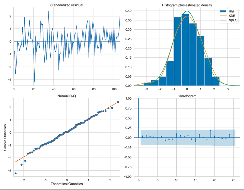
First, we plot diagnostic plots for the residuals of the fitted ARIMA(2,1,2) model:
Running the snippet generates the following figure:
Figure 6.26: The diagnostics plot of the fitted ARIMA(2,1,2) model
Below we cover the interpretation of each of the plots:
Standardized residuals over time (top left)—the residuals should behave like white noise, that is, there should be no clear patterns visible. Also, the residuals should have a mean of zero and a uniform variance. In our case, there seem to be more negative values than positive ones, so the mean is also probably negative.
The histogram and the KDE estimate (top right)—the KDE curve of the residuals should be very similar to the one of the standard normal distribution (labeled as N(0,1)). We can see that this is not the case for our model, as the distribution is shifted toward the negative values.
Q-Q plot (bottom left)—the majority of the data points should lie in a straight line. This would indicate that the quantiles of a theoretical distribution (Standard Normal) match the empirical ones. Significant deviations from the diagonal line imply that the empirical distribution is skewed.
Correlogram (bottom right)—here we are looking at the plot of the autocorrelation function of the residuals. We would expect that the residuals of a well-fitted ARIMA model are not autocorrelated. In our case, we can clearly see correlated residuals at lags 12 and 24. This is a hint that the model is not capturing the seasonal patterns present in the data.
To continue investigating the autocorrelation of the residuals, we can also apply Ljung-Box’s test for no autocorrelation. To do so, we use the test_serial_correlation method of the fitted ARIMA model. Alternatively, we could use the acorr_ljungbox function from statsmodels.
Running the snippet generates the following figure:
Figure 6.27: The results of the Ljung-Box test for no autocorrelation in the residuals
All of the returned p-values are below the 5% significance level, which means we should reject the null hypothesis stating there is no autocorrelation in the residuals. It makes sense, as we have already observed a significant yearly correlation caused by the fact that our model is missing the seasonal patterns.
What we should also keep in mind is the number of lags to investigate while performing the Ljung-Box test. Different sources suggest a different number of lags to consider. The default value in statsmodels is min(10, nobs // 5) for non-seasonal models and min(2*m, nobs // 5) for seasonal time series, where m denotes the seasonal period. Other commonly used variants include min(20,nobs − 1) and ln(nobs). In our case, we did not use a seasonal model, so the default value is 10. But as we know, the data does exhibit seasonal patterns, so we should have looked at more lags.
The fitted ARIMA models also contain the test_normality and test_heteroskedasticity methods, which we could use for further evaluation of the model’s fit. We leave exploring those as an exercise for the reader.
See also
Please see the following references for more information on fitting ARIMA models and helpful sets of rules for manually picking up the correct orders of the models:
Finding the best-fitting ARIMA model with auto-ARIMA
As we have seen in the previous recipe, the performance of an ARIMA model varies greatly depending on the chosen hyperparameters (p, d, and q). We can do our best to choose them based on our intuition, the statistical tests, and the ACF/PACF plots. However, this can prove to be quite difficult to do in practice.
That is why in this recipe we introduce auto-ARIMA, an automated approach to finding the best hyperparameters of the ARIMA class models (including variants such as ARIMAX and SARIMA).
Without going much into the technical details of the algorithm, it first determines the number of differences using the KPSS test. Then, the algorithm uses a stepwise search to traverse the model space, searching for a model that results in a better fit. A popular choice of evaluation metric used for comparing the models is the Akaike Information Criterion (AIC). The metric provides a trade-off between the goodness of fit of the model and its simplicity—AIC deals with the risks of overfitting and underfitting. When we compare multiple models, the lower the value of AIC, the better the model. For a more complete description of the auto-ARIMA procedure, please refer to the sources mentioned in the See also section.
The auto-ARIMA framework also works well with the extensions of the ARIMA model:
ARIMAX—adds exogenous variable(s) to the model.
SARIMA (Seasonal ARIMA)—extends ARIMA to account for seasonality in the time series. The full specification is SARIMA(p,d,q)(P,D,Q)m, where the capitalized parameters are analogous to the original ones, but they refer to the seasonal component of the time series. m refers to the period of seasonality.
In this recipe, we will once again work with the monthly US unemployment rates from the years 2010 to 2019.
Getting ready
We will use the same data that we used in the Time series decomposition recipe.
How to do it...
Execute the following steps to find the best-fitting ARIMA model using the auto-ARIMA procedure:
Import the libraries:
import pandas as pd
import pmdarima as pm
from sklearn.metrics import mean_absolute_percentage_error
Executing the snippet generates the following summary:
Figure 6.28: The summary of the best-fitting ARIMA model, as identified using the auto-ARIMA procedure
The procedure indicated that the best-fitting ARIMA model is ARIMA(2,1,2). But as you can see, the results in Figure 6.28 and Figure 6.21 are different. That is because in the latter case, we have fitted the ARIMA(2,1,2) model to the log transformed series, while in this recipe, we have not applied the log transformation.
Because we indicated trace=True, we also see the following information about the models fitted during the procedure:
Similar to the ARIMA model estimated with the statsmodels library, with pmdarima (which is in fact a wrapper around statsmodels) we can also use the plot_diagnostics method to analyze the fit of the model by looking at its residuals:
Executing the snippet generates the following figure:
Figure 6.29: The diagnostic plots of the best-fitting ARIMA model
Similar to the diagnostics plot in Figure 6.26, this ARIMA(2,1,2) model is also struggling with capturing the yearly seasonal patterns—we can clearly see that in the correlogram.
Find the best hyperparameters of a SARIMA model using the auto-ARIMA procedure:
Executing the snippet generates the following figure:
Figure 6.31: The diagnostic plots of the best-fitting SARIMA model
We can clearly see that the SARIMA model results in a much better fit than the ARIMA(2,1,2) model.
Calculate the forecasts from the two models and plot them:
df_test["auto_arima"] = auto_arima.predict(TEST_LENGTH)
df_test["auto_sarima"] = auto_sarima.predict(TEST_LENGTH)
df_test.plot(title="Forecasts of the best ARIMA/SARIMA models")
Executing the snippet generates the following plot:
Figure 6.32: The forecasts from the ARIMA and SARIMA models identified using the auto-ARIMA procedure
It should not come as a surprise that the SARIMA model is capturing the seasonal patterns better than the ARIMA model. That is also reflected in the performance metrics calculated below. We also calculate the MAPEs:
mape_auto_arima = mean_absolute_percentage_error(
    df_test["unemp_rate"],
    df_test["auto_arima"]
)

mape_auto_sarima = mean_absolute_percentage_error(
    df_test["unemp_rate"],
    df_test["auto_sarima"]
)

print(f"MAPE of auto-ARIMA: {100*mape_auto_arima:.2f}%")
print(f"MAPE of auto-SARIMA: {100*mape_auto_sarima:.2f}%")
Executing the snippet generates the following output:
MAPE of auto-ARIMA: 6.17%
MAPE of auto-SARIMA: 5.70%
How it works...
After importing the libraries, we created the training and test set just as we have done in the previous recipes.
In Step 3, we used the auto_arima function to find the best hyperparameters of the ARIMA model. While using it, we specified that:
We wanted to use the augmented Dickey-Fuller test as the stationarity test instead of the KPSS test.
We turned off the seasonality to fit an ARIMA model instead of SARIMA.
We wanted to estimate a model without an intercept, which is also the default setting when estimating ARIMA in statsmodels (under the trend argument in the ARIMA class).
We wanted to use the stepwise algorithm for identifying the best hyperparameters. When we mark this one as False, the function will run an exhaustive grid search (trying out all possible hyperparameter combinations) similarly to the GridSearchCV class of scikit-learn. When using that scenario, we can indicate the n_jobs argument to specify how many models can be fitted in parallel.
There are also many different settings we can experiment with, for example:
Selecting the starting value of the hyperparameters for the search.
Capping the maximum values of parameters in the search.
Selecting different statistical tests for determining the number of differences (also seasonal).
Selecting an out-of-sample evaluation period (out_of_sample_size). This will make the algorithm fit the models on the data up until a certain point in time (the last observation minus out_of_sample_size) and evaluate on the hold-out set. This way of selecting the best model might be preferable when we care more about the forecasting performance than the fit to the training data.
We can cap the maximum time for fitting the model or the max number of hyperparameter combinations to try out. This is especially useful when estimating seasonal models on more granular (for example, weekly) data, as such scenarios tend to take quite a long time to fit.
In Step 4, we used the auto_arima function to find the best SARIMA model. To do so, we specified seasonal=True and indicated that we are working with monthly data by setting m=12.
Lastly, we calculated the forecasts coming from the two models using the predict method, plotted them together with the ground truth, and calculated the MAPEs.
There’s more...
We can use the auto-ARIMA framework in the pmdarima library to estimate even more complex models or entire pipelines, which include transforming the target variable or adding new features. In this section, we show how to do so.
We start by importing a few more classes:
from pmdarima.pipeline import Pipeline
from pmdarima.preprocessing import FourierFeaturizer
from pmdarima.preprocessing import LogEndogTransformer
from pmdarima import arima
For the first model, we train an ARIMA model with additional features (exogenous variables). As an experiment, we try to provide features indicating which month a given observation comes from. If this works, we might not need to estimate a SARIMA model to capture the yearly seasonality.
We create dummy variables using the pd.get_dummies function. Each column contains a Boolean flag indicating if the observation came from the given month or not.
We also need to drop the first column from the new DataFrame to avoid the dummy-variable trap (perfect multicollinearity). We added the new variables for both the training and test sets:
We then use the auto_arima function to find the best-fitting model. The only thing that changes as compared to Step 3 of this recipe is that we had to specify the exogenous variables using the exogenous argument. We indicated all columns except the one containing the target. Alternatively, we could have kept the additional variables in a separate object with identical indices as the target:
Executing the snippet generates the following summary:
Figure 6.33: The summary of the ARIMA model with exogenous variables
We also look at the residuals plots by using the plot_diagnostics method. It seems that the autocorrelation issues connected to the yearly seasonality were fixed by including the dummy variables.
Figure 6.34: The diagnostic plots of the ARIMA model with exogenous variables
Lastly, we also show how to create an entire data transformation and modeling pipeline, which also finds the best-fitting ARIMA model. Our pipeline consists of three steps:
We apply the log transformation to the target.
We create new features using the FourierFeaturizer—explaining Fourier series is outside of the scope of this book. In practice, using them permits us to account for the seasonality in a seasonal time series without using a seasonal model per se. To provide a bit more context, it is something similar to what we have done with the month dummies. The FourierFeaturizer class supplies decomposed seasonal Fourier terms as an exogenous array of features. We had to specify the seasonal periodicity m.
We find the best-fitting model using the auto-ARIMA procedure. Please keep in mind that when using the pipelines, we have to use the AutoARIMA class instead of the pm.auto_arima function. Those two offer the same functionalities, just this time we had to use a class to make it compatible with the Pipeline functionality.
In the log produced by fitting the pipeline, we can see that the following model was selected as the best one:
Best model: ARIMA(4,1,0)(0,0,0)[0] intercept
The biggest advantage of using the pipeline is that we do not have to carry out all the steps ourselves. We just define a pipeline and then provide a time series as input to the fit method. In general, pipelines (also the ones in scikit-learn as we will see in Chapter 13, Applied Machine Learning: Identifying Credit Default) are a great functionality that helps us with:
Making the code reusable
Defining a clear order of the operations that are happening on the data
Avoiding potential data leakage when creating features and splitting the data
A potential disadvantage of using the pipelines is that some operations are not that easy to track anymore (the intermediate results are not stored as separate objects) and it is a bit more difficult to access the particular elements of the pipeline. For example, we cannot run auto_arima_pipe.summary() to get the summary of the fitted ARIMA model.
Below, we create forecasts using the predict method. Some noteworthy things about this step:
We created a new DataFrame containing only the target. We did so to remove the extra columns we created earlier in this recipe.
When using the predict method with a fitted ARIMAX model, we also need to provide the required exogenous variables for the predictions. They are passed as the X argument.
When we use the predict method of a pipeline that transforms the target variable, the returned predictions (or fitted values) are expressed on the same scale as the original input. In our case, the following sequence happened under the hood. First, the original time series was log transformed. Then, new features were added. Next, we obtained predictions from the model (still on the log transformed scale). Finally, the predictions were converted to the original scale using the exponent function.
results_df = df_test[["unemp_rate"]].copy()
results_df["auto_arimax"] = auto_arimax.predict(
    TEST_LENGTH,
    X=df_test.drop(columns=["unemp_rate"])
)
results_df["auto_arima_pipe"] = auto_arima_pipe.predict(TEST_LENGTH)
results_df.plot(title="Forecasts of the ARIMAX/pipe models")
Running the code generates the following plot:
Figure 6.35: The forecasts from the ARIMAX model and the ARIMA pipeline
For reference, we also add the scores of those forecasts:
MAPE of auto-ARIMAX: 6.88%
MAPE of auto-pipe: 4.61%
Of all the ARIMA models we have tried in this chapter, the pipeline model performed best. However, it still performs significantly worse than the exponential smoothing methods.
When using the predict method of the ARIMA models/pipelines in the pmdarima library, we can set the return_conf_int argument to True. When we do so, the method will not only return the point forecast but also the corresponding confidence intervals.
See also
Hyndman, R. J. & Athanasopoulos, G. 2021. “ARIMA Modeling in Fable.” In Forecasting: Principles and Practice, 3rd edition, OTexts: Melbourne, Australia. OTexts.com/fpp3. Accessed on 2022-05-08 – https://otexts.com/fpp3/arima-r.html.
Hyndman, R. J. & Khandakar, Y., 2008. “Automatic time series forecasting: the forecast package for R,” Journal of Statistical Software, 27: 1-22.
Summary
In this chapter, we have covered the classical (statistical) approaches to time series analysis and forecasting. We learned how to decompose any time series into trend, seasonal, and remainder components. This step can be very helpful in getting a better understanding of the explored time series. But we can also use it directly for modeling purposes.
Then, we explained how to test if a time series is stationary, as some of the statistical models (for example, ARIMA) require stationarity. We also explained which steps we can take to transform a non-stationary time series into a stationary one.
Lastly, we explored two of the most popular statistical approaches to time series forecasting—exponential smoothing methods and ARIMA models. We have also touched upon more modern approaches to estimating such models, which involve automatic tuning and hyperparameter selection.
In the next chapter, we will explore ML-based approaches to time series forecasting.