
13
Applied Machine Learning: Identifying Credit Default
In recent years, we have witnessed machine learning gaining more and more popularity in solving traditional business problems. Every so often, a new algorithm is published, beating the current state of the art. It is only natural for businesses (in all industries) to try to leverage the incredible powers of machine learning in their core functionalities.
Before specifying the task we will be focusing on in this chapter, we provide a brief introduction to the field of machine learning. The machine learning domain can be broken down into two main areas: supervised learning and unsupervised learning. In the former, we have a target variable (label), which we try to predict as accurately as possible. In the latter, there is no target, and we try to use different techniques to draw some insights from the data.
We can further break down supervised problems into regression problems (where a target variable is a continuous number, such as income or the price of a house) and classification problems (where the target is a class, either binary or multi-class). An example of unsupervised learning is clustering, which is often used for customer segmentation.
In this chapter, we tackle a binary classification problem set in the financial industry. We work with a dataset contributed to the UCI Machine Learning Repository, which is a very popular data repository. The dataset used in this chapter was collected in a Taiwanese bank in October 2005. The study was motivated by the fact that—at that time—more and more banks were giving credit (either cash or via credit cards) to willing customers. On top of that, more people, regardless of their repayment capabilities, accumulated significant amounts of debt. All of this led to situations in which some people were unable to repay their outstanding debts. In other words, they defaulted on their loans.
The goal of the study was to use some basic information about customers (such as gender, age, and education level), together with their past repayment history, to predict which of them were likely to default. The setting can be described as follows—using the previous 6 months of repayment history (April-September 2005), we try to predict whether the customer will default in October 2005. Naturally, such a study could be generalized to predict whether a customer will default in the next month, within the next quarter, and so on.
By the end of this chapter, you will be familiar with a real-life approach to a machine learning task, from gathering and cleaning data to building and tuning a classifier. Another takeaway is understanding the general approach to machine learning projects, which can then be applied to many different tasks, be it churn prediction or estimating the price of new real estate in a neighborhood.
In this chapter, we focus on the following recipes:
- Loading data and managing data types
- Exploratory data analysis
- Splitting data into training and test sets
- Identifying and dealing with missing values
- Encoding categorical variables
- Fitting a decision tree classifier
- Organizing the project with pipelines
- Tuning hyperparameters using grid search and cross-validation
Loading data and managing data types
In this recipe, we show how to load a dataset from a CSV file into Python. The very same principles can be used for other file formats as well, as long as they are supported by pandas. Some popular formats include Parquet, JSON, XLM, Excel, and Feather.
pandas has a very consistent API, which makes finding its functions much easier. For example, all functions used for loading data from various sources have the syntax pd.read_xxx, where xxx should be replaced by the file format.
We also show how certain data type conversions can significantly reduce the size of DataFrames in the memory of our computers. This can be especially important when working with large datasets (GBs or TBs), which can simply not fit into memory unless we optimize their usage.
In order to present a more realistic scenario (including messy data, missing values, and so on) we applied some transformations to the original dataset. For more information on those changes, please refer to the accompanying GitHub repository.
How to do it...
Execute the following steps to load a dataset from a CSV file into Python:
- Import the libraries:
import pandas as pd - Load the data from the CSV file:
df = pd.read_csv("../Datasets/credit_card_default.csv",
                 na_values="")
df
Running the snippet generates the following preview of the dataset:

Figure 13.1: Preview of the dataset. Not all columns were displayed
The DataFrame has 30,000 rows and 24 columns. It contains a mix of numeric and categorical variables.
- View the summary of the DataFrame:
df.info()Running the snippet generates the following summary:
RangeIndex: 30000 entries, 0 to 29999
Data columns (total 24 columns):
 #   Column                      Non-Null Count  Dtype
---  ------                      --------------  -----
 0   limit_bal                   30000 non-null  int64
 1   sex                         29850 non-null  object
 2   education                   29850 non-null  object
 3   marriage                    29850 non-null  object
 4   age                         29850 non-null  float64
 5   payment_status_sep          30000 non-null  object
 6   payment_status_aug          30000 non-null  object
 7   payment_status_jul          30000 non-null  object
 8   payment_status_jun          30000 non-null  object
 9   payment_status_may          30000 non-null  object
 10  payment_status_apr          30000 non-null  object
 11  bill_statement_sep          30000 non-null  int64
 12  bill_statement_aug          30000 non-null  int64
 13  bill_statement_jul          30000 non-null  int64
 14  bill_statement_jun          30000 non-null  int64
 15  bill_statement_may          30000 non-null  int64
 16  bill_statement_apr          30000 non-null  int64
 17  previous_payment_sep        30000 non-null  int64
 18  previous_payment_aug        30000 non-null  int64
 19  previous_payment_jul        30000 non-null  int64
 20  previous_payment_jun        30000 non-null  int64
 21  previous_payment_may        30000 non-null  int64
 22  previous_payment_apr        30000 non-null  int64
 23  default_payment_next_month  30000 non-null  int64
dtypes: float64(1), int64(14), object(9)
memory usage: 5.5+ MB
In the summary, we can see information about the columns and their data types, the number of non-null (in other words, non-missing) values, the memory usage, and so on.
We can also observe a few distinct data types: floats (floating-point numbers, such as 3.42), integers, and objects. The last ones are the
pandasrepresentation of string variables. The number next tofloatandintindicates how many bits this type uses to represent a particular value. The default types use 64 bits (or 8 bytes) of memory.The basic
int8type covers integers in the following range: -128 to 127.uint8stands for unsigned integer and covers the same total span, but only the non-negative values, that is, 0 to 255. By knowing the range of values covered by specific data types (please refer to the link in the See also section), we can try to optimize allocated memory. For example, for features such as the month of purchase (represented by numbers in the range 1-12), there is no point in using the defaultint64, as a much smaller type would suffice.
- Define a function for inspecting the exact memory usage of a DataFrame:
def get_df_memory_usage(df, top_columns=5):
    print("Memory usage ----")
    memory_per_column = df.memory_usage(deep=True) / (1024 ** 2)
    print(f"Top {top_columns} columns by memory (MB):")
    print(memory_per_column.sort_values(ascending=False)
                           .head(top_columns))
    print(f"Total size: {memory_per_column.sum():.2f} MB")
We can now apply the function to our DataFrame:
get_df_memory_usage(df, 5)Running the snippet generates the following output:
Memory usage ----
Top 5 columns by memory (MB):
education             1.965001
payment_status_sep    1.954342
payment_status_aug    1.920288
payment_status_jul    1.916343
payment_status_jun    1.904229
dtype: float64
Total size: 20.47 MB
In the output, we can see that the 5.5+ MB reported by the
infomethod turned out to be almost 4 times more. This is still very small in terms of current machines’ capabilities, however, the memory-saving principles we show in this chapter apply just as well to DataFrames measured in gigabytes.
- Convert the columns with the
objectdata type into thecategorytype:object_columns = df.select_dtypes(include="object").columns df[object_columns] = df[object_columns].astype("category") get_df_memory_usage(df)Running the snippet generates the following overview:
Memory usage ----
Top 5 columns by memory (MB):
bill_statement_sep      0.228882
bill_statement_aug      0.228882
previous_payment_apr    0.228882
previous_payment_may    0.228882
previous_payment_jun    0.228882
dtype: float64
Total size: 3.70 MB
Just by converting the
objectcolumns into apandas-native categorical representation, we managed to reduce the size of the DataFrame by ~80%!
- Downcast the numeric columns to integers:
numeric_columns = df.select_dtypes(include="number").columns
for col in numeric_columns:
    df[col] = pd.to_numeric(df[col], downcast="integer")
get_df_memory_usage(df)
Running the snippet generates the following overview:
Memory usage ----
Top 5 columns by memory (MB):
age                     0.228882
bill_statement_sep      0.114441
limit_bal               0.114441
previous_payment_jun    0.114441
previous_payment_jul    0.114441
dtype: float64
Total size: 2.01 MB
In the summary, we can see that after a few data type conversions, the column that takes up the most memory is the one containing customers’ ages (you can see that in the output of
df.info(), not shown here for brevity). That is because it is encoded using afloatdata type and downcasting using theintegersetting was not applied tofloatcolumns.
- Downcast the
agecolumn using thefloatdata type:df["age"] = pd.to_numeric(df["age"], downcast="float") get_df_memory_usage(df)
Running the snippet generates the following overview:
Memory usage ----
Top 5 columns by memory (MB):
bill_statement_sep      0.114441
limit_bal               0.114441
previous_payment_jun    0.114441
previous_payment_jul    0.114441
previous_payment_aug    0.114441
dtype: float64
Total size: 1.90 MB
Using various data type conversions, we have managed to reduce the memory size of our DataFrame from 20.5 MB to 1.9 MB, which is a 91% reduction.
How it works...
After importing pandas, we loaded the CSV file by using the pd.read_csv function. When doing so, we indicated that empty strings should be interpreted as missing values.
In Step 3, we displayed a summary of the DataFrame to inspect its contents. To get a better understanding of the dataset, we provide a simplified description of the variables:
limit_bal—the amount of the given credit (NT dollars)sex—biological sexeducation—level of educationmarriage— marital statusage—age of the customerpayment_status_{month}—status of payments in one of the previous 6 monthsbill_statement_{month}—the number of bill statements (NT dollars) in one of the previous 6 monthsprevious_payment_{month}—the number of previous payments (NT dollars) in one of the previous 6 monthsdefault_payment_next_month—the target variable indicating whether the customer defaulted on the payment in the following month
In general, pandas tries to load and store data as efficiently as possible. It automatically assigns data types (which we can inspect by using the dtypes method of a pandas DataFrame). However, there are some tricks that can lead to much better memory allocation, which definitely makes working with larger tables (in hundreds of MBs, or even GBs) easier and more efficient.
In Step 4, we defined a function for inspecting the exact memory usage of a DataFrame. The memory_usage method returns a pandas Series with the memory usage (in bytes) for each of the DataFrame’s columns. We converted the output into MBs to make it easier to understand.
When using the memory_usage method, we specified deep=True. That is because the object data type, unlike other dtypes (short for data types), does not have a fixed memory allocation for each cell. In other words, as the object dtype usually corresponds to text, it means that the amount of memory used depends on the number of characters in each cell. Intuitively, the more characters in a string, the more memory that cell uses.
In Step 5, we leveraged a special data type called category to reduce the DataFrame’s memory usage. The underlying idea is that string variables are encoded as integers, and pandas uses a special mapping dictionary to decode them back into their original form. This is especially useful when dealing with a limited number of distinct values, for example, certain levels of education, country of origin, and so on. To save memory, we first identified all the columns with the object data type using the select_dtypes method. Then, we changed the data type of those columns from object to category. We did so using the astype method.
We should know when it is actually profitable (from the memory’s perspective) to use the category data type. A rule of thumb is to use it for variables with a ratio of unique observations to the overall number of observations lower than 50%.
In Step 6, we used the select_dtypes method to identify all numeric columns. Then, using a for loop iterating over the identified columns, we converted the values to numeric using the pd.to_numeric function. This might strike as odd, given that we first identified the numeric columns and then converted them to numeric again. However, the crucial part is the downcast argument of the function. By passing the "integer" value, we have optimized the memory usage of all the integer columns by downcasting the default int64 data type to smaller alternatives (int32 and int8).
Even though we applied the function to all numeric columns, only the ones that contained integers were successfully transformed. That is why in Step 7 we additionally downcasted the float column containing the clients’ ages.
There’s more…
In this recipe, we have mentioned how to optimize the memory usage of a pandas DataFrame. We first loaded the data into Python, then we inspected the columns, and at the end we converted the data types of some columns to reduce memory usage. However, such an approach might not be possible, as the data might simply not fit into memory in the first place.
If that is the case, we can also try the following:
- Read the dataset in chunks (by using the
chunkargument ofpd.read_csv). For example, we could load just the first 100 rows of data. - Read only the columns we actually need (by using the
usecolsargument ofpd.read_csv). - While loading the data, use the
column_dtypesargument to define the data types used for each of the columns.
To illustrate, we can use the following snippet to load our dataset and while doing so indicate that the selected three columns should have a category data type:
column_dtypes = {
    "education": "category",
    "marriage": "category",
    "sex": "category"
}
df_cat = pd.read_csv("../Datasets/credit_card_default.csv",
                     na_values="", dtype=column_dtypes)
If all of those approaches fail, we should not give up. While pandas is definitely the gold standard of working with tabular data in Python, we can leverage the power of some alternative libraries, which were built specifically for such a case. Below you can find a list of libraries you could use when working with large volumes of data:
Dask: an open-source library for distributed computing. It facilitates running many computations at the same time, either on a single machine or on clusters of CPUs. Under the hood, the library breaks down a single large data processing job into many smaller tasks, which are then handled bynumpyorpandas. As the last step, the library reassembles the results into a coherent whole.Modin: a library designed to parallelizepandasDataFrames by automatically distributing the computation across all of the system’s available CPU cores. The library divides an existing DataFrame into different parts such that each part can be sent to a different CPU core.Vaex: an open-source DataFrame library specializing in lazy out-of-core DataFrames. Vaex requires negligible amounts of RAM for inspecting and interacting with a dataset of arbitrary size, all thanks to combining the concepts of lazy evaluations and memory mapping.datatable: an open-source library for manipulating 2-dimensional tabular data. In many ways, it is similar topandas, with special emphasis on speed and the volume of data (up to 100 GB) while using a single-node machine. If you have worked with R, you might already be familiar with the related package calleddata.table, which is R users’ go-to package when it comes to the fast aggregation of large data.cuDF: a GPU DataFrame library that is part of NVIDIA’s RAPIDS, a data science ecosystem spanning multiple open-source libraries and leveraging the power of GPUs.cuDFallows us to use apandas-like API to benefit from the performance boost without going into the details of CUDA programming.polars: an open-source DataFrame library that achieves phenomenal computation speed by leveraging Rust (programming language) with Apache Arrow as its memory model.
See also
Additional resources:
- Dua, D. and Graff, C. (2019). UCI Machine Learning Repository [http://archive.ics.uci.edu/ml]. Irvine, CA: University of California, School of Information and Computer Science.
- Yeh, I. C. & Lien, C. H. (2009). “The comparisons of data mining techniques for the predictive accuracy of probability of default of credit card clients.” Expert Systems with Applications, 36(2), 2473-2480. https://doi.org/10.1016/j.eswa.2007.12.020.
- List of different data types used in Python: https://numpy.org/doc/stable/user/basics.types.html#.
Exploratory data analysis
The second step of a data science project is to carry out Exploratory Data Analysis (EDA). By doing so, we get to know the data we are supposed to work with. This is also the step during which we test the extent of our domain knowledge. For example, the company we are working for might assume that the majority of its customers are people between the ages of 18 and 25. But is this actually the case? While doing EDA we might also run into some patterns that we do not understand, which are then a starting point for a discussion with our stakeholders.
While doing EDA, we can try to answer the following questions:
- What kind of data do we actually have, and how should we treat different data types?
- What is the distribution of the variables?
- Are there outliers in the data and how can we treat them?
- Are any transformations required? For example, some models work better with (or require) normally distributed variables, so we might want to use techniques such as log transformation.
- Does the distribution vary per group (for example, sex or education level)?
- Do we have cases of missing data? How frequent are these, and in which variables do they occur?
- Is there a linear relationship (correlation) between some variables?
- Can we create new features using the existing set of variables? An example might be deriving an hour/minute from a timestamp, a day of the week from a date, and so on.
- Are there any variables that we can remove as they are not relevant for the analysis? An example might be a randomly generated customer identifier.
Naturally, this list is non-exhaustive and carrying out the analysis might spark more questions than we initially had. EDA is extremely important in all data science projects, as it enables analysts to develop an understanding of the data, facilitates asking better questions, and makes it easier to pick modeling approaches suitable for the type of data being dealt with.
In real-life cases, it makes sense to first carry out a univariate analysis (one feature at a time) for all relevant features to get a good understanding of them. Then, we can proceed to multivariate analysis, that is, comparing distributions per group, correlations, and so on. For brevity, we only show selected analysis approaches to selected features, but a deeper analysis is highly encouraged.
Getting ready
We continue with exploring the data we loaded in the previous recipe.
How to do it...
Execute the following steps to carry out the EDA of the loan default dataset:
- Import the libraries:
import pandas as pd import numpy as np import seaborn as sns - Get summary statistics of the numeric variables:
df.describe().transpose().round(2)Running the snippet generates the following summary table:

Figure 13.2: Summary statistics of the numeric variables
- Get summary statistics of the categorical variables:
df.describe(include="object").transpose()Running the snippet generates the following summary table:

Figure 13.3: Summary statistics of the categorical variables
- Plot the distribution of age and split it by sex:
ax = sns.kdeplot(data=df, x="age",
                 hue="sex", common_norm=False,
                 fill=True)
ax.set_title("Distribution of age")
Running the snippet generates the following plot:

Figure 13.4: The KDE plot of age, grouped by sex
By analyzing the kernel density estimate (KDE) plot, we can say there is not much difference in the shape of the distribution per sex. The female sample is slightly younger, on average.
- Create a pairplot of selected variables:
COLS_TO_PLOT = ["age", "limit_bal", "previous_payment_sep"]
pair_plot = sns.pairplot(df[COLS_TO_PLOT], kind="reg",
                         diag_kind="kde", height=4,
                         plot_kws={"line_kws":{"color":"red"}})
pair_plot.fig.suptitle("Pairplot of selected variables")
Running the snippet generates the following plot:

Figure 13.5: A pairplot with KDE plots on the diagonal and fitted regression lines in each scatterplot
We can make a few observations from the created pairplot:
- The distribution of
previous_payment_sepis highly skewed—it has a very long tail. - Connected to the previous point, we can observe some very extreme values of
previous_payment_sepin the scatterplots. - It is difficult to draw conclusions from the scatterplots, as there are 30,000 observations on each of them. When plotting such volumes of data, we could use transparent markers to better visualize the density of the observation in certain areas.
- The outliers can have a significant impact on the regression lines.
Additionally, we can separate the sexes by specifying the
hueargument:pair_plot = sns.pairplot(data=df, x_vars=COLS_TO_PLOT, y_vars=COLS_TO_PLOT, hue="sex", height=4) pair_plot.fig.suptitle("Pairplot of selected variables")Running the snippet generates the following plot:

Figure 13.6: The pairplot with separate markers for each sex
While we can gain some more insights from the diagonal plots with the split per sex, the scatterplots are still quite unreadable due to the sheer volume of plotted data.
As a potential solution, we could randomly sample from the entire dataset and only plot the selected observations. A possible downside of that approach is that we might miss some observations with extreme values (outliers).
- The distribution of
- Analyze the relationship between age and limit balance:
ax = sns.jointplot(data=df, x="age", y="limit_bal",
                   hue="sex", height=10)
ax.fig.suptitle("Age vs. limit balance")
Running the snippet generates the following plot:

Figure 13.7: A joint plot showing the relationship between age and limit balance, grouped by sex
A joint plot contains quite a lot of useful information. First of all, we can see the relationship between two variables on the scatterplot. Then, we can also investigate the distributions of the two variables individually using the KDE plots along the axes (we can also plot histograms instead).
- Define and run a function for plotting the correlation heatmap:
def plot_correlation_matrix(corr_mat):
    sns.set(style="white")
    mask = np.zeros_like(corr_mat, dtype=bool)
    mask[np.triu_indices_from(mask)] = True
    fig, ax = plt.subplots()
    cmap = sns.diverging_palette(240, 10, n=9, as_cmap=True)
    sns.heatmap(corr_mat, mask=mask, cmap=cmap,
                vmax=.3, center=0, square=True,
                linewidths=.5, cbar_kws={"shrink": .5},
                ax=ax)
    ax.set_title("Correlation Matrix", fontsize=16)
    sns.set(style="darkgrid")
corr_mat = df.select_dtypes(include="number").corr()
plot_correlation_matrix(corr_mat)
Running the snippet generates the following plot:

Figure 13.8: Correlation heatmap of the numeric features
We can see that age seems to be uncorrelated to any of the other features.
- Analyze the distribution of age in groups using box plots:
ax = sns.boxplot(data=df, y="age", x="marriage", hue="sex")
ax.set_title("Distribution of age")
Running the snippet generates the following plot:

Figure 13.9: Distribution of age by marital status and sex
The distributions seem quite similar within marital groups, with men always having a higher median age.
- Plot the distribution of limit balance for each sex and education level:
ax = sns.violinplot(x="education", y="limit_bal",
                    hue="sex", split=True, data=df)
ax.set_title(
    "Distribution of limit balance per education level",
    fontsize=16
)
Running the snippet generates the following plot:

Figure 13.10: Distribution of limit balance by education level and sex
Inspecting the plot reveals a few interesting patterns:
- The largest balance appears in the group with the Graduate school level of education.
- The shape of the distribution is different per education level: the Graduate school level resembles the Others category, while the High school level is similar to the University level.
- In general, there are few differences between the sexes.
- Investigate the distribution of the target variable per sex and education level:
ax = sns.countplot("default_payment_next_month", hue="sex",
                   data=df, orient="h")
ax.set_title("Distribution of the target variable", fontsize=16)
Running the snippet generates the following plot:

Figure 13.11: Distribution of the target variable by sex
By analyzing the plot, we can say that the percentage of defaults is higher among male customers.
- Investigate the percentage of defaults per education level:
ax = df.groupby("education")["default_payment_next_month"]
       .value_counts(normalize=True)
       .unstack()
       .plot(kind="barh", stacked="True")
ax.set_title("Percentage of default per education level",
             fontsize=16)
ax.legend(title="Default", bbox_to_anchor=(1,1))
Running the snippet generates the following plot:

Figure 13.12: Percentage of defaults by education level
Relatively speaking, most defaults happen among customers with a high-school education, while the fewest defaults happen in the Others category.
How it works...
In the previous recipe, we already explored two DataFrame methods that are useful for starting exploratory data analysis: shape and info. We can use them to quickly learn the shape of the dataset (number of rows and columns), what data types are used for representing each feature, and so on.
In this recipe, we are mostly using the seaborn library, as it is the go-to library when it comes to exploring data. However, we could use alternative plotting libraries. The plot method of a pandas DataFrame is quite powerful and allows for quickly visualizing our data. Alternatively, we could use plotly (and its plotly.express module) to create fully interactive data visualizations.
In this recipe, we started the analysis by using a very simple yet powerful method of a pandas DataFrame—describe. It printed summary statistics, such as the count, mean, min/max, and quartiles of all the numeric variables in the DataFrame. By inspecting these metrics, we could infer the value range of a certain feature, or whether the distribution is skewed (by looking at the difference between the mean and median). Also, we could easily spot values outside the plausible range, for example, a negative or very young/old age.
We can include additional percentiles in the describe method by passing an extra argument, for example, percentiles=[.99]. In this case, we added the 99th percentile.
The count metric represents the number of non-null observations, so it is also a way to determine which numeric features contain missing values. Another way of investigating the presence of missing values is by running df.isnull().sum(). For more information on missing values, please see the Identifying and dealing with missing values recipe.
In Step 3, we added the include="object" argument while calling the describe method to inspect the categorical features separately. The output was different from the numeric features: we could see the count, the number of unique categories, which one was the most frequent, and how many times it appeared in the dataset.
We can use include="all"to display the summary metrics for all features—only the metrics available for a given data type will be present, while the rest will be filled with NA values.
In Step 4, we showed a way of investigating the distribution of a variable, in this case, the age of the customers. To do so, we created a KDE plot. It is a method of visualizing the distribution of a variable, very similar to a traditional histogram. KDE represents the data using a continuous probability density curve in one or more dimensions. One of its advantages over a histogram is that the resulting plot is less cluttered and easier to interpret, especially when considering multiple distributions at once.
A common source of confusion around the KDE plots is about the units on the density axis. In general, the kernel density estimation results in a probability distribution. However, the height of the curve at each point gives a density, instead of the probability. We can obtain a probability by integrating the density across a certain range. The KDE curve is normalized so that the integral over all possible values is equal to 1. This means that the scale of the density axis depends on the data values. To take it a step further, we can decide how to normalize the density when we are dealing with multiple categories in one plot. If we use common_norm=True, each density is scaled by the number of observations so that the total area under all curves sums to 1. Otherwise, the density of each category is normalized independently.
Together with a histogram, the KDE plot is one of the most popular methods of inspecting the distribution of a single feature. To create a histogram, we can use the sns.histplot function. Alternatively, we can use the plot method of a pandas DataFrame, while specifying kind="hist". We show examples of creating histograms in the accompanying Jupyter notebook (available on GitHub).
An extension of this analysis can be done by using a pairplot. It creates a matrix of plots, where the diagonal shows the univariate histograms or KDE plots, while the off-diagonal plots are scatterplots of two features. This way, we can also try to see if there is a relationship between the two features. To make identifying the potential relationships easier, we have also added the regression lines.
In our case, we only plotted three features. That is because with 30,000 observations it can take quite some time to render the plot for all numeric columns, not to mention losing readability with so many small plots in one matrix. When using pairplots, we can also specify the hue argument to add a split for a category (such as sex, or education level).
We can also zoom into a relationship between two variables using a joint plot (sns.jointplot). It is a type of plot that combines a scatterplot to analyze the bivariate relationship and KDE plots or histograms to analyze the univariate distribution. In Step 6, we analyzed the relationship between age and limit balance.
In Step 7, we defined a function for plotting a heatmap representing the correlation matrix. In the function, we used a couple of operations to mask the upper triangular matrix and the diagonal (all diagonal elements of the correlation matrix are equal to 1). This way, the output is much easier to interpret. Using the annot argument of sns.heatmap, we could add the underlying numbers to the heatmap. However, we should only do so when the number of analyzed features is not too high. Otherwise, they will become unreadable.
To calculate the correlations, we used the corr method of a DataFrame, which by default calculates the Pearson’s correlation coefficient. We did this only for numeric features. There are also methods for calculating the correlation of categorical features; we mention some of them in the There’s more… section. Inspecting correlations is crucial, especially when using machine learning algorithms that assume linear independence of the features.
In Step 8, we used box plots to investigate the distribution of age by marital status and sex. A box plot (also called a box-and-whisker plot) presents the distribution of data in such a way that facilitates comparisons between levels of a categorical variable. A box plot presents the information about the distribution of the data using a 5-number summary:
- Median (50th percentile)—represented by the horizontal black line within the boxes.
- Interquartile range (IQR)—represented by the box. It spans the range between the first quartile (25th percentile) and the third quartile (75th percentile).
- The whiskers—represented by the lines stretched from the box. The extreme values of the whiskers (marked as horizontal lines) are defined as the first quartile − 1.5 IQR and the third quartile + 1.5 IQR.
We can use the box plots to gather the following insights about our data:
- The points marked outside of the whiskers can be considered outliers. This method is called Tukey’s fences and is one of the simplest outlier detection techniques. In short, it assumes that observations lying outside of the [Q1 – 1.5 IQR, Q3 + 1.5 IQR] range are outliers.
- The potential skewness of the distribution. A right-skewed (positive skewness) distribution can be observed when the median is closer to the lower bound of the box, and the upper whisker is longer than the lower one. Vice versa for the left-skewed distributions. Figure 13.13 illustrates this.

Figure 13.13: Determining the skewness of distribution using box plots
In Step 9, we used violin plots to investigate the distribution of the limit balance feature per education level and sex. We created them by using sns.violinplot. We indicated the education level with the x argument. Additionally, we set hue="sex" and split=True. By doing so, each half of the violin represented a different sex.
In general, violin plots are very similar to box plots and we can find the following information in them:
- The median, represented by a white dot.
- The interquartile range, represented as the black bar in the center of a violin.
- The lower and upper adjacent values, represented by the black lines stretched from the bar. The lower adjacent value is defined as the first quartile − 1.5 IQR, while the upper one is defined as the third quartile + 1.5 IQR. Again, we can use the adjacent values as a simple outlier detection technique.
Violin plots are a combination of a box plot and a KDE plot. A definite advantage of a violin plot over a box plot is that the former enables us to clearly see the shape of the distribution. This is especially useful when dealing with multimodal distributions (distributions with multiple peaks), such as the limit balance violin in the Graduate school education category.
In the last two steps, we investigated the distribution of the target variable (default) per sex and education. In the first case, we used sns.countplot to display the count of occurrences of both possible outcomes for each sex. In the second case, we opted for a different approach. We wanted to plot the percentage of defaults per education level, as comparing percentages between groups is easier than comparing nominal values. To do so, we first grouped by education level, selected the variable of interest, calculated the percentages per group (using the value_counts(normalize=True) method), unstacked (to remove multi-index), and generated a plot using the already familiar plot method.
There’s more...
In this recipe, we introduced a range of possible approaches to investigate the data at hand. However, this requires many lines of code (quite a lot of them boilerplate) each time we want to carry out the EDA. Thankfully, there is a Python library that simplifies the process. The library is called pandas_profiling and with a single line of code, it generates a comprehensive summary of the dataset in the form of an HTML report.
To create a report, we need to run the following:
from pandas_profiling import ProfileReport
profile = ProfileReport(df, title="Loan Default Dataset EDA")
profile
We could also create a profile using the new (added by pandas_profiling) profile_report method of a pandas DataFrame.
For practical reasons, we might prefer to save the report as an HTML file and inspect it in a browser instead of the Jupyter notebook. We can easily do so using the following snippet:
profile.to_file("loan_default_eda.html")
The report is very exhaustive and contains a lot of useful information. Please see the following figure for an example.

Figure 13.14: Example of a deep-dive into the limit balance feature
For brevity’s sake, we will only discuss selected elements of the report:
- An overview giving information about the size of the DataFrame (number of features/rows, missing values, duplicated rows, memory size, breakdown per data type).
- Alerts warning us about potential issues with our data, including a high percentage of duplicated rows, highly correlated (and potentially redundant) features, features that have a high percentage of zero values, highly skewed features, etc.
- Different measures of correlation: Spearman’s
 , Pearson’s r, Kendall’s
  , Cramér’s V, and Phik (
 ). The last one is especially interesting, as it is a recently developed correlation coefficient that works consistently between categorical, ordinal, and interval variables. On top of that, it captures non-linear dependencies. Please see the See also section for a reference paper describing the metric.
 - Detailed analysis of missing values.
- Detailed univariate analysis of each feature (more details are available by clicking Toggle details in the report).
pandas-profiling is the most popular auto-EDA tool in Python’s vast ecosystem of libraries. However, it is definitely not the only one. You can also investigate the following:
sweetviz—https://github.com/fbdesignpro/sweetvizautoviz—https://github.com/AutoViML/AutoVizdtale—https://github.com/man-group/dtaledataprep—https://github.com/sfu-db/datapreplux—https://github.com/lux-org/lux
Each one of them approaches EDA a bit differently. Hence, it is best to explore them all and pick the tool that works best for your needs.
See also
For more information about Phik (![]() ), please see the following paper:
), please see the following paper:
- Baak, M., Koopman, R., Snoek, H., & Klous, S. (2020). “A new correlation coefficient between categorical, ordinal and interval variables with Pearson characteristics.” Computational Statistics & Data Analysis, 152, 107043. https://doi.org/10.1016/j.csda.2020.107043.
Splitting data into training and test sets
Having completed the EDA, the next step is to split the dataset into training and test sets. The idea is to have two separate datasets:
- Training set—on this part of the data, we train a machine learning model
- Test set—this part of the data was not seen by the model during training and is used to evaluate its performance
By splitting the data this way, we want to prevent overfitting. Overfitting is a phenomenon that occurs when a model finds too many patterns in data used for training and performs well only on that particular data. In other words, it fails to generalize to unseen data.
This is a very important step in the analysis, as doing it incorrectly can introduce bias, for example, in the form of data leakage. Data leakage can occur when, during the training phase, a model observes information to which it should not have access. We follow up with an example. A common scenario is that of imputing missing values with the feature’s average. If we had done this before splitting the data, we would have also used data from the test set to calculate the average, introducing leakage. That is why the proper order would be to split the data into training and test sets first and then carry out the imputation, using the data observed in the training set. The same goes for setting up rules for identifying outliers.
Additionally, splitting the data ensures consistency, as unseen data in the future (in our case, new customers that will be scored by the model) will be treated in the same way as the data in the test set.
How to do it...
Execute the following steps to split the dataset into training and test sets:
- Import the libraries:
import pandas as pd from sklearn.model_selection import train_test_split - Separate the target from the features:
X = df.copy() y = X.pop("default_payment_next_month") - Split the data into training and test sets:
X_train, X_test, y_train, y_test = train_test_split( X, y, test_size=0.2, random_state=42 ) - Split the data into training and test sets without shuffling:
X_train, X_test, y_train, y_test = train_test_split( X, y, test_size=0.2, shuffle=False ) - Split the data into training and test sets with stratification:
X_train, X_test, y_train, y_test = train_test_split( X, y, test_size=0.2, stratify=y, random_state=42 ) - Verify that the ratio of the target is preserved:
print("Target distribution - train")
print(y_train.value_counts(normalize=True).values)
print("Target distribution - test")
print(y_test.value_counts(normalize=True).values)
Running the snippet generates the following output:
Target distribution - train
[0.77879167 0.22120833]
Target distribution - test
[0.77883333 0.22116667]
In both sets, the percentage of payment defaults is around 22.12%.
How it works...
After importing the libraries, we separated the target from the features using the pop method of a pandas DataFrame.
In Step 3, we showed how to do the most basic split. We passed X and y objects to the train_test_split function. Additionally, we specified the size of the test set, as a fraction of all observations. For reproducibility, we also specified the random state. We had to assign the output of the function to four new objects.
In Step 4, we took a different approach. By specifying test_size=0.2 and shuffle=False, we assigned the first 80% of the data to the training set and the remaining 20% to the test set. This might come in handy when we want to preserve the order in which the observations are becoming available.
In Step 5, we also specified the stratification argument by passing the target variable (stratify=y). Splitting the data with stratification means that both the training and test sets will have an almost identical distribution of the specified variable. This parameter is very important when dealing with imbalanced data, such as in cases of fraud detection. If 99% of data is normal and only 1% covers fraudulent cases, a random split can result in the training set not having any fraudulent cases. That is why when dealing with imbalanced data, it is crucial to split it correctly.
In the very last step, we verified if the stratified train/test split resulted in the same ratio of defaults in both datasets. To verify that, we used the value_counts method of a pandas DataFrame.
In the rest of the chapter, we will use the data obtained from the stratified split.
There’s more...
It is also common to split data into three sets: training, validation, and test. The validation set is used for frequent evaluation and tuning of the model’s hyperparameters. Suppose we want to train a decision tree classifier and find the optimal value of the max_depth hyperparameter, which decides the maximum depth of the tree.
To do so, we can train the model multiple times using the training set, each time with a different value of the hyperparameter. Then, we can evaluate the performance of all these models, using the validation set. We pick the best model of those, and then ultimately evaluate its performance on the test set.
In the following snippet, we illustrate a possible way of creating a train-validation-test split, using the same train_test_split function:
import numpy as np

# define the size of the validation and test sets
VALID_SIZE = 0.1
TEST_SIZE = 0.2

# create the initial split - training and temp
X_train, X_temp, y_train, y_temp = train_test_split(
    X, y,
    test_size=(VALID_SIZE + TEST_SIZE),
    stratify=y,
    random_state=42
)

# calculate the new test size
new_test_size = np.around(TEST_SIZE / (VALID_SIZE + TEST_SIZE), 2)

# create the valid and test sets
X_valid, X_test, y_valid, y_test = train_test_split(
    X_temp, y_temp,
    test_size=new_test_size,
    stratify=y_temp,
    random_state=42
)
We basically ran train_test_split twice. What is important is that we had to adjust the sizes of the test_size input in such a way that the initially defined proportions (70-10-20) were preserved.
We also verify that everything went according to plan: that the size of the datasets corresponds to the intended split and that the ratio of defaults is the same in each set. We do so using the following snippet:
print("Percentage of data in each set ----")
print(f"Train: {100 * len(X_train) / len(X):.2f}%")
print(f"Valid: {100 * len(X_valid) / len(X):.2f}%")
print(f"Test: {100 * len(X_test) / len(X):.2f}%")
print("")
print("Class distribution in each set ----")
print(f"Train: {y_train.value_counts(normalize=True).values}")
print(f"Valid: {y_valid.value_counts(normalize=True).values}")
print(f"Test: {y_test.value_counts(normalize=True).values}")
Executing the snippet generates the following output:
Percentage of data in each set ----
Train: 70.00%
Valid: 9.90%
Test: 20.10%
Class distribution in each set ----
Train: [0.77879899 0.22120101]
Valid: [0.77878788 0.22121212]
Test: [0.77880948 0.22119052]
We have indeed verified that the original dataset was split with the intended 70-10-20 ratio and that the distribution of defaults (target variable) was preserved due to stratification. Sometimes, we do not have enough data to split it into three sets, either because we do not have that many observations in general or because the data can be highly imbalanced, and we would remove valuable training samples from the training set. That is why practitioners often use a method called cross-validation, which we describe in the Tuning hyperparameters using grid search and cross-validation recipe.
Identifying and dealing with missing values
In most real-life cases, we do not work with clean, complete data. One of the potential problems we are bound to encounter is that of missing values. We can categorize missing values by the reason they occur:
- Missing completely at random (MCAR)—The reason for the missing data is unrelated to the rest of the data. An example could be a respondent accidentally missing a question in a survey.
- Missing at random (MAR)—The missingness of the data can be inferred from data in another column(s). For example, a missing response to a certain survey question can to some extent be determined conditionally by other factors such as sex, age, lifestyle, and so on.
- Missing not at random (MNAR)—When there is some underlying reason for the missing values. For example, people with very high incomes tend to be hesitant about revealing it.
- Structurally missing data—Often a subset of MNAR, the data is missing because of a logical reason. For example, when a variable representing the age of a spouse is missing, we can infer that a given person has no spouse.
Some machine learning algorithms can account for missing data, for example, decision trees can treat missing values as a separate and unique category. However, many algorithms either cannot do so or their popular implementations (such as the ones in scikit-learn) do not incorporate this functionality.
We should only impute features, not the target variable!
Some popular solutions to handling missing values include:
- Drop observations with one or more missing values—while this is the easiest approach, it is not always a good one, especially in the case of small datasets. We should also be aware of the fact that even if there is only a small fraction of missing values per feature, they do not necessarily occur for the same observations (rows), so the actual number of rows we might need to remove can be much higher. Additionally, in the case of data missing not at random, removing such observations from the analysis can introduce bias into the results.
- We can opt to drop the entire column (feature) if it is mostly populated with missing values. However, we need to be cautious as this can already be an informative signal for our model.
- Replace the missing values with a value far outside the possible range, so that algorithms such as decision trees can treat it as a special value, indicating missing data.
- In the case of dealing with time series, we can use forward-filling (take the last-known observation before the missing one), backward-filling (take the first-known observation after the missing one), or interpolation (linear or more advanced).
- Hot-deck imputation—in this simple algorithm, we first select one or more of the other features correlated with the one containing missing values. Then, we sort the rows of the dataset by these selected features. Lastly, we iterate over the rows from top to bottom and replace each missing value with the previous non-missing value in the same feature.
- Replace the missing values with an aggregate metric—for continuous data, we can use the mean (when there are no clear outliers in the data) or median (when there are outliers). In the case of categorical variables, we can use mode (the most common value in the set). Potential disadvantages of mean/median imputation include the reduction of variance in the dataset and distorting the correlations between the imputed features and the rest of the dataset.
- Replace the missing values with aggregate metrics calculated per group—for example, when dealing with body-related metrics, we can calculate the mean or median per sex, to more accurately replace the missing data.
- ML-based approaches—we can treat the considered feature as a target, and use complete cases to train a model and predict values for the missing observations.
In general, exploring the missing values is part of the EDA. We briefly touched upon it when analyzing the report generated with pandas_profiling. But we deliberately left it without much coverage until now, as it is crucial to carry out any kind of missing value imputation after the train/test split. Otherwise, we cause data leakage.
In this recipe, we show how to identify the missing values in our data and how to impute them.
Getting ready
For this recipe, we assume that we have the outputs of the stratified train/test split from the previous recipe, Splitting data into training and test sets.
How to do it...
Execute the following steps to investigate and deal with missing values in the dataset:
- Import the libraries:
import pandas as pd import missingno as msno from sklearn.impute import SimpleImputer - Inspect the information about the DataFrame:
X.info()Executing the snippet generates the following summary (abbreviated):
RangeIndex: 30000 entries, 0 to 29999
Data columns (total 23 columns):
 #   Column                Non-Null Count  Dtype
---  ------                --------------  -----
 0   limit_bal             30000 non-null  int64
 1   sex                   29850 non-null  object
 2   education             29850 non-null  object
 3   marriage              29850 non-null  object
 4   age                   29850 non-null  float64
 5   payment_status_sep    30000 non-null  object
 6   payment_status_aug    30000 non-null  object
 7   payment_status_jul    30000 non-null  object
Our dataset has more columns, however, the missing values are only present in the 4 columns visible in the summary. For brevity, we have not included the rest of the output.
- Visualize the nullity of the DataFrame:
msno.matrix(X)Running the line of code results in the following plot:

Figure 13.15: The nullity matrix plot of the loan default dataset
The white bars visible in the columns represent missing values. We should keep in mind that when working with large datasets with only a few missing values, those white bars might be quite difficult to spot.
The line on the right side of the plot describes the shape of data completeness. The two numbers indicate the maximum and minimum nullity in the dataset. When an observation has no missing values, the line will be at the maximum right position and have a value equal to the number of columns in the dataset (23 in this case). As the number of missing values starts to increase within an observation, the line moves towards the left. The nullity value of 21 indicates that there is a row with 2 missing values in it, as the maximum value for this dataset is 23 (the number of columns).
- Define columns with missing values per data type:
NUM_FEATURES = ["age"] CAT_FEATURES = ["sex", "education", "marriage"] - Impute numerical features:
for col in NUM_FEATURES: num_imputer = SimpleImputer(strategy="median") num_imputer.fit(X_train[[col]]) X_train.loc[:, col] = num_imputer.transform(X_train[[col]]) X_test.loc[:, col] = num_imputer.transform(X_test[[col]]) - Impute categorical features:
for col in CAT_FEATURES:
    cat_imputer = SimpleImputer(strategy="most_frequent")
    cat_imputer.fit(X_train[[col]])
    X_train.loc[:, col] = cat_imputer.transform(X_train[[col]])
    X_test.loc[:, col] = cat_imputer.transform(X_test[[col]])
We can verify that neither the training nor test sets contain missing values using the info method.
How it works...
In Step 1, we imported the required libraries. Then, we used the info method of a pandas DataFrame to view information about the columns, such as their type and the number of non-null observations. The difference between the total number of observations and the non-null ones corresponds to the number of missing observations. Another way of inspecting the number of missing values per column is to run X.isnull().sum().
Instead of imputing, we could also drop the observations (or even columns) containing missing values. To drop all rows containing any missing value, we could use X_train.dropna(how="any", inplace=True). In our sample case, the number of missing values is not large, however, in a real-life dataset it can be considerable or the dataset might be too small for the analysts to be able to remove observations. Alternatively, we could also specify the thresh argument of the dropna method to indicate in how many columns an observation (row) needs to have missing values in order to be dropped from the dataset.
In Step 3, we visualized the nullity of the DataFrame, with the help of the missingno library.
In Step 4, we defined lists containing features we wanted to impute, one list per data type. The reason for this is the fact that numeric features are imputed using different strategies than categorical features. For basic imputation, we used the SimpleImputer class from scikit-learn.
In Step 5, we iterated over the numerical features (in this case, only the age feature), and used the median to replace the missing values. Inside the loop, we defined the imputer object with the correct strategy ("median"), fitted it to the given column of the training data, and transformed both the training and test data. This way, the median was estimated by using only the training data, preventing potential data leakage.
In this recipe, we used scikit-learn to deal with the imputation of missing values. However, we can also do this manually. To do so, for each column with any missing values (either in the training or test set), we need to calculate the given statistic (mean/median/mode) using the training set, for example, age_median = X_train.age.median(). Afterward, we need to use this median to fill in the missing values for the age column (in both the training and test sets) using the fillna method. We show how to do it in the Jupyter notebook available in the book’s GitHub repository.
Step 6 is analogous to Step 5, where we used the same approach to iterate over categorical columns. The difference lies in the selected strategy—we used the most frequent value ("most_frequent") in the given column. This strategy can be used for both categorical and numerical features. In the latter case, it corresponds to the mode.
There’s more...
There are a few more things worth mentioning when covering handling missing values.
More visualizations available in the missingno library
In this recipe, we have already covered the nullity matrix representation of missing values in a dataset. However, the missingno library offers a few more helpful visualizations:
msno.bar—generates a bar chart representing the nullity in each column. Might be easier to quickly interpret than the nullity matrix.msno.heatmap—visualizes the nullity correlation, that is, how strongly the presence/absence of one feature impacts the presence of another. The interpretation of the nullity correlation is very similar to the standard Pearson’s correlation coefficient. It ranges from -1 (when one feature occurs, then the other one certainly does not) through 0 (features appearing or not appearing have no effect on each other) to 1 (if one feature occurs, then the other one certainly does too).msno.dendrogram—allows us to better understand the correlations between variable completion. Under the hood, it uses hierarchical clustering to bin features against one another by their nullity correlation.

Figure 13.16: Example of the nullity dendrogram
To interpret the figure, we need to analyze it from a top-down perspective. First, we should look at cluster leaves, which are linked at a distance of zero. Those fully predict each other’s presence, that is, one feature might always be missing when the other is present, or they might always both be present or missing, and so on. Cluster leaves with a split close to zero predict each other very well.
In our case, the dendrogram links together the features that are present in every observation. We know this for certain, as we have introduced the missing observations by design in only four features.
ML-based approaches to imputing missing values
In this recipe, we mentioned how to impute missing values. Approaches such as replacing the missing values with one large value or the mean/median/mode are called single imputation approaches, as they replace missing values with one specific value. On the other hand, there are also multiple imputation approaches, and one of those is Multiple Imputation by Chained Equations (MICE).
In short, the algorithm runs multiple regression models, and each missing value is determined conditionally on the basis of the non-missing data points. A potential benefit of using an ML-based approach to imputation is the reduction of bias introduced by single imputation. The MICE algorithm is available in scikit-learn under the name of IterativeImputer.
Alternatively, we could use the nearest neighbors imputation (implemented in scikit-learn's KNNImputer). The underlying assumption of the KNN imputation is that a missing value can be approximated by the values of the same feature coming from the observations that are closest to it. The closeness to the other observations is determined using other features and some form of a distance metric, for example, the Euclidean distance.
As the algorithm uses KNN, it comes with some of its drawbacks:
- Requires tuning of the k hyperparameter for best performance
- We need to scale the data and preprocess categorical features
- We need to pick an appropriate distance metric (especially in cases when we have a mix of categorical and numerical features)
- The algorithm is sensitive to outliers and noise in data
- Can be computationally expensive as it requires calculating the distances between every pair of observations
Another of the available ML-based algorithms is called MissForest (available in the missingpy library). Without going into too much detail, the algorithm starts by filling in the missing values with the median or mode imputation. Then, it trains a Random Forest model to predict the feature that is missing using the other known features. The model is trained using the observations for which we know the values of the target (so the ones that were not imputed in the first step) and then makes predictions for the observations with the missing feature. In the next step, the initial median/mode prediction is replaced with the one coming from the RF model. The process of looping through the missing data points is repeated several times, and each iteration tries to improve upon the previous one. The algorithm stops when some stopping criterion is met or we exhaust the allowed number of iterations.
Advantages of MissForest:
- Can handle missing values in both numeric and categorical features
- Does not require data preprocessing (such as scaling)
- Robust to noisy data, as Random Forest makes little to no use of uninformative features
- Non-parametric—it does not make assumptions about the relationship between the features (MICE assumes linearity)
- Can leverage non-linear and interaction effects between features to improve imputation performance
Disadvantages of MissForest:
- Imputation time increases with the number of observations, features, and the number of features containing missing values
- Similar to Random Forest, not very easy to interpret
- It is an algorithm and not a model object we can store somewhere (for example, as a pickle file) and reuse whenever we need to impute missing values
See also
Additional resources are available here:
- Azur, M. J., Stuart, E. A., Frangakis, C., & Leaf, P. J. (2011). “Multiple imputation by chained equations: what is it and how does it work?” International Journal of Methods in Psychiatric Research, 20(1), 40-49. https://doi.org/10.1002/mpr.329.
- Buck, S. F. (1960). “A method of estimation of missing values in multivariate data suitable for use with an electronic computer.” Journal of the Royal Statistical Society: Series B (Methodological), 22(2), 302-306. https://www.jstor.org/stable/2984099.
- Stekhoven, D. J. & Bühlmann, P. (2012). “MissForest—non-parametric missing value imputation for mixed-type data.” Bioinformatics, 28(1), 112-118.
- van Buuren, S. & Groothuis-Oudshoorn, K. (2011). “MICE: Multivariate Imputation by Chained Equations in R.” Journal of Statistical Software 45 (3): 1–67.
- Van Buuren, S. (2018). Flexible Imputation of Missing Data. CRC press.
miceforest—a Python library for fast, memory-efficient MICE with LightGBM.missingpy—a Python library containing the implementation of the MissForest algorithm.
Encoding categorical variables
In the previous recipes, we have seen that some features are categorical variables (originally represented as either object or category data types). However, most machine learning algorithms work exclusively with numeric data. That is why we need to encode categorical features into a representation compatible with the ML models.
The first approach to encoding categorical features is called label encoding. In this approach, we replace the categorical values of a feature with distinct numeric values. For example, with three distinct classes, we use the following representation: [0, 1, 2].
This is already very similar to the outcome of converting to the category data type in pandas. Let’s assume we have a DataFrame called df_cat, which has a feature called feature_1. This feature is encoded as the category data type. We can then access the codes of the categories by running df_cat["feature_1"].cat.codes. Additionally, we can recover the mapping by running dict(zip(df_cat["feature_1"].cat.codes, df_cat["feature_1"])). We can also use the pd.factorize function to arrive at a very similar representation.
One potential issue with label encoding is that it introduces a relationship between the categories, while often there is none. In a three-classes example, the relationship looks as follows: 0 < 1 < 2. This does not make much sense if the categories are, for example, countries. However, this can work for features that represent some kind of order (ordinal variables). For example, label encoding could work well with a rating of service received, on a scale of Bad-Neutral-Good.
To overcome the preceding problem, we can use one-hot encoding. In this approach, for each category of a feature, we create a new column (sometimes called a dummy variable) with binary encoding to denote whether a particular row belongs to this category. A potential drawback of this method is that it significantly increases the dimensionality of the dataset (curse of dimensionality). First, this can increase the risk of overfitting, especially when we do not have that many observations in our dataset. Second, a high-dimensional dataset can be a significant problem for any distance-based algorithm (for example, k-Nearest Neighbors), as—on a very high level—a large number of dimensions causes all the observations to appear equidistant from each other. This can naturally render the distance-based models useless.
Another thing we should be aware of is that creating dummy variables introduces a form of redundancy to the dataset. In fact, if a feature has three categories, we only need two dummy variables to fully represent it. That is because if an observation is neither of the two, it must be the third one. This is often referred to as the dummy-variable trap, and it is best practice to always remove one column (known as the reference value) from such an encoding. This is especially important in unregularized linear models.
Summing up, we should avoid label encoding as it introduces false order to the data, which can lead to incorrect conclusions. Tree-based methods (decision trees, Random Forest, and so on) can work with categorical data and label encoding. However, one-hot encoding is the natural representation of categorical features for algorithms such as linear regression, models calculating distance metrics between features (such as k-means clustering or k-Nearest Neighbors), or Artificial Neural Networks (ANN).
Getting ready
For this recipe, we assume that we have the outputs of the imputed training and test sets from the previous recipe, Identifying and dealing with missing values.
How to do it...
Execute the following steps to encode categorical variables with label encoding and one-hot encoding:
- Import the libraries:
import pandas as pd from sklearn.preprocessing import LabelEncoder, OneHotEncoder from sklearn.compose import ColumnTransformer - Use Label Encoder to encode a selected column:
COL = "education"
X_train_copy = X_train.copy()
X_test_copy = X_test.copy()
label_enc = LabelEncoder()
label_enc.fit(X_train_copy[COL])
X_train_copy.loc[:, COL] = label_enc.transform(X_train_copy[COL])
X_test_copy.loc[:, COL] = label_enc.transform(X_test_copy[COL])
X_test_copy[COL].head()
Running the snippet generates the following preview of the transformed column:
6907     3
24575    0
26766    3
2156     0
3179     3
Name: education, dtype: int64
We created a copy of
X_trainandX_test, just to show how to work withLabelEncoder, but we do not want to modify the actual DataFrames we intend to use later.We can access the labels stored within the fitted
LabelEncoderby using theclasses_attribute.
- Select categorical features for one-hot encoding:
cat_features = X_train.select_dtypes(include="object")
                      .columns
                      .to_list()
cat_features
We will apply one-hot encoding to the following columns:
['sex', 'education', 'marriage', 'payment_status_sep', 'payment_status_aug', 'payment_status_jul', 'payment_status_jun', 'payment_status_may', 'payment_status_apr']
- Instantiate the
OneHotEncoderobject:one_hot_encoder = OneHotEncoder(sparse=False, handle_unknown="error", drop="first") - Create the column transformer using the one-hot encoder:
one_hot_transformer = ColumnTransformer( [("one_hot", one_hot_encoder, cat_features)], remainder="passthrough", verbose_feature_names_out=False ) - Fit the transformer:
one_hot_transformer.fit(X_train)Executing the snippet prints the following preview of the column transformer:

Figure 13.17: Preview of the column transformer with one-hot encoding
- Apply the transformations to both training and test sets:
col_names = one_hot_transformer.get_feature_names_out()
X_train_ohe = pd.DataFrame(
    one_hot_transformer.transform(X_train),
    columns=col_names,
    index=X_train.index
)
X_test_ohe = pd.DataFrame(one_hot_transformer.transform(X_test),
                          columns=col_names,
                          index=X_test.index)
As we have mentioned before, one-hot encoding comes with the potential disadvantage of increasing the dimensionality of the dataset. In our case, we started with 23 columns. After applying one-hot encoding, we ended up with 72 columns.
How it works...
First, we imported the required libraries. In the second step, we selected the column we wanted to encode using label encoding, instantiated the LabelEncoder, fitted it to the training data, and transformed both the training and the test data. We did not want to keep the label encoding, and for that reason we operated on copies of the DataFrames.
We demonstrated using label encoding as it is one of the available options, however, it comes with quite serious drawbacks. So in practice, we should refrain from using it. Additionally, scikit-learn's documentation warns us with the following statement: This transformer should be used to encode target values, i.e. y, and not the input X.
In Step 3, we started the preparations for one-hot encoding by creating a list of all the categorical features. We used the select_dtypes method to select all features with the object data type.
In Step 4, we created an instance of OneHotEncoder. We specified that we did not want to work with a sparse matrix (a special kind of data type, suitable for storing matrices with a very high percentage of zeros), we dropped the first column per feature (to avoid the dummy variable trap), and we specified what to do if the encoder finds an unknown value while applying the transformation (handle_unknown='error').
In Step 5, we defined the ColumnTransformer, which is a convenient approach to applying the same transformation (in this case, the one-hot encoder) to multiple columns. We passed a list of steps, where each step was defined by a tuple. In this case, it was a single tuple with the name of the step ("one_hot"), the transformation to be applied, and the features to which we wanted to apply the transformation.
When creating the ColumnTransformer, we also specified another argument, remainder="passthrough", which has effectively fitted and transformed only the specified columns, while leaving the rest intact. The default value for the remainder argument was "drop", which dropped the unused columns. We also specified the value of the verbose_feature_names_out argument as False. This way, when we use the get_feature_names_out method later, it will not prefix all feature names with the name of the transformer that generated that feature.
If we had not changed it, some features would have the "one_hot__" prefix, while the others would have "remainder__".
In Step 6, we fitted the column transformer to the training data using the fit method. Lastly, we applied the transformations using the transform method to both training and test sets. As the transform method returns a numpy array instead of a pandas DataFrame, we had to convert them ourselves. We started by extracting the names of the features using the get_feature_names_out. Then, we created a pandas DataFrame using the transformed features, the new column names, and the old indices (to keep everything in order).
Similar to handling missing values or detecting outliers, we fit all the transformers (including one-hot encoding) to the training data only, and then we apply the transformations to both training and test sets. This way, we avoid potential data leakage.
There’s more...
We would like to mention a few more things regarding the encoding of categorical variables.
Using pandas for one-hot encoding
Alternatively to scikit-learn, we can use pd.get_dummies for one-hot encoding categorical features. The example syntax looks like the following:
pd.get_dummies(X_train, prefix_sep="_", drop_first=True)
It’s good to know this alternative approach, as it can be easier to work with (column names are automatically accounted for), especially when creating a quick Proof of Concept (PoC). However, when productionizing the code, the best approach would be to use the scikit-learn variant and create the dummy variables within a pipeline.
Specifying possible categories for OneHotEncoder
When creating ColumnTransformer, we could have additionally provided a list of possible categories for all the considered features. A simplified example follows:
one_hot_encoder = OneHotEncoder(
    categories=[["Male", "Female", "Unknown"]],
    sparse=False,
    handle_unknown="error",
    drop="first"
)
one_hot_transformer = ColumnTransformer(
    [("one_hot", one_hot_encoder, ["sex"])]
)
one_hot_transformer.fit(X_train)
one_hot_transformer.get_feature_names_out()
Executing the snippet returns the following:
array(['one_hot__sex_Female', 'one_hot__sex_Unknown'], dtype=object)
By passing a list (of lists) containing possible categories for each feature, we are taking into account the possibility that the specific value does not appear in the training set, but might appear in the test set (or as part of the batch of new observations in the production environment). If this were the case, we would run into errors.
In the preceding code block, we added an extra category called "Unknown" to the column representing sex. As a result, we will end up with an extra “dummy” column for that category. The male category was dropped as the reference one.
Category Encoders library
Aside from using pandas and scikit-learn, we can also use another library called Category Encoders. It belongs to a set of libraries compatible with scikit-learn and provides a selection of encoders using a similar fit-transform approach. That is why it is also possible to use them together with ColumnTransformer and Pipeline.
We show an alternative implementation of the one-hot encoder.
Import the library:
import category_encoders as ce
Create the encoder object:
one_hot_encoder_ce = ce.OneHotEncoder(use_cat_names=True)
Additionally, we could specify an argument called drop_invariant, to indicate that we want to drop columns with no variance, so for example columns filled with only one distinct value. This could help with reducing the number of features.
Fit the encoder, and transform the data:
one_hot_encoder_ce.fit(X_train)
X_train_ce = one_hot_encoder_ce.transform(X_train)
This implementation of the one-hot encoder automatically encodes only the columns containing strings (unless we specify only a subset of categorical columns by passing a list to the cols argument). By default, it also returns a pandas DataFrame (in comparison to the numpy array, in the case of scikit-learn's implementation) with the adjusted column names. The only drawback of this implementation is that it does not allow for dropping the one redundant dummy column of each feature.
A warning about one-hot encoding and decision tree-based algorithms
While regression-based models can naturally handle the OR condition of one-hot-encoded features, the same is not that simple with decision tree-based algorithms. In theory, decision trees are capable of handling categorical features without the need for encoding.
However, its popular implementation in scikit-learn still requires all features to be numerical. Without going into too much detail, such an approach favors continuous numerical features over one-hot-encoded dummies, as a single dummy can only bring a fraction of the total feature information into the model. A possible solution is to use either a different kind of encoding (label/target encoding) or an implementation that handles categorical features, such as Random Forest in the h2o library or the LightGBM model.
Fitting a decision tree classifier
A decision tree classifier is a relatively simple yet very important machine learning algorithm used for both regression and classification problems. The name comes from the fact that the model creates a set of rules (for example, if x_1 > 50 and x_2 < 10 then y = 'default'), which taken together can be visualized in the form of a tree. The decision trees segment the feature space into a number of smaller regions, by repeatedly splitting the features at a certain value. To do so, they use a greedy algorithm (together with some heuristics) to find a split that minimizes the combined impurity of the children nodes. The impurity in classification tasks is measured using the Gini impurity or entropy, while for regression problems the trees use the mean squared error or the mean absolute error as the metric.
In the case of a binary classification problem, the algorithm tries to obtain nodes that contain as many observations from one class as possible, thus minimizing the impurity. The prediction in a terminal node (leaf) is made on the basis of mode in the case of classification, and mean for regression problems.
Decision trees are a base for many complex algorithms, such as Random Forest, Gradient Boosted Trees, XGBoost, LightGBM, CatBoost, and so on.
The advantages of decision trees include the following:
- Easily visualized in the form of a tree—high interpretability
- Fast training and prediction stages
- A relatively small number of hyperparameters to tune
- Support numerical and categorical features
- Can handle non-linearity in data
- Can be further improved with feature engineering, though there is no explicit need to do so
- Do not require scaling or normalization of features
- Incorporate their version of feature selection by choosing the features on which to split the sample
- Non-parametric model—no assumptions about the distribution of the features/target
On the other hand, the disadvantages of decision trees include the following:
- Instability—the trees are very sensitive to the noise in input data. A small change in the data can change the model significantly.
- Overfitting—if we do not provide maximum values or stopping criteria, the trees tend to grow very deep and do not generalize well.
- The trees can only interpolate, but not extrapolate—they make constant predictions for observations that lie beyond the boundary region established on the feature space of the training data.
- The underlying greedy algorithm does not guarantee the selection of a globally optimal decision tree.
- Class imbalance can lead to biased trees.
- Information gain (a decrease in entropy) in a decision tree with categorical variables results in a biased outcome for features with a higher number of categories.
Getting ready
For this recipe, we assume that we have the outputs of the one-hot-encoded training and test sets from the previous recipe, Encoding categorical variables.
How to do it...
Execute the following steps to fit a decision tree classifier:
- Import the libraries:
from sklearn.tree import DecisionTreeClassifier, plot_tree
from sklearn import metrics
from chapter_13_utils import performance_evaluation_report
In this recipe and the following ones, we will be using the
performance_evaluation_reporthelper function. It plots useful metrics (confusion matrix, ROC curve) used for evaluating binary classification models. Also, it returns a dictionary containing more metrics, which we cover in the How it works… section.
- Create the instance of the model, fit it to the training data, and create predictions:
tree_classifier = DecisionTreeClassifier(random_state=42) tree_classifier.fit(X_train_ohe, y_train) y_pred = tree_classifier.predict(X_test_ohe) - Evaluate the results:
LABELS = ["No Default", "Default"]
tree_perf = performance_evaluation_report(tree_classifier,
                                          X_test_ohe,
                                          y_test, labels=LABELS,
                                          show_plot=True)
Executing the snippet generates the following plot:

Figure 13.18: The performance evaluation report of the fitted decision tree classifier
The
tree_perfobject is a dictionary containing more relevant metrics, which can further help us with evaluating the performance of our model. We present those metrics below:{'accuracy': 0.7141666666666666, 'precision': 0.3656509695290859, 'recall': 0.39788997739261495, 'specificity': 0.8039803124331265, 'f1_score': 0.3810898592565861, 'cohens_kappa': 0.1956931046277427, 'matthews_corr_coeff': 0.1959883714391891, 'roc_auc': 0.601583581287813, 'pr_auc': 0.44877724015824927, 'average_precision': 0.2789754297204212}For more insights into the interpretation of the evaluation metrics, please refer to the How it works… section.
- Plot the first few levels of the fitted decision tree:
plot_tree(tree_classifier, max_depth=3, fontsize=10)Executing the snippet generates the following plot:

Figure 13.19: The fitted decision tree, capped at a max depth of 3
Using the one-liner, we can already visualize quite a lot of information. We decided to plot only the 3 levels of the decision tree, as the fitted tree actually reached the depth of 44 levels. As we have mentioned, not restricting the max_depth hyperparameter can lead to such cases, which are also very likely to overfit.
In the tree, we can see the following information:
- Which feature is used to split the tree and at which value. Unfortunately, with the default settings, we only see the column number instead of the feature’s name. We will fix that soon.
- The value of the Gini impurity.
- The number of samples in each node/leaf.
- The number of observations of each class within the node/leaf.
We can add more information to the plot with a few additional arguments of the plot_tree function:
plot_tree(
    tree_classifier,
    max_depth=2,
    feature_names=X_train_ohe.columns,
    class_names=["No default", "Default"],
    rounded=True,
    filled=True,
    fontsize=10
)
Executing the snippet generates the following plot:

Figure 13.20: The fitted decision tree, capped at a max depth of 2
In Figure 13.20, we see some additional information:
- The name of the feature used for creating the split
- The name of the class dominating in each node/leaf
Visualizing decision trees has many benefits. First, we can gain insights into which features are used for creating the model (a possible measure of feature importance) and what values were used to create the splits. Provided that the features have clear interpretation, this could work as a form of a sanity check to see if our initial hypotheses about the data and the considered problem came true and are aligned with common sense or domain knowledge. It could also help with presenting a clear and coherent story to the business stakeholders, who can quite easily understand such a simple representation of the model. We will discuss the feature importance and model explainability in depth in the following chapter.
How it works...
In Step 2, we used the typical scikit-learn approach to training a machine learning model. First, we created the object of the DecisionTreeClassifier class (using all the default settings and a fixed random state). Then, we fitted the model to the training data (we needed to pass both the features and the target) using the fit method. Lastly, we obtained the predictions by using the predict method.
Using the predict method results in an array of predicted classes (in this case, it is either a 0 or a 1). However, there are cases when we are interested in the assigned probabilities or scores. To obtain those, we can use the predict_proba method, which returns an array of size n_test_observations by n_classes. Each row contains all the possible class probabilities (they sum up to 1). In the case of binary classification, the predict method automatically assigns a positive class when the corresponding probability is above 50%.
In Step 3, we evaluated the performance of the model. We used a custom function to display all the results. We will not go deeper into its specifics, as it is quite standard and is built using functions from the metrics module of scikit-learn. For a detailed description of the function, please refer to the accompanying GitHub repository.
The confusion matrix summarizes all possible combinations of the predicted values as opposed to the actual target. The possible values are as follows:
- True positive (TP): The model predicts a default, and the client defaulted
- False positive (FP): The model predicts a default, but the client did not default
- True negative (TN): The model predicts a good customer, and the client did not default
- False negative (FN): The model predicts a good customer, but the client defaulted
In the scenarios presented above, we assumed that default is represented by the positive class. It does not mean that the outcome (client defaulting) is good or positive, just that an event occurred. Most frequently, the majority class is the “uninteresting” case and is assigned the negative label. This is a typical convention used in data science projects.
Using the presented values, we can further build multiple evaluation criteria:
- Accuracy [expressed as (TP + TN) / (TP + FP + TN + FN)]—measures the model’s overall ability to correctly predict the class of the observation.
- Precision [expressed as TP / (TP + FP)]—measures what fraction of all predictions of the positive class (in our case, the default) indeed were positive. In our project, it answers the question: Out of all predictions of default, how many clients actually defaulted? Or in other words: When the model predicts default, how often is it correct?
- Recall [expressed as TP / (TP + FN)]—measures what fraction of all positive cases were predicted correctly. Also called sensitivity or the true positive rate. In our case, it answers the question: What fraction of all observed defaults did we predict correctly?
- F-1 Score—a harmonic average of precision and recall. The reason for using the harmonic mean instead of arithmetic average is that it takes into account the harmony (similarity) between the two scores. Thus, it punishes extreme outcomes and discourages highly unequal values. For example, a classifier with precision = 1 and recall = 0 would score a 0.5 using a simple average, but a 0 when using the harmonic mean.
- Specificity [expressed as TN / (TN + FP)]—measures what fraction of negative cases (clients without a default) actually did not default. A helpful way of thinking about specificity is to consider it the recall of the negative class.
Understanding the subtleties behind these metrics is very important for the correct evaluation of the model’s performance. Accuracy can be highly misleading in the case of class imbalance. Imagine a case when 99% of data is not fraudulent and only 1% is fraudulent. Then, a naïve model classifying each observation as non-fraudulent achieves 99% accuracy, while it is actually worthless. That is why, in such cases, we should refer to precision or recall:
- When we try to achieve as high precision as possible, we will get fewer false positives, at the cost of more false negatives. We should optimize for precision when the cost of a false positive is high, for example, in spam detection.
- When optimizing for recall, we will achieve fewer false negatives, at the cost of more false positives. We should optimize for recall when the cost of a false negative is high, for example, in fraud detection.
There is no one-size-fits-all rule about which metric is best. The metric that we try to optimize for should be selected based on the use case.
The second plot contains the Receiver Operating Characteristic (ROC) curve. The ROC curve presents a trade-off between the true positive rate (TPR, recall) and the false positive rate (FPR, which is equal to 1 minus specificity) for different probability thresholds. A probability threshold determines the predicted probability above which we decide that the observation belongs to the positive class (by default, it is 50%).
An ideal classifier would have a false positive rate of 0 and a true positive rate of 1. Thus, the sweet spot in the ROC plot is the (0,1) point in the plot. A skillful model’s curve would be as close to it as possible. On the other hand, a model with no skill will have a line close to the diagonal (45°) line. To better understand the ROC curve, please consider the following:
- Let’s assume that we pick the decision threshold to be 0, that is, all observations are classified as defaults. This leads to two conclusions. First, no actual defaults are predicted as the negative class (false negatives), which means that the true positive rate (recall) is 1. Second, no good customers are classified as such (true negatives), which means that the false positive rate is also 1. This corresponds to the top-right corner of the ROC curve.
- Let’s move to the other extreme and assume that the decision threshold is 1, that is, all customers are classified as good customers (no default, that is, the negative class). As there are no positive predictions at all, this leads to the following conclusions. First, there are no true positives (TPR = 0). Second, there are no false positives (FPR = 0). Such a scenario corresponds to the bottom left of the curve.
- As such, all the points on the curve correspond to the scores of a classifier for thresholds between the two extremes (0 and 1). The curve should approach the ideal point, in which the true positive rate is 1 and the false positive rate is 0. That is, no defaulting client is classified as a good customer and no good customer is classified as likely to default. In other words, a perfect classifier.
- If the performance approaches the diagonal line, the model is classifying roughly as many defaulting and non-defaulting customers as defaulting. In other words, this would be a classifier as good as random guessing.
A model with a curve below the diagonal line is possible and is actually better than the “no-skill” one, as its predictions can be simply inverted to obtain better performance.
To summarize the performance of a model with one number, we can look at the area under the ROC curve (AUC). It is an aggregate measure of performance across all possible decision thresholds. It is a metric with values between 0 and 1 and it tells us how much the model is capable of distinguishing between the classes. A model with an AUC of 0 is always wrong, while a model with an AUC of 1 is always correct. An AUC of 0.5 indicates a model with no skill that is pretty much equal to random guessing.
We can interpret the AUC in probabilistic terms. In short, it indicates how well the probabilities from the positive classes are separated from the negative classes. AUC represents the probability that a model ranks a random positive observation more highly than a random negative one.
An example might make it a bit easier to understand. Let’s assume we have predictions obtained from some model, ranked in ascending order by their score/probability. Figure 13.21 illustrates this. An AUC of 75% means that if we take one random positive observation and one random negative observation, with a 75% probability they will be ordered in the correct way, that is, the random positive example is to the right of the random negative example.

Figure 13.21: Model’s output ordered by predicted score/probability
In practice, we may use the ROC curve to select a threshold that results in an appropriate balance between false positives and false negatives. Furthermore, AUC is a good metric to compare the difference in performance between various models.
In the last step, we visualized the decision tree using the plot_tree function.
There’s more...
We have already covered the basics of using an ML model (in our case, a decision tree) to solve a binary classification task. We have also gone through the most popular classification evaluation metrics. However, there are still a few interesting topics to at least mention.
Diving deeper into classification evaluation metrics
One of the metrics we have covered quite extensively was the ROC curve. One issue with it is that it loses its credibility when it comes to evaluating the performance of the model when we are dealing with (severe) class imbalance. In such cases, we should use another curve—the Precision-Recall curve. That is because, for calculating both precision and recall, we do not use the true negatives, and only consider the correct prediction of the minority class (the positive one).
We start by extracting the predicted scores/probabilities and calculating precision and recall for different thresholds:
y_pred_prob = tree_classifier.predict_proba(X_test_ohe)[:, 1]
precision, recall, _ = metrics.precision_recall_curve(y_test,
                                                      y_pred_prob)
As we do not actually need the thresholds, we substitute that output of the function with an underscore.
Having calculated the required elements, we can plot the curve:
ax = plt.subplot()
ax.plot(recall, precision,
        label=f"PR-AUC = {metrics.auc(recall, precision):.2f}")
ax.set(title="Precision-Recall Curve",
       xlabel="Recall",
       ylabel="Precision")
ax.legend()
Executing the snippet generates the following plot:

Figure 13.22: Precision-recall curve of the fitted decision tree classifier
Similar to the ROC curve, we can analyze the Precision-Recall curve as follows:
- Each point in the curve corresponds to the values of precision and recall for a different decision threshold.
- A decision threshold of 0 results in precision = 0 and recall = 1.
- A decision threshold of 1 results in precision = 1 and recall = 0.
- As a summary metric, we can approximate the area under the Precision-Recall curve.
- The PR-AUC ranges from 0 to 1, where 1 indicates the perfect model.
- A model with a PR-AUC of 1 can identify all the positive observations (perfect recall), while not wrongly labeling a single negative observation as a positive one (perfect precision). The perfect point is located in (1, 1), that is, the top-right corner of the plot.
- We can consider models that bow toward the (1, 1) point as skillful.
One potential issue with the PR-Curve in Figure 13.22 is that it might be overly optimistic due to the undertaken interpolations when plotting the values of precision and recall for each threshold. A more realistic representation can be obtained using the following snippet:
ax = metrics.PrecisionRecallDisplay.from_estimator(
    tree_classifier, X_test_ohe, y_test
)
ax.ax_.set_title("Precision-Recall Curve")
Executing the snippet generates the following plot:

Figure 13.23: More realistic precision-recall curve of the fitted decision tree classifier
First, we can see that even though the shape is different, we can easily recognize the pattern and what the interpolation actually does. We can imagine connecting the extreme points of the plot with the single point (values of ~0.4 for both metrics), which would result in the shape obtained using interpolation.
Second, we can also see that the score decreased quite substantially (from 0.45 to 0.28). In the first case, we obtained the score using trapezoidal interpolation of the PR curve (auc(precision, recall) in scikit-learn). In the second case, the score is actually another metric—average precision. Average precision summarizes a precision-recall curve as the weighted mean of precisions achieved at each threshold, where the weights are calculated as the increase in recall from the previous threshold.
Even though these two metrics produce very similar estimates in many cases, they are fundamentally different. The first approach uses an overly optimistic linear interpolation and its effect might be more pronounced when the data is highly skewed/imbalanced.
We have already covered the F1-Score, which was the harmonic mean of precision and recall. Actually, it is a specific case of a more general metric called the ![]() -Score, where the
-Score, where the ![]() factor defines how much weight is put on recall, while precision has a weight of 1. To make sure that the weights sum up to one, both are normalized by dividing them by
factor defines how much weight is put on recall, while precision has a weight of 1. To make sure that the weights sum up to one, both are normalized by dividing them by ![]() . Such a definition of the score implies the following:
. Such a definition of the score implies the following:
 —more weight is put on recall
 —the same as the F1-Score, so recall and precision are treated equally
 —more weight is put on precision
Some potential pitfalls of using precision, recall, or F1-Score include the fact that those metrics are asymmetric, that is, they focus on the positive class. When looking at their formulas, we can clearly see that they never account for the true negative category. That is exactly what Matthew’s correlation coefficient (also known as the phi-coefficient) is trying to overcome:

Analyzing the formula reveals the following:
- All of the elements of the confusion matrix are taken into account while calculating the score
- The formula looks similar to the one used for calculating Pearson’s correlation
- MCC treats the true class and the predicted class as two binary variables, and effectively calculates their correlation coefficient
MCC has values between -1 (a classifier always misclassifying) and 1 (a perfect classifier). A value of 0 indicates that the classifier is no better than random guessing. Overall, as MCC is a symmetric metric, in order to achieve a high value the classifier must be doing well in predicting both the positive and negative classes.
As MCC is not as intuitive and easy to interpret as F1-Score, it might be a good metric to use when the cost of low precision and low recall is unknown or unquantifiable. Then, MCC can be better than F1-Score as it provides a more balanced (symmetric) evaluation of a classifier.
Visualizing decision trees using dtreeviz
The default plotting functionalities in scikit-learn can definitely be considered good enough for visualizing decision trees. However, we can take it a step further using the dtreeviz library.
First, we import the library:
from dtreeviz.trees import *
Then, we train a smaller decision tree with a maximum depth of 3. We do so just in order to make the visualization easier to read. Unfortunately, there is no option in dtreeviz to plot only x levels of a tree:
small_tree = DecisionTreeClassifier(max_depth=3,
                                    random_state=42)
small_tree.fit(X_train_ohe, y_train)
Lastly, we plot the tree:
viz = dtreeviz(small_tree,
               x_data=X_train_ohe,
               y_data=y_train,
               feature_names=X_train_ohe.columns,
               target_name="Default",
               class_names=["No", "Yes"],
               title="Decision Tree - Loan default dataset")
viz
Running the snippet generates the following plot:
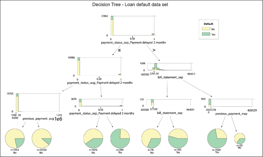
Figure 13.24: Decision tree visualized using dtreeviz
Compared to the previously generated plots, the ones created with dtreeviz additionally show the distribution of the feature used for splitting (separately for each class) together with the split value. What is more, the leaf nodes are presented as pie charts.
For more examples of using dtreeviz, including adding a path following a particular observation through all the splits in the tree, please refer to the notebook in the book’s GitHub repository.
See also
Information on the dangers of using ROC-AUC as a performance evaluation metric:
- Lobo, J. M., Jiménez‐Valverde, A., & Real, R. (2008). “AUC: a misleading measure of the performance of predictive distribution models.” Global Ecology and Biogeography, 17(2), 145-151.
- Sokolova, M. & Lapalme, G. (2009). “A systematic analysis of performance measures for classification tasks.” Information Processing and Management, 45(4), 427-437.
More information about the Precision-Recall curve:
- Davis, J. & Goadrich, M. (2006, June). “The relationship between Precision-Recall and ROC curves.” In Proceedings of the 23rd international conference on Machine learning (pp. 233-240).
Additional resources on decision trees:
- Breiman, L., Friedman, J., Olshen, R., & Stone, C. (1984) Classification and Regression Trees. Chapman & Hall, Wadsworth, New York.
- Breiman, L. (2017). Classification and Regression Trees. Routledge.
Organizing the project with pipelines
In the previous recipes, we showed all the steps required to build a machine learning model—starting with loading data, splitting it into training and test sets, imputing missing values, encoding categorical features, and ultimately fitting a decision tree classifier.
The process requires multiple steps to be executed in a certain order, which can sometimes be tricky with a lot of modifications to the pipeline mid-work. That is why scikit-learn introduced pipelines. By using pipelines, we can sequentially apply a list of transformations to the data, and then train a given estimator (model).
One important point to be aware of is that the intermediate steps of the pipeline must have the fit and transform methods, while the final estimator only needs the fit method.
In scikit-learn's terminology, we refer to objects containing the fit and transform methods as transformers. We use those to clean and preprocess data. An example could be the OneHotEncoder we have already covered. Similarly, we use the term estimators for objects with the fit and predict methods. Those are ML models, such as the DecisionTreeClassifier.
Using pipelines has several benefits:
- The flow is much easier to read and understand—the chain of operations to be executed on given columns is clear.
- Makes it easier to avoid data leakage, for example, when scaling the training set and then using cross-validation.
- The order of steps is enforced by the pipeline.
- Increased reproducibility.
In this recipe, we show how to create the entire project’s pipeline, from loading the data to training the classifier.
How to do it...
Execute the following steps to build the project’s pipeline:
- Import the libraries:
import pandas as pd from sklearn.model_selection import train_test_split from sklearn.impute import SimpleImputer from sklearn.preprocessing import OneHotEncoder from sklearn.compose import ColumnTransformer from sklearn.tree import DecisionTreeClassifier from sklearn.pipeline import Pipeline from chapter_13_utils import performance_evaluation_report - Load the data, separate the target, and create the stratified train-test split:
df = pd.read_csv("../Datasets/credit_card_default.csv", na_values="") X = df.copy() y = X.pop("default_payment_next_month") X_train, X_test, y_train, y_test = train_test_split( X, y, test_size=0.2, stratify=y, random_state=42 ) - Prepare lists of numerical/categorical features:
num_features = X_train.select_dtypes(include="number") .columns .to_list() cat_features = X_train.select_dtypes(include="object") .columns .to_list() - Define the numerical pipeline:
num_pipeline = Pipeline(steps=[ ("imputer", SimpleImputer(strategy="median")) ]) - Define the categorical pipeline:
cat_list = [ list(X_train[col].dropna().unique()) for col in cat_features ] cat_pipeline = Pipeline(steps=[ ("imputer", SimpleImputer(strategy="most_frequent")), ("onehot", OneHotEncoder(categories=cat_list, sparse=False, handle_unknown="error", drop="first")) ]) - Define the
ColumnTransformerobject:preprocessor = ColumnTransformer( transformers=[ ("numerical", num_pipeline, num_features), ("categorical", cat_pipeline, cat_features) ], remainder="drop" ) - Define the full pipeline including the decision tree model:
dec_tree = DecisionTreeClassifier(random_state=42) tree_pipeline = Pipeline(steps=[ ("preprocessor", preprocessor), ("classifier", dec_tree) ]) - Fit the pipeline to the data:
tree_pipeline.fit(X_train, y_train)Executing the snippet generates the following preview of the pipeline:

Figure 13.25: Preview of the pipeline
- Evaluate the performance of the entire pipeline:
LABELS = ["No Default", "Default"] tree_perf = performance_evaluation_report(tree_pipeline, X_test, y_test, labels=LABELS, show_plot=True)Executing the snippet generates the following plot:

Figure 13.26: The performance evaluation report of the fitted pipeline
We see that the performance of the model is very similar to what we achieved by carrying out all the steps separately. Considering how little has changed, this is exactly what we expected to achieve.
How it works...
In Step 1, we imported the required libraries. The list can look a bit daunting, but that is due to the fact that we need to combine multiple functions/classes used in the previous recipes.
In Step 2, we loaded the data from a CSV file, separated the target variable from the features, and lastly created a stratified train-test split. Then, we also created two lists containing the names of the numerical and categorical features. We did so as we will apply different transformations depending on the data type of the feature. To select the appropriate columns, we used the select_dtypes method.
In Step 4, we defined the first Pipeline containing the transformations we wanted to apply to numerical features. As a matter of fact, we only wanted to impute the missing values of the features using the median value. While creating an instance of the Pipeline class, we provided a list of tuples containing the steps, each of the tuples consisting of the name of the step (for easier identification and accessing) and the class we wanted to use. In this case, it was the SimpleImputer class we covered in the Identifying and dealing with missing values recipe.
In Step 5, we prepared a similar pipeline for categorical features. This time, however, we chained two different operations—the imputer (using the most frequent value) and the one-hot encoder. For the encoder, we also specified a list of lists called cat_list, in which we listed all the possible categories. We based that information only on X_train. We did so as preparation for the next recipe, in which we introduce cross-validation, during which it can happen that some of the random draws will not contain all of the available categories.
In Step 6, we defined the ColumnTransformer object. In general, we use a ColumnTransformer when we want to apply separate transformations to different groups of columns/features. In our case, we have separate pipelines for numerical and categorical features. Again, we passed a list of tuples, where each tuple contains a name, one of the pipelines we defined before, and a list of columns to which the transformations should be applied. We also specified remainder="drop", to drop any extra columns to which no transformations were applied. In this case, the transformations were applied to all features, so no columns were dropped. One thing to bear in mind is that ColumnTransformer returns numpy arrays instead of pandas DataFrames!
Another useful class available in scikit-learn is FeatureUnion. We can use it when we want to transform the same input data in different ways and then use those outputs as features. For example, we could be working with text data and want to apply two transformations: TF-IDF (term frequency-inverse document frequency) vectorization and extracting the text’s length. The outputs of those should be appended to the original DataFrame, so we could use them as features for our model.
In Step 7, we once again used a Pipeline to chain the preprocessor (the previously defined ColumnTransformer object) with the decision tree classifier (for reproducibility’s sake, we set the random state to 42). The last two steps involved fitting the entire pipeline to the data and using the custom function to evaluate its performance.
The performance_evaluation_report function was built in such a way that it works with any estimator or Pipeline that has the predict and predict_proba methods. Those are used to obtain predictions and their corresponding scores/probabilities.
There’s more...
Adding custom transformers to a pipeline
In this recipe, we showed how to create the entire pipeline for a data science project. However, there are many other transformations we can apply to data as preprocessing steps. Some of them include:
- Scaling numerical features: In other words, changing the range of the features due to the fact that different features are measured on different scales, as that can introduce bias to the model. We should mostly be concerned with feature scaling when dealing with models that calculate some kind of distance between features (such as k-Nearest Neighbors) or linear models. Some popular scaling options from
scikit-learnincludeStandardScalerandMinMaxScaler. - Discretizing continuous variables: We can transform a continuous variable (such as age) into a finite number of bins (for example: <25, 26-50, and >51 years). When we want to create specific bins, we can use the
pd.cutfunction, whilepd.qcutcan be used for splitting based on quantiles. - Transforming/removing outliers: During the EDA, we often see feature values that are extreme and can be caused by some kind of error (for example, adding an extra digit to the age) or are simply incompatible with the rest (for example, a multimillionaire among a sample of middle-class citizens). Such outliers can skew the results of the model, and it is good practice to somehow deal with them. One solution would be to remove them altogether, but this can have an impact on the model’s ability to generalize. We can also bring them closer to regular values.
ML models based on decision trees do not require any scaling.
In this example, we show how to create a custom transformer to detect and modify outliers. We apply a simple rule of thumb—we cap the values above/below the average +/- 3 standard deviations. We create a dedicated transformer for this task, so we can incorporate the outlier treatment into the previously established pipeline:
- Import the base estimator and transformer classes from
sklearn:from sklearn.base import BaseEstimator, TransformerMixin import numpy as npIn order for the custom transformer to be compatible with scikit-learn’s pipelines, it must have methods such as
fit,transform,fit_transform,get_params, andset_params.We could define all of those manually, but a definitely more appealing approach is to use Python’s class inheritance to make the process easier. That is why we imported the
BaseEstimatorandTransformerMixinclasses fromscikit-learn. By inheriting fromTransformerMixin, we do not need to specify thefit_transformmethod, while inheriting fromBaseEstimatorautomatically provides theget_paramsandset_paramsmethods.As a learning experience, it definitely makes sense to dive into the code of at least some of the more popular transformers/estimators in
scikit-learn. By doing so, we can learn a lot about the best practices of object-oriented programming and observe (and appreciate) how all of those classes consistently follow the same set of guidelines/principles.
- Define the
OutlierRemoverclass:class OutlierRemover(BaseEstimator, TransformerMixin): def __init__(self, n_std=3): self.n_std = n_std def fit(self, X, y = None): if np.isnan(X).any(axis=None): raise ValueError("""Missing values in the array! Please remove them.""") mean_vec = np.mean(X, axis=0) std_vec = np.std(X, axis=0) self.upper_band_ = pd.Series( mean_vec + self.n_std * std_vec ) self.upper_band_ = ( self.upper_band_.to_frame().transpose() ) self.lower_band_ = pd.Series( mean_vec - self.n_std * std_vec ) self.lower_band_ = ( self.lower_band_.to_frame().transpose() ) self.n_features_ = len(self.upper_band_.columns) return self def transform(self, X, y = None): X_copy = pd.DataFrame(X.copy()) upper_band = pd.concat( [self.upper_band_] * len(X_copy), ignore_index=True ) lower_band = pd.concat( [self.lower_band_] * len(X_copy), ignore_index=True ) X_copy[X_copy >= upper_band] = upper_band X_copy[X_copy <= lower_band] = lower_band return X_copy.valuesThe class can be broken down into the following components:
- In the
__init__method, we stored the number of standard deviations that determines whether observations will be treated as outliers (the default is 3) - In the
fitmethod, we stored the upper and lower thresholds for being considered an outlier, as well as the number of features in general - In the
transformmethod, we capped all the values exceeding the thresholds determined in thefitmethod
Alternatively, we could have used the
clipmethod of apandasDataFrame to cap the extreme values.One known limitation of this class is that it does not handle missing values. That is why we raise a
ValueErrorwhen there are any missing values. Also, we use theOutlierRemoverafter the imputation in order to avoid that issue. We could, of course, account for the missing values in the transformer, however, this would make the code longer and less readable. We leave this as an exercise for the reader. Please refer to the definition ofSimpleImputerinscikit-learnfor an example of how to mask missing values while building transformers. - In the
- Add the
OutlierRemoverto the numerical pipeline:num_pipeline = Pipeline(steps=[ ("imputer", SimpleImputer(strategy="median")), ("outliers", OutlierRemover()) ]) - Execute the rest of the pipeline to compare the results:
preprocessor = ColumnTransformer( transformers=[ ("numerical", num_pipeline, num_features), ("categorical", cat_pipeline, cat_features) ], remainder="drop" ) dec_tree = DecisionTreeClassifier(random_state=42) tree_pipeline = Pipeline(steps=[("preprocessor", preprocessor), ("classifier", dec_tree)]) tree_pipeline.fit(X_train, y_train) tree_perf = performance_evaluation_report(tree_pipeline, X_test, y_test, labels=LABELS, show_plot=True)Executing the snippet generates the following plot:

Figure 13.27: The performance evaluation report of the fitted pipeline (including treating outliers)
Including the outlier-capping transformation did not result in any significant changes in the performance of the entire pipeline.
Accessing the elements of the pipeline
While pipelines make our project easier to reproduce and less prone to data leakage, they come with a small disadvantage. Accessing the elements of a pipeline for further inspection or substitution becomes a bit more difficult. Let’s illustrate with a few examples.
We start by displaying the entire pipeline represented as a dictionary by using the following snippet:
tree_pipeline.named_steps
Using that structure (not printed here for brevity), we can access the ML model at the end of the pipeline using the name we assigned to it:
tree_pipeline.named_steps["classifier"]
It gets a bit more complicated when we want to dive into the ColumnTransformer. Let’s assume that we would like to inspect the upper bands (under the upper_bands_ attribute) of the fitted OutlierRemover. To do so, we have to use the following snippet:
(
    tree_pipeline
    .named_steps["preprocessor"]
    .named_transformers_["numerical"]["outliers"]
    .upper_band_
)
First, we followed the same approach as we have employed when accessing the estimator at the end of the pipeline. This time, we just used the name of the step containing the ColumnTransformer. Then, we used the named_transformers_ attribute to access the deeper levels of the transformer. We selected the numerical pipeline and then the outlier treatment step using their corresponding names. Lastly, we accessed the upper bands of the custom transformer.
While accessing the steps of the ColumnTransformer, we could have used the transformers_ attribute instead of the named_transformers_. However, then the output would be a list of tuples (the same ones as we have manually provided when defining the ColumnTransformer) and we have to access their elements using integer indices. We show how to access the upper bands using the transformers_ attribute in the notebook available on GitHub.
Tuning hyperparameters using grid searches and cross-validation
In the previous recipes, we have used a decision tree model to try to predict whether a customer will default on their loan. As we have seen, the tree became quite massive with a depth of 44 levels, which prevented us from plotting it. However, this can also mean that the model is overfitted to the training data and will not perform well on unseen data. Maximum depth is actually one of the decision tree’s hyperparameters, which we can tune to achieve better performance by finding a balance between underfitting and overfitting (bias-variance trade-off).
First, we outline some properties of hyperparameters:
- External characteristics of the model
- Not estimated based on data
- Can be considered the model’s settings
- Set before the training phase
- Tuning them can result in better performance
We can also consider some properties of parameters:
- Internal characteristics of the model
- Estimated based on data, for example, the coefficients of linear regression
- Learned during the training phase
While tuning the model’s hyperparameters, we would like to evaluate its performance on data that was not used for training. In the Splitting data into training and test sets recipe, we mentioned that we can create an additional validation set. The validation set is used explicitly to tune the model’s hyperparameters, before the ultimate evaluation using the test set. However, creating the validation set comes at a price: data used for training (and possibly testing) is sacrificed, which can be especially harmful when dealing with small datasets.
That is the reason why cross-validation became so popular. It is a technique that allows us to obtain reliable estimates of the model’s generalization error. It is easiest to understand how it works with an example. When doing k-fold cross-validation, we randomly split the training data into k folds. Then, we train the model using k-1 folds and evaluate the performance on the kth fold. We repeat this process k times and average the resulting scores.
A potential drawback of cross-validation is the computational cost, especially when paired together with a grid search for hyperparameter tuning.
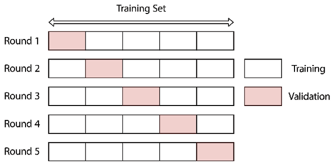
Figure 13.28: Scheme of a 5-fold cross-validation procedure
We already mentioned that grid search is a technique used for tuning hyperparameters. The underlying idea is to create a grid of all possible hyperparameter combinations and train the model using each one of them. Due to its exhaustive, brute-force search, the approach guarantees to find the optimal parameter within the grid. The drawback is that the size of the grid grows exponentially when adding more parameters or more considered values. The number of required model fits and predictions increases significantly if we additionally use cross-validation!
Let’s illustrate this with an example by assuming that we are training a model with two hyperparameters: a and b. We define a grid that covers the following values of the hyperparameters: {"a": [1, 2, 3], "b": [5, 6]}. This means that there are 6 unique combinations of hyperparameters in our grid and the algorithm will fit the model 6 times. If we also use a 5-fold cross-validation procedure, it will result in 30 unique models being fitted in the grid search procedure!
As a potential solution to the problems encountered with grid search, we can also use the random search (also called randomized grid search). In this approach, we choose a random set of hyperparameters, train the model (also using cross-validation), return the scores, and repeat the entire process until we reach a predefined number of iterations or the computational time limit. Random search is preferred over grid search when dealing with a very large grid. That is because the former can explore a wider hyperparameter space and often find a hyperparameter set that performs very similarly to the optimal one (obtained from an exhaustive grid search) in a much shorter time. The only problematic question is: how many iterations are sufficient to find a good solution? Unfortunately, there is no simple answer to that. Most of the time, it is indicated by the available resources.
Getting ready
For this recipe, we use the decision tree pipeline created in the Organizing the project with pipelines recipe, including the outlier treatment from the There’s more... section.
How to do it...
Execute the following steps to run both grid search and randomized search on the decision tree pipeline we have created in the Organizing the project with pipelines recipe:
- Import the libraries:
from sklearn.model_selection import ( GridSearchCV, cross_val_score, RandomizedSearchCV, cross_validate, StratifiedKFold ) from sklearn import metrics - Define a cross-validation scheme:
k_fold = StratifiedKFold(5, shuffle=True, random_state=42) - Evaluate the pipeline using cross-validation:
cross_val_score(tree_pipeline, X_train, y_train, cv=k_fold)Executing the snippet returns an array containing the estimator’s default score (accuracy) values:
array([0.72333333, 0.72958333, 0.71375, 0.723125, 0.72])
- Add extra metrics to the cross-validation:
cv_scores = cross_validate(
    tree_pipeline, X_train, y_train, cv=k_fold,
    scoring=["accuracy", "precision", "recall",
             "roc_auc"]
)
pd.DataFrame(cv_scores)
Executing the snippet generates the following table:

Figure 13.29: The results of 5-fold cross-validation
In Figure 13.29, we can see the 4 requested metrics for each of the 5 cross-validation folds. The metrics have very similar values in each of the 5 test folds, which suggests that the cross-validation with stratified split worked as intended.
- Define the parameter grid:
param_grid = { "classifier__criterion": ["entropy", "gini"], "classifier__max_depth": range(3, 11), "classifier__min_samples_leaf": range(2, 11), "preprocessor__numerical__outliers__n_std": [3, 4] } - Run the exhaustive grid search:
classifier_gs = GridSearchCV(tree_pipeline, param_grid,
                             scoring="recall", cv=k_fold,
                             n_jobs=-1, verbose=1)
classifier_gs.fit(X_train, y_train)
Below we see how many models will be fitted using the exhaustive search:
Fitting 5 folds for each of 288 candidates, totalling 1440 fitsThe best model from the exhaustive grid search is the following:
Best parameters: {'classifier__criterion': 'gini', 'classifier__max_depth': 10, 'classifier__min_samples_leaf': 7, 'preprocessor__numerical__outliers__n_std': 4}
Recall (Training set): 0.3858
Recall (Test set): 0.3775
- Evaluate the performance of the tuned pipeline:
LABELS = ["No Default", "Default"]
tree_gs_perf = performance_evaluation_report(
    classifier_gs, X_test,
    y_test, labels=LABELS,
    show_plot=True
)
Executing the snippet generates the following plot:

Figure 13.30: The performance evaluation report of the best pipeline identified by the exhaustive grid search
- Run the randomized grid search:
classifier_rs = RandomizedSearchCV(tree_pipeline, param_grid,
                                   scoring="recall", cv=k_fold,
                                   n_jobs=-1, verbose=1,
                                   n_iter=100, random_state=42)
classifier_rs.fit(X_train, y_train)
print(f"Best parameters: {classifier_rs.best_params_}")
print(f"Recall (Training set): {classifier_rs.best_score_:.4f}")
print(f"Recall (Test set): {metrics.recall_score(y_test, classifier_rs.predict(X_test)):.4f}")
Below we can see that the randomized search will train fewer models than the exhaustive one:
Fitting 5 folds for each of 100 candidates, totalling 500 fitsThe best model from the randomized grid search is the following:
Best parameters: {'preprocessor__numerical__outliers__n_std': 3, 'classifier__min_samples_leaf': 7, 'classifier__max_depth': 10, 'classifier__criterion': 'gini'}
Recall (Training set): 0.3854
Recall (Test set): 0.3760
In the randomized search, we looked at 100 random sets of hyperparameters, which correspond to ~1/3 of all possibilities covered by the exhaustive search. Even though the randomized search did not identify the same model as the best one, the performance of both pipelines is very similar on both training and test sets.
How it works...
In Step 2, we defined the 5-fold cross-validation scheme. As there is no inherent order in the data, we used shuffling and specified the random state for reproducibility. Stratification ensured that each fold received a similar ratio of classes in the target variable. Such a setting is crucial when we are dealing with imbalanced classes.
In Step 3, we evaluated the pipeline created in the Organizing the project with pipelines recipe using the cross_val_score function. We passed the estimator (the entire pipeline), the training data, and the cross-validation scheme as arguments to the function.
We could have also provided a number to the cv argument (the default is 5)—in the case of a classification problem, it would have automatically applied the stratified k-fold cross-validation. However, by providing a custom scheme, we also ensured that the random state was defined and that the results were reproducible.
We can clearly observe another advantage of using pipelines—we are not leaking any information while carrying out cross-validation. Without pipelines, we would fit our transformers (for example, StandardScaler) using the training data and then transform training and test sets separately. This way, we are not leaking any information from the test set. However, we are leaking a bit of information if we carry out cross-validation on such a transformed training set. That is because the folds used for validation were transformed using all the information from the training set.
In Step 4, we extended the cross-validation by using the cross_validate function. This function is more flexible in the way it allows us to use multiple evaluation criteria (we used accuracy, precision, recall, and the ROC AUC). Additionally, it records the time spent in both the training and inference steps. We printed the results in the form of a pandas DataFrame to make them easier to read. By default, the output of the function is a dictionary.
In Step 5, we defined the parameter grid to be used for the grid search. An important point to remember here is the naming convention when working with Pipeline objects. The keys in the grid dictionary are built from the name of the step/model concatenated with the hyperparameter name using a double underscore. In this example, we searched a space created on top of three hyperparameters of the decision tree classifier:
criterion—the metric used for determining a split, either entropy or Gini importance.max_depth—the maximum depth of the tree.min_samples_leaf—the minimum number of observations in a leaf. It prevents the creation of trees with very few observations in leaves.
Additionally, we experimented with the outlier transformer, by using either three or four standard deviations from the mean to indicate whether an observation was an outlier. Please pay attention to the construction of the name, which contains the following pieces of information in sequence:
preprocessor—the step of the pipeline.numerical—which pipeline it was within theColumnTransformer.outliers—which step of that inner pipeline we are accessing.n_std—the name of the hyperparameter we wanted to specify.
When only tuning the estimator (model), we should directly use the names of the hyperparameters.
We decided to select the best-performing decision tree model based on recall, that is, the percentage of all defaults correctly identified by the model. This evaluation metric is definitely useful in cases when we are dealing with imbalanced classes, for example, when predicting default or fraud. In real life, there is often a different cost of a false negative (predicting no default when the user actually defaulted) and a false positive (predicting that a good customer defaults). To predict defaults, we decided that we could accept the cost of more false positives, in return for reducing the number of false negatives (missed defaults).
In Step 6, we created an instance of the GridSearchCV class. We provided the pipeline and parameter grid as inputs. We also specified recall as the scoring metric to be used for selecting the best model (different metrics could have been used here). We also used our custom CV scheme and indicated that we wanted to use all available cores to speed up the computations (n_jobs=-1).
When working with the grid search classes of scikit-learn, we can actually provide multiple evaluation metrics (specified as a list or dictionary). That is definitely helpful when we want to carry out a more in-depth analysis of the fitted models. We need to remember that when using multiple metrics, we must use the refit argument to specify which metric should be used to determine the best combination of hyperparameters.
We then used the fit method of the GridSearchCV object, just like any other estimator in scikit-learn. From the output, we saw that the grid contained 288 different combinations of hyperparameters. For each set, we fitted five models (5-fold cross-validation).
GridSearchCV's default setting of refit=True means that after the entire grid search is completed, the best model has automatically been fitted once again, this time to the entire training set. We can then directly use that estimator (identified by the indicated criterion) for inference by running classifier_gs.predict(X_test).
In Step 8, we created an instance of a randomized grid search. It is similar to a regular grid search, except that the maximum number of iterations was specified. In this case, we tested 100 different combinations from the parameter grid, which was roughly 1/3 of all available combinations.
There is one additional difference between the exhaustive and randomized approaches to grid search. In the latter one, we can provide a hyperparameter distribution instead of a list of distinct values. For example, let’s assume that we have a hyperparameter that describes a ratio between 0 and 1. In the exhaustive grid search, we might specify the following values: [0, 0.2, 0.4, 0.6, 0.8, 1]. In the randomized search, we can use the same values and the search will randomly (uniformly) pick up a value from the list (there is no guarantee that all of them will be tested). Alternatively, we might prefer to draw a random value from the uniform distribution (restricted to values between 0 and 1) as the hyperparameter’s value.
Under the hood, scikit-learn applies the following logic. If all hyperparameters are presented as lists, the algorithm performs sampling without replacement. If at least one hyperparameter is represented by a distribution, sampling with replacement is used instead.
There’s more...
Faster search with successive halving
For each candidate set of hyperparameters, both exhaustive and random approaches to grid search train a model/pipeline using all available data. scikit-learn offers an additional approach to grid search called halving grid search, which is based on the idea of successive halving.
The algorithm works as follows. First, all candidate models are fitted using a small subset of the available training data (in general, using a limited amount of resources). Then, the best-performing candidates are picked out. In the next step, those best-performing candidates are retrained with a bigger subset of the training data. Those steps are repeated until the best set of hyperparameters is identified. In this approach, after each iteration, the number of available hyperparameter candidates is decreasing while the size of the training data (resources) is increasing.
The default behavior of the halving grid search is to use training data as a resource. However, we could just as well use another hyperparameter of the estimator we are trying to tune, as long as it accepts positive integer values. For example, we could use the number of trees (n_estimators) of the Random Forest model as the resource to be increased with each iteration.
The speed of the algorithm depends on two hyperparameters:
min_resources—the minimum amount of resources that any candidate is allowed to use. In practice, this corresponds to the number of resources used in the first iteration.factor—the halving parameter. The reciprocal of thefactor(1 /factor) determines the proportion of candidates to be selected as the best models in each iteration. The product of thefactorand the previous iteration’s number of resources determines the current iteration’s number of resources.
While picking those two might seem a bit daunting with all the calculations to be carried out manually to make use of most of the resources, scikit-learn makes it easier for us with the "exhaust" value of the min_resources argument. Then, the algorithm will determine for us the number of the resources in the first iteration such that the last iteration uses as many resources as possible. In the default case, it will result in the last iteration using as much of the training data as possible.
Similar to the randomized grid search, scikit-learn also offers a randomized halving grid search. The only difference compared to what we have already described is that at the very beginning, a fixed number of candidates is sampled at random from the parameter space. This number is determined by the n_candidates argument.
Below we demonstrate how to use the HalvingGridSearchCV. First, we need to explicitly allow using the experimental feature before importing it (in the future, this step might be redundant when the feature is no longer experimental):
from sklearn.experimental import enable_halving_search_cv
from sklearn.model_selection import HalvingGridSearchCV
Then, we find the best hyperparameters for our decision tree pipeline:
classifier_sh = HalvingGridSearchCV(tree_pipeline, param_grid,
                                    scoring="recall", cv=k_fold,
                                    n_jobs=-1, verbose=1,
                                    min_resources="exhaust", factor=3)
classifier_sh.fit(X_train, y_train)
We can see how the successive halving algorithm works in practice in the following log:
n_iterations: 6
n_required_iterations: 6
n_possible_iterations: 6
min_resources_: 98
max_resources_: 24000
aggressive_elimination: False
factor: 3
----------
iter: 0
n_candidates: 288
n_resources: 98
Fitting 5 folds for each of 288 candidates, totalling 1440 fits
----------
iter: 1
n_candidates: 96
n_resources: 294
Fitting 5 folds for each of 96 candidates, totalling 480 fits
----------
iter: 2
n_candidates: 32
n_resources: 882
Fitting 5 folds for each of 32 candidates, totalling 160 fits
----------
iter: 3
n_candidates: 11
n_resources: 2646
Fitting 5 folds for each of 11 candidates, totalling 55 fits
----------
iter: 4
n_candidates: 4
n_resources: 7938
Fitting 5 folds for each of 4 candidates, totalling 20 fits
----------
iter: 5
n_candidates: 2
n_resources: 23814
Fitting 5 folds for each of 2 candidates, totalling 10 fits
As we have mentioned before, max_resources is determined by the size of the training data, that is, 24,000 observations. Then, the algorithm figured out that it needs to start with a sample size of 98 in order to end the procedure with as big a sample as possible. In this case, in the last iteration, the algorithm used 23,814 training observations.
In the following table, we can see which values of the hyperparameters were picked by each of the 3 approaches to grid search we have covered in this recipe. They are very similar, and so is their performance on the test set (the exact comparison is available in the notebook on GitHub). We leave the comparison of fitting times of all those algorithms as an exercise for the reader.

Figure 13.31: The best values of hyperparameters identified by exhaustive, randomized, and halving grid search
Grid search with multiple classifiers
We can also create a grid containing multiple classifiers. This way, we can see which model performs best with our data. To do so, we first import another classifier from scikit-learn. We will use the famous Random Forest:
from sklearn.ensemble import RandomForestClassifier
We selected this model as it is an ensemble of decision trees and thus also does not require any further preprocessing of the data. For example, if we wanted to use a simple logistic regression classifier (with regularization), we should also scale the features (standardize/normalize) by adding an additional step to the numerical part of the preprocessing pipeline. We cover the Random Forest model in more detail in the next chapter.
Again, we need to define the parameter grid. This time, it is a list containing multiple dictionaries—one dictionary per classifier. The hyperparameters for the decision tree are the same as before, and we chose the simplest hyperparameters of the Random Forest, as those do not require additional explanations.
It is worth mentioning that if we want to tune some other hyperparameters in the pipeline, we need to specify them in each of the dictionaries in the list. That is why preprocessor__numerical__outliers__n_std is included twice in the following snippet:
param_grid = [
    {"classifier": [RandomForestClassifier(random_state=42)],
     "classifier__n_estimators": np.linspace(100, 500, 10, dtype=int),
     "classifier__max_depth": range(3, 11),
     "preprocessor__numerical__outliers__n_std": [3, 4]},
    {"classifier": [DecisionTreeClassifier(random_state=42)],
     "classifier__criterion": ["entropy", "gini"],
     "classifier__max_depth": range(3, 11),
     "classifier__min_samples_leaf": range(2, 11),
     "preprocessor__numerical__outliers__n_std": [3, 4]}
]
The rest of the process is exactly the same as before:
classifier_gs_2 = GridSearchCV(tree_pipeline, param_grid,
                               scoring="recall", cv=k_fold,
                               n_jobs=-1, verbose=1)

classifier_gs_2.fit(X_train, y_train)

print(f"Best parameters: {classifier_gs_2.best_params_}")
print(f"Recall (Training set): {classifier_gs_2.best_score_:.4f}")
print(f"Recall (Test set): {metrics.recall_score(y_test, classifier_gs_2.predict(X_test)):.4f}")
Running the snippet generates the following output:
Best parameters: {'classifier': DecisionTreeClassifier(max_depth=10, min_samples_leaf=7, random_state=42), 'classifier__criterion': 'gini', 'classifier__max_depth': 10, 'classifier__min_samples_leaf': 7, 'preprocessor__numerical__outliers__n_std': 4}
Recall (Training set): 0.3858
Recall (Test set): 0.3775
Turns out that the tuned decision tree managed to outperform an ensemble of trees. As we will see in the next chapter, we can easily change the outcome with a bit more tuning of the Random Forest classifier. After all, we have only tuned two of the many hyperparameters available.
We can use the following snippet to extract and print all the considered hyperparameter/classifier combinations, starting with the best one:
pd.DataFrame(classifier_gs_2.cv_results_).sort_values("rank_test_score")
See also
An additional resource on the randomized search procedure is available here:
- Bergstra, J. & Bengio, Y. (2012). “Random search for hyper-parameter optimization.” Journal of Machine Learning Research, 13(Feb), 281-305. http://www.jmlr.org/papers/volume13/bergstra12a/bergstra12a.pdf.
Summary
In this chapter, we have covered the basics required to approach any machine learning project, not just limited to the financial domain. We did the following:
- Imported the data and optimized its memory usage
- Thoroughly explored the data (distributions of features, missing values, and class imbalance), which should already provide some ideas about potential feature engineering
- Identified the missing values in our dataset and imputed them
- Learned how to encode categorical variables so that they are correctly interpreted by machine learning models
- Fitted a decision tree classifier using the most popular and mature ML library—
scikit-learn - Learned how to organize our entire codebase using pipelines
- Learned how to tune the hyperparameters of the model to squeeze out some extra performance and find a balance between underfitting and overfitting
It is crucial to understand those steps and their significance, as they can be applied to any data science project, not only binary classification. The steps would be virtually the same for a regression problem, for example, predicting the price of a house. We would use slightly different estimators (though most of them work for both classification and regression) and evaluate the performance using different metrics (MSE, RMSE, MAE, MAPE, and so on). But the principles stay the same.
If you are interested in putting the knowledge from this chapter into practice, we can recommend the following sources for finding data for your next project:
- Google Datasets: https://datasetsearch.research.google.com/
- Kaggle: https://www.kaggle.com/datasets
- UCI Machine Learning Repository: https://archive.ics.uci.edu/ml/index.php
In the next chapter, we cover a selection of techniques that might be helpful in further improving the initial model. We will cover, among others, more complex classifiers, Bayesian hyperparameter tuning, dealing with class imbalance, exploring feature importance and selection, and more.
Join us on Discord!
To join the Discord community for this book – where you can share feedback, ask questions to the author, and learn about new releases – follow the QR code below: