
While Web Parts and ASP.NET application pages are easy to create and deploy, experienced SharePoint developers agree that building professional SharePoint applications is anything but trivial.
To address this incongruity, in this chapter we will walk through the most important SharePoint web controls that are needed to build individual custom applications or SharePoint Web Parts.
The main part of this chapter describes the most common SharePoint user interface (UI) controls. They include such powerful controls as the SPGridView control and the new SPRibbon control—both are highly useful when creating applications with a great user experience.
This chapter covers
Field controls
Input form controls
Picker and selector controls
Toolbar and ribbon controls
Data controls (
SPGridView,JSGrid)
With each new version, the SharePoint framework has grown in size. Currently, the Microsoft.SharePoint.WebControls namespace alone contains more than 450 public classes and over 370 classes that inherit from System.Web.UI.Control.
This section covers a fraction of all the available controls. Divided into five categories, the most significant controls for developers are each described briefly (see Table 11-1).
Table 11.1. Web Control Categories
Category | Description |
|---|---|
Field controls | Controls that inherit from |
Input controls | Controls that begin with the prefix |
Picker controls | Controls for displaying picker boxes and dialogs. |
Controls that enable the user to control pages. | |
Data controls | Controls for displaying list data. |
Let's start with the field controls that are commonly used to display or edit list items. When you create a custom list and add a column, you can choose between 12 field types, as shown in Figure 11-1.

Each field type is mapped to a SharePoint field control in the Microsoft.SharePoint.WebControls namespace. Table 11-2 shows these mappings.
Table 11.2. Field Type Mappings
SharePoint Web Control | |
|---|---|
Single line of text |
|
Multiple lines of text (plain text) |
|
Multiple lines of text (rich text) |
|
Multiple lines of text (enhanced rich text) |
|
Choice (drop-down) |
|
Choice (radio button) |
|
Number |
|
Currency |
|
Date and Time |
|
Lookup (single item) |
|
Lookup (multiple items) |
|
Yes/no |
|
Person or group |
|
Hyperlink or picture |
|
Calculated |
|
Business data |
|
As you've learned, SharePoint provides various standard form controls to render each type of column. These controls appear on the standard Display, Add, and Edit forms, and they all inherit from the BaseFieldControl class.
In a SharePoint list (class SPList), there are a number of fields, and each SPField element creates a control based on BaseFieldControl. Each control is a composite control consisting of one or more ASP.NET controls.
For a single-line text field, the control is a wrapped TextBox. For more advanced fields, such as a multiselect lookup field or a rich text field, you will need some more complex controls, and of course their related JavaScript code.
The BaseFieldControl can be directly connected to a SharePoint SPListItem, and BaseFieldControl.Value will match the format required to fill the SPListItem.
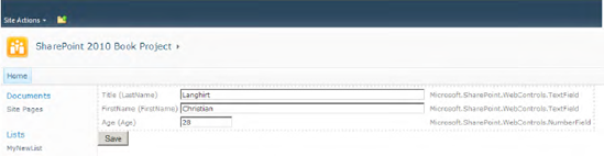
To see the functionality, create a list named MyNewList with the columns LastName, FirstName, and Age. Now you can write an application page that displays a list item with the rendering controls defined for the fields (see Figure 11-2).

First, build a simple application page (DisplayListItem.aspx) with a code-behind file in the LAYOUTS directory, as shown in Listing 11-1.
Example 11.1. Application Page DisplayListItem.aspx
<%@ Page Language="C#" AutoEventWireup="true"
         DynamicMasterPageFile="˜masterurl/default.master"
         CodeFile="DisplayListItem.aspx.cs"
         Inherits="DisplayListItem"
         MasterPageFile="v4.master"
         CodeFileBaseClass= "Microsoft.SharePoint.WebControls.LayoutsPageBase" %>

<asp:Content ContentPlaceHolderId="PlaceHolderMain" runat="server">
    <asp:PlaceHolder runat="server" ID="content" />
</asp:Content>
Second, implement suitable methods to display the list items' fields, as shown in Listing 11-2.
Example 11.2. Code-Behind Class DisplayListItem.aspx.cs
public partial class DisplayListItem : LayoutsPageBase
{
    protected void Page_Load(object sender, EventArgs e)
    {
        ShowListItem();
    }

    protected void ShowListItem()
    {
        using (SPWeb web = SPContext.Current.Web)
        {
            // Define List and ItemID
            SPList list = web.Lists["MyNewList"];
            int listItemId = 1;

            Table table = new Table();
            table.BorderStyle = BorderStyle.Dotted;

            foreach (SPField f in list.Fields)
            {
                if (!f.Hidden && f.CanBeDisplayedInEditForm)
                {
                    // Render every visible field with a rendering control
                    BaseFieldControl bfc = f.FieldRenderingControl;
                    if (bfc != null)
                    {
                        SPContext renderContext =
                        SPContext.GetContext(this.Context, listItemId,
                                              list.ID, web);
                        bfc.ListId = list.ID;
                        bfc.FieldName = f.InternalName;
                        bfc.ID = f.InternalName;
                        bfc.ControlMode = SPControlMode.Display;
                        bfc.RenderContext = renderContext;
                        bfc.ItemContext = renderContext;
                        bfc.EnableViewState = true;
                        bfc.Visible = true;
                        table.Rows.Add(CreateTR(f,bfc));
                    }
                }
            }
            content.Controls.Add(table);
        }
    }

    private TableRow CreateTR(SPField field, Control ctl)
    {
        TableRow tr = new TableRow();
TableCell td1 = new TableCell();
td1.Text = field.InternalName + " (" + field.Title + ")";
TableCell td2 = new TableCell();
td2.Controls.Add(ctl);
TableCell td3 = new TableCell();
td3.Text = field.Description;
TableCell td4 = new TableCell();
td4.Text = field.FieldRenderingControl.ToString();
tr.Cells.AddRange(new TableCell[] {td1, td2, td3, td4});
return tr;
}
}The example in Listing 11-2 loops through all the visible fields of the SharePoint list MyNewList. Within each iteration, the FieldRenderingControl property is evaluated, and the assigned BaseFieldControl instance of this field is rendered. By populating the RenderContext and ItemContext properties of the BaseFieldControl list item, values for the list item are loaded with ID=1. For each field value, a table row instance is created and added to the output table. Thus, the ASP.NET page renders all visible list fields and displays them in a table, as shown in Figure 11-3.

You can also set the ControlMode property of the rendering controls to SPControlMode.Edit. This switches the controls to appear in their editable mode (see Figure 11-4). If you build your own Edit mode forms, be sure to exclude read-only fields (SPField.ReadOnlyField is true).
To build a fully functional edit form, place an <asp:Button> on the page and add the methods shown in Listing 11-3 to the code-behind file.
Example 11.3. Postback Event Handler Implementation
protected void Button1_Click(object sender, EventArgs e)
{
   SPListItem li = null;
   List<BaseFieldControl> ctls =  FindControls<BaseFieldControl>(content);
   foreach (BaseFieldControl bfc in ctls)
   {
       bfc.UpdateFieldValueInItem();
        li = bfc.ListItem;
   }
   li.Update();
}


private List<T> FindControls<T>(Control rootControl) where T : Control
{
    List<T> retVal = new List<T>();
    if (rootControl.HasControls())
    {
        foreach (Control c in rootControl.Controls)
        {
            if (c.GetType().IsSubclassOf(typeof(T))) retVal.Add((T)c);
            retVal.AddRange(FindControls<T>(c));
        }
    }
    return retVal;
}
This example includes a helper method, FindControls, which iterates recursively through all the controls of a container control and assembles in a list all the child controls of a particular type. In the example, the Button1_Click method uses this function to obtain all the controls of type BaseFieldControl. For every control, the code calls the UpdateFieldValueInItem method to ensure that the new values are stored within the ListItem of the rendering context. The final step is to call the SPListItem.Update method to write the list item data back to the database.
The need to create a custom field type for lists is a frequent requirement—but it is unfortunately not as easy as it seems. There are a couple of ways to build your own custom field types; in this section we'll show you a way to do that.
The most important thing is to understand the correlations between the involved elements, as shown in Figure 11-5. First of all, a custom field implementation consists of at least the following elements:
A field class, which inherits from
SPFieldand contains the field dataA field-rendering control class, which inherits from
BaseSPFieldControland references the field-rendering templateA field-rendering template for adding and editing dialogs (ASCX), which is used within the field-rendering control
An XML field type definition (
fldtypes_[myFieldType].xml), which defines the custom field type and points to a field class and a field editor user controlA custom field type XSL stylesheet, which renders the field within list views (
fldtypes_[myFieldType].xsl]). You only need to implement this if you want to customize the rendering output of your custom field.
There is one further element if custom column properties are used:
A field editor user control for creating and changing the column settings (ASCX)

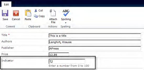
The following example demonstrates how to create a custom field that behaves as a number field while it is being edited, and renders as a bar indicator when it is viewed (see Figure 11-6).

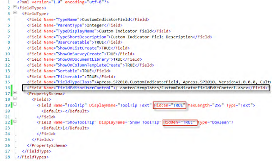
We start with the XML file for the field type definition. Simply create an XML file, prefix the file name with fldtypes_ (in this example, it is called fldtypes_CustomIndicatorField.xml), and save the file in the TEMPLATE/XML directory of the 14 hive, as shown in Listing 11-4.
Example 11.4. Field Type Definition: fldtypes_CustomIndicatorField.xml
<?xml version="1.0" encoding="utf-8"?>
<FieldTypes>
  <FieldType>
    <Field Name="TypeName">CustomIndicatorField</Field>
    <Field Name="ParentType">Number</Field>
    <Field Name="TypeDisplayName">Custom Indicator Field</Field>
    <Field Name="TypeShortDescription">Custom Indicator Field Description</Field>
    <Field Name="UserCreatable">TRUE</Field>
    <Field Name="ShowOnListCreate">TRUE</Field>
    <Field Name="ShowOnSurveyCreate">TRUE</Field>
    <Field Name="ShowOnDocumentLibrary">TRUE</Field>
    <Field Name="ShowOnColumnTemplateCreate">TRUE</Field>
    <Field Name="Sortable">TRUE</Field>
    <Field Name="Filterable">TRUE</Field>
    <Field Name="FieldTypeClass">Apress.SP2010.CustomIndicatorField, Apress.SP2010,
           Version=1.0.0.0, Culture=neutral, PublicKeyToken=4113b8ec9b28df52</Field>

   <PropertySchema>
      <Fields>
        <Field Name="ToolTip" DisplayName="ToolTip Text"
               MaxLength="255" Type="Text">
          <Default>-</Default>
        </Field>
        <Field Name="ShowToolTip" DisplayName="Show ToolTip" Type="Boolean">
          <Default>1</Default>
        </Field>
      </Fields>
    </PropertySchema>
   <RenderPattern Name="DisplayPattern" DisplayName="DisplayPattern">
      <HTML>
         <![CDATA[<span><span style='background-color:blue'>
         <img src='/_layouts/images/blank.gif' height='10' width=']]>
</HTML>
<HTML>
<Column HTMLEncode="TRUE"/>
</HTML>
<HTML><![CDATA[' /></span> ]]></HTML>
<HTML>
<Column HTMLEncode="TRUE"/>
</HTML>
<HTML><![CDATA[</span> ]]></HTML>
</RenderPattern>
</FieldType>
</FieldTypes>The first few XML elements define the type and the names of our new field. The FieldTypeClass attribute is important, as it has a fully named reference to an assembly containing the field class.
After the field elements, there is a PropertySchema section. Here you can define custom properties. Custom properties are column-related values and are stored within the field class (see Figure 11-7). The RenderPattern section defines how the field is rendered within HTML. In the preceding example (Listing 11-4), the custom indicator field renders as a transparent image, encapsulated by a <span> tag with blue background color. The width of the image in pixels depends on the value of the custom column.
<span><span  style='background-color:blue'>
<img src='/_layouts/images/blank.gif' height='10'
     width='[value of the custom indicator column]'/>
<span>[value of the custom indicator column]</span>
Note
With SharePoint 2010, the RenderPattern section of the field definition by default has no effect on list views. This is because SharePoint 2010 introduces XsltListViewWebPart, which simplifies the customizing of list views by using XSLT. If you still want to use RenderPattern, you have to add the following code to the field type definition: <Field Name="CAMLRendering">TRUE</Field>.
Once the file has been saved and IIS reset, the new column is available for your lists (see Figure 11-7). If you choose the custom column and click Save, an error will be thrown, since the field class does not yet exist.

As already mentioned, SharePoint 2010 comes with a new XsltListViewWebPart architecture (XLV). It ships with a set of shared XSLT files that are used to generate out-of-the-box list views. These files are placed in the LAYOUTS folder within the .xsl directory (e.g., main.xsl, fldtypes.xsl, etc.). If you want to add your own customization for your field, you just have to add an XSL file named fldtypes_yourFieldName.xsl.
<xsl:stylesheet xmlns:x="http://www.w3.org/2001/XMLSchema"
    xmlns:d="http://schemas.microsoft.com/sharepoint/dsp" version="1.0"
    exclude-result-prefixes="xsl msxsl ddwrt"
    xmlns:ddwrt="http://schemas.microsoft.com/WebParts/v2/DataView/runtime"
    xmlns:asp="http://schemas.microsoft.com/ASPNET/20"
    xmlns:__designer="http://schemas.microsoft.com/WebParts/v2/DataView/designer"
    xmlns:xsl="http://www.w3.org/1999/XSL/Transform"
    xmlns:msxsl="urn:schemas-microsoft-com:xslt"
    xmlns:SharePoint="Microsoft.SharePoint.WebControls"
    xmlns:ddwrt2="urn:frontpage:internal">

<xsl:template match="FieldRef[@FieldType='CustomIndicatorField']"mode="Number_body"><xsl:param name="thisNode" select="."/><xsl:variable name="value" select="$thisNode/@*[name()=current()/@Name]" /><span><span style="background-color:blue"><img src="/_layouts/images/blank.gif" height="10" width="{$value}" /></span><xsl:value-of select="$value"/></span></xsl:template></xsl:stylesheet>
The XSL template displayed in the preceding code will be used if a field is of type CustomIndicatorField and has a base type of Number. The result of the template is HTML output such as the following:
<span><span  style='background-color:blue'>
<img src='/_layouts/images/blank.gif' height='10'
     width='[value of the custom indicator column]'/>
<span>[value of the custom indicator column]</span>
The numeric value of the current field instance is assigned to the XSL variable value. Then this variable is used for the width attribute of the image tag and for displaying the value as clear text behind the image.
This class is derived from SPField. It manages the data required by a custom field, such as additional properties. Furthermore, it handles validation, data loading, and saving. In our example, we inherit directly from SPFieldNumber. The only things we have to implement are
Two constructors that merely call the corresponding constructors of the base class
Overriding the
FieldRenderingControland returning an instance of ourCustomIndicatorFieldControlimplementationOverriding the
GetValidatedStringmethod to serialize the field's value into a string
Listing 11-5 shows the code for the CustomIndicatorField class, with two custom properties (ToolTipCustomProperty and ShowToolTipCustomProperty) added.
Example 11.5. Field Class CustomIndicatorField.cs
namespace Apress.SP2010
{
    public class CustomIndicatorField : SPFieldNumber
    {
        public CustomIndicatorField(SPFieldCollection fields, string fieldName)
            : base(fields, fieldName) { Init(); }

        public CustomIndicatorField(SPFieldCollection fields, string typeName,
                                     string displayName)
            : base(fields, typeName, displayName) { Init(); }
public String ToolTipCustomProperty { get; set; }
public bool ShowToolTipCustomProperty { get; set; }
private void Init()
{
// Initialize properties
this.ToolTipCustomProperty = this.GetCustomProperty("ToolTip") + "" ;
bool showToolTip = false;
bool.TryParse(Convert.ToString(GetCustomProperty("ShowToolTip")),
out showToolTip);
this.ShowToolTipCustomProperty = showToolTip;
}
public override BaseFieldControl FieldRenderingControl
{
get
{
BaseFieldControl fieldControl = new CustomIndicatorFieldControl();
fieldControl.FieldName = this.InternalName;
return fieldControl;
}
}
public override string GetValidatedString(object value)
{
int intValue = 0;
Int32.TryParse(Convert.ToString(value), out intValue);
return intValue.ToString();
}
public override void Update()
{
this.SetCustomProperty("ToolTip", this.ToolTipCustomProperty);
this.SetCustomProperty("ShowToolTip", this.ShowToolTipCustomProperty);
base.Update();
}
}
}The field-rendering control renders our custom field. To build one, you need to override some methods (see Listing 11-6):
Override the
DefaultTemplateNamemethod and return the name of the custom field-rendering template.Override the
CreateChildControlsmethod to initialize the web controls of the rendering template and assign them to local variables.Override the
Valueproperty and implement your owngetandsetmethods.Override the
Focusmethod to set the focus to the correct web control (if using more than one).
Example 11.6. Field-Rendering Control Class CustomIndicatorFieldControl.cs
namespace Apress.SP2010
{
    public class CustomIndicatorFieldControl : BaseFieldControl
    {

        protected TextBox txtNumber;

        protected override string DefaultTemplateName
        {
            get { return "CustomIndicatorFieldTemplate"; }
        }

        public override object Value
        {
            get {
                EnsureChildControls();
                return txtNumber.Text;
            }

            set {
                try
                {
                    EnsureChildControls();
                    txtNumber.Text = value.ToString();
                }
                catch { }
            }
        }

        public override void Focus()
        {
            EnsureChildControls();
            txtNumber.Focus();
        }

        protected override void CreateChildControls()
        {

            if (Field == null) return;
            base.CreateChildControls();

            // Don't render the text box if we are just displaying the field
            if (ControlMode == SPControlMode.Display) return;
            txtNumber = (TextBox)TemplateContainer.FindControl("txtNumber");

            if (txtNumber == null)
                             throw new NullReferenceException("txtNumber is null");

            if (ControlMode == SPControlMode.New)
{
txtNumber.Text = "0";
}
}
}
}The rendering template is a web user control (in our example it is named CustomIndicatorFieldTemplate.ascx) with at least the following:
A
SharePoint:RenderingTemplatetag with a unique IDOne or more web controls and HTML elements
Listing 11-7 defines a RenderingTemplate web control, which contains a TextBox and HTML text.
Example 11.7. Field-Rendering Template CustomIndicatorFieldTemplate.ascx
<%@ Control Language="C#" AutoEventWireup="false" %>
<%@Assembly Name="Microsoft.SharePoint, Version=14.0.0.0, Culture=neutral, PublicKeyToken=71e9bce111e9429c" %>
<%@Register TagPrefix="SharePoint" Assembly="Microsoft.SharePoint, Version=14.0.0.0, Culture=neutral, PublicKeyToken=71e9bce111e9429c" namespace="Microsoft.SharePoint.WebControls"%>

<SharePoint:RenderingTemplate ID="CustomIndicatorFieldTemplate" runat="server">
    <Template>
        <asp:TextBox runat="server" ID="txtNumber" /><br />
        Enter a number from 0 to 100
    </Template>
</SharePoint:RenderingTemplate>
Please note that the ASCX control defines no code-behind class, and thus no server-side code. Don't create a new ASCX control that automatically adds a code-behind class by using Visual Studio. Instead, just create a new text file and rename it with an .ascx extension. In conjunction with the field-rendering control class, the content of the RenderingTemplate is displayed if you edit an item (see Figure 11-8).
This chapter shows how to rapidly develop and deploy your code. The optimal way to deploy nearly all customizations is to encapsulate the functionalities within a feature and deliver this feature as a SharePoint solution (a WSP file, which by design can be easily deployed to other SharePoint servers).
Getting the custom field working is quickly accomplished:
Ensure that the field type definition file (
fldtypes_CustomIndicatorField.xml) is named correctly (it must begin with the prefixfldtypes_) and resides underTEMPLATE/XMLwithin the 14 hive.Ensure that the field-rendering template (
CustomIndicatorFieldTemplate.ascx) has a unique ID and is stored underTEMPLATE/CONTROLTEMPLATESwithin the 14 hive.Ensure that the field class (
CustomIndicatorField.cs) and the field-rendering control class (CustomIndicatorFieldControl.cs) are both compiled for AnyCPU or x64 as the platform target (not for x86!) into an assembly that is signed with a strong name, and that they're both installed into the GAC.Restart IIS (or recycle the application pool).
In the previous section, some fields were defined within the PropertySchema element of the field type definition file (fldtypes_CustomIndicatorField.xml) to store custom properties into a field. The input controls rendering these fields have very limited functionality. Although it is possible to input simple values—such as strings using text boxes and Booleans through check boxes—what if you need a more complex input control? Consider the case where you wish to select another SPList from a drop-down menu—for example, to populate values of a custom field control (similar to the lookup field). To achieve this you need to implement a so-called field editor user control (see Figure 11-9).

There are several things to do:
Add a field element containing the path to a
FieldEditorUserControlto thefldtypes_[FieldName].xmlfile (as shown in Figure 11-10).Hide the fields of the property schema so that they are not automatically displayed (however, you still need them to store your custom properties).
Implement a
FieldEditorUserControl(ASCX and code-behind).
The user control for editing custom field properties (see Listing 11-8) consists of
A reference to a compiled code-behind class (
Inherits=...)An assembly reference to
Microsoft.SharePoint.dllTag registrations (
InputFormControl,InputFormSection)Content, usually enclosed by
InputFormSectionandInputFormControl
Example 11.8. The CustomIndicatorFieldEditControl.ascx Web User Control
<%@ Control Language="C#" AutoEventWireup="false" Inherits="Apress.SP2010.CustomIndicatorFieldEditControl, Apress.SP2010, Version=1.0.0.0, Culture=neutral, PublicKeyToken=4113b8ec9b28df52" %>
<%@ Assembly Name="Microsoft.SharePoint, Version=14.0.0.0, Culture=neutral, PublicKeyToken=71e9bce111e9429c" %>
<%@ Register TagPrefix="SharePoint" Assembly="Microsoft.SharePoint, Version=14.0.0.0, Culture=neutral, PublicKeyToken=71e9bce111e9429c" namespace="Microsoft.SharePoint.WebControls"%>
<%@ Register TagPrefix="wssuc" TagName="InputFormControl" src="˜/_controltemplates/InputFormControl.ascx" %>
<%@ Register TagPrefix="wssuc" TagName="InputFormSection" src="˜/_controltemplates/InputFormSection.ascx" %>
<%@ Import Namespace="Microsoft.SharePoint" %>

<wssuc:InputFormSection runat="server" id="MySections"
                        Title="Special Configuration Section">
    <Template_InputFormControls>
         <wssuc:InputFormControl runat="server"
                LabelText="Select tooltip settings">
                <Template_Control>
                       <asp:Label ID="lblTooltip" runat="server" Text="ToolTip"
                                  Width="120px" />
                       <asp:TextBox runat="server" ID="txtToolTip" />
                       <br />
                       <asp:CheckBox ID="chkShowToolTip" runat="server" />
                </Template_Control>
         </wssuc:InputFormControl>
    </Template_InputFormControls>
</wssuc:InputFormSection>
The web user control in Listing 11-8 defines an InputFormSection containing a Label, a TextBox, and a CheckBox. This section is displayed when editing the field in a list (see Figure 11-9).
The code-behind class of the field user control derives from System.Web.UI.UserControl and implements the interface IFieldEditor (see Listing 11-9), containing three methods (see Table 11-3).
Table 11.3. Methods of the IFieldEditor Interface
Method | Description |
|---|---|
| This method indicates whether the control renders in a separate section ( |
| This is an initialization method that is called automatically when displaying the field properties for the first time. It can be used to get the custom properties of the nominated |
| This method is called when the user clicks the OK button to save the changes. It must be used to save the values of the web controls into the custom properties of the |
Example 11.9. The CustomIndicatorFieldEditControl.cs Code-Behind Class
namespace Apress.SP2010
{
    public partial class CustomIndicatorFieldEditControl : UserControl, IFieldEditor
    {

        CustomIndicatorField _field = null;
public bool DisplayAsNewSection{get { return true; }}public void InitializeWithField(SPField field){this._field = field as CustomIndicatorField;}public void OnSaveChange(SPField field, bool isNewField){CustomIndicatorField myField = field as CustomIndicatorField;myField.ShowToolTipCustomProperty =FindControlRecursive<CheckBox>(this, "chkShowToolTip").Checked;myField.ToolTipCustomProperty =FindControlRecursive<TextBox>(this, "txtToolTip").Text;}protected override void CreateChildControls(){base.CreateChildControls();if (!IsPostBack && _field != null){FindControlRecursive<TextBox>(this, "txtToolTip").Text =_field.ToolTipCustomProperty;FindControlRecursive<CheckBox>(this, "chkShowToolTip").Checked =_field.ShowToolTipCustomProperty;}}protected T FindControlRecursive<T>(Control rootControl, String id)where T : Control{T retVal = null;if (rootControl.HasControls()){foreach (Control c in rootControl.Controls){if (c.ID == id) return (T)c;retVal = FindControlRecursive<T>(c, id);if (retVal != null) break;}}return retVal;}} }
The example in Listing 11-9 implements a helper method, FindControlRecursive, that recursively finds a control by name in the control tree. You need this for accessing the property controls (TextBox and CheckBox). In the OnSaveChange method, you save the control values into appropriate properties of the field. In the overridden CreateChildControls method, you ensure that already saved properties are displayed correctly.
SharePoint offers many useful web controls that you can easily use for your own application pages or Web Parts. Obviously, before building a custom control for a specific behavior, it's a good idea to check if SharePoint's repertoire includes something that will do the job already. This section introduces the more significant SharePoint web controls with simple examples of their usage.
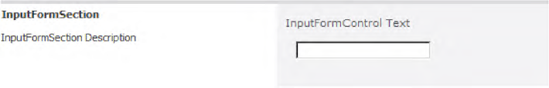
The controls InputFormSection and InputFormControl are mainly responsible for separating input areas, as shown in Figure 11-11.
To use these two controls, you first need to register them in your ASP.NET application page. Remember to surround the InputFormSection element with a <table> tag, because it only generates HTML output starting with <tr> (see Listing 11-10).
Example 11.10. Using the InputFormSection and InputFormControl User Controls
<%@ Register TagPrefix="wssuc" TagName="InputFormSection" src="˜/_controltemplates/InputFormSection.ascx" %>
<%@ Register TagPrefix="wssuc" TagName="InputFormControl" src="˜/_controltemplates/InputFormControl.ascx" %>

<asp:Content ID="Content1" ContentPlaceHolderId="PlaceHolderMain" runat="server">

 <table class="propertysheet" border="0" width="100%"
        cellspacing="0" cellpadding="0">
    <wssuc:InputFormSection Title="InputFormSection"
            Description="InputFormSection Description" runat="server">
        <template_inputformcontrols>
            <wssuc:InputFormControl runat="server"
                                    LabelText="InputFormControl Text">
                <Template_Control>
                    <asp:TextBox runat="server" CssClass="ms-input" />
                </Template_Control>
            </wssuc:InputFormControl>
        </template_inputformcontrols>
</wssuc:InputFormSection> </table> </asp:Content>
Listing 11-10 defines a simple InputFormSection that includes an InputFormControl with a TextBox (see Figure 11-11).
The InputFormTextBox control is derived directly from System.Web.UI.WebControls.TextBox and also implements the System.Web.UI.IValidator interface. Several methods for supporting rich text input fields are also implemented (see Listing 11-11):
Example 11.11. Properties for Rich Text Support in InputFormTextBox
public bool AllowHyperlink { get; set; }
public bool RichText { get; set; }
public SPRichTextMode RichTextMode { get; set; }
Figure 11-12 contains two InputFormTextBox controls, one without and one with rich-text support. The code example for Figure 11-12 is shown in Listing 11-12.
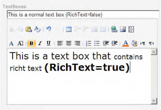
Example 11.12. Example of Using InputFormTextBox Controls
<wssuc:InputFormControl runat="server" LabelText="TextBoxes">
    <Template_Control>
       <SharePoint:InputFormTextBox ID="Subject" RichText="false" runat="server"
              Width="100%"/>
<SharePoint:InputFormTextBox ID="Body" RichText="true"
RichTextMode="FullHtml"
runat="server"
TextMode="MultiLine"
Rows="10"/>
</Template_Control>
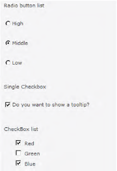
</wssuc:InputFormControl>The SharePoint controls InputFormCheckBox, InputFormCheckBoxList, and InputFormRadioButton all derive from their corresponding web controls in the System.Web.UI.WebControls namespace (CheckBox, CheckBoxList, and RadioButton).
The InputFormCheckbox includes three additional properties:
public int ButtonSpacing { get; set; }
public string LabelText { get; set; }
public bool ToggleChildren { get; set; }
For the InputFormRadioButton class, the extra properties are
public int ButtonSpacing { get; set; }
public string LabelText { get; set; }
Listing 11-13 demonstrates how to use both web controls.
Example 11.13. Example of Using Check Boxes and Radio Buttons
<wssuc:InputFormControl runat="server" LabelText="Radio button list">
    <Template_Control>
        <SharePoint:InputFormRadioButton runat="server" ID="rbtn01"
                GroupName="myGroup" LabelText="High" />
        <SharePoint:InputFormRadioButton runat="server" ID="rbtn02"
                GroupName="myGroup" LabelText="Middle" />
        <SharePoint:InputFormRadioButton runat="server" ID="rbtn03"
                GroupName="myGroup" LabelText="Low" />
    </Template_Control>
</wssuc:InputFormControl>

<wssuc:InputFormControl runat="server" LabelText="Single Checkbox">
    <Template_Control>
        <SharePoint:InputFormCheckBox ID="chkBox"
                LabelText="Do you want to show a tooltip?" runat="server" />
    </Template_Control>
</wssuc:InputFormControl>

<wssuc:InputFormControl runat="server" LabelText="CheckBox list">
    <Template_Control>
       <SharePoint:InputFormCheckBoxList ID="chkBoxList"
                LabelText="Color" runat="server">
             <asp:ListItem Text="Red" Value="Red" />
             <asp:ListItem Text="Green" Value="Green" />
             <asp:ListItem Text="Blue" Value="Blue" />
</SharePoint:InputFormCheckBoxList>
</Template_Control>
</wssuc:InputFormControl>The example in Listing 11-13 defines three InputFormControl objects. The first one has three InputFormRadioButton controls; the second has a single InputFormCheckBox, and the last has an InputFormCheckBoxList with three ListItem values. Figure 11-13 shows the rendered output.
For validation of user input fields, you can use the standard ASP.NET validator controls. Better still, you can use the SharePoint InputField validator controls. SharePoint comes with six controls that are derived from the standard validator controls from ASP.NET:
InputFormCheckBoxListValidatorInputFormCompareValidatorInputFormCustomValidatorInputFormRangeValidatorInputFormRegularExpressionValidatorInputFormRequiredFieldValidator
All of the validation controls inherit from the base class System.Web.UI.BaseValidator, so they all have properties and methods that are common to all validation controls. Table 11-4 shows the standard properties of System.Web.UI.BaseValidator.
Table 11.4. Standard ASP.NET Validation Control Properties from BaseValidator
Description | |
|---|---|
| This is the control to which the validator is applied. |
| This is the error message that will be displayed in the validation summary. |
| This takes a Boolean value for whether or not the control is valid. |
| This is a method to validate the input control and update the |
| This controls how the error message is shown. The possible options are |
The derived SharePoint input validation controls add three properties that primarily influence the rendering of the error message:
public bool BreakAfter { get; set; }
public bool BreakBefore { get; set; }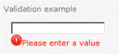
public string ErrorImageUrl { get; set; }The first control is the InputFormRequiredFieldValidator control. It ensures that a user inputs a value. Here is how it is used:
<SharePoint:InputFormTextBox ID="txtBox" runat="server" CssClass="ms-input" />
<SharePoint:InputFormRequiredFieldValidator runat="server"
    ControlToValidate="txtBox" ErrorMessage="Please enter a value"
    ErrorImageUrl="/_layouts/images/cell-error.png" />
Figure 11-14 shows the result of the preceding code.
Next, have a look at the InputFormCompareValidator control. Use this control for such tasks as confirming that new passwords match or checking whether a departure date is before an arrival date (see Figure 11-15).
<SharePoint:InputFormTextBox ID="txt01" runat="server" CssClass="ms-input" />
<SharePoint:InputFormTextBox ID="txt02" runat="server" CssClass="ms-input" />
<SharePoint:InputFormCompareValidator runat="server" ControlToValidate="txt01"
    ControlToCompare="txt02" ErrorMessage="The values are not equal" />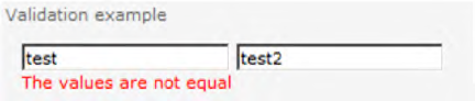
Tip
By using the validator properties ValueToCompare, Type, and Operator, you can easily compare an entered value with a predefined value (e.g., if you want to check if an entered number is greater than X).
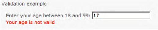
The InputFormRangeValidator control checks whether a control value is within a valid range. The required attributes for this control are MaximumValue, MinimumValue, and Type.
The following code shows how to use the InputFormRangeValidator web control:
Enter your age between 18 and 99:
<SharePoint:InputFormTextBox ID="txt3" runat="server" CssClass="ms-input" />
<SharePoint:InputFormRangeValidator runat="server"
    ControlToValidate="txt3" Type="Integer" MinimumValue="18"
    MaximumValue="99" ErrorMessage="Your age is not valid" />
The result is displayed in Figure 11-16.
The regular expression validator is one of the more powerful features of ASP.NET. While many developers don't enjoy building their own regular expressions, there are many examples to be found on the Web. The resulting regular expressions can be somewhat cryptic. The following example checks whether an e-mail address is valid (see Figure 11-17):
Enter your email address:
<SharePoint:InputFormTextBox ID="txtMail" runat="server" CssClass="ms-input" />
<SharePoint:InputFormRegularExpressionValidator runat="server" ControlToValidate="txtMail" ValidationExpression="^([a-zA-Z0-9_-.]+)@(([[0-9]{1,3}.[0-9]{1,3}.[0-9]{1,3}.)|(([a-zA-Z0-9-]+.)+))([a-zA-Z]{2,4}|[0-9]{1,3})(]?)$" ErrorMessage="Your email address is not valid" />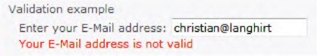
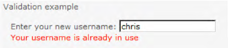
The InputFormCustomValidator control adds great flexibility because it enables developers to write their own validation methods (server- or client-side). This is useful if, for example, an entered value has to be checked against a database.
Enter your new username:
<SharePoint:InputFormTextBox ID="txt4" runat="server" CssClass="ms-input" />
<SharePoint:InputFormCustomValidator runat="server" ControlToValidate="txt4"
    OnServerValidate="OnServerValidate"
    ErrorMessage="Your username is already in use" />
In your code-behind class, implement the OnServerValidate method as follows:
protected void OnServerValidate(object source, ServerValidateEventArgs e)
{
    e.IsValid = (e.Value != "chris");
}
The result is shown in Figure 11-18.
Security is always an issue to keep in mind when developing custom application pages or Web Parts. The SPSecurityTrimmedControl class is a web control that selectively displays content or controls depending on the current user's SharePoint permissions. Irrespective of the inner content of the control, it will not be shown if the user lacks the nominated permissions—for example:
<SharepointWebControls:SPSecurityTrimmedControl runat="server"
                                                Permissions="ManageWeb">
    This is only visible to users who can manage the current web...
</SharepointWebControls:SPSecurityTrimmedControl>
In addition to the Permissions property, which is an enumeration of type SPBasePermission, you can also use the PermissionsString property to specify a comma-separated list of required permissions. There are other ways to define who may view the controls (see the properties in Table 11-5).
Table 11.5. Properties of SPSecurityTrimmedControl
Property | Default Value | Values |
|---|---|---|
|
|
|
|
|
|
|
|
|
|
|
|
|
|
|
| n/a | Comma-separated list of permissions (e.g., |
Warning
Some property combinations, especially combinations with AuthenticationRestriction, PageModes, and PermissionContext, don't always work as expected. If you use the Permissions and PermissionsString properties only, they will work without ambiguity.
When developing your own web controls, it is not always optimal to wrap your content with SPSecurityTrimmedControl. Instead, you can derive from this class and thus include security-trimming behavior directly within your web control.
A good example is the SPLinkButton class, which is directly derived from the SPSecurityTrimmedControl class. The SPLinkButton control is used within the default master page to display the link to the recycle bin. This link is security-trimmed and only visible for users with the right to delete list items:
<SharePoint:SPLinkButton runat="server"
NavigateUrl="˜site/_layouts/recyclebin.aspx"
ImageUrl="/_layouts/images/recycbin.gif"
Text="Recycle Bin"
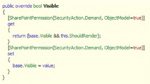
PermissionsString="DeleteListItems" />Looking inside the SPSecurityTrimmedControl class using .NET Reflector (see Figure 11-19) reveals a very simple implementation—overriding the Visible property of the control. All permission-related code is encapsulated within the private method ShouldRender, which simply returns true or false.
A collection of controls are available for selecting data using particular pop-up dialogs.
In this section we'll introduce several interesting SharePoint web controls for selecting data.
SharePoint comes with four selector controls to choose destination elements for operations:
These selector controls are normally used within the SharePoint administration pages. You can easily integrate the controls with the following lines (see Figure 11-20):
<SharePoint:WebApplicationSelector runat="server" ID="webAppSelector" />
<SharePoint:SiteAdministrationSelector runat="server" ID="siteColSelector" />
<SharePoint:WebAdministrationSelector runat="server" ID="webSelector" />
<SharePoint:ListAdministrationSelector runat="server" ID="listSelector" />

To connect the controls, include the following code during page initialization:
protected void Page_Load(object sender, EventArgs e)
{
    this.webSelector.SiteSelector = this.siteSelector;
    this.listSelector.SiteSelector = this.siteSelector;
    this.listSelector.WebSelector = this.webSelector;
}
After clicking the selection field, a pop-up dialog with a list of items to choose will be displayed (see Figure 11-21).

However, if you want to get the selected values, just use the CurrentItem property of the selector controls:
SPWebApplication webApplication = webAppSelector.CurrentItem
SPSiteAdministration siteAdmin = siteColSelector.CurrentItem
SPWeb web = webSelector.CurrentItem
SPList list = listSelector.CurrentItem
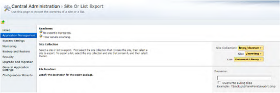
SharePoint Central Administration itself uses these controls on the Site Or List Export page (/_admin/SiteAndListExport.aspx; see Figure 11-22).
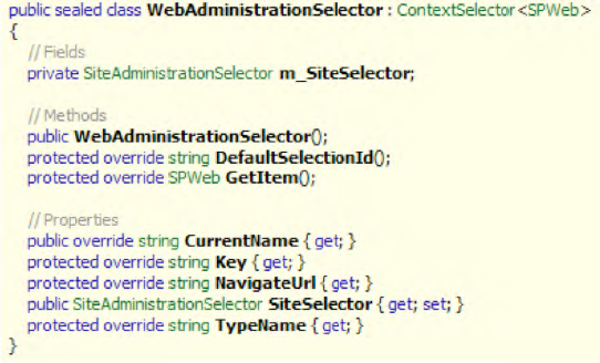
The internal implementation of the selector controls shows that all are derived from the generic class Microsoft.SharePoint.WebControls.ContextSelector<T>. If you need to write your own selector, you can inherit this class with the object type you want to return. You simply have to override some methods and properties, as shown in Figure 11-23, and build a custom pop-up dialog page to select items.
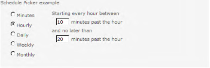
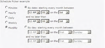
Another useful control is SPSchedulePicker, which allows a user to define recurring events to use for timer jobs. Several Boolean properties control the rendering of the SPSchedulePicker control:
MinutesHourlyDailyWeeklyMonthly
If one or more of these properties are set to true, they will be rendered as radio button elements. After you select a radio button, further settings are displayed. Figures 11-24 through 11-28 show the various properties and their settings for recurring events.


Utilizing the schedule picker is straightforward. First, register the user control at the top of your ASP.NET application page:
<%@ Register TagPrefix="wssuc" TagName="SchedulePicker"
             src="˜/_controltemplates/SchedulePicker.ascx" %>
Second, call it using this format:
<wssuc:SchedulePicker id="schedulePicker" Minutes="True" Hourly="True" Daily="True"
Weekly="True" Monthly="True" Enabled="True" EnableStateView="True" runat="server" />
As you can see, there are several properties for configuring the selectable picker time spans. After the user fills out a schedule, you get the result from the Schedule property:
protected void btnOk_Click(object sender, EventArgs e)
{
     SPWebApplication webApp = webAppSelector.CurrentItem;
     CustomTimerJob customTimerJob = new CustomTimerJob("MyCustomJob",  webApp);
     customTimerJob.Schedule =  schedulePicker.Schedule;
     customTimerJob.Update();
}
If you need to display the current schedule for a timer job, you can use the following schedule picker example:
protected override void OnLoadComplete(EventArgs e)
{
    SPWebApplication webApp = webAppSelector.CurrentItem;
    if (!Page.IsPostBack)
    {
        foreach (SPJobDefinition job in webApp.JobDefinitions)
        {
            if (job.Name == "MyCustomJob" )
            {
                schedulePicker.ScheduleString = job.Schedule.ToString();
            }

        }
    }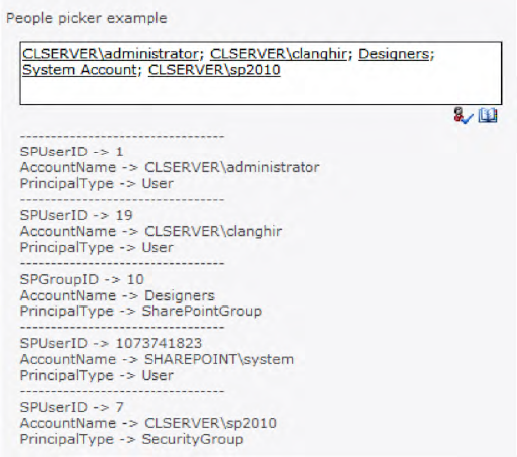
}The people picker is one of the most important and commonly used controls in SharePoint. The people picker allows users to search for and select users defined at some specified scope. This control is normally associated with the Person or Group field in a SharePoint list.
This is another simple control to implement in your own code. The people picker is actually a PeopleEditor control, and is in the Microsoft.SharePoint.WebControls namespace (see Figure 11-29). Insert the following line into your application page:
<SharePoint:PeopleEditor runat="server" />

The control consists of three child controls:
A text box where you can enter partial or complete usernames
An image button to check the filled-out names
A browse image button to search for a username
When you click the browse image button, a dialog opens where you can search for specific users or groups, as shown in Figure 11-30.

There are several properties available for the people picker (see Table 11-6):
Table 11.6. Most Important Properties of the PeopleEditor Web Control
Property | Description |
|---|---|
| Retrieves the accounts associated with the |
| Sets or retrieves whether the user must fill in at least one entry. |
| Sets or retrieves whether the user can type the desired user or group name into the text box or whether the search pop-up has to be used. |
| Initializes the control with predefined login names separated by commas. |
| Specifies the character that separates entities. The default value is a semicolon ( |
| Sets or retrieves a custom error message. |
| Indicates whether the user can select multiple people. |
| Sets or retrieves the warning text if a search returns no results. |
| Indicates whether the check names and browse image buttons will be on the same line as the text box or beneath it. |
| Sets or retrieves a SharePoint group of the site from which people can be selected. |
| Indicates whether to display the check names and browse image buttons. |
| Indicates whether to display a Create button when creating an Active Directory service account. |
| Defines where to look up users. Allowed values are |
| Contains an |
| Defines the type of selectable entities as a comma-separated string. Valid values are |
| Specifies that an error message should be displayed if the input is invalid. |
Validates the resolved entry when set to |
If you are developing a Web Part, you need to create the PeopleEditor control completely in code:
private PeopleEditor peopleEditor;

private void EnsureChildControls()
{
    peopleEditor = new PeopleEditor();
    peopleEditor.AutoPostBack = true;
    peopleEditor.ID = "MyPeopleEditor";
    peopleEditor.AllowEmpty = false;
    peopleEditor.MultiSelect = true;
    peopleEditor.SelectionSet = "User,SPGroup" ;
    MyPanel.Controls.Add(peopleEditor);
}
If you wish to populate the PeopleEditor with the username of the current user, this can be accomplished in code, as shown in Listing 11-14.
Example 11.14. Populating the PeopleEditor with the Current User
protected void initPeopleEditor()
{
    PickerEntity entity = new PickerEntity();
    entity.Key = SPContext.Current.Web.CurrentUser.LoginName;

    // Make sure the entity is correct
    entity = peopleEditor.ValidateEntity(entity);

    ArrayList entityArrayList = new ArrayList();
    entityArrayList.Add(entity);
    peopleEditor.UpdateEntities(entityArrayList);
}
The line peopleEditor.ValidateEntity(entity) can be omitted if you are sure that the entity is correct. The code simply creates a new PickerEntry instance with the LoginName as the key. This PickerEntity is added to an ArrayList and finally passed to the UpdateEntites method of the PickerEditor. The result is shown in Figure 11-31.

Now let's go a step further and get the typed in names after a postback. First, define the PeopleEditor control with a customized SelectionSet property:
<SharePoint:PeopleEditor runat="server" id="peopleEditor"
   SelectionSet="User,SecGroup,SPGroup" />
Then add a Submit button with a server-side click event that gets the property ResolvedEntities of the PickerEditor and displays the entity.EntityData hashtable for each entity:
protected void OnBtnSubmit_Click(object sender, EventArgs args)
{
     lblPickerResult.Text = "";
    foreach (PickerEntity entity in peopleEditor.ResolvedEntities)
    {
        lblPickerResult.Text += "---------------------------------<br>";
        foreach (object key in entity.EntityData.Keys)
        {
            lblPickerResult.Text += key + " -> " + entity.EntityData[key] + "<br>";
        }
    }
}
Warning
It is not recommended to use the Entities property to get the selected entities, because using this sometimes causes unexpected behavior. It's much more reliable to use ResolvedEntities instead.
The result of the preceding example is shown in Figure 11-32.
The default behavior and styling of the PeopleEditor control is adequate for most situations. However, if you need to do more than the very basics with the control, then it is strongly recommended that you subclass the control so that you can hook into the behavior at a much deeper level.
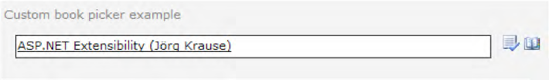
The requirement to select one or more items from a list is most commonly met by using a simple drop-down list. But what happens if this list is very long and becomes a performance issue for your page? (Even if you overcome the performance issue, the user experience is poor if a user has to scroll through hundreds or thousands of items.) The DialogPicker classes enable you to easily build usable custom pickers. SharePoint provides base classes for this purpose. This section shows how to implement a dialog for picking items from a list (see Figures 11-33 and 11-34).

Our custom picker implementation consists of the following elements:
A data source from which the data to select can be queried. For our example we use a simple SharePoint list.
An editor class that inherits from
Microsoft.SharePoint.WebControls.EntityEditorWithPicker.A dialog picker class that inherits from
Microsoft.SharePoint.WebControls.PickerDialog.A query control class that inherits from
Microsoft.SharePoint.WebControls.SimpleQueryControl.
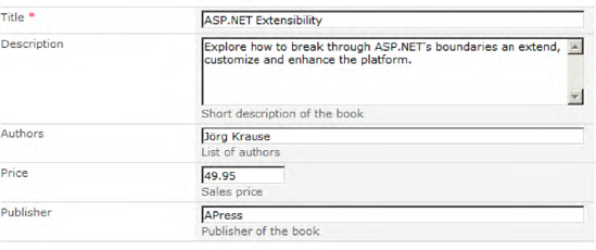
The data source for our example picker implementation is a custom SharePoint list called Books. This list has five columns: Title, Description, Authors, Price, and Publisher (see Figure 11-35).
To query your data source, build a simple manager class with static methods as shown in Listing 11-15.
Example 11.15. Implementation of BookDataManager.cs
namespace Apress.SP2010.Picker
{
    public class BookDataManager
    {

        protected static SPList BookList
        {
            get { return SPContext.Current.Web.Lists["Books"]; }
        }

        public static DataTable ValidateBook(String key)
        {
            SPQuery query = new SPQuery();
            query.Query = "<Where><Eq><FieldRef Name="Title"/>" +
                          "<Value Type="Text">{0}</Value></Eq></Where>";
            query.Query = String.Format(query.Query, key);
            return BookList.GetItems(query).GetDataTable();
        }

        public static DataTable SearchForBooks(String keyword)
        {
            SPQuery query = new SPQuery();
            query.Query = "<Where><Or><Contains><FieldRef Name="Title"/>" +
                          "<Value Type="Text">{0}</Value></Contains>" +
                          "<Contains><FieldRef Name="Authors"/>" +
                          "<Value Type="Text">{0}</Value></Contains></Or>" +
                          "</Where>";
            query.Query = String.Format(query.Query, keyword);
DataTable dt = BookList.GetItems(query).GetDataTable();
return dt;
}
public static PickerEntity ConvertFromDataRow(DataRow dataRow,
PickerEntity entity)
{
if (entity == null) entity = new PickerEntity();
entity.Key = Convert.ToString(dataRow["Title"]);
entity.DisplayText = Convert.ToString(dataRow["Title"]) + " (" +
Convert.ToString(dataRow["Authors"]) + ")";
entity.Description = Convert.ToString(dataRow["Description"]);
// Fill hashtable with item values
entity.EntityData = new Hashtable();
foreach (DataColumn dc in dataRow.Table.Columns)
{
entity.EntityData[dc.ColumnName] = dataRow[dc.ColumnName];
}
return entity;
}
}
}This class contains in the first stage three static methods and one static property. The property BookList simply returns an SPList instance of your data source. The two methods ValidateBook and SearchForBooks execute various CAML queries—ValidateBook looks for a single entry with the specified title, and SearchForBooks looks up multiple entries where the Title or Authors fields contain a specified search string.
The third method, ConvertFromDataRow, is a helper method that converts a DataRow into a PickerEntity. It also fills a Hashtable called EntityData with all columns from the data row. This method is used by several methods of the following picker classes, and therefore it makes sense to extract that functionality to a single place.
The dialog editor class inherits from the base class EntityEditorWithPicker, and is mainly responsible for the look and feel of the input text box (see Figure 11-36).
To build such a class, set the property PickerDialogType to a custom dialog type. (In Listing 11-16 we specify the type as BookPickerDialog, a class we cover in the next section.) Then override the ValidateEntity method to suit your requirements.
Example 11.16. Implementation of BookEditor.cs
namespace Apress.SP2010.Picker
{
    public class BookEditor : EntityEditorWithPicker
    {
        public BookEditor()
        {
            PickerDialogType = typeof(BookPickerDialog);
            ValidatorEnabled = true;
        }

        public override PickerEntity ValidateEntity(PickerEntity needsValidation)
        {
            DataTable tblItem = BookDataManager.ValidateBook(needsValidation.Key);
            needsValidation.IsResolved = false;
            if (tblItem != null && tblItem.Rows.Count > 0)
            {
                needsValidation = BookDataManager.ConvertFromDataRow(
                                               tblItem.Rows[0], needsValidation);
                needsValidation.IsResolved = true;
            }
            return needsValidation;
        }

    }
}
As you can see, the PickerDialogType property is set within the constructor. This property is important because the autogenerated JavaScript code in the page uses this property to open the dialog window:
function __Dialog__ctl00_PlaceHolderMain_ctl08_ctl00_bookEditor(defaultSearch)
{
    if(defaultSearch==undefined)
    defaultSearch='';
    var sDialogUrl = '/_layouts/Picker.aspx?MultiSelect=True&CustomProperty=&
            PickerDialogType=Apress.SP2010.Picker.BookPickerDialog, Apress.SP2010,
            Version=1.0.0.0, Culture=neutral,PublicKeyToken=3D4113b8ec9b28df52&
            EntitySeparator=;'
    sDialogUrl = sDialogUrl + '&DefaultSearch=' + escapeProperly(defaultSearch);
    var sFeatures='resizable: yes; status: no; scroll: no; help: no; center: yes;
            dialogWidth : 575px; dialogHeight : 500px;';

    var rv=commonShowModalDialog(sDialogUrl, sFeatures,
            CallbackWrapperctl00_PlaceHolderMain_ctl08_ctl00_bookEditor);
}
To display the picker pop-up, the fully qualified class name (including the assembly) is added as a query string parameter to the dialog picker URL (/_layouts/picker.aspx).
The dialog picker class is referenced by the property PickerDialogType of the dialog editor class mentioned previously. It is used by the code-behind implementation of the picker.aspx application page. Figure 11-37 shows an excerpt of the class Microsoft.SharePoint.ApplicationPages.Picker using .NET Reflector.

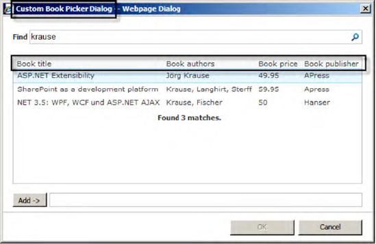
The request property PickerDialogType is resolved, and there are two checks to ensure that the class is a subclass of PickerDialog and is registered as a safe control within the web.config file. The property DialogControl is then set to a new instance of the dialog picker class (here, BookPickerDialog). For this example, the class looks like Listing 11-17.
Example 11.17. Implementation of BookPickerDialog.cs
namespace Apress.SP2010.Picker
{
    public class BookPickerDialog : PickerDialog
    {
        public BookPickerDialog() :
            base(new BookQueryControl(),new TableResultControl(), new BookEditor())
        {
this.DialogTitle = "Custom Book Picker Dialog";
this.Description = "Please select one more more books";
this.MultiSelect = true;
}
protected override void OnPreRender(EventArgs e)
{
TableResultControl resultControl = (TableResultControl)ResultControl;
ArrayList columnDisplayNames = resultControl.ColumnDisplayNames;
ArrayList columnNames = resultControl.ColumnNames;
ArrayList columnWidths = resultControl.ColumnWidths;
columnDisplayNames.Clear();
columnNames.Clear();
columnWidths.Clear();
columnDisplayNames.AddRange(new String[] {
"Book title","Book authors","Book price","Book publisher"});
columnNames.AddRange(new String[] {
"Title", "Authors", "Price", "Publisher" });
columnWidths.AddRange(new String[] { "40%", "20%", "10%", "30%" });
base.OnPreRender(e);
}
}
}Some associated objects are defined in the constructor (the picker query control, the picker result control, and the editor control). In addition to modifying several properties in the constructor, you need to override the OnPreRender method to define the columns to be displayed. You do this by setting the ColumnNames, ColumnDisplayNames, and ColumnWidths properties of the ResultControl property from the PickerDialog base class. The result is shown in Figure 11-38.
This class is referenced by the dialog picker class. It is mainly responsible for executing search queries in the picker dialog (see Figure 11-39).

There's also one special feature to mention. By default, the Find row consists of two parts: a drop-down list to select a group/category or similar, and a text field for entering search text (see Figure 11-40).
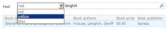
To initialize the drop-down field, override the OnLoad method:
protected override void OnLoad(EventArgs e)
{
    base.OnLoad(e);

    EnsureChildControls();
    mColumnList.Items.Clear();
    mColumnList.Items.Add("red");
    mColumnList.Items.Add("yellow");
    mColumnList.Items.Add("blue");
}
In our example in Listing 11-18, we don't use the drop-down field, and therefore we set the Visible property to false.
Example 11.18. Implementation of BookQueryControl.cs
namespace Apress.SP2010.Picker
{
    public class BookQueryControl : SimpleQueryControl
    {
        protected override void OnLoad(EventArgs e)
        {
            base.OnLoad(e);

            // Hide search drop-down
            EnsureChildControls();
            mColumnList.Visible = false;
        }


        public override PickerEntity GetEntity(DataRow entityDataRow)
        {
            if (entityDataRow == null)
                throw new ArgumentNullException("entityDataRow==null");

            PickerEntity entity = BookDataManager.ConvertFromDataRow(
                                                           entityDataRow,null);
            entity.IsResolved = true;

            return entity;
        }
protected override int IssueQuery(string search, string groupName,
int pageIndex, int pageSize)
{
DataTable dt = BookDataManager.SearchForBooks(search);
if (dt !=null && dt.Rows.Count != 0)
{
PickerDialog.Results = dt;
PickerDialog.ResultControl.PageSize = dt.Rows.Count;
return dt.Rows.Count;
}
else
{
return 0;
}
}
}
}The two main methods to override are GetEntity and IssueQuery. The GetEntity method simply converts a DataRow instance into a PickerEntity instance. The IssueQuery method executes a query with the entered search string. Also notice the groupName parameter, which contains the selected value from the drop-down list. (In our example we don't use this parameter.) After the search query returns the DataTable, this DataTable is bound to the Results property of the PickerDialog. The PageSize is set to the total count of results.
To get the custom picker to work, you have to ensure that
All classes (
BookDataManager,BookEditor,BookPickerDialog, andBookQueryControl) are properly implemented, compiled into a strongly named assembly, and installed into the GAC.The namespace of your picker classes (in our example,
Apress.SP2010.Picker) is explicitly registered as a safe control in theweb.configfile.
To register your implementation under the SafeControls section of the web.config file, add your assembly and namespace as follows:
<SafeControl Assembly="Apress.SP2010, Version=1.0.0.0, Culture=neutral,
             PublicKeyToken=xxxxxxxxxxxx" Namespace="Apress.SP2010.Picker"
             TypeName="*"
             Safe="True" />
After registering your assembly as a safe control, integrate your custom editor class into an application page:
<Apress:BookEditor runat="server" ID="bookEditor"
                   AllowTypeIn="true" MultiSelect="true" />
To test your implementation, add a submit button and a label, and write the following event handler code for your button:
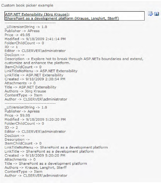
protected void OnBtnSubmit_Click(object sender, EventArgs args)
{
    lblBookPickerResult.Text = "";
    foreach (PickerEntity entity in bookEditor.ResolvedEntities)
    {
        lblBookPickerResult.Text += "---------------------------------<br>";
        foreach (object key in entity.EntityData.Keys)
        {
             lblBookPickerResult.Text +=
                             key + " -> " + entity.EntityData[key] + "<br>";
        }
    }
}
This outputs all the hashtable values of the selected PickerEntity instances into the label lblBookPickerResult, as shown in Figure 11-41.
This section describes the following controls:
A toolbar control is typically a control containing one or more buttons (see Figure 11-42). Each button, when clicked by a user, executes an action. In SharePoint, toolbars are used in many pages, generally at the top of the content area. With SharePoint 2010 and its new ribbon control, toolbars will be pushed into the background. However, you can regard ribbons as modern toolbars. Nevertheless, toolbars still make sense, and should be used to improve the user experience in custom SharePoint application pages or Web Parts. The advantage of toolbars over ribbons is their simplicity and rapid implementation. It's very easy to implement a toolbar with a few buttons compared with the effort required to do the same thing using a ribbon. In this section, toolbars are covered first.
SharePoint comes with two web user controls in the /_CONTROLTEMPLATES directory:
These two controls can be used in custom application pages if you register them at the top of your page:
<%@ Register TagPrefix="wssuc" TagName="ToolBar" src="˜/_controltemplates/ToolBar.ascx" %>
<%@ Register TagPrefix="wssuc" TagName="ToolBarButton" src="˜/_controltemplates/ToolBarButton.ascx" %>
To display a basic toolbar, simply define some buttons in it:
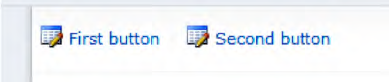
<wssuc:ToolBar runat="server" id="ToolBar" CssClass="ms-menutoolbar">
    <Template_Buttons>

       <wssuc:ToolBarButton runat="server" Text="First button"
                            NavigateUrl="/_admin/EditOutboundUrls.aspx"
                            ImageUrl="/_layouts/images/edit.gif" Padding="2px" />

       <wssuc:ToolBarButton runat="server" Text="Second button"
                            OnClick="SecondButton_Click"
                            ImageUrl="/_layouts/images/edit.gif" Padding="2px" />

    </Template_Buttons>
</wssuc:ToolBar>
The result is shown in Figure 11-43.
In our example, the NavigateUrl property of the first button is set to a URL, which after rendering results in an HTTP link. The second button uses a server-side event handler. To handle the postback event from clicking the button, implement the methods referenced in the OnClick attributes in the code-behind class:
protected void SecondButton_Click(object sender, EventArgs args)
{
   // Do something
}
SharePoint toolbars usually use ASCX user controls to direct the HTML rendering and layout. This is great if you have an ASPX page, but presents an interesting challenge when you want to create toolbars in code only.
Notice that there's no constructor for the two useful classes Toolbar and ToolbarButton in the Microsoft.SharePoint.WebControls namespace. To include a toolbar in, say, your Web Part, you need to create a control using the Page.LoadControl method, pointing to the relevant user control and casting the result. It's relatively straightforward, as Listing 11-19 demonstrates.
Example 11.19. Creating a Toolbar Programmatically
private void CreateToolbar()
{
        ToolBarButton myToolbarButton1 =
          (ToolBarButton)Page.LoadControl("˜/_controltemplates/ToolBarButton.ascx");
        myToolbarButton1.Text = "First button";
        myToolbarButton1.ImageUrl = "/_layouts/images/edit.gif";
        myToolbarButton1.NavigateUrl = "/_admin/EditOutboundUrls.aspx";

        ToolBarButton myToolbarButton2 =
          (ToolBarButton)Page.LoadControl("˜/_controltemplates/ToolBarButton.ascx");
        myToolbarButton2.Text = "Second button";
        myToolbarButton2.ImageUrl = "/_layouts/images/edit.gif";
        myToolbarButton2.Click += new EventHandler(myToolbarButton2_Click);

        ToolBar toolbar =
          (ToolBar)Page.LoadControl("˜/_controltemplates/ToolBar.ascx");
        toolbar.Buttons.Controls.Add(myToolbarButton1);
        toolbar.Buttons.Controls.Add(myToolbarButton2);

        myToolBar.Controls.Add(toolbar);
}

void myToolbarButton2_Click(object sender, EventArgs e)
{
    throw new NotImplementedException();
}
This code programmatically produces the exact toolbar shown in Figure 11-43.
As mentioned in the previous chapter, with SharePoint 2010, the already well-known ribbon interface of Microsoft Office has been ported to the Web. The ribbon interface is designed to help users quickly find the commands they need to complete a task (see Figure 11-44).
It creates a consistent user interface for working with SharePoint objects. You can extend the ribbon to add new functionality.
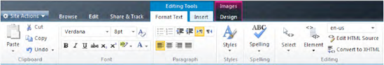
The top-level elements in the ribbon are tabs. Tabs appear across the top of the page in a SharePoint site. Each tab organizes a set of groups. These groups contain sets of controls. Each group can contain multiple controls and has a label to identify each group. The controls inside the group include buttons, drop-down menus, check boxes, combo boxes, split buttons, and galleries (see Figure 11-45). Each of these controls is tied to a unique command.

The ribbon is defined in XML in a feature manifest or a user custom action. The XML used for the ribbon defines each tab, group, and control. The Tab element contains one Groups element. Each Groups element has multiple Group elements. Inside the Group element is a single Controls element containing multiple types of controls. A sample XML snippet is shown following for all of the basic levels in the ribbon:
<Tab Id="Ribbon.Custom_Tab" Description="A new tab" Title="Custom Tab">
  <Groups Id="Ribbon.Custom_Tab.Groups">
    <Group Id="Ribbon.Custom_Tab.Custom_Group"
     Title="Custom Commands">
       <Controls Id="Ribbon.Custom_Tab.Custom_Group.Controls">
<Button
Id="Ribbon.Custom_Tab.Custom_Group.CustomCommand"
Command="CustomCommand"
Image16by16=""
Image32by32=""
Alt=""
TemplateAlias=""
LabelText="Custom Command"
... />
</Controls>
</Group>
</Groups>
</Tab>The ribbon interface, also known as the command UI, uses multiple objects to interact with the rest of the page. It requires information about the following:
Which controls are enabled/disabled
The current state of the controls
When to refresh
The ribbon communicates using the CommandDispatcher, PageManager, and PageComponent objects, among others. Each of these objects plays an important role in interacting with the ribbon. The communication is largely done on the client side—thus, all objects are implemented in JavaScript (see Figure 11-46).
The PageManager initializes all of the controls and registers the PageComponent objects for the ribbon. Exactly one instance of the PageManager lives on the page and can be accessed in JavaScript via the method SP.Ribbon.PageManager.get_instance.
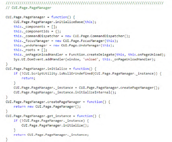
The CommandDispatcher handles all of the PageComponent objects and the commands they can handle. When a command is received on the page, the CommandDispatcher receives the command and passes it to the correct PageComponent.
A PageComponent is created in JavaScript, too, and handles commands passed by the CommandDispatcher. After the PageComponent is added to the page, you use JavaScript to create an instance of your PageComponent and register it with the PageManager. The PageComponent can then respond to the commands you defined in XML.
As you can see in Listing 11-20, the client-side class CUI.Page.PageComponent defines a kind of abstract class for further implementations.
Example 11.20. JavaScript Code for the PageComponent Class from File /_layouts/CUI.js.debug
////////////////////////////////////////////////////////////////////////////////
// CUI.Page.PageComponent

CUI.Page.PageComponent = function() {
}
CUI.Page.PageComponent.prototype = {

    init: function() {
    },
getGlobalCommands: function() {
return null;
},
getFocusedCommands: function() {
return null;
},
handleCommand: function(commandId, properties, sequence) {
return false;
},
canHandleCommand: function(commandId) {
return false;
},
isFocusable: function() {
return false;
},
receiveFocus: function() {
return false;
},
yieldFocus: function() {
return true;
},
getId: function() {
return 'PageComponent';
}
}This class also implements the JavaScript pseudointerface ICommandHandler.
CUI.Page.PageComponent.registerClass('CUI.Page.PageComponent', null,
CUI.Page.ICommandHandler);
This class needs to be implemented if you want to extend the command UI with your controls. An example implementation for a custom PageComponent class could look like Listing 11-21.
Example 11.21. Example JavaScript Implementation of a Custom PageComponent
////////////////////////////////////////////////////////////////////////////////
// SP.Ribbon.MyCustomPageComponent

SP.Ribbon.MyCustomPageComponent = function() {
     SP.Ribbon.MyCustomPageComponent.initializeBase(this);
}

/// Singleton implementation for getting only one instance
SP.Ribbon.MyCustomPageComponent.get_instance = function() {
        if (!SP.Ribbon.MyCustomPageComponent.s_instance) {
SP.Ribbon.MyCustomPageComponent.s_instance = new SP.Ribbon.MyCustomPageComponent ();}return SP.Ribbon.MyCustomPageComponent.s_instance;}SP.Ribbon.MyCustomPageComponent.prototype = { init: function() { }, getGlobalCommands: function() {return ['CommandX', 'CommandY', 'CommandZ']}, getFocusedCommands: function() { return null; }, handleCommand: function(commandId, properties, sequence) {if (commandId == 'CommandX') { alert('CommandX:' + commandId); }else if (commandId == 'CommandY') { alert(commandId); }else if (commandId == 'CommandZ') { alert('->' + commandId); }else return false;return true;}, canHandleCommand: function(commandId) {if ((commandId == 'CommandX')|| (commandId == 'CommandY')|| (commandId == 'CommandZ')) { return true; }return false;}, isFocusable: function() { return false; }, receiveFocus: function() { return false; }, yieldFocus: function() { return true; }, getId: function() {return 'MyCustomPageComponent';} } /// Register class and ensure it "inherits" from CUI.Page.PageComponent
SP.Ribbon.MyCustomPageComponent.registerClass(SP.Ribbon.MyCustomPageComponent ', CUI.Page.PageComponent);
This example implementation handles three commands: CommandX, CommandY, and CommandZ. If a matching command of the getGlobalCommands array is triggered, first the canHandleCommand method is executed to check whether this command should ever be handled. If the return value is true, then the handleCommand method is executed. In our example, an alert box is displayed.
Before a PageComponent class can be active, it must be registered by the PageManager. This is achieved with the following code:
var pageMgr = SP.Ribbon.PageManager.get_instance();
pageMgr.addPageComponent(SP.Ribbon.MyCustomPageComponent.get_instance());
Now our PageComponent (MyCustomPageComponent) is registered and able to receive the defined commands from the command UI. It is the CommandDispatcher, implemented as the class CUI.Page.CommandDispatcher in JavaScript, that receives all the commands and distributes them among the registered PageComponent instances. For a clearer understanding, look through the source code excerpt shown in Figure 11-47. As you can see, there is a local property called _registrations that contains one or more command handlers that can handle a command. Because the PageComponent class itself implements the pseudointerface ICommandHandler, it is possible to detect this interface and execute the method callCommandHandler for every registered PageComponent. This method simply invokes the handleCommand method of the PageComponent.

Warning
Elements of a ribbon (tabs, groups, controls) are only active and clickable if the appropriate command is handled by a registered PageComponent. If only the commands of the controls (e.g., buttons) are implemented, but not the commands for the enclosed tab or group of the controls, they will not fire any events. Your elements will appear to be deactivated.
The ribbon contains many types of controls. These can include simple controls, such as check boxes, buttons, and combo boxes, and also more advanced controls, such as split buttons or flyout anchors. The controls described in Table 11-7 are available in the ribbon.
Table 11.7. Available Ribbon Controls for SharePoint 2010
Control Type | Description | Image |
|---|---|---|
| A simple button used to perform an action. |  |
| A check box used to select an option. |  |
| A grid used to select colors. |  |
| A list used to select a value by clicking or typing. |  |
| A list used to select a value by clicking. |  |
| A button with a down arrow used to open a menu. |  |
| A container used to show custom pop-ups containing |  |
| A button within a |  |
| A ten-by-ten grid used to specify the dimensions of a table. |  |
| A line of text, with an optional image, used to provide information. |  |
| A container used to show pop-up menus. | 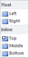 |
| A section used to divide a menu. A menu section can have a title and contain controls. |  |
A button used to execute a recently used menu action. This control uses the last action chosen from its submenu as the button action. |  | |
| A control used to insert a value by typing or using the arrow keys to cycle through the values. |  |
| A control used as both a button and a menu. |  |
| A control used to enter text. |  |
| A button used to toggle between an on and off state. |  |
The implementation of the ribbon interface is very dynamic, and the client-side JavaScript plays a large role. For example, controls such as the FlyoutAnchor or ComboBox have so-called "population properties" that begin with the prefix Populate and support generating the necessary submenus dynamically in JavaScript. These properties control how menus are loaded and displayed. An example for this is the ComboBox to select fonts shown in Figure 11-48.

This ComboBox is defined in the file /TEMPLATE/GLOBAL/XML/CMDUI.XML:
<ComboBox
    Id="Ribbon.FormatText.Font.Fonts"
    Command="FontFamilyStyleValue"
    QueryCommand="QueryFontFamily"
    AllowFreeForm="true"
    PopulateDynamically="true"
    PopulateOnlyOnce="false"
    PopulateQueryCommand="GetFontFamilyMenuXml"
    Width="75px"
    ImageArrow="/_layouts/images/Menu1.gif"
    TemplateAlias="font">
</ComboBox>
The three properties beginning with Populate determine that if a user clicks the right arrow of the ComboBox, the menu that appears will be generated on every click (PopulateOnlyOnce=false) by the JavaScript function GetFontFamilyMenuXml (PopulateQueryCommand). The implementation can be found in the file /_layouts/SP.UI.rte.debug.js:
commandHandlerRibbonGetFontFamilyMenuXml: function(commandId, properties, sequence) {ULS_SP();
    var props = properties;
    props.PopulationXML = SP.UI.Rte.FontCommands.initFontFamilyDropDownMenu();
    return true;
},
The called function, initFontSizeDropDownMenu, which in turn calls the function populateFontFamilyDropDownMenu, can also be found in the same JavaScript file (see Listing 11-22).
Example 11.22. JavaScript Functions from SP.UI.rte.debug.js
SP.UI.Rte.FontCommands.initFontFamilyDropDownMenu= function() {ULS_SP(); var sb = new Sys.StringBuilder(); SP.UI.Rte.FontCommands.populateFontFamilyDropDownMenu(sb); return sb.toString(); } SP.UI.Rte.FontCommands.populateFontFamilyDropDownMenu= function(sb) {ULS_SP(); var prefix = SP.UI.Rte.Canvas.getCurrentStyleSheetPrefix(); var prefixWithClasses = [ prefix + 'ThemeFontFace', prefix + 'FontFace' ]; var standardFontInfo = SP.UI.Rte.StyleRuleUtility.getStyleRules(prefixWithClasses[1]); var themeFontInfo = SP.UI.Rte.StyleRuleUtility.getStyleRules(prefixWithClasses[0]); var firstMenuDisplayName = null; var groupDisplayNames = [ SP.Res.themeFonts, SP.Res.fonts ]; var commands = [ 'FontFamilyThemeClass', 'FontFamilyCssClass' ]; var commandsPreview = [ 'FontFamilyThemeClassPreview', 'FontFamilyCssClassPreview' ]; var commandsRevert = [ 'FontFamilyThemeClassPreviewRevert', 'FontFamilyCssClassPreviewRevert' ]; sb.append('<Menu Id=''), sb.append('Ribbon.EditingTools.CPEditTab.Font.FontSize.Menu'), sb.append(''>'), for (var groupIndex = 0; groupIndex < groupDisplayNames.length; groupIndex++) { var infos; if (!groupIndex) { infos = themeFontInfo; }
else {
            infos = standardFontInfo;
        }
        if (!infos || !infos.length) {
            continue;
        }
        sb.append('<MenuSection Id=''),
        sb.append('msFontFamily-' + groupIndex.toString());
        sb.append('' Title=''),
        sb.append(SP.Utilities.HttpUtility.escapeXmlText(groupDisplayNames[groupIndex]));
        sb.append('' Description=''),
        sb.append('' Scrollable='false' >'),
        sb.append('<Controls>'),
        for (var i = 0; i < infos.length; i++) {
            var info = infos[i];
            var selectorText = info.rule.selectorText;
            var className = SP.UI.Rte.StyleRuleUtility.getClassNameFromSelectorText(selectorText);
            var suffix = SP.UI.Rte.StyleRuleUtility.getSuffix(selectorText, prefixWithClasses[groupIndex] + '-'),
            var displayName = SP.UI.Rte.StyleRuleUtility.getRuleDisplayName(info, suffix, 'fontFamily'),
            if (!firstMenuDisplayName) {
                firstMenuDisplayName = displayName;
            }
            sb.append('<Button id=''),
            sb.append('fseaFont-' + groupIndex.toString() + '-' + i.toString());
            sb.append('' LabelText=''),
            sb.append(SP.Utilities.HttpUtility.escapeXmlText(displayName));
            sb.append('' LabelStyle=''),
            sb.append(className);
            sb.append('' Image32by32='/_layouts/images/actionscreate.gif' Image16by16='/_layouts/images/edit.gif' MenuItemId=''),
            sb.append(SP.Utilities.HttpUtility.escapeXmlText(displayName));
            sb.append('' CommandValueId=''),
            sb.append(className);
            sb.append('' Command=''),
            sb.append(commands[groupIndex]);
            sb.append('' CommandPreview=''),
            sb.append(commandsPreview[groupIndex]);
            sb.append('' CommandRevert=''),
            sb.append(commandsRevert[groupIndex]);
            sb.append('' />'),
        }
        sb.append('</Controls>'),
        sb.append('</MenuSection>'),
    }
    sb.append('</Menu>'),
    return firstMenuDisplayName;
}
The result is returned into the property props.PopulationXML as plain XML. In the example it defines a Menu containing two MenuSection elements, each with two Button elements:
<Menu Id='Ribbon.EditingTools.CPEditTab.Font.FontSize.Menu'>
  <MenuSection Id='msFontFamily-0' Title='Theme Fonts' Description='' Scrollable='false' >
    <Controls>
      <Button id='fseaFont-0-0' LabelText='Verdana'
              LabelStyle='ms-rteThemeFontFace-1'
              Image32by32='/_layouts/images/actionscreate.gif'
              Image16by16='/_layouts/images/edit.gif'
              MenuItemId='Verdana'
              CommandValueId='ms-rteThemeFontFace-1'
              Command='FontFamilyThemeClass'
              CommandPreview='FontFamilyThemeClassPreview'
              CommandRevert='FontFamilyThemeClassPreviewRevert' />

      <Button id='fseaFont-0-1' LabelText='Arial'
              LabelStyle='ms-rteThemeFontFace-2'
              Image32by32='/_layouts/images/actionscreate.gif'
              Image16by16='/_layouts/images/edit.gif'
              MenuItemId='Arial'
              CommandValueId='ms-rteThemeFontFace-2'
              Command='FontFamilyThemeClass'
              CommandPreview='FontFamilyThemeClassPreview'
              CommandRevert='FontFamilyThemeClassPreviewRevert' />
    </Controls>
  </MenuSection>
  <MenuSection Id='msFontFamily-1' Title='Fonts' Description='' Scrollable='false' >
    <Controls>
      <Button id='fseaFont-1-0' LabelText='Tahoma' LabelStyle='ms-rteFontFace-1'
              Image32by32='/_layouts/images/actionscreate.gif'
              Image16by16='/_layouts/images/edit.gif'
              MenuItemId='Tahoma'
              CommandValueId='ms-rteFontFace-1'
              Command='FontFamilyCssClass'
              CommandPreview='FontFamilyCssClassPreview'
              CommandRevert='FontFamilyCssClassPreviewRevert' />
      <Button id='fseaFont-1-1' LabelText='Courier' LabelStyle='ms-rteFontFace-2'
              Image32by32='/_layouts/images/actionscreate.gif'
              Image16by16='/_layouts/images/edit.gif'
              MenuItemId='Courier'
              CommandValueId='ms-rteFontFace-2'
              Command='FontFamilyCssClass'
              CommandPreview='FontFamilyCssClassPreview'
              CommandRevert='FontFamilyCssClassPreviewRevert' />
    </Controls>
  </MenuSection>
</Menu>
As you can see, there are new, very flexible concepts introduced with the new command UI ribbon interface. The idea of separation between the UI definition and its implementation is obvious. But for real developers, this doesn't necessarily make things easier, because we are now faced with two worlds: the new client-side JavaScript world and the old, familiar world of server-side code. To facilitate the beginning of ribbon development, the next section outlines a practical way to integrate the ribbon UI interface in your own application pages.
As you've learned already in Chapter 10, you can easily customize the existing ribbon interface by adding, removing, or hiding various ribbon controls. This can be done using XML and JavaScript. The XML defines the controls on the ribbon and the JavaScript performs actions on the page or object. You can, for example, create buttons and use JavaScript to implement your own handlers.
When customizing the ribbon, you can add, replace, and remove controls, groups, and tabs. Customizations to the ribbon are defined using a custom action in a feature, and can be deployed in a solution package (WSP file). Ribbon customizations can be scoped to a particular list type via the RegistrationId and RegistrationType attributes. Customizations can also be scoped to a site or a particular web through the Scope attribute in the feature.xml file.
In this section we use the ribbon interface to extend the user experience of our custom application pages. We want to use ribbons as a contemporary replacement for toolbars. Step by step we will develop a modern ribbon interface and demonstrate how to use both client-side and server-side event handlers to process user actions.
The steps to building your own custom ribbon in an application page are as follows:
Create a feature with a ribbon definition.
Create an application page and render the ribbon.
Create client-side JavaScript code for a
PageHandler.Implement event handlers (client side and server side).
To provide a custom ribbon in your application pages, you have to define it in an element manifest file within a feature. Such a feature.xml file follows:
<?xml version="1.0" encoding="utf-8" ?>
<Feature
  Id="7F762A93-2205-499B-84E3-125423D86E32"
  Title="Provides a ribbon"
  Description="Feature that provides a ribbon definition"
  Scope="Site"
  xmlns="http://schemas.microsoft.com/sharepoint/">
  <ElementManifests>
    <ElementManifest Location="MyCustomRibbon.xml" />
  </ElementManifests>
</Feature>
This feature references the file MyCustomRibbon.xml which describes the ribbon and all of its elements (tabs, groups, and controls; see Listing 11-23).
Example 11.23. MyCustomRibbon.xml Defines a Tab and a Group Containing a Button Control
<Elements xmlns="http://schemas.microsoft.com/sharepoint/">

  <CustomAction
                Id="Ribbon.CustomTab.CA"
Location="CommandUI.Ribbon.Tabs._children"
Sequence="100"
Title="My Custom Tab">
<CommandUIExtension>
<CommandUIDefinitions>
<CommandUIDefinition>
<Tab Id="Ribbon.Tabs.MyCustomTab" Sequence="200" Command="MyCustomTab"
Description="desc" Title="My Custom Actions">
<Scaling Id="Ribbon.Tabs.MyCustomTab.Scaling">
<MaxSize Id="Ribbon.Tabs.MyCustomTab.maxsize"
GroupId="Ribbon.Tabs.MyCustomTab.Actions"
Sequence="20" Size="LargeLarge" />
</Scaling>
<Groups Id="Ribbon.Tabs.MyCustomTab.Groups">
<Group Id="Ribbon.Tabs.MyCustomTab.Actions"
Command="MyCustomTabActions"
Sequence="10"
Description=""
Title="Group X"
Template="Ribbon.Templates.Flexible2">
<Controls Id="Ribbon.Tabs.MyCustomTab.Actions.Ctrls">
<Button Id="Ribbon.Tabs.MyCustomTab.Actions.Save"
Command="MyCustomSave"
Image16by16="/_layouts/images/formatmap16x16.png"
Image16by16Class="formatmap16x16_rbsavehs"
Image32by32="/_layouts/images/formatmap32x32.png"
Image32by32Class="formatmap32x32_rbsavehh"
LabelText="My Save" Alt="My Safe Tooltip" TemplateAlias="o1"
/>
</Controls>
</Group>
</Groups>
</Tab>
</CommandUIDefinition>
</CommandUIDefinitions>
</CommandUIExtension>
</CustomAction>
</Elements>After deploying the preceding feature, create an application page in which you can render the defined ribbon tab. The necessary code-behind C# code is very simple, as Listing 11-24 shows.
Example 11.24. Overriding the OnPreRender Method to Show the Ribbon
protected override void OnPreRender(EventArgs e)
{
    SPRibbon current = SPRibbon.GetCurrent(this);
    if (current != null)
{
current.CommandUIVisible = true;
current.MakeTabAvailable("Ribbon.Tabs.MyCustomTab");
current.InitialTabId = "Ribbon.Tabs.MyCustomTab";
current.Minimized = false;
current.Visible = true;
current.ServerRendered = true;
}
base.OnPreRender(e);
}The preceding code gets the current ribbon (SPRibbon.GetCurrent(this)), which automatically exists because it has previously been defined in the associated master page.
The property CommandUIVisible shows or hides the ribbon section at the top of the application page. For example, if you have an application page that doesn't need a ribbon, you can hide the ribbon section to increase the space for your content. By using an ID parameter, the MakeTabAvailable method ensures that a tab will be available for the current page. If you need more than one tab, call this method for each required tab. To ensure that our single tab is displayed at page load, set the InitialTabId property to the ID of a tab that you've already defined via the MakeTabAvailable method.
To correctly render the ribbon, as shown in Figure 11-49, set three more properties: set Minimized to false, Visible to true, and ServerRendered to true.

When testing your application page, you will find that the button cannot be clicked. It seems to be disabled. The problem is that there's no way to set an enabled/disabled property for this button. At this point—if not earlier—you'll need a deeper understanding of how the ribbon implementation works.
Recall the explanation of the client-side PageComponent a few paragraphs earlier. To enable our button we have to implement a PageComponent class in JavaScript that is responsible for the ribbon tab group and handles the commands of all the elements. But instead of hard-coding all the commands in JavaScript, we use a combination of client- and server-side code (see Listing 11-25).
Example 11.25. Enabling Custom Commands on the Ribbon
protected override void OnPreRender(EventArgs e)
{
    SPRibbon current = SPRibbon.GetCurrent(this);
    if (current != null)
    {
        current.CommandUIVisible = true;
        current.MakeTabAvailable("Ribbon.Tabs.MyCustomTab");
        current.InitialTabId = "Ribbon.Tabs.MyCustomTab";
current.Minimized = false;
current.Visible = true;
current.ServerRendered = true;
SPRibbonScriptManager manager = new SPRibbonScriptManager();
List<IRibbonCommand> commands = new List<IRibbonCommand>();
commands.Add(new SPRibbonCommand("MyCustomTab", ""));
commands.Add(new SPRibbonCommand("MyCustomTabActions", ""));
commands.Add(new SPRibbonCommand("MyCustomSave", "alert(commandId)"));
manager.RegisterGetCommandsFunction(this, "getGlobalCommands", commands);
manager.RegisterCommandEnabledFunction(this, "commandEnabled", commands);
manager.RegisterHandleCommandFunction(this, "handleCommand", commands);
String script = "<script type="text/javascript" defer="true"> //
<![CDATA[
function InitPageComponent() {
SP.Ribbon.UsageReportPageComponent.initialize(); }
ExecuteOrDelayUntilScriptLoaded(InitPageComponent, "SP.Ribbon.js");
//]]
</script>";
this.Page.ClientScript.RegisterClientScriptBlock(this.GetType(),
"InitPageComponent", script, false);
}
base.OnPreRender(e);
}In this extended code version, we create an instance of SPRibbonScriptManager that offers some very useful register methods. Initially, we traverse our CommandID chain (the tab command equals MyCustomTab, the group command equals MyCustomTabActions, and the button command equals MyCustomSave) and add a new SPRibbonCommand instance for each CommandID. Then we register these commands with all three registration methods of the SPRibbonScriptManager. The JavaScript output of those methods is shown in Figure 11-50.
The last thing to do is assign a PageComponent. To do this, we can use an existing PageComponent implementation of the UsageReportPage for our example. The registered script block (InitPageComponent) is also shown in Figure 11-50.
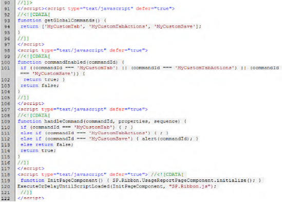
This JavaScript code becomes clear if you look at the PageComponent implementation that uses our generated functions to detect which commands should be handled and how (see Listing 11-26).
Example 11.26. Extracting from UsageRibbonPageComponent in File SP.Ribbon.js
...
   getGlobalCommands: function() {ULS_SP();
        return getGlobalCommands();
    },

    canHandleCommand: function(commandId) {ULS_SP();
        return commandEnabled(commandId);
    },

    handleCommand: function(commandId, properties, sequence) {ULS_SP();
        return handleCommand(commandId, properties, sequence);
    }
...
After executing the application page with the new code enhancements, our button is enabled, and thus clickable. After clicking the button, internally the PageComponent validates via the commandEnabled function if the command (MyCustomSave) is valid. It then executes handleCommand, which displays an alert box containing the command ID, as shown in Figure 11-51.
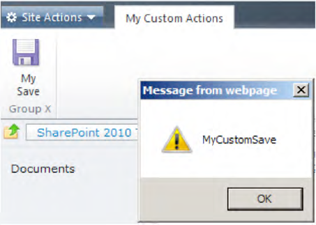
Although it is possible to use the UsageRibbonPageComponent that already exists in the built-in script file SP.Ribbon.js, this is not recommended. The reason for this is because the implementation could be changed with the next SharePoint update. Instead, you should create your own custom PageComponent implementation, as shown in Listing 11-27.
Example 11.27. Custom PageComponent Implementation in File SP.UI.MyCustomRibbon.debug.js
Type.registerNamespace('MyCustom.Ribbon'),

////////////////////////////////////////////////////////////////////////////////
// MyCustom.Ribbon.RibbonComponent

MyCustom.Ribbon.RibbonComponent = function() {
    MyCustom.Ribbon.RibbonComponent.initializeBase(this);
}

    MyCustom.Ribbon.RibbonComponent.get_instance = function() {
        if (!MyCustom.Ribbon.RibbonComponent.s_instance) {
            MyCustom.Ribbon.RibbonComponent.s_instance =
                 new MyCustom.Ribbon.RibbonComponent();
        }
        return MyCustom.Ribbon.RibbonComponent.s_instance;
    }

    MyCustom.Ribbon.RibbonComponent.prototype = {
        focusedCommands: null,
globalCommands: null,
registerWithPageManager: function() {
SP.Ribbon.PageManager.get_instance().addPageComponent(this);
SP.Ribbon.PageManager.get_instance().get_focusManager().requestFocusForComponent(this);
},
unregisterWithPageManager: function() {
SP.Ribbon.PageManager.get_instance().removePageComponent(this);
},
init: function() {
},
getFocusedCommands: function() {
return [];
},
getGlobalCommands: function() {
return getGlobalCommands();
},
canHandleCommand: function(commandId) {
return commandEnabled(commandId);
},
handleCommand: function(commandId, properties, sequence) {
return handleCommand(commandId, properties, sequence);
},
isFocusable: function() {
return true;
},
receiveFocus: function() {
return true;
},
yieldFocus: function() {
return true;
}
}
////////////////////////////////////////////////////////////////////////////////
MyCustom.Ribbon.RibbonComponent.registerClass('MyCustom.Ribbon.RibbonComponent', CUI.Page.PageComponent);
NotifyScriptLoadedAndExecuteWaitingJobs("sp.ui.mycustomribbon.debug.js");To embed your own PageComponent implementation, you need to change the code of the PreRender method (see Listing 11-28). Add the script link to your custom JavaScript code file (SP.UI.MyCustomRibbon.debug.js), which has to be stored relative to the LAYOUTS folder. Also, ensure that the CUI.js and SP.Ribbon.js script files are registered. The function InitPageComponent must be executed after the custom script file is loaded. Within this function, retrieve the singleton instance of this PageComponent and call the function registerWithPageManager to register the PageComponent at the PageManager.
Example 11.28. Extended OnPreRender Method for Using a Custom PageComponent
...
manager.RegisterGetCommandsFunction(this, "getGlobalCommands", commands);
manager.RegisterCommandEnabledFunction(this, "commandEnabled", commands);
manager.RegisterHandleCommandFunction(this, "handleCommand", commands);

ScriptLink.RegisterScriptAfterUI(this.Page, "CUI.js", false, true);
ScriptLink.RegisterScriptAfterUI(this.Page, "SP.Ribbon.js", false, true);
ScriptLink.RegisterScriptAfterUI(this.Page, "SP.UI.MyCustomRibbon.debug.js", false,
                                  true);

String script = "<script type="text/javascript" defer="true"> //<![CDATA[

                             function InitPageComponent() {
                             MyCustom.Ribbon.RibbonComponent.
                             get_instance().registerWithPageManager()}

ExecuteOrDelayUntilScriptLoaded(InitPageComponent,
                               "SP.UI.MyCustomRibbon.debug.js");
 //]]
</script>";

this.Page.ClientScript.RegisterClientScriptBlock(this.GetType(),"InitPageComponent",
                                                  script, false);
...
As you see, it's not trivial, but it is feasible to integrate your own page component.
You may have already asked yourself how it would be possible to handle click events on the server side instead of the client side. If you understand the complex examples of the last two subsections, this should be a very simple exercise.
Just replace the following line in the PreRender method with the second one, and the SPRibbonPostBackCommand will do everything you need (see Figure 11-52).
commands.Add(new SPRibbonCommand("MyCustomSave", "alert(commandId)"));
commands.Add(new SPRibbonPostBackCommand("MyCustomSave", this));
In the JavaScript code that is automatically generated, the command MyCustomSave executes the __doPostBack function, which causes a postback of the current page. To handle this postback event, you have to implement the interface IPostBackEvent and the corresponding method RaisePostBackEvent, as shown in Listing 11-29.
Example 11.29. Postback Handler Implementation for Ribbon Postbacks
void IPostBackEventHandler.RaisePostBackEvent(string eventArgument)
{
        SPRibbonPostBackEvent event2 =
                 SPRibbonPostBackCommand.DeserializePostBackEvent(eventArgument);
        if (event2 != null) {
            Response.Write("-->" + event2.Id + " -> " + event2.Arguments);
        }
}
Finally, after a postback, you have to deserialize the event arguments before you can use them. The output, after clicking the button, looks like Figure 11-53.

In this section, two important SharePoint web controls used to display list data are covered:
The
SPGridViewcontrolThe JS Grid control
Both controls provide powerful functionality to deal with list data, but both also come with incredible complexity. This section explains how to use the controls in your own application pages or Web Parts.
One of the most complex SharePoint web controls is the SPGridView control. Many developers fear it because of its complexity and lack of good documentation. In this section you'll get a practical introduction to this web control and some good reproducible examples of customizing this control for your own needs.
When you create custom application pages, you often need to display data from SharePoint list items in a grid consisting of rows and columns. One way to do that is to build an HTML table programmatically. Although this is the easiest and fastest approach for displaying data, it offers only very limited functionality. For example implementing filtering, sorting, or paging isn't possible with a pure HTML table.
With ASP.NET, the recommended approach for displaying a grid is to use the GridView control introduced with ASP.NET 2.0. SharePoint Foundation offers a grid control named SPGridView that inherits from the ASP.NET GridView control and provides a good alternative for displaying grid data in SharePoint application pages or Web Parts.
One significant advantage of the SPGridView control is that it automatically supports the SharePoint stylesheets, and you don't need to worry about the look and feel of your grid. The SPGridView control is widely used in standard application pages and Web Parts that are built into SharePoint Foundation. That means that your custom solutions can have the same look and feel as other aspects of the standard SharePoint user interface.
Let's look at some examples of how to use the control. Keep the following steps in mind:
Add a
Registerdirective to your application page.Add an
SPGridViewtag to your application page.Define bound fields for your grid.
Retrieve data and bind it to the
DataSourceproperty of theSPGridView.
Warning
The SPGridView control does not support the automatic generation of columns. You always have to set the property AutoGenerateColumns to false and explicitly bind your columns using SPBoundField. Otherwise you will receive an exception.
In this first example, we query a SharePoint list named Books and display all the items in an SPGridView control (see Figure 11-54).
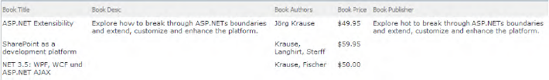
In the code-behind class of our application page, we define the model class Book that is later bound to the SPGridView. The class contains five properties and a constructor, as shown in Listing 11-30.
Example 11.30. Example Class Book with Five Properties and a Constructor
public class Book
{
    public Book(String title, String desc, String authors, double price,
                String publisher)
    {
        this.Title = title;
        this.Description = desc;
this.Authors = authors;
this.Price = price;
this.Publisher = publisher;
}
public String Title { get; set; }
public String Description { get; set; }
public String Authors { get; set; }
public double Price { get; set; }
public String Publisher { get; set; }
}Next, we query the data from a SharePoint list and populate the Book instances, as shown in Listing 11-13.
Example 11.31. Querying the SharePoint Books List and Returning the Values as Instances of Type Book
/// <summary>
/// Query all books and convert the list item properties to the book object
/// </summary>
protected List<Book> GetAllBooks()
{
    List<Book> allBooks = new List<Book>();
    using (SPWeb web = SPContext.Current.Web)
    {
        foreach (SPListItem li in web.Lists["Books"].GetItems(new SPQuery())) {
            Book b = new Book(
                Convert.ToString(li["Title"]),
                Convert.ToString(li["Description"]),
                Convert.ToString(li["Authors"]),
                Convert.ToDouble(li["Price"]),
                Convert.ToString(li["Publisher"])
                );
            allBooks.Add(b);
        }
    }
    return allBooks;
}
You can now bind the list of Book objects to the SPGridView during the page load:
protected void Page_Load(object sender, EventArgs e)
{
    myGrid.DataSource = GetAllBooks();
    myGrid.DataBind();
}
So far it is straightforward. To display the properties of the Book instances, define bound fields with at least two properties: HeaderText and DataField. The HeaderText property contains the column title, and the DataField property contains the name of the property to display from the bound data source (in this case, Book; see Listing 11-32).
Example 11.32. Application Page Containing an SPGridView with Bound Column Definitions
<%@ Page Language="C#" AutoEventWireup="true" DynamicMasterPageFile="˜masterurl/default.master"
    CodeFile="GridViewExample.aspx.cs" Inherits="GridViewExample" MasterPageFile="v4.master"
    CodeFileBaseClass="Microsoft.SharePoint.WebControls.LayoutsPageBase" %>

<%@ Register Tagprefix="SharePoint" Namespace="Microsoft.SharePoint.WebControls"
    Assembly="Microsoft.SharePoint, Version=14.0.0.0, Culture=neutral, PublicKeyToken=71e9bce111e9429c" %>

<asp:Content ContentPlaceHolderId="PlaceHolderMain" runat="server">

    <SharePoint:SPGridView runat="server" ID="myGrid" AutoGenerateColumns="false">
        <Columns>
            <asp:BoundField HeaderText="Book Title" DataField="Title" />
            <asp:BoundField HeaderText="Book Desc" DataField="Description" />
            <asp:BoundField HeaderText="Book Authors" DataField="Authors" />
            <asp:BoundField HeaderText="Book Price" DataField="Price"
                            DataFormatString="{0:c}" />
            <asp:BoundField HeaderText="Book Publisher" DataField="Publisher" />
        </Columns>
    </SharePoint:SPGridView>

</asp:Content>The preceding example is rather cumbersome—it requires an object model to be built and the list items to be converted. But there is a much easier approach—the SharePoint SPListItemCollection object can return DataTable instances. The complete code-behind implementation can now be done in only two lines and without the need for a separate object model and its conversion methods:
protected void Page_Load(object sender, EventArgs e)
    {
        myGrid.DataSource =  SPContext.Current.Web.Lists["Books"].GetItems(
                             new SPQuery()).GetDataTable();
        myGrid.DataBind();
    }
The SPList.GetItems method takes an SPQuery object, which defines the CAML query to run against the SharePoint list. Instead of querying only one list, you can use the SPWeb.GetSiteData method, which takes an SPSiteDataQuery parameter. With such site queries, it is possible to query several lists in one call. Imagine you wish to display the latest documents (say, modified within the last seven days) across multiple document libraries in one grid view (see Listing 11-33).
Example 11.33. SPSiteDataQuery Example for All Documents in All Document Libraries Modified Within the Last Seven Days
SPSiteDataQuery Query = new SPSiteDataQuery();
String str7DaysBackDateTime = (DateTime.Now.Add(
        new TimeSpan(-7, 0, 0, 0, 0))).ToString("yyyy-MM-ddThh:mm:ssZ");
string strQuery = String.Format("<Where><Gt><FieldRef Name="Modified" />"
+"<Value Type="DateTime">{0}</Value></Gt></Where>"
+"<OrderBy><FieldRef Ascending="FALSE" Name="Modified"/></OrderBy>",
str7DaysBackDateTime);
Query.Query = strQuery;
Query.RowLimit = 25;
StringBuilder sb = new StringBuilder();
sb.Append("<Lists>");
foreach (SPList list in web.Lists)
{
if (list.BaseType == SPBaseType.DocumentLibrary)
{
sb.Append("<List ID="" + list.ID.ToString() + ""/>");
}
}
sb.Append("</Lists>");
Query.Lists = sb.ToString(); // the lists on which you want your query to run
DataTable dt = web.GetSiteData(Query);The previously presented grid view implementation is static and does not allow any user interaction. The default interactions of grids or tables are simple hyperlinks that can easily be constructed, for example, by using the asp:HyperLink field. SharePoint offers an enhanced method to expose several actions on single items within the SPGridView: the SPMenuField. A per-item menu could look like Figure 11-55.

You construct such a menu by adding a menu definition (consisting of MenuTemplate and MenuItemTemplate; see Listing 11-34) and using an SPMenuField within the SPGridView that references a menu definition (see Listing 11-35).
Example 11.34. Declarative Menu Definition
<SharePoint:MenuTemplate runat="server" ID="myMenu">
    <SharePoint:MenuItemTemplate ID="mit1" runat="server"
         Text="First menu item" ImageUrl="/_layouts/images/ICDOC.gif"
         ClientOnClickNavigateUrl="page.aspx?ID=%MYID%&title=%NAME%" />

    <SharePoint:MenuItemTemplate ID="mit2" runat="server"
Text="Second menu item" ImageUrl="/_layouts/images/ICWM.gif"
ClientOnClickNavigateUrl="page2.aspx?ID=%MYID%&title=%NAME%" />
</SharePoint:MenuTemplate>Example 11.35. Declarative SPGridView Definition with SPMenuField
<SharePoint:SPGridView runat="server" ID="myGrid" AutoGenerateColumns="false">
    <Columns>
        <SharePoint:SPMenuField HeaderText="Book Title" TextFields="Title"
                                MenuTemplateId="myMenu"
                                TokenNameAndValueFields="MYID=ID,NAME=Title" />
        <asp:BoundField HeaderText="Book Desc" DataField="Description" />
        <asp:BoundField HeaderText="Book Authors" DataField="Authors" />
        <asp:BoundField HeaderText="Book Price" DataField="Price"
                        DataFormatString="{0:c}" />
        <asp:BoundField HeaderText="Book Publisher" DataField="Publisher" />
    </Columns>
</SharePoint:SPGridView>
The most interesting part here is the token syntax that is passed to the menu items. In our example, the token MYID is assigned to the ID property of the data column, and the token NAME is assigned to the Title property. These two tokens can be used, encapsulated in percent signs, in the ClientOnClickNavigateUrl of the MenuItemTemplate. A click on the second list item (which has an ID of 2) calls the link: page.aspx?ID=2&title=SharePoint as a development Platform.
Tip
If you need to add different menu items to your list items (e.g., for different content types), you can change the bound fields programmatically for every row, by using the event onRowDataBound. With this event you get access to the current row instance, and you are able to modify the controls bound to this row. By casting, for example, a menu control with (Microsoft.SharePoint.WebControls.Menu) e.Row.Cells[n].Controls[n], you get access to the menu properties, such as HiddenMenuItems, where you can hide menu items that should not be displayed for this row.
A modern grid view in SharePoint needs to be able to sort and filter the columns. Fortunately, this nontrivial functionality is built in, so it's very easy to implement.
There are three steps to enable sorting:
Set the
SPGridViewpropertyAllowSortingtotrue.Implement the
SPGridVieweventOnSorting.Add a
SortExpressionto every bound column.
The following code shows the declarative implementation of the three steps:
<SharePoint:SPGridView runat="server" ID="myGrid"
AutoGenerateColumns="false"AllowSorting="true"OnSorting="myGrid_Sorting"><Columns> <SharePoint:SPMenuField HeaderText="Book Title"SortExpression="Title"TextFields="Title" MenuTemplateId="myMenu" TokenNameAndValueFields="MYID=ID,NAME=Title" /> <asp:BoundField HeaderText="Book Desc"SortExpression="Description"DataField="Description" /> ...
The sorting itself has to be implemented programmatically in the method myGrid_Sorting. To understand what's happening under the hood, you need to be familiar with the DataTable and DataView classes. The DataView class can be customized to present a subset of data from a DataTable. This allows you to have more than one control bound to the same data table. Hence, you can bind different views of the data table to several web controls. Imagine you bind a DataTable to the DataSource property of an SPGridView like this:
myGrid.DataSource = myDataTable
This is what happens under the covers:
myGrid.DataSource = myDataTable.DefaultView
The SPGridView binds to the DataTable.DefaultView property, which returns all columns and rows in your table with a DataRowState equal to CurrentRows. Remember, we merely wish to implement basic sorting for our columns. As you can see in Listing 11-36, we need the DataView.Sort property to make use of the built-in sorting methods. This property takes an SQL-like sort expression and, in our example, the value of the SortExpression property of the bound fields.
Example 11.36. Custom Sorting Implementation Using DataView
protected void myGrid_Sorting(object sender, GridViewSortEventArgs e)
{
    string lastExpression = "";
    if (ViewState["SortExpression"] != null)
        lastExpression = ViewState["SortExpression"].ToString();

    string lastDirection = "asc";
    if (ViewState["SortDirection"] != null)
        lastDirection = ViewState["SortDirection"].ToString();

    string newDirection = "asc";
    if (e.SortExpression == lastExpression)
        newDirection = (lastDirection == "asc") ? "desc" : "asc";

    ViewState["SortExpression"] = e.SortExpression;
    ViewState["SortDirection"] = newDirection;

    ((DataTable)myGrid.DataSource).DefaultView.Sort =
                                       e.SortExpression + " " + newDirection;
    myGrid.DataBind();
}
In this listing, the SortExpression is saved into the view state and the SortDirection (either ascending or descending) is calculated. Then the new SortExpression is set to the Sort property of the DefaultView of the DataTable. Figure 11-56 shows the sorting arrow of the first column, Book Title.

The next step is to integrate filtering capabilities. Unfortunately, filtering is not as easy as it seems, and can be a very frustrating issue. To enable filtering you have to follow these steps:
Set the
SPGridViewpropertyAllowFilteringtotrue.Define a
DataSourcedeclaratively and set theDataSourceIDproperty.Set additional
SPGridViewproperties:FilterDataFields,FilteredDataSourcePropertyName, andFilteredDataSourcePropertyFormat.
<SharePoint:SPGridView runat="server" ID="myGrid"
        AutoGenerateColumns="false"
        AllowSorting="true"
        AllowFiltering="true"
        FilterDataFields="Title„Authors„Publisher"
        DataSourceID="linqDS"
        FilteredDataSourcePropertyName="Where"
        FilteredDataSourcePropertyFormat='{1} == "{0}"'
>...
The property FilterDataFields specifies to the SPGridView which columns filtering should be enabled on. This is a comma-separated string of column names. In our example, we want to filter for Title, Authors, and Publisher, but not Description or Price, so we leave the unwanted fields empty.
The next step is to declaratively define a data source and assign the DataSourceID property to it. In this example we use a LINQ data source:
<asp:LinqDataSource runat="server"
             ID="linqDS"
             OnSelecting="linqDS_Selecting"  />
The implementation of this data source is relatively easy. We simply query all the list items and return them in the LINQ syntax (see Listing 11-37).
Example 11.37. Implemenation of a LINQ Data Source
protected void linqDS_Selecting(object sender, LinqDataSourceSelectEventArgs e)
{
    SPList list = SPContext.Current.Web.Lists["Books"];
    IEnumerable<SPListItem> books =
list.GetItems(new SPQuery()).OfType<SPListItem>();
e.Result = from book in books
select new
{
ID = book.ID,
Title = Convert.ToString(book["Title"]),
Description = Convert.ToString(book["Description"]),
Authors = Convert.ToString(book["Authors"]),
Price = Convert.ToDouble(book["Price"]),
Publisher = Convert.ToString(book["Publisher"])
};
}The values of the filter properties (FilteredDataSourcePropertyName and FilteredDataSourcePropertyFormat) depend on the data source. Usually, a data source has a property for a filter string that is used by executing queries. For example, the ObjectDataSource has a property called FilterExpression, and for our LinqDataSource the property is called Where (see Figure 11-57). The format of the property contains two tokens ({0} and {1}) that are both automatically replaced by the column name ({1}) and the filter value ({0}).
The result of this very simple implementation is a grid that can be sorted and filtered with only a few lines of code, as shown in Figure 11-58.
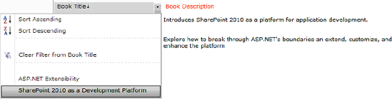
The JS Grid control is new in SharePoint 2010. It allows Excel-like editing and rendering of tabular data, and replaces the ActiveX-based datasheet of Windows SharePoint Services 3.0 with a richer, more extensible UI. It also supports the Access Services grid and offers a Gantt chart view, familiar to users of Microsoft Project (see Figure 11-59).
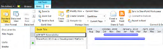
From a technical perspective, the JS Grid control is a grid manager component hosting one or two panes. The grid pane is the pane that renders tabular data. The Gantt pane is the surface on which charts are rendered.
The grid is extensible and offers developers a rich environment in which to create interactive and responsive applications in a browser. Developers can create a control that behaves more like one in a desktop application. The client-side rendering provides the user more immediate feedback because a round trip to the server is not required.
The JS Grid control offers a broad variety of functions similar to a desktop application. The following features are supported:
First of all, the JS Grid control supports the default copy and paste operations, as well as undo and redo. The undo/redo functionality is implemented as a multilevel operation, which means that changes are stored in a stack with up to 20 levels of undo/redo.
Even more complex operations such as fill-down (better known from Excel; Ctrl+U) and exporting data to Excel are supported. If paged data is exported, the JS Grid control requests all pages of data from the server to send to the client. The update status indicator displays the message "Preparing data for export." When all the data is in memory, the control automatically transforms the datasheet into spreadsheet XML.
Another important feature is asynchronous validation. Errors from the server need to be displayed to the user so that the user can correct them. Because dynamic grid implementations use asynchronous updates, the reporting of errors can be complicated. For instance, the user can make a change that is invalid and scroll that change out of view before the server returns an error. Or the user can make several invalid changes (through fill-down or copy/paste operations) that each need separate attention. In the JS Grid control errors are highlighted with red exclamation mark icons. The error message is displayed if the user clicks the icon (see Figure 11-60).

The JS Grid control supports data validation by using a widget framework and infrastructure. Widgets can be complex controls that can be built by developers with their own icons and click actions. Some built-in widgets include
Date picker
People picker
Edit control
When working with the JS Grid control, the precedence of edit mode is important to understand. The default order of precedence is cell, row, column, and then the grid itself. That means the user can type directly in a grid cell if the edit mode of the cell permits. The EditMode enumeration specifies whether the cells contained in a grid should allow editing. The enumeration values are as follows:
ReadOnlyReadWriteReadOnlyDeferReadWriteDeferDefer
To use the JS Grid control in your custom pages or controls, you must write a new controller. The controller tells the grid how to render content (i.e., which panes or columns to display). The controller enables the data source and controller to understand how to handle unrelated rows, allowing edits to occur without having all the data.
Note
Implementing a JS Grid control in your own application pages or Web Parts is possible, but not necessarily recommended. At the time of writing this chapter, the functionality is poorly documented, and although it is possible to write custom JavaScript grid controller classes, it seems to be a very complex and error-prone endeavor. In particular, if you want to use editing, sorting, filtering, and paging functionalities, you will have to implement a large amount of JavaScript code to handle this.
Despite this, anyone who wishes to explore this grid implementation deeply should not be discouraged. Soon there will be many interesting blog articles with very clever solutions describing how to use the JS Grid in your own application pages and Web Parts.
Perhaps with the next edition of this book you will also find new examples using the JS Grid control in this section.
In this example, the JS Grid control is used to display data from a data source. Integrating the JS Grid control to display read-only data from a data table is not very complicated. Just follow these steps:
Embed the grid control either by adding a
<SharePoint:JSGrid>tag to your application page or user control, or by creating a new instance programmatically.Implement a JavaScript grid controller class for your grid.
Implement server-side code to feed the
GridSerializerwith the necessary data (data table, data columns, data fields).Set grid properties, such as
JSControllerClassName, and bind theGridSerializerto the grid.
To embed the JS Grid control, add the following line to your application page:
<SharePoint:JSGrid ID="myGrid" runat="server" />
Then implement a basic grid controller class with JavaScript:
Type.registerNamespace("MyGridManager");
MyGridManager = function() {
     this.Init = function(jsGridControl, initialData, props) {
         var dataSource = new SP.JsGrid.StaticDataSource(initialData);
         var jsGridParams = dataSource.InitJsGridParams();
         jsGridControl.Init(jsGridParams);
     }
};
The only thing this minimal controller implementation does is initialize the grid control with the data source and additional parameters.
Now let's turn to the server side. The next step is to provide all the mandatory parameters for the GridSerializer. The code for the Page_Load method looks like Listing 11-38.
Example 11.38. Example for Displaying a JS Grid Control in an Application Page
protected void Page_Load(object sender, EventArgs e)
{
    DataTable dataTable = GetBookDataTable();
    SerializeMode serializeMode = SerializeMode.Full;
    String keyColumnName = "ID";
    FieldOrderCollection sortedColumns = new FieldOrderCollection(
                                             new String[] { "Title" });
    IEnumerable<GridField> gridFields = GetGridFields(dataTable);
    IEnumerable<GridColumn> gridColumns = GetGridColumns(dataTable);

    // Create a grid serializer to connect to data
    GridSerializer gds = new GridSerializer(serializeMode, dataTable,
        keyColumnName, sortedColumns, gridFields, gridColumns);

    // Point this at the grid serializer data
    myGrid.GridDataSerializer = gds;

    // Tell the grid which JavaScript controller it should listen to
    myGrid.JSControllerClassName = "MyGridManager";
}
As you can see, the GridSerializer needs six properties for the grid to display data. These properties are explained in Table 11-8.
Table 11.8. Constructor Parameters for Microsoft.SharePoint.JSGrid.GridSerializer
Parameter | Type | Description |
|---|---|---|
|
| The type of data serialization (e.g., |
|
| An instance of |
|
| A column with a unique key as the identifier (e.g., ID) |
|
| Names of columns to be sorted by |
|
| Field definitions for grid fields |
|
| Column definitions for grid columns |
You start by querying the data and storing it in a DataTable instance. For the example, use the SharePoint list Books, as shown in Figure 11-61.
To query the data, you can use the SPList.GetItems.GetDataTable method. The disadvantage of this is that if your SPQuery parameter doesn't limit the view fields, you get all fields back. When displaying in a grid, you have to filter out the unwanted fields. To overcome this, use a LINQ query and convert the result to a DataTable instance (see Listing 11-39). For this conversion, a separate extension method called Linq2DataTable is provided (see Listing 11-40).
Example 11.39. Querying the SharePoint Books List and Return the Selected Fields in a DataTable
public DataTable GetBookDataTable()
{
        SPList list = SPContext.Current.Web.Lists["Books"];
        IEnumerable<SPListItem> books = list.GetItems(
                                        new SPQuery()).OfType<SPListItem>();
        var query = from book in books
                   select new
                   {
                       ID = book.ID,
                       Title = Convert.ToString(book["Title"]),
                       Description = Convert.ToString(book["Description"]),
                       Authors = Convert.ToString(book["Authors"]),
                       Price = Convert.ToDouble(book["Price"]),
                       Publisher = Convert.ToString(book["Publisher"])
                   };

        return query.Linq2DataTable();
 }
Example 11.40. Extension Method for Converting Results of a LINQ Query to a DataTable
public static class Extensions
{
    public static DataTable Linq2DataTable<T>(this IEnumerable<T> list)
    {
        DataTable dt = new DataTable(Guid.NewGuid().ToString());
        PropertyInfo[] cols = null;

        if (list == null) return dt;

        foreach (T item in list)
        {
            if (cols == null)
            {
                cols = item.GetType().GetProperties();
                foreach (PropertyInfo pi in cols)
                {
Type colType = pi.PropertyType;
if (colType.IsGenericType &&
colType.GetGenericTypeDefinition() == typeof(Nullable<>))
colType = colType.GetGenericArguments()[0];
dt.Columns.Add(new DataColumn(pi.Name, colType));
}
}
DataRow dr = dt.NewRow();
foreach (PropertyInfo pi in cols)
dr[pi.Name] =
pi.GetValue(item, null) ?? DBNull.Value;
dt.Rows.Add(dr);
}
return dt;
}
}The next step is the implementation method to convert the DataTable data into grid columns and fields automatically (see Listing 11-41 and Listing 11-42).
Example 11.41. GetGridColumns Iterates Through a DataTable and Creates GridColumns
public virtual IList<GridColumn> GetGridColumns(DataTable table)
{
      List<GridColumn> r = new List<GridColumn>();
      foreach (DataColumn iterator in table.Columns)
      {
             GridColumn col = new GridColumn();
             col.FieldKey = iterator.ColumnName; //unique key
             col.Name = iterator.ColumnName; //column title
             col.Width = 110;    //column width
             r.Add(col);
      }
      return r;
}
Example 11.42. GetGridFields Iterates Through a DataTable and Creates GridFields
public virtual IList<GridField> GetGridFields(DataTable table)
{
     List<GridField> r = new List<GridField>();
     foreach (DataColumn dc in table.Columns)
     {
            GridField field = new GridField();
            field.FieldKey = dc.ColumnName;

            if (dc.DataType == typeof(string))
            {
                field.PropertyTypeId = "String";
field.Localizer = (ValueLocalizer)delegate(DataRow row,
object toConvert)
{
return toConvert.ToString();
};
}
else if (dc.DataType == typeof(int) || dc.DataType == typeof(double))
{
field.PropertyTypeId = "JSNumber";
field.Localizer = (ValueLocalizer)delegate(DataRow row,
object toConvert)
{
if (dc.ColumnName == "ID") return toConvert.ToString();
return String.Format("{0:C}", toConvert);
};
}
else
throw new Exception("No PropTypeId defined for this datatype: "
+ dc.DataType);
r.Add(field);
}
return r;
}The GetGridColumns method is very simple because it merely iterates through all the columns of the DataTable and creates GridColumn instances. The GetGridFields method, on the other hand, does extra work. For every DataColumn, the DataType property is evaluated and the GridField.PropertyTypeId is set. Using this ID, the client-side controller determines the appropriate rendering method. Also, an anonymous Localizer delegate that converts values to the right format has to be implemented.
This chapter has given detailed insight into many different web controls supplied with SharePoint. It introduced the most significant SharePoint web controls for building custom applications and SharePoint Web Parts.
We covered the base field controls for working with list fields, as well as the creation of custom field controls. To arrange the field controls, knowledge about some common input form controls is required. These controls were described in the second section.
If you need to build user-friendly interfaces, you cannot avoid integrating pickers and selector controls into your user interface. The third section introduced those controls and gave examples of how to implement your own custom picker controls.
With SharePoint 2010, the toolbar is replaced with the new ribbon bar. Nevertheless, it is feasible in some scenarios to still use the toolbar control. This chapter showed how both the toolbar and the ribbon bar can be customized to meet your custom requirements.
Finally, the last section showed how to use more complex controls to display list item data: the SPGridView control and the JS Grid control.