
13. Multiple Regression Analysis: Further Issues
Chapter 12, “Multiple Regression Analysis and Effect Coding: The Basics,” discusses the concept of using multiple regression analysis to address the question of whether group means differ more than can reasonably be explained by chance. The basic idea is to code nominal variables such as type of medication administered, or sex, or ethnicity, so as to represent them as numeric variables. Coded in that way, nominal variables can be used as input to multiple regression analysis. You can calculate correlations between independent variables and the outcome variable—and, what’s equally important, between the independent variables themselves. From there it’s a short step to testing whether chance is a reasonable explanation for the differences you observe in the outcome variable.
This chapter explores some of the issues that arise when you go beyond the basics of using multiple regression to analyze variance. In particular, it’s almost inevitable for you to encounter unbalanced factorial designs—those with unequal numbers of observations per design cell. Finally, this chapter discusses how best to use the worksheet functions, such as LINEST() and TREND(), that underlie the Data Analysis add-in’s more static Regression tool.
Solving Unbalanced Factorial Designs Using Multiple Regression
An unbalanced design can come about for a variety of reasons, and it’s useful to classify the reasons according to whether the imbalance is caused by the factors that you’re studying or the population from which you’ve sampled. That distinction is useful because it helps point you toward the best way to solve the problems that the imbalance in the design presents. This chapter has more to say about that in a later section. First, let’s look at the results of the imbalance.
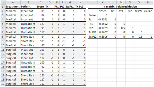
Figure 13.1 repeats a data set that also appears in Figures 12.10 and 12.11.
Figure 13.1. This design is balanced: It has an equal number of observations in each group.
In Figure 13.1, the data is presented as a balanced factorial design: that is, two or more factors with an equal number of observations per cell. For the purposes of this example, in Figure 13.2 one observation has been moved from one group to another. The observation that has a Score of 93 and is shown in Figure 13.1 in the group defined by a Surgical treatment on an Outpatient basis has in Figure 13.2 been moved to the Short Stay patient basis.
Figure 13.2. Moving an observation from one group to another results in unequal group sizes: an unbalanced design.

Figures 13.1 and 13.2 also show two correlation matrices. They show the correlations between the outcome measure Score and the effect vectors Tx, Pt1, and Pt2, and their interactions. Figure 13.1 shows the matrix with the correlations for the data in the balanced design in the range J2:P8. Figure 13.2 shows the correlation matrix for the unbalanced design, also in the range J2:P8.
Variables Are Uncorrelated in a Balanced Design
Compare the two correlation matrices in Figures 13.1 and 13.2. Notice first that most correlations in Figure 13.1, based on the balanced design, are zero. In contrast, all the correlations in Figure 13.2, based on the unbalanced design, are nonzero.
All correlation matrices contain what’s called the main diagonal. It is the set of cells that shows the correlation of each variable with itself, and that therefore always contains values of 1.0. In Figures 13.1 and 13.2, the main diagonal of each correlation matrix includes the cells K3, L4, M5, N6, O7, and P8. No matter whether a design is balanced or unbalanced, a correlation matrix always has 1’s in its main diagonal. It must, by definition, because the main diagonal of a correlation matrix always contains the correlation of each variable with itself.
Figure 13.1 has almost exclusively 0’s below the main diagonal and to the right of the column for Score. These statements are true of a correlation matrix in a balanced design where effect coding is in use:
• The correlations between the main effects are zero. See cells L5 and L6 in Figure 13.1.
• The correlations between the main effects and the interactions are zero. See cells L7:N8 in Figure 13.1.
• A main effect that requires two or more vectors has nonzero correlations between its vectors. This is also true of unbalanced designs. See cell M6 in Figures 13.1 and 13.2. (Recall from Chapter 12 that a main effect has as many vectors as it has degrees of freedom. Using effect coding, a factor that has two levels needs just one vector to define each observation’s level, and a factor that has three levels needs two vectors to define each observation’s level.)
• Interaction vectors that involve the same factors have nonzero correlations. This is also true of unbalanced designs. See cell O8 in Figures 13.1 and 13.2.
Those correlations of zero in Figure 13.1 are very useful. When two variables are uncorrelated, it means that they share no variance. In Figure 13.1, Treatment and Patient Status are uncorrelated—you can tell that from the fact that the Tx vector (representing Treatment, which has two levels) has a zero correlation with both the Pt1 and the Pt2 vectors (representing Patient Status, which has three levels). Therefore, whatever variance that Treatment shares with Score is unique to Treatment and Score, and is not shared with the Patient Status variable. There is no ambiguity about how the variance in Score is to be allocated across the predictor variables, Treatment and Patient Status.
This is the reason that, with a balanced design, you can add up the sum of squares for all the factors and their interactions, add the within group variance, and arrive at the total sum of squares. There’s no ambiguity about how the variance of the outcome variable gets divided up, and the total of the sums of squares equals the overall sum of squared deviations of each observation from the grand mean.
Variables Are Correlated in an Unbalanced Design
But if the design is unbalanced, if not all design cells contain the same number of observations, then there will be correlations between the vectors that would otherwise be uncorrelated. In Figure 13.2, you can see that Tx is correlated at −0.302 and −0.032 with Pt1 and Pt2, respectively (cells K5:K6). Because Treatment now is correlated with Patient Status, it shares variance with Patient Status. (More precisely, because the Tx, Pt1, and Pt2 vectors are now correlated with one another, they have variance in common.)
In turn, the variance that Treatment shares with Score can’t be solely attributed to Treatment. The three predictor vectors are correlated, and therefore share some of their variance, and therefore have some variance in common with Score.
The same is true for the other predictor variables. Merely shifting one observation from the Patient Status of Outpatient to Short Stay causes all the correlations that had previously been zero to be nonzero. Therefore, they now have variance in common. Any of that common variance might also be shared with the outcome variable, and we’re dealing once again with ambiguity: How do we tell how to divide the variance in the outcome variable between Treatment and Patient Status? Between Treatment and the Treatment by Patient Status interaction? The task of allocating some proportion of variance to one predictor variable, and some to other predictor variables, depends largely on the design of the research that gathered the data.
There are ways to complete that task, and we’re coming to them shortly. First, let’s return to the nice, clean, unambiguous balanced design to point out a related reason that equal group sizes are helpful.
Order of Entry Is Irrelevant in the Balanced Design
Figures 13.3 and 13.4 continue the analysis of the balanced data set in Figure 13.1.
Figure 13.3. In this analysis, Treatment enters the regression equation before Patient Status.

Figure 13.4. Patient Status enters the regression equation first in this analysis.

Figures 13.3 and 13.4 look somewhat complex, but there are really only a couple of crucial points to take away from them.
In both figures, the range J1:O21 contains a regression analysis and a traditional analysis of variance for the data in the range C2:H19. There are three observations in each cell, so the design is balanced.
Cells J3:O7 contain the partial results of using the Data Analysis add-in’s Regression tool. As discussed in the final section of Chapter 12, the correlations between main effects vectors in a balanced design are zero. But there are correlations between vectors that represent the same factor: In this case, there is a correlation between vector Pt1 and vector Pt2 for the Patient Status factor. Squared semipartial correlations in L11:O11 of Figures 13.3 and 13.4 remove from each vector as it enters the analysis any variance that it shares with vectors that have already entered.
Therefore, the sums of squares attributed to each factor and the interaction (cells K12, M12, and O12) are unique and unambiguous. They are identical to the sums of squares reported in the traditional analysis of variance shown in J14:O21 in Figures 13.3 and 13.4.
Now, compare the proportions of variance shown in cells K11:O11 of Figure 13.3 with the same cells in Figure 13.4.
Notice that in Figures 13.3 and 13.4 the predictor variables appear in different orders in the analysis shown in cells J9:O12. In Figure 13.3, Treatment enters the regression equation first via its Tx vector. The Treatment variable shares 0.126 of its variance with the Score outcome. Because Treatment enters the equation first, all of the variance it shares with Score is attributed to Treatment. No one made a decision to give the variable that’s entered first all its available variance: It’s just the way that multiple regression works. You don’t have to live with that, though. You might want to adjust Treatment for Patient Status even if Treatment enters the equation first. A later section in this chapter, “Managing Unequal Group Sizes in a True Experiment,” deals with that possibility.
Next, the two Patient Status vectors, Pt1 and Pt2, enter the regression equation, in that order. They account, respectively, for 0.129 and 0.004 of the variance in Score. The variables Pt1 and Pt2 are correlated, and the variance attributed to Pt2 is reduced according to the amount of variance already attributed to Pt1. (See the section titled “Using TREND() to Replace Squared Semipartial Correlations” in Chapter 12 for a discussion of that reduction using the squared semipartial correlation.)
Compare those proportions for Patient Status, 0.129 and 0.004, in Figure 13.3 with the ones shown in Figure 13.4, cells K11:L11. In Figure 13.4, it is Patient Status, not Treatment, that enters the equation first. All the variance that Pt1 shares with Score is attributed to Pt1. It is identical to the proportion of variance shown in Figure 13.3, because Pt1 and Treatment are uncorrelated: The sample size is the same in each group. Therefore, there is no ambiguity in how the variance in Score is allocated, and it makes no difference whether Treatment or Patient Status enters the equation first. When two predictor variables are uncorrelated, the variance that each shares with the outcome variable is unique to each predictor variable.
It’s also a good idea to notice that the regression analysis in cells J3:O7 and the traditional ANOVA summary in cells J14:O21 return the same aggregate results. In particular, the sum of squares, degrees of freedom, and the mean square for the regression in cells K5:M5 are the same as the parallel values in cells K19:M19. The same is true for the residual variation in K6:M6 and K20:M20 (labeled “Within” in the traditional ANOVA summary).
The only meaningful difference between the ANOVA table that accompanies a standard regression analysis and a standard ANOVA summary table is that the regression analysis usually lumps all the results for the predictors into one line labeled “Regression.” A little additional work of the sort described in Chapter 12 and in this chapter is often needed.
But the findings are the same in the aggregate. Total up the sums of squares for Treatment, Patient, and their interaction in K16:K18, and you get the same total as is shown for the Regression sum of squares in L5.
The next section discusses how these results differ when you’re working with an unbalanced design.
Order Entry Is Important in the Unbalanced Design
For contrast, consider Figures 13.5 and 13.6. Their analyses are the same as in Figures 13.3 and 13.4, except that Figures 13.5 and 13.6 are based on the unbalanced design shown in Figure 13.2.
Figure 13.5. The Treatment variable enters the equation first and shares the same variance with Score as in Figures 13.3 and 13.4.

Figure 13.6. The proportions of variance for all effects are different here than in Figures 13.3 through 13.5.

The data set used in Figures 13.5 and 13.6 is no longer balanced. It is the same as the one shown in Figure 13.2, where one observation has been moved from the Patient Status of Outpatient to Short Stay. As discussed earlier in this chapter, that one move causes the correlations of Score with Patient Status and with the interaction variables to change from their values in the case of the balanced design (Figure 13.1). It also changes the correlations between all the vectors, which causes them to share variance: the correlations are no longer zero.
The one correlation that does not change between the balanced and the unbalanced designs is that of Treatment and Score. The proportion of variance in Score that’s attributed to Treatment is 0.126 in Figure 13.3 (cell K11), where Tx is entered first, and in Figure 13.4 (cell M11), where Tx is entered third. Two reasons combine to ensure that the correlation between Treatment and Score remains at −0.3551, and the shared variance at 0.126, even when the balanced design is made unbalanced:
• Moving one subject from Outpatient to Short Stay changes neither that subject’s Score value nor the Treatment value. Because neither variable changes its value, the correlation remains the same.
• In Figure 13.5, where Treatment is still entered into the regression equation first, the proportion of shared variance is still 0.126. Although there is now a correlation between Treatment and Patient Status (cells L5 and L6 in Figure 13.2), Treatment loses none of the variance it shares with Patient Status. Because it’s entered first, it keeps all the shared variance that’s available to it.
Figure 13.6 shows what happens when Patient Status enters the equation before Treatment in the unbalanced design.
In the balanced design, the vector Pt1 correlates at −0.3592 with Score (see Figure 13.1, cell K5). In the unbalanced design, one value in Pt1 changes with the move of one subject from Outpatient to Short Stay, so the correlation between Pt1 and Score changes (as does the correlation between Pt2 and Score). In Figures 13.1 and 13.2, you can see that the correlation between Pt1 and Score changes from −0.3592 to −0.3019 as the design becomes unbalanced.
The square of the correlation is the proportion of variance shared by the two variables, and the square of −0.3019 is 0.0911. However, in the unbalanced design analysis in Figure 13.5, the proportion of variance shown as shared by Score and Pt1 is 0.078 (see cell L11). That’s because Tx and Pt1 themselves share some variance, and because Treatment is already in the equation, it has laid claim to all the variance it shares with Score.
But in Figure 13.6, where Pt1 enters the equation first, the Pt1 vector accounts for 0.091 of the variance of the Score outcome variable (see cell K11). There are two points to notice about that value:
• It is the square of the correlation between the two variables, −0.3019.
• It is not equal to the proportion of variance allocated to Pt1 when Pt1 enters the equation after Tx.
With Pt1 as the vector that enters the regression equation first, it claims all the variance that it shares with the outcome variable, Score, and that’s the square of the correlation between Pt1 and Score. Because Pt1 in this case—entering the equation first—cedes none of its shared variance to Treatment, Pt1 gets a different proportion of the variance of Score than it does when it enters the equation after Treatment.
About Fluctuating Proportions of Variance
Intuitively, you might think that in an unbalanced design, where correlations between the predictor variables are nonzero, moving a variable up in the order of entry would increase the amount of variance in the outcome variable that’s allocated to the predictor. For example, in Figures 13.5 and 13.6, the Pt1 vector is allocated 0.078 of the variance in Score when it’s entered after the Tx vector, but 0.091 of the Score variance when it’s entered first.
And things often turn out that way, but not necessarily. Looking again at Figures 13.5 and 13.6, notice that the Tx vector is allocated 0.126 of the variance in Score when it’s entered first, but 0.129 of the variance when it’s entered third. So, although some of the variance that it shares with Score is allocated to Pt1 and Pt2 in Figure 13.6, Tx still shares a larger proportion of variance when it is entered third than when it is entered first.
There’s no general rule about it. As the order of entry is changed, the amount and direction that shared variance fluctuates depends on the magnitude and the direction of the correlations between the variables involved.
From an empirical viewpoint, that’s well and good. You want the numbers to determine the conclusions that you draw, even if the way they behave seems counterintuitive. Things are even better when you have equal group sizes. Then, as I’ve pointed out several times, the correlations between the predictor variables are zero, there is no shared variance between the predictors to worry about, and you get the nice, clean results in Figures 13.3 and 13.4, where the order of entry makes no difference in the allocation of variance to the predictors.
But it’s worrisome when the design is unbalanced, group sizes are unequal, and predictor variables are correlated. It’s worrisome because you don’t want to insert yourself into the mix. Suppose you decide to force Patient Status into the regression equation before Treatment, increasing the proportion of variance attributed to Patient Status so that differences between, say, Inpatient and Outpatient meet your criterion for alpha. You don’t want what is possibly an arbitrary decision on your part (to move Patient Status up) to affect your decision to treat the difference as real rather than the result of sampling error.
You can adopt some rules that help make your decision less arbitrary. To discuss those rules sensibly, it’s necessary first to discuss the relationship between predictor correlations and group sizes from a different viewpoint.
Experimental Designs, Observational Studies, and Correlation
Chapter 4, “How Variables Move Jointly: Correlation,” discusses the problems that arise when you try to infer that causation is present when all that’s really going on is correlation. One of those problems is the issue of directionality: Does a person’s attitude toward a given social issue cause him or her to identify with a particular political party? Or does an existing party affiliation cause the attitude to be adopted? The problem of group sizes and correlations between vectors is a case in which there is causality present, but its direction varies.
Suppose you’re conducting an experiment—a true experiment, one in which you have selected participants randomly from the population you’re interested in and have assigned them at random to equally sized groups. You then subject the groups to one or more treatments, perhaps with double-blinding so that neither the subjects nor those administering the treatments know which treatment is in use. This is true experimental work, the so-called gold standard of research.
But during the month-long course of the experiment, unplanned events occur. Slipping past your random selection and assignment, a brother and sister not only take part but are assigned to the same treatment, invalidating the assumption of independence of observations. An assistant inadvertently administers the wrong medication to one subject, converting him from one treatment group to another. Three people have such bad reactions to their treatment that they quit. Equipment fails. And so on.
The result of this attrition is that what started out as a balanced factorial design is now an unbalanced design. If you’re testing only one factor, then from the viewpoint of statistical analysis it’s not a cause for great concern. As noted in Chapter 10, you may have to take note of the Behrens-Fisher problem, but if the group variances are equivalent, there’s no serious cause for worry about the statistical analysis.
If you have more than one factor, though, you have to deal with the problem of predictor vectors and the allocation of variance that this chapter has discussed, because ambiguity in how to apportion the variance enters the picture. One possible method is to randomly drop some subjects from the experiment until your group sizes are once again equal. That’s not always a feasible solution, though. If the subject attrition has been great enough and is concentrated in one or two groups, you might find yourself having to throw away a third of your observations to achieve equal group sizes.
Furthermore, the situation I’ve just described results in unequal group sizes for reasons that are due to the fact of the experiment and how it is carried out. There are ways to deal with the unequal group sizes mathematically. One is discussed in Chapter 12, which demonstrates the use of squared semipartial correlations to make shared variance unique. But that sort of approach is appropriate only if it’s the experiment, not the population from which you sampled, that causes the groups to have different numbers of subjects. To see why, consider the following situation, which is very different from the true experiment.
You are interested in the joint effect of sex and political affiliation on attitude toward a bill that’s under discussion in the House of Representatives. You take a telephone survey, dialing phone numbers randomly, establishing first that whoever answers the call is registered to vote. You ask their sex, their party affiliation, and whether they favor the bill. When it comes time to tabulate the responses, you find that your sample is distributed by party and by sex as shown in Figure 13.7.
Figure 13.7. The differences in group sizes are due to the nature of the population, not the research.
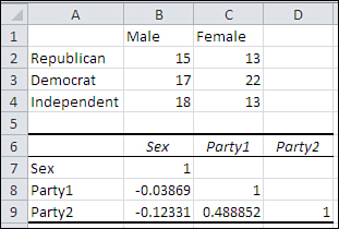
In the population, there tends to be a relationship between sex and political affiliation. Women are more likely than men to identify themselves as Democrats. Men are more likely to identify themselves as Republicans or Independents. Obviously, you’re not in a position to experimentally manipulate the sex or the political party of your respondents, as you do when you assign subjects to treatments: You have to take them as they come.
Your six groups have different numbers of subjects, and any regression analysis will be subject to correlations between the predictor variables. The range A6:D9 in Figure 13.7 shows the correlations between the effect-coded vectors for sex and political party. They are correlated, and you’ll have to deal with the correlations between sex and party when you allocate the variance in the outcome variable (which is not relevant to this issue and is not shown in Figure 13.7).
You could randomly discard some respondents to achieve equal group sizes. You would have to discard 20 respondents to get to 13 per group, and that’s 20% of your sample—quite a bit. But more serious is the fact that in doing so you would be acting as though there were no relationship between sex and political affiliation in the population. That’s manipulating substantive reality to achieve a statistical solution, and that’s the wrong thing to do.
Let’s review the two situations:
• A true experiment in which the loss of some subjects and, in consequence, unequal group sizes are attributable to aspects of the treatments. Correlations among predictors come about because the nature of the experiment induces unequal group sizes.
• An observational study in which the ways the population classifies itself results in unequal group sizes. Those unequal group sizes come about because the variables are correlated.
So causation is present here, but its direction depends on the situation.
In the first case, you would not be altering reality to omit a few subjects to achieve equal group sizes. But you could do equally well without discarding data by using the technique of squared semipartial correlations discussed in this chapter and in Chapter 12. By forcing each variable to contribute unique variance, you can deal with unequal group sizes in a way that’s unavailable to you if you use traditional analysis of variance techniques. In this sort of situation it’s usual to observe the unique variance while switching the order of entry into the regression equation. An example follows shortly.
In the second case, the observational study in which correlations in the population cause unequal group sizes, it’s unwise to discard observations in pursuit of equal group sizes. However, you still want to eliminate the ambiguity that’s caused by the resulting correlations among the predictors. Various approaches have been proposed and used, with varying degrees of success and of sense.
Note
Approaches such as forward inclusion, backward elimination, and stepwise regression are available, and may be appropriate to a situation that you are confronted with. Each of these approaches concerns itself with repeatedly changing the order in which variables are entered into, and removed from, the regression equation. Statistical decision rules, usually involving the maximization of R2, are used to arrive at a solution. In the Excel context, the use of these methods inevitably requires VBA to manage the repetitive process. Because this book avoids the use of VBA as much as possible—it’s not a book about programming—I suggest that you consult a specialized statistics application if you think one of those approaches might be appropriate.
One approach that deserves serious consideration in an observational study with unequal group sizes is what Kerlinger and Pedhazur term the a priori ordering approach (refer to Multiple Regression in Behavioral Research, 1973). You consider the nature of the predictor variables that you have under study and determine if one of them is likely to have caused the other, or at least preceded the other. In that case, there may be a strong argument for following that order in constructing the regression equation.
In the sex-and-politics example, it is possible that a person’s sex might exert some influence, however slight, on his or her choice of political affiliation. But our political affiliation does not determine our sex. So there’s a good argument in this case for forcing the sex vector to enter the regression equation before the affiliation vectors. You can do that simply by the left-to-right order in which you put the variables on the Excel worksheet. Both the Regression tool in the Data Analysis add-in and the worksheet functions concerned with regression, such as LINEST() and TREND(), enter the leftmost predictor vector first, then the one immediately to its right, and so on.
Before discussing how to do that it’s important to take a closer look at the information that the LINEST() worksheet function makes available to you.
Using All the LINEST() Statistics
I have referred to the worksheet function LINEST() in this and prior chapters, but those descriptions have been sketchy. We’re at the point that you need a much fuller discussion of what LINEST() can do for you.
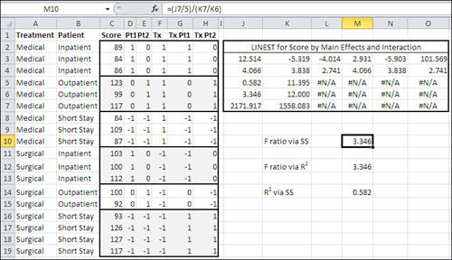
Figure 13.8 shows the LINEST() worksheet function acting on the data set most recently shown in Figure 13.6, in the range C1:H19. The data set is repeated on the worksheet in Figure 13.8.
Figure 13.8. LINEST() always returns #N/A error values below its second row and to the right of its second column.
You can obtain the regression coefficients only, if that’s all you’re after, by selecting a range consisting of one row and as many columns as there are columns in your input data. Then type a formula such as this one:
=LINEST(A2:A20,B2:E20)
Then array-enter the formula by the keyboard combination Ctrl+Shift+Enter instead of simply Enter. If you want all the available results, you’ll need to select a range with five rows, not just one, and you’ll also need to set a LINEST() argument to TRUE. That has been done in Figure 13.8, where the formula is as follows:
=LINEST(C2:C19,D2:H19,,TRUE)
The meanings of the third argument (which is not used here) and the fourth argument are discussed later in this section.
Using the Regression Coefficients
Let’s take a closer look at what’s in J3:O7, the analysis of the main effects Treatment and Patient Status and their interaction. Chapter 4 discusses the data in the first two rows of the LINEST() results, but to review, the first row contains the coefficients for the regression equation, and the second row contains the standard errors of the coefficients.
LINEST()’s most glaring drawback is that it returns the coefficients in the reverse order that the predictor variables exist on the worksheet. In the worksheet shown in Figure 13.8, column D contains the first Patient Status vector, Pt1; column E contains the second Patient Status vector, Pt2; and column F contains the only Treatment vector, Tx. Columns G and H contain the vectors that represent the interaction between Patient Status and Treatment by obtaining the cross-products of the three main effects vectors. So, reading left to right, the underlying data shows the two Patient Status vectors, the Treatment vector, and the two interaction vectors.
However, the LINEST() results reverse this order. The regression coefficient for PT1 is in cell N3, for Pt2 in M3, and Tx in L3. K3 contains the coefficient for the first interaction vector, and J3 for the second interaction vector. The intercept is always in the rightmost column of the LINEST() results (assuming that you began by selecting the proper number of columns to contain the results).
You make use of the regression coefficients in combination with the values on the predictors to obtain a predicted value for Score. For example, using the regression equation based on the coefficients in J3:O3, you could predict the value of Score for the subject in row 2 with this equation (O3 is the intercept and is followed by the product of each predictor value with its coefficient):
=O3+N3*D2+M3*E2+L3*F2+K3*G2+J3*H2
Given the length of the formula, plus the fact that the predictor values run left to right while their coefficients run right to left, you can see why TREND() is a good alternative if you’re after the results of applying the regression equation.
Using the Standard Errors
The second row of the LINEST() results contains the standard errors of the regression coefficients. They are useful because they tell you how likely it is that the coefficient, in the population, is actually zero. In this case, for example, the coefficient for the second Patient Status vector, Pt2, is 2.931 while its standard error is 4.066 (cells M3:M4 in Figure 13.8). A 95% confidence interval on the coefficient spans zero (see the section titled “Constructing a Confidence Interval” in Chapter 7, “Using Excel with the Normal Distribution”). In fact, the coefficient is within one standard error of zero and there’s nothing to convince you that the coefficient in the population isn’t zero.
So what? Well, if the coefficient is really zero, there’s no point in keeping it in the regression equation. Here it is again:
=O3+N3*D2+M3*E2+L3*F2+K3*G2+J3*H2
The coefficient for Pt2 is in cell M3. If it were zero, then the expression M3*E2 would also be zero and would add literally nothing to the result of the equation. You might as well omit it from the analysis. If you do so, the predictor’s sum of squares and degree of freedom are pooled into the residual variance. This pooling can reduce the residual mean square, if only slightly, making the statistical tests slightly more powerful. However, some statisticians adhere to the “never pool rule,” and prefer to avoid this practice. If you do decide to pool by dropping a predictor that might well have a zero coefficient in the population, you should report your results both with and without the predictor in the equation so that your audience can make up its own mind.
Dealing with the Intercept
The intercept is the point on the vertical axis where a charted regression line crosses—intercepts—that axis. In the normal course of events, the intercept is equal to the mean of the outcome variable; here, that’s Score.
With effect coding, the intercept is actually equal to the mean of the group means. Chapter 12 points out that if you have three group means whose values are 53, 46, and 51, then the regression equation’s intercept with effect coding is 50. (With equal cell sizes, the grand mean of the individual observations is also 50; see the section titled “Multiple Regression and ANOVA” in Chapter 12.)
The third argument to LINEST(), which Excel terms const, takes the value TRUE or FALSE; if you omit the argument, as is done in Figure 13.8, the default value TRUE is used. The TRUE value causes Excel to calculate the intercept, sometimes called the constant, normally. If you supply FALSE instead, Excel forces the intercept in the equation to be zero.
Recall from Chapter 2, “How Values Cluster Together,” that the sum of the squared deviations is smaller when the deviations are from the mean than from any other number. If you tell Excel to force the intercept to zero, the result is that the squared deviations are not from the mean, but from zero, and their sum will therefore be larger than it would be otherwise. It can easily happen that, as a result, the sum of squares for the regression becomes larger than the sum of squares for the residual. (Furthermore, the residual sum of squares gains a degree of freedom, making the mean square residual smaller.) All this can add up to an apparently and spuriously larger R2 and F ratio for the regression than if you allow Excel to calculate the intercept normally.
If you force the intercept to zero, other and worse results can come about, such as negative sums of squares. A negative sum of squares is theoretically impossible, because a squared quantity must be positive, and therefore the sum of squared quantities must also be positive.
In some applications of regression analysis, particularly in the physical sciences and where the predictors are continuous rather than coded categorical variables, the grand mean is expected to be zero. Then, it may make sense to force the intercept to zero.
But it’s more likely to be senseless. If you expect the outcome variable to have a mean of zero anyway, then a rational sample will tend to return a zero (or close to zero) intercept even if you don’t make Excel interfere. So there’s little to gain and much to lose by forcing the intercept to zero by setting LINEST()’s third argument to FALSE.
Understanding LINEST()’s Third, Fourth, and Fifth Rows
If you want LINEST() to return statistics other than the coefficients for the regression equation, you must set LINEST()’s fourth and final argument to TRUE. FALSE is the default, and if you don’t set the fourth argument to TRUE, then LINEST() returns only the coefficients.
If you set the fourth argument to TRUE, then LINEST() returns the coefficients and standard errors discussed earlier, plus six additional statistics. These additional figures are always found in the third through fifth rows and in the first two columns of the LINEST() results. This means that you must begin by selecting a range that’s five rows high. (As you can see in Figure 13.8, the third through fifth rows contain #N/A to the right of the second column of LINEST() results.)
Tip
You should also begin by selecting as many columns for the LINEST() results as there are columns in the input range: One column for each predictor and one for the predicted variable. LINEST() does not return a coefficient for the predicted variable, but it does return one for the intercept. So, if your input data is in columns A through F, and if you want the additional statistics, you should begin by selecting a six-column range such as G1:L5 before array-entering the formula with the LINEST() function.
The statistics found in the third through fifth rows and in the first and second columns of the LINEST() results are detailed next.
Column 1, Row 3: The Multiple R2
R2 is an enormously useful statistic and is defined and interpreted in several ways. It’s the square of the correlation between the outcome variable and the best combination of the predictors. It expresses the proportion of variance shared by that best combination and the outcome variable. The closer it comes to 1.0, the better the regression equation predicts the outcome variable, so it helps you gauge the accuracy of a prediction made using the regression equation. It is integral to the F test that assesses the reliability of the regression. Differences in R2 values are useful for judging whether it makes sense to retain a variable in the regression equation.
It’s hard to see the point of performing a complete regression analysis without looking first at the R2 value. Doing so would be like driving from San Francisco to Seattle without first checking that your route points north.
Column 2. Row 3: The Standard Error of Estimate
The standard error of estimate gives you a different take than R2 on the accuracy of the regression equation. It tells you how much dispersion there is in the residuals, which are the differences between the actual values and the predicted values. The standard error of estimate is the standard deviation of the residuals, and if it is relatively small then the prediction is relatively accurate: The predicted values tend to be close to the actual values.
It’s actually a little more complicated than that. Although you’ll see in various sources the standard error of estimate defined as the standard deviation of the residuals, it’s not the familiar standard deviation that divides by N−1. The residuals have fewer degrees of freedom because they are constrained by not just one statistic, the mean, but by the number of predictor variables.
Here’s one formula for the standard error of estimate:
![]()
That is the square root of the sum of squares of the residuals, divided by the number of observations (N), less the number of predictors (k), less 1. As you’ll see later, all these figures are reported by LINEST().
The statistics returned by LINEST() in its third through fifth rows are all closely related. For example, the formula just given for the standard error of estimate uses the value in the fifth row, second column (the residual sum of squares), and in the fourth row, second column (the degrees of freedom for the residual). Here’s another formula for the standard error of estimate:
![]()
Notice that the latter formula uses the sum of squares of the raw scores, not the residuals, as does the former formula. The residuals, the differences between the predicted and the actual scores, are a measure of the inaccuracy of the prediction. That inaccuracy is accounted for in the latter formula in the form of (1−R2), the proportion of variance in the outcome variable that is not predicted by the regression equation.
Some sources give this formula for the standard error of estimate:
![]()
The latter formula is a good way to conceptualize, but not to calculate, the standard error of estimate. Conceptually, you can consider that you’re multiplying a measure of the amount of unpredictability, ![]() by the standard deviation of the outcome variable (Y) to get a measure of the variability of the predicted values. But the proper divisor for the sum of squares of Y is not (N−1), as is used with the sample standard deviation, but (N−k−1), taking account of the k predictors. If N is very large relative to k, it makes little difference, and many people find it convenient to think of the standard error of estimate in these terms.
by the standard deviation of the outcome variable (Y) to get a measure of the variability of the predicted values. But the proper divisor for the sum of squares of Y is not (N−1), as is used with the sample standard deviation, but (N−k−1), taking account of the k predictors. If N is very large relative to k, it makes little difference, and many people find it convenient to think of the standard error of estimate in these terms.
Column 1, Row 4: The F Ratio
The F ratio for the regression is given in the first column, fourth row of the LINEST() results. You can use it to test the likelihood of obtaining by chance an R2 as large as LINEST() reports, when there is no relationship in the population between the predicted and the predictor variables. To make that test, use the F ratio reported by LINEST() in conjunction with the number of predictor variables (which is the degrees of freedom for the numerator) and N−k−1 (which is the degrees of freedom for the denominator). You can use them as arguments to the F.DIST() or the F.DIST.RT() function, discussed at some length in Chapter 10, to obtain the exact probability. LINEST() also returns (N−k−1), the degrees of freedom for the denominator (see later).
More relationships among the LINEST() statistics involve the F ratio. There are two ways to calculate the F ratio from the other figures returned by LINEST(). You can use the equation
![]()
where SSreg is the sum of squares for the regression and SSres is the sum of squares for the residual. (Together they make up the total sum of squares.) The sums of squares are found in LINEST()’s fifth row: The SSreg is in the first column and the SSres is in the second column. The df1 figure is simply the number of predictors. The df2 figure, (N−k−1), is in the fourth row, second column of the LINEST() results, immediately to the right of the F ratio for the full regression.
So, using the range J3:O7 in Figure 13.8, you could get the F ratio with this formula:
=(J7/5)/(K7/K6)
Why should you calculate the F ratio when LINEST() already provides it for you? No reason that you should. But seeing the figures and noticing how they work together not only helps people understand the concepts involved, it also helps to make abstract formulas more concrete.
Another illuminating exercise involves calculating the F ratio without ever touching a sum of squares. Again, using the LINEST() results found in J3:O7 of Figure 13.8, here’s a formula that calculates F relying on R2 and degrees of freedom only:
=(J5/5)/((1−J5)/K6)
This formula does the following:
- It divides R2 by 5 (the degrees of freedom for the numerator, which is the number of predictors).
- It divides (1−R2) by (N−k−1), the degrees of freedom for the dominator.
- It divides the result of (1) by the result of (2).
More generally, this formula applies:
![]()
If you examine the relationship between F and R2, and how R2 is calculated using the ratio of the SSreg to the sum of SSreg and SSres, you will see how the F ratio for the regression is largely a function of how well the regression equation predicts, as measured by R2. To convince yourself this is so, download the workbook for Chapter 13 from www.informit.com/title/9780789747204. Then examine the contents of cell M12 on the worksheet for Figure 13.8.
Degrees of Freedom for the F Test in Regression
LINEST() returns in its fourth row, second column the degrees of freedom for the denominator of the F test of the regression equation. As in traditional analysis of variance, the degrees of freedom for the denominator is (N−k−1), although the figure is arrived at a little differently because traditional analysis of variance does not convert factors to coded vectors.
The degrees of freedom for the numerator is the number of predictor vectors. Why not the number of predictor vectors minus 1? Because using effect coding you have already eliminated one degree of freedom. If a factor has three levels, it requires only two vectors to completely describe the group membership for that factor.
Managing Unequal Group Sizes in a True Experiment
Figure 13.9 shows several analyses of the data set used in this chapter. The design is unbalanced, as it is in Figures 13.5 and 13.6, and I will show one way to deal with the proportions of variance to ensure that each variable is allocated unique variance only.
Figure 13.9. Unique variance proportions can be determined by subtraction.
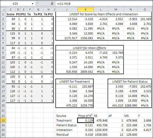
Each of the instances of LINEST() in Figure 13.9 uses Score as the predicted or outcome variable. The four instances differ as to which vectors are used as predictors:
• The range J2:O6 uses all five vectors as predictors. The array formula used to return those results is =LINEST(C2:C19,D2:H19,,TRUE).
• The range J9:M13 uses only the main effects, leaving the interactions out. The array formula used is =LINEST(C2:C19,D2:F19,,TRUE).
• The range J16:K20 uses only the Treatment vector. The array formula is =LINEST(C2:C19,F2:F19,,TRUE).
• The range M16:O20 uses only the two Patient Status vectors. The array formula is =LINEST(C2:C19,D2:E19,,TRUE).
Suppose there’s good reason to regard the data and the underlying design shown in Figure 13.9 as a true experiment. In that case, there’s a strong argument for assigning unique proportions of variance to each predictor. The problem of the order of entry of the variables into the regression equation remains, though, as discussed earlier in the section titled “Order Entry Is Important in the Unbalanced Design.”
That problem can be solved by adjusting the variance attributed to each variable for the variance that could be attributed to the other variables. Here’s how that works out with the analyses in Figure 13.9.
We’ll be arranging to assign to each factor only the variance that can be uniquely attributed to it; therefore, it doesn’t matter which factor we start with, and this example starts with Treatment. (The same outcome results if you start with Patient Status, and that would be a good test of your understanding of these procedures.)
The range J9:M13 in Figure 13.9 contains the LINEST() results from regressing Score on the two main effects, Treatment and Patient Status. All the variance in Score that can be attributed to the main effects, leaving aside the interaction for the moment, is measured in cell J11: R2 is 0.247.
The range M16:O20 shows the results of regressing Score on Patient Status alone. The R2 for that regression is 0.118 (cell M18).
By subtracting the variance attributable to Patient Status from the variance attributable to the main effects of Treatment and Patient Status, you can isolate the variance due to Treatment alone. That is done in cell K23 of Figure 13.9. The formula in K23 is =J11−M18 and the result is 0.129.
Similarly, you can subtract the variance attributable to Treatment from the variance attributable to the main effects, to determine the amount of variance attributable to Patient Status. That’s done in cell K24 with the formula =J11−J18, which returns the value 0.121.
Finally, the proportion of variance attributable to the Treatment by Patient Status interaction appears in cell K25, with the formula =J4−J11. That’s the total R2 for Score regressed onto the main effects and the interaction, less the R2 for the main effects alone.
The approach outlined in this section has the effect of removing variance that’s shared by the outcome variable and one predictor from the analysis of another predictor. But this approach has drawbacks. For example, the total of the sums of squares in L23:L26 of Figure 13.9 is 3739.73, whereas the total sum of squares for the data set is 3730 (add the SSreg to the SSres in the fifth row of any of the LINEST() analyses in Figure 13.9). The reason that the two calculations are not equal is the adjustment of the proportions of variance by subtraction.
This isn’t a perfect situation, and there are other approaches to allocating the total sum of squares in an unbalanced design. The one described here is a conservative one. It’s a thorny problem, though. There is not now and never has been complete consensus on how to allocate the sum of squares among correlated predictors.
Managing Unequal Group Sizes in Observational Research
One of those other approaches to the problem is more appropriate for an observational study in which you can reasonably assume that one predictor causes another, or at least precedes it in time. In that case you might well be justified in assigning all the variance shared between the predictors to the one that has greater precedence.
Figure 13.10 shows how you would manage this with the same data used in prior figures in this chapter, but assuming that the data represents different variables.
Figure 13.10. Under this approach the proportions of variance sum to 1.0.

The only difference in how the sum of squares is allocated in Figures 13.9 and 13.10 is that in Figure 13.10 the first variable, Sex, is not adjusted for the second variable, Political Affiliation. However, Political Affiliation is adjusted so that the variance it shares with Score is independent of Sex.
Also, the variance associated with the interaction of Sex with Political Affiliation is adjusted for the main effects. (This was also done in Figure 13.9.) That adjustment is managed by subtracting the variance explained by all the main effects, cell J11 in Figure 13.9, from the variance explained by all the predictors, cell J4. There are exceptions, but it’s normal to remove variance shared by main effects and interactions from the interactions and allow it to remain with the main effects.
The result of using the directly applicable variance in the Sex variable is to make the total of the sums of squares for the main and interaction effects, plus the residual, equal the total sum of squares. Cells L23:L26 in Figure 13.10 sum to the total sum of squares, 3730, unlike in Figure 13.9. Therefore, the proportion of explained variance, cells K23:K26 in Figure 13.10, sum to 1.000, whereas in Figure 13.9 the proportions of variance sum to 1.003.
Compare the proportions of variance and the sums of squares in Figure 13.10 with those reported in Figure 13.5. The labels for the variables are different, but the underlying data is the same. So are the variance proportions and the sums of squares.
In the range K11:O12 of Figure 13.5, the first variable is unadjusted for the second variable, just as in Figure 13.10, and the sums of squares are the same. The second variable is Patient Status in Figure 13.5 and Political Affiliation in Figure 13.10. That variable is adjusted so that it is not allocated any variance that it shares with the first variable, and again the sums of squares are the same. The same is true for the interaction of the two variables.
The difference between the two figures is the method used to arrive at the adjustments for the second and subsequent variables. In Figure 13.10, the proportions of variance for Political Affiliation and for the interaction were obtained by subtracting the variance of variables already in the equation. The sums of squares were then obtained by multiplying the proportion of variance by the total sum of squares.
Figure 13.11 repeats for convenience the ANOVA table from Figure 13.5 along with the associated proportions of variance.
Figure 13.11. The proportions of variance also sum to 1.0 using squared semipartial correlations.

In contrast to Figure 13.10, the proportions of variance shown in Figure 13.11 were obtained by squared semipartial correlations: correlating the outcome variable with each successive predictor variable after removing from the predictor the variance it shares with variables already in the equation.
The two methods are equivalent mathematically. If you give some thought to each approach, you will see that they are equivalent logically—each involves removing shared variance from predictors as they enter the regression equation—and that’s one reason to show both methods in this chapter.
The methods used in Figures 13.5 and 13.10 are also equivalent in the ease with which you can set them up. That’s not true of Figure 13.9, though, where you adjust Treatment for Patient Status. It is a subtle point, but you calculate the squared semipartial correlations by using Excel’s RSQ() function, which cannot handle multiple predictors. Therefore, you must combine the multiple predictors first by using TREND() as an argument to RSQ()—see Chapter 12 for the details. However, TREND() cannot handle predictors that aren’t contiguous on the worksheet, as would be the case if you wanted to adjust the vector named Pt2 for Tx and for Pt1.
In that sort of case, where Excel imposes additional constraints on you due to the requirements of its function arguments, it’s simpler to run LINEST() several times, as shown in Figure 13.9, than it is to try to work around the constraints.
Nevertheless, many people prefer the conciseness of the approach that uses squared semipartial correlations and use it where possible, resorting to the multiple LINEST() approach only when the design of the analysis forces them to adopt it.
If you have worked your way through the concepts discussed in Chapters 12 and 13—and if you’ve taken the time to work through how the concepts are managed using Excel worksheet functions—then you’re well placed to understand the topic of Chapters 14 and 15, the analysis of covariance. As you’ll see, it’s little more than an extension of multiple regression using nominal scale factors to multiple regression using interval scale covariates.