
14. Analysis of Covariance: The Basics
The very term analysis of covariance sounds mysterious and forbidding. And there are enough ins and outs to the technique (usually called ANCOVA) that this book spends two chapters on it—as it does with t-tests, ANOVA, and multiple regression. This chapter discusses the basics of ANCOVA, and Chapter 15, “Analysis of Covariance: Further Issues,” goes into some of the special approaches that the technique requires and issues that can arise.
Despite taking two chapters to discuss here, ANCOVA is simply a combination of techniques you’ve already read about and probably experimented with on Excel worksheets. To carry out ANCOVA, you supply what’s needed for an ANOVA or, equivalently, a multiple regression analysis with effect coding: that is, an outcome variable and one or more factors with levels you’re interested in. You also supply what’s termed a covariate: an additional numeric variable, usually measured on an interval scale, that covaries (and therefore correlates) with the outcome variable. This is just as in simple regression, in which you develop a regression equation based on the correlation between two variables.
In other words, all that ANCOVA does is combine the technique of linear regression, discussed in Chapter 4, “How Variables Move Jointly: Correlation,” along with TREND() and LINEST(), with the effect coding vectors discussed in Chapter 12, “Multiple Regression Analysis and Effect Coding: The Basics,” and Chapter 13, “Multiple Regression Analysis: Further Issues.” At its simplest, ANCOVA is little more than adding a numeric variable to the vectors that, via effect coding, represent categories, as discussed in Chapters 12 and 13.
The Purposes of ANCOVA
Using ANCOVA instead of a t-test or ANOVA can help in two general ways: by providing greater power and by reducing bias.
Greater Power
Using ANCOVA rather than ANOVA can reduce the size of the error term in an F test. Recall from Chapter 11, “Analysis of Variance: Further Issues,” in the section titled “Factorial ANOVA,” that adding a second factor to a single-factor ANOVA can cause some variability to be removed from the error term and to be attributed instead to the second factor. Because the error term is used as the denominator of the F ratio, a smaller error term normally results in a larger F ratio. A larger F ratio means that it’s less likely that the results were due to chance—the unpredictable vagaries of sampling error.
The same effect can occur in ANCOVA. Some variability that would otherwise be assigned to the error term (often called the residual error when you’re using multiple regression instead of traditional ANOVA techniques) is assigned to the outcome measure’s relationship with a covariate. The error sum of squares is reduced and therefore the residual mean square is also reduced. The result is a larger F ratio: a more sensitive, statistically powerful test of the differences in group means.
Note
Don’t be misled by the term analysis of covariance into thinking that the technique places covariance into the same role that variance occupies in the analysis of variance. The route to hypothesis testing is the same in both ANOVA and ANCOVA: The F test is used in both, and an F test is the ratio of two variances. But in analysis of covariance, the relationship of the outcome variable to the covariate is quantified, and used to increase power and decrease bias—hence the term ANCOVA, primarily to distinguish it from ANOVA.
Bias Reduction
ANCOVA can also serve what’s called a bias reduction function. If you have two or more groups of subjects, each of which will receive a different treatment (or medication, or course of instruction, or whatever it is that you’re investigating), you want the groups to be equivalent at the outset. Then, any difference at the end of treatment can be chalked up to the treatment (or, as we’ve seen, to chance). The best way to arrange for that equivalence is random assignment.
But random assignment, especially with smaller sample sizes, doesn’t ensure that all groups start on the same footing. Assuming that assignment of subjects to groups is random, then ANCOVA can give random assignment an assist, and help equate the groups. This result of applying ANCOVA can increase your confidence that mean differences you see subsequent to treatment are in fact due to treatment and not to some preexisting condition.
Using ANCOVA for bias reduction—to statistically equate group means—can be misleading, though: not because it’s especially tricky mathematically, but because the research has to be designed and implemented properly. Chapter 15 has more to say about that issue.
First, let’s look at a couple of examples.
Using ANCOVA to Increase Statistical Power
Figure 14.1 contains data from a shockingly small medical experiment. The figure analyzes the data in two different ways that return the same results. I provide both analyses—multiple regression and traditional analysis of variance—to demonstrate once again that with balanced designs the two approaches are equivalent.
Figure 14.1. These analyses indicate that the difference in group means might be due to sampling error alone.

Figure 14.1 shows a layout similar to one you’ve seen several times in Chapters 12 and 13:
• Group labels in column A that indicate the type of treatment administered to subjects
• Values of an outcome variable in column B
• A coded vector in column C that enables you to use multiple regression to test the differences in the means of the groups, as measured by the outcome variable
ANOVA Finds No Significant Mean Difference
In this case, the independent variable has only two values—medication and control—so only one coded vector is needed. The range H14:I18 shows the results of this array formula:
=LINEST(B2:B21,C2:C21,,TRUE)
As discussed in Chapters 12 and 13, the LINEST() function, in combination with the effect coding in column C and the general linear model, provides the data needed for an analysis of variance. That analysis has been pieced together in the range E20:J22 of Figure 14.1. The sums of squares in cells F21:F22 come from cells H18:I18 in the LINEST() results. The degrees of freedom in cell G21 comes from the fact that there is only one coded vector, and in cell G22 from cell I17. As usual, the mean squares in H21:H22 are calculated by dividing the sums of squares by the degrees of freedom.
The F ratio in I21 is formed by dividing the mean square for treatment by the residual mean square. (Notice that the figures are the same in I8:K9, despite the use of the traditional terminology “Between” and “Within.”) The probability of obtaining an F ratio this large because of sampling error, when the group means are identical in the population, is in J21.
Notice that the calculated F ratio in I21 is the same as that returned by LINEST() in cell H17, and by the Data Analysis add-in in L8. The probability in cell J21 is obtained by means of the formula
=F.DIST.RT(I21,G21,G22)
which makes use of the ratio itself and the degrees of freedom for its numerator and denominator. See the section titled “Using F.DIST() and F.DIST.RT()” in Chapter 10, “Testing Differences Between Means: The Analysis of Variance,” for more information.
The p value in cell J21 states that you can expect to obtain an F ratio as large as 2.36, with 1 and 18 degrees of freedom, as often as 14% of the time when the population values of the treatment group’s mean and the control group’s mean are the same.
Still in Figure 14.1, the range H7:M11 shows a traditional analysis of variance produced by Excel’s Data Analysis add-in, specifically by its ANOVA: Single Factor tool, which requires that the input data be laid out with each group occupying a different column (or if you prefer, a different row). This has been done in the range E1:F11. Notice that the sums of squares, degrees of freedom, mean squares, F ratio, and probability of the F ratio are identical to those reported by or calculated from the LINEST() analysis.
The ANOVA: Single Factor tool provides some information that LINEST() doesn’t, at least not directly. The descriptive statistics reported by the add-in are in I3:L4, and the group means are of particular interest, because unlike ANOVA, ANCOVA routinely and automatically adjusts them. (Only when the groups have the same means on the covariate does ANCOVA fail to adjust the means on the outcome variable.)
Note
The LINEST() worksheet function also returns the group means, indirectly, if you’re using effect coding. A coded vector’s regression coefficient plus the intercept equals the mean of the group that’s assigned 1’s in that vector. So in Figure 14.1, the coefficient plus the intercept in H14:I14 equals 73.71, the mean of the Medication group. This aspect of effect coding is discussed in the section titled “Multiple Regression and ANOVA” in Chapter 12.
The main point to come away with from Figure 14.1 is that standard ANOVA techniques tell you it’s quite possible that the difference between the group means, 73.7 and 63.1, is due to sampling error.
Adding a Covariate to the Analysis
Figure 14.2 adds another source of information, a covariate.
Figure 14.2. ANCOVA traditionally refers to the outcome variable as Y and the covariate as X.

In Figure 14.2, a covariate has been added to the underlying data, in column C. I have labeled the covariate as X, because most writing that you may come across concerning ANCOVA uses the letter X to refer to the covariate. Later in this chapter, you’ll see that it’s important to test what’s called the treatment by covariate interaction, which might be abbreviated as something such as Group 1 by X or Group 2 by X. There, it’s useful to have a letter such as X stand in for the actual name of the covariate in the interaction’s label.
We want to use ANCOVA to test group mean differences in the outcome variable (conventionally designated as Y) after any effect of the covariate on the outcome variable has been accounted for.
The chart in Figure 14.2 shows the relationship between the outcome variable (suppose it’s HDL cholesterol levels in adolescents) and the covariate (suppose it’s the weight in pounds of those same children). Each group is charted separately, and you can see that the relationship is about the same in each group: The trendlines are very nearly parallel. You’ll soon see why that’s important, and how to test for it statistically. For now, simply be aware that the question of parallel trendlines is the same as that of treatment by covariate interaction mentioned earlier in this section.
You can check explicitly whether the groups have different means on the covariate, and you should do so, but by simply glancing at the chart’s horizontal axis you can see that there’s just a moderate difference between the two groups as measured on the covariate X (weight). As it happens, the average weight of the Medication group is 103.9 and that of the Control group is 108.6. This is just the sort of difference that tends to come about when a relatively small number of subjects is assigned to groups at random.
It’s not the dramatic difference that you can get from preexisting groupings, such as people enrolled in weight loss programs versus those who are not. It is not the vanishingly small difference that comes from randomly assigning thousands of subjects to one of several groups. It’s the moderately small difference that’s due to the imperfect efficiency of the random assignment of a relatively small number of subjects.
And that makes a situation such as the one depicted in Figures 14.1 and 14.2 an ideal candidate for ANCOVA. You can use it to make minor adjustments to the means of the outcome measure (HDL level) by equating the groups on the covariate (weight). So doing gives random assignment to groups an assist (ideally, random assignment equates the groups, but what’s ideal isn’t necessarily real).
You can also use ANCOVA to improve the sensitivity, or power, of the F test. Recall from Figure 14.1 that using ANOVA—and thus using no covariate—no reliable difference between the two groups was found. Figure 14.3 shows what happens when you use the covariate to beef up the analysis.
Figure 14.3. This analysis notes the increment in R2 due to adding a predictor, as discussed in Chapter 13.

Figure 14.3 displays two instances of LINEST(). The instance in the range H2:I6 uses this array formula:
=LINEST(B2:B21,C2:C21,,TRUE)
This instance analyzes the relationship between Y (HDL level) and X (weight). For convenience, the R2 value is called out in the figure. Cell H4 shows that 0.52 or 52% of the variance in Y is shared with X; another way of stating this is that variability in weight explains 52% of the variability in HDL.
The other instance of LINEST() is in L2:N6, and it analyzes the relationship between Y and the best combination of the covariate and the coded vector. (The phrase “best combination” as used here means that the underlying math calculates the combination of the covariate and the coded vector that has the highest possible correlation with Y. Chapter 4 goes into this matter more fully.)
The R2 value in cell L4 is 0.88. By including the coded vector in the regression equation as a predictor, along with the covariate X, we can account for 0.88 or 88% of the variance in Y. That’s an additional 36% of the variance in Y, over and above the 52% already accounted for by the covariate alone.
This book has already made extensive use of the technique of comparing variance explained before and variance explained after one or more predictors are added to the equation. Chapter 13 in particular uses the technique because it’s so useful in the context of unbalanced designs. Statisticians have a keen ear for the bon mot and an appreciation of the desirability of consensus on a concise, descriptive terminology. Therefore, they have coined terms such as models comparison approach, incremental variance explained, and regression approach when they mean the method used here.
Regardless of the technique’s name, it puts you in a position to reassess the reliability of, in this example, the difference in the mean HDL levels of the two groups. Using ANOVA alone, an earlier section in this chapter showed that the difference could be attributed to sampling error as much as 14% of the time.
But the ANCOVA in Figure 14.3, in the range H13:M16, changes that finding substantially. The cells in question are H15:M15. The total sum of squares of the outcome variable appears in cell K11, using this formula:
=DEVSQ(B2:B21)
We know from comparing the R2 values from the two instances of LINEST() that the treatment vector accounts for 36% of the variability in Y after X has entered the equation; that value appears in cell K8. Therefore, the formula
=K8*K11
entered in cell I15 gives us the sum of squares due to Treatment. Converted to a mean square and then to the numerator of the F ratio in cell L15, this result is highly unlikely to occur as a result of sampling error, and an experimenter would conclude that the treatment has a reliable effect on HDL levels after removing the effect of differences in the covariate weight from the outcome measure.
Be sure to notice that the F ratio’s denominator in Figure 14.3 is 32.97 (cell K16), but in Figure 14.1 it’s 239.11 (cell H22). Most of the variability that’s assigned to residual variation in Figure 14.1 is assigned to the covariate in Figure 14.3, thus increasing the F ratio and making the test much more sensitive.
Figure 14.4 provides further insight into how it can happen that an ANOVA fails to return a reliable difference in group means while an ANCOVA does so.
Figure 14.4. The adjustment of the means combined with the smaller residual error makes the F test much more powerful.
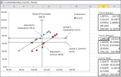
The Group Means Are Adjusted
In Figure 14.4, notice the vertical line labeled “Mean of Covariate” in the chart. It is located at 106.23 on the horizontal X axis; that value, 106.23, is the grand mean of all subjects on the covariate, Weight. The vertical line representing the mean of the covariate is crossed by two diagonal regression lines. Each regression line (in Excel terminology, trendline) represents the relationship in each group, Medication or Control, between the covariate Weight and the outcome variable HDL.
The point on the vertical axis at which each regression line crosses the mean of the covariate is where that group’s HDL mean would be if the two groups had started out with the same mean Weight. This is how ANCOVA goes about adjusting group means on an outcome variable as if they started out with equal means on the covariate.
In general, you use ANCOVA to take the relationship between the covariate and the outcome measure as a starting point. You can draw a line that represents the relationship, just as the regression lines are drawn for each group in Figure 14.4. There is a point where each regression line crosses the vertical line that represents the covariate’s mean. That point is where the group’s mean on the outcome variable would be if the group’s mean on the covariate were equal to the grand mean on the covariate.
So, in Figure 14.4, you can see that the actual Y mean of the Control group is 63.1. It is shown in the chart as the lower of the two horizontal lines. But the regression line indicates that if the Control group’s covariate mean were slightly lower (106.23 instead of its actual 108.59) then the Control group’s mean on Y, the HDL outcome measure, would be 58.5 instead of its observed 63.1.
Similarly, the regression line for the Medication group crosses the grand mean of the covariate at 78.31. If the Medication group’s mean on the covariate were 106.23 instead of its actual 103.87, then we would expect its HDL mean to be 78.31.
Therefore, the combined effect of each group’s regression line and its actual mean value on the weight covariate is to push the group HDL means farther apart, from 73.71 − 63.10 = 10.61, to 78.31 − 58.50 = 19.81.
With the group means farther apart, the sum of squares attributable to the difference between the means becomes larger, and therefore the numerator of the F test also becomes larger—the result is a more statistically powerful test.
In effect, the process of adjusting the group means says, “Some of the treatment effect has been masked by the fact that the two groups did not start out on an equal footing. There’s a relationship between weight and HDL, and the Medication group started out with a handicap because its lower mean weight masked the treatment effect. The regression of HDL on weight enables us to view the difference between the two groups as though they had started out on an equal footing prior to the treatment.”
Calculating the Adjusted Means
It’s usually helpful to chart your data in Excel, regardless of the type of analysis you’re doing, but it’s particularly important to do so when you’re working with the regression of one variable on another (and with the closely related issue of correlations, as discussed in Chapter 4). In the case of ANCOVA, where you’re working with the relationship between an outcome variable and a covariate in more than one group, charting the data as shown in Figure 14.4 helps you visualize what’s going on with the analysis—for example, the adjustment of the group means as discussed in the prior section.
But it’s also good to be able to calculate the adjusted means directly. Fortunately, the formula is fairly simple. For a given group, all you need are the following values (they are not all displayed in Figure 14.4 but you can verify them by downloading Chapter 14’s workbook from www.informit.com/title/9780789747204):
• The group’s observed mean value on the outcome variable. For the data in Figure 14.4, that’s 63.1 in the Control group.
• The regression coefficient for the covariate. In Figure 14.4, that’s 1.947. (It’s easy to get the regression coefficient, but it’s not immediately apparent how to do so. More on that shortly.)
• The group’s mean value on the covariate. In this example, that’s 108.59 in the Control group.
• The grand mean value on the covariate. In Figure 14.4, that’s 106.23.
With those four numbers in hand, here’s the formula for the Control group’s adjusted mean. (You can get the adjusted mean for any group by substituting its actual mean value on the outcome variable and on the covariate.)
![]()
The symbols in the formula are as follows:
• ![]() is the adjusted mean of the outcome variable for the jth group.
is the adjusted mean of the outcome variable for the jth group.
• ![]() is the actual, observed mean of the outcome variable for the jth group.
is the actual, observed mean of the outcome variable for the jth group.
• b is the common regression coefficient for the covariate.
• ![]() is the mean of the covariate for the jth group.
is the mean of the covariate for the jth group.
• ![]() is the grand mean of the covariate.
is the grand mean of the covariate.
Using the actual values for the Control group in Figure 14.4, we have the following:
58.5 = 63.1 − 1.947 * (108.59 − 106.23)
Where did the figure 1.947 for the common regression coefficient come from? It’s the average of the two separate regression coefficients calculated for each group. This is sometimes called the pooled or the common regression coefficient. In Figure 14.4, it’s the average of the values in cells O2 and O9.
If you’re interested in getting the individual adjusted scores in addition to the adjusted group means, you can use the following simple modification of the formula given earlier:
![]()
In this case, the symbols are as follows:
• ![]() is the adjusted value of the outcome variable for the ith subject in the jth group.
is the adjusted value of the outcome variable for the ith subject in the jth group.
• Yij is the actual, observed value of the outcome variable for the ith subject in the jth group.
• b is the common regression coefficient for the covariate.
• Xij is the value of the covariate for the ith subject in the jth group.
• ![]() is the grand mean of the covariate.
is the grand mean of the covariate.
A Common Regression Slope
In the course of preparing to write this book, I looked through 11 statistics texts on my shelves, each of which I have used as a student, as a teacher, or both. Several of those texts discuss the fact that a statistician uses a common regression coefficient to adjust group means, but nowhere could I find a discussion of why that’s done—nothing to supply as a reference, so I’ll cover it here.
Refer to Figure 14.4 and notice the two sets of LINEST() results. Cell O2 contains the regression coefficient for the covariate based on the data for the Medication group, 1.998. Cell O9 contains the regression coefficient for the covariate calculated from the data for the Control group, 1.896. Although close, the two are not identical.
A fundamental assumption in ANCOVA is that the regression slopes—the coefficients—in each group are the same in the population, and that any difference in the observed slopes is due to sampling error. In fact, in the example we’ve used so far in this chapter, the two coefficients of 1.998 and 1.896 are only 0.102 apart. Later in this chapter I’ll show you how to test whether the difference between the coefficients is real and reliable, or just sampling error.
You might intuitively think that the way to get the common regression line would be to ignore the information about group membership and simply regress the outcome variable on the covariate for all subjects. Figure 14.5 shows why that’s not a workable solution.
Figure 14.5. When the group means differ on either the outcome or the covariate, the regression becomes less accurate.
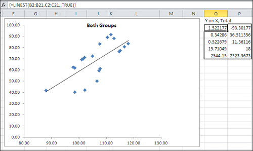
The same data for the outcome variable and the covariate appears in Figure 14.5 as in Figure 14.4. But even a visual inspection tells you that the relationship between the two variables is not as strong when all the data is combined: The markers that represent the individual observations are farther from the regression line in Figure 14.5 than is the case in Figure 14.4. The reason is that the two groups, Medication and Control, have little overlap on the outcome variable (plotted on the vertical axis). In Figure 14.5, the same regression equation that is based on ten Medication group units with a higher mean on the outcome variable must also be based on the ten observations with a lower mean on the outcome variable.
In the sort of situation presented by this data, it is not that a common regression line has a markedly different coefficient than the regression lines calculated for each group. The coefficients are quite close. Figure 14.4 shows that the coefficient for the Medication group alone is 1.998 (cell O2); for the Control group, it’s 1.896 (cell O9). As you will see in cell H10 of Figure 14.6, the coefficient is 1.948 when the group membership is included in the equation. What matters is that if you use a single regression line as calculated and shown in Figure 14.5, the deviations of the individual observations are greater than if you use two regression lines, both with the same slope but different intercepts, as shown in Figure 14.4.
Figure 14.6. If the additional variance can be attributed to sampling error, it’s reasonable to assume a common regression coefficient.

Therefore, you can lose accuracy if you use a single regression based on all the data. The solution is to use a common regression slope. Take the average of the regression coefficients calculated for the covariate in each group: cells O2 and O9 in Figure 14.4. At first glance this may seem like a quick-and-dirty guesstimate, but it’s actually the best estimate available for the common regression line.
Suppose that you converted each observation to a z-score: that is, subtract each group’s mean from each individual score and divide the result by the group’s standard deviation. This has the effect of rescaling the scores on both the covariate and the outcome variable to have a mean of 0 and a standard deviation of 1.
Having rescaled the data, if you calculate the total regression as in Figure 14.5, the coefficient for the covariate will be identical to the average of the coefficients in the single group analyses. (This holds only if the groups have the same number of observations, so that the design is balanced.)
Testing for a Common Regression Line
Why is it so important to have a common regression line? It’s largely a question of interpreting the results. It’s convenient to be able to use the same coefficient for each group; that way, you need change only the group means on the outcome measure and the covariate to calculate each group’s adjusted mean.
There are ways to deal with the situation in which the data suggests that the regression coefficient between the covariate and the outcome variable is different in different groups. This book does not discuss those techniques, but if you are confronted with that situation, you can find guidance in The Johnson-Neyman Technique, Its Theory and Application, by Palmer Johnson and Leo Fay (Biometrika, December 1950), and in The Analysis of Variance and Alternatives, by B. E. Huitema (Wiley, 1980). Obviously these references predate the existence of Excel, but the discussion of using LINEST() and other worksheet functions in this chapter and the next positions you to make use of the techniques if necessary.
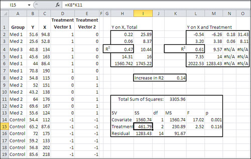
The question of determining whether you can assume a common regression coefficient remains (you may see this topic discussed as homogeneity of regression coefficients in other material on ANCOVA). Figure 14.6 illustrates the approach, which you’ll recognize from earlier situations in which we have evaluated the significance of incremental variance that’s attributable to variables added to the regression equation.
Figure 14.6 contains a new vector in column E. It represents the interaction of the Treatment vector—medication or control—with the covariate. It’s easily created: You simply multiply a value in the Treatment vector by the associated value in the covariate’s vector. If there is additional information that column E’s interaction vector can provide, it will show up as an increment to the proportion of variance already explained by the information about treatment group membership and the covariate, Weight.
If there is a significant amount of additional variance in the outcome measure HDL that is explained by the interaction vector, you should consider using the Johnson-Neyman techniques, and those discussed in Huitema’s book, both mentioned earlier.
However, the analysis in Figure 14.6 shows that in this case there’s little reason to believe that including the factor-covariate interaction explains a meaningful amount of additional variance in the outcome measure. In that case, it’s rational to conclude that the slope of the regression between the covariate and the outcome variable is the same in both groups.
The comparison of models in the range G16:M18 tests that increment of variance, as follows: LINEST() is used in G3:J7 to analyze the regression of the HDL outcome measure on all the available predictors: the weight covariate, the treatment, and the weight by treatment interaction. LINEST() returns the R2 value in its third row, first column, so the total proportion of variance in the outcome measure that’s explained by those three predictors is 0.8854.
LINEST() is used once again in G10:I14 to test the regression of HDL on the covariate and the treatment factor only, omitting the weight by treatment interaction. In this analysis, R2 in cell G12 turns out to be 0.8849. The difference between the two values for R2 is 0.0005, shown in cell H17 of Figure 14.6. That’s half of a thousandth of the variance, so you wouldn’t regard it as meaningful. However, the formal test appears in G16:M18.
Cell H17 is obtained by subtraction, the R2 in G12 from that in G5. The proportion of the variance that remains in the residual, “error” term is also obtained by subtraction: 1.0 less the total proportion of variance explained in the full model, the R2 in cell G5.
It’s not necessary to involve a sum of squares column in the analysis, but to keep the analysis on familiar ground, the sums of squares are shown in I17:I18. Both values are the product of the proportion of variance explained in column H and the total sum of squares. Notice these alternatives:
• You can obtain the total sum of squares with the formula =DEVSQ(B2:B21), substituting for B2:B21 whatever worksheet range contains your outcome measure. You can also get the total sum of squares from the sum of squares (regression) plus the sum of squares (residual); these values are found both in G7:H7 and in G14:H14.
• You can obtain the incremental sum of squares by taking the difference in the sum of squares (regression) for the two models. In Figure 14.6, for example, you could subtract cell G14 from cell G7 to get the incremental sum of squares.
The degrees of freedom for the R2 increment is the difference in the number of predictor vectors in each analysis. In this case, the full model has three vectors: the covariate, the treatment, and the covariate by treatment interaction. The restricted model has two vectors: the covariate and the treatment. So, 3 − 2 = 1, and the R2 increment has 1 df.
The degrees of freedom for the denominator is the number of observations, less the number of vectors for the full model, less 1 for the grand mean. In this case, that’s 20 − 3 − 1 = 16.
As usual, the mean squares are formed by the ratio of the sum of squares to the degrees of freedom. Finally, the F ratio is the mean square for the R2 increment divided by the mean square for the residual. In this case, the p value of .79 indicates that 79% of the area in an F distribution with 1 and 16 df falls to the right of the obtained F ratio: clear evidence that the covariate by factor interaction is simply sampling error.
Note that you could dispense with the sums of squares entirely by dividing each proportion of variance by the associated degrees of freedom and then forming the F ratio using the results:
0.07 = (0.0005 / 1) / (0.1146 / 16)
This is generally true, not just for the test of a factor by covariate interaction. The route to an F test via sums of squares is due largely to the reliance on adding machines in the early part of the twentieth century. As tedious, cumbersome, and error prone as those methods were, they were more tractable than repeatedly calculating entire regression analyses to determine the differences in proportions of explained variance that result. As late as the 1970s, books on regression analysis showed how different regression equations could be obtained from the overall analysis by piecing together intercepts and coefficients. This approach saved time and had some pedagogical value, but 40 years later it’s much more straightforward to use the LINEST() function repeatedly, with different sets of predictors, and to test the resulting difference in R2 values.
Removing Bias: A Different Outcome
The adjustment of the group means in the prior example was combined with the increased sensitivity of the F test, due to the allocation of variance to the covariate instead of to residual variation. The result was that the difference between the group means, initially judged non-significant, became one that was likely reliable, and not merely due to sampling error.
Things can work out differently. It can happen that differences between group means that an ANOVA judges significant turn out to be unreliable when you run an ANCOVA instead—even with the increased sensitivity due to the use of a covariate. Figure 14.7 has an example.
Figure 14.7. An additional factor level requires an additional coded vector.

Compare Figure 14.7 with Figure 14.1. Two differences are fairly clear: Figure 14.1 depicts an analysis with one factor that has two levels. Figure 14.7’s analysis uses a factor that has three levels: a control group as before, but two experimental medications instead of just one. That additional factor level simply means that there’s an additional vector, and therefore an additional regression line to test.
The other meaningful difference between Figure 14.1 and 14.7 is that the initial ANOVA in Figure 14.1 indicates no reliable difference between the Medication and Control group means on the outcome variable named Y, which measures each subject’s HDL. The subsequent ANCOVA that begins with Figure 14.2 shows that the means are adjusted to be farther apart, and the residual mean square is reduced enough that the result is a reliable difference between the two means.
But in Figure 14.7, the ANOVA indicates a reliable difference somewhere in the group means if the experimenter set alpha to .05. (Recall that neither ANOVA nor ANCOVA by itself pinpoints the source of a reliable difference. All that a significant F ratio tells you is that there is a reliable difference somewhere in the group means. But when there are only two groups, as in Figure 14.1, the possibilities are limited.) In Figure 14.7, both the traditional ANOVA summary in J8:O12, and the regression approach in H15:J19 and F21:K23, indicate that at least one significant difference in group means exists. The F ratio’s p-value of .048 is smaller than the alpha of .05.
So what’s the point of using ANCOVA in this situation? The answer begins with the analysis in Figure 14.8, which adds a covariate in column C to the layout in Figure 14.7.
Figure 14.8. The factor by covariate interaction again fails to contribute meaningful shared variance.

Figure 14.8 contains an analysis that is a necessary preliminary to subsequent figures. It uses the models comparison approach to test whether there is a reliable difference in the regression slopes of HDL on Weight within each group. The range A21:B25 contains the first two columns of a LINEST() analysis of HDL (Y) regressed onto all the prediction vectors in C2:G19. The total proportion of HDL that’s predicted by those vectors appears in cell A23: 63.46% of the variance in HDL is associated with the covariate, the two treatment vectors, and the factor by covariate interaction in columns F and G.
Another instance of LINEST is in D21:E25, where HDL is regressed onto the covariate and the two treatment vectors, leaving the factor by covariate interaction out of the analysis. In this case, cell D23 shows that 61.18% of the variance in HDL is associated with the covariate and the treatment factor.
The increment in explained variance (or R2) from putting the covariate by factor interaction in the equation is therefore 63.46% − 61.18%, or 2.3%, as shown in cell H22. The remaining values in the models comparison are as follows:
• The unexplained proportion of variance—the residual—in cell H23 is 1.0 minus the proportion of explained variance in the full model, shown in cell A23.
• The degrees of freedom for the R2 increment is the number of prediction vectors in the full model (5) minus the number of prediction vectors in the restricted model (3), resulting in 2 df for the comparison’s numerator.
• The degrees of freedom for the denominator is the number of observations (18) less the number of vectors for the full model (5) less one for the grand mean (1), resulting in 12 df for the comparison’s denominator.
• The column headed “Prop / df” (H21:H23) is not a mean square, because we’re not bothering to multiply and divide by the constant total sum of squares in this analysis. We simply divide the increment in R2 by its df and the residual proportion by its df. If you multiplied each of those by the total sum of squares, you would arrive at two mean squares, but their F ratio would be identical to the one shown in cell K22.
• The F ratio in cell K22 is less than one and therefore insignificant, but to complete the analysis I show in cell L22 the probability of that F ratio if the factor by covariate interaction were due to true population differences instead of simple sampling error.
I belabor this analysis of parallel regression slopes (or, if you prefer, common regression coefficients) here for several reasons. One is that it’s an important check, and Excel makes it very easy to carry out. All you have to do is run LINEST() a couple of times, subtract one R2 from another, and run an F test on the difference.
The second reason is that in this chapter’s first example, I postponed running the test for homogeneity of regression coefficients until after I had discussed the logic of and rationale for ANCOVA and illustrated its mechanics using Excel. In practice you should run the homogeneity test before other tasks such as calculating adjusted means. If you have within-group regression coefficients that are significantly different, there’s little point in adjusting the means using a common coefficient. Therefore, I wanted to put the test for a common slope here, to demonstrate where it should occur in the order of analysis.
Because in this example we’re dealing with regression coefficients that do not differ significantly across groups, we can move on to examining the regression lines. See Figure 14.9.
Figure 14.9. The regression slopes adjust the observed means to show the expected HDL if each group started with the same average weight.

Notice the table in the range A21:D23 of Figure 14.9. It provides the mean weight—the covariate X—for each of the three groups at the outset of the study. Clearly, random assignment of subjects to different groups has failed to equate the groups as to their mean weight at the outset. When group means differ on the covariate, and when the covariate is correlated with the outcome measure, then the group means on the outcome measure will be adjusted as though the groups were equivalent on the covariate.
You can see this effect in Figure 14.9, just as you can in Figure 14.4. In Figure 14.4, the Medication group weighed less than the Control group, but its HDL was higher than that of the Control group. The adjustment’s effect was to push the means farther apart.
But in Figure 14.9, the Med 1 group has the lowest mean of 120.2 on the covariate and also has the lowest unadjusted mean on the HDL outcome measure, about 46. (See the lowest horizontal line in the chart.) Furthermore, the Control group has the highest mean of 154.6 on the covariate and also has the highest unadjusted mean on the HDL measure, about 66. (See the highest horizontal line in the chart.)
Under those conditions, and with the covariate and the outcome measure correlated positively within each group, the effect is to close up the differences between the group means. Notice that the regression lines are closer together where they cross the vertical line that represents the grand mean of the covariate: where the groups would be on HDL if they started out equivalent on the weight measure.
So the adjusted group means are closer together than are the raw means. Figure 14.7 shows that the group raw means are significantly different at the .05 alpha level. Are the adjusted means also significantly different? See Figure 14.10.
Figure 14.10. With the group means adjusted closer together, there is no longer a significant difference.
Compare Figure 14.10 with Figure 14.3. Structurally the two analyses are similar, differing only in that Figure 14.3 has just one treatment vector, whereas Figure 14.10 has two. But they have different input data and different results. Both regress the outcome measure Y onto the covariate X, and in a separate analysis they regress Y onto the covariate plus the treatment. The result in Figure 14.3 is to find that the group means on the outcome measure are significantly different somewhere, in part because the raw means are pushed apart by the regression adjustments.
In contrast, the result in Figure 14.10 shows that differences in the raw means that were judged significantly different by ANOVA are, adjusted for the regression, possibly due to sampling error. The ANCOVA summary in H11:M16 assigns some shared variance to the covariate (47%, or 1560.74 in terms of sums of squares), but not enough to reduce the residual enough that the F ratio for the treatment factor is significant at a level that most would accept as meaningful.
In Figure 14.10, I could have left the sum of squares and the mean square columns out of the analysis in H11:M16 and followed the strict proportion of variance approach used in Figure 14.8, cells G21:L23. I include them in Figure 14.10 just to demonstrate that either can be used—depending mainly on whether you want to follow a traditional layout and include them, or a more sparse layout and omit them.
Chapter 15 looks at some special considerations concerning the analysis of covariance, including multiple comparisons following a significant finding in ANCOVA, and multiple covariates.