
In Business Intelligence, dates are an essential part of analysis, and they are an important part of Business Intelligence projects. Data warehouses, for example, have a Date dimension as a way of helping business users to describe their data by date. People's business questions often include a when element. Additionally, dashboards will often reference dates.
Comparison is fundamental to analysis. Time is a fundamental part of comparison. Dashboards will often display comparisons between periods of time, so time is an essential part of the dashboard display. It is easy to envisage the following business questions that involve time:
- What are my numbers compared to last year?
- How did my sales region perform this month as compared to the last month?
- When will my department reach its target?
This recipe explains how to use dates in order to analyze your data using the Dates functionality in Tableau. In the last recipe, we imported the FactInternetSales table. Once the FactInternetSales data has been imported, we will also do the same for the DimDate table. To analyze our data, we will perform the following actions:
- Join data together
- Activate links in relationships
- Date analysis in Tableau
We will continue to use the same Tableau workbook we set up in the first recipe. It was called Chapter 2.
- We will connect to an Excel file called
DimDate.xlsand import it into Tableau's internal data store mechanism. To do this, navigate to Data | Connect to Data. - Then, select the link Microsoft Excel and a file browser will appear. Navigate to the folder where you stored the downloaded Excel and CSV files.
- Navigate to the
DimDate.xlsfile and select it. - In the Excel Workbook Connection dialog box, change the Step 4 name so that it reads
Connection_DimDate. - We have two data sources which will need to be joined together so that the data can be analyzed by date. We can join the
DateKeyandOrderDateKeycolumns together for theDimDateandFactInternetSalestables respectively. Make sure that theDateKeyandOrderDateKeycolumns are both dimensions, not measures. So, ensure that both fields are contained in the Dimensions field; if not, drag them from the Measures pane to the Dimensions pane. If they are measures, then we cannot join them. - To do this, we edit the relationship between the two tables. Ensure that you have selected the
Connection_DimDatedata source in the Data pane in the sidebar. - Next, go to the Data menu item and select Edit Relationships. You can see this illustrated in the following screenshot:

- You can now see the Relationships dialog box. Click on Custom and then click on Add.
- Next, you will see two columns: one for the
DimDatecolumns and the other for theFactInternetSalescolumns. Each column represents a table, and the items in the list are source fields. - Select DateKey on the left-hand side, OrderDateKey on the right-hand side, and then click on the OK button. You can see this in the following screenshot:

- Let's create a new sheet by going to the tab at the foot of the worksheet with the worksheet name on it. Right-click to select Duplicate Sheet. Let's make the canvas clean again by removing all of the pills from the Columns, Rows, and Marks shelves.
- Let's use the new worksheet to proceed.
- In the Data pane, select the Connection_DimDate dimension. Select Calendar Year and drag it into the Rows shelf. Make sure it is set to the String data type by right-clicking on Calendar Year on the Data pane, then navigating to Change Data Type, and finally selecting String.
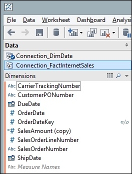
- Next, click on the Connection_FactInternetSales connection and you will see a broken link symbol next to OrderDateKey. You can see this in the following screenshot:
- We need to make the relationship between the data sources active. If we don't, then the data sources will not be related to one another and our analysis will not make sense. To activate the link, click on the broken chain; it will go red and change to a whole link. The following is an example:

- Staying in the
FactInternetSalestable, drag the SalesAmount column from the Measures pane to the Canvas shelf. You can see this in the following screenshot:
- If you break the link by clicking on it again, then you will notice that the figures change. Each calendar year is now set to 29,358,677, rather than the figures shown in the previous screenshot. This is because the link between the tables is now broken, so Tableau cannot sum the data according to the years; instead, it issues a query to both data sources and simply returns the product of the total.
- Let's look at what happens if we use a different aggregation, count distinct. This returns a count of the distinct SalesAmount values. When we link the
OrderDateKeycolumn and select Count Distinct for the SalesAmount figure, Tableau turns the SalesAmount pill to red and grays out the whole screen. You can see an example of this in the following screenshot:
- In Tableau 8, the aggregation is considered not valid, so Tableau saves the user from themselves by graying out the screen until it is fixed. You have the facility to undo the last step. To do this, press Ctrl + Z.
Tableau allows business users to enrich their data through the addition of calculations that get stored as part of the workbook. This is useful for data analysis, since we can look and see how simple steps can quickly affect the data.
Why is this the case? Tableau issues separate queries to each data source and joins the two data sources together. Then, it conducts the aggregation on the joined data sources at the lowest level of detail in the view of the data from the Tableau interface.
Unfortunately, if the level of detail in the underlying query is different from the level of detail in the view, then the calculation will not be correct.
The moral of the story is to keep the relevant dimensions in the Tableau view, that is, put their features in the Columns and Rows shelves or in the Marks shelf. By putting more elements in the view, these shelves will move the query towards serving up data that can be used for matching the data sources. Then, the user can try to incorporate the query by including as many dimensions as possible, which in turn will produce as much detail in the query as possible in order to facilitate matching between the tables.
Dashboards use a lot of calculations to summarize data. Research by specialists such as Ben Shneiderman shows that people tend to want to see the summary first, followed by zooming and filtering the data, and then finally see the details on demand. This is a very natural way of engaging with data. Shneiderman calls this the "Visual Information Seeking Mantra".
If you are interested in the psychology of how individuals interact with data, then Ben Shneiderman's paper The Eyes Have It (1996), which you can find at http://dl.acm.org/citation.cfm?id=834354, will be of help.