
It is easy to balance columns in a report, but it is not very easy to lay out a dashboard. The size and location of dashboard elements is critical in helping users to understand the data better. How can you know how to put the dashboard elements together in order to facilitate understanding?
One key concept in design is called the golden ratio. It is based on the Fibonacci sequence, which is found in nature all around us, and it is familiar. You find the Fibonacci sequence in a number of flower petals, for example. You can also find it in art. For example, artists such as Salvador Dali and Le Corbusier have set out their works to approximate the golden ratio in the placement of the items within the painting. The golden ratio itself is 1:1.61, and is represented by the Greek character phi.
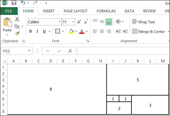
By using the golden ratio to design your dashboard, it means that you are following a natural order that is harmonious and familiar. You can use the following diagram as a way of helping you in the placement of the dashboard elements.

How can this help you to design your dashboard? The golden ratio can be used as a heuristic to help you to tell a story with the data. It can help you to decide what goes where. Here is the preceding design translated into an Excel template, which has been set into blocks. To try things out, you can swap your dashboard components around and use rectangle blocks to fill out blanks until you have finished with this aspect. The following screenshot depicts this:
We can use size as a way of determining how the dashboard components are laid out. How can we determine size and positioning? Here are some helpful tips:
- Prioritize your components in terms of their importance, and then assign the size in the order of their importance.
- Don't include dashboard components that aren't relevant. We are in the business of making the dashboard clear, not busy!
- Get your users involved. It is always possible that your prioritization and sizing is not the same as their prioritization. You could generate a series of prototypes of the dashboard. For example, you could paste pictures of your components onto the preceding template, make a picture, and then show them the different options. If you want your users to use your dashboard, why not involve them earlier in the process?
In this recipe, we will create a dashboard from the visualizations that we created earlier in this chapter. We will look at the different ways in which we can place components on the dashboard and the tricks to resize things.
For the exercises in this recipe, we will build on the existing Chapter 7 dashboard. We don't need to add in any more data for now.
- On one of the tabs at the bottom, right-click and select the option Create Dashboard.
- Name the new dashboard
Dashboard Sizing. - On the new dashboard, we can treat the visualizations from the first topic as one topic. Therefore, drag Topic 1 Color Average onto the left-hand side of the dashboard.
- Now, drag Topic 1 Color Sparkline to the right-hand side of the element.
- Drag Topic 3 Sales Transactions onto the right-hand side of the element.
- Drag Topic 2 Dual Axes Box Whiskers underneath Topic 3 Sales Transactions.
- Remove the title from Topic 1 Color Average by going to the right-hand drop-down list and deselecting Title.
- Remove the title and headers from Topic 1 Color Sparkline by going to the right-hand drop-down list and deselecting Title.
- Remove the year from the x axis in Topic 1 Color Sparkline by right-clicking on one of the years and deselecting Show Header.
- Insert a title at the top by dragging the text to the top of the dashboard.
- In the textbox that appears, type
What is my Sales Performance Over Time?. - Change the font to Segoe UI.
- Change the font size to 12.
- Let's resize the dashboard by inserting a blank tile underneath the other visualizations. Making it smaller will make it neater! To do this, drag Blank to the right-hand side.
- Your dashboard will now look like the following screenshot:

In this recipe, we have experimented with layout. If we had more product categories, the sparkline would be smaller, we would have more rows, and it would appear much smaller. However, the purpose was to illustrate the importance of sizing. We can see that using the golden ratio as a template is a good starting point, and you can bring the users along with you.