
Data visualization is all about communicating a message using data. In the first chapter, we specified communication as one of the key features of a dashboard.
The problem with data visualization is that people don't always like what visualization tells them about their business. It can defy commonly held assumptions about a business that goes against the grain of what people believe. This can be particularly uncomfortable if people have been with an organization for a long time and perhaps have not changed their perspective as the business moved ahead.
In this recipe, we will look at how we can use correlation to test a hypothesis and then display this information so that the message of the data is easy to understand.
We will continue to use the same worksheet as we have used in the previous recipes of this chapter.
In this recipe, we will use a real-life example where a business analyst wants to know if people with more cars spend less on bikes. We will test whether there is a correlation between the number of cars owned by a customer and how much money is spent on bikes. Since the AdventureWorks store is selling bikes, there is an assumption that people who own fewer cars will spend more on bikes. However, this hypothesis would need to be tested, and data visualization can help us "sense-check" the data and see patterns easily. Perform the following steps to create correlations in Tableau:
- Open up the
Chapter 2workbook and create a new worksheet by pressing Ctrl + M, or by going to the Worksheet menu item and then selecting New Worksheet. - Rename the tab
Correlation with Calculations. - Take the dimension named NumberCarsOwned from the
DimCustomertable and drag it on to the Rows shelf. Change the measure to Count. - Take the SalesAmount measure from the FactInternetSales table and place it on the Columns shelf.
- Take the NumberCarsOwned member from the DimCustomer dimension and place it on the Color attribute in the Marks shelf.
- Next, we will add a trend line order to convey the relationship between the sales amount and the number of sales. To do this, go to the Analysis menu item and the Trend Lines menu item and select Show Trend Lines. You can see this in the following screenshot:

- The visualization now appears as follows:

- The image needs some more detail in order to clarify the message of the data.
- We can add labels to the data points that will help us identify the data points more clearly. To do this, we can drag the NumberCarsOwned dimension to the Label option in the Marks shelf.
- The black trend line looks quite harsh, and we can soften it by turning it into a light gray color. This would still get the message of the data across, but without attracting too much attention away from other pieces of the image.
- To change the image, right-click on the trend line and you will get the following menu:

- Select Format and the following menu item will appear:

- We can soften the trend line by changing the width. To do this, click on the arrow and the following panel appears. This allows us to soften the trend line.

- The resulting visualization appears as you can see in the next screenshot:

- We can learn more about the trend line by selecting Describe Trend Model from the Trend Lines menu. This provides us with the following information:
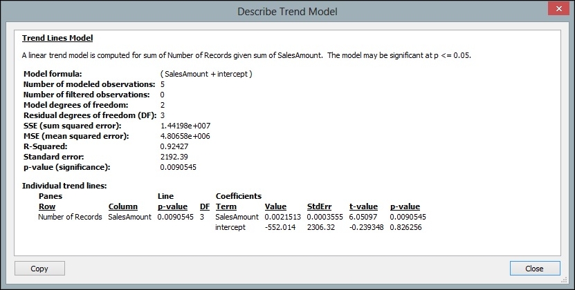
- We can see the results of the analysis in the resulting window.
Tableau provides a way to test hypotheses quickly and help business users to identify the relationships between variables. Tableau does this by simplifying the process of creating visualizations quickly and on-the-fly.
The visualization shows us that a linear correlation is produced, which shows how the sum of transactions or Number of Records is related to the sales amount.
We can see that the R-squared value is 0.92, and when we find the square root of this number, we will find that R = 0.95. This shows there is a very strong relationship between the two variables. We could then proceed to do some more analysis, but this would provide us with a great starting point.
From a dashboard perspective, Tableau also helps business processes by allowing analysts to test assumptions that are perhaps long-held and subtle. When a visualization like this is placed with other visualizations that tell a similar story, then the dashboard becomes a valuable tool for promoting real business change.