
7
Predicting Customer Churn
The churn rate is a metric used to determine how many clients or staff leave a business in a certain time frame. It might also refer to the sum of money that was lost because of the departures. Changes in a company’s churn rate might offer insightful information about the firm. Understanding the amount or proportion of consumers who don’t buy more goods or services is possible through customer churn analysis.
In this chapter, we will understand the concept of churn and why it is important in the context of business. We will then prepare the data for further analysis and create an analysis to determine the most important factors to take into account to understand the churn patterns. Finally, we will learn how to create machine learning models to predict customers that will churn.
This chapter covers the following topics:
- Understanding customer churn
- Exploring customer data
- Exploring variable relationships
- Predicting users who will churn
Technical requirements
In order to be able to follow the steps in this chapter, you will need to meet the next requirements:
- A Jupyter Notebook instance running Python 3.7 and above. You can also use the Google Colab notebook to run the steps if you have a Google Drive account.
- An understanding of basic math and statistical concepts.
Understanding customer churn
In business, the number of paying customers that fail to become repeat customers for a given product or service is known as customer churn, also known as customer attrition. Churn in this sense refers to a measurable rate of change that happens over a predetermined period of time.
Analyzing the causes of churn, engaging with customers, educating them, knowing who is at risk, identifying your most valuable customers, offering incentives, selecting the correct audience to target, and providing better service are a few strategies to reduce customer turnover.
It’s crucial to lower churn because it increases Customer Acquisition Cost (CAC) and lowers revenue. In actuality, maintaining and improving current client relationships is much less expensive than gaining new consumers. The more clients you lose, the more money you’ll need to spend on acquiring new ones in order to make up for the lost revenue. You can use the following formula to determine CAC: CAC is calculated by dividing the cost of sales and marketing by the number of new customers attracted. The proportion of consumers who come back to your firm is known as the retention rate.

This is different from the churn rate, which measures how many clients you’ve lost over time. By default, a business with a high churn rate will have a lower retention rate.
Now that we have an idea of the business value that we get by identifying the patterns that make our clients churn, in the next section, we will start to explore the data and its variables.
Exploring customer data
Our goal is to create a model to estimate the likelihood of abandonment using data pertaining to Telecom customers. This is to answer the question of how likely it is that a consumer will discontinue utilizing the service.
Initially, the data is subjected to exploratory analysis. Knowing the data types of each column is the first step in the process, after which any necessary adjustments to the variables are made.
To explore the data, we will plot the relationships between the churn variable and the other important factors that make up the dataset. Prior to suggesting a model, this work is carried out to get a preliminary understanding of the underlying relationships between the variables.
A thorough approach is taken while performing descriptive statistics, which focus on client differences based on one or more attributes. The primary variable of interest, churn, is now the focus, and a new set of interesting graphs is produced for this reason.
To examine the variables, we have to handle unstructured data and adjust data types; the first step is to explore the data. In essence, we will be learning about data distribution and arranging the data for the clustering analysis.
For the analysis we will use in the next example, the following Python modules were used:
- Pandas: Python package for data analysis and data manipulation.
- NumPy: This is a library that adds support for large, multi-dimensional arrays and matrices, along with an extensive collection of high-level mathematical functions to operate on these arrays.
- statsmodels: A Python package that provides a complement to SciPy for statistical computations, including descriptive statistics and estimation and inference for statistical models. It provides classes and functions for the estimation of many different statistical models.
- Seaborn, mpl_toolkits, and Matplotlib: Python packages for effective data visualization.
We’ll now get started with the analysis as follows:
- The first step is in the following block of code, we will load all the required packages just mentioned, including the functions that we will be using, such as LabelEncoder, StandardScaler, and KMeans:
import os
- For readability purposes, we will limit the maximum rows to 20, set the maximum columns to 50, and show the floats with 2 digits of precision:
data.head()
This block of code will load the data and show the first rows of it:
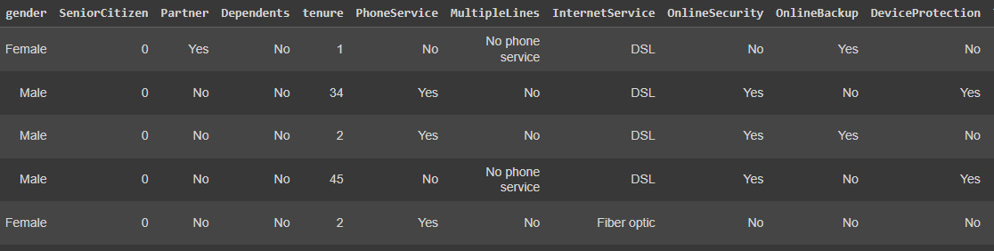
Figure 7.1: Customer data
In order to obtain information about the type of each column and the number of missing values, we can use the info method:
data.info()
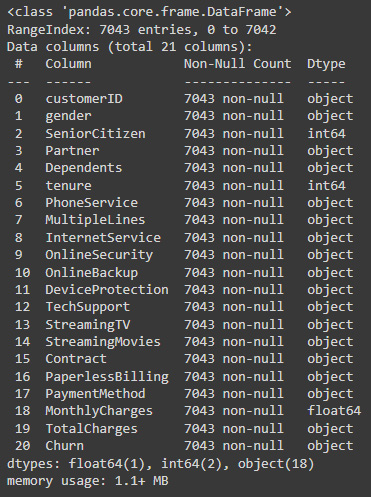
Figure 7.2: Pandas column data types
- We can see that although we don’t have null values to impute, most of the variables are categorical – meaning that we need to cast them into boolean numerical columns before using machine learning models or clustering methods. The first step is converting TotalCharges into a numerical data type:
data.TotalCharges = pd.to_numeric(data.TotalCharges, errors='coerce')
The preceding code casts the variable to a numeric variable, coercing any errors instead of failing.
We can see the results of the transformation using info again:
data.info()
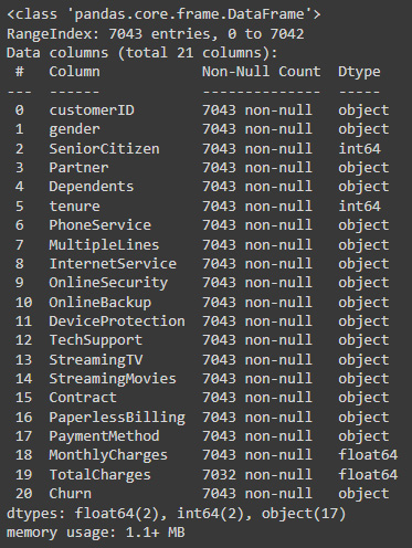
Figure 7.3: Corrected data types
The resulting transformation has been successful but has generated 10 null values that we can later drop.
- Now, we will determine the total list of categorical columns that we need to cast to dummies for better analysis:
object_cols
- There are several columns that could be easily represented by ones and zeros given that there are Yes or No values; we will determine which of these variables has only these two options and then map these values to their numerical counterparts:
yn_cols = []
For c in object_cols:
val_counts = data[c].value_counts()
print(c)
yn_cols.append(c)
- The preceding code will generate a list of categorical Yes/No columns to which we can map the data into ones and zeros:
# Iterate over the yes/no column names
for c in yn_cols:
data[c] = data[c].str.lower().map({'yes': 1, 'no': 0})
We can now re-evaluate the results of these replacements:
data.head()

Figure 7.4: Column transformed into a normalized Boolean column
We can now look at the numerical variable distribution to get a better understanding of the data using the describe method:
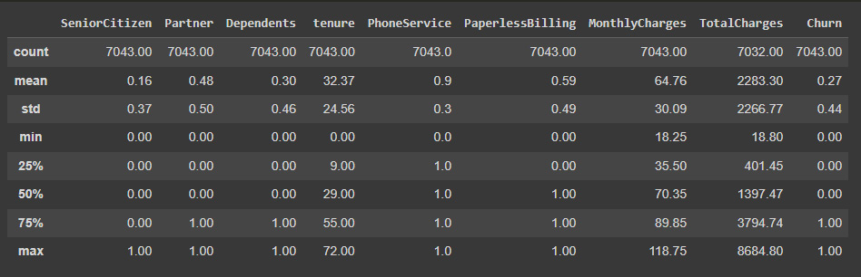
Figure 7.5: Statistical description of the data
It is interesting to see that here, 27% of clients churn, which is a very large proportion. In other contexts, these values tend to be much lower, making the dataset highly imbalanced and imposing the need to adapt the analysis to handle these imbalances. Thankfully, this is not the case, as the number of occurrences of churn is representative enough. Nevertheless, an imbalanced dataset requires us to take into consideration that we need to inspect the metrics used to evaluate the model in more depth. If we would just look into the precision, in our case, a model that just outputs the most common variable (the customer doesn’t churn) will have an accuracy of 73%. That is why we need to add more performance metrics, precision, recall, and a combination of both, such as the F1 score, and especially look at the confusion matrix to find the proportion of correctly predicted cases for each type of class.
- We can now visualize the distribution of some of these categorical variables accounting for the cases in which the users have churn. We can do this using Seaborn's countplot:
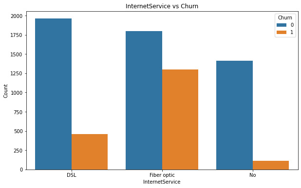
Figure 7.6: Customer internet contract versus churn
We can see that there is a big difference between the relative percentage of churn for the users that opted for the fiber optic service, compared to the ones who don’t have internet service or have DSL.
- This information can be useful for diving into the reasons or developing new promotions to address this situation:

Figure 7.7: Customer phone contracts versus churn
We can see some relative differences, again, for clients that have multiple lines, whereas the ones that don’t have multiple lines seem to churn more. These differences need to be validated with a t-test or other hypothesis testing methods to determine actual differences between the means of the groups.
- The next step is to visualize the relationship between the contract and churn:
pl.set_ylabel("Count")
The code here will show us a bar plot of contract type method versus churn:
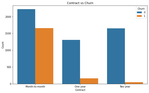
Figure 7.8: Customer contract type versus churn
Here, the client churn rate is extremely high for customers with month-to-month contracts relative to the ones that have 1- or 2-year contracts. This information can be used to create marketing strategies that seek to convert the month-to-month contracts into 1- or 2-year contracts.
- Finally, our last variable exploration focuses on the type of payment method. The next plot will show us the relationship of churn to the type of payment used:
pl.set_ylabel("Count")
The code here will show us a bar plot of payment method versus churn:

Figure 7.9: Customer payment method versus churn
Here, the difference is clear between the ones using electronic checks rather than other kinds of payment methods.
Up next, we will explore the variable relationships between the different variables using Seaborn's pairplot and with the use of correlation analysis.
Exploring variable relationships
Exploring the way in which variables move together can help us to determine the hidden patterns that govern the behaviors of our clients:
- Our first step here will be using the Seaborn method to plot some of the relationships, mostly between numerical continuous variables such as tenure, monthly charges, and total charges, using the churn as the hue parameter:
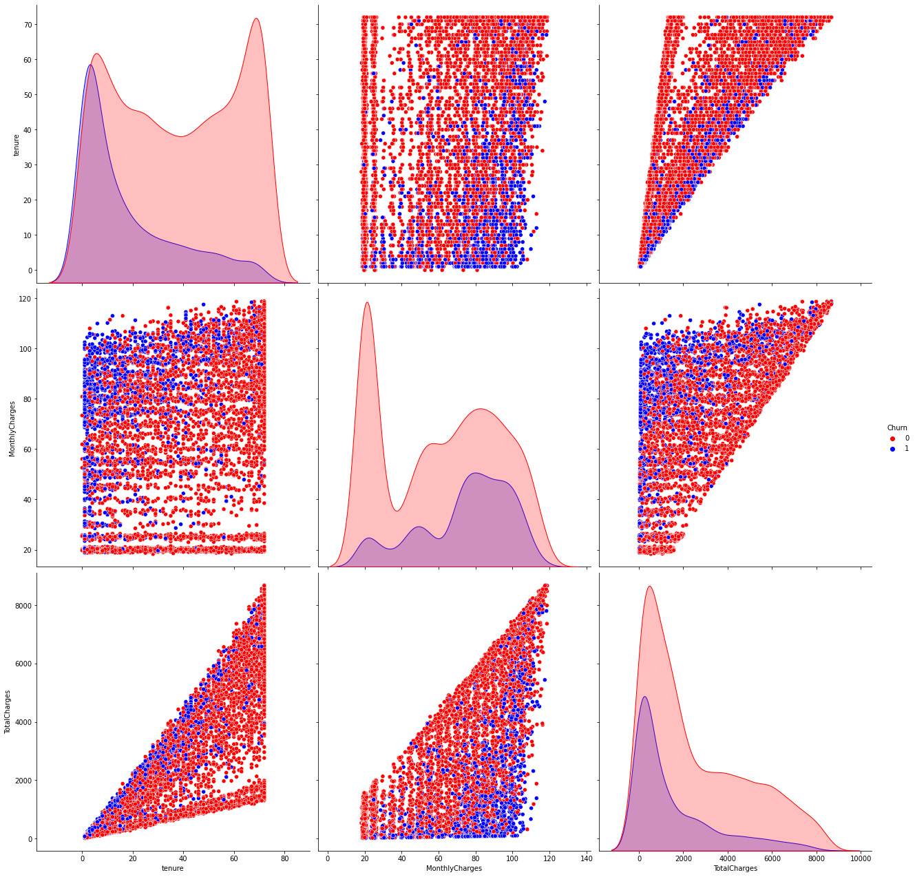
Figure 7.10: Continuous variable relationships
We can observe from the distributions that the customers who churn tend to have a low tenure number, generally having low amounts of monthly charges, as well as having much lower total charges on average.
- Now, we can finally transform and determine the object columns that we will convert into dummies:
object_cols
- Once these columns are determined, we can use the get_dummies function and create a new DataFrame only with numeric variables:
data.head()
The preceding code will show us the data restructured:

Figure 7.11: Restructured data
Here, the data can effectively describe each one of the customers’ descriptive levels so that the information is represented numerically rather than categorically. These factors consist of tenure, subscription type, cost, call history, and demographics, among other things. The fact that the dimensions need to be represented numerically is because most machine learning algorithms require the data to be this way.
- As the next step, we will be studying the relationship of variables to determine the most important correlations between them:
import numpy as np
sns.heatmap(df_corr, annot=True,ax=ax)
The code determines these correlations and constructs a triangular dataset that we can plot as a heat map to clearly visualize the relationship between the variables.
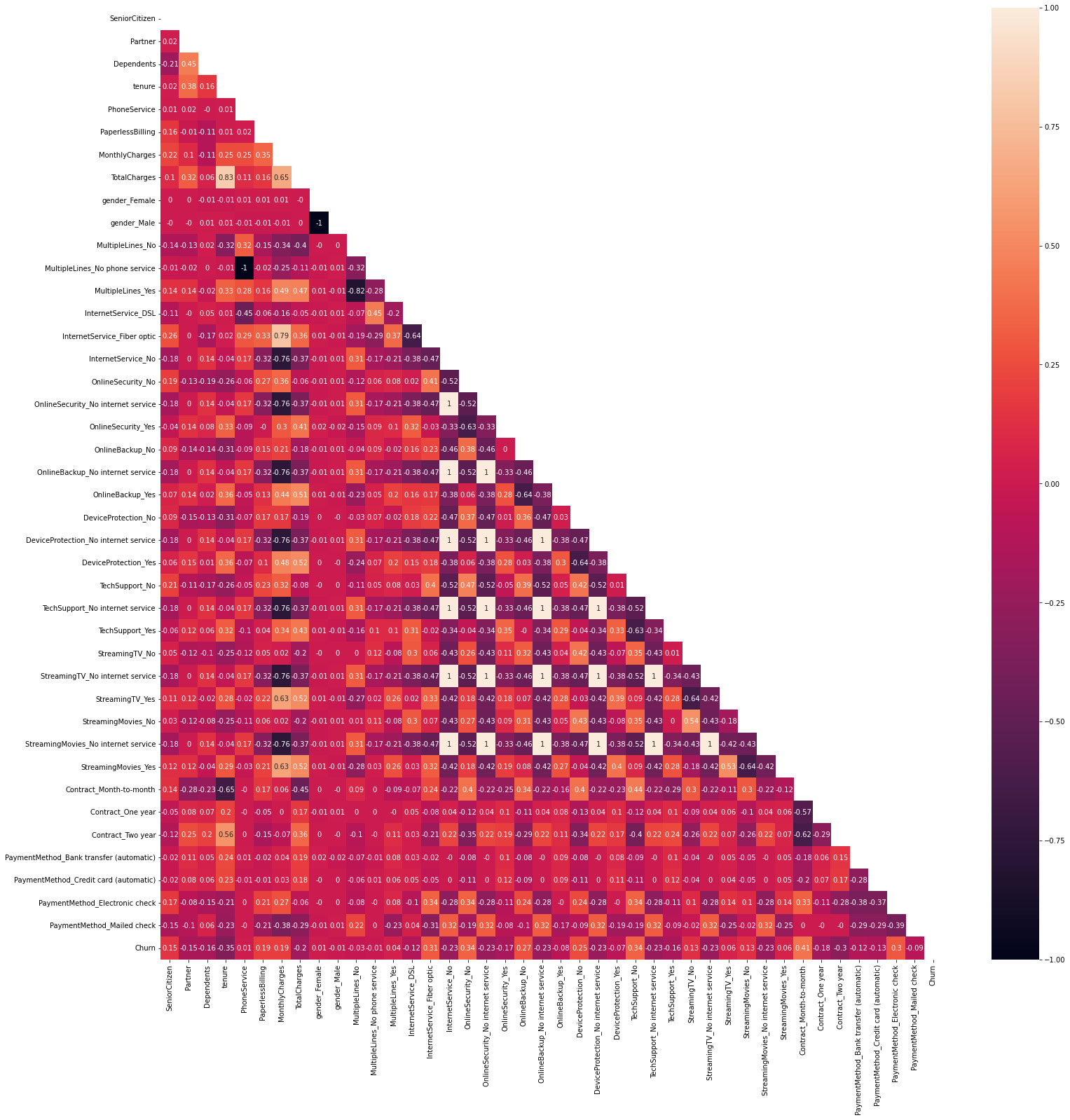
Figure 7.12: Variable correlations
Here, we can visualize the entire set of variable correlations, but we may just look at the ones that are related to our target variable. We can see that some variables that depend on others will have a correlation of 1 to this variable – for example, in the case of internet contract = no, which has a correlation equal to 1 with streaming service = no. This is because if there is no internet contract, it is obvious that you won’t be able to access a streaming service that requires an internet contract.
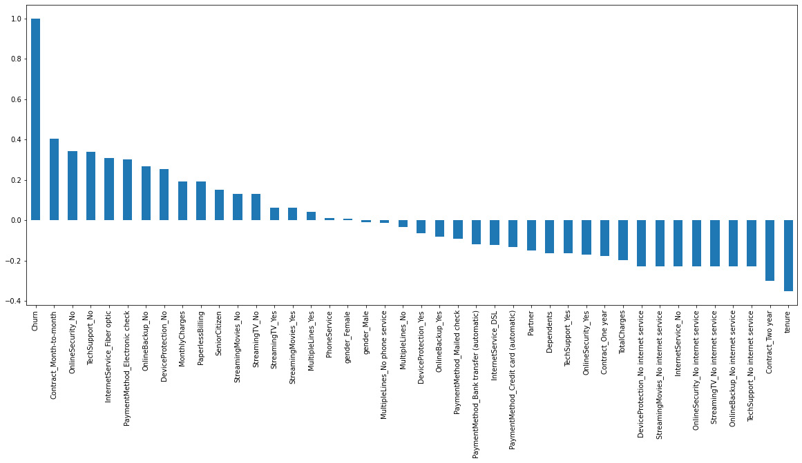
Figure 7.13: Most important correlations to churn
This information is really useful, as it not only determines the variables associated with a higher degree of churn but also the ones that lead to a lower churn rate, such as the tenure time and having a 2-year contract. It would be a good practice to remove the churn variable here as the correlation of the variable with itself is 1 and distorts the graphic.
After going through this EDA, we will develop some predictive models and compare them.
Predicting users who will churn
In this example, we will train logistic regression, random forest, and SVM machine learning models to predict the users that will churn based on the observed variables. We will need to scale the variables first and we will use the sklearn MinMaxScaler functionality to do so:
- We will start with logistic regression and scale all the variables to a range of 0 to 1:
x_scaled.head()
The preceding code will create the x and y variables, out of which we only need to scale x.
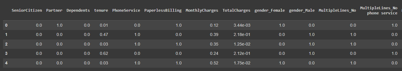
Figure 7.14: Model input features
It is important to scale the variables in logistic regression so that all of them are within a range of 0 to 1.
- Next, we can train the logistic regression model by splitting the data to get a validation set first:
x_train, x_test, y_train, y_test = train_test_split(
preds_lr = model.predict(x_test)
Finally, we can print the prediction accuracy:
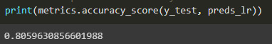
Figure7.15: Logistic regression model accuracy
We have obtained good accuracy in the model.
- We can also get the weights of all the variables to weigh their importance in the predictive model:
pd.concat([weights.head(10),weights.tail(10)]).sort_values(ascending = False).plot(kind='bar',figsize=(16,6))
The preceding code will create a data frame of the weights of the 10 most positive and 10 most negative weighted variables.
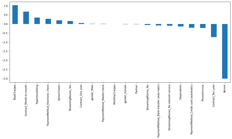
Figure 7.16: Model feature importance
It is interesting to see how the total charges and the tenure, especially the latter, have great importance in the regression. The importance of these variables is also validated by looking at the variable correlation. An important next step would be to do a deeper analysis of the relationship of this variable to the churn variable to understand the mechanism behind this relationship.
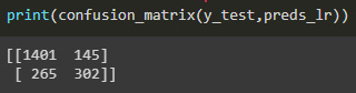
Figure 7.17: Model confusion matrix
In the confusion matrix, the information shown in the columns are the distinct classes (no churn and churn) and in the rows are the predicted outcomes in the same order (no churn, churn). The values in the diagonal represent the true positives, predicted to be a class that it in fact was. The values that are outside the diagonal are the values predicted wrong. In our case, we correctly classified 1401 cases of no churn, mislabeled 265 no churn as churn, predicted 145 cases to churn when in fact they didn’t, and correctly classified 302 cases of churn. We can see from the confusion matrix that the model is good at predicting the most common cases, which is that there is no churn, but it got almost a third of the classes wrong, which is important for us to predict.
- Our next step is to create a classification system made up of several decision trees called a random forest. It attempts to produce an uncorrelated forest of decision trees, which is more accurate than a single individual tree, using bagging and feature randomness when generating each individual tree.
In the next code, we will use the RandomForestClassifier class from sklearn and train it on the data:
from sklearn.ensemble import RandomForestClassifier
model_rf = RandomForestClassifier(n_estimators=750 , oob_score = True, random_state =50, max_features = "auto",max_leaf_nodes = 15)
model_rf.fit(x_train, y_train)
- Finally, we have trained the model and we can make predictions:
print(metrics.accuracy_score(y_test, preds_rfc))
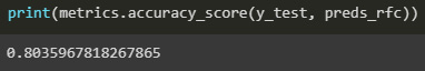
Figure 7.18: Random forest model accuracy
We have obtained an accuracy very similar to the regression model.
- Let’s see the variable importance of the model as the next step:
The preceding code will show us the 10 most positive and 10 most negative weights of the model.
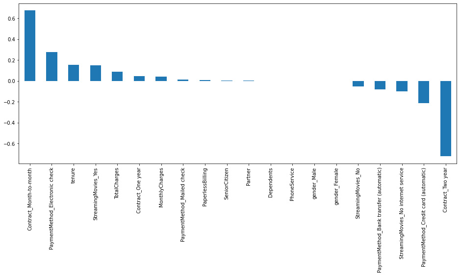
Figure 7.19: Model feature importance
This model has a different ranking, having, in the extremes, the month-to-month contract and the 2-year contract:

Figure 7.20: Model confusion matrix
This model predicts our target variable better, which makes it suitable for our needs.
- Next, we will train a supervised machine learning technique known as a Support Vector Classifier (SVC), which is frequently used for classification problems. An SVC separates the data into two classes by mapping the data points to a high-dimensional space and then locating the best hyperplane:
The code here will fit the model to the data and print the accuracy score.
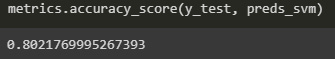
Figure 7.21: Model accuracy score
- The accuracy score is still in the same range as the other models, so let’s look at the absolute weight importance of the model:
The code here will prompt the 10 most important variables for the model.
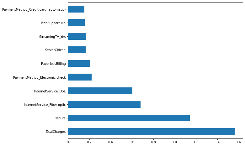
Figure 7.22: Model feature importance
We can see that tenure and total charges are variables of importance for the model, which is something that we saw in the other models as well. The drawback of this kind of visualization is that we cannot see the orientation of this importance.
- Let’s look at the performance of predicting our target variable:
The next step is the confusion matrix, which will allow us to determine with more certainty which labels we are correctly predicting.

Figure 7.23: Model confusion matrix
The model is less accurate than the random forest for predicting whether the clients will churn or not.
It is always good to combine the various perspectives of the confusion matrix, as the accuracy will not work as a performance metric alone if the set is imbalanced.
Summary
In this chapter, we analyzed a very common business case: customer churn. Understanding the causes of this, as well as being able to take preventive actions to avoid this, can create a lot of revenue for a company.
In the example that we have analyzed, we have seen how to clean the variables in a dataset to properly represent them and prepare them for machine learning. Visualizing the variables in a relationship against the target variable that we are analyzing allows us to understand the problem better. Finally, we trained several machine learning models that we later analyzed to understand how their performances were when predicting the target variable.
In the next chapter, we will focus more of our attention on understanding how variables affect segments and group users with homogenous characteristics to understand them better.