
10
Web Analytics Optimization
A data-driven marketing optimization is an analytical approach to marketing that values decisions that can be supported with trustworthy and verifiable data. It places high importance on choices that can be substantiated by empirical evidence, whether traffic sources, page views, or time spent per session. The effectiveness of data collection, processing, and interpretation to maximize marketing results are key components of the data-based approach’s success.
In this chapter, we will be learning about the following:
- Understanding what web analytics is
- How web analytics data is used to improve business operations
- Calculating the user’s customer lifetime value (CLV) based on web analytics data
- Predicting the user’s CLV based on this historical data
Let’s determine what the requirements will be for understanding these steps and following the chapter.
This chapter covers the following topics:
- Understanding web analytics
- Using web analytics to improve business decisions
- Exploring the data
- Calculating CLV
- Predicting customer revenue
Technical requirements
In order to be able to follow the steps in this chapter, you will need to meet the next requirements:
- A Jupyter Notebook instance running Python 3.7 and above. You can use the Google Colab notebook to run the steps as well if you have a Google Drive account.
- Understanding of basic math and statistical concepts.
Understanding web analytics
For e-commerce, understanding user base behavior is fundamental. Data from web analytics is frequently shown on dashboards that can be altered on the basis of a user persona or time period, along with other factors. These dashboards are then used to make product and market decisions, so the accuracy of this data is of paramount importance. The data can be divided into groups, including the following:
- By examining the number of visits, the proportion of new versus returning visitors, the origin of the visitors, and the browser or device they are using (desktop vs. mobile), it is possible to understand audience data
- Common landing pages, commonly visited pages, common exit pages, the amount of time spent per visit, the number of pages per visit, and the bounce rate can all be used to study audience behavior
- Campaign data to understand which campaigns have generated the most traffic, the best websites working as referral sources, which keyword searches led to visits, and a breakdown of the campaign’s mediums, such as email versus social media
This information can then be used by sales, product, and marketing teams to gain knowledge about how the users interact with the product, how to tailor messages, and how to improve products.
One of the best and most potent tools available for tracking and analyzing website traffic is Google Analytics. You can learn a ton about your website’s visitors from this, including who they are, what they are looking for, and how they found you. Google Analytics should be used by every company that wants to develop and improve its online presence.
The most crucial information that Google Analytics will provide you with is listed here:
- Where your visitors are coming from – very important if you’re targeting a specific audience.
- How people find your website is crucial information for figuring out whether your efforts are successful. It indicates whether users arrived at your site directly, via a link from another website (such as Twitter or Facebook), or via search engines.
- Browsers used by your visitors – by understanding which browsers they use, you can decide which ones you should concentrate on.
- Which search engine terms people used to find your website are essential information for SEO. Finding out what search terms people use to find your website helps you gauge your progress.
In the next section, we will dive into how we can use Google Analytics data to understand our customer bases.
Using web analytics to improve business operations
By utilizing insights from digital analytics and user input, we can increase the performance of our websites and apps through conversion rate optimization. This is done by using the current traffic and maximizing it, with the intention of leading to a rise in sales, leads, or any other goal.
With the help of digital analytics dashboards and analysis, we can monitor user activity, including their source, where they go on our website or app, and how they move around the various pages. We can determine where there is the most potential and what needs to be changed to meet the specified aims and objectives thanks to the content and user behavior analysis.
Tagging for a business’s website or app has context thanks to the definition and execution of a measurement plan. This enables companies to perform a strengths, weakness, opportunities, and threats (SWOT) analysis, which will lead to fixing your goals and objectives and indicate which user segments must be targeted with particular content and messaging both inside and outside the website or app.
An A/B or multivariate test is also possible when the opportunity or threat has been identified. With this, we may display two (or more) different iterations of a website’s functionality to various user groups and then assess which one performs better. We can make data-driven decisions using this method while ignoring factors such as seasonal impacts.
Now that we have the context of the application, let’s start by looking at the dataset and understanding our needs, our objectives, and the limitations of the analysis.
Exploring the data
We will use the following Python modules in the next example:
- pandas: Python package for data analysis and data manipulation.
- NumPy: This is a library that adds support for large, multi-dimensional arrays and matrices, along with a large collection of high-level mathematical functions to operate on these arrays.
- Statsmodels: Python package that provides a complement to SciPy for statistical computations, including descriptive statistics and estimation and inference for statistical models. It provides classes and functions for the estimation of many different statistical models.
- Seaborn and Matplotlib: Python packages for effective data visualization.
We’ll get started using the following steps:
- The following block of code will load all the required packages, as well as load the data and show the first five rows of it. For readability purposes, we will limit the maximum number of rows to be shown to 20, set the limit of maximum columns to 50, and show the floats with 2 digits of precision:
df.head()
The preceding code will load the file, convert the date column into the correct data type, and prompt us to the first rows.
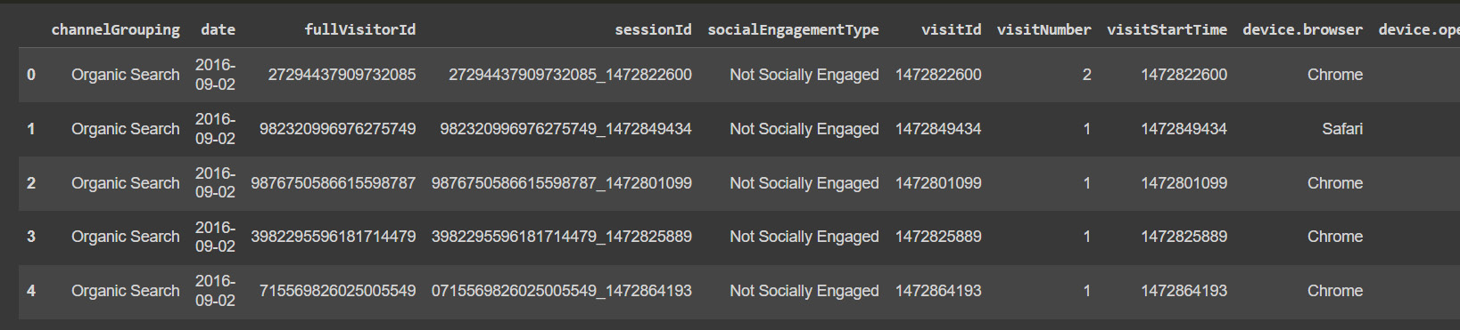
Figure 10.1: Google Analytics sample data
We can see that it’s a demo of the data that we can obtain from Google Analytics, as some columns are not available.
This line will show us the name of all the columns in the file.
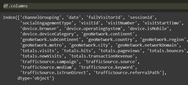
Figure 10.2: Column names
From the information that we obtain about the columns and the data from the Kaggle competition, we can describe the columns in the dataset:
- fullVisitorId: Identifier for each user.
- channelGrouping: The channel from which the customer was redirected.
- date: The date of the visit.
- Device: Type of device used.
- geoNetwork: Location of the customer.
- socialEngagementType: Is the customer socially engaged?
- trafficSource: This shows the source of the traffic.
- visitId: Identifier of the specific visit.
- visitNumber: Count of sessions for the specific customer.
- Now that we have the information about the columns, we can plot the revenue columns to look at their distribution:
df['totals.transactionRevenue'].plot(figsize=(12,4))
This line will use pandas plot methods to show the distribution of the column.
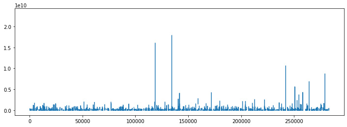
Figure 10.3: Revenue distribution
Many companies have found the 80/20 rule to be true: only a tiny proportion of clients generate the majority of the revenue, and we can verify this by looking at the data, with a small proportion of clients generating the most amount of revenue. The problem for marketing teams is allocating the proper funds to promotional activities. In this instance, the ratio is significantly lower.
- The statistical link between the data points is depicted using a relational plot. Data visualization is crucial for spotting trends and patterns. This graphic gives users access to additional axes-level functions that, using semantic subset mappings, can illustrate the relationship between two variables. Passing the entire dataset in long-form mode will aggregate over repeated values (each year) to show the mean and 95% confidence interval.
Here, we use the seaborn package to create a relation plot with 95% confidence interval areas for the revenue column:
import seaborn as sns
sns.relplot(x='date', y='totals.transactionRevenue', data=df,kind='line',height=8, aspect=2.2)
This showcases the distribution of the transactions with a confidence interval as follows:

Figure 10.4: Revenue distribution with a confidence interval
One of the problems we see here is that because of the difference in value, the data is difficult to see, so we will implement a logarithmic scale. When examining a wide range of values, a nonlinear scale called a logarithmic scale is frequently utilized. Each interval is raised by a factor of the logarithm’s base rather than by equal increments. A base ten and base e scale are frequently employed.
Sometimes, the data you are displaying is much less or greater than the rest of the data – when the percentage changes between values are significant, logarithmic scales also might be helpful. If the data on the visualization falls within a very wide range, we can use a logarithmic scale.
Another benefit is that when displaying less significant price rises or declines, logarithmic pricing scales perform better than linear price scales. They can assist you in determining how far the price must rise or fall in order to meet a buy or sell target. However, logarithmic price scales may become crowded and challenging to read if prices are close together. When utilizing a logarithmic scale, when the percent change between the values is the same, the vertical distance between the prices on the scale will be equal.
- Here, we will implement the logarithmic scale using the numpy library on the revenue column:
df['totals.transactionRevenue'].plot(figsize=(12,4))
Here, we can see the transactions on a logarithmic scale.
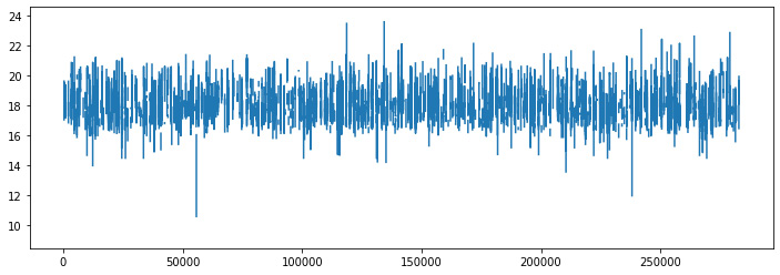
Figure 10.5: Logarithmic scale revenue
- We can now use the relationship plot to visualize the logarithmic transaction values with their confidence interval better:
sns.relplot(x='date', y='totals.transactionRevenue', data=df,kind='line',height=8, aspect=2.2)
We can get better visibility with relplot, which will plot the mean data as a line and show the confidence intervals where 95% percent of the data exists.
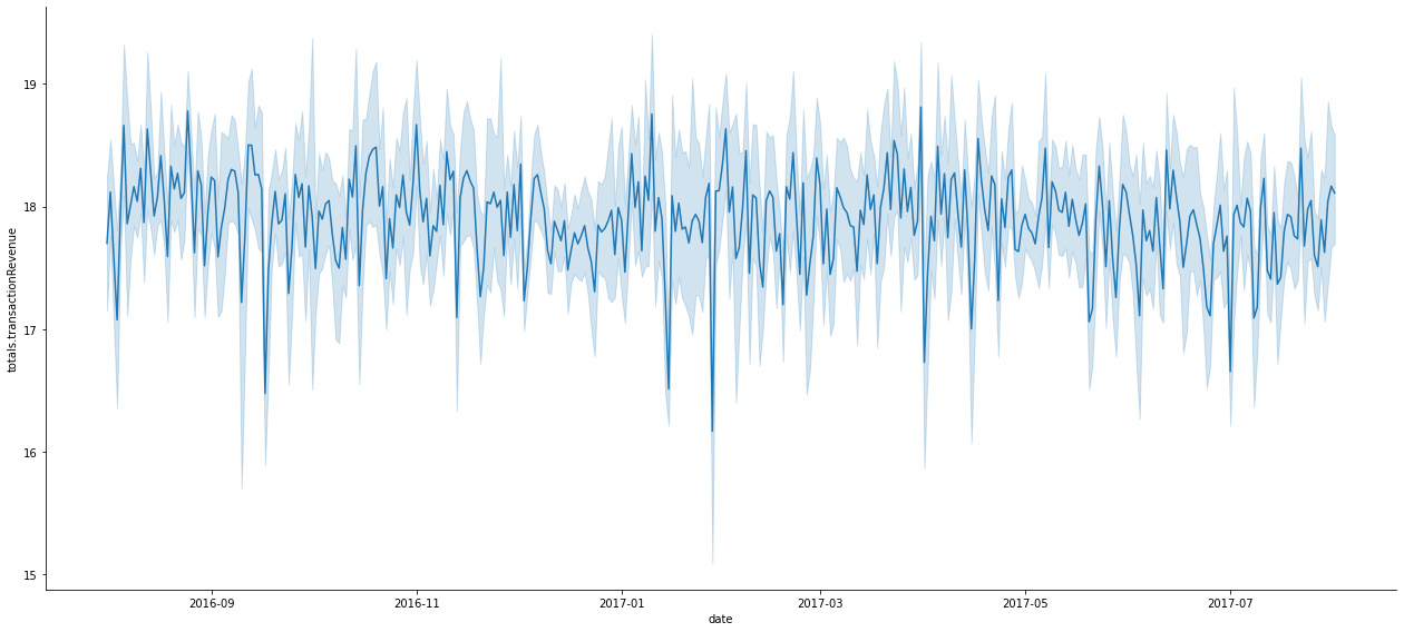
Figure 10.6: Logarithmic scale revenue with a confidence interval
- Another way to visualize this is by using scatter plots, which will be helpful for identifying outliers:
fig =sns.scatterplot(x='fullVisitorId', y='totals.transactionRevenue',size=4,alpha=.8,color='red', data=data)
The scatter plot shows us that there are some outliers.

Figure 10.7: Transactions as scatter plot
Here, we can see more clearly that there are just a couple of users who generate an incredibly high amount of revenue with their orders.
- Now, we can look at the expenditure patterns of the top 50 clients:
top_50_customers['totals.transactionRevenue'].plot.bar(figsize=(15,6))
The next is a barplot of the top customers.
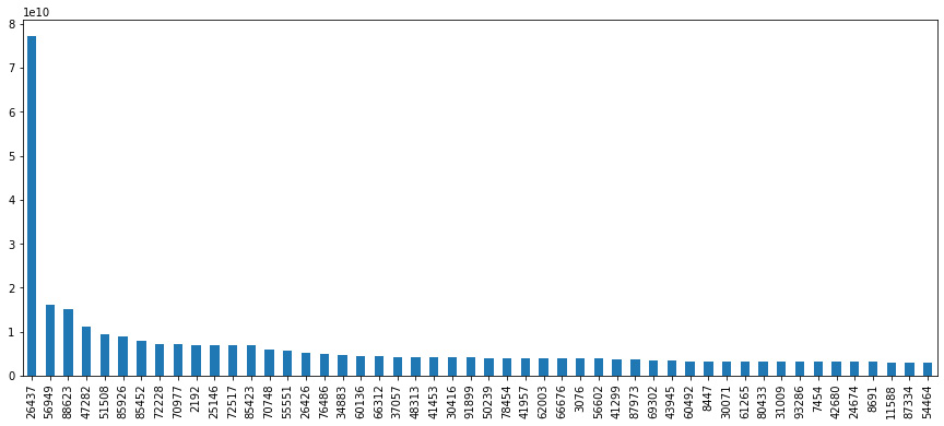
Figure 10.8: Users with the highest revenue
We can confirm from this graphic that user 26437 is our biggest customer.
- Finding potential markets for your goods and services with Google Analytics is another fantastic application of the tool. You can check the number of visits and conversion rates separately by country to choose where to focus your efforts and which locations are worth expanding into if your business runs on a worldwide scale or if you are considering becoming global. Here, we can analyze the top countries in our user base:
global_countries.plot.bar(figsize=(16,6))
The preceding code will show us the countries that the users come from.
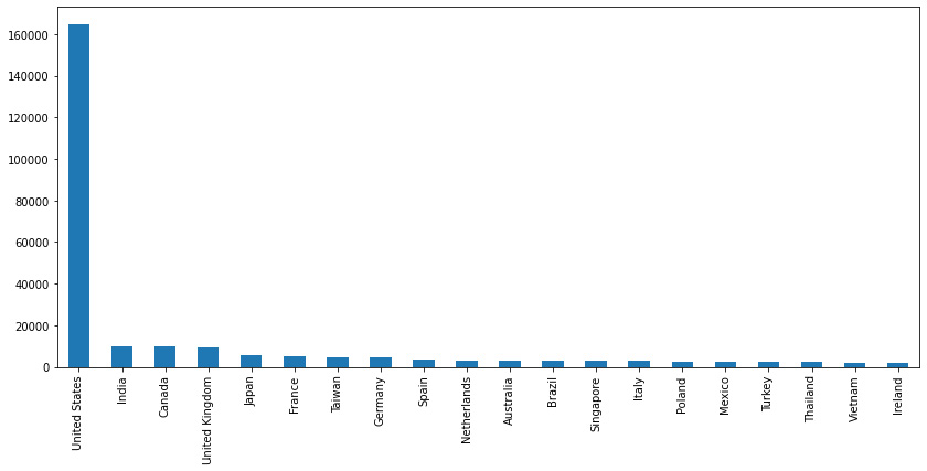
Figure 10.9: Total countries
We can see that the vast majority of users are concentrated in the US.
- Let’s now focus on our top clients and see where they come from. We can do this by masking the users that are in our top 50 users list and then replicating the preceding graphic:
top_50_countries.plot.bar(figsize=(12,6))
The preceding code will show us the top countries in a barplot.

Figure 10.10: Countries of biggest customers
Again, we can determine that our biggest clients come from the US, followed by Kenya and Japan.
- Now, we will analyze how many of our visitors actually converted, meaning that they actually bought something:
print("Number of unique customers with non-zero revenue: ", len(data)-zero_revenue_users, "and the ratio is: ", zero_revenue_users / len(data))>>> Number of unique customers with non-zero revenue: 6876 and the ratio is: 0.9264536003080478
The ratio is that almost 8% of our users have actually bought from the website, which is good.
- Now, we will start the process of cleaning the data, so we will look for categorical columns with just a single value. These are columns that don’t provide any data, so we will get rid of them:
Const_cols
df = df.drop(const_cols, axis=1)
- Now, we will simplify the data by removing some of the columns that we will not be using:
df.columns
The following screenshot shows the columns we have now:

Figure 10.11: Final set of columns
- Our columns have now been reduced to the ones that we actually need. Now, let’s explore the campaign column to find which campaign was more successful:
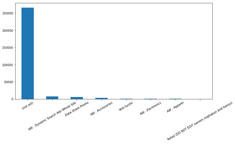
Figure 10.12: Campaign data
We can see from the campaign data that most of the traffic doesn’t come from campaigns, and some of them actually perform poorly. This is information that could help the marketing team to optimize these campaigns and save money.
Calculating CLV
Customer lifetime value (CLV) is a metric used to describe how much money a company can expect to make overall from a typical customer during the duration that person or account stays a customer. CLV is the total amount a company makes from a typical customer during the term of that customer’s relationship with the company and it is used in marketing to forecast the net profit that will be generated over the course of a customer’s entire future relationship.
Knowing the CLV of our clients is crucial since it informs our choices regarding how much money to spend on attracting new clients and keeping existing ones. The simplest way to calculate CLV is by multiplying the average value of a purchase by the number of times the customer will make a purchase each year by the average length of the customer relationship (in years or months).
Numerous benefits can be derived from calculating the CLV of various clients, but business decision-making is the key one. Knowing your CLV allows you to find out things such as the following:
- How much you can spend and still have a lucrative connection with a similar consumer
- What kinds of products customers with the highest CLVs want
- Which products have the highest profitability
- Who your most profitable types of clients are
Spending your resources on selling more to your present client base is the key since the odds of selling to a current customer are 60 to 70 percent, compared to the odds of selling to a new customer, which are 5 to 20 percent. Several strategies will make it more likely for a consumer to make additional purchases from a company. Some of these methods are as follows:
- Make returning things that they have purchased from you simple for your clients, as making it difficult or expensive for a user to return a product will drastically lower the likelihood that they will make another purchase.
- Set expectations for delivery dates with the goal of exceeding expectations by establishing a safety margin. Promise delivery by May 20 and deliver it by May 1 instead of the other way around.
- Create a program with attainable and desired incentives for users to repeat purchases.
- To encourage customers to stick with your brand, provide incentives.
- Maintain contact with long-term clients to assert that you are still thinking of them. Give them a simple way to contact you as well.
- Focusing on acquiring and keeping repeat consumers who will promote your brand, as well as long-term clients.
More concretely, the steps to calculate the CLV are as follows:
- Slice the data into chunks of 3 months.
- Sum the revenue for each customer in the last 3 months.
- Generate columns such as days since the last buy, average number of days between buys, and so on.
We’ll run this using the following steps:
- To apply this, we will define some helper functions that we will use along with the aggregate method in pandas to determine the CVL of our users:
return x.mean()
return x.count()
return (x.max() - x.min()).days/x.count()
- We want to establish the time frame of analyses as 3 months, so we will create a variable to establish this:
clv_freq = '3M'
- One thing to note is that we will be using the __name__ property to determine the function name in Python and to keep the column names tidy. To access the __name__ property, just put in the function name without parentheses and use the __name__ property. It will then return the function name as a string:
avg_frequency.__name__ = 'purchase_frequency'
- Now, we can create our summary DataFrame by applying the groupby method and aggregating the values using our previously defined functions:
})
- Lastly, we will make some corrections to the column names for readability:
summary_df.columns = ['_'.join(col).lower() for col in summary_df.columns]
We can check the final size of the DataFrame:
summary_df.shape
>>> (93492, 9)
We can also check the distribution of the values with the describe method:
summary_df.describe()
Here, we are calling a statistical summary from pandas:
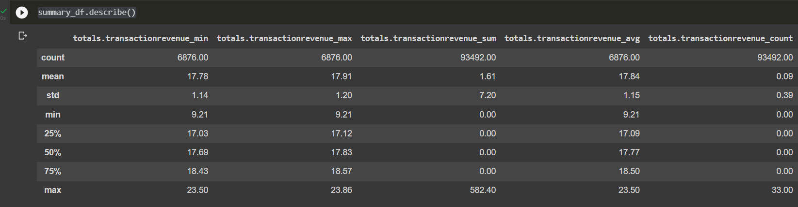
Figure 10.13: Calculated user CLV
- Now, let’s filter the ones that have actually bought something by looking at the purchase date:
summary_df = summary_df.loc[summary_
df['date_purchase_duration'] > 0]
After this, we have widely reduced the number of users in our dataset:
summary_df.shape
>>> (66168, 9)
- We can visualize these results by plotting the grouped results using the transaction count:
ax = summary_df.groupby('totals.transactionrevenue_count').count()['totals.transactionrevenue_avg'][:20].plot(grid=True
)
plt.show()
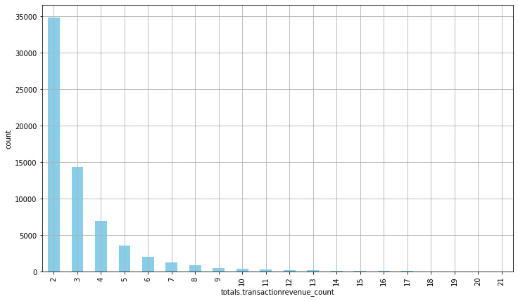
Figure 10.14: Transaction revenue count
- Now, the most common number of transactions made is 2, reducing in a parabolic manner. This gives us enough information to be able to offer customers incentives to keep buying after their second transaction.
Now let’s take a look at the number of days between transactions:
ax = summary_df['date_purchase_frequency'].hist(
    bins=20,
    color='blue',
    rwidth=0.7,
    figsize=(12,7)
)
ax.set_xlabel('avg. number of days between purchases')
ax.set_ylabel('count')
plt.show()
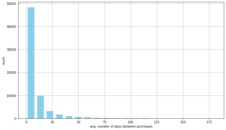
Figure 10.15: Time between purchases
This information shows us that it’s rare for customers to make another purchase after 25 days, so we can use this information to keep our users engaged in case the number of times between transactions is higher than a given threshold. This allows us to reduce customer churn and improve loyalty.
Now, we have determined how we can calculate the CLV, which will allow us to craft better marketing strategies, knowing exactly what we can spend to acquire each customer.
Predicting customer revenue
By utilizing the historical transactional data from our company, we are attempting to forecast the future revenue that we will get from our clients at a given time. Planning how to reach your revenue goals is simpler when you can predict your revenue with accuracy, and in a lot of cases, marketing teams are given a revenue target, particularly after a funding round in startup industries.
B2B marketing focuses on the target goals, and here is when historical forecasting, which predicts our revenue using historical data, has consistently been successful. This is because precise historical revenue and pipeline data provide priceless insights into your previous revenue creation. You can then forecast what you’ll need in order to meet your income goals using these insights. Things that will allow us to provide better information to the marketing teams can be summarized into four metrics before you start calculating your anticipated revenue:
- How long you take to generate revenue
- The average time deals spend in each pipeline stage
- The number of previous deals
- The revenue generated for the time period
These metrics form the basis of your predicted revenue in most cases and will allow the creation of better-defined marketing plans.
Questions such as how long it takes for a user to start making money require you to gather these metrics. Knowing your user’s time to revenue (the length of time it takes a deal to generate a paying customer) is the first step. This is due to the fact that time to revenue determines the framework for how long it typically takes you to create revenue and earn back the investment made into gaining this customer, from the moment an account is created to the user making a purchase. If these metrics are omitted, your revenue cycle and your estimates will be out of sync without this parameter, which may cause you to miss goals and allocate money incorrectly. The fact is that you must be aware of your time to revenue.
Equally, the only way to measure it precisely is to gather data starting from the instant an anonymous user first interacts with you until the moment this account converts to a client. If you don’t identify first contact, you’re measuring incorrectly and, once more, underestimating how long it actually takes you to make an income:
- We will start the analysis by importing the packages that we will be using, including the LightGBM classification. It’s important to note that we will the transaction NaN values with zeros:
import lightgbm as lgb
id = df["fullVisitorId"].values
To make categorical data available to the various models, categorical data must be translated into integer representation first through the process of encoding. Data preparation is a necessary step before modeling in the field of data science – so, how do you handle categorical data in data science? Some of the methods used are as follows:
- One-hot encoding using Python’s category_encoding library
- Scikit-learn preprocessing
- get_dummies in pandas
- Binary encoding
- Frequency encoding
- Label encoding
- Ordinal encoding
When data cannot be transported across systems or applications in its existing format, this method is frequently employed to ensure the integrity and usefulness of the data. Data protection and security do not employ encoding because it is simple to decode.
A very effective method for converting the levels of categorical features into numerical values is to use labels with a value between 0 and n classes - 1, where n is the number of different labels. Here, we are encoding the variables using LabelEncoder. A label that repeats assigns the same value as it did the first time.
- We will list the categorical columns that we want to encode. Here, the list is hardcoded, but we could have used pandas data types to determine the object column:
cat_cols = ['channelGrouping','device.browser','device.deviceCategory','device.operatingSystem','geoNetwork.country','trafficSource.campaign','trafficSource.keyword','trafficSource.medium','trafficSource.referralPath','trafficSource.source','trafficSource.isTrueDirect']
- Now, we will iterate over them and encode them using LabelEncoder:
print(col)
df[col] = lbl.transform(list(df[col].values.astype('str'))) - Now that the categorical columns have been converted, we will continue to convert the numerical columns into floats to meet the requirements of LightGBM.
The next are the columns that we will be working with:
- As the next step, we use the astype pandas method to cast these data types into floats:
print(col)
df[col] = df[col].astype(float)
- Now, we can split the training dataset into development (dev) and valid (val) based on time:
import datetime
val_df = df[df['date']>'2017-05-31']
- Apply the log to the revenue variable:
val_y = np.log1p(val_df["totals.transactionRevenue"].values)
- Next, we concatenate the categorical and numerical columns:
val_X = val_df[cat_cols + num_cols]
The final shape of the development DataFrame can be found as follows:
dev_df.shape
>>> (237158, 20)
The final shape of the validation DataFrame can be found as follows:
val_df.shape
>>> (45820, 20)
In order to predict the CLV of each user, we will use the LightGBM regressor as specified before. This algorithm is one of the best-performing and it’s a decision tree algorithm.
A decision tree is a supervised machine learning tool that can be used to classify or forecast data based on how queries from the past have been answered. An example of supervised learning is a decision tree model, which is trained and tested on datasets that have the desired category. The non-parametric approach used for classification and regression applications is the decision tree. It is organized hierarchically and has a root node, branches, internal nodes, and leaf nodes.
LightGBM is a gradient-boosting algorithm built on decision trees that improves a model’s performance while using less memory. An open source gradient boosting implementation in Python, also called LightGBM, is made to be as effective as existing implementations, if not more so. The software library, machine learning method, and open source project are all referred to collectively as LightGBM.
The benefits of LightGBM include faster training rates and greater effectiveness: LightGBM employs a histogram-based approach, which accelerates the training process by bucketing continuous feature values into discrete bins. This technique also converts continuous values into discrete bins, which use less memory.
- To simplify the training pipeline, we will implement a custom function to run the LightGBM model. This function has predefined parameters that we can change according to the performance obtained. These parameters are passed as a dictionary and the documentation can tell you a bit more about them:
params = {"num_leaves" : 50,
"learning_rate" : 0.1,
"verbosity" : -1
}
model = lgb.train(params, lg_train , 1000,
verbose_eval=100)
pred_val_y = model.predict(val_X,
return model, pred_val_y
Here, the function loads the training and development datasets using the Dataset method and trains the model using the specified parameters during 1,000 steps. The development dataset is used for validation, as it will give us information about the overall performance of the model.
- Now, we can train the model:
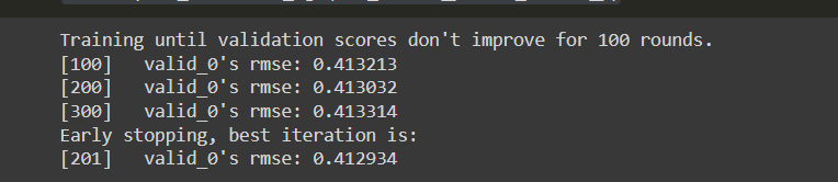
Figure 10.16: RMSE values for the revenue per user
The result shows us that the performance of the model can be improved, which would require us to fine-tune the parameters until we reach a level of performance that is within our interval of confidence.
Summary
Web analytics allows us to optimize the performance of the products and services sold online. The information obtained enables us to improve the way in which we communicate with clients, thanks to a deeper understanding of our customers and their consumption patterns. In this chapter, we have dived into a basic understanding of this data and how it can be used to determine the CLV of our customers, understand their characteristics, and identify key metrics to establish a successful digital marketing plan.
The next chapter will look into the considerations made by several industry experts on how data, machine learning, and BI can be used in real-life business contexts to improve operations.