
3
Finding Business Opportunities with Market Insights
In recent years, the word insight has been used with more frequency among innovation market testers. Most of the time it’s utilized without a clear definition, sometimes implying that there are hidden patterns in the data that is being utilized, or it can be used in the context of business to create new sources of revenue streams, to define more clearly the conditions and preferences of a given market, or how the different customer preferences vary across different geographies or groups.
In this chapter, we will use search engine trends to analyze the performance of different financial assets in several markets. Overall, we will focus on the following:
- Gathering information about the relative performance of different terms using the Google Trends data with the Pytrends package
- Finding changes in the patterns of those insights to identify shifts in consumer preferences
- Using information about similar queries to understand the search patterns associated with each one of the financial products we are studying
After that, we will go through the different stages of the analysis, and by the end of the chapter, you will be able to do the following:
- Use search engine trends to identify regions that might be susceptible to liking/buying/subscribing to a given product or service
- Understand that these relationships are changing in their behavior and adapt to those changes
- Expand the search space analysis with terms that relate to the original queries to gather a better understanding of the underlying market needs
This chapter covers the following topics:
- Understanding search trends with Pytrends
- Installing Pytrends and ranking markets
- Finding changes in search trend patterns
- Using similar queries to get insights on new trends
- Analyzing the performance of similar queries in time
Let’s start the analysis of trends using the Google Trends API with a given set of examples and some hypothetical situations that many companies and businesses might face. An example of this is gathering intelligence about a given market to advertise new products and services.
Technical requirements
In order to be able to follow the steps in this chapter you will need to meet the following requirements:
- A Jupyter Notebook instance running Python 3.7 and above. You can also use a Google Colab notebook to run the steps if you have a Google Drive account.
- An understanding of basic math and statistical concepts.
Understanding search trends with Pytrends
In marketing, market research refers to finding relevant, actionable, and novel knowledge about a given target market, which is always important when planning commercial strategies. This means that the intention is to find information that allows us to know more about the needs of a given market and how the business can meet them with its products and services. We access this knowledge by running data analysis to find previously unseen patterns. This new insight allows companies to do the following:
- Be able to innovate by actually meeting needs
- Gain a better understanding of the customers in a given market
- Monitor brand awareness, and more
In this chapter, we will analyze a set of financial assets and how they perform in different markets, and what people are searching for when they search for these assets. The four assets we will be tracking in particular are bitcoin, real estate, bonds, and stocks. These assets are financial assets in the form of cryptocurrencies, the housing market, bonds, which are loans to a given company or government, as well as bonds which are a company’s partial ownership. In this case, we will simulate a company that is looking to have a particular set of assets and wants to target certain markets with information that better meets their search patterns.
We will use the Pytrends package, which accesses the data from the Google Trends API, which is freely accessible with some exceptions.
The Google Trends API retrieves the same information as the one shown in the web interface on any browser, but it makes it easier to access the data through the API in cases where we have large amounts of data.
There are some limitations to this data that have to be carefully considered, which are the following:
- The API has a limitation on the number of responses that it can retrieve in a given amount of time. This means that you cannot make a huge number of requests in a short amount of time.
- The results are shown in relative terms. The queries used will yield different results if we remove one of them and make a new request. This is because the results are relative.
- The units of measure according to Google are calculated between zero and 100, considering the fraction of total searches for a given query in that location.
- The requests are limited in the number of terms that you can provide at the same time. You can only compare up to five terms in the same request. This limitation does not apply to the results, which can be quite extensive sometimes.
Now that we understand what we are looking for, let’s start the analysis.
Installing Pytrends and ranking markets
As a first step, we need to install the package that we will use to analyze the web search data. We will install the Pytrends package, which is a wrapper around the Google Trends API. To do this, open a new Jupyter notebook running Python 3.7, and in a new cell run the following command to install the package:
pip install pytrends
After the package has been installed, we can start the analysis. We can run several types of queries to the API, which are as follows:
- Interest over time
- Historical hourly interest
- Interest by region
- Related topics
- Related queries
- Trending searches
- Real-time search trends
- Top charts
- Suggestions
In this case, we want to obtain information about where the interest per region in a given set of terms is. These are steps that we will follow:
- Import the pandas package for storing the results and plotting the data.
- Initialize the Pytrends API and we will pass a set of search terms and build the payload using the last 12 months as a parameter of the search.
- Finally, we will store the results in a pandas DataFrame named regiondf_12m:
import pandas as pd
regiondf_12m = pytrend.interest_by_region()
In the result, it might be the case that some regions will have no results for the search terms that we are looking for, so we can remove them by summing the rows and checking whether the sum equals zero. If it does, we will remove this row. If you try to make too many requests in a given amount of time, Google will restrict you from making new queries and you will receive an error with code 429, which indicates that you might need to wait until you make can more queries.
- Now, we can use this logic to create the mask between brackets that is passed to the regiondf_12m DataFrame to remove the rows with no results:
regiondf_12m = regiondf_12m[regiondf_12m.sum(axis=1)!=0]
- Finally, we can visualize the results by using the plot method of the pandas DataFrame to create a bar chart showing the results:
regiondf_12m.plot(figsize=(14, 8), y=kw_list,
kind ='bar')
Executing the previous block of code will prompt us with a result similar to this one:

Figure 3.1: Relative search trend importance by region in the last 12 months
Here, it is important to remember that the search trend is modeled as a fraction of the total searches in a given area, so all these results are relative only to the region that they indicate.
Trying to analyze the results from only this bar chart might be a little difficult, so we will dive into the specifics of each one of the search terms we analyzed.
- We will now plot the regions where the search term bitcoin has performed better in the last 12 months. To do this, we need to select the column, sort the values in ascending order, and use the plot method to draw a bar chart indicating the regions where the search term was a larger relative fraction of the total regional searches:
regiondf_12m['bitcoin'].sort_values(ascending= False).plot(figsize=(14, 8),
y=regiondf_12m['bitcoin'].index,kind ='bar')
This code generates the following result:

Figure 3.2: Countries where bitcoin was a top search trend in the last 12 months
This graph shows us the countries where bitcoin has been a popular search trend in the last 12 months. This can be an indicator of the maturity of a given trend in a market because it means that there has been a constant search relative to other search trends for these locations for a period of at least a year.
- Next, we will do the same for the rest of the search terms and we will compare the difference between the given markets.
The next block of code filters, sorts, and plots the data in the same way but in this case for the real estate search term:
regiondf_12m['real estate'].sort_values(ascending=
   False).plot(figsize=(14, 8),
      y=regiondf_12m['real estate'].index,kind ='bar')
The result of this block is a bar chart showing the results of searches for this term in different regions:
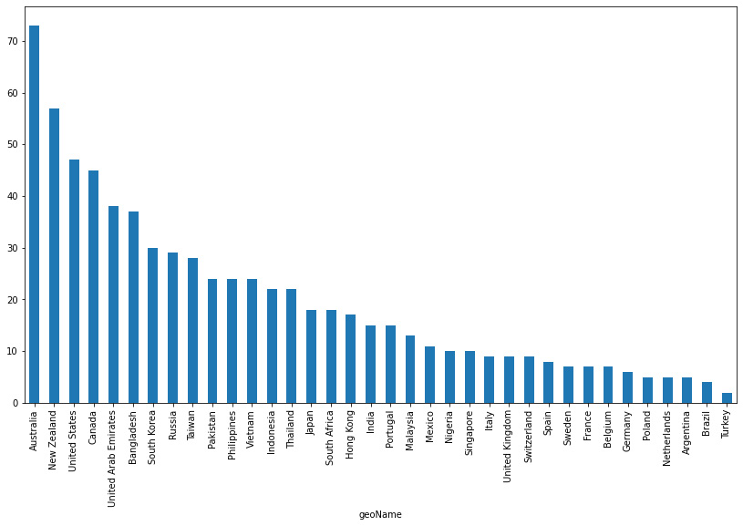
Figure 3.3: Countries where real estate was a top search trend in the last 12 months
As a first difference, we can see that the results for real estate differ in the distribution of the results. While we can see in Figure 3.1 that the results tend to be more evenly distributed among the results, in the real estate results the data shows that only a certain number of countries have a relatively large number of searches for this term. This might be an indication that this type of investment is much tighter to the local regulations and conditions. We can see that Australia, New Zealand, the USA, and Canada are the only countries that represent more than 40 points.
- The next block of code will show us the performance of the search term stocks:
regiondf_12m['stocks'].sort_values(ascending= False).plot(figsize=(14, 8),
y=regiondf_12m['stocks'].index,kind ='bar')
This shows us the results of the stocks search term in the last 12 months:
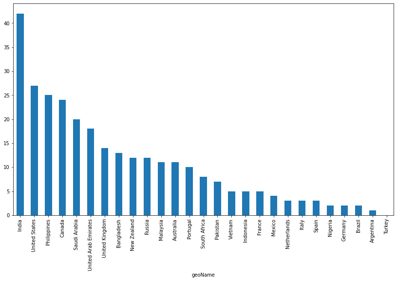
Figure 3.4: Countries where stocks were a top search trend in the last 12 months
Here, the tendency tends to repeat but in different countries. In this case, the top five countries are India, the USA, the Philippines, Canada, and Saudi Arabia. Here, the difference lies in the fact that India is the only country that surpasses the mark of 40 points. This might be a good way to infer how the people in these regions are thinking in terms of investment options.
- Finally, we need to repeat the same process but for the bonds search term by changing the column in the code used before:
regiondf_12m['bonds'].sort_values(ascending= False).plot(figsize=(14, 8),
y=regiondf_12m['bonds'].index, kind ='bar')
Executing this code will return the following result:
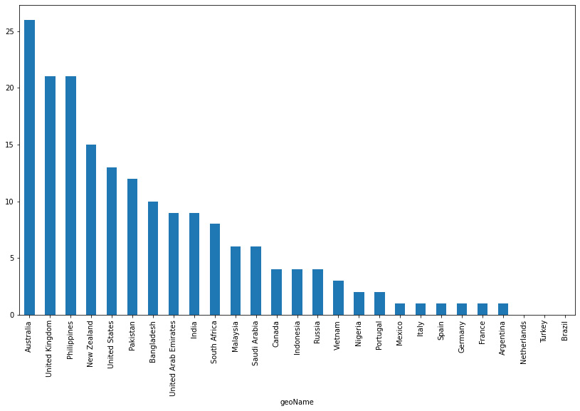
Figure 3.5: Countries where bonds were a top search trend in the last 12 months
It can be seen that bonds seem to be an option less used by the users searching for investment options on Google. The fact that Australia is the leading country in terms of the proportion of searches for bonds along with real estate suggests that bonds and real estate seem to be an option that is more attractive than stocks or bitcoin in Australia.
Now that we have determined the regions where each of the assets performs best in terms of popularity, we will study the change in patterns of these trends.
Finding changes in search trend patterns
Search trends are not a static variable; in fact, they change and vary over time. We will get the results of the interest by region in the last 3 months and then we will look at changes in the results compared to the ones obtained over a period of 12 months:
- To find the changes in search trends patterns, we will build the payload within a different timeframe.
- Finally, we will store the results in a pandas DataFrame named regiondf_3m:
regiondf_3m = pytrend.interest_by_region()
- We need to remove the rows that don’t have results for the search terms specified:
regiondf_3m = regiondf_3m[regiondf_3m.sum(axis=1)!=0]
- Now, we can visualize the results using the plot method of the pandas DataFrame:
regiondf_3m.plot(figsize=(14, 8), y=kw_list, kind ='bar')
This code yields the next visualization:
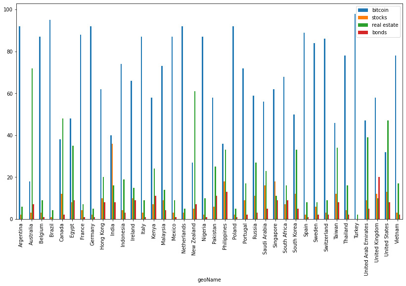
Figure 3.6: Interest over time in the last 3 months
At a glance, it would be very complicated to find any possible changes in the results so we will arrange the data in such a way that we will just display the changes in these trends:
- The first step is to create a DataFrame that contains the information from both the last 12 months and the last 3 months:
]).T
Here, the DataFrame is constructed by concatenating the results of the different search terms.
- Next, we need to rename the columns and create columns that are the differences in the interest in the search terms over time:
cols = ['stocks_3m','stocks_12m','bitcoin_3m',
df['diff_bonds'] = df['bonds_12m'] - df['bonds_3m']
# Inspect the new created columns
df.head()
- Now, we can limit the values to the newly created columns:
n_cols = ['diff_stocks','diff_bitcoin',
df.head()
This produces the next result, which shows us the relative changes in search trends:
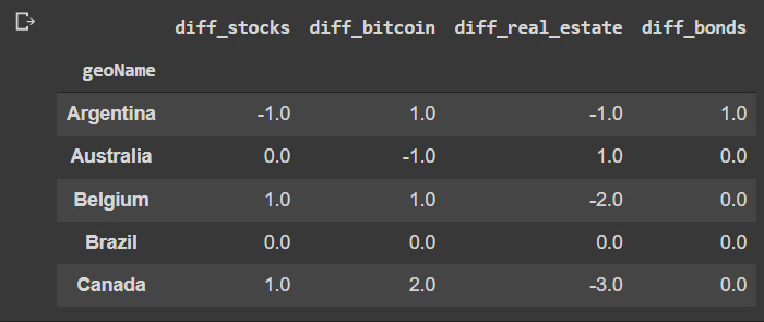
Figure 3.7: Relative differences between the last 3 and 12 months compared
- Some countries have no changes, so we will filter them out by summing across the axis and comparing this result to zero to create a mask that we can use to filter out these cases:
# Create a mask for of the null results
mask = df.abs().sum(axis=1)!=0
df.head()
It’s important to note that this comparison is made over absolute values only.
The preceding code shows us the results that have now been filtered.

Figure 3.8: Filtered results of relative differences
- Now, we can visualize the results obtained. We will first look at the regions where there has been a change in the searches of the term stock.
To do this, we will use the results in Figure 3.8 to filter them by the column we want and filter out the rows where there was no change, sort in ascending order and then visualize the results using the plot method of the pandas DataFrame:
data = df['diff_stocks'][df['diff_stocks']!=0]
data = data.sort_values(ascending = False)
data.plot(figsize=(14, 8),y=data.index, kind ='bar')
This produces the next result:

Figure 3.9: Countries where the search term stocks changed in popularity over the few 12 months
The results show us that in comparison, the popularity of stocks as a search trend has been consolidated in the UAE and the USA, while they have reduced in popularity in Pakistan and Russia. These results cannot be directly interpreted as an indication of a change of perception about the value of the asset itself, but rather as an indication of the amount of search traffic. An increase in traffic can be due because of both positive and negative reasons, so it’s always important to dive in deeper.
- Now, we will look at the difference in changes in search trends for bitcoin:
df['diff_bitcoin'][df['diff_bitcoin']!=0
].sort_values(ascending = False).plot(figsize=(14, 8), y=df['diff_bitcoin'][df['diff_bitcoin']!=0].index,kind ='bar')
The code generates the next graph:
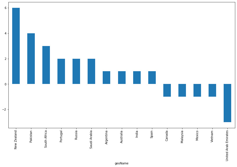
Figure 3.10: Countries where the search term bitcoin has changed in popularity over the last 12 months
One of the first things to note about this graph is that the majority of changes in recent months have been positive rather than negative. This could be an indication of a trend in even wider global adoption over the last few months.
The countries leading this chart in terms of growth are New Zealand, Pakistan, and South Africa, while the UAE is leading the decline.
- The next block of code illustrates the same effect in the case of bonds:
df['diff_bonds'][df['diff_bonds']!=0
].sort_values(ascending = False).plot(figsize=(14, 8),y = df['diff_bonds'][df['diff_bonds']!=0].index,kind ='bar')
The results are shown in the next graph:
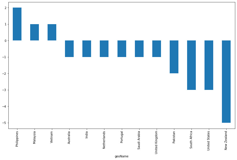
Figure 3.11: Countries where the search term bond has changed in popularity over the last 12 months
There can be seen an interesting change in trend in which now the vast majority of the countries have experienced a decline in the search term. This might be an indication of a consistent change in investment patterns globally, which affects some countries more than others. It is also noticeable that New Zealand now leads the countries with the largest decline in search trends over the analyzed period when in the case of bitcoin, it was leading the positive growth. This is also the case in the US, where there has a descending trend, but in the case of the search term stocks, it showed a positive change.
- Finally, the next block of code shows the search variations in the search term real estate:
df['diff_real_estate'][df['diff_real_estate']!=0].sort_values(ascending = False).plot(figsize=(14, 8),y=df['diff_real_estate'][df['diff_real_estate']!=0].index,kind ='bar')

Figure 3.12: Countries where the search term real estate has changed in popularity over the last months
In this case, the change can also be seen as more globally negative than positive. Although some countries experienced a positive change, such as Vietnam and Thailand, more of the cases have seen a reduction in the search term. This can not only be caused by investment decisions but also by search patterns. Depending on the region, in most cases, real estate can be seen as an investment, and in other cases, it is only for living and commercial purposes.
In the next section, we will dive more into the countries that experienced significant changes and try to understand the cause in more detail.
Using related queries to get insights on new trends
If we want to find more information about the terms that are most associated with the search terms we are looking for, we can use the related queries to obtain queries that are similar to the ones we are searching for. This is useful because it provides not only contextual information but also information about trends that can be further analyzed.
In the next block of code, we will define a series of regions in which we want to look for the related queries for a given timeframe. In this case, we will be looking at the USA, Canada, New Zealand, and Australia. The results will be arranged into a single pandas DataFrame:
geo = ['US','CA','NZ','AU']
d_full = pd.DataFrame()
for g in geo:
  pytrend.build_payload(kw_list=['bitcoin','stocks'],
  geo=g,timeframe='today 3-m')
  #get related queries
  related_queries = pytrend.related_queries()
  # Bitcoin top
  d = related_queries['bitcoin']['top']
  d['source_query'] = 'bitcoin'
  d['type'] = 'top'
  d['geo'] = g
  d_full = pd.concat([d_full,d],axis=0)
  # Bitcoin rising
  d = related_queries['bitcoin']['rising']
  d['source_query'] = 'bitcoin'
  d['type'] = 'rising'
  d['geo'] = g
  d_full = pd.concat([d_full,d],axis=0)
  # stocks top
  d = related_queries['stocks']['top']
  d['source_query'] = 'stocks'
  d['type'] = 'top'
  d['geo'] = g
  d_full = pd.concat([d_full,d],axis=0)
  # stocks rising
  d = related_queries['stocks']['rising']
  d['source_query'] = 'stocks'
  d['type'] = 'rising'
  d['geo'] = g
  d_full = pd.concat([d_full,d],axis=0)
This code will loop over the defined regions and concatenate the results of related queries that are the top results of the given timeframe, and also the ones that are rising in that given region.
Finally, we reset the index and display the first 10 rows:
This results in the following output:
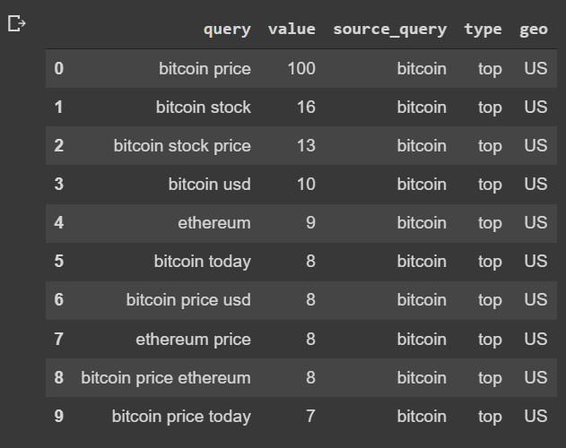
Figure 3.13: Similar queries to bitcoin in the US region
We can use the information of related queries to run an analysis on the frequency and the terms associated with the original search term. This would give us a better context to understand the correlated factors for a given asset in a certain region. This means that in this case, we can see that the people searching for bitcoin are also searching for Ethereum, so we can expect a certain degree of correlation between them:
- Let’s use a simple method to show the most frequent terms in these queries by using a word cloud to show the most significant terms. We will use wordcloud and the matplotlib package:
import matplotlib.pyplot as plt
- We will use the results of top related queries in the US associated with the term stocks as the data:
data = d_full[(d_full['source_query']=='stocks')&(
d_full['type']=='top')&(d_full['geo']=='US')]
- After this, we will concatenate all the results for the result column, replacing the source query to avoid this redundancy and remove the stopwords. Finally, the last part of the code will generate the figure and display the results:
plt.show()
This generates the next word cloud with the size adapted to the relative frequency of the term. Take into account that we always need to have at least one word to plot, otherwise we will get an error saying that we got 0 words.

Figure 3.14: Frequent top related queries to the search term stocks in the US
The results show that the term stocks a mostly related to terms such as the following:
- penny: Refers to the penny stock market
- now, today: There is a need for day-to-day frequency of information, and live updates
- dividend: A preference for stocks that pay dividends
- amazon, tesla: Stocks that are popular
- reddit, news: Sources of information
- buy, invest: The action of the user
This information can be really interesting when trying to gain information about the patterns that drive users.
- Next is the same code used as before, but now it references the rising search term stocks in the US:
data = d_full[(d_full['source_query']=='stocks')&(
wordcloud = WordCloud(stopwords=stopwords,
plt.show()
The next figure will show us the terms found in the rising queries related to our original search terms. The size of the terms varies according to their frequency, providing us with information about their relative importance.

Figure 3.15: Frequent top queries related to the search term stocks in the US
It shows a different level of information as we can see events currently happening, such as the fear of a recession in the short term, indicating a bullish market, and some new stock names such as Twitter, Disney, and Haliburton.
- We repeat the same exercise by looking at the top queries related to the bitcoin search term in New Zealand:
data = d_full[(d_full['source_query']=='bitcoin')&(
wordcloud = WordCloud(stopwords=stopwords,
plt.show()
This generates the next word cloud of terms.

Figure 3.16: Frequent top queries related to the search term bitcoin in New Zealand
Here, we can see that there is a relationship between Tesla and bitcoin, as well as Dow Jones. The latter can be an indication that the people looking to invest in bitcoin already have an investment in stocks, or are considering investing in one or the other.
- The next one focuses on the rising related terms to bitcoin in New Zealand:
data = d_full[(d_full['source_query']=='bitcoin')&(
wordcloud = WordCloud(stopwords=stopwords,
plt.show()
The results are shown in the next word cloud.

Figure 3.17: Frequent top queries related to the search term bitcoin in New Zealand
The results show the names of other cryptocurrencies such as Cardano and Luna, also we can see the term crash, possibly associated with the latter.
These visualizations are useful to be able to detect at a glance certain terms that are becoming more and more relevant by representing the trending popularity of each term using size. Humans are not very good at absorbing a lot of detailed information at once, so we need to think about the storytelling of the data in advance.
Analyzing the performance of related queries over time
After capturing more information about the context, we can track the evolution of these queries over time. This could provide us with valuable information about local trends that have been rising in importance under our radar. We will do so using the following steps:
- We will select the rising queries related to bitcoin in the US:
query_data = d_full[(d_full['source_query']=='bitcoin' )&(d_full['type']=='rising')&(d_full['geo']=='US')]
query_data.head()
This results in the following output:
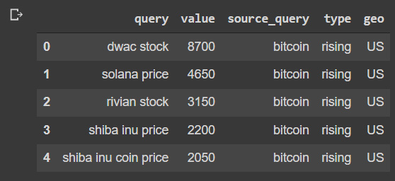
Figure 3.18: Rising queries related to bitcoin in the US
- We will use the top five resulting queries to track their performance in the last 12 months:
# build payload
data = data.reset_index()
- Finally, we will show the results using the Plotly library to be able to display the information more interactively:
fig.show()
This shows us the following graph, where we can see the evolution of the rising trends over time:

Figure 3.19: Rising query performance over time
We can see that the queries had a peak around November 2021, with a mixed performance.
Summary
Information about specific live trends in different markets can be expensive to obtain, but the use of web search engine traffic can provide us with valuable tools to analyze different regions. In this chapter, we have focused on the analysis of regions at the country level, but we can also use different regional geo codes, such as US-NY representing New York.
This information can be used also in combination with sales data to obtain valuable correlations that, with causal analysis, can produce a variable that can be used for predicting behavior, as we will see in the next chapters.
The following chapters will continue to focus on the understanding of underlying value, but this time, it will be at the level of product characteristics scoring with conjoint analysis.