
Combine Reports by Creating a Dashboard
With Dashboard Builder, you combine reports to create your dashboards without writing JSL scripts. Similar to Application Builder, Dashboard Builder has a drag-and-drop interface but with pre-configured display boxes. In Dashboard Builder, the display boxes do not require customization. You can put reports and graphs in tabs, embed database queries, save the dashboard as an add-in, and more.
You can also quickly create dashboards by combining several open windows using the Window > Combine Windows option. For example, you might combine two reports and a data table to arrange them on a dashboard. See “Example of Combining Windows to Create a Dashboard” for an example.
Example of Creating a Dashboard with Two Reports
Suppose that you created two reports and want to run the reports again the next day against an updated set of data. This example shows how to create a dashboard from the reports.
1. Select Help > Sample Data Library and open Hollywood Movies.jmp.
2. To create the reports, run the table scripts named “Distribution: Profitability by Lead Studio and Genre” and “Graph Builder: World and Domestic Gross by Genre”.
3. From any window, select File > New > Dashboard.
Templates for common layouts appear.
4. Select the 2x1 Dashboard template.
A box with room for two reports appears on the workspace.
5. In the Reports list, double-click the report thumbnails to put them on the dashboard (Figure 11.3).
6. Select Preview Mode from the Dashboard Builder red triangle menu.
A preview of the dashboard appears. Notice that the graphs are linked to each other and the data table. They also have the same red triangle options as the Distribution and Graph Builder platforms.
Figure 11.2 A Dashboard with Two Reports

7. Click Close Preview.
8. In Dashboard Builder, select File > Save, and then save the file as a .jmpapp file.
Users who have JMP can open the data table and double-click this file to display the dashboard. Note that the .jmpapp file cannot be edited.
9. Return to the Dashboard Builder window, select File > Save As, and then save the file as a .jmpappsource file.
The dashboard is saved in a file that you can edit in the future.
Note: You might also want to save the dashboard as an add-in. Users then view the dashboard by selecting a menu item in the main Add-Ins menu instead of opening the .jmpapp file. See “Example of Creating a JMP Query Dashboard and Add-In” for details.
Details about Using the Dashboard Builder
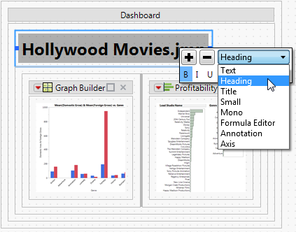
Figure 11.3 shows a dashboard in development. The two reports in the left pane were generated from the Hollywood Movies.jmp sample data table. Those reports were added to the right pane. “Hollywood Movies.jmp” is displayed in a text box that was added to the dashboard and centered using the toolbar buttons.
Figure 11.3 The Dashboard Builder Window

Dashboard Builder Red Triangle Options
The Dashboard Builder red triangle menu provides options such as running the dashboard, previewing the dashboard, and saving the dashboard as an add-in.
Run Dashboard
Starts the dashboard.
Preview Mode
Displays a preview of the dashboard. Click Close Preview on the dashboard to return to the dashboard mode.
Start Over
Remove objects from the workspace and select a new template.
Show Grid
Displays dotted grid lines on the workspace. Selected by default.
Show Properties
Shows or hides the Objects and Properties panels for editing display boxes. See the Creating Applications chapter in the Scripting Guide for details about editing properties.
Auto Scroll
Automatically scrolls horizontally or vertically as you drag an object near the edges of the workspace. Selected by default.
Dashboard Mode
Deselect to display the dashboard in Application Builder, where you can fully customize the application and write scripts. See the Creating Applications chapter in the Scripting Guide for details. Select Dashboard Mode to return to the dashboard.
Source Panel
Shows or hides the Sources panel (the left column in which report components are displayed). Categorizes boxes into Data Table and Display sections.
Save Script
Contains options that enable you to save a script that reproduces the report to several destinations. See “Save Script Menus” in the “JMP Reports” chapter for details.
Sample Dashboards
Examples of dashboards are shown when you open Dashboard Builder. You can modify these samples instead of starting with an empty dashboard. The dashboards are also installed in the JMP Samples/Dashboards folder.
The following sample dashboards are available:
Instant Dashboard.jmpappsource
Combines two Multivariate reports (Principal Components/Factor Analysis and T Square with All Principal Components).
Six Quality Graphs Dashboard.jmpappsource
Creates three Control Charts, a Distribution report, and a Capability Analysis report.
Edit a Dashboard
“Example of Creating a Dashboard with Two Reports” shows how to create a dashboard from two reports. This section shows how to arrange those reports and preview the final dashboard.
Rearrange Reports in Dashboard Edit Mode
To help you rearrange reports while editing a dashboard, the outline around a report includes drop zones. When you drag the report into a different area of the box, a portion of the box is highlighted. The highlight shows where you can drop the box.
Figure 11.4 shows how to create tabbed reports. To put the Distribution report inside a tab, drag the report over the other report until the upper right corner of the bar chart report is highlighted. The Distribution report appears in a tab on top of the other report.
To remove a tabbed report, click the middle of the report and drag it outside of the tab.
Figure 11.4 Working with Tabbed Reports in Dashboard Edit Mode
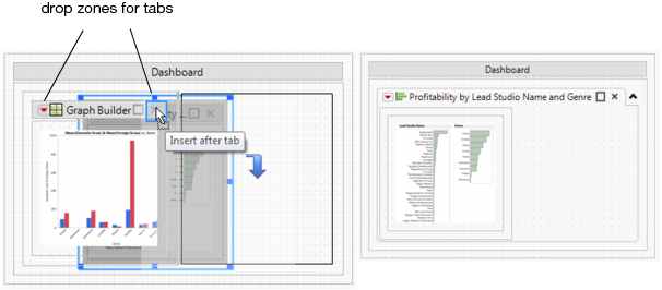
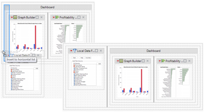
Figure 11.5 shows an example of placing a data table inside the bottom border of the report.
To display the data table below the report instead of inside it, drag the Data Table box onto the dashboard below the report. The box snaps inside the bottom border of the report.
Figure 11.5 Displaying a Data Table Inside a Report

Figure 11.6 shows a data filter that appears to the left of a report.
Figure 11.6 Adding a Data Filter to the Left of a Report
Format Text in a Text Box
When you edit a dashboard, you can format text in a text box. Drag the text box to the dashboard and click the middle of the text box. Formatting options appear (Figure 11.7).
Figure 11.7 Formatting Options for a Text Box
Preview the Dashboard
When you edit the dashboard, you can see a preview of the final dashboard by selecting Preview Mode from the Dashboard Builder red triangle menu. Previewing the dashboard is particularly helpful when testing interactive elements such as data filters and tabbed reports.
Note that if you resize panes in preview mode, your changes are not saved.
View a Running Dashboard
When you view a running dashboard, the same red triangle options that you find in JMP platforms are available in the reports. Dashboard Builder also provides several other options.
View a Summary of the Report
A report that contains graphs and statistics can grow fairly large. To view only the graphs while running the report, select the top red triangle in a report and then select Report View > Summary. The report shown in Figure 11.8 originally showed parameter estimates. In the Summary view, only the graphs are shown.
Figure 11.8 Viewing a Summary of the Report

Rearrange Reports in a Running Dashboard
You rearrange reports in a running dashboard by dragging the reports into highlighted drop zones. The drop zones indicate where you can place the report. Figure 11.9 shows an example of moving a report into a tab. The Distribution report is dropped inside the highlighted drop zone to place it on the first tab.
Figure 11.9 Creating Tabbed Reports in a Running Dashboard

To remove a tabbed report, click the middle of the report and drag it outside of the tab.
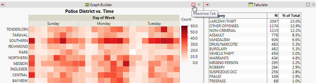
Maximize a Report in a Running Dashboard
To see only a specific report while running a dashboard, select the report’s Maximize Tab box (Figure 11.10). Note that the box is named Maximize Tab even if the reports are not in tabs.
Figure 11.10 Maximizing a Tab
To restore the report to its original size, select the Restore Tab box (Figure 11.11).
Figure 11.11 Restoring a Maximized Report

Resize Reports in a Running Dashboard
The thick gray line that appears between reports in a dashboard is called a splitter. Drag the splitter to resize the panes. When the pane is too wide to display the enclosed report, the pane closes. Drag the splitter from the outer edge of the dashboard to see all reports again. Figure 11.12 shows the collapsed and expanded reports.
Figure 11.12 Resizing Panes in a Running Dashboard

You can also drag the edge of a graph. The graph widens as far as the width of the window and the other reports allow.
Share Reports with Users Working Outside JMP
You can share reports with users working outside JMP by saving a dashboard as interactive HTML. In the running dashboard, select File > Save As and then select Interactive HTML with Data from the list. The reports are saved in a web page that also contains the data. Email the web page to users or publish the page on a website. Users then explore the data as they would in JMP. See “Save the Report as Interactive HTML” for details.
Example of Combining Windows to Create a Dashboard
Instead of creating a dashboard in Dashboard Builder, you can combine open windows to create a dashboard. Dashboard Builder provides more options. However, combining windows is a quick way to create a simple dashboard.
This example shows how to combine two reports from Hollywood Movies.jmp into a dashboard.
1. Select Help > Sample Data Library and open Hollywood Movies.jmp.
2. Run the first two table scripts
3. Select Window > Combine Windows.
4. In the Combine Windows window that appears, make the following changes:
‒ In the Combine column, select the two report windows.
‒ In the Filter By column, select Hollywood Movies - Distribution.
5. Click OK.
The two reports are combined into one window. Notice the filter icon  at the top of the Distribution report. When you select a bar in one of the histograms, the corresponding data in the Graph Builder graph and in the data table are selected.
You can rearrange the reports as shown in “Rearrange Reports in a Running Dashboard”.
Tips:
• To combine reports on Windows, you can also select Combine Windows from the Arrange Menu option in the lower right corner of JMP windows.
• In the Combine Windows window, select Summary Report View to see only the graphs in a report and omit the statistics.
• Only reports that are in the combined window can be used as a filter.
Example of Adding a Selection Filter to a Dashboard
In a dashboard that contains several reports, you can select data in one report and then view only that data in other reports contained in the same window. This example shows how to add a selection filter to the primary report when you edit a dashboard.
1. Follow step 1 through step 5 in “Example of Creating a Dashboard with Two Reports” to create a dashboard.
2. Right-click the center of the left report and select Use As Selection Filter.
3. Select Preview Mode from the Dashboard Builder red triangle menu.
4. Select one of the bars for the Fantasy genre in the left report.
In the right report, you can see that Warner Bros and independent studios produced the most Fantasy movies.
Figure 11.13 Filtering Data

Example of Creating a JMP Query Dashboard and Add-In
Suppose that you used JMP Query Builder to import portions of two data tables into JMP. A dashboard displays reports of the data. You want to create an add-in that queries the data and shows the updated reports on a dashboard.
Build the Query
1. Select Help > Sample Data Library and open Hollywood Movies.jmp.
2. Select Tables > JMP Query Builder.
3. Click Build Query.
4. In the Available Columns list, double-click t1.Movie Name, t1.Rotten Tomatoes Score, t1.Audience Score, and t1.Theaters Opening Wknd to add them to the Included Columns tab.
5. Click Run Query.
The queried data appears in a new data table. Note the Source table script. When you open the dashboard, JMP runs this Source script to query the data in Hollywood Movies.jmp.
6. In the new data table, run the Graph Builder: Scores by Opening Weekend table script to create a report.
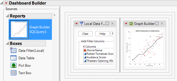
Create the Dashboard
1. From the report window, select File > New > Dashboard.
2. Select the Blank Dashboard template.
3. Double-click the Data Filter(Local) box in the left pane to add it to the dashboard.
4. Double-click the Graph Builder report in the left pane to place it next to the local data filter.
Figure 11.14 Dashboard for Hollywood Movies
Create and Run the Add-In
1. From the Dashboard Builder red triangle menu, select Save Script > To Add-In.
Add-In Builder opens.
2. Next to Add-In name, type Hollywood Movies Dashboard (the add-in filename).
3. Click the Menu Items tab and type Hollywood Movies Dashboard next to Menu item name (the name of the add-in menu item).
4. Click Save and save the add-in to your desktop.
The add-in is saved and installed in your Add-Ins menu.
5. Click Close on the Add-In Builder window.
6. From the JMP main menu, select Add-Ins and select Hollywood Movies Dashboard.
The Hollywood Movies.jmp data table is queried, and the dashboard opens to show the local data filter and updated report.
Figure 11.15 Hollywood Movies Add-In

..................Content has been hidden....................
You can't read the all page of ebook, please click here login for view all page.