
13. Adding Charts, Graphs, and Diagrams
Charts, graphs, and diagrams are a great way to add visual impact to data and explain an important concept or procedure. Most of us are quite visual by nature, and seeing any kind of message presented in a visual way makes it much more engaging. You can use charts, graphs, and diagrams with great success in your Word files, and this chapter demonstrates how you can get started.
Exactly what’s the difference between a chart, a graph, and a diagram? Well, if you want to get technical about it, chart is really more of an umbrella term for all kinds of information graphics, such as maps, pie and bar graphs, and tables. Graphs traditionally show mathematical relationships, such as income and expenses, or population growth over time. Diagrams present data more pictorially and abstractly using shapes and connecting lines. Typically, diagrams are geared more toward showing relationships or processes. Unless you’re a purist in the world of informational graphics, however, the distinctions between charts, graphs, and diagrams are really quite murky. They’re all related in some fashion, and the bottom line is they illustrate data in a visual way. You’re free to call them charts, graphs, or diagrams, but the best part is you can build them all in Microsoft Word.
Working with SmartArt
One of the quickest ways to insert an illustration into your document is to use Word’s SmartArt graphics to represent information. Basically, SmartArt is pre-drawn artwork you can use to build graphics to illustrate or explain relationships, such as a visual layout of your corporate structure or the workflow for a manufactured product. You can use SmartArt to illustrate lists, processes, procedures, hierarchies, organization charts, and more. Figure 13.1 shows an example of a SmartArt illustration. As you can see, it illustrates a process. Most SmartArt graphics consist of shapes, text boxes, and connecting arrows or lines, but not all.

FIGURE 13.1 Graphics are easy to insert into a document using the SmartArt tools.
When planning out your own illustrations, think about what type of data you want to include and what sort of layout best communicates your information. If you find your first choice in a SmartArt layout isn’t working out, you can easily swap it out for another layout that does a better job. This is just one way the SmartArt tools are so flexible. You can also fine-tune a layout by changing the shapes and colors used in the illustration, changing fonts and sizes of any text, and even assigning a different style. As you work with SmartArt, Word displays two specialized SmartArt Tools tabs on the Ribbon to help you format and design the graphic. These tabs are chock-full of tools for controlling the appearance and structure of the illustration.
You can access the library of layouts through the Choose a SmartArt Graphic dialog box, shown in Figure 13.2. You can choose graphical layouts from several categories, and preview a layout and its intended purpose before inserting it into your document. The SmartArt library features a wide variety of illustration types and variations of each type. You can choose from the following SmartArt categories:
• List Turn list data, such as a bulleted list, into shapes for added emphasis. List layouts do not include connecting arrows or demonstrate a sequence.
• Process Use to illustrate a directional flow, such as steps or stages.
• Cycle This type of graphic illustrates a circular or repetitive process.
• Hierarchy Use to illustrate a hierarchy, such as a family tree, company organization, or product family.
• Relationship Illustrate interlocking or overlapping concepts and relationships with this type of graphic. The famous Venn diagram is a Relationship style chart.
• Matrix Use this type of graphic to visually show the relationship of parts to a whole.
• Pyramid Just as its name suggests, this illustration style shows proportional or hierarchical relationships that build from top to bottom or bottom to top.
• Picture Good for showing non-sequential information or groups of blocks in a list diagram.
• All Choose this category if you want to see all the diagram layouts.
• Office.com Go online with this choice and find new diagram layouts from Microsoft’s Office website.
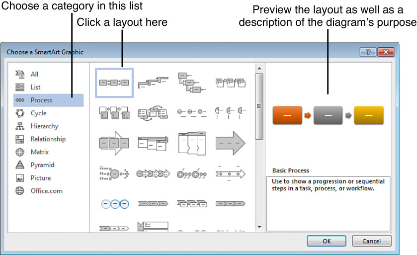
FIGURE 13.2 Choose the category of illustration you want to make, then choose a style.
The SmartArt feature is also available in the other Microsoft Office programs, including Excel, PowerPoint, and Outlook.
![]() Tip
Tip
You’re not limited to building your own illustrations. You can also utilize the Copy and Paste commands to copy and paste illustrations from other places and insert them onto a document page. You won’t be able to edit them like SmartArt, per se, but with a finished graphic you might not want to.
Inserting SmartArt
Inserting a graphic is the easy part. Before you get started, though, make sure you have a pretty good idea of how you want your illustration to look. This helps you narrow down your choice of graphic type and layout. When you’re ready to insert a SmartArt graphic, follow these steps:
1. Click the Insert tab.
2. Click SmartArt to open the Choose a SmartArt Graphic dialog box, shown in Figure 13.2.
3. Click a category.
5. Click OK.
Word adds a SmartArt graphic to your document with placeholder text, as shown in Figure 13.3.

FIGURE 13.3 Here’s an example of a snazzy SmartArt illustration.
As you can see in Figure 13.3, two new tabs appear on the Ribbon when a SmartArt object is active: Design and Format. You can use the tools on these tabs to work with and edit the graphic, as explained in the next section.
Customizing SmartArt Graphics
After you insert a SmartArt graphic, you can immediately start filling it with your own information or modifying it to work with your document. As you’ve seen in other template-type features in Word, your SmartArt graphic layout includes placeholders. A placeholder is a stand-in for where your own content is added. SmartArt placeholders are pretty obvious; they say [Text] everywhere your text is supposed to go.
When you insert a new graphic, a Text pane appears next to it by default to help you build your illustration (see Figure 13.4), with directions at the top of the pane telling you where to type your text. To start working with text in this pane, just click the text element you want to edit and start typing. When you’re ready to move on to another text element, click the next one and type in more text. Don’t press Enter unless you want to add another shape to the illustration. You can also click a shape to type text directly onto the shape (see Figure 13.5). Choose whichever method works best for you.
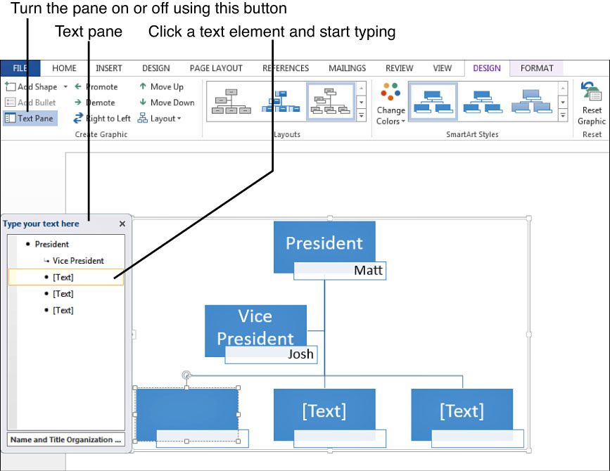
FIGURE 13.4 You can enter text using the Text pane.
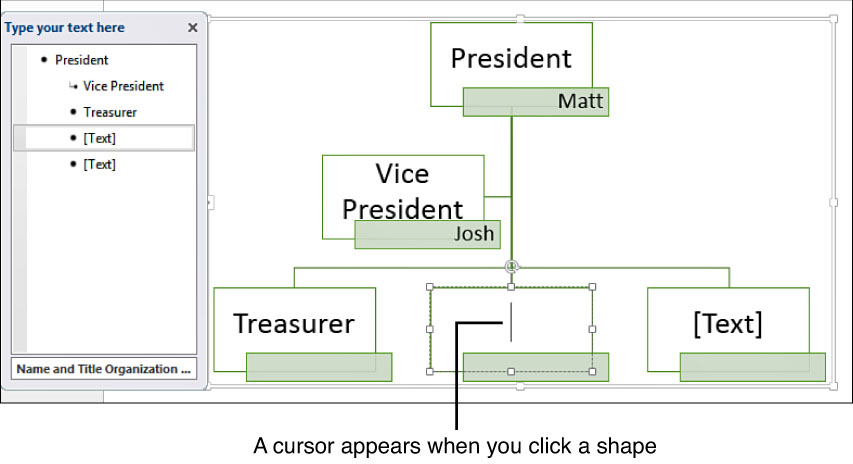
FIGURE 13.5 Another option is to enter text directly into a shape in the illustration.
As you’re building your illustration, the Design tab on the Ribbon offers all the tools you need to adjust the layout, add more shapes, and assign a different style. For example, click the Text Pane button to turn the pane on or off, or click the Add Shape button to add another element to the illustration. Let’s go over a few of the ways you can build your illustration and adjust the layout.
To modify your layout, check out the tools listed under the Create Graphic group on the Design tab, shown in Figure 13.6. Depending on the type of layout you’re working with, you can move text elements around to change their position in the illustration. For example, you might want to promote a shape or move it up in the hierarchy. You can apply any of these commands to a selected shape in the diagram or the current text item selected in the Text pane. Here are a few rearrangement options you can apply:
• Click the Promote button to move a text element up in superiority.
• Click the Demote button to make a text element subordinate to the text above or adjacent to it.
• Click the Right to Left button to reorder the diagram in the opposite direction.
• Click the Move Up button to move a text element up in the order.
• Click the Move Down button to move a text element down in the order.

FIGURE 13.6 You can use the Create Graphic group of tools to rearrange illustration text order.
To add a shape to your illustration, click the Add Shape drop-down arrow on the Design tab, shown in Figure 13.7, and choose one of the following:
• Click the Add Shape After command to add a new shape directly after the current (selected) shape.
• Click the Add Shape Before command to add a new shape directly before the current shape.
• Click the Add Shape Above command to add a new shape directly above the current shape.
• Click the Add Shape Below command to add a new shape directly below the current shape.
• Click the Add Assistant command to add an assistant shape to an organizational chart.

FIGURE 13.7 Use the Add Shape button to add shapes to your diagram.
A grayed-out Add Shape command means that it doesn’t apply to the particular layout you chose. Not all the diagrams are built the same way; some allow for shapes before and after elements, others allow for shapes above and below existing elements.
![]() Tip
Tip
After you select a particular Add Shape command, it’s in effect until you choose another, so to continue adding the same shape throughout, just click the Add Shape button rather than the drop-down arrow.
If your shape needs some subordinate bullet items, just click the Add Bullet command. As you can see in both the Text pane and illustration shown in Figure 13.8, the new bullet appears below the main text.

FIGURE 13.8 Use the Add Bullet button to create subordinate text.
One more command under the Create Graphic group you might want to know about is the Layout drop-down menu, shown in Figure 13.9. The layouts offered in this menu are only available to an organizational chart created under the Hierarchy category. You can change the direction of a shape in the organization layout by choosing an option from the Layout menu.

FIGURE 13.9 If you’re building an organization layout, you can use the Layout menu to change the illustration’s direction.
Inexplicably, no removal button is available to delete a shape from the diagram. However, you can press the Delete key to remove a selected shape, or you can employ the Cut command. The remainder of the diagram’s shapes shift to make up for the deletion.
![]() Note
Note
If you choose a layout with pictures, you can insert digital pictures, such as photos of the various people in your corporate hierarchy, into the diagram. Like the placeholder text elements, placeholder picture elements are marked with an icon that looks like a tiny photograph. Click it to open the Insert Pictures dialog box and navigate to the file you want to insert. To learn more about using pictures in Word, see Chapter 14, “Adding Simple Graphic Elements.”
Changing Layouts, Colors, and Styles
As you’re working with your illustration, you might find that the layout you originally chose is not working out. Rather than delete everything and redo the steps for adding graphics, you can use the Layouts gallery on the Design tab (see Figure 13.10) to switch to another layout. Click another layout to immediately apply it to the current illustration. If you would rather view all the choices at a glance, click the More button in the corner of the Layouts gallery to open a full view of the available layouts. The layouts shown in the gallery pertain to the particular illustration category you selected at the beginning of the process.

FIGURE 13.10 Change the layout, style, or color scheme using the other Design tab features.
SmartArt graphics also include a wide variety of styles you can apply to adjust the appearance of the shapes. Styles include 3-D effects that add shadows and depth to shapes, and lots of blending, lines, and other subtle design flourishes. To see what’s available for your illustration’s layout, choose a style from the SmartArt Styles gallery. To view all the styles at a glance, click the gallery’s More button.
To change the illustration’s coloring, click the Change Colors button and choose another scheme from the palette, as shown in Figure 13.11.

FIGURE 13.11 Use the Change Colors palette to assign another color scheme.
![]() Tip
Tip
You can undo any of your edits using the Undo button on the Quick Access toolbar.
Formatting SmartArt
Flip over to the Ribbon’s Format tab to view all kinds of tools to format your SmartArt graphic. You can find tools for changing the shapes, assigning styles to shapes, and changing text styles. As shown in Figure 13.12, you can use these tools to further refine your illustration. For example, you might want to increase the size of the shapes within it, or change their fill color. You can apply such changes to a select part of the illustration, or to all of it at once.
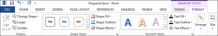
FIGURE 13.12 The Format tab offers tools for changing the various attributes of the graphic’s shapes and text.
The tools on the Format tab are grouped into commands for working with shapes and commands for working with text. In the Shapes group, for example, you can click the Change Shape button and choose another shape to use from Word’s
Shapes gallery. The gallery offers basic shapes, arrows, stars, and more.
Here are a few more formatting techniques you can apply to a selected shape:
• Click the Larger button to increase the shape size.
• Click the Smaller button to decrease the shape size.
• Click the Size drop-down button if you want to set an exact height and width measurement for the shape.
• Click the Shape Fill button to choose a fill color for the shape.
• Click the Shape Outline button to set an outline color or line thickness.
• Click the Shape Effects button to assign a special effect, such as a shadow, glow, or 3-D look.
• Use the Shape Styles gallery to assign a different style to the shape.
Meanwhile, over in the WordArt Styles group of tools, you can format the text within the illustration’s shape. You can apply a WordArt effect to text, giving it an artistic appearance, then use the text tools to adjust the style, fill color, outline, or choose a special effect (shadows, glows, and so on). Here’s what you can do:
• Use the WordArt Styles gallery to assign a specific WordArt effect.
• Click the Text Fill button to choose a fill color for the text.
• Click the Text Outline button to set an outline color or line thickness.
• Click the Text Effects button to choose a special effect, such as a shadow, glow, or 3-D look.
As if those aren’t enough formatting options, you can also make adjustments to the arrangement of elements in your illustration, specifically the shape and the text. Click the Arrange button to view a variety of tools for positioning, controlling text wrapping, rotating and aligning elements, and grouping and arranging shapes and text on top of each other. These same controls are used in working with other graphics you add to a document, such as shapes you draw or artwork you import. You can learn more about utilizing these commands to change the appearance of graphic objects in Chapter 16, “Fine-Tuning Your Graphics.”
![]() Note
Note
To remove a SmartArt graphic you no longer want, select it and press the Delete key.
If you click the border that surrounds the selected SmartArt graphic, a Layout Options icon appears at the top-right corner. You can click the icon to view a menu of layout options that control text wrapping around the graphic.
Inserting Charts
Microsoft Word’s charting feature taps into the power of spreadsheets and helps you create visuals to illustrate quantitative and qualitative data. For example, your boss might say, “Put a graph showing the department’s sales figures for last month in your report” or your spouse says, “Let’s see a pie chart of our expenses.” Don’t panic. You can access charting tools directly in Word without ever having to open Excel or another spreadsheet program. You can whip up an excellent chart in no time at all. Figure 13.13 shows an example of a pie chart.

FIGURE 13.13 My freshly made pie chart looks quite delicious.
If you’re new to charts in general, reviewing what types are available and making sure you have a broad understanding of the lingo used in making charts might help. After you have that under your belt, you can start inserting charts and learning how to tweak them with a little formatting.
Understanding the Chart Types
First things first—you need to figure out what sort of chart you want to create. You can choose from 10 different chart categories, and each one has a specific purpose. Within each category you can find a variety of styles to depict the data. For example, if you go with a bar chart, the bars measure something of quantity, such as dollar amounts, and you can choose stacked or clustered bars, or bars rendered in 3-D style. So many choices! Before you get tangled in styles, decide on a chart type. To help you out, take a look at this list describing the categories:
• Column Shows changes in data over a period of time or compares data.
• Line Shows trends in intervals, such as time.
• Pie Shows how individual values are proportional to the sum of the whole.
• Bar Compares data using rectangular horizontal bars.
• Area Shows trends or amounts of change over time or across categories.
• X Y (Scatter) Illustrates relationships between numerical values or trends across uneven time periods.
• Stock Illustrates fluctuating stock prices.
• Surface Looking like topographical maps, this chart type illustrates combinations between data values.
• Radar Shows changes in values relative to a center point. This chart type looks like a spider web.
• Combo Uses a combination of chart types to illustrate up to three data series.
You don’t have to memorize any of these types. Choose Insert, Chart to open the Insert Chart dialog box, which does a pretty good job of explaining each one and gives you a chance to preview any chart type before attempting to build it. Figure 13.14 shows the dialog box and what you can expect.

FIGURE 13.14 The Insert Chart dialog box lists the various chart types you can apply.
![]() Note
Note
Two more categories are listed in the Insert Chart dialog box: Recent and Templates. The Recent category keeps track of recently used charts so you can quickly insert them again without wading through the chart types. The Templates category lists any charts you’ve saved as templates to reuse in more chart creation.
Understanding Chart Parts
Just by naming chart types, we’re already getting into the charting vernacular. Not all charts look the same, but the general elements are fairly common. Charts are typically composed of several key parts, and naturally those parts have distinct names:
• Data points The individual values you plot in a chart. For example, if you’re creating a chart that tracks monthly sales, the total for each salesperson is a data point on the chart.
• Data series A group of related values in a chart. Back to the monthly sales total example used previously, if you’re charting three months’ worth of sales for each salesperson, you’re using a data series—three totals for the same person makes it a series, you see.
• Data categories When you organize data for a chart, such as the three months you’re tracking for sales, the name of each month becomes a data category in your chart.
• Axes The display of horizontal and vertical scale upon which the data is plotted. The X axis, also called the category axis, is the horizontal scale, and the Y axis, also called the value axis, is the vertical scale. In our monthly sales example, the X axis would list the individual salespeople by name and the Y axis lists the monetary values by which you are measuring their success, such as increments of $1,000 or $10,000.
• Axis labels These identify what data is being plotted out on the chart, such as time intervals, categories, or monetary scale.
• Plot area Shows the measurement for the given values in the chart, such as how much money each salesperson generated displayed in bars or lines, and so on.
• Legend A summary or key indicating what the chart is mapping out. Depending on the type of chart, the legend identifies the data series or differentiates between the series.
• Chart area Refers to the entire chart and all of its parts, including any borders you assign.
• Gridlines Also called tick marks, these are the lines that appear in the plot area to help you read your chart and line up the chart data with the scale it’s illustrating.
• Data table The chunk of worksheet cells you use to enter the chart data. You can include the cells in the final chart, if you want, if you need to show how you built the chart.
• Chart text You can add chart titles, subtitles, and other information text to a chart. You can also format the text to correspond with the rest of the document.
Figure 13.15 shows some of these chart terms pointed out on an actual chart.
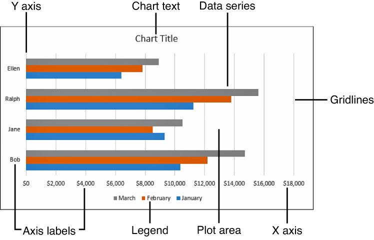
FIGURE 13.15 See if you can identify several of the chart parts; then try it blindfolded for added fun.
Inserting a Chart
If phase 1 is deciding on the type of chart you want, then phase 2 is inserting a chart into your document. Decide where you want it to appear with a click on the page, and then follow these steps:
1. Click the Insert tab.
2. Click Chart to open the Insert Chart dialog box (refer to Figure 13.14).
3. Click a chart type.
4. Click the chart you want to create.
5. Click OK and Word creates the chart, similar to Figure 13.16.
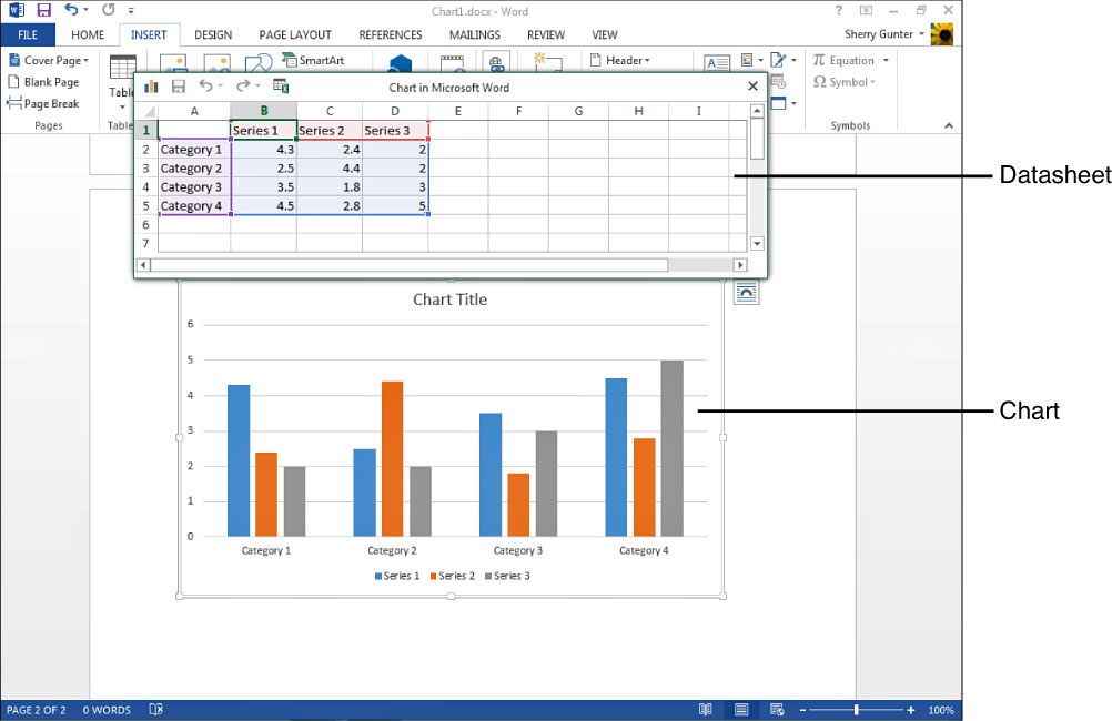
FIGURE 13.16 Look at the sweet newborn chart. Isn’t it adorable, and empty?
Suddenly, the Word program window is overtaken by a worksheet grid, a large chart area filled with placeholder chart elements, and two new tabs on the Ribbon. Yikes! Now what? Time to start adding your own chart data.
Entering Chart Data
Phase 3 is inputting chart data. If you’ve worked with Microsoft Excel before, then you’re already familiar with the worksheet columns, rows, and cells upon which charting data is recorded. If not, you’re in for a treat. Everything is neatly organized in a worksheet, so jumping in and assembling your chart material is pretty easy. The grid of columns and rows is the datasheet, the spot where you record all the data you want to turn into a chart. The datasheet window even presents some helpful placeholder data to help you get started, and names it appropriately to give you a clue as to what might go where.
To begin, click in a cell and type your own data. As soon as you type something, Word updates the chart with the new data. Let’s reuse that monthly sales totals example we’ve been talking about so far. For this example, we’ll use a Column chart. To plot three salespeople’s totals across three months, you can type the month names in as your column headings, as shown in Figure 13.17.
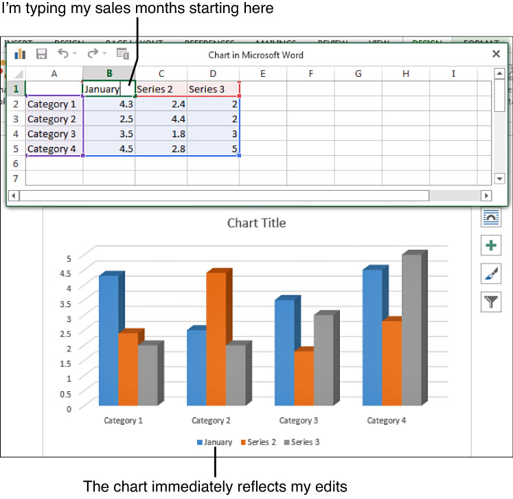
FIGURE 13.17 This example shows months as column headings.
Next, add the individual names of your sales force in the row headings, shown in Figure 13.18.

FIGURE 13.18 Type in each salesperson’s name in the row headings.
The intersecting cells hold all the sales figures for each person, as shown in Figure 13.19. Type in the sales amounts for each person in their corresponding columns and rows.

FIGURE 13.19 Type in all the sales figures.
When you finish typing in all the chart data, you can close the datasheet by clicking the little window’s Close button. You can also drag it by its title bar to move it out of the way, or minimize it. If you do close it and want to open it again, right-click the chart and click Edit Data or click the Edit Data button on the Design tab.
Editing Charts
Remember those two specialized tabs of tools I told you about when we started talking about charts? Well, you’ll use those tabs and tools to work on your chart, such as adding chart elements, changing the layout or style, or formatting parts of your chart. As soon as you click anywhere on a chart, the Chart Tools appear: Design and Format. The Design tab offers tools for fiddling with the design elements of the chart, and the Format tab has tools for changing the appearance of chart shapes, text, and arrangement.
Shall we discuss some ways to add items to your chart? Click the Design tab, shown in Figure 13.20, and we’ll get going. If you click the first button on the tab, the Add Chart Elements button, a drop-down menu appears listing various elements you can add. Click a category to open a submenu and then click the item you want to insert. For example, if you want to include a legend—a key to what all the colors or data series stand for—click the Legend category and click a location for the item. You can easily experiment with each of the items listed to see what they look like in your chart. As you move the mouse pointer over each, the chart reflects the addition.
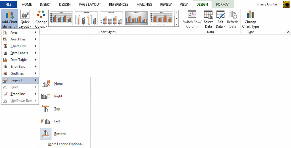
FIGURE 13.20 You can add elements to enhance your chart using the Add Chart Elements menu.
The Design tab offers other chart-changing tools you can apply:
• Don’t like the original layout you chose? You can change it using the Quick Layout drop-down list. Click the Quick Layout button on the Design tab and click another layout. (These are the same layouts you viewed in the Insert Chart dialog box.)
• Don’t like the chart color scheme? Change it with the Change Colors drop-down list. Click the button and choose another color set to apply.
• Don’t like the chart’s overall style? Swap it out with something different from the available styles listed in the Chart Styles gallery. Chart styles include colors, fonts, and backgrounds.
• Don’t like your chart type? Click the Change Chart Type button to open the appropriately named Change Chart Type dialog box and select another chart type.
If you need to edit your chart’s data, you can click the Edit Data button and click Edit Data from the drop-down menu. This opens the datasheet window you used to enter all the chart data. If you would rather do your editing over in the Excel program window instead, click the Edit Data in Excel 2013 option.
The Format tab, shown in Figure 13.21, displays tools for changing the formatting attributes of your chart parts and controlling the position of the chart. Most of the tools are the same tools used to format SmartArt, shapes, and pictures, so we won’t go over them again here, except to talk about a few unique to charts.
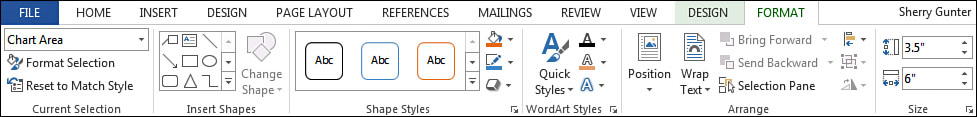
FIGURE 13.21 Use the tools on the Format tab to change the appearance of various chart elements.
Over on the left side of the tab is a group of tools labeled Current Selection. You can use these tools to format a particular selection in your chart, such as the legend or data series. When you click the Format Selection button, a pane opens with additional options you can apply to format the selection, as shown in Figure 13.22. The pane changes based on what item you’re formatting and you can click the tools within the pane to make different types of changes, such as changing a fill color or plotting the series on another axis. Many of the tools duplicate what’s already offered on the Format tab, such as the Shape Fill or Shape Effects tools. But the pane handily groups tools related to the task at hand in one spot so you can easily change the settings for the selected item in one fell swoop. When you finish using the pane, click its Close button.

FIGURE 13.22 Formatting panes help you quickly assign attributes to a selected chart element.
In addition to Ribbon tabs, you can also jump right to task-related chart editing features using some special shortcuts, shown in Figure 13.23. When you work with a chart, four icons appear to the right of the chart:
• Layout Options Displays text wrapping settings to control how the chart interacts with the rest of the document page.
• Chart Elements Add or subtract chart elements using this pop-up list.
• Chart Styles Gives you quick access to the Chart Styles gallery to change the chart appearance.
• Chart Filters Edit data points and names on the chart using this pop-up list.

FIGURE 13.23 Use the task-related editing features as shortcuts to chart commands and tools.
Click an icon to view its related information.
![]() Tip
Tip
You can right-click on a chart to view a shortcut menu of commands to help you edit and format chart elements.