
![]()
KPIs and Scorecards
Key Performance Indicators, or KPIs, are a core element in most business intelligence. SSRS has been able to display KPIs for some time now, and they can be invaluable when it comes to delivering essential performance data in a succinct and meaningful way.
A set of KPIs is often referred to as a scorecard. Here I will not be delving into the management theory of what makes up a “balanced” scorecard, but will only refer to a scorecard as being a collection of KPIs.
Nonetheless, there are many ways to display KPIs. You may be used to a more traditional style of presentation where each KPI is on a separate row in a table, with visual elements to alert the user to deviations from an expected result. However, there are many other ways to deliver KPIs that need not involve tabular data. These can include using gauges to present the information. They may also include using text and colors to highlight changes in status and showing trends with the aid of sparklines. This chapter will begin with traditional KPIs, both to explain the concepts and to demonstrate the techniques. Then I will move on to some examples of less traditional KPIs. The underlying principle will always be the same, nevertheless. I will be comparing a metric to a target and highlighting any deviation from the objective, be it positive or negative. Similarly, I will display a trend over time.
In any case, I hope that you will discover that SSRS can deliver visually arresting KPIs in many ways, and I also hope that the examples in this chapter will be of use in your organization.
What Are Key Performance Indicators?
Before you can start using SSRS to display KPIs, you need to define what they are. Without wishing to get lost in layers of management-speak, let’s say that Key Performance Indicators are a way of measuring progress towards a defined organizational objective. In practical terms, this usually means displaying the following elements:
- A goal: This is the target you are measuring an outcome against. This will be a figure, perhaps a budget or a sales target.
- A value: This is the actual data that will be compared to the target.
These two elements are the core of any KPI. However, they can be extended with one or both of the following elements:
- The status of the value compared to the goal. This indicates how well you are doing.
- The trend (over time, inevitably) of how well you are doing.
What you want to display in a KPI is up to you, or rather, up to the business you are working in. I consider that as long as you have a target figure and valid data to compare to the target, along with some indication of progress, then you have a KPI that you can use to convey meaningful information to your audience.
KPI Value
These metrics are often the easiest to understand. They are the figures that represent the business reality. In practice, however, delivering high-level data can require a lot of work preparing the source data. So you must be prepared to aggregate, calculate, filter, and rationalize your data in order to produce a meaningful set of KPI values.
KPI Goal
It probably sounds a little obvious, but you need to have goals (or targets) for a KPI to function. This means getting your business users to specify exactly what the targets are; they can be simple values (such as budgetary data) or they can be calculated values such as a defined percentage increase or decrease. In any case, you need to store and/or calculate the goal data for each metric. In practice, this can be tougher than it sounds. The difficulties are often more operational than technical, because
- Business users do not always have clearly defined quantifiable goals.
- Budgetary values, where they exist, are often in separate systems, or (worse in some cases) in spaghetti-like spreadsheets, which present difficulties such as:
- Loading and updating the data can be painful, as it is not structured.
- Mapping the budget data to the data from line of business systems is difficult.
Resolving these problems is outside the scope of this book. In the following examples, you will be using a set of budgetary data from the sample database that has been pre-crunched to map to the business data and that allows you to create meaningful KPIs.
KPI Status
Status is probably best thought of as a visual signal of how well you are doing. Frequently a status indicator is a symbol like a traffic light. Alternatively, it can be an image that indicates success or failure. It may even be a symbol that changes color to indicate good, average, or bad (or even under-achievement, on target, or over-achievement). As these examples imply, most status indicators will only display three values. You can extend this to five or even more values if you want. Just remember that you can easily lose the visual effect and clarity if you make it too complex for instant and intuitive understanding by the user.
What you need to retain is that the KPI status is essentially a flag indicator that has to be calculated. So you will need to know three things:
- The value (as for any KPI)
- The target (also as for any KPI)
- The thresholds at which a status flag switches from one value to another
KPI Status Thresholds
Let’s take a simple example of a status flag in a KPI. Suppose that you have a target of 100. The business has said that any result under 80 is bad news, whereas anything over 125 will win a vacation. This means that you have the target and the thresholds. Once you have the value, you can then divide the result by the target. Under 80 percent is bad news, between 80 percent and 125 percent is expected, and anything over 125 percent is good news indeed. It is that easy. (In the real world, threshold calculations can be more complex than this, but I want to demonstrate the principle.) Of course, the thresholds can be absolute values rather than percentages; it will all depend on the business requirements. In the case that I just mentioned, the example only has three status flags; you can have as many status flags as you wish in your visualizations. However, I will never exceed three status indicators in the examples in this book as I firmly believe that using more than three status flags obscures the information rather than clarifies it.
Threshold Flags
If you are carrying out any status calculations in a database (relational or dimensional), I generally advise that you convert the status to a simple indicator, such as 1 for bad, 2 for OK, and 3 for good. This is because
- It is often easier to have the business logic in one place.
- You can standardize the threshold flags across your entire reporting suite, or better still across the enterprise.
- It is simpler to maintain reports if the business logic is in a structured (and hopefully annotated) environment.
- It is generally easier to concentrate on the way that an indicator value is displayed in SSRS (the choice of symbols or images and the color selection, for instance) if you are not having to mix this in with the calculation and the business logic in the report at the same time.
This threshold value will then be used by SSRS to display a more visual and meaningful indicator.
You can, of course, perform calculations and apply business logic in SSRS, and there are many valid reasons for this approach, too. However, as I mentioned in Chapter 1, in this book I will always place business logic at a lower layer of the solution.
KPI Trends
KPIs can also give a visual indication of how the current results compare to past outcomes. Here again, exactly how you define the time-based comparison will depend on the business. For example, you may need to
- Compare the current month’s sales with the previous month’s sales
- Compare the current month’s sales with the same month of the previous year
- Visualize the last few months or year’s data as a sparkline
KPI Trend Thresholds and Flags
The principles that I outlined for status thresholds and flags apply in a very similar way to trend thresholds and flags. You need the current value and the value you are comparing it with. Then you need to compare the two and indicate what the trend is on a simple scale. Interestingly, trend indicators in KPIs tend to show at least five values, and can show more; though, once again, clarity is essential, and a trend indicator that has nine different levels can be hard to read. So I will stick to a maximum of five in this book. Later I will show you how to use sparklines to display trends in a different type of detail.
As for the indicators, I feel that trend indicators are best calculated at the database layer and a simple flag (say 1 through 5) is sent to the report to be displayed in a more visual and intuitive way. This is what you will do in the next few examples.
A Simple KPI
I suspect that you have had enough theory and want to get down to delivering KPIs with SSRS. So let’s move on to a simple KPI that will let you see how the principles can be applied in practice. This KPI takes sales data for the selected year (up to the selected month) and does the following:
- Displays the sales data.
- Displays the forecast data.
- Compares the sales data with the sales forecast and indicates the status on a scale of 1 to 3. The status is displayed as a traffic light.
- Compares the current sales up to the selected month with the sales for the same period in the previous year and returns a trend flag on a scale of 1 to 5. The trend is displayed as five pointed star that ranges from empty (a threshold indicator of 1) to full (an indicator of 5).
You will use a single stored procedure to gather the data and apply business logic. Status and trend indicators will be delivered in the same dataset as the business data and target metrics. At the risk of belaboring the point, I prefer to centralize the business logic and source data in a single place (a stored procedure in a reporting database) wherever possible. Of course, the reporting suite that you develop may take another approach, and there is nothing to prevent you carrying out the calculations and applying business logic in SSRS.
As this is the first example in this chapter (indeed in the whole book) I will be explaining it in more detail than the subsequent KPIs in this chapter. So this is an excellent place to start if you have a basic grasp of SQL Server Reporting Services and need to consolidate your knowledge before moving on to some of the more advanced techniques that you will find later in this chapter.
Figure 2-1 shows the KPI that you are trying to create. It displays sales and budget figures alongside the status and trend indicators for all the makes of car sold in 2014 up to the end of June.

Figure 2-1. A KPI showing sales by make for the first half of 2014
The Source Data
First, you need some data to work with. The following code snippet (available as Code.pr_CarSalesYearToDateKPISimple in the CarSales_Reports database) gives you the data that you need for June 2014:
DECLARE @ReportingYear INT = 2014
DECLARE @ReportingMonth TINYINT = 6

IF OBJECT_ID('Tempdb..#Tmp_KPIOutput') IS NOT NULL DROP TABLE Tempdb..#Tmp_KPIOutput

CREATE TABLE #Tmp_KPIOutput
(
ReportingYear INT
,Make NVARCHAR(80) COLLATE DATABASE_DEFAULT
,Sales NUMERIC(18,6)
,SalesBudget NUMERIC(18,6)
,PreviousYear NUMERIC(18,6)
,StatusIndicator SMALLINT
,TrendIndicator SMALLINT
)

INSERT INTO #Tmp_KPIOutput
(
ReportingYear
,Make
,Sales
)

SELECT     ReportingYear
          ,Make
          ,SUM(SalePrice)
FROM      Reports.CarSalesData
WHERE     ReportingYear = @ReportingYear
          AND ReportingMonth <= @ReportingMonth
GROUP BY  ReportingYear
          ,Make
-- Previous Year Sales
;
WITH SalesPrev_CTE
AS
(
SELECT     ReportingYear
          ,Make
          ,SUM(SalePrice) AS Sales
FROM      Reports.CarSalesData
WHERE     ReportingYear = @ReportingYear - 1
          AND ReportingMonth <= @ReportingMonth
GROUP BY  ReportingYear
          ,Make
)

UPDATE    Tmp
SET       Tmp.PreviousYear = CTE.Sales
FROM      #Tmp_KPIOutput Tmp
          INNER JOIN SalesPrev_CTE CTE
          ON Tmp.Make = CTE.Make

;
WITH Budget_CTE
AS
(
SELECT     SUM(BudgetValue) AS BudgetValue
          ,BudgetDetail
          ,Year
FROM      Reference.Budget
WHERE     BudgetElement = 'Sales'
          AND Year = @ReportingYear
          AND Month <= @ReportingMonth
GROUP BY  BudgetDetail
          ,Year
)

UPDATE    Tmp
SET       Tmp.SalesBudget = CTE.BudgetValue
FROM      #Tmp_KPIOutput Tmp
          INNER JOIN Budget_CTE CTE
          ON Tmp.Make = CTE.BudgetDetail
          AND Tmp.ReportingYear = CTE.Year

-- Internal Calculations
-- Year on Year Delta
-- TrendIndicator

UPDATE  #Tmp_KPIOutput
SET     TrendIndicator =
           CASE
               WHEN ((Sales - PreviousYear) / Sales) + 1 <= 0.7 THEN 1
               WHEN ((Sales - PreviousYear) / Sales) + 1  > 1.3 THEN 5
               WHEN ((Sales - PreviousYear) / Sales) + 1  > 0.7
                             AND ((Sales - PreviousYear) / PreviousYear) <= 0.9 THEN 2
               WHEN ((Sales - PreviousYear) / Sales) + 1  > 1.1
                             AND ((Sales - PreviousYear) / PreviousYear) <= 1.3 THEN 4
               WHEN ((Sales - PreviousYear) / Sales) + 1  > 0.9
                             AND ((Sales - PreviousYear) / PreviousYear) <= 1.1 THEN 3
               ELSE 0
           END

-- StatusIndicator

UPDATE    #Tmp_KPIOutput
SET       StatusIndicator =
              CASE
                WHEN ((Sales - SalesBudget) / Sales) + 1 <= 0.8 THEN 1
                WHEN ((Sales - SalesBudget) / Sales) + 1  > 1.2 THEN 3
                WHEN ((Sales - SalesBudget) / Sales) + 1  > 0.8
                     AND ((Sales - SalesBudget) / SalesBudget) <= 1.2 THEN 2
                ELSE 0
              END
-- Output

SELECT   Make, Sales, SalesBudget, StatusIndicator, TrendIndicator
FROM     #Tmp_KPIOutput
Running this snippet gives the output in Figure 2-2.

Figure 2-2. The data for a simple KPI
How the Code Works
This T-SQL snippet is quite simple, really; it does the following:
- Prepares a temporary table to hold the output that will be sent to SSRS. This table contains only the essential data used by the KPI. This means the make, the (sales) value, the (budgetary) target, and the status indicator are on a scale of 1-3 and the trend indicator is on a scale of 1-5.
- Groups the sales per make of car for the selected year (2014) up to and including the selected month (June) and adds them to the output table.
- Updates the table with the corresponding figures for the previous year.
- Updates the table with the budget figures for the current year.
- Calculates the status and trend indicators using a predefined and hard-coded logic. This sets the status from 1 through 3 and the trend from 1 through 5 using a predefined business rule that we will imagine has been chosen by the CFO.
![]() Note I have got into the habit of defining status indicators as 1-3 and trend indicators as 1-5. This is far from the only way of doing this, and many other approaches exist. You could (for status) use -1, 0, and 1, for instance. My only advice is to set a standard and stick to it across all of your KPIs.
Note I have got into the habit of defining status indicators as 1-3 and trend indicators as 1-5. This is far from the only way of doing this, and many other approaches exist. You could (for status) use -1, 0, and 1, for instance. My only advice is to set a standard and stick to it across all of your KPIs.
Building the KPI
Now that you have your source data, you can get into the fun bit: building the KPI itself. As this is not only the first example in this chapter, but the first in the entire book, I will try to make the explanation reasonably comprehensive so that SSRS novices are not left floundering. In any case (and whatever your level of SSRS knowledge), remember that you can refer back to Figure 2-1 at any time when you are building this KPI if you need to check that you are doing things the right way.
- Create a new SSRS report named KPI_Basic.rdl.
- Add the shared data source CarSales_Reports. Name it CarSales_Reports (and not Datasource1, which is the default).
- Add the following four shared datasets (ensuring that you also use the same name for the dataset in the report):
- CurrentYear
- CurrentMonth
- ReportingYear
- ReportingMonth
- Add the parameters ReportingYear and ReportingMonth, and set their properties as defined in Chapter 1.
- Add a new stand-alone (i.e., not shared) dataset named CarSalesYearToDateKPISimple. Have it use the CarSales_Reports data source and the stored procedure Code.pr_CarSalesYearToDateKPISimple that you saw earlier.
- Drag a table from the SSRS toolbox onto the report body.
- Select the table and display the properties window unless it is already visible (pressing F4 is one way to do this; another is to select View
 Properties Window).
 - Find the DataSetName property and click the pop-up list to the right. Select the dataset CarSalesYearToDateKPISimple.
- Select all the textboxes (or cells if you prefer) in the table. Expand BorderStyle in the Properties window and set the Default property to None. This will ensure that the table will only display the borders that you have specifically added.
- Add two new columns to the table. One way to do this is to right-click a text box anywhere inside a table. You then select Insert Column Right (or left) from the context menu. You can add these columns anywhere. Your table will now have five columns.
- Add the following three fields to the Details row of the leftmost three columns, in this order: Make, Sales, SalesBudget. You can either drag the fields into the detail (second) row from the dataset CarSalesYearToDateKPISimple, or click the tiny table symbol that appears when you hover the mouse pointer over a textbox and select the field from the pop-up list.
- Drag an indicator (from the SSRS toolbox) to the fourth column of the details row. The Select Indicator dialog will appear. Select the three-gray-arrows indicator shown in Figure 2-3.

Figure 2-3. The Select Indicator Type dialog
- Click OK.
- Right-click the indicator that you can now see in the fourth column and select Indicator Properties from the context menu.
- Click the Values and States option on the left to display the Change Indicator Value pane of the dialog.
- Set the Value to [Sum(StatusIndicator)].
- Select Numeric as the States measurement unit.
- Leaving the icon images as they are, set the following start and end attributes for the three icons (in this order from top to bottom):
- Down-facing arrow: Color: Gainsboro, Start and End: 1.
- Right-facing arrow: Color: Silver, Start and End: 2.
- Up-facing arrow: Color: Dim Gray, Start and End: 3.
The dialog should look like Figure 2-4.

Figure 2-4. Setting indicator values
- Click OK.
- Drag a second indicator into the fifth column of the detail row. Select the Five Stars rating (it is on the top row of the ratings section in the center) and click OK.
- Right-click the indicator that you can now see in the fifth column and select Indicator Properties from the context menu. In the Values and States pane, set the following:
- Value: [Sum(TrendIndicator)].
- States measurement Unit: Numeric.
- First Star: Color: Gainsboro, Start and End: 1.
- Second Star: Color: Light Gray, Start and End: 2.
- Third Star : Color: Silver, Start and End: 3.
- Fourth Star: Color: Dark Gray, Start and End: 4.
- Fifth Star: Color: Dim Gray, Start and End: 5.
- Click OK.
- Add titles to the first row for the fourth and fifth columns of Status and Trend, respectively.
- Set all the text boxes to the following font attributes. To save time, I suggest that you Ctrl-click on the text boxes one by one (to select a group of text boxes) and then use the Properties window to set the color and font.
- Font: Arial
- Font Size: 10 pt.
- Color: Gray
- Set the number format the Sales and SalesBudget text boxes in the Detail row to Number using the thousands separator and with no decimals (right-click each text box, select Text Box Properties, then the Number pane to do this). Right-align these numbers.
- Center all the titles and set them to use boldface. Using the toolbar is the quickest way to do this, but you can use the properties window or the Text Box Properties dialog (from the context menu) if you prefer.
- Italicize the Make textbox in the details row.
- Add a 2pt gray border to the bottom of the header row.
This is your first KPI. If you select 2014 and 6 (for the year and month parameters) it should look like Figure 2-1 (which you saw at the start of this example) and can be delivered as it is (on a tablet or smartphone if you want) or it can become part of a scorecard containing other KPIs.
![]() Note You can replace steps 1-4 by using a copy of the report __BaseReport.rdl, which is in the sample SSRS project CarSalesReports on the Apress web site. This report contains the datasource, datasets, and parameters that you need for most of the examples in this book.
Note You can replace steps 1-4 by using a copy of the report __BaseReport.rdl, which is in the sample SSRS project CarSalesReports on the Apress web site. This report contains the datasource, datasets, and parameters that you need for most of the examples in this book.
How It Works
Once the data has been defined, this KPI is largely a question of using the right datasource field in the right way. This means applying the numeric fields to certain text boxes, and then adding indicators to the remaining fields. Then you apply the fields that contain the precalculated status and trend flags to these indicators. As you saw in steps 18 and 21, you finish by telling SSRS which status indicator translates into which indicator shape and color.
The indicators for status and trend were defined in the code, so all SSRS had to do was to attribute the value returned in the data to the corresponding icon for that value. This is why the States measurement unit was set to numeric, so that it would recognize the value in the data. If your data contains a range of values for each status or trend element, then you need to set the corresponding start and end values, and not the same values for each icon as you did here.
I formatted this KPI in a slightly subdued way using grays for borders and text, as this lets the figures and indicators speak without shouting. You are, of course, free to choose the formatting style that you prefer. Explaining the formatting was more a quick revision of formatting techniques than any attempt at imposing a choice of presentation style.
A More Complex KPI Using Sparklines
Now that you have seen how to create a “starter” KPI, let’s move on to a more complex example. Specifically, I want now to replace the trend indicator with a sparkline so that you can see the evolution of sales over the last 12 months. Also, I want to make the status indicator into a data bar that indicates the extent of sales and uses color to indicate the status relative to the target.
Figure 2-5 show the kind of visualization that you are trying to create, for August 2013. It shows sales by color of vehicle (let’s imagine that the head of marketing requested this).
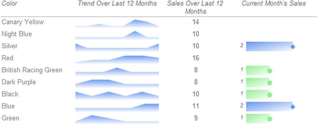
Figure 2-5. A complex KPI using sparklines and data bars
The Source Data
This KPI cannot really be delivered using a single stored procedure. I found it much easier to use separate stored procedures to feed the necessary data into the KPI. The four ‘sprocs are the following:
DECLARE @ReportingYear INT = 2013
DECLARE @ReportingMonth TINYINT = 8

-- Code.pr_WD_MonthlyColorSales

IF OBJECT_ID('tempdb..#Tmp_Output') IS NOT NULL DROP TABLE tempdb..#Tmp_Output

CREATE TABLE #Tmp_Output
(
NoSales INT NULL
,Color VARCHAR(50) COLLATE DATABASE_DEFAULT NULL
,SortDate DATE NULL
)

INSERT INTO #Tmp_Output
(
NoSales
,Color
,SortDate
)

SELECT  NoSales, Color, SortDate
FROM     (
          SELECT     COUNT(Color) AS NoSales
                    ,Color
                    ,CAST(CAST(YEAR(InvoiceDate) AS CHAR(4)) + '-' + RIGHT('0'
                    + CAST(MONTH(InvoiceDate) AS VARCHAR(2)),2) + '-01' AS DATE) AS SortDate
          FROM      Reports.CarSalesData
          GROUP BY  Color
                    ,CAST(CAST(YEAR(InvoiceDate) AS CHAR(4)) + '-' + RIGHT('0'
                    + CAST(MONTH(InvoiceDate) AS VARCHAR(2)),2) + '-01' AS DATE)
                    ,YEAR(InvoiceDate)
                    ,MONTH(InvoiceDate)
        ) A

WHERE  SortDate > DATEADD(mm,-12,CAST(CAST(@ReportingYear AS CHAR(4)) + '-' + RIGHT('0'
       + CAST(@ReportingMonth AS VARCHAR(2)),2) + '-01' AS DATE))
       AND SortDate <= CAST(CAST(@ReportingYear AS CHAR(4)) + '-' + RIGHT('0'
       + CAST(@ReportingMonth AS VARCHAR(2)),2) + '-01' AS DATE)

SELECT * FROM #Tmp_Output ORDER BY SortDate

-- Code.pr_WD_ColorSalesCurrentMonth

CREATE TABLE #Tmp_KPIOutput
(
 ReportingYear INT
,Color NVARCHAR(80) COLLATE DATABASE_DEFAULT
,NoSales NUMERIC(18,6)
,SalesBudget NUMERIC(18,6)
,StatusIndicator SMALLINT
)

INSERT INTO #Tmp_KPIOutput
(
 ReportingYear
,NoSales
,Color
)

SELECT     ReportingYear
          ,COUNT(Color) AS NoSales
          ,Color
FROM      Reports.CarSalesData
WHERE     YEAR(InvoiceDate) = @ReportingYear
          AND MONTH(InvoiceDate) = @ReportingMonth
GROUP BY  ReportingYear, Color

;
WITH Budget_CTE
AS
(
SELECT     SUM(BudgetValue) AS BudgetValue
          ,BudgetDetail
          ,Year
FROM      Reference.Budget
WHERE     BudgetElement = 'Color'
          AND Year = @ReportingYear
          AND Month = @ReportingMonth
GROUP BY  BudgetDetail
          ,Year
)

UPDATE    Tmp
SET       Tmp.SalesBudget = CTE.BudgetValue
FROM      #Tmp_KPIOutput Tmp
          INNER JOIN Budget_CTE CTE
          ON Tmp.Color = CTE.BudgetDetail
          AND Tmp.ReportingYear = CTE.Year

-- StatusIndicator

UPDATE    #Tmp_KPIOutput
SET       StatusIndicator =
              CASE
                 WHEN ((NoSales - SalesBudget) / NoSales) + 1 <= 0.8 THEN 1
                 WHEN ((NoSales - SalesBudget) / NoSales) + 1  > 1.2 THEN 3
                 WHEN ((NoSales - SalesBudget) / NoSales) + 1  > 0.8
                 AND ((NoSales - SalesBudget) / SalesBudget) <= 1.2 THEN 2
                 ELSE 0
              END

SELECT Color, NoSales, StatusIndicator FROM  #Tmp_KPIOutput

-- Code.pr_WD_ColorSalesInLast12Months

IF OBJECT_ID('tempdb..#Tmp_Output') IS NOT NULL DROP TABLE tempdb..#Tmp_Output

CREATE TABLE #Tmp_Output
(
NoSales INT NULL
,Color VARCHAR(50) COLLATE DATABASE_DEFAULT NULL
)

INSERT INTO #Tmp_Output
(
NoSales
,Color
)

SELECT   SUM(NoSales) AS NoSales, Color
FROM     (
           SELECT     COUNT(Color) AS NoSales
                     ,Color
                     ,CAST(CAST(YEAR(InvoiceDate) AS CHAR(4)) + '-' + RIGHT('0'
                     + CAST(MONTH(InvoiceDate) AS VARCHAR(2)),2) + '-01' AS DATE) AS SortDate
          FROM       Reports.CarSalesData

          GROUP BY   Color
                     ,CAST(CAST(YEAR(InvoiceDate) AS CHAR(4)) + '-' + RIGHT('0'
                     + CAST(MONTH(InvoiceDate) AS VARCHAR(2)),2) + '-01' AS DATE)
                     ,YEAR(InvoiceDate)
                     ,MONTH(InvoiceDate)
         ) A

WHERE     SortDate >= DATEADD(mm,-12,CAST(CAST(@ReportingYear AS CHAR(4)) + '-' + RIGHT('0'
          + CAST(@ReportingMonth AS VARCHAR(2)),2) + '-01' AS DATE))
          AND SortDate <= CAST(CAST(@ReportingYear AS CHAR(4)) + '-' + RIGHT('0'
          + CAST(@ReportingMonth AS VARCHAR(2)),2) + '-01' AS DATE)
GROUP BY  Color

SELECT * FROM #Tmp_Output

-- Code.pr_WD_ColorSalesCurrentMonthMAX

SELECT MAX(NoSales) + 1 AS MaxSales
FROM
     (
          SELECT     COUNT(Color) AS NoSales
                    ,Color
          FROM      Reports.CarSalesData
          WHERE     YEAR(InvoiceDate) = @ReportingYear
                    AND MONTH(InvoiceDate) = @ReportingMonth
          GROUP BY   Color
     ) A
These stored procedures return the four datasets shown in Figure 2-6 (the monthly color sales are not shown in full):
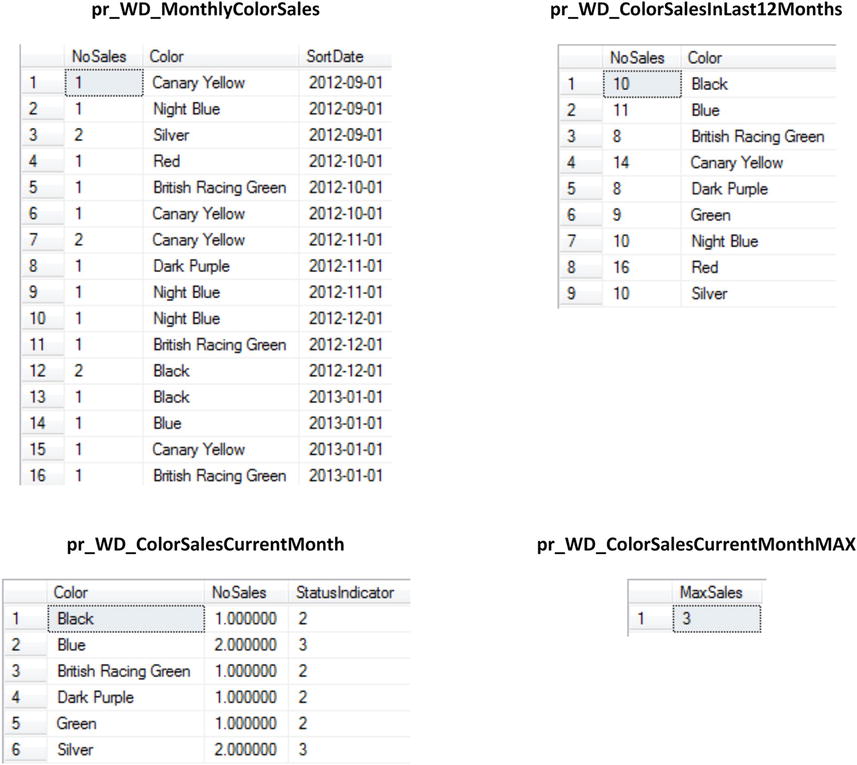
Figure 2-6. The four datasets needed to produce a complex KPI
How the Code Works
The four datasets to produce this KPI are the following:
- Code.pr_WD_MonthlyColorSales: This is used to generate the sparkline of the sales trend over the last 12 months.
- Code.pr_WD_ColorSalesCurrentMonth: This stored procedure gives you the sales for the selected month as well as the trend indicator for the month.
- Code.pr_WD_ColorSalesInLast12Months: This data source gives you the cumulated sales for the twelve months up to and including the selected month.
- Code.pr_WD_ColorSalesCurrentMonthMAX: This dataset returns the value of sales for the color with the most sales for the month, plus one. This is used to set the scale maximum for the data bar of sales for the month.
It might be perfectly possible to coerce all the data you are using into a single dataset for this KPI. However, reality frequently dictates that it is easiest to use separate datasets and combine them in a single visualization. So I want here to give an idea of how such an approach can be used in practice.
Building the KPI
As this is the second KPI that you are creating in this chapter, I will describe the process a little more succinctly, especially where there are common features shared with the previous example. If you are relatively new to SSRS, you may want to build the previous example before beginning this one.
- Create a new SSRS report named _ColorSales.rdl, and add the shared data source CarSales_Reports. Name it CarSales_Reports.
- Add the following four shared datasets (ensuring that you also use the same name for the dataset in the report): CurrentYear, ReportingYear, CurrentMonth, ReportingMonth. Set the parameter properties for ReportingYear and ReportingMonth as defined at the start of Chapter 1.
- Add four datasets corresponding to the four stored procedures shown above. Name them MonthlyColorSales (using Code.pr_WD_MonthlyColorSales), ColorSalesCurrentMonth (using Code.pr_WD_ColorSalesCurrentMonth), ColorSalesInLast12Months (using Code.pr_WD_ColorSalesInLast12Months) and ColorSalesCurrentMonthMAX (using Code.pr_WD_ColorSalesCurrentMonthMAX).
- Add a table from the SSRS toolbox. Set it to use the dataset MonthlyColorSales, and add two more columns so that there are five in total. Set the text box border default to None for all cells in the table (as described in the first example).
- Add the field Color to the first column of the detail row.
- Add the expressions given below to the Detail row. If you are new to expressions, you can do this by right-clicking the appropriate text box and selecting Expression from the context menu.
- Column 3: =Lookup(Fields!Color.Value, Fields!Color.Value, Fields!NoSales.Value, "ColorSalesInLast12Months")
- Column 4: =Lookup(Fields!Color.Value, Fields!Color.Value, Fields!NoSales.Value, "ColorSalesCurrentMonth")
- Click a text box inside the detail row and then right-click the row selector (the grey square to the left). Select Row Group Group Properties from the context menu. In the General pane of the Group Properties dialog, click Add to add a group expression and select Color as the field to group on. Click OK to finish setting this property.
- Drag a sparkline from the SSRS toolbox into the second column of the detail row. Select Area as the sparkline type. This is the leftmost of the area sparklines. Click OK.
- Click twice on the sparkline to display the Chart Data pane. Add NoSales as the ∑ Values.
- Click twice on the sparkline to ensure that it is selected (and not the text box that contains it). Right-click the Sparkline and select Series Properties. In the Series Properties dialog, select Fill on the left. In the Fill pane, set the following and then confirm with OK:
- Fill style: Gradient
- Color: Cornflower Blue
- Secondary color: White
- Gradient style: Top bottom
- Drag a data bar into the fifth column of the detail row. Select Bar (this is the leftmost of the data bars) as the sparkline type and click OK.
- Click twice on the data bar to display the Chart Data pane. Click the plus symbol to the right of the ∑ Values and select Expression from the pop-up. Add the following expression:
=Lookup(Fields!Color.Value, Fields!Color.Value, Fields!NoSales.Value, "ColorSalesCurrentMonth") - Click twice on the data bar, then right-click and select Series Properties from the context menu. Set the following properties:
Section
Property
Value
Markers
Marker type (expression)
=IIF(Lookup(Fields!Color.Value, Fields!Color.Value, Fields!StatusIndicator.Value, "ColorSalesCurrentMonth") = 1, "Square",IIF(Lookup(Fields!Color.Value, Fields!Color.Value, Fields!StatusIndicator.Value, "ColorSalesCurrentMonth") = 2, "Circle","Diamond"))
Marker size
7pt
Marker color (expression)
=IIF(Lookup(Fields!Color.Value, Fields!Color.Value, Fields!StatusIndicator.Value, "ColorSalesCurrentMonth") = 1, "LightCoral",IIF(Lookup(Fields!Color.Value, Fields!Color.Value, Fields!StatusIndicator.Value, "ColorSalesCurrentMonth") = 2, "LightGreen","CornflowerBlue"))
Marker border color (expression)
=IIF(Lookup(Fields!Color.Value, Fields!Color.Value, Fields!StatusIndicator.Value, "ColorSalesCurrentMonth") = 1, "LightCoral",IIF(Lookup(Fields!Color.Value, Fields!Color.Value, Fields!StatusIndicator.Value, "ColorSalesCurrentMonth") = 2, "LightGreen","CornflowerBlue"))
Fill
Fill style
Gradient
Color
=IIF(Lookup(Fields!Color.Value, Fields!Color.Value, Fields!StatusIndicator.Value, "ColorSalesCurrentMonth") = 1, "Red",IIF(Lookup(Fields!Color.Value, Fields!Color.Value, Fields!StatusIndicator.Value, "ColorSalesCurrentMonth") = 2, "LightGreen","CornflowerBlue"))
Secondary color
White
Gradient Style
Diagonal left
- Add a 2-point light gray border under the header row.
- Set the following column widths (or something near to this):
- Column 1: 1.5in.
- Column 2: 1.85in.
- Column 4: 0.4in.
- Select the fourth and fifth cells on the header row and then right-click and select Merge Cells from the context menu. Add the titles you see in Figure 2-5. Set the titles to be in italics.
- Set all the text boxes to Dim Gray. Center the figures in column three and right-align the figures in column 4. Center the titles in columns 2-4.
- Right-click the fourth data column and select Text Box Properties. Click Number on the left and choose Custom as the category. Then set the custom format to #,#. This will remove decimals and add a thousands separator.
That is your KPI completed. If you preview it, it should look like Figure 2-5.
How It Works
The first point concerning this KPI is that it is centered on the sparkline. This is why the dataset ColorSales is used for the table; it contains the sales per month per color, which are needed to display the sparklines for each color of car sold over the 12-month period. However, this dataset has to group the data by color for the sparkline to display correctly. Hence the need to group the detail row using the Color field. Indeed, if you try to add the sparkline without the grouping element you will get an error message.
With the sparkline in place you can add the figures for the current month’s sales and the sales over the last twelve months. However, there is a trick here, too. As the data for each of these metrics does not come from the dataset used by the table, you need to link the core dataset to the dataset used for these metrics. This is done using the Lookup function. This function is in four parts, and indicates the following:
- The field in the dataset used by the table that you want to use as a filter in the other dataset. This is the field Color.
- The field in the other dataset which will map to the field in the table (Color again).
- The field that will be returned from the other dataset.
- The name of the other dataset.
Lookup fields can be used in many ways, and this KPI shows how you can use them to return values and status indicators. The status indicator is then used to set the color of the data bar for the month’s sales and the shape of the marker as well. This is not just a stylistic flourish. It is always recommended to use shape as well as color in status indicators to cater for any color-blind readers of your KPIs.
![]() Note Using color and shape to indicate status is less traditional (and consequently less soporific) than using classic indicators. However, you may have to educate your users to their meaning-and use this approach across all your BI delivery.
Note Using color and shape to indicate status is less traditional (and consequently less soporific) than using classic indicators. However, you may have to educate your users to their meaning-and use this approach across all your BI delivery.
Above all, this KPI has demonstrated that you can use multiple datasets for a single visualization. However, this can require some careful preparation of the source data so that the various datasets can be joined in the KPI.
Gauge-Based KPIs
The aim of a KPI is to show how well your business area is doing. In the previous example, you looked at a tabular KPI, where the figures delivered the information. However, figures are not the only way of presenting high-level information. SSRS includes a wealth of gauges to display data, and gauges can be adapted extremely easily to show values, target status, and trend.
If you are using gauges to present your KPIs, then it is probably worth seeing the advantages and drawbacks of each approach. Table 2-1 resumes the essential aspects of both tabular and gauge-based KPIs.
Table 2-1. Tabular vs. Gauge-Based KPIs
Tabular KPIs | Gauge-Based KPIs |
|---|---|
Multiple elements per page | Intuitive comparison over multiple elements |
Can present lots of information | Can take longer to build |
Can be rolled up and drilled down like any table or matrix | Nearly always take up more space |
Easy to overload and obscure key data | Fewer gauges than rows in a table |
Harder to maintain | |
Greater “wow” factor |
Suppose you want to create a series of gauge-based KPIs that look like Figure 2-7.

Figure 2-7. Gauge-based KPIs
Each gauge shows the sales (the bar) and budget (the marker) for a make of car as well as the status (using the bar color). They also have a trend indicator in the center of the gauge. Once an initial gauge has been created, it is simply copied and pasted (and the country filter tweaked) to show the data for several different makes of car.
There are a couple of subtleties that I want to make clear before you start configuring these gauge-bases KPIs:
- The gauge uses two pointer types, a bar for the value and a marker for the target.
- Status is displayed using the color of the bar pointer.
So core KPI elements are nonetheless present. They are, however, presented differently from a more traditional KPI.
The Source Data
These gauges only need a single source dataset. It is on the source database as Code.pr_YearlyCarSalesKPIGauges. Although the T-SQL is nearly identical to that used in the first example in this chapter, I will nonetheless reproduce it all here as there are enough differences to justify this. The code output and the gauges show the data for May 2013.
IF OBJECT_ID('Tempdb..#Tmp_KPIOutput') IS NOT NULL DROP TABLE Tempdb..#Tmp_KPIOutput

CREATE TABLE #Tmp_KPIOutput
(
ReportingYear INT
,Make NVARCHAR(80) COLLATE DATABASE_DEFAULT
,Sales NUMERIC(18,6)
,SalesBudget NUMERIC(18,6)
,PreviousYear NUMERIC(18,6)
,StatusIndicator SMALLINT
,TrendIndicator SMALLINT
,ScaleMax INT
)

INSERT INTO #Tmp_KPIOutput
(
ReportingYear
,Make
,Sales
)

SELECT         ReportingYear
              ,Make
              ,SUM(SalePrice)
FROM          Reports.CarSalesData
WHERE         ReportingYear = @ReportingYear
              AND ReportingMonth <= @ReportingMonth
GROUP BY       ReportingYear
              ,Make

-- Previous Year Sales
;
WITH SalesPrev_CTE
AS
(
SELECT        ReportingYear
             ,Make
             ,SUM(SalePrice) AS Sales
FROM         Reports.CarSalesData
WHERE        ReportingYear = @ReportingYear - 1
             AND ReportingMonth <= @ReportingMonth
GROUP BY     ReportingYear
             ,Make
)

UPDATE      Tmp
SET         Tmp.PreviousYear = CTE.Sales
FROM        #Tmp_KPIOutput Tmp
            INNER JOIN SalesPrev_CTE CTE
            ON Tmp.Make = CTE.Make

;
WITH Budget_CTE
AS
(
SELECT     SUM(BudgetValue) AS BudgetValue
           ,BudgetDetail
           ,Year
FROM       Reference.Budget
WHERE      BudgetElement = 'Sales'
           AND Year = @ReportingYear
           AND Month <= @ReportingMonth
GROUP BY   BudgetDetail
           ,Year
)

UPDATE      Tmp
SET         Tmp.SalesBudget = CTE.BudgetValue
FROM        #Tmp_KPIOutput Tmp
            INNER JOIN Budget_CTE CTE
            ON Tmp.Make = CTE.BudgetDetail
            AND Tmp.ReportingYear = CTE.Year

-- Scale maximum

UPDATE   #Tmp_KPIOutput
SET      ScaleMax =
                    CASE
                         WHEN Sales >= SalesBudget
                         THEN (SELECT CarSales_Reports.Code.fn_ScaleDecile (Sales))
                         ELSE (SELECT CarSales_Reports.Code.fn_ScaleDecile (SalesBudget))
                    END

-- Internal Calculations
-- Year on Year Delta

-- TrendIndicator

UPDATE  #Tmp_KPIOutput
SET     TrendIndicator = CASE
                         WHEN ((Sales - PreviousYear) / Sales) + 1 <= 0.7 THEN 1
                         WHEN ((Sales - PreviousYear) / Sales) + 1  > 1.3 THEN 5
                         WHEN ((Sales - PreviousYear) / Sales) + 1  > 0.7
                         AND ((Sales - PreviousYear) / PreviousYear) <= 0.9 THEN 2
                         WHEN ((Sales - PreviousYear) / Sales) + 1  > 1.1
                         AND ((Sales - PreviousYear) / PreviousYear) <= 1.3 THEN 4
                         WHEN ((Sales - PreviousYear) / Sales) + 1  > 0.9
                         AND ((Sales - PreviousYear) / PreviousYear) <= 1.1 THEN 3
                         ELSE 0
                         END

-- StatusIndicator

UPDATE   #Tmp_KPIOutput
SET     StatusIndicator = CASE
                          WHEN ((Sales - SalesBudget) / Sales) + 1 <= 0.8 THEN 1
                          WHEN ((Sales - SalesBudget) / Sales) + 1  > 1.2 THEN 3
                          WHEN ((Sales - SalesBudget) / Sales) + 1  > 0.8
                          AND ((Sales - SalesBudget) / SalesBudget) <= 1.2 THEN 2
                          ELSE 0
                          END

-- Output

SELECT   Make, Sales, SalesBudget, StatusIndicator, TrendIndicator, ScaleMax
FROM     #Tmp_KPIOutput
The T-SQL used in this example returns the data shown in Figure 2-8.

Figure 2-8. The data for a collection of KPI gauges
How the Code Works
As I said previously, this code is largely similar to the first code block at the start of this chapter. It uses a temporary table to hold the sales by make for a specific period, adds the budget figures and previous year’s figures, and then calculates the status and trend calculations.
This addition to the code uses a tiny “helper” function that you can find in the CarSales_Reports database. It rounds up the maximum value of the gauge scale to the nearest decile, which makes the scale easier and more pleasant to read.
Now that you have the data you need, you can start by building the first gauge that will be the model for all the gauges in this composite KPI. If this example seems a little complex, feel free to look ahead at Chapter 3 first, as it explains more of the techniques used when creating gauge-based KPIs.
- Create a new SSRS report named KPI_Gauges.rdl, and add the shared data source CarSales_Reports. Name it CarSales_Reports.
- Create a dataset named BudgetComparisons. Set it to use the CarSales_Reports data source and the query Code.pr_ScorecardCostsGauges. Yes, I am making the dataset name different from the stored procedure name for once.
- Create a dataset named YearlyCarSalesKPIGauges. Set it to use the CarSales_Reports data source and the query Code.pr_YearlyCarSalesKPIGauges.
- Add the following four shared datasets (ensuring that you also use the same name for the dataset in the report): CurrentYear, ReportingYear, CurrentMonth, ReportingMonth. Set the parameter properties for ReportingYear and ReportingMonth as defined at the start of Chapter 1.
- Drag a gauge from the toolbox onto the report surface. Select Radial (the top left gauge) as the gauge type.
- Right-click the range (the red area) on the right of the gauge and select Delete Range from the context menu.
- Right-click just outside the gauge-but inside the gauge bounding box-and select Gauge Panel Properties from the context menu. Select YearlyCarSalesKPIGauges as the dataset name.
- Select Filters on the left of the Gauge Panel Properties dialog and click Add to add a filter. Set the Expression to Make the operator to = (equals) and the Value to Rolls Royce, then click OK.
- Right-click the scale, select Scale Properties from the context menu, and set the following properties:
Section
Property
Value
General
Minimum
0
Maximum
Sum([ScaleMax])
Layout
Scale Radius (percent)
39
Start angle (degree)
20
Sweep angle (degree)
320
Scale bar width (percent)
0
Labels
Placement (relative to scale)
Cross
Distance from scale (percent)
0
Label Font
Font
Arial
Size
11 point
Color
Dark Blue
Bold
Checked
Number
Category
Number
Use 1000 separator (,)
Checked
Decimal places
2
Major Tick Marks
Check Hide major tick marks
Minor Tick Marks
Uncheck Hide minor tick marks
Minor tick mark shape
Diamond
Width (percent)
1
Minor tick mark placement
Cross
Length (percent)
2
- Right-click the pointer (the needle) and select Pointer Properties from the context menu. Set the following properties:
Section
Property
Value
Pointer Options
Value
[Sum(Sales)]
Pointer type
Bar
Placement (relative to scale)
Inside
Distance from scale (percent)
15
Width (percent)
12
Pointer Fill
Fill style
Gradient
Color
=Switch(
Sum(Fields!StatusIndicator.Value) = 1, "Red"
,Sum(Fields!StatusIndicator.Value) = 2, "DarkGray"
,Sum(Fields!StatusIndicator.Value) = 3, "Blue"
)
Secondary color
White
Gradient style
Vertical center
Cap Options
Hide pointer cap
Checked
Shadow
Shadow Offset
1 Point
Shadow intensity
25
- Right-click inside the gauge and select Add Pointer from the context menu. Right-click the newly added pointer (RadialPointer2) and set the new pointer properties to the following values:
Section
Property
Value
Pointer Options
Value
[Sum(SalesBudget)]
Pointer type
Marker
Marker style
Diamond
Placement (relative to scale)
Cross
Distance from scale (percent)
15
Width (percent)
15
Length
25
Pointer Fill
Fill style
Gradient
Color
Black
Secondary color
Silver
Gradient style
Left right
Shadow
Shadow Offset
1 point
Shadow intensity
25
- Right-click inside the gauge and select Add Indicator Child from the context menu. Select 5 Ratings (the bottom left collection of icons) and click OK.
- Right-click the indicator and select Indicator Properties from the context menu. Set the following properties:
Section
Property
Value
General
X position (percent)
40
Y position (percent)
36
Width (percent)
25
Height (percent)
25
Values and states
Value
[Sum(TrendIndicator)]
States Measurement Unit
Numeric
Icon 1
Color: Black, Start and End: 1
Icon 2
Color: Black, Start and End: 2
Icon 3
Color: Black, Start and End: 3
Icon 4
Color: Black, Start and End: 4
Icon 5
Color: Black, Start and End: 5
- Right-click the gauge and select Gauge Properties from the context menu. Set the following properties:
Section
Property
Value
Back Fill
Color
White
Frame
Style
Edged
Shape
Circular 1
Frame Fill
Color
WhiteSmoke
Your gauge is now complete, and should resemble the top left gauge in Figure 2-7. It is now easy to copy the gauge as many times as there are makes of cars in the dataset and set the filter for each gauge to a different make of car to produce a visualization that covers the entire range of products sold. You can add text boxes containing the names of the car makes as a final flourish.
How It Works
This KPI uses two gauge pointers to display the sales figure and the corresponding budget. The visual trick is to use two different pointer types so that the marker (the diamond) indicates the target value. The status is indicated by the color of the bar pointer using the Switch code shown in step 10. The trend indicator is just another trend indicator chosen from those available in SSRS-but it is added as a child indicator of the main gauge.
In this example, the maximum value for each scale varies according to the make displayed in the gauge. This means that the gauges are not standardized on a single scale-and consequently that the data in the gauges is not strictly comparable. In practice, this may not be what your users are expecting, and so you may have to indicate this to them in some way.
Hints and Tips
Here are some tips and tricks to keep in mind.
- Once again, the choice of colors is up to you. I suggest that you try to let the status colors stand out against the rest of the gauge or the visual indication will be drowned out.
- You have a wide choice of pointer types in gauges, so try them out until you find the one that projects the effect you want.
- Ensure that you place the trend indicator to avoid clashing with the pointer and obscuring the visibility of one-or both.
The previous sections showed you what a KPI is and what it can deliver. Sometimes, however, you may need to produce more complex KPIs, where several pieces of information are presented to the user as a coherent whole. This is where a well-constructed text-based KPI can be truly useful. Through the use of font size, color, and position, you can present several essential pieces of data to a user, as well as provide an idea of how the information is to be prioritized.
A Simple Text-Based KPI
To show you that KPIs that do not have indicators in them can be just as powerful as “classic” KPIs, let’s look at a first example of a text-based KPI. Suppose that you want to display the value for a collection of key enterprise metrics. For each one you want to show the percentage attainment of the target-which will display the metric’s status through changing the color of the percentage. You then want to display the trend as a sparkline. Here is how it can be done.
Figure 2-9 shows a text-based KPI. This KPI relies on color to convey the status of certain metrics; this is less obvious in a black and white book than on a color screen, so you may need to preview the report in the sample application to get the full effect.

Figure 2-9. A simple text-based KPI
The Source Data
This particular KPI requires six datasets: one for each sparkline (though they could, admittedly, be refactored as a single dataset) and another dataset for the grouped metrics and targets for each cost area. This dataset will then be filtered to use the appropriate figures for each component of the visualization. The stored procedures in the sample database that produce the data are the following (for May 2015):
DECLARE @ReportingYear INT = 2015
DECLARE @ReportingMonth TINYINT = 5

-- Code.pr_WD_KeyFiguresForMonthLaborSparkline

SELECT
ReportingMonth
,SUM(LaborCost) AS MetricValue
FROM          Reports.CarSalesData
WHERE         ReportingYear = @ReportingYear
              AND ReportingMonth <= @ReportingMonth
GROUP BY      ReportingMonth

-- Code.pr_WD_KeyFiguresForMonthDeliverySparkline

SELECT
ReportingMonth
,SUM(DeliveryCharge) AS MetricValue
FROM          Reports.CarSalesData
WHERE         ReportingYear = @ReportingYear
              AND ReportingMonth <= @ReportingMonth
GROUP BY      ReportingMonth

-- Code.pr_WD_KeyFiguresForMonthDiscountSparkline

SELECT
ReportingMonth
,SUM(TotalDiscount) AS MetricValue
FROM          Reports.CarSalesData
WHERE         ReportingYear = @ReportingYear
              AND ReportingMonth <= @ReportingMonth
GROUP BY      ReportingMonth

-- Code.pr_WD_KeyFiguresForMonthPartsSparkline

SELECT
ReportingMonth
,SUM(SpareParts) AS MetricValue
FROM          Reports.CarSalesData
WHERE         ReportingYear = @ReportingYear
              AND ReportingMonth <= @ReportingMonth
GROUP BY      ReportingMonth

-- Code.pr_WD_KeyFiguresForMonthSalesSparkline

SELECT
ReportingMonth
,SUM(SalePrice) AS MetricValue
FROM          Reports.CarSalesData
WHERE         ReportingYear = @ReportingYear
              AND ReportingMonth <= @ReportingMonth
GROUP BY      ReportingMonth

-- Code.pr_WD_KeyFiguresForMonth

IF OBJECT_ID('tempdb..#Tmp_Output') IS NOT NULL DROP TABLE tempdb..#Tmp_Output

CREATE TABLE #Tmp_Output
(
 Sales NUMERIC(18,2)
,SalesTarget NUMERIC(18,2)
,Parts NUMERIC(18,2)
,PartsTarget NUMERIC(18,2)
,Labor NUMERIC(18,2)
,LaborTarget NUMERIC(18,2)
,Delivery NUMERIC(18,2)
,DeliveryTarget NUMERIC(18,2)
,Discount NUMERIC(18,2)
,DiscountTarget NUMERIC(18,2)
,SalesStatus TINYINT
,PartsStatus TINYINT
,LaborStatus TINYINT
,DeliveryStatus TINYINT
,DiscountStatus TINYINT
)

-- Sales

INSERT INTO #Tmp_Output (Sales)

SELECT        SUM(SalePrice)
FROM          Reports.CarSalesData
WHERE         ReportingYear = @ReportingYear
              AND ReportingMonth <= @ReportingMonth

UPDATE     #Tmp_Output
SET     SalesTarget =
               (
               SELECT   SUM(BudgetValue)
               FROM     Reference.Budget
               WHERE    BudgetElement = 'Sales'
                        AND Year = @ReportingYear
                        AND Month <= @ReportingMonth
               )

-- Parts

UPDATE     #Tmp_Output
SET     Parts =
               (
               SELECT        SUM(SpareParts)
               FROM          Reports.CarSalesData
               WHERE         ReportingYear = @ReportingYear
                             AND ReportingMonth <= @ReportingMonth
               )

UPDATE     #Tmp_Output
SET     PartsTarget =
               (
               SELECT        SUM(BudgetValue)
               FROM          Reference.Budget
               WHERE         BudgetElement = 'Costs'
                             AND BudgetDetail = 'Parts'
                             AND Year = @ReportingYear
                             AND Month <= @ReportingMonth
               )

-- Labor

UPDATE     #Tmp_Output
SET     Labor =
               (
               SELECT        SUM(LaborCost)
               FROM          Reports.CarSalesData
               WHERE         ReportingYear = @ReportingYear
                             AND ReportingMonth <= @ReportingMonth
               )

UPDATE     #Tmp_Output
SET     LaborTarget =
               (
               SELECT          SUM(BudgetValue)
               FROM          Reference.Budget
               WHERE          BudgetElement = 'Costs'
                         AND BudgetDetail = 'Labor'
                         AND Year = @ReportingYear
                         AND Month <= @ReportingMonth
               )

-- Delivery Charge

UPDATE     #Tmp_Output
SET     Delivery =
               (
               SELECT        SUM(DeliveryCharge)
               FROM          Reports.CarSalesData
               WHERE         ReportingYear = @ReportingYear
                             AND ReportingMonth <= @ReportingMonth
               )

UPDATE     #Tmp_Output
SET     DeliveryTarget =
               (
               SELECT        SUM(BudgetValue)
               FROM          Reference.Budget
               WHERE         BudgetElement = 'Costs'
                             AND BudgetDetail = 'DeliveryCharge'
                             AND Year = @ReportingYear
                             AND Month <= @ReportingMonth
               )

-- Discount

UPDATE          #Tmp_Output
SET          Discount =
               (
               SELECT        SUM(TotalDiscount)
               FROM          Reports.CarSalesData
               WHERE         ReportingYear = @ReportingYear
                             AND ReportingMonth <= @ReportingMonth
               )

UPDATE     #Tmp_Output
SET     DiscountTarget =
               (
               SELECT        SUM(BudgetValue)
               FROM          Reference.Budget
               WHERE         BudgetElement = 'Costs'
                             AND BudgetDetail = 'TotalDiscount'
                             AND Year = @ReportingYear
                             AND Month <= @ReportingMonth
               )

-- StatusIndicators

UPDATE     #Tmp_Output
SET     SalesStatus =
               CASE
               WHEN ((Sales - SalesTarget) / Sales) + 1 <= 0.8 THEN 1
               WHEN ((Sales - SalesTarget) / Sales) + 1  > 1.2 THEN 3
               WHEN ((Sales - SalesTarget) / Sales) + 1  > 0.8
                    AND ((Sales - SalesTarget) / SalesTarget) <= 1.2 THEN 2
               ELSE 0
               END

UPDATE     #Tmp_Output
SET     PartsStatus =
               CASE
               WHEN ((Parts - PartsTarget) / Parts) + 1 > 1.2 THEN 1
               WHEN ((Parts - PartsTarget) / Parts) + 1 <= 0.8  THEN 3
               WHEN ((Parts - PartsTarget) / Parts) + 1  > 0.8
                    AND ((Parts - PartsTarget) / PartsTarget) <= 1.2 THEN 2
               ELSE 0
               END

UPDATE      #Tmp_Output
SET     LaborStatus =
               CASE
               WHEN ((Labor - LaborTarget) / Labor) + 1  > 1.2 THEN 1
               WHEN ((Labor - LaborTarget) / Labor) + 1 <= 0.8 THEN 3
               WHEN ((Labor - LaborTarget) / Labor) + 1  > 0.8
                    AND ((Labor - LaborTarget) / LaborTarget) <= 1.2 THEN 2
               ELSE 0
               END

UPDATE     #Tmp_Output
SET     DeliveryStatus =
               CASE
               WHEN ((Delivery - DeliveryTarget) / Delivery) + 1 > 1.2 THEN 1
               WHEN ((Delivery - DeliveryTarget) / Delivery) + 1 <= 0.8  THEN 3
               WHEN ((Delivery - DeliveryTarget) / Delivery) + 1  > 0.8
                    AND ((Delivery - DeliveryTarget) / DeliveryTarget) <= 1.2 THEN 2
               ELSE 0
               END

UPDATE     #Tmp_Output
SET     DiscountStatus =
               CASE
               WHEN ((Discount - DiscountTarget) / Discount) + 1 <= 0.8 THEN 1
               WHEN ((Discount - DiscountTarget) / Discount) + 1  > 1.2 THEN 3
               WHEN ((Discount - DiscountTarget) / Discount) + 1  > 0.8
                    AND ((Discount - DiscountTarget) / DiscountTarget) <= 1.2 THEN 2
               ELSE 0
               END

-- Output

SELECT * FROM #Tmp_Output
The six outputs are shown in Figure 2-10.
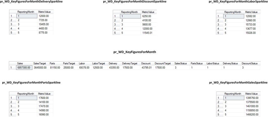
Figure 2-10. The data used to create a text-based KPI
How the Code Works
These pieces of T-SQL are quite a bit more complex than most of those that you have seen so far. This reflects the fact that several steps are necessary to collate and extract all the necessary data. This is what happens:
- The five small “sparkline” stored procedures collect the values for the five metrics that are used by the KPI (LaborCost, TotalDiscount, DeliveryCharge, SalePrice, and SpareParts) for each month of the selected year up until the month set in the ReportingMonth parameter.
- The stored procedure pr_WD_KeyFiguresForMonth may be long, but it simply collates the value and target for the five metrics for the selected year up to and including the selected month in a single dataset. Each of the 10 metrics needs a separate process to return the data, so a temporary table is probably the best solution. The status of each metric is then calculated in a way similar to that used in previous examples in this chapter using hard-coded thresholds.
Building a Text-Based KPI
Although this KPI is designed to be read as the sum of its parts, you only really need to learn how to make one of the text blocks. Once an initial KPI is finished, it can be duplicated and then the dataset filtered and any expressions tweaked to display the relevant data.
Here is how to create a text-based KPI. You will build the Sales KPI as the initial model.
- Create a new SSRS report named KeyFiguresForMonth.rdl, and add the shared data source CarSales_Reports. Name it CarSales_Reports.
- Add the following four shared datasets (ensuring that you also use the same name for the dataset in the report): CurrentYear, ReportingYear, CurrentMonth, ReportingMonth. Set the parameter properties for ReportingYear and ReportingMonth as defined at the start of Chapter 1.
- Add six datasets corresponding to the six stored procedures shown previously. Name them KeyFiguresForMonth (using Code.pr_WD_KeyFiguresForMonth) SalesSparkline (using Code.pr_WD_KeyFiguresForMonthSalesSparkline), DiscountSparkline (using Code.pr_WD_KeyFiguresForMonthDiscountSparkline), PartsSparkline (using Code.pr_WD_KeyFiguresForMonthPartsSparkline), LaborSparkline (using Code.pr_WD_KeyFiguresForMonthLaborSparkline) and DeliverySparkline (using Code.pr_WD_KeyFiguresForMonthDeliverySparkline).
- Add a table to the SSRS report canvas. Set the SalesSparkline as its dataset and remove all borders as described previously. Delete the Detail row by clicking a text box to display the gray grid and clicking the grey square to the left of the row. Then right-click and select Delete Row, and confirm that you want to do this.
- Add rows and columns until your table is composed of five rows and four columns.
- The top and bottom rows and leftmost and rightmost columns will be used only as spacers and will not contain any data. So you need to make them as narrow as possible-a couple of millimeters at the most. You also need to select the textboxes in the top and bottom rows and set the font height to 2 points; this prevents the rows growing vertically when displaying the report.
- Select the two center cells in the third row and merge them. Do the same for the two center cells on the fourth row.
- Set column 2 to be 2 inches wide, and column 3 to be 1 inch wide.
- Set row 2 to be 0.385 inches high, row 3 to be 0.5 inches high, and row 4 to be 0.25 inches high.
- Drag a sparkline to the merged cells in the fourth row. Select Column as the sparkline type (the top left sparkline). Click the sparkline to display the Chart Data pane, then select MetricValue as the ∑ Value. Click the pop-up triangle to the right of (Details) in the Category Groups section and select ReportingMonth.
- Click twice on any of the data bars. Then right-click and select Series Properties. In the Fill pane, set the following properties:
- Fill style: Gradient
- Color: Dark Blue
- Secondary color: White
- Gradient style: Vertical Center
- Click in the two merged cells in row 3 and add the following expression: =Sum(Fields!Sales.Value, "KeyFiguresForMonth"). Set the font to Cambria 22pt black, and center the textbox contents horizontally and vertically. Set the number format to the following custom format: #,#.
- Set the background color for the two rightmost cells in row 2 to Black.
- Add the following expression to the third cell in row 2: =Sum(Fields!Sales.Value, "KeyFiguresForMonth") / Sum(Fields!SalesTarget.Value, "KeyFiguresForMonth"). Set the font to Arial 14pt, and right-align the text box contents. Set the number format to percentage with two decimals. Set the vertical alignement of the text box to Top.
- Set the Color property (this will be the text color) for this same cell to the following expression:
=Switch(
Sum(Fields!SalesStatus.Value, "KeyFiguresForMonth")=1,"Red",
Sum(Fields!SalesStatus.Value, "KeyFiguresForMonth")=2,"Gray",
Sum(Fields!SalesStatus.Value, "KeyFiguresForMonth")=3,"White"
) - Add a 1-point black border to the top and left outside border of the table, and a 2-point black border to the bottom and right outside border of the table.
- In the second cell of the second row, add the text: Sales. Set it to Arial Black 14 point. Leave it left-aligned. Set the vertical alignment of the text box to Top.
You now have your initial KPI. You can now make four copies of the KPI and set the dataset for each to one of the remaining datasets: Discount Sparkline, Parts Sparkline, Labor Sparkline, and Delivery Sparkline. As there are no filters applied, you will have to tweak the expressions that are used to show the key metric, the percentage, and the status from the KeyFiguresForMonth dataset. In practice, this means replacing the field in step 15 with the field required by the specific KPI. So, for example, in the table that displays Parts KPIs you need to change SalesStatus.Value to PartsStatus.Value. Similar changes are required in steps 12 and 14.
How It Works
This KPI shows that you can use multiple datasets to populate KPIs. However, it can necessitate some forethought and a little work. At its heart, this KPI is similar to the KPI using a sparkline that was the second KPI example in this chapter. However, each table only shows one set of data; there is no data grouping. The metrics and status indicator are specific to each KPI, and rather than have multiple datasets, they are returned in a single dataset that contains a single row where it is the column that defines the metric. Consequently, when writing the functions to return a value from a dataset that is not linked to the table, you have to specify the column that will be used, as well as the dataset.
Step 10 sets the sparkline properties. You need to set the Category Groups so that the month data will appear on the horizontal axis.
The threshold indicator in this example is simply the text color. While not difficult, this can be effective-if it is not overused. This is why I left the sales figure in black. More generally, in this KPI I have chosen a slightly “harder” color scheme, trading grey for black and primary colors for pastel shades.
The table structure is essentially part of the presentation. However, I think that this part of the KPI development should not be overlooked, as it is the visual quality that will make your KPI memorable. So be prepared to spend some time tweaking row heights (and even the font sizes for blank cells) as well as column widths to add spacing to your table, both outside the central data and also inside the table.
A Complex Text-Based KPI
There are occasions when merely having the value, target, status, and trend for a metric are not enough. You may need to display the value for previous periods, such as the preceding month or the same month last year. All of these figures need to show the percentage difference and a status indicator. It is when faced with this level of complexity that a text-based KPI can be really effective. To give you an idea of what you are looking for, take a glance at Figure 2-11.

Figure 2-11. A complex text-based KPI
The Source Data
This KPI needs two datasets. They are Code.pr_ScorecardTimeCountryAndMake and Code.pr_ScorecardTimeCountryAndMake12MonthSales in the CarSales_Reports database. The code for both is as follows:
DECLARE @ReportingYear INT = 2015
DECLARE @ReportingMonth TINYINT = 6

-- Code.pr_ScorecardTimeCountryAndMake

IF OBJECT_ID('Tempdb..#Tmp_KPIOutput') IS NOT NULL DROP TABLE Tempdb..#Tmp_KPIOutput

CREATE TABLE #Tmp_KPIOutput
(
Country NVARCHAR(100) COLLATE DATABASE_DEFAULT
,Sales NUMERIC(18,6)
,SalesTarget NUMERIC(18,6)
,PrevMonthSales NUMERIC(18,6)
,PrevYearSales NUMERIC(18,6)
,Delta NUMERIC(18,6)
,PrevMonthDelta NUMERIC(18,6)
,PrevYearDelta NUMERIC(18,6)
,DeltaPercent NUMERIC(18,6)
,PrevMonthDeltaPercent NUMERIC(18,6)
,PrevYearDeltaPercent NUMERIC(18,6)
,SalesStatus TINYINT
,PrevMonthStatus TINYINT
,PrevYearStatus TINYINT
)

-- Sales

INSERT INTO #Tmp_KPIOutput (Country, Sales)

SELECT
CASE
WHEN CountryName = 'United Kingdom' THEN 'United Kingdom'
WHEN CountryName = 'France' THEN 'France'
WHEN CountryName = 'Switzerland' THEN 'Switzerland'
ELSE 'Other'
END
,SUM(SalePrice)

FROM       Reports.CarSalesData
WHERE      ReportingYear = @ReportingYear
           AND ReportingMonth = @ReportingMonth
GROUP BY
CASE
WHEN CountryName = 'United Kingdom' THEN 'United Kingdom'
WHEN CountryName = 'France' THEN 'France'
WHEN CountryName = 'Switzerland' THEN 'Switzerland'
ELSE 'Other'
END

-- Targets

-- Previous Months Sales
;
WITH PrevMonthSales_CTE
AS
(
SELECT
CASE
WHEN CountryName = 'United Kingdom' THEN 'United Kingdom'
WHEN CountryName = 'France' THEN 'France'
WHEN CountryName = 'Switzerland' THEN 'Switzerland'
ELSE 'Other'
END AS Country
,SUM(SalePrice) AS MetricValue

FROM     Reports.CarSalesData

WHERE    InvoiceDate BETWEEN DATEADD(mm, -1, DATEADD(dd, 1,
         EOMONTH(CONVERT(DATE, CAST(@ReportingYear AS CHAR(4))
         + RIGHT('0' + CAST(@ReportingMonth AS VARCHAR(2)),2) + '01', 112), -1)))
         AND  DATEADD(mm, -1, EOMONTH(CONVERT(DATE,
         CAST(@ReportingYear AS CHAR(4)) + RIGHT('0'
        + CAST(@ReportingMonth AS VARCHAR(2)),2) + '01', 112)))

GROUP BY
CASE
WHEN CountryName = 'United Kingdom' THEN 'United Kingdom'
WHEN CountryName = 'France' THEN 'France'
WHEN CountryName = 'Switzerland' THEN 'Switzerland'
ELSE 'Other'
END
)

UPDATE       Tmp
SET          Tmp.PrevMonthSales = CTE.MetricValue
FROM         #Tmp_KPIOutput Tmp
             INNER JOIN PrevMonthSales_CTE CTE
             ON Tmp.Country = CTE.Country

-- PrevYearSales
;
WITH PrevYearSales_CTE
AS
(SELECT
CASE
WHEN CountryName = 'United Kingdom' THEN 'United Kingdom'
WHEN CountryName = 'France' THEN 'France'
WHEN CountryName = 'Switzerland' THEN 'Switzerland'
ELSE 'Other'
END AS Country
,SUM(SalePrice) AS MetricValue

FROM         Reports.CarSalesData
WHERE        ReportingYear = @ReportingYear
             AND ReportingMonth = @ReportingMonth
GROUP BY
CASE
WHEN CountryName = 'United Kingdom' THEN 'United Kingdom'
WHEN CountryName = 'France' THEN 'France'
WHEN CountryName = 'Switzerland' THEN 'Switzerland'
ELSE 'Other'
END
)

UPDATE       Tmp
SET          Tmp.PrevYearSales = CTE.MetricValue
FROM         #Tmp_KPIOutput Tmp
             INNER JOIN PrevYearSales_CTE CTE
             ON Tmp.Country = CTE.Country

-- Targets
;
WITH Targets_CTE
AS
(
SELECT
CASE
WHEN BudgetDetail = 'United Kingdom' THEN 'United Kingdom'
WHEN BudgetDetail = 'France' THEN 'France'
WHEN BudgetDetail = 'Switzerland' THEN 'Switzerland'
ELSE 'Other'
END AS Country
,SUM(BudgetValue) AS BudgetValue

FROM          Reference.Budget
WHERE         BudgetElement = 'Countries'
              AND Year = @ReportingYear
              AND Month = @ReportingMonth
GROUP BY
CASE
WHEN BudgetDetail = 'United Kingdom' THEN 'United Kingdom'
WHEN BudgetDetail = 'France' THEN 'France'
WHEN BudgetDetail = 'Switzerland' THEN 'Switzerland'
ELSE 'Other'
END
)

UPDATE       Tmp
SET          Tmp.SalesTarget = CTE.BudgetValue
FROM         #Tmp_KPIOutput Tmp
             INNER JOIN Targets_CTE CTE
             ON Tmp.Country = CTE.Country

-- Calculations

UPDATE       #Tmp_KPIOutput

SET           Delta = SalesTarget - Sales
             ,PrevMonthDelta = (Sales - PrevMonthSales)
             ,PrevYearDelta = (Sales - PrevYearSales)
             ,DeltaPercent = (SalesTarget - Sales) / Sales
             ,PrevMonthDeltaPercent = (Sales - PrevMonthSales) / Sales
             ,PrevYearDeltaPercent = (Sales - PrevYearSales) / Sales

-- Status

UPDATE     #Tmp_KPIOutput

SET     SalesStatus =
               CASE
               WHEN ((Sales - SalesTarget) / Sales) + 1 <= 0.8 THEN 1
               WHEN ((Sales - SalesTarget) / Sales) + 1  > 1.2 THEN 3
               WHEN ((Sales - SalesTarget) / Sales) + 1  > 0.8
                    AND ((Sales - SalesTarget) / SalesTarget) <= 1.2 THEN 2
               ELSE 0
               END
     ,PrevMonthStatus =
                  CASE
                  WHEN PrevMonthDeltaPercent <= 0.9 THEN 1
                  WHEN PrevMonthDeltaPercent  > 1.1 THEN 3
                  WHEN PrevMonthDeltaPercent  > 0.9
                       AND PrevMonthDeltaPercent <= 1.1 THEN 2
                  ELSE 0
                  END
     ,PrevYearStatus =
                  CASE
                  WHEN PrevYearDeltaPercent <= 0.7 THEN 1
                  WHEN PrevYearDeltaPercent  > 1.4 THEN 3
                  WHEN PrevYearDeltaPercent  > 0.7
                       AND PrevYearDeltaPercent <= 1.4 THEN 2
                  ELSE 0
                  END
-- Output

SELECT * FROM #Tmp_KPIOutput

-- Code.pr_ScorecardTimeCountryAndMake12MonthSales

SELECT
CASE
WHEN CountryName = 'United Kingdom' THEN 'United Kingdom'
WHEN CountryName = 'France' THEN 'France'
WHEN CountryName = 'Switzerland' THEN 'Switzerland'
ELSE 'Other'
END AS Country
,SUM(SalePrice) AS Sales
,DATENAME(mm,InvoiceDate) + '-' + CAST(YEAR(InvoiceDate) AS CHAR(4)) AS MonthYear
,CAST(YEAR(InvoiceDate) AS CHAR(4)) + RIGHT('0' + CAST(MONTH(InvoiceDate) AS VARCHAR(2)),2) AS SortOrder

FROM        Reports.CarSalesData
WHERE       InvoiceDate BETWEEN '2012-08-01' AND '2013-08-01'
GROUP BY
CASE
WHEN CountryName = 'United Kingdom' THEN 'United Kingdom'
WHEN CountryName = 'France' THEN 'France'
WHEN CountryName = 'Switzerland' THEN 'Switzerland'
ELSE 'Other'
END
,DATENAME(mm,InvoiceDate) + '-' + CAST(YEAR(InvoiceDate) AS CHAR(4))
,CAST(YEAR(InvoiceDate) AS CHAR(4)) + RIGHT('0' + CAST(MONTH(InvoiceDate) AS VARCHAR(2)),2)

ORDER BY SortOrder
The data returned from these two scripts (although only partially for the second) looks like the output shown in Figure 2-12. This data is for June 2015 in the sample data.
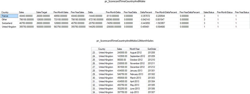
Figure 2-12. The data needed to create a complex text-based KPI
How the Code Works
As was the case for the second example in this chapter (the KPI with a sparkline), it is easier to separate out the data for the sparkline from the data used for all the other metrics in the KPI. This means two queries:
- pr_ScorecardTimeCountryAndMake12MonthSales, which returns the sales data for three countries that you want to analyze, as well as an “other” category for any remaining countries. It returns the sales figures for each month (up to and including the selected month) for the selected year.
- pr_ScorecardTimeCountryAndMake, which returns the data for sales, sales for the previous month, sales for the previous month, and sales for the same month for the previous year. These figures are added to a temporary table. Then the deltas are calculated so that status indicators for certain sales figures can be added.
While a little long, these procedures are not complicated. If anything, they emphasize that BI depends on the source data and that if you want a visualization to work, you must prepare the source data cogently.
Building a Complex Text-Based KPI
Once again, with the data defined you can start building the KPI itself. Here is how.
- Create a new SSRS report named _TimeCountryAndMake.rdl, and add the shared data source CarSales_Reports. Name it (as ever) CarSales_Reports.
- Create a dataset named CountryAnalysis. Set it to use the CarSales_Reports data source, and the query Code.pr_ScorecardTimeCountryAndMake. Add a second dataset named CountrySalesOver12Months using the query Code.pr_ScorecardTimeCountryAndMake12MonthSales.
- Add the following four shared datasets (ensuring that you also use the same name for the dataset in the report): CurrentYear, ReportingYear, CurrentMonth, ReportingMonth. Set the parameter properties for ReportingYear and ReportingMonth as defined at the start of Chapter 1.
- Add a table to the SSRS report canvas. Set CountryAnalysis as its dataset. Delete the header row. Ensure that the border style is set to None for all text boxes in the table.
- Right-click any row or column selector and choose Tablix Properties from the context menu. In the Tablix Properties dialog, select Filters and click Add. Select Country as the expression, and United Kingdom as the value. Click OK. You can, instead, use the Properties window (with the table selected) and click the ellipsis for the Filters property to set the filter if you prefer.
- Right-click the row selector and select Add Group Parent Group. Group by the field Country. Confirm with OK.
- Add two rows (you can insert above or below, it makes no difference) and two columns at the right of the table so that your table is three rows by six columns.
- Set the row sizes to the following:
- Top row: 0.65 inches.
- Middle and bottom rows: 0.25 inches.
- Set the column widths to the following:
- Column 1: 0.65 inches.
- Columns 2, 4 and 6: 1.55 inches.
- Columns 3 and 5: 0.7 inches.
- Drag an Indicator from the toolbox onto the first column (which is, in effect, a single cell). Select three up/down triangles as the indicator type (top right of the directional indicators). Click OK.
- Right-click the indicator and set the following indicator properties:
Section
Property
Value
General
Auto fit all gauges in panel
Unchecked
X position (percent)
4
Y position (percent)
-15
Width (percent)
92
Height (percent)
92
Values and States
Value
[Sum(SalesStatus)]
States Measurement unit
Numeric
Icon 1
Start: 1, End: 1
Icon 2
Start: 2, End: 2
Icon 3
Start: 3, End: 3
- Add an indicator to the third column of the first row. Set the type as three arrows (colored) and then set the following indicator properties:
Section
Property
Value
General
Auto fit all gauges in panel
Unchecked
X position (percent)
10
Y position (percent)
20
Width (percent)
70
Height (percent)
70
Values and States
Value
[Sum(PrevMonthStatus)]
States Measurement unit
Numeric
Icon 1
Start: 1, End: 1
Icon 2
Start: 2, End: 2
Icon 3
Start: 3, End: 3
- Copy this indicator into the fifth column of the first row and alter the Value to [Sum(PrevYearStatus)].
- Add the following fields:
Cell
Value
Row 1, Column 2
[Sales]
Row 1, Column 4
[PrevMonthDeltaPercent]
Row 1, Column 6
[PrevYearDeltaPercent]
Row 2, Column 2
[SalesTarget]
Row 2, Column 4
[PrevMonthSales]
Row 2, Column 6
[PrevYearSales]
- On the third row, merge the cells in columns 3 and 4. Do the same for the cells in columns 5 and 6.
- Format all the cells in the third row as Arial 8pt italic. Format all the cells in the second row as Arial 10pt. On the first row, format the cell in the second column as Arial 24 pt, and in the fourth and sixth columns as 16pt. Set all the font colors to Dim Gray, and the alignment to right aligned.
- On the first row fourth column, set the Color as the following expression:
=Switch(
Fields!PrevMonthStatus.Value=1,"Red",
Fields!PrevMonthStatus.Value=2,"Green",
Fields!PrevMonthStatus.Value=3,"Blue"
) - Do the same for the cell in the first row, sixth column. Here, however, the field in the switch expression is PrevYearStatus.
- Add a 1-point border to the right of the cells in the second and fourth columns, as well as a 1-point border above all the cells in the third row-except for the first column.
- Format the numbers in the fourth and sixth cells of the first row as percentage with two decimals. Format the second, fourth, and sixth cells on the second row to the custom format #,#.
- Add a line chart to the report outside and below the table that you have created. Right-click inside the chart and select Chart Properties from the context menu. Set the dataset name as CountrySalesOver12Months. Click Filters on the left and then Add. Select Country as the Expression and United Kingdom as the Value, and then Click OK.
- As the chart is selected, you should see the Chart datapane on the right. Click the plus symbol to the right of ∑ Values and select Sales.
- In the Chart Data pane, right-click Details in the Category Groups section and select Category Group Properties from the context menu. Select MonthYear as the Label, and click OK.
- Right-click the legend (outside the chart on the right) and select Delete Legend from the context menu.
- Right-click (in turn) the horizontal and vertical axis titles and uncheck Show Axis Title.
- Click inside the chart and display the Properties window. Expand CustomInnerPlotPosition, and set Enabled to True and Width to 95.
- Right-click the chart title and select Title Properties from the context menu. Set the following properties:
Section
Property
Value
General
Title text, as a function
=Fields!Country.Value
Title position
Bottom center
Font
Font
Arial Black
Size
16pt
Color
Black
- Right-click the horizontal axis and select Horizontal Axis Properties from the context menu. Set the following properties:
Section
Property
Value
Labels
Disable auto-fit
Selected
Label rotation angle (degrees)
21
Label Font
Font
Arial
Size
6pt
Color
Gray
Major Tick Marks
Hide major tick marks
Checked
Minor Tick Marks
Hide minor tick marks
Checked
Line
Line color
Dim Gray
- Right-click the vertical axis and select Vertical Axis Properties from the context menu. Set the following properties:
Section
Property
Value
Axis Options
Always include zero
Checked
Labels
Disable auto-fit
Selected
Label rotation angle (degrees)
0
Label Font
Font
Arial
Size
6pt
Color
Gray
Number
Category
Number
Decimal places
0
Use 1000 separator (,)
Checked
Major Tick Marks
Hide major tick marks
Unchecked
Position
Outside
Length
1
Line color
Gray
Minor Tick Marks
Hide minor tick marks
Checked
Line
Line color
Dim Gray
- Right-click inside the chart and select Chart Area Properties from the context menu. Select Shadow on the left, and in the Set the Shadow Options pane set the Shadow offset to 1.5pt and the Shadow color to Gray.
- Ensure that the table and chart are the same width and positioned perfectly one under the other.
Well, that took some time and needed close attention to detail. The result is, however, worth the effort; I am sure that you will agree. This visualization displays not only the data and status for the current and previous month’s sales (you will need to choose June 2015 to get the same result as Figure 2-11), but also the sales and status for the same month in the previous year. The trend is a chart, rather than a sparkline, that clearly shows the direction of travel.
You can now duplicate the two elements, table and chart, and set the filters on both to another country, and thus create a complex visualization for data from multiple countries.
How It Works
Once again, the secret to this KPI is in the source data. If the two datasets are accurate, then building the KPI is essentially simple. As the chart is a separate object, the decision to create one stored procedure for the chart data and one for all the data in the table seemed self-evident.
The table is, once again, an “Excel-like” structure where the art is in creating the right structure and merging cells where appropriate. As SSRS does not let you merge cells vertically, you group a parent group to “merge” vertically in the leftmost column. Then you place the appropriate fields and format them, and add three indicators that you customize. As you can see, indicators can be copied just like most other objects, and it can save a lot of time to get the first one right-and then copy and paste it as a basis for other indicators.
To make a change from nested IIF statements, you use a Switch() function in step 17. If this is new to you, consider it a bit like a T-SQL CASE statement.
When building complex scorecards like this, you must be careful to apply the relevant filters to all the objects that make up a single visualization. This means applying the filter to the chart and to the table for this example.
One interesting thing about the chart is setting the custom inner plot position. Altering this allows you to override SSRS’s sense of proportion, and to use the available space more efficiently. Another space-saving trick is to set the horizontal axis titles at an angle.
In this visualization, I chose slightly bolder colors for the indicators (and the status given by text colors where appropriate). You may prefer to use more pastel shades or alter the color scheme completely.
Conclusion
This chapter introduced you to Key Performance Indicators. As you saw, there are many types of KPI that you can build in SSRS. These range from the simple to the complex and from the classic to the adventurous. KPIs can be based on text, image indicators, or gauges-or a combination of some or all of these types. Then you can combine KPIs to make scorecards or dashboards, as you will see later in this book.