
![]()
Interface Enhancements
In the previous chapter, you saw some of the basic techniques that you can use to mask parameter selection in SSRS. It is now time to push these techniques a little further and apply them to add some real visual pizazz to your business intelligence delivery with SSRS.
Once again, most of what you will see in this chapter is based on hidden parameters and causing a report to refresh so that it displays a different subset of the data, or indeed a different view of the information. Consequently I recommend that you read the previous chapter before proceeding with this one.
The interface tweaks that you will look at in this chapter include
- Highlighting chart elements for data selection
- Creating tiles to subset data
- Adding a “carousel” effect to filter datasets
- Adding paged recordsets
- Creating “tabbed” reports
This is not all that can be done to add flair and style to your BI delivery with SSRS. Far from it; these ideas are only a starting point. I really hope that they will inspire you to discover further ways to create visually arresting dashboards and scorecards, because with a little time, effort, and ingenuity, SSRS can deliver reports that can rival or surpass most corporate and self-service BI products.
As most of the reports that you will see in this chapter use the interactive year and month selector that you created in the last chapter, I will make life easy for all of us by beginning with a template report that contains the widgets and datasets that are needed for these common elements. This report is called __DateSelector.rdl and can be found in the sample SSDT application that is available on the Apress web site.
This chapter suggests several techniques for scrolling through datasets. Inevitably, image buttons are used to allow more intuitive scrolling. There are hundreds of available sample images for this on the Web, but I have created a few extremely simple buttons for use in this chapter; see Table 9-1. You are, of course, free to use them in your own widgets, or to use any buttons that you prefer for this instead.
Table 9-1. Paging Buttons
Button | File Name | Description |
|---|---|---|
| LeftOne.png | Moves one element to the left |
| RightOne.png | Moves one element to the right |
| LeftSet.png | Moves one group of elements to the left |
| RightSet.png | Moves one group of elements to the right |
| LeftAll.png | Jumps to the leftmost element |
| RightAll.png | Jumps to the rightmost element |


Highlighting for Data Selection
Tools like Power View have got users used to interactive highlighting in reports. What this means essentially is that users want to be able to click or tap on a bar in a bar chart (or a column in a column chart or a segment in a pie chart) and have the data in the report filtered by the selected element.
Once again, this is not a problem for SSRS. Indeed, this is nothing more than a form of interactive parameter selection that is easy to implement. The effect is best enhanced by setting a different color for the selected chart element (be it a bar, pie slice, or column) so that the user can see exactly what element is filtering the data. An example of this kind of highlighting is shown in Figure 9-1.
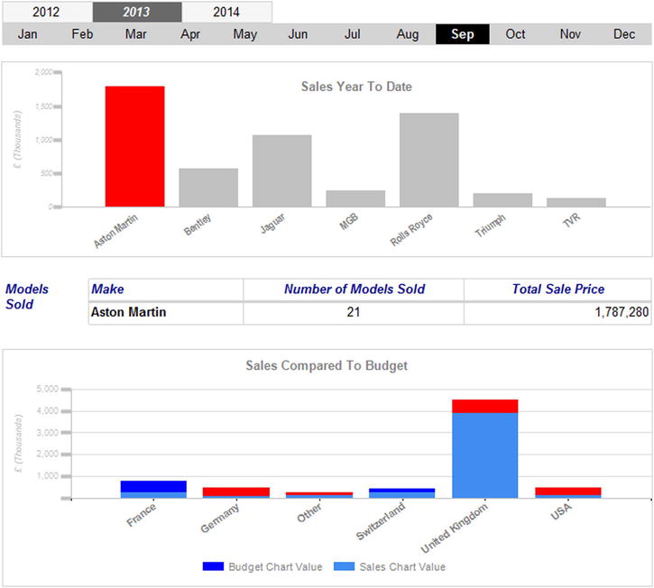
Figure 9-1. Highlighting report data
Hopefully the shading in a book is sufficiently clear to allow you to distinguish between the selected and unselected chart columns in the upper chart where the selected make, Aston Martin, is used to filter the data in the table. If the effect is not clear, you can always preview the report Tablet_ChartHighlight.rdl in the sample SSDT project to get the full effect.
The Source Data
The source data for the upper chart and the table are shown below. You saw the data for the lower chart in Chapter 4 (Code.pr_WD_CountrySalesToBudgetRatio), so I will not repeat it here. What you do need, however, are the code snippets used to display the top chart (pr_Tablet_ChartHighlight_SalesYTD) and the table (pr_Tablet_ChartHighlight_MakeSales). So here they are:
DECLARE @ReportingYear INT = 2013
DECLARE @ReportingMonth TINYINT = 9
DECLARE @Make NVARCHAR(50) = 'Aston Martin'

-- Code.pr_Tablet_ChartHighlight_SalesYTD

SELECT       Make
            ,SUM(SalePrice) / 1000 AS SalesYTD
FROM        Reports.CarSalesData
WHERE       ReportingYear = @ReportingYear
            AND ReportingMonth <= @ReportingMonth
GROUP BY    Make

-- Code.pr_Tablet_ChartHighlight_MakeSales

SELECT         Make
              ,SUM(SalePrice) AS SalePrice
              ,COUNT(Make) AS NbModels
FROM          Reports.CarSalesData
WHERE         ReportingYear = @ReportingYear
              AND ReportingMonth <= @ReportingMonth
              AND Make = @Make
GROUP BY      Make
Running these code snippets gives the results (for September 2013) shown in Figure 9-2.

Figure 9-2. Data for the selector chart
How the Code Works
The first piece of code merely aggregates the total sales for the selected year and month. It divides the result by 1,000 purely for the chart axis. The second piece of code returns the same sales figure (not divided by 1,000) as well as the number of cars sold for the selected (highlighted) color that is passed back using the @Make parameter.
So, with the data in place, here is how to build the report.
- Make a copy of the .rdl file named __DateSelector. Name the copy Tablet_ChartHighlight.rdl, and open the copy.
- Add the following datasets:
- ChartHighlight_MakeSales, using the stored procedure Code.pr_Tablet_ChartHighlight_MakeSales
- CountrySalesToBudgetRatio, using the stored procedure Code.pr_WD_CountrySalesToBudgetRatio
- ChartHighlight_SalesYTD, using the stored procedure Code.pr_Tablet_ChartHighlight_SalesYTD
- Add a column chart to the report. Apply the dataset ChartHighlight_SalesYTD. Widen the chart to match (approximately) the width of the month selector table.
- Set the following in the Chart Data pane:
- ∑ Values: SalesYTD
- CategoryGroups: Make
- Click any of the columns and set the Color property (in the Properties window) to the following expression:
=IIF(IsNothing(Parameters!Make.Value),"DarkGray",IIF(Fields!Make.Value = Parameters!Make.Value,"Red","Silver")) - Right-click any column and select Series Properties from the context menu. Click Action on the left. Choose Go to report as the action to enable. Set the Specify a report property (after clicking on the Function (Fx) button) to =Globals!ReportName. Remember that this is the ReportName item of the Built-in Fields category.
- Click the Add button three times to add three parameters. Define them as
- Make: =Fields!Make.Value
- ReportingYear: =Parameters!ReportingYear.Value
- ReportingMonth: =Parameters!ReportingMonth.Value
- Right-click the vertical axis and select Vertical Axis properties. Set the following properties:
Section
Property
Value
Axis Options
Always include zero
Checked
Labels
Disable auto-fit
Selected
Label rotation angle (degrees)
0
Label Font
Font
Arial
Size
6 point
Color
Silver
Italic
Checked
Number
Category
Number
Decimal places
0
Use 1000 separator
Checked
Major Tick Marks
Hide major tick marks
Unchecked
Position
Outside
Length
1.25
Line color
Silver
Line width
3 point
Minor Tick Marks
Hide minor tick marks
Checked
Line
Line color
Silver
- Right-click the horizontal axis and select Horizontal Axis Properties from the context menu. Set the following properties:
Section
Property
Value
Labels
Disable auto-fit
Selected
Label rotation angle (degrees)
-36
Label Font
Font
Arial
Size
8 point
Color
Gray
Bold
Checked
Major Tick Marks
Hide major tick marks
Checked
Minor Tick Marks
Hide minor tick marks
Checked
Line
Line color
Silver
- Delete the legend.
- Right-click the title and select Title Properties from the context menu. Set the following properties:
Section
Property
Value
General
Title text
Sales Year To Date
Title position
Top center
Font
Font
Arial
Size
10 point
Bold
Checked
Color
Gray
Border
Line style
None
- Right-click the Vertical Axis Title and select Axis Title Properties from the context menu. Set the following properties:
Section
Property
Value
General
Title text
£ (Thousands)
Title alignment
Center
Font
Font
Arial
Size
7 point
Italic
Checked
Color
Silver
- Click the Chart Area, and in the Properties window, expand CustomPosition. Set the following values:
- Enabled: True
- Height: 95
- Width: 100
- Delete the horizontal axis title.
- Adjust the chart height and width to suit your aesthetic sensibilities.
- Add a table to the report. Set it to use the dataset ChartHighlight_MakeSales. Leave a header row and three columns. Set all the column widths to around 2.2 inches.
- Place the field Make in the left-hand column, NbModels in the center column, and SalePrice in the right-hand column.
- Enter some suitable titles in the table header row. I suggest those that are used in Figure 9-1. Set the titles to be Arial Blue 10 point italic.
- Add a text box to the left of the table and enter the text “Models Sold” (without the quotes). Make this Arial Blue 10 point italic, too. Adjust its height and width so that the contents flow over two lines.
- Open the report _SalesToBudget.rdl that you created in Chapter 4, or open the example SSDT project where you will find it. Select the chart and copy it onto the report area of the report that you are currently creating. Drag the copied chart below the table. This visualization will use the dataset CountrySalesToBudgetRatio that you added in step 2.
- Apply exactly the same formatting to the chart title, vertical axis title, and horizontal and vertical axes that you applied to the chart you made previously in this report. You can leave the major gridlines, but set their color to silver.
- Select the chart area for the second chart, and in the Properties window, expand CustomPosition. Set the following values:
- Enabled: True
- Height: 75
- Width: 100
- Click the vertical axis and (in the Properties window) set the LabelsFormat to #,#,;(#,#,). This will present the output divided by 1,000.
Now that you have your report, you can preview it. The bar colors will change to display those that have been set by an SSRS expression for each chart.
This is a report that you really have to preview to get the full effect. Specifically, the columns will apply the correct colors in the preview, and you will be able to click any column in the top chart to display the sales figures in the table for that specific make.
How It Works
The essential part of this report is the top chart. The data that it displays (sales for the year up to the selected month) is simple. It is the way that clicking a column sets the @Make parameter that is interesting. This parameter not only highlights the column (as the column color has been set by the expression that you added in step 5), but also filters the data shown in the table.
Adding the second chart is merely a stylistic flourish. It also serves to make the point that any selection made using a chart as you did here will not apply automatically to every element in the report. You have to wire everything up manually. This can be a good thing because it gives you greater control. It can also be a pain when you have to hand craft the code over and over for all the parameters in the various action properties of clickable elements in the report.
The adjustment of the chart area window is to remind you that you are not limited to the default settings for the chart area. The other presentation ideas are only suggestions.
Creating Tiles to Subset Data
Another technique that has become popular in BI reporting is to subset data is using tiles in a report. These are, in essence, a filter that is
- Visual and intuitive
- Well suited to extensive filter sets
It is a little more work to set up a tile set rather than a slicer to allow the reader to select a filter. However, this kind of visualization adds a certain “wow” factor to your reports. So here is how to deliver the report shown in Figure 9-3.
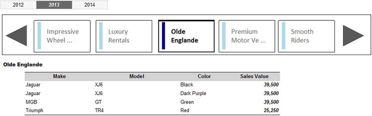
Figure 9-3. A tiled report
Clicking any of the vehicle distributor names will display a table of sales for the selected year. The tile containing the client is then highlighted so that you can see which tile is selected (Olde Englande, in this example). Clicking the right-hand button scrolls to the next set of clients, whereas clicking the left-hand button scrolls back to the previous set of clients. Code tweaks are also added to prevent the tile set scrolling past the first or last elements in the set.
This visualization uses three stored procedures, the code for which is given below. The first code block returns the five clients that you can see in the tile set. The second block returns the maximum number of tiled sets that are possible in a given year. This figure is used to prevent empty sets of tiles being displayed through providing a ceiling to the data set. The third block is much simpler, and displays the sales for the selected client.
-- Code.pr_TabletTileTiles

DECLARE @ReportingYear INT = 2013
DECLARE @SelectedElement VARCHAR(50) = 'Aston Martin'
DECLARE @BatchRow INT
DECLARE @RowCount INT = 1
DECLARE @BatchCount INT = 1
DECLARE @BatchCountRemainder INT = 1
DECLARE @Counter INT = 1
DECLARE @LowerThreshold INT = 1

SELECT @BatchCount = COUNT(DISTINCT ClientName) FROM Reports.CarSalesData WHERE CountryName = 'United Kingdom' AND YEAR(InvoiceDate) = @ReportingYear
SELECT @RowCount = @BatchCount / 5
SELECT @BatchCountRemainder = @BatchCount % 5

IF @BatchCountRemainder > 0 SET @RowCount += 1
IF @BatchRow <= 0 SET @BatchRow = 1

-- Required Iterations
IF OBJECT_ID('tempdb..#Tmp_Output') IS NOT NULL DROP TABLE tempdb..#Tmp_Output

CREATE TABLE #Tmp_Output
(
  ID INT IDENTITY(1,1)
 ,FirstElement VARCHAR(100)
 ,SecondElement VARCHAR(100)
 ,ThirdElement VARCHAR(100)
 ,FourthElement VARCHAR(100)
 ,FifthElement VARCHAR(100)
)

WHILE @Counter <= @RowCount

BEGIN

INSERT INTO #Tmp_Output (FirstElement,SecondElement ,ThirdElement ,FourthElement ,FifthElement)

SELECT [1] AS FirstElement, [2] AS SecondElement ,[3] AS ThirdElement ,[4] AS FourthElement ,[5] AS FifthElement
FROM
     (
      SELECT TOP (5) ROW_NUMBER() OVER (ORDER BY S.ID) AS ID, S.ClientName
      FROM

          (
           SELECT DISTINCT
                    DENSE_RANK() OVER (ORDER BY ClientName) AS ID
                   ,ClientName
           FROM    Reports.CarSalesData
           WHERE   CountryName = 'United Kingdom'
                   AND YEAR(InvoiceDate) = @ReportingYear
          ) S

      WHERE     S.ID BETWEEN ISNULL(@LowerThreshold, 1) AND @LowerThreshold * 5
     ) PT
PIVOT (MAX(ClientName) FOR ID IN ([1],[2],[3],[4],[5])) AS PT

SET @Counter += 1
SET @LowerThreshold = @LowerThreshold + 5
END

IF  @BatchRow > @RowCount
BEGIN
SELECT * FROM #Tmp_Output WHERE ID  = @RowCount
END
ELSE
BEGIN
SELECT * FROM #Tmp_Output WHERE ID  = @BatchRow
END

-- Code.pr_TabletTileMaxElements

DECLARE @RowCount INT = 1
DECLARE @BatchCount INT = 1
DECLARE @BatchCountRemainder INT = 1

SELECT @BatchCount = COUNT(DISTINCT ClientName)
                     FROM Reports.CarSalesData
                     WHERE CountryName = 'United Kingdom'
                     AND YEAR(InvoiceDate) = @ReportingYear
SELECT @RowCount = @BatchCount / 5
SELECT @BatchCountRemainder = @BatchCount % 5

IF @BatchCountRemainder > 0 SET @RowCount += 1

SELECT @RowCount AS MaxElements

-- Code.pr_TabletTileListOutput

SELECT
Make
,Model
,Color
,SalePrice

FROM      Reports.CarSalesData
WHERE     CountryName = 'United Kingdom'
          AND ReportingYear = @ReportingYear
          AND ClientName = @SelectedElement
ORDER BY  Make, Model, Color
The output for the three stored procedures is shown in Figure 9-4.

Figure 9-4. The result sets used by a tiled report
How the Code Works
The procedure Code.pr_TabletTileTiles (the core process for this visualization) starts by creating a temporary table where each row returned will be displayed as a set of five tiles. This table is then populated by a PIVOT operation that does the following:
- Selects all the records that correspond to the criteria (a hard-coded country and a parameterized year). These records are sorted in alphabetical order of client name.
- Pivots the rows into sets of five clients (clients) and gives each row a unique ID number.
- Adds these rows, one at a time, to the temporary output table. A WHILE clause adds the sets of five records to the output table.
The code for the stored procedure Code.pr_TabletTileMaxElements determines, independently of the previous procedure, the maximum number of records in the output table. Finally, the procedure Code.pr_TabletTileListOutput returns all the sales for a client once they have been selected in the tile set.
Once the three stored procedures have been built, you can create the tile visualization. As this report uses the year selector that you have used previously (but not the month selector), I suggest using the __DateSelector template, and then removing any references to the reporting month parameter rather than rebuilding the year selector from scratch.
- Make a copy of the .rdl file named __DateSelector. Name the copy Tablet_Tile.rdl, and open the copy.
- Delete the table containing the months. Delete the dataset named Dummy that is used by this table.
- For each of the three text boxes in the table containing the years, do the following to remove the reference to the ReportingMonth parameter:
- Right-click the text box.
- Click Action on the left.
- Click inside the ReportingMonth parameter.
- Click Delete.
- Expand the Parameters folder in the Report Data pane, right-click the ReportingMonth parameter, and select Delete from the context menu.
- Add the following datasets:
- Tiles, using the stored procedure Code.pr_TabletTileTiles– this will add the parameter @BatchRow
- Maximumelements, using the stored procedure Code.pr_TabletTileMaxElements
- ListOutput, using the stored procedure Code.pr_TabletTileListOutput– this will add the parameter @SelectedElement
- Ensure that importing the datasets has added the following two parameters; otherwise add them, and set their properties as follows:
- BatchRow
Section
Property
Value
General
Data type
Integer
Visible
Hidden
Default Values
Specify values
1
- SelectedValue
Section
Property
Value
General
Data type
Text
Allow null value
Checked
Visible
Hidden
Default Values
No default value
- BatchRow
- Add a rectangle to the report. Make it 1.5 inches high by 0.9 inches wide.
- Place a text box inside the rectangle. Name it TxtFirstElement. Set the following properties in the Properties window:
Property
Value
Color
=Iif(ReportItems!TxtFirstElement.Value = ReportItems!TxtSelectedElement.Value,"Black","DimGray")
Font
 FontFamily
Calibri
Font
FontSize14 point
Font
FontWeight=Iif(ReportItems!TxtFirstElement.Value = ReportItems!TxtSelectedElement.Value,"Bold","Normal")
CanGrow
False
CanShrink
False
- Set the default border width of the rectangle containing the text box to the following expression:
=Iif(ReportItems!TxtFirstElement.Value = ReportItems!TxtSelectedElement.Value,"3pt","1pt") - Add a rectangle in the shape of a wide vertical line to the left of the text box (as you can see in Figure 9-3). Note that this is purely for visual effect to attract the reader’s attention to the selected element. Set its BackgroundColor property to the following expression:
=Iif(ReportItems!TxtFirstElement.Value = ReportItems!TxtSelectedElement.Value,"DarkBlue","LightBlue") - Select the three elements that you just created, which in effect make up a single tile, and make four copies of them. Place the copies on a single row as in Figure 9-3.
- Change the name of the four copied text boxes inside each set of copied elements to TxtSecondElement, TxtThirdElement, TxtFourthElement, and TxtFifthElement. Make sure that the numbering in the names flows from left to right, so that the last one is TxtFifthElement.
- Change the code for the four expressions that you created in steps 7, 8, and 9 to the name of the corresponding text box for each tile. So, for example, the second text box will contain =If(ReportItems!TxtSecondElement.Value = ReportItems!TxtSelectedElement.Value,"Black","DimGray") as the expression that sets its color.
- Embed the following two images from the directory C:BIWithSSRSImages (assuming that you have downloaded the sample data from the Apress web site):
- LeftOne.png
- RightOne.png
- Add two images to the report: one to the left of the set of elements that make up the tiles, one to the right. Set the left-hand one to use the image LeftOne and the right-hand one to use the image RightOne. Make them both 0.6 inches square.
- Right-click the leftmost image and select Image Properties from the context menu. Select Action on the left.
- Select Go to report as the enabled action.
- In the Specify a report pop-up, do not select the name of the report, but enter =Globals!ReportName as the report to jump to. The dialog will display [&ReportName].
- Click three times on the Add button and define the following expressions as the values for the parameters (so click on the Fx button to display the Expression dialog):
- Name: ReportingYear - Value: =Fields!Year1.Value
The dialog will show [Year1] after you click OK in the Expression dialog.
- Name: SelectedElement - Value: =Parameters!SelectedElement.Value
The dialog will display [@SelectedElement] after you click OK in the Expression dialog.
- Name: BatchRow - Value: =IIF(Parameters!BatchRow.Value -1 < 1, 1, Parameters!BatchRow.Value - 1)
- Name: ReportingYear - Value: =Fields!Year1.Value
- Click OK to confirm your modifications to the image properties.
- Repeat steps 15 through 19 for the right-hand image (RightOne). Set the expression for the BatchRow parameter to
=IIF(Sum(Fields!MaxElements.Value, "MaximumElements") <= Parameters!BatchRow.Value
,Parameters!BatchRow.Value
,Parameters!BatchRow.Value + 1
) - Add four lines (two horizontal, above and below, and two vertical to the left and to the right) to give the effect of a box around the five tiles and the two buttons.
- Add a text box under the tiles. This will be the indication of the selected client. Make it approximately half the width of the report. Set the font to Arial Black 10 point and the expression for the text box value to
=IIF(IsNothing(Parameters!SelectedElement.Value) = True, "Please click on a reseller", Parameters!SelectedElement.Value) - Add a table under the tiles and add a column (there should be a total of four columns). Apply the dataset ListOutput.
- Add the following fields to the four columns, from left to right:
- Make
- Model
- Color
- SalePrice
- Set the title row to have a grey background and centered text in bold. Add a border to the top and bottom of the table in the table properties.
There you have your tiled report. When displayed, the user can scroll through the client list and click or tap on any one of them to display the vehicles that they have sold to this customer for a given year.
How It Works
This report is in two parts. The top part is a list of clients that can be scrolled to display all the UK-based resellers. This list is tweaked, visually, to show five clients at a time in a horizontal structure called a tile display. Clicking a tile containing a client name refreshes the report to display the sales for the selected client in the table under the tile set.
As is the case with all the visual tricks in this chapter, a set of hidden parameters is used to convey all the information required to show the tiles and the selected client. These parameters are
- ReportingYear: This contains the year for the metrics.
- BatchRow: This indicates which row of the pivoted table of clients will be displayed in the tile set.
- SelectedElement: This parameter contains the name of a selected client (if there is one). This is used not only to filter the data used in the table that appears below the tile set, but also to change the appearance of the selected tile so that the user can see which client has been selected. This parameter is also displayed in a text box above the table. This is because it is possible to scroll through the client list while leaving a non-visible client selected. If you prefer, you can tweak the code to set the @SelectedElement parameter to nothing when scrolling through the list of clients.
Once the code and parameters are in place, it is the Action property of the text boxes in the tile set, or the scroll buttons to either side of the tiles, that takes over. As you can see in steps 19 and 21, this code simply tests that there is a previous or following row in the table that feeds data into the text boxes that make up the tile set, and returns the data if it exists. The code for the text boxes in the tile set (for the font, border, and colored bar) checks to see if the value of the selected element (in the text box that displays the client) matches the contents of the text box contents. If it does, then these visual elements are changed to draw attention to the selection.
As a final tweak, the length of the client name is checked, and if it is too long to be displayed comfortably in the text box, it is truncated and ellipses added.
![]() Note In this example, the verification of the selected element uses a text box. It could just as easily compare the value of the parameter containing a selected element.
Note In this example, the verification of the selected element uses a text box. It could just as easily compare the value of the parameter containing a selected element.
Adding a Carousel to Filter Data
Another form of interactive data selection is a carousel. This technique is similar to using tiles to subset data, and uses many of the same techniques to filter the data that is displayed. One major difference is that the selected element is always visible because it appears in the center of the carousel.
A carousel adds a sense of perspective to show the selected element as well as a defined number of elements both before and after the current selection. You can scroll forward and backwards through the elements that make up the carousel using the buttons at the right and left of the carousel, or you can click any visible element to position it in the center of the carousel. The chart will then update to display the chart data for the central element. This way the central element of the carousel is the selected element.
The trick to this visualization is to add an image as the background to each text box in the table. The design of the images gives the impression of perspective to the carousel. A report with a carousel appears to the user like the one shown in Figure 9-5.

Figure 9-5. A report using a carousel to select data
As an added extra, this particular report compares sales and profits for the selected year with those for the previous year for the chosen reseller. This report extends the charting techniques that you saw previously in this book. Specifically, it shows how to create multiple chart areas as sub-charts inside a single chart.
The Source Data
This report is definitely quite complex. It requires the following four datasets to work properly:
- pr_TabletCarouselCarousel: This stored procedure fills the carousel with the list of clients (or clients, or resellers if you prefer).
- pr_TabletCarouselMaxElements: This stored procedure calculates the maximum number of records returned to the carousel. This number is used to prevent the carousel scrolling into infinity (or beyond).
- pr_TabletCarouselClient: This stored procedure returns the name of the client that is at the center of the carousel. This is then used as a parameter to select the data for the chart.
- pr_TabletCarouselChart: This stored procedure returns the data required by the chart.
The four code snippets are
DECLARE @ReportingYear INT = 2013
DECLARE @BatchRow INT = 5
DECLARE @ClientName VARHAR(100) = 'Aldo Motors'

-- Code.pr_TabletCarouselCarousel

IF OBJECT_ID('tempdb..#Tmp_Dealers') IS NOT NULL DROP TABLE tempdb..#Tmp_Dealers

CREATE TABLE #Tmp_Dealers (ID INT IDENTITY(1,1), ClientName NVARCHAR(100) COLLATE DATABASE_DEFAULT)

INSERT INTO #Tmp_Dealers (ClientName)
VALUES (NULL), (NULL), (NULL)

INSERT INTO #Tmp_Dealers (ClientName)

SELECT DISTINCT
ClientName
FROM   Reports.CarSalesData
WHERE  CountryName = 'United Kingdom'
       AND YEAR(InvoiceDate) = @ReportingYear
ORDER BY ClientName

IF OBJECT_ID('tempdb..#Tmp_Output') IS NOT NULL DROP TABLE tempdb..#Tmp_Output

CREATE TABLE #Tmp_Output
(
 FirstElement VARCHAR(100) COLLATE DATABASE_DEFAULT
,SecondElement VARCHAR(100) COLLATE DATABASE_DEFAULT
,ThirdElement VARCHAR(100) COLLATE DATABASE_DEFAULT
,FourthElement VARCHAR(100) COLLATE DATABASE_DEFAULT
,FifthElement VARCHAR(100) COLLATE DATABASE_DEFAULT
,SixthElement VARCHAR(100) COLLATE DATABASE_DEFAULT
,SeventhElement VARCHAR(100) COLLATE DATABASE_DEFAULT
)

INSERT INTO #Tmp_Output (FirstElement,SecondElement ,ThirdElement ,FourthElement ,FifthElement, SixthElement, SeventhElement)

SELECT [1] AS FirstElement, [2] AS SecondElement, [3] AS ThirdElement, [4] AS FourthElement, [5] AS FifthElement, [6] AS SixthElement, [7] AS SeventhElement
FROM
    (
     SELECT TOP (7) ROW_NUMBER() OVER (ORDER BY ID) AS SEQ, ClientName FROM #Tmp_Dealers WHERE ID >= @BatchRow
        ) PT
PIVOT (MAX(ClientName) FOR SEQ IN ([1],[2],[3],[4],[5],[6],[7])) AS PT

SELECT * FROM #Tmp_Output

-- Code.pr_TabletCarouselMaxElements

SELECT COUNT(DISTINCT ClientName) AS MaxValue
FROM   Reports.CarSalesData
WHERE  CountryName = 'United Kingdom'
       AND YEAR(InvoiceDate) = @ReportingYear

-- Code.pr_TabletCarouselClient

SELECT
ClientName
FROM
(
SELECT DISTINCT
ROW_NUMBER() OVER (ORDER BY ClientName) AS RowNo
,ClientName
FROM   Reports.CarSalesData
WHERE  CountryName = 'United Kingdom'
       AND YEAR(InvoiceDate) = @ReportingYear
GROUP BY ClientName
) A
WHERE RowNo = @BatchRow

-- Code.pr_TabletCarouselChart

IF OBJECT_ID('tempdb..#Tmp_Output') IS NOT NULL DROP TABLE tempdb..#Tmp_Output

CREATE TABLE #Tmp_Output (Make NVARCHAR(50) COLLATE DATABASE_DEFAULT, CurrentYearSales NUMERIC(18,2), PreviousYearSales NUMERIC(18,2), CurrentYearProfits NUMERIC(18,2), PreviousYearProfits NUMERIC(18,2))

INSERT INTO #Tmp_Output (Make)

SELECT
CASE
WHEN Make IN ('Aston Martin','Rolls Royce','Bentley','Jaguar') THEN Make
WHEN Make IN ('Triumph','MG') THEN 'Classic Brit'
ELSE 'Other'
END
FROM      Reports.CarSalesData
WHERE     ReportingYear IN (@ReportingYear, @ReportingYear - 1)
          AND ClientName = @ClientName
GROUP BY
CASE
WHEN Make IN ('Aston Martin','Rolls Royce','Bentley','Jaguar') THEN Make
WHEN Make IN ('Triumph','MG') THEN 'Classic Brit'
ELSE 'Other'
END

-- Current Year Sales
;
WITH CurrSales_CTE
AS
(
SELECT
CASE
WHEN Make IN ('Aston Martin','Rolls Royce','Bentley','Jaguar') THEN Make
WHEN Make IN ('Triumph','MG') THEN 'Classic Brit'
ELSE 'Other'
END AS Make
,SUM(SalePrice) AS SalePrice
FROM      Reports.CarSalesData
WHERE     ReportingYear = @ReportingYear
          AND ClientName = @ClientName
GROUP BY
CASE
WHEN Make IN ('Aston Martin','Rolls Royce','Bentley','Jaguar') THEN Make
WHEN Make IN ('Triumph','MG') THEN 'Classic Brit'
ELSE 'Other'
END
)

UPDATE     Tmp

SET        Tmp.CurrentYearSales = CTE.SalePrice

FROM       #Tmp_Output Tmp
           INNER JOIN CurrSales_CTE CTE
                  ON Tmp.Make = CTE.Make

-- Previous Year Sales
;
WITH PrevSales_CTE
AS
(
SELECT
CASE
WHEN Make IN ('Aston Martin','Rolls Royce','Bentley','Jaguar') THEN Make
WHEN Make IN ('Triumph','MG') THEN 'Classic Brit'
ELSE 'Other'
END AS Make
,SUM(SalePrice) AS SalePrice
FROM      Reports.CarSalesData
WHERE     ReportingYear = @ReportingYear - 1
          AND ClientName = @ClientName
GROUP BY
CASE
WHEN Make IN ('Aston Martin','Rolls Royce','Bentley','Jaguar') THEN Make
WHEN Make IN ('Triumph','MG') THEN 'Classic Brit'
ELSE 'Other'
END
)

UPDATE     Tmp

SET        Tmp.PreviousYearSales = CTE.SalePrice

FROM       #Tmp_Output Tmp
           INNER JOIN PrevSales_CTE CTE
           ON Tmp.Make = CTE.Make

-- Current Year Profit
;
WITH CurrProfit_CTE
AS
(
SELECT
CASE
WHEN Make IN ('Aston Martin','Rolls Royce','Bentley','Jaguar') THEN Make
WHEN Make IN ('Triumph','MG') THEN 'Classic Brit'
ELSE 'Other'
END AS Make
,SUM(SalePrice) - SUM(CostPrice) - SUM(TotalDiscount) - SUM(DeliveryCharge) - SUM(SpareParts) - SUM(LaborCost) AS Profit
FROM      Reports.CarSalesData
WHERE     ReportingYear = @ReportingYear
          AND ClientName = @ClientName
GROUP BY
CASE
WHEN Make IN ('Aston Martin','Rolls Royce','Bentley','Jaguar') THEN Make
WHEN Make IN ('Triumph','MG') THEN 'Classic Brit'
ELSE 'Other'
END
)

UPDATE     Tmp
SET        Tmp.CurrentYearProfits = CTE.Profit
FROM       #Tmp_Output Tmp
           INNER JOIN CurrProfit_CTE CTE
           ON Tmp.Make = CTE.Make

-- Previous Year Profit
;
WITH PrevProfit_CTE
AS
(
SELECT
CASE
WHEN Make IN ('Aston Martin','Rolls Royce','Bentley','Jaguar') THEN Make
WHEN Make IN ('Triumph','MG') THEN 'Classic Brit'
ELSE 'Other'
END AS Make
,SUM(SalePrice) - SUM(CostPrice) - SUM(TotalDiscount) - SUM(DeliveryCharge) - SUM(SpareParts) - SUM(LaborCost) AS Profit
FROM      Reports.CarSalesData
WHERE     ReportingYear = @ReportingYear - 1
          AND ClientName = @ClientName
GROUP BY
CASE
WHEN Make IN ('Aston Martin','Rolls Royce','Bentley','Jaguar') THEN Make
WHEN Make IN ('Triumph','MG') THEN 'Classic Brit'
ELSE 'Other'
END
)

UPDATE     Tmp
SET        Tmp.PreviousYearProfits = CTE.Profit
FROM       #Tmp_Output Tmp
           INNER JOIN PrevProfit_CTE CTE
           ON Tmp.Make = CTE.Make

UPDATE     #Tmp_Output SET CurrentYearSales = 0 WHERE CurrentYearSales IS NULL
UPDATE     #Tmp_Output SET PreviousYearSales = 0 WHERE PreviousYearSales IS NULL
UPDATE     #Tmp_Output SET CurrentYearProfits = 0 WHERE CurrentYearProfits IS NULL
UPDATE     #Tmp_Output SET PreviousYearProfits = 0 WHERE PreviousYearProfits IS NULL

SELECT * FROM #Tmp_Output
The output from these four stored procedures is shown in Figure 9-6.
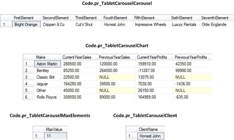
Figure 9-6. The output from the four stored procedures creating the carousel and its chart
How the Code Works
The initial, and main, procedure underlying this visualization is Code.pr_TabletCarouselCarousel. This piece of code starts by creating a temporary table (#Tmp_Dealers) into which it places all the clients that have recorded sales for the chosen year for the UK. The choice of the UK is currently hard-coded. This temporary table, however, has three empty rows added before the data. This is because the carousel essentially starts with the fourth element in the list, the central box in the visualization. Then a second temporary table, #Tmp_Output, is filled with seven pivoted records (beginning with the one that has to be the leftmost box in the carousel). The starting record is a variable returned from SSRS.
The other three procedures are much simpler. pr_TabletCarouselMaxElements echoes a part of the previous code to count the total possible number of records that can appear in a carousel for a specific year. This figure will be used by the interface to prevent empty recordsets being displayed. Code.pr_TabletCarouselClient takes the variable returned from Reporting Services that indicates where the selection of records begins and returns the corresponding client name. Finally, Code.pr_TabletCarouselChart takes the client name and calculates the data required to display the four charts. This is little different from many of the code snippets that you have already seen that aggregate sales or profit figures for a specified year and client. The only trick here is that, as you need to compare clients over two years, the client list is generated for either of the two years (in case a client appears in one but not the other) and placed in a temporary table first. Subsequently, any required metrics are calculated as CTEs and the temporary table is updated. Finally, any NULL values are set to zero to ensure that the shared legend (read from the chart of current year sales) will contain all the clients because any NULL clients would not otherwise be included by SSRS.
Assuming that these stored procedures are clear, you can proceed to build the visualization. I have to warn you that this particular report is quite complex and can take a while to produce. Not only is the carousel complex to create, but the chart (which is in fact a single chart using four separate chart areas) requires a certain attention to detail. However, I feel that the result is worth the effort, and I hope that you do, too.
- Follow steps 1 through 4 of the preceding example. Name the copy of the file Tablet_Carousel.rdl. This way you will have a base report containing the year selector.
- Add the following datasets (this will add all the necessary parameters automatically):
- Carousel, using the stored procedure Code.pr_TabletCarouselCarousel
- Maximumelements, using the stored procedure Code.pr_TabletCarouselMaxElements
- TabletCarouselChart, using the stored procedure Code.pr_TabletCarouselChart
- TabletCarouselClient, using the stored procedure Code.pr_TabletCarouselClient
- Add the following images from the folder C:BIWithSSRSImages:
- CarouselMain.png: This is the central box in the carousel.
- CarouselLeft3.png: This is the leftmost box in the carousel.
- CarouselLeft2.png: This is the second box from the left in the carousel.
- CarouselLeft1.png: This is the third box from the left in the carousel.
- CarouselRight1.png: This is the first box to the right of the central box in the carousel.
- CarouselRight2.png: This is the second box to the right of the central box in the carousel.
- CarouselRight3.png: This is the rightmost box in the carousel.
- LeftOne.png: This is the scroll button to slide the contents of the carousel one box to the left.
- LeftAll.png: This is the scroll button that jumps to the start of the list in the carousel.
- LeftSet.png: This is the scroll button that scrolls seven element leftwards (in effect filling the carousel with a complete set of elements).
- RightOne.png: This is the scroll button to slide the contents of the carousel one box to the right.
- RightAll.png: This is the scroll button that jumps to the end of the list in the carousel.
- RightSet.png: This is the scroll button that scrolls seven element rightwards (in effect filling the carousel with a complete new set of elements)
- Add seven text boxes to the report. Make them all 0.9 inches high and approximately 1.2 inches wide (you will be resizing them later). Place them in a row under the year selector.
- Name the text boxes TxtFirstElement, TxtSecondElement, etc. up to TxtSeventhElement (from left to right).
- Add the images CarouselLeft3, CarouselLeft2, CarouselLeft1, CarouselMain, CarouselRight1, CarouselRight2, and CarouselRight3 (from left to right) as the background images to the text boxes. Set the BackgroundRepeat property for each text box to Clip.
- Adjust the width of each text box individually so that the width matches the image. You will find that the further a text box is from the center, the less wide it is. Ensure that the (tiny) space between each text box is identical. You may want to select the text boxes and use Format Horizontal Spacing Make Equal to get them perfectly positioned. Tweak the height of the text boxes if this is necessary to display the full image. Finally, align all the text boxes vertically (Format Align Tops). Remember that this is purely to obtain a visual effect.
- Set the fonts for the text boxes as follows:
- TxtFirstElement: Arial 6 point italic
- TxtSecondElement: Arial 8 point italic
- TxtThirdElement: Arial 10 point italic
- TxtFourthElement: Arial 11 point bold
- TxtFifthElement: Arial 10 point italic
- TxtSixthElement: Arial 8 point italic
- TxtSeventhElement: Arial 6 point italic
- Add six images to the report; anywhere under the carousel will do for the moment. Make them all 0.25 inches square. Add the six images LeftOne, LeftSet, LeftAll, RightOne, RightSet, and RightAll. Set the images’ Sizing property to FitProportional.
- Place the images to the left and right of the carousel as shown in Figure 9-5.
- Set the expression for the leftmost text box (TxtFirstElement) to the following: =First(Fields!FirstElement.Value, "Carousel")
- Repeat this operation for all the remaining text boxes. Modify the expression so that the second text box (TxtSecondElement) refers to the field SecondElement, and so on for all the text boxes.
- Right-click the leftmost text box (TxtFirstElement) and select Text Box Properties from the context menu. Click Action on the left and set the following:
- Action: Go to report.
- Report: =Globals!ReportName.
- Add two parameters:
- Name: ReportingYear - Value: =Parameters!ReportingYear.Value.
- Name: BatchRow - Value:
=IIF(Parameters!BatchRow.Value <= Sum(Fields!MaxValue.Value, "MaximumElements") AND Not IsNothing(First(Fields!FirstElement.Value, "Carousel"))
,Parameters!BatchRow.Value - 3
,Parameters!BatchRow.Value
) - Click OK to confirm your modifications.
- Do exactly the same for the following text boxes; the expression for the BatchRow parameter will vary only slightly as shown below:
Text Box
Expression
TxtSecondElement
=IIF(Parameters!BatchRow.Value <= Sum(Fields!MaxValue.Value, "MaximumElements") AND Not IsNothing(First(Fields!SecondElement.Value, "Carousel"))
,Parameters!BatchRow.Value - 2
,Parameters!BatchRow.Value
)
TxtThirdElement
=IIF(Parameters!BatchRow.Value <= Sum(Fields!MaxValue.Value, "MaximumElements") AND Not IsNothing(First(Fields!ThirdElement.Value, "Carousel"))
,Parameters!BatchRow.Value - 1
,Parameters!BatchRow.Value
)
TxtFifthElement
=IIF(Sum(Fields!MaxValue.Value, "MaximumElements") <= Parameters!BatchRow.Value
,Parameters!BatchRow.Value
,Parameters!BatchRow.Value + 1
)
TxtSixthElement
=IIF(Sum(Fields!MaxValue.Value, "MaximumElements") <= Parameters!BatchRow.Value
,Parameters!BatchRow.Value
,Parameters!BatchRow.Value + 2
)
TxtSeventhElement
=IIF(Sum(Fields!MaxValue.Value, "MaximumElements") <= Parameters!BatchRow.Value
,Parameters!BatchRow.Value
,Parameters!BatchRow.Value + 3
)
- Set the Action properties for the six images to the left and right of the carousel exactly as you did for the leftmost text box (TxtFirstElement) in steps 13 and 14. The expression for the BatchRow parameter needs to be set as shown:
Image
Expression
LeftOne
=IIF(Parameters!BatchRow.Value -1 < 1, 1, Parameters!BatchRow.Value - 1)
LeftSet
=IIF(Parameters!BatchRow.Value -7 < 1, 1, Parameters!BatchRow.Value - 7)
LeftAll
=1
RightOne
=IIF(Sum(Fields!MaxValue.Value, "MaximumElements") <= Parameters!BatchRow.Value
,Parameters!BatchRow.Value
,Parameters!BatchRow.Value + 1
)
RightSet
=IIF(Parameters!BatchRow.Value + 7 <= Sum(Fields!MaxValue.Value, "MaximumElements")
,Parameters!BatchRow.Value + 7
,Parameters!BatchRow.Value + (Sum(Fields!MaxValue.Value, "MaximumElements") - Parameters!BatchRow.Value)
)
RightAll
=Sum(Fields!MaxValue.Value, "MaximumElements")
- Now for the chart. First, you need to add a chart to the report area under the carousel. Make it as wide as the carousel and around seven times taller. Make it a 3-D funnel chart and set it to use the dataset TabletCarouselChart.
- Click inside the chart to display the Chart Data pane and add the following ∑ values: CurrentYearDales, PreviousYearSales, CurrentYearProfits, and PreviousYearProfits. Set the Category Groups to Make.
- Right-click the funnel chart and select Series Properties. Choose Sum(PreviousYearSales) as the Value field. Select Make as the Category field in the Series Data pane. Confirm your modifications with OK.
- Select the chart area for the chart by clicking close to the chart funnel but outside it. Rename the chart area to PrevYearSales.
- Right-click inside the chart, but outside the existing chart area and legend. Select Add New Chart Area. Don’t worry about the unprepossessing gray box that appears, and rename the new chart area PrevYearProfits.
- In the Chart Data window, click the pop-up menu triangle to the right of the PreviousYearProfits series and select Series Properties from the context menu. Set the Category field to Make. Click Axes and Chart Area on the left, and select PrevYearProfits as the chart area to use. A funnel chart will now be displayed.
- Repeat steps 22 and 23 twice to add two more chart areas. Name the one on the top right CurrYearSales, and the one on the bottom right CurrYearProfits.
- In the Chart Data window, click the pop-up menu triangle to the right of the CurrentYearProfits series and select Series Properties from the context menu. Set the Category field to Make. Click on Axes and Chart Area on the left, and select CurrYearSales as the chart area to use. A funnel chart will now be displayed.
- In the Chart Data window, click the pop-up menu triangle to the right of the CurrentYearProfits series and select Series Properties from the context menu. Set the Category field to Make. Click on Axes and Chart Area on the left, and select CurrYearProfits as the chart area to use. A funnel chart will now be displayed.
- Right-click the legend and select Legend Properties from the context menu. Set the legend position to bottom center, and select wide table from the Layout pop-up menu. Confirm your changes.
- Right-click the top left funnel and select Series Properties from the context menu. Click Legend on the left, and check the Do not show this series in a legend check box.
- Do the same for the two bottom charts as you did in the previous step. The legend will now only display one make of car for the four charts.
- Right-click the bottom left chart and select Change Chart Type from the context menu. Choose 3-D pyramid as the type of chart.
- Do exactly the same for the bottom right chart as you did in the previous step.
- In the Properties window, set the CustomPosition property as follows for the four charts:
- Enabled: True
- Height: 90
- Left: 10
- Top: 10
- Width: 80
- Click the chart title, and in the Properties window, set the following properties:
Section
Property
Value
Caption
(Expression)
=Cstr(Parameters!ReportingYear.Value - 1)
CustomPosition
Enabled
True
Height
5
Left
10
Top
0
Width
30
- Click inside the chart itself, and outside any of the chart areas, and select Add New Title from the context menu. Click the new chart title, and in the Properties Window, set the following properties:
Section
Property
Value
Caption
(Expression)
=Parameters!ReportingYear.Value
CustomPosition
Enabled
True
Height
5
Left
60
Top
0
Width
30
- Click inside the chart itself, and outside any of the chart areas, and select Add New Title (again) from the context menu. Click the new chart title, and in the Properties window, set the following properties:
Section
Property
Value
Caption
Sales
CustomPosition
Enabled
True
Height
5
Left
0
Top
30
Width
100
- Add a final new title, as you did in the previous step, and set the same properties, except that the Caption should be “Profits” and the CustomPosition Top property must be 60.
- Click inside the chart itself, and outside any of the chart areas, and in the Properties Window, set the BorderStyle to None.
Well, that took a little while, but the effect will hopefully please your users. They can now flip from client to client singly, in sets, or directly leaping from start to end of the list and see the comparative sales and profits for the selected year and the previous year presented in an original way.
How It Works
This visualization is essentially in two parts:
- The carousel that lets you scroll through the list of clients
- The chart that displays metrics for the client in the center of the carousel
The Carousel
The carousel itself is a list of clients. Three principal tricks have been applied:
- The carousel is set to display the first client when first run.
- The recordset begins with three empty records. This means that the fourth record is the one that starts in the central box of the carousel. Consequently, this sleight of hand must be taken into account when scrolling through the carousel.
- The carousel is a pivoted dataset based on the initial selection of clients.
Virtually everything else is a question of shaping the appearance of the data in the carousel, hence the perspective effect produced by the background images and the text sizes that decrease the further the element is from the center of the carousel. Once the appearance has been defined, everything else is a question of handling the way the data in the carousel can be scrolled. In effect, it all boils down to setting the record that begins the set of seven records that is pivoted and displayed.
As you can see from the various expressions used to scroll through the data set, there are a few checks that have been added to the expressions. These ensure that scrolling cannot go beyond the limits of the available data.
The Chart
The chart is, perhaps surprisingly, a single chart. This is something that you have not seen in previous charts. While it can seem a little complex, it has the advantage of being easy to resize proportionally-something that is much harder when charts are separate, or contained in tables. It is also much easier to apply a single legend to chart collections like this.
When building a chart like this, you need to ensure that each chart has a data series that can be used by the individual chart element, as is the case with the dataset TabletCarouselChart. Then the trick is to add a separate chart area for each chart, and apply the required series to the chart area. Once this is done, everything else is position and aesthetics. There are a few points to note, however:
- When you set the custom position for titles, this is relative to the entire chart.
- When you set the inner plot position for the charts, this is relative to the individual chart area.
![]() Note You can also specify the exact position of each chart area by setting the Custom Position for the chart area. However, you will have to do this for all the chart areas if you do it for one of them.
Note You can also specify the exact position of each chart area by setting the Custom Position for the chart area. However, you will have to do this for all the chart areas if you do it for one of them.
The buttons that have been added to the carousel try to cover all the ways that a user might want to scroll through a recordset: singly, in groups, or directly to the start or end. Although this may be overkill, at least you have examples of paging and scrolling code that you can reuse, totally or partially, in your own reports.
Of course, the chart that you added here is not the only visualization that you can use with a carousel-like selector. You can use tables, gauges, other chart types-indeed anything that you want. What matters is to give your users a more intuitive and visually appealing way of selecting a parameter in Reporting Services.
SSRS lets you flip forwards and backwards through larger datasets “out of the box.” However, you need to display the toolbar for this, and the visual appeal is limited, to say the least. It is relatively easy in SSRS to enhance a table so that you can see instantly where you are in the recordset, and move through the recordset in a much more intuitive way. To show a way of doing this, let’s produce a paged report that looks like the one in Figure 9-7.

Figure 9-7. A report with paged recordsets
In a break with tradition, I think that it will also help to see the design view for this report. Consequently, you can see this in Figure 9-8.

Figure 9-8. The design view of a report with paged recordsets
The Source Data
The source data for this output is a simple set of records beginning at a defined starting point in the record set. There is also a separate procedure to calculate the maximum number of records. This is used to prevent the interface spiraling off into infinity when paging the data.
-- Code.pr_BatchedSet

DECLARE @ReportingYear INT = 2014
DECLARE @ReportingMonth INT = 12
DECLARE @Country VARCHAR(50) = 'United Kingdom'
DECLARE @BatchStart INT = 1
DECLARE @SetNumber INT = 7

SELECT TOP (@SetNumber) Make, Model, InvoiceDate, Color, SalePrice
FROM
  (
   SELECT
              ROW_NUMBER() OVER (ORDER BY InvoiceDate) AS ID
             ,Make
             ,Model
             ,InvoiceDate
             ,Color
             ,SalePrice

   FROM      Reports.CarSalesData
   WHERE     ReportingYear = @ReportingYear
             AND ReportingMonth <= @ReportingMonth
             AND CountryName = @Country
) S
WHERE     ID > @BatchStart
ORDER BY  InvoiceDate

-- Code.pr_BatchLimit

SELECT COUNT(*) AS BatchMax
FROM

       (
              SELECT   Make ,Model, InvoiceDate, Color, SalePrice
              FROM     Reports.CarSalesData
              WHERE    ReportingYear = @ReportingYear
                       AND ReportingMonth <= @ReportingMonth
                       AND CountryName = @Country
        ) S
The output from these two procedures is shown in Figure 9-9.

Figure 9-9. The output for the two stored procedures in a paged recordset
How the Code Works
The main procedure, Code.pr_BatchedSet, lists the sales according to the parameters passed into the procedure and a hard-coded country parameter. Then the output from this inner query is subset by selecting a specified number of records beginning at a defined record. Both the number of records to return and the starting record are passed in as parameters to make the code more reusable.
Building the Report
With the stored procedures in place, you can move on to creating this report.
- Make a copy of the .rdl file named __DateSelector. Name the copy Tablet_BatchedRecordset.rdl, and open the copy.
- Add the following datasets:
- BatchSet, using the stored procedure Code.pr_BatchedSet
- BatchLimit, using the stored procedure Code.pr_BatchLimit
- Ensure that you have the following parameters; add them if not. Set them all to be hidden, and set their properties as follows:
Parameter
Property
Value
BatchStart
Data Type
Integer
Allow null value
True
Default Values
Specify values: 0
SetNumber
Data Type
Integer
Default Values
Specify values: 7
Country
Data Type
Text
Allow blank value
Checked
Allow null value
Checked
Default Values
Specify values: United Kingdom
- Add the following images from the folder C:BIWithSSRSImages:
- LeftAll.png: This is the button to scroll back to the start of the record set.
- RightAll.png: This is the button to scroll forward to the end of the record set.
- LeftOne.png: This is the button to scroll forward to the next set of records.
- RightOne.png: This is the button to scroll backward to the previous set of records.
- Add a table to the report. Apply the dataset BatchSet.
- Add two more columns to the report. Add the fields Make, Model, Color, InvoiceData, and SalePrice to the detail row, in this order.
- Add a vertical line (that you set to be 2.8 inches high) to the left of the table.
- Set the line’s Hidden property to True.
- Align the tops of the line and the table by Ctrl-clicking both of them and selecting Format Align Tops.
- Add a horizontal line just under the bottom of the vertical line. Make it as wide as the table.
- Add four images to the report. Make each one 0.4 inches square (approximately). Add the four embedded images that you imported into the report in step 3, one to each of the image elements. Set their Sizing property to FitProportional.
- Place the images as shown in Figure 9-8. Tweak the size of the images if you need to display the contents.
- Add a text box at the bottom center of the report. Set the font to Arial Bold 10 point italic. Set the expression for this text box to the following:
="Rows " & Parameters!BatchStart.Value + 1 & " to " &
Iif(Sum(Fields!BatchMax.Value, "BatchLimit") <= (Parameters!BatchStart.Value + Parameters!SetNumber.Value)
, Sum(Fields!BatchMax.Value, "BatchLimit")
, (Parameters!BatchStart.Value + Parameters!SetNumber.Value)) & " (of " & Sum(Fields!BatchMax.Value, "BatchLimit") & ")" - Add a text box at the top right of the report. Set the font to Arial Bold 16 point blue. Set the expression for this text box to the following:
=Parameters!Country.Value - Set the Action property for each of the image buttons at the bottom of the report to the following:
Option
Value
Enable as an action
Go to report
Specify a report
[&ReportName]
Parameters
Name: ReportingYear - Value: [@ReportingYear]
Name: ReportingMonth - Value: [@ReportingMonth]
Name: Country - Value: [@Country]
- For each of the image buttons, add the parameter BatchStart in the Action property with the following values for the given buttons:
Button Image
Value
LeftAll
0
RightAll
=Cint(Sum(Fields!BatchMax.Value, "BatchLimit")) - Parameters!SetNumber.Value
RightOne
=IIF(
(Parameters!BatchStart.Value + Parameters!SetNumber.Value) < Sum(Fields!BatchMax.Value, "BatchLimit")
,Parameters!BatchStart.Value + Parameters!SetNumber.Value
,Parameters!BatchStart.Value
)
LeftOne
=IIF(Parameters!BatchStart.Value - Parameters!SetNumber.Value < 0, 0, Parameters!BatchStart.Value - Parameters!SetNumber.Value)
That is all that you have to do. You can now visualize the report and click the scroll buttons to page through the report. As an added bonus, you can see the value of the Country parameter on the top right, as well as a record counter at the bottom of the report.
How It Works
As I mentioned when explaining the code, this is simply a way of paging data in a report. The heavy lifting is done by the stored procedure that returns a set of records for display. The interface merely handles how the necessary parameters are passed back to the stored procedure.
Two parameters are hard-coded with initial values in the report. These are the Country parameter (that selects the country for the sales) and the SetNumber parameter that sets the number of records displayed. Either or both of these could be made interactive using, say, a pop-up menu, as you saw in the last chapter.
Specifically, the interface maintains the state of the BatchStart parameter that sets the initial record in the set that is returned to the report. All this is done using the Action property of the image buttons, which also contain some checks and balances to prevent empty or invalid recordsets being displayed. These buttons work like this (I am using the image names to indicate which button is described):
- The PrevList button checks that the BatchStart parameter will not descend below zero if it is decremented, and if not, it decreases the BatchStart parameter by the value of the SetNumber parameter.
- The NextList button ensures that incrementing the BatchStart parameter will not exceed the number of records available, and if not, it adds the value of the SetNumber parameter to the BatchStart parameter. If the maximum value would be exceeded, then the value remains unchanged.
- The StartList button is the easiest of the lot; it resets the BatchStart parameter to zero.
- The EndList button calculates the value of the maximum available records minus the SetNumber parameter and uses this to display the final set of records.
So this is uniquely an interface trick, but one that users will probably prefer to paging through recordsets using the SSRS toolbar, especially on tablet devices.
The hidden line exists solely to ensure that the “footer” elements of the table remain in the same place whatever the number of records in the table. Without this, the buttons can move up if the final set of records contains fewer than seven records.
Conclusion
This chapter showed a few of the many ways that you can enhance the SSRS interface and give your users a more intuitive and friendly way of interacting with your reports. You saw how to page through data sets in several ways, from simple tables via tiles to carousels. All this is done using Reporting Services parameters and the Action properties of images and textboxes.
These examples are far from the limits of what is possible when you apply a little ingenuity and invention to the SSRS canvas. I hope that they will not only prove useful as they are, but will also inspire you to push the SSRS interface to new heights as you develop even more interesting and-dare I say-cooler reports.