
![]()
Gauges for Business Intelligence
If there is one presentation technique that you really have to master for business intelligence, it is using gauges. A well though-out gauge (or set of gauges) will enable you to do the following:
- Deliver essential information quickly
- Focus your audience’s attention on what matters
- Give a clean and efficient-looking impression of your BI team’s technical prowess
Fortunately, SSRS has, since the 2008 version, added a wide range of gauges to its available features. There are many types of gauge available, and they are
- Easy to implement
- Effective and interesting to use
- Capable of producing a wide range of effects
All of the gauges supplied with Reporting Services are either linear or radial. Fortunately, this distinction is largely esoteric because you will be using the same techniques to create a gauge whatever its type. What really matters is learning how gauges work and then how you can push and tweak the available properties to deliver business intelligence reporting that really impresses your audience.
However varied and whatever the information contained, a gauge will always contain some or all of the following core elements:
- One or more pointers to display the values
- One or more scales to indicate what numeric value the pointer represents
- A range (or ranges) to indicate where the values are relative to a defined threshold
If you are aiming for a more complex representation of your data, you could add any of the following to your gauges:
- Text elements (or labels) to define the gauge content or add further information
- Indicators (to alert the user or to display trends)
- Sub-gauges to display additional information
Of course, any gauge can also be formatted in many, many different ways. You can apply different colors and shading to most gauge elements as well as adding images to the gauge background or selecting a gauge shape and frame from a wide set of built-in options. Using and combining these elements are essential to effective BI delivery.
When you start creating gauges, the sheer wealth of options can seem a little overwhelming. The best advice I can give is to stay calm and persevere. With a little experience you will almost certainly come to appreciate all that can be done once you know your way around the available settings.
Feeding the right data into a gauge is the key to successful delivery. Gauges nearly always need only few data elements. Yet preparing the correct data before you leap into designing and building even simple gauges will repay your initial investment in time spent re-tweaking code considerably.
So what do you need for a gauge? Well, you will definitely need
- The metric for each pointer.
You could also need
- The upper limit for each range.
- The minimum and maximum values for each scale; however, in any cases the upper limit for the topmost range is also the maximum value for a scale.
- Threshold indicators if you are using colors in pointers (be they needles, bars, or markers) to indicate where the metric stands relative to a key break-point.
I realize that range limits can be hard-coded, as can scale limits. However, in practice hard-coding these values is only a short-term solution that rapidly becomes unusable in practice. So feel free to hard-code in your initial development, but be prepared to add further data to the dataset (or even to create further datasets) to deliver dynamic range and scale thresholds before you consider moving the gauge into production.
Depending on the intricacy of the report that you are developing and the source data that you are using, you might use multiple data sets for a gauge. My preference once again is to combine all the required data into a single dataset in most cases, as it is easier to apply data to a gauge (and easier to maintain the gauge) when all of the data is in the same set. Consequently, nearly all the examples in this chapter will use various T-SQL techniques to do the following:
- Combine all required data into a single dataset per gauge
- Combine all necessary data into a single dataset for all gauges that form part of a “multi-gauge” visualization
In practice, you are free to use the type and number of datasets and data sourcing techniques that you feel happiest with-or that the business requires for maintenance.
Creating gauges is frequently a process involving much trial and error until you have settled on the perfect look and feel. In the real world, you will probably have to accept that your users will go through many iterations until they are content. So be prepared to call on vast amounts of patience when developing your BI gauges in SSRS.
Gauges are rarely used singly. Most often they only become truly useful when combined in various ways. This chapter, however, will only concentrate on creating single gauges. The techniques for assembling them and creating composite visualizations are explained in various other chapters, specifically in Chapters 7 and 10.
As either a brief introduction to basic gauge use, or as a rapid refresher course if you have already used gauges, I will begin with a fairly standard gauge that contains
- A single pointer
- A single scale
- A range that indicates, in true KPI style, where the figures stand in relation to corporate objectives
This example will explain the basic concepts and elements to give you a solid basis from which you can then proceed to more advanced gauge development.
Figure 3-1 shows what you are trying to create. To give you an idea of how a gauge like this could be used, it is shown alongside a visualization made up of several gauges that are identical in design but based on different data filters. Also, as a break with the “softer” design approach taken so far in the book, I will make this gauge more “edgy.” The techniques needed to assemble the six gauges are given in Chapter 7.
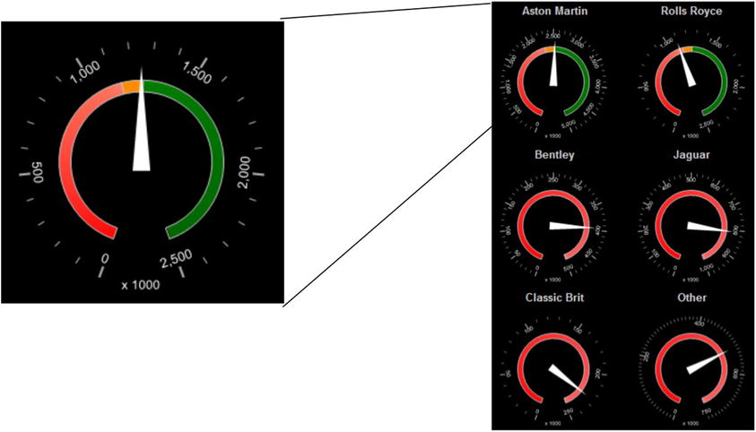
Figure 3-1. Comparing a metric to a target
The first thing that you need is your business data. In this example, let’s suppose that what you want is a list of the principal makes of car, plus a couple of “catch-all” categories for minor makes, along with the budget figures for a selected year and month. Using the budget figure, you will then calculate the thresholds for a three-part range that you will add to the gauge. This range indicates how well you are doing compared to the target. The following code snippet (available as Code.pr_SmartPhoneCarSalesGauges in the CarSales_Report database) gives you the data you need for July 2012:
DECLARE @ReportingYear INT = 2013
DECLARE @ReportingMonth TINYINT = 6

IF OBJECT_ID('tempdb..#Tmp_Output') IS NOT NULL DROP TABLE tempdb..#Tmp_Output

CREATE TABLE #Tmp_Output
(
KPIMetric VARCHAR(50)
,CurrentValue NUMERIC(18,6)
,ScaleMax INT
,KPI1Threshold NUMERIC(18,6)
,KPI2Threshold NUMERIC(18,6)
)

INSERT INTO #Tmp_Output (KPIMetric, CurrentValue, ScaleMax, KPI1Threshold, KPI2Threshold)

SELECT
CASE
WHEN Make IN ('Aston Martin','Rolls Royce','Bentley','Jaguar') THEN Make
WHEN Make IN ('Triumph','MG') THEN 'Classic Brit'
ELSE 'Other'
END
,SUM(SalePrice) / 1000
,CASE
WHEN SUM(SalePrice) >=  SUM(SalePrice) THEN Code.fn_ScaleQuartile(SUM(SalePrice / 1000))
ELSE Code.fn_ScaleQuartile(SUM(B.BudgetValue / 1000))
END
,SUM(B.BudgetValue) * 0.95 / 1000
,SUM(B.BudgetValue) * 1.05 / 1000

FROM     Reports.CarSalesData S
         INNER JOIN
         (
          SELECT     BudgetValue
                    ,Year
                    ,Month
                    ,BudgetDetail
                    FROM     Reference.Budget
                    WHERE     BudgetElement = 'Sales'
         ) B

ON
CASE
WHEN Make IN ('Aston Martin','Rolls Royce','Bentley','Jaguar') THEN Make
WHEN Make IN ('Triumph','MG') THEN 'Classic Brit'
ELSE 'Other'
END = B.BudgetDetail
AND ReportingYear = B.Year
AND ReportingMonth = B.Month

WHERE     ReportingYear = @ReportingYear
          AND ReportingMonth = @ReportingMonth

GROUP BY
CASE
WHEN Make IN ('Aston Martin','Rolls Royce','Bentley','Jaguar') THEN Make
WHEN Make IN ('Triumph','MG') THEN 'Classic Brit'
ELSE 'Other'
END

SELECT * FROM #Tmp_Output
Running this snippet gives the output shown in Figure 3-2.

Figure 3-2. The data used to compare vehicle sales to sales target for a specific month
How the Code Works
This code block aggregates sales data from the CarSalesData view for the selected year and joins this to the budget table. The output groups the makes of car into a few key makes and two other groupings. All this is done, in this example, in a single query rather than by using a temporary table and multiple steps.
The code then divides the final result by 1,000 to enhance the readability of the scale on the gauge.
This code snippet also uses one of the user-defined functions described in Chapter 1 to round up the largest output to a figure in increments of 25, 250, or 2,500, etc. This also enhances the readability of the scale on the gauge.
Now that you have prepared your data, it is time to create the gauge itself. Here is how.
- Create a new SSRS report named _CarSalesGauge.rdl.
- Add the shared data source CarSales_Reports. Name it CarSales_Reports.
- Create a dataset named SmartPhoneCarSalesGauges. Have it use the CarSales_Reports data source and the query Code.pr_SmartPhoneCarSalesGauges that you saw earlier.
- Add the following four shared datasets (ensuring that you also use the same name for the dataset in the report):
- CurrentYear
- CurrentMonth
- ReportingYear
- ReportingMonth
- Set the parameter properties for ReportingYear and ReportingMonth as defined at the start of Chapter 1.
- Drag a gauge from the toolbox onto the report surface. Select Radial as the gauge type.
- Right-click outside the gauge itself, but inside the gauge panel (the square delimiting the gauge) and select Gauge Panel properties. Select SmartPhoneCarSalesGauges as the dataset name.
- Click Filters on the left, followed by Add. Select KPIMetric from the pop-up list as the expression, equals (=) as the operator, and Rolls Royce as the value.
- Click OK.
- Click the pointer. The Gauge Data panel will appear to the right of the gauge (if it is not already visible). Click the triangle to the right of the pop-up currently containing Unspecified and select CurrentValue. This will make the pointer display the sales metric.
- Right-click the pointer and select Pointer Properties. Set the following properties:
- Pointer Type: Needle
- Pointer Style: Triangular
- Placement: Inside
- Distance from scale (percent): 18
- Width (percent): 15
- Click Pointer Fill on the left and set the fill style to solid and the color to white.
- Click the Cap Options on the left and check the Hide pointer cap checkbox.
- Click OK. This will confirm all your changes and close the Pointer Properties dialog.
- Right-click the gauge scale and select Scale Properties. In the General pane, set the following:
- Minimum: 0
- Maximum: Click the Expression button (Fx) and add this code:
=Fields!ScaleMax.Value
- Set the multiply scale labels by option to 10.
- Select Layout on the left and set the following properties:
- Scale radius (percent): 42
- Start angle (degrees): 20
- Sweep angle (degrees): 320
- Scale bar width (percent): 0
- Select Labels on the left and set the Placement relative to scale property to Inside.
- Select Label Font on the left and select Arial 11 point white as the font.
- Select Major Tick Marks on the left and set the following properties:
- Major tick mark shape: Rectangle
- Major tick mark placement: Cross
- Width (percent): 2
- Length (percent): 10
- Select Number on the left and set the Category to Number, Decimal places to 0, and check the Use 1000 separator check box.
- Click Ok. This will confirm all your modifications for the gauge.
- Right-click inside the gauge panel (the square delimiting the gauge) and select Gauge Panel properties. Click Fill on the left and select black as the color.
- Click Frame on the left and set the following:
- Style: Simple.
- Shape: Circular2.
- Click Frame Fill on the left and set the Color to Black.
- Click OK.
- Right-click the range and select Range Properties. On the General tab, set the following:
- Start Range at scale value: 0
- End range at scale value: Click the Expression button (Fx) and add this code:
=Fields!KPI1Threshold.Value
- Placement relative to scale: Inside
- Distance from scale (percent): 30
- Start width (percent): 10
- End width (percent): 10
- Click Fill on the left and set the following:
- Fill style: Gradient
- Color: Red
- Secondary color: Salmon
- Gradient style: Start to end
- Click Border on the left and set the following:
- Line style: Solid
- Line width: 1 point
- Line color: Silver
- Click OK.
- Right-click the gauge and select Add range. Do this a second time.
- Set the properties of the two other ranges as shown below.
Property
Range2
Range3
Start Range at scale value
=Fields!KPI2Threshold.Value
=Fields!KPI1Threshold.Value
End Range at scale value
=Fields!ScaleMax.Value
=Fields!KPI2Threshold.Value
Placement relative to scale
Inside
Inside
Distance from scale (percent)
30
30
Start width (percent)
10
10
End width (percent)
10
10
Fill style
Solid
Gradient
Color
Dark Orange
Green
Secondary color
Orange
Dark Green
Gradient style
Start to end
Start to end
Line style
Solid
Solid
Line width
1 point
1 point
Line color
Silver
Silver
- Click inside the gauge panel and select Add label. Right-click the label and select Label Properties from the context menu. Set the following properties:
Section
Property
Value
General
Text
x 1000
Top
91
Left
42
Width
16
Height
6
Font
Font
Arial
Color
White
Fill
Fill style
Solid
Fill color
No color
Border
Line style
None
- Click OK.
Your gauge is now complete. Admittedly, there were a considerable number of properties that needed to be set, and it can take a while to familiarize yourself with the structure of a gauge. The tricky part to this visualization is setting the upper and lower thresholds of the ranges correctly. So you may need to pay particular attention to this part of the process, and ensure that you set each of the three ranges correctly. However, the end result is, and I hope you agree, well worth the effort. Once a first gauge is perfect, you can copy it and adjust the filter to have a multi-gauge display. You will be assembling one of these using this gauge in Chapter 7.
How It Works
This gauge simply represents the sales figure as the pointer (the needle). As mentioned earlier, the gauge scale is adjusted to quartile increments as this means more readable graduations on the scale. The gauge has three ranges whose color indicates how the sales figure compares to the budget metric. The range boundaries are set in the code to allow for easier maintenance and more interactive redefinition.
![]() Note Selecting a range when you have created several ranges can be a little tricky. To select a range, right-click inside the gauge panel and click on the Gauge Panel in the context menu. A sub-menu will appear, listing (among other things) all the existing ranges. All you have to do is click the range that you want to modify.
Note Selecting a range when you have created several ranges can be a little tricky. To select a range, right-click inside the gauge panel and click on the Gauge Panel in the context menu. A sub-menu will appear, listing (among other things) all the existing ranges. All you have to do is click the range that you want to modify.
Now that the initial gauge is defined, you can make multiple copies of the original, and modify the filter on each one so that it shows data for a different make of car, for instance. This composite gauge collection is designed for a smartphone; see Chapter 10 for more information.
As this was the first gauge in the chapter, I have quite a few tips for you.
- This gauge uses a fairly plain needle type. However, SSRS offers a wide selection of available needle types, so feel free to experiment and to select the type that best suits the report or dashboard you are creating. Also remember that you can tweak the length or width of a needle to alter the overall effect produced by the gauge. Somewhat counterintuitively, the needle length is set using the Distance from scale property.
- When sizing and positioning gauge elements such as scales, pointers, and ranges, you do not need to know initially the exact figures to enter to set the various properties. To start with, it’s best to place and size elements visually. This means moving the dialog away from the gauge, so that both dialog and gauge are visible. Then modify the properties that you want to tweak. Since any modifications that you make in the dialog are reflected interactively in the gauge, you will see the result of your modifications immediately.
- For some elements you will need to reuse the same property several times (height, position, and width are some of these). In these cases, it can be worth noting the values that you want to reuse once you have an initial element that is correct and thus representative of the values that you want to reproduce for other elements.
- Although I defined the size and position of the text box inside the gauge by setting properties, you can position (though not resize) text elements with the mouse.
- It is worth noting that although you set the font for the scale to a specific size, this will only be used as guidance for SSRS. The font will scale if you resize the gauge.
- In step 15, you modified the multiply scale labels by property to 10. This can be set to a positive or negative factor of 10 to act as a multiplier on the axis.
Using Multiple Pointers in Gauges
The truly wonderful thing about gauges is their sheer versatility. One basic technique that can expand the way a gauge is used is to add multiple pointers to a gauge. The following example shows how a gauge can be used to display separate metrics related to different thresholds. This example also tries to vary the presentation effect by using a bar style of pointer. Another extension of the basic elements of a gauge is to change the color of the bar to represent thresholds. This in effect replaces the need to add ranges to the gauge.
Figure 3-3 shows a gauge with two pointers. To give you an idea of how this gauge can be used in a practical application, you can see that it then becomes part of a larger visualization where each gauge displays the results for a month in the selected year.

Figure 3-3. Multiple gauges with multiple pointers
The data for this series of gauges is not difficult to create. For each month of a selected year you want the delivery charge and the discount given across all cars sold. You then want to compare this with the budget figure and set an alert flag if you have exceeded the budget. The code for this is in the stored procedure Code.pr_ScorecardCostsGauges in the CarSales_Reports database. You will also in this example need a second dataset to return the maximum value to use for all the gauge pointers. It is in the stored procedure Code.pr_ScorecardCostsGaugesTopscale.
The body of the code for these two snippets is as follows:
-- Code.pr_ScorecardCostsGauges

DECLARE @ReportingYear INT = 2012
IF OBJECT_ID('tempdb..#Tmp_KPIOutput') IS NOT NULL DROP TABLE tempdb..#Tmp_KPIOutput

CREATE TABLE #Tmp_KPIOutput
(
 ReportingMonth TINYINT
,Discount NUMERIC(18,6)
,DeliveryCharge NUMERIC(18,6)
,DiscountBudget NUMERIC(18,6)
,DeliveryChargeBudget NUMERIC(18,6)
,DiscountAlert TINYINT
,DeliveryChargeAlert TINYINT
)

INSERT INTO #Tmp_KPIOutput
(
 ReportingMonth
,Discount
,DeliveryCharge
)

SELECT
ReportingMonth
,SUM(TotalDiscount) AS TotalDiscount
,SUM(DeliveryCharge) AS DeliveryCharge

FROM         Reports.CarSalesData
WHERE        ReportingYear = @ReportingYear
GROUP BY     ReportingMonth

;
WITH Budget_CTE
AS
(
SELECT
 Month AS ReportingMonth
,TotalDiscount
,DeliveryCharge

FROM
(
SELECT
 Month
,BudgetDetail
,BudgetValue
FROM     Reference.Budget
WHERE    Year = @ReportingYear
         AND BudgetElement = 'Costs'
) SRC

PIVOT     (
          SUM( BudgetValue)
          FOR  BudgetDetail IN (TotalDiscount,DeliveryCharge)
          ) AS PVT
)

UPDATE      Tmp
SET          Tmp.DiscountBudget = CTE.TotalDiscount
            ,Tmp.DeliveryChargeBudget = CTE.DeliveryCharge
FROM        #Tmp_KPIOutput Tmp
            INNER JOIN Budget_CTE CTE
            ON CTE.ReportingMonth = Tmp.ReportingMonth

-- Calculations

UPDATE       #Tmp_KPIOutput
SET          DiscountAlert =
                    CASE
                    WHEN DiscountBudget < Discount THEN 1
                    ELSE 0
                    END
            ,DeliveryChargeAlert =
                    CASE
                    WHEN DeliveryChargeBudget < DeliveryCharge THEN 1
                    ELSE 0
                    END
-- Output

SELECT * FROM #Tmp_KPIOutput

--Code.pr_ScorecardCostsGaugesTopscale

SELECT
CASE WHEN MAX(TotalDiscount) > MAX(DeliveryCharge) THEN Code.fn_ScaleQuartile(MAX(TotalDiscount))
ELSE Code.fn_ScaleQuartile(MAX(DeliveryCharge))
END AS TopScale

FROM           Reports.CarSalesData
WHERE          ReportingYear = @ReportingYear
Running these code snippets, or executing the two stored procedures from the CarSales_Reports database, should return the two datasets shown in Figure 3-4.
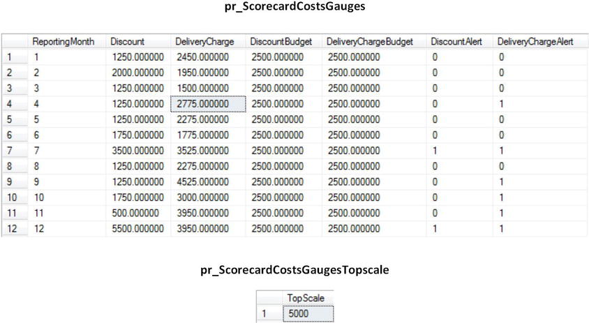
Figure 3-4. Month-on-month data for discount and delivery metrics compared to budget
How the Code Works
The first procedure (pr_ScorecardCostsGauges) aggregates the total discount and delivery charge for the selected year grouped by month and inserts this into a temporary table. It then updates the temporary table with the budget figures for the same year and metrics. Then it calculates if the results are over or under budget and sets a flag (a 0 or a 1) to indicate the status. You will use this in the gauge to set the pointer color. The second stored procedure (pr_ScorecardCostsGaugesTopscale) calculates the maximum value for the scale based on the largest figure for all months. It uses a user-defined function to round up the scale maximum to a figure that will display figures that are easier to read when placed on the scale.
Here, then, is how to create the gauge. Since I went through the creation of the first gauge in this chapter in some detail, I will not be explaining all the steps in the process quite so exhaustively this time around. Consequently, I suggest that you refer to the previous example if you need a more in-depth explanation of a specific aspect of how to configure a gauge.
- Create a new SSRS report named Scorecard_Costs.rdl, and add the shared data source CarSales_Reports. Name it CarSales_Reports.
- Create a dataset named BudgetComparisons. Set it to use the CarSales_Reports data source and the stored procedure Code.pr_ScorecardCostsGauges.
- Create a dataset named TopScale. Set it to use the CarSales_Reports data source and the stored procedure Code.pr_ScorecardCostsGaugesTopscale.
- Add the following two shared datasets (ensuring that you also use the same name for the dataset in the report):
- CurrentYear
- ReportingYear
- Set the parameter properties for ReportingYear as defined at the start of Chapter 1.
- Drag a gauge from the toolbox onto the report surface. Select Multiple bar pointers as the gauge type. This is the third of the linear gauges in the Select Gauge Type dialog.
- Right-click in the gauge itself, and select Gauge Panel
 Gauge Panel properties. Select BudgetComparisons as the dataset name. Set the filter to ReportingMonth = 2. When these are set, click OK.
 - Right-click the leftmost vertical bar and select delete to remove it. This is considered the first gauge pointer, and it is named LinearPointer1.
- Click the leftmost gauge pointer (LinearPointer2) and in the Gauge Data panel set it to use DeliveryCharge as the data field. Set the other gauge pointer (LinearPointer3) to use Discount as its data field.
- Right-click the scale, select Scale Properties, and set the following properties:
Section
Property
Value
General
Minimum
0
Maximum (expression)
=Sum(Fields!TopScale.Value, "TopScale")
Layout
Position in gauge (percent)
50
Start margin (percent)
8
End margin (percent)
8
Scale bar width (percent)
0
Labels
Placement (relative to scale)
Cross
Font
Font
Arial
Size
8 point
Color
Dim Gray
Major Tick Marks
Hide major tick marks
Checked
Minor Tick Marks
Hide minor tick marks
Unchecked
Minor tick mark shape
Rectangle
Minor tick mark placement
Cross
Width (percent)
1
Length (percent)
9
- Right-click the leftmost gauge pointer (LinearPointer2) and set the following pointer properties:
Section
Property
Value
Pointer Options
Placement (relative to scale)
Outside
Distance from scale (percent)
-35
Width (percent)
20
Pointer Fill
Fill style
Gradient
Color
=IIF(Fields!DeliveryChargeAlert.Value=1,"Red","DarkBlue")
Secondary color
White
Gradient style
Diagonal left
- Right-click the rightmost gauge pointer (LinearPointer1) and set the following pointer properties:
Section
Property
Value
Pointer Options
Placement (relative to scale)
Outside
Distance from scale (percent)
15
Width (percent)
20
Pointer Fill
Fill style
Gradient
Color
=IIF(Fields!DeliveryChargeAlert.Value=1,"Orange","DarkGreen")
Secondary color
White
Gradient style
Diagonal left
This is all you have to do. Once the “base” gauge is as you want it to be, you can duplicate it for all the months in the year and set the filter on each gauge to the relevant month.
What you are doing here is adding a second pointer to a basic gauge, and then setting each pointer to use a specific field from the data source. Once the scale has been set to use the maximum value from the second data source, everything else is pure aesthetics. The pointer color and fill are set to change using a function that uses a field in the source code to switch the color.
Once an initial gauge has been created successfully, it can be copied and pasted once for each month, and the filter can be set to the required month.
Varying the Pointer Types and Assembling Gauges
Gauge pointers do not have to be plain needles. You can instead use markers or bars to represent the data. Indeed, as the following example shows, you can mix pointer types in certain cases. Each pointer will display a different metric. The choice and positioning of the pointer can, as you will see, affect the way in which the information is perceived by the user.
Figure 3-5 shows four gauges using multiple pointer types assembled into a visualization that is designed to separate visually three makes from the rest. However, the essence of this visualization is based on a single gauge, and it is this gauge that you will build. Creating legends for multiple gauges is explained in Chapter 7.

Figure 3-5. Multiple gauges with multiple pointer types
The source data for these gauges is a little more complex that the data used in previous gauges. However, there is nothing difficult here. If anything, it proves that if you do the heavy lifting in the source data definition, then creating gauges is generally easier. The only layer of complexity is added by the need to calculate a running average, the previous month’s data, and the data for the same month the previous year. I find it easier to do this using a temporary table that can then be updated with the relevant metrics. As a final tweak, you will calculate the maximum value for the gauges and add this to the source dataset, rather than using a separate dataset as you did previously. Also (even if it is a little longer), I will include the code to round up the maximum value for the gauge in the T-SQL snippet itself, rather than use a function.
The code is shown below, and can be found in the stores procedure Code.pr_WD_MakeSalesComparedOverTime in the database CarSales_Reports. This example uses data for June 2015.
DECLARE @ReportingYear INT = 2015
DECLARE @ReportingMonth TINYINT = 6

IF OBJECT_ID('tempdb..#Tmp_Output') IS NOT NULL DROP TABLE tempdb..#Tmp_Output
IF OBJECT_ID('tempdb..#Tmp_MaxOutput') IS NOT NULL DROP TABLE tempdb..#Tmp_MaxOutput
IF OBJECT_ID('Tempdb..#Tmp_ScaleRef') IS NOT NULL DROP TABLE Tempdb..#Tmp_ScaleRef

CREATE TABLE #Tmp_ScaleRef (ScaleThreshold NUMERIC(36,6))

INSERT INTO #Tmp_ScaleRef (ScaleThreshold)
VALUES
 (1.0000)
,(0.9500)
,(0.9000)
,(0.8500)
,(0.8000)
,(0.7500)
,(0.7000)
,(0.6500)
,(0.6000)
,(0.5500)
,(0.5000)
,(0.4500)
,(0.4000)
,(0.3500)
,(0.3000)
,(0.2500)
,(0.2000)
,(0.1500)

CREATE TABLE #Tmp_Output
(
      Make VARCHAR(30) NULL
     ,CurrentMonthSales NUMERIC(38, 6) NULL
     ,ThreeMonthRunningAverage NUMERIC(38, 6) NULL
     ,PreviousMonthSales NUMERIC(38, 6) NULL
     ,SameMonthLastYearSales NUMERIC(38, 6) NULL
     ,MaxValue NUMERIC(38, 6) NULL
)

CREATE TABLE #Tmp_MaxOutput (MaxValue NUMERIC(38, 6) NULL)

-- Month sales

INSERT INTO #Tmp_Output (CurrentMonthSales, Make)

SELECT
 SUM(SalePrice) AS CurrentMonthSales
,CASE
     WHEN Make = 'Aston Martin' THEN Make
     WHEN Make = 'Rolls Royce' THEN Make
     WHEN Make = 'Jaguar' THEN Make
     ELSE 'Other'
 END AS Make

FROM     Reports.CarSalesData

WHERE    ReportingYear = @ReportingYear
         AND ReportingMonth = @ReportingMonth

GROUP BY
 CASE
     WHEN Make = 'Aston Martin' THEN Make
     WHEN Make = 'Rolls Royce' THEN Make
     WHEN Make = 'Jaguar' THEN Make
     ELSE 'Other'
 END

 -- Previous 3 month average

 ;
 WITH ThreeMonthSales_CTE
 AS
 (
SELECT
SUM(SalePrice) / 3 AS Sales
,CASE
     WHEN Make = 'Aston Martin' THEN Make
     WHEN Make = 'Rolls Royce' THEN Make
     WHEN Make = 'Jaguar' THEN Make
     ELSE 'Other'
 END AS Make

FROM     Reports.CarSalesData

WHERE    InvoiceDate >= DATEADD(mm, -3 ,CONVERT(DATE, CAST(@ReportingYear AS CHAR(4))
         + RIGHT('0' + CAST(@ReportingMonth AS VARCHAR(2)),2) + '01'))
         AND InvoiceDate <= DATEADD(dd, -1 ,CONVERT(DATE, CAST(@ReportingYear AS CHAR(4))
         + RIGHT('0' + CAST(@ReportingMonth AS VARCHAR(2)),2) + '01'))

GROUP BY
 CASE
     WHEN Make = 'Aston Martin' THEN Make
     WHEN Make = 'Rolls Royce' THEN Make
     WHEN Make = 'Jaguar' THEN Make
     ELSE 'Other'
 END
 )

UPDATE       Tmp
SET          Tmp.ThreeMonthRunningAverage = CTE.Sales
FROM         #Tmp_Output Tmp
             INNER JOIN ThreeMonthSales_CTE CTE
             ON Tmp.Make = CTE.Make

 -- Previous month sales

 ;
 WITH PreviousMonthSales_CTE
 AS
 (
SELECT
SUM(SalePrice) AS Sales
,CASE
     WHEN Make = 'Aston Martin' THEN Make
     WHEN Make = 'Rolls Royce' THEN Make
     WHEN Make = 'Jaguar' THEN Make
     ELSE 'Other'
 END AS Make

FROM      Reports.CarSalesData

WHERE     InvoiceDate >= DATEADD(mm, -1 ,CONVERT(DATE, CAST(@ReportingYear AS CHAR(4))
          + RIGHT('0' + CAST(@ReportingMonth AS VARCHAR(2)),2) + '01'))
          AND InvoiceDate <= DATEADD(dd, -1 ,CONVERT(DATE, CAST(@ReportingYear AS CHAR(4))
          + RIGHT('0' + CAST(@ReportingMonth AS VARCHAR(2)),2) + '01'))

GROUP BY
 CASE
     WHEN Make = 'Aston Martin' THEN Make
     WHEN Make = 'Rolls Royce' THEN Make
     WHEN Make = 'Jaguar' THEN Make
     ELSE 'Other'
 END
 )

UPDATE     Tmp
SET        Tmp.PreviousMonthSales = CTE.Sales
FROM       #Tmp_Output Tmp
           INNER JOIN PreviousMonthSales_CTE CTE
           ON Tmp.Make = CTE.Make

 -- Same Month Last Year

 ;
 WITH SameMonthLastYear_CTE
 AS
 (
SELECT
SUM(SalePrice) AS Sales
,CASE
     WHEN Make = 'Aston Martin' THEN Make
     WHEN Make = 'Rolls Royce' THEN Make
     WHEN Make = 'Jaguar' THEN Make
     ELSE 'Other'
 END AS Make

FROM      Reports.CarSalesData

WHERE     ReportingYear = @ReportingYear
          AND ReportingMonth = @ReportingMonth

GROUP BY
 CASE
     WHEN Make = 'Aston Martin' THEN Make
     WHEN Make = 'Rolls Royce' THEN Make
     WHEN Make = 'Jaguar' THEN Make
     ELSE 'Other'
 END
 )

UPDATE       Tmp

SET          Tmp.SameMonthLastYearSales = CTE.Sales

FROM         #Tmp_Output Tmp
             INNER JOIN SameMonthLastYear_CTE CTE
             ON Tmp.Make = CTE.Make

-- MaxValue

INSERT INTO  #Tmp_MaxOutput SELECT CurrentMonthSales FROM #Tmp_Output
INSERT INTO  #Tmp_MaxOutput SELECT ThreeMonthRunningAverage FROM #Tmp_Output
INSERT INTO  #Tmp_MaxOutput SELECT PreviousMonthSales FROM #Tmp_Output
INSERT INTO  #Tmp_MaxOutput SELECT SameMonthLastYearSales FROM #Tmp_Output

-- Maximum value for gauges

INSERT INTO #Tmp_Output (Make, MaxValue)

SELECT  'MaxValue', MIN(ScaleThreshold) * POWER(10, LEN((SELECT FLOOR(MAX(MaxValue))
                                                                 FROM #Tmp_MaxOutput)))
FROM    #Tmp_ScaleRef
WHERE   ScaleThreshold >= (SELECT FLOOR(MAX(MaxValue)) FROM #Tmp_MaxOutput) / POWER(10,
                           LEN((SELECT FLOOR(MAX(MaxValue)) FROM #Tmp_MaxOutput)))

-- Output

 SELECT * FROM #Tmp_Output
The output from this code should look like Figure 3-6.

Figure 3-6. Data for multiple gauges including the maximum scale value
How the Code Works
This code block starts by creating a temp table of maximum values. This will be used for rounding up the maximum value for all the scales in the visualization in order to let the gauges compare values across all the filter elements. This is exactly what is done using the helper functions you saw earlier, but this time it is part of the stored procedure.
The sales for the year and month are then aggregated and added to another temporary table. This table is then updated with the running average of the sales figures for the previous three months and then for the previous month and the same month for the previous year. To make things more realistic, the aggregations group car manufacturers into three major makes and an “other” category. The maximum value is then rounded up and added to the table so that it can be used in all gauges, unlike in the previous example where this value was obtained using a second stored procedure.
It is, of course, possible to return all the sales data using correlated subqueries. As with so many things, this is a question of personal preference and deciding on the appropriate method.
Here, then, is how you can create a gauge using this data. Let’s take the data for the current month as the starting point for the first gauge.
- Create a new SSRS report named _MonthSalesByMakeOverTime.rdl, and add the shared data source CarSales_Reports. Name it CarSales_Reports.
- Create a dataset named MakeSalesComparedOverTime. Set it to use the CarSales_Reports data source and the stored procedure Code.pr_WD_MakeSalesComparedOverTime.
- Add the four shared datasets: CurrentYear, CurrentMonth, ReportingYear, and ReportingMonth (ensuring that you also use the same name for the dataset in the report). Set the parameter properties for ReportingYear and ReportingMonth as defined at the start of Chapter 1.
- Drag a gauge from the toolbox on to the report surface and select Linear - vertical as the gauge type.
- Right-click in the gauge itself, and select Gauge Panel Gauge Panel properties. Select MakeSalesComparedOverTime as the dataset name. Add a filter that you configure so that the Make = Rolls Royce. Click OK.
- Right-click the gauge and select Gauge Properties from the context menu. Set the following properties:
Section
Property
Value
Back Fill
Fill style
Gradient
Color
White
Secondary color
Whitesmoke
Gradient style
Top bottom
Frame
Style
Simple
Shape
Rounded rectangular
Width
1 point
Frame Fill
Fill style
Gradient
Color
WhiteSmoke
Secondary color
DarkGray
Gradient style
Horizontal center
Frame Border
Line style
Solid
Line width
2 point
Line color
Light Gray
- Right-click the range at the top right of the gauge and select Delete Range from the context menu.
- Right-click the scale and set the following properties:
Section
Property
Value
General
Minimum
0
Maximum (expression)
=Sum(Fields!MaxValue.Value, "MakeSalesComparedOverTime") / 1000
Layout
Position in gauge (percent)
32
Start margin (percent)
8
End margin (percent)
8
Scale bar width (percent)
1
Labels
Placement (relative to scale)
Outside
Distance from scale (percent)
-4
Font
Font
Arial Narrow
Size
11 point
Color
Indigo
Major Tick Marks
Hide major tick marks
Unchecked
Major tick mark shape
Diamond
Major tick mark placement
Cross
Width (percent)
2
Length (percent)
7
Minor Tick Marks
Hide minor tick marks
Checked
Fill
Fill style
Solid
Color
Cornflower Blue
- Right-click the pointer (the vertical bar) and select Pointer Properties from the context menu. Set the following properties:
Section
Property
Value
Pointer Options
Value (expression)
=First(Fields!CurrentMonthSales.Value) / 1000
Pointer type
Bar
Placement (relative to scale)
Outside
Distance from scale (percent)
36
Width (percent)
17
Pointer Fill
Fill style
Gradient
Color
Dark Blue
Secondary color
Light Blue
Gradient style
Vertical center
Shadow
Shadow Offset
1 Point
Shadow intensity
25
- Right-click inside the gauge and select Add Pointer from the context menu. Set the new pointer (LinearPointer2) properties to the following:
Section
Property
Value
Pointer Options
Value
=First(Fields!PreviousMonthSales.Value) / 1000
Pointer type
Marker
Marker style
Triangle
Placement (relative to scale)
Inside
Distance from scale (percent)
10
Width (percent)
13
Length
12
Pointer Fill
Fill style
Solid
Color
Light Steel Blue
Shadow
Shadow Offset
1 point
Shadow intensity
25
- Add two more pointers to the gauge. Set the pointer properties as described above for LinearPointer 2, with the following differences:
- LinearPointer3:
Section
Property
Value
Pointer Options
Value
=First(Fields!SameMonthLastYearSales.Value) / 1000
Pointer Fill
Color
Aqua
- LinearPointer4:
Section
Property
Value
Pointer Options
Value
=First(Fields!SameMonthLastYearSales.Value) / 1000
Pointer Fill
Color
Blue
- LinearPointer3:
Now the gauge is finished. You can then copy the gauge three times and set the filter for each gauge to the other three makes returned by the SQL query (excluding the MaxValue record). After that, all you have to do is position the gauges appropriately, and add text boxes for the description of each make. The way to set vertical text boxes is described in Chapter 7.
How It Works
This gauge extends the principle of gauges with multiple pointers that you used in the previous example. This time, however, you have four pointers and two different pointer types. In most other respects, the approach is the same: add the pointers, attach the correct field from the dataset, and define the aesthetics.
Once built, you place the gauges together in a container and tweak the layout by adding a shared legend to give the impression that the gauges are to be taken as a whole, which is indeed the effect you are trying to create. You then add a “legend” by adding text boxes that contain either the text for the gauge element, or simply a colored background corresponding to the fill of the gauge pointers. You then align these objects to create the effect of a legend for all the gauges. These techniques are explained in greater detail in Chapter 7.
Hints and Tips
- Chapter 2 gave an example of a KPI delivered as a gauge through using two different pointer types in the same gauge. The current example does not attempt to be a “true” KPI because it does not display trend data.
Sometimes you may want to display several items of data in a single gauge. Most times you will be dealing with a principle metric that will be represented as the main pointer and other metrics that you want to display as secondary gauges or even text. This example uses additional text elements to allow comparison with the previous month, the same month’s data for the previous year, and the three month running average.
The type of gauge you are trying to produce in shown in Figure 3-7. In this example (as in the others in this chapter), you will only be creating a single gauge. However, you will craft the code so that it can easily be applied to multiple separate gauges to display similar but comparable data for several data elements.
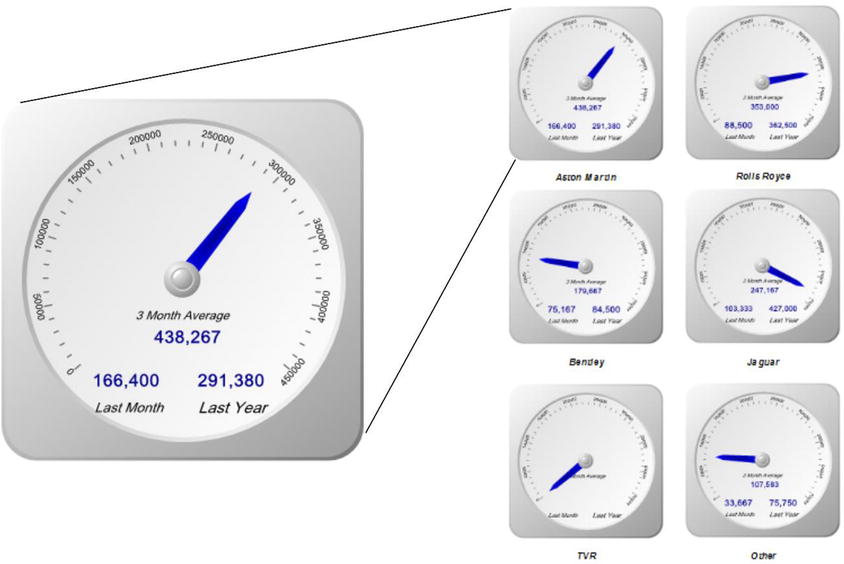
Figure 3-7. Gauges with multiple data elements added
The code can be found in the stored procedure Code.pr_SmartPhoneSalesGauges in the database CarSales_Reports. I am not showing it here, as it is virtually identical to the code used in the previous example, except that it adds one more make of car to the analysis. The output from the SQL is shown in Figure 3-8.

Figure 3-8. The output from the stored procedure Code.pr_SmartPhoneSalesGauges
So, given that you have seen what you want to produce, here is how it is done.
- Create a new SSRS report named SmartPhone_SalesOverTime.rdl, and add the shared data source CarSales_Reports. Name the shared data source CarSales_Reports.
- Create a dataset named SalesOverTime. Set it to use the CarSales_Reports data source and the stored procedure Code.pr_SmartPhoneSalesGauges.
- Add the four shared datasets: CurrentYear, CurrentMonth, ReportingYear, and ReportingMonth (ensuring that you also use the same name for the dataset in the report). Set the parameter properties for ReportingYear and ReportingMonth as defined at the start of Chapter 1.
- Drag a gauge from the toolbox on to the report surface and select Radial as the gauge type.
- Delete the range on the gauge, and set the gauge dataset to SalesOverTime.
- Right-click the gauge and set the following properties:
Section
Property
Value
Back Fill
Color
WhiteSmoke
Frame
Style
Edged
Shape
Circular 15
Frame Fill
Color
WhiteSmoke
- Right-click the pointer, select Pointer Properties, and set the following properties:
Section
Property
Value
Pointer Options
Value
[Sum(CurrentMonthSales)]
Pointer type
Needle
Needle style
Tapered
Placement (relative to scale)
Inside
Distance from scale (percent)
18
Width (percent)
13
Pointer Fill
Fill style
Gradient
Color
Dark Blue
Secondary color
Blue
Gradient style
Center
Cap Options
Cap style
Rounded glossy with indentation
Cap width (percent)
27
Cap Fill
Color
White
- Right-click the scale, select Scale Properties, and set the following properties:
Section
Property
Value
General
Minimum
0
Maximum
=Sum(Fields!MaxValue.Value, "SalesOverTime")
Layout
Position in gauge (percent)
38
Start margin (percent)
50
End margin (percent)
260
Scale bar width (percent)
0
Labels
Placement (relative to scale)
Outside
Distance from scale (percent)
0
Font
Font
Arial
Size
7 point
Color
Dark Gray
Major Tick Marks
Hide major tick marks
Unchecked
Major tick mark shape
Rectangle
Major tick mark placement
Cross
Width (percent)
1
Length (percent)
6
Minor Tick Marks
Hide minor tick marks
Unchecked
Minor tick mark shape
Rectangle
Minor tick mark placement
Cross
Width (percent)
1
Length (percent)
4
- Right-click the gauge and select Add Label. Right-click the label and set the following properties:
Section
Property
Value
General
Text (function)
=Microsoft.VisualBasic.Strings.Format(Fields!ThreeMonthRunningAverage.Value, "#,#")
Text alignment
Center
Vertical alignment
Middle
Top (percent)
61
Left (percent)
41
Width (percent)
21
Height (percent)
10
Font
Auto resize text to fit label
Checked
Font
Arial Light
Style
Bold
Color
Dark Blue
Fill
Fill style
Solid
Color
No color
- Add a second label using the techniques from the previous step and set its properties identically to the first one except for the following:
Section
Property
Value
General
Text (function)
=Microsoft.VisualBasic.Strings.Format(Fields!PreviousMonthSales.Value, "#,#")
Top (percent)
73
Left (percent)
24
Height (percent)
10
- Add a third label and set its properties identically to the previous two except for the following:
Section
Property
Value
General
Text (function)
=Microsoft.VisualBasic.Strings.Format(Fields!SameMonthLastYearSales.Value, "#,#")
Top (percent)
73
Left (percent)
53
Height (percent)
10
- Add three final labels containing the texts “Three month average”, “Last month”, and “Last year”. Set the font to black and italic, and place them under or over the three labels that you added previously to explain each figure.
Once you have perfected an initial gauge, you can copy it as many times as necessary and tweak the gauge filter so that each gauge displays data for a different make of car.
How It Works
This gauge is fairly similar to the previous example in the chapter except for the fact that you use text boxes to show the comparison figures rather than pointers.
Here are some helpful hints and tips for this gauge.
- Formatting text in a text box inside a gauge cannot be done as you would for a standard SSRS text box. This is why you need to use the code given in step 10.
- You can set the position of all the labels inside the gauge manually by dragging them with the mouse. However, if you want perfect alignment, it is probably best to finalize the Top and Left values using the Label Properties dialog and then copy and paste the relevant figures.
- If you format the first label before creating any additional labels, the new labels will inherit the properties of the previous one modified. This makes adding labels much faster (and many thanks to Rodney Landrum, one of the technical reviewers of this book, for this, one of his many excellent suggestions).
The classic stand-alone linear and radial gauges in SSRS can probably handle most of your BI reporting requirements. In some cases, however, you may need to create an effect using a less “traditional” approach. This is where a couple of less classic gauge types can be useful. So now is the time to take a look at a couple of less frequently used gauge types, which can nonetheless add real visual value to your BI delivery.
A fairly non-traditional gauge is a thermometer. This is basically just a linear gauge with a bulb at the bottom. However, users will associate a thermometer with progress and warnings, which makes it highly suitable for certain forms of data visualization. The following example shows sales for the year to date, which is ideal for a dashboard that will be used regularly by users who will see the progress over time.
To continue the trend in this book of showing you what you are aiming for, Figure 3-9 shows a thermometer gauge of sales to date. The thermometer will change color to indicate how close it is to the target, shown by the cross bar near the top of the thermometer.

Figure 3-9. A thermometer gauge
The Source Data
The source data for the thermometer is mercifully simple. The only tweak is to include a calculation of a predefined alert level, which will be used to set the color of the gauge fill. The code is shown below, and can be found in the stored procedure Code.pr_WD_SalesYTD in the database CarSales_Reports. In this example, you will display the data for June 2015.
DECLARE @ReportingYear INT = 2015
DECLARE @ReportingMonth TINYINT = 6

IF OBJECT_ID('tempdb..#Tmp_Output') IS NOT NULL DROP TABLE tempdb..#Tmp_Output

CREATE TABLE #Tmp_Output
(Sales NUMERIC(18,2), SalesTarget NUMERIC(18,2), MaxLimit NUMERIC(18,2), AlertLevel TINYINT)

INSERT INTO #Tmp_Output (Sales)

SELECT    SUM(SalePrice)

FROM      Reports.CarSalesData
WHERE     ReportingYear = @ReportingYear
          AND  ReportingMonth <= @ReportingMonth

-- Target figure

UPDATE     #Tmp_Output
SET        SalesTarget = (SELECT SUM(BudgetValue)
           FROM Reference.Budget
           WHERE BudgetElement = 'Sales' AND Year = @ReportingYear)

UPDATE     #Tmp_Output
SET        MaxLimit = (SELECT Code.fn_ScaleQuartile(
                           (SELECT MAX(MaxValue)
                            FROM (SELECT Sales AS MaxValue FROM #Tmp_Output
                            UNION
                            SELECT SalesTarget FROM #Tmp_Output
                           ) A
                       ) ) )

-- AlertLevel

UPDATE          #Tmp_Output

SET AlertLEvel =
     CASE
     WHEN CAST(Sales AS NUMERIC(18,6)) / CAST(SalesTarget AS NUMERIC(18,6)) <= 0.2 THEN 1
     WHEN CAST(Sales AS NUMERIC(18,6)) / CAST(SalesTarget AS NUMERIC(18,6)) <= 0.4 THEN 2
     WHEN CAST(Sales AS NUMERIC(18,6)) / CAST(SalesTarget AS NUMERIC(18,6)) <= 0.6 THEN 3
     WHEN CAST(Sales AS NUMERIC(18,6)) / CAST(SalesTarget AS NUMERIC(18,6)) <= 0.8 THEN 4
     WHEN CAST(Sales AS NUMERIC(18,6)) / CAST(SalesTarget AS NUMERIC(18,6)) > 0.8 THEN 5
     ELSE 0
     END

-- Output

SELECT * FROM #Tmp_Output
The output from this code is shown in Figure 3-10.

Figure 3-10. The data to display a thermometer gauge
How the Code Works
If you have been following the code samples given so far in this chapter, I suspect that this code will appear amazingly simple. First, a temporary table is created, and the sales up to and including the selected month are added. Then the target figure is added along with a maximum figure for the scale, suitably rounded up. Finally, a hard-coded set of indicators (on a scale of 1 through 5) are calculated as the basis for the thermometer color.
Here is how the thermometer is put together.
- Create a new SSRS report named _ThermometerYTDSales.rdl, and add the shared data source CarSales_Reports. Name the shared data source CarSales_Reports.
- Create a dataset named SalesYTD. Set it to use the CarSales_Reports data source and the query Code.pr_WD_SalesYTD.
- Add the four shared datasets: CurrentYear, CurrentMonth, ReportingYear, and ReportingMonth (ensuring that you also use the same name for the dataset in the report). Set the parameter properties for ReportingYear and ReportingMonth as defined in Chapter 1.
- Drag a gauge from the toolbox on to the report surface and select Thermometer as the gauge type. Assign the dataset SalesYTD to the gauge.
- Right-click the gauge and set the following properties:
Section
Property
Value
Back Fill
Fill style
Gradient
Color
Gainsboro
Secondary color
WhiteSmoke
Gradient style
Diagonal left
Frame
Style
Simple
Shape
Rectangular
Width
5
Frame Fill
Fill style
Gradient
Color
WhiteSmoke
Secondary color
Dark Gray
Gradient style
Horizontal center
Frame Border
Line style
Solid
Line width
1 point
Line color
Dark Gray
Frame Shadow
Shadow offset
3 points
- Right-click the scale and set the following properties:
Section
Property
Value
General
Minimum
0
Maximum
[MaxLimit]
Layout
Position in gauge (percent)
56
Start margin (percent)
3
End margin (percent)
8
Scale bar width (percent)
0
Labels
Placement (relative to scale)
Inside
Distance from scale (percent)
2
Font
Font
Arial
Size
8 point
Color
Dark Gray
Number
Category
Number
Decimal places
0
Use thousands separator
Checked
Show values in
Thousands
Major Tick Marks
Hide major tick marks
Unchecked
Major tick mark shape
Rectangle
Major tick mark placement
Cross
Width (percent)
1
Length (percent)
9
Minor Tick Marks
Hide minor tick marks
Unchecked
Minor tick mark shape
Rectangle
Minor tick mark placement
Cross
Width (percent)
1
Length (percent)
1
- Right-click the thermometer bulb (the first pointer) and set the following pointer options:
Section
Property
Value
Pointer Options
Value
[Sum(Sales)]
Pointer type
Thermometer
Thermometer style
Flask
Placement (relative to scale)
Cross
Distance from scale (percent)
0
Width (percent)
9.5
Offset (from zero position)
5
Size (percent)
50
Pointer Fill
Fill style
Gradient
Color
=Switch
(
Fields!AlertLevel.Value = 1, "Red"
,Fields!AlertLevel.Value = 2, "Yellow"
,Fields!AlertLevel.Value = 3, "Orange"
,Fields!AlertLevel.Value = 4, "Green"
,Fields!AlertLevel.Value = 5, "Blue"
)
Secondary color
White
Gradient style
Diagonal right
- Click inside the gauge and select Add Pointer from the context menu. Right-click the new pointer (it is already selected) and set the following properties:
Section
Property
Value
Pointer Options
Value
[Sum(SalesTarget)]
Pointer type
Marker
Marker style
Rectangle
Placement (relative to scale)
Cross
Distance from scale (percent)
0
Width (percent)
4
Length (percent)
18
Pointer Fill
Fill style
Solid
Color
Dim Gray
Pointer Border
Line style
Solid
Line width
1 point
Line color
Gray
- Click inside the thermometer and select Add Label. Right-click the label, select Label Properties, and set the following:
Section
Property
Value
General
Text
In 000s
Text alignment
Center
Vertical alignment
Default
Top (percent)
3
Left (percent)
20
Width (percent)
69
Height (percent)
3
Font
Auto resize text to fit label
Checked
Font
Arial
Style
Bold
Color
Dark Gray
Fill
Fill style
Solid
Color
No color
Border
Line style
None
This is all you need to do. You now have a thermometer that displays the target for the year and the sales for the year to date.
Since this type of gauge is quite simple, there is little that has not already been covered previously in this chapter. You simply define the gauge type and then apply the correct data to the single pointer. The only slightly quirky tweak is setting the fill color using an expression based on the AlertLevel field.
Hints and Tips
Follow these tips for this gauge.
- You can set the color of the fill in the T-SQL itself if you prefer and refer to the field in the expression. There is an example of this in the next chapter.
- SSRS thermometers allow for a couple of different bulb shapes, so feel free to experiment.
In certain cases, you may want your gauge to look like a wristwatch that contains one or more minor gauges that represent other metrics. In reality, I find that sub-gauges are not very readable, and that too many of them in a gauge can make the whole gauge difficult to read. Nonetheless, if used sparingly, this can be an interesting technique.
In this example, you will display the sales for a country in the main gauge and show the profit in the minor gauge. The profit metric is given more as a comparison element when multiple gauges are used, and is nonetheless an interesting addition that conveys useful information. As sub-gauges are difficult to read in detail, you will make the figure into a tooltip, so the reader can verify any profit ratios that seem suspect. An example of this is shown in Figure 3-11.

Figure 3-11. Gauges with sub-gauges
Once again you will only create a single gauge, but define source data that can be used for multiple gauges together.
The code follows, and can be found in the stored procedure Code.pr_WD_MonthlyProfitByMake in the database CarSales_Reports.
DECLARE @ReportingYear INT = 2013
DECLARE @ReportingMonth TINYINT = 8

SELECT
SUM(SalePrice) / 1000  AS CurrentMonthSales
,(SUM(SalePrice) -  SUM(CostPrice) - SUM(TotalDiscount) - SUM(DeliveryCharge) - SUM(SpareParts) - SUM(LaborCost)) / 1000 AS MonthlyProfit
,(SUM(SalePrice) - (SUM(CostPrice) - SUM(TotalDiscount) - SUM(DeliveryCharge) - SUM(SpareParts) - SUM(LaborCost))) / SUM(SalePrice) AS CurrentMonthPercentageProfit
,CASE
 WHEN CountryName = 'United Kingdom' THEN 'United Kingdom'
 WHEN CountryName = 'France' THEN 'France'
 WHEN CountryName = 'USA' THEN 'USA'
 WHEN CountryName = 'Switzerland' THEN 'Switzerland'
 ELSE 'Other'
 END AS Country
,Code.fn_ScaleDecile(SUM(SalePrice) / 1000) AS GaugeMax

FROM       Reports.CarSalesData

WHERE      ReportingYear = @ReportingYear
           AND Reportingmonth <= @ReportingMonth

GROUP BY   CASE
                WHEN CountryName = 'United Kingdom' THEN 'United Kingdom'
                WHEN CountryName = 'France' THEN 'France'
                WHEN CountryName = 'USA' THEN 'USA'
                WHEN CountryName = 'Switzerland' THEN 'Switzerland'
                ELSE 'Other'
           END
The output from this code is shown in Figure 3-12.

Figure 3-12. The data to display a sub-gauge inside a gauge
This code snippet calculates sales and profits (up to and including a selected month for a selected year) and also calculates the profit as a percentage of sales. This time, each gauge will have its own maximum value set for each individual scale.
Creating Gauges with Sub-Gauges
Now that you have your source data, you can configure the gauge itself.
- Create a new SSRS report named _GaugeSalesUK.rdl, and add the shared data source CarSales_Reports. Name the shared data source CarSales_Reports.
- Create a dataset named MonthlyProfitByMake. Set it to use the CarSales_Reports data source and the query Code.pr_WD_MonthlyProfitByMake.
- Add the four shared datasets: CurrentYear, CurrentMonth, ReportingYear, and ReportingMonth (ensuring that you also use the same name for the dataset in the report). Set the parameter properties for ReportingYear and ReportingMonth as defined at the start of Chapter 1.
- Drag a gauge from the toolbox on to the report surface and select radial with mini gauge as the (radial) gauge type.
- Right-click the gauge and set the following gauge properties:
Section
Property
Value
Back Fill
Color
Dim Gray
Frame
Style
Edged
Shape
Circular 13
Frame Fill
Color
Dark Gray
Frame Shadow
Shadow offset
0 pt.
- In either the Gauge Panel properties dialog or in the Gauge data pane, set the dataset name to MonthlyProfitByMake. In the Filters pane, add a filter and set the Country to United Kingdom.
- Right-click the pointer (RadialPointer1) and set the following pointer properties:
Section
Property
Value
Pointer Options
Value
[Sum(MonthlyProfit)]
Pointer type
Needle
Needle Type
Tapered
Placement (relative to scale)
Inside
Distance from scale (percent)
18
Width (percent)
13
Pointer Fill
Fill style
Gradient
Color
Gray
Secondary color
Light Gray
Gradient style
Center
Cap options
Cap style
Flattened with wide indentation
Cap width (percent)
27
Cap fill
Color
White
- Add a second pointer, and set the following properties:
Section
Property
Value
Pointer Options
Value
[Sum(CurrentMonthSales)]
Pointer type
Bar
Bar start
ScaleStart
Placement (relative to scale)
Inside
Distance from scale (percent)
-18
Width (percent)
13
Pointer Fill
Fill style
Gradient
Color
Gray
Secondary color
Light Gray
Gradient style
Center
- Right-click the scale and set the following properties (having selected Scale Properties from the context menu):
Section
Property
Value
General
Minimum
0
Maximum (expression)
=Fields!GaugeMax.Value
Layout
Scale radius (percent)
35
Start angle (degrees)
50
Sweep angle (degrees)
260
Scale bar width (percent)
2
Labels
Placement (relative to scale)
Inside
Distance from scale (percent)
0
Label Font
Font
Arial
Size
10 point
Color
White
Major Tick Marks
Hide major tick marks
Unchecked
Major tick mark shape
Rectangle
Major tick mark placement
Cross
Width (percent)
1
Length (percent)
6
Minor Tick Marks
Hide minor tick marks
Unchecked
Minor tick mark shape
Rectangle
Minor tick mark placement
Cross
Width (percent)
1
Length (percent)
4
Fill
Fill style
Solid
Color
Light Gray
- Right-click the sub-gauge and select Gauge Properties from the context menu. Set the following properties:
Section
Property
Value
General
Tooltip (Expression)
="Profit Ratio: " & Microsoft.VisualBasic.Strings.Format(Fields!CurrentMonthPercentageProfit.Value, "0.00 %")
X Position (percent)
26
Y Position (percent)
64
Width (percent)
48
Height (percent)
26
Pivot Point X position
50
Pivot Point Y position
75
Frame
Style
None
- Right-click the sub-gauge and select Gauge Panel Pointer Properties from the context menu. Set the following properties:
Section
Property
Value
Pointer options
Value
[Sum(CurrentMonthPercentageProfit)]
Pointer type
Needle
Needle style
Tapered
Placement (relative to scale)
Inside
Distance from scale (percent)
17
Width (percent)
15
Pointer Fill
Fill style
Gradient
Color
Dim Gray
Secondary color
Light Gray
Gradient style
Diagonal left
Cap Options
Cap style
Rounded with wide indentation
Cap width (percent)
33
Cap Fill
Color
White
- Right-click the scale for the sub-gauge and set the following properties:
Section
Property
Value
General
Minimum
0
Maximum
1
Layout
Scale radius (percent)
57
Start angle (degrees)
90
Sweep angle (degrees)
180
Scale bar width (percent)
0
Labels
Placement (relative to scale)
Inside
Distance from scale (percent)
0
Label Font
Font
Arial
Size
14 point
Color
Orange
Major Tick Marks
Hide major tick marks
Unchecked
Major tick mark shape
Rectangle
Major tick mark placement
Cross
Width (percent)
2
Length (percent)
18
Minor Tick Marks
Hide minor tick marks
Unchecked
Minor tick mark shape
Rectangle
Minor tick mark placement
Cross
Width (percent)
1
Length (percent)
8
- Add a label and set the following properties:
Section
Property
Value
General
Text
UK
Anchor label to
RadialGauges.RadialGauge1
Top (percent)
9
Left (percent)
75
Width (percent)
20
Height (percent)
13
Angle (degrees)
42
Font
Auto resize to fit label
Checked
Font
Arial
Color
Black
Fill
Solid
No Color
And that is all that you have to do. You can then copy the gauge and apply a different filter to each copy to create a composite visualization. You will be doing this in Chapter 7.
How It Works
By this stage of this chapter you are probably getting used to creating BI gauges. So I will not explain all the details of the techniques shown previously. The minor gauge is a gauge like any other, only smaller. This is why I suggest adding a tooltip to make the figure for the percentage profit readable. One thing to note is that you need to format tooltips as an expression (just as you did for gauge text boxes).
![]() Note If you are using multiple gauges, you could well want to use a table to control how they are laid out. Using tables to assemble objects is described in Chapter 7.
Note If you are using multiple gauges, you could well want to use a table to control how they are laid out. Using tables to assemble objects is described in Chapter 7.
Follow these hints and tricks for this example.
- You can create multi-line tooltips by adding a VB CrLf function to your tooltip expression.
- You can add multiple sub-gauges if you really want to create the visual aura of certain wristwatches. However, be warned that such a visualization can become unreadable, and that sub-gauges are easily hidden by a major gauge pointer.
- Setting the second bar pointer outside the scale (on the main gauge) separates the two pointers visually.
- Placing descriptive text inside the gauge frame is a useful space-saving technique. However, it can mean a lot of fiddling with custom font sizes for each individual gauge.
Interesting Tricks with Gauges
So far in this chapter you have seen a good few techniques that allow you to present information in a clear, concise, and even stylish way using the built-in support for gauges in SSRS. To conclude this overview, I want to show you one idea that you might find useful when developing your own dashboards and reports.
Often you need multiple gauges to convey all the information that is required. In cases like this, you can consider that all the gauges taken together are really one large gauge. When creating multi-gauge displays like this, the difficulty can be in making the whole as interesting as the parts. One idea can be to use color effectively, as the following example shows (Figure 3-13). Or, rather, as the sample file shows, because unlike in the book, it is in color.

Figure 3-13. Multiple gauges with multiplecolors
This gauge is essentially a composite visualization, so you will create the entire collection of four gauges at once in this example.
The code follows, and can be found in the stored procedure Code.pr_WD_SalesPercentageByMakein the database CarSales_Reports.
DECLARE @ReportingYear INT = 2013
DECLARE @ReportingMonth TINYINT = 8
SELECT CASE
       WHEN Make IN ('Aston Martin','Jaguar','Rolls Royce') THEN Make
       ELSE 'Other'
       END AS Make
       ,(SUM(SalePrice)  /
                           (
                           SELECT   SUM(BudgetValue)
                           FROM     Reference.Budget
                           WHERE    BudgetElement = 'Sales'
                                    AND  BudgetDetail = 'Aston Martin'
                                    AND  Year = @ReportingYear
                                    AND  Month <= @ReportingMonth
                            ) * 100) AS SalesPercentage

FROM      Reports.CarSalesData
WHERE     ReportingYear = @ReportingYear
          AND  ReportingMonth <= @ReportingMonth
GROUP BY  CASE
               WHEN Make IN ('Aston Martin','Jaguar','Rolls Royce') THEN Make
               ELSE 'Other'
           END
The output from this code is shown in Figure 3-14.
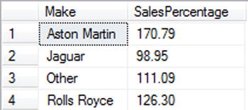
Figure 3-14. The data to display a mutliple gauges
This code snippet returns the aggregate sales expressed as a percentage of the budget for the make for four selected makes.
Creating and Assembling the Gauges
This process is rather long, I warn you, but it is not difficult. You begin by making one gauge that you will then copy and rework (slightly) three times. Here is how to go about it.
- Create a new SSRS report named _SalesPercentageByMake.rdl, and add the shared data source CarSales_Reports. Name the shared data source CarSales_Reports.
- Create a dataset named SalesPercentageByMake. Set it to use the CarSales_Reports data source and the stored procedure Code.pr_WD_SalesPercentageByMake.
- Add the four shared datasets: CurrentYear, CurrentMonth, ReportingYear, and ReportingMonth (ensuring that you also use the same name for the dataset in the report). Set the parameter properties for ReportingYear and ReportingMonth as defined at the start of Chapter 1.
- Drag a gauge from the toolbox on to the report surface and select Horizontal as the (linear) gauge type.
- Right-click the gauge and set the following gauge properties (most of these could be the default on your system but I prefer to specify them anyway):
Section
Property
Value
Back Fill
Fill style
Gradient
Color
Gray
Secondary color
WhiteSmoke
Gradient style
Diagonal right
Frame
Style
Edged
Shape
Rounded Rectangular
Width
8
Frame Fill
Fill style
Gradient
Color
WhiteSmoke
Secondary color
Dark Gray
Gradient style
Horizontal center
Frame Border
Line style
None
Frame Shadow
Shadow offset
0 pt.
- In either the Gauge Panel properties dialog or in the Gauge data pane, set the dataset name to SalesPercentageByMake. In the Filters pane, add a filter and set the Make to Aston Martin.
- Right-click the pointer (or use the Gauge Data pane), select Pointer Properties, and set the following properties:
Section
Property
Value
Pointer Options
Value
[Sum(SalesPercentage)]
Pointer type
Bar
Bar start
Scale start
Placement (relative to scale)
Cross
Distance from scale (percent)
0
Width (percent)
10
Pointer Fill
Fill style
Solid
Color
Black
- Right-click the scale and set the following properties:
Section
Property
Value
General
Minimum
0
Maximum
150
Layout
Position in gauge (percent)
41
Start margin (percent)
3
End margin (percent)
3
Scale bar width (percent)
18
Labels
Placement (relative to scale)
Outside
Distance from scale (percent)
20
Font
Font
Arial
Size
18 point
Color
Dark Gray
Number
Custom
0\%
Major Tick Marks
Hide major tick marks
Unchecked
Major tick mark shape
Rectangle
Major tick mark placement
Cross
Width (percent)
0.5
Length (percent)
5
Minor Tick Marks
Hide minor tick marks
Checked
- Add four new ranges to the existing one. Set the following common properties for all five ranges:
Section
Property
Value
General
Start width (percent)
30
End width (percent)
30
Placement relative to scale
Cross
Fill
Solid
Border
Line style
None
Shadow
Shadow offset
0pt
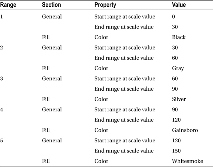
- Now you need to differentiate the ranges by setting their start and end values and color. These are as follows:
- Copy the gauge three times, and set the filter for each gauge to a different make of car from the dataset (Rolls Royce, Jaguar, and Other in this example).
- Set the color properties of the gauge back fill, pointer, and five ranges so that each gauge uses shades of a base color. I will not go into all of the details of how to do each one because you saw the principles in previous steps. Figure 3-13 uses the following colors:
Gauge
Property
Value
Rolls Royce
Back fill
Midnight Blue
Pointer fill
Dark Blue
Range 1 Fill
Medium Blue
Range 2 Fill
Dark Slate Blue
Range 3 Fill
Royal Blue
Range 4 Fill
Steel Blue
Range 5 Fill
Sky Blue
Jaguar
Back fill
Dark Red
Pointer fill
Dark Red
Range 1 Fill
Maroon
Range 2 Fill
Red
Range 3 Fill
Orange Red
Range 4 Fill
Tomato
Range 5 Fill
Light Salmon
Other
Back fill
Dark Green
Pointer fill
Dark Green
Range 1 Fill
Green
Range 2 Fill
Medium Sea Green
Range 3 Fill
Lime
Range 4 Fill
Lawn Green
Range 5 Fill
Pale Green
The main task here is to define the five ranges that serve as a background for the pointer bar. Each must be of the same height and width, and have start and end ranges that do not leave any gaps. Apart from this, it is up to you to define colors for each gauge that differentiate the gauges while remaining readable.
These tips will help with this example.
- You will probably need to use custom formatting for the scale. Specifically, the number of commas defines the multiple of thousands, millions, etc. that will be applied.
- The fewer ranges that you use, the easier it will be to see a clearly delineated set of colors.
- You can set the gauge pointer color so that it changes, too. This way you can set a contrasting color to the underlying range. In this example, for instance, you would set the pointer to be a light shade if the figure is lower and dark if the figure is higher.
Conclusion
This was a fairly long chapter, but there is so much that can be done with gauges to deliver compelling business intelligence that I thought it worth the effort to explain as many useful gauge types and tricks as possible. Given the vast potential that gauges can bring to business intelligence when using SSRS, we have not finished with gauges in this book. You will see a few more techniques using gauges in Chapter 10. So if you want to see how gauges can be adapted to BI delivery on mobile devices, this is the chapter for you.
Hopefully, the ideas that you have seen here will inspire you to create your own BI reports using gauges where necessary (and within the bounds of clarity and good taste) so that your users will be wowed, rather than bored-and who knows, perhaps the boss will be secretly impressed too.