
![]()
BI for SSRS on Tablets and Smartphones
“Give me Mobile BI” is the cry that has been coming from the executive suite for some time now. Admittedly, until SQL Server 2012 SP1 was released, all a Microsoft Reporting Services specialist could do in answer to this request was to shuffle their feet and look sheepish while they tried to implement a third-party add-on.
Now, however, the landscape has changed. Thanks to SQL Server 2012 SP1 (and naturally SQL Server 2014) you can output reports to a host of mobile devices, including iPads and iPhones as well as Android and Windows phones and tablets. Moreover, nothing has fundamentally changed as far as SSRS is concerned. You still develop reports as you did before. All you have to do is ensure that your reports are designed for the output device you will be using. In the case of both tablets and smartphones, this means the following:
- Design your output as a function of the size of the phone or tablet’s screen.
- Take account of the height-to-width aspect ratio of the output device’s screen.
- Tweak your reports to be used with the device held either vertically or horizontally for optimum viewing.
- Do not force the same report to appear on a multitude of output devices. Be prepared to start by building “widgets” that display the data, and then reuse the widgets in possibly several different reports, where each report is tailored to the size and aspect (height to width) ratio of each device.
- Attempt to use shared datasets so that your initial effort can be reused more easily.
So you are likely to be looking at a minimum of redesigning, and possibly rewriting, a good few reports. However, this could be the case with any suite of reports that have to be reworked for mobile output, whatever the tool used to create them. When all is said and done, the constraints come from the output device. Good mobile reports are the ones that have been designed with the specific mobile device in mind.
In this chapter, you will build on some of the visualizations that you saw in previous chapters. More specifically, you will look at further techniques that you can use to build gauges. This will extend the knowledge that you acquired in Chapter 3.
There is definitely an art to designing tablet and smartphone reports. In any case, there is no one way of doing things, and most people will disagree on the best approach anyway. However, there are probably a few core guidelines that you need to take into account when designing reports for tablets and smartphones. These include the following:
- Don't overload the screen. It is too easy to think “the user only has to zoom in.” The result is that you create a report that is hard to read. The user will probably want to view their data immediately and clearly, without having to use pinch movements to read the data, be it a chart, gauge, or table.
- Hide the Report Toolbar and mask parameters using a custom interface. Users of mobile devices are accustomed to slick apps with state of the art interfaces. While you can never get to the highest levels of swish user interfaces using Reporting Services, you can at least make the interaction smoother.
- Develop a clear interface hierarchy. You will inevitably need a couple of reports on a tablet, and possibly several on a smartphone, to do the work of one report designed for a large laptop screen. So accept this, and be prepared to break up existing reports into separate reports, and to drill through from report to report.
- Learn about firewalls. You will have to take corporate firewalls into account when preparing to deploy mobile BI using SSRS. So it is a worthwhile investment to make friends with the IT people who deal with this, or learn about it if the buck stops with you.
Delivering Mobile Reports
At the start of this chapter I mentioned that mobile BI has only become practical since SQL Server 2012 SP1. The other main point to remember is that if you are intending to view reports on mobile devices, you can only access them using the Web Service Report Viewer. You cannot use the Report Manager to view or browse reports. Indeed, if you try to use the Report Manager all you will see is a discouragingly blank screen.
Using Report Viewer is not a handicap in any way when it comes to displaying BI reports. However, report navigation may well require some tweaking. There are a couple of main reasons for this:
- Do you really want to show your users a report navigation screen that looks like it stems from the 1990s, and one that has never even heard of interactive interfaces? Your users will swipe to another app in microseconds!
- The URL that returns a report will be almost impossible to memorize.
An example of the first of these two limitations is shown in Figure 10-1.

Figure 10-1. The standard report web services interface
As to the URLs, well, you will find one or two of those further on in this chapter. So be prepared to wrap your mobile BI reports in a navigation hierarchy, as described at the end of this chapter. It can require a little extra effort, but it is a major step on the road to ensuring that business users buy into your mobile BI strategy.
I am prepared to bet that tablets are the most frequently-used output platform for mobile business intelligence. They combine portability, ease of use, and a practical screen size, and can become an extremely efficient medium for BI using SSRS.
This is not to say, however, that the transition from laptop or PC to tablet will always be instantaneous. You will almost certainly need to adapt reports to tablet display for at least some of the following of reasons:
- The screen is smaller than most laptops, and despite often extremely high resolution, cannot physically show all that a desktop monitor is capable of displaying.
- Even if you can fit all of a report that was designed for a large desktop screen onto a tablet, users soon get tired of zooming in and out to make the data readable.
- Interactivity will require the application of many of the “revamping” techniques introduced in Chapter 8.
Let’s now look at one of the principal techniques that you can use when creating business intelligence reports for tablets.
A classic way to make large report easier to use is to separate different elements on separate “pages.” Obviously, in Reporting Services, pages are a display, not a design concept. Yet you can use paging effectively when creating or adapting reports for tablet devices. As an example, think back to the dashboard Dashboard_Monthly that you assembled in Chapter 7. A dashboard like this that was designed for a large high-resolution monitor would be unreadable if it were squeezed onto a 9-inch tablet screen. Yet if you separate out its component elements and adjust the layout a little, you end up with a presentation that is both appealing and easy to read, as shown in Figure 10-2.

Figure 10-2. A dashboard broken down into separate screens for mobile BI
This is still a single SSRS report, but it uses page breaks to separate the elements into three parts. Then you add buttons that jump to bookmarks inside the report to make flipping from page to page easier. To make the point, Figure 10-3 shows the design view of the report. As you can see, the three “pages” are nothing more than a vertical report layout.

Figure 10-3. Design view of a tablet report designed for multi-page display
The Source Data
Assuming that you have already built the dashboard Dashboard_Monthly.rdl in Chapter 7, there is no data needed; you have it already. This is to underline the point that one positive aspect of SSRS BI is the potential reusability of the various objects that you create.
Building the Report
Let’s see how to adapt the source dashboard so that it is perfectly adapted to dashboard delivery.
- Make a copy of the report named Dashboard_Monthly.rdl. Name the copy Tablet_Dashboard_Monthly.rdl.
- Add the following datasets to the copied report to prepare for the addition of the date selector:
- YearSelector, using the shared dataset DateWidgetYear
- ColorScheme, using the shared dataset DateWidgetColorScheme
- Dummy, using the SQL query SELECT
- Add the three following images from the directory C:BIWithSSRSImages:
- SmallGrayButton_Overview
- SmallGrayButton_Make
- SmallGrayButton_Country
- Select everything in the report and move all elements down a good 6-10 inches. This will give you some room to tweak the existing objects.
- Open the report __DateSelector.rdl that you created in Chapter 9, and copy the contents into the report Tablet_Dashboard_Monthly.rdl. Place the date selector elements at the top left of the report.
- Cut and paste the three pyramid charts from the table that currently contains them. This way you will have three independent charts. Place them vertically on the top left of the report under the date selector. Make them slightly smaller, and align and space them until they look something like the leftmost part of the first page in Figure 10-3.
- Make four copies of the table containing the figures that were originally at the top of the dashboard. Delete all the columns but one, leaving a different metric each time, until you have five separate tables, each containing one of the sales metrics from the table. Place them vertically on the top right of the report under the date selector. Align and space them until they look something like the rightmost part of the first page in Figure 10-3.
- Leaving about an inch of clear space, place the gauges for the sales by country and the table of color sales under each other and under the elements that you rearranged in steps 6 and 7. They should look like the center page in Figure 10-3.
- Drag both remaining visualizations out of the rectangle that contains them, and then delete the container rectangle. Again, leaving about an inch of clear space, place the two elements under each other and under the elements that you rearranged in step 8. They should look like the third page in Figure 10-3.
- Add two image elements at the top right of the report just above the month list. Set the left-hand one to use the image SmallGrayButton_Country and the right-hand one to use the image SmallGrayButton_Make.
- Set the images to a size of around 1 inch by 0.2 inches.
- Copy the images twice. Place one copy above and at the right of the second group of elements (gauges for the sales by country and the table of color sales), and one copy above and at the right of the third group of elements (gauges for the sales by make and the chart of key ratios).
- For the second set of images, set the left-hand one to use the image SmallGrayButton_Overview and the right-hand one to use the image SmallGrayButton_Make.
- For the third set of images, set the left-hand one to use the image SmallGrayButton_Overview and the right-hand one to use the image SmallGrayButton_Country. Refer back to Figure 10-3 (the design view) if you need to see exactly how to set these items in the report.
- Add a rectangle just under the bottom pyramid chart. Set the following properties:
- Hidden: False
- BackgroundColor: No Color
- BorderStyle: None
- PageBreak > PageLocation: Start
- Bookmark: MiddlePage
- Copy this rectangle and place the copy just below the table of color sales. Set its bookmark property to BottomPage.
- Ensure that the tops of the sets of buttons are always just below the bottom of the rectangles.
- Select the tablix containing the years in the year selector, and using the Properties window, set its bookmark property to TopPage.
- Right-click the top left image button (it should display Country) and select Image Properties from the context menu. Select Action on the left and then Go to bookmark as the action to enable.
- Enter MiddlePage as the bookmark, and click OK.
- Do the same for all the image buttons, using the following bookmarks per button:
- Country: MiddlePage
- Make: BottomPage
- Overview: TopPage
You can now preview the report. When you click the buttons you should jump to the next part of the report. You may need to tweak the height of the sections of the report to match the display size of the actual mobile device that you are using.
How It Works
This report uses a tried-and-tested technique of using the vertical parts of a report as separate pages when displayed. A rectangle (which, although technically not hidden, is not visible because it has no border or fill) is used to force the page breaks. The same rectangles serve to act as bookmarks, except for the top of the page, where using the year selector is more appropriate. Then a series of images (here they are buttons) are used to provide the action, which jumps to the appropriate bookmark if the image is clicked or tapped.
Quite possibly the hardest part when rejuggling dashboards like this is deciding how best to reuse, and how to group, the existing visualizations. In reality, you might find yourself re-tweaking an original dashboard more than you did here. So do not be afraid to remove objects or add other elements if it suits the purpose of the report.
You do not need to use images for the buttons that allow users to jump around a report. Any SSRS object that triggers an action will do. However, tweaking a handful of images so that they contain the required text takes only a few minutes, and it certainly looks professional. Also, these buttons could become a standard across all your reports and consequently familiar to all your users.
Sometimes you need to present information in a series of separate areas that are nonetheless part of a whole. In these cases, scrolling down through a report (or jumping to a different part of the report) is distracting, and moving to a completely different report can confuse the user.
One classic, yet effective, way to overcome these issues is to design reports that break down the available information into separate sections. You then make these sections available to the user as “tabs” on the report. This avoids an unnecessarily complex navigation path through a set of reports, and lets the user focus on a specific area of information. These reports group different elements in separate sections (or “tabs”) where one click on the tab displays the chosen subset of data. This is a bit like having an Excel file with multiple worksheets, only in an SSRS report.
A tabbed report is a single report consisting of two or more sections. These sections are laid out vertically in SSRS, one above the other. The trick is only to make visible the elements that make up one section at a time when viewing the report.
This approach is a little different from most of the techniques you have seen so far in this chapter. Up until now you have been filtering data in charts or tables. What you will be doing now is making report elements visible or invisible as an interface technique.
In this example, the report will have three tabs as visual indicators at the top of the report. The sections of the report are implemented as three sets of elements (charts, tables, text boxes, etc.), one above the other in the actual report design. The key trick is to handle the Hidden property of each element so that it is set by clicking on the appropriate tab. The final report appears to the user like one of the tabs shown in Figure 10-4.
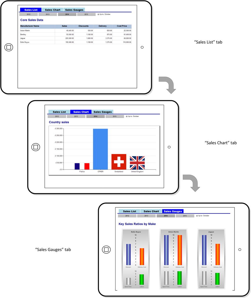
Figure 10-4. A tabbed report
However, the report is somewhat different in Report Designer, shown in Figure 10-5. Here, as you can see, the three tabbed screens are, in effect, a single report.

Figure 10-5. A tabbed report in Report Designer
You saw how to create the gauges in Chapter 4, so I will not repeat the code for them here. However, the code for the initial table and the column chart is as follows:
DECLARE @ReportingYear INT = 2014
DECLARE @ReportingMonth INT = 10

-- Code.pr_TabletTabbedReportCountrySales

SELECT
CASE
WHEN CountryName IN ('France','United Kingdom','Switzerland', 'United States', 'Spain') THEN CountryName
ELSE 'OTHER'
END AS CountryName
,SUM(SalePrice) AS Sales
FROM        Reports.CarSalesData
WHERE       ReportingYear = @ReportingYear
            AND ReportingMonth = @ReportingMonth
GROUP BY    CountryName

-- Code.pr_TabletTabbedReportSalesList
SELECT
 Make
,SUM(SalePrice) AS Sales
,SUM(TotalDiscount) AS Discounts
,SUM(DeliveryCharge) AS DeliveryCharge
,SUM(CostPrice) AS CostPrice
FROM       Reports.CarSalesData
WHERE      ReportingYear = @ReportingYear
           AND ReportingMonth = @ReportingMonth
GROUP BY   Make

-- Code.pr_TabletTabbedReportRatioGauges

IF OBJECT_ID('tempdb..#Tmp_GaugeOutput') IS NOT NULL DROP TABLE #Tmp_GaugeOutput

CREATE TABLE #Tmp_GaugeOutput
(
ManufacturerName NVARCHAR(80) COLLATE DATABASE_DEFAULT
,Sales NUMERIC(18,6)
,Discount NUMERIC(18,6)
,DeliveryCharge NUMERIC(18,6)
,SpareParts NUMERIC(18,6)
,LabourCost NUMERIC(18,6)
,DiscountRatio NUMERIC(18,6)
,DeliveryChargeRatio NUMERIC(18,6)
,SparePartsRatio NUMERIC(18,6)
,LabourCostRatio NUMERIC(18,6)
)

INSERT INTO #Tmp_GaugeOutput (ManufacturerName, Sales, Discount, DeliveryCharge, SpareParts, LabourCost)

SELECT
Make
,SUM(SalePrice) AS Sales
,SUM(TotalDiscount) AS Discount
,SUM(DeliveryCharge) AS DeliveryCharge
,SUM(SpareParts) AS SpareParts
,SUM(LaborCost) AS LabourCost
FROM         Reports.CarSalesData
WHERE        ReportingYear = @ReportingYear
             AND ReportingMonth = @ReportingMonth
GROUP BY     Make

UPDATE     #Tmp_GaugeOutput
SET        DiscountRatio =
                                        CASE
                                        WHEN Discount IS NULL or Discount = 0 THEN 0
                                        ELSE (Discount / Sales) * 100
                                        END
          ,DeliveryChargeRatio =
                                        CASE
                                        WHEN DeliveryCharge IS NULL or DeliveryCharge = 0 THEN 0
                                        ELSE (DeliveryCharge / Sales) * 100
                                        END
          ,SparePartsRatio =
                                        CASE
                                        WHEN SpareParts IS NULL or SpareParts = 0 THEN 0
                                        ELSE (SpareParts / Sales) * 100
                                        END
          ,LabourCostRatio =
                                        CASE
                                        WHEN LabourCost IS NULL or LabourCost = 0 THEN 0
                                        ELSE (LabourCost / Sales) * 100
                                        END

SELECT * FROM #Tmp_GaugeOutput
How the Code Works
These code snippets return a few key metrics aggregated by make or country for a specific year and month. Running this code returns the data shown in Figure 10-6.

Figure 10-6. The output for the table in the tabbed report
Building the Report
This report is nothing more than a series of objects whose visibility is controlled by the action properties of the text boxes that are used to give a “tabbed” appearance. As I want to concentrate on the way that objects are made to appear and disappear, I will be somewhat succinct about how to create the objects (table, chart, and gauges) themselves, as they are essentially variations on a theme of visualizations that you have already seen in previous chapters.
- Make a copy of the .rdl file named __DateSelector. Name the copy Tablet_TabbedReport.rdl, and open the copy.
- Remove the month elements as described for the tiled report earlier in this chapter. Leave the ReportingMonth parameter, however.
- Add the following three parameters, all of which are Boolean and hidden:
- TabSalesList - default value: False
- TabSalesChart - default value: True
- TabSalesGauge - default value: True
- Add the following datasets:
- CountrySales, using the stored procedure Code.pr_TabletTabbedReportCountrySales
- SalesList, using the stored procedure Code.pr_TabletTabbedReportSalesList
- RatioGauges, using the stored procedure Code.pr_TabletTabbedReportRatioGauges
- MonthList, using the shared dataset ReportingFullMonth
- Embed the following seven images into the report (all .png files from the directory C:BIWithSSRSImages that you have downloaded from the Apress web site): EuropeFlag, GermanFlag, USAFlag, GBFlag, SpainFlag, FranceFlag, and SwissFlag.
- Copy the pop-up menu text box and table that you created in Chapter 8. You can see this type of visualization in Figure 8-5. Set the table for the “menu” to use the dataset MonthList.
- Add three text boxes in a row above the year selector. Format them to Arial Black 14 point centered. Enter the following texts (in this order): Sales List, Sales Chart, and Sales Gauges. Name the three text boxes (also in this order): TxtTabSalesList, TxtTabSalesChart, and TxtTabSalesGauges.
- Add a line under the text boxes. Set the LineColor to dark blue and the LineWidth to 3 points. This is the “tabbed” header that you can see in Figure 10-4.
- Create a table and delete the second (detail) row. Delete all but one column. Add two more rows and set the dataset to SalesList. In the Properties window, name this table TabSalesList.
- Create a second table of five columns and drag it into the second row of the table that you created previously. As the nested table will inherit the outer table’s dataset, you can set the detail row to use the fields Make, Sales, Discounts, DeliveryCharge, and CostPrice (in this order).
- Add the text Core Sales Data to the top row of the outer table. Format the table as you see fit, possibly using Figure 9-11 as an example.
- Add a text box under the table and name it TxtChartTitles. Set the font to Arial blue 18 point.
- Under this title, add a column chart that you name Chart. Set it to use the dataset CountrySales. Set the ∑ Values to use the Sales field and the category groups to use the CountryName field.
- Click any column in the chart and set it to use an embedded background image where the Value for the image is set in the Properties window using the following expression:
=Switch (
        Fields!CountryName.Value= "United Kingdom", "GBFlag"
        ,Fields!CountryName.Value= "France", "FranceFlag"
        ,Fields!CountryName.Value= "UnitedStates", "USAFlag"
        ,Fields!CountryName.Value= "Germany", "GermanFlag"
        ,Fields!CountryName.Value= "Spain", "SpainFlag"
        ,Fields!CountryName.Value= "Switzerland", "SwissFlag"
        ,Fields!CountryName.Value= "OTHER", "EuropeFlag"
) - Format this chart as you want, possibly using Figure 6-13 from Chapter 6 as a model.
- Add a text box under the chart and name it TxtGaugeTitles. Set the font to Arial blue 18 point.
- Create a gauge similar to the one that you created in Chapter 3 for Figure 3-3. However, you must add a second scale by right-clicking the gauge and selecting Add Scale.
- The first scale needs the following properties setting in the Linear Scale Properties dialog:
Parameter
Property
Value
Layout
Position in gauge (percent)
50
Start margin (percent)
40
End margin (percent)
11
Scale bar width (percent)
0
Labels
Placement relative to scale
Cross
Major Tick Marks
Hide major tick marks
Checked
Minor Tick Marks
Hide minor tick marks
Checked
- The second scale needs the following properties setting in the Linear Scale Properties dialog:
Parameter
Property
Value
Layout
Position in gauge (percent)
50
Start margin (percent)
8
End margin (percent)
70
Scale bar width (percent)
0
Labels
Placement relative to scale
Cross
Major Tick Marks
Hide major tick marks
Checked
Minor Tick Marks
Hide minor tick marks
Checked
- In this case, however, use the dataset RatioGauges and add a total of four bar pointers, two for each scale. You do this by right-clicking inside the gauge and selecting Add Pointer For and selecting the relevant scale for each pointer that you add. These pointers must use (clockwise from top left) the following fields: DeliveryChargeRatio, DiscountRatio, LaborCostRatio, SparePartsRatio.
- Set all the pointers to 15 percent width. The two left-hand pointers should have their distance from the scale set to 33 percent. The two right-hand pointers should have their distance from the scale set to 15 percent.
- Add titles under each pointer. See Chapter 3 for techniques on how to do this. Add a title at the top of the gauge and enter the text Rolls Royce.
- Filter the gauge on the make Rolls Royce.
- Make two copies of the gauge and place them side by side with the first gauge. Name the second gauge GaugeAstonMartin and filter it on Make = Aston Martin. Name the third gauge GaugeJaguar and filter it on Make = Jaguar.
Now that you have all the elements in place, you can add the final touch: managing the visibility of the various parts of the report.
- Select the table named TabSalesList and in the Properties window, set its Hidden property to =Parameters!TabSalesList.Value.
- Select the text box title for the chart as well as the chart, and set their Hidden property to =Parameters!TabSalesChart.Value.
- Select the three gauges and the text box title for the gauges and set their Hidden property to =Parameters!TabSalesGauge.Value.
- Click the TxtTabSalesList text box, and set the following properties:
Property
Value
BackgroundColor
=Switch(
Parameters!TabSalesList.Value=False,"Blue"
,1=1
,"LightBlue"
)
Color
=Switch(
Parameters!TabSalesList.Value=False,"White"
,1=1
,"Black"
)
- Set the same properties for the two other text boxes (TxtTabSalesChart and TxtTabGauges), only change the parameter reference in the expression to the appropriate parameter. So, for the text box TxtTabSalesChart, you will see Parameters!TabSalesChart.Value and the text box TxtTabSalesGauge you should use Parameters!TabSalesGauge.Value.
- Right-click the text box TxtTabSalesList and select Text Box Properties from the context menu. Click Action on the left, and set the following options:
Option
Parameter
Value
Enable as action
Go to report
Specify a report
[&ReportName]
Use these parameters
ReportingYear
[@ReportingYear]
TabSalesList
False
TabSalesChart
True
TabSalesGauge
True
ReportingMonth
[@ReportingMonth]
- The dialog should look like Figure 10-7.
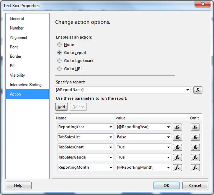
Figure 10-7. The action parameters for a tabbed report
- Do exactly the same for the text box TxtTabSalesChart, only alter the two following parameters:
- TabSalesList: True
- TabSalesChart: False
- TabSalesGauge: True
- Do exactly the same for the text box TxtTabSalesGauge, only alter the two following parameters:
- TabSalesList: True
- TabSalesChart: True
- TabSalesGauge: False
That’s it. You have defined a report where two out of three will parts of the report always be hidden, giving the impression that the user is flipping from tab to tab when a text box at the top of the report is clicked or tapped.
How It Works
Because there are three groups of report items that have to be made visible or invisible as coherent units, I find it easier to use parameters to contain the state of the visibility of items in the report. Then, when a text box is clicked, its action property can set the value for the parameters that control visibility. This causes the report to be redisplayed with a different set of visible items.
I used this report as an opportunity to reuse a technique that you saw in the previous chapter: the pop-up menu. This is not strictly necessary when creating tabbed reports, but I want to illustrate that you can soon end up with a plethora of parameters that have to be kept in synch when developing reports with more complex interfaces like this one.
The property used to handle visibility is called Hidden, so you have to remember to set the parameter to True to hide an element and False to display it. This can seem more than a little disconcerting at first.
![]() Note A tabbed report is loaded in its entirety, including the hidden elements. This means that switching from tab to tab can be extremely rapid once the report has been loaded. This makes tabbed reports ideal candidates for caching. Caching techniques are described in greater detail in Chapter 12.
Note A tabbed report is loaded in its entirety, including the hidden elements. This means that switching from tab to tab can be extremely rapid once the report has been loaded. This makes tabbed reports ideal candidates for caching. Caching techniques are described in greater detail in Chapter 12.
Other Techniques for Tablet Reports
Tabbed reports are not the only solution that you can apply when creating or adapting reports for handheld devices. Other approaches include the following:
- Drilldown to hierarchical tables, just as you would with classic reports in SSRS.
- Restructuring the visualizations into a whole new set of reports and linking the reports. An example of this technique is given at the end of this chapter.
- Simplifying the visualizations that make up a dashboard to allow a greater concentration of widgets in a smaller space. Most, if not all, of the examples in this chapter do this in some way.
- Removing dashboard elements to declutter the report.
Smartphone Reports
There is probably one word that defines successful reports for smartphones: simplicity. As in most areas, simplicity in report design is often harder than complexity. While we all have our opinions about design, here are a few tips:
- Isolate truly key elements. Remove anything not essential from the report.
- Create single-focus screens. Ideally the information should be “bite-sized.”
- Deliver key data higher in the sequence of reports. Give less detail at higher levels and reserve granularity for further reports lower in the hierarchy.
- Limit the number of metrics you deliver on each screen.
- Consider providing data or titles as tooltips. It can save screen real estate.
- Share datasets. This encourages widget reuse.
Let’s see how these principles can be applied in practice. I’ll cover using gauges and charts to display metrics, and then provide a few tips on delivering text-based metrics on a smartphone.
A user looking at their phone for business intelligence will be a busy person and their attention span will be limited. After all, many other distractions are jostling for their time and focus. So you need to give them the information they want as simply and effectively as possible. Gauges can be an ideal way to achieve this objective.
Inevitably you will have to limit the information that can be displayed efficiently. This will depend on the size of the screen you are targeting, so there are no definite limits. In this example, I will use six gauges to show car sales for the current month. Moreover, I will deliberately break down the display into
- Five specific makes of cars sold
- One gauge for all the others
This could require tweaking the source data to suit the desired output, but this is all too often what you end up doing when designing BI for smartphones. This final output will look like Figure 10-8. In this particular visualization, there is no facility for selecting the year and month; the current year and month are displayed automatically.

Figure 10-8. Gauges showing sales for the current month
You can get the figures for sales for the current month using the following SQL (Code.pr_SmartPhoneCarSalesGauges). You saw this in Chapter 3, so I will refer you to back to this chapter rather than show it all again here.
Building the Gauges
Now it is time to put the pieces together and assemble the gauges for the smartphone display. You will be building on some of the experience gained in Chapter 3, specifically the report named _CarSalesGauge.rdl.
- Make a copy of the report named _CarSalesGauge.rdl. Name the copy SmartPhone_CarSalesGauges.rdl.
- Right-click the ReportingYear and ReportingMonth parameters (in turn) and set the parameter to hidden.
- Increase the size of the report so that it is three times wider and five times taller than the gauge. Place the gauge on the right of the report. Resize the gauge so that it is 1.5 inches square.
- Add a table to the left of the report. Delete the detail row. Make the table three columns by six rows, adding the required number of columns and rows. Set the dataset to SmartPhoneCarSalesGauges.
- Set the first, third, and fifth rows to be 0.25 inches tall. Set the second, fourth, and sixth rows to be 1.5 inches tall.
- Set the first and third columns to be 1.5 inches wide, and the second column to be 0.25 inches wide.
- Set all the cell backgrounds to black.
- Add the titles shown in Figure 10-8 to the first and third columns of the first, third, and fifth rows. Set the font to Arial 10 point white.
- Drag the gauge into the left-hand cell of row two. Ensure that the filter is set to Aston Martin.
- Copy the gauge into the cells of the left-hand and right-hand columns of rows two, four, and six.
- Filter each of the gauges to apply only the make that appears in the title above the gauge.
- Resize the report to fit to the size of the table.
How It Works
This report simply uses a table as a placeholder to contain the six gauges. The table uses the same dataset as the gauges, even though it does not use it. Each gauge is then filtered on the field that allows it to display data for a single record in the output recordset. The big advantage of gauges here is that they can be resized easily, and will even resize if you adjust the height or width of the row and column that they are placed in.
Slider Gauges
A type of presentation that is extremely well suited to smartphones is the lateral gauge. These gauges have been popularized by certain web sites, and are sometimes called “slider” gauges. An example is shown in Figure 10-9.

Figure 10-9. A slider gauge
The Source Data
The code needed to produce this mobile report is as follows:
DECLARE @ReportingYear INT = 2014
DECLARE @ReportingMonth INT = 10

IF OBJECT_ID('Tempdb..#Tmp_Output') IS NOT NULL DROP TABLE Tempdb..#Tmp_Output

CREATE TABLE #Tmp_Output
(
Make NVARCHAR(80) COLLATE DATABASE_DEFAULT
,Sales NUMERIC(18,6)
,SalesBudget NUMERIC(18,6)
,PreviousYear NUMERIC(18,6)
,PreviousMonth NUMERIC(18,6)
,ScaleMax INT
)

INSERT INTO #Tmp_Output
(
Make
,Sales
)

SELECT     CASE
               WHEN Make IN ('Aston Martin','Bentley','Jaguar','Rolls Royce') THEN Make
               ELSE 'Other'
           END AS Make
           ,SUM(SalePrice)
FROM       Reports.CarSalesData
WHERE      ReportingYear = @ReportingYear
           AND ReportingMonth <= @ReportingMonth
GROUP BY   CASE
               WHEN Make IN ('Aston Martin','Bentley','Jaguar','Rolls Royce') THEN Make
               ELSE 'Other'
           END

-- Previous Year Sales
;
WITH SalesPrev_CTE
AS
(
SELECT      CASE
               WHEN Make IN ('Aston Martin','Bentley','Jaguar','Rolls Royce') THEN Make
               ELSE 'Other'
            END AS Make
            ,SUM(SalePrice) AS Sales
FROM        Reports.CarSalesData
WHERE       ReportingYear = @ReportingYear - 1
            AND ReportingMonth <= @ReportingMonth
GROUP BY     CASE
               WHEN Make IN ('Aston Martin','Bentley','Jaguar','Rolls Royce') THEN Make
               ELSE 'Other'
             END
)

UPDATE       Tmp
SET          Tmp.PreviousYear = CTE.Sales

FROM         #Tmp_Output Tmp
             INNER JOIN SalesPrev_CTE CTE
             ON Tmp.Make = CTE.Make
;
WITH Budget_CTE
AS
(
SELECT        SUM(BudgetValue) AS BudgetValue
              ,BudgetDetail
FROM          Reference.Budget
WHERE         BudgetElement = 'Sales'
              AND Year = @ReportingYear
              AND Month <= @ReportingMonth

GROUP BY      BudgetDetail
)

UPDATE       Tmp
SET          Tmp.SalesBudget = CTE.BudgetValue

FROM         #Tmp_Output Tmp
             INNER JOIN Budget_CTE CTE
             ON Tmp.Make = CTE.BudgetDetail

 -- Previous month sales

 ;
 WITH PreviousMonthSales_CTE
 AS
 (
SELECT
SUM(SalePrice) AS Sales
,CASE
     WHEN Make IN ('Aston Martin','Bentley','Jaguar','Rolls Royce') THEN Make
     ELSE 'Other'
 END AS Make
FROM      Reports.CarSalesData
WHERE     InvoiceDate >= DATEADD(mm, -1 ,CONVERT(DATE, CAST(@ReportingYear AS CHAR(4))
          + RIGHT('0' + CAST(@ReportingMonth AS VARCHAR(2)),2) + '01'))
          AND InvoiceDate <= DATEADD(dd, -1 ,CONVERT(DATE, CAST(@ReportingYear AS CHAR(4))
          + RIGHT('0' + CAST(@ReportingMonth AS VARCHAR(2)),2) + '01'))
GROUP BY
 CASE
     WHEN Make IN ('Aston Martin','Bentley','Jaguar','Rolls Royce') THEN Make
     ELSE 'Other'
 END
 )

UPDATE          Tmp
SET             Tmp.PreviousMonth = CTE.Sales
FROM          #Tmp_Output Tmp
               INNER JOIN PreviousMonthSales_CTE CTE
               ON Tmp.Make = CTE.Make

-- Scale maximum

UPDATE     #Tmp_Output
SET        ScaleMax =
                         CASE
                         WHEN Sales >= SalesBudget THEN (SELECT Code.fn_ScaleDecile (Sales))
                         ELSE (SELECT Code.fn_ScaleDecile (SalesBudget))
                         END
-- Output

SELECT     *
FROM     #Tmp_Output
Running this code gives the results shown in Figure 10-10 (for March 2013):

Figure 10-10. The data for slider display
How the Code Works
This code first creates a temporary table, and then it adds the sales data for the current year up to the selected month, sales up to the same month for the previous year, the budget data for the current year, and the sales for the preceding month.
This code block also includes the maximum value for the scale inside the table where the core data is held. This is because the maximum value can change for each make of car.
Building the Report
So, with the data in place, here is how to build the report.
- Make a copy of the report __DateSelector and name the copy SmartPhone_SalesAndTargetWithPreviousMonthAndPreviousPeriod.rdl.
- Add the following two datasets:
- MonthList, based on the shared dataset ReportingFullMonth
- MonthlyCarSalesWithTargetPreviousMonthAndPreviousYear, based on the stored procedure Code.pr_MonthlyCarSalesWithTargetPreviousMonthAndPreviousYear
- Delete the table containing the months.
- Copy the text box and table that act as a pop-up menu from the report Tablet_TabbedReport.rdl that you created earlier in this chapter, and place them under the year selector.
- Add a gauge to the report and choose Horizontal as the gauge type. Apply the dataset MonthlyCarSalesWithTargetPreviousMonthAndPreviousYear.
- Add three new pointers and one range so that there are four pointers and two ranges in total. Set the pointers to use the following fields (the easiest way is to click the gauge so that the Gauge Data pane appears):
- LinearPointer1: PreviousMonth
- LinearPointer2: SalesBudget
- LinearPointer3: Sales
- LinearPointer4: PreviousYear
- Add the following tooltips in the Properties window for three of the four pointers:
- LinearPointer1: =“Last Month”
- LinearPointer3: =“This Month”
- LinearPointer4: =“Same Month Last Year”
- Set the four pointer properties as follows (right-click each one individually and select Linear Pointer Properties from the context menu):

- Set the following properties in the Linear Range Scale Properties dialog for the two ranges:
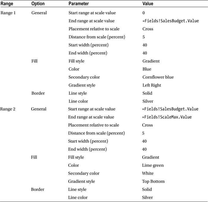
- Right-click the scale, select Scale Properties, and set the following properties:
Section
Property
Value
General
Minimum
0
Maximum (expression)
=Fields!ScaleMax.Value
Layout
Position in gauge (percent)
57
Start margin (percent)
4
End margin (percent)
4
Scale bar width (percent)
1
Labels
Placement (relative to scale)
Outside
Distance from scale
28
Font
Font
Arial
Size
8 point
Color
Dim gray
Number
Category
Number
Use 1000 separator
Checked
Major Tick Marks
Hide major tick marks
Checked
Minor Tick Marks
Hide minor tick marks
Checked
- Add a table to the report area and delete all but one column and the header row. Set the remaining cell to be the width of the gauge and approximately 0.8 inches high.
- Drag the gauge into the table cell.
- Right-click the gauge and set the following Gauge Panel Properties. This will filter the gauge data so that only the data for the current record is displayed:
Section
Property
Value
Filters
Expression
Make
Operator
=
Value
Make
Fill
Background color of the gauge panel
White
- Right-click the gauge and set the following Gauge Properties:
Section
Property
Value
Back Fill
Fill style
Gradient
Color
Dim gray
Secondary Color
White smoke
GradientStyle
Diagonal left
Frame
Style
Simple
Width (percent)
4.5
Frame Fill
Fill style
Gradient
Color
White smoke
Secondary Color
Dim gray
GradientStyle
Horizontal center
Frame Border
Line style
None
How It Works
This gauge uses three different pointer styles as well as pointer placement to add a lot of information to a single gauge. The “main” pointer is the central bar (which contains the data for sales to the selected month in the year) while the budget is a bar across the gauge that lets the user see how sales relate to budget. Because they are ancillary data, the pointers for last month’s sales and the sales up until the same month for the previous year are shown as small triangular pointers above and below the main pointer.
The budget is then reflected in the two ranges to indicate more clearly how sales relate to budget. Finally, tooltips are added for all the pointers so that the user can see which pointer represents which value.
![]() Note Every time a new user sees this gauge, they ask how they can move the “slider” pointers and change the data. You have been warned!
Note Every time a new user sees this gauge, they ask how they can move the “slider” pointers and change the data. You have been warned!
I would never advise creating BI visualizations for smartphones that rely on lots of text. Users will simply not read reams of prose on a tiny mobile device. Instead, think of some of the apps that you currently use. They probably have simple screens and large buttons. Smartphone BI should emulate this approach. As an example, consider the list of sales by make in Figure 10-11. You will note that this example also gives the user the possibility to select the year and month using some of the techniques for interactive selection described earlier in this chapter.

Figure 10-11. Sales by make for smartphone display
The Source Data
The code needed to deliver this visualization is not overly complex, and is as follows:
DECLARE @ReportingYear INT = 2014
DECLARE @ReportingMonth INT = 10

IF OBJECT_ID('Tempdb..#Tmp_Output') IS NOT NULL DROP TABLE Tempdb..#Tmp_Output

CREATE TABLE #Tmp_Output
(
Make NVARCHAR(80) COLLATE DATABASE_DEFAULT
,Sales NUMERIC(18,6)
,SalesBudget NUMERIC(18,6)
,SalesStatus TINYINT
)

INSERT INTO #Tmp_Output
(
Make
,Sales
)

SELECT    CASE
             WHEN Make IN ('Aston Martin','Bentley','Jaguar','Rolls Royce') THEN Make
             ELSE 'Other'
          END AS Make
          ,SUM(SalePrice)
FROM      Reports.CarSalesData
WHERE     ReportingYear = @ReportingYear
          AND ReportingMonth <= @ReportingMonth
GROUP BY  CASE
              WHEN Make IN ('Aston Martin','Bentley','Jaguar','Rolls Royce') THEN Make
              ELSE 'Other'
          END
;
WITH Budget_CTE
AS
(
SELECT     SUM(BudgetValue) AS BudgetValue
            ,BudgetDetail
FROM       Reference.Budget
WHERE      BudgetElement = 'Sales'
           AND Year = @ReportingYear
           AND Month <= @ReportingMonth
GROUP BY   BudgetDetail
)

UPDATE     Tmp
SET        Tmp.SalesBudget = CTE.BudgetValue
FROM       #Tmp_Output Tmp
           INNER JOIN Budget_CTE CTE
           ON Tmp.Make = CTE.BudgetDetail

-- Set Sales Status

UPDATE     #Tmp_Output
SET SalesStatus =
                CASE
                WHEN Sales < (SalesBudget * 0.9) THEN 1
                WHEN Sales >= (SalesBudget * 0.9)  AND Sales <= (SalesBudget * 1.1) THEN 2
                WHEN Sales > (SalesBudget * 1.1) THEN 3
                ELSE 0
                END
-- Output

SELECT   *
FROM     #Tmp_Output
Running this code produces the table shown in Figure 10-12.

Figure 10-12. The data for sales by make for the current year
How the Code Works
Using the approach that you have probably become used to by now in this book, a temporary table is used to hold the sales data for a hard-coded set of vehicle makes. Then, using a CTE, the budget data for these makes is added, and a status flag is calculated on a scale of 1 through 3.
Building the Display
Let’s assemble the table to display this key data on your smartphone.
- Make a copy of the report __DateSelector and name the copy SmartPhone_CarSalesByCountryWithFlagDials.rdl. Delete the table containing the months.
- Add the following two datasets:
- MonthList, based on the shared dataset ReportingFullMonth
- MonthlyCarSalesWithTargetAndStatus, based on the stored procedure Code.pr_MonthlyCarSalesWithTargetAndStatus
- Copy the text box and table that act as a pop-up menu from the report SmartPhone_CarSalesByCountryWithFlagDials.rdl that you created earlier in this chapter, and place them under the year selector.
- Add a table to the report and delete the third column. Apply the dataset MonthlyCarSalesWithTargetAndStatus.
- Set the left column to 1.75 inches wide and the right column to 1.25 inches wide (approximately). Set the details row to be about 1/2 inch high. Merge the cells on the top row.
- Add the text Make to the top row and center it. Set the text box background to black and the font to light gray Arial 12 point bold.
- Add the field Make to the left. Set the text box background to silver and the font to black Arial 16 point bold.
- Set the text box background of the right column to dim gray.
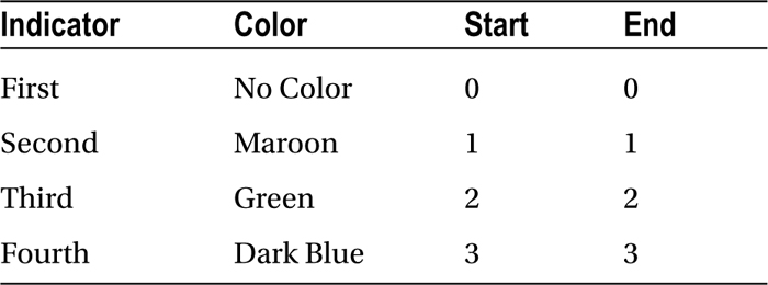
- Drag an indicator from the toolbox into the right-hand column cell and select 3 signs as the indicator type.
- Click the indicator (twice if necessary) and when the Gauge Data pane appears, select SalesStatus as the ∑ Value.
- Right-click the indicator and select Indicator Properties from the context menu. Set the Value and States measurement unit property to numeric.
- Add an indicator state so that there are a total of four. Set all to use the diamond icon. Set the indicator properties as follows:
- Right-click the indicator and select Add Label from the context menu. Then right-click the label and select Label Properties from the context menu. Set the following properties:
Section
Property
Value
General
Text (Expression)
=Microsoft.VisualBasic.Strings.Format(Fields!Sales.Value, "#,#")
Text alignment
Center
Vertical alignment
Middle
Top (percent)
30
Left (percent)
10
Width (percent)
90
Height (percent)
50
Font
Font
Arial
Style
Bold
Color
Yellow
- Right-click the table and select Tablix properties from the context menu. Select Sorting on the left and click Add. Select Sales as the column to sort by and Z to A as the sort order.
How It Works
This visualization uses a table structure to show the records from the source data where the data is not only directly input into a table cell (the Make) but is also part of the indicator, as a text. However, when text is added to an indicator you must use an expression to display it and some simple Visual Basic to format the numbers. One advantage of a table here is that you can resize the indicator simply by adjusting the height and width of the column that contains it; the text will resize automatically as well.
Because I am demonstrating smartphone delivery, the color scheme is deliberately brash. You may prefer more moderate pastel shades. Just be aware that this medium has little respect for subtlety or discretion.
Multiple Charts
Some, but not all, chart types can be extremely effective when used on smartphones. I do not want to dismiss any of the more “traditional” chart types as unsuitable, so the only comment I will make is that it’s best to deliver a single chart per screen if the charts are complex or dense line or bar charts.
If you need to deliver multiple charts, consider using a chart like the one from the tabbed report at the start of this chapter. While it can be a little laborious to configure multiple chart areas in this way, it does make resizing the whole chart to suit a specific mobile device extremely easy.
Alternatively, if you need multiple charts to make comparisons easier for the user, consider a trellis chart structure. You saw an example of this at the end of Chapter 4 if you need to refer back to refresh your memory.
Smartphone and Tablet Report Hierarchy
You may find that the way you present the hierarchy of reports for smartphone users is not the same way you create a reporting suite for tablet devices. This is because smartphone users are (probably) more used to simpler, more bite-sized chunks of information. So consider the following tips:
- Breaking down reports into sub-elements, with bookmark links inside the report, as you saw at the start of this chapter.
- A menu-style access to a report hierarchy, using buttons rather than lists (as you saw for tablets above) to navigate down and up a hierarchy.
- Use graphically consistent buttons in all reports.
- Using visualizations that are “tappable” and that become part of the navigation when possible.
As you have seen the first of these solutions already, let’s take a quick look at a simple implementation of the second. This is fairly “classic” stuff, but it is worth showing how it can be applied to some of the tablet-based reports that you have developed so far in this book.
Access to a Report Hierarchy
To hide the undeniably horrendous Web Services interface, all you have to do is to set up a home page for your suite of reports and send this URL to your users. They can then add it to the favorites menu in their browser, and use it as the starting point for accessing the set of tablet-oriented BI that you have lovingly crafted. A simple example is shown in Figure 10-13.

Figure 10-13. Accessing reports through a custom interface
I am presuming here that you have deployed your reports to a SQL Server Reporting Services Instance, and that you have structured the reports into a set of subfolders. In this specific instance, I have set up a virtual folder named CarSalesReports, with a subfolder named Tablet that contains all the reports in the sample solution that begin with Tablet_.
Here is how to create this entry page.
- Create a new, blank report and save it under the name Tablet_Reportsmenu.rdl.
- Add the image CarsLogo.png.
- Drag this image to the top left of the report.
- Add a suitably formatted title such as “Mobile BI Sales Reports.”
- Add a text box. Enter the text Sales Report, and set the text to Arial 12 point bold in blue.
- Right-click the text box and select Text Box Properties from the context menu.
- Click Action on the left.
- Select Go to URL and enter the following URL:
http://localhost/ReportServer/Pages/ReportViewer.aspx?%2fCarSalesReports%2fTablet%2fTablet_TabbedReport&rs:Command=Render - Confirm with OK.
- Add four new text boxes, all formatted like the first one. Set the texts and URLs to the following:
- Sales Highlights: http://localhost/ReportServer/Pages/ReportViewer.aspx?%2fCarSalesReports%2fTablet%2fTablet_SimpleSlicer&rs:Command=Render
- Sales by Make: http://localhost/ReportServer/Pages/ReportViewer.aspx?%2fCarSalesReports%2fTablet%2fTablet_ChartHighlight&rs:Command=Render
- Sales and Costs: http://localhost/ReportServer/Pages/ReportViewer.aspx?%2fCarSalesReports%2fTablet%2fTablet_SlicerHighlight&rs:Command=Render
- Reseller Sales: http://localhost/ReportServer/Pages/ReportViewer.aspx?%2fCarSalesReports%2fTablet%2fTablet_Tile&rs:Command=Render
- Deploy the report (to the Tablet subdirectoy of the CarSalesReports virtual directory) and run it using the following URL:
http://localhost/ReportServer/Pages/ReportViewer.aspx?%2fCarSalesReports%2fTablet%2fTablet_ReportsMenu&rs:Command=Render
You can now display the home page for your reporting suite, and then drill down into any report with a simple tap on the tablet.
How It Works
As you can see, you are using the Web Services URL for every report and studiously avoiding the Report Manager interface. This is to ensure that tablets (and that means iPads too) can display the report. However, all that your users see is a structured drill-down to the reports that they want, so hopefully the few minutes of work to set up a menu-driven access to your reporting suite will be worth the effort.
Structuring the Report Hierarchy
Now that you have seen the principles of creating an interface to replace the Report Manager, you should be able to extend this to as many sublevels as you need. One extra point is that you might find it useful to add a small text box, using the principles that you just saw, to each of the subreports. This text box uses the URL of the home menu in its action property. This way you can flip back from any report at a sublevel to the home page or to another sublevel. If you are thinking “yes, but I have the browser’s back button for that,” remember that your users could be using the postback techniques that you have been using in this and previous chapters. If so, the back button will only display the same report, but using the previous set of parameters and not return to a higher level in the report hierarchy.
This technique can also be used to break down existing reports into multiple separate reports. In the case of both the tabbed report and the bookmark report that you saw earlier, you could “cut” a report into separate .rdl files and use action properties to switch to another report.
Conclusion
This chapter showed you some of the ways you can deliver business intelligence to tablets and smartphones using SSRS. You saw that you frequently have to tailor the way information is delivered to a tablet or phone. If you have an existing report, you may have to adapt it for optimum effect on a mobile device. In any case, there are a series of methods that you can apply to save space and use the available screen real estate to greatest effect. These can involve creating tabbed reports, breaking reports down into separate reports, or using bookmarks to flip around inside a report.
Where smartphones are concerned, you probably need to think in terms of simplicity first. In this chapter, you applied the “less is more” principle and consequently you removed any element that added clutter to a screen. This way you key BI metrics are visible, instantly and clearly, for your users.