
![]()
Charts for Business Intelligence
Charts may be a staple of spreadsheets and PowerPoint presentations, but that does not mean that you cannot use them in dashboards (and in BI generally) to great effect. The main thing to remember if you want your dashboards to be striking and memorable is that a BI chart needs to convey key information succinctly. So you may well find that you end up avoiding the more traditional (not to say overused) chart types in your BI reports in favor of less tired ways of visualizing your data.
Charts have been around in SSRS for nearly 15 years, so I won’t provide a chart primer here. What I want to do is to outline some of the ways in which a well-designed chart can be an intrinsic part of an effective BI dashboard. Charts are, however, infinitely varied and a matter of taste. So I will not be prescribing which chart type to use in which scenarios; I can only advise you to consult some of the excellent books on this subject. Nonetheless, one fundamental point to bear in mind when creating your reports is that charts used for BI will nearly always benefit considerably from being simplified rather than overloaded. It is nearly always better to create several charts rather than to create a single chart containing many data series.
What I will do is show you some of the ways in which charts can be used (almost) as KPIs, and how using some of the rarer chart types can add real visual effect to a dashboard. This chapter aims to be largely a collection of tips and tricks which I hope you will find useful. I am not attempting to provide complete coverage of how to use charts in Reporting Services for business intelligence because there are simply too many ways that charts can be used to convey information succinctly and coherently in dashboards and other BI output to be handled in a short book. However, this chapter should encourage you to experiment with charts for business intelligence and to deliver some really cool visualizations to your users.
Some Chart Presentation Ideas
All the charts that you will be creating in this chapter are designed to be used in a business intelligence context. For me, this means that they must be designed for clarity and simplicity, so that the key message and metrics are conveyed succinctly and transparently.
We all have our ideas about what constitutes taste and effective delivery, especially where design and color are concerned. Consequently, I expect many people to disagree with my ideas, and I can only encourage you to do your own thing. In this chapter, however, you will generally be adopting the following design principles for all of the charts that you will develop:
- Chart title: Arial, 10 point, gray
- Axis titles: Arial narrow, 8 point, italic, gray
- Legend title: Arial Narrow, 9 point, gray
- Legend: Shadow, dark gray also for lines
- Lines, gridlines, tick marks: Light gray 0.5 or 1 point
- Right and bottom border of the chart: 1.75 point
- Top & left border of the chart: 1 point all in dark gray
- All backgrounds white or transparent
The logic behind this design is to make text and boundaries less obtrusive so that the data can stand out. Equally, I will be using mostly lighter colors except in a few cases. However, this is my approach, and you are, of course, free to apply your own design ideas and strictures.
As was the case in previous chapters, I will be fairly expansive when explaining the first example, and a little more concise for the remaining examples in this chapter.
Charts to Compare Metrics with Targets
Charts can be ideal when you need to show how a series of metrics compares to target values. They have the advantage of being largely intuitive, as can be seen in the number of charts in BI reports and dashboards the world over.
Admittedly, comparing targets to results is largely what most KPIs do. Where charts are concerned, though, I will not be adding any form of trend indicator. As this would really be necessary for a true KPI, I do not consider target-metric charts as KPIs. This does not in any way, however, mitigate their usefulness and value in a BI context.
Basic Target Comparison Charts
In its most simple form, a target comparison chart could have only two series of data:
- The required metric
- The target value
The only trick here is to differentiate the two series sufficiently. Mixing a standard chart type that represents one series with custom markers for another series can be an efficient way of doing this, as Figure 4-1 shows for June 2015 in the sample data.
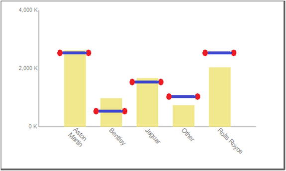
Figure 4-1. Comparing a metric to a target
The first thing that you need is your business data. In this example, let’s suppose that all you want is a list of the principal makes of car, plus a catch-all category for minor makes, along with the budget figures for a selected year and month. The following code snippet (available as Code.pr_MonthlyCarSalesWithTarget in the CarSales_Report database) provides the data:
DECLARE @ReportingYear INT = 2015
DECLARE @ReportingMonth TINYINT = 6

IF OBJECT_ID('Tempdb..#Tmp_Output') IS NOT NULL DROP TABLE Tempdb..#Tmp_Output

CREATE TABLE #Tmp_Output
(
Make NVARCHAR(80) COLLATE DATABASE_DEFAULT
,Sales NUMERIC(18,6)
,SalesBudget NUMERIC(18,6)
)

INSERT INTO #Tmp_Output
(
Make
,Sales
)

SELECT    CASE
          WHEN Make IN ('Aston Martin','Bentley','Jaguar','Rolls Royce') THEN Make
          ELSE 'Other'
          END AS Make
          ,SUM(SalePrice)
FROM      Reports.CarSalesData
WHERE     ReportingYear = @ReportingYear
          AND ReportingMonth <= @ReportingMonth
GROUP BY  CASE
          WHEN Make IN ('Aston Martin','Bentley','Jaguar','Rolls Royce') THEN Make
          ELSE 'Other'
          END
;
WITH Budget_CTE
AS
(
SELECT    SUM(BudgetValue) AS BudgetValue
          ,BudgetDetail
FROM      Reference.Budget
WHERE     BudgetElement = 'Sales'
          AND Year = @ReportingYear
          AND Month = @ReportingMonth
GROUP BY  BudgetDetail
)

UPDATE    Tmp
SET       Tmp.SalesBudget = CTE.BudgetValue
FROM      #Tmp_Output Tmp
          INNER JOIN Budget_CTE CTE
          ON Tmp.Make = CTE.BudgetDetail

-- Output

SELECT    *
FROM      #Tmp_Output
Running this snippet gives the output shown in Figure 4-2.

Figure 4-2. The data used to compare vehicle sales to sales target for a specific month
How the Code Works
This short code snippet calculates the sales for the year to date (as defined by the selected month) and places the result into a temporary table. It then adds the budgetary figure for the same period to the table. This data only looks at four major makes of car plus an “Other” category.
Time, then, to build the chart. As this is the first chart you’re creating, I will go into some detail of the base techniques that are necessary to create it.
- Create a new SSRS report named _CountryChartPercentageToTarget.rdl. Resize the report so that it is sufficiently large to hold a chart.
- Add the shared data source CarSales_Reports. Name it CarSales_Reports.
- Create a dataset named CountryChartPercentageToTarget. Have it use the CarSales_Reports data source and the stored procedure Code.pr_MonthlyCarSalesWithTarget, whose code is shown above.
- Add the following four shared datasets (ensuring that you also use the same name for the dataset in the report):
- CurrentYear
- CurrentMonth
- ReportingYear
- ReportingMonth
- Set the parameter properties for ReportingYear and ReportingMonth as defined at the start of Chapter 1.
- Right-click Images in the Report Data window, select Add Image from the context menu, and navigate to the file C:BIWithSSRSImagesDumbbellTarget.png to embed this image in the report.
- Click the Chart item in the SSRS toolbox, and either draw a sufficiently large area for the chart or drag a chart onto the report surface that you will resize once the chart is created. Select 3D Column as the chart type, and click OK.
- Right-click in a blank part of the chart and select Chart Properties from the context menu. Select CountryChartPercentageToTarget as the dataset name and click OK.
- In the Chart Data pane (at the right of the chart; it will have appeared when you right-clicked in the previous step) add the Sales and SalesBudget fields as the ∑ values (in this order), and the Make field as the Category Group by clicking on Details in the Category Groups and selecting Make from the pop-up.
- Right-click inside the chart area, but not on a column, and choose Chart Area Properties from the context menu. In the 3D Options pane set the Rotation, Inclination, and Wall Thickness to 0.
- Click Fill on the left, leave the fill style as Solid, and set the fill color to No Color. Click OK.
- Click one of the columns for SalesBudget (or the SalesBudget field in the Chart Data pane) and display the Properties window (pressing F4 should do it).
- In the Chart Series properties, expand Marker, then Image, and set the following properties to apply the image that you imported earlier:
- Mime type: image/png
- Source: Embedded
- Value: DumbbellTarget
- TransparentColor: White
- While in the Properties window, set the Color (of this chart series) to No Color.
- Leave the Properties window visible and click the Sales series (or the Sales field in the Chart Data pane). Set the following properties:
- Color: Khaki (or a suitably quiet and non-virulent color)
- Border Color: No Color
- Custom Attributes
 Point Width: 0.6
- Right-click the legend and select Delete Legend. Do the same for the title.
- Right-click each axis title and uncheck Show Axis Title.
- Set the number format of the vertical axis to the following custom format: #,0," K";(#,0," K")
- While you are setting vertical axis properties, disable auto fit for the labels and set the font size to 7 point.
- Right-click the horizontal axis and select Horizontal Axis Properties from the context menu. Set the following properties:
Section
Property
Value
Labels
Disable auto-fit
Selected
Label rotation angle (degrees)
45
Label Font
Font
Arial
Size
8 point
Color
Gray
Major Tick Marks
Hide major tick marks
Checked
Minor Tick Marks
Hide minor tick marks
Checked
Line
Line color
Dim gray
- Right-click the vertical axis and select Vertical Axis Properties from the context menu. Set the following properties:
Section
Property
Value
Axis Options
Always include zero
Checked
Labels
Disable auto-fit
Selected
Label rotation angle (degrees)
0
Label Font
Font
Arial
Size
6 point
Number
Category
Custom
Custom format
#,0," K";(#,0," K")
Major Tick Marks
Hide major tick marks
Checked
Minor Tick Marks
Hide minor tick marks
Checked
Line
Line color
Dim gray
That is it. You have delivered a chart that avoids the more “classic” approach by using an image rather than a column to display the target value. Moreover, you have superposed the two data series by using a 3D chart that you have “flattened” to remove the perspective.
![]() Note You may prefer to leave the axes and fonts on the axes in black, or another color of your choice. I am merely trying to show that you can avoid distracting the user’s gaze if you tweak axes and number formatting (and remove any superfluous decoration such as titles) in this way.
Note You may prefer to leave the axes and fonts on the axes in black, or another color of your choice. I am merely trying to show that you can avoid distracting the user’s gaze if you tweak axes and number formatting (and remove any superfluous decoration such as titles) in this way.
Of course, when it comes to setting properties in SSRS charts, you have several alternative ways of achieving your objectives. I am merely suggesting one way of doing this here. If you have another method and prefer it, the choice is yours.
This chart required quite a few steps to complete, and some of the techniques you applied may not be immediately comprehensible. Some may even seem superfluous. Here are some of the reasons for doing what you did.
- The principal technique was to replace one of the columns with an image. In reality, the column is still there, but as its color is the same as the chart area, it is invisible. The upper edge of the column is where the image will appear.
- Creating and applying a personalized image could seem like overkill. If it does, then you can use a standard marker in the place of the image. Applying a marker is described later in this chapter. The reason for using an image is that using a bar or a line as the point of comparison is far too traditional. So I chose to customize the visualization to avoid provoking indifference on the part of the reader.
- Formatting the vertical axis is a great way to save space and to avoid distracting the user with multiple sets of 000,000,000, which add nothing to the visualization. SSRS number formats are a little abstruse, but it is well worth playing with them so that you can enhance your charts with unobtrusive axes.
- Equally, reducing the amount of numbers displayed (by tweaking the vertical axis interval) can also enhance the chart by reducing the quantity of numbers on the axis.
- Tweaking the column width to make the chart seem less standard is another way of preventing the user from feeling a sense of déjà vu. Remember that delivering information also means avoiding repetition, even if the sense of repetition has been created by other people in other visualizations.
Another way of showing how a metric compares to a target value is to use the same chart type for both data series in a stacked bar or column chart. One of these charts is shown in Figure 4-3. If you are only opening the sample file, set the year to 2015 and the month to 6 to get the same result.
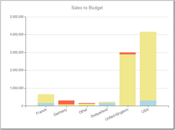
Figure 4-3. Comparing metrics to target values in a chart
If the black and white example from a printed book does not make the point (and you are not reading this in a color e-book) then you can always display the file _SalesToBudget.rdl from the example solution. This way you should get the effect of displaying the sales over budget in one color and the sales under budget in another color.
This approach requires a little work on the source data, as a simple calculation will be required to do the following:
- See if the metric is less than the target, and if so, set the metric to one series, and the shortfall to the second series. This way the two together equal the target figure.
- In the case where the metric is greater than the target, set the first series to equal the target value, and the second series to represent the surplus between the metric and the target.
Moreover, to make it clearer when there is a shortfall and when the target has been exceeded, the source data will include a flag that will indicate the state of the second data series (shortfall or excess) that can then be used to set the color of the category for each data point.
The source SQL not only return the sales and budget figures, but will also apply the business logic that is required to set the chart column colors. You can find this code (wrapped in a stored procedure) in the CarSales_Reports database as Code.pr_WD_CountrySalesToBudgetRatio.
DECLARE @ReportingYear INT = 2015
DECLARE @ReportingMonth TINYINT = 6

IF OBJECT_ID('tempdb..#Tmp_MyData') IS NOT NULL DROP TABLE tempdb..#Tmp_MyData

CREATE TABLE #Tmp_MyData
(
CountryName VARCHAR(50) COLLATE DATABASE_DEFAULT
,Sales MONEY
,Budget MONEY
,SalesChartValue MONEY  -- The first data series
,BudgetChartValue MONEY -- The second data series
,Indicator TINYINT
)

-- Sales Data

INSERT INTO #Tmp_MyData (CountryName, Sales)

SELECT
CASE
WHEN CountryName IN ('France','Germany','Switzerland','United Kingdom','USA') THEN CountryName
ELSE 'Other'
END AS CountryName
,SUM(SalePrice)
FROM      Reports.CarSalesData
WHERE     ReportingYear = @ReportingYear
          AND ReportingMonth <= @ReportingMonth
GROUP BY
CASE
WHEN CountryName IN ('France','Germany','Switzerland','United Kingdom','USA') THEN CountryName
ELSE 'Other'
END

-- Budget Data
;
WITH Budget_CTE
AS
(
SELECT
BudgetDetail AS CountryName
,SUM(BudgetValue) AS BudgetValue

FROM      Reference.Budget

WHERE     Year = @ReportingYear
          AND  Month <= @ReportingMonth
          AND BudgetElement = 'Countries'

GROUP BY  BudgetDetail
)

UPDATE      Tmp
SET         Tmp.Budget = CTE.BudgetValue
FROM        Budget_CTE CTE
            INNER JOIN #Tmp_MyData Tmp
            ON CTE.CountryName = Tmp.CountryName

-- Calculations

UPDATE     #Tmp_MyData

SET        SalesChartValue =
                         CASE
                         WHEN Sales < Budget THEN Sales
                         ELSE Budget
                         END
           ,BudgetChartValue =
                         CASE
                         WHEN Sales < Budget THEN Budget - Sales
                         ELSE Sales - Budget
                         END
           ,Indicator =
                         CASE
                         WHEN Sales < Budget THEN 1
                         ELSE 2
                         END
SELECT CountryName, SalesChartValue, BudgetChartValue, Indicator from #Tmp_MyData
Running this T-SQL gives the output shown in Figure 4-4.

Figure 4-4. Comparing metrics to target values and adding an indicator
How the Code Works
Here you are using a single stored procedure to output all the data that you need for the chart. As the two data series that are used in the chart are calculated, and not taken directly from the source data, you use a temporary table to store the sales and budget data first. Then a simple calculation sets the values of the two data series. You use the indicator value to set the column color: 1 means that you are under budget, 2 means that you are over budget. Note that the SalesChartValue and BudgetChartValue figures are not the raw data for sales and budget.
Let’s see how to apply this data to your chart to get the result you desire. As you just saw many of the essential techniques in some detail in the previous chart, I will be a little more succinct when describing any repeated elements.
- Create a new SSRS report named _SalesToBudget.rdl. Resize the report so that it is sufficiently large to hold a chart. Add the shared data source CarSales_Reports. Name it CarSales_Reports.
- Create a dataset named CountrySalesToBudget. Have it use the CarSales_Reports data source and the stored procedure Code.pr_WD_CountrySalesToBudgetRatio, which you saw earlier.
- Add the following four shared datasets (ensuring that you also use the same name for the dataset in the report): CurrentYear, CurrentMonth, ReportingYear, and ReportingMonth. Set the parameter properties for ReportingYear and ReportingMonth as defined at the start of Chapter 1.
- Add a stacked column chart from the SSRS toolbox and resize it to suit your needs. Attach the dataset CountrySalesToBudget.
- In the Chart Data pane (at the right of the chart), add the SalesChartValue and BudgetChartValue fields as the ∑ values (in this order). Set the CountryName field as the Category Group.
- Right-click the upper segment of any of the columns (or BudgetChartValue in the Chart Data pane) and select Series Properties. Click Fill on the left, and add the following code as the expression for the color:
=Iif(Fields!Indicator.Value=1,"Tomato","Khaki") - Right-click the lower segment of any of the columns (or SalesChartValue in the Chart Data pane) and select Series Properties. Click Fill on the left, and add the following code as the expression for the color:
=Iif(Fields!Indicator.Value=1,"Khaki","LightBlue") - Right-click the horizontal axis and select Horizontal Axis properties. Click Labels on the left, click the Disable Auto Fit radio button, and set the Label angle rotation (degrees) to -25. While in this dialog, set the text and line to dim gray.
- Right-click the vertical axis and select Vertical Axis properties. Set the following properties:
Section
Property
Value
Axis Options
Always include zero
Checked
Labels
Disable auto-fit
Selected
Label rotation angle (degrees)
0
Label Font
Font
Arial
Size
9 point
Color
Dim gray
Number
Category
Number
Decimal places
0
Use 1000 separator
Checked
Major Tick Marks
Hide major tick marks
Unchecked
Position
Outside
Length
1
Line color
Dim gray
Minor Tick Marks
Hide minor tick marks
Checked
Line
Line color
Dim gray
- Add the title text Sales to Budget. Format any other axes and title properties as you think fit.
The key to this chart is in the work done by the source SQL. This code essentially sets the second series to display the over- or underachievement of the sales targets. Then SSRS applies colors to the columns to indicate much more visually whether the target has been attained or undershot.
- The expression simply sets the fill color of the second series depending on whether the target has been exceeded or not.
- The choice of colors for the second series can have an immediate visual effect. Traditionally, red is a negative color in finance, whereas blue is positive. You can, of course, define your own color scheme as long as you explain it to your users.
![]() Note Some graphic artists object strongly to presenting axis elements at an angle, as you have done in the last two examples. I am not saying who is right or wrong, merely showing how it can be done and the effect that it produces. The choice is yours.
Note Some graphic artists object strongly to presenting axis elements at an angle, as you have done in the last two examples. I am not saying who is right or wrong, merely showing how it can be done and the effect that it produces. The choice is yours.
One trick that can help your audience appreciate the essence of a simple data set (and assuming that you are presenting it as a bar, column or even pie chart) is to order the data in the series. This is particularly useful if you are displaying the top or bottom elements in a set, as it makes the hierarchy of data (such as sales, for instance) really stand out. An example of such a chart is shown in Figure 4-5. The data shown is for June 2015 again.

Figure 4-5. Ordering the series in a chart
As this is a simple example, the data is also extremely simple to produce. It uses the following code snippet, which is in the stored procedure Code.pr_MonthlyCarSalesCount, to return the car sales for the year to date:
DECLARE @ReportingYear INT = 2015
DECLARE @ReportingMonth TINYINT = 6

SELECT    Make
          ,COUNT(Make) AS NbSales
FROM      Reports.CarSalesData
WHERE     ReportingYear = @ReportingYear
          AND ReportingMonth <= @ReportingMonth
GROUP BY  Make
This T-SQL returns the output shown in Figure 4-6.

Figure 4-6. Monthly unit sales by make
This simple snippet merely calculates the unit sales for makes of car for the selected month in the chosen year.
This chart requires a few tweaks to be applied to make it look effective, so here is how to build it.
- Create a new SSRS report named _OrderedBarChartOfSales.rdl. Resize the report so that it is sufficiently large to hold a chart. Add the shared data source CarSales_Reports. Name it CarSales_Reports.
- Create a dataset named MonthlyCarSalesCount. Have it use the CarSales_Reports data source and the query Code.pr_MonthlyCarSalesCount, which you created earlier.
- Add the following four shared datasets (ensuring that you also use the same name for the dataset in the report): CurrentYear, CurrentMonth, ReportingYear, and ReportingMonth. Set the parameter properties for ReportingYear and ReportingMonth as defined at the start of Chapter 1.
- Add a bar chart from the SSRS toolbox and resize it to suit your needs. Attach the dataset MonthlyCarSalesCount.
- In the Chart Data pane (at the right of the chart), add the NbSales fields as the ∑ value, and the Make field as the Category Group.
- Right-click Make in the category groups section of the Chart Data pane and select Category group properties in the context menu. Select Sorting on the left, and in the Sort By pop-up, select NbSales instead of Make (which is set by default) as the column to order on, set the Order to A to Z, and click OK.
- Right-click any of the bars and select Series Properties. Click Markers on the left, and set the following attributes:
- Marker type: Diamond
- Maker size: 24 point (or a suitable size relative to the width of the bars and the total dimensions of the chart)
- Marker color: Cornflower blue
- Marker border width: 0.5 point
- Marker border color: Automatic
- Click Fill the left, and set the following attributes:
- Fill style: Gradient
- Color: Cornflower blue
- Secondary color: Light blue
- Gradient style: Horizontal center
- Confirm your settings by clicking OK.
- Click the horizontal axis. Press F4 to display the Properties window (unless it is already visible). Set the following properties:
- Interlaced: True
- InterlacedColor: Whitesmoke
- LineStyle: None
- LabelsColor: Gray
- MajorGridLines Enabled: True
- MajorGridLines LineColor: Gainsboro
- MajorTickMarks Enabled: True
- MajorTickMarks LineColor: Gray
- MajorTickMarks Type: Outside
- LabelsFont FontSize: 6 point
- As a decorative tweak, right-click the vertical axis and select Axis Properties from the context menu. Click Line on the left and set the Line width to 2.5 point and the Line color to gray. Ensure that neither the major nor the minor tick marks are visible.
- Format the axes, add title text (or remove titles as you see fit), and add a chart border. I have broken my own rules here, and placed the vertical axis text in the font Arial Black (and the font color to gray) to draw attention to the vehicle makes.
That is your chart finished. It should look like Figure 4-5.
I have only the following few points to make here:
- Ordering the bars in a chart was as simple as setting the sort order for the Category Group, but it makes the chart considerably easier to read, and makes it immediately clearer which makes sell best. This is, after all, what business intelligence is all about.
- Adding striplines, if they are suitably discreet, can be more readable than gridlines. Be careful, though, to ensure that they enhance the visualization rather than just distract the user. In this example, the striplines are enhanced by the presence of the major gridlines. You can achieve a “softer” effect by hiding the major gridlines.
- Setting a gradient style for the bar can be overkill, as can adding a marker. If you prefer a more sober presentation, go for it. As much as anything I am trying to show that charts need to be varied (and sufficiently different from classic Excel charts as possible) to gain attention.
- I removed the horizontal axis line to emphasize the “horizontal” aspect of the chart. Also, as there are striplines I found a horizontal line on the axis to be a little heavy. You may prefer to keep the line.
Bar charts have been around since charts first appeared on PCs (some readers may even remember them gaining popularity with Lotus 1-2-3). Their sheer ubiquity can have a detrimental effect, because readers are so used to bar charts that they do not make any conscious or unconscious attempt to interpret them.
So you, the BI developer, may need to assist the user. One way to do this is to add a little pizazz to a bar chart so that the differences in the data series stand out more. Superimposing bars and tweaking their respective widths is one way to do this.
As this chart is, as the case with so many BI charts, a comparison of two metrics, you will reuse an existing dataset from earlier in the chapter. This dataset is Code.pr_MonthlyCarSalesWithTarget. You will use it to present another way of using charts to compare sales with targets. An example is given in Figure 4-7. This example also uses the data for June 2015.

Figure 4-7. Superposed bar charts
As the source data for this chart is virtually identical to that used in the previous example, I will not show it here. Feel free to look at it in the CarSales_Reports database if you really want a closer look.
Now that you have seen what you are aiming for, here is how to create it.
- Create a new SSRS report named _MetricAndTargetSuperposed.rdl. Resize the report so that it is sufficiently large to hold a chart. Add the shared data source CarSales_Reports. Name it CarSales_Reports.
- Create a dataset named MonthlyCarSalesWithTarget. Have it use the CarSales_Reports data source and the query Code.pr_MonthlyCarSalesWithTarget, which you created earlier.
- Add the following four shared datasets (ensuring that you also use the same name for the dataset in the report): CurrentYear, CurrentMonth, ReportingYear, and ReportingMonth. Set the parameter properties for ReportingYear and ReportingMonth as defined at the start of Chapter 1.
- Add a 3D Column chart from the SSRS toolbox and resize it to suit your needs. Attach the dataset MonthlyCarSalesWithTarget.
- In the Chart Data pane (at the right of the chart), add the SalesBudget and Sales fields as the ∑ values (in this order), and the Make field as the Category Group.
- Right-click inside the chart area, but not on a column, and choose Chart Area Properties from the context menu. In the 3D Options pane, set the Rotation, Inclination, and Wall Thickness to 0, and the Fill to No Color.
- Click the SalesBudget series in the Chart Data pane. Press F4 to display the Properties window (unless it is already visible). Expand CustomAttributes and set thePointWidth to 0.7.
- In the Properties window, set the Color to Gold.
- Click the Sales series in the Chart Data pane. Set the Color to cornflower blue. Set the BorderColor to No Color.
- Expand CustomAttributes and set the following:
- PointWidth to 0.3
- DrawingStyle to Cylinder
- Right-click the Sales series (in either the Chart Data pane or the series itself in the chart area), and choose Series Properties from the context menu.
- Click Markers on the left and set the following:
- MarkerType to Diamond
- MarkerSize to 10 point
- MarkerColor to Blue
- Click OK.
- Hide or delete the Axis and Chart titles, and configure the chart border and axis attributes as described at the start of this chapter.
- Right-click the vertical axis, select Vertical Axis Properties from the context menu, and enter 250000 as the Interval. Set the number format of the vertical axis to the following custom format: #,0," K";(#,0," K"). While you are setting vertical axis properties, disable auto fit for the labels and set the font size to 7 point.
- Right-click the legend and select Legend Properties from the context menu. In the General tab, uncheck Show legend outside chart area.
- Right-click any of the horizontal gridlines and select Major Gridline Properties from the context menu. Set the Line style to None.
- Right-click the horizontal axis, select Horizontal Axis Properties from the context menu, and click Major tick marks on the left. Check the Hide major tick marks box.
That is all that you need to do to create the chart.
You may have a couple of questions as to why you carried out some of the steps in this process. I am not suggesting that all of the aesthetic choices are necessary, but I took the opportunity to add some further effects to your SSRS BI armory. Anyway, the points I want to make are the following:
- Placing the legend inside the chart gains valuable space on the right of the chart. Of course, depending on your actual data, this may or may not prove possible, and you could have to place the legend elsewhere inside the chart.
- Removing the horizontal gridlines is purely to declutter the chart and remove a visual distraction.
- Tweaking the vertical axis interval is simply to obtain a balanced interval on the axis, and to prevent SSRS from creating too few intervals.
- You cannot use gradients in 3D charts, and this chart is technically a 3D chart. This is why you used CustomAttributes/DrawingStyle: Cylinder instead.
- Adding a marker is purely decorative because in this case I wanted to draw attention to the sales series. You may prefer not to add a marker.
You are free to disagree with these choices, and to reinstate or alter any elements that you choose.
This chart could potentially be extended in a couple of ways.
- You may want to sort the horizontal axis to leave the Other category at the right. This can be done by adding a SortOrder column to the source data that you use to sort the axis.
- Creating “bucket” categories for charts (as you did frequently with gauges in the previous chapter) can be an excellent way of reducing visual clutter by grouping les important metrics in a single element. I find it easiest to hard-code this in the T-SQL.
Much business intelligence consists of comparing values and being alerted to anomalies. One chart type that lends itself easily to this kind of analysis is a radar chart. This kind of chart is great when you have a few (say between four and eight) data points that are on the same scale. It is instantly evident if any data point varies compared to the others.
As it is easier to understand the techniques if you can visualize the result, an example of a radar chart is shown in Figure 4-8. What is important to remember is that each data point is essentially a percentage (so that disparate figures have been reduced to a similar scale). In this case, the percentage is the over- or under-shoot compared to the budget.
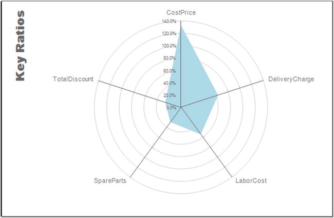
Figure 4-8. A radar chart
For this example, the data is also extremely simple to produce. It uses the following code snippet, which is in the stored procedure Code.pr_WD_RatioAnalysis, to return the car sales for the year to date (June 2015 in this example):
DECLARE @ReportingYear INT = 2015
DECLARE @ReportingMonth TINYINT = 6

SELECT
((1/(SELECT BudgetValue FROM Reference.Budget WHERE [Year] = @ReportingYear AND BudgetElement = 'KeyRatio' AND BudgetDetail = 'CostPrice')) * SUM(CostPrice)) / SUM(SalePrice) AS Ratio, 'CostPrice' AS RatioName
FROM   Reports.CarSalesData
WHERE  ReportingYear = @ReportingYear
       AND ReportingMonth <= @ReportingMonth
UNION
SELECT
((1/(SELECT BudgetValue FROM Reference.Budget WHERE [Year] = @ReportingYear AND BudgetElement = 'KeyRatio' AND BudgetDetail = 'TotalDiscount')) * SUM(TotalDiscount)) / SUM(SalePrice), 'TotalDiscount'
FROM   Reports.CarSalesData
WHERE  ReportingYear = @ReportingYear
       AND ReportingMonth <= @ReportingMonth
UNION
SELECT
((1/(SELECT BudgetValue FROM Reference.Budget WHERE [Year] = @ReportingYear AND BudgetElement = 'KeyRatio' AND BudgetDetail = 'DeliveryCharge')) * SUM(DeliveryCharge)) / SUM(SalePrice), 'DeliveryCharge'
FROM   Reports.CarSalesData
WHERE  ReportingYear = @ReportingYear
       AND ReportingMonth <= @ReportingMonth
UNION
SELECT
((1/(SELECT BudgetValue FROM Reference.Budget WHERE [Year] = @ReportingYear AND BudgetElement = 'KeyRatio' AND BudgetDetail = 'LabourCost')) * SUM(LaborCost)) / SUM(SalePrice), 'LaborCost'
FROM   Reports.CarSalesData
WHERE  ReportingYear = @ReportingYear
       AND ReportingMonth <= @ReportingMonth
UNION
SELECT
((1/(SELECT BudgetValue FROM Reference.Budget WHERE [Year] = @ReportingYear AND BudgetElement = 'KeyRatio' AND BudgetDetail = 'SpareParts')) * SUM(SpareParts)) / SUM(SalePrice), 'SpareParts'
FROM   Reports.CarSalesData
WHERE  ReportingYear = @ReportingYear
       AND ReportingMonth <= @ReportingMonth
This T-SQL returns the data shown in Figure 4-9.
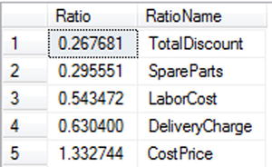
Figure 4-9. Key ratios expressed as a percentage of target
This chart requires five different sales metrics to be returned from the CarSalesData view and then expressed as a percentage of the corresponding budgetary figure. In this case, I preferred (for no real reason other than to show that it is possible) to use UNION statements to assemble the data set.
Now that you have your source data, you can build the chart to display it.
- Create a new SSRS report named _RatioAnalysis.rdl. Resize the report so that it is sufficiently large to hold a radar chart. Add the shared data source CarSales_Reports. Ensure that its name in the report is CarSales_Reports.
- Create a dataset named RatioAnalysis. Have it use the CarSales_Reports data source and the stored procedure Code.pr_WD_RatioAnalysis, which you saw earlier.
- Add the following four shared datasets (ensuring that you also use the same name for the dataset in the report): CurrentYear, CurrentMonth, ReportingYear, and ReportingMonth. Set the parameter properties for ReportingYear and ReportingMonth as defined at the start of Chapter 1.
- Add a radar chart from the SSRS toolbox (it is at the bottom with the polar charts) and resize it to suit your needs. Attach the dataset RatioAnalysis.
- In the Chart Data pane (at the right of the chart), add the Ratio field as the ∑ values, and the RatioName field as the Category Group.
- Delete the legend and hide the two axis titles.
- Right-click the radial axis (the vertical one with the figures) and select Radial Axis Properties from the context menu. Select Disable auto-fit in the Labels pane. Set the Label Font to Arial Narrow, 7 point in gray. Set the Number Format to Percentage with one decimal place. Set the Line Color for both the Line and the Major Tick Marks (with Position: Outside and Length: 1) to light gray. Ensure that the minor tick marks are hidden.
- Right-click one of the concentric circles and select Major Gridline Properties from the context menu. Set the Line Color to light gray.
- Right-click the data series (the colored shape in the chart) and select Series Properties from the context menu. Select Fill on the left and set the Color to light blue.
- Right-click the chart title and select Title Properties from the context menu. Set the Title Text to Key Properties, the font to Arial Black 14 point gray, and (in the General pane) click the top left hand vertical button for the Title Position.
- Select the chart area and display the Properties window. Click the ellipses to the right of the Category Axes property. The ChartAxisCollection editor dialog will appear. Select Primary on the left and set the color to gray. Expand the LabelsFont property and the font size to 8 point. Confirm the warning about labels autofit being disabled, then click OK.
The main point to note for this chart is that this is a classic example of a chart where most of the work is done when preparing the data. If the data is right, then creating the chart is a piece of cake. As you require an output table of five elements, the easiest way to deliver this is using a UNION query where each record is customized to return the required ratio.
Here are two hints for this example.
- Striplines can also be extremely effective in radar charts.
- Vertical titles can help you save a lot of space that can be used efficiently to make the chart clearer. As ever, however, they should be used discreetly.
Bubble charts seem to be in vogue at the moment. This is probably because, if properly constructed, they can display four data series and how they relate to each other. An example of such a chart is shown in Figure 4-10. This chart displays sales and profit by make of car by age range. One data series displays the make on the X (horizontal) axis. The second data series shows how (on the Y or vertical axis) the sales relate to the age of the car. The third data series shows the bubble size for each intersection of sales and age range. Finally, the fourth data series (the color) indicates the percentage profit.
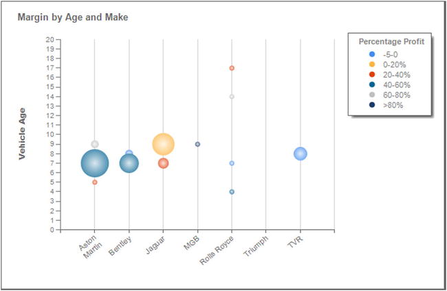
Figure 4-10. A bubble chart
The data for this chart is produced by the following code snippet, which is in the stored procedure Code.pr_WD_MarginByAgeAndMake. The values returned are used as follows:
- Make, Category Group: Horizontal axis
- VehicleAge, Y Value: Vertical axis
- NbSales, Size: Bubble size
- Percentage Profit, Series Groups: Legend
The code for this chart (for June 2015) is
DECLARE @ReportingYear INT = 2015
DECLARE @ReportingMonth TINYINT = 6

SELECT
 Make
,COUNT(SalePrice) AS NbSales
,CASE
WHEN (SUM(SalePrice) - (SUM(CostPrice) + SUM(TotalDiscount) + SUM(DeliveryCharge) + SUM(SpareParts) + SUM(LaborCost))) / SUM(SalePrice) BETWEEN -5 AND 0 THEN '-5-0'
WHEN (SUM(SalePrice) - (SUM(CostPrice) + SUM(TotalDiscount) + SUM(DeliveryCharge) + SUM(SpareParts) + SUM(LaborCost))) / SUM(SalePrice) BETWEEN 0 AND 0.2 THEN '0-20%'
WHEN (SUM(SalePrice) - (SUM(CostPrice) + SUM(TotalDiscount) + SUM(DeliveryCharge) + SUM(SpareParts) + SUM(LaborCost))) / SUM(SalePrice) BETWEEN 0.2 AND 0.4 THEN '20-40%'
WHEN (SUM(SalePrice) - (SUM(CostPrice) + SUM(TotalDiscount) + SUM(DeliveryCharge) + SUM(SpareParts) + SUM(LaborCost))) / SUM(SalePrice) BETWEEN 0.4 AND 0.6 THEN '40-60%'
WHEN (SUM(SalePrice) - (SUM(CostPrice) + SUM(TotalDiscount) + SUM(DeliveryCharge) + SUM(SpareParts) + SUM(LaborCost))) / SUM(SalePrice) BETWEEN 0.6 AND 0.8 THEN '60-80%'
ELSE '>80%'
END AS PercentageProfit
,CASE
WHEN (SUM(SalePrice) - (SUM(CostPrice) + SUM(TotalDiscount) + SUM(DeliveryCharge) + SUM(SpareParts) + SUM(LaborCost))) / SUM(SalePrice) BETWEEN -5 AND 0 THEN 1
WHEN (SUM(SalePrice) - (SUM(CostPrice) + SUM(TotalDiscount) + SUM(DeliveryCharge) + SUM(SpareParts) + SUM(LaborCost))) / SUM(SalePrice) BETWEEN 0 AND 0.2 THEN 2
WHEN (SUM(SalePrice) - (SUM(CostPrice) + SUM(TotalDiscount) + SUM(DeliveryCharge) + SUM(SpareParts) + SUM(LaborCost))) / SUM(SalePrice) BETWEEN 0.2 AND 0.4 THEN 3
WHEN (SUM(SalePrice) - (SUM(CostPrice) + SUM(TotalDiscount) + SUM(DeliveryCharge) + SUM(SpareParts) + SUM(LaborCost))) / SUM(SalePrice) BETWEEN 0.4 AND 0.6 THEN 4
WHEN (SUM(SalePrice) - (SUM(CostPrice) + SUM(TotalDiscount) + SUM(DeliveryCharge) + SUM(SpareParts) + SUM(LaborCost))) / SUM(SalePrice) BETWEEN 0.6 AND 0.8 THEN 5
ELSE 6
END AS ProfitOrder
,DATEDIFF(yy, Registration_Date, GETDATE()) AS VehicleAge

FROM      Reports.CarSalesData
WHERE     ReportingYear = @ReportingYear
          AND ReportingMonth <= @ReportingMonth
GROUP BY  Make, DATEDIFF(yy, Registration_Date, GETDATE())
ORDER BY  Make
This T-SQL returns several rows of data, a few of which are displayed in Figure 4-11.

Figure 4-11. The data for a bubble chart
How the Code Works
Here the data is the count of the number of sales for the selected year up to and including the selected month. However, the code groups the number of sales per make according the whole number of years representing the age of the car. It then calculates the percentage profit of each age range using a hard-coded setting to produce five profit ranges.
The data may seem more complex than it really is. All that the CASE statements do is to calculate profit in discreet ranges to avoid a plethora of different values, and then add a sort order from smallest to largest, which is used by the legend to provide visual coherence by ordering the ranges from smallest to largest, rather than in alphabetical order.
Now that you have your source data you can build the chart to display it.
- Create a new SSRS report named _BubbleChartMarginByAgeAndMake.rdl. Resize the report so that it is sufficiently large to hold a largish chart. Add the shared data source CarSales_Reports. Ensure that its name in the report is CarSales_Reports.
- Create a dataset named MarginByAgeAndMake. Have it use the CarSales_Reports data source and the query MarginByAgeAndMake, whose code is shown above.
- Add the following four shared datasets (ensuring that you also use the same name for the dataset in the report): CurrentYear, CurrentMonth, ReportingYear, and ReportingMonth. Set the parameter properties for ReportingYear and ReportingMonth as defined at the start of Chapter 1.
- Add a 3D bubble chart from the SSRS toolbox (it is at the bottom with the scatter charts) and resize it to suit your needs. Attach the dataset MarginByAgeAndMake as the data source.
- Right-click inside the chart area, but not on a column, and choose Chart Area Properties from the context menu. In the 3D Options pane, set the Rotation, Inclination, and Wall Thickness to 0. Select Fill and set the Fill style to Solid and the Color to No Color.
- In the Chart Data pane (at the right of the chart), add the VehicleAge field as the ∑ values. Do not worry about for the moment about the “extra” fields Size and X Value that appear.
- Add the Make field as the Category Group, and PercentageProfit as the Series Group.
- Right-click VehicleAge in the Chart Data pane and select Series Properties from the context menu. Set the properties shown below. This will alter the fields that are shown in the Chart Data pane.
Section
Property
Value
Series Data
Bubble Size
[Sum(NbSales)]
Category Field
[Make]
Markers
Marker Type
Circle
Marker Size
30 point
Marker Color
Automatic
- Hide the horizontal axis title.
- Right-click the vertical axis and select Vertical Axis Properties from the context menu. Set the Label font to Arial Bold 9 point gray.
- Right-click the title and select Title Properties from the context menu. Set the font to Arial Bold 10 point gray. Set the Title Text to Margin by Age and Make, and in the General pane, the Title Position to top left (the left-hand button of the top row).
- Right-click any of the bubbles (or on either of the ∑ values in the Chart Data pane) and choose Series Properties from the context menu. Select Markers to the left, and set the Marker Size to 30 point.
- Right-click the legend and select Legend Properties from the context menu. Add a border (in light gray) and set the font to Arial Narrow 9 point gray. Ensure (in the General pane) that the legend is on the upper right and is set to Tall Table.
- Right-click the Series Group (PercentageProfit) in the Chart Data and select Series Group properties from the context menu. Select Sorting on the left, and select ProfitOrder from the Sort By pop-up list instead of PercentageProfit, and click OK.
You can now preview your bubble chart. If all has gone well, it will look like Figure 4-10, above.
I have only a three short points to make about what you have done here.
- Setting the marker size only affects the size of the points in the legend. Indeed, the actual size of the marker is largely irrelevant. However, if you leave it at the default, you will produce circles in the legend that are too small to identify clearly.
- One again, you do not have to adopt all of the stylistic modifications that I am suggesting here. They are outlined so that you know how to find them should you want to create your own style or add a house style.
- You applied a custom sort order to the series group so that the legend would be easier to read. Without this the legend, elements would start with >80% and show -5-0 next to last.
Waterfall Charts
A waterfall chart is perfect when you need to isolate the various data elements that make up a whole, such as the determination of profit for a sale, for instance. A waterfall chart will only display one data series, essentially, but you can display multiple waterfall charts in a multiple-chart structure if you need to compare and contrast several elements.
An example of a set of waterfall charts is shown in Figure 4-12, using the data for June 2015. In the example, you will only be creating a single chart, but the source data allows you subsequently to alter the filter on the chart to use it as part of a composite visualization.
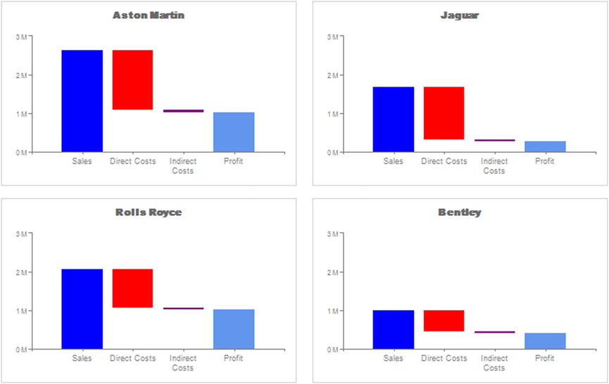
Figure 4-12. A waterfall chart
The code for this dataset can be found in the stored procedure Code.pr_WaterfallChartOfProfitByMake in the CarSales_Reports database. It is as follows (for June 2015 again; a pattern is emerging here):
DECLARE @ReportingYear INT = 2015
DECLARE @ReportingMonth TINYINT = 6
DECLARE @MaxValUE BIGINT

;
WITH Mx_CTE
AS
(
     SELECT
     Code.fn_ScaleSparse(MAX(SalePrice)) AS MaxValue
     FROM
          (
          SELECT    SUM(SalePrice) AS SalePrice, Make
          FROM      Reports.CarSalesData
          WHERE     Make IN ('Rolls Royce', 'Jaguar', 'Aston Martin', 'Bentley')
                    AND ReportingYear = @ReportingYear
                    AND ReportingMonth <= @ReportingMonth
          GROUP BY  Make
          ) Mx
)

SELECT @MaxValue = MaxValue FROM Mx_CTE

SELECT
Make
,Sum(SalePrice) AS Result
,'Sales' AS Element
,1 AS SortOrder
,'Blue' AS ColumnColor
,'Lower' AS ChartElement
,@MaxValue AS MaxValue
FROM        Reports.CarSalesData
WHERE       Make IN ('Rolls Royce', 'Jaguar', 'Aston Martin', 'Bentley')
            AND ReportingYear = @ReportingYear
            AND ReportingMonth <= @ReportingMonth
GROUP BY    Make
UNION
SELECT
Make
,Sum(CostPrice) + SUM(TotalDiscount) AS Result
,'Direct Costs' AS Element
,2 AS SortOrder
,'Red' AS ColumnColor
,'Upper' AS ChartElement
,@MaxValue AS MaxValue
FROM        Reports.CarSalesData
WHERE       Make IN ('Rolls Royce', 'Jaguar', 'Aston Martin', 'Bentley')
            AND ReportingYear = @ReportingYear
            AND ReportingMonth <= @ReportingMonth
GROUP BY    Make
UNION
SELECT
Make
,Sum(SalePrice) - (Sum(CostPrice) + SUM(TotalDiscount)) AS Result
,'Direct Costs' AS Element
,2 AS SortOrder
,'white' AS ColumnColor
,'Lower' AS ChartElement
,@MaxValue AS MaxValue
FROM        Reports.CarSalesData
WHERE       Make IN ('Rolls Royce', 'Jaguar', 'Aston Martin', 'Bentley')
            AND ReportingYear = @ReportingYear
            AND ReportingMonth <= @ReportingMonth
GROUP BY    Make
UNION
SELECT
Make
,Sum(DeliveryCharge) + SUM(SpareParts) + SUM(LaborCost) AS Result
,'Indirect Costs' AS Element
,3 AS SortOrder
,'Purple' AS ColumnColor
,'Upper' AS ChartElement
,@MaxValue AS MaxValue
FROM        Reports.CarSalesData
WHERE       Make IN ('Rolls Royce', 'Jaguar', 'Aston Martin', 'Bentley')
            AND ReportingYear = @ReportingYear
            AND ReportingMonth <= @ReportingMonth
GROUP BY    Make
UNION
SELECT
Make
,(Sum(SalePrice) - (Sum(CostPrice) + SUM(TotalDiscount))) - (Sum(DeliveryCharge) + SUM(SpareParts) + SUM(LaborCost)) AS Result
,'Indirect Costs' AS Element
,3 AS SortOrder
,'White' AS ColumnColor
,'Lower' AS ChartElement
,@MaxValue AS MaxValue
FROM        Reports.CarSalesData
WHERE       Make IN ('Rolls Royce', 'Jaguar', 'Aston Martin', 'Bentley')
            AND ReportingYear = @ReportingYear
            AND ReportingMonth <= @ReportingMonth
GROUP BY    Make
UNION
SELECT
Make
,Sum(SalePrice) - (Sum(CostPrice) + SUM(TotalDiscount) + Sum(DeliveryCharge) + SUM(SpareParts) + SUM(LaborCost)) AS Result
,'Profit' AS Element
,4 AS SortOrder
,'CornflowerBlue' AS ColumnColor
,'Lower' AS ChartElement
,@MaxValue AS MaxValue
FROM        Reports.CarSalesData
WHERE       Make IN ('Rolls Royce', 'Jaguar', 'Aston Martin', 'Bentley')
            AND ReportingYear = @ReportingYear
            AND ReportingMonth <= @ReportingMonth
GROUP BY    Make
This T-SQL returns many rows of data. Figure 4-13 shows the data for one make of vehicle.

Figure 4-13. The data for a waterfall chart
This type of chart does not take its data directly from a data source, but needs to apply a little logic first. The arithmetic is not difficult (it is essentially a series of accounting operations) but it requires two records for each column:
- One series for the lower section of the column
- One series for the upper section of the column
The two series are defined in the ChartElement column and are hard-coded. Equally, and to show that it can be done, the color for the series is hard-coded in the T-SQL. To finish, a manually-defined sort order is added. This will be used to present the columns in the correct sequence on the horizontal axis.
This code could be extended, if you wish, to set the colors as variables or as data sourced from another table.
Now that you have your source data, you can build the waterfall chart to display it.
- Create a new SSRS report named _WaterfallChartOfProfitByMake.rdl. Resize the report so that it is sufficiently large to hold a largish chart. Add the shared data source CarSales_Reports. Ensure that its name in the report is CarSales_Reports.
- Create a dataset named WaterfallChartOfProfitByMake. Have it use the CarSales_Reports data source and the query Code.pr_WaterfallChartOfProfitByMake, which you created earlier.
- Add the following four shared datasets (ensuring that you also use the same name for the dataset in the report): CurrentYear, CurrentMonth, ReportingYear, and ReportingMonth. Set the parameter properties for ReportingYear and ReportingMonth as defined at the start of Chapter 1.
- Add a Stacked Column chart from the SSRS and resize it a little, making it smaller than the charts that you have created so far in this chapter. Attach the dataset WaterfallChartOfProfitByMake as the data source.
- Right-click the chart (not on any elements of the chart) and select Chart Properties from the context menu. Click Filters on the left and then click Add to add a filter. Set the filter to Make = Aston Martin.
- In the Chart Data pane (at the right of the chart), add the Result field as the ∑ values. Add the Element field as the Category Group, and ChartElement as the Series Group.
- Right-click the Element field in the Category Groups area of the Chart Data pane and select Category Group Properties from the context menu. Click Sorting on the left and then select SortOrder from the Sort By pop-up (instead of Element) and click OK.
- Right-click one of the columns and select Series Properties from the context menu. Click Fill on the left, and then the expression (Fx) button for the Color. Enter the following expression:
=Fields!ColumnColor.Value - Click OK to return to the Series Properties dialog and then click OK again.
- Hide the two axis titles and delete the legend.
- Set the chart title to 12 point Arial Black in gray. Place the title at the top center of the chart. In the General pane of the Title Properties dialog, click the expression (Fx) button for the title. Enter the following expression:
=Fields!Make.Value - Confirm your modifications to the title with OK.
- Right-click one of the horizontal gridlines and uncheck Show Gridlines.
- Format the vertical and horizontal axes as described for previous charts, or indeed in any way that you prefer.
- Apply the following number format to the vertical axis: #,0.0,," M";(#,0.0,," M"). In the Axis Options pane of the vertical axis properties dialog, set the Interval to 1000000. Click the expression (Fx) button for the Maximum and enter the following expression:
=Fields!MaxValue.Value - Make three copies of the chart and organize the charts into a 2 x 2 matrix.
- Set the filters for the copied charts respectively to Jaguar, Rolls Royce, and Bentley.
You should now have an initial waterfall chart that shows how the final profit figure for a make of car is computed.
This chart uses the two data series that were calculated in the T-SQL to produce the waterfall effect. The trick is to set the lower series to appear transparent for the final three columns. This is done by applying the same color as the chart background.
This group of charts really needs to be used as a set. This is why the maximum value is calculated using a CTE and not left to SSRS to decide. This way the same maximum figure is applied to each of the charts. Doing this allows sales for different makes to be compared without multiple vertical scales distorting the picture and making comparison difficult.
The final trick is to force the order of the horizontal axis, again using a hard-coded value set in the source SQL.
Here are several tips for this example.
- You can use a separate dataset to return maximum value for vertical axis if you prefer, as was the case in previous examples.
- The rounding function (fn_ScaleSparse) is one of the three helper functions explained in Chapter 1.
- You can, when setting the reference to database fields, click Fields on the left of the Expression dialog and then double-click the field that you want to add to the expression.
- In this example, you set the vertical axis maximum value to be the same for all the charts. This allows the user to compare the metrics across the different makes.
Sometimes a chart itself is extremely simple. Its value, however, is drawn from the fact that it allows multiple elements to be compared. This is where trellis charts (also known as lattice charts) can be useful.
A trellis chart in SSRS is simply a table that holds a matrix of charts. They are usually between two and four rows and two and five columns. Each chart in the matrix is a copy of the same chart, filtered to display a different record from the source data.
For this type of chart, creating the source data is the easy part (though, as ever, this is important). Most of the attention is spent setting up the table that will hold the multiple charts. It is worth noting that the charts that you use really must be simple, or their density will make the information unreadable, and consequently invalidate the whole purpose of the chart. An example of a trellis chart is shown in Figure 4-14.

Figure 4-14. A trellis chart
The data for this chart is produced by the following code snippet, which is in the stored procedure Code.pr_Trellis:
DECLARE @ReportingYear INT = 2015

SELECT
ReportingMonth
,SUM(TotalDiscount) AS TotalDiscount
,SUM(DeliveryCharge) AS DeliveryCharge
,SUM(SpareParts) AS SpareParts
,SUM(LaborCost) AS LaborCost
FROM        Reports.CarSalesData
WHERE       ReportingYear = @ReportingYear
GROUP BY    ReportingMonth
This T-SQL returns twelve rows of data, one for each month, as shown in Figure 4-15.
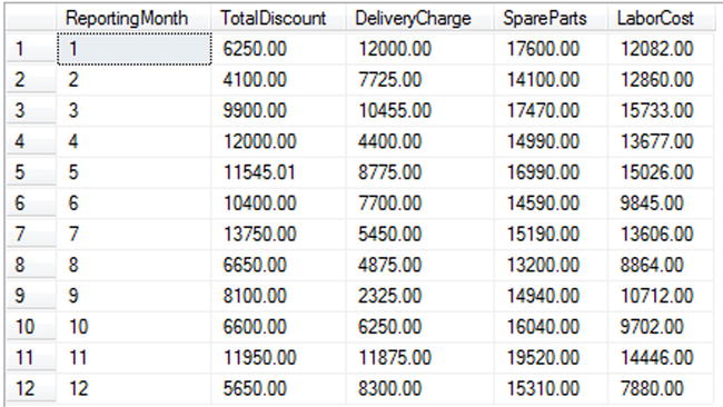
Figure 4-15. The data for a trellis chart of costs per month
How the Code Works
You have, for once, a code snippet that is mercifully easy to understand. It aggregates a set of metrics from a source view and groups them by month for the selected year.
So, armed with your source data, you can create the trellis chart.
- Create a new SSRS report named _TrellisChartCostsPerMonth.rdl. Resize the report so that it is sufficiently large to hold a large trellis chart. Add the shared data source CarSales_Reports. Name it CarSales_Reports.
- Create a dataset named Trellis. Have it use the CarSales_Reports data source and the stored procedure Code.pr_Trellis (which you saw earlier).
- Add the following two shared datasets (ensuring that you also use the same name for the dataset in the report): CurrentYear and ReportingYear. Set the parameter properties for ReportingYear as defined at the start of Chapter 1.
- Add a second, embedded dataset named Dummy that contains the following SQL code: SELECT ''.
- Add a table to the report. Right-click to the left of the data row on the row selector (the grey box), and select Insert Row Outside Group - Below. Do this a total of three times.
- Delete the data row and header row. Your table should only have the three rows that you inserted in the previous step.
- Add a fourth column to the table.
- Set the table’s dataset to Trellis.
- Set the width of a textbox in each of the three rows to 1.5 inches. Set the height of a textbox in each of the columns to 1.5 inches. This will set all the textboxes to 1.5 inches square.
- Drag a chart from the toolbox into any of the textboxes in the table and choose the Donut chart type.
- Right-click in the chart on the legend and select Delete Legend from the context menu.
- In the Chart Data pane (which should have appeared; if not, click to display it) add the values of TotalDiscount, DeliveryCharge, SpareParts, and LaborCost. Remove the Category Group.
- In the Chart Properties window, set the Palette to Custom.
- In the Chart Properties window, click the ellipses to the right of the CustomPaletteColors property. In the ChartColor Collection Editor dialog, add four members and set their colors to Aqua, Gold, Lime, and Tan.
- Set the chart title font to Arial Narrow 7 point gray.
- Right-click the chart and select Chart Properties. Select Filter on the left, and click Add. Set the Expression to ReportingMonth = 1.
- Copy the chart to the 11 other text boxes in the table.
- Type in the month name for each chart as shown previously in Figure 4-14.
- Set the filter for each chart to correspond to the month number of the month that the chart represents.
This creates the trellis chart. However, it is missing a legend. This is something that you will learn in Chapter 7.
The key to a successful trellis chart is a clean table structure from the outset. Once you have created a table with the required number of columns and rows, everything else is a copy-and-paste operation once the initial chart has been created.
Once again, as so often with multiple charts and gauges, getting the initial chart right is key. Otherwise, you will be deleting and re-copying and re-pasting over and over again as you make and reapply changes multiple times.
Keep these hints and tips in mind for this example.
- The reason that you defined a custom palette is that the order of palette colors corresponds to the order of the series in the Chart Data pane. This makes it easy to know which color corresponds to which series. Consequently, if you alter the series order, you will have to adjust the colors in the custom legend. This is explained in Chapter 7.
- This chart compares the months in a year, so the source data does not need the month as a parameter.
- You may find it useful to create a set of empty preconfigured tables that you can use to hold trellis charts (and other composite visualizations) in your BI presentations.
As mentioned, one problem that you as a BI developer will face is avoiding the repetition of constantly used chart types. To avoid “chart fatigue” on the part of your users, you should vary chart types if only to waken your public from their slumbers.
Given the general consensus against using pie charts in BI, one alternative is to use pyramid charts. An example of a pyramid chart is shown in Figure 4-16.
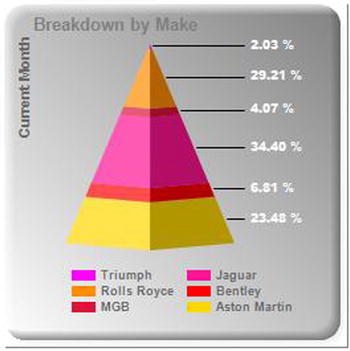
Figure 4-16. A pyramid chart
This chart simply shows sales for a selected month (June 2015) by make. It has the added advantage of sorting the makes by sales amount and making the relative percentages clear.
The data for this chart is produced by the following code snippet, which is in the stored procedure Code.pr_WD_PyramidSales_Simple:
DECLARE @ReportingYear INT = 2015
DECLARE @ReportingMonth TINYINT = 6
IF OBJECT_ID('tempdb..#Tmp_Output') IS NOT NULL DROP TABLE tempdb..#Tmp_Output

CREATE TABLE #Tmp_Output (ChartType VARCHAR(25) COLLATE DATABASE_DEFAULT, Make VARCHAR(25) COLLATE DATABASE_DEFAULT, Sales NUMERIC(18,6))

INSERT INTO #Tmp_Output (ChartType, Make, Sales)

SELECT
'MonthlySales'
,Make
,SUM(SalePrice) AS Sales
FROM       Reports.CarSalesData
WHERE      ReportingYear = @ReportingYear
           AND ReportingMonth = @ReportingMonth
GROUP BY   Make

SELECT     * FROM #Tmp_Output
This T-SQL returns six rows of data, one for each make of car, as shown in Figure 4-17. The ChartType field is not used yet, but you will see it in action in Chapter 7.
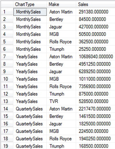
Figure 4-17. The data for a trellis chart of costs per month
You have, once again, a code snippet that is mercifully easy to understand. It returns the total sales from a source view for a selected month and year.
Now that you have the data, you can create the pyramid chart.
- Create a new SSRS report named _PyramidSales_Single.rdl. Resize the report so that it is sufficiently large to hold a large trellis chart. Add the shared data source CarSales_Reports. Name it CarSales_Reports.
- Create a dataset named PyramidSales. Have it use the CarSales_Reports data source and the stored procedure Code.pr_WD_PyramidSales_Simple (which you saw earlier).
- Add the following two shared datasets (ensuring that you also use the same name for the dataset in the report): CurrentYear and ReportingYear. Set the parameter properties for ReportingYear as defined at the start of Chapter 1.
- Drag a chart from the toolbox on to the report area. Select 3-D Pyramid as the chart type.
- Set PyramidSales as the dataset, Sales as the ∑ Values, and Make as the Category Groups.
- Right-click the chart area and select Chart Properties. Set the following properties:
Section
Property
Value
Fill
Fill style
Gradient
Color
Dim gray
Secondary color
White
Gradient style
Diagonal right
Border
Border type
Raised
- Select the legend, and in the Properties pane set the following properties:
Property
Value
Position
Bottom center
Font
Arial 7 point bold
Color
Dim gray
Layout
Wide table
- Select the chart title and set the following properties in the Properties pane:
Property
Value
Caption
Breakdown by Make
Color
Gray
Custom Position
Enabled
Height: 7.97
Left: 7.07
Top: 2
Width: 80
Font
Arial 8 point bold
- Right-click inside the chart and select Add New Title from the context menu. Select the new title and set the following properties in the Properties pane:
Property
Value
Caption
Current Month
Color
Dim gray
DockOffset
-4
Position
LeftTop
Font
Arial 7 point bold
- Right-click the pyramid chart and select Add Data Labels from the context menu.
- Right-click one of the data labels and select Series Label Properties. Set the following properties:
Section
Property
Value
General
Label data
#PERCENT
Font
Font
Arial Black
Size
7 point
Color
White
Number
Category
Percentage
Decimal places
2
That is it. You now have a stylish pyramid chart to display sales per make for a specific month.
Setting up a pyramid chart is really very easy, so this one was spiced up with a few stylistic points. Firstly, the titles were tweaked to be positioned closer to the chart area edges than is the default. This automatically lets the chart grow and take up a relatively larger amount of the available space. Then you set the legend so that it does not occupy too much space either, which lets the chart itself grow even more.
A Few Ideas on Using Charts for Business Intelligence
In this chapter, you saw only a very few of the ways that charts can be used to deliver your business intelligence with SSRS. There are many other possibilities, some traditional, some more adventurous, that you can also apply. The trick is to use charts effectively, without trying to impress by using exaggerated stylistic effects, and also without underwhelming the audience through delivering chart types and styles that they have seen too many times before.
So instead of detailing all the potential application of charts, I want to present a few tips on effective BI chart use. This is not a definitive guideline, nor a list of rules to be followed blindly. They are just some ideas that I have applied over time, and that you may find useful.
BI dashboards rarely have the space, and their readers even more rarely the attention span, for complex or even large charts. So a first principle is to reduce the number of elements in a chart so that it is readable. Another idea is to accentuate the information that really matters, so consider using greys for text unless you need to stress something. Then you can put in black the text that needs the audience’s attention. This is better than using large or bold text to attract the reader’s attention: you gain space and avoid multiple confusing and conflicting text styles in a tiny visualization. You could use pastel colors for the less important chart elements, and a primary color for a bar, line, or column that you need your audience to focus on.
I always advise simple chart design in BI reports. This can mean avoiding the temptations of 3-D charts. These are essentially a matter of taste, but they can distract from the information being displayed, and they take up more space to deliver the same information.
Use Multiple Charts of the Same Type
If you have a dense amount of information to deliver, consider creating multiple charts with few data series rather than a single chart with multiple data series. As you will see in Chapter 8, there are ways to add interactivity to an SSRS BI report. Consequently, you can switch between multiple charts on the same report if you do not have the space for several charts to be displayed at once.
Titles take up space. If space is at a premium, see if you can avoid them. This is not always possible, but if you can reduce the size of titles, or even remove them, then do so. As you saw earlier, you can always rotate titles on axes to save space, and you can also set titles to be vertical or pivoted, all of which can save space. These tweaks can add to development time, but the result is nearly always worth it.
If your chart does not need a legend, remove it. The same logic applies to most chart elements. Think about the chart as a whole, and remember that in most cases “less is more.”
If you are afraid of your readers not reacting to the information on a dashboard because the chart type is too classic (once again, possibly because it is one of the overused Excel standard chart types), then consider varying a basic chart type. A few possibilities are given in Table 4-1, though the final choice will inevitably depend on the data and the effect that you want to create.
Table 4-1. Chart Variations
Classic Chart | Alternative |
|---|---|
Pie | Donut Pyramid |
Bar | Horizontal Cylinder |
Column | Cylinder |
Line | Radar |
Conclusion
In this chapter, you saw a few ideas on ways to produce charts that suit the more specific requirements of business intelligence reports. These ideas are not the only ones that you can apply, but hopefully they will give you some ideas for your own dashboards and reports. Take these examples and extend and adapt them. Even better, perhaps you now have ideas that were not even touched upon here.
There are also ways to use charts to deliver greater levels of interactivity in a dashboard. Some techniques to enhance the user experience using charts to highlight and slice data are given in Chapter 10. In any case, charts are a fundamental part of BI delivery. I hope that you will enjoy using them and pushing the envelope to deliver some really eye-catching BI.