Chapter 13
Exploring the Different Types of Reports and Dashboards
This chapter covers Objective 4.2 (Given a scenario, use appropriate design components for reports and dashboards) and Objective 4.3 (Given a scenario, use appropriate methods for dashboard development) of the CompTIA Data+ exam and includes the following topics:
 Report cover page
- Design elements
- Documentation elements
- Dashboard considerations
- Development process
- Delivery considerations
For more information on the official CompTIA Data+ exam topics, see the Introduction.
This chapter explores different types of reports and dashboards. It provides details about the report cover page, design elements, and documentation elements. This chapter also focuses on dashboard considerations and the development process, and it highlights delivery considerations in a corporate environment.
Report Cover Page and Design Elements
You have likely seen many reports—from corporate reports to reports on population analysis or reports that talk about increases in the cost of living (yes, we’re talking about dreaded inflation). Reports can be very exciting and informative, or they can be very dull, depending on many factors such as color schemes, fonts used to highlight text, and insights presented and how they are presented.
Report Cover Page
A report’s cover can be exciting even if the content is not so exciting, however, and if it is, chances are you will read the report or pay attention to someone who’s presenting its content. If the cover catches your eye and is welcoming, it has done about half the job of the report—being interesting to read. A good cover can prompt a reader to turn pages, and that’s exactly what the report was put together for in the first place: to deliver key information.
Let’s consider an example of quarterly sales reports. While these reports aren’t usually anything fancy, making the cover interesting—with a storyline or an interesting graphic—can kindle audience interest.
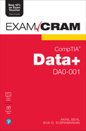
Microsoft PowerPoint gives a good starting point for creating visually appealing reports. In addition, online reporting tools such as Visme and tools like Tableau and Power BI can be used to make reports interesting—with captivating covers and other elements that are covered later in this chapter. Figure 13.1 gives an overview of the types of reports you can create with PowerPoint.
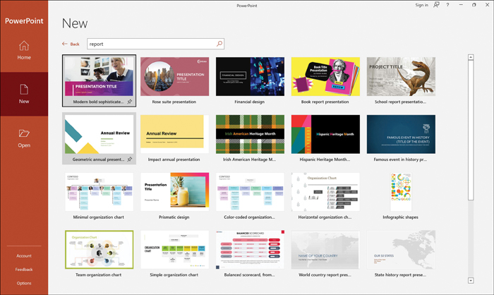
Figure 13.1 Report Options in Microsoft PowerPoint
Note
Figure 13.1 shows some of the default templates provided in PowerPoint. However, a content creator can customize many different styles of reports by leveraging these templates.
While these templates may not be suitable in certain corporate environments, they can still serve as starting points for creating reports, which is especially helpful for those who haven’t ever worked with reports. Templates can help you create reports that fit with the rest of the reports used in your organization.
Instructions
At times, it is necessary to give instructions that provide information to assist a project and/or research team/staff in the completion and submission of reports. The reports may need to be standardized across the organization, or the reporting team may need to have data in a certain format such that all reports look and feel the same (regardless of the content).
Instructions may address how to populate different sections of the report, such as the following:
 Whether to enter data manually or leverage data from another system
- What questions need to be answered (if conducting a study)
- The required steps to be considered, from acquisition to cleansing of data for use in the report
- The way the data should be interpreted while creating the report
- The templates, font, and visualizations to be used in the report
- Any logos that may be used for reports
- Any references and how they should be used
Good instructions help create useful and meaningful reports, especially when report generation is handled by multiple people. Good instructions also lead to homogeneity in the way a set of reporting parameters can be enforced and help standardize corporate reporting.
In general, a report has the one or more of the following headings, depending on what type of report it is (for example, corporate, marketing, sales, research):
- Subject matter or topic of the report
- Problem statement
- Methods of analysis
- Findings
- Conclusions
- Recommendations
- Limitations of the report
- Summary of key findings, solutions to the problem, and recommendations
Summary
A report and its content mean different things to different audiences, and the type of summary used should reflect the content and consider the audience. For example, a report’s summary may be an executive summary if the report is being presented to leadership or the board. The audience may only read the executive summary if they’re short on time, or they may prefer to read some or all sections of the report.
An executive summary in a report should have the following content:
- Summary of key findings
- Summary of the solutions to the problem
- Summary of recommendations
For example, in a sales presentation to a CEO, you would want to focus on key aspects that led to better sales this month and how your team achieved their goals. This information needs to be crisp as the C-level executives have little time to spend deciphering cryptic phrasing or incomplete thoughts in a dashboard or report. To get your findings through to them, you should present a one-page (executive) summary that captures all the important information at a glance.
Note
The summary of findings should be provided to a C-level audience in the form of a “BLUF” statement—that is, a “Bottom Line Up Front” statement that summarizes the key point of the report.
Figure 13.2 shows an executive summary report template. (This template is from www.powerslides.com.)
Now think about a report for the IT group. If you show this audience only a summary, they will scratch their heads and ask for details. This is quite the opposite of a report for C-level executives, as the IT group folks need details such as what caused the downtime, what vendor or supplier issues occurred, which systems need upgrades, and what activities are being planned for next month. The summary for such a report would be very different from an executive report and would likely span more than a page.

Figure 13.2 A Sample Executive Summary Template
Figure 13.3 shows an IT report summary template. (This template was also sourced from www.powerslides.com.) You can appreciate that this summary is very different from—and much busier than—the executive summary shown in Figure 13.2.
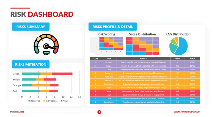
Figure 13.3 A Sample IT Summary Template
As you have seen, when preparing a report’s summary, it is important to understand your audience in order to get their attention.
In a summary, it is important to summarize factual data such as the time, place, and date of observation for an activity. These observations and insights should be clear and unambiguous as well as easy to follow and organized. Insights are acquired by examining information and data to understand specific conditions and make conclusions.
Design Elements
Design elements are the heart and soul of a report. As you will discover in this section, picking the right color scheme and the right fonts and using other design elements well can help spark your target audience’s interest.
When you think of aesthetics or an immersive experience, you might think of the design of an object; design elements can be used well to make something very appealing. Design elements lead the human brain to perceive information much faster than just raw text. A report cover page as well as the report contents (including the summary) can be made much more intuitive using the right design elements, such as:
- Color schemes
- Layout
- Font sizes and styles
- Key chart elements
- Titles
- Labels
- Legends
The following sections highlight some of the design elements that can help you create and present an engaging report.
ExamAlert
Report design is an important topic that is often ignored. Expect a few questions on report design elements on the CompTIA Data+ exam.
Color Schemes
Colors are all around us and make things interesting or dull, depending on how we feel about colors and the color themes/schemes used. Color is an important communication tool that can provoke various emotional responses. Reactions to color can be positive or not so positive, depending on what colors are used and whether they work in harmonious or dissenting ways.
While there are millions of colors, they all fall into three major categories:
- Primary colors: Red, blue, and yellow
- Secondary colors: Orange, green, and violet
- Tertiary colors: Red–violet, yellow–orange, blue–green, blue–violet, yellow–green, and red–orange
A color wheel shows many colors and helps a user choose which ones to use together. It can be very helpful in choosing a color scheme for a document or report. Figure 13.4 shows a color wheel.
Figure 13.4 Color Wheel
There are a few basic types of color schemes:
- Monochromatic: Uses a single color from the color wheel (such as blue) and can present a very consistent look with varying shades and tints of that color
- Complementary: Uses two colors that are directly opposite each other on the color wheel (such as blue and tangerine)
- Split complementary: Uses colors on either side of the complementary color (such as blue with orange and light orange)
- Analogous: Uses one main color from the color wheel and two colors that appear right next to it (such as yellow with light orange and lime green)
- Triadic: Uses a palette of three colors that appear at equidistant points on the color wheel (such as blue, red, and yellow)
- Tetradic: Uses four colors that appear on the color wheel in a rectangular pattern (such as purple, red, yellow, and green)
To choose a good color scheme for a report, it is important to gauge your audience and their liking, the environment, and the purpose of the report. Let’s consider an example. Observe the report covers shown in Figure 13.5.
Note
The report covers in Figure 13.5 were created at www.visme.co.

Figure 13.5 Color Schemes for Sales and Art Reports
The sales report cover uses a very natural and subtle color scheme that goes well with the report’s messaging and is not overbearing. In contrast, the art report cover is much more colorful and bright. This color scheme might not invoke the best reactions in a corporate sales presentation, but an arts audience would appreciate the thought behind the color scheme.
The following are a few color scheme considerations that you may find helpful:
- Choose appropriate colors—solids or shades—for a report based on the topic, the audience, the environment in which the report will be presented, and its message.
- Pastel colors are usually considered calming; they might not be suitable in a high-energy presentation.
- Bright colors can reflect happiness and are great for non-corporate presentations; however, they may appear cheap in certain situations or if used poorly.
- Darker colors denote professionalism and can be useful for executive presentation; however, they might appear too somber in certain situations.
Report Layout
Reports can be very simple or more complicated. A report may be one page, or it may be multiple pages, depending on the audience and topic. Before designing the report cover and report body, it is a good idea to consider the layout that will be used for the body of the report. Consider the following questions when writing a report:
- Is this a simple one-page report, or will it have multiple pages?
- Can text convey the message of the report, or would infographics work better?
- Is the report going to show many data points, and if so, are they graphs or charts?
- Is the report going to be around for some time (as for a research topic, an annual report, or a report that discusses outcomes of a survey)?
- What are the main sections in the report?
In general, a report should have one or more of the following pages or sections:
- Cover page
- Introduction
- Executive summary
- Overview
- Methodology adopted for report findings
- Findings and/or analysis
- Results and/or recommendations
- Summary or conclusion
Another important factor in a report layout is the placement of figures and charts, which can add a lot of visual impact to a report. You might want to experiment and see what works best in the layout of a particular report (such as positioning images or charts across pages alongside text or combining them in some places).
It is crucial to have a well-defined layout for the type of report you want to present as different reports have different sections, and some may be more suitable for one type of report or another. For example, sections such as methodology and recommendations may not be applicable to sales reports, whereas a research report would need these sections.
Font Size and Style
As you have already gathered, a report needs to be presented in a suitable way for the intended audience. As long as the audience can read and understand the various sections of a report, the report can serve its purpose. Ideally, a report should bring out the key data insights in a simple way, and the audience should find the report easy to read and self-navigate. To make a report easy for the audience to use, you can use simple formatting styles—such as easy-to-read fonts and easy-to-spot headings—throughout the report. Good use of typography—font sizes and styles—can make the contents of a report easy to understand and visually pleasing, helping the report deliver maximum impact.
To get an idea of the impact of typography, take a look at Figure 13.6, which shows the font size 18 across a few well-known fonts. You could use any of these fonts to create a very neutral-looking report—which is often what you want for organizational reports. When you use fonts that your audience is used to, users perceive it as a good, clear report to read.
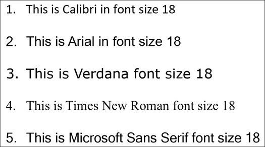
Figure 13.6 Well-Known Fonts
Following are some formatting-related tips for making reports easy to read and presentable:
- Use a font that is compatible with web pages as most reports today are digital reports.
- Where possible, use one font for all the text in a report to make it consistent. You may use a different font for the headings.
- Use headings and subheadings to differentiate the content in various sections of a report. Headings and subheadings can be the same font as body text but in different sizes, or they can be in a different font.
- Use italics or bold in a report to emphasize various topics.
- Keep in mind that each font has its own characteristics. Either stick with a standard font that is used in your organization or get creative and see what works best.
Key Chart Elements
A report may contain charts or other graphics that make it easier and intuitive for the audience to take in information. Figure 13.7 shows a sales revenue chart of results from SaaS software across quarter 1—January, February, and March—for forecasts and closed deals.

Figure 13.7 Sales Revenue Chart
Notice the following elements in the chart in Figure 13.7 (some of which are marked with dotted squares):
- The title indicates the purpose of the chart.
- Legends describe the meanings of colors and shapes used in the chart.
- Labels on the X-axis and Y-axis describe the related information.
Using elements like these across charts can make them intuitive for readers to consume.
Corporate Reporting Standards/Style Guide
As discussed previously in this chapter, report cover pages and content can be very different for different audiences. This section provides an overview of the key elements that should be considered for corporate reports (such as branding, color codes, logos/trademarks, and watermarks).
As you have seen throughout this chapter, there can be multiple types of corporate reports, such as:
- Annual reports
- IT inventory reports
- Marketing reports
- Sales and revenue reports
A good and well-thought-out corporate report portrays professionalism, trustworthiness, and clarity in thought process.
A corporate report cover page should include the following:
- Report title/subtitle
- Author’s name and job title
- Organization’s name and logo
- Date of report generation
In addition to formatting, layout, fonts, and colors, there are some other important elements of a corporate report:
- Branding: The branding should be clear and concise, and it should portray the organization correctly. Keep in mind that when you are presenting a report, you are the organization’s spokesperson to the customers.
- Logos: A logo may stand alone or may appear with the name of the organization. A logo is seen as an extension of a brand. A logo is created and used to imply the message of the organization and to provide a pictorial representation of the brand.
- Watermark: Some pages in a report may be watermarked with a logo or with “Confidential” or “Secret” text to prevent the intended audience from sharing the information in the report with others.
A corporate report is a package that delivers a corporate message beyond the content. It is a good idea to leverage a data visualization style guide to standardize corporate reports. A data visualization style guide offers increased impact by ensuring consistent adoption of fonts (style and size), colors, types of charts, and formatting organization wide. It saves time as a reporting team does not have to spend hours trying to decide which colors, fonts, or styles should be used. A data visualization style guide helps use the brand logos and other aspects cohesively to help communicate the corporate message in a powerful way.
Documentation Elements
Gone are the days when documents were all physically handled. Documentation today is almost all digital. Receipts, pay slips, reports, and anything else that needs to be recognized as a document can exist in a digital format. Documentation involves a lot of elements, including digital signing, versioning, and much more. This section discusses these elements.
Version Number
Every document that is digitally created may possibly be modified by authorized users. If the original document had four sections and a revised version of the document has five sections, which one should you work with? How do you know if a document’s contents have been changed? Versioning helps with these issues. Every document should have a version number; using versioning is also known as version control. Versioning is important because it helps everyone know which is the latest version of a document and whether any changes can be made to it.
ExamAlert
Versioning is a very important concept in context to documentation and this would one of the focus topics in CompTIA Data+ exam.
A report should have a version number to help readers determine whether they are looking at the most recent/updated report. For example, if a sales team is looking at a sales forecast report, they need to be sure they’re using this month’s report and not last month’s because a recent report will give better insights for better decision making; a date of generation or, better yet, a version number, will help the team ensure that they’re using the most current report.
Note
Popular document editing tools like Microsoft PowerPoint and Word have built-in tools to help with versioning.
Typically, version numbers are assigned by the document author, but they can also be system generated. A report may be released as version 1.0, and the next release may be 1.1, then 1.2, and so on. Any changes in the report—manual or system generated—should be reflected in the version number. A revamped report should be considered a major release, and the main version should be updated from 1.x to 2.x and so on.
Reference Data Sources and Dates
Data may be referenced or reused both internally and externally by authorized users. It is a good practice to reference the source(s) of the data used in your report, especially when you leverage an external document or article for text, figures, articles, findings, diagrams, maps, and so on. Ideally you should cite such material within the report. If someone else is using information from a report that you generated, that person should cite your report as the source of the information.
Citations can include the following:
- Authors of the original document/article/research report
- Publication date of the document/article/research report
- Title of the document/article/research report
- Persistent identifier/locator (for example, DOI or URL) of the document/article/research report
- Version and accessed date of the document/article/research report
- Publisher and year of publication of the document/article/research report, if available
Figure 13.8 shows the citation options in Microsoft Word.
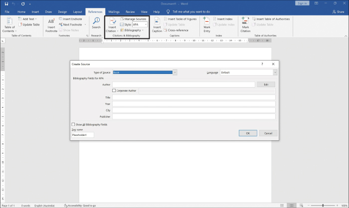
Figure 13.8 Microsoft Word Citation Options
The tool Zotero (see https://www.zotero.org/) allows you to reference almost anything across your documents and lets you keep adding links, research papers, and articles to your collection and then reference them easily.
Every report should be labeled with a report run date. When a newer version is generated or even if the same report is generated on a different day/time, the run date should reflect when the report was generated. This helps viewers determine whether they’re looking at the current report.
An important aspect to be aware of regarding data updates is the refresh rate at which data is updated in a report. This is the rate at which data is pulled (or uploaded) from the data sources, goes through analysis, and is reflected in the report. A report administrator can set up a refresh schedule. For example, sales reports from Salesforce can be refreshed as required, but a decent refresh rate would be every hour or every couple hours. Frequent refreshes can help a report reflect new opportunities as well as any movement on opportunities in the system, for example, a sales report.
FAQs and Appendix
An FAQ (frequently asked questions) is a list of commonly asked questions and answers, presented in order to anticipate queries related to a report. The viewers or users of a report may not be familiar with certain sections or how to interpret data across those sections. Hence, it’s a good idea to build an FAQ section that describes how the data points were calculated or what certain sections imply.
A good FAQ aims to do the following:
- Act as a virtual guide, reflecting on the needs of readers and helping them understand the content of the report
- Be frequently updated based on new data insights and as the report evolves
- Help readers browse to additional information pertinent to the report
- Increase the use of the report and encourage constructive feedback
- Answer questions from readers
- Offer concise and to-the-point explanations of key facts or subjects
Report appendixes (also sometimes spelled appendices) sometimes contain content that is referenced earlier in the report (typically in academic or research reports) and sometimes present calculations, algorithms, drawings, and insights about raw data to bolster the information in the body of the report. For example, you may want to display detailed equations and calculations in an appendix and only the results in main body. A report might have one or more appendixes, depending on the content and length of the report and the type of information included. Each appendix is denoted by a letter or a number in the body of the report. The content in an appendix—references, diagrams, or titles, for example—may be listed as a numbered or unnumbered list.
Dashboard Considerations, Development, and Delivery Process
This section is dedicated to dashboards. Before we get into the specifics of how dashboards are developed and delivered, it is good to understand what dashboards are all about and how they are similar to and differ from reports. Dashboards enable near-real-time insights with charts and data points that track performance, and they make it possible to analyze trends by interacting with data.
ExamAlert
Dashboards are a hot topic in the data analytics world, and almost every organization out there is using different dashboards. Be sure to read through the development process and how dashboards are deployed and delivered as there would likely be questions on this topic in the CompTIA Data+ exam.
A dashboard is a single screen (typically live and on demand) that gives insights about the key performance indicators (KPIs) across a number of functions or a specific business function within an organization.
A simple real-world example is the dashboard of your car, which tells you about important functions, such as the fuel level, your speed, engine RPM, drive mode, and much more. By using certain functions on the dashboard, you can monitor fuel consumption, fuel economy, and the length of a trip. Much like a car dashboard, a digital dashboard used by an organization makes it possible to see important information, such as KPIs or highlights within the organization. For example, an IT operations dashboard might show the number of tickets being generated in an hour, how many issues have been reported and rectified, any outages, and so on.
Information in a dashboard is available at a glance; in contrast, in a report you can drill down to examine the specifics of an incident. A dashboard is basically a summarized report—a single screen that provides insights in real time, without requiring you to scroll through multiple pages. When you use a dashboard, you probably still want to generate reports; dashboards are not meant to replace reports but to augment them. Dashboard reporting helps users visualize events across the IT landscape. Figure 13.9 shows a sales commission dashboard created with Tableau. This dashboard captures the relationships between compensation type, commissions, and quota attainment for a set of salespeople in an organization.
Note
The dashboard in Figure 13.9 is from https://public.tableau.com/app/profile/technical.product.marketing/viz/SalesCommissionModel_10_0/CommissionModel.

Figure 13.9 Sales Commission Dashboard in Tableau
Dashboard Considerations
Dashboards, which can be quite interactive, offer a 10,000-foot to 1000-foot view of information. It is important to consider a few key details when putting together dashboards:
- What are the sources of the information?
- What attributes would be useful for viewers?
- What important aspects are being measured?
- Who are the users of the dashboard?
- What type of dashboard is it going to be—static or live?
- What important insights are being derived from the dashboard?
The next few sections go over these concepts and help you understand the mechanics behind each of these considerations.
Data Sources and Attributes
Dashboards give an organization many ways to view and filter information in the form of charts or graphs. For building dashboards, you need to define the sources from which information is collected, which may include the following:
- SQL databases (for example, Microsoft SQL, Oracle, MySQL)
- Data lakes (for example, Azure Synapse, GCP BigQuery)
- Data from master data management (MDM) platforms (for example, Informatica, Oracle)
- CSV or flat files
Note
Use of the terms master and slave is ONLY in association with the official terminology used in industry specifications and standards and in no way diminishes Pear-son’s commitment to promoting diversity, equity, and inclusion and challenging, countering, and/or combating bias and stereotyping in the global population of the learners we serve.
Data attributes are properties or characteristics that explain the data objects in a dataset. For example, a sales dataset may be defined using attributes such as Customer_ID, Customer_Address, and Products_Services.
Figure 13.10 illustrates the types of data attributes, which are as follows:
- Nominal: This type of data attribute distinguishes between one data object and others by using name, age, sex, colors, and so on.
- Ordinal: This type of data attribute shows a meaningful sequence between values, without the magnitude of values being known (for example, grades A through F, without defining what scores constitute A vs. F).
- Binary: This type of data attribute uses 0 or 1, which may describe false or true, not included or included, and so on.
- Numeric: This type of data attribute is quantitative and measurable in value (for example, kilometers). Numeric attributes can be further classified as interval or ratio:
- Interval: Measured on an equal scale of units (for example, degree of hot vs. cold in Celsius or Fahrenheit)
- Ratio: Measured in comparative values (for example, a mathematical ratio)
- Discrete: This type of data attribute is used for data with finite values and whole numbers (for example, number of students in a class, number of employees in an organization).
- Continuous: This type of data attribute is used for data with non-finite values and continuing numbers (for example, time, amount of rain).
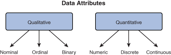
Figure 13.10 Data Attributes
A dashboard can be prepared with one or more of these data attributes, depending on the requirements of the viewers. For example, if there’s a need to categorize data and show a chart about the number of students in a school and their ages, both discrete and continuous data can be pulled from the identified data sources to create the appropriate charts.
It is important to be aware of the way that quantitative and qualitative values are represented in a dashboard. Dashboard dimensions contain qualitative (representative) values, whereas measures contain quantitative (numeric) values. You can use dimension values—such as names, colors, and languages—to categorize and reveal the required details in a dashboard. You can use measures to aggregate age, weight, size, and so on and reveal the relationships between the values being measured.
When using a dashboard, you may want to filter information or set up custom sections. Dashboard fields help map required information across a dashboard as well as filter various elements in the dashboard. Each field has a data type that is automatically applied (for example, integer, string). For example, in Salesforce, you can manage information across fields such as ID, Description, CreatedDate, ChartTheme, and Title.
Continuous/Live Data Feed vs. Static Data
Sometimes viewers are okay with point-in-time data, but at other times, they are more interested in live updates. For example, a dashboard created for asset inventory can be updated once a day because there are not a lot of inventory changes happening every minute. However, with a share price dashboard, viewers don’t want to look at share prices from an hour ago; they need this information in near real time.
Note
It is important to understand the purpose of a dashboard and whether its users require a live view or a static view.
Live data feed, or continuous, dashboards are just what the names suggest. Much like streaming video, they get updated as soon as a change occurs in the data source. Live feed dashboards have live inputs that influence the visuals and can be used for making decisions in near real time.
Static dashboards are for viewing information from a particular time in the past. For example, results from reported data could provide insights about how to enhance a process and what might be considered for enhancement.
Consumer Types
If you are developing a dashboard, what should matter most beyond the how and the what is the who. A detailed dashboard with 10 different charts may be popular with an IT team, but executives need only 2 to 4 charts. Different consumers need different metrics, and it is important to know which ones a dashboard audience needs.
Before we get into specific consumer personas, let’s talk about the broad categories of consumers: internal and external. It is important that any dashboard that is published is accessible only by internal or external consumers, according to their authorization level and their roles in the organization. Internal and sensitive dashboards should not be published externally. For example, a software solutions organization might want to share quarterly sales results with consumers. In this case, a publicly available dashboard should be published that’s accessible by anyone over the Internet. However, the firm may also want to publish for employees details on products by market and profit as well as other details. In this case, an internal private dashboard should be published that’s available only to employees.
A C-level executive dashboard should provide very high-level insights to viewers. It should be geared toward KPIs impacting business growth and suggestions on how to grow revenue while minimizing risk and driving productivity. C-level executives would not be interested in aspects such as average reply time or resolution rate but would want to know the impact of these things on customer satisfaction (CSAT).
Note
A C-level audience typically has an attention span of only 15 to 20 minutes. If you provide anything more than higher-level details and suggestions/insights, you risk losing their attention and wasting their time.
For a management or leadership audience, a dashboard is a tool for presenting KPIs as well as improvement suggestions across various verticals within the organization, using tables, graphs, and links to case study data. Leadership needs the information shown for a C-level audience as well as key metrics such as conversion rate, net promoter score, and customer retention rate. Leadership appreciates insights into what is working well and what opportunities for improvement exist.
For an IT team, metrics such as first-contact resolution, volume of tickets, average resolution/reply time, and asset management are most important. Information from various sources of data should be integrated for unified reporting such that the IT team gets a single pane of glass to look at.
For external stakeholder/vendors, such as shareholders and investors, customers, and suppliers, different levels of information and metrics may be required, depending on the external customer. For example, for vendors and suppliers, information like inventory levels, logistics details, and goods ordered may be useful; for investors and shareholders, key information about how the organization is performing overall and net revenue or sales figures may be required.
For the general public, you might want to publish a public dashboard on the latest activities related to consumer focus or products as well as any environmental efforts by the organization.
Development Process
A dashboard needs to tell viewers a story that they are interested in. Dashboards are not just pieces of information presented in one place; they are vehicles used for storytelling. When you are looking at a dashboard, it should seem like you are looking at a larger and coherent picture of events of interest.
Making a dashboard that tells a good story requires a lot of work, including brainstorming ideas, getting those ideas into a storyboard, doing mockups, building layouts, getting the right set of approvals to deploy the dashboard, and deploying the dashboard for the authorized consumers. This section describes these steps and shows how dashboards come to life.
These are the high-level steps of the dashboard development process:
Requirements gathering: Gather the requirements for this dashboard in order to solve a business problem.
Ideation: Record ideas about what should be in the dashboard, such as charts or pictorial representations. The result of this stage is known as a wireframe.
Storyboard creation: Get the dashboard story sorted by figuring out which elements are needed to ensure that the dashboard delivers what it is supposed to deliver.
Design layout: Get the layout approved and place the widgets in the right places to enable consumers to look at the right information. The result of this stage is known as a mockup.
Testing: Have the dashboard tested by using a pilot group, canary, blue-green, or any other deployment mechanism.
Deployment: Get the dashboard rolled out in production.
Feedback and maintenance: Gather feedback from consumers to enable development of more widgets or features.
Mockup/Wireframe
Once the business requirements have been well defined and the need for a dashboard has been established, the ideation phase kicks in, and the dashboard outlook/layout is determined. When developing a new dashboard, it is important to make prototypes or drafts (also known as mockups) in order to ensure that the dashboard captures all the required information and allows consumers to look at the KPIs they are interested in. A mockup is essentially a replica of a final dashboard that can be used to demonstrate the look and feel of the dashboard before the development work begins. A wireframe, on the other hand, is a very basic rendering of a dashboard that does not offer an intuitive layout, as a mockup does.
Note
An organization may have standard templates that can be used for mockups or may require designers to build new templates, as per the business requirements.
You can create dashboard wireframes or mockups in your favorite BI tool, such as Power BI or Tableau. Figure 13.11 shows a sample mockup created at https://app.creately.com/. As you can see, this mockup is a work in progress (WIP) and can be changed in terms of outlook, headings, charts, and so on, based on the requirements.
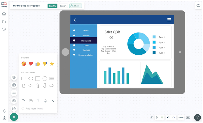
Figure 13.11 Dashboard Mockup Template
Fun Fact
You can pick up a pen and create a wireframe on a sheet of paper. Even though there are a lot of tools available for creating dashboards, sometimes pen and paper are the perfect tools for getting your ideas about a dashboard jotted down while you still have them fresh in your mind.
It is important to look at multiple layouts and determine which one should make the cut. It’s a good idea to work with a design team and stakeholders to ensure that they are on same page and they give you the required approvals before moving from draft to final layout version. Layouts can make or break a dashboard as the way content is presented is often as important as the content itself. For example, whether you should use a line graph or histograms or pie charts would depend on the details you want to show in your layout and the audience. A more technical audience would appreciate more details, and executives would want only important insights.
In terms of flow and navigation, it is a good idea to keep the dashboard layout simple, so that it can explore and capture the most relevant information only. A simple click-and-explore interface allows users to navigate a dashboard effortlessly, and usability increases adoption.
While you might want to group all the metrics onto a single page, it is good to balance graphs and text with suitable whitespace to draw users’ attention to details. It’s a good idea to get feedback on how the layout and navigation are working for users and then improve the layout and navigation accordingly.
Approvals
It is important to get approval from stakeholders about what needs to be shown on a dashboard and to whom it is shown. In other words, the KPIs and any metrics that are to be shown on a dashboard should be approved by the relevant business stakeholders. For example, dashboards published externally should not show customer purchase details. It is possible to make a dashboard available to many users from multiple groups (such as sales, IT, and marketing) and give access to customer details only to some of these users by applying role-based access control (RBAC).
Approvals may also be related to the events across a dashboard. For example, think about a process flow where approvals are required by relevant stakeholders. With an IT ticket, for instance, the user raising the ticket needs to get approvals upon resolution before closing the ticket. Or with a procurement ticket, approval from the procurement team is required before an order can be placed. These types of approvals would be in effect only when the dashboard is live.
Develop Dashboard
Once approvals are in place, the next step is to develop the dashboards. This is typically done by designers, who work closely with the business intelligence (BI) team. The designers are responsible for deploying and maintaining the dashboard. They take the inputs from the BI team on metrics and post charts and graphics based on mockups or wireframes. Once a dashboard is ready to be deployed in production, the designers ensure that the dashboard is distributed or shared with relevant users, and they get feedback on design elements and keep improving the dashboard as it matures.
Deployment to Production
Finally, a dashboard needs to be deployed in production. During this phase, users get access to relevant information for insights and decision making. This phase occurs both for new deployments and for upgrades of dashboards with new charts or widgets (as in the case of a new release).
With either a new deployment or an upgrade, it is important to have the dashboard rolled out in a phased manner, using one or more deployment methodologies, such as the canary approach or piloting with a subset of users. When the testing feedback is positive and all approvals are in place, you can deploy the dashboard in production. It is also a good idea to incrementally increase user adoption of a dashboard because the dashboard can fulfill its purpose only when the users it was developed for are actively leveraging it. Once a dashboard is deployed, the maintenance and continuous improvement process kicks in.
Delivery Considerations
Once you have developed a dashboard, it is time for users to use it to actively look at the data they want. This can be easier said than done, though. Just developing a dashboard is like developing a product; without any marketing or making noise (in a good way), consumers aren’t going to be aware of or actively choose your product (in this case, your dashboard) over other similar products. This section covers topics related to dashboard delivery, including subscriptions, scheduled delivery, and making dashboards interactive.
Subscription
When a dashboard is developed, the hope is that all consumers or users will be able to look at the dashboard for insights. However, when users are on the move or aren’t able to sit in front of the dashboard, they can be subscribed to the dashboard feed. Dashboard subscriptions are a great way to keep consumers up to date on the data that matters most to them. Dashboard administrators can use subscriptions to send updates (that is, refreshed dashboards) via email. Such an email typically contains a snapshot of the refreshed dashboard as well as a link to the dashboard. For a team that is using Slack, Microsoft Teams, or some other communication channel, a refreshed dashboard can be delivered via that channel as well.
Scheduled Delivery
Upon activating a subscription for a set of dashboards related to your role, you can set up the subscriptions to deliver refreshed dashboards at regular intervals. You can schedule delivery of dashboards to your email on a periodic basis or get ad hoc delivery. Then recurring deliveries will be made according to the schedules created in the dashboard platform by end users or by dashboard administrators.
Popular BI platforms such as Power BI, Looker, Tableau, Qlik, and Oracle make it possible to easily schedule delivery of dashboards via email in PDF, CSV, and other formats.
Interactive Dashboards
This section describes the different dashboard usage mechanisms—primarily drill-down and roll-up. It also covers other aspects related to the way users consume dashboards.
Drill-down involves double-clicking or zooming into insights. It allows users to move from an overview of data to a more granular view within the same dataset. A user can simply click an interactive section of a dashboard for a metric, and instead of looking at information from a 10,000-foot view, the user can peel the data “onion” to get better insights into the metric. For example, take a look at the two dashboards shown in Figures 13.12 and 13.13. The dashboard in Figure 13.12 shows sales performance data across the United States, and Figure 13.13 shows a drill-down into the Pennsylvania data for much more detailed insights.
Note
The dashboard examples in Figures 13.12 and 13.13 are from https://www.tableau.com/solutions/gallery/superstore.
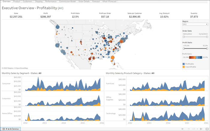
Figure 13.12 Drill-Down Example: Sales Performance Data Across the United States
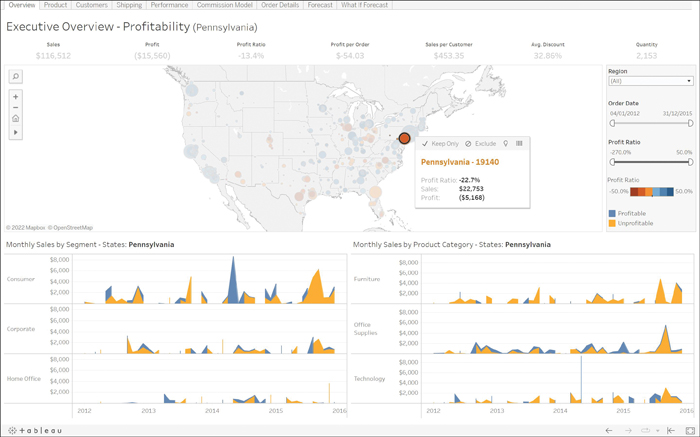
Figure 13.13 Drill-Down into the Pennsylvania Results
Dashboards are often interactive and allow you to easily perform drill-downs into metrics you’re interested in.
A roll-up enables you to aggregate or collate data from multiple sources into one place. Specifically, it allows you to get real-time insights from multiple sources of information in one place and take action on those insights. For example, your organization might have multiple websites selling different products, and your teams may be doing search engine optimization (SEO), doing Google and Facebook ad integration, and allowing people to interact across blogs. If you want to see how you can engage better across one or more of these or see where the users are spending most of their time, instead of going across all sites and looking at all the data individually, you can collate all the data in one place by rolling up the data to determine where to focus and how to prioritize the budget.
In addition to allowing drill-down and roll-out, you allow users to add their saved searches to a dashboard so it becomes easier to perform these searches on preselected metrics and pull out data as required. In addition, you can allow users to save their own custom views of a dashboard after they have applied filters. This allows each user to pull up a custom dashboard view every time they want to look for data-driven inputs without needing to spend time applying filters repeatedly.
Earlier in this chapter, we talked about how dashboards are delivered. While dashboards are mostly web based, they can also be delivered via email as snapshots in PDF or CSV format to users who subscribe and set delivery preferences. Dashboards can also be delivered over an app, but in this case, the back-end server is web based.
Note
It is unreasonable to expect C-level executives or members of the board of directors to go to a website to view a dashboard. Instead, you probably want to present them with one or two KPIs from a larger dataset delivered via a presentation; you can deliver dashboards via presentation software such as Microsoft PowerPoint or as PDFs.
Dashboards are naturally always evolving. Users might make requests to change features or the way they interact with dashboard charts, graphs, widgets, and so on. Optimization based on user feedback as well as business requirements is an ongoing phenomenon and takes the same route as any other corporate application: concept formation, development, deployment, and optimization. These are a few ideas about optimizing dashboards in an organization:
- Use filters and remove any fields that are not actively used (even after applying filters). Doing so improves the speed of loading and is easy on the eyes.
- Where possible, use preprocessed data rather than processing data on the fly when producing or refreshing a dashboard. Doing so helps reduce latency in producing required insights.
- Keep narrowing down metrics that become outdated or irrelevant.
- Query optimization helps reduce the time to results.
Finally, security is crucial in any organization, and dashboards need to be kept secure. Any dashboards delivered to an internal audience (that is, private dashboards) should be limited to the right audience using access permissions. For example, managers may not be given permission to view a dashboard for directors, and directors may not be given permissions for dashboards meant for executives. Any public dashboards ideally should allow everyone to view the published data insights.
Note
RBAC should be deployed appropriately to give the right permission to the right audience for any privately published dashboards.
What Next?
If you want more practice on this chapter’s exam objectives before you move on, remember that you can access all of the Cram Quiz questions on the Pearson Test Prep software online. You can also create a custom exam by objective with the Online Practice Test. Note any objective you struggle with and go to that objective’s material in this chapter.