
Chapter 10
Understanding Descriptive and Inferential Statistical Methods
This chapter covers Objective 3.1 (Given a scenario, apply the appropriate descriptive statistical methods) and Objective 3.2 (Explain the purpose of inferential statistical methods) of the CompTIA Data+ exam and includes the following topics:
 Measures of central tendency
- Measures of dispersion
- Frequencies and percentages
- Percent change
- Percent difference
- Confidence intervals
- t-tests
- Z-score
- p-values
- Chi-squared
- Hypothesis testing
- Simple linear regression
- Correlation
For more information on the official CompTIA Data+ exam topics, see the Introduction.
This chapter covers topics related to descriptive and inferential statistical methods. It is important to understand the measures of central tendency and measures of dispersion. This chapter also covers frequencies, percent change, percent difference, and confidence intervals, as well as t-tests, Z-scores, p-values, and chi-squared.
Introduction to Descriptive and Inferential Analysis
Before we get into the specifics of how descriptive and inferential statistics are carried out, it is important to discuss some basics about statistical methods.
The study of statistics can be categorized into two major categories: descriptive statistics and inferential statistics. Performing a statistical study requires identifying a population, group, or collection of target entities nominated for gathering data. The population, group, or collection of entities could be a group of cattle for a livestock study, a group of human beings for a study of DNA trait statistics, or a collection of data around sea level in an area across a number of days.
Descriptive statistics helps summarize data in a meaningful way such that statisticians can realize any patterns that emerge from the data collected. In other words, descriptive statistics is simply a way to describe data and does not aim to make conclusions or formulate any hypothesis about the data being analyzed.
Inferential statistics, on the other hand, is all about making inferences based on the data samples collected from a population. In other words, inferential statistics allows you to leverage data samples to hypothesize generalities about the populations from which the samples were drawn and arrive at a conclusion.
The following sections explore descriptive statistics methods such as central tendency, measures of dispersion, and more.
Measures of Central Tendency
In statistics, the central tendency refers to a single value of a dataset or a whole distribution. The central tendency is a typical value of the dataset. Central tendency of a dataset can be identified using measures such as mode, median, and mean (see Figure 10.1).
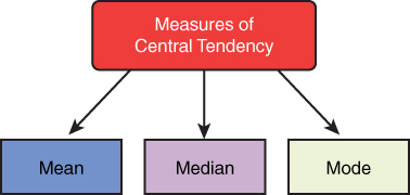
Figure 10.1 Measures of Central Tendency
Mean
The mean is a dataset’s average value. It can be estimated as the total of each value in set of data divided by total quantity of values. It is also known as the arithmetic mean and indicated with the symbol μ.
Estimating the mean value is fairly straightforward. The formula for calculating the mean value is as follows:
μ = (X1 + X2 + X3 + . . . + Xn) / n,
where:
X is a value
n is the number of values
For example, the mean for the numbers 2, 4, 6, and 8 can be calculated as follows:
Median
The median is the middle value in a set of data, where the dataset might be arranged in descending or ascending order.
Let us consider a dataset with an odd number of values arranged in ascending order (see Table 10.1).
Note
This implies not the data values within the fields, but the number of fields in the dataset that are odd.
Table 10.1 Median with Odd Number of Data Fields
5 |
6 |
7 |
9 |
10 |
11 |
13 |
14 |
15 |
16 |
18 |
21 |
23 |
You can easily calculate the median value for this dataset because it has an odd number of data fields: It is simply the middle value, in this case 13. Six values are presented above 13, and six values are presented below 13.
Now let’s consider the median for an even number of fields that are arranged in an ascending order (see Table 10.2).
Table 10.2 Median with an Even Number of Data Fields
17 |
19 |
22 |
23 |
24 |
26 |
27 |
29 |
30 |
32 |
33 |
35 |
38 |
40 |
In the dataset in Table 10.2, the two middle values are 29 and 27. In this case, the median value is calculated by finding the mean value for the two middle numbers:
(29 + 27) / 2 = 56/2 = 28
Thus, the median value for the distribution in Table 10.2 is 28.
Mode
The mode is the value that occurs the most frequently in a dataset. Consider the given dataset in Table 10.3.
Table 10.3 Sample Dataset for Mode Calculation
5 |
5 |
5 |
4 |
3 |
2 |
2 |
1 |
The most repeated value in this dataset is 5.
Note
When is each measure of central tendency most useful? It depends on the data properties. For example:
 If you have continuous data with a symmetrical distribution, then all three measures of central tendency—mode, median, and mean—are useful. Many times, analysts use the mean since it applies to all the values in a dataset or distribution.
- In a skewed distribution, the best choice for measuring central tendency is the median.
- With categorical data, the best choice for finding central tendency is the mode.
- With original data, the mode and median are the best measures of central tendency.
Measures of Dispersion
The measure of dispersion, as the name indicates, describes the scattering of data. It explains the variation in data points and gives a clear view of the data distribution. It indicates the heterogeneity or homogeneity of distributed data observations, which are categorized as the absolute measure and relative measure of dispersion:
- The absolute measure of dispersion is used for observation scattering in distances such as quartile deviation and range. It denotes differences in observations for the average number of deviations such as standard and mean deviations.
- A relative measure of dispersion compares the distributed data with two or more data points.
These include the coefficient of mean deviation, coefficient of range, coefficient of variation, coefficient of quartile deviation, and coefficient of standard deviation.
ExamAlert
Measures of dispersion are most commonly used by statisticians and analysts and are a focus of the CompTIA Data+ exam.
Range
Range is an easily understandable measure of dispersion. Range is the difference between the maximum value and the minimum value of a dataset. If Ximin and Ximax are these two values, the range can be identified using this formula:
Range = Ximax – Ximin
Quartile Deviation
Quartiles divide a set of data into quarters. Following are the specifics:
- The middle number between the median of the dataset and the smallest number is the first quartile (Qu1).
- The dataset median is the second quartile (Qu2).
- The middle number between the largest number and the median is the third quartile (Qu3).
The formula for quartile deviation is as follows:
Quartile deviation = (Qu3 - Qu1)/2
Quartile deviation is the best dispersion measure for open-ended classification. It is independent of origin change and dependent on scale change.
Mean Deviation
Mean deviation denotes the arithmetic mean of observation from absolute deviations. If x1, x2, x3, x4, x5, x6, . . . , xn are the observation set, then the deviation of mean of x about average A (mode, median, or mean) is:
Deviation of mean from average Av = 1⁄n [∑i|xi – Av|]
Deviation of mean from average A for grouped frequency is estimated as follows:
Deviation of mean from average Av = 1⁄N [∑i fri |xi – Av|], N = ∑fri
Here fri and xi are the frequency and middle values of the ith class interval.
Mean deviation gives a minimum value when observations are taken from the measure of the median. It is independent of origin change and dependent on scale change.
Standard Deviation
Standard deviation is the square root of mean of deviation squares of provided values from their mean. Standard deviation is represented by sigma (σ). At the same time, it is also denoted as the deviation of root mean square. Standard deviation can be calculated as follows:
The square of standard deviation is known as variance and is also a dispersion measure. Variance can be represented as σ2.
Let’s consider an example to calculate standard deviation. Say that you have the data points 2, 4, 6, and 8, and you need to calculate standard deviation.
First, you need to find the mean:
μ = (2 + 4 + 6 + 8) / 4 = 5
Next, you need to find the square of the distance from each data point to the mean:
|x – μ|2
where x is the number, and μ is the mean:
Note
The brackets in |x| represent the absolute value and non-negative value of x.
Now, you can calculate σ :
The variance is σ2—that is, (2.237)2 = 5.0.
Relative Measure of Dispersion
Relative measures of dispersion are used for comparing the distributed data of two or more datasets. Relative measures compare observations without units. The most commonly used methods for relative measures of dispersion are as follows:
- Coefficient of range
- Coefficient of quartile deviation
- Coefficient of mean deviation
- Coefficient of standard deviation
- Coefficient of variation
Frequencies
Frequency (f) refers to the number of times an observation of a specific value occurs in data. For example, frequency is the number of times that each variable occurs, such as the number of male athletes and the number of female athletes within a sample population.
A distribution represents frequency pattern of a variable. A distribution is a set of probable values as well as their frequencies. In other words, a frequency distribution represents values and their frequency—that is, how often each value occurs in a sample dataset.
Let’s consider an example of a frequency distribution of magazines sold at a retail outlet. The data includes the numbers of magazines sold at a local retail outlet over the past 7 days:
10, 11, 12, 13, 14, 15, 16
Table 10.4 shows how many times each number occurs in this dataset.
Table 10.4 Frequency Distribution of Magazines Sold
Magazines Sold | Frequency |
|---|---|
10 | 3 |
11 | 1 |
12 | 0 |
13 | 10 |
14 | 10 |
15 | 9 |
16 | 11 |
As you can see, the frequency tells how often there were 10, 11, 12, 13, 14, 15, or 16 magazines sold over the past 7 days.
A distribution of frequency could indicate either a real number of values falling in observation percentage or a range. In the observation percentage, the distribution of frequency is referred to as a relative distribution of frequency. Distributions of frequency tables are leveraged for numeric variables and categorical variables. Continuous variables in a frequency distribution are used only with class intervals.
Percent Change and Percent Difference
Percent change can be used to compare old values with new values. Estimating the percent change between two provided quantities is an effortless process. When an old or initial value and a new or final value of quantity are identified, the percent change formula is applied to identify the percent change. The formula is as follows:
where:
V2 denotes the new value
V1 denotes the old value
If the percent change value is positive, this indicates that the percentage has increased; if the percent change value is negative, this indicates that the percentage has decreased.
For example, if V1 = 100 and V2 = 200, the percent change would be:
Percent difference is a measure of the absolute value of variance among the two numbers, divided by the average of the two values and then multiplied by 100%:
Again using the example of V1 = 100 and V2 = 200:
Inferential Statistical Methods
Inferential analysis is all about making inferences and predictions by performing analysis on sample population data from an original or larger dataset(s). As you can appreciate, a data engineer or a data scientist cannot possibly look at an entire volume of data; it is just too difficult to collect data from a whole population. Instead, they need to work with samples from data stores.
Inferential analysis makes it possible to derive trends by leveraging probability to reach conclusions and by testing hypotheses as well as samples from the population.
Before we get into the specifics of methods to perform inferential analysis, it is vital that you understand the term hypothesis. A hypothesis is simply a perception or an idea about a value that can be tested given sample data from a population under study. A hypothesis is very important in the context of inferential statistics as all conclusions about a given population are based on a representative sample. Hence, you need to understand two important terms in the context of inferential analysis: null hypothesis and alternative hypothesis. The null hypothesis assumes that there is no association between the two (categorical) variables, whereas the alternative hypothesis does assume that there is an association between the two (categorical) variables. (You’ll learn more about hypotheses later in this chapter.)
ExamAlert
Hypothesis testing is an important concept, and it is good to know about type I and type II errors for the CompTIA Data+ exam.
The following sections cover the various inferential statistics methods, starting with confidence intervals.
Confidence Intervals
The confidence level is the range of values that are likely to contain plausible population values. Confidence intervals are used to measure the degree of uncertainty in a sampling method. Typically, the most common confidence interval is 95% or 99%; however, it is possible to have other values, such as 85% or 90%.
Note
It is key to understand that it is close to impossible to study a whole dataset, given that terabytes of data are being generated every day. Hence, researchers select a sample or subgroup of a population and work with confidence intervals as a way to measure how well the sample represents the population.
For example, if a data analyst constructs a confidence interval with a 95% confidence level, that analyst is confident that 95 out of 100 times, the estimate will fall between the upper and lower values specified by the confidence interval (see Figure 10.2).
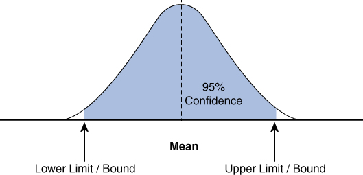
Figure 10.2 Confidence Interval Graph
Let’s consider another example. Say that a device manufacturer wants to ensure that the weight of the devices that will be carried on a military convoy is in line with specifications. A data analyst has measured the average weight of a sample of 100 devices to be 10 kg. He has also found the 95% confidence interval to be between 9.6 kg and 10.30 kg. This means the data analyst can be 95% sure that the average weight of all the devices manufactured will be between 9.6 kg and 10.30 kg.
Note
This calculation was performed using the Omni calculator, at https://www.omnicalculator.com/statistics/confidence-interval.
The formula for the confidence interval is:
where:
X is the sample mean
Z is the confidence coefficient (Z-score), which is 1.960 for 95% and 2.576 for 99%
σ is the standard deviation
n is the sample size
Z-score
A Z-score, also referred to as a standard score, describes how distant from the mean a data point is. It is also an estimation of how many standard deviations above or below the mean of a population a raw score is.
The basic formula for the Z-score is:
Z = (x – µ) / σ
where:
x denotes the observed value
σ denotes the standard deviation of the sample
µ denotes the mean of the sample
If the x value is 1350, the mean value is 1000, and the standard deviation value is 200, then the Z-value is found as follows:
In this case, the Z-score is 1.750 standard deviations above the mean.
Figure 10.3 illustrates a sample Z-score value.

Figure 10.3 Z-score Representation
How is a Z-score helpful? A Z-score gives you an idea about how an individual value compares to the rest of the distribution. For example, a Z-score can tell you if devices being produced for military vehicles are being actively used or not, depending upon the weight specifications on the vehicles they are supposed to be used with.
In the previous example, we have a positive Z-score (that is, the individual value is greater than the mean, as shown in Figure 10.3). A negative Z-score indicates a value less than the mean. Finally, a Z-score of 0 means that the individual value is equal to the mean.
t-tests
The t-test, which originated in inferential statistics, is used to identify the main variance between mean values from two groups. In other words, it is used to compare the mean values from two samples and evaluate whether the means of the two groups are statistically dissimilar. t-tests are based on hypotheses.
There are three categories of t-tests:
- One-sample t-test: This type of t-test compares the average or mean of one group against the set average or population mean. For example, it can be used to compare the sales of a product across a set of new stores against sales in one of the established stores.
- Two-sample t-test: This type of t-test is used to compare the means of two different samples and implies that the two mean groups are different from the hypothesized population mean. For example, it might be used to compare the performance of salespeople across two different states for the same product.
- Paired t-test: This type of t-test is used to compare separate means for a group at two different times or under two different conditions. For example, it might be used to compare the effect of training of salespeople on selling a sophisticated product before and after training.
Figure 10.4 shows the distribution of t-values when the null hypothesis is true.
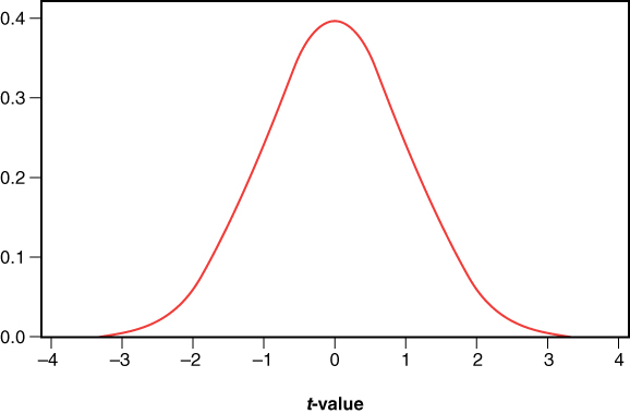
Figure 10.4 Sample t-test Graph
p-values
A p-value, or probability value, is leveraged as part of hypothesis testing to help accept or reject the null hypothesis. The p-value is a number that explains the probability that a data point happened by chance (that is, randomly). The statistical significance level is denoted as a p-value between 0 and 1.
p-values are usually expressed as decimal figures and can be expressed as percentages. For example, a p-value of 0.054 is 5.40% and implies that there is a 5.40% chance that the results could be random (or happened by chance). In comparison, a p-value of 0.99 translates to 99.00% and implies that the results have a 99% probability of being completely random. Hence, with p-values, a smaller value reflects more significant results. Table 10.5 explains how to interpret p-values.
Table 10.5 Interpretations of p-value
p-value | Interpretations |
|---|---|
p < 0.01 | p is statistically and highly significant. Therefore, reject the null hypothesis and accept the alternative hypothesis. |
p > 0.05 | p is not statistically significant. Therefore, reject the null hypothesis. |
p < 0.05 | p is statistically significant. Therefore, accept the alternative hypothesis and reject the null hypothesis. |
Chi-Square Test
The chi-square test is used for testing hypotheses about observed distributions in various categories. In other words, a chi-square test compares the observed values in a dataset to the expected values that you would see if the null hypothesis were true. A chi-square test can be used to infer information such as:
- Whether two categorical variables are independent and have no relationship with one another. This is known as a chi-square test of independence.
- Whether one variable follows a given hypothesized distribution or not. This is known as a chi-square goodness-of-fit test.
Chi-square can be calculated using the following formula:
Xc2 = Σ(Obi – Ei)2 / Ei
where:
c denotes the degrees of freedom
E represents the expected value
Ob represents the observed value
A chi-square test provides the p-value, which indicates whether the results of the test are significant (as discussed in the previous section).
Let’s consider an example. An organization is conducting research and trying to relate the different levels of education of people to whether those people work in IT or non-IT jobs. Table 10.6 shows the simple random sample the organization is working with.
Table 10.6 Sample Data on Education Level Related to IT vs. Non-IT Jobs
| No Bachelor’s Degree | Bachelor’s Degree | Master’s Degree or Higher | Row Total |
|---|---|---|---|---|
IT Job | 30 | 80 | 45 | 155 |
Non-IT Job | 50 | 55 | 15 | 120 |
Column Total | 80 | 135 | 60 | 275 |
Note
The authors used the calculator available at https://www.socscistatistics.com/tests/chisquare2/default2.aspx for calculating chi-square in this example. This site provides multiple statistics calculators that you can leverage and walks you through the calculation process step by step. The authors assumed 2 degrees of freedom for this calculation.
The organization can use a chi-square test of independence to determine whether there is a statistically significant association between the two variables (education and working in IT jobs).
In this case, the chi-square (X2) test gives the number 20.507268, with a p-value of 0.000035. Now, given that the p-value is less than 0.05, we know that result of the chi-square test is statistically significant. Thus, the alternative hypothesis is acceptable (and rejects the null hypothesis), and there is sufficient evidence to state that there is an association between education level and holding an IT job.
The graph in Figure 10.5 shows the chi-squared distribution graph for this example.
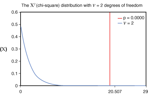
Figure 10.5 Chi-squared Graph (Generated Using the Free Chi-square Calculator at https://www.di-mgt.com.au/chisquare-calculator.html)
Hypothesis Testing
We began looking at hypothesis testing earlier in this section, when we looked at null and alternative hypotheses. Hypothesis testing is a method for testing a hypothesis or claim about a parameter value, based on data from a sample, that helps in drawing conclusions about a population. The first (tentative) assumption is known as the null hypothesis. Then, an alternative hypothesis, which is the opposite of the null hypothesis, is defined.
To put these hypotheses into context, let’s consider an example. Say that an organization is performing an analysis of salaries of salespeople. It takes a sample of 100 salaries from a population of 10,000. The null hypothesis is that the mean salary of a salesperson is less than or equal to $85,000, and the alternative hypothesis is that the mean salary of a salesperson is more than $85,000.
The null hypothesis is usually represented as H0, and the alternative hypothesis is usually represented as Ha. H0 (the null hypothesis) is where things are happening as expected, and there is no difference from the expected outcome. Ha (the alternative hypothesis) is where things change from expected, and you have not just rejected H0 but made a discovery.
Figure 10.6 gives an overview of the test statistic locations and their results.

Figure 10.6 Hypothesis Testing Overview
In the context of our example of salesperson salaries, the sample mean (µ) is:
H0: µ ≤ $85,000
Ha: µ > $85,000
There are various methods to perform hypothesis testing, such as by using Z-scores, t-tests, and p-values, as discussed earlier in this chapter.
Because hypothesis tests are based on sample information from a larger population, there is always a possibility of errors. To determine if the null hypothesis should be rejected, the hypothesis test should consider the level of significance for the test. The level of significance is represented as α and is commonly set as α = 0.05, α = 0.01, or α = 0.1. When working with hypotheses, errors are broadly classified as two types:
- Type I error: A type I error occurs when the null hypothesis is incorrectly rejected when, in fact, it is true. This is also known as a false positive.
- Type II error: A type II error occurs when the null hypothesis is not rejected (fail to reject) when, in fact, it is false. This is also referred to as a false negative.
Note
Lower values of α make it difficult to reject the null hypothesis, which can lead to type II errors. Higher values of α make it convenient to reject the null hypothesis but can lead to type I errors.
Simple Linear Regression
Simple linear regression helps describe a relationship between two variables through a straight-line equation that closely models the relationship between these variables. This line, which is sometimes called the line of best fit, is plotted as a scatter graph between two continuous variables X and Y, where:
X is regarded as the explanatory, or independent, variable
Y is regarded as the response, or dependent, variable
Note
Simple linear regression is used to determine a trend by observing the relationship between X and Y variables.
For example, variable X could represent sales for a product Y (another variable), and as time passes, sales may go up or down, depending on how popular the product is (that is, the trend). Another example could be the speed (variable X) that the car would go and the miles (variable Y) per gallon (mpg) that the car owner expects. The mileage may vary depending on the speed of the vehicle and show a trend.
The formula to calculate simple linear regression is:
y = mx + b
where:
m is the slope
x is the mean
b is the intercept
Consider an example with the following sample values across the X and Y axes:
X = 100, 200, 300, 400, 500, 600
Y = 200, 300, 400, 500, 600, 700
In this case:
Mean X (MX) = (100+200+300+400+500+600) / 6 = 2100 / 6 = 350
Mean Y (MY) = (200+300+400+500+600+700)/6 = 2700 / 6 = 450
Sum of squares (SSq) = 175,000
Sum of products (Sp) = 175,000
The regression equation is:
y = bX + a
where:
b = Sp / SSq = 175,000 / 175,000 = 1
a = (MY) – b(MX) = 450 – (1 × 350) = 100
y = 1x + 100
Note
Authors have used the calculator available at https://www.socscistatistics.com/tests/regression/default.aspx for calculating simple linear regression.
The linear regression in this case can be represented as a scatter plot, with the values along the X and Y axes (see Figure 10.7).
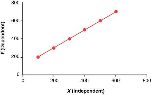
Figure 10.7 Simple Linear Regression Scatter Plot
Correlation
Correlation is a statistical measure that denotes the degree to which two values or variables are associated or related. It is used to describe a relationship without indicating cause and effect. Correlation coefficients are used to measure the (linear) relationship between two variables. When both values increase together, the linear correlation coefficient is positive. When one value increases and the other value decreases, the correlation coefficient is negative.
An example of correlation would be fuel prices and inflation in the cost of groceries. An increase in fuel prices impacts grocery prices as it costs more to transport food from farms to retail shops; therefore, as fuel prices rise, grocery prices also rise. This is a good example of positive correlation. On the other hand, as inflation rises, the general spending on items of want (not need) decreases. For example, with rising fuel prices, spending on cosmetics tends to decrease. This is a good example of negative correlation.
If X and Y are the two variables, the correlation coefficient can be represented by the following equation:
ρ = cov(X,Y) / σXσY
where:
ρ is the linear correlation coefficient
σ is the standard deviation
cov is covariance, a measure of how the two variables change together
ExamAlert
Positive/negative correlation is a common topic of discussion in statistics, and the CompTIA Data+ exam may test you on these concepts.
The correlation coefficient is supposed to be linear (that is, follow a line). It can have several different values:
- ρ = 1 is a positive correlation coefficient
- ρ = 0 indicates null/no correlation found between the two values/variables
- ρ = –1 is a negative correlation coefficient
Note
The closer the value of ρ is to (+/–)1, the stronger the linear relationship.
Figure 10.8 illustrates correlation relationships, including the (perfect) negative, null/no, and (perfect) positive correlations.
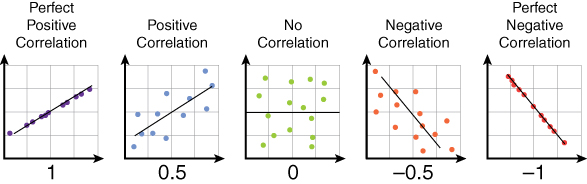
Figure 10.8 Correlation Relationship Overview
What Next?
If you want more practice on this chapter’s exam objectives before you move on, remember that you can access all of the Cram Quiz questions on the Pearson Test Prep software online. You can also create a custom exam by objective with the Online Practice Test. Note any objective you struggle with and go to that objective’s material in this chapter.