
Data visualization is a field in constant evolution. However, some concepts have proven their value time and again throughout the years and have become what we call best practices. These notions should not be seen as strict rules that must be applied without any further consideration but as a series of tips that will help you create better applications.
If you are a beginner, try to stick to them as much as you can. They will save you a lot of trouble and greatly enhance your first endeavors. On the other hand, if you are an advanced developer, combine them with your personal experiences in order to build the ultimate dashboard.
Some guidelines in this chapter come from widely renowned characters in the field of data visualization, such as Stephen Few, Edward Tufte, John Tukey, Alberto Cairo, and Nathan Yau. If any of these concepts strikes your attention, I strongly recommend you to read more about it in their books. Throughout this chapter, we will discuss the following topics:
- Dashboard design best practices
- Data-ink ratio and chart junk
- Using white space, alignment, and distribution
- Selecting the appropriate chart type
Throughout this section, we will review some useful recommendations that will help you create not only engaging, but also effective and user-friendly dashboards. Remember that they may apply differently depending on the information displayed and the audience you are working with. Nevertheless, they are great guidelines in the field of data visualization, so do not hesitate to consider them in all your developments.
In the early 1900s, the Gestalt School of Psychology conducted a series of studies on human perception in order to understand how our brain interprets forms and recognizes patterns. Understanding these principles might help you create a better structure for your dashboard and make your charts easier to interpret.
- Proximity: When we see multiple elements located near one another, we tend to see them as a group. For example, we can visually distinguish clusters in a scatter plot by grouping the dots according to their position.
- Similarity: Our brain associates elements that are similar to each other (shape, size, color, or orientation). For example, consider a chart with color encoding. Even if they are not grouped, we can associate the bars that share the same color.
- Enclosure: If a border surrounds a series of objects, we perceive them as a group. For example, if a scatter plot has two reference lines that wrap the elements between 20 and 30 percent, we automatically see them as a cluster.
- Closure: When we detect a figure that looks incomplete, we tend to perceive it as a closed structure. For example, even if we discarded the borders of a bar chart, the axes would form a region that our brain isolates without the need of extra lines.
- Continuity: If a number of objects are aligned, we usually perceive them as a continuum. For instance, consider the notion of different blocks of code when you indent a QlikView script.
- Connection: If a set of objects are connected by a line, we also see them as a group. For example, a scatter plot with lines and symbols (dots connected by lines).

When it comes to analyzing data, context is everything. If you present isolated figures, users will have a hard time trying to find the story hidden behind them. For example, if I told you that the gross margin of our company was 16.5 percent during the first quarter of 2015, would you evaluate it as a positive or as a negative sign? It's pretty difficult, right? But, what if we added some extra information to complement this KPI?

As you see in the preceding image, adding context to the data can make the landscape look quite different. Now, it is easy to notice that even though the gross margin has substantially improved during the last year, our company still has some work to do in order to be competitive and surpass the industry standard.
The appropriate references may change depending on the KPI you are dealing with and the goals of the organization, but some common examples are as follows:
- The last year's performance
- The quota/budget/objective
- Comparisons with the closest competitors/products/employees
- The market share
- Industry standards
Another good tip in this regard is to anticipate the comparisons. If you display the figures regarding the monthly quota and the actual sales, save the users some mental calculations and include complementary indicators, such as the gap between them and the percentage of completion.
One of the most interesting principles in the field of data visualization is the Data-Ink Ratio, introduced by Edward R. Tufte in his book, The Visual Display of Quantitative Information (a must-read for every QlikView designer). In this publication, he states that there are two different types of ink (or in our case, pixels) in any chart:
- Data-Ink: This includes all the nonerasable portions of the graphic that are used to represent the actual data. These pixels are the core of the visualization and cannot be removed without losing some of its content.
- Non-Data-Ink: This includes any other elements that's not directly related to the data or that don't convey anything meaningful to the reader.
Based on these concepts, he defined Data-Ink Ratio as the proportion of a graphic's ink devoted to the nonredundant display of information. It can be represented as follows:
Data Ink Ratio = Data Ink / Total Ink
As you can imagine, our goal is to maximize this number by decreasing the non-data-ink used in our dashboards. For example, the chart to the left has a low data-ink ratio due to the usage of 3D effects, shadows, backgrounds, and multiple grid lines. On the contrary, the chart to the right presents a higher ratio as most of the pixels are data-related:
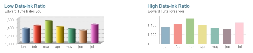
Chart junk is another term coined by Tufte that refers to all the elements that distract the viewer from the actual information in a graphic. Evidently, chart junk is considered non-data-ink and comprises features such as heavy gridlines, frames, redundant labels, ornamental axes, backgrounds, overly complex fonts, shadows, images, or other effects included only as decoration. Take for instance the following charts:

As you can see, removing all the unnecessary elements in a chart improves its readability and makes it look much more elegant.
Colors, icons, reference lines, and other visual cues can be very useful to help the users focus on the most important elements in a dashboard. However, misusing or overusing these features can be a real hazard; so, try to find the adequate balance for each one of them.
As we mentioned in Chapter 1, Know Your Battlefield, Devise Your Strategy, QlikView applications should use the adequate language for each audience. While designing, consider whether precise figures will be useful or if they will only become a distraction. Most of the time, dashboards show high-level KPIs, so it may be more comfortable for certain users to see rounded numbers:

One of Microsoft Excel's greatest wrongdoings is making everyone believe that 3-D charts are good for data analysis. For some reason, people seem to love them, but believe me, they are a real threat to business analysts. Despite their visual charm, these representations can easily hide parts of the information and convey wrong perceptions depending on their usage of colors, shadows, and axis inclination. I strongly recommend you to avoid them in any context.
Whether you are working with a list box, a bar chart, or a straight table, sorting an object is always advisable as it adds context to the data. It can help you find the most commonly selected items in a list box, distinguish which element is bigger on a pie chart when the slices are similar, or easily spot the outliers in other graphic representations.
Most of my colleagues argue that I am on the verge of an obsessive-compulsive disorder, but I cannot stand an application with unaligned objects. (Actually, I am still struggling with the fact that the paragraphs in this book are not justified, but anyway...).
The design toolbar offers useful options in this regard, so there is no excuse for not having a tidy dashboard. If you take care of the quadrature of all the charts and filters, your interface will display a clean and professional look that every user will appreciate. Take a look at the following images:

I have a rule of thumb regarding chart animation in QlikView: If you are Hans Rosling, go ahead. If not, better think it twice. Even though they can be very illustrative, most of the time, chart animations end up being a distraction rather than a tool that helps us visualize data; so, be conservative about their use.
Tip
For those of you who do not know him, Hans Rosling is a Swedish professor of International Health who works in Stockholm. However, he is best known for his amazing way of presenting data with Gapminder, a simple piece of software that allows him to animate a scatter plot. If you are a data enthusiast, you ought to watch his appearances in TED Talks.
Throughout his work, Stephen Few emphasizes that all the information in a dashboard must fit on a single screen. While I believe that there is no harm in splitting the data in multiple sheets, it is undeniable that scroll bars reduce the overall usability of an application. If the user has to continuously scroll right and left to read all the figures in a table, or if she must go up and down to see the filter panel, she will end up getting tired and eventually discard your dashboard.
If you want to create an easy-to-navigate dashboard, you cannot forget about consistency. Locating standard objects (current selections box, search object, and filter panels) in the same area in every tab will help the users to easily find all the items they need. In addition, applying the same style, fonts, and color palettes throughout your charts will make your dashboard look more elegant and professional.
The space between charts, tables, and filters is often referred to as white space and, even though you may not notice it, is a vital part of any dashboard. Displaying dozens of objects without letting them breathe makes your interface look cluttered, and therefore, it is harder to understand it. Some of the benefits of using white space adequately are:
Every now and then, you stumble upon delicate situations where some business users try their best to hide certain parts of the data. Whether it is about low sales or insane amounts of defective products, they often ask you to remove a few charts or avoid visual cues so that those numbers go unnoticed. Needless to say, dashboards are tools intended to inform and guide decisions, so avoid presenting visualizations that can be misleading.
As a designer, you will often hesitate to use the same chart type multiple times in your application fearing that users will get bored of it. Though this may be a haunting perception, if you present valuable data in the adequate formats, there is no need to add new chart types just for variety's sake. We want to keep users engaged with great analyses, not just with pretty graphics.
Selecting the best chart types for your dashboard is a key aspect of QlikView design. With an ever-growing list of options flying around, we must focus on the message we are trying to convey and evaluate the pros and cons of each style. Although most of the time there isn't a single correct answer, I recommend you to base your decision on the type of analysis you intend to do and its required level of accuracy.
There is an outstanding study published in the eighties where William Cleveland and Robert McGill rank several methods for encoding data depending to how well our brain can interpret them. They point out that if a chart requires a lot of accuracy to be adequately understood, we should use the representations located in the left part of the scale (that is, position or length). On the other hand, if the visualization displays a general idea and doesn't require a lot of precision to be well interpreted, we can rely on techniques such as shading and color saturation (right part of the scale):

Based on this, if we want to compare the number of stores that our company has in each country, a bar chart would be among the most accurate representations as it uses the leftmost methods: position along a common scale and length. In second place, we can find area-based visualizations such as bubble charts (which are located in the middle of the scale). Finally, if we opted for a heat map (graphic based on color saturation), our visualization would convey the general idea, but it would be very hard to make precise comparisons between the items:

The choice of the best graphic depends not only on the level of accuracy required to interpret it, but also on how well each chart gets along with the data and the type of analysis that it will support. Therefore, let's analyze the most common chart types and the scenarios where they excel or fall behind.
Created by William Playfair more than 200 years ago, bar charts are among the first and most popular visualizations. They are most commonly used to compare categories:

Here are a few points to note about bar charts:
- They are great for comparisons and rankings.
- Easy to interpret. Among the most accurate charts.
- They are amazingly flexible as they work great with multiple dimensions/expressions, stacked/grouped bars, and even high/low cardinality.
- Be careful with the Forced 0 option as it may change the interpretation of the data. We will learn more about this in Chapter 5, Handling "The Classics".
- If the text in the axis is too long, change the orientation to horizontal. This improves the readability and lets you display the numbers at the end of each bar without the fear of overlapping labels.
- Bar charts can also be used to represent trends. However, instead of conveying an idea of continuity as with line charts, this style fosters a direct comparison between periods.
Dot plots are elegant—and often forgotten—alternatives for comparisons. They are built using only the Symbol representation in a combo chart. A dot plot has the same analytical power as a bar chart but uses less ink:

Dot plots are very useful for the following reasons:
- They are great for comparison and rankings.
- They are easy to interpret and very accurate.
- As they use less ink, dot plots are lighter than bar charts. If your interface is starting to look cluttered, they could be a better choice.
- Dot plots usually have a high Data-Ink ratio.
- You can use multiple dimensions/expressions by changing the color and type of symbol displayed displayed (dots, squares, diamonds, and so on).
- They can be very hard to read if you use too many dimensions/expressions, so don't overdo it. My recommendation is to use up to three data series.
If you need to visualize a sequence of values representing a trend over time, your best bet is to use a line chart. It's simple, elegant, and meaningful:

Here are a few advantages of line charts:
- They are widely used and easy to interpret.
- They can handle multiple dimensions or expressions (again, it's better to not overdo it).
- Vertical line charts usually don't work very well. Most people read these visualizations from left to right and understand this movement as the transition from past to present and, depending on the data, future as well. Therefore, unless there is a good reason not to do so, it is advisable to use the horizontal representation and apply the Numeric Value: Ascending mode to sort them.
- Adding symbols emphasizes the start of each period and can help the user spot the missing values.
- Besides changing the color of the lines, it is possible to change their width and style (continuous, dashed or dotted) to create visual cues.
Although very popular, stacked area charts should be used with extreme caution. These graphics can be misleading as they only use the axis as the starting point for the first component. After that, the new elements are placed one above the other; so, in order to interpret them correctly, you need to focus on the size of the layer and not on the shape of the top line.
Take for instance the following charts. If I asked you how our green market is doing, you will be tempted to read only the top part of the green area, pointing out a slight improvement. However, it is the size of the layer (highlighted with a red dotted line in the middle chart) that really matters. As you can see, a traditional line chart might be less appealing, but certainly clearer:

Combo charts are perfect for displaying multiple measurements at once. They can be used with categorical or time dimensions without any problem:
- Just like the bar, dot, and line charts, these representations are hard to read when you use more than three expressions.
- While creating combo charts, be careful with the contrast of the colors you choose. A symbol might land in a blank space or inside a bar, so your palette should be able to handle both cases:

This kind of representation is based on a traditional line chart, and it specializes in showing a before and after comparison of two different points in time. Here are a few points about slope charts to keep in mind:
- Even though they don't provide much detail, they are a great way to spot the changes in ranking between two periods.
- If you are dealing with a few items, you can keep the legend and use Values on Data Points to be more specific.
- You can create an interesting visualization by keeping all the elements in gray and highlighting only the selected values. With this, you can focus on specific elements without losing the context provided by the rest of the data:

Seasonality is often represented using radar charts; however, they can be very difficult to read due to their circular axis. For instance, try to spot the month with the highest value by looking only at the graphic on the left-hand side. April, July, and October seem to be good candidates, right? Most of the time, a traditional line chart works better, so think twice before creating a radar:

This is one of the most controversial charts in the field of data visualization. While it is true that our brain is not very good at reading areas and angles, pie charts are still the quintessential way to display parts of a whole (the word quintessential is brought to you by http://www.thesaurus.com/). In my opinion, most of the issues derived from this graphic come from misusing it and not because it is a bad tool per se. If you deploy them correctly, pie charts can be a great addition to your dashboards:

Here are a few points to be careful about while using pie charts:
- Pie charts are only suited to represent parts-to-whole relationships.
- I cannot emphasize this enough—never use 3-D pie charts. The angle and depth of the graphic can easily deceive the reader.
- If you have a pie chart with more than five or six slices, it might be a good idea to swap it for a bar chart or other visualizations.
- Sorting the values can help the user when two slices have similar sizes.
There are plenty of area-based visualizations—block charts, tree maps, waffle charts, or funnel charts, just to name a few. Sadly, they all suffer from the same problem: our brain's inability to compare areas accurately. However, when used in the right context, these visualizations can be quite handy, so don't delete them from your arsenal just yet:

We can also represent composition with stacked bar charts by adding new dimensions or expressions. However, this visualization might suffer from interpretation issues due to the offset of the bars. As we discussed in the previous section, length is not as reliable as the position in the Cleveland and McGill scale, so our perception may vary depending on the order of the bars:

Scatter plots are the best way to analyze the relationship between two variables (correlation). They can also help the users visualize several items at once in order to define clusters or spot outliers. It is a great option to explore a new dataset. Here are a few handy points about scatter plots:
- Scatter plots usually benefit from using gridlines in both axes.
- Though the simplest scatter plot is based on two metrics, you can display up to four measurements by changing the bubble size and color.
- Most of the time, scatter plots don't have a legend panel due to the amount of elements displayed. However, you can overcome this issue and let the user identify each bubble by adding a descriptive popup expression.

Even though they may be less appealing, tables are frequently the best way to present data. They can display a great amount of information in a small space and offer valuable features such as drag and drop columns, interactive sort, and pivoting. Besides, they can be further enhanced by adding visual cues, sparklines, and minicharts.
Tables are a key element to analyze data. A well-balanced application includes charts to promote insights and spot trends but complements them with detailed information via straight and pivot tables:

Labels, gauges, thermometers, and bullet charts are great ways to highlight the key performance indicators. However, their overuse can be counterproductive, so limit their usage to the most relevant metrics only:

The chart types that we have reviewed so far are the most common visualizations used in QlikView dashboards. However, there are dozens of other representations that may be useful in specific situations, such as histograms, box plots, heat maps, trellis charts, sparklines, or geographical maps. We will review most of these in the following chapters, so stay tuned!
Tip
If you want further guidance on choosing the right chart type, I recommend you to visit Dr. Andrew Abela's website, where he shares a practical flow chart to guide you through this process (http://extremepresentation.com/).