
The wait is over, we know exactly what kind of dashboard we want, and it is time to start materializing it! So turn on your computer and open a new QlikView document as we are about to define the structure upon which our application will be based.
Though there is no formal categorization, we usually divide QlikView objects into two groups. First, we have the analytical objects. These are usually charts or tables, and their job is to present the right information in the appropriate formats. Secondly, we have all those elements that form the skeleton of the application and help the user navigate through the application, such as filters, buttons, current selections box, and other controls.
Although there isn't a correct order to create them (and most of the time, we find ourselves doing both at the same time), having the dashboard's structure built before you start creating the analytics often helps you overcome the blank page syndrome. With that in mind, throughout this chapter, we will talk about the following topics:
- Dashboard style and data distribution
- Filter panes and current selections objects
- Navigation schema
Defining the dashboard style involves much more than just choosing a color palette and including a logo. While some developers consider it secondary, taking care of the look and feel of an application is imperative to turning data analysis into an engaging experience for the users. During the development, pay special attention to the document style, fonts, colors, backgrounds, and design resolution.
The Styling Mode is one of the first choices that you will face when creating a new document. By changing it, you can alter some visual features in the charts, such as the caption bar and the object's borders. In order to change this, navigate to Settings | Document Properties | General. Once there, you will find two options:
- Simplified: If you want a simple, good-looking, out-of-the-box style for your sheet objects, the Simplified mode is a good choice. It offers four different Objects Styles to work with:

- Advanced: Activating this option enables extra features in the Layout tab of all the objects. Therefore, it is the preferred mode to create a customized look in your dashboards:

Select legible fonts and use appropriate sizes to ensure readability. Believe me, no one enjoys working with dashboards built entirely using Comic Sans or Lucida Handwriting.
Note
There are two main types of fonts: serif and sans serif (with and without serif). Serifs are the small lines tailing from the edges of the letters. They usually make individual symbols more distinctive, so our brain can process them faster as a result. However, the sans serif family is clearer at smaller sizes and displays higher readability on screens:

While we must strive for consistency, there is no harm in mixing different fonts in a single app. A good recipe is to apply serif styles, such as Times New Roman, in the titles and KPI displays while using sans serif fonts, such as Arial, for the rest of the objects.
It is also advisable to create hierarchies by mixing upper and lower cases, different sizes, and colors. This will help you highlight the important figures and make it easier for the user to follow the flow of the dashboard:

Color is a double-edged sword. If you use it adequately, it can enhance your visualizations and boost the overall usability of a dashboard. If not, it may confuse the users and make them lose focus. If you are uncertain about how to apply color in your applications, follow these tips:
- Create a palette that matches your dashboard's profile. A good approach is to take the corporate colors and create combinations around them.
- There is no need to be an expert in color theory to create friendly and balanced palettes. You can find plenty of online resources that will help you in this endeavor:
- Color wheel simulators: These sites let you choose a base color and build several schemas based on the color wheel. The recipes are easy to create and usually have great results. My personal advice is to use http://paletton.com/ and https://color.adobe.com/.

- Design websites: Forums such as http://colorpalettes.net/ and http://design-seeds.com/ share a great variety of palettes. You can look for a specific color, search by category, or simply browse the most popular combinations.
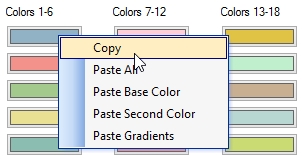
- Other tools: Programs such as Color Detector let you retrieve the RGB code of any pixel on the screen. This is a must-have in any QlikView designer's arsenal.
- Color wheel simulators: These sites let you choose a base color and build several schemas based on the color wheel. The recipes are easy to create and usually have great results. My personal advice is to use http://paletton.com/ and https://color.adobe.com/.
- Be consistent across all sheets and objects. This will make your applications look much more professional.
- Using contrasting colors help you to highlight the most relevant items in a chart. On the other hand, applying too many colors in a single visualization makes it difficult to identify the important elements:

- While bright and intense colors are good to capture the user's attention, neutral colors are easier on the eye. If the users are to work with your apps for long periods, opaque or matte tones are preferred.

- There are three ways to neutralize a color:

- Gray should be included in any palette as it helps to balance the intensity of other colors. Besides, it gets along pretty well with almost every style.
- Associate colors with ideas. For example, if you use blue to represent the sales in the first tab, follow that rule in the entire application. This will make your dashboards easier to follow and let the users work more efficiently.

- Respect the RAG convention—red for negative, amber for alert, and green for positive.
A well-chosen background is a key element to build an engaging dashboard as it can improve its usability and create a more stylish look. When you create a new background, ensure that you take into account the following advice:
- Avoid using bright colors as they tend to be aggressive on the eyes and might end up stealing the user's attention.
- Keep a good level of contrast between the background and the charts to maintain the readability.
- It is acceptable to use logos in order to enforce the corporate image. As usual, try not to get carried away and include dozens of logos, labels, watermarks, and the company's mascot in every sheet.
- Use color strips, textures, and shadows to create subtle divisions that make it easier for the user to identify the filters, buttons, and analytical objects on the screen:

Here's a piece of friendly advice—always define the appropriate design resolution before starting your development. If you don't consider it beforehand, you might end up restructuring the whole dashboard because it is either too big or too small.

Unfortunately, QlikView does not adjust the size of the objects to fit the screen (except for mobile clients), so you have to establish a standard resolution manually. Therefore, if your computer has a 1920 x 1080 screen, use visual cues to help you delimit the working area so that the applications look good at lower resolutions.