
Maps are one of the most eye-catching visualizations available in any BI tool. Unfortunately, these objects are frequently misused and end up serving only as decoration. Whether you use a specialized platform, such as GeoQlik or QlikMaps, a custom-built extension object or borrow the Google API, these recommendations might be useful while implementing geographic visualizations:
- Just as with any other chart, the inclusion of maps should be based on whether or not they add something valuable to the dashboard.
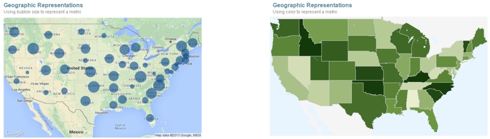
- Select the most adequate representation depending on your data. Many tools let the designer choose between choropleth, isopleth, dot, and proportional symbols maps.
- The color palette used in these graphics should contrast with the map itself so that the metrics are clearly distinguishable from the background (no one likes to play Where's Waldo? in QlikView).
- Let the color talk. Even if you use a simple bubble map, you can use color encoding to represent categorical values (such as regions) or even add a metric with the
colormix()function.
- Select an appropriate calculation. If you saw three maps representing the number of tweets, the sales amount of dairy products, and the number of car accidents, respectively, they would probably look very similar. Does that mean that most of the accidents can be attributed to irresponsible drivers that tweet on their way to the grocery store? Well, most likely not. Chances are that the most populated areas would have more occurrences of the three metrics. Therefore, these visualizations would not be as representative as you might think. Instead of using raw magnitudes, you can create composite metrics to solve this issue. For example, you could investigate the number of accidents for every 100,000 habitants.
..................Content has been hidden....................
You can't read the all page of ebook, please click here login for view all page.