
Choropleth map is a thematic map, in other words, a specially designed map not a general purpose one, which is designed to show measurement of statistical variable on the map using different color shades or patterns; or sometimes referred as geographic heat-map in simpler terms. We have already seen in the previous two recipes that geographic projection in D3 consists of a group of svg:path elements, therefore, they can be manipulated as any other svg elements including coloring. We will explore this feature in geo-projection and implement a Choropleth map in this recipe.
Open your local copy of the following file in your web browser hosted on your local HTTP server:
https://github.com/NickQiZhu/d3-cookbook/blob/master/src/chapter12/choropleth.html
In a choropleth map different geographic regions are colored according to their corresponding variables, in this case based on 2008 unemployment rate in US by county. Now, let's see how to do it in code:
<script type="text/javascript">
    var width = 960, height = 500;

    var color = d3.scale.threshold() // <-A
            .domain([.02, .04, .06, .08, .10])
            .range(["#f2f0f7", "#dadaeb", "#bcbddc",
             "#9e9ac8", "#756bb1", "#54278f"]);

    var path = d3.geo.path();

    var svg = d3.select("body").append("svg")
            .attr("width", width)
            .attr("height", height);

var g = svg.append("g")
...
    d3.json("/data/us.json", function (error, us) {
        d3.tsv("/data/unemployment.tsv", function (error,
                                            unemployment) {
            var rateById = {};
            unemployment.forEach(function (d) { // <-B
                rateById[d.id] = +d.rate;
            });

            g.append("g")
                    .attr("class", "counties")
                    .selectAll("path")
                    .data(topojson.feature(us,
                            us.objects.counties).features)
                    .enter().append("path")
                    .attr("d", path)
                    .style("fill", function (d) {
                        return color(rateById[d.id]); // <-C
                    });

            g.append("path")
                    .datum(topojson.mesh(us, us.objects.states, function(a, b) { return a !== b; }))
                    .attr("class", "states")
                    .attr("d", path);
        });
});
...
</script>
This recipe generates the following choropleth map:
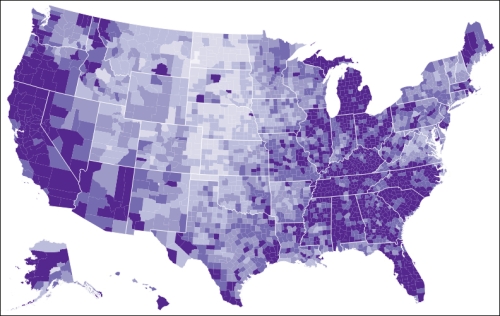
Choropleth Map of 2008 Unemployment Rate
In this recipe we loaded two different data sets: one for the US topology and the other containing unemployment rate by county in 2008. This technique is generally considered as layering and is not necessarily limited to only two layers. The unemployment data are stitched to counties by their ID (line B and C). Region coloring is achieved by using a threshold scale (line A). One last point worth mentioning is the topojson.mesh function used to render state borders. topojson.mesh is useful for rendering strokes in complicated objects efficiently since it only renders shared edge by multiple features once.
- TopoJSON Wiki for more information on mesh function: https://github.com/mbostock/topojson/wiki/API-Reference#wiki-mesh
- D3 Wiki for more information on threshold scale: https://github.com/mbostock/d3/wiki/Quantitative-Scales#wiki-threshold
- Mike Bostock's post on choropleth map which this recipe is based on: http://bl.ocks.org/mbostock/4090848