
8. Using Styles for Layout
In Chapter 7, you saw how to use CSS (Cascading Style Sheets) to style text. CSS can do a whole lot more than just make your words look pretty—style sheets can also be used to lay out the elements on your page.
This chapter covers creating pages using Dreamweaver’s CSS layouts, including how to modify them to match your designs. We’ll wrap it up by showing some layout tools that will look familiar if you’ve ever used any graphic design applications.
CSS Layout Basics
When CSS first started becoming popular (that is, when enough browsers supported it consistently), its primary use was for styling text, and Web designers were thrilled to say goodbye to the font tag. Besides styling text, it’s also possible to use CSS to define how your page is laid out, and thankfully, modern browsers now have sufficient market share that CSS layouts are standard.
The box model
When you lay out a page using CSS, you’re using the box model—that is, you’re creating boxes (almost always done by adding a div) and laying them out on your pages. Each box contains several elements  : its margin, border, padding, and content. Using CSS, you can set rules for each element. If you want, you can (for example) set different rules for the top, right, bottom, and left sides of an element.

The CSS box model, broken down into parts.
Let’s say that you want to put a line above and below your text. You can set the border around your text (that is, to the tag that contains your text) to 1px black solid just for the top and bottom. If you don’t set the other sides, they’ll be set to 0 by default.
Positioning your boxes
When you’ve created boxes on your page, you’ll want to place them. To do that, you need to understand two new concepts: position and float.
The position of a box can be static, relative, inherit, absolute, or fixed  .
.
• Static: The simplest position is static; it just means that the box ends up wherever it would normally end up, all on its own. Any left or top offsets you give it are ignored.
• Relative: The next simplest is relative, which is just like static except that you can set its left and top positions.
• Inherit: Inherit is used when you want a box to automatically inherit the properties of its parent (that is, its container). Wherever that box happens to be, it just takes on the position rules based on its container.
• Absolute: Absolute and fixed are similar in that you can specify exactly where on your page you want the box to appear. The difference between the two involves their frame of reference: an absolutely positioned box is positioned in reference to its container. If you have an absolutely positioned box placed 100 pixels from the top of a page and another absolutely positioned box inside that box that is also set to be 100 pixels down, the interior box will be 200 pixels down, not 100—because its frame of reference is to the box that it’s inside.
• Fixed: Fixed positioning, on the other hand, is based on the page itself. If you set a box to be fixed at 100 pixels down, it will always be there, even if you scroll the page. When you scroll, that box will move down with you so that it’s always 100 pixels down from the top of the visible page.
An example of an absolutely positioned box with set width.
Floating your boxes
Alternatively, a box can be set to float, such that its contents stick to one side or the other of its containing element  . The values for float are left, right, none, and inherit.
• Left: A box that is floated to the left causes everything else on the page (everything that isn’t explicitly told to be somewhere else, that is) to wrap around it to the right.
• Right: Similarly to left, a box floated to the right causes everything else to wrap around it on the left.
• None: This is the default, but it’s sometimes useful to be able to explicitly tell a box not to float (usually when trying to work around browser bugs).
• Inherit: If you do want a box to inherit the float value of its container, just set float to inherit.

This div (and the navigation area it contains) is floated to the right.
Tip
All of the browsers released in the last several years handle positioning and floating boxes well. Older browsers may have varying degrees of difficulty with these concepts. As always, we recommend testing your site in as many browsers (and versions and platforms) as possible. Adobe’s BrowserLab online service is useful if, like most of us, you don’t have your own computer lab filled with test machines.
Tip
The information about the box model here is just a quick and dirty definition. Many pages (and some entire books) have been written on the intricacies of the box model.
Using the Included Layouts
Initially, you might think that it’s difficult to get started using CSS for layout, but fortunately, Dreamweaver has included CSS layouts to make getting started as easy as can be. These files are flexible, professionally developed templates that make a great starting point.
To use the included layouts
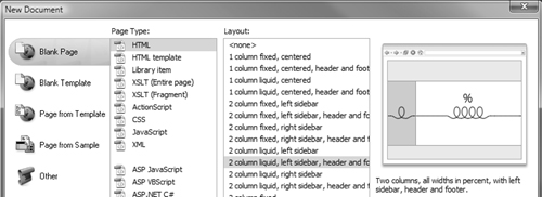
1. From Dreamweaver’s menu, choose File > New. The New Document dialog appears .

The familiar New Document dialog contains handy CSS-based page designs to get you started. Look at the Preview column to decide which of the designs you want to use as the basis for your page.
2. If it wasn’t chosen by default, select the category Blank Page and HTML for the Page Type. You should see 16 designs listed in the center column. Choose any of these to see a preview in the right column. Directly below the preview is a short description of the design.
3. If you see a design you like, click Create. A new untitled Dreamweaver document opens in the chosen design . You now have a template for your site that’s entirely CSS-based. You can modify the page content and its styles.
Here’s your new page, ready to receive your content.
4. Save the new layout by choosing File > Save, or by pressing Ctrl-S (Cmd-S).
Tip
Even if none of the included design files suit your taste, take a look at them and check out how they work. They’re a good way to learn how to use CSS to lay out a page.
Tip
When creating a new page based on an included layout, you’re given the option of putting the required CSS in the head of the document, in a new file, or in an existing file. When you put your site online, your CSS should be in an external file, but it’s easier to test and debug when it’s in the head of the document. If you decide to start with it in the head, you’ll want to check out Chapter 9, which covers moving internal styles to an external file.
Tip
Don’t forget to add a title to your page in the Title field of the Document toolbar.
Tip
If you used a previous version of Dreamweaver, you might be wondering where some of its included layouts went. The answer is that while it was great that there were so many options, the sheer number of them (elastic, fixed, liquid, hybrid, etc.) ended up confusing people. Some of them, sadly, were so complex that they were brittle—that is, they could break when new browser versions shipped. For CS5, Adobe pruned the list, keeping only those that are commonly used and rock solid. They also rewrote the templates to use cleaner code and to include instructions in the layouts that make it easier for you to understand how the different parts of the layouts work.
Laying Out Your Page
Here’s where things get interesting: now that you’ve got the theory, it’s time to put it into practice. With the included CSS layouts, it’s straightforward.
Before you start laying out your page, you need to think about what you want on that page and where you want it to go. As discussed in Chapter 2, the best way to do that is with pencil and paper. That should tell you what styles you’ll need: for instance, a header, footer, content area, and navigation area. Once you have a design in mind, look through the included CSS layouts to see which best fits your idea .

You’ll want to have a plan before you start laying out your page; here’s our planned design.
Now you’re ready to start. In this case, we’ll start with the 2-column liquid layout, with a left sidebar, header, and footer . The liquid part of the name means that the page content expands and contracts to fit the width of the browser window.
Start by selecting a new blank page with a new layout.
To lay out your page
1. Choose the 2-column liquid, left sidebar, header and footer layout, and Dreamweaver gives you a bare-bones page to start .

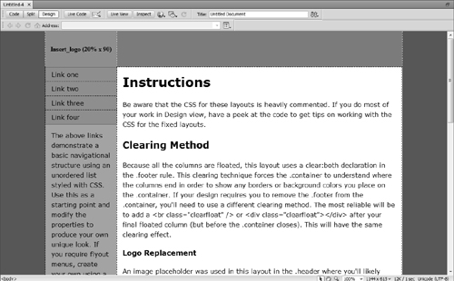
This page doesn’t just contain dummy text—it also contains many helpful tips.
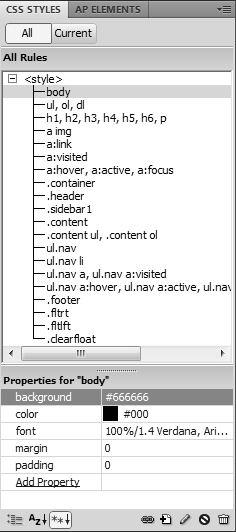
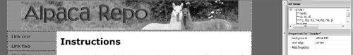
2. Almost all your work will be done in the CSS Styles panel  . Here the
 body styles are all fine except for the background—we want it to be gray instead of the default blue, so we changed its value to #666666.
Start your new page by changing the styles for the body tag.
3. Next is the .container rule, which applies the one large div that contains all the content on the page. Again, we only want to change the background; now it will be a lighter shade of gray, #EBEBEBEB  .
.

Next, change the styles for the class named .container.
4. The .content area is the section that will contain (as you might guess) the bulk of the page content. For easy readability, we want its background to be #FFFFFF (that is, white). This section doesn’t have a default background color, so we have to add it  .
.

The .content style needs a white background, which we added here.
5. The default page assigned a background color to the sidebar, which we don’t want. To remove the default, select the background property (found under .sidebar1) and click the trashcan icon  .
.

Click the trashcan icon in the CSS Styles panel to delete a property and its value.
6. Our page header has two parts: the foreground banner and the background color. The banner image is named header.jpg, and it simply needs to be dragged into the .header div. Next, delete the dummy logo image placeholder that came with the layout and change the blue background to a green that blends into the header graphic (#91A43D). And finally, add a text-align style declaration with a value of center to center the banner horizontally within the header area  .
.
Once you’ve set up the header, you’re a long way towards having your Web page just the way you want it.
7. All that’s left to change is the background of .footer to another shade of gray, #DDDDDD  .
.

Styling the footer finishes the page.
Tip
Setting the background color for .sidebar1 by letting the background color for .container show through is a technique called faux columns. To produce the desired effect (a sidebar with a background color going from the header to the footer), each page needs to have enough content so that the main content area is longer than the sidebar’s content. Thankfully, our navigation needs here are minimal enough that that isn’t a problem.
Tip
You don’t really need to know that white is #FFFFFF—you can just select the color you want from the color well in the panel.
Laying Out Your Navigation
The previous task laid out the entire page except for one small section: the navigation menu. While the menu is only a small section of the Web page, it’s a vitally important part to your visitors. Here’s how to personalize it to match the rest of your design.
1. Start by removing the one unwanted style rule: the border-bottom on the ul.nav li rule.
2. The only change the ul.nav rule needs is to the top border’s color, and that’s done by changing the value of border-top to 1px #EBEBEB solid .

Here you’ve changed the standard ul.nav rule.
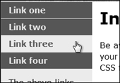
3. The changes to the ul.nav a, ul.nav a:visited rule are a little more complex. Start by changing color to #EBEBEB and background to #336666. Then add two new properties: font-weight, which should be set to bold; and border-bottom, which should be set to 1px #EBEBEB solid .

Once you’ve changed the rule for your links, you can see how the navigation will look.
4. You may think you’re done , but you still need to handle rollovers. That’s where users get feedback so they know where to click.

The almost-completed navigation section before styling the rollovers.
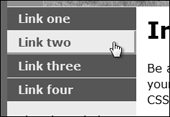
The rule to change is ul.nav a:hover, ul.nav a:active, ul.nav a:focus. Change the color to #336666 and the background to #EBEBEB: the same colors you used in the last step, just reversed. When you roll the cursor over a link, it will go from gray text on a green background to green on gray .
Swapping the color scheme from gray on green to green on gray means you’re almost there.
5. Make the links look like buttons by setting their padding and border values . To achieve the desired button-like effect, you have to do a little bit of calculating.
Adding a border to the right and bottom makes your links look like 3D buttons
For each side of the button, add together the width of the padding and the width of the border for the nonhovering (inactive) version of the button. Then for the hover state, the width of the padding added to the width of the border must be the same sum as the nonhover version.
In this example, look at the bottom of any navigation link: when inactive, the padding is 5px and the border is 1px, for a total of 6 pixels. So when you’re hovering, the sum of the padding and the border must also be 6 pixels—if not, the button will appear to jump around. With the border and the padding each set to 3px, you get the effect you want.
Now look at the right side. The inactive state has 5px padding and no border, for a sum of 5 pixels. To get a nice even button when hovering, set the right border to be 3px, which means the padding needs to be 2px.
Now that you have the values you need, all you have to do is add them to the ul.nav a:hover, ul.nav a:active, ul.nav a:focus rule. Set both the border-bottom and border-right properties to 3px #999999 solid. And finally, add padding-bottom with a value of 3px and padding-right with a value of 2px .

Here you’ve set the necessary properties to make the rollover happen.
Tip
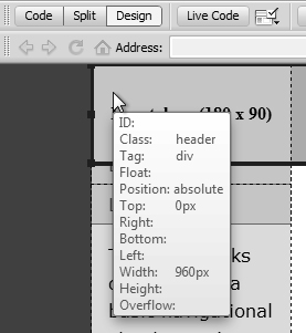
Don’t forget that you can inspect any element on the page by Alt-clicking (Opt-clicking) to show the Code Navigator, including the rules that apply to that element. Hovering over a rule, as in , shows all the declarations that make up the rule. The tip also shows the values (if any) of float, position, top, right, bottom, left, width, height, and overflow. See Chapter 7 for more about using the Code Navigator.
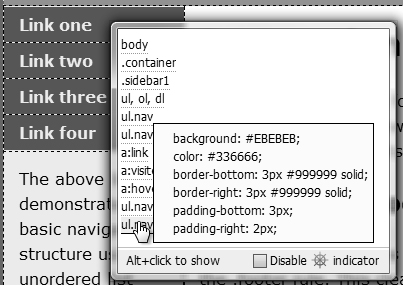
Hovering over a style in the Code Navigator gives you useful information about that element.
Tip
If you’re trying to find the padding width for a particular side, you might be thrown off by padding having a value of 5px 5px 5px 15px—which is the one you want? When you see four values like this in CSS, they’re always in the order top, right, bottom, left (a clockwise direction). So with that value, the bottom and right sides each have 5 pixels of padding.
Tip
Not seeing the rollovers? Turn on Live View, which shows your site the way a browser would display it. And if you’re trying to track down a layout issue and want the hover effect even when you aren’t actually hovering, choose View > Style Rendering > Show :hover styles—but don’t forget to set it back again afterwards.
Modifying Your Navigation
You have your page now just the way you want it—or so you think. After working with it, you realize that the left sidebar needs to be used for other purposes, and you want the navigation horizontally along the top. Back to the drawing board to start all over again, right? Nope; here’s where the power of CSS really comes through.
To modify your navigation
1. Using the tag selector, select ul.nav , and then drag the selection just after the header and before the sidebar. This can be a little tricky, so use Edit > Undo until you get it right. The result should look like . But don’t panic because of the way it looks—you’re not done yet.

Select the ul.nav element from the tag selector, and then carefully move it to its new home.

Now the navigation is above the content, but every button goes clear across the page.
2. Now you just need to modify the CSS, so you start by changing the ul.nav rule :
• Delete the margin-bottom and border-top properties.
• Add the property height with a value of 1.8em.
• Add the property background-color with a value of #336666.
• Add the border-left and border-bottom properties with values of 1px #EBEBEB solid.
• Add the property padding-bottom with a value of 3px.
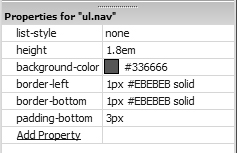
A few modifications to the ul.nav rule fix some of the issues.
3. Make these changes to the ul.nav a, ul.nav a:visited rule :
• Delete the border-bottom property.
• Add the property float set to left.
• Add the property border-right with a value of 1px #EBEBEB solid.
• Change the width of the padding-bottom property from 5px to 3px.
• Add the property width set to 22%.

Tweaking the link rule takes you most of the way there.
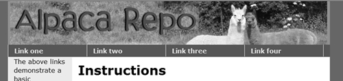
As shown in , the navigation has now taken shape. Floating each link to the left caused them to display in a single horizontal line.
Looks good—all that’s left to do are the rollovers.
4. For the ul.nav a:hover, ul.nav a:active, ul.nav a:focus rule :
• Change the padding-bottom property from 3px to 0.
• Change the padding-right property from 2px to 3px.

The rollover rule needs some changes to the right and bottom borders.
Your menu should now look like with button-like links spread evenly across the page under the header.

And here’s the finished product.
Tip
We gave the buttons a width of 22% to spread them out. You could also have done this by setting the width to a specific pixel size, but using a percentage makes them expand and contract with the rest of the liquid layout. However, you’ll need to remember to lower that number if you want to add another navigation button.
Tip
We did the same calculation here as in the previous task to make sure that the bottom and right sides appear button-like. The bottom has 3 pixels of padding and no border when inactive and no padding and a 3 pixel border when active. The right has 5 pixels of padding with a 1 pixel border when inactive and 3 pixels of padding and a 3 pixel border when active.
Tip
You might be wondering if you could have just left out the declaration setting padding-bottom to 0. In this case, no—you need that declaration of zero pixels of padding to explicitly override the three pixels of padding set in the previous step. If you left out the declaration, the browser would use the inherited padding, throwing off your button layout.
Using the Grid
If you want items on a page to line up, a handy way to make sure they’re aligned is to use the grid—a feature you may well be familiar with from other applications such as Photoshop. If you’re used to it elsewhere, it’s easy; if you’re not, here’s a quick overview.
The grid overlays graph paper-like lines on your Web page, making it easy to see if elements on the page are horizontally or vertically aligned. Nothing on your page is actually changed, and the lines are only visible inside Dreamweaver. If you choose to have elements on your page snap to the grid, whenever you move an element close to a grid line, it will “jump” (or snap) to match up with it. This way, you know for sure that your elements are perfectly aligned.
To turn the grid on or off
• To toggle the grid display, choose View > Grid > Show Grid .
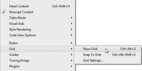
You can get to all the grid options from the menu.
or
Press Ctrl-Alt-G (Cmd-Opt-G).
Your document displays the grid if it wasn’t already displayed , and vice versa.

Here’s the page with the grid visible.
To change the grid settings
1. Choose View > Grid > Grid Settings  . The Grid Settings dialog appears .

If you don’t like the grid defaults, you can change the settings.
2. From this dialog, you can change the color, spacing, and whether the grid displays as lines or dots. You can also use this as a way to set the Show grid and Snap to Grid options at the same time. If you want to check how a setting looks, click Apply. When you like your results, click OK, and if the grid is set to show, your document appears with your chosen grid style. If the grid is not set to show, the settings will still be changed and will display their new values the next time you show the grid.
To make elements snap to the grid
1. Choose View > Grid > Snap To Grid .
or
Select the Snap to grid check box in the Grid Settings dialog  .
.
or
Press Ctrl-Alt-Shift-G (Cmd-Opt-Shift-G).
2. Move an absolutely positioned page element. It snaps to line up with the grid if you move the element within a few pixels of a grid line.
Using Rulers and Guides
Rulers and guides are also tools commonly found in other design applications. Dreamweaver has both horizontal and vertical rulers, which can use pixels, inches, or centimeters as units.
Guides can do almost everything grids can and a whole lot more. For instance, guides can be locked into place, guides can be set to percentages of the page, and not only can elements snap to guides, but guides can be set to snap to elements.
To turn rulers on or off
• To toggle the display of rulers, choose View > Rulers > Show . You can also choose the ruler units in this menu.
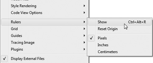
You can turn rulers on and off in the View menu.
or
Press Ctrl-Alt-R (Cmd-Opt-R).
To turn guides on or off
• To toggle the display of guides, choose View > Guides > Show Guides .

As you could with the grid, you can get to many guide options in the View menu.
or
Press Ctrl-; (Cmd-;).
To add a guide to your page
1. Click in either the horizontal or vertical ruler, and then drag into the document. The guide appears along with a tip that displays the number of pixels that the guide is currently away from the edge of the document .

By default, guides are measured in pixels.
2. When the guide is where you want it, release the mouse. The line remains, but the tip goes away.
To edit guide settings
1. Choose View > Guides > Edit Guides, and the Guides dialog appears .

Use the Guides dialog to change any of its settings.
2. From here, you can set:
• The guide and distance colors
• Whether guides should show
• Whether elements should snap to guides, guides snap to elements, both, or neither
• Whether guides are locked
You can also use it to clear all the current guides by clicking the Clear All button.
3. When your changes are complete, click OK.
Tip
To move a guide, move the mouse over the guide. When the cursor changes, click the guide and drag it to its new location.
Tip
To remove a guide from your page, move the guide off the document. Mac users will see a little “puff of smoke” animation—sorry, Windows users! You can also remove all the guides at once (without the animated effect) by choosing View > Guides > Clear Guides or by clicking Clear All in the Guides dialog  .
.
Tip
To inspect the current position of a guide, hover the cursor over the guide, and a tip showing the position appears.
Tip
To position a guide based on the percentage distance of the document rather than pixels, hold down the Shift key while moving the guide . The tip displays the current location in both pixels and percentages when you’re moving it and also when you check the guide’s position later.

If you want a percentage instead of pixels, hold down the Shift key.
Tip
To see how far a guide is from the sides of your document, hold down the Ctrl (Cmd) key. Lines appear showing the distance in pixels (and percentage, if set in the previous tip) to the edges of the document . If you have multiple guides on your page, the distance shown will be from guide to guide or from guide to edge.

Holding down the Ctrl (Cmd) key gives you the distance between the document edge and the guide.
Tip
Guides can be locked on your page so that they can’t be moved. To do this, choose View > Guides > Lock Guides  or use the Guides dialog . It’s a toggle, so just do it again to unlock your guides.
Tip
Rulers have to be visible for you to add guides, but you can view, move, and delete guides even when the rulers are hidden.
Tip
Guides can be used to simulate dimensions of standard browsers. Choose View > Guides and pick one of the standard sizes from the bottom of the menu . This creates both vertical and horizontal guides on your page. Be careful, though, because you can still move them accidentally, and then they aren’t much use for providing dimension hints. This is the one exception to the previous tip: you can create guides with this method even when the ruler is hidden.
Tip
As with the grid, you can choose to snap elements to your guides—but you can also choose to snap guides to your elements. Choose View > Guides > Snap To Guides, or View > Guides > Guides Snap To Elements, or even both . Or, you can set them in the Guides dialog .
Tip
If you double-click a guide, the Move Guide dialog appears . Use this dialog to set the guide to a precise position in pixels, inches, centimeters, or percentages.

Double-click a guide to get to the Move Guide dialog.
Zooming in on Your Page
Yes, it’s another feature borrowed from standard design applications, just like the grid and guides. The Zoom feature lets you design your pages more precisely. And as with the grid and guides, you’ll need to be in Design view to use it.
To zoom into your page
• Select the Zoom tool from the status bar at the bottom right of your document and your cursor changes to a magnifying glass with a plus. While in zoom mode, you can do either of two things:
• Click and drag to draw a box over the area you want to zoom in on. That rectangle expands to take up the entire document window .
• Click the spot on the page you want to magnify. Continue to click it until you get the magnification level you want.

The magnification tools in the Status bar are especially useful when making detailed changes to your pages.
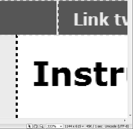
You can zoom in on a particular part of the screen.
or
Press Ctrl-= (Cmd-=) until you’ve reached the level you want.
or
Select a magnification level from the Zoom pop-up menu in the status bar.
or
Type your desired magnification level into the Zoom text box in the status bar.
or
Select View > Magnification and pick a magnification level .

You can also access the magnification levels from the menu.
or
Select an element on the page, and then choose View > Fit Selection .
or
Select an element on the page, and then choose Fit Selection from the Zoom pop-up menu in the status bar.
To zoom out from your page
• Select the Zoom tool from the status bar at the bottom right of your document. Press Alt (Opt) and the cursor changes to a magnifying glass and a minus. Click on the page to zoom out.
or
Press Ctrl- (minus key) (Cmd- [minus key]) until you’ve reached the level you want.
or
Select View > Magnification and pick a magnification level .
or
Choose View > Fit All or View > Fit Width .
or
Choose Fit All or Fit Width from the Zoom pop-up menu in the status bar.
Tip
To edit your page in Zoom mode, select the pointer in the status bar and click inside the page.
Tip
To pan your page after you’ve zoomed in, select the hand icon in the status bar, and then drag the page to move around.
Setting Page Dimensions
It’s handy to be able to easily set guides to show the dimensions of common browsers, but it’s not quite the same as seeing how your design actually appears in a window of that size. That’s where setting page dimensions comes in.
To resize the window to a preset size
• Click the Window Size pop-up menu in the status bar, and select one of the listed sizes . Your document window resets to that size.

Dreamweaver comes with preset window sizes for the most commonly used monitors.
To edit the preset window sizes
1. Click the Window Size pop-up menu in the status bar, and select Edit Sizes. The Status Bar Preferences pane appears .
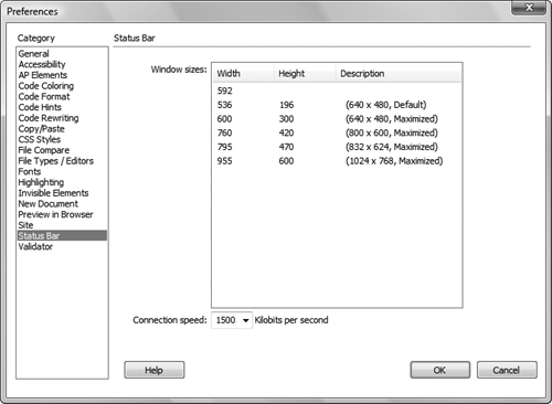
You can view or edit the window sizes in the Status Bar category of Dreamweaver’s Preferences.
or
Open Dreamweaver’s Preferences and select the Status Bar category.
2. Click in any of the fields and write over the current value to replace it. To add a value, click in the first unfilled line . To delete a value, clear the entire line by deleting the contents of each field.
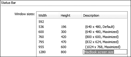
New sizes can be added just by clicking in the first unused line and typing the appropriate dimensions.
3. Click OK to accept. The new size now appears in the Window Size pop-up menu .

And here’s the new window size.
Tip
You can resize the window to a fixed width (leaving the height as is) by entering only a width value. To make the window resize to a fixed height, enter only the height.
Tip
You can’t resize a document on Windows if it’s maximized.
Tip
While it looks like you can sort the values in the Status Bar Preferences, you actually can’t.
Tip
Sadly, if you enter a new window size, it doesn’t get added as a new possible value for creating guides—it’s only for resizing.
Tip
While you’re in the Status Bar Preferences, take the chance to reset the Connection speed if it’s not appropriate for you or your audience. Dreamweaver uses that number to calculate page download time, which is shown on the far-right end of the status bar.
Putting It All Together
1. Explore the included Dreamweaver layouts.
2. Choose one of the included layouts and modify it.
3. Lay out a navigation menu.
4. Align items on a page using the grid and snap to grid tools.
5. Tweak the placement of elements on the page using rulers and guides.
6. In Design view, use the Zoom tool.
7. Resize the window to a pre-defined dimension.