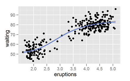
Figure 18-1: A ggplot2 graphic of the faithful dataset.
Chapter 18
Looking At ggplot2 Graphics
In This Chapter
![]() Installing and loading the ggplot2 package
Installing and loading the ggplot2 package
![]() Understanding how to use build a plot using layers
Understanding how to use build a plot using layers
![]() Creating charts with suitable geoms and stats
Creating charts with suitable geoms and stats
![]() Adding facets to your plot
Adding facets to your plot
One of the strengths of R is that it’s more than just a programming language — it also has thousands of packages written and contributed by independent developers. One of these packages, ggplot2, is tremendously popular and offers a new way of creating insightful graphics using R.
 Much of the
 ggplot2 philosophy is based on the so-called “grammar of graphics,” a theoretically sound way of describing all the components that go into a graphical plot. You don’t need to know anything about the grammar of graphics to use ggplot2 effectively, but now you know where its name comes from.
In this chapter, you first install and load the ggplot2 package and then take a first look at layers, the building blocks of the ggplot2 graphics. Next, you define the data, geoms, and stats that make up a layer, and use these to create some plots. Finally you take full control over your graphics by adding facets and scales as well as controlling other plot options, such as adding labels and titles.
Installing and Loading ggplot2
Because ggplot2 isn’t part of the standard distribution of R, you have to download the package from CRAN and install it.
In Chapter 3, you see that the Comprehensive R Archive Network (CRAN) is a network of servers around the world that contain the source code, documentation, and add-on packages for R. Its homepage is at http://cran.r-project.org.
Each submitted package on CRAN also has a page that describes what the package is about. You can view the ggplot2 page at http://cran.r-project.org/web/packages/ggplot2/index.html.
 Although it’s fairly common practice to simply refer to the package as
 ggplot, it is, in fact, the second implementation of the grammar of graphics for R; hence, the package is ggplot2. As of this writing, the current version of the package is version 0.9.0.
Perhaps somewhat confusingly, the most important function in this package is ggplot(). Notice that the function doesn’t have a 2 in its name. So, be careful to include the 2 when you install.packages() or library() the package in your R code, but the function ggplot() itself does not contain a 2.
In Chapter 3, you also see how to install a package for the first time with the install.packages() function and to load the package at the start of each R session with the library() function.
To install the ggplot2 package, use the following:
> install.packages(“ggplot2”)
And then to load it, use the following:
> library(“ggplot2”)
Looking At Layers
The basic concept of a ggplot2 graphic is that you combine different elements into layers. Each layer of a ggplot2 graphic contains information about the following:
![]() The data that you want to plot: For
The data that you want to plot: For ggplot(), this must be a data frame.
![]() A mapping from the data to your plot: This usually is as simple as telling
A mapping from the data to your plot: This usually is as simple as telling ggplot() what goes on the x-axis and what goes on the y-axis. (In the “Mapping data to plot aesthetics” section, later in this chapter, we explain how to use the aes() function to set up the mapping.)
![]() A geometric object, or geom in
A geometric object, or geom in ggplot terminology: The geom defines the overall look of the layer (for example, whether the plot is made up of bars, points, or lines).
![]() A statistical summary, called a stat in
A statistical summary, called a stat in ggplot: This describes how you want the data to be summarized (for example, binning for histograms, or smoothing to draw regression lines).
That was a mouthful. In practice, you describe all this in a short line of code. For example, here is the ggplot2 code to plot the faithful data using two layers. (Because you plot faithful in Chapter 17, we won’t bore you by describing it here.) The first layer is a geom that draws the points of a scatterplot; the second layer is a stat that draws a smooth line through the points.
> ggplot(faithful, aes(x=eruptions, y=waiting)) + geom_point() + stat_smooth()
This single line of code creates the graphic in Figure 18-1.
Using Geoms and Stats
To create a ggplot2 graphic, you have to explicitly tell the function what’s in each of the components of the layer. In other words, you have to tell the ggplot() function your data, the mapping between your data and the geom, and then either a geom or a stat.
In this section, we discuss geoms and then stats.
Defining what data to use
The first element of a ggplot2 layer is the data. There is only one rule for supplying data to ggplot(): Your data must be in the form of a data frame. This is different from base graphics, which allow plotting of data in vectors, matrices, and other structures.
In the remainder of this chapter we use the built-in dataset quakes. As you see in Chapters 13 and 17, quakes is a data frame with information about earthquakes near Fiji.
You tell ggplot() what data to use and how to map your data to your geom in the ggplot() function. The ggplot() function takes two arguments:
![]()
data: a data frame with your data (for example, data=quakes).
![]()
...: The dots argument indicates that any other argument you specified here gets passed on to downstream functions (that is, other functions that ggplot() happens to call). In the case of ggplot(), this means that anything you specify in this argument is available to your geoms and stats that you define later.
 Because the dots argument is available to any geom or stat in your plot, it’s a convenient place to define the mapping between your data and the visual elements of your plot.
This is where you typically specify a mapping between your data and your geom.
Mapping data to plot aesthetics
After you’ve told ggplot() what data to use, the next step is to tell it how your data corresponds to visual elements of your plot. This mapping between data and visual elements is the second element of a ggplot2 layer.
The visual elements of a plot, or aesthetics, include lines, points, symbols, colors, position . . . anything that you can see. For example, you can map a column of your data to the x-axis of your plot, or you can map a column of your data to correspond to the y-axis of your plot. You also can map data to groups, colors or the size of points in scatterplots — in fact, you can map your data to anything that your geom supports.
You use the special function aes() to set up a mapping between data and aesthetics. Each argument to aes() maps a column in your data to a specific element in your geom.
Take another look at the code used to create Figure 18-1:
> ggplot(faithful, aes(x=eruptions, y=waiting)) + geom_point() + stat_smooth()
You can see that this code tells ggplot() to use the data frame faithful as the data source. And now you understand that aes() creates a mapping between the x-axis and faithful$eruptions, as well as between the y-axis and faithful$waiting.
The next thing you notice about this line are the plus signs. In ggplot2, you use the + operator to combine the different layers of the plot.
In summary, you use the aes() function to define the mapping between your data and your plot. This is simple enough, but it leaves one question: How do you know which aesthetics are available in different geoms?
Getting geoms
A ggplot2 geom tells the plot how you want to display your data. For example, you use geom_bar() to make a bar chart. In ggplot2, you can use a variety of predefined geoms to make standard types of plot.
A geom defines the layout of a ggplot2 layer. For example, there are geoms to create bar charts, scatterplots, and line diagrams (as well as a variety of other plots), as you can see in Table 18-1.
Each geom has a default stat, and each stat has a default geom. In practice, you have to specify only one of these.
Table 18-1 A Selection of Geoms and Associated Default Stats
|
Geom |
Description |
Default Stat |
|
|
Bar chart |
|
|
|
Scatterplot |
|
|
|
Line diagram, connecting observations in ordered by x-value |
|
|
|
Box-and-whisker plot |
|
|
|
Line diagram, connecting observations in original order |
|
|
|
Add a smoothed conditioned mean |
|
|
|
An alias for |
|
Creating a bar chart
To make a bar chart you use the geom_bar() function. However, note that the default stat is stat_bin(), which is used to cut your data into bins. Thus, the default behavior of geom_bar() is to create a histogram.
For example, to create a histogram of the depth of earthquakes in the quakes dataset, you do the following:
> ggplot(quakes, aes(x=depth)) + geom_bar()
> ggplot(quakes, aes(x=depth)) + geom_bar(binwidth=50)
Notice that your mapping defines only the x-axis variable (in this case, quakes$depth). A useful argument to geom_bar() is binwidth, which controls the size of the bins that your data is cut into. This creates the plot of Figure 18-2.
So, if geom_bar() makes a histogram by default, how do you make a bar chart? The answer is that you first have to aggregate your data, and then specify the argument stat=”identity” in your call to geom_bar().
In the next example, you use aggregate() (see Chapter 13) to calculate the number of quakes at different depth strata:
> quakes.agg <- aggregate(mag ~ round(depth, -1), data=quakes,
+ FUN=length)
> names(quakes.agg) <- c(“depth”, “mag”)
Now you can plot the object quakes.agg with geom_bar(stat=”identity”):
> ggplot(quakes.agg, aes(x=depth, y=mag)) +
+ geom_bar(stat=”identity”)
Your results should be very similar to Figure 18-2.
In summary, you can use geom_bar() to create a histogram and let ggplot2 summarize your data, or you can presummarize your data and then use stat=”identity” to plot a bar chart.
Making a scatterplot
To create a scatterplot, you use the geom_point() function. A scatterplot creates points (or sometimes bubbles or other symbols) on your chart. Each point corresponds to an observation in your data.
You’ve probably seen or created this type of graphic a million times, so you already know that scatterplots use the Cartesian coordinate system, where one variable is mapped to the x-axis and a second variable is mapped to the y-axis.
In exactly the same way, in ggplot2 you create a mapping between x-axis and y-axis variables. So, to create a plot of the quakes data, you map quakes$long to the x-axis and quakes$lat to the y-axis:
> ggplot(quakes, aes(x=long, y=lat)) + geom_point()
This creates Figure 18-3.
Figure 18-2: Making a histogram with geom_bar().

Figure 18-3: Making a scatterplot with geom_point().

Creating line charts
To create a line chart, you use the geom_line() function. You use this function in a very similar way to geom_point(), with the difference that geom_line() draws a line between consecutive points in your data.
This type of chart is useful for time series data in data frames, such as the population data in the built-in dataset longley (see Chapter 17). To create a line chart of unemployment figures, you use the following:
> ggplot(longley, aes(x=Year, y=Unemployed)) + geom_line()
This creates Figure 18-4.
Figure 18-4: Drawing a line chart with geom_line().

You can use either geom_line() or geom_path() to create a line drawing in ggplot2. The difference is that geom_line() first orders the observations according to x-value, whereas geom_path() draws the observations in the order found in the data.
Sussing Stats
After data, mapping, and geoms, the fourth element of a ggplot2 layer describes how the data should be summarized. In ggplot2, you refer to this statistical summary as a stat.
One very convenient feature of ggplot2 is its range of functions to summarize your data in the plot. This means that you often don’t have to pre-summarize your data. For example, the height of bars in a histogram indicates how many observations of something you have in your data. The statistical summary for this is to count the observations. Statisticians refer to this process as binning, and the default stat for geom_bar() is stat_bin().
Analogous to the way that each geom has an associated default stat, each stat also has a default geom. Table 18-2 shows some useful stats functions, their effect, and their default geoms.
So, this begs the question: How do you decide whether to use a geom or a stat? In theory it doesn’t matter whether you choose the geom or the stat first. In practice, however, it often is intuitive to start with a type of plot first — in other words, specify a geom. If you then want to add another layer of statistical summary, use a stat.
Figure 18-2, earlier in this chapter, is an example of this. In this plot, you used the same data to first create a scatterplot with geom_point() and then you added a smooth line with stat_smooth().
Next, we take a look at some practical examples of using stat functions.
Table 18-2 Some Useful Stats and Default Geoms
|
Stat |
Description |
Default Geom |
|
|
Counts the number of observations in bins. |
|
|
|
Creates a smooth line. |
|
|
|
Adds values. |
|
|
|
No summary. Plots data as is. |
|
|
|
Summarizes data for a box-and-whisker plot. |
|
Binning data
You’ve already seen how to use stat_bin() to summarize your data into bins, because this is the default stat of geom_bar(). This means that the following two lines of code produce identical plots:
> ggplot(quakes, aes(x=depth)) + geom_bar(binwidth=50)
> ggplot(quakes, aes(x=depth)) + stat_bin(binwidth=50)
Your plot should be identical to Figure 18-2.
Smoothing data
The ggplot2 package also makes it very easy to create regression lines through your data. You use the stat_smooth() function to create this type of line.
The interesting thing about stat_smooth() is that it makes use of local regression by default. R has several functions that can do this, but ggplot2 uses the loess() function for local regression. This means that if you want to create a linear regression model (as in Chapter 15), you have to tell stat_smooth() to use a different smoother function. You do this with the method argument.
To illustrate the use of a smoother, start by creating a scatterplot of unemployment in the longley dataset:
> ggplot(longley, aes(x=Year, y=Employed)) + geom_point()
Next, add a smoother. This is as simple as adding stat_smooth() to your line of code.
> ggplot(longley, aes(x=Year, y=Employed)) +
+ geom_point() + stat_smooth()
Your graphic should look like the plot to the left of Figure 18-5. Finally, tell stat_smooth to use a linear regression model. You do this by adding the argument method=”lm”.
> ggplot(longley, aes(x=Year, y=Employed)) +
+ geom_point() + stat_smooth(method=”lm”)
Your graphic should now look like the plot to the right in Figure 18-5.
Figure 18-5: Adding regression lines with stat_smooth().

Doing nothing with identity
Sometimes you don’t want ggplot2 to summarize your data in the plot. This usually happens when your data is already pre-summarized or when each line of your data frame has to be plotted separately. In these cases, you want to tell ggplot2 to do nothing at all, and the stat to do this is stat_identity(). You probably noticed in Table 18-1 that stat_identity is the default statistic for points and lines.
Adding Facets, Scales, and Options
In addition to data, geoms, and stats, the full specification of a ggplot2 includes facets and scales. You’ve encountered facets in Chapter 17 — these allow you to visualize different subsets of your data in a single plot. Scales include not only the x-axis and y-axis, but also any additional keys that explain your data (for example, when different subgroups have different colors in your plot).
Adding facets
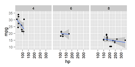
To illustrate the use of facets, you may want to replicate some of the faceted plots of the dataset mtcars that you encountered in Chapter 17.
To make the basic scatterplot of fuel consumption against performance, use the following:
> ggplot(mtcars, aes(x=hp, y=mpg)) + geom_point()
Then, to add facets, use the function facet_grid(). This function allows you to create a two-dimensional grid that defines the facet variables. You write the argument to facet_grid() as a formula of the form rows ~ columns. In other words, a tilde (~) separates the row variable from the column variable.
To illustrate, add facets with the number of cylinders as the columns. This means your formula is ~cyl. Notice that because there are no rows as facets, there is nothing before the tilde character:
> ggplot(mtcars, aes(x=hp, y=mpg)) + geom_point() +
+ stat_smooth(method=”lm”) + facet_grid(~cyl)
Your graphic should look like Figure 18-6.
Similar to facet_grid(), you also can use the facet_wrap() function to wrap one dimension of facets to fill the plot grid.
Figure 18-6: Adding facets with facet_grid().
Changing options
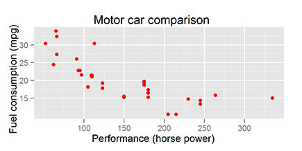
In ggplot2, you also can take full control of your titles, labels, and all other plot parameters.
To add x-axis and y-axis labels, you use the functions xlab() and ylab().
To add a main title, you have to specify the title argument to the function opts():
> ggplot(mtcars, aes(x=hp, y=mpg)) + geom_point(color=”red”) +
+ xlab(“Performance (horse power”) +
+ ylab(“Fuel consumption (mpg)”) +
+ opts(title = “Motor car comparison”)
Your graphic should look like Figure 18-7.
Figure 18-7: Changing ggplot2 options.
Working with scales
In ggplot2, scales control the way your data gets mapped to your geom. In this way, your data is mapped to something you can see (for example, lines, points, colors, position, or shapes).
The ggplot2 package is extremely good at selecting sensible default values for your scales. In most cases, you don’t have to do much to customize your scales. However, ggplot2 has a wide range of very sophisticated functions and settings to give you fine-grained control over your scale behavior and appearance.
In the following example, you map the column mtcars$cyl to both the shape and color of the points. This creates two separate, but overlapping, scales: One scale controls shape, while the second scale controls the color of the points:
> ggplot(mtcars, aes(x=hp, y=mpg)) +
+ geom_point(aes(shape=factor(cyl), colour=factor(cyl)))
The name of a scale defaults to the name of the variable that gets mapped to it. In this case, you map factor(cyl) to the scale. To change the appearance of a scale, you need to add a scale function to your plot. The specific scale function you use is dependent on the type of scale, but in this case, you have a shape scale with discrete values, so you use the scale_shape_ discrete() function. You also have a color scale with discrete value, so you can control that with scale_colour_discrete(). To change the name that appears in the legend of the plot, you need to specify the argument name to these scales. For example, change the name of the legend to “Cylinders” by setting the argument name=”Cylinders”:
> ggplot(mtcars, aes(x=hp, y=mpg)) +
+ geom_point(aes(shape=factor(cyl), colour=factor(cyl))) +
+ scale_shape_discrete(name=”Cylinders”) +
+ scale_colour_discrete(name=”Cylinders”)
+ scale_colour_discrete(name=”Cylinders”)
Similarly, to change the x-axis scale, you would use scale_x_continuous().

Getting More Information
In this chapter, we give you only a glimpse of the incredible power and variety at your fingertips when you use ggplot2. No doubt you’re itching to do more. Here are a few resources that you may find helpful:
![]() The
The ggplot2 website (http://had.co.nz/ggplot2) contains help and code examples for all the geoms, stats, facets, and scales. This site is an excellent resource. Because it also contains images of each plot, it’s even easier to use than the built-in R Help.
![]() Hadley Wickham, the author of
Hadley Wickham, the author of ggplot2, also wrote an excellent book that describes how to use ggplot2 in a very easy and helpful way. The book is called ggplot2: Elegant Graphics for Data Analysis, and you can find its website at http://had.co.nz/ggplot2/book. At this website, you also can find some sample chapters that you can read free of charge.
![]() At
At https://github.com/hadley/ggplot2/wiki, you can find the ggplot2 wiki, which is actively maintained and contains links to all kinds of useful information.
..................Content has been hidden....................
You can't read the all page of ebook, please click here login for view all page.