Figure 14-1: Creating a histogram for your data.
Chapter 14
Summarizing Data
In This Chapter
![]() Using statistical measures to describe your variables
Using statistical measures to describe your variables
![]() Using convenience functions to summarize variables and data frames
Using convenience functions to summarize variables and data frames
![]() Comparing two groups
Comparing two groups
It’s time to get down to the core business of R: statistics! Because R is designed to do just that, you can apply most common statistical techniques with a single command. Moreover, in general, these commands are very well documented both in the Help files and on the web. If you need more advanced methods or to implement cutting-edge research, very often there’s already a package for that, and many of these packages come with a book filled with examples.
It may seem rather odd that it takes us 14 chapters to come to the core business of R. Well, it isn’t. The difficult part is very often getting the data in the right format. After you’ve done that, R allows you to carry out the planned analyses rather easily. To see just how easy it is, read on.
 R allows you to do just about anything you want; also, the analysis you carry out doesn’t make sense at all. R gives you the correct calculation, but that’s not necessarily the right answer to your question. In fact, R is like a professional workbench available for everybody. If you don’t know what you’re doing, chances are, things will get bloody at some point. So, make sure you know the background of the tests you apply on your data, or look for guidance by a professional. All techniques you use in this chapter are explained in the book Statistics For Dummies, 2nd Edition, by Deborah J. Rumsey, PhD (Wiley).
Starting with the Right Data
Before you attempt to describe your data, you have to make sure your data is in the right format. This means
![]() Making sure all your data is contained in a data frame (or in a vector if it’s a single variable)
Making sure all your data is contained in a data frame (or in a vector if it’s a single variable)
![]() Ensuring that all the variables are of the correct type
Ensuring that all the variables are of the correct type
![]() Checking that the values are all processed correctly
Checking that the values are all processed correctly
 The previous chapters give you a whole set of tools for doing exactly these things. We can’t stress enough how important this is. Many of the mistakes in data analysis originate from wrongly formatted data.
Using factors or numeric data
Some data can have only a limited number of different values. For example, people can be either male or female, and you can describe most hair types with only a few colors. Sometimes more values are theoretically possible but not realistic. For example, cars can have more than 16 cylinders in their engines, but you won’t find many of them. In one way or another, all this data can be seen as categorical. By this definition, categorical data also includes ordinal data (see Chapter 5).
On the other hand, you have data that can have an unlimited amount of possible values. This doesn’t necessarily mean that the values can be any value you like. For example, the mileage of a car is expressed in miles per gallon, often rounded to the whole mile. Yet, the real value will be slightly different for every car. The only thing that defines how many possible values you allow is the precision with which you express the data. Data that can be expressed with any chosen level of precision is continuous. Both the interval-scaled data and the ratio-scaled data described in Chapter 5 are usually continuous data.
The distinction between categorical and continuous data isn’t always clear though. Age is, in essence, a continuous variable, but it’s often expressed in the number of years since birth. You still have a lot of possible values if you do that, but what happens if you look at the age of the kids at your local high school? Suddenly you have only five, maybe six, different values in your data. At that point, you may get more out of your analysis if you treat that data as categorical.
When describing your data, you need to make the distinction between data that benefits from being converted to a factor and data that needs to stay numeric. If you can view your data as categorical, converting it to a factor helps with analyzing it.
Counting unique values
Let’s take another look at the dataset mtcars. This built-in dataset describes fuel consumption and ten different design points from 32 cars from the 1970s. It contains, in total, 11 variables, but all of them are numeric. Although you can work with the data frame as is, some variables could be converted to a factor because they have a limited amount of values.
If you don’t know how many different values a variable has, you can get this information in two simple steps:
1. Get the unique values of the variable using unique().
2. Get the length of the resulting vector using length().
Using the sapply() function from Chapter 9, you can do this for the whole data frame at once. You apply an anonymous function combining both mentioned steps on the whole data frame, like this:
> sapply(mtcars, function(x) length(unique(x)))
mpg cyl disp hp drat wt qsec vs am gear carb
25 3 27 22 22 29 30 2 2 3 6
So, it looks like the variables cyl, vs, am, gear, and carb can benefit from a conversion to factor. Remember: You have 32 different observations in that dataset, so none of the variables has unique values only.
 When to treat a variable like a factor depends a bit on the situation, but, as a general rule, avoid more than ten different levels in a factor and try to have at least five values per level.
Preparing the data
In many real-life cases, you get heaps of data in a big file, and preferably in a format you can’t use at all. That must be the golden rule of data gathering: Make sure your statistician sweats his pants off just by looking at the data. But no worries! With R at your fingertips, you can quickly shape your data exactly as you want it. Selecting only the variables you need and transforming them to the right format becomes pretty easy with the tricks you see in the previous chapters.
Let’s prepare the data frame mtcars a bit using some simple tricks. First, create a data frame cars like this:
> cars <- mtcars[c(1,2,9,10)]
> cars$gear <- ordered(cars$gear)
> cars$am <- factor(cars$am, labels=c(‘auto’, ‘manual’))
With this code, you do the following:
![]() Select four variables from the data frame
Select four variables from the data frame mtcars and save them in a data frame called cars. Note that you use the index system for lists to select the variables (see Chapter 7).
![]() Make the variable
Make the variable gear in this data frame an ordered factor.
![]() Give the variable
Give the variable am the value ‘auto’ if its original value is 1, and ‘manual’ if its original value is 0.
![]() Transform the new variable
Transform the new variable am to a factor.
In the conversion of cars$am, you notice that the first argument of the ifelse() statement isn’t a logical expression. The original variable has 0 and 1 as values, and R reads a 0 as FALSE and everything else as TRUE. You can use this property in your own code, as shown earlier.
After running this code, you should have a dataset cars in your workspace with the following structure:
> str(cars)
‘data.frame’: 32 obs. of 4 variables:
$ mpg : num 21 21 22.8 21.4 18.7 ...
$ cyl : num 6 6 4 6 8 ...
$ am : Factor w/ 2 levels “auto”,”manual”: 1 1 1 2 2 ...
$ gear: Ord.factor w/ 3 levels “3”<”4”<”5”: 2 2 2 1 1 ...
With this dataset in your workspace you’re ready to tackle the rest of this chapter.
 In order to avoid too much clutter on the screen, we set the argument
 vec.len to 2 in the str() function when creating the output. This argument defines the default number of values that are displayed for each variable. If you use str(cars), your output may look a bit different from the one shown here. See the Help page ?str for more information. Or just forget about it — you’ll never use it unless you start writing a book about R.
Describing Continuous Variables
You have the dataset and you’ve formatted it to fit your needs, so now you’re ready for the real work. Analyzing your data always starts with describing it. This way you can detect errors in the data, and you can decide which models are appropriate to get the information you need from the data you have. Which descriptive statistics you use depends on the nature of your data, of course. Let’s first take a look at some things you want to do with continuous data.
Talking about the center of your data
Sometimes you’re more interested in the general picture of your data than you are in the individual values. You may be interested not in the mileage of every car, but in the average mileage of all cars from that dataset. For this, you calculate the mean using the mean() function, like this:
> mean(cars$mpg)
[1] 20.09062
You also could calculate the average number of cylinders those cars have, but this doesn’t really make sense. The average would be 6.1875 cylinders, and we have yet to see a car driving with an incomplete cylinder. In this case, the median — the most central value in your data — makes more sense. You get the median from using the function median(), like this:
> median(cars$cyl)
[1] 6
There are numerous other reasons for calculating the median instead of the mean, or even both together. Both statistics describe a different property of your data, and even the combination can tell you something. If you don’t know how to interpret these statistics, Statistics For Dummies, 2nd Edition, by Deborah J. Rumsey, PhD (Wiley) is a great resource.
Describing the variation
A single number doesn’t tell you that much about your data. Often it’s at least as important to have an idea about the spread of your data. You can look at this spread using a number of different approaches.
First, you can calculate either the variance or the standard deviation to summarize the spread in a single number. For that, you have the convenient functions var() for the variance and sd() for the standard deviation. For example, you calculate the standard deviation of the variable mpg in the data frame cars like this:
> sd(cars$mpg)
[1] 6.026948
Checking the quantiles
Next to the mean and variation, you also can take a look at the quantiles. A quantile, or percentile, tells you how much of your data lies below a certain value. The 50 percent quantile, for example, is nothing but the median. Again, R has some convenient functions to help you with looking at the quantiles.
Calculating the range
The most-used quantiles are actually the 0 percent and 100 percent quantiles. You could just as easily call them the minimum and maximum, because that’s what they are. We introduce the min() and max() functions in Chapter 4. You can get both together using the range() function. This function conveniently gives you the range of the data. So, to know between which two values all the mileages are situated, you simply do the following:
> range(cars$mpg)
[1] 10.4 33.9
Calculating the quartiles
The range still gives you only limited information. Often statisticians report the first and the third quartile next to the range and the median. These quartiles are, respectively, the 25 percent and 75 percent quantiles, which are the numbers for which one-fourth and three-fourths of the data is smaller. You get these numbers using the quantile() function, like this:
> quantile(cars$mpg)
0% 25% 50% 75% 100%
10.400 15.425 19.200 22.800 33.900
The quartiles are not the same as the lower and upper hinge calculated in the five-number summary. The latter two are, respectively, the median of the lower and upper half of your data, and they differ slightly from the first and third quartiles. To get the five number statistics, you use the fivenum() function.
Getting on speed with the quantile function
The quantile() function can give you any quantile you want. For that, you use the probs argument. You give the probs (or probabilities) as a fractional number. For the 20 percent quantile, for example, you use 0.20 as an argument for the value. This argument also takes a vector as a value, so you can, for example, get the 5 percent and 95 percent quantiles like this:
> quantile(cars$mpg, probs=c(0.05, 0.95))
5% 95%
11.995 31.300
The default value for the probs argument is a vector representing the minimum (0), the first quartile (0.25), the median (0.5), the third quartile (0.75), and the maximum (1).
All functions from the previous sections have an argument na.rm that allows you to remove all NA values before calculating the respective statistic. If you don’t do this, any vector containing NA will have NA as a result. This works identically to the na.rm argument of the sum() function (see Chapter 4).
Describing Categories
A first step in every analysis consists of calculating the descriptive statistics for your dataset. You have to get to know the data you received before you can accurately decide what models you try out on them. You need to know something about the range of the values in your data, how these values are distributed in the range, and how values in different variables relate to each other. Much of what you do and how you do it depends on the type of data.
Counting appearances
Whenever you have a limited number of different values, you can get a quick summary of the data by calculating a frequency table. A frequency table is a table that represents the number of occurrences of every unique value in the variable. In R, you use the table() function for that.
Creating a table
You can tabulate, for example, the amount of cars with a manual and an automatic gearbox using the following command:
> amtable <- table(cars$am)
> amtable
auto manual
13 19
This outcome tells you that, in your data, there are 13 cars with an automatic gearbox and 19 with a manual gearbox.
Working with tables
As with most functions, you can save the output of table() in a new object (in this case, called amtable). At first sight, the output of table() looks like a named vector, but is it?
> class(amtable)
[1] “table”
The table() function generates an object of the class table. These objects have the same structure as an array. Arrays can have an arbitrary number of dimensions and dimension names (see Chapter 7). Tables can be treated as arrays to select values or dimension names.
In the “Describing Multiple Variables” section, later in this chapter, you use multidimensional tables and calculate margins and proportions based on those tables.
Calculating proportions
After you have the table with the counts, you can easily calculate the proportion of each count to the total simply by dividing the table by the total counts. To calculate the proportion of manual and automatic gearboxes in the dataset cars, you can use the following code:
> amtable/sum(amtable)
auto manual
0.40625 0.59375
Yet, R also provides the prop.table() function to do the same. You can get the exact same result as the previous line of code by doing the following:
> prop.table(amtable)
You may wonder why you would use an extra function for something that’s as easy as dividing by the sum. The prop.table() function also can calculate marginal proportions (see the “Describing Multiple Variables” section, later in this chapter).
Finding the center
In statistics, the mode of a categorical variable is the value that occurs most frequently. It isn’t exactly the center of your data, but if there’s no order in your data — if you look at a nominal variable — you can’t really talk about a center either.
Although there isn’t a specific function to calculate the mode, you can get it by combining a few tricks:
1. To get the counts for each value, use table().
2. To find the location of the maximum number of counts, use max().
3. To find the mode of your variable, select the name corresponding with the location in Step 2 from the table in Step 1.
So, to find the mode for the variable am in the dataset cars, you can use the following code:
> id <- amtable == max(amtable)
> names(amtable)[id]
[1] “manual”
The variable id contains a logical vector that has the value TRUE for every value in the table amtable that is equal to the maximum in that table. You select the name from the values in amtable using this logical vector as an index.
You also can use the which.max() function to find the location of the maximum in a vector. This function has one important disadvantage, though: If you have multiple maximums, which.max() will return the position of the first maximum only. If you’re interested in all maximums, you should use the construct in the previous example.
Describing Distributions
Sometimes the information about the center of the data just isn’t enough. You get some information about your data from the variance or the quantiles, but still you may miss important features of your data. Instead of calculating yet more numbers, R offers you some graphical tools to inspect your data further. And in the meantime, you can impress people with some fancy plots.
Plotting histograms
To get a clearer idea about how your data is distributed within the range, you can plot a histogram. In Chapter 16, you fancy up your plots, but for now let’s just check the most-used tool for describing your data graphically.
Making the plot
To make a histogram for the mileage data, you simply use the hist() function, like this:
> hist(cars$mpg, col=’grey’)
The result of this function is shown on the left of Figure 14-1. There you see that the hist() function first cuts the range of the data in a number of even intervals, and then counts the number of observations in each interval. The bars height is proportional to those frequencies. On the y-axis, you find the counts.
With the argument col, you give the bars in the histogram a bit of color. In Chapter 16, we give you some more tricks for customizing the histogram (for example, by adding a title).
Playing with breaks
R chooses the number of intervals it considers most useful to represent the data, but you can disagree with what R does and choose the breaks yourself. For this, you use the breaks argument of the hist() function.
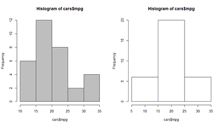
You can specify the breaks in a couple different ways:
![]() You can tell R the number of bars you want in the histogram by giving a single number as the argument. Just keep in mind that R will still decide whether that’s actually reasonable, and it tries to cut up the range using nice rounded numbers.
You can tell R the number of bars you want in the histogram by giving a single number as the argument. Just keep in mind that R will still decide whether that’s actually reasonable, and it tries to cut up the range using nice rounded numbers.
![]() You can tell R exactly where to put the breaks by giving a vector with the break points as a value to the
You can tell R exactly where to put the breaks by giving a vector with the break points as a value to the breaks argument.
So, if you don’t agree with R and you want to have bars representing the intervals 5 to 15, 15 to 25, and 25 to 35, you can do this with the following code:
> hist(cars$mpg, breaks=c(5,15,25,35))
The resulting plot is on the right side of Figure 14-1.
You also can give the name of the algorithm R has to use to determine the number of breaks as the value for the breaks argument. You can find more information on those algorithms on the Help page ?hist. Try to experiment with those algorithms a bit to check which one works the best.
Using frequencies or densities
By breaking up your data in intervals, you still lose some information, albeit a lot less than when just looking at the descriptives you calculate in the previous sections. Still, the most complete way of describing your data is by estimating the probability density function (PDF) or density of your variable.
If this concept is unfamiliar to you, don’t worry. Just remember that the density is proportional to the chance that any value in your data is approximately equal to that value. In fact, for a histogram, the density is calculated from the counts, so the only difference between a histogram with frequencies and one with densities, is the scale of the y-axis. For the rest, they look exactly the same.
Creating a density plot
You can estimate the density function of a variable using the density() function. The output of this function itself doesn’t tell you that much, but you can easily use it in a plot. For example, you can get the density of the mileage variable mpg like this:
> mpgdens <- density(cars$mpg)
The object you get this way is a list containing a lot of information you don’t really need to look at. But that list makes plotting the density as easy as saying “plot the density”:
> plot(mpgdens)
You see the result of this command on the left side of Figure 14-2. The plot looks a bit rough on the edges, but you can polish it with the tricks shown in Chapter 16. The important thing is to see how your data comes out. The density object is plotted as a line, with the actual values of your data on the x-axis and the density on the y-axis.
Figure 14-2: Plotting density lines and combining them with a histogram.
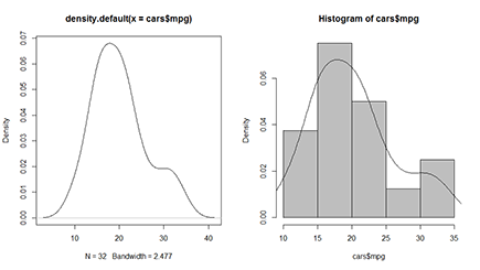
The mpgdens list object contains — among other things — an element called x and one called y. These represent the x- and y-coordinates for plotting the density. When R calculates the density, the density() function splits up your data in a large number of small intervals and calculates the density for the midpoint of each interval. Those midpoints are the values for x, and the calculated densities are the values for y.
Plotting densities in a histogram
Remember that the hist() function returns the counts for each interval. Now the chance that a value lies within a certain interval is directly proportional to the counts. The more values you have within a certain interval, the greater the chance that any value you picked is lying in that interval.
So, instead of plotting the counts in the histogram, you could just as well plot the densities. R does all the calculations for you — the only thing you need to do is set the freq argument of hist() to FALSE, like this:
> hist(cars$mpg, col=’grey’, freq=FALSE)
Now the plot will look exactly the same as before; only the values on the y-axis are different. The scale on the y-axis is set in such a way that you can add the density plot over the histogram. For that, you use the lines() function with the density object as the argument. So, you can, for example, fancy up the previous histogram a bit further by adding the estimated density using the following code immediately after the previous command:
> lines(mpgdens)
You see the result of these two commands on the right side of Figure 14-2. You get more information on how the lines() function works in Chapter 16. For now, just remember that lines() uses the x and y elements from the density object mpgdens to plot the line.
Describing Multiple Variables
Until now, you looked at a single variable from your dataset each time. All these statistics and plots tell part of the story, but when you have a dataset with multiple variables, there’s a lot more of the story to be told. Taking a quick look at the summary of the complete dataset can warn you already if something went wrong with the data gathering and manipulation. But what statisticians really go after is the story told by the relation between the variables. And that story begins with describing these relations.
Summarizing a complete dataset
If you need a quick overview of your dataset, you can, of course, always use str() and look at the structure. But this tells you something only about the classes of your variables and the number of observations. Also, the function head() gives you, at best, an idea of the way the data is stored in the dataset.
Getting the output
To get a better idea of the distribution of your variables in the dataset, you can use the summary() function like this:
> summary(cars)
mpg cyl am gear
Min. :10.40 Min. :4.000 auto :13 3:15
1st Qu.:15.43 1st Qu.:4.000 manual:19 4:12
Median :19.20 Median :6.000 5: 5
Mean :20.09 Mean :6.188
3rd Qu.:22.80 3rd Qu.:8.000
Max. :33.90 Max. :8.000
The summary() function works best if you just use R interactively at the command line for scanning your dataset quickly. You shouldn’t try to use it within a custom function you wrote yourself. In that case, you’d better use the functions from the first part of this chapter to get the desired statistics.
The output of the summary() function shows you for every variable a set of descriptive statistics, depending on the type of the variable:
![]() Numerical variables:
Numerical variables: summary() gives you the range, quartiles, median, and mean.
![]() Factor variables:
Factor variables: summary() gives you a table with frequencies.
![]() Numerical and factor variables:
Numerical and factor variables: summary() gives you the number of missing values, if there are any.
![]() Character variables:
Character variables: summary() doesn’t give you any information at all apart from the length and the class (which is ‘character’).
Fixing a problem
Did you see the weird values for the variable cyl? A quick look at the summary can tell you there’s something fishy going on, as, for example, the minimum and the first quartile have exactly the same value. In fact, the variable cyl has only three values and would be better off as a factor. So, let’s put that variable out of its misery:
> cars$cyl <- as.factor(cars$cyl)
Now you can use it correctly in the remainder of this chapter.
Plotting quantiles for subgroups
Often you want to split up this analysis for different subgroups in order to compare them. You need to do this if you want to know how the average lip size compares between male and female kissing gouramis (great fish by the way!) or, in the case of our example, you want to know whether the number of cylinders in a car influences the mileage.
Of course you can use tapply() to calculate any of the descriptives for subgroups defined by a factor variable. In Chapter 13, you do exactly that. But in R you find some more tools for summarizing descriptives for different subgroups.
One way to quickly compare groups is to construct a box-and-whisker plot from the data. You could construct this plot by calculating the range, the quartiles, and the median for each group, but luckily you can just tell R to do all that for you. For example, if you want to know how the mileage compares between cars with a different number of cylinders, you simply use the boxplot() function to get the result shown in Figure 14-3:
> boxplot(mpg ~ cyl, data=cars)
Figure 14-3: Use the boxplot() function to get this result.

You supply a simple formula as the first argument to boxplot(). This formula reads as “plot boxes for the variable mpg for the groups defined by the variable cyl.” You find more information on the formula interface for functions in Chapter 13.
This plot uses quantiles to give you an idea of how the data is spread within each subgroup. The line in the middle of each box represents the median, and the edges of the box represent the first and the third quartiles. The whiskers extend to either the minimum and the maximum of the data or 1.5 times the distance between the first and the third quartiles, whichever is smaller.
To be completely correct, the edges of the box represent the lower and upper hinges from the five-number summary, calculated using the fivenum() function. They’re equal to the quartiles only if you have an odd number of observations in your data. Otherwise, the results of fivenum() and quantile() may differ a bit due to differences in the details of the calculation.
You can let the whiskers always extend to the minimum and the maximum by setting the range argument of the boxplot() function to 0.
Tracking correlations
Statisticians love it when they can link one variable to another. Sunlight, for example, is detrimental to skirts: The longer the sun shines, the shorter skirts become. We say that the number of hours of sunshine correlates with skirt length. Obviously, there isn’t really a direct causal relationship here — you won’t find short skirts during the summer in polar regions. But, in many cases, the search for causal relationships starts with looking at correlations.
To illustrate this, let’s take a look at the famous iris dataset in R. One of the greatest statisticians of all time, Sir Ronald Fisher, used this dataset to illustrate how multiple measurements can be used to discriminate between different species. This dataset contains five variables, as you can see by using the names() function:
> names(iris)
[1] “Sepal.Length” “Sepal.Width” “Petal.Length”
[4] “Petal.Width” “Species”
It contains measurements of flower characteristics for three species of iris and from 50 flowers for each species. Two variables describe the sepals (Sepal.Length and Sepal.Width), two other variables describe the petals (Petal.Length and Petal.Width), and the last variable (Species) is a factor indicating from which species the flower comes.
Looking at relations
Although looks can be deceiving, you want to eyeball your data before digging deeper into it. In Chapter 16, you create scatterplots for two variables. To plot a grid of scatterplots for all combinations of two variables in your dataset, you can simply use the plot() function on your data frame, like this:
> plot(iris[-5])
Because scatterplots are useful only for continuous variables, you can drop all variables that are not continuous. Too many variables in the plot matrix makes the plots difficult to see. In the previous code, you drop the variable Species, because that’s a factor.
You can see the result of this simple line of code in Figure 14-4. The variable names appear in the squares on the diagonal, indicating which variables are plotted along the x-axis and the y-axis. For example, the second plot on the third row has Sepal.Width on the x-axis and Petal.Length on the y-axis.
When the plot() function notices that you pass a data frame as an argument, it calls the pairs() function to create the plot matrix. This function offers you a lot more flexibility. For example, on the Help page ?pairs, you find some code that adds a histogram on the diagonal plots. Check out the examples on the Help page for some more tricks.
Figure 14-4: Plotting the relations for all variables in a dataset.

Getting the numbers
The amount in which two variables vary together can be described by the correlation coefficient. You get the correlations between a set of variables in R very easily by using the cor() function. You simply add the two variables you want to examine as the arguments. For example, if you want to check how much the petal width correlates with the petal length, you simply do the following:
> with(iris, cor(Petal.Width, Petal.Length))
[1] 0.9628654
This tells you that the relation between the petal width and the petal length is almost a perfect line, as you also can see in the fourth plot of the third row in Figure 14-4.
Calculating correlations for multiple variables
You also can calculate the correlation among multiple variables at once, much in the same way as you can plot the relations among multiple variables. So, for example, you can calculate the correlations that correspond with the plot in Figure 14-4 with the following line:
> iris.cor <- cor(iris[-5])
As always, you can save the outcome of this function in an object. This lets you examine the structure of the function output so you can figure out how you can use it in the rest of your code. Here’s a look at the structure of the object iris.cor:
> str(iris.cor)
num [1:4, 1:4] 1 -0.118 0.872 0.818 -0.118 ...
- attr(*, “dimnames”)=List of 2
..$ : chr [1:4] “Sepal.Length” “Sepal.Width” “Petal.Length” “Petal.Width”
..$ : chr [1:4] “Sepal.Length” “Sepal.Width” “Petal.Length” “Petal.Width”
This output tells you that iris.cor is a matrix with the names of the variables as both row names and column names. To find the correlation of two variables in that matrix, you can use the names as indices — for example:
> iris.cor[‘Petal.Width’, ‘Petal.Length’]
[1] 0.9628654
Dealing with missing values
The cor() function can deal with missing values in multiple ways. For that, you set the argument use to one of the possible text values. The value for the use argument is especially important if you calculate the correlations of the variables in a data frame. By setting this argument to different values, you can
![]() Use all observations by setting
Use all observations by setting use=’everything’. This means that if there’s any NA value in one of the variables, the resulting correlation is NA as well. This is the default.
![]() Exclude all observations that have
Exclude all observations that have NA for at least one variable. For this, you set use=’complete.obs’. Note that this may leave you with only a few observations if missing values are spread through the complete dataset.
![]() Exclude observations with
Exclude observations with NA values for every pair of variables you examine. For that, you set the argument use=’pairwise’. This ensures that you can calculate the correlation for every pair of variables without losing information because of missing values in the other variables.
In fact, you can calculate different measures of correlation. By default, R calculates the standard Pearson correlation coefficient. For data that is not normally distributed, you can use the cor() function to calculate the Spearman rank correlation, or Kendall’s tau. For this, you have to set the method argument to the appropriate value. You can find more information about calculating the different correlation statistics on the Help page ?cor. For more formal testing of correlations, look at the cor.test() function and the related Help page.
Working with Tables
In the “Describing Categories” section, earlier in this chapter, you use tables to summarize one categorical variable. But tables can easily describe more variables at once. You may want to know how many men and women teach in each department of your university (although that’s not the most traditional criterion for choosing your major).
Creating a two-way table
A two-way table is a table that describes two categorical variables together. It contains the number of cases for each combination of the categories in both variables. The analysis of categorical data always starts with tables, and R gives you a whole toolset to work with them. But first, you have to create the tables.
Creating a table from two variables
For example, you want to know how many cars have three, four, or five gears, but split up for cars with automatic gearboxes and cars with manual gearboxes. You can do this again with using the table() function with two arguments, like this:
> with(cars, table(am, gear))
3 4 5
auto 0 8 5
manual 15 4 0
The levels of the variable you give as the first argument are the row names, and the levels of the variable you give as the second argument are the column names. In the table, you get the counts for every combination. For example, you can count 15 cars with manual gearboxes and three gears.
Creating tables from a matrix
Researchers also use tables for more serious business, like for finding out whether a certain behavior (like smoking) has an impact on the risk of getting an illness (for example, lung cancer). This way you have four possible cases: risk behavior and sick, risk behavior and healthy, no risk behavior and healthy, or no risk behavior and sick.
Often the result of such a study consists of the counts for every combination. If you have the counts for every case, you can very easily create the table yourself, like this:
> trial <- matrix(c(34,11,9,32), ncol=2)
> colnames(trial) <- c(‘sick’, ‘healthy’)
> rownames(trial) <- c(‘risk’, ‘no_risk’)
> trial.table <- as.table(trial)
With this code, you do the following:
1. Create a matrix with the number of cases for every combination of sick/healthy and risk/no risk behavior.
2. Add column names to point out which category the counts are for.
3. Convert that matrix to a table.
The result looks like this:
> trial.table
sick healthy
risk 34 9
no_risk 11 32
A table like trial.table can be seen as a summary of two variables. One variable indicates if the person is sick or healthy, and the other variable indicates whether the person shows risky behavior.
Extracting the numbers
Although tables and matrices are two different beasts, you can treat a two-way table like a matrix in most situations. This becomes handy if you want to extract values from the table. If you want to know how many people were sick and showed risk behavior, you simply do the following:
> trial.table[‘risk’, ‘sick’]
[1] 34
All the tricks with indices that we cover in Chapters 4 and 7 work on tables, too. A table of a single variable reacts the same as a vector, and a two-way table reacts the same as a matrix.
Converting tables to a data frame
The resulting object trial.table looks exactly the same as the matrix trial, but it really isn’t. The difference becomes clear when you transform these objects to a data frame. Take a look at the outcome of the following code:
> trial.df <- as.data.frame(trial)
> str(trial.df)
‘data.frame’: 2 obs. of 2 variables:
$ sick : num 34 11
$ healthy: num 9 32
Here you get a data frame with two variables (sick and healthy) with each two observations. On the other hand, if you convert the table to a data frame, you get the following result:
> trial.table.df <- as.data.frame(trial.table)
> str(trial.table.df)
‘data.frame’: 4 obs. of 3 variables:
$ Var1: Factor w/ 2 levels “risk”,”no_risk”: 1 2 1 2
$ Var2: Factor w/ 2 levels “sick”,”healthy”: 1 1 2 2
$ Freq: num 34 11 9 32
The as.data.frame() function converts a table to a data frame in a format that you need for regression analysis on count data. If you need to summarize the counts first, you use table() to create the desired table.
Now you get a data frame with three variables. The first two — Var1 and Var2 — are factor variables for which the levels are the values of the rows and the columns of the table, respectively. The third variable — Freq — contains the frequencies for every combination of the levels in the first two variables.
In fact, you also can create tables in more than two dimensions by adding more variables as arguments, or by transforming a multidimensional array to a table using as.table(). You can access the numbers the same way you do for multidimensional arrays, and the as.data.frame() function creates as many factor variables as there are dimensions.
Looking at margins and proportions
In categorical data analysis, many techniques use the marginal totals of the table in the calculations. The marginal totals are the total counts of the cases over the categories of interest. For example, the marginal totals for behavior would be the sum over the rows of the table trial.table.
Adding margins to the table
R allows you to extend a table with the marginal totals of the rows and columns in one simple command. For that, you use the addmargins() function, like this:
> addmargins(trial.table)
sick healthy Sum
risk 34 9 43
no_risk 11 32 43
Sum 45 41 86
You also can add the margins for only one dimension by specifying the margin argument for the addmargins() function. For example, to get only the marginal counts for the behavior, you do the following:
> addmargins(trial.table,margin=2)
sick healthy Sum
risk 34 9 43
no_risk 11 32 43
The margin argument takes a number or a vector of numbers, but it can be a bit confusing. The margins are numbered the same way as in the apply() function. So 1 stands for rows and 2 for columns. To add the column margin, you need to set margin to 2, but this column margin contains the row totals.
Calculating proportions
You can convert a table with counts to a table with proportions very easily using the prop.table() function. This also works for multiway tables. If you want to know the proportions of observations in every cell of the table to the total number of cases, you simply do the following:
> prop.table(trial.table)
sick healthy
risk 0.3953488 0.1046512
no_risk 0.1279070 0.3720930
This tells you that, for example, 10.4 percent of the people in the study were healthy, even when they showed risk behavior.
Calculating proportions over columns and rows
But what if you want to know which fraction of people with risk behavior got sick? Then you don’t have to calculate the proportions by dividing the counts by the total number of cases for the whole dataset; instead, you divide the counts by the marginal totals.
R lets you do this very easily using, again, the prop.table() function, but this time specifying the margin argument.
Take a look at the table again. You want to calculate the proportions over each row, because each row represents one category of behavior. So, to get the correct proportions, you specify margin=1 like this:
> prop.table(trial.table, margin=1)
sick healthy
risk 0.7906977 0.2093023
no_risk 0.2558140 0.7441860
In every row, the proportions sum up to 1. Now you can see that 79 percent of the people showing risk behavior got sick. Well, it isn’t big news that risky behavior can cause diseases, and the proportions shown in the last result point in that direction. Yet, scientists believe you only if you can back it up in a more objective way. That’s the point at which you should consider doing some statistical testing. We show you how that’s done in the next chapter.
..................Content has been hidden....................
You can't read the all page of ebook, please click here login for view all page.