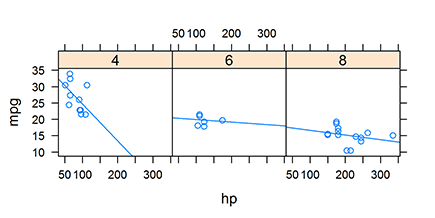
Figure 17-1: Faceted graphics, like this one, provide simultaneous views of different slices of data.
Chapter 17
Creating Faceted Graphics with Lattice
In This Chapter
![]() Getting to know the benefits of faceted graphics
Getting to know the benefits of faceted graphics
![]() Using the
Using the lattice package to create faceted plots
![]() Changing the colors and other parameters of lattice plots
Changing the colors and other parameters of lattice plots
![]() Understanding the differences between base graphics and lattice graphics
Understanding the differences between base graphics and lattice graphics
Creating subsets of data and plotting each subset allows you to see whether there are patterns between different subsets of the data. For example, a sales manager may want to see a sales report for different regions in the form of a graphic. A biologist may want to investigate different species of butterflies and compare the differences on a plot.
A single graphic that provides this kind of simultaneous view of different slices through the data is called a faceted graphic. Figure 17-1 shows a faceted plot of fuel economy and performance of motor cars. The important thing to notice is that the plot contains three panels, one each for cars with four, six, and eight cylinders.
R has a special package that allows you to easily create this kind of graphic. The package is called lattice and in this chapter you get to draw lattice charts. Later in this chapter, you create a lattice plot that should be identical to Figure 17-1.
 In this chapter, we give the briefest of introductions to the extensive functionality in
 lattice. An entire book could be written about lattice graphics — and, in fact, such a book already exists. The author of the lattice package, Deepayan Sarkar, also wrote a book called Lattice: Multivariate Data Visualization with R (Springer). You can find the figures and code from that book at http://lmdvr.r-forge.r-project.org/figures/figures.html.

Creating a Lattice Plot
To explore lattice graphics, first take a look at the built-in dataset mtcars. This dataset contains 32 observations of motor cars and information about the engine, such as number of cylinders, automatic versus manual gearbox, and engine power.
 All the built-in datasets of R also have good help information that you can access through the Help mechanism — for example, by typing ?mtcars into the R console.
> str(mtcars)
‘data.frame’: 32 obs. of 11 variables:
$ mpg : num 21 21 22.8 21.4 18.7 18.1 14.3 24.4 22.8 19.2 ...
$ cyl : num 6 6 4 6 8 6 8 4 4 6 ...
$ disp: num 160 160 108 258 360 ...
$ hp : num 110 110 93 110 175 105 245 62 95 123 ...
$ drat: num 3.9 3.9 3.85 3.08 3.15 2.76 3.21 3.69 3.92 3.92 ...
$ wt : num 2.62 2.88 2.32 3.21 3.44 ...
$ qsec: num 16.5 17 18.6 19.4 17 ...
$ vs : num 0 0 1 1 0 1 0 1 1 1 ...
$ am : num 1 1 1 0 0 0 0 0 0 0 ...
$ gear: num 4 4 4 3 3 3 3 4 4 4 ...
$ carb: num 4 4 1 1 2 1 4 2 2 4 ..
Say you want to explore the relationship between fuel economy and engine power. The mtcars dataset has two elements with this information:
![]()
mpg: Fuel economy measured in miles per gallon (mpg)
![]()
hp: Engine power measured in horsepower (hp)
In this section, you create different plots of mpg against hp.
Loading the lattice package
Although the lattice package forms part of the R distribution, you have to tell R that you plan to use the code in this package. You do this with the library() function. Remember that you need to do this at the start of each clean R session in which you want to use lattice:
> library(“lattice”)
Making a lattice scatterplot
The lattice package has a number of different functions to create different types of plot. For example, to create a scatterplot, use the xyplot() function. Notice that this is different from base graphics, where the plot() function creates a variety of different plot types (because of the method dispatch mechanism). Besides xyplot(), we briefly discuss the other lattice functions later in this chapter.
To make a lattice plot, you need to specify at least two arguments:
![]()
formula: This is a formula typically of the form y ~ x | z. It means to create a plot of y against x, conditional on z. In other words, create a plot for every unique value of z. Each of the variables in the formula has to be a column in the data frame that you specify in the data argument.
![]()
data: A data frame that contains all the columns that you specify in the formula argument.
This example should make it clear:
> xyplot(mpg ~ hp | factor(cyl), data=mtcars)
You can see that:
![]() The variables
The variables mpg, hp, and cyl are columns in the data frame mtcars.
![]() Although
Although cyl is a numeric vector, the number of cylinders in a car can be only whole numbers (or discrete variables, in statistical jargon). By using factor(cyl) in your code, you tell R that cyl is, in fact, a discrete variable. If you forget to do this, R will still create a graphic, but the labels of the strips at the top of each panel will be displayed differently.
Your code should produce a graphic that looks like Figure 17-2. Because each of the cars in the data frame has four, six, or eight cylinders, the chart has three panes. You can see that the cars with larger engines tend to have more power (hp) and poorer fuel consumption (mpg).
Figure 17-2: A lattice scatterplot of the data in mtcars.

Adding trend lines
In Chapter 15, we show you how to create trend lines, or regression lines through data.
When you tell lattice to calculate a line of best fit, it does so for each panel in the plot. This is straightforward using xyplot(), because it’s as simple as adding a type argument. In particular, you want to specify that the type is both points (type=”p”) and regression (type=”r”). You can combine different types with the c() function, like this:
> xyplot(mpg ~ hp | factor(cyl), data=mtcars,
+ type=c(“p”, “r”))
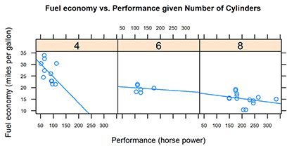
Your graphic should look like Figure 17-3.
Figure 17-3: Lattice xyplot with regression lines added.
Base, grid, and lattice graphics
Perhaps confusingly, the standard distribution of R actually contains three different graphics packages:
![]() Base graphics is the graphics system that was originally developed for R. The workhorse function of base graphics is a
Base graphics is the graphics system that was originally developed for R. The workhorse function of base graphics is a plot() (see Chapter 16). The code for base graphics is in the graphics package, which is loaded by default when you start R.
![]() Grid graphics is an alternative graphics system that was later added to R. The big difference between grid and the original base graphics system is that grid allows for the creation of multiple regions, called viewports, on a single graphics page. Grid is a framework of code and doesn’t, by itself, create complete charts. The author of grid, Paul Murrell, describes some of the ideas behind grid graphics on his website at
Grid graphics is an alternative graphics system that was later added to R. The big difference between grid and the original base graphics system is that grid allows for the creation of multiple regions, called viewports, on a single graphics page. Grid is a framework of code and doesn’t, by itself, create complete charts. The author of grid, Paul Murrell, describes some of the ideas behind grid graphics on his website at www.stat.auckland.ac.nz/~paul/grid/doc/grid.pdf. Note: The grid package needs to be loaded before you can use it.
![]() Lattice is a graphics system that specifically implements the idea of Trellis graphics (or faceted graphics), which was originally developed for the languages S and S-Plus at Bell Labs. Lattice graphics in R make use of grid graphics. This means that the functions for creating graphics and changing options in base and
Lattice is a graphics system that specifically implements the idea of Trellis graphics (or faceted graphics), which was originally developed for the languages S and S-Plus at Bell Labs. Lattice graphics in R make use of grid graphics. This means that the functions for creating graphics and changing options in base and lattice are mostly incompatible with one another. The lattice package needs to be loaded before use.
 Strictly speaking,
 type is not an argument to xyplot(), but an argument to panel.xyplot(). You can control the panels of lattice graphics with a panel function. The function xyplot() calls this panel function internally, using the type argument you specified. The default panel function for xyplot() is panel.xyplot(). Similarly, the panel function for barchart() — which we cover later in this chapter — is panel.barchart(). The panel function allows you to take fine control over many aspects of your chart. You can find out more in the excellent Help for these functions — for example, by typing ?panel.xyplot into your R console.
Changing Plot Options
R has a very good reputation for being able to create publication-quality graphics. If you want to use your lattice graphics in reports or documents, you’ll probably want to change the plot options.
The lattice package makes use of the grid graphics engine, which is completely different from the base graphics in Chapter 16. Because of this, none of the mechanisms for changing plot options covered in Chapter 16 are applicable to lattice graphics.
Adding titles and labels
To add a main title and axis labels to a lattice plot, you can specify the following arguments:
![]()
main: Main title
![]()
xlab: x-axis label
![]()
ylab: y-axis label
> xyplot(mpg ~ hp | factor(cyl), data=mtcars,
+ type=c(“p”, “r”),
+ main=”Fuel economy vs. Performance”,
+ xlab=”Performance (horse power)”,
+ ylab=”Fuel economy (miles per gallon)”,
+ )
Your output should now be similar to Figure 17-4.
Figure 17-4: A lattice graphic with titles.

Changing the font size of titles and labels
You probably think that the title and label text in Figure 17-4 are disproportionately large compared to the rest of the graphic.
To change the size of your labels, you need to modify your arguments to be lists. Similar to base graphics, you specify a cex argument in lattice graphics to modify the character expansion ratio. For example, to reduce the main title and axis label text to 75 percent of standard size, specify cex=0.75 as an element in the list argument to main, xlab, and ylab.
To keep it simple, build up the formatting of your plot step by step. Start by changing the size of your main title to cex=0.75:
> xyplot(mpg ~ hp | factor(cyl), data=mtcars,
+ type=c(“p”, “r”),
+ main=list(
+ label=”Fuel economy vs. Performance given Number of Cylinders”,
+ cex=0.75)
+ )
Do you see what happened? Your argument to main now contains a list with two elements: label and cex.
You construct the arguments for xlab and ylab in exactly the same way. Each argument is a list that contains the label and any other formatting options you want to set. Expand your code to modify the axis labels:
> xyplot(mpg ~ hp | factor(cyl), data=mtcars,
+ type=c(“p”, “r”),
+ main=list(
+ label=”Fuel economy vs. Performance given Number of Cylinders”,
+ cex=0.75),
+ xlab=list(
+ label=”Performance (horse power)”,
+ cex=0.75),
+ ylab=list(
+ label=”Fuel economy (miles per gallon)”,
+ cex=0.75),
+ scales=list(cex=0.5)
+ )
If you look carefully, you’ll see that the code includes an argument to modify the size of the scales text to 50 percent of standard (scales=list(cex=0.5)). Your results should look like Figure 17-5.
Figure 17-5: Changing the font size of lattice graphics labels and text.
Using themes to modify plot options
One neat feature of lattice graphics is that you can create themes to change the plot options of your charts. To do this, you need to use the par.settings argument. In Chapter 16, you use the par() function to update graphics parameters of base graphics. The par.settings argument in lattice is similar.
The easiest way to use the par.settings argument is to use it in conjunction with the simpleTheme() function. With simpleTheme(), you can specify the arguments for the following:
![]()
col, col.points, col.line: Control the colors of symbols, points, lines, and other graphics elements such as polygons
![]()
cex, pch, font: Control the character expansion ratio (cex), plot character (pch), and font type
![]()
lty, lwd: Control the line type and line width
For example, to modify your plot to have red points and a blue regression line, use the following:
> xyplot(mpg ~ hp | factor(cyl), data=mtcars,
+ type=c(“p”, “r”),
+ par.settings=simpleTheme(col=”red”, col.line=”blue”)
+ )
You can see the result in Figure 17-6.
Figure 17-6: Using a theme to change the color of the points and lines.

Plotting Different Types
With lattice graphics, you can create many different types of plots, such as scatterplots and bar charts. Here are just a few of the different types of plots you can create:
![]() Scatterplot:
Scatterplot: xyplot()
![]() Bar chart:
Bar chart: barchart()
![]() Box-and-whisker plot:
Box-and-whisker plot: bwplot()
![]() One-dimensional strip plot:
One-dimensional strip plot: stripplot()
![]() Three-dimensional scatterplots:
Three-dimensional scatterplots: cloud()
![]() Three-dimensional surface plots:
Three-dimensional surface plots: wireframe()
For a complete list of the different types of lattice plots, see the Help at ?lattice.
Because making bar charts and making box-and-whisker plots are such common activities, we discuss these functions in the following sections.
Making a bar chart
To make a bar chart, use the lattice function barchart(). Say you want to create a bar chart of fuel economy for each different type of car. To do this, you first have to add the names of the cars to the data itself. Because the names are contained in the row names, this means assigning a new column in your data frame with the name cars, containing rownames(mtcars):
> mtcars$cars <- rownames(mtcars)
Now you can create your bar chart using similar syntax to the scatterplot you made earlier:
> barchart(cars ~ mpg | factor(cyl), data=mtcars,
+ main=”barchart”,
+ scales=list(cex=0.5),
+ layout=c(3, 1)
+ )
Once again (because you have eagle eyes), you’ve noticed the additional argument layout in this code. Lattice plots adapt to the size of the active graphics window on your screen. They do this by changing the configuration of the panels of your plot. For example, if your graphics window is too narrow to contain the panels side by side, then lattice will start to stack your panels.
You control the layout of your panels with the argument layout, consisting of two numbers indicating the number of columns and number of rows in your plot. In our example, we want to ensure that the three panels are side by side, so we specify layout=c(3, 1).
Your plot should look like Figure 17-7.
Figure 17-7: Making a lattice bar chart.

Making a box-and-whisker plot
A box-and-whisker plot is useful when you want to visually summarize the uncertainty of a variable. The plot consists of a dark circle at the mean; a box around the upper and lower hinges (the hinges are at approximately the 25th and 75th percentiles); and a dotted line, or whisker, at 1.5 times the box length (see Chapter 14).
The lattice function to create a box and whisker plot is bwplot(), and you can see the result in Figure 17-8.
Figure 17-8: Making a lattice box-and-whisker plot.

Notice that the function formula doesn’t have a left-hand side to the equation. Because you’re creating a one-dimensional plot of horsepower conditional on cylinders, the formula simplifies to ~ hp | cyl. In other words, the formula starts with the tilde symbol:
> bwplot(~ hp | factor(cyl), data=mtcars, main=”bwplot”)
Plotting Data in Groups
Often, you want to create plots where you compare different groups in your data. In this section, you first take a look at data in tall format as opposed to data in wide format. When you have data in tall format, you can easily use lattice graphics to visualize subgroups in your data. Then you create some charts with contained subgroups. Finally, you add a key, or legend, to your plot to indicate the different subgroups.
Using data in tall format
So far, you’ve graphed only one variable against another in your lattice plots. In most of the examples, you plotted mpg against hp for each unique value of cyl. But what happens when you want to analyze more than one variable simultaneously?
Consider the built-in dataset longley, containing data about employment, unemployment, and other population indicators:
> str(longley)
‘data.frame’: 16 obs. of 7 variables:
$ GNP.deflator: num 83 88.5 88.2 89.5 96.2 ...
$ GNP : num 234 259 258 285 329 ...
$ Unemployed : num 236 232 368 335 210 ...
$ Armed.Forces: num 159 146 162 165 310 ...
$ Population : num 108 109 110 111 112 ...
$ Year : int 1947 1948 1949 1950 1951 1952 1953 1954 1955 1956 ...
$ Employed : num 60.3 61.1 60.2 61.2 63.2 ...
One way to easily analyze the different variables of a data frame is to first reshape the data frame from wide format to tall format.
A wide data frame contains a column for each variable (see Chapter 13). A tall data frame contains all the same information, but the data is organized in such a way that one column is reserved for identifying the name of the variable and a second column contains the actual data.
An easy way to reshape a data frame from wide format to tall format is to use the melt() function in the reshape2 package. Remember: reshape2 is not part of base R — it’s an add-on package that is available on CRAN. You can install it with the install.packages(“reshape2”) function.
> library(“reshape2”)
> mlongley <- melt(longley, id.vars=”Year”)
> str(mlongley)
‘data.frame’: 96 obs. of 3 variables:
$ Year : int 1947 1948 1949 1950 1951 1952 1953 1954 1955 1956 ...
$ variable: Factor w/ 6 levels “GNP.deflator”,..: 1 1 1 1 1 1 1 1 1 1 ...
$ value : num 83 88.5 88.2 89.5 96.2 ...
Now you can plot the tall data frame mlongley and use the new columns value and variable in the formula value~Year | variable.
> xyplot(value ~ Year | variable, data=mlongley,
+ layout=c(6, 1),
+ par.strip.text=list(cex=0.7),
+ scales=list(cex=0.7)
+ )
The additional arguments par.strip.text and scales control the font size (character expansion ratio) of the strip at the top of the chart, as well as the scale, as you can see in Figure 17-9.
 When you create plots with multiple groups, make sure that the resulting plot is meaningful. For example, Figure 17-9 correctly plots the
 longley data, but it can be very misleading because the units of measurement are very different. For example, the unit of GNP (short for Gross National Product) is probably billions of dollars. In contrast the unit of population is probably millions of people. (The documentation of the longley dataset is not clear on this topic.) Be very careful when you present plots like this — you don’t want to be accused of creating chart junk (misleading graphics).
Figure 17-9: Using data in tall format to put different variables in each panel.

Creating a chart with groups
Many graphics types — but bar charts in particular — tend to display multiple groups of data at the same time. Usually, you can distinguish different groups by their color or sometimes their shading.
If you ever want to add different colors to your plot to distinguish between different data, you need to define groups in your lattice plot.
Say you want to create a bar chart that differentiates whether a car has an automatic or manual gearbox. The mtcars dataset has a column with this data, called am — this is a numeric vector with the value 0 for automatic and 1 for manual. You can use the ifelse() function to convert from numeric values to a character values “Automatic” and “Manual”:
> mtcars$cars <- rownames(mtcars)
> mtcars$am <- with(mtcars, ifelse(am==0, “Automatic”, “Manual”))
Now you plot your data using the same formula as before, but you need to add an argument defining the group, group=am.
> barchart(cars ~ mpg | factor(cyl), data=mtcars,
+ group=am,
+ scales=list(cex=0.5),
+ layout=c(3, 1),
+ )
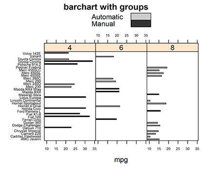
When you run this code, you’ll get your desired bar chart. However, the first thing you’ll notice is that the colors look a bit washed out and you don’t have a key to distinguish between automatic and manual cars.
Adding a key
It is easy to add a key to a graphic that already contains a group argument. Usually, it’s as simple as adding another argument, auto.key=TRUE, which automatically creates a key that matches the groups:
> barchart(cars ~ mpg | factor(cyl), data=mtcars,
+ main=”barchart with groups”,
+ group=am,
+ auto.key=TRUE,
+ par.settings = simpleTheme(col=c(“grey80”, “grey20”)),
+ scales=list(cex=0.5),
+ layout=c(3, 1)
+ )
One more thing to notice about this specific example is the arguments for par.settings to control the color of the bars. In this case, the colors are shades of gray. You can see the effect in Figure 17-10.
Figure 17-10: A lattice bar chart with groups and a key.
Printing and Saving a Lattice Plot
You need to know three other essential things about lattice plots: how to assign a lattice plot to an object, how to print a lattice plot in a script, and how to save a lattice plot to file. That’s what we cover in this section.
Assigning a lattice plot to an object
Lattice plots are objects; therefore you can assign them to variables, just like any other object. This is very convenient when you want to reuse a plot object in your downstream code — for example, to print it later.
The assignment to a variable works just like any variable assignment in R:
> my.plot <- xyplot(mpg ~ hp | cyl, data=mtcars)
> class(my.plot)
[1] “trellis”
Printing a lattice plot in a script
When you run code interactively — by typing commands into the R console — simply typing the name of a variable prints that variable. However, you need to explicitly print an object when running a script. You do this with the print() function.
Because a lattice plot is an object, you need to explicitly use the print() function in your scripts. This is a frequently asked question in the R documentation, and it can easily lead to confusion if you forget.
To be clear, the following line of code will do nothing if you put it in a script and source the script. (To be technically correct: the code will still run, but the resulting object will never get printed — it simply gets discarded.)
> xyplot(mpg ~ hp | cyl, data=mtcars)
To get the desired effect of printing the plot, you must use print():
> my.plot <- xyplot(mpg ~ hp | cyl, data=mtcars)
> print(my.plot)
Saving a lattice plot to file
To save a lattice plot to an image file, you use a slightly modified version of the sequence of functions that you came across in base graphics (see Chapter 16).
Here’s a short reminder of the sequence:
1. Open a graphics device using, for example, png().
Tip: The lattice package provides the trellis.device() function that effectively does the same thing, but it’s optimized for lattice plots, because it uses appropriate graphical parameters.
2. Print the plot.
Remember: You must use the print() function explicitly!
3. Close the graphics device.
Put this into action using trellis.device() to open a file called xyplot.png, print your plot, and then close the device. (You can use the setwd(“~/”) to set your working directory to your home folder; see Chapter 16.)
> setwd(“~/”)
> trellis.device(device=”png”, filename=”xyplot.png”)
> print(my.plot)
> dev.off()
You should now be able to find the file xyplot.png in your home folder.
..................Content has been hidden....................
You can't read the all page of ebook, please click here login for view all page.