Figure 16-1: A plot with labels, main title, and text.
Chapter 16
Using Base Graphics
In This Chapter
![]() Creating a basic plot in R
Creating a basic plot in R
![]() Changing the appearance of your plot
Changing the appearance of your plot
![]() Saving your plot as a picture
Saving your plot as a picture
In statistics and other sciences, being able to plot your results in the form of a graphic is often useful. An effective and accurate visualization can make your data come to life and convey your message in a powerful way.
R has very powerful graphics capabilities that can help you visualize your data. In this chapter, we give you a look at base graphics. It’s called base graphics, because it’s built into the standard distribution of R.
Creating Different Types of Plots
The base graphics function to create a plot in R is simply called plot(). This powerful function has many options and arguments to control all kinds of things, such as the plot type, line colors, labels, and titles.
 The
The plot() function is a generic function (see Chapter 8), and R dispatches the call to the appropriate method. For example, if you make a scatterplot, R dispatches the call to plot.default(). The plot.default() function itself is reasonably simple and affects only the major look of the plot region and the type of plotting. All the other arguments that you pass to plot(), like colors, are used in internal functions that plot.default() simply happens to call.
Getting an overview of plot
To get started with plot, you need a set of data to work with. One of the built-in datasets is islands, which contains data about the surface area of the continents and some large islands on Earth.
First, create a subset of the ten largest islands in this dataset. There are many ways of doing this, but the following line of code sorts islands in decreasing order and then uses the head() function to retrieve only the first ten elements:
> large.islands <- head(sort(islands, decreasing=TRUE), 10)
It is easy to create a plot with informative labels and titles. Try the following:
> plot(large.islands, main=”Land area of continents and islands”,
+ ylab=”Land area in square miles”)
> text(large.islands, labels=names(large.islands), adj=c(0.5, 1))
You can see the results in Figure 16-1. How does this work? The first line creates the basic plot with plot() and adds a main title and y-axis label. The second line adds text labels with the text() function. In the next section, you get to know each of these functions in more detail.

Adding points and lines to a plot
To illustrate some different plot options and types, we use the built-in dataset faithful. This is a data frame with observations of the eruptions of the Old Faithful geyser in Yellowstone National Park in the United States.
 The built-in R datasets are documented in the same way as functions. So, you can get extra information on them by typing, for example,
 ?faithful.
You’ve already seen that plot() creates a basic graphic. Try it with faithful:
> plot(faithful)
Figure 16-2 shows the resulting plot. Because faithful is a data frame with two columns, the plot is a scatterplot with the first column (eruptions) on the x-axis and the second column (waiting) on the y-axis.
Eruptions indicate the time in minutes for each eruption of the geyser, while waiting indicates the elapsed time between eruptions (also measured in minutes). As you can see from the general upward slope of the points, there tends to be a longer waiting period following longer eruptions.
Figure 16-2: Creating a scatterplot.

Adding points
You add points to a plot with the points() function. You may have noticed on the plot of faithful there seems to be two clusters in the data. One cluster has shorter eruptions and waiting times — tending to last less than three minutes.
Create a subset of faithful containing eruptions shorter than three minutes:
> short.eruptions <- with(faithful, faithful[eruptions < 3, ])
Now use the points() function to add these points in red to your plot:
> plot(faithful)
> points(short.eruptions, col=”red”, pch=19)
You use the argument col to change the color of the points and the argument pch to change the plotting character. The value pch=19 indicates a solid circle. To see all the arguments you can use with points, refer to ?points.
Your resulting graphic should look like Figure 16-3, with the shorter eruption times indicated as solid red circles.
Figure 16-3: Adding points in a different color to a plot.

Changing the shape of points
You’ve already seen that you can use the argument pch to change the plotting character when using points. This is described in more detail in the Help page for points, ?points. For example, the Help page lists a variety of symbols, such as the following:
![]()
pch=19: Solid circle
![]()
pch=20: Bullet (smaller solid circle, two-thirds the size of 19)
![]()
pch=21: Filled circle
![]()
pch=22: Filled square
![]()
pch=23: Filled diamond
![]()
pch=24: Filled triangle, point up
![]()
pch=25: Filled triangle, point down
Changing the color
You can change the foreground and background color of symbols as well as lines. You’ve already seen how to set the foreground color using the argument col=”red”. Some plotting symbols also use a background color, and you can use the argument bg to set the background color (for example, bg=”green”). In fact, R has a number of predefined colors that you can use in graphics.
To get a list of available names for colors, you use the colors() function (or, if you prefer, colours()). The result is a vector of 657 elements with valid color names. Here are the first ten elements of this list:
> head(colors(), 10)
[1] “white” “aliceblue” “antiquewhite” “antiquewhite1”
[5] “antiquewhite2” “antiquewhite3” “antiquewhite4” “aquamarine”
[9] “aquamarine1” “aquamarine2”
Adding lines to a plot
You add lines to a plot in a very similar way to adding points, except that you use the lines() function to achieve this.
But first, use a bit of R magic to create a trend line through the data, called a regression model (see Chapter 15). You use the lm() function to estimate a linear regression model:
fit <- lm(waiting~eruptions, data=faithful)
The result is an object of class lm. You use the function fitted() to extract the fitted values from a regression model (see Chapter 15). This is useful, because you can then plot the fitted values on a plot. You do this next.
To add this regression line to the existing plot, you simply use the function lines(). You also can specify the line color with the col argument:
> plot(faithful)
> lines(faithful$eruptions, fitted(fit), col=”blue”)
Another useful function is abline(). This allows you to draw horizontal, vertical, or sloped lines. To draw a vertical line at position eruptions==3 in the color purple, use the following:
> abline(v=3, col=”purple”)
Your resulting graphic should look like Figure 16-4, with a vertical purple line at eruptions==3 and a blue regression line.
To create a horizontal line, you also use abline(), but this time you specify the h argument. For example, create a horizontal line at the mean waiting time:
> abline(h=mean(faithful$waiting))
Figure 16-4: Adding lines to a plot.

You also can use the function abline() to create a sloped line through your plot. In fact, by specifying the arguments a and b, you can draw a line that fits the mathematical equation y = a + b*x. In other words, if you specify the coefficients of your regression model as the arguments a and b, you get a line through the data that is identical to your prediction line:
> abline(a=coef(fit)[1], b=coef(fit)[2])
Even better, you can simply pass the lm object to abline() to draw the line directly. (This works because there is a method abline.lm().) This makes your code very easy:
> abline(fit, col = “red”)
Different plot types
The plot function has a type argument that controls the type of plot that gets drawn. For example, to create a plot with lines between data points, use type=”l”; to plot only the points, use type=”p”; and to draw both lines and points, use type=”b”:
> plot(LakeHuron, type=”l”, main=’type=”l”’)
> plot(LakeHuron, type=”p”, main=’type=p”’)
> plot(LakeHuron, type=”b”, main=’type=”b”’)
Your resulting graphics should look similar to the three plots in Figure 16-5. The plot with lines only is on the left, the plot with points is in the middle, and the plot with both lines and points is on the right.
Using R functions to create more types of plot
Aside from plot(), which gives you tremendous flexibility in creating your own plots, R also provides a variety of functions to make specific types of plots. (You use some of these in Chapters 14 and 15). Here are a few to explore:
![]() Scatterplot: If you pass two numeric vectors as arguments to
Scatterplot: If you pass two numeric vectors as arguments to plot(), the result is a scatterplot. Try:
> with(mtcars, plot(mpg, disp))
![]() Box-and-whisker plot: Use the
Box-and-whisker plot: Use the boxplot() function:
> with(mtcars, boxplot(disp, mpg))
![]() Histogram: A histogram plots the frequency of observations. Use the
Histogram: A histogram plots the frequency of observations. Use the hist() function:
> with(mtcars, hist(mpg))
![]() Matrix of scatterplots: The
Matrix of scatterplots: The pairs() function is useful in data exploration, because it plots a matrix of scatterplots. Each variable gets plotted against another, as you saw in Chapter 14:
> pairs(iris)
Figure 16-5: Specifying the plot type argument.

The Help page for plot() has a list of all the different types that you can use with the type argument:
![]()
“p”: Points
![]()
“l”: Lines
![]()
“b”: Both
![]()
“c”: The lines part alone of “b”
![]()
“o”: Both “overplotted”
![]()
“h”: Histogram like (or high-density) vertical lines
![]()
“n”: No plotting
It seems odd to use a plot function and then tell R not to plot it. But this can be very useful when you need to create just the titles and axes, and plot the data later using points(), lines(), or any of the other graphical functions.
This flexibility may be useful if you want to build a plot step by step (for example, for presentations or documents). Here’s an example:
> x <- seq(0.5, 1.5, 0.25)
> y <- rep(1, length(x))
> plot(x, y, type=”n”)
> points(x, y)
In the next section, you take full control over the plot options and arguments, such as adding titles and labels or changing the font type of your plot.
Controlling Plot Options and Arguments
To really convey the message of your graphic, you may want to add titles and labels. You also can modify other elements of the graphic (for example, the type of box around the plot area or the font size of axis labels).
Base graphics allows you to take fine control over many plot options.
Adding titles and axis labels
You add the main title and axis labels with arguments to the plot() function:
![]()
main: Main plot title
![]()
xlab: x-axis label
![]()
ylab: y-axis label
To add a title and axis labels to your plot of faithful, try the following:
> plot(faithful,
+ main = “Eruptions of Old Faithful”,
+ xlab = “Eruption time (min)”,
+ ylab = “Waiting time to next eruption (min)”)
Your graphic should look like Figure 16-6.
Changing plot options
You can change the look and feel of plots with a large number of options.
You can find all the documentation for changing the look and feel of base graphics in the Help page ?par(). This function allows you to set (or query) the graphical parameters or options.
Notice that par() takes an extensive list of arguments. In this section, we describe a few of the most commonly used options.
The axes label style
To change the axes label style, use the graphics option las (label style). This changes the orientation angle of the labels:
![]()
0: The default, parallel to the axis
![]()
1: Always horizontal
![]()
2: Perpendicular to the axis
![]()
3: Always vertical
For example, to change the axis style to have all the axes text horizontal, use las=1 as an argument to plot:
> plot(faithful, las=1)
You can see what this looks like in Figure 16-7.
Figure 16-6: Adding main title, x-axis label, and y-axis label.

Working with axes and legends
R allows you to also take control of other elements of a plot, such as axes, legends, and text:
![]() Axes: If you need to take full control of plot axes, use
Axes: If you need to take full control of plot axes, use axis(). This function allows you to specify tickmark positions, labels, fonts, line types, and a variety of other options.
![]() Legends: You can use the
Legends: You can use the legend() function to add legends, or keys, to plots.
![]() Text: In addition to legends, you can use the
Text: In addition to legends, you can use the text() function to add text elements at any position on the plot.
The Help pages of the respective functions give you more information, and the examples contained in the Help pages show you how much you can do with these functions.
Figure 16-7: Changing the label style.

The box type
To change the type of box round the plot area, use the option bty (box type):
![]()
“o”: The default value draws a complete rectangle around the plot.
![]()
“n”: Draws nothing around the plot.
![]()
“l”, “7”, “c”, “u”, or “]”: Draws a shape around the plot area that resembles the uppercase letter of the option. So, the option bty=”l” draws a line to the left and bottom of the plot.
To make a plot with no box around the plot area, use bty=”n” as an argument to plot:
> plot(faithful, bty=”n”)
Your graphic should look like Figure 16-8.
Figure 16-8: Changing the box type.

More than one option
To change more than one graphics option in a single plot, simply add an additional argument for each plot option you want to set. For example, to change the label style, the box type, the color, and the plot character, try the following:
> plot(faithful, las=1, bty=”l”, col=”red”, pch=19)
The resulting plot is the plot in Figure 16-9.
Font size of text and axes
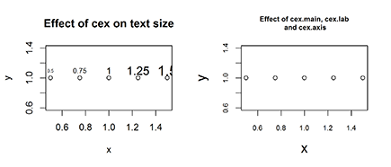
To change the font size of text elements, use cex (short for character expansion ratio). The default value is 1. To reduce the text size, use a cex value of less than 1; to increase the text size, use a cex value greater than 1.
> x <- seq(0.5, 1.5, 0.25)
> y <- rep(1, length(x))
> plot(x, y, main=”Effect of cex on text size”)
> text(x, y+0.1, labels=x, cex=x)
Your plot should look like Figure 16-10 (left).
To change the size of other plot parameters, use the following:
![]()
cex.main: Size of main title
![]()
cex.lab: Size of axis labels (the text describing the axis)
![]()
cex.axis: Size of axis text (the values that indicate the axis tick labels)
> plot(x, y, main=”Effect of cex.main, cex.lab and cex.axis”,
+ cex.main=1.25, cex.lab=1.5, cex.axis=0.75)
Your results should look like Figure 16-10 (right). Carefully compare the font size of the main title and the axes labels with the left side of Figure 16-10, and note how the main title font is larger while the axes fonts are smaller.
Putting multiple plots on a single page
To put multiple plots on the same graphics pages, you can use the graphics parameter mfrow or mfcol. To use this parameter, you need to supply a vector argument with two elements: the number of rows and the number of columns.
For example, to create two side-by-side plots, use mfrow=c(1, 2):
> old.par <- par(mfrow=c(1, 2))
> plot(faithful, main=”Faithful eruptions”)
> plot(large.islands, main=”Islands”, ylab=”Area”)
> par(old.par)
 When your plot is complete, you need to reset your
 par options. Otherwise, all your subsequent plots will appear side by side (until you close the active graphics device, or window, and start plotting in a new graphics device). We use a neat little trick to do this: When you make a call to par(), R sets your new options, but the return value from par() contains your old options. In the previous example, we save the old options to an object called old.par, and then reset the options after plotting using par(old.par).
Figure 16-9: Changing the label style, box type, color, and plot character.

Figure 16-10: Changing the font size of labels (left) and title and axis labels (right).
Your result should look like Figure 16-11.
Figure 16-11: Creating side-by-side plots.

Use mfrow to fill the plot grid by rows, and mfcol to fill the plot grid by columns. The Help page ?par, explains these option in detail, and also points you alternative layout mechanisms (like layout() or split.screen()).
Saving Graphics to Image Files
Much of the time, you may simply use R graphics in an interactive way to explore your data. But if you want to publish your results, you have to save your plot to a file and then import this graphics file into another document.
To save a plot to an image file, you have to do three things in sequence:
1. Open a graphics device.
The default graphics device in R is your computer screen. To save a plot to an image file, you need to tell R to open a new type of device — in this case, a graphics file of a specific type, such as PNG, PDF, or JPG.
The R function to create a PNG device is png(). Similarly, you create a PDF device with pdf() and a JPG device with jpg().
2. Create the plot.
3. Close the graphics device.
You do this with the dev.off() function.
Put this in action by saving a plot of faithful to the home folder on your computer. First set your working directory to your home folder (or to any other folder you prefer). If you use Linux, you’ll be familiar with using “~/” as the shortcut to your home folder, but this also works on Windows and Mac:
> setwd(“~/”)
> getwd()
[1] “C:/Users/Andrie”
Next, write the three lines of code to save a plot to file:
> png(filename=”faithful.png”)
> plot(faithful)
> dev.off()
Now you can check your file system to see whether the file faithful.png exists. (It should!) The result is a graphics file of type PNG that you can insert into a presentation, document, or website.
..................Content has been hidden....................
You can't read the all page of ebook, please click here login for view all page.