

Being a lighting artist or lighting TD can involve a wide range of responsibilities depending on the studio or company. Being a lighter could mean not only creating and positioning lights, but also handling all the materials and shaders for the scene as well. Some studios have a separate shading department that creates all the material and texture files. The same is true with regard to compositing. In other studios, lighters assemble all their render layers into a final composite and are responsible for outputting the final image that will appear on screen. There are also pipelines in which the lighters pass shots off to compositors or stereoscopic artists to bring the shot across the finish line. In the end, each studio and project functions a little differently.
Either way, it is essential for lighters to have a good understanding of how materials and compositing play a role in the overall look in order to complete the job successfully. Because, at the end of the day, it is the lighter’s job to just make stunning visuals however he or she can. This chapter will explore the various ways materials and compositing can influence lighting.

Figure 7.1 Different studios have uniquely different pipelines. Some require lighting artists to handle only the creation of lights while others require the lighter to be responsible for other tasks including shading and compositing.
The way any object in the world appears to the eye is a combination of the environment, the light sources, and the surface qualities of that object. The surface qualities of an object include the roughness, reflectivity, opacity, color, and a multitude of other nuanced variables that go into the appearance of the surface. It is these qualities that distinguish a piece of wood from metal from skin. Controlling and adjusting these attributes can give the artist the ultimate ability to adjust the look.
Surface Attributes
The overall appearance of a CG surface can be broken down into individual attributes designed to define their look. These attributes vary from object to object but most will be defined by some basic parameters. In a 3D work environment these attributes are given simple numeric values by default, but in most cases the artist will choose to create texture maps for each attribute. Texture maps are either images or procedural elements that are used to define these individual components.
Overall Color
The most basic attribute for any object is the overall color. This is the default color that lies on the surface of the object when illuminated by neutral light. Since most objects in the world are not one consistent color, texture maps or procedural maps are almost always used to represent the subtle variations that go into an object’s overall color.

Figure 7.2 The sphere on the left has a procedural ramp applied to it while the one on the right has a painted texture map.

Figure 7.3 The sphere on the left has a procedural checkerboard applied to the specular attribute while the one on the right has a painted texture map. Both spheres show that the closer the map gets to a white value, the stronger the specular highlight.
Specular Reflection or Specular Color
The specular reflection or specular color is the color of the highlights of the surface of the object. These highlights are a reflection of the light sources or bright objects in the scene.
A black specular color leaves the surface with no specularity at all while a white value leaves the highlight to mimic the same color as the light. When creating a texture map for the specular color it is important to remember this relationship. The whiter the area of the texture map, the more prominent the specular highlight in that region is when hit with light.

Figure 7.4 There are many different types of reflection that a surface can create. Both images are from the animated short Alarm and property of MESAI.
Reflectivity/Reflected Color
Reflectivity is the object’s ability to reflect the surrounding environment. Reflections occur whenever light hits an object. Therefore, almost all objects have some level of reflectivity. The amount and type of reflection are dependent on the light source and the object’s surface material. The smoother the surface, the more reflective it is perceived to be. Smooth surfaces like chrome or mirrors will have a lot of perceived reflection while rougher surfaces like wool or raw tree bark will have very little to no perceived reflection.
Like specularity, the closer to white reflectivity becomes the more pronounced the object’s reflection will be. A value of 0 or black will render no reflectivity. Additional setting for blur of the reflection and the reflective color exists as a way to fine tune the reflective look. These RGB values are multiplied by the main reflective value to ultimately determine the final look.
Bump/Displacement
Surfaces are rarely completely flat. Almost always, there is at least some subtle roughness to an object. The amount and shape of this roughness pattern can help distinguish objects such as metal or plastic or paper.
In CG, this attribute can be calculated in different ways. The two most popular are either bump mapping or displacement. The difference between these two attributes is that displacement offsets the geometry in the render and physically changes the surface of the object. Bump mapping, on the other hand, will only give the illusion of a textured surface by altering the surface normal of the object based on the map’s value. The silhouette of the object will remain the same.
Unlike the other attributes discussed previously, these values are only driven by grayscale images. The more contrast in a particular region, the greater the bump or displacement offset will become.

Figure 7.5 The top row demonstrates that when an object is far away from the camera may not matter if the artist uses displacement or bump. Once that image gets closer to the camera, the bump image begins to break down and a displacement map is needed.
Translucence
When an object is described as being translucent it means there is a certain amount of light that is able to pass through it. Translucency is different from transparency since light gets diffused to the point where objects on the other side are not clearly visible. Common translucent objects include leaves, sheets of paper, and flower petals. Accurately simulating translucence on these objects is essential to establishing their overall look.

Figure 7.6 Leaves are a great example of a translucent surface. Light is able to pass through the surface, but it is diffused enough so they are not considered transparent.
Incandescence
Incandescence is the visual appearance of an object glowing. It is almost like an inner fire that exists in the belly of an object and bursts out onto the environment. In CG, this simulates what the viewer would see when looking at an object like lava or a light bulb.
The one major thing to remember is that while adding incandescence can make an object appear as if it is emitting light, it may not affect the lighting of the surrounding objects unless some indirect illumination method in the renderer is activated.
Ambient Color
Ambient color is the color of the object without the addition of light. In other words, ambient light is what the object would look like if it existed in complete darkness. Most of the time, this setting will be left to black or very near it so an object will be properly shaded and fall into darkness when necessary. It is unnatural to have an object possess an ambient setting above 0 (black) because no object in reality can have a visible color without light. Therefore, this ambient color setting should be used sparingly if at all. Using it incorrectly could result in undesirable aesthetic results.

Figure 7.7 Examples of incandescent light. Stills from the animated short Whole and property of William Reynish.

Figure 7.8 Ambient color is the base color of an object before light of any kind is applied to it. Pio is downloadable character courtesy of Boutique23 (www.boutique23.com).
It is easy to understand that artists need to look at objects in order to understand their surface attributes. It is much more difficult to know how to complete this analysis and what specific characteristics one should evaluate. This section will break down the surface attributes of real world objects to better understand that process and so it can be replicated in the future.

Figure 7.9 Breakdown of metal material.

Figure 7.10 Breakdown of wood material.

Figure 7.11 Breakdown of plastic material.

Figure 7.12 Breakdown of window material.

Figure 7.13 Breakdown of water material.

Figure 7.14 Breakdown of sub-surface scattering material.
Common Adjustments to Shaders in Lighting
Rebalancing Materials
There are many complications that can arise in regard to shaders and materials once a shot is being lit. This can be a result of a large number of issues but often is caused by the different aspects of the shot not working together properly. In many instances there are a number of artists working on different models and shaders that, once combined, can look disjointed. The responsibility may fall on the lighter to rebalance the materials and shaders in order for the final image to be harmonious.

Figure 7.15 In this example, the white shirt appeared way too dark in comparison with the skin right next to it. After an omni render was done, it could be determined that the discrepancy in the material values is to blame. Pio is downloadable character courtesy of Boutique23 (www.boutique23.com).
This issue becomes apparent when lighting a shot where the light intensity that is working for one element is causing other objects to be either too bright or too dark. Ideally, the same key light with the same intensity would illuminate all objects uniformly. One way to solve this is through light linking and that is fine if the shot is worked on in isolation. This is not the best solution when working on an animated project with dozens or even hundreds of shots using the same materials and shaders. This can result in a very inefficient workflow of creating complex light rigs in every shot to counteract imbalanced materials. The better method is to rebalance the materials so they complement one another and then each subsequent shot requires a simpler light rig. This may take some extra time initially, but the long-term timesaving can be enormous.
One way to test for material balance is through an omni lighting test. If an artist creates an omni light casting no shadows with an intensity of 1, the artist can analyze the overall color of each object objectively. If any of the base materials are far out of line with the rest, they will appear in this test.
RGB Mattes with Material Files
Previously this book discussed creating layers for RGB mattes by assigning different shaders to different pieces of geometry. There are times, however, when an RGB matte will need to be created for a single piece of geometry. Say the artist wanted to make an RGB mask of a character’s face in order to isolate the area around the nose and the area around the ears to do a special color modification or comp tweak. This is accomplished by creating a color matte that isolates the desired region in the red, green, or blue coloring. That material can then be applied to the object’s ambient color value and all lights can be turned off in order to get the desired final image.

Figure 7.16 RGB mattes can be painted to isolate different sections of a single piece of geometry. Pio is downloadable character courtesy of Boutique23 (www.boutique23.com).
Compositing is taking all the individually rendered elements and combining them in such a way as to create a beautiful final image. The major component of this process is properly layering all the rendered elements together so they make sense spatially and work together aesthetically. Does the character go in front of this tree or is he behind it? How are the diffuse renders combined with the specular renders? How are the RGB mattes controlled in the composite? Additionally, there are several common aesthetic adjustments that take place during the compositing process including color corrections, depth of field, light wrap, lens distortion, diffusion, and vignetting, to name a few.
What is an Alpha Channel?
An alpha channel is essentially a transparency mask that informs the image processing software where each calculation will take place. Most images rendered in a computer are designed to be composited together and have an alpha channel. This allows the different layers to identify their positive and negative space and allows them to merge together as anticipated.

Figure 7.17 The alpha channel is a mask that isolates objects and helps determine the degree of transparency. In this example the objects have a white alpha, meaning they are opaque. The black regions of the image have a black alpha, meaning they will be 100 percent transparent if this image is laid over another.
Common Layering Methods
At its most basic level, compositing is a way to layer individual components together into one final image. This method goes as far back as the early days of animation when the common practice was Cel Animation. The Cel Animation process began with artists drawing separate elements of a shot on transparent acetate and then positioning those sheets beneath a camera to make it appear as though they were one image when photographed. This method allowed the static parts to be the same image from frame to frame while only animating the layers that contained the character or object that was moving. If the character was bouncing around but the background was stationary then only the image containing the character would need to be redrawn.
There are many different ways two images can be layered together in modern digital compositors. Many of these methods use the same principles as Cel Animation while others are completely digital concepts. Some may be used more than others, but each has its place and should be understood for its individual merits.

Figure 7.18 An example of the Cel Animation stills used on Disney’s The Little Mermaid.
The most basic layering concept in digital compositing is exactly the same as Cel Animation. Just take one image and put it over another. In digital compositing, this is done by using an “over” node. In the example in Figure 7.19, the red square is being layered over the blue square. The “over” node is probably used more than any other layering node. It is commonly implemented when layering beauty layers together or simply combining various elements to the shot.
The “plus” (or “minus”) merge operation is a mathematical way to combine layers. Instead of placing one image over the other, the “plus” operation merges the two images together by adding the RGB values together. If one has a red channel value of 0.50 and the other is 0.25, then the resulting image will have a red value of 0.75 (0.25 + 0.50). This is repeated for each channel and that is how the final image is created.
When a pure red square is merged using the plus operation with a pure blue square, the result is magenta. A less obvious combination is when red combines with green, as in Figure 7.19. The resulting image is yellow, which seems to go against logic. If red and green paint were combined, the result would definitely not be yellow. This is because the way light combines is very different from physical colors in the real world. So it is important for artists to fully analyze the mathematical implications when considering color combinations.

Figure 7.19 Examples of the “over,” “plus,” and “multiple” operations merging colors together.
A production example of using the “plus” operation is combining different light passes. Say the artist decides to render each light separately and combine them in the comp to have greater control. These rendered elements should not be combined by using the “over” operation because that will give a false result. Instead, the artist will use the “plus” operation to add all these different light passes together to simulate the nature of adding light to a scene.
“Multiply” is another mathematical operation similar to “plus.” Instead of adding values, the “multiply” operation will multiply the channels together to create the resulting image. Take the same example as before. Instead of the resulting image being yellow, it is actually black. This is because of the idea that if any number is multiplied by 0 the resulting number is 0.
In that way, the “multiply” operation is a bit counterintuitive. Normally multiplying numbers increases their values. But in computer graphics, multiplying will normally darken the image since RGB values normally range from 0 to 1, and multiplying a number by less than 1 will actually decrease its value.
A common use of this operation is when dealing with shadow and ambient occlusion passes. Both shadow and ambient occlusion passes are mostly white with the areas being affected as darker. When these images are multiplied into the original image, the resulting image is properly darkened in the shadowed areas and left at their original values in the white regions.
“Screen” works in a way that is the inverse of “multiply.” Unlike “multiply,” which generally darkens an image, “screen” merges will brighten the image. “Screen” gets its name from a real world lighting phenomenon. This phenomenon is simulating the effect of combining two separate slide images on one screen and seeing the resulting image.

Figure 7.20 Comparing “screen” vs. “plus” when adding a specular pass.
The major benefit of using “screen” is that it will raise the midtones of the image without affecting the dark areas or pushing the bright areas beyond a value of 1. One example of using the “screen” operation in a production environment is to create a pass to add some additional specularity to an image. If the artist uses the “plus” operation, the added specular values could combine with the original image to leave areas too bright.
There are many other layering methods that will be used over the course of an animated project, but the ones described here are the most common. Ultimately the artist just needs to be aware that each merge function has a different mathematical or theoretical basis for the operation and, by understanding those facets, he or she can have more control of the final image.
Color Corrections
After properly layering all the necessary rendered elements together, the artist now has the opportunity to start making color correction or adjustments to an image. This tweaking of colors represents a huge portion of the artist’s time. Whether it is perfecting a character’s skin tone or pushing the values of the color of the tree trunks just a bit more to match the previous shot, these types of tweaks will make a huge difference in the final image. There are several basic ways of adjusting colors that are available in any compositing software package. Having an understanding of each will go a long way in giving the artist the ultimate control over color of the scene.

Figure 7.21 Example of how subtle color corrections and value tweaks can improve an image and make it more dynamic.
Gamma
Modifying the color of an image by influencing the gamma is most useful when attempting to adjust the midtones. The darks and lights values of an image will remain relatively the same when gamma corrections are made, but the largest changes happen in the middle values. If it is thought of in terms of a color graph, the gamma would be adding a point to the middle of the curve and bending it upward or downward, but the top and bottom are pinned to 0 and 1. This is demonstrated in the graph in Figure 7.22.

Figure 7.22 Gamma and multiply color correction graphs.
Multiply
Multiplying the RGB values of an image is exactly what it sounds like. Take a gray pixel with RGB values of 0.5 0.5 0.5. If those three values are multiplied by 1.5, then the resulting image is a gray image with a brighter RGB value of 0.75 0.75 0.75.
The result of this process is that images have higher contrast as values are multiplied to brighten and less contrast as they decrease the brightness. To exemplify this, take these two pixels side by side. One is almost black with values of 0.1 0.1 0.1. The pixel next to it is middle gray with 0.5 0.5 0.5. If the colors are multiplied by 2, the results are that the gray pixel becomes white (1 1 1) and the dark pixel becomes 0.2 0.2 0.2. The difference in value between the two pixels has increased from 0.4 to 0.8 and the result is that the image has gained contrast.
Multiplication works for colors as well. Each channel multiplies together to get the final RGB value. If, for example, an artist wanted to take something white and make it red, the artist would take the white layer and multiply it by a red color (1 × 1,1 × 0,1 × 0 = 1,0,0). Or if the artist multiplied a cyan image by a magenta image (1 × 0,0 × 1,1 × 1 = 0,0,1) the result would be blue.
Color Corrections with Alpha
Of course there are times when an artist wants to manipulate only a section of the image. In order to do that, the artist must manipulate the alpha channel of the color correction. This can be done in a multiple number of ways, but two of the most common are isolating an area with a roto and utilizing render mattes.
Using a roto is fairly straightforward. The roto allows the artist the ability to draw a region on the screen where the color correction or alteration can take place. Rotos are great in some circumstances, but can be problematic if either the area being adjusted is being animated or the camera is moving. This would mean that the roto would need to be animated and this could cause some arduous work for the artist.
Another method of controlling color is through using rendered mattes (previously discussed in Chapter 4). These mattes are created at the time of render and can be used in the alpha channel to isolate particular elements in the shot. These are great when the artist wants to make color tweaks in the composite to the shoes of a character or the shutters on a house. The best part about these types of mattes is that they are a perfect pixel-to-pixel match on every frame even when there is animation, motion blur, or camera moves.

Figure 7.23 Rotoshapes can be used alone or combined with matte passes to make color corrections. Pio is downloadable character courtesy of Boutique23 (www.boutique23.com).
There are some additional visual cues that are added in the composite that add that extra bit of believability and touches that can make an image come alive. These are not always large-scale changes that are obvious to the audience, but instead very minor tweaks that just make an image “feel right.”
Edge Blur/Light Wrap
One of the biggest factors that can make a CG image “feel wrong” is crisp edges and perfect corners. A small but important element when making a CG image feel more natural is edge blur and light wrap. These are at the points where one piece of geometry comes into contact with another piece of geometry in the 2D image. If a photograph or even human vision is analyzed, it is clear that when one object is in front of the other, there is a tiny bit where these two objects’ color and value merge together. Even in the most crisp, precise photographs there is still a bit of edge softness that will always occur in the world.
Naturally, when compositing layered renders together this element is not automatically present. One object is slapped over the other and there is a hard line of distinction between the two elements. This difference is too harsh and perceived by the audience almost immediately as being false and incorrect.
The solution is to create a bit of edge blur. Edge blur involves isolating the outer edge of an object (an edge detect operation is commonly used for this) and giving those areas a 1–3 pixel blur in order to make the entirety of the image come together. Be careful not to use this too heavily since too much edge blur can look equally incorrect to the audience.

Figure 7.24 Edge blur and light wrap add softness to the outline of an object and are especially important when an object is against a very bright background as in these examples. Still from the animated short The Fantastic Flying Books of Mr. Morris Lessmore. Property of Moonbot Studios (right).
In some instances, this needs to be taken a step further. Whenever an object is between the camera and a very bright background, light wrapping will occur. This is the bright element seeping around the sides of the foreground element. Take a sunset, for example. If a character or object is standing in between that bright sun and the camera, the color and value of the sun will wrap around the edges of the foreground element and become visible. To replicate this look, the artist should take a similar edge detect and isolate the colors and values of the background in that area. If blurred slightly and layered back over the top of the foreground element, a very effective replication of natural light wrap occurs.
Diffusion
This softening of the image occurs not only on the edges and outer components of an image, but also the inside of the objects. This is especially true of bright, sunlit areas and specular highlights. In those areas the optics of a camera, or the human eye for that matter, can get a bit fuzzy and cause these areas to appear soft. The solution is to isolate the brighter regions of an image and blur those areas slightly. Obviously, this blur is minor and not meant to cause the object itself to go out of focus. This is just a few pixels to give the CG image a more lifelike feeling. Depending on the desired mood, the effect of diffusion can be increased or exaggerated past the natural level to generate emotion from the audience.

Figure 7.25 Example of a photograph with and without diffusion.
Vignetting
As described in previous chapters, vignetting is normally a slight darkening of the edges of the frame to help the audience focus their attention on the central elements. Often, this is done in the render and with the use of spotlights. There are times, however, when this effect can be done with a 2D solution in the composite. It is generally just a blurred roto used around the edge of the frames to bring down the values slightly.
There are some obstacles to be aware of when creating a vignette. These obstacles center on avoiding exposure of this effect to the audience. The first issue is not to make the vignetting too dark and obvious to the audience. Also, be careful when the camera is moving. In those circumstances the darkening around the edge of the frame can be obvious and can also break the illusion. The other major issue is the darkening of very bright areas. These can make them looked clamped and flat. Therefore, a nice, subtle, soft vignette is normally ideal.

Figure 7.26 Example of an image with and without vignetting.
Lens Effects
In live action films and photography there are artifacts that occur when a camera faces directly into the light. Depending on the lens, the type of light, and the film being used or digital capture, these artifacts appear to be quite different. Sometimes when shooting in the natural world these are accidents and sometimes they are aesthetically designed to be in the shot. Either way, they are an expected occurrence when shooting directly into sunlight or another extremely bright light source.
Often, compositing software has the ability to simulate this effect. There are different shapes and styles of lens effects the artist can choose from. The one major thing to remember when using lens effects is that it is actually happening inside the lens. So even though the light source may be behind certain elements, the flare needs to be comped over everything else in order for it to appear correct.

Figure 7.27 The sun and other bright light sources can cause an optical effect in a camera’s lens known as a lens flare.
Lens effects have a negative connotation with some artists if used too often. They can be said to look gimmicky and be a cheap way of adding interest to a shot. Therefore, it is wise to use lens effects sparingly and tactfully.
Depth of Field
Depth of field has been discussed in previous chapters as a fantastic adjustment which mimics a photographic anomaly and can focus the viewer’s eye on the desired region. Depth of field is generally applied in the composite, and when that occurs the artist can have complete control over the look. One control is the ability to animate the focal point. This focal point can also be changed over the course of the shot to direct the audience’s eye to multiple story points. This is referred to as “racking” focus. There may be characters in the foreground discussing something and the attention needs to shift to action in the background.

Figure 7.28 In the left image the grandfather is the focal point, but by racking the focus onto the girl the audience is more likely to concentrate on her.
How Depth of Field is Created
Most render software programs offer the ability to add depth of field during the render. The user can identify a focal point and instruct the renderer how far in front or behind that point to render in focus. Renderers can also give controls that are similar to a physical camera that determine the depth of field based on these simulated settings.
That being said, it is very rare for an animated project to rely on the rendering software for depth of field. Almost always the blurring caused by depth of field is added in the compositor. The main reason for this is the quick turnaround in the compositor versus the renderer. In the render, the artist will modify the settings, hit render, and often wait for long periods of time before seeing any results. This is especially problematic when working with shots that require a rack focus. Any tweak would be made and the artist could wait hours or days for a long render of many layers and many frames to complete.

Figure 7.29 Example of a z-depth render.
The solution is to generate a z-depth pass (or z-map) in the renderer and use that to manipulate the depth of field in the compositor. A z-depth pass is a grayscale, visual representation of the depth. Normally, the closer an object is to the camera the whiter it is while more distant objects are darker. This grayscale image can be used to create the areas of defocus in front of or behind the center of focus and simulate depth of field.
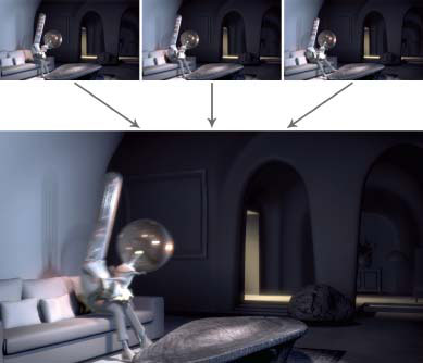
Figure 7.30 By successfully implementing a 2D motion blur solution, the artist can potentially save hours of render time.
2D Motion Blur
Enabling motion blur in a render can make movements flow together smoothly, but it can also increase the render time significantly. In some instances, this increase can cause a project to go past its deadline and a solution in the compositor is required. The solution is using one of the many 2D motion blur plug-ins that exist. There are a variety of methods that can generate 2D motion blur, but generally they first look at a single frame and analyze some of the frames surrounding it. If an object is moving between those frames, the compositing software will interpolate the movement between those points with a blurred image essentially mimicking the look of motion blur. Although this is not a flawless method and can cause problems in a number of situations, as when characters or objects come on and off screen and when there is a lot of movement, there are definitely times when using this method can cut down on render times substantially.
Reducing Noise/Chatter
One of the biggest pains for a lighting or rendering artist can be noise or chatter. This is caused by insufficient samples or resolution when rendering and the visual outcome is an image that appears gritty or grainy. When multiple frames are rendered for an animated shot, these gritty areas of the image can flicker like film grain and make the image appear “noisy.”
As discussed previously, common solutions are to increase render settings or to increase the image size. An additional, timesaving solution can be done just by adding some nodes in the compositing software. This method is called frame blending. It is similar to 2D motion blur in that the compositor will take samples within a given region from surrounding frames and average the pixels together to make a more consistent value. Say, for example, over the course of five frames a pixel has the following values in one of the channels: 0.5, 0.8, 0.7, 0.6, 0.5. The result of frame averaging is to make a pixel with a value of 0.62. This averaging can greatly reduce or even eliminate the noise in certain instances. The biggest downside to this method is that it can only be used on stationary or slow-moving objects. If the camera is moving quickly, the frame averaging is sampling too wide a variety of pixels and will just appear blurry. Not all compositing software has this option, but if it does exist it is a useful tool for the CG lighter.

Figure 7.31 Frame averaging helps eliminate noise and chatter by sampling from surrounding frames to normalize the image.
Being a lighter is not solely understanding and manipulating lights. It is about taking 3D geometry and making an image that comes alive. That means that lighters need to have full understanding and control of materials and compositing in order to meet that goal.
Many young artists make the assumption that there is an army of other artists at every company that will create the material attributes and composite the shot for the lighter. In many cases, nothing could be further from the truth. The lighting artist’s job description can include painting texture maps, building shaders, creating final composites, and everything in between. Remember, the ultimate role of the lighting artist is to make a beautiful final image. The more understanding and control the artist can have over the image, the more likely he or she will be able to achieve that goal.
|

Q. What is your current job/role at your company?
A. I am currently the Supervisor of the Materials Department at Blue Sky Studios.
Q. What inspired you to become an artist on CG films?
A. I originally started out as a mechanical engineering major in college. By the time I graduated I had decided that strict engineering really wasn’t for me, but I was really interested in the technical/software side of it (FEA, CAD, etc.), so I went to work for a 3D CAD company (SolidWorks) for a few years. I started off doing technical support and while I was there I got involved in the development and testing of their photorealistic rendering plug-in PhotoWorks on the side. Being able to not only model something in the computer in 3D, but also visualize it in a semi-photorealistic way was really mind-blowing for me. That was really the turning point for me. From then on I had my eyes set on getting into CG one way or another.
Q. What non-CG artwork inspires you?
A. Metal sculpture. I love it. In my final year of college, I took a metal sculpting class to help break up my engineering load, and it was amazing.
Q. What are some of the specific skills you look for when reviewing a demo reel?
A. When hiring for a materials TD position here at Blue Sky we always look at the reels first. At the end of the day our job is to put pretty pictures up on the screen—so we tend the vet the reels first on aesthetics. Are the images appealing? Are they “different” than the usual classroom tutorials? Does the artist have full control over all aspects of the material (color, specularity, bump, translucency, etc.)?
The job of a materials TD at Blue Sky can be a very technical one at times, so if they pass the first check then we try and find out more about exactly how they made the image. What techniques did they employ? Was everything hand painted, tiled texture maps, or were some elements of the image created procedurally? Did they have to write any scripts or tools to help throughout the process to get the job done?
Q. What is the most important aspect of creating materials for a character?
A. I always try and make sure that my team focuses on the eyes, face, and head. The vast majority of the time that is where the audience is going to be looking.
After that—hands and feet.
Additionally, making sure that the character fits into the style of the world and works well next to the other characters in the show is very important. Usually the character part of our pipeline happens well before the set and sequence part, so we don’t have actual production shots to work with. At that point I’ll often ask the team to prepare some side-by-side comparisons of characters that will act alongside each other in the film. That way the art director and director can get a feeling for however they will work together in the shot.
Q. When you are working with a large set, where do you begin? Do you develop rough shaders for all objects and then refine or do you work on each asset until completion?
A. It tends to vary a little show to show, but we usually approach sets with a multi-pass approach. Coverage pass first, then review with the art director and, depending on the film, possibly the director as well. Once we have their notes and a rough idea of what parts of the set are important to them and to telling the story, we’ll go back in and detail those areas first, and then increase the detail on the rest of the set as time permits to make sure it all works together as a whole.
On some shows, particularly those that are a “new world” for us (not a sequel), we’ll usually try and approach the new vegetation first in isolation, working back and forth with the art director to usually a medium detail pass. Then once we see the vegetation in the set, we’ll go in and do refinements as needed.
Q. The company you work for uses a lot of procedural materials. What are some of the benefits of that workflow versus painted textures?
A. In most cases, no UV layouts are needed—and you’re not tied to the topology, so topology changes can happen without a materials artist having to go back and redo or transfer work.
Faster tweaks to elements within the material.
“Plop-and-drop” material libraries that we can use to quickly block out a rough pass on a sequence or set.
Pre-programmed randomization can be built into material libraries so the same material applied to different assets can have different looks right out of the box (random color shifts, noise scales, etc.)
Q. What’s the one sequence or shot you are most proud to have worked on?
A. I have to pick just one?! That’s going to be tough. As a materials TD, my favorite work was some of the first work I did at Blue Sky on Robots. I didn’t get to work on too many sets or sequences as most of those had already been built up by the time I started, but I did get to work on quite a few characters and props. That movie was a materials TD’s dream—we had so much freedom to make everything dirty, scratched up and ‘used’ looking. One of the ones I remember the most was the “battle armor” for some of the lead characters as they suit up for the final battle at the end of the film.
Q. In your opinion, what makes a good shading artist?
A. It is someone that has a good artistic eye, who is technically sound, and constantly looking at the world around them wondering how they would make that material.
Q. If you could tell yourself one piece of advice when you were first starting out in this industry, what would it be?
A. Sometimes we can all get caught up in making something into the best we want it to be in our own eyes. Always make sure to look at the film you’re creating from the point of view of the audience. Everything you do should be geared toward making them enjoy watching your work, over and over and over.