

When done well, lighting can bring beauty and magic to a shot. © Disney.
Animated films are born when skilled and passionate artists merge their talents to build a story within a universe of extraordinary possibilities. Designers dream up the world, modelers build the world, riggers give the world the ability to move, and animators make the world sing and dance. It is the job of the lighter to make that world beautiful; to give it shape and life and an unmistakable soul. Lighting is about taking geometry and transforming it to create a setting the audience can submerse themselves into, thus allowing the film to take them on a journey. Ultimately, like all departments in an animation studio, the lighter’s goal is to tell a story.
Lighting for animation is an art unto itself, and a subtle one at that. When viewing an animated work the contributions made by other artists are clear. The audience can see all the props in the scene and know a modeler must have constructed objects in 3D space. The characters’ movements are evidence of the animator’s work. Lighting, like a musical score, works on a rooted, more psychological level. Lighting does not necessarily stand out as an element in the scene but is more felt by the audience. The audience generally does not identify each individual light or even pay much attention to what time of day is being portrayed. Instead, viewers feel lighting’s influence and react to it subconsciously.
A lighter on an animated film has three main goals in mind. These goals will be discussed in detail over the course of this book but they will be introduced now. The first goal is to direct the viewer’s eye. The lighter will use luminance, contrast, color, and any other means necessary to craft the scene in a way for the audience to focus on the action. Scenes can become incredibly complex and it is the lighter’s job to ensure that the audience is focusing on the area of the screen that is most important to the story. This is also critical when a shot is very short and the audience has limited time to focus on the main story point of the shot.
The second goal is to create visual interest in the scene by defining good shaping in all objects. Visual shaping in computer graphics (CG) is similar to painting in that the artist is creating value differences so the two-dimensional objects on the flat screen can be perceived as existing in three-dimensional space. By creating light, color, or value variations across an object to give it more volume, an artist can make CG objects appear more visually interesting.

Figure 1.1 Both of these images are the same geometry. The visual shaping caused by creating a variety of tones using light and shadow gives the sphere in Image B more volume, weight, and visual interest.
The third major responsibility of the lighter is to help tell the story by establishing the mood. Again, all artists on an animated project are working toward telling a single story and it is essential that every facet of the film strives to tell the best story possible. The story notes a lighter may receive are often based on creating a specific emotion such as:
• Make this shot more romantic.
• The audience needs to feel this character’s sinister motives.
• Tension needs to build over the course of these three shots.
There are many tools that a lighter has at his or her disposal to help set the mood. One major tool is the use of color design. Through the use of color and light, a lighter can influence the viewer’s subconscious reaction when first viewing the scene. In Figure 1.2, the set and camera angle are nearly identical in each shot but notice how the mood changes significantly depending on the light and color values.

Figure 1.2 Whether it is the crisp, clean daylight, the warm orange glow of the evening’s “magic hour”, or the cooler evening lighting, the color palette greatly influences the mood of each of these shots. Stills from the animated short The Fantastic Flying Books of Mr. Morris Lessmore. Property of Moonbot Studios.
Color is also used extremely effectively to set the mood in this scene from Edmond était un âne (Edmond Was A Donkey) in Figure 1.3 In this shot, Edmond is unhappy and dreary about life. The lighting was designed with cool blues to instantly portray a feeling of sadness and melancholy. As the shot progresses, warm light enters from offscreen creating a feeling of optimism and hope. This feeling is not communicated through dialog or actions but instead with a simple color design consisting of warm and cool light.

Figure 1.3 The introduction of warm light completely alters the mood of this otherwise cool-toned shot. Stills from the animated short Edmond était un âne (Edmond was a Donkey). Property of Papy3d/ONF NFB/ARTE.

Figure 1.4 Diffusion in this shot was added around the window and other light sources. Still from the animated short Little Freak. Property of Edwin Schaap.

Figure 1.5 Diffusion has been used since silent era Hollywood films.
Diffusion is another visual element that helps set the mood of the shot. When artists speak of diffusion they are referring to the effects of a soft light source causing glow and blur over the entire image, giving it a sense of magic. Increasing diffusion is accomplished by evenly spreading the light from a light source creating a softer feel as seen in Figure 1.4.
This concept of using soft light to give the image a glow is a tried and proven film technique. During the era of early cinema, adding practical elements like petroleum jelly to the lens to achieve the same look was common practice. This softness is once again something that is not necessarily recognized by the audience, but is definitely felt and used to influence the audience’s mood. Present-day animated films simply picked up on this already established aesthetic and implemented it.
The soft and diffused look is an excellent example of lighting playing a psychological role in the telling of the story in a similar way to a musical score. The musical equivalent would be a romantic tune that is soothing to keep the audience engaged. The music would flow evenly and effortlessly without abrupt changes that could startle the audience.
Drama and horror films have much heavier, deeper notes to help audibly set the mood. There are quick changes and jumps in the music that could put the audience on edge. The visual equivalent is a dark and high contrast image to convey an evil theme. This type of look goes back to the earliest days of cinema as similar techniques were displayed in one of the first and most influential of early horror films, Nosferatu. In this movie, the contrast is extremely dramatic and many sections of the frame fall into complete darkness while other sections illuminate past the point that the film can record, creating a white, “blown-out” look.
Without the use of effective lighting, movies would fall short of telling a complete story to the viewers. To successfully bring the emotions and story of a film to the audience, every artist from the previsualization stages through lighting must work together with one task in mind: to tell a story.

Figure 1.6 Nosferatu is a classic film that uses dark shadows and high contrast to add to the suspenseful mood. Nosferatu (1922), Jofa–Atelier Berlin–Johannisthal, Prana–Film GmbH.
At its core, visual shaping is a way of giving objects in a two-dimensional image a sense of height, depth, weight, and volume. Take, for example, a simple cube. A cube is a known object that has six sides. If positioned and lit in a certain way, the cube will communicate to the audience as a flat plane, lacking depth and dimension (Figure 1.7a). Even if the cube is positioned properly, the lighting can cause the cube to look flat, depriving the audience of the proper understanding of the space and shape of the object (Figure 1.7b). Therefore, if nothing else, the goal of visual shaping within lighting is to communicate this shape and volume to the audience (Figure 1.7c).
By lighting a scene with good visual shaping, the lighter has the power to bring more depth and the feeling of complexity to a shot that would otherwise fall, quite literally, flat.
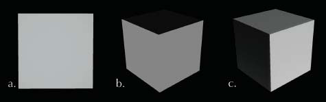
Figure 1.7 The same cube can be portrayed in different ways by changing the position and lighting.

Figure 1.8 In this shot, the position and intensity of the sunlight draws the viewer’s eye toward the character and the mural on the wall. © Disney.
Another lighting technique that influences the story is something so basic and simple that it is often overlooked. The lighter needs to answer the question, “What part of the image should be the audience’s focus?” Shots can be a few seconds or fewer in length and it is absolutely crucial for the audience to know exactly where to look in order to read the action of a shot.
Lighters can use light, contrast, color, or any means possible to direct the audience’s eye. Generally speaking, the viewer’s eyes are drawn to the brightest object on the screen. This bright part of the screen can be accentuated even more if surrounded by darker values. In the examples in Figure 1.9, the eye immediately focuses on the main character and the other areas of the shots become secondary. This is commonly referred to as being “light over dark.”
This can also work in reverse. A darker character can be placed in front of a lighter background and that high contrast can draw the viewer’s eye. Looking at the frame below from The Fantastic Flying Books of Mr. Morris Lessmore, the eye is immediately drawn to the bright window and then settles on the contrast of the darker character, making that character the central focus. Specifically, the focus is on the character’s head so the audience will be more inclined to watch his eyes and help read his emotions.

Figures 1.9a Concept Art from Song of the Sea—Courtesy of Cartoon Saloon, Melusine Productions, The Big Farm, Superprod, Norlum.

Figure 1.9b Still from the animated short The Fantastic Flying Books of Mr. Morris Lessmore. Property of Moonbot Studios.
Contrasting colors is another method lighters use to make elements of an image stand out. Take these colored squares in Figure 1.10b, for example. Notice how the center square draws the audience’s eye immediately. Whether it is light vs. dark, warm vs. cool, or the use of complementary colors, these are all viable options when trying to direct the viewer’s eye.

Figure 1.10a A good example of the use of complementary red suits over green foliage making the characters really pop out on screen. © Disney.
If a shot has set the proper mood, created good visual shaping, and directed the viewer’s eye, chances are it will be successful. These core elements are what are at the heart of lighting. This book will work to show you all the ins and outs of lighting, but each and every element relates back to at least one of these concepts. When these core concepts are followed, lighting can move the audience’s spirit and enable them to connect with the film and allow the story to touch their souls.

Figure 1.10b These squares demonstrate how the use of colors and values can make an object stand out on the screen.
|

Q. What is your current job/role at your company?
A. I am the Creative Director and Co-Founder of Blue Sky Studios.
Q. How did you get started in this industry?
A. I got started very early in computer animation. I had done stop-motion animation as a kid and in college. I loved making a little set look big by using camera position and lights. It was one thing to look at the miniature in a room and another thing entirely to look at it through the camera. Through the camera it became another world entirely. I learned about a lot about lighting for films by lighting those little sets.
I became interested in 3D animation because it had a lot of the same qualities as stop-motion. It was fun to transform geometry into another world. The dimensional nature of the 3D world was fantastic and I began working in it back around 1980. I was actually one of the first animators ever to use 3D animation.
Q. Any non-CG artwork that inspires you?
A. It’s all about the project. There is an aesthetic you bring to any particular project and I feel that the aesthetic needs to focus the spectrum of emotion. Sometimes it’s painting, sometimes it’s photography. When we were working on Epic, we looked at a lot of N.C. Wyeth. He did beautiful renderings for classic story illustration. Very romantic, very complete artwork. Sculptural paintings of natural environments with classic compositions and a beautiful palette. When you look at those images you get a lot of dimension and romanticism and that was one artist that inspired me during Epic.
Q. If you could tell yourself one thing when first starting in this industry, what would it be?
A. Follow your heart. If you feel passionately about something just continue with it and do the work you believe in. Do not let people talk you out of ideas if you truly believe it is best. It’s different for everyone, and of course you will always deal with compromise, but more often than not your instincts are right. I’ve always been most successful when I was true to my own instincts. When you apply the advice of too many people the message can get blurred.
That being said, you want to listen to those around you because you never know where the next good idea is going to come from. Be open to advice, but choose wisely whether or not you act upon that advice. Listen to criticism—especially when it is consistent. I grew up not trusting anyone, like a lot of people in my generation. As I’ve grown older, I’ve realized that sometimes they know what they are talking about.
Q. Is there any one sequence or project from your career that stands out to you?
A. Hopefully there are a bunch of them!
Specifically the one that stands out is the cave painting sequence in Ice Age. It is the moment that Manny’s back story is explored and presented to the audience. I felt that scene gave the film the depth of emotion that allowed the audience to invest further than just the comedy and really connect to the characters. That was a special sequence.
In Epic, I enjoyed the sequences that allowed us to go in and explore that magical world. It was particularly great to go into the battle sequence on a lily pond with these tiny people and make it look kinetic, dangerous, and full of action. That sequence exemplified the type of life and energy I wanted to bring to that world. That was a lot of fun.
Q. What is lighting’s largest contribution to an animated film?
A. Lighting controls a certain spectrum of the story that is just as important as the acting, the quality of the motion, the dialogue, or the music. It’s part of how we focus perspective and it creates the mood with associations we make. It’s what we use to control the audience’s experience and determine what they are looking at.
Every film is coded with subconscious color palettes and a range of emotional dialogue that is controlled with composition, lighting, and music. Different aspects of the story get different colors, saturation values, and contrast levels. It’s important to establish that palette and keep it consistent throughout the film.
Good guys and bad guys get contrasting elements. In Epic, there was a battle in the forest and the contradicting colors were the verdant greens and deep forest colors of the heroes versus the evil characters which looked more like bare bark, gray rock, and black fungus. Spring-like greens and colors that represent life in the forest were allocated to the good guys and the evil guys were desaturated and cooler, to represent the death of the forest. All non-fantastical characters like the humans fell in between with more salmon-like colors that were desaturated and muted just a bit to distinguish them from the fantasy characters. These types of color distinctions, which are aided by the lighting, are crucial to the film.
Q. After being in this industry for over thirty years, has your approach toward lighting changed?
A. At Blue Sky, we started because of lighting. We started the company with the goal of making images that no one had ever seen before. That was twenty-seven years ago. When we started out, we were geeks about raytracing technology. We knew that if we had enough computing power and time, we could make images that were indistinguishable from photographs. We never thought of that as the finish line, but if we had the power to do that, we could do anything with CG. Back then, raytracing was only done in labs and had not been applied to anything with commercial viability. So for us, it has always been about creating the subtleties of objects and interacting light and bringing that to an audience.
My first Blue Sky film was Bunny and that film took eight years to make. It was all about getting the technology to the point where I could tell a story that was dreamy and weird and convincing and complete. By today’s standards it is a little rough around the edges, but it definitely has its moments. For me and Carl Ludwig, it was all about creating the complexities that convince us something is real. Lighting is an incredible thing and we take it for granted in our daily lives.
As far as developing over time, lighting is completely project driven. In the past decade or so, it hasn’t been about achieving technical goals, but telling stories with the most impact. We are at the point now where duplicating the real world or photography isn’t the goal. It is about using the technology to create an aesthetic to tell the story. This is truly an exciting time to work in this industry.