

Still from the animated short Edmond était un âne (Edmond was a Donkey). Property of Papy3d/ONF NFB/ARTE.
Now that this book has discussed both the technical elements and the workflow of the lighter, it is time to dedicate the rest of the book to the artistic side of lighting. Training the lighter’s artistic eye by understanding what makes a well-lit shot is the most important element to being a lighter. Knowing the technical information and workflow will only get an artist so far. It is this artistic understanding and implementation of those skills that elevates one lighter above the rest.
New lighters have a tendency to jump head first into producing their own work. While it is certainly important to get in there and start lighting, it is also absolutely necessary to take the time to observe and learn the craft by observing the work of others. It is through this study that an artist begins to understand the components of a well-lit shot and how those concepts can be utilized in his or her own work.
What are the Elements of a Well-lit Shot?
As mentioned earlier, a successful shot has three major elements. First and foremost, it needs to help tell the story by setting the mood through the use of light. Second, it should direct the viewer’s eye with subtle techniques to control the audience’s gaze. Last, a well-lit shot should always create good visual shaping. These topics were touched upon in Chapter 1, but this chapter will delve deeper and break these elements down further.
Telling the Story by Emphasizing the Mood
A necessary component for any successful storyteller is the ability to set the appropriate mood for the audience. By inducing a particular feeling or state of mind, the storyteller is setting the proper stage for the actions to follow. In animation, all artists are storytellers regardless of their job title. Lighters have the particular job of helping tell the story through color, contrast, saturation, and all the other visual components that make up an image. This section will explore a variety of ways these visual elements can be implemented to successfully set the mood.
Light Placement and Intensity in Relation to Mood
The placement of lights and their relative intensities is a huge factor in the creation of mood. Lights can be positioned either to enhance a character’s beauty or conversely to make that same character appear malicious. The relative intensities of the lights determine the overall contrast level of the scene. A high contrast scene has a very different mood from a lower contrast scene. These lighting decisions will help lay the groundwork for the story to come.
High Key
A common lighting practice in classic Hollywood musicals and comedies was high key lighting. In high key lighting situations the key light and fill light are more frontal and given similar intensity values. The ultimate goal of this style is to minimize shadows, especially harsh shadows, that could disrupt and distract from the overall soft, gentle look desired. The frontal nature also flattens out smaller details so this lighting practice is much more focused on the larger details and overall form of the characters and objects.

Figure 5.1 Examples of high key lighting. Still from the animated short El Vendedor de Humo, property of Primer Focus and produced by Carlos Escutia.
Low Key
Low key lighting is the exact opposite situation. Fill values are dropped and key positions are rotated further around the subjects, creating longer, harsher shadows. The overall look is much more dramatic with a grittier, moodier aesthetic. This style is appropriate for a villain and any scene where mystery and suspense are present.
Under-lighting
Under-lighting is also a light rig generally used to portray evil characters and ominous scenes. It is when the key is positioned beneath the character, causing long upward shadows.
This is a very unnatural feeling lighting scenario because it rarely happens in nature. The sun and moon are constantly above the horizon line so seeing this light feels eerie. Only in situations with man-made light like campfires or low-placed light bulbs will there be a situation like this in the world.

Figure 5.2 Examples of low key lighting. Still from the animated short Leucotopia, property of Mehdi Louala, Geoffrey Godet, Nicolas Lejeune, Céline Hermann, and Simon Legrand. Produced by Supinfocom (right).

Figure 5.3 Examples of under-lighting. Still from the animated short Little Freak. Property of Edwin Schaap (right).
Rim Key
Lighting with a strong key that outlines the character from behind is another technique for light placement. This technique creates a strong “rim key” and is useful in three main situations. The first is when the lighting scenario calls for it. This normally occurs when the character is standing between the camera and something very bright like a sunset. Usually this would mean the character is silhouetted with a bright rim to integrate with the surroundings.
Another situation is if the characters are very small on the screen and the audience needs to be aware of their presence. A key rim can help pop that character out of the background and make the viewers focus their attention on the character without realizing it. Obviously the lighting situation would need to be respected, but this can still be achieved in most instances.
The third major situation is when the silhouette of the character needs to pop because of a specific hand gesture or body position. By positioning the key light behind the character, the artist can emphasize the silhouette which can aid in the storytelling. Most often this is when a character is pointing or making some sort of other hand gesture and it is difficult to read the fingers.

Figure 5.4 Examples of rim key lighting. Images from Marilyn Myller, used courtesy of Mikey Please.
Shadow
Light placement not only benefits the illumination but can also aid in shadow casting as a tool for storytelling. A properly positioned shadow can create a dark swath in the image that can be utilized in a variety of fashions. Sometimes the scene will involve two characters that are in dispute and it is beneficial to show a visual divide between the two. The lighter may choose to construct the rig so a bold shadow is cast between the characters.
Shadows that harshly slash across the character are normally avoided when attempting to make a character look more beautiful. In some situations, however, this may not be the objective. There may be a battle or a chase sequence that is filled with drama. The hero may fear for his or her life and that tension needs to be felt by the viewing audience. That drama may best be emphasized further with sharp, angling shadows on the faces of the characters in order to truly emphasize the gravity of the situation.
The timing of passing shadows can become very important in storytelling if the character is moving through space. When traveling in a park or forest, the character will pass through patches of light and shadow as a result of sun breaking through the canopy of overhead trees. If the scene depicts two children playing and running around a shaded playground, then the timing of those patches of light and shadow will be nice and evenly spaced and potentially a little slower than they would happen in reality. If a monster suddenly pops out and starts chasing the children, the timing of shadow and light patches could increase in speed. This would showcase the drama of the moment and make the characters feel like they are traveling at a faster speed than before. As the monster closes in, the speed can increase even more to continue to build the tension. But a hero jumps in and saves the day, allowing the pacing to return to normal. This is just one of countless examples of how shadow placement is a powerful tool in storytelling.

Figure 5.5 In both of these examples the shadow is designed to help frame the character. Still from the animated short Shave It. Property of 3DAR.
Color and Mood
Lighting for the purpose of establishing mood and telling a story must include a study into color and its effect on the audience. Previously, this book discussed how subtle pinks and warm tones can make a scene feel inviting and even romantic. Although these color associations are something that may seem fairly obvious when discussed, the audience does not often perceive these color shifts. An argument could be made that color alone is the most salient feature of animated films. Color has a strong, deep-rooted place in the human brain and an artist can utilize those associations in order to subtly create mood.

Figure 5.6 Color and mood chart.
Color is not only an integral part of how the audience interacts with film, but also how humans interact with the world. The study of color and its influence on mood is inexact. No one color gives every person the same emotion every time. A soft blue like the sky can be calming and soothing, but when someone is unhappy it can be said that they “feel blue.” Red can mean fire, passion, love, and action, but at the same time symbolize warmth and comfort.
There are two general ways that a viewer can interpret color: biologically and culturally. Biologically speaking there are colors in nature like green for foliage, blue for water, and orange for fire. Each one of these is thought to have a deep-seated impact on the way humans view color. They are universal and timeless and are unchangeable in the human psyche.
One interesting example is the biological influence the color blue can have on appetite. This is thought to be because there are very few blue colored foods in nature. There are no blue leafy vegetables or blue meats. This unnaturalness of blue food actually is thought to trigger the part of the brain that cautions people against eating it since it is perceived as strange and possibly poisonous. Many weight loss specialists will even make the claim that eating off a blue plate will cause patients to lose more weight. Stronger still, they claim that by simply adding blue food coloring to dishes like pasta, one can actually minimize the craving for certain foods at certain times.
Warm, reddish tones have exactly the opposite effect. Reds will increase heart rate and increase appetite. Tomatoes, apples, raw meat, pomegranates, raspberries and strawberries all exist in nature and therefore we are much more comfortable associating reds with food. Think of corporate logos like Mc-Donald’s, Wendy’s, and Pizza Hut. All of these logos have the advantage of raising heart rates and have the added benefit of attracting attention.
Translate these examples into the world of CG lighting. There may be a scene where a child is forced to eat a plate of unwanted vegetables when, really, she wants the big piece of cake sitting in the middle of the table. It would be wise of the lighting artist to have the unwanted food in cool light while the cake just so happens to fall into the warm appetizing light.
Cultural bias toward color varies from society to society. The colors of flags, money, and sports teams can greatly influence an individual’s reaction. For Americans, green is the color of money, but in Islam it symbolizes the heavens. Purple, referred to as Tyrian purple in ancient Rome, was the color of royalty and wealth. While a lovely color, Tyrian purple was a symbol of grandeur because purple dye was extremely expensive to obtain. The process involved craftsmen gathering thousands of marine snails and boiling them with special chemicals just to get a few drops. In modern times, purple does not have this association since its rarity is no longer the case. Therefore, these types of color associations are ones that are not inherent in people but are dictated by an individual’s specific surroundings.
This is just one minor example of the influence of color on mood in a CG scene. There are countless ways color can impact the audience’s reaction to a scene depending on the situation and there are several examples at the end of this section. Each scene and each shot is unique and must be handled independently and with care in order to achieve the maximum impact.

Figure 5.7 Blue food is perceived as far less appetizing than warmer colored foods.

Figure 5.8 This distinct pink color is only used in this film when the potion is present. © Disney.

Figure 5.9 Contrast defines the value difference between the brightest and darkest points in terms of luminance and/or color.
Symbolic Color in Films
Certain colors can come to represent specific emotions, elements, or even characters in films. It is not uncommon in a film to assign a certain palette or color temperature for given situations. Art designs can even call for all the hero characters to have warm, red tones while villains are represented by blue, cool tones. Or perhaps every time there are strong, warm colors the scene is full of danger. Green tones may repeatedly be present when there is hope and life in a certain environment, while the inclusion of a blue color could only appear whenever a certain character is around.
One great example of this is from Disney’s Emperor’s New Groove. In this film there is a potion that plays a key role in the film’s plot. That potion is a bright pink color and that pink color is only present in the film when the potion is around. That pink color is a direct representative of that story point. In fact, the introduction of the potion is set up by a series of cool toned shots that seem to have all warmth sucked out of them. Then, when the potion finally appears on screen, the color visually jumps off the screen into the audience’s lap because the withholding of warm tones made this vibrant pink’s impact even more powerful.
Contrast and Saturation
When discussing color and light one must also discuss contrast and saturation as well. Contrast defines the value difference between the brightest and darkest points in terms of luminance and/or color.
If an image is said to have high contrast, it means the difference between the brightest point and darkest point is drastic. Alternatively if a shot has low contrast, the brightest and darkest points are not as far apart from one another.
Contrast levels definitely influence mood. High contrast images almost completely define an entire genre in the history of American cinema known as Film Noir. Film Noir, or “Black Films,” get their name because not only are they about grim subjects but the films themselves are visually dark and carry heavy black values. These graphic images depict a gloomy world filled with murder, betrayal, and an overall somber outlook. When lighting a scene that is meant to be full of tension and anxiety, one would most likely approach it with high contrast lighting.
Low contrast images have a much softer and more inviting feel. The brightest areas are tamped down a bit and the shadows and dark points are lifted slightly with a lot of midtone values. If lighting a romantic or comedic scene then the softness of low contrast lighting would probably be the best choice.
Saturation refers to how vivid the color appears. Saturated colors are more pure than unsaturated ones, meaning their value in one or more of the three RGB settings approaches a 100 percent contribution. High levels of saturation generally cause colors to pop off the screen more dramatically.
Generally speaking, more saturation is used on happier sequences or on a bright, sunny day while less saturation is used in more dreary scenarios. In an Internet search for “sad images,” it will be immediately noticed that the resulting images are predominantly desaturated. Do the same search for “happy images” and all the images are full of more vibrant colors.

Figure 5.10a Giant © Sanford Roth / A.M.P.A.S. / mptvimages.com.

Figure 5.10b Doris Day © Martin Mills / mptvimages.com.

Figure 5.11 Generally speaking, more vibrant, colorful images are thought of as being happy versus black and white or low saturation images that are viewed as sad.
As discussed in Chapter 1, directing the viewer’s eye is a key part of the lighter’s job. This section will build upon those earlier concepts and explore new ways the artist can modify a scene to manipulate the viewer’s focus onto the essential story point.
What Draws the Eye When a Viewer Looks at a Screen?
There is a trick artists can use when looking at an image to help determine the focal point. It involves looking at a blurred version of the image to help minimize the shapes and objects and just evaluate the overall tones. Audiences are often drawn to the brightest or most contrasted section of the image and those areas are made apparent in this simplified, blurred version. An artist can artificially blur an image in an image manipulation software but the easiest way to accomplish this is to just squint. Squinting to analyze the image is a trick from painting and photography and is used for the same purpose. This will mush the image into a series of general shapes and allow the artist to make aesthetic decisions based on simple composition principles.

Figure 5.12 Looking at an image through squinted eyes can enable the artist to identify the focal point of the image.
Leading Lines with Light
Using leading lines to draw the viewer’s eye to the subject matter is a common design technique. Normally, it is discussed in regard to elements within the scene forming a visual line that leads the viewer’s eye to the subject, but this is absolutely true in lighting as well. The artist could structure a shot in such a way that the light and shadow will actually create a path for the viewer to follow to the subject. It could highlight and illuminate objects in the scene that could be used as leading lines to the subject.

Figure 5.13a Leading lines are an effective way to help focus the viewer’s eye. © Disney.

Figure 5.13b Leading lines are an effective way to help focus the viewer’s eye.
An excellent example is lighters using volumetric lights to lead the viewer’s eye. A spotlight is already a cone that normally starts off screen and is focused on the subject matter. If that spotlight’s cone becomes visible it can serve as a path to the focal point.

Figure 5.14 An example of a volumetric light used as leading lines. Still from the animated short Edmond était un âne (Edmond was a Donkey). Property of Papy3d/ONF NFB/ARTE.

Figure 5.15 Examples of contrasting elements allowing the main subjects to be more prominent. (Left) Still from the animated short Shave It. Property of 3DAR. (Center) Still from the animated short Premier Automne. Property of Carlos DeCarvalho. (Right) Still from the animated short Mac and Cheese. Property of Colorbleed Animation Studio.
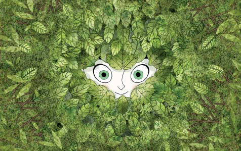
Figure 5.16 The clutter of leaves creates a pattern that is broken up by the character’s face. This interruption in the clutter helps draw the viewer in. Image for The Secret Life of Kells. Courtesy of Cartoon Saloon, Les Armateurs and Vivi Film.
Contrasting Elements
In Chapter 1, the concept of creating visual separation between the subject and the background was discussed. The idea was to use either bright elements over dark, dark over light, or complementary colors to get the subject to pop off the background. The core concept is to establish a pattern or anticipated look with one element (color, value, etc.) and then use the contradicting element of that pattern to make the viewer focus on that particular region.
Another example of creating this visual separation can be achieved with shapes. The contrast of cluttered, “busy” shapes with simple, clean shapes can also direct the viewer’s eye. By breaking that pattern of visual clutter with a clean center, the audience has the contrasting element to focus on.
Pockets of Light
When lighting, it may be necessary to give the audience multiple focal points. Perhaps the characters are standing on one side of the room and the objects they are searching for are across on the other side. In these particular instances the artist will need to create multiple pockets of light in order for the audience to read all necessary story points. These pockets will guide the audience’s eye around the image and allow them to understand the necessary components of the shot.
Another trick is to use pockets of light to construct a visual path for the characters to follow. This works particularly well for traveling sequences or shots when the character’s goal is to get from one place to the other. By placing lights to illuminate the intended path, the artist can indicate what the characters are planning and the audience can begin to envision the journey with them.
Figure 5.17 These pockets of light help lead the audience’s eye along the pathway the character will follow. Still from the animated short The Tale of Mr. Revus, property of Marius Herzog.

Figure 5.18 Artistically positioned shadows can aid the overall composition.
Artistically Positioned Shadows
When positioning light to direct the viewer’s eye one must focus not only on their illumination but also on the shadows being created. These shadows, if crafted well, can be used to direct the viewer’s eye across the screen. Shadows can be used to create swaths of dark sections for a bright object to sit atop. They can visually separate two objects, causing them to appear not only as different pockets of light but also as completely disconnected from one another, as discussed in the “Emphasizing the Mood” section. Elongated shadows also can create a unique line that helps lead the audience’s eye to a character that is relatively small on screen, as in Figure 5.18.
Vignetting
Vignetting is a subtle tool in the never-ending struggle to help the audience center their focus. Vignetting is the darkening around the periphery of the frame allowing the center to obtain more of the attention.
Although it is now used often used as an aesthetic element, vignetting used to be an unintentional and unwanted effect of lens distortion or camera settings. The camera lens creates a circular image on the film plane which is normally cropped, but vignetting occurs when the dark circular shape appears on the frame. An artificial vignette in computer graphics is therefore normally circular or round in shape to mimic this mechanical process.
The aesthetic value of a vignette is the creation of a perimeter or darkened, visual wall around the image. The darker values stop viewers from having a wandering eye that could drift off screen and instead keeps them focused on the brighter subject matter. It can also add an extra element of visual shaping since the vignette gradually darkens over distance and can create a nice falloff toward the side of the frame.

Figure 5.19 This strong vignette pushes the audience’s attention to the girl in the center of the screen. Still from the animated short I, Pet Goat II and property of Heliofant.

Figure 5.19 Increasing the vignette can help center the focus. Be aware that the stronger the vignette, the more the audience is likely to be aware of it.
Depth of Field
Depth of field is another concept from photography that started as a mechanical flaw of the image-making process but has morphed into a visual aesthetic. Depth of field is the term given to the area of apparent sharpness within the photograph versus the blurred areas in front of or behind the subject.
Three factors, the aperture of the lens, the focal length of the lens, and the distance to the subject, determine depth of field. The aperture is the small opening in a lens that lets the light pass through. The size of that opening will increase the amount of light that enters, but will also influence depth of field. The smaller the aperture, the greater the depth of field. So an aperture setting of f4 will be a much more shallow depth of field than f16. There was even a group of twentieth-century photographers who formed an organization called Group F64 that represented images in sharp focus. Group members included famous photographers like Ansel Adams, Imogen Cunningham, and Edward Weston. Thinking of their group name and the images they outputted tends to help artists remember the f-stop/depth of field relationship.

Figure 5.20 The aperture of the lens, the focal length of the lens, and the distance to the subject all play a role in determining depth of field.

Figure 5.21 Adding too much depth of field blur can make large landscape feel microscopic.

Figure 5.22 By shifting the depth of field the artist is also able to shift the viewer’s focus.
The focal length of the lens also plays a role in depth of field. Wide-angle lenses will increase the depth of field while telephoto lenses decrease it. This is a big factor as to why telephoto images look more compressed than wide-angle ones.
Finally, the distance to camera plays a role in depth of field. The closer the focal point is to the camera, the less depth of field is and the more intense the blur is. Therefore, the same lens with the same aperture will be able to put a larger range in focus when the subject is standing twenty feet away versus one foot away. All these factors must be taken into consideration when determining the amount of depth of field blur to add to a shot.
By blurring elements in the foreground and background the artist can allow only the area around the subject matter to be in focus. This is a great technique, but one that must be done with reference images. If blur is applied too heavily it can make a large scene feel very tiny. Take the photograph in Figure 5.21 as an example. By using a photographic technique called “tilt-shift” the artist is able to take this scene and make it feel like a miniature just by over-emphasizing the depth of field.
This is, of course, a more extreme use of depth of field. Many times when working with animated films, the blurriness will be subtler and less dramatic.
Take a moment and stop reading this book. Look around and pick out one object in your current surroundings. Study that object and notice how light is striking it. Even if it is a flat object like a flat wall or hanging picture, there is always some sort of value or hue shift as light make its way across, around, or up the object. Light does not illuminate an object uniformly. In 3D, it is these value differences that an artist simulates in order to create good visual shaping.
If anyone has ever looked at a CG image and thought it looked fake, it is almost certainly because it lacked visual shaping. Even a pure white wall will still have variation to it. The wall will be slightly brighter as it gets closer to a window or other light source in the room. If there is an overhead light, the value will shift darker as it vertically descends the wall.
If there is a lamp on an end table, notice the shape of the light on the wall directly surrounding that light source.
Even if the lighting is purely even, a child’s handprint, some markings from furniture, or a slight warping of the wall will stop it from being evenly illuminated all the time. The world is full of such complex and subtle details that, when overly flat objects appear lacking in shape, the audience will know there is something false about it. The world is an extremely messy place and anything that looks too perfect just reads as fake.

Figure 5.23 Creating visual shaping and variation across all surfaces, even flat ones, is essential to successful visual shaping.
Take this example from the Dutch Golden Age painter Willem Claeszoon Heda (Figure 5.24). Notice the variation within each object. At no point in the painting does the value of the color remain the same for very long. The bread roll at the front of the table, the specular variation in the glass and metal objects, the reflections in the plate, the way the white tablecloth lightens and darkens at every crease, everything has variation. Even the wall behind the scene has light variation that provides shaping and directs the viewer’s eye to the still life. It is this type of subtle shaping that allows a man-made image to look organic and believable.
Painting with Light
Often people equate a CG lighter to a photographer positioning lights around a studio. In the natural world, photographers and filmmakers are confined to working with existing natural light and are only able to add additional light through using artificial light sources, bounce cards, or other practical lighting techniques. Rarely do they start with the absence of any light, as a CG lighter would. Even in that situation a photographer is still handcuffed by the physics of light in his or her work.
CG lighters, like painters, are not confined by those restrictions. They can push, pull, twist, and bend light in whatever way they wish to achieve the desired look. While an understanding of the physics of light is absolutely crucial, the lighting artist does not want to break the audience’s level of believability. A lighter has free rein to use any means necessary to make the simulated world more beautiful. In the CG world, unlike photography, there are no laws of physics or pre-existing natural light that must be harnessed in order to achieve the shot. Like painting, the CG world starts off as a blank canvas. All light must be created, warped, and positioned in just the way the artist wants.

Figure 5.24 Still Life with Oysters, a Rummer, a Lemon and a Silver Bowl (1634), oil on canvas, Rijksmuseum, Amsterdam. This painting by Willem Claeszoon Heda demonstrates exceptional shaping across all the objects in the scene.
One of the most concrete examples of visual shaping was developed during the Dutch Renaissance when painters utilized a lighting technique now known as Rembrandt Lighting. Rembrandt Lighting is best identified by one main key light positioned on one side of the character. The light is roughly positioned 45 degrees to the side and 45 degrees above the character, creating subtle falloff from the main key side across to the opposite side of the face emphasizing the volume of the character. One of the biggest indicators that Rembrandt Lighting is being used is the telltale “triangle of light” that forms on the fill side of the character’s cheek as light sneaks past the bridge of the nose..
The term “Rembrandt Lighting” has been credited to Cecil B. De-Mille when he was describing his innovative use of artificial lighting in the early days of modern cinema.
DeMille and his set and lighting designer, Wilfred Buckland, had both been trained by Broadway producer, David Belasco, known for his brilliant lighting techniques. DeMille explained in his autobiography that while shooting The Warrens of Virginia (1915), he borrowed some portable spotlights from the Mason Opera House in downtown Los Angeles and “began to make shadows where shadows would appear in nature.”
When business partner Sam Goldwyn saw the film with only half an actor’s face illuminated, he feared the exhibitors would pay only half the price for the picture. After DeMille told him it was Rembrandt lighting, “Sam’s reply was jubilant with relief: for Rembrandt lighting the exhibitors would pay double!” http://www.cecilbdemille.com/legacy.html

Figure 5.25 Notice the triangle of light beneath Rembrandt’s eye in this self-portrait. Rembrandt Harmenszoon van Rijn, Rembrandt autoportrait aux mains sur les hanches (Selfportrait with the hands on the hips) (1632).

Figure 5.26a This Rembrandt Lighting triangle can also be achieved by positioning the key light in the CG scene.
Examples of Rembrandt Lighting can be found in a wide variety of films, television shows, and animated work. It is successful because it creates a good volumetric representation of the shape of the face. The lighting is dramatic yet soft enough to flatter the subject being lit. All the contours and attributes are brought to life and the viewer gets a good sense of space and depth in this otherwise two-dimensional medium.

Figure 5.26b Image courtesy of Rocky McCorkle and from the series You and Me on a Sunny Day.
The Ansel Adams Zone System
Rembrandt Lighting is an excellent technique in helping to teach artists how to position a key light to create good visual shaping on a character. An example of creating successful value variation is the Ansel Adams zone system. Adams and fellow photographer Fred Archer created the zone system back in the 1930s as a guide to creating a variety of tones in a photographic image.
The zone system’s goal is to create proper exposures at the time of shooting a photograph to achieve an appropriate range of zones. This system categorizes the values of an image into eleven groups ranging from black to white. In photography, each zone represents an f-stop of exposure, but for the final image it breaks the image down into components and tonal ranges in the chart in Figure 5.27a.
It is not completely necessary for all zones to be hit for an image to be successful. This just exemplifies one technique for creating a range of values in a shot. In these examples, it is apparent how almost every zone is represented in each image and how that can translate to an overall visually stimulating product.
The artist may ask how this relates to images being created with computer graphics. One would assume that computer animation generally works in color and this black to white range only applies to black and white images. The truth is that one trick artists use when analyzing their work is to strip the color out and make the image black and white in order to analyze the tonal range. This can be achieved by desaturating the image in an image editing tool. The artist can then analyze the luminosity of the image without color to help gain an understanding of whether the overall tonal range of the image is working. Often with color images it is easy to get lost in their hues and tones and lose focus of just the simple grayscale image to ensure that there is variation in the luminance and that the brightest point is where the audience should be looking. This grayscale version will allow the artist to just see masses and get a better understanding of the overall tonal balance of the shot. If the black to white version of the shot is weak and flat, the image will suffer as a result.

Figure 5.27a The Ansel Adams zone system categorizes values into numeric values ranging from 0 to 10.

Figure 5.27b Examples of photographs that demonstrate a full range of values across the image.

Figure 5.27c Achieving this full range of values is just as important in a CG image as it is in photography. Still from the animated short The Fantastic Flying Books of Mr. Morris Lessmore. Property of Moonbot Studios.
Once these basic elements of a well-lit shot are identified, it is difficult to look at an image the same way. The artist can begin to dissect shots in such a way that will allow individual elements to emerge. What is the mood being created by these colors and light qualities? How does this image create shaping? Where is my eye being drawn and why? This understanding and analysis will not only improve the artist’s eye when viewing the work of others, but also when analyzing one’s own images and looking for ways to improve them.
Q. What is your current job/role at your company?
A. I’ve been at Walt Disney Animation Studios for eight years, most recently serving as Visual Effects Supervisor on the short film Feast, but prior to that I was a Lighting Supervisor on the animated feature films Frozen and Tangled. My first film at Disney was as a Lighting and Compositing Artist on Bolt.
Q. What inspired you to become an artist on CG films?
A. Prior to coming to Disney I spent almost fourteen years at a game company called Cyan Worlds (most known for the games Myst and Riven). At Cyan I wore many hats—Artist, Production Designer, Art Director, Game Designer—but after several years there I began to feel pulled towards the film industry, specifically because of the linear storytelling aspect. It had gotten frustrating for me to work in games where, from the “storyteller’s” perspective, you give up control to the audience (the player) to determine how your work is experienced. This was also at a time when CG animated fFilms, most notably those by Pixar—Finding Nemo, The Incredibles, Ratatouille—were really pushing the genre forward in terms of visual storytelling.
Q. What non-CG artwork inspires you?
A. Wow, where to begin! I’m inspired by traditional art forms—painting, drawing, and photography in particular. I tend to be pretty polished with my own drawings and paintings, so artists like José Manuel Fernández Oli, Yannick Dusseault, Kazuo Oga (known for his incredible Studio Ghibli background paintings), and Craig Mullins are right up my alley. They have an incredible understanding of light so even when they paint stylistically there is a natural quality to their work that I find appealing. On the other end of the spectrum (I suppose because opposites attract), I’m mesmerized by the design qualities of Kevin Dart, Tadahiro Uesugi, and Charley Harper. Ironically, a lot of the incredible artists I just mentioned often work digitally, but with today’s tools being what they are the lines are so blurred I don’t make much of a distinction any more.
Q. What are your key components to a well-lit shot? In other words, what are the handful of requirements every shot must have in order to be successful?
A. First and foremost, shots should be clearly and easily readable. The viewer’s eye should quickly focus on the important part of the image. They should also be appealing—this is particularly important when it comes to characters. Characters designed to be beautiful should look beautiful under any lighting condition. Furthermore, successfully lit shots are believable, balanced, and maintain continuity with the shots around them when applicable. Finally, the most effective shots are lit in a way that enhances the story by using mood and drama to evoke the proper emotional response from the audience.
Q. Color obviously plays a large role in lighting. Can you discuss some of the ways that you use color to help set the mood of your lighting designs?
A. Color has an obvious role in setting a particular mood—cooler colors evoke a sense of calm and quietness, warm colors are vibrant and energetic, red being the most exciting. In general terms I tend to use colors that create a contrast between light and shadow—for example, I often balance warm key lighting with cooler shadows, and cool key lighting will play off warmer shadows. Keeping the shadows saturated is important—particularly when lighting characters—as shadows can tend to look grey, yielding an unappealing ghostly or cadaverous appearance. Management of colors within the image is also important. Bright colors away from the point of focus can be distracting to the eye, so I will often mute them (artificially in the composite if necessary).
Q. Do you have any specific tricks or techniques you use for generating good visual shaping?
A. No particular tricks or techniques aside from trying to keep the lighting setup as simple as possible. Too many lights results in complex light shapes and shadows which yield an unappealing image. I spend most of my time simply on the basic fill light and the direction of the key light and its resulting shadow shape. Once I’m happy with that I move on to whatever bounces I need, followed by a rim when necessary to serve as icing on the cake to help the character (or object of focus) pop. I tend to try and get a lit image into the composite as soon as possible and work back and forth between the lighting and compositing stage. Having said that, I try and do as much as possible in the lighting and almost nothing in the comp except for enhancements (subtle blooms, depth of field modifications, slight color tweaks, etc.) because I believe it results in the simplest setup and yields the clearest and most impactful image.
Q. Are there certain ways you like to draw the viewer’s eye to a certain section of the image?
A. There are many ways to draw the viewer’s eye, but I tend to think of it in terms of value structure first. Putting the object of interest in a pool of light surrounded by dimmer and less interesting lighting is generally effective. Areas of high contrast draw the eye as well so using a strong rim or putting the object of interest in silhouette surrounded by bright lighting also works. Color is obviously another way of achieving this: bright colors will draw the eye—a strong warm color surrounded by a sea of cool, for example. Last but not least, depth of field is another great tool which helps let the viewer know subconsciously where they should be looking. Of course, these techniques should be chosen only to serve the purpose of communicating the story and mood—the misuse of these techniques can have devastating consequences and leave the audience confused. For example, pushing the amount of depth of field too far can make a scene feel miniature, a character placed in silhouette will evoke drama that may be unintended, etc.
Q. When looking at a demo reel, what are the elements you look for to show the applicant has the ability to create a well-lit shot?
A. Number one, only put your best work on the reel. It should really be about quality, and not quantity. Having said that, there should be enough variety to show that you are capable of executing a number of different styles. For example, having a shot or two of both photo-realistic and stylized work is helpful. Furthermore, still images are nice, but it’s much more difficult to execute a shot with an animated character which is most of what you will be doing should you land your dream job anyway, so make sure most (if not all) of your shots include motion. As I mentioned earlier, every shot should be clear and easy to read—when looking at a reel I should know exactly where I’m supposed to look the moment the image appears on screen.
Q. Where do you think the future of lighting is headed?
A. I believe we are at a very important moment in the industry in terms of lighting. We now have the ability to create images that are completely natural and photorealistic, and there are times when photorealism can and should be the goal. However, just because we can create an image that looks photorealistic doesn’t mean we should! There is no limit now to what we are technically and artistically capable of achieving visually, so—and this sounds incredibly cheesy I know—the only limit is our imagination. Let’s see how far we can push it in as many unique directions as possible.
Q. If you could tell yourself one piece of advice when you were first starting out in this industry, what would it be?
A. The greatest piece of advice I would give to myself just starting out would be to keep the story in the forefront of my mind with every shot, make sure that every decision I make enhances the story visually by providing clarity and purpose. The end result should be beautiful, but if my choices confuse or distract from the story the lighting has failed to do its job. The other piece of advice I would give myself is to never stop learning—be a great listener and be humble and open to any and all input and direction.
Q. In your opinion, what makes a good lighting artist?
A. First and foremost, a great lighter has a fantastic eye and is a wonderful visual storyteller. They are masters of versatility. They are able to work both alone and in teams and take artistic direction well, while also thoughtfully promoting their own ideas. Technically, they must be capable of managing high levels of complexity while maintaining an organized workflow. They are able to produce inspiring work even under intense time constraints and pressure, while keeping a positive attitude.