

This chapter will go through the lighting setup and execution for each of these three shots.
Up until now, this book has been almost strictly theoretical. The discussion has centered on basic lighting terminology and concepts, the structure of a beautiful image, and how to break down the work of others. Now it is time to be light! This chapter will explore three different lighting scenarios and the step-by-step process taken to achieve the final result.

Figure 9.1 Pio—beauty lighting. Pio is downloadable character courtesy of Boutique23 (www.boutique23.com).
Lighting Scenario One :: Character Beauty Lighting
One of the most basic lighting scenarios is to ignore any environment and simply make a character look as good and as ideal as possible. This ideal look is generally referred to as “beauty lighting.” Beauty lighting consists of lighting a character over a neutral background with light values and colors to complement his or her inherent persona. Often, as in this example, the background is a gray plane that has been curved so it appears as a simple gradient value.
Beauty lighting is commonly done in pre-production when the look of a character is being defined. This part of the schedule is commonly known as the character development phase or the look development phase of a project. Additionally, beauty lighting is also useful when an artist or studio is creating promotional material or print advertisements for the project. For the purposes of this book, beauty lighting will be used to kick off this process of lighting a shot from start to finish.
Pio
For this example, Pio will be the main character. Pio (courtesy of Boutique23) is a twelve-year-old boy from 1930s Chicago and works as a newsie. Pio is an optimistic and outgoing kid and his beauty lighting should represent his overall sunny disposition. Keeping the levels bright and luminous is desired to ensure he is read as a joyful, pleasant kid.

Figure 9.2 The individual lights used during the first breakout of Pio.
Key
The process of lighting normally begins with positioning the key light. In this case, it was decided to position the key light in the upper screen-right side of the image and create Rembrandt Lighting by allowing the light to fall across his face and create strong shaping. When positioning the key light, the focus fell on a few main parts of Pio. The first was his nose. His nose is a spherical shape and the key light was positioned in a way that created strong variation across that round surface. Pio’s little nose will not create that triangle of light seen in Rembrandt’s work, but the basic principles are still in place.
Another main focus when positioning the key light was on how the shadow cast from his hat was interacting with his eyes. With the focus on keeping him happy, the eyes would ideally not be in complete shadow. But if the key was positioned in a way that both eyes were being illuminated, the light would be too low to the ground and frontal, making the lighting unflattering. The compromise was to position the light where the eye on the screen-right side gets some nice shaping while the screen-left side falls into darkness. It is important to note that the shadow does not slice the eyeball in half, which is distracting when trying to create beauty lighting.
For the color, the decision was made for warm colors simulating a sunny day since that complements his skin tone and generally gives him a healthy glow. To enhance this feeling even further, the shadows on the key light were made very soft. This was accomplished by increasing the light’s radius and therefore softening the shadows.
Sky/Fill
For the sky and fill lights, the aim was to create something very broad to illuminate many of the areas not hit by the key light. The difficulty was to accomplish this while not creating a look that was too ambient, flat, and shapeless. In this example, a very broad light was added and positioned above the character. It was angled slightly with an eye toward maintaining visual shaping. In more dramatic, high contrast lighting scenarios this amount of fill would be too much. Given this soft, happy scene, however, this value seemed to meet the aesthetic goals of the shot. The color of the fill was given a cooler tone to keep with the blue sky on a sunny day, but it was definitely desaturated to ensure his skin would stay nice and warm.
Bounce
Once the key, sky, and fill lights were combined, it was noticed that the area under his chin was lacking light. An area light was placed beneath Pio that would help illuminate and fill in this dark section with a little bounce light. The intensity of the light was minimal so as not to compete with the key light’s value. This light was also kept on the warmer side to help complement his skin.
Rim
Now there was a lack of variation around the screen-left side of his body and something needed to be done to make his outline distinguishable from the background. A rim light was added to help solve both of these issues. The rim has a lower intensity because it should not be apparent to the audience and it should not compete with the key as the dominant light source. Extra attention was paid to his screen-left hand as the rim light should help accentuate his waving action.
Extra Hand Fill
Once the rim light was added, the front of the waving hand still felt a little under-lit and could have used some additional illumination. Looking back at the render of just the key light in Figure 9.3, it can be seen how the waving hand was being illuminated far less than the brightest part of the face. Normally this would be ideal since the artist wants the attention on the face. But in this particular pose, the audience should also be drawn to the hand and see the character’s action. Therefore, a small spotlight was created just to help boost that area and give the hand the illumination necessary to garner attention from the viewer.
Compositing
Now that all the lights were in place, it was time to render the first images and build the comp. As always, the goal was to keep the layering and the comp minimal to avoid an over-complicated workflow. Pio and the background were rendered separately and a shadow pass was created to control the shadow color and quality on the ground. These renders were constructed in the comp and the resulting image can be analyzed to determine the steps needed to improve the image.

Figure 9.3 This initial layer breakout consisted of a background layer, a shadow layer, and a beauty layer.
Critique :: Round 1
After analyzing the image, there were definitely areas that needed to be addressed for the next iteration. The first was the eyes. The eyes were a bit dead and needed some reflection and a nice ding light. Some extra steps needed to be taken in both the lighting and the compositing in order to resolve the issues.
Another major problem was the shaping on the hat and lower body. Now that everything was analyzed in the composite, they appeared to be frontally lit and in need of a different key light. To solve this issue, a new key light would be created and parented to the hat and lower body geo with a slightly more exaggerated angle in order to create the same successful shaping being seen on the face.

Figure 9.4
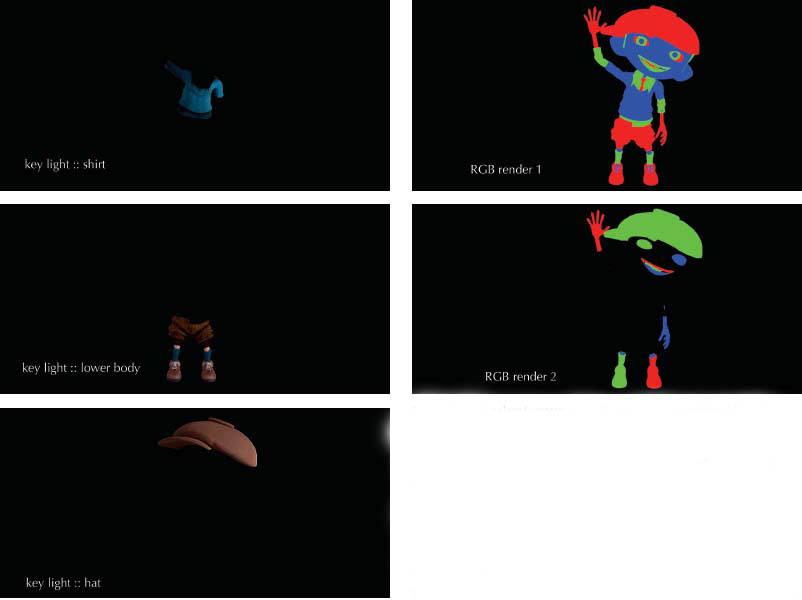
Figure 9.5 Additional render passes created to complete the notes from Critique 1.
Adjustments :: Round 1
The next step was to return to the rendering software to hit the notes. The first note to be addressed was the separate key for the hat, shirt, and lower body. The current key was unlinked to each of these pieces of geometry and additional key lights were added and properly linked to only the necessary geometry. For the hat, the key light was swung around more to the screen-right side and the intensity was increased. The same was true for the lower body, except the amount of rotation was slightly different. The key on the sweater was left in the same position, but the intensity was increased to create a more drastic variation from lightness to dark.
In order to address the issues with the eyes, a couple of new layers needed to be created. The first was an eye reflection pass. The goal of the eye reflection pass was to capture the reflections as they would be seen in the eye. To accomplish this, the outer cornea of the eye was rendered separately and given a material that output a mirrored reflection. The first step was to set all the other geometry in the scene to be visible only in the reflections of the new mirrored eye shader. To add additional reflections of a mock environment, an image was mapped onto a sphere surrounding the character and that sphere is also set to appear only in the reflections. The image chosen for the reflection was also a happy, warm image to match the rest of the scene.
The other render pass that was created was for the eye ding. The goal of the ding layer was to create a single highlight in each eye that would make Pio feel more alive with a twinkle in his eye. The setup was very similar to the reflection pass, but in this case a white, only a circular plane, was added to the scene to appear in the reflections. This white card was scaled and manipulated to give a nice, desirable ding in that ten o’clock position on both eyes. The eye ding was rendered separately from the eye reflections since the intensity and color will often need to be modified in the comp without changing the environmental reflection. The size of the eye ding was on the smaller side and the shape was kept a simple geometric circle so as not to reveal a particular light source being reflected.
RGB mattes were also created to help control each of the areas that have already been identified as problematic. As was discussed earlier in the book, these RGB mattes will help the artist control certain sections of the image in the comp and make minor adjustments that do not require a re-render.

Figure 9.6 Passes for individual eye reflections and an eye ding to help add extra life to the eye.
Critique :: Round 2

Figure 9.7
Adjustments :: Round 2
Thanks to the RGB matte passes already created, these notes could be addressed in the comp. A rotoshape and the RGB matte which isolates Pio’s waving arm were combined to slightly brighten that area up to the desired level (Figure 9.). Similarly, the teeth were brought down in value slightly and given a little extra warmth with a simple color correction in the comp. The tie was also fixed with a color correction. For the contact shadow on the sclera and the shaping on the shadow side of the face, an ambient occlusion render was created and added to just those regions.

Figure 9.8 The RGB render makes it very easy to isolate certain sections of the image for adjustments. A great example is the note to increase the value of the palm of the waving hand. Since the palm of the hand overlaps the hat, it would be difficult to isolate that area with just a rotoshape. Instead, the RGB matte is utilized by first isolating the red channel (a), then drawing a rotoshape to isolate the desired area (b), then blurring the edge of that rotoshape to avoid hard lines in the color adjustment (c), and merging those two areas together with an “inside” merge operation so the hand is only being used where the change is desired (d). In the end, that image is used as the mask for the color adjustment to increase the value.
Final Image
The final result revealed Pio exemplifying his hero look. His skin and clothing match their hero colors and he has the desired warm, happy glow. Although it took some extra work to get additional shaping on some of his garments, the visual results were worth the effort. In the end, we have an image that can be used to show the ideal look for this character.

Figure 9.9 Pio—final image and light positions. Pio is downloadable character courtesy of Boutique23 (www.boutique23.com).
Lighting Scenario Two :: Character and Environment
In most animated projects the character will not be lit alone. Characters normally perform in an environment and a lighting rig must be constructed to work with the entire shot. The character must feel like he or she is both properly illuminated within the scene while also given the proper structure to allow him or her to visually stand off from their surroundings.
In this example, Tre3 is sitting on a set of stairs along a cobblestoned street. He has just been given some news that he must contemplate during this particular evening. This is not an action-packed shot but a calm, thoughtful nature should be expressed in the lighting.
Focusing the Audience’s Eye
The biggest challenge this shot presented was creating a rig that would allow the audience to properly focus on Tre3. He was relatively small on camera and not centrally positioned. The lighting should keep the audience’s eye on the screen-right side of the image while also giving him proper shaping.
Since there were no lamps or other light sources visibly present in the foreground, the main light sources would exist off camera. This allowed for flexibility in terms of positioning the light source wherever it best aided the aesthetics. The decision was made to have the light source be a lamp on the wall shining from above Tre3. This would create a nice pocket of light that could be used to focus the audience’s attention on this section of the image. A couple of locations were tested but ultimately it was determined to have the source coming from the screen-right side, which allowed the door behind Tre3 to remain dark while letting his brighter values come forward. This light position also allowed for shaping similar to Rembrandt Lighting.

Figure 9.10 Tre3—alley scene. Tre3 is downloadable character courtesy of Boutique23 (www.boutique23.com). The environment was modeled and shaded by Anuar Figueroa.

Figure 9.11 The key light was created and positioned with the intention of focusing the audience’s attention on Tre3 while also creating good shaping on his face and body.
Generating Pockets of Light
Another challenge of this shot was expressing the depth and space of the environment. With the key light focusing the audience’s attention to one section of the image, secondary lights were added to help define the surroundings. It was important that these secondary sources create pockets of light and dark and not create one flat value. These varying values helped make the scene feel larger and deeper.
If this was a daytime scene, the set would almost be exclusively lit by the natural lighting like the sun and sky and those lights would only be used to create this feeling of depth. This night scene not only had elements of natural light but also allowed the freedom to add artificial lights. Another street lamp were added to some of the windows in the background. Their values were carefully dialed in as they needed to be bright enough to give the audience the idea of the set without drawing too much attention away from the focal point.
Creating Shaping in Fill Values
The interior lights of the set not only created brightness on the windows themselves but also spilled light onto the street. This is important because it creates subtle areas of variation that are essential to successful environment lighting. It must always be the focus of the artist to never allow areas to get too flat or evenly lit. Like character lighting, both diffuse and specular values were adjusted to create shaping in these areas.
Adding Softness
The mood of this shot was soft and gentle and some techniques were implemented in order to achieve that look. The first was adding some diffusion by isolating the brighter points in the compositing, blurring them, and then screening them back on top of the original. This created a nice diffusion on the scene that softened some of the harsher edges and gave the overall image a final, more polished look.
Adding depth of field was also implemented to both focus on the main character and also add a little extra softness to the image. As previously mentioned, depth of field should be added with care and an understanding of the scale of the scene. But within those boundaries the artist has some wiggle room for dialing in the amount of softness. In this particular case, the decision was made to lean toward heavier blur since that will aid in supplying some softness that will enhance the mood.

Figure 9.12 After the natural evening sky was added, lights illuminating the windows were created to add depth and variation to the scene.

Figure 9.13 Example of using a luminance key to add diffusion to only the highlights of a shot.
Critique :: Round 1
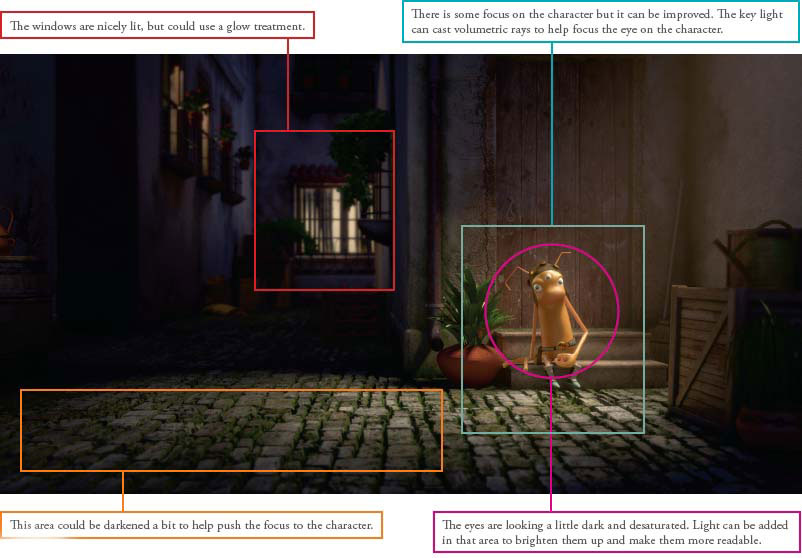
Figure 9.14.
Adjustments :: Round 1
The first note addressed was the eyes. Whenever the eyes are looking too dark or “dirty,” the main goal is to add a value and saturation. This was accomplished with a combination of adding lights specifically linked to the eyes and also creating RGB mattes for the eyes to lift the values overall and create a bit of separation between the iris, pupil, and sclera.
To get more focus on the character, a volumetric light was created at the same position as the key light and rendered out as a separate pass. The aesthetic goal of this light was to create a visual path to lead the audience’s eye to the character. The edges of the volumetric light were kept soft to keep with the aesthetic. These lights do not need to be harsh lines in order to be effective.
In order to make the rear windows look like glowing light, additional glow and diffusion were created in the comp. Also, the darkening on the screen-left side was accomplished in the composite by drawing a soft rotoshape around that area and darkening the gamma and multiplying the overall value down.

Figure 9.15 A volumetric light was created at the same location as the key light to add some more mood and to serve as a leading line for the viewer’s attention.
Critique :: Round 2

Figure 9.16
Adjustments :: Round 2
The value of the key light plus the quality of the surface area beneath the character equals the resulting bounce light. Therefore, since we added this volumetric light, the image appeared to have more key value and the area of Tre3’s body normally filled in by the bounce looked weak. The bounce light was increased by about 25 percent in order to accommodate.

Figure 9.17 Tre3—alley scene. Light positions for the final image.
The walls on the screen-left side of the frame were starting to merge together in value. The wall going down the side alley was also appearing to be a bit flat and could use more variation. In order to keep the attention on the screen-right side, the decision was made to darken the overall value of that wall but also to give it a subtle variation in color in order to give it more visual shaping.
The last modification was altering the material value of the far background leaves close to the window. In nature, these leaves have a translucent value that allows light to pass through them. By default, the shader on the leaves did not have that quality since it was assumed they would be so far away from camera to justify that added calculation time. Only after the lighting was added was it apparent that this quality was missing. This is often the case and one of the many reasons why lighting and shaders work so closely together. The modification was made and the leaves now have a more natural translucent quality.
Final Image

Figure 9.18

Figure 9.19 Party time!!!
Lighting Scenario Three :: Multiple Characters
There are often lighting situations that require an atypical approach. They do not fall into the normal lighting scenarios and require some extra research and vision in order to make them successful. For this example, the entire light bulb family is going dancing. It is either a wedding or some other family event where the whole family is celebrating together. Everyone is invited from grandfather to granddaughter and even the puppy. It is a jovial, cheerful engagement and the lighting, colors, and overall feeling must convey that emotion.
To begin a unique lighting situation like this it was essential to gather reference and determine a direction of the final look before proceeding. Research was done and the film Saturday Night Fever was chosen as a very general basis for several reasons. Obviously, this film has an iconic look that is whimsical, fun, and playful. The goal was to create a unique look by building this lighting design. The second reason this reference was chosen was the darkness in the areas around the main characters. The CG set in this example is extremely minimal with only the characters, dance floor, and a couple of simple set pieces. In these situations it is up to the lighter to craft a scene that allows the audience to mentally extend that space and believe the environment is more elaborate than it actually is.
The Floor
The first step in tackling the obstacle of lighting this scene was the glowing dance floor. When approaching a challenge like this it was important to try and conceptualize how that structure was constructed. Analyzing the reference made it appear as though there was a top, transparent glass dance floor with the colored tiles below. The colored tiles appeared to have a light source in the center that decreased in intensity as it reached the edge of each square.
It was important to construct the geometry in a similar method to get the same effect. A plane was laid as the top layer and given a slightly frosted glass material. Individual planes were placed below this glass floor and given a glowing material that had a ramp controlling the intensity from the center outward. These squares were given colors and arranged in a geometric pattern that was similar to the reference.

Figure 9.20 Saturday Night Fever— © mptvimages.com.

Figure 9.21 Each of the illuminating floor tiles was given a ramped texture to make it appear like there was a glowing bulb beneath the floor.

Figure 9.22 The disco ball sprays hundreds of little dots of light around the room. Our gobo map was created to do the same thing with colors that match the lights used.
The Disco Ball
The disco ball was intriguing on a few levels. The mirrored surface gathered much of its illumination from reflecting the light of brighter objects around it. Disco balls also create a unique pattern of refracted light hitting the surrounding environment. Since the ball was made up of individual, square mirrors, the refracted light appeared to be many individual specks of light following the rotation of the ball. Last, disco balls always seem to have a magical aura surrounding them. In many of the reference images found, disco balls are given an extra glow or lens flare to make them appear more beautiful.
A few elements were needed to be placed in order to get the disco ball working successfully. The first was getting the lighting and shaping on the object itself working. The next step was making sure the disco ball had enough elements to reflect to be properly illuminated in the space. This can be done by constructing an entire set and lighting it even if the objects are off camera. In this particular case, however, the decision was made to instead add a reflection map to the scene to give the disco ball something to reflect, since this would be much more efficient during the rendering phase. This was done by placing a sphere around the disco ball that only appears in the reflection of the object. The sphere’s visibility was turned off along with its ability to cast or receive shadows. Then an image mimicking the surrounding set was mapped to that sphere and the reflection was set.
A unique light rig was constructed in order to achieve the sparkling lights surrounding the disco ball. This rig consisted of six spotlights all placed at the center of the disco ball and projecting light in each direction around the room. The disco ball’s visibility was turned off to avoid it casting shadows. These lights were given gobo maps that have the same square shape as the individual pieces of the mirrored ball. Finally, the light rig was parented to the disco ball itself to ensure it would properly rotate when the disco ball was animated.
The Volumetric Lights
Another element that was observed in the reference was strong volumetric lights focused on the dance floor. These did a great job of directing the viewer’s eye while also masking off areas of the background that are bare and empty. The lights were also a beautiful streak of color that added playfulness to the scene.
Character Lighting
The first step was to establish an overall value for the characters since they all needed to be visible and readable over the dark background. They were each given enough light to pop out from the dark surroundings, but not enough to feel out of place. The characters on the dance floor were the main focus so their illumination was even a touch brighter than those characters standing off to the side.
As far as the specifics of light direction, the focus once again went to the reference image to begin the process. How much light was shining on them from the glowing floor? How were the characters being illuminated by the surrounding overhead spotlights? How saturated should the light color get? The reference showed an overall red fill value that illuminated the main characters. That fill value is also accompanied by several colorful rim lights that not only integrated the characters into the space but also made them look more beautiful. This image was made with the same structure in mind with slight modifications to match the desired color palette.

Figure 9.23 The light emitting from the disco ball is actually six different spotlights emitting light in all directions.
Critique :: Round 1

Figure 9.24
Adjustments :: Round 1
When faced with a long list of notes, some prefer to attack the easiest notes first to gain momentum before approaching the more difficult challenges. In this case, increasing the intensity of the volumetric lights was easy. After that, the color of the dance floor was desaturated and the incandescent intensity was increased to create more of a glow. Then the size of the gobo map was decreased and tiled to create smaller points of light around the room.
From there it was on to the disco ball. At first more lights were created to light the disco ball but that was only adding specular values to the mirrored surface. In order to make the ball appear brighter, the reflection map was initially increased but it was difficult to determine the proper value. Instead, a separate reflection pass for the sphere was created so the exact brightness could be controlled in the comp. An RGB specular pass was also created to add some highlights to the ball.
To add some additional value to the background, a magenta light fog was added to the room. There is a little of this haze present in the reference image and just adding that bit of value can make a very dark space feel more realistic.
For the characters, the materials needed to be adjusted before anything else could be done. The lighter and darker components of their clothing were exaggerated in order for the audience to see the difference. This is a common tweak when working in bizarre lighting scenarios because material values can appear very different depending on their surroundings.
The reflection on the bulbs also needed to be modified. The layout of the space was creating reflections that were unappealing and confusing. To improve this the reflective properties of the bulbs were turned off in the character render and a separate bulb reflection pass was created to replace it. In that layer the surrounding geometry’s main visibility was turned off so it would only appear in the reflections and refractions. Then all the surrounding geometry was slightly adjusted so the reflections were still believable but more aesthetically appealing.
Critique :: Round 2

Figure 9.25
Adjustments :: Round 2
To address the filament note, two separate elements needed to be in place. The first was the glowing filament itself and the second was that light’s influence on its surroundings. The glow was first attempted in the render, but after some testing it was determined that the glow value could be more easily controlled in the comp. A matte layer was created that allowed those filaments to be isolated in the comp and controlled accordingly.
The bulb’s influence on the surrounding elements was achieved by placing a point light at each position where there was a filament. That point light was given a decay rate so it would only influence the area directly around it. This was also rendered as a separate pass so the filament color and the resulting light could match.
Some compositing techniques were utilized to allow the disco ball and volumetric lights to feel more magical. Adding a bit of added diffusion or light glow to these regions was the first step. Both the specular highlights of the disco ball and the bulbs of these volumetric lights were extremely bright compared with the rest of the scene so it was believable that they would create this softness. The next step that went along with this brightness was to add a small amount of lens flare. These two elements should be applied with a gentle hand to avoid looking hokey, but if just the right balance is met they can provide the image with a little extra magic.

Figure 9.26 Party time — light positions for final image.
The final steps included lifting the blacks beneath a few of the characters by increasing the bounce value, increasing the value of the dance floor lights to make them look like they are glowing, adding a little darkening in the two bottom corners of the frame to create a little more vignetting, and color correcting the disco ball slightly to have a bit more of the magenta color of the room.
Final Image

Figure 9.27
If there is any overarching concept to take away from this chapter it would be that no two lighting scenarios are the same. There is no single approach to lighting that will work in every instance. Every scenario will present its own set of challenges that must be solved in a variety of ways. These walkthroughs are not the only solution but simply one way to approach these situations. The key is to remember the core fundamentals of lighting and strive to reach those in every shot: create shaping, direct the viewer’s eye, and tell the story.
|

Q. What is your current job/role at your company?
A. My current role is Creative Director/Partner at Interstate. Previously, I was a Director at Mill+.
Q. What inspired you to work in this industry?
A. There were many factors that inspired me to work in this industry. Back when I started in 1995, it felt like you were part of a team of pioneers. We were all exploring a new medium which allowed us not only to create images never seen before, but also to bring whole worlds to life through animation and direct digital translation of traditional cinema techniques. The technological aspect of this industry also made a huge impression on me. The technology was just fascinating to me as an artist as nothing then was taken for granted and it all really seemed like mysterious science. It really was a relief that 3D imagery was actually made, even back then, by artists and not computer gurus. I was lucky to have been mentored by a team of incredibly talented people. I started as a 3D artist in France. Back then 3D imagery was something very special that really seemed to come out of the mind of mysterious computer wizards. I was lucky to live in a city that was home to one of the best 3D companies in France which was called Gribouille and had won technical prizes at the Imagina festival. They had a Cyberscan which was one of the first in Europe and that allowed the scanning of human faces. The whole company was equipped with Silicon Graphics machines running IRIX and Softimage 2.6. To put things in context, not a single person in the company had an email when I started as an intern. It just was not widespread then. I interrupted my graphic art studies to become a full-time employee at Gribouille.
Right now my work is different in the way that I focus less on detail and more on the conceptual aspect of the project. I do not create any CGI any more but I am able to creatively guide teams and make sure we all create high quality visuals.
Q. What non-CG artwork inspires you?
A. I enjoy traditional illustration a lot. Children’s books are incredibly creative and the techniques are very diverse. Comics have always been a huge source of inspiration for me, be it through the storytelling aspect or technique. I was greatly inspired by Juan Giménez with the work he did for the “Caste des Méta-Barons,” also by Philippe Caza who I was incredibly lucky to work with. His intricate science fiction book covers let your imagination run wild. Of course, the incredibly influential Moebius and Philippe Druillet who created Heavy Metal magazine. I was also lucky to have worked with Druillet at Gribouille to make a pilot for Excalibur. Comics in France are considered as the ninth art and have been extremely influential and are still today for me. I also like land art a lot. Andy Goldsworthy is a master. His work is incredibly modest but very powerful and at the same time fragile. Since I have been living in the US, I have been more attentive to French cinema and as a result American independent cinema, which I am a big fan of. I also admire Théo Jansen, who creates admirable kinetic sculptures that look like they could be other animal beings.
Q. Can you tell us a little bit of how lighting plays a role when working on a job?
A. Be it a fully CG job or a hyper-realistic CG element composited in a live action plate, lighting is obviously key. Without good quality lighting, the job simply will not look good. Lighting sets the mood of a movie or a commercial, it allows the design and textures of characters and assets to come to life and express their specific beauty. Lighting is the conduit for expression. Without light, you would not see. With great lighting, everything becomes beautiful in its own right.
Q. How important is lighting to the process when you are integrating a CG element in a live action plate as opposed to working on a fully animated shot?
A. In a realistic job, the role of lighting is to solely replicate the lighting setup on set to achieve maximum realism for a good integration. In this context, the approach is a bit more technical as the artist either has to use data gathered on set to light his scene, or replicate the lighting on set using his artistic abilities, or both. Well, that’s in theory; sometimes the artist has to add a little extra to make the CG asset perfectly integrated. Overall, the live action is what drives the artist’s choices. In a fully CGI project, the lighting approach is more free as it is not limited to just recreating the setup of the live action plate. As a result, lighting can be more expressive in projects like this. Every scene that composes a shot becomes a mini set into which physical lighting rules can be broken. Unlike a live action set, every component here can be controlled, which is a great canvas for an artist.
Q. What kind of assets do you like to provide for the lighters when shooting on set? For example, do you always provide reference of the lighting rig/environment, create HDRI images …?
A. It is now a standard to capture HDRI data on set. It is recommended but obviously not essential. It allows a faster turnaround time and more precise lighting and reflections. However, an artist should be able to go beyond the HDRI data or even not use it at all. In the end, it’s all about the artist’s eye and how a specific lighting setup can be recreated to achieve seamless integration. Lighting is never plug and play. There is always a little something to improve or a way to cheat perception to make CG work better within the live action plate. There is no set recipe to create a realistic render. Every situation is different, there are very different methods and approaches. In the end, what is important is that the artist has a good sense of observation and analysis.
Q. In commercial work, what is the standard amount of time a lighting artist has to work on a shot? Is their role strictly lighting or do they take on other responsibilities like shaders and compositing?
A. In commercial work a lighter not only sets up the lighting in the 3D scene, but also sets up shaders and digs into compositing to make sure his renders fit within the live action. The shaders are somewhat dependent on lighting and vice versa, so it makes sense for the artist to refine both at the same time. Again, this is in the commercial world. Also, the artist needs to see further down the pipeline, hence why, in general, he does pre comps to see how big the range is in 2D to achieve the right integration. The bigger the range, the more off the asset is and the more it will need 2D work. With a smaller range, the tweaks in 2D will be minimal, which means the 3D render is good.
Q. If you could tell yourself one piece of advice when you were first starting out in this industry, what would it be?
A. The generic answer is to follow your passion, of course. I realized quite a lot of people did not have a true passion for the medium, which can only bring you to a certain level. Beyond this, a lot of people do think that CGI is just knowing the tools. They think that the software alone will allow them to make great visuals. The computer is going to “sort it out” for them. By pressing the right button, using the right renderer, they will be great artists. Some schools are all about promoting the latest software, technique, etc.. Forget all this and trust your eye and your instinct. In the end, an artist is someone who is sensitive to certain things in life that mostly everyone else will not perceive. Use your own perception, tap into it and exploit it through the CGI medium.
Q. Where do you think the future of lighting is headed?
A. I would say real time lighting. Real time engines are getting closer to using algorithms used by non real time renderers. The overall building process is similar, which is great for the artists. A 3D artist who uses the Unreal Engine 4 editor will feel familiar with Maya and vice versa. Obviously they are different software and will require adaptation time but the approaches from both are merging. The real time approach is less forgiving in the preparation of assets right now but a lot more flexible once you actually start lighting. Eventually, I think a 3D artist will be using virtual headsets to light scenes in real time.
Q. What’s the one spot or shot you are most proud to have worked on?
A. I am proud of some of the work I did when I first started and some very recent work. By today’s standards the old work, which was mostly game cinematics, is not comparable to what is done today and the software has evolved dramatically. At that time, modeling was literally creating vertices one by one, then adding edges one by one to make polygons. Things were different; it was labor intensive but incredibly rewarding. I was proud of the work because at the time it was some of the best. I am thinking of long nights rendering a pilot for the Dungeon Keeper 2 cinematics which involved the “Reaper” squashing chickens. What a lot of fun that was! Recently, I am proud of some work I directed: one is a promo for the series Penny Dreadful on Showtime which is called “Just Like You” and the other is a Hallmark commercial I also directed about two years ago which is called “Mother Bird” and features fully CG birds.
Q. In your opinion, what makes a good lighting artist?
A. To recreate a world you don’t have to understand how the real world is built. You don’t really have to know the science behind lighting to recreate good lighting. All you need to do is to be attentive to the world around you. You need to trust your sense of observation and analyze what you see so that it makes sense to you. You have to constantly be on the lookout to see things that other people bypass. You have to observe the world from an artist’s perspective, which is constantly trying to absorb specific details about the environment around you. Also, what do you feel like when you are present in a specific situation? Do you feel more melancholic on a stormy day? Do you feel more relaxed on a rainy day? These are different moods that do affect you as an artist and that once digested will help you create similar moods in CG. You have to let yourself be sensitive and somewhat understand what affects you and absorb as much as you can around you. Artists are sensitive beings because they are sensitive to their surroundings.