Chapter 2
Distributions
Comparing Distributions of Data
Introduction
A detailed consideration of characteristics of univariate distributions occupies significant time and attention in elementary statistics. We use techniques of exploratory data analysis early in the formal study of elementary statistics to describe many distributions. The same techniques are used later to assess the credibility of the normality conditions that underpin inference with means, as well as the normality and homogeneity assumptions about errors in linear regression. In chapter 1 we saw how to enter data and display the default univariate display of information in JMP. In this chapter, I will delve more deeply into the power of JMP to analyze and compare univariate data distributions.
In elementary statistics, it is virtually impossible to overstate the importance of being able to examine distributions of univariate data easily and flexibly. A “statistical” response to data implies going beyond calculating measures of center. The conscientious data analyst must attend to the shape of a distribution of data, ask about the magnitude of the observed variability, and search for possible causes of that variability. We will explore data sets using a variety of techniques (stem and leaf plots, box plots, histograms, and so on) to highlight important aspects of the distribution of data, including shape, spread, clusters and gaps, and outliers. A distribution is a synergistic entity, not just a collection of individual data points. Graphically, we think of characteristics such as center and shape. Numerically, we may calculate statistics such as the mean, skew, spread, and so on. Statistics and graphs are not characteristics of data; they are characteristics of distributions of data. Not only is the concept of a distribution a big idea; it is also a fundamental idea. Unfortunately, the concept of a distribution is a level of abstraction above the data, and it should come as no surprise that the idea of a distribution is not necessarily a natural one for students.
In their review of the literature on the place of distributions in the statistics curriculum Garfield and Ben-Zvi (2008) point to “distribution” as one of the most important “big ideas” in statistics:
Rather than introduce [distributions] early in a class and then leave it behind, today’s more innovative curriculum and courses have students constantly revisit and discuss graphical representation of data, before any data analysis or inferential procedure…. [The] ideas of distributions having characteristics of shape, center, and spread can be revisited when students encounter theoretical distributions and sampling distributions late in the statistics course. (Chap. 8, p. 168)
Students learn the strengths and weaknesses of different representations of data by working with distributions in their various graphic forms. Box plots, for example, give a general idea of center and spread and are particularly useful for identifying outliers; stem and leaf plots and dot plots show more detail and may be used to spot clusters and gaps; histograms give a global sense of the shape of a distribution. Early in the learning process it is necessary for students to be able create graphs of distributions by hand. As these skills are honed, it is important for students to move beyond the construction of these graphs to actual reasoning about patterns in individual data sets, to comparisons between and among data sets, and finally to an understanding of what story the data have to tell. Students will acquire these data analysis skills in the same way one “gets to Carnegie Hall”: practice, practice, practice. It is here that the utility of technology has a primary facilitative role. Fast production of graphs and statistics results in more time that can be spent on interpretation.
The statistical technology present in classrooms today consists of graphing calculators and computers. There are advantages to each. It is not my intent to rail against the use of graphing calculators, but rather to point out some advantages of JMP. Identifying the best mix of technologies is a decision properly left to individual classroom teachers and departments based on their unique circumstances, but it is beyond question that statistical software should be a major part of the mix. The advantages of JMP over the graphing calculator are impressive:
![]() Presentation quality of information is better with JMP. This is not simply a matter of more pixels on the computer screen: Consider also scales, axes, labels, units, and other information. Graphing calculators' failure to include this information with a graph raises the already high level of abstraction.
Presentation quality of information is better with JMP. This is not simply a matter of more pixels on the computer screen: Consider also scales, axes, labels, units, and other information. Graphing calculators' failure to include this information with a graph raises the already high level of abstraction.
![]() JMP can provide varied representations of the same data on one screen.
JMP can provide varied representations of the same data on one screen.
![]() JMP can provide representations of different data sets in a single window for comparative purposes.
JMP can provide representations of different data sets in a single window for comparative purposes.
![]() Data entry is more reliable and simple with JMP; small calculator buttons and up and down arrows are more difficult to navigate than keyboards and mouse clicks.
Data entry is more reliable and simple with JMP; small calculator buttons and up and down arrows are more difficult to navigate than keyboards and mouse clicks.
![]() The keystroke overhead in changing graphic and/or numeric representations is relatively excessive with the graphing calculator; with JMP, the addition or deletion of a graph usually takes about two to three mouse clicks.
The keystroke overhead in changing graphic and/or numeric representations is relatively excessive with the graphing calculator; with JMP, the addition or deletion of a graph usually takes about two to three mouse clicks.
![]() Data transfer and student collaboration in the classroom and around the world is easier with JMP. JMP supports a wide range of data formats to facilitate data transfer as well as to download data from the Internet.
Data transfer and student collaboration in the classroom and around the world is easier with JMP. JMP supports a wide range of data formats to facilitate data transfer as well as to download data from the Internet.
![]() JMP has a greater capability for working with large data sets.
JMP has a greater capability for working with large data sets.
![]() Finally, as we look to students' future college work and beyond, into their professional lives, the tools for serious work will be computers and statistical software. Teaching with JMP provides a better preparation for future college students and down the road supports their entry into the workforce.
Finally, as we look to students' future college work and beyond, into their professional lives, the tools for serious work will be computers and statistical software. Teaching with JMP provides a better preparation for future college students and down the road supports their entry into the workforce.
Univariate Data
The data analysis problem described in this section comes from the work of anthropologist Margaret E. Beck (2002). She analyzed the tensile strength of ceramic objects from archeological sites in south central Arizona. Her unit of analysis was the “sherd,” a fragment of pottery. Tensile strength is the maximum load that a material can support without fracture. Beck reported the load in units of force (kg) needed to shatter standard (equal area) sherd samples from her sites.
1. Select File → Open, and navigate to the folder in which you have stored this book’s data files.
2. Select TensileStrength → Open.
JMP will respond by displaying the data table in figure 2.1.
Figure 2.1 TensileStrength data table

The variable SherdSource indicates (no surprise!) the source of the sherd: Sacaton, Casa Grande, or Gila Plain, all sites in the Phoenix basin. The Sacaton and Gila Plain sherds date from AD 950–1100, and the Casa Grande sherds from AD 1100–1300. The variable Weight (g) is measured in grams, and MuThick(mm) is the mean thickness of the sherds measured in millimeters. The mean thickness is used because the surfaces of these sherds are slightly curved with variable thickness, typical of ceramic pots.
Now we will consider some of the univariate distribution options of JMP. Some of what follows will be a review of chapter 1.
1. Select Analyze → Distribution.
2. Select Load (kg) → Y, Columns → OK.
3. Click the Load (kg) hot spot; repeatedly select Display Options and deselect Quantiles and Moments.
4. Click the Distributions hot spot and choose Stack.
5. Repeatedly click on the Load (kg) hot spot and select Normal Quantile Plot and Stem and Leaf.
6. Right-click in the box plot area and deselect the Mean Confid Diamond and Shortest Half Bracket options, as we did in chapter 1.
You should see the data representations as shown in figure 2.2. You may wish to resize the graphics area by clicking and dragging in the lower right-hand corner of the histogram.
Figure 2.2 Common univariate displays

In their own different ways, each of the plots clearly indicates skewed data. The normal quantile plot may be less familiar to students than the box plot and histogram. If so, this may be an opportune time to introduce the excellent help capabilities built into JMP. (Remember, I encourage you to use the software’s Help capability any time you feel the need for a bit more explanation.)
1. Select Help → Index.
2. Type in the keywords Normal Quantile Plot and click on Display.
3. Choose Options for Continuous Variables from the list and click Display.
A portion of the resulting Help information screen is shown in figure 2.3.
Figure 2.3 Normal Quantile Plot Help screen

JMP has capabilities teachers and students can use to highlight the important aspects of graphs and focus student and audience attention on the most important concepts. As an example, consider the concepts of skew and outliers. Suppose that we wish to point out the different ways these plots indicate skew and outliers. We could annotate the graph to highlight or explain these important ideas.
1. Select Tools → Annotate and click-and-drag to create a text box.
Position the text box in a reasonable place on the graph by clicking and dragging; you may also have to make the text box wider and/or taller to display all of your text.
Key in an explanatory phrase such as “Indications of skew and outliers” in the text box. You can resize the box to suit your taste. Right-clicking inside the text box allows you to change some of its features, for example, the font.
2. Select Tools → Simple Shape; click and drag the ovals to the positions as shown in figure 2.4.
Figure 2.4 Annotated graphic information

JMP allows you to easily tailor the presentation of your histogram to suit your personal taste. For example, by clicking on the Load (kg) hot spot, you have the option of removing or adding various graphical representations of the data. Try removing the box plot by deselecting Outlier Box Plot. (Repeat to remove all but the histogram.) Right-click the ovals that we created and select Delete to remove the oval shape. While we are here we can also implement a couple of perfecting amendments to our histogram presentation. If you wish, you may deselect the box plot and normal quantile plot in the display via Load (kg) → Display Options.
3. On the Load (kg) hot spot select Histogram Options → Count Axis. This adds a y-axis of observed counts to the histogram.
4. Again click the Load (kg) hot spot, this time selecting Continuous fit → Normal. This adds a normal curve to the graph.
You should now see a vertical axis similar to that in figure 2.5. The scale labeled “Count” presents the frequencies for each bar, and the normal curve associated with the sample mean and standard deviation is fitted to the data. The histogram’s bars peek significantly above and below the curve, evidence of a lack of approximate normality in the data. This can be a further aid in contrasting the normal curve model with the usually “approximately normal” actual distributions we see with real data.
Figure 2.5 Normal curve fit to data

Comparing Distributions of Data
Once students are comfortable—or at least competent—with distributions, the next data analysis step involves comparing distributions; that is, comparing their characteristics to identify similarities and differences between and among their distributions. Comparing distributions of data sets is not just a task of analyzing one distribution multiplied by the number of distributions. Students who simply construct separate lists of characteristics of distributions when asked to compare them are missing something essential in their analysis. Students should go beyond analyzing the nature of the variability within each set of data, and also identify and comment on any differences in variability, shape, or other distinguishing features. The comparison of distributions at an early exploratory level in students' experience sets the conceptual stage for future comparisons using formal statistical inference. Beyond a statistics course, the statistical structure of most research studies reported in the press and increasingly available online is a comparison of distributions and their statistics. From a teaching standpoint, comparisons also lead to much more interesting class discussions.
Two prevalent graphical techniques useful in comparing distributions of data are histograms and box plots. Histograms allow a more detailed comparison of the shape of distributions; box plots allow a more condensed presentation of more than two batches of data. Of course, the relative advantages of histograms and box plots will vary with the nature of the data and the sample sizes.
To illustrate the power of JMP in comparing data we will once again consider the tensile strength data of Beck (2002).
1. Select Window → Close All Reports.
2. From the JMP data table, select Analyze → Distribution.
3. Select Load (kg) → Y, Columns.
4. Select SherdSource → By → OK.
This sequence tells JMP to display the Load (kg) for each SherdSource group separately.
5. Click the Distributions disclosure icon and choose Stack.
Choosing Stack will result in a display of the information for each sherd type on its own horizontal row.
6. Click the Distributions disclosure icon again, and this time choose Uniform Scaling for each SherdSource graph.
The Uniform Scaling choice will result in equal-length scale intervals across the three groups of data. That is, intervals of size 5 will appear with the same length on the screen irrespective of the SherdSource. (I have silently hidden the means diamonds and the most concentrated intervals.)
Your results should now be similar to those shown in figure 2.6, except you will see presentations of all three sherds, rather than just two.
Figure 2.6 Comparing distributions

Some subtleties in the process of comparing histograms still might evade the attention of the unwary student comparing these groups of data. For example, the three scales range over different intervals. JMP has presented these graphs, reasonably enough, in a manner that maximizes the detail, given the area allocated on the screen. In the Stack representation, the capability of visual comparison is enhanced if the bin sizes and intervals are the same. Inspection of the data (by appealing to the stem and leaf plot or checking the quantiles) reveals that the smallest load in any of the sherds was 9 kg and the largest 66 kg. Considering this, it seems convenient to fix the endpoints of the intervals at 0 and 70 kg. I will arbitrarily suggest 10 kg for the increment, and throw in one minor tick per 10-kg interval. For each of the distributions, execute the following sequence:
1. Double-click the scale area to bring up the X Axis Specification panel.
2. Choose 0 for the Minimum field, 70 for the Maximum field, 10 for the Increment field, and 1 for the # Minor Ticks field. Leave the other settings at their default values.
The histograms should appear as shown in figure 2.7, except you will again see presentations of all three sherd sources. As usual, feel free to experiment with different values of axis settings to see their effects on the histograms.
Figure 2.7 Comparisons redux

Pause for a moment to compare the presentations shown in figures 2.6 and 2.7. Creating uniform scales facilitates the quick visual comparison of distributions. The shapes of these distributions appear to be different; it now seems that the data from Sacaton and CasaGrande are skewed and GilaPlain’s data is not. Greater detail can be displayed with the normal quantile plot.
For each of the sherd source sites:
1. Select Load (kg) → Display Options.
2. Select the Normal Quantile Plot and deselect Quantiles, Moments, and the Outlier Box Plot.
3. Select Histogram Options and deselect Histogram.
The display should look similar to that in figure 2.8. Again, the point here is that the route from original to alternative display using JMP was fast and easy, even this late in the analysis.
Figure 2.8 Normal quantile plots

Since in elementary statistics the normal quantile plot is mostly about the shapes of distributions, we need not ruthlessly enforce uniform scaling. If you are unfamiliar with the normal quantile plot, it is instructive to examine these three plots simultaneously. From inspection of the histograms it appeared that the loads from the GilaPlain plot were closest to approximately normal; the two histograms for CasaGrande and Sacaton are skewed to the right. The box plots tell the same story, with the box plot for GilaPlain appearing to be more symmetric, showing whiskers of similar lengths. Not surprisingly, the normal quantile plots tell a consistent story. The plot for GilaPlain is closest to being straight by a larger margin, and the normal quantile plots for CasaGrande and Sacaton are similar to each other.
JMP also provides an alternative path to displaying multiple distributions.
1. Select Windows → Close All Reports.
2. Select Analyze → Fit Y by X.
3. Choose Load (kg) → Y, Response, and SherdSource → X, Factor → OK.
The Fit Y by X choice might sound a little odd; perhaps some explanation is in order. We usually think of “fitting” in the context of regression. The dominant paradigm of statisticians today is the construction of models for Y, or response variables as functions of the X, or explanatory variables, and the generic term for this is “model fitting.” The explanatory and response variables in the model can be either categorical or numeric. These models contain many of the techniques of elementary statistics under one regression umbrella, and JMP mirrors this by locating many techniques under the Fit Y by X moniker.
JMP keeps everything straight in the Fit Y by X world by checking the data types. It then offers options that are relevant for those data types, performs the appropriate procedures, and displays appropriate graphs automatically. JMP remembers that for our data the “response” variable is Load (kg) and the “explanatory” variable is SherdSource. The technical name for analyzing models with a quantitative response variable and categorical explanatory variable is one-way analysis of variance (Oneway Analysis). What we get out of all this is the graphic display in figures 2.9a and 2.9b.
Figure 2.9a Oneway ANOVA
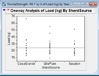
Figure 2.9b Oneway ANOVA with box plots

The Grand Mean is the horizontal line in figure 2.9a. It is positioned at the mean for all the Load (kg) data and functions as a line of reference much like the zero line in a residual plot in simple regression. The X Axis Proportional selection (which we have suppressed) allocates horizontal space in proportion to the sample sizes.
1. Click the Oneway Analysis of Load (kg) By SherdSource hot spot.
2. In the Display Options, deselect Grand Mean and X Axis Proportional.
3. In the Display Options, select Box Plots.
Your efforts will be rewarded by the transformation of figure 2.9a into figure 2.9b.
Beck was interested in whether there were technological changes over time in production that made the ceramic materials better able to withstand higher forces. The later CasaGrande site does appear to have higher load measures than the Sacaton site, suggesting an increase in strength. Beck asserts that this evidence is consistent with the fact that the CasaGrande vessels are less fragmented than the Sacaton vessels. Interestingly, the GilaPlain site, though dating from the earlier time period, appears to have the strongest sherds. Notice that the data points are presented with the box plots. This is optional, and the presentation of the data points can be deselected in JMP (Oneway Analysis hot spot → Display Options). Some discussion in the literature (Garfield and Ben-Zvi, 2008, chap. 8) suggests that students learning to analyze distributions should make a transition from seeing data as distinct points to seeing a distribution as a single entity. Graphic displays with both points and box plot may aid students in making this transition.
Finally, I would like to point out that the Oneway Analysis hot spot includes an option for showing histograms also.
1. Click the Oneway Analysis of Load (kg) By SherdSource hot spot.
2. Select Display Options → Histograms.
The resulting figure 2.10 presents a view at three different levels of detail: individual points, histograms with selectable bin sizes, and box plots.
Figure 2.10 Three views

What Have We Learned?
In chapter 2, I discussed some of the advantages of JMP over graphing calculators. You learned how to annotate graphs and in general delved deeper into the capabilities for analyzing univariate data in JMP. We multiplied these capabilities when we considered how to compare groups of univariate data, a great leap forward for students conceptually. We also considered some teaching issues related to univariate plots. In chapter 3, I will illustrate some of these techniques with larger data sets.
References
Beck, M. E. (2002). The ball-on-three-ball test for tensile strength: refined methodology and results for three Hohokam ceramic types. American Antiquity 67(3): 558–69.
Fitzgibbon, C. D. (1989). A cost to individuals with reduced vigilance in groups of Thomson’s gazelles hunted by cheetahs. Animal Behavior 37(3): 508–510.
Garfield, J., & D. Ben-Zvi. (2008). Developing students' statistical reasoning: Connecting research and teaching practice. New York: Springer.