
"The greatest value of a picture is when it forces us to notice what we never expected to see." | ||
| --John Wilder Tukey, statistician and developer of the box plot | ||
"The purpose of visualization is insight, not pictures." | ||
| --Ben Shneiderman, developer of the treemap | ||
These two quotes are interesting in their juxtaposition. One tells us to draw pictures that reveal the unexpected. The other tells us that the purpose of visualization is not pictures but insight. If they were part of the same conversation, one might believe that the two famous contributors to the area of data visualization were in a disagreement.
Of course, this is not true, and these statements were made at different times and in different contexts. However, they could be part of the same conversation. One that extols us to, yes, create pictures, but not just pretty pictures; pictures that deliver insight, pictures that reveal the unexpected.
In this chapter, we are going to explore where data visualization has come from. We will also look at the important things to understand about how humans work with data, and this will lead us to some rules about how to present data most effectively.
These are the topics we'll cover in this chapter:
- Reviewing the history of data visualization
- Understanding the audience
- Designing effective visualizations
Before we can discuss how best to visualize data, it is useful to understand a little about your audience: humans. The first thing to understand is that humans have been visualizing things for a long, long time. Some people seem to think that data visualization started some time in 1800, but things were happening a long time before that.
At some unknown stage in human evolution, it suddenly became important to tell stories. In many cultures, the easiest way to tell these stories was to create pictures that would enable the storyteller to show the listeners what was being related:

Bisonte Rupestre en Altamira by Baperukamo—own work
This photograph is licensed under Creative Commons Attribution-Share Alike 3.0 via Wikimedia Commons and is available at http://commons.wikimedia.org/wiki/File:Bisonte_Rupestre_en_Altamira.jpg#mediaviewer/File:Bisonte_Rupestre_en_Altamira.jpg.
As civilizations grew, the aural transfer of information became more important. Later, the written word became the most important method of transmitting messages. However, art was always the most important way of telling stories and sharing ideas.
As numeracy increased and mathematics developed, methods to use images to understand the numbers started to appear.
The first cases of uses of visualizations to represent numbers come in the area of analytical geometry—using some kind of coordinate system to either resolve or create equations.
The earliest uses can be traced back to before 300 BC in ancient Greece, during the great era of philosophers, at a time when scholastic pursuits were encouraged.
Menaechmus (around 380 BC to 320 BC) was a Greek mathematician and friend of Plato, who is credited with discovering the conic sections: the realization that shapes like the ellipse and parabola were actually cross-sections of a cone. His methods of proving his theorems had a strong resemblance to the use of coordinates.
Apollonius of Perga (around 262 BC to 190 BC) developed a method that is very similar to those developed by more modern mathematicians. He can't be fully attributed with the development of analytical geometry, because he was also working on conics and his equations related to curves. He was able to come up with equations of the motions of planets, and his work influenced other important mathematicians such as Ptolemy.
Claudius Ptolemy (around 90 AD to 168 AD) created one of the first, widely replicated data visualizations when he created his Geographia. He collected as much data as he could, transformed it using rules that he established himself, and created his famous world maps.
One of the most interesting debates in Mathematics is that of who really created analytical geometry. The debate centers on two famous French mathematicians and history appears to have come down in the favor of the publishing date.
René Descartes (1596 to 1650) is the historical winner:

René Descartes
This photograph is licensed under Public Domain via Wikimedia Commons and is available at http://commons.wikimedia.org/wiki/File:Ren%C3%A9_Descartes.jpg#mediaviewer/File:Ren%C3%A9_Descartes.jpg.
Descartes is famous as being both a mathematician and philosopher. He coined the often used phrase, "I think, therefore I am". He has also had the honor of having his name applied to the coordinate system used in analytical geometry: Cartesian coordinates.
Descartes published his essay, La Geometrie, in 1637. Interestingly, although he reduced geometry down to arithmetic and algebra and he introduced the concepts of the coordinate system that now bears his name, there are no equations actually graphed in this work.
Pierre de Fermat (1601 to 1665) appears to be the loser:

Pierre de Fermat
This photograph is licensed under Public Domain via Wikimedia Commons and is available at http://commons.wikimedia.org/wiki/File:Pierre_de_Fermat.png#mediaviewer/File:Pierre_de_Fermat.png.
Pierre de Fermat had also written a work on analytical geometry that was apparently circulating in Paris in the manuscript form in 1637, prior to Descartes publication of La Geometrie. It is unlikely that Descartes was aware of this as he was living in the Dutch Republic at the time. So, it appears that both came up with their ideas independently. Descartes was actually published in 1637 (with a Latin translation published in 1649), whereas de Fermat's manuscript was not published until 1679.
The main difference between the two works was a matter of perspective. Descartes' techniques started with a curve and produced the equation of the curve. Pierre de Fermat's techniques started with an equation and then described the curve. Because of this, Descartes had to deal with more complex equations but this meant that he developed methods to deal with higher degree polynomial equations.
Mathematicians developed the use of charts to help them work out complex calculations. Over a hundred years after Descartes' La Geometrie, scientists and mathematicians emerged who would use charts to educate and persuade. They used them to tell stories.
One of the earliest recorded uses of using charts to educate was by the polymath, Joseph Priestley (1733 to 1804) who used charts that look very like what we today know as Gantt charts, to help deliver history lectures at Warrington Academy:

A New Chart of History (color) by Alan Jacobs
The preceding photograph is licensed under Public Domain via Wikimedia Commons and is available at http://commons.wikimedia.org/wiki/File:A_New_Chart_of_History_color.jpg#mediaviewer/File:A_New_Chart_of_History_color.jpg.
His A New Chart of History and Chart of Biography might have been influenced by an earlier chart created by Jacques Barbeu-Dubourg (1709 to 1779) in 1753 in Paris. However, Priestly's charts were much simplified (Barbeu-Duborg's chart was 54-feet long!) and easier to understand.
His charts were much admired, and along with his influential work in the area of Chemistry, this led him to be nominated by his peers to become a member of the Royal Society.
Now entering into this account, we meet one of the most famous individuals in the history of data visualization: William Playfair (1759 to 1823). Playfair, after a long line of interesting employments, became an economic journalist. He was almost certainly influenced by Priestly's time series charts and developed them as a method of representing the change of a value over time—what we would recognize today as a line chart:

Playfair TimeSeries by William Playfair (1786)
This photograph is licensed under Public Domain via Wikimedia Commons and is available at http://commons.wikimedia.org/wiki/File:Playfair_TimeSeries.png#mediaviewer/File:Playfair_TimeSeries.png.
When creating his work, Commercial and Political Atlas, 1786, Playfair had 43 plates that showed these line charts of import and export from various countries over the years. However, he had a problem. He also wanted to include the data for Scotland but did not have all the data. So, he came up with a different solution; he just showed one year's data for Scotland's 17 trading partners with two lines for each that represented the imports and exports:
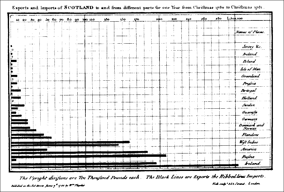
Playfair Barchart by William Playfair, London, 1786
This photograph is licensed under Public Domain via Wikimedia Commons and is available at http://commons.wikimedia.org/wiki/File:Playfair_Barchart.gif#mediaviewer/File:Playfair_Barchart.gif.
Of course, this is what we know today as a bar chart.
In his work, Statistical Breviary, 1801, Playfair introduced another new chart; the pie chart:
Playfair-piechart by William Playfair
This piechart is taken from The Commercial and Political Atlas and Statistical Breviary, Cambridge University Press.
This photograph is licensed under Public Domain via Wikimedia Commons and is available at http://commons.wikimedia.org/wiki/File:Playfair-piechart.jpg#mediaviewer/File:Playfair-piechart.jpg.
What Playfair achieved was not just the creation of a new chart type, but it was the use of charts to bring numbers to the public. From that time, the use of charts in financial and statistical publications has become the norm.
A retired French engineer, Charles Joseph Minard (1781 to 1870), created a visualization that had a big impact on infographics.
Minard retired in 1851 and spent his retirement doing private research. In his career as a civil engineer, he worked on road and bridge projects and used maps extensively. After his retirement, he started to produce some data visualizations that made use of maps to position the data geographically. For example, in 1858, he created a visualization of the cattle being sold in Paris. The chart showed a pie chart on each region, where the cattle were coming from with the segments breaking down the breed of the animals.
The size of each pie chart represented the total sales:

Minard-carte-viande, 1858, by Charles Joseph Minard
This map is taken from Des chiffres et des cartes: la cartographie quantitative au XIXè siècle, Gilles Palsky, Paris: Comité des travaux historiques et scientifiques.
This photograph is licensed under Public Domain via Wikimedia Commons—http://commons.wikimedia.org/wiki/File:Minard-carte-viande-1858.png#mediaviewer/File:Minard-carte-viande-1858.png.
His most famous work was published in 1869. Minard combined his ideas around mapping and engineering flow diagrams to show the results of Napoleon Bonaparte's disastrous Russian campaign of 1812/1813. The beauty of this visualization was that the entire campaign was described in one image and the reader required very little effort to understand it:
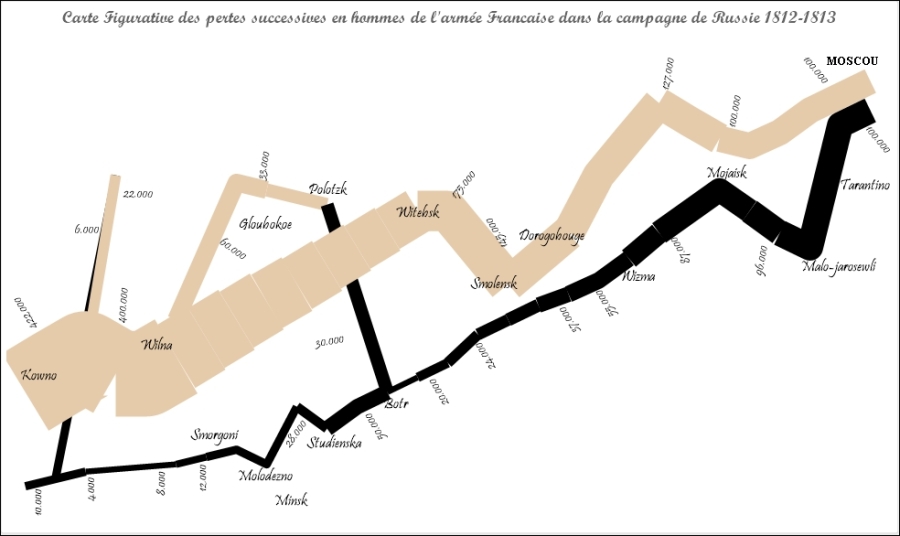
Stephen Redmond's recreation in QlikView of Minard's famous visualization
You can refer to http://www.qliktips.com/2012/06/homage-to-minard.html to find out more on how this was created.
Florence Nightingale (1820 to 1910) is famous to many people as one of the founders of modern nursing techniques. Her caring work during the Crimean War helped establish her reputation, and she later established a nursing school in St. Thomas's Hospital in London.
What is less well known about her is that she was a brilliant mathematician and became the first female member of the Royal Statistical Society. She wrote extensively on the subject of public health and used her mathematical knowledge to help make her points, quite often including pie charts in her publications to help make her points.
Nightingale's most famous visualization was an early use of a polar chart:

Nightingale-mortality by Florence Nightingale
This photograph is licensed under Public Domain via Wikimedia Commons and is available at http://commons.wikimedia.org/wiki/File:Nightingale-mortality.jpg#mediaviewer/File:Nightingale-mortality.jpg.
The segments in this chart show the total deaths of servicemen in the British Army. The red segments in the middle are deaths from wounds. The black segments are "others". The larger blue segments are preventable deaths caused by infections. She used this chart to make the case for better sanitation in hospitals.
The story didn't end at the beginning of the twentieth century. Mathematicians, statisticians, engineers, economists, and other scientists have continued to use and develop data visualizations.
However, until quite recently, relatively little has been written and broadly published on the subject. One of the best books on data visualization in the modern era is The Visual Display of Quantitative Data by Edward Tufte. This book was published back in 1983.
The digital revolution brought data visualization to the masses. Anyone with a PC and Microsoft Excel could now quickly create charts and share them with colleagues. While everyone was doing what they wanted with these tools, the academic study of the subject has been slow to catch up. However, we now have a rich amount of information and research available and there are several leading thinkers in the area.
There are a number of thought leaders that I follow online and believe that it is worthwhile for others to pay attention to. Of course, following online does not mean blindly following each and every suggestion made by these luminaries. We should always apply our own thoughts and logic to come up with the right solutions for us.
Edward Tufte is alive and well and still talking to the world about data visualization. His 1983 book is still in print and widely available. You can follow Edward on Twitter at @EdwardTufte.
Stephen Few published his first book on data visualization, Show Me The Numbers, back in 2004. This was at a time when there was a real lack of thought-leadership on the subject. He has since published two additional works: Information Dashboard Design and Now You See It. Both Show Me the Numbers and Information Dashboard Design have had second editions published in recent years. Stephen regularly publishes blogs and comments to his own website, www.perceptualedge.com.
Robert Kosara was a professor at the University of Maryland before taking a sabbatical year and joining Tableau Software, where he still works.
His blog, www.eagereyes.com, has been very popular for many years, and he also appears at data visualization conferences and is a regular contributor to various media. Robert can be followed on Twitter at @eagereyes.
Alberto Cairo is a professor teaching visualization at the University of Miami. His book, The Visual Art, is a bestseller in the topic. He has also taught the subject on a Massive Open Online Course (MOOC). Alberto can be following on Twitter at @albertocairo.
Andy Kirk is a freelance data visualization specialist, designer, speaker, and researcher. He is the author of Data Visualization: A Successful Design Process. He delivers public training on the subject worldwide. His data visualization website is www.visualisingdata.com and Andy tweets on Twitter at @visualisingdata.
Enrico Bertini lectures on visualization at NYU. Stefaner is an independent design consultant. Together, they present a biweekly podcast called Data Stories. Each episode will involve a guest from one of many subjects within the area of data visualization.
The podcast can be subscribed to on iTunes or via their website, www.datastori.es. Enrico tweets at @FILWD and Stefaner at @moritz_stefaner.
Mike Bostock has had a huge influence on the area of data visualization because he is the founder of and chief contributor to the d3.js JavaScript library. This library allows developers to create engaging web content from their data with very little coding. The library can also be relatively easily used within Qlik extension objects.
Mike's day job is working for the New York Times as part of their award-winning visualization team where they regularly push the boundaries of how we view data. He has his own blog at bost.ocks.org and he tweets at @mbostock.