
One of the most powerful features in QlikView is the ability to create vertical calculations in charts. We normally calculate values horizontally, where all values are in reference to the dimensions in the chart. It is a very important feature for us to also make vertical calculations across those horizontal numbers. For example, we might want to know what the total of all our calculations is so that we can calculate a ratio.
We might want to know the average, or the standard deviation, to draw a line in a chart. We might want to accumulate just the last four results to calculate a rolling average.
There are several functions that allow us to compare between different records in a chart. Some work in all charts, but others are specific to a particular chart type, such as a pivot table. In the graphical charts (Bar, Pie, and so on), we should imagine their Straight Table equivalent to understand how these functions will work.
The main functions that we can use here are listed in the following table:
The default for the Above, Below, Before, After, Top, Bottom, First, and Last functions are to just return one value that will be, as you would expect, the value in the direction stated in the name of the function. Consider the following example:
Above(Sum(LineValue))
This will give us the value of Sum(LineValue) in the row directly above it.
These functions also take additional, optional parameters. The second parameter will accept an offset value, defaulting to 1, indicating how many rows above we want to take the value. So, consider the following example:
Above(Sum(LineValue),2)
This will give us the value two rows above. In fact, we can actually specify 0 as the offset and this will just give us the current row.
The third optional parameter, which defaults to 1, will specify how many row values we want to return. Consider the following example:
Above(Sum(LineValue),0,4)
This will give us four values, starting with the current row. Now, QlikView cannot handle multiple values like this, and if we try to use this in a chart, it will return null. This is where we need to use the range functions, which will handle a range of values like this. There are several range functions, such as RangeSum, RangeCount, and RangeAvg, that are designed for this purpose. So, if we want the average of the four values above, we would do the following:
RangeAvg(Above(Sum(LineValue),0,4))
This will give us, if the dimension in this chart were in months, a four-month moving average:

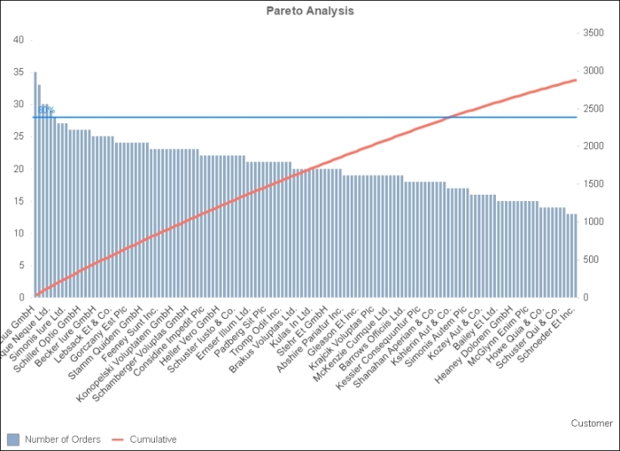
If we include the RowNo function to tell us what row we are on, we can calculate a cumulative value:
RangeAvg(Above(Sum(LineValue),0,RowNo()))
This might be used in, say, a Pareto analysis:
By default, of course, expressions in charts will be calculated with respect to the dimensions in the chart. The Sum calculation on the USA row will only calculate for values that are associated with the USA. This is exactly what we will expect.
Sometimes, we will want to override this behavior so that we can create a calculation that ignores the dimensions in the chart. For example, we might want to calculate the percentage of the current value versus the total. When we add the Total qualifier into our expression, then the dimensions will be ignored and the expression will be calculated for the whole chart.
For example, suppose that we have a chart that has the following expression:
Sum(LineValue)
Now, we add a second expression with the Total qualifier:
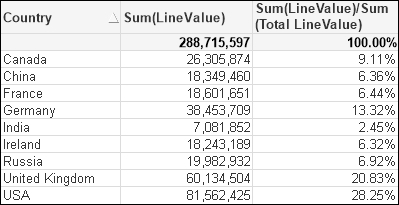
Sum(Total LineValue)
We can see the effect of the Total qualifier:

We can see that the dimensions in the chart have been ignored and the same total value has been calculated on each row. We can then change this to divide one by the other:
Sum(LineValue)/Sum(Total LineValue)
We will get a percentage calculated:
Now, if we were to add a second dimension to this chart, we would get the percentage of each row in reference to the total as before. However, what if we wanted to see the percentage of the second dimension in reference to the first dimension's total? In this case, we can add a modifier to the Total qualifier to indicate that it should not ignore some dimensions:
Sum(LineValue)/Sum(Total<Region>LineValue)
Now, only the second dimension is ignored:

QlikView has a fantastic chart engine. It is no surprise that we can get additional access to this chart engine, inside or outside of a chart, so as to create more advanced calculations. The Aggr function allows us to create a virtual chart—we can imagine it like a Straight Table—and then, we can do something with the set of values that are returned, that is, the expression column in our imaginary Straight Table.
Like a chart, the Aggr function takes an expression as a parameter. It also takes one or more dimensions. It then calculates the expression against the dimensions and returns a set of the results that we generally use in another aggregation function such as Sum, Avg, Max, Stdev, and so on. For example, suppose we were to perform the following Aggr function:
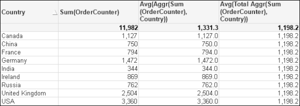
Aggr(Sum(OrderCounter), Country)
Then, we can imagine the virtual Straight Table that this will create:

We might then want to calculate the average of these values:
Avg(Aggr(Sum(OrderCounter), Country))
When an Aggr function is used within a chart, its context is set by the dimensions of the chart. This means that on each row of the chart, the Aggr function will only have access to the values that are related to the dimension values for that row. For example, if we want to use the Aggr above in a chart that contains the Country dimension, we will need to add the Total qualifier:
Avg(Total Aggr(Sum(OrderCounter), Country))
If we didn't, the calculation will respect the dimensionality of the chart and just give us the sum of the OrderCounter field on each row:
Note
There is an interesting issue present in this table. The average of 1,198.2 does not appear to be correct! The average should be 1,331.3. However, if we turn off the Supress Zero option for the chart, we will find that there is another blank value, Country! If we include this in the average calculation, then we will get 1,198.2 and this is what Aggr is doing. We can exclude the blank value by using a bit of Set Analysis:
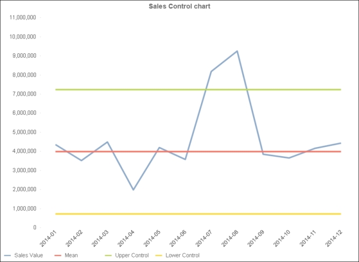
Avg(Total Aggr(Sum({<Country={*}>} OrderCounter), Country))Statistical control charts were first proposed by Walter A. Shewhart, a statistician working for Bell Laboratories in the 1920s. They take into consideration that variation is normal in a process and that we should only be concerned with variation outside control limits.
A control chart will often use a combination and a mean of a range of values from a particular period to compare to another period. For example, we might say that we will treat 2012 as a sample for the deviation of our sales figures and then we want to see the trend of our sales figures in 2014.
To do this, we will have to have a calculation of the mean value that includes a Set Analysis statement to limit to the correct period:
Avg({$<Year={2012}>} Total Aggr(Sum({$<Year={2012}>} LineValue), YearMonth))We can add the upper control value for the control chart:
Avg({$<Year={2012}>} Total Aggr(Sum({$<Year={2012}>} LineValue), YearMonth))
+
2*Stdev({$<Year={2012}>} Total Aggr(Sum({$<Year={2012}>} LineValue), YearMonth))
We can add the lower control as well:
Avg({$<Year={2012}>} Total Aggr(Sum({$<Year={2012}>} LineValue), YearMonth))
-
2*Stdev({$<Year={2012}>} Total Aggr(Sum({$<Year={2012}>} LineValue), YearMonth))
Now we should have a chart that allows us to look at different year's performance versus the 2012 controls:
Another use that we can put the Aggr function to is to create calculated dimension. Before we had dimension limitations in charts, this was the only way that we can limit some charts to, say, the top 5. In fact, we still need to turn to this to calculate the top x dimension values in pivot tables. For example, if we want to have the top 5 customers, we need to add a calculated dimension of the following:
=If(Aggr(Rank(Sum(LineValue)), Customer)<=5, Customer, Null())
We should also set the Supress When Value is Null option for this dimension. We can also add a second dimension such as Year to the chart:
This is a really interesting thing because it is using the calculated virtual chart to provide the values for the dimension, but knows how the dimension values are associated to the data so that it can correctly calculate the totals.
The Aggr function has as an optional clause, that is, the possibility of stating that the aggregation will be either distinct or nodistinct.
The default option is distinct, and as such, is rarely ever stated. In this default operation, the aggregation will only produce distinct results for every combination of dimensions—just as you would expect from a normal chart or straight table.
The nodistinct option only makes sense within a chart, one that has more dimensions than are in the Aggr statement. In this case, the granularity of the chart is lower than the granularity of Aggr, and therefore, QlikView will only calculate that Aggr for the first occurrence of lower granularity dimensions and will return null for the other rows. If we specify nodistinct, the same result will be calculated across all of the lower granularity dimensions.
This can be difficult to understand without seeing an example, so let's look at a common use case for this option. We will start with a dataset:
ProductSales:
Load * Inline [
Product, Territory, Year, Sales
Product A, Territory A, 2013, 100
Product B, Territory A, 2013, 110
Product A, Territory B, 2013, 120
Product B, Territory B, 2013, 130
Product A, Territory A, 2014, 140
Product B, Territory A, 2014, 150
Product A, Territory B, 2014, 160
Product B, Territory B, 2014, 170
];
We will build a report from this data using a pivot table:
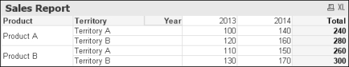
Now, we want to bring the value in the Total column into a new column under each year, perhaps to calculate a percentage for each year. We might think that, because the total is the sum for each Product and Territory, we might use an Aggr in the following manner:
Sum(Aggr(Sum(Sales), Product, Territory))
However, as stated previously, because the chart includes an additional dimension (Year) than Aggr, the expression will only be calculated for the first occurrence of each of the lower granularity dimensions (in this case, for Year = 2013):

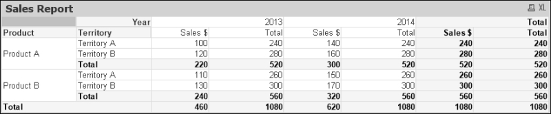
The commonly suggested fix for this is to use Aggr without Sum and with nodistinct as shown:
Aggr(NoDistinct Sum(Sales), Product, Territory)
This will allow the Aggr expression to be calculated across all the Year dimension values, and at first, it will appear to solve the problem:

The problem occurs when we decide to have a total row on this chart:

As there is no aggregation function surrounding Aggr, it does not total correctly at the Product or Territory dimensions. We can't add an aggregation function, such as Sum, because it will break one of the other totals.
However, there is something different that we can do; something that doesn't involve Aggr at all! We can use our old friend Total:
Sum(Total<Product, Territory> Sales)
This will calculate correctly at all the levels:
There might be other use cases for using a nodistinct clause in Aggr, but they should be reviewed to see whether a simpler Total function will work instead.