
It is useful for designers of user interfaces to understand some general design principles. It can only make them better UI designers and deliver a better user experience.
It might seem that the positioning of elements on the screen shouldn't be that important. Surely, it depends on the style of the Qlik developer. However, is it important? It is important because we need to consider the person who is clicking the mouse. The user should always be considered in any design of layout, and we should strive for a clean design, consistency, and ease of use.
Donald Norman is a famous person in the area of design. Not in the area of data visualization at all, but just the design of everyday things. In fact, one of his best works is called The Design of Everyday Things.
Norman adopted a term that is now central in design: the idea of affordance. Originally, an affordance means all of the things that an item affords you to do with it. For example, a table affords us with many options: we can place things, sit, write or even dance on it! Some other items have very few affordances. For example, a button on a screen has pretty much only one: you can click on it. However, Norman had a closer definition of this term: not all the things that are physically possible, but the possibilities of different actions that will be immediately apparent to the person using the item (we don't all immediately think of dancing on tables!) I like to call these "unwritten rules": you look at something and will just know what to do with it.
A classic example of this is the known as a Donald Door because so many people reference Donald Norman when discussing it. When we see a door that has a flat panel on it, we don't even need to look for the word, "PUSH," above the panel, because we know how to open that door. Similarly, when we see a door that has a long vertical bar, our natural instinct is to grasp the bar and pull—this is the unwritten rule. However, we are often stymied in our attempts to open such a door until we realize that actually we need to push it. Here is an example:
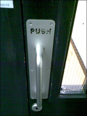
Image courtesy of Colman Walsh, Owner, UXTraining
This image was taken from the UX article, The Usability of Garda Doors which can be found at http://iqcontent.com/blog/2007/01/.
Here, we see a door that users want to grab and pull, but they should grab and push. It is clear, from the wear on the word, PUSH, on the panel, that regular users of this door completely bypass the use of the handle and push against the panel instead. They choose to do the natural thing and reject the unnatural.
As user interface designers, we should always think about how the user will actually use our layouts. We might do things that cause minor irritations to users that become major irritations over extended use. If we have difficulty getting into the mind of a user, it is useful to engage with users and talk to them about how they like or dislike using an interface.
Not all areas of the screen are equal. Depending on the user and their connection with the data, how they look at it will also be different, but with some similarities.
Jakob Nielsen is the cofounder, along with the aforementioned Donald Norman, of the Nielsen Norman Group, a major design consultancy. He has done a large amount of work in the area of user experience and has created several usability methods.
One of his experiments was to use eye-tracking equipment to track how users viewed websites. You can refer to http://www.nngroup.com/articles/f-shaped-pattern-reading-web-content/ for more information.
The interesting thing for us to take note of is that when users first look at a page on the screen, their gaze is directed immediately to the top-left area of the screen. They will spend some time here and across the top and then move down and to the left again, but spend less time on the lower areas. The gaze pattern often looks like the shape of the capital letter, F.
There might be a difference in other cultures; however, a learned response by web users in those cultures might also cause them to look to the upper-left area first.
The important conclusion for us is that the upper-left area of the screen is the most important real estate and should contain the most important information.
The theory of the Gutenberg diagram, created by Edmund Arnold (1913 to 2007), a newspaper layout designer, is that a page can be divided into four main areas like this:
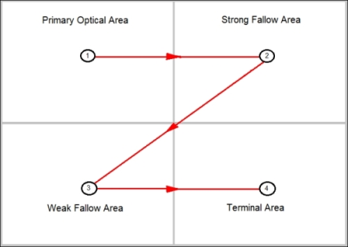
Similar to Nielsen's F pattern, the upper-left area (1) is the primary area in which information is inserted. Unlike the F pattern, the fallow areas are taken in, but only if the user has a level of interest in the content. In this model, the lower-right area (4) is actually an important area because it is the area where the gaze pattern will terminate.
This technique has been used by newspaper and magazines and latterly for web designs, and it has been shown that the terminal area is the correct area to place items where the user might take action. In this model, the lower-left area (3) is the least important.
Studies by marketing experts have shown that people are more likely to click on action items on the right-hand side of the screen. These studies are backed up by research by Daniel Casasanto of the Psychology Department of the University of Chicago. Casasanto found that people who are right-handed (90 percent of us) have a natural tendency to prefer things that are positioned to the right.
Based on the scientific evidence, we can now derive some rules about where various screen elements should be positioned.
We know that the most important real estate on the screen is the upper-left. Therefore, this is the area that we should place our most important information: the charts that show the information that users need to see.
People who are right-handed (most of us) are more comfortable clicking on things on the right-hand side of the screen. Therefore, we should place our listboxes, the things that users will click on, on the right-hand side of the screen.
The scientific reasons are not the only reasons why we should consider placing listboxes on the right-hand side. Another reason to consider is the use of Qlik products on mobile devices. Right-handed people tend to hold their devices in their left hand and use their right hand to tap the screen. So, what happens when the listboxes are on the left:

Every time the user has to make a new selection, their hand covers most of the screen, so they have to then move their hand out of the way to see the effect of the change. Now, what if the listboxes are on the right-hand side?

Now, the user can make selections and see the changes as they happen without having to move their hand. This is a preferable situation.
Because of their nature, field values, such as year and month, lend themselves to being rendered as horizontal listboxes. These are quite often rendered across the top of the screen in QlikView applications.
It appears that this is acceptable because users will accept a certain amount of header and navigation elements across the top of the screen and the date filters, as they are horizontal across the top, become a part of this.
In the QlikView View menu, there is an option to turn on a design grid that assists us with our layout (this is the default behavior in Qlik Sense). We can define the size of the grid and the snap steps in User Preferences:

We can use this design grid to help implement a grid baseline design such as those recommended by many web designers. By setting the Line Distance and Snap Step values appropriately and then following the rule of always keeping objects one snap step from the edge of the grid, we can achieve a clean and consistent layout with regular spacing between objects:

There is an excellent show on BBC Radio 4 called More Or Less (http://www.bbc.co.uk/radio4/moreorless) that takes statistics that have been presented in the media and explains or debunks them. For a show about numbers, it is quite amusing and worth listening to. Their podcasts can be downloaded worldwide.
They have a concept on the show of "big numbers". A big number is a number that sounds quite big, is usually quite round, but is usually presented without any additional context. It is the kind of number that headline writers love to use and that the More Or Less team love to debunk. There are examples of them everywhere.
The important thing to do with big numbers or any number is to put it in context. Otherwise, we face the prospect of the dreaded SFW question.
SFW stands for So What. A client once explained to me the SFW question in relation to a dashboard that was being built. If you look at a number on a dashboard, no matter how big that number, it is completely meaningless if there is no context around it.
One morning, TV3 News led with the story that the public prosecution service had not pursued 2,000 cases in the previous year:

Of course, 2,000 is a big number. The news article gave zero context to the number. We don't know what types of cases they were. We don't know how many cases were pursued and what the total was. Is the number 2,000 more or less than that of other years, versus the crime rate of other years?
This was the lead story and presented as a major scandal. The reality is that we should say: 2,000 cases? So what?
Every number that is presented in a Qlik application should have some context. Whether that is a breakdown by category in a bar chart, a ratio versus a target or previous period, or a trend over several periods, it is vital to give the users information about where that number sits. Otherwise, the users will just be asking, so what?
For me, the ultimate design of a dashboard is the one sitting in front of me when I drive my car. It gives me all of the information that I need to know to be able to manage my progress along the road.
It contains indicators vital to the current situation of the car: my speed, the engine oil temperature, and the engine RPMs. It doesn't have any information about the speed I was driving at the same time last week; this isn't important for me to drive the car along the motorway right now. I don't have an indicator for the amount of oil that I have in my engine, but this is something that I can find out by opening the hood and checking the dipstick; something that I should do on a semiregular basis, but not something that I need to know when I am behind the wheel.
For a business, the dashboard should be designed along the same lines. It should only show the information needed for the users to understand what is happening right now in their business: their key performance indicators. There should be very limited selectability, if any, on a dashboard and there should be no date selectors. The dashboard shouldn't show us the KPI value last week; it should show it right now. We can provide analysis sheets for users to investigate values at different time periods if that is important to them.
When picking the chart to display numbers, there is often a balance to achieve between effective visualization and attractive visualization. Users will appreciate an attractive display and will get the most information out of an effective chart. Luckily, with QlikView and Qlik Sense, we often can usually achieve both.
For a normal day-to-day comparison between different values in a category, it is hard to beat a bar chart for simplicity and accuracy. Humans appear to have a very good ability to discern differences in length, even if this is just a very small difference. Bar charts beautifully encode their values by their lengths, so we can quickly see the differences between the different categories:
Bar charts are also very effective when comparing two measures across category values. It is important that the magnitude of the measures being compared be similar, or they are at least expected to be similar; for example, budget versus actual, so that they can share a common axis, and therefore, be comparable by length. We should also be careful that if we put two bar charts side by side, the different axis lengths could cause confusion for users and lead them to take up the wrong idea. For example, does black tea have as much caffeine as brewed coffee?

One of the things that we need to be aware of is that bar charts, as they encode their values in their length, must always begin their axis at zero. If we are tempted to change this, perhaps because the data doesn't look good, we are actually not telling the truth about our data!
Back in 2007, the Quaker Oats company was making some quite interesting claims about oatmeal and its effect on cholesterol in the body. They marketed this with a graph showing the effect of consumption of oatmeal on cholesterol over a four-week period:
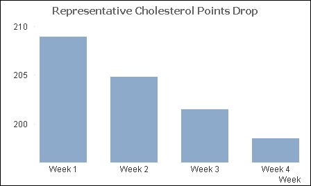
At first glance, it appears that we should rush out and buy oatmeal! But wait! We should notice that the axis here starts at about 195, not zero. How would it look if we redraw with a zero axis:

Now we see that the change is not quite so drastic! The company was later forced to remove the graph, along with some of the other more exaggerated claims.
When looking at patterns of change over time, there is no better chart than the simple line graph. While a bar chart allows us to focus on the difference between individual bars, a line graph is all about the shape of the line: peaks and troughs:
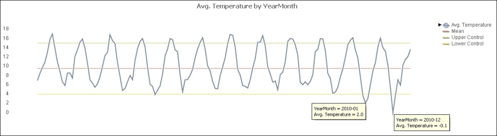
By adding additional expressions, usually an average along with control lines based on standard deviations, we can create a statistical control chart to look out for times where peaks and troughs are not just normal variation:
The rules about zero on the axis that we have for bar charts do not have to be applied to line charts. This is because the important thing about line charts is the shape of the line, and we might need to change the axis bounds to properly see that.
When we are comparing measures, we can, of course, use a bar chart to juxtapose one measure against another. However, this does not reveal whether there is any correlation between the two measures, to see whether one measure appears to be a driver for another. For this purpose, a scatter chart is the best choice:

As well as being able to see correlations, we can also spot outliers. We can also interact with the chart and zoom in on areas of interest.
It can also be useful to be able to set the size of each of the bubbles based on a different measure. We can also define the color of each bubble based on yet another measure.
Many people quite like pie charts. There is something about them that is familiar and comfortable about them. This is possibly because we learn things based on circles, such as fractions and time, from a young age.
However, there are many people in the data visualization world who will tell you that pie charts should be avoided at all costs! The respected expert, Stephen Few, has written an interesting article that explains why pie charts should never be used, and it can be found at http://www.perceptualedge.com/articles/08-21-07.pdf.
The equally well-respected expert, Robert Kosara, has written an equally interesting article, In Defense of Pie Charts, which can be found at http://eagereyes.org/criticism/in-defense-of-pie-charts.
There is merit in both arguments and both are not actually wrong. What we should consider is not whether we should use pie charts, but what we are going to use the pie chart for.
Pie charts are all about ratio comparison. We are trying to compare a segment with the whole of the circle. We should not be using a pie chart to compare one segment with another; that task is much better served by a bar chart. Consider this example:

In this example, it becomes hard to separate the different segments from each other. It can be argued that the legend on the right-hand side delivers more information than the pie. We might also consider whether all regions are represented on the chart; if not, then this is not a valid part-to-whole comparison.
A pie chart should really have a low number of segments (low cardinality) so that a user can focus on the part-to-whole comparison. Ideally, this should be just one segment versus the whole. We should also be sure that the whole does represent the whole and not just a selected part.
Of course, QlikView and Qlik Sense are interactive, so they do give interesting information when we hover over the segments, and we can add additional information to that pop up using a pop-up text expression. We can also click to make a selection that gives additional information.
It can also be interesting to do a true part-to-whole comparison by having one segment representing the currently selected values and the whole showing all values:

Note
You can refer to http://www.qliktips.com/2011/04/defending-pie-charts.html for more information.
Recently, I wrote a blog post on key performance indicator approaches that included a proposed new KPI visualization called Pie-Gauge, which can be found at http://www.qliktips.com/2013/12/key-performance-indicator-approaches.html.
Pie-Gauge is an interesting use of pie charts. It is a part-to-whole but the whole depends on whether we have exceeded the target or not. If not, the whole is the target value and we have a segment representing the shortfall. If we have exceeded the target, then the whole is the actual value and we have a segment representing the amount by which we have exceeded the target:

The straight table is a very powerful tool to represent actual numbers. In general, it will be used to show several calculations versus one-dimension category. However, we know that raw numbers are not always processed well by humans, so we can add additional graphical elements to aid understanding:

We can see two uses of horizontal gauge here: one with an indicator and one using the Fill to Value setting to represent a bar chart. We also have a sparkline, which is an example of a mini line chart that shows just the trend of a value over a period without showing magnitudes. We also see a whisker chart here that shows values above or below a value, in this case, budget and over time.
Another visual that we can add in straight tables is setting the color of the text to indicate positive or negative results.
It is good to use color in charts, but it is important to consider how we are going to use it and what we are going to do with it.
We have an option in QlikView to turn on Multicolor as an option in some charts. This will give us a pleasant result:

However, we should consider whether there is any additional information given to the user by adding this option. If the chart has only one color, it looks like this:

The chart with only one color gives the same information as the chart with multicolors. In fact, it can be argued that the chart with all the colors might actually add some confusion to what should be a simple chart.
We should, perhaps, learn a lesson from nature. Things that stand out from the background can be seen. Things that stand out more than other objects will be noticed even more. However, if everything is standing out, then nothing will come to the forefront of our attention.
If we use softer colors for most of our bars, with a plain white background, then we can see those bars very well. If we need one of the bars to stand out, because it needs some action, then we can have just that bar can have a stronger color to attract attention:

Many businesses will implement a RAG system for dashboards, where they use red for bad, amber for slightly bad, and green for okay. We should challenge this and ask what the action is, that is, what behavior do we want to drive?
Anything that is okay should probably have no coloring at all. This means that other areas are easier to find. Anything that is bad can remain red and should be a call to action to have users click and discover.
But what about amber? We really need to think about this. Do we want users to click and discover? If so, then perhaps it should be red. If not, perhaps it should have no color at all.
So, instead of RAG, perhaps we should be implementing R.
The ink-to-data ratio is a term coined by Edward Tufte in his 1983 book, The Visual Display of Quantitative Data. Of course, back in 1983, Tufte was not talking about displaying something on the computer screen but on printed reports. Therefore, he was talking about ink and not pixels. Perhaps, we can restyle it as the pixel-to-data ratio.
What this ratio means is that any pixel that is not representing data needs to justify its existence. If it is not useful, then it should be removed. Consider this table:

We have some common elements here: background color, striped rows, and grid lines. By making a few tweaks to the Style tab of this chart, we can clean up superfluous pixels:

We can see that the background color has been removed completely. The vertical grid lines have also been removed as the white areas in between the columns act as very effective separators. The horizontal grid lines have been left but are now almost transparent; they serve as effective guidelines, but are not impactful in the cleaner display.
It is not just in tables that we should keep things clean. In bar charts, there are options to have backgrounds on the display area and lines around the bars:

These are really superfluous and unnecessary in a clean chart:

Color blindness is something that affects up to eight or nine percent of the male population. It is almost exclusively a male issue, as female color blindness is extremely rare, and the colors affected are, in the majority, between red and green.
Of course, when we consider things such as RAG beacons on dashboards, we can see that there might be problems for quite a large number of people in even seeing data. We should really be aware of this and consider the colors that we choose for different purposes.
Note
A great resource for color selection is the Color Brewer website: http://www.colorbrewer2.org.
This website suggests color ranges that we can use, including color-blind-safe selections.
In general, we should avoid juxtaposing green and red. If we are using diverging hues, we should not use green and red and instead use blue along with either green or red. This gives most people the greatest chance of seeing the data.
A lot of data that we deal with might have a spatial component. This could be a post code or address that can be geocoded, or we might already have latitude and longitude information. Just because we have this, it doesn't mean that we need to plot the information on a map!
While the data might have a spatial component, it usually doesn't have a special dependency; it doesn't really matter to our analysis exactly where the data occurred. In these cases, a map is just a pretty display, while a bar chart is a better option.
Quite often, people use colored areas on a map to indicate information. This is known as a choropleth, the classic example being used with US election polls and results:

US election results
The image is taken from http://elections.huffingtonpost.com/2012/results.
If we look at this map, with large swathes of red, we might be surprised that Obama won the election! The problem is that quite a lot of the land area of the US, especially in the mid-west, has a low population, so contributes less votes to the overall result. The New York Times came up with a novel approach to solving this—resizing the states based on electoral vote size:

Image from the New York Times electoral coverage
This image is taken from http://elections.nytimes.com/2012/ratings/electoral-map/.
One other issue that we must consider with the use of maps is the general level of education. Several studies have shown that a percentage of the population is unable to correctly identify states and countries on a map. Consider whether a simple bar chart would be more appropriate.