
Tables are a simple, yet very powerful, means for visualizing data. Despite the fact that some designers disregard them due to their lack of visual impact, these objects are an integral part of any robust application in QlikView. Most of the time, charts are the preferred medium to spot trends and find outliers, but a table's ability to show great amounts of data in a flexible and accurate manner makes it an invaluable element for dashboard designers.
QlikView offers three options to display information in a tabular format:
- Straight table (chart object): This is one of the most flexible objects in QlikView. You can include as many dimensions and expressions as you want (just be careful with the horizontal scroll bar). It has two awesome features that boost its usability: column drag and drop and the ability to dynamically sort the data depending on the user's needs (Interactive Sort).
- Pivot table (chart object): If you need to distribute data among multiple dimensions and see the subtotals for each group, the pivot table is your best choice. Though less flexible than straight tables, they offer a unique feature—the ability to create cross tables.
- Table box: This object is rarely seen in finished dashboards. However, it is a great tool for developers as it shows the associations between multiple fields and all their possible combinations.
Having a detailed view of the information is reason enough to include tables in your applications. However, you can further enhance these visualizations by adding extra features that help draw the user's attention to the most relevant lines.
The easiest way to add context to a table is to change the colors of certain columns or rows. These changes usually respond to one of the following rationales:
- Usability/aesthetics: If you change the background color of specific elements, you can create chunks of data that are easier to interpret. For instance, the colors that divide the hierarchy of a financial statement can be set as follows:

- Data association: As discussed earlier, associating colors with metrics increases the usability of your interfaces while making the analyses easier for the users. Use this technique with caution as the overuse of color can be counterproductive.

- Visual cues: These are an old time classic in dashboard design. You can define thresholds for your KPIs and give the users a hint of how each element is doing by changing the background or font colors.

Luckily, QlikView has different ways of adjusting these settings. Pick the one that best suits your business need.
The easiest way to change these formats is the Visual Cues tab. It lets you define the colors (Font/Background) and text style (Bold/Italic/Underlined) for each expression according to an upper and a lower limit.
If you need a more complex rule to define the cell format, you can go to the Expressions tab and create a formula that combines multiple criteria to alter Background Color, Text Color, and Text Format. For example, the following calculation highlights in green all the records where the product margin is above 40 percent:

In order to define these colors, you can rely on standard functions, such as red() and lightblue(), or pick a particular RGB combination, such as RGB(150, 30, 30).
Regarding Text Format, the options include '<B>' for bold, '<I>' for italics, and '<U>' for underlined. If you need combinations of these formats, use multiple tags in the same expression, as with'<B><I>'.
Tip
The column() function or the expression's Label are easy ways to reference a formula. This saves you the trouble of copying complex calculations repeatedly.
In the same manner, rowno() can help you pick particular records. It is quite useful for financial statements such as the one shown previously:
if(match(rowno(), 1, 3, 4, 5), RGB(255, 235, 210))
Not a lot of developers take advantage of this option, but it is quite functional. If you activate Design Grid (Ctrl + G) and right-click on a table, you will find a Custom Format Cell menu. From here, you can change several parameters that will help you format your tables in an easy way.

By using this functionality, you can create highly customized tables. For instance, you can adapt the backgrounds and borders to create a calendar-like table:

Another trick that must be under any QlikView developer's belt is the adequate usage of icons and traffic lights. These visual cues help the users comfortably spot the most relevant elements in a table or quickly classify them depending on their performance.
In order to transform an expression into a standard traffic light gauge, go to Display Options | Representation and select Traffic Light. It is configured just as an independent gauge chart and offers a fair variety of visual styles. Albeit that the default colors for this visualization are amazingly bright, it is advisable to neutralize them a little bit so that they are less aggressive.

When the situation calls for high customization, QlikView lets us display images inside a column based on a business rule. All you have to do is create an expression with a conditional statement that points to either a predefined picture (bundle) or a custom file, and navigate to Representation | Image:
if(sum(Margin) / sum(Sales) > .4, 'qmem://<bundled>/BuiltIn/led_g.png', 'qmem://<bundled>/BuiltIn/led_r.png')

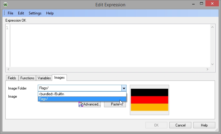
When you manage your folders appropriately, there is no problem in referencing an image with its path ('../IMG/Image.png'). Nevertheless, sometimes you need to make your QVW files as portable as possible, so loading the images directly into QlikView can be helpful. This can be achieved by using a BUNDLE LOAD in the script:
Flags:
BUNDLE LOAD * INLINE [
    Flags,       Location
    Germany,     C:FlagsGermany.gif
    Mexico,      C:FlagsMexico.gif
    Sweden,      C:FlagsSweden.gif
];
This is an INLINE table, but you can use any other type of data source you want (flat files, databases, Excel, etc.). After reloading, the new bundle will be available in the Edit Expression dialog under the
Image Folder option.
Not all visual cues have to be elaborate images or intricate gauges. Every now and then, your dashboards can benefit from putting the icons aside and resorting to old-school symbols or plain-colored cells. For instance:
if(column(4)>0, '▲', '▼')


So far, we have talked about representing expressions as text and images. Now, it is time to bring in a new type of visualization: embedded charts. The idea behind these elements is to show a general overview of the information via trends, distributions, or the percentage of completion in order to give the users a better view of the current situation.
Sparklines are small line charts that depict the behavior of an element over time. Their objective is not to show exactly on which month a certain KPI peaked, but to
illustrate, in general, if it is increasing or decreasing; or even if it is constant, cyclic or erratic.

To create a sparkline, do the following:
- Create a new expression with the KPI you want to display.
- Go to the Expressions tab and select Mini Chart in the Representation drop-down list.

- Click on the Mini Chart Settings button and select a dimension upon which to base the sparkline. Usually time dimensions such as
Month,MonthName, orWeekdaywork well.
Linear gauges are a great option to represent KPIs regarding completion. Whether the commercial team is pursuing a sales quota or you are monitoring a fundraising for an NPO, these visualizations let the users quickly assess how far (or close) they are from reaching the goal.

In order to create a linear gauge, perform the following steps:
- Create a new expression with an appropriate KPI.
- Go to the Expressions tab and select Linear Gauge in the Representation drop-down list.
- Click on the Gauge Settings button and configure the following elements:

- Unselect the Autowidth Segments box so that you can define the Lower Bound for each section.
- Create two segments. The first one should start on the Min setting defined in step three, while the second one can start wherever you want the color to change. I will use a gray segment starting in
0and a green one starting in1. - Select Hide Segment Boundaries and Hide Gauge Outlines. This will make your visualization leaner.
This is one of the most useful mini charts due to its good readability and high visual impact. By creating a linear gauge inside a table, it is possible to simulate a horizontal bar chart so that the user can see not only the raw figures, but also a visual cue that displays the magnitudes. To illustrate it, let's work with some information regarding the top scorers in the UEFA Champions League, as shown in the following screenshot:

To create a mini bar chart, do the following:
- Create a new expression with the KPI you want to display. In this case, let's use the formula
sum(Goals). - Go to the Expressions tab and select Linear Gauge in the Representation drop-down list.
- Click on the Gauge Settings button and configure the following elements:

- The trick in this visualization lies in the Max setting. The gauge will have to span from
0to the maximum number of goals scored by one player, so we will use the following formula:max(TOTAL aggr( sum(Goals), // Your KPI UEFA // Your dimension ))
- Select Hide Segment Boundaries and Hide Gauge Outlines to make the visualization lighter.
The following section contains a series of handy tips that can help you get the most out of Straight and Pivot Tables.
As weird as it may sound, chart junk is not an illness exclusive to charts. When some features obscure your tables instead of adding value to them, try maximizing the data-ink ratio by removing subtotals, cell borders, sort indicators, or backgrounds. Minimalistic tables can be surprisingly elegant and perfectly readable:

Tip
Elements you can (but not necessarily should) remove:
Caption: Caption | Show Caption
Borders: Layout | Use Borders
Subtotals: Expressions | Total Mode | No Totals (for each expression)
Indicators: Presentation | Selection Indicators / Sort Indicator
Headers: Presentation | Suppress Header Row
Vertical borders: Style | Vertical Dimension | Expression Cell Borders
All cell borders: Style | Cell Border | Background Transparency | 100%
Backgrounds: Style | Background | Color Transparency | 100%
Tables can benefit from increasing the cell height to two or three lines depending on the amount of data they display (Presentation | Wrap Cell Text). These extra pixels between records prevent your dashboard from feeling cluttered and improve readability.

Creating a table without dimensions is a great way to display the most relevant KPIs at the top of a dashboard. Besides, it is much easier to maintain than dozens of text objects packed together. Just remove the subtotals and adjust the fonts and background as necessary.


QlikView automatically displays zeros or null values (dashes) when an expression requires it. While this behavior is desirable most of the times, you can remove these characters by replacing the Null Symbol with a space in the Presentation tab, using the Suppress Missing option or by changing the number format of the expression to #,##0;-#,##0; (notice that it ends with a semicolon).
While often considered as chart junk, stripes can be of assistance when you have to deal with long tables. Even a slight contrast can help our eyes accurately read each record. Just go to the Style tab and add Stripes Every 1 Row. If you want lighter stripes (which is usually a good idea), there is a Cell Background Color Transparency control in the same tab.

Though it might sound pretty obvious, it is imperative that all the columns of the table are well aligned and adequately sized. The traditional convention of text on the left and numbers on the right works well in most situations. However, some tables might benefit from centering their content; it all depends on the type of data displayed. Yet, you should always avoid overly cluttered columns. If you reduce the margins too much, you might end up with an undesirable set of pounds/hashtags that diminish the usability of the object.
Business users hold ad hoc tables in high esteem because they grant enough flexibility to handle unsuspected scenarios. This kind of tables allows them to create custom reports with the dimensions, expressions, and filters that they need.

Here's how you can create an ad hoc table:
- Create two
INLINEtables in the script. They will serve as menus to select which columns to show:SET HidePrefix = '_'; Dimensions: LOAD * INLINE [ _Dimensions Country Store Category Product Date Month Year ]; Expressions: LOAD * INLINE [ _Expressions Sales Quantity Orders Avg Order ];
- Create a list box for each of the new fields. The LED or Windows Checkbox styles (Presentation | Selection Style Override) work great in this situation as the users can easily differentiate between a normal selection (the traditional green-white-gray contrast) and an ad hoc field selection.
- Create a table that contains all the dimensions and expressions that you want to display (yes, it is a big table).
- The magic behind the ad hoc functionality lies in the Conditional parameter, which will show or hide each column depending on the selections made in the menus. Let's use the
Yearfield as an example. Go to the Dimensions tab and select the Enable Conditional box. Add the following formula:substringcount(concat(_Dimensions, '|'), 'Year')
- Repeat step four for every dimension in the table.
- Now is the time to perform the same procedure with the metrics. As an example, let's work with the
Salescolumn. Go to the Expressions tab and select the Conditional box. The formula you have to type in is almost the same, just modify the target field:substringcount(concat(_Expressions, '|'), 'Sales') - This report should only be presented when at least one dimension and one expression are selected; so, go to the General tab and type the following formula in the Calculation Condition box:
GetSelectedCount(_Dimensions) > 0 AND GetSelectedCount(_Expressions) > 0
- To make this table even more powerful, you can add a Fast Type Change button (in the General tab) that switches between a straight and a pivot table. In this way, we can take advantage of both types of objects.
Even though it is not an exclusive feature, accumulation is frequently found in tables. One of its most popular usages is the Pareto Analysis and all of its variations, where you highlight the larger elements accumulating X percent of the total. This visualization revolves around two options contained in the Expressions tab—the Relative box to obtain the individual share and the Full Accumulation radio button to sum up all the previous records.

Have you ever faced a situation where you need to create a table but all the cells contain independent formulas? Well, here is how to do it:

- Create a straight table using a Calculated Dimension. As we want this table to have three rows (just because
3is a good number), the formula is:ValueLoop(1, 3)
- The interesting part of creating these tables is defining a different expression for each row. Using a
pickstatement, we can list all our calculations so that they will be presented in an order:pick(rowno(), 'QlikView', num(sum(Margin) / sum(Sales), '#,##0%'), num(sqrt(50), '#,##.#') )
- Add as many expressions as you want. You can mix text with dates or other numeric formats.
- If you need to hide the first column, go to the Presentation tab, select the first expression, and click on the Hide Column radio button.
Sometimes, it is necessary to disable certain features for the sake of usability or security. If you use column() in one of your expressions, it is advisable to go to the Presentation tab and unselect the Allow Drag and Drop box. On the other hand, if you need the data sorted in a specific fashion (for example, Pareto Analysis), you should disable the Allow Interactive Sort function in the Sort tab.