
In the following section, you will find a bunch of recipes that are valuable by themselves, but moreover, they contain interesting features that you can apply in many other contexts. If you want to follow the exercises (which I highly recommend), download the materials for this chapter from https://qlikfreak.wordpress.com/books/.
This graph is built with two sets of bars going in opposite directions. It can be applied in any situation where you need to compare two groups face to face. For instance, brick and mortar against online sales (x-axis) divided by the average ticket size (y-axis).
Example: Population Pyramid
Relevant features: Chart orientation, stacked bars, and cluster distance

To create this twin bar chart, perform the following steps:
- Create a new bar chart using
Ageas the dimension. - Our first expression will represent the female population (on the right-hand side):
sum({$<Gender={'Female'}>} Population) - Now, add a second expression to represent the male population. Make sure that it goes to the opposite side by forcing a negative value:
sum({$<Gender={'Male'}>} -Population) - In the Style tab, click on the Horizontal Orientation icon.
- While there, also select the Stacked Subtype bullet.
- Go to the Presentation tab and set the Cluster Distance to one point. This will position the bars closer to each other and give the chart a different look.
- Go to the Colors tab and change the first two tiles so that they become pink and blue respectively.
- Configure the rest of the chart as you prefer.
- Our visualization is now ready, congratulations!
Though it is not its main purpose, bar charts can be disguised as linear gauges. In this example, we are going to create a visualization that displays the current progress of the projects in our firm.
Example: Project Completion chart.
Relevant features: column(), values on data points, and plot values inside the segments

For this visualization, perform the following steps:
- Create a new bar chart using
Projectas the dimension. - Add the following expression to represent the percentage of completion:
sum(Completion)
- Select the Horizontal Orientation in the Style tab.
- In order to create the gray bar in the background representing 100 percent, we have to add a new expression—the remainder:
1 - column(1)
Note
The
column()function lets you reference another expression in the same chart and saves you the time of retyping the whole formula time and again. In addition, it makes the charts easier to maintain as you do not have to modify two expressions if the calculation changes.Warning: Beware of Column Drag & Drop!
- Select the Stacked Subtype inside the Style tab.
- Go to the Presentation tab and unselect the Show Legend box. This is a little side effect of using two expressions, but we have no use for these references.
- In the Expressions tab, select the first formula and select the Values on Data Points box. This will display the figures at the end of each bar.
- As we want these numbers to appear inside the bars, let's select Plot Values Inside Segments in the Presentation tab.
- In this particular chart, it is not really necessary to show numbers along the axes (all our bars go from 0 to 100 percent). Therefore, go to the Axes tab and select Hide Axis.
- In order to improve readability, still in the Axes tab change the font color of the labels shown inside the bars by clicking on the Font button at the top of the window (yes, there are two Font buttons).
- Adjust the rest of the chart as you see fit and voilà! We have created a completion chart.
One of the most elegant charts in QlikView's arsenal—and a great alternative to bar charts—is the dot plot. It works nicely in either orientation, and you can include multiple dimensions or expressions.
Example: Gender Comparison graph.
Relevant features: Persistent colors and text in chart

Here's how you can create this chart:
- Create a new horizontal combo chart using both
PositionandGender2as the dimensions (in that order). - Add an expression to represent the number of employees:
sum(Employees)
- As this will be a dot plot, go to the Expressions tab and change its representation to Symbol | Dots.
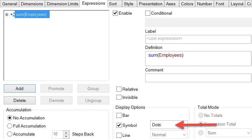
- In order to increase the readability of this chart, go to Presentation and increase the Symbol Size to 5 or 6 points.
- Now, go to the Colors tab and select the Persistent Colors box. While there, use blue and pink as the preferred colors in your chart.
Note
This option locks the color map so that every item in the corresponding dimension has a consistent color across the whole application. It is very useful for color encoding, especially while working with several objects. In this example, the 'Male' values will always be blue, while the 'Female' values will remain pink regardless of the selections.
- In the Axes tab, activate the Show Grid option for Dimension Axis. This will create a light line that lets the users know exactly which dots correspond to each element.
- Although the default legend works perfectly in this scenario, let's try another style. Go to the Presentation tab and unselect Show Legend.
- In the Text in Chart grouping, click on the Add button and type this string:
█ Male
- Click on Font and adjust the color to blue.
- Repeat the last two steps for the female label using pink.
- Locate the new labels wherever you see fit by dragging each element while holding Ctrl + Shift.
Note
When you hold Ctrl + Shift, some red lines around the internal parts of the chart will become visible. This means that you can move and resize them.
Some of these elements (particularly the legends), have a magnet function that changes their shape if you locate them near the edges. If you screw up, there is a Reset User Sizing and Reset User Docking button in the General tab.
- Make any other adjustments that you see fit in order to make your visualization stunning.
- Done! Enjoy your newly created dot plot.
If you need to visualize the impact of accumulating positive and negative movements, the waterfall chart is your best choice. It is a great way to break down total figures into their basic components and a classic chart when it comes to finances.
Example: Revenue, cost, and profit chart
Relevant features: Bar offset and color assignment

To create the preceding chart, do the following:
- Create a new bar chart with no dimensions (yep, no dimensions at all).
- In this example, we will create an independent calculation for each bar. Hence, we ought to create five expressions:
Label
Definition
Products
sum({$<Concept={'Products'}>} Amount)Services
sum({$<Concept={'Services'}>} Amount)Fixed Costs
sum({$<Concept={'Fixed Costs'}>} Amount)Var. Costs
sum({$<Concept={'Var. Costs'}>} Amount)Profit
sum(Amount)
- The trick behind a waterfall chart lies in the Bar Offset parameter, which can be accessed by clicking on the Expression Expansion icon. This feature tells QlikView the point where each column should start.

- Add the following formulas to the Bar Offset parameter on each bar:
Expression
Bar Offset
Products
Services
column(1)
Fixed Costs
column(1) + column(2)
Var. Costs
column(1) + column(2) + column(3)
Profit
- Go to the Presentation tab and unselect the Show Legend box. As we are using a dimensionless chart, the labels will appear in the x-axis instead of an independent legend.
- Show the figures at the end of each column by selecting the Values on Data Points box on each expression.
- In the Colors tab, adjust the palette so that the first two columns are painted in green, the third and fourth in red, and the fifth one in blue.
- Make the final adjustments to improve the look and feel of the visualization. The waterfall chart has been delivered!
All good stories deserve a sequel, and the waterfall chart is not an exception. Another way to create this visualization is by dynamically calculating the bar offset as the accumulation of the previous elements. Though it is not very common, it is a great way to illustrate the power of the range functions.
Example: A waterfall chart displaying the number of products in stock per week. These figures must be calculated by accumulating the items received and sold.
Relevant features: Bar offset, RangeSum(), interrecord functions, background color, values on data points, text on axis, and number format pattern.

To create this waterfall chart, perform the following steps:
- Create a new bar chart using
Weekas the dimension andsum(Quantity)as the expression. - Time for some color encoding: we will use green for when the stock goes up and red for when it goes down. Click on the Expression Expansion icon and type the following formula in Background Color:
if(column(1)>0, RGB(172, 204, 136), RGB(255, 149, 149))
- The next step is adding some labels. First, we will add a legend that shows the weekly movements. Select the Text on Axis box (Expressions tab). This will show the numbers right above the x-axis.
- As we are displaying the products that came in or went out, it is a good idea to change the numbers' formats. Go to the Number tab, select Integer and change Format Pattern (the box on the right-hand side) to:
+#,##0;- #,##0
- The Text on Axis usually appears in a barely visible color, so change it by opening the Expression Expansion icon (in the Expressions tab) and modifying its Text Color value. In this case, a simple RGB will suffice:
RGB(100, 100, 100)
- Now, let's add a second label that represents the number of items available in stock. For example, in the first three weeks, we received 10, 2, and 4 items respectively. Then, in week four, we got rid of 3. Therefore, at the end of that period, we had a total of 13 items available (10 + 2 + 4 - 3).
- Create a new expression using the following calculation:
sum(Quantity)
- In the Expressions tab, locate the Accumulation grouping and select Full Accumulation.
- We don't want this new expression to be shown as another set of bars but only as a label over the existing ones. Therefore, in the Display Options grouping, select Values on Data Points and unselect the Bar box.
- Remove the extra legend that appeared in the last step by disabling the Show Legend box in the Presentation tab.
- Now, the waterfall effect. Since it is a little complex, let's clarify our objective first: we need each bar to start where the previous one ended. Thus, the total height of the bar will represent the items in stock, while the size of the bar will embody only the weekly movements.
- Click on the first expression's Expansion icon and type the following calculation in the Bar Offset parameter:
RangeSum(above(sum(Quantity), 1, RowNo()))
- Customize the axes, titles, and borders as you prefer.
- Now we're ready to go. Cheers!
This chart is mainly used to check how a process changes over time and to determine whether each element is under control (that is, if it's between an upper and a lower limit).
Example: Caffeine level among different product lots.
Relevant features: Reference lines, line styles, and conditional colors.

You can create this chart by doing the following:
- Create a new line chart using
Lotas the dimension andavg(Caffeine_Level)as the expression. - In the Axes tab, disable the Forced 0 option.
- In order to create the control limits, go to the Presentation tab and add two reference lines. Even though it is possible to use variables or calculations to define them, in this example, we will just hardcode the first one at
45and the second one at47. Do not forget to select the Show Label in Chart box so that we see the labels above the lines.
- In order to highlight the lots located outside the control limits, let's create a new expression using the same formula. However, this time, instead of using the Line representation, select Symbol | Squares Filled.
- Click on the Expansion Icon of the second expression and type the following calculation in the Background Color parameter:
if(column(2)>47 OR column(2)<45, RGB(220, 0, 0))
- Even though we are highlighting all the elements out of the control area in red, the rest of the squares look odd due to their color. Let's fix this issue by going to the Colors tab. Copy the first color by right-clicking on its tile and selecting Copy. Afterwards, paste it on the second tile.

- As usual, the default symbol size is too small, so go to the Presentation tab and increase it to
3points. - While there, disable the Show Legend option. Even though we are using two expressions (one for the line and one for the squares), both calculations represent the same metric.
- Format the rest of the chart as you prefer and presto!
Slope charts are a variation of the traditional line charts. However, instead of describing the ups and downs along the way, this visualization focuses on how the journey started and how it ended. It is perfect for then and now analyses (much like that TV show that presents celebrities and how they looked 30 years ago).
When working with these charts, our brain will easily spot patterns and recognize the distinctive slopes of certain elements (in terms of direction or magnitude). It is also an intuitive way of showing how the rankings changed from a point in time to another, as the lines will intersect each other and end up in a different order.
Example: A distribution of students and how it changed between 1990 and 2015.
Relevant features: Preloaded color formulas.

Here's how you can create such a chart:
- Create a new line chart using two dimensions:
YearandHouse. - In technical terms, the only difference between a slope and a line chart is the number of elements displayed. In this case, we only require the maximum and minimum years, so our expression would be:
sum({$<Year={$(=max(Year)), $(=min(Year))}>} Students) - In the Expressions tab, activate the Values on Data Points box.
- As we are showing the exact values for each point, we can go to the Axes tab and select Hide Axis.
- While you are there, disable the Forced 0 option.
- Finally, let's use the same color for the lines and their corresponding labels in order to improve readability (it can be a little confusing when two lines are too close). Click on the Expression Expansion Icon and type the following formula in both the Background and Text Color parameters:
House_Color
Note
Yep, there is a trick here. If you open the data model, you will see that there is a field called
House_Colorthat contains a series of RGB functions. So, it is not necessary to type a complex conditional expression every time you want to assign a color.In order to create this type of field, you need to build an RGB with its three components. For example:

- Make the final adjustments to this visualization.
- Done. Enjoy your new slope chart!
This visualization is a little twist to the Completion Chart recipe. It is also based on a gray bar that ranges from 0 to 100 percent; however, instead of focusing on the actual progress, it highlights the variance against the objective.
Example: The comparison of Sales versus Quota.
Relevant features: Conditional expressions, format pattern, and error bars.

To create this chart, perform the following steps:
- Create a new horizontal bar chart using
Salespersonas the dimension. - Add the variance against the quota as the first expression:
sum(Sales) / sum(Quota) - 1
- On to the visible stuff. This visualization is composed of three parts: the gray baseline, the colored variance, and the error bar. The gray column is a bit tricky because it can represent either 100 percent (if the salesperson surpassed the quota) or the actual percentage of completion (if she didn't achieve the goal). Therefore, in order to create it, we ought to evaluate whether the variance (our first column) is positive or negative. Create a new expression and type the following formula:
if(column(1)>0, 1, 1 + column(1))
- On the other hand, the colored part may represent either the surplus (if the salesperson exceeds the quota) or the deficit (if she didn't do it). Create a third expression based on this calculation:
if(column(1)>0, column(1), -column(1))
- As we mentioned before, the first expression will only serve as a label, so select the Values on Data Points box instead of the Bar option in the Display Options grouping (Expressions tab).
- Go to the Style tab and select Stacked Subtype. Also, change the chart orientation to Horizontal if you haven't done so.
- In the Presentation tab, unselect the Show Legend box.
- Now, it is time to adjust the colors. The first part of the bar will always remain the same, so you can go to the Color tab and change the second tile to gray (Yep, it is the second one. We do not actually see the first color because this expression is invisible due its representation).
- Conversely, the second part of the chart does change according to the salesperson's performance. So, go to the Expressions tab, click on the third expression's Expansion icon and modify its Background Color value using this formula:
if(column(1)>0, RGB(155, 195, 115), ARGB(0, 0, 0, 0))
- While you are there, also change the Text Color parameter so that the labels appear in either red or green:
if(column(1)>0, RGB(84, 118, 50), RGB(180, 0, 0))
- In the same manner, add the following expression to the Text Format parameter so that the labels are displayed in bold:
'<B>'
- Go to the Numbers tab, select all the expressions, and apply the Fixed to 1 Decimal format. Also, select the Show in Percent option.
- Here is a little trick to enhance the labels of the first expression (the one that displays the values at the end of the bars). Let's change its Format Pattern to include some symbols like the ones we reviewed in Chapter 4, It's Not Only about Charts:
▲ #,##0.0%;▼ -#,##0.0%
- Here's an interesting (and almost unknown) feature of QlikView's charts. We are going to use error bars to highlight the gap between the actual percentage and the goal for all the items that obtained less than 100 percent. Go to the Expressions tab, select the second calculation, and select the Has Error Bars option.
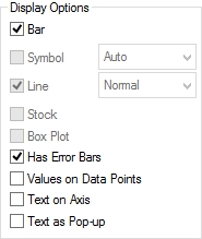
- Click on the Expression Expansion Icon (still on the second expression) and add the following formula to the Error Above parameter:
if(sum(Sales) / sum(Quota) - 1<0,
-(sum(Sales) / sum(Quota) - 1))
- Now, use this formula for Error Below:
0.0001
- The width and thickness of the error bars are modified in the Presentation tab. For this example, use the following parameters:

- Now, the final touch: go to the Presentation tab, and add a red reference line that marks 100 percent.
- Adjust any other visual feature you see fit, and the chart is ready to go.
Line charts offer a wide variety of formatting options that we can use to enhance our dashboards and make friendlier visualizations.
Example: Monthly trend of operating expenses.
Relevant features: Line styles and conditional colors.

To create this chart, perform the following steps:
- Create a new line chart using
Periodas the dimension andsum(OPEX)as the expression. - As the dimension that we are using contains a great amount of values, the labels in the x-axis will automatically stagger. However, we are dealing with a time field, so we can omit some of these values without much confusion on the user's side. Go to the Axes tab and disable the Stagger Labels option.
- Create a variable that contains the current year. You can do it either in the script or directly in the Variable Pane.
LET CurrentYear = year(today()); // 2015;
- In the same manner, create three variables that contain the definitions for each year's color:
LET MyColor1 = RGB(200, 200, 200);
LET MyColor2 = RGB(016, 143, 205);
LET MyColor3 = RGB(153, 216, 247);
- Return to the chart's Properties window and click on the Expression Expansion Icon (Expressions tab). Type the following formula in the Background Color parameter:
if(year(Period)= CurrentYear - 1, MyColor1,
if(year(Period)= CurrentYear + 1, MyColor3,
MyColor2
))
- In this example, the records for 2016 are not actual figures, but budgets. In order to reinforce that idea, select the expression's Line Style parameter and type the following formula:
if(year(Period) = CurrentYear + 1, '<S2><W.7>', '<W.7>')
- Let's further improve this graphic by displaying the labels that correspond to the first month of each year. In the Expressions tab, select the Show Value parameter and add this calculation:
month(Period) = 1
- Since we are only using one dimension and one expression, QlikView will not add any legends. Thus, create three labels to explain the color encoding using the Text in Chart grouping (in the Presentation tab).
- Make some final adjustments, such as in the number format, axes, and grids. Done! We can now present a friendlier visualization thanks to Line Styles.
The usage of color to represent a metric is not only eye-catching but also very useful to enhance classic representations. By combining position, size, shape, and color, it is easier for a designer to tell complex stories and draw a better picture of the current situation.
Example: Sales bar chart and margin heat map.
Relevant features: ColorMix wizard.

In order to create a chart such as this, do the following:
- Create a new bar chart using
Productas the dimension andsum(Sales_USD)as the expression. - In order to change the color of the bars depending on the product's margin, click on the Expression Expansion Icon and select the Background Color parameter.
- Open Expression Editor by clicking on the Definition button.

- Go to File | Colormix Wizard. This wizard will help you create a formula that builds a gradient based on a new expression.
- Type
sum(Margin)as the Value Expression and click on Next. - Select the upper and lower limits of the gradient. These tones will represent the highest and lowest values, respectively.
- Click on Next and then on Finish. Quite simple, right? With this type of visualization, your users can better understand the product's behavior. For instance, one might realize that even though Product B is, in magnitude, considerably bigger than some others, it also suffers from a lower margin.