
Scatter plots are one of the strongest allies that you will find when it comes to real data discovery. These visualizations can help you find correlations, identify clusters, and spot outliers. Even though their simplest structure compares only two variables (the x and y axes), it is possible to add a third one by changing the bubble size and even a fourth one by animating the chart.
Example: Sales vs Margin % scatter plot divided by store format.
Relevant features: Color encoding and text as popup.

To create such a chart, perform the following steps:
- Create a new scatter chart using
Storeas the dimension and click on Next. - As you can see, the Expressions tab looks quite different. In order to use the classic layout (and get access to a lot of useful menus), select the Advanced Mode box in the bottom part of the window.
- Modify the first expression in order to represent the Margin % using the following code:
sum(Margin) / sum(Sales)
- Modify the second expression in order to represent the Sales using this formula:
sum(Sales)
- The resulting chart clearly has the Forced 0 option active. In order to improve its readability, go to the Axes tab and disable it for both axes.
- Go to the Style tab and select the sixth look:

- As the number of distinct values in the
Storedimension is too big, the legend on the right side of the chart is not exactly useful. Thus, let's remove it by going to the Presentation tab and unselecting the Show Legend box. - Instead of this reference, we are going to create a pop-up expression with more information about each element. Still in the Presentation tab, unselect the Pop-up Labels option.
- Create a new expression using the following formula:
'= = = = = = = = = = = = = = '
& chr(10) & chr(10) & Store & chr(10)
& chr(10) & 'Location: ' & Location
& chr(10) & 'Format: ' & Format & chr(10)
& chr(10) & 'Sales: ' & money(sum(Sales))
& chr(10) & 'Margin %: ' & num(sum(Margin)/sum(Sales),
'#,##0.#%')
& chr(10) & chr(10) &
'= = = = = = = = = = = = = = '
& chr(10)
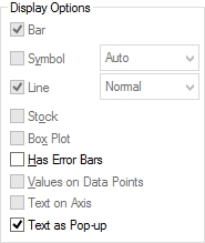
- Before leaving, select the Text as Pop-up box in the Display Options grouping:
- Depending on the size of your chart, the bubbles might be either too big or too small. If you need to adjust this feature, go to the Presentation tab, unselect the Autosize Symbols option and define the Max Bubble Size value that best suits your resolution:

- As we have discussed throughout this book, you can use colors to display metrics or identify categorical values in any chart. In this example, we will plot the traditional stores in blue, and the express stores, in orange. So, go to the Expressions tab and click on the first expression's Expansion icon.
- Locate the Background Color parameter and add the following calculation:
if(Format='Traditional', RGB(120, 198, 214),
RGB (239, 183, 88))
- Adjust the axes, number formats, labels, and titles as you see fit.
- Mission accomplished!

This kind of visualization can be extremely useful to understand the business. In our example, there are a couple of interesting features to highlight:
- The higher the bubble, the greater the sales. This means that the items in the upper part of the chart are the strongest stores.
- On the other hand, the elements in the rightmost section have a greater margin percentage. In other words, these are the most intelligent stores.
- Therefore, our best players are located in the top right quadrant, meaning that they have high sales and good margins.
- In order to help the stores located in the lower-left part of the graphic, we could implement strategies to increase the sales or foster cost savings. In consequence, the bubbles would move up or right (hopefully both).
- The usage of colors often helps the user to spot patterns in the data. In this example, judging only by the position of the orange dots, we could say that the express stores are performing a little better.
- In the same manner, these representations make it easier to find outliners. Take, for instance, the rightmost bubble in our chart (Store 14: Sofia), which is clearly managing its costs more efficiently than the rest of the company as its margin is well above the average.
..................Content has been hidden....................
You can't read the all page of ebook, please click here login for view all page.