
So far, your new Magento theme has focused on building a custom design for your store for devices with larger screens, such as desktop computers and laptops. In this chapter, you will start customizing your Magento theme for devices with different screen sizes, such as smartphones and tablet computers. We will cover the following topics:
- Using CSS media queries to create breakpoints for different device widths
- Making images responsive for your Magento theme
- Developing responsive navigation for your Magento theme
- Adding mobile homepage icons for Windows and Apple devices to your Magento theme
One of the ways in which you can get your Magento theme to adapt to your customer's device and provide them with an experience more tailored to their needs is to use CSS media queries to alter the style and layout of your Magento store for different screen sizes.
Firstly, you will need to add the meta viewport element to the <head> element of your Magento theme. This will tell the device viewing your store to fit the store to the width of the available device's screen.
Open your theme's local.xml file under /app/design/frontend/default/m18/layout/ and add the XML highlighted in the following code within the <default> handle of the <reference name="head"> element:
<default>
  <reference name="head">
    <block type="core/text" name="meta.viewport">
      <action method="setText">
      <meta><![CDATA[<meta name="viewport" content="width=device-width, initial-scale=1.0" />]]></meta>
    </action>
    </block>
  </reference>
</default>
Once you have saved this file, you can begin to work on CSS within your media query.
Open your theme's styles.css file (located in the /skin/frontend/default/m18/css/ directory), and add the following CSS towards the bottom of your file:
@media only screen and (min-width: 50em) {
/* Your CSS applied only to larger screens goes here */
}
Tip
Note that support for media queries in older browsers is limited; visit http://caniuse.com/css-mediaqueries for more details.
The CSS you add between the curly braces of the @media query here is applied only to devices that are using a screen media type and have a minimum width of 50em—roughly equivalent to most larger desktop computer monitors.
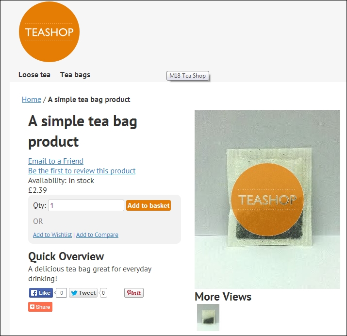
For larger screens, the background of your theme is currently looking a little bare, as you can see in the following screenshot. There is currently a lot of space around the page itself.
You can provide a background image for the .main-container element of your store that appears only for larger-screened devices by including the following CSS in your theme's styles.css file:
@media only screen and (min-width: 50em) {
.main-container {
background: #f6f6f6 url("../images/body_bg.png") repeat center center;
}
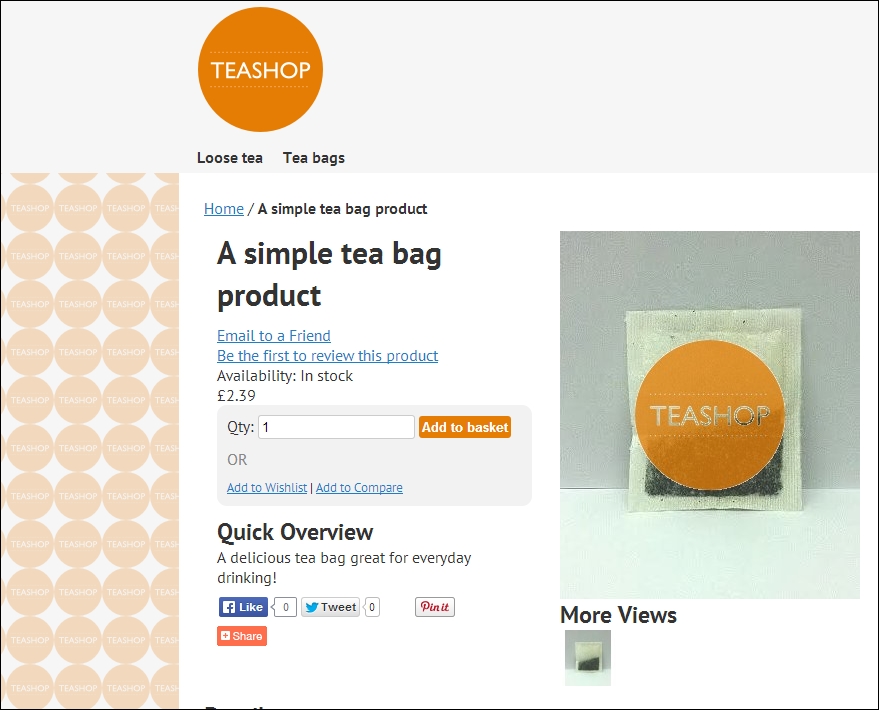
}If you now refresh your store, you'll see the new pattern take effect as shown in the following screenshot:
As always, if you can't see your changes, clear Magento's caches by navigating to System | Cache Management.
By using CSS media queries such as the preceding one, you can create a responsive Magento theme for your store—defining different layouts to better organize your store's content for those on different sized screens. To do this, first comment out the widths defined outside the media query you just created, which will collapse the layout for your theme in to a single column for devices with smaller screens:
.wrapper {
/* min-width:954px; */
}
.main {
background:#fff;
color: #333;
margin:0 auto;
min-height:400px;
padding:25px 25px 80px;
text-align:left;
/* width:900px; */
}
.col-left {
float:left;
padding:0 0 1px;
/* width:195px; */
}
.col-main {
float:left;
padding:0 0 1px;
/* width:685px; */
}
.col-right {
float:right;
padding:0 0 1px;
/* width:195px; */
}
.col1-layout .col-main {
float:none;
width:auto
}
.col3-layout .col-main {
margin-left:17px;
/* width:475px; */
}
.col3-layout .col-wrapper {
float:left;
/* width:687px; */
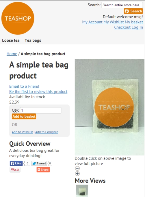
}So, on smaller screen devices (with a width less than the 50em you defined in the media query earlier), you will see the simplified layout:
If you do not define some widths for the columns in your Magento theme within the media query you created earlier, this is how your store will appear on larger screens too. To rectify this, open your theme's styles.css file once again and add the following CSS within the media query:
.header, #nav, .footer {
margin: 0 auto;
max-width: 60em;
width: 100%;
}
.main-col, .col-right, .col-left {
margin: 0 1%;
padding: 1%;
}
.main {
width:900px;
}
.col-left, .col-right {
width: 21%;
}
.col-main {
width: 71%;
}
.col1-layout .col-main {
float:none;
width:auto;
}
.col3-layout .col-main {
width: 46%;
}
.col3-layout .col-wrapper {
float:left;
width: 71%;
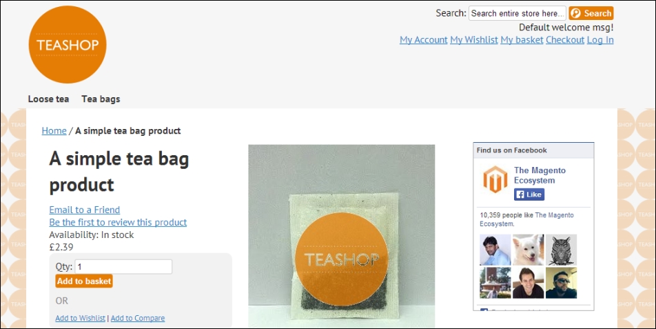
}This provides browsers with enough styling to display your store's content as columns for customers who use larger screens like your original Magento theme did before you added the media query to your style sheet. If you now view your Magento theme on a larger screen, you'll see that the layout is back to its previous state as shown in the following screenshot:
That's it! You have the basics of media queries working in your Magento theme now, and you can add and adapt CSS as your store's design requires!