
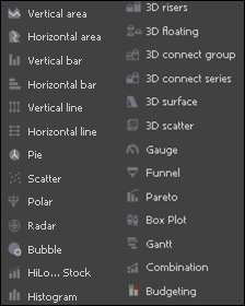
Graphs allow the user to analyze data quickly by providing a visual view of data. In MicroStrategy, there are a number of graph styles, such as vertical, polar, bubble and so on, depending on the user's needs. The following screenshot shows the types of graph in MicroStrategy:
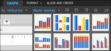
These graphs can have further subtypes; a Vertical bar graph can be further divided into absolute, clustered, stacked, and so on:
Steps to add a graph are as follows:
- Open the document in design mode.
- Click INSERT | GRAPH and select the appropriate graph type.
Graph type selection depends on the number of objects in the report, as we cannot display the graphs until a certain number of attributes or metrics appear in the report. The following table displays the minimum number of objects needed for different types of graph:

The following graphs displays the amount of revenue generated by various bike subcategories in 2005, on a monthly basis. The following screenshot shows design mode:

Vertical Line graph in design mode
The following screenshot shows presentation mode.Once the graph is created in design mode, we can run it in presentation mode for the final output:

Vertical Line graph in presentation mode
These graphs are used to compare two sets of closely related data, such as when comparing actual revenue against forecasted revenue or prior revenue. In this example, we are comparing actual sales with expected sales.
The following screenshot shows this graph in design mode:

Budgeting graph in design mode
Once the graph has been created in design mode, we can run it in presentation mode for the final output:

Budgeting graph in presentation mode
The following graph displays the total order quantity, sales, and profit earned by products in different years. The size of the markers gives the actual picture of the metric. The position of the object determines how the object will be displayed in the resulting graph.
The following screenshot shows this graph in design mode:

Bubble graph in design mode
The following screenshot shows this graph in presentation mode:
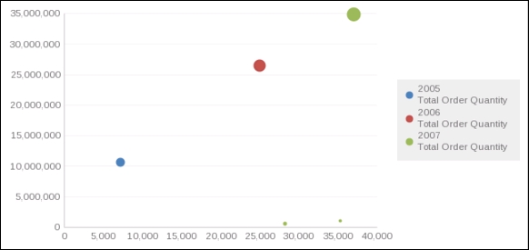
Bubble graph in presentation mode
This type of graph allows the user to view high, low, opening, and closing values, all in one graph. While creating this graph, the user should arrange the columns of the graph in the proper order. In this graph:
- The first metric is for the high value
- The second metric is for the low value
- The third metric is for the open value
- The fourth metric is for the close value
The following graph displays a company's monthly stock prices. We can create a graph to analyze company stocks and inventories on a daily, monthly, and so on basis.
The following screenshot shows this graph in design mode:

Stock: Hi-Lo-Open-Close graph in design mode
The following screenshot shows this graph in presentation mode:

Stock: Hi-Lo-Open-Close graph in presentation mode
A boxplot lets the user depict a grouping of numerical data based on its quartiles. It is also known as a box and whisker plot; the "whiskers" are the lines extending vertically from the box. It helps us compare similar distributions at a glance; the goal is to make the center, spread, and overall range of values immediately apparent.
The box and whisker plot includes:
- Lower quartile: Middle point of lower half of data
- Upper quartile: Middle point of upper half of data
- Minimum value: Largest value
- Maximum value: Smallest value
- Median: Middle point of ascendingly arranged data
These are five different metrics and one attribute.
The easiest way to explain this graph is to say a company wants to identify the age group of prospective buyers; this could be done using a boxplot graph.
The following screenshot shows this graph in design mode:

Boxplot in design mode
The following screenshot shows this graph in presentation mode:

Boxplot in presentation mode
Similarly, we can use a boxplot to analyze the company's sales in different quarters, as follows:

Boxplot in presentation mode
Clicking on individual boxes provides related information within a tooltip.
This type of chart is useful for presenting project schedules, human resources-related activities, and so on. It basically displays the start, end, and duration of an activity. In the following example, we have created a chart to identify the length of time an employee has been at the company.
The following screenshot shows this graph in design mode:

Gantt graph in design mode
The following screenshot shows this graph in presentation mode:

Gantt graph in presentation mode