
9
Creating the Main Application
In this chapter, we’ll create the core features for the frontend application, which will complete the task manager we’ve been developing throughout this book. We’ll start by adding user-specific features that will allow users to easily log out from the application and change their passwords. We’ll also add the required functionality for users to be able to create projects so that they can group tasks into different categories, and the task management features so that they can create, delete, update, and mark tasks as complete.
By the end of this chapter, you should be able to use Redux Toolkit and MUI to implement user interfaces in React to be able to consume REST HTTP APIs. Being able to create user interfaces for your backend will allow you to create complete usable full-stack applications. You should be able to understand the complete cycle of web application development, from the persistence layer through the backend, and expose it via an HTTP API to the frontend and the final interface so that users can interact with your application.
We will be covering the following topics in this chapter:
- Adding user-specific features
- Adding CRUD functionalities
- Deleting the no longer needed files and running the application
Technical requirements
You will need the latest Java JDK LTS version (at the time of writing, this is Java 17). In this book, we will be using Fedora Linux, but you can use Windows or macOS as well.
You will need the latest Node.js LTS version (at the time of writing, this is 16.15).
You will need a working Docker environment to deploy a PostgreSQL database and to create a Linux native image using Docker. There are Docker packages available for most Linux distributions. If you are on a Windows or macOS machine, you can install Docker Desktop.
You can download the full source code for this chapter from https://github.com/PacktPublishing/Full-Stack-Quarkus-and-React/tree/main/chapter-09.
Adding user-specific features
In Chapter 8, Creating the Login Page, we implemented the Redux store slices and developed the required logic to manage users and their authentication and authorization. In this section, we’ll take advantage of these features to implement a dialog for users to be able to change their passwords. We will also add an icon to the TopBar component to allow users to perform actions related to their account and session management, such as triggering the change password workflow or logging out of the application. Let’s start by implementing the password change dialog.
Implementing a password change dialog
To implement the password change dialog, we’ll create a new React component called ChangePasswordDialog that will contain two required text fields to introduce – the current and new passwords – and two action buttons to confirm or cancel the action. The resulting component should look like this when rendered:
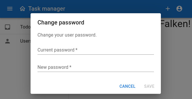
Figure 9.1 – A screenshot of the ChangePasswordDialog component
Note
In Chapter 7, Bootstrapping the React Project, we initialized the application in the src/main/frontend directory. All of the directories and files referenced in the rest of this chapter related to the frontend application modules will be relative to this folder unless stated otherwise.
To implement the component, let’s create a new file in the src/users directory called ChangePasswordDialog.js, which will contain its code. You can find the complete source code for this file in this book’s GitHub repository at https://github.com/PacktPublishing/Full-Stack-Development-with-Quarkus-and-React/tree/main/chapter-09/src/main/frontend/src/users/ChangePasswordDialog.js. Let’s analyze the most relevant parts here:
export const ChangePasswordDialog = () => {
  const {values, invalid, isValid, error, setError,
    clearForm, onChange} = useForm({
    initialValues: {currentPassword: '', newPassword: ''}
  });
  const dispatch = useDispatch();
  const changePasswordOpen = useSelector(state =>
    state.layout.changePasswordOpen);
  const close = () => dispatch(closeChangePassword());
  const [changePassword] = api.endpoints.changePassword.
    useMutation();
  const canSave = isValid &&
    Boolean(values.currentPassword) &&
      Boolean(values.newPassword);
  const save = () => {
    changePassword(values).then(({error}) => {
      if (!Boolean(error)) {
        clearForm();
        close();
      } else if (error?.status === 409) {
          setError('Current password is incorrect');
      } else {
        setError('Unknown error, please try again');
      }
    });
  };
We start by defining and exporting a React functional component called ChangePasswordDialog that contains a component composition to render the Material Design-based dialog shown in Figure 9.1. Since the component contains a form to capture user input, we’re reusing the useForm hook we described in the Creating the login page section of Chapter 8, Creating the Login Page, which provides form state management and validation features. The const canSave variable declaration uses some of the values returned by our hook to determine whether the form is valid and filled in, and can be saved.
Then, we initialize the changePasswordOpen variable, which will be used to determine whether the dialog is visible or not. This variable is read from the global application state and will allow us to open and close the dialog from different parts of the application. This variable should be used in conjunction with the closeChangePassword function, which can be dispatched to the application’s store to close the change password dialog.
In the Adding a protected user management page section in Chapter 8, Creating the Login Page, we initialized the user API Redux slice, which contained the changePassword endpoint definition. In the last part of the preceding snippet, we declare the save function that will send the data to the backend by leveraging the endpoint’s mutation hook. The save function starts by dispatching the changePassword endpoint action with the values retrieved from the form. Once the response from the server is processed, in the then function, we check whether it successfully closed the dialog. If it didn’t, we use the setError function provided by the useForm hook to present a relevant error message to the user.
The following screenshot shows how the error message would be rendered in case a user introduced an invalid current password:
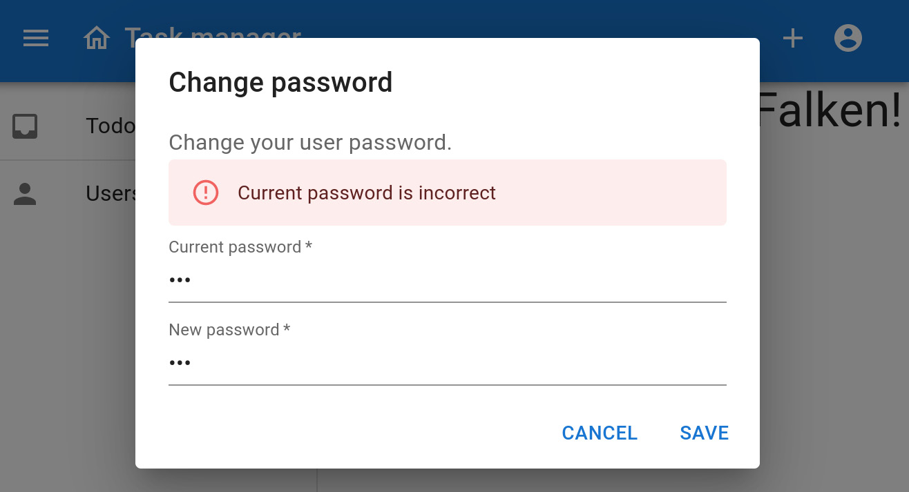
Figure 9.2 – A screenshot of the ChangePasswordDialog component displaying an error message
Now, let’s focus on the return statement of the ChangePasswordDialog component. The following snippet contains its code:
<Dialog open={changePasswordOpen} onClose={close}>
  <DialogTitle>Change password</DialogTitle>
  <DialogContent>
    <DialogContentText>
      Change your user password.
    </DialogContentText>
    {Boolean(error) && <Alert severity='error'>
      {error}</Alert>}
    <TextField type='password' fullWidth margin='dense'
      variant='standard' label='Current password'
      name='currentPassword' value={values.currentPassword}
        onChange={onChange}
      required error={Boolean(invalid.currentPassword)}
      autoFocus
    />
    <TextField type='password' fullWidth margin='dense'
      variant='standard' label='New password'
      name='newPassword' value={values.newPassword}
        onChange={onChange}
      required error={Boolean(invalid.newPassword)}
    />
  </DialogContent>
  <DialogActions>
    <Button onClick={close}>Cancel</Button>
    <Button onClick={save} disabled={!canSave}> Save
    </Button>
  </DialogActions>
</Dialog>
We learned about some of these components in Chapter 7, Bootstrapping the React Project, and Chapter 8, Creating the Login Page. Let’s study the most relevant and those we haven’t covered yet:
- <Dialog>: In Material Design, dialogs are a type of modal window used to inform users about a task. They usually contain critical information, involve multiple tasks, or require decisions. In our case, we’re using the dialog to request the user a new password and perform the password change operation. <Dialog> is the MUI component used to define the main dialog container and controls if it’s hidden or displayed. The open attribute expects a Boolean property indicating if the dialog is displayed or hidden. The onClose attribute expects a function that will be invoked when the user clicks or taps on the scrim area (in Material Design, the scrim is the shaded area that appears behind the dialog) and that should complete by closing the dialog.
- <DialogTitle>: This MUI component is used to specify the dialog’s title that appears in the upper part of the modal dialog window. In our case, we’ll just specify a static literal Change password.
- <DialogContent>: This MUI component encloses the dialog’s content that appears in the middle section of the dialog. This is where we’ll add the dialog child components required to render the change password form.
- <Alert>: This is an MUI-specific component that displays short messages in a way that attracts the user’s attention. This is the component that we’ll use to render the error messages, as shown in Figure 9.2. The component accepts a severity configuration attribute to control if the alert is displayed as an informative message, a warning, an error, and so on. In this case, we check if there’s an error message to conditionally display this Alert with an error type severity.
- <DialogActions>: This MUI component encloses the action buttons that appear in the bottom part of the dialog. In our case, we’re adding a cancel button that’s always enabled, and a save button that will only be enabled when the canSave condition is true.
Now that we’ve implemented the dialog component, we need to add it to our layout so that we can display it whenever the user invokes a change password action. Since our layout component is common to every application page, users should be able to change their password from any of the application’s pages, provided that they are logged in.
Let’s open the src/layout/Layout.js file and add the new component entry to the last part of the component definition. You can find the complete source code for this file in this book’s GitHub repository. The following snippet shows the affected part only:
<Box sx={{flex: 1}}>
  <Toolbar />
  <Box component='main'>
    {children}
  </Box>
</Box>
<ChangePasswordDialog />
We added the component right after the main area container of the layout. Despite the component being always in the layout composition, it will only be displayed if the application’s global state property, layout.changePasswordOpen, is true.
With that, we have implemented the dialog and added it to the layout, but we still need a way to display it. Now, let’s add an icon to the TopBar component so that users can perform actions to manage their accounts.
Adding a user icon to the top bar
So far, we’ve created the ChangePasswordDialog component, which will only be displayed if the layout.changePasswordOpen global state property is true. However, we haven’t added this property to the layout Redux slice yet. Let’s edit the src/layout/redux.js file we created in the Managing the layout’s state section of Chapter 7, Bootstrapping the React Project, and make the following changes:
const layoutSlice = createSlice({
  name: 'layout',
  initialState: {
    changePasswordOpen: false,
    drawerOpen: true,
  },
  reducers: {
    openChangePassword: state => {
      state.changePasswordOpen = true;
    },
    closeChangePassword: state => {
      state.changePasswordOpen = false;
    },
    toggleDrawer: state => {
      state.drawerOpen = !state.drawerOpen;
    }
  }
});
export const {
  openChangePassword, closeChangePassword, toggleDrawer
} = layoutSlice.actions;
Let’s analyze these changes in detail:
- initialState: This creates a new field called changePasswordOpen with a false default value. This setting forces the dialog to be hidden by default whenever the application is accessed for the first time.
- reducers: This creates two new reducer functions that will be used to change the changePasswordOpen property, one to open the dialog (openChangePassword) and one to close it (closeChangePassword). Alternatively, we could have created a single function with a parameter to set the value.
- exports: This includes the newly generated action creator functions in the list of exported constants.
Now that we’ve completed the layout’s Redux slice changes, let’s continue by implementing the user icon as a separate component. This icon is a clickable button that displays a pop-up menu with user-related tasks when clicked. The resulting icon and menu should look like this when rendered:
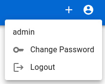
Figure 9.3 – A screenshot of the UserIcon component with its pop-up menu
To implement the component, let’s create a new file in the src/layout directory called UserIcon.js, which will contain its code. You can find the complete source code for this file in this book’s GitHub repository at https://github.com/PacktPublishing/Full-Stack-Quarkus-and-React/blob/main/chapter-09/src/main/frontend/src/layout/UserIcon.js. Let’s analyze the most relevant parts:
export const UserIcon = () => {
  const [anchorEl, setAnchorEl] = useState(null);
  const menuOpen = Boolean(anchorEl);
  const closeMenu = () => setAnchorEl(null);
  const dispatch = useDispatch();
  const {data} = api.endpoints.getSelf.useQuery();
We start by defining and exporting a React functional component named UserIcon, which contains a component composition that renders a clickable icon of a person. This expands a pop-up menu when clicked, as shown in Figure 9.3. Next, we initialize the anchorEl and setAnchorEl variables using React’s built-in useState hook. This hook is used to preserve a local state within this component; its invocation returns a variable with the state and a function to be able to mutate it. In this case, we’re using it to store the reference to the component that holds the user’s context menu. anchorEl holds the reference to this component, which is initially null. The menu should appear closed or hidden whenever this variable is null, which we explicitly define in the menuOpen variable. We also define a convenience function, closeMenu, that encapsulates a call to the setAnchorEl function with a null value that will close the pop-up menu when invoked.
In the last statement, we take advantage of the useQuery hook of the Redux user slice’s getSelf endpoint to retrieve the information of the currently logged-in user from the backend. In this case, the main purpose is to use this information to show the currently logged-in user’s name as the first entry of the pop-up menu. This same information could be used to create a profile page for the user as a future evolution of the application.
Now, let’s focus on the return statement of UserIcon, where we define the component composition. The following snippet contains its code:
<Tooltip title='Profile'>
  <IconButton color='inherit' onClick={event =>
    setAnchorEl(event.currentTarget)}>
    <AccountCircleIcon />
  </IconButton>
</Tooltip>
<Menu
  anchorEl={anchorEl}
  open={menuOpen}
  onClose={closeMenu}
>
  {data && <MenuItem>{data.name}</MenuItem>}
  <MenuItem onClick={() => {
    dispatch(openChangePassword());
    closeMenu();
  }}>
    <ListItemIcon>
      <KeyIcon />
    </ListItemIcon>
    Change Password
  </MenuItem>
  <MenuItem onClick={() => dispatch(logout())}>
    <ListItemIcon>
      <LogoutIcon />
    </ListItemIcon>
    Logout
  </MenuItem>
</Menu>
We’ve already learned about some of these components. Let’s study the most relevant and those we haven’t covered yet:
- <IconButton>: We learned about this MUI component in the Creating the TopBar section of Chapter 7, Bootstrapping the React Project. However, let’s focus on the onClick attribute, which contains the function that will display the pop-up menu. When the user clicks on the button, the function takes the HTML event to set the anchorEl value with the Document Object Model (DOM) element that was clicked.
- <Menu>: In Material Design, menus display a list of choices on temporary surfaces; <Menu> is the MUI component used to define them. The anchorEl attribute contains a reference to an HTML element that will be used by MUI as a reference to position the menu. The open attribute specifies whether the menu is visible or not. The onClose attribute accepts a function that closes the menu. This function is invoked whenever the user clicks outside the menu or presses the Esc key.
- <MenuItem>: This MUI component must be used to encapsulate each of the menu entries. It can contain an onClick attribute that invokes a function whenever the user clicks on it. In our case, we have three entries. The first entry displays the logged-in user’s name. The second opens the Change password dialog when clicked. The third dispatches the logout action from the auth Redux slice we created in the Managing the frontend session section of Chapter 8, Creating the Login Page.
Now that we have implemented and analyzed the UserIcon component that will allow the user to open the Change password dialog, let’s add it to the TopBar component. Let’s open the src/layout/TopBar.js file and add the new component entry to the last part of the component definition. You can find the complete source code for this file in this book’s GitHub repository at https://github.com/PacktPublishing/Full-Stack-Quarkus-and-React/blob/main/chapter-09/src/main/frontend/src/layout/TopBar.js. The following snippet only shows the affected part:
    <UserIcon />
  </Toolbar>
</AppBar>
The changes involve just adding the component as the last element in the Toolbar component. This means that when the toolbar is rendered, the new icon will be displayed as the rightmost element.
With that, we’ve implemented a change password dialog and added a user context menu to the application’s layout top bar. We’ve also made the required changes to the application’s Redux store to be able to open and close the new dialog. Now, let’s continue by creating some of the task manager application’s pages to implement its task and project management functionalities.
Adding CRUD functionalities
The task manager application allows users to create tasks, manage their completion status, assign them different levels of priority, group them into projects, and so on. So far, we’ve learned how to bootstrap a generic frontend application with global state management and we’ve added some features related to user management. However, we haven’t implemented anything related to the main application functionalities yet. Let’s continue by implementing the project CRUD features.
Adding the project management features
The main purpose of projects is to allow the application’s users to group the tasks they create. For example, users can create a Home and a Work project and add home-specific tasks or work-specific tasks to each of them. Later, they can filter the tasks for each of these projects, so they can focus on each of them separately. Our first goal is to provide the means for users to be able to create projects. Let’s begin by implementing the required functionality to interact with the HTTP API.
Defining the project API Redux slice
In the Adding a protected user management page section of Chapter 8, Creating the Login Page, we learned about Redux Toolkit’s createApi function and how we can use it to interact with an HTTP API backend to populate and mutate a Redux store slice. For each of the backend entities (Users, Projects, Tasks, and so on), we will create a Redux Toolkit API implementation.
Let’s create a projects directory under the src directory where we’ll create all of the project-related services and components. Next, we’ll create a new api.js file where we’ll implement the required functionality. The following snippet contains the most relevant part of the code. You can find the complete source code for this file in this book’s GitHub repository at https://github.com/PacktPublishing/Full-Stack-Quarkus-and-React/blob/main/chapter-09/src/main/frontend/src/projects/api.js:
export const api = createApi({
  reducerPath: 'projects',
  baseQuery: authBaseQuery({path: 'projects'}),
  tagTypes: ['Project'],
  endpoints: builder => ({
    getProjects: builder.query({
      query: () => '/',
      providesTags: ['Project'],
    }),
    addProject: builder.mutation({
      query: project => ({
        url: '/',
        method: 'POST',
        body: project
      }),
      invalidatesTags: ['Project'],
    }),
    updateProject: builder.mutation({
      query: project => ({
        url: `/${project.id}`,
        method: 'PUT',
        body: project
      }),
      invalidatesTags: ['Project'],
    })
  })
});
We covered the main createApi function options in Chapter 8, Creating the Login Page. In this case, we’re adding three endpoint definitions to deal with the project HTTP API resource:
- getProjects: This endpoint definition queries the projects HTTP endpoint, which returns the list of projects for the currently logged-in user.
- addProject: This is the endpoint definition for creating a new project. When invoked, it performs an HTTP POST request to the projects endpoint with the data provided for the new project, which for now is just the new project’s name.
- updateProject: This is the endpoint definition for updating an existing project. When invoked, it performs an HTTP PUT request to the projects endpoint for the provided project id with the updated project data.
For each of the new store slices we define in the application, we’ll need to edit the src/store.js file to add the slice reducer and middleware to the application’s global store.
In the following snippet, we are adding the project API reducer:
const appReducer = combineReducers({
  auth: authReducer,
  layout: layoutReducer,
  [projectApi.reducerPath]: projectApi.reducer,
  [userApi.reducerPath]: userApi.reducer
});
In the following snippet, we are adding its middleware:
export const store = configureStore({
  reducer: rootReducer,
  middleware: getDefaultMiddleware =>
    getDefaultMiddleware()
    .concat(projectApi.middleware)
    .concat(userApi.middleware)
});
With that, we’ve finished implementing the Redux Toolkit API slice for projects. This allows us to interact with the backend through its HTTP API very easily.
Let’s continue by implementing some components to deal with projects that will take advantage of this API.
Creating components to deal with projects
In our task management application, projects are used to group and classify the user’s tasks. Currently, the Project entity just contains a field for the project’s name. In the future, the application might evolve in such a way that projects could offer more functionality and store additional information such as start and end dates, collaborators, and so on. However, given their current simplicity, there’s no need to create specific application pages to manage projects.
To create new projects, we’ll add a new button in the application drawer that will show a modal dialog where the user can specify the project name and confirm its creation. To assign a task to an existing project, we’ll create a drop-down list from which users can select an existing project.
Implementing a new project dialog
To implement the new project dialog, we’ll create a new React component called NewProjectDialog that will contain a single text field to introduce the new project name, and two action buttons to confirm or cancel the project creation action. The resulting component should look like this when rendered:

Figure 9.4 – A screenshot of the NewProjectDialog component
The implementation of this component follows the same patterns we learned for ChangePasswordDialog in the Implementing a password change dialog section. We won’t go over them again here; you can find the complete source code for this component at https://github.com/PacktPublishing/Full-Stack-Quarkus-and-React/blob/main/chapter-09/src/main/frontend/src/projects/NewProjectDialog.js.
Following that approach, we’ll also need to modify the layout’s Redux store slice in the src/layout/redux.js file so that it includes a new field called newProjectOpen that will be true if the modal dialog is visible:
initialState: {
  changePasswordOpen: false,
  drawerOpen: true,
  newProjectOpen: false,
},
We’ll also add two reducer functions to show and hide the modal dialog:
openNewProject: state => {
  state.newProjectOpen = true;
},
closeNewProject: state => {
  state.newProjectOpen = false;
},
The NewProjectDialog component implementation, which will enable users to create new projects, is ready. In the Finalizing the application’s layout section, we’ll improve the application’s drawer to list the projects and allow users to filter their tasks by clicking on them. We’ll also add a button so that users can dispatch the openNewProject reducer function to show the dialog and create new projects. Let’s continue by implementing another generic component to list and select the user’s projects.
Implementing a project selector drop-down list
The main goal of projects is to allow users to group their tasks and filter them. Let’s create a drop-down list selector component that will allow users to select a project when they are editing or creating a new task. This component should be generic so that it can be reused on different parts of the application too. When collapsed, the component is just an icon button of a label. When the user presses the button, a pop-up menu is expanded, showing the list of projects for that user. The resulting component should look like this when rendered:

Figure 9.5 – A screenshot of the SelectProject component
To implement this component, let’s create a new file in the src/projects directory called SelectProject.js, which will contain its code. You can find the complete source code for this file in this book’s GitHub repository at https://github.com/PacktPublishing/Full-Stack-Development-with-Quarkus-and-React/tree/main/chapter-09/src/main/frontend/src/projects/SelectProject.js. Let’s analyze the most relevant parts:
export const SelectProject = ({disabled, onSelectProject = () => {}}) => {This snippet shows the SelectProject React functional component definition, which has two attributes: disabled and onSelectProject. The disabled attribute can be passed in to enable or disable the icon button that toggles the pop-up menu. The onSelectProject attribute expects a function that will be triggered whenever the user clicks or taps on one of the menu entries. When the onSelectProject function is invoked, it receives an object representing the project as its single argument; the project corresponds with the one the user clicked on from the dropdown of available entries.
In the following snippet, we take advantage of the useQuery hook of the Redux project slice’s getProjects endpoint to retrieve the list of projects for the user:
const {data: projects} = api.endpoints.getProjects.useQuery(undefined);This list is used to populate the pop-up menu entries that are displayed, as shown in Figure 9.5. The rest of the component follows a similar pattern as the UserIcon component we analyzed in the Adding a user icon to the top bar section.
With that, we’ve implemented the project-related components and Redux store logic. Now, let’s continue by implementing the task management-related features and putting everything together.
Adding the task management features
Tasks are the core feature of our task management application. In this section, we’ll implement all of the components related to rendering tasks and the required business logic to interact with the backend through its HTTP API. Let’s start by implementing the Redux API slice.
Defining the task API Redux slice
Just like we did for the projects in the Defining the project API Redux slice section, we’ll start by implementing the task API Redux slice that will be used both to manage the state for tasks and to interact with the HTTP API. Let’s create a tasks directory under the src directory, where we’ll create all of the task-related services and components. Next, we’ll create a new api.js file, where we’ll implement the required functionality. This implementation is almost identical to what we did for users in the Defining a user API Redux slice using the Redux Toolkit createApi function section of Chapter 8, Creating the Login Page, as well as for the projects in the Defining the project API Redux slice section. We won’t go over this again here; you can find the complete source code at https://github.com/PacktPublishing/Full-Stack-Quarkus-and-React/blob/main/chapter-09/src/main/frontend/src/projects/NewProjectDialog.js.
To complete the slice configuration, we just need to add the reducer and its middleware to the main application’s store; then, we’ll be done. Let’s edit the src/store.js file and add the required entries. The following snippet contains the relevant changes:
const appReducer = combineReducers({
  /* [...] */
  [taskApi.reducerPath]: taskApi.reducer,
/* [...] */
  middleware: getDefaultMiddleware =>
    getDefaultMiddleware()
    .concat(projectApi.middleware)
    .concat(taskApi.middleware)
/* [...] */
In this code block, we’re adding taskApi.reducer to the global appReducer, and concatenating taskApi.middleware to the global store’s middleware configuration.
With that, we’ve finished implementing the Redux Toolkit API slice for tasks. Let’s continue by implementing a dialog to display and edit tasks.
Implementing the task edit dialog
To implement the task edit dialog, we’ll create a new React functional component named EditTask that will contain several fields to edit and display the task data and buttons to save, cancel, and delete the open task. Unlike the other dialogs we’ve implemented so far, this one will be a full-screen dialog instead of a modal one. The resulting component should look like this when rendered:

Figure 9.6 – A screenshot of the EditTask component when creating a new task
To implement the component, let’s create a new file in the src/tasks directory called EditTask.js, which will contain its code. You can find the complete source code for this file in this book’s GitHub repository at https://github.com/PacktPublishing/Full-Stack-Quarkus-and-React/blob/main/chapter-09/src/main/frontend/src/tasks/EditTask.js. Let’s analyze the most relevant parts:
const openTask = useSelector(state => state.layout.openTask);In the previous code block, we’re retrieving the currently open task from the global application state. For this to work, we need to modify the layout’s Redux slice to add an openTask field. Since this follows the same approach we already covered for the change password dialog in the Implementing a password change dialog section, we won’t go over this again. You can find the code for the final layout redux implementation at https://github.com/PacktPublishing/Full-Stack-Quarkus-and-React/blob/main/chapter-09/src/main/frontend/src/layout/redux.js.
Continuing with the EditTask component implementation, in the following snippet, we are defining two variables based on the currently open task:
const isNew = openTask && !Boolean(openTask.id);
const isComplete = openTask && Boolean(openTask.complete);
The isNew variable is used to select the kind of operation to perform when saving – addTask in case it’s true or updateTask in case it’s false. It is also used to determine the dialog’s title – that is, New Task or Edit Task. In the following screenshot, we can see the EditTask dialog component when editing an existing task:

Figure 9.7 – A screenshot of the EditTask component when editing an existing task
The isComplete variable will be true in case the task was marked as completed by the user. We will use this to disable the input fields and save button in case the task was completed since we want to prevent users from editing these tasks. In the following screenshot, you can see the same task displayed in Figure 9.7 once the user marks it as complete:

Figure 9.8 – A screenshot of the EditTask component when displaying a complete task
Now, let’s take a closer look at the save function, which will be invoked whenever the user presses the save button. The following code snippet contains its implementation:
const [addTask] = api.endpoints.addTask.useMutation();
const [updateTask] = api.endpoints.updateTask.useMutation();
const save = event => {
  event.preventDefault();
  if (event.currentTarget.checkValidity()) {
    const operation = isNew ? addTask: updateTask;
    operation(openTask).then(({error}) => {
      if (!Boolean(error)) {
        close();
      }
}
    });
  }
};
We start by defining two constants with the possible operations the save function can perform by leveraging the useMutation hooks from the task API Redux slice endpoints we defined in the Defining the task API Redux slice section. We’ll use the addTask endpoint in case the edited task is new, and the updateTask endpoint in case we’re editing an already existing task. In the save function body, we start by validating the form and then invoking the save operation function promise. If the promise succeeds, we close the dialog.
The dialog also contains an icon button of a trash can. When the user presses this button, the doDeleteTask function will be invoked. The following snippet contains its implementation:
const [deleteTask] = api.endpoints.deleteTask.useMutation();
const doDeleteTask = () => {
  deleteTask(openTask).then(({error}) => {
    if (!Boolean(error)) {
      close();
    }
  })
};
This code is very similar to the code we implemented for the save function. However, in this case, we’re not performing any kind of validation. We just invoke the deleteTask function, which returns a Promise, and we close the dialog in case it succeeds.
Now, let’s analyze the component composition on the return statement of the EditTask component. Since the code is quite long, please check it at https://github.com/PacktPublishing/Full-Stack-Quarkus-and-React/blob/main/chapter-09/src/main/frontend/src/tasks/EditTask.js.
We’ve already learned about some of these components. Let’s study the most relevant and those we haven’t covered yet:
- <Dialog>: We covered MUI’s Dialog component in the Implementing a password change dialog section. However, notice how in this case, we’re providing an additional fullScreen attribute, which will configure the dialog to fully cover the visible area.
- <AppBar> and <Toolbar>: In the Creating the TopBar section of Chapter 7, Bootstrapping the React Project, we introduced both the AppBar and Toolbar components provided by MUI. When we first introduced modal dialogs, we saw that the action buttons should be positioned in the lower area. However, when dealing with full-screen dialogs, Google’s Material Design guidelines state that the action buttons should be positioned in the top bar. In our case, we’re adding a close icon button, the dialog title, and the delete and save buttons, which will be positioned to the right.
- <Grid>: This MUI component allows users to position elements following the Material Design responsive layout grid guidelines. In this case, we use it to position the form elements so that they have consistent spacing and alignment.
- <CompleteChip>: This is a custom component that encapsulates an MUI Chip. In Material Design, chips are compact elements that represent an input, attribute, or action. <Chip> is the MUI component to define them. You can find the complete implementation at https://github.com/PacktPublishing/Full-Stack-Quarkus-and-React/blob/main/chapter-09/src/main/frontend/src/tasks/CompleteChip.js. The <CompleteChip> component renders the completion date of the provided task or nothing if the task hasn’t been completed yet. The resulting component should look like this when rendered with a completed task:
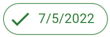
Figure 9.9 – A screenshot of the CompleteChip component
- <ProjectChip>: This is a custom component that encapsulates an MUI Chip to render the provided task’s project name. You can find the complete implementation at https://github.com/PacktPublishing/Full-Stack-Quarkus-and-React/blob/main/chapter-09/src/main/frontend/src/tasks/ProjectChip.js. The resulting component should look like this when rendered with a task that has been assigned to a project:

Figure 9.10 – A screenshot of the ProjectChip component
- <SelectProject>: This is the custom component we implemented in the Implementing a project selector drop-down list section. This generic component is used to allow users to select the project to which they want to assign the currently edited task.
- <EditPriority>: This is a custom component that allows users to specify the priority of the task. The implementation of this component is very similar to the one we did for the SelectProject component; it includes an icon button and a popup menu to select from the list of priority entries. You can find the component’s source code at https://github.com/PacktPublishing/Full-Stack-Quarkus-and-React/blob/main/chapter-09/src/main/frontend/src/tasks/Priority.js. The resulting component should look like this when rendered:

Figure 9.11 – A screenshot of the EditPriority component
We’ve seen a good overview of the task edit dialog. This is the most complex component of the application; it’s used in the application to edit and display information about the user’s tasks. You should now have a good understanding of a wide variety of MUI components and be able to create your own by leveraging the composition pattern. Now, let’s create a new page using our common Layout component to display a list of tasks.
Implementing a task list page
In the Displaying a dummy page section of Chapter 7, Bootstrapping the React Project, we implemented a very simple page so that we could start the application and log into it. This page had no real purpose besides having a landing page when the user authenticates and is no longer of any use. Let’s replace it with a multipurpose task lister page, which we’ll use to display the user’s tasks filtered by several criteria.
To implement the task list page, we’ll create a new React functional component named Tasks that will reuse our common Layout component to display a list of tasks filtered by different criteria. Depending on how the page is accessed and configured, the filter will display different tasks based on the resulting criteria. The resulting page should look like this when rendered to display the pending, or todo, tasks:
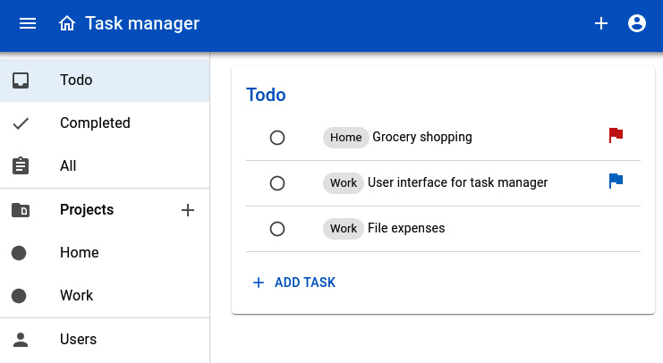
Figure 9.12 – A screenshot of the tasks pending page
To implement the page component, let’s create a new file in the src/tasks directory called Tasks.js, which will contain its source code. You can find the complete code for the page component in this book’s GitHub repository at https://github.com/PacktPublishing/Full-Stack-Quarkus-and-React/blob/main/chapter-09/src/main/frontend/src/tasks/Tasks.js. Now, let’s analyze the most relevant parts:
export const Tasks = ({title = 'Tasks', filter = () => true}) => {The previous snippet contains the functional component declaration. The title attribute is used to override the title, which is displayed on top of the table. If nothing is provided, Tasks will be used as default. In Figure 9.12, the rendered component has a title attribute configured with a Todo value. The filter attribute accepts a function that can be used to filter the tasks. For example, the t => Boolean(t.complete) function would configure the page to display only the completed tasks.
In addition to these attributes, the page component can also be configured through React Router URL params:
const {projectId} = useParams();
const {project} = projectApi.endpoints.getProjects.useQuery(undefined, {
  selectFromResult: ({data}) => ({project: data?.find(p => p.id === parseInt(projectId))})
});
if (Boolean(project)) {
  title = project?.name;
  filter = task => task.project?.id === project.id;
}
In the first statement, we use React Router’s useParams hook to retrieve projectId, which might have been passed through the page URL. In the next statement, we use the useQuery hook provided by the Redux project API slice’s getProjects endpoint to retrieve the project that matches projectId from the application’s Redux store. The useQuery hook accepts a selectFromResult query option that can be configured with a function. In our case, we compare the IDs of the retrieved projects with the ones we obtained from the URL parameters. If a project matching this ID is found, then we override the title and filter attributes to configure them with the project-specific data. In the following screenshot, you can see what the page looks like when the tasks are filtered by the Home project:
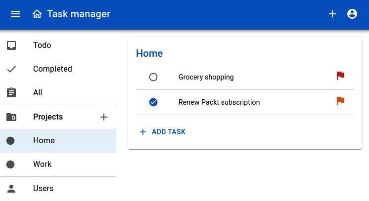
Figure 9.13 – A screenshot of the Home project tasks page
To retrieve the data to populate the table, we consume the useQuery hook from the getTasks endpoint of the task API Redux slice:
const {data} = api.endpoints.getTasks.useQuery(undefined, {pollingInterval: 10000});We configure the hook to poll the data from the backend HTTP API every 10 seconds. The user will always have the most recent data available since the page will update transparently in case changes are received from the backend that update the main application’s store.
The return statement is a component composition that displays the table with the filtered tasks. We covered all of the components and how to use them in the Creating the Users page section of Chapter 8, Creating the Login Page, so we won’t go over them again.
The page component is ready. However, we still need to configure the main application router so that the page is rendered whenever the user accesses the applicable URLs.
Adding the task pages to the application router
In the Setting up the application router section of Chapter 7, Bootstrapping the React Project, we developed the first iteration of our application’s router with routes for the login page and the dummy initial page. Now, let’s edit the src/App.js file to add the definitive routes for the task manager. The following snippet contains the final route configuration with the relevant changes:
<Routes>
  <Route exact path='/' element={<Navigate to='/tasks/pending' />} />
  <Route exact path='/login' element={<Login />} />
  <Route exact path='/tasks' element={<Tasks />} />
  <Route exact path='/tasks/project/:projectId' element={<Tasks />} />
  <Route exact path='/tasks/pending'
         element={<Tasks title='Todo' filter={t => !Boolean(t.complete)} />} />
  <Route exact path='/tasks/completed'
         element={<Tasks title='Completed' filter={t => Boolean(t.complete)} />} />
  <Route exact path='/users' element={<Users />} />
</Routes>
Let’s see how each route behaves, depending on its configured path attribute:
- /: This is the path for the landing page where the users are redirected once they log into the application. Since we want users to focus on their pending tasks, we’ll configure this route to redirect them to the pending tasks page. In the element attribute, we configure a React Router Navigate component that will take care of the redirection to the applicable path.
- /login: This is the route for rendering the Login page. Users won’t navigate to this page manually, but they’ll be redirected if they haven’t logged in or their session has expired. The element attribute is configured with the Login page component we implemented in the Creating the Users page section of Chapter 8, Creating the Login Page.
- /tasks: This is the route that renders an unfiltered list of tasks. Notice how the element attribute contains an unconfigured Tasks page component that will render the complete, unfiltered list of tasks for the current user.
- /tasks/project/:projectId: This is the route that renders a list of tasks filtered by a project, as shown in Figure 9.13. In this case, the element attribute is also configured with a plain Tasks component with no attributes. However, the URL contains a :projectId param definition that allows users to enter URLs such as http://localhost:3000/tasks/project/10, where 10 would be the project ID passed on to the Tasks page. The Tasks page component will read this parameter and infer the filter and title configurations based on the found project.
- /tasks/pending: This is the route that renders a list of the user’s pending tasks. The element attribute contains a Tasks component configured with a title and filter that shows only the tasks that aren’t complete.
- /tasks/completed: This is the route that renders a list of the user’s completed tasks. The element attribute contains a Tasks component configured with a title and filter that shows only the tasks that have been marked as complete.
- /users: This is the route that renders a page containing the list of registered users in the application.
Now that the application router configuration is ready, users should be able to navigate freely to any of the routes we’ve defined. However, to improve the experience, let’s add some links to the application drawer.
Finalizing the application’s layout
The MainDrawer component’s purpose is to display navigation links to the different pages and sections of the task manager application. Let’s edit the src/layout/MainDrawer.js file to add some links to the routes we just created. You can find the complete set of changes in this book’s GitHub repository. Let’s analyze the most important ones:
<Item disableTooltip={drawerOpen} Icon={InboxIcon} title='Todo' to='/tasks/pending'/>
<Item disableTooltip={drawerOpen} Icon={CheckIcon} title='Completed' to='/tasks/completed'/>
<Item disableTooltip={drawerOpen} Icon={AssignmentIcon} title='All' to='/tasks'/>
<Projects
  drawerOpen={drawerOpen} openNewProject={openNewProject} projects={projects}
/>
The previous snippet contains the new entries for the drawer. The first three are new Item definitions with links to the pages listing pending, complete, and all tasks. Notice how the to attributes are configured with the routes we defined in the App.js main router for each of these pages.
The last entry in the snippet references a custom Projects component defined in the same MainDrawer.js file. This component accepts a list of projects and creates an Item entry for each project with its corresponding path, as shown in the following snippet:
{Array.from(projects).map(p => (
  <Item
    key={p.id} disableTooltip={drawerOpen}
    Icon={CircleIcon} iconSize='small'
    title={p.name} to={`/tasks/project/${p.id}`}/>
))}
In this case, the to attribute is configured with a path matching the /tasks/project/:projectId route for each project ID.
In the Implementing a new project dialog and Implementing a task edit dialog sections, we implemented a modal dialog to create new projects and a full-screen dialog to edit and create tasks. To be able to use them, we need to add them to the application’s Layout component. Let’s open the src/layout/Layout.js file and add the new component entries to the last part of the component definition. The following snippet shows the required changes:
</Box>
<EditTask />
<NewProjectDialog />
<ChangePasswordDialog />
We’ll also need to add the required attributes to the TopBar and MainDrawer component entries:
<TopBar
  goHome={() => navigate('/')}
  newTask={() => dispatch(newTask())}
  toggleDrawer={doToggleDrawer} drawerOpen={drawerOpen}
/>
<MainDrawer
  toggleDrawer={doToggleDrawer} drawerOpen={drawerOpen}
  openNewProject={doOpenNewProject} projects={projects}
/>
The application’s layout is now complete. We’ve added navigation links to all of the application’s routes in the main drawer, and configured the common layout to be able to display the dialogs to create projects and edit tasks. Now, let’s clean up some of the residual files and start the application to see all of the changes in action.
Deleting the no longer needed files and running the application
We’ve finished implementing the task manager frontend application functionality. However, we bootstrapped the application using the Create React App script, which added some residual files we no longer need and that we should delete. Let’s go ahead and delete the following files from the project:
- src/App.css
- src/logo.svg
- src/InitialPage.js
Now, let’s start the application. In the Running the application section of Chapter 8, Creating the Login Page, we already went through these steps:
- Start the Quarkus backend from the project root by executing the following command:
./mvnw quarkus:dev
- In a different Terminal, and from the frontend root (src/main/frontend), start the React development server by executing the following command:
npm start
The frontend application should start and a browser window should open automatically at http://localhost:3000. The page should load and automatically redirect us to http://localhost:3000/login.
After logging in, the application should redirect us to the Todo tasks page at http://localhost:3000/tasks/pending:
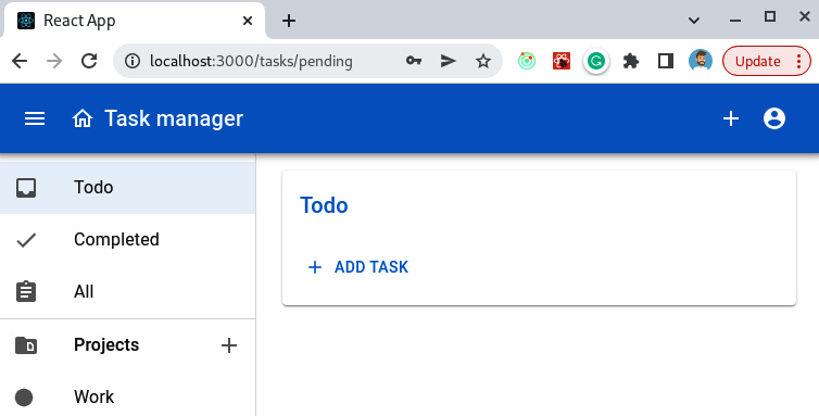
Figure 9.14 – A screenshot of a browser pointing to http://localhost:3000/tasks/pending for a regular user
Let’s try to create a new task by pressing the ADD TASK button. The EditTask dialog should open and we should see an empty form, similar to what’s shown in Figure 9.6. Let’s add some details for this task and press the SAVE button. The dialog should close and we should be able to see the new task listed. Now, let’s press on the circle to the left of the task to mark it complete. The task should disappear from the Todo list but should be visible if we navigate to the Completed tasks page.
Everything should be working by now, and a fully functional task management application should be ready. You can play around with the application to check all of the features we implemented: creating new tasks, changing your user password, logging in and out, creating new projects, managing users, and so on.
Summary
In this chapter, we worked on the core features of the frontend application and finished implementing the task manager we’ve been creating throughout this book. We started by adding user-specific features to allow users to log out of the application and change their passwords. Then, we worked on the core features of the application by adding functionality for users to be able to create projects and perform task management tasks. We also cleaned up the project of residual, not needed files, and learned how to run it in development mode to check that the new functionality is working.
You should now be able to use Redux Toolkit, React Router, and MUI to implement your own React components to build user interfaces that consume REST APIs. In the next chapter, we’ll introduce Jest and other frontend testing tools, and learn how to implement tests to ensure that the implemented functionality works according to our specifications.
Questions
- What’s the most appropriate MUI component to display short messages in a way that attracts the user’s attention?
- What’s the main purpose of React’s built-in useState hook?
- Where are the action buttons located in a modal dialog according to the Material Design guidelines?
- What additional steps are required to add a Redux Toolkit slice to the main application’s Redux store?
- How do you configure a React Router route that accepts parameters?