4
Completely Randomized Design
Introduction
In both of the tomato fertilizer experiments in Chapter 3, the gardener set out several tomato plants in her garden and randomly assigned one of two fertilizers to each of them. Her experiment is the simplest example of the experimental design that is called the “completely randomized design (CRD),” which is the topic of this and the following chapter. The tomato experiment had a single qualitative treatment factor (fertilizer), and this factor had two discrete, qualitative levels (brands A and B in the first experiment, brands A and C in the second).
In the general case of a CRD, there are k (= two or more) treatments. In this chapter, these k treatments are the k selected levels of a single treatment factor. Chapter 5 addresses the situation in which the treatments are combinations of various levels of two or more factors. The experimental units (eus) to which the treatments are applied are a single group of essentially homogeneous entities, like laboratory mice, plots of land, or people in a certain demographic or medical group. There are no distinguishing characteristics on which one might group, or block, the experimental units. Blocked designs are addressed in Chapters 6 and 7.
In a CRD, the assignment of treatments to experimental units is, as the label implies, completely randomized: ni eus are selected at random to receive level i of the treatment factor, i = 1, …, k. The numbers of eus that receive each treatment are often equal, but need not be. The purpose of the experiment is to evaluate differences among the different treatment levels in their effect on the responses of interest. There may be differences or trends in the data for the k treatments that have important implications, such as finding the most productive fertilizer, for the process, product, or phenomenon under study.
In this chapter, we consider two situations:
- The treatment factor is a qualitative variable—discrete types, brands, materials, methods, etc.—that we want to evaluate and compare, as in the tomato experiments comparing fertilizers.
- The treatment factor is a quantitative variable, generally measured on a continuous scale, such as concentrations, temperature, dose amounts, or dollars. In this case, the design and analysis objective is generally to find a functional relationship between a response and the x-variable that is the factor of interest. That function can then be used to address issues such as what dose level of a medication is required to achieve a desired response.
Design Issues
The key design decisions the experimenter must make in designing a completely randomized experiment to evaluate the effect of a single factor are the choice of experimental units, how many factor levels to include in the experiment, and the number of eus to be assigned to each factor level and in total. The choices of response(s) and measurement method are always design issues for this and all other designs. Experimental controls and protocols are context specific.
Subject-matter considerations dominate the selection of factor levels. For example, if the objective is to compare the ability of five different paper towel brands to absorb spills (a common student project), and these brands have been purposely chosen—say, the largest selling—then those five brands will be the levels included in the experiment. Cost, schedule, and statistical-precision considerations, addressed later in this chapter, determine the number of experimental units and the allocation of experimental units among the factor levels.
CRD: Single Qualitative Factor
Example: Market research
Selling consumer products is highly competitive, as a stroll down any Wal-Mart or Walgreen’s aisle tells you. You’ve got to have visibility in order to generate sales. You have to know what catches the consumer’s eye and what doesn’t. Market research has long had the objective of finding out what sells and what beats the competition. The business community has found that designed experiments not only have a role in product research but also in market research. Controlled experimentation generates directly usable, information-laden data more quickly and cleanly than observational data. I will use the following marketing example and story, inspired by, but different from, a marketing example in Testing 1-2-3. Experimental Design with Applications in Marketing and Service Operations (Ledolter and Swersey 2007), for our first illustration of a CRD (with more than two factor levels). (See Ledolter and Swersey 2007 for many examples of business applications of designed experiments.)

The marketing department for a company that makes shampoo has come up with four candidate store displays for their product. Rather than just ask upper management to choose the display they like (think Dilbert and his pointy-haired boss), the department decided to run an experiment in actual stores to see how much of an effect the displays have on sales—decisions to be made on customer data, not management opinion! After considering cost and schedule and convenience, they select 20 stores, such as CVS, in the surrounding counties in which to do the study. Someone in the marketing department has heard that to make it a fair comparison, the displays should be randomly assigned to stores. Five stores are randomly assigned to each of the displays. (Recall that it’s the random assignment that validates the analysis by which the “real or random?” question can be answered. The stores do not have to be a random sample of stores from the “population” of stores that carry the company’s product.)
The company installs the displays for a week and records the shampoo sales for that week (automatically, via bar codes and scanners). Different stores have different levels of activity and sales, so to normalize the sales figures and make them more comparable across stores, the measurement used to assess the effect of a display on the store’s sales is the percent increase (or decrease) in a store’s shampoo sales (try saying that phrase quickly) during the week relative to the store’s “base sales.” The base chosen is the previous month’s average weekly sales. The resulting data are given in Table 4.1, along with the means and standard deviations for each display. What is the message in these data?
Table 4.1 Sales Data: %Increase in Sales for Four Displays. Each display was installed in five different stores for 1 week.
| Sales Increase (%) | Display | |||
| D1 | D2 | D3 | D4 | |
| 4.2 | 8.4 | 3.0 | 4.9 | |
| 2.7 | 4.5 | 3.8 | 2.8 | |
| 3.1 | 4.9 | 2.0 | 6.1 | |
| 4.6 | 7.3 | 2.1 | 4.2 | |
| 1.2 | 5.7 | 3.2 | 3.7 | |
| Average | 3.2 | 6.2 | 2.8 | 4.3 |
| Std. dev. | 1.3 | 1.7 | .74 | 1.2 |
If someone walked into my office with these data, here are some questions I would ask:
- Hey, where’d you get that coat?
- Why 20 stores? (I realize I can’t change this after the fact, but this and other questions can provide subject-matter information that could be pertinent later.)
- How were they selected?
- How were the displays assigned to stores? (Haphazard assignment is not the same as random assignment. Purposeful, biased assignment, as in, “I think Display 2 will play well in Peoria,” will invalidate the results.)
- Are there variables of potential interest that characterize individual stores, such as their location: city, town, or village?
- When was the test conducted? (This could be important for a seasonal product, which shampoo isn’t.)
- Was it the same calendar week at every store? (One might imagine a scenario in which one of each display was constructed, then trucked around to five different stores in some metropolitan region over a 5 (or more) week period.)
- Why was 1 week selected as the time period for measuring sales, rather than, say, 2 weeks, a month, or a quarter?
- What was the base period and was it the same for every store?
- Do you have the sales data for the base and test periods? (In working with ratios, it’s always good to have both numerator and denominator. Sometimes you can be surprised. For example, if a store has a small base level of sales, a small increase in sales, dollar-wise, might result in a large percentage increase.)
- Was the display removed after its 1-week exposure?
- Do you have sales data for some time period after the display was removed? (With product bar codes and networked computerized recording of sales details, retailers have an astounding data-based ability to react to their sales environment. I like to tell a Wal-Mart story. One year Thanksgiving weekend sales were weaker than expected. Wal-Mart’s data system told them the bad news almost immediately and also identified the problem areas. The company was able to make pricing and advertising changes, and maybe product display changes, aimed at fixing these problems, quickly, and recovered to have a successful Christmas season. That’s like turning an ocean liner around on a dime.)
- On the other hand, if the display was left up, do you have data for subsequent weeks’ sales to see if the effect on sales persists? (Even if the display was taken down, it would be interesting to have data from subsequent weeks to see if, or how long, the increased sales persisted after the experiment.)

I would have liked to ask and discuss these questions when the experiment was being planned. The success of an experiment and its ability to generate data that have an important message generally depend more on these planning decisions than on any of the statistical-analysis gymnastics the data are subsequently put through.
Time for Analysis 1: Plot the data. Figure 4.1 shows the sales-growth data for each of the four displays.

Figure 4.1 Pct. Increase of Shampoo Sales by Display.
If there is a winner, eyeball analysis of Figure 4.1 says it is Display 2—the largest increases. Of course, all four displays are winners in the sense that they all resulted in increased sales at every store. On the other hand, if the goal had been to achieve a 10% increase, all four displays are losers. Context matters. But, before we draw any conclusions, we need to ask: could the apparent sales differences among displays happen just by chance? We need a statistical test.
Analysis of Variance
One way to compare the display means would be to compare all or various selected pairs of displays by applying the two-sample t-test of Chapter 3 to the selected pairs. But, this is tedious (for large k) and subject to bias: if, for example, one picked out the display with the highest average sales increase and compared it to the display with the lowest average sales increase by way of a two-sample t-test, then (as theory can show), just by chance, there is more than a 5% chance, say, of getting a t-test P-value less than .05, when in fact there is no difference among all of the underlying means. Selecting the highest and lowest means from the group of k means biases the t-test analysis toward showing a significant difference.
Our analysis goal is to do a fair comparison of the “data we got” to the distribution of “data we might have gotten” if there were no underlying differences among the displays, that is, if the apparent differences were just due to chance. More to the point, we need make this comparison via a statistic (analogous to the t-statistic for two independent sets of data) that is sensitive to the differences among the four data sets. Once that statistic is selected, the probability distribution of that statistic when there is no difference among the underlying distributions will be the reference distribution of the test statistic against which we compare the test statistic calculated from the data we got. In short, we need to apply the same sort of analysis we did to compare two tomato fertilizers to this extended situation that involves comparisons of four displays.
The data in Figure 4.1 exhibit variation of two types: (i) variation within displays, that’s the vertical variability of sales results among the stores that had the same display, and (ii) variation among displays, the horizontal variability, in this case primarily the upward shift of Display 2 data relative to the data for Displays 1, 3, and 4. The statistical tool called the analysis of variance (generally abbreviated ANOVA) quantifies and compares these two sources of variation via a particular statistic, an F-ratio, previously discussed in Chapter 3 for the comparison of two variance estimates. The ANOVA addresses the question: is the variation among displays larger than what would be expected, just by chance, due to the variation within displays? It answers that question by modeling the “data we might have gotten” by chance as k random samples of size n from the same Normal distribution.
One can also think in terms of a randomization analysis: if one took the 20 data points in Table 4.1 and randomly distributed them into four groups of five, how likely is it that we would get variability among the four constructed groups comparable to that shown in Figure 4.1? That question could be addressed via randomization-analysis software (Simon 1997).
Table 4.1 shows the summary statistics, ybari and si (the mean and standard deviation), for each display’s data. These statistics will be used to develop the ANOVA’s comparison of the variability among groups to the variability within groups. The following subsections give some formulas underlying an ANOVA. The formula-averse reader can skip to the discussion of the ANOVA table itself.
Within-group variation
Under the assumption of equal underlying variances for all treatments, each data set’s variance, ![]() , estimates this common variance, call it σ2. This variance is the within-group variance. It is also called the experimental-error variance, or just the error variance, because it is the variance among experimental units that receive the same treatment. (Recall that in Chapter 2, experimental error was defined as the variation among experimental units (eus) that receive the same treatment; error does not mean mistake.) From the data, we can estimate this common variance by combining these k estimates into an overall, or pooled, estimate of σ2 by calculating the average of the
, estimates this common variance, call it σ2. This variance is the within-group variance. It is also called the experimental-error variance, or just the error variance, because it is the variance among experimental units that receive the same treatment. (Recall that in Chapter 2, experimental error was defined as the variation among experimental units (eus) that receive the same treatment; error does not mean mistake.) From the data, we can estimate this common variance by combining these k estimates into an overall, or pooled, estimate of σ2 by calculating the average of the ![]() , s
, s

where the subscript p stands for pooled and the summation (denoted by ![]() ) is across the k treatments.
) is across the k treatments.
The degrees of freedom associated with this pooled estimate is k(n − 1) because there are n − 1 df in each treatment, pooled across k treatments.
For the case of unequal sample sizes, ![]() , the pooled variance estimate, is obtained by calculating a weighted average of the
, the pooled variance estimate, is obtained by calculating a weighted average of the ![]() , s, the weights being equal to the degrees of freedom (ni − 1) associated with each
, s, the weights being equal to the degrees of freedom (ni − 1) associated with each ![]() . Thus, in the general case, the combined estimate of σ2 is
. Thus, in the general case, the combined estimate of σ2 is

where ![]() .
.
This pooled estimate of variance is the same as that used in the two-sample t-test when the equal-sigma assumption is made. The associated df in the case of unequal sample sizes is ![]() .
.
Among-groups variation
A statistic that measures variation among the k treatments is the variance of the ybar’s:

where ybar. is the overall average (the “dot” subscript denotes that an average has been taken). This formula says just calculate the sample variance of the k treatment means. Under the assumption of k samples of n observations from the same distribution, this variance of the ybars estimates σ2/n, which is the variance of a mean based on n observations. This means that ![]() estimates σ2.
estimates σ2.
For the case of unequal treatment-group sizes, say n1, n2, …, nk, the among groups variance is given by

where ![]() .
.
The F-test
The previous two subsections have provided two estimates of the underlying within-treatment variance, σ2, under the assumption of no real difference among treatments. The next important thing that theory tells us is that the within-group variance estimate of σ2, namely, ![]() , is statistically independent of the among-group estimate, namely,
, is statistically independent of the among-group estimate, namely, ![]() . Intuitively, one could move any of the k different data sets up or down, en masse, and not affect the within-group variance, but the among-group variance would change. The greater the differences among the ybars, the larger
. Intuitively, one could move any of the k different data sets up or down, en masse, and not affect the within-group variance, but the among-group variance would change. The greater the differences among the ybars, the larger ![]() would be.
would be.
The theory has one more step to take: compare the two variance estimates via their ratio, call it F:

As discussed in Chapter 3, the F-statistic, as the ratio of two independent estimates of the same variance, has a known probability distribution. In this situation, the particular F-distribution has k − 1 degrees of freedom (df) in the numerator and k(n − 1) df in the denominator. Comparing the F-statistic we got to the appropriate F-distribution provides us a means of evaluating the “real or random?” question about the differences among treatment means.
The F-statistic is sort of a generalized t2 statistic. That is, the F-statistic is roughly (can be thought of as) an average of squared t-statistics among all pairs of the k treatments. The important fact is that the probability distribution function of F has been derived, calculated, tabulated, plotted, and programmed. The F-distribution family (or at least selected percentiles) is tabulated in many texts and is available in software such as Minitab, JMP, and Excel.
Conceptually, the comparison of calculated F to its reference distribution is shown in Figure 4.2. The scale of F is not shown, because it changes for different members of the family of F-distributions, but the center of the distribution is around 1.0 because the numerator and denominator variances are estimating the same underlying σ2 so the nominal value of this ratio is 1.0.

Figure 4.2 Graphical F-Test for Testing the Hypothesis of No Difference Among the Underlying Means for k Treatment Groups.
The more variability there is among treatment means, relative to the within-treatment variability, the larger the F-ratio will be. Thus, larger F-values mean stronger evidence against the hypothesis of no real difference among treatments. This means that the appropriate P-value to calculate to summarize this picture of the comparison of the F-value we got to the distribution of F-values we might have gotten, just randomly, is, as shown in Figure 4.2, the upper tail—the area under the curve to the right of the observed F-value.
Analysis of variance
For many years, dating back before computers, the preceding calculations have been organized into an “ANOVA” table. Even with computers doing the tedious calculations for us, software still presents the calculations leading up to and including the F-test statistic and its P-value in this ANOVA table format. Table 4.2 gives the ANOVA table for the present case of a completely randomized experiment with one treatment factor with k levels. In subsequent chapters, the ANOVA table will be extended to more complicated experimental designs.
Table 4.2 Analysis of Variance (ANOVA) Table for the Completely Randomized Design: One Treatment Factor with k Levels and n Observations per Treatment.
| Source | df | SS | MS = SS/df | F | P-Value |
| Treatments | k − 1 | TMS | TMS/EMS | Prob(>F) | |
| Error | k(n − 1) | EMS | |||
| Total | nk − 1 |
ybar. is the overall mean; ybari is the mean for treatment i.
The column entries in Table 4.2 are the following:
- Source means source of variation. The table entries, reading from the bottom, are Total, Within Treatments, and Among Treatments. Shorthand terminology is Total, Error, and Treatments. Error means experimental error—the variation among experimental units that receive the same treatment, that is, the variation within Treatments.
- df means degrees of freedom. Just as a variance calculated from n observations has n − 1 degrees of freedom, a variance calculated from k means has k − 1 df.
- SS means sum of squares. The entries in this column are various algebraic expressions involving sums of squared quantities. The double summations in these mathematical expressions mean that the sum is taken over both subscripts, i and j.
- MS means mean squares. It is calculated by dividing SS by df.
- TMS stands for treatment mean square and is in fact the numerator of the F-statistic developed previously.
- EMS stands for error mean square and is the denominator of the F-statistic developed previously.
- F is the F-statistic, namely, the quotient, TMS/EMS.
- P-value is the probability of exceeding the observed F-value, denoted by Prob(>F), based on the F-distribution with, for this situation, k − 1 numerator degrees of freedom and k(n − 1) denominator degrees of freedom. The P-value tells you how far out on the upper tail of the distribution the F-statistic falls. The smaller the P-value, the stronger the evidence of real differences among the treatment means.
Discussion
In Table 4.2, the df for Treatments and for Error add up to equal the Total df. The Total SS is not used directly in the F-test calculation, and its inclusion in the ANOVA table traces back to hand or mechanical calculator ANOVA calculations.
Now, algebraically, it can be shown that the sums of squares add up like the df: Total SS = Treatment SS + Error SS. This relationship would be used in the calculations by calculating Total SS and TSS using the appropriate variance formulas and then calculating ESS by subtraction. Or, if all three SS’s were calculated, they could be checked to see if they added up as they should. No more do we need to do all this, but we who date back to that era get some comfort from seeing the full ANOVA table and seeing that the entries that are supposed to add up really and truly do.
These relationships among the SS and df help us understand conceptually what the ANOVA is doing with the data—it is partitioning total variability into separate parts: (i) variation among and (ii) variation within Treatments (displays in this example). This is similar to doing a chemical analysis of some compound to determine the relative concentrations of its constituent elements. We are doing this separation in order to judge whether the variability among treatment means (the possible signal of a real difference among displays) is appreciably larger than the experimental-error variability (the noise). The F-distribution provides the frame of reference for evaluating the signal-to-noise ratio.
Results
Table 4.3 gives the ANOVA results from Minitab for the display experiment. In addition to the ANOVA table, Minitab provides a graphical display that compares the means for the four displays.
Table 4.3 ANOVA of SalesIncr% Data.
| Source | DF | SS | MS | F | P |
| Displays | 3 | 33.91 | 11.30 | 6.81 | .004 |
| Error | 16 | 26.57 | 1.66 | ||
| Total | 19 | 60.47 | |||
| S = 1.29 | |||||
| Individual 95% CIs for mean based on pooled StDev | |||||
| Level | N | Mean | StDev ------+---------+--------- | ||
| D1 | 5 | 3.2 | 1.34 (-------*-------) | ||
| D2 | 5 | 6.2 | 1.65 (-------*-------) | ||
| D3 | 5 | 2.8 | .74 (-------*-------) | ||
| D4 | 5 | 4.3 | 1.25 (-------*-------) | ||
| ------------+--------+--------+--------+ | |||||
| 3.0 4.5 6.0 7.5 | |||||
The P-value of .004 for the test of no difference among Displays is quite strong evidence of a real difference in the sales boosts provided by the different displays. Display 2 had increased sales of about 6.2%, while the other displays had increases of roughly 3–4%. That sales difference may be practically significant, in dollars, as well as statistically significant.
Figure 4.3 gives the picture behind the P-value in the previous ANOVA table. The observed F-ratio for comparing displays is 6.81. The appropriate reference distribution under the hypothesis of no difference among displays is the F-distribution with 3 and 16 numerator and denominator df, respectively. Software, tables, and Figure 4.3 show that the F-ratio calculated from the experimental data we got falls at about the upper .004 point on the F(3,16) distribution. The probability associated with the right tail area beyond F = 6.81 is so small that the distribution curve and the horizontal axis cannot be distinguished at the scale of the figure. The P-value of .004 is fairly substantial evidence of a real difference in sales among the three displays. Only four times in 1000 repetitions of sampling from four identical Normal distributions (sample sizes of five) could you expect to get an F-ratio this large or larger (F > 6.81).
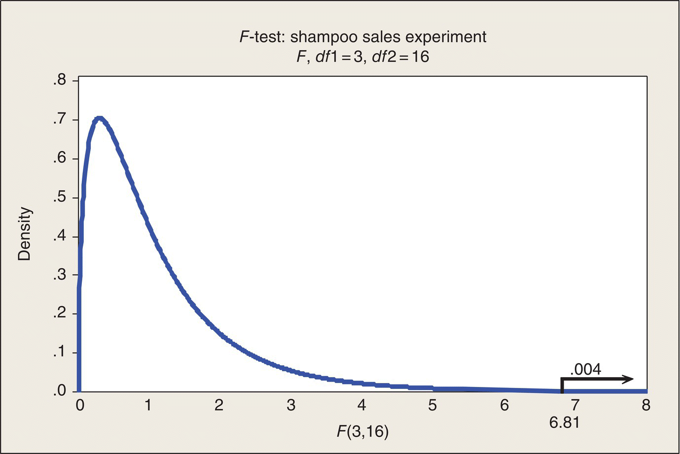
Figure 4.3 Graphical Depiction of F-Test for Shampoo Sales Experiment.
Before the shampoo company makes the decision to install Display 2 nationwide, costs would need to be figured in and the return on investment evaluated. Floor or shelf space for the displays may be expensive. Also, as indicated by the questions previously, the useful life of a new display needs to be considered. If people get bored by the display and sales fall back quickly, or if the competition comes up with something hotter, it could all go for naught. The market research department could be embarrassed. This may not be rocket science, but it is still complicated—and serious business.
Often in experiments like this, a Control group will be included. In this experiment, each store’s previous “base” period of sales served as its control. However, to be sure that the increases seen for the stores in the study are not just the result of something fortuitous, such as good weather, it would have been useful to select five additional stores where no display was added and collect their base and pseudo-test-week sales and the percentage change in sales to provide a baseline against which to compare the 20 stores with displays.
In physics, there is an “observer effect:” the act of measuring something affects the thing being measured. That happens in human affairs, too. Store personnel who see the new displays going up might conclude, “Hmm, looks like the home office is trying to boost the sales of Shampoo X. Let’s talk it up with our customers.” The experiment’s protocol would need to prevent this sort of bias from infecting the experiment.
Testing the Assumptions of Equal Variances and Normality
The assumption underlying the ANOVA is that the underlying standard deviations for the three displays are identical. Empirical studies have been done evaluating the effect of deviations from this assumption. The general conclusion is that it depends—on how seriously the assumption is violated and on the sample sizes. In general, though, the ANOVA F-test is fairly robust to violations of the assumption of equal underlying variances.
There are formal statistical significance tests of the equal-variances hypothesis for more than two groups of data in the statistical literature and in software. Minitab does the Bartlett’s and Levene’s tests (NIST/Sematech 2010). For the Display data, those tests confirm what the eye easily sees in Figure 4.1: the variability of the five data points in each display is quite consistent across the four displays. Similarly, with these small sample sizes, there is no reason to discredit the Normal distribution assumption underlying the analysis.
Confidence Intervals
So, Display 2 increased sales by about 6.2%. By being based on only five stores, that’s a pretty imprecise estimate. To make the decision that it will be profitable to install this display nationwide, let’s evaluate that imprecision and see if that decision is adequately supported.
We could use only the Display 2 data and calculate a confidence interval on an underlying mean just as we did for the underlying mean difference in wear for the boys’ shoes data. But, for data from a CRD, we can do better. The underlying statistical assumption, supported by the data, is that the underlying variability in each display group is the same for all three groups. That means we can use the data from all four displays to estimate the common sigma. The ANOVA does that for us.
A term used in statistics for this use of more than just the Display 2 data is “borrowing strength.” Our test is strengthened, made more powerful, by borrowing information in the other three displays to estimate the common σ. The additional strength is reflected in the degrees of freedom: k(n − 1) for S versus n − 1 for s2.
In the ANOVA table, the EMS is the pooled estimate of the common variance, σ2. Its square root, ![]() (denoted by S in Table 4.3), based on 16 df, is the standard deviation that we will now use in the confidence interval for the underlying average sales% for Display 2, call it μ2. The formula is
(denoted by S in Table 4.3), based on 16 df, is the standard deviation that we will now use in the confidence interval for the underlying average sales% for Display 2, call it μ2. The formula is
The ![]() divisor in this formula comes from the fact that ybar2 is based on five observations. Plugging in the following values:
divisor in this formula comes from the fact that ybar2 is based on five observations. Plugging in the following values:
leads to
(This is the confidence interval roughly displayed in the Minitab output in Table 4.3.)
In round numbers, the finding is that our data are consistent with an underlying average 1-week increase in sales of between 5 and 7.4% (at the 95% level of confidence). Shall we go national with Display 2?
Suppose our accountants have told us that if we can get a 4% or more increase, the new display will be profitable. Then, the data, via the confidence interval, say there’s negligible risk in installing it: the return on investment is substantially greater than 4%. If I am the shampoo company’s chief financial officer (CFO), though, I would be concerned about whether a 1-week spike in sales is enough evidence. It’s annual profit that gets the attention of stockholders and determines my bonus. If the market research staff says that in our experience and that of others in similar situations, we have found that the staying power of a new display is such that over a year we will show one-half the gain as the initial week, then I would not support installing Display 2 because one-half of the lower bound is 2.5%, substantially less than 4%. Otherwise, I’d like to see the sales data for at least a few months of Display 2 exposure before adopting it.
Based on the results, we have pretty well dropped Displays 1, 3, and 4 from consideration. Suppose the shampoo company’s CFO’s niece, who is enrolled in an MBA program, but is working at the company as a summer intern, had developed Display 4. She says, “My display did pretty well, too. My two best stores outsold the lowest two stores with Display 2. Display 4 may be close enough to Display 2 to warrant further consideration.” The marketing department, recognizing the sensitivity of this issue, hires a statistical consultant from the business school at the state university.
The consultant calculates a 95% confidence interval on the underlying mean difference, μ2 − μ2, as follows:

The factor 2 shows up in this equation because we are dealing with the difference of two means of five observations. (The theory tells us that if a mean has a standard deviation of ![]() , then the difference of two means with these same standard deviations has a standard deviation of
, then the difference of two means with these same standard deviations has a standard deviation of ![]() .) Doing the calculation leads to
.) Doing the calculation leads to
95% confidence interval on μ2 − μ4:
The CFO’s niece says, “See. The difference could be pretty small (less than a percentage point) and my display is less expensive. Let’s do some more testing before we make a final decision.” The consultant says, “Yeah, and I can design you a really neat experiment.” And, so it goes …. Science marches on.
Inference
The inference about the underlying difference between μ2 and μ4 is a statement about the size of the difference between Normal distribution means that could result in the difference observed in the experiment’s data—the 20 participating stores. Broader inference relies on how the selected stores relate to the population of stores nationwide. If the 20 stores were selected at random nationally, then the statistical inference could be extended to that population. Otherwise, broader inference is a matter of subject-matter knowledge: characteristics of the 20 stores relative to the nationwide collection of stores. For example, if, for convenience, the experiment was run in Ohio, then inference beyond Ohio has to be based on knowledge about how Ohio stores and customers and shampoo preferences relate to those elsewhere. Sometimes, “just-pretend” inference is engaged in. Let’s pretend these 20 stores are a random sample from all stores that carry Shampoo X. Under that “pretension,” it is then claimed that the inference about the underlying mean difference is a statement about that hypothetical population. I prefer to interpret patterns in the data we have and rely on subject-matter knowledge to carry broader inferences beyond the experimental framework.
Statistical Prediction Interval
The statistical confidence interval for an underlying mean is a statement of uncertainty about nationwide sales, that is, sales averaged across a very large number of stores. All individual store managers, of course, imagine themselves as being above average, but they still might wonder, what might the sales% increase be in my store? Statistical prediction intervals (see, e.g., Meeker and Hahn 1991) answer this question.
The formula for a 95% prediction interval for a single future sales increase when Display 2 is used is

In this expression, df is the Error degrees of freedom, S is the square root of the Error MS, and n is the number of observations on which ybar2 is based, namely, five.
Evaluating this expression leads to
This could make the store manager feel reasonably comfortable, particularly if he has reasons to expect the sales boost to persist at a reasonable level. The store manager, though, has a different perspective than the shampoo manufacturer does. There’s only so much shampoo you can sell, so increased sales of Shampoo X in this experiment may be offset by decreased sales of other shampoos.
Note that the common (estimated) “two-sigma” limit in this situation would be ybar2 ± 2S = 6.2% ± 2.6% = (3.6%, 8.8%). This can be regarded as a crude, approximate 95% prediction interval, but it is somewhat more optimistically precise than the statistical prediction interval. The statistical prediction interval accounts for both the imprecision of S as an estimate of sigma and the imprecision of ybar2 as an estimate of the underlying μ2, the way any good statistician should do.
Example: Tomato Fertilizer Experiment Revisited
As noted in the introduction, the tomato fertilizer experiments in Chapter 3 were examples of a CRD in the special case of only two treatments. The significance testing portion of the analysis there was a two-sample t-test. The data can also be analyzed via an ANOVA. The assumptions underlying both analyses are the same: two independent random samples from the same Normal distribution, so you might hope and should expect that the results will be the same. And you would not be disappointed. Table 4.4 presents that analysis for Experiment 2.
Table 4.4 ANOVA for Tomato Fertilizer Experiment 2.
| Source | DF | SS | MS | F | P |
| Fert. | 1 | 16.61 | 16.61 | 3.60 | .08 |
| Error | 14 | 64.60 | 4.61 | ||
| Total | 15 | 81.21 | |||
| S = 2.15 | |||||
The F-statistic for no difference between Fertilizers A and C is 3.60, which when compared to the F(1, 14) distribution gives a P-value of .08. By way of comparison, consider one of the analyses in Chapter 3 which was a two-sample t-test under the assumption of equal underlying standard deviations. The result was t = 1.90, which when compared to the t(14) distribution, had a one-tail P-value of .04. The two-tail P-value, then, is .08. This matches the ANOVA result. The F-test ignores the sign of the difference between Fertilizers C and A, as does the two-tail t-test. The two analyses do result in the same result. Further, note that the square of the t-test statistic equals the F-ratio: (1.9)2 = 3.6. In general, the square of a t-value based on f degrees of freedom is equivalent to F with 1 and f degrees of freedom. What is lost in the F-statistic is the direction of the difference between the two treatment means. Of course, if we have plotted the data before doing the ANOVA (Analysis 1: Plot the Data), we already know the direction of the difference. Also, it is the case that the pooled standard deviation in the t-test is equal to the square root of the Error MS in the ANOVA table.
Sizing a Completely Randomized Experiment
Because a completely randomized experiment generally ends up with an analysis involving the precision of the estimate of one particular treatment’s mean or of the difference between two treatment means, the methods discussed in Chapter 3, based on confidence interval widths or power curves, can be applied to the issue of sizing future experiments. The only difference is that for three or more treatments in the experiment, there will be more degrees of freedom associated with the estimated standard deviation than in the case of two treatments. Thus, applying the two-sample sample size analyses to k > 2 situations will be conservative, though not greatly so. Statistical literature has other power-curve analyses for sizing a CRD.
CRD: Single Quantitative Factor
In many experimental situations, some of the factors of interest are quantitative variables, often continuous. This is particularly true in experiments that address physical or chemical processes that involve factors such as temperature, pressure, concentration, voltage, electrical current, and the like. Dosage levels in medical experiments, fertilizer amounts in agricultural experiments, and advertising dollars spent in a business experiment are other examples of a quantitative treatment factor.
For the case of a single quantitative factor, designing an appropriate CRD experiment involves the same issues as in Chapter 4—choice of factor levels and the nature, number, and allocation of the experimental units to the selected treatment levels. Allocation of treatment levels to experimental units is completely at random, per the CRD protocol. However, the choice of levels and replication can be driven by other considerations. Instead of choosing the number of replications, say, to provide a given level of precision in estimating the difference between two treatment means, the objective can be designing the experiment with enough data to estimate the slope of a line with a desired level of precision. Replication is still a consideration in order to provide an estimate of experimental error variation with adequate precision.
The analysis of the resulting data can and should differ considerably. The objective of the data analysis for a quantitative factor often is to fit a mathematical function, a curve or a multidimensional function to the data, rather than determining if the observed average response differences, say, between two levels of a quantitative variable, were real or random, picking winning treatments, and estimating selected treatment differences.
Curve fitting (more formally regression analysis) is a much-used statistical tool in contexts other than designed experiments. For example, the manufacturer of a product made by injection molding may keep data on various processing variables, such as injection volume and mold temperature, and then do strength tests on a sample of produced items. After accumulating such observational data for some period, a regression analysis could be done seeking a mathematical model for the relationship of strength to volume and temperature. As many authors, including BHH (1978, 2005), have pointed out, such analyses of “happenstance,” or observational data, can be inadequate or misleading, primarily due to the lack of control of the predictor variables (volume and temperature in this example). If you really want to know how changing the injection volume changes product strength, you have to run a controlled, randomized experiment.
Example: Growth rate of rats
Box, Hunter, and Hunter (1978, 2005) give an example pertaining to the growth rate of rats in which the factor of interest is the amount of a particular dietary supplement (denoted by x, measured in grams) in a rat’s diet. Ten rats were in the experiment, with one to three rats being assigned to each of the six levels of x selected for the experiment. BHH note that for the sake of clarity, textbook examples are generally smaller than real-world experiments would be, but that’s OK for our purposes, too. This is the sort of experiment that might be done for a science fair—which reminds me of a story. I once judged a junior high school science fair. When I came to the end of one student’s report, I read: “Unfortunately, I was unable to come to any conclusions due to the untimely death of my control rat.” The honesty was good. Sadly, though, the experimental design lacked replication.
The protocol for feeding the rats and measuring their growth rates are left to the reader’s imagination. The growth rates are given in a coded measurement: weight gain (perhaps ounces) per unit of time, such as a day. Also, in terms of context, the reader should assume that the experimenters were not just interested in rats, but rather in what they could learn from these experiments that would possibly be applicable to humans.
Graphical display
The natural data plot for these data is a scatter plot of the response, y (= growth rate) versus x (= supplement amount), as shown in Figure 4.4. This plot shows clearly that growth rate first increases as a function of x, reaches a maximum growth rate in the neighborhood of 20–25 g of supplement, and then decreases for higher amounts of supplement. Even a rat can get too much of a good thing! But seriously, this plot calls out for a curve to be smoothed through the data and that is the direction the analysis takes.

Figure 4.4 Data from Growth Rate Experiment. Source: Box, Hunter, and Hunter (2005, p. 381), used here by permission of John Wiley & Sons.
Curve fit
What kind of curve should we fit? Well, it’s possible that biological–nutritional theory could suggest a function to use. In the absence of theory, we will just consider simple mathematical functions. The simplest is a straight line: y = a + bx. Clearly, from the data plot, this experiment’s data would not be well fitted by a straight line. There’s a definite concave shape to the relationship. A quadratic function, y = a + bx + cx2, is a possibility. For negative c, this curve will have a concave downward shape. Statistical curve fitting is done by a method called least squares regression. The regression analysis, in this case, finds the values of a, b, and c that give a curve that fits closest to the data in the sense of minimizing the sum of squared differences between the data points and the fitted function. Details can be found in many textbooks and internet sources. Statistical software does the fitting. Minitab does the honors here; the results are in Table 4.5.
Table 4.5 Regression Analysis Results.
| The Regression Equation Is | ||||
| y-gr-rate = 35.7 + 5.26 x-supp − .128 x-sq | ||||
| Predictor | Coef | SE Coef | t | P |
| Constant | 35.7 | 5.6 | 6.35 | .000 |
| x-supp | 5.3 | .56 | 9.43 | .000 |
| x-sq | −.13 | .013 | −9.97 | .000 |
| S = 2.54 | ||||
Before evaluating the fitted equation in Table 4.5, let’s discuss the other entries in the table. There are some t-test statistics and P-values. Where did they come from? To answer this, we need to introduce the statistical model explicitly.
The statistical model underlying the Table 4.5 analysis is the equation
where e denotes random error which is assumed to be a random observation from a Normal distribution with a mean of zero and an unknown standard deviation, σ. (You can tell that we’re into serious modeling here because Greek letters are used for the model coefficients.) In words, this model (for data we might have gotten) says that there is a quadratic function that gives the mean of the distribution of rat growth rates at any particular value of x and individual data points vary around this mean curve according to a Normal distribution with a standard deviation, σ, that is constant across all x. Under that model, the imprecision of a, b, and c as estimates of α, β, and δ can be evaluated by calculating the standard errors (SEs) of the coefficients. The t-values in the table come from comparing the estimates to hypothesized values of zero. Thus, t = COEF/SE. If growth rate was not a function of the amount of supplement given the rats, the underlying coefficients of x and x2 would be zero; the “curve” would be a horizontal line. The large t-values and small P-values for the coefficient estimates confirm the visual impression in Figure 4.4 and show that the relationship between growth rate and amount of supplement is definitely not a horizontal line.
The question of model fit can be answered graphically. Figure 4.5 overlays the fitted curve on the data plot and shows that the model fits the data quite nicely. This impression will be substantiated by the following data analysis.
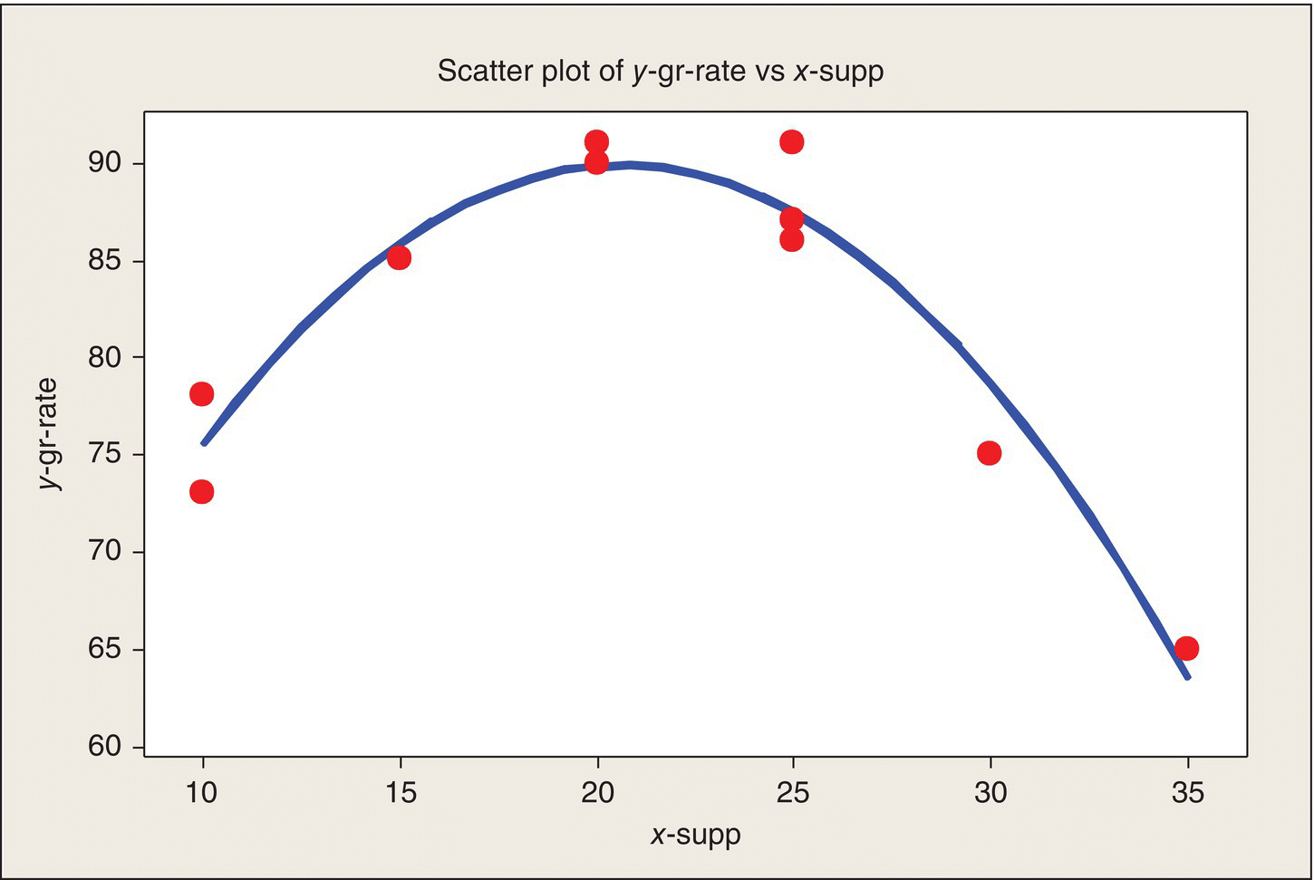
Figure 4.5 Data Plot and Fitted Model.
Analysis of variance
The quadratic model leads to its own ANOVA table: Table 4.6. Let’s discuss the entries in this ANOVA table.
Table 4.6 ANOVA for Quadratic Model.
| Source | DF | SS | MS | F | P |
| Regression | 2 | 665.7 | 332.9 | 51.6 | .000 |
| Residual error | 7 | 45.2 | 6.46 | ||
| Lack of fit | 3 | 18.2 | 6.06 | .90 | .52 |
| Pure error | 4 | 27.0 | 6.75 | ||
| Total | 9 | 710.9 | |||
The first line in the ANOVA, Regression, represents the variation accounted for by the two variables, x and x2, in the regression model. That is why there are two df associated with the Regression SS.
The Total SS is the sum of squared deviations of the 10 observations from the overall mean (the numerator of s2 calculated from all the data). It has 9 df (= n − 1) and the third coefficient in the model, the constant, α, is accounted for in this SS, as is reflected in the df.
Residual Error is the remaining variation: the difference between the Total SS and the Regression SS. The Residual Error SS is the sum of the squared differences between the observed growth rates and the fitted growth rates based on the model. This is the quantity that was minimized by the least squares fitting method. The Residual Error has seven df. The intuition for this is that we started with 10 data points. We fitted a model with three constants in it that were estimated from the data. Thus, the unexplained or residual variation has 7 df associated with it.
The ANOVA in Table 4.6 goes further. In the two indented lines of the ANOVA following the Residual SS, the Residual SS is partitioned into Lack of Fit and Pure Error. We can do this separation because of the replication in the experiment. As can be seen in Figure 4.4, this experiment had multiple experimental units (rats) at some of the x-values. At two x’s, there were two replications; at one, there were three. The variability within these three small groups, pooled together, provide the Pure Error SS, which has 4 df associated with it: 1 df from each group of two eus and 2 df from the group of three eus pooled together, just as the within-groups variability was pooled together in the CRD ANOVA for a qualitative factor. What’s left, by subtraction, is called Lack of Fit. If the quadratic model was not adequate, the Lack of Fit MS would be large relative to the Pure Error MS. If the fit is adequate, these two MS’s are independent estimates of the residual variance, σ2. The F-ratio of these two MS’s thus tells us how well the selected model fits the data. In the case of the growth rate data, F = .90, on 3 and 4 df, and the P-value of .52 is large; it shows that the F we got is right in the middle of the distribution of Fs we might have gotten if there is no lack of fit relative to the fitted quadratic model. The two MS’s are nearly equal. There is no evidence against the quadratic relationship for these data, as we could see in Figure 4.4. If that had not been the case, we would have had to try another model.
One benefit of having a mathematical function that relates growth rate to amount of supplement is that we can use the fitted function to predict growth rates at values of x where we have no data. Also, we can work the following problem.
Suppose you’re the producer of the rat diet supplement (hey, somebody’s got to do it) and need to tell customers what amount of supplement is needed to achieve certain growth rates. For example, if the target is a growth rate of 80 or more, you can draw a horizontal line at y = 80 and then read down from the fitted model to the corresponding x interval. Doing this determination in Figure 4.4 leads to the finding that a supplement level between, roughly, 12 and 30 g will meet this goal. This analysis could be refined to include the imprecision with which the curve is estimated. Statistical software makes it possible to obtain confidence intervals and prediction intervals at any x-value. Figure 4.6 shows what are called “point-wise” 95% confidence intervals on the underlying average growth rate as a function of x. For example, at x = 20, the conclusion is that with 95% confidence, the underlying average growth rate of rats fed this amount of supplement is between 87 and 92 g.

Figure 4.6 Fitted Model with 95% Confidence Intervals on the Underlying Expected Growth Rate as a Function of Amount of Supplement.
If you read down from where the lower confidence limit intersects the line at a growth rate of 80, the approximate x interval that will achieve this is roughly from 14 to 28 g. So, being conservative, one might recommend supplement amounts in this tighter interval (relative to that obtained from the fitted model) to achieve a growth rate of at least 80.
Design Issues
You may have noticed that I did not recount or make up a story about how this rat growth rate experiment came to be designed as it was. I succumbed to the statistician’s innate enthusiasm for data analysis and plunged right in. Let us now take a belated look at the design considerations. The situation is to design a CRD experiment for the case of one quantitative treatment factor.
The design issues, mentioned previously (p. 107), are:
- What levels of x to choose?
- How many replicates should be assigned to each level?
The starting point would be to determine the range of x. Here, the experimenter determined that the amount of supplement fed to rats, per feeding, I presume, would be from 10 to 35 g (.35 to 1.2 ounces). BHH (2005) state that “From similar investigations it was believed that over the range tested the response would be approximately linear.” Boy, were they (the investigators) in for a surprise!
If it was assumed that the response was a linear function of x, theory tells us that the statistically “optimum” design would have been to feed half of the rats 10 g, the other half 35 g. That is, under the assumption of a straight-line relationship, over the x interval considered, this design provides the most precise estimates of the slope and intercept. (Intuitively, under the straight-line assumption, you would devote your data to pinning down the two end points and then drawing the connecting line.) With a two-level design, though, there is no way to verify or test the linearity assumption. We can see from the previous plots of the data if we experimented at only x = 10 and 35 g, we would get a very different curve fit: a straight line with a downward slope. We would completely miss the peak in between. We would wrongly conclude that maximum growth is attained at 10 g and more supplement would actually slow growth.
Fortunately, the investigators were working with an applied statistician, rather than a theoretical one, in designing the experiment. He or she cautioned, “You really should run some intermediate points just to be able to detect a departure from the linear relationship you expect. In my experience, nature can sometimes throw you a curve (heh).”
After some further discussion, it was decided to run the experiment at 5 g increments from 10 to 35 g and to devote 10 rats to the experiment. Fortunately, that allowed for some replication in the experiment from which experimental error variation could be estimated and used to assess the goodness of fit for the final model. The pattern of replications is a little unusual—due to the untimely death of some experimental units?—but the experiment still provided a useful model. One can see in Figure 4.6 that the confidence limits are wider at the right end of the curve than at the left end, because of the differences in replication. A follow-up experiment over the range of 15–25 g might be useful in estimating the level of x that maximizes rat growth with more precision than this experiment provided. For a real experiment pertaining to rat diets, see Vento et al. (2008).
Enhanced Case Study: Power Window Gear Teeth
The data in this example are from an article by Gunter (1988) and later appeared in the text by Wild and Seber (2000). The following story is my dramatization of the episode. Any resemblance to real events and people is purely accidental.
Once upon a time, way back in the 1980s, an American car manufacturer encountered a problem with a plastic gear in the power window mechanism: teeth were breaking and jamming the window. Warranty claims and angry letters rolled in to Detroit. Either the gear teeth did not have the strength they were required to have or the stresses to which the gears were subjected were greater than had been designed for. A crisis team was assembled to find and fix the problem. “We need data!” someone cried. Data were needed on gear tooth strength in order to identify and then resolve the problem. The plan was to grab a bunch of gears, then test them to determine the stress at which they would break. Those data could identify whether the spec was wrong or if the gears were not meeting the spec. Gears can be tested by putting a gear in a fixture with one tooth held in place, then torqueing the gear until the tooth breaks. The stress at which the tooth breaks is the recorded response. Because the gear is damaged, or effectively destroyed, only one tooth on a gear could be tested to failure.

At first glance, at least to the layperson, a gear, as in the above clip art, looks to be symmetric, front and back and around its circumference—there are no identifying features that distinguish the gear teeth, 12 in this case, on a gear. Those who know the manufacturing process, which is injection molding, know, however, that there is a small dimple at the point at which powder, say, is injected into a mold. This “injection port” is on the end of one of the teeth, so this dimpled tooth provides a reference point on the gear. It was important to have this reference point because someone on the team with knowledge of the manufacturing process must have said, “Breaking strength might be related to tooth position. We need to keep track of the position of each tooth we test and we need to be sure that we test an adequate number of teeth at each position in order to have enough data to see if tooth strength is related to position.” This subject-matter knowledge was the key ingredient in the experiment and led to resolution of the problem.
The project team adopted the following tooth numbering scheme: the gear is oriented with the injection dimple at the bottom. Then the teeth are numbered clockwise from the top tooth, which is designated position 1. Thus, the tooth at the injection point is in position 7. These gears are symmetric, front to back, so you cannot tell, for example, whether a tooth immediately adjacent to position 1 is position 2 or position 12. Thus, strength measurements of a tooth adjacent to position 1 can only be identified as position 2 or 12. Similarly, the other teeth can be paired according to their position relative to position 1.
Details of this experiment are not available, but we will suppose it was carried out as a CRD: each of the available gears was randomly assigned to be tested (broken) at one of the seven positions. That is, treatment t in this experiment was to destructively test the tooth in position t, for t running from 1 to 7 (recognizing that position pairs 2 and 12, 3 and 11, etc., cannot be distinguished). As will be seen in Table 4.7, the number of teeth tested varies considerably among positions—from 9 to 33. Whether that was planned or just happened is not known. If a statistician had been on the team to begin with, he or she might have insisted on better balance. The best precision for comparing tooth positions is obtained by having an equal number of tests at each position. Balance, though, is not required for the analysis of data from the CRD.
| Position 1 | Positions 2 and 12 | Positions 3 and 11 | Positions 4 and 10 | Positions 5 and 9 | Positions 6 and 8 | Position 7 |
| 1976 | 2425 | 2228 | 2186 | 2228 | 2431 | 2287 |
| 1916 | 2000 | 2347 | 2521 | 2180 | 2250 | 2275 |
| 2090 | 2251 | 2251 | 2156 | 2114 | 2311 | 1946 |
| 2000 | 2096 | 2222 | 2216 | 2365 | 2210 | 2150 |
| 2323 | 2132 | 1940 | 2593 | 2299 | 2329 | 2228 |
| 1904 | 1964 | 1904 | 2204 | 2072 | 2263 | 1695 |
| 2048 | 1750 | 1820 | 2228 | 2323 | 2353 | 2000 |
| 2222 | 2018 | 2012 | 2198 | 2449 | 2251 | 2006 |
| 2048 | 1766 | 2204 | 2150 | 2300 | 2275 | 1945 |
| 2174 | 2144 | 2311 | 2078 | 1958 | 2006 | |
| 1976 | 2305 | 2102 | 2150 | 2185 | 2209 | |
| 2138 | 2042 | 2138 | 2377 | 2216 | ||
| 2455 | 2120 | 1982 | 2108 | 1934 | ||
| 1886 | 2419 | 2042 | 2257 | 1904 | ||
| 2246 | 2162 | 2030 | 2383 | 1958 | ||
| 2287 | 2251 | 2216 | 2323 | 1964 | ||
| 2030 | 2222 | 2305 | 2246 | 2066 | ||
| 2210 | 2204 | 2251 | 2222 | |||
| 2084 | 2198 | 2156 | 2066 | |||
| 2383 | 2204 | 2419 | 1964 | |||
| 2132 | 2162 | 2329 | 2150 | |||
| 2210 | 2120 | 2198 | 2114 | |||
| 2222 | 2108 | 2269 | 2125 | |||
| 1766 | 2030 | 2287 | 2210 | |||
| 2078 | 2180 | 2330 | 1588 | |||
| 1994 | 2251 | 2329 | 2234 | |||
| 2198 | 2210 | 2228 | 2210 | |||
| 2162 | 2216 | 2156 | ||||
| 1874 | 2168 | 2204 | ||||
| 2132 | 2210 | 1641 | ||||
| 2108 | 2341 | 2263 | ||||
| 1892 | 2000 | 2120 | ||||
| 1671 | 2132 | 2156 | ||||

|
||||||
a Source: reproduced with the permission of John Wiley & Sons from Wild and Seber (2000, p. 119).
Table 4.7 provides the data. The tooth breaking strength is called “impact strength” and is measured in foot-pounds of torque. The table shows that the measurements were identified by position or position pair: position 1, 2–12, 3–11, etc. To start to identify and understand any impact strength patterns among tooth positions, let us do Analysis 1: Plot the data!
Graphical display
There are several ways to plot the data in order to compare the impact strength distributions across positions, including the individual value plots used earlier. Figure 4.7 is a Minitab “box and whisker plot” of the data. The boxes cover the middle 50% of the data at each position, and the whiskers are calculated to cover approximately 95% of the data in each group. Data points beyond the whiskers are shown as asterisks. Also shown, to help provide focus, are the average impact strengths at each position and a line connecting these averages. The most notable pattern in the data is that it appears that average impact strength increases in going from position 2–12 to position 6–8. That is, as you can see in Figure 4.7, for these circumferential positions, impact strength decreases as the distance from the injection point increases. The impact strengths at the injection point and directly across, positions 7 and 1, both have relatively lower impact strengths and look similar to each other.

Figure 4.7 Box and Whisker Plot of Impact Strength Data.
To show the tooth-strength pattern even more clearly relative to the gear, the average impact strengths were plotted on a schematic of the gear: Figure 4.8.

Figure 4.8 Average Impact Strengths by Position.
After seeing these data, my imagined scenario is that the injection-molding specialist on the team clapped himself on the forehead and exclaimed something like, “I know what’s going on. Our supplier is shorting us! They’re not injecting enough powder so we’re not getting the material density we need consistently throughout the mold.” (If the team had not thought of identifying the data by tooth position, they would have missed the whole story!) At this point, the statistician who has been brought in to analyze (or autopsy) the data, says, “I see the pattern you’re talking about, but there’s quite a bit of strength variability within tooth-positions as well as across different positions. Let me do a bit of analysis to see whether the apparent differences could be just due to random variation among gears.” She soon reports back that the pattern is real (if pressed, she can even present the ANOVA and explain a P-value). The team reports to the vice president in charge and recommends coming down hard on the supplier.

At this point, it gets ugly. The VP says, “How come you and the supplier haven’t been monitoring this process? How come you didn’t catch this problem before it became a major field problem? That’s your job. You didn’t do it. In the words of Donald Trump, ‘You’re Fired’—all except the statistician, Mary—Is that your name? Mary, I want you to talk to the Executive Committee about how we could better monitor and improve the processes we’re responsible for and how many statisticians we should hire to help us do it right,” (I am making this up.)
ANOVA
Mary did an ANOVA, the results are shown in Table 4.8. The F-ratio for evaluating the variation among positions is 6.86, on 6 and 156 df, with a resulting P-value less than .001. It is quite unlikely to get the sort of differences among tooth positions seen here, just by chance.
Table 4.8 ANOVA of Gear Teeth Impact Strength Data.
| Source | DF | SS | MS | F | P |
| Factor | 6 | 975 056 | 162 509 | 6.86 | .000 |
| Error | 156 | 369 4221 | 23 681 | ||
| Total | 162 | 4 669 278 | |||
| S = 153.9 | |||||
| Individual 95% CIs for mean based on pooled StDev | |||||
| Level | N | Mean | StDev | --------+---------+---------+---------+- | |
| P1 | 33 | 2085.9 | 172.6 | (----*---) | |
| P2-12 | 9 | 2044.7 | 215.4 | (-------*--------) | |
| P3-11 | 17 | 2152.5 | 162.0 | (-----*------) | |
| P4-10 | 33 | 2191.3 | 126.7 | (----*---) | |
| P5-9 | 27 | 2261.0 | 102.9 | (---*----) | |
| P6-8 | 11 | 2256.0 | 120.3 | (-------*-------) | |
| P7 | 33 | 2067.0 | 178.2 | (---*----) | |
| -------+---------+---------+---------+- | |||||
| 2040 2160 2280 2400 | |||||
| Pooled StDev = 153.9 | |||||
Our previous plots of the data tell us about the trend around the perimeter of the gear. Minitab shows us 95% confidence intervals for each underlying mean by position and shows us the separation: the confidence intervals for positions 4–10, 5–9, and 6–8 are all above and not overlapping the confidence intervals for positions 1 and 7, while the means for positions 2–12 and 3–11 are intermediate between these two groups.
Discussion
The ANOVA told us that the tooth strengths observed in our test data differ among tooth positions by more than could be due just to chance. We don’t know enough about the gears in our test—their pedigrees—to know that they adequately represent the gears that have been installed in cars and that have subsequently broken. It’s possible that the injection problem has been present through all of the production or it might just have been associated with a few production runs. There is a need for further investigations to pin down the extent of the problem. This is why you see recall notices for certain cars and car models and production periods.
The preceding analysis treated the tooth positions as qualitative levels of the treatment: position. From the schematic, though, we see that we could represent these positions quantitatively. For example, x could be the distance from the injection point to the base of each tooth. Or x could be the angle formed between the radii for each tooth versus tooth 7. There might be physics flow models that suggest particular mathematical functions. That’s an area for further research. If indeed the problem is one of powder-volume control—tooth strengths around the gear depend on how much powder is injected into the mold—then we might want to run some other experiments with injection volume as a quantitative factor of interest. We might want to include other process variables, such as the time and temperature settings for the molding process, in those experiments. More work for Mary and the company’s statisticians. Rather than a blame game, one would hope that the manufacturer’s personnel would work harmoniously with the supplier’s personnel to understand the production process and establish appropriate controls to assure that reliable product is produced—and live happily ever after.
Assignment
Choose a topic of interest to you and identify issues to investigate with two experiments.
- Design a completely randomized experiment to compare at least three levels of a qualitative treatment factor. Describe the design in detail: experimental units, treatments, response measurement, experimental protocol, and issues to be addressed. Describe your anticipated data plots and analyses.
- Design a completely randomized experiment to investigate the effect of a single quantitative treatment factor. Describe the design in detail: experimental units, treatments, response measurement, experimental protocol, and issues to be addressed. Describe your anticipated data plots and analyses.
References
- Box, G., Hunter, W. G., and Hunter, J. S. (1978, 2005) Statistics for Experimenters, 1st and 2nd eds., John Wiley & Sons, New York.
- Gunter, B. (1988) Subversive Data Analysis, Part II: More Graphics, Including My Favorite Example, Quality Progress, 21, 77–78.
- Ledolter, J., and Swersey, A. (2007) Testing 1-2-3, Stanford University Press, Stanford, CA.
- Meeker, W., and Hahn, G. (1991) Statistical Intervals: A Guide for Practitioners, John Wiley & Sons, Inc., New York.
- NIST/SEMATECH (2010) e-Handbook of Statistical Methods, http://www.itl.nist.gov/div898/handbook/2010.
- Simon, J. (1997) Resampling: The New Statistics, http://www.statistics101.net/index.htm.
- Vento, P., Swartz, M. E., Martin, L. B., and Daniels, D. (2008) Food Intake in Laboratory Rats Provided Standard and Fenbendazole-supplemented Diets, Journal of the American Association for Laboratory Animal Science, 47(6), 46–50.
- Wild, C., and Seber, G. (2000) Chance Encounters, John Wiley & Sons, Inc., New York.