3
Fundamentals of Statistical Data Analysis
Introduction
Once an experiment has been conducted and the data collected, the next task is to extract and communicate the information contained in the data (as depicted in the cloud cartoon; Fig. 1.1). The structure of an experiment dictates, to a large extent, the nature of the statistical data analysis to be carried out. (Indeed, careful planning of an experiment includes the anticipated analyses and even anticipated results.) In the remaining chapters in this book, detailed statistical data analyses will be discussed and illustrated in conjunction with the different experimental designs addressed. Some general principles and basic analyses, though, are set forth in this chapter and illustrated with simple two-treatment experiments. Two types of intertwined analysis are discussed—graphical and quantitative. My general approach is as follows:
Analysis 1. Plot the data! An analysis will often cycle between plots and calculations related to the plots as the message in the data is extracted and communicated.
Analysis 2. Do appropriate number crunching to characterize patterns seen in data plots, to separate and measure what is real from what could just be random variation, and to point the way to further data displays and analyses.

The two experiments addressed in some detail in this chapter are from the classic experimental design text, Box, Hunter, and Hunter (1978, 2005). The first, an experiment on the wear of boys’ shoes, was introduced in the preceding chapter. In this chapter, we continue that story through several layers of analyses and issues. The story gets a little lengthy, but it illustrates that there can be several legitimate ways to extract and communicate information from that data cloud.
Next, we take up the story of a gardener’s experiment that compares two tomato fertilizers. We also address what happens after the analysis: business decisions and consequences. Both of these examples are very simple experiments, but they illuminate fundamental issues and concepts that come into play in all experimental contexts.
Boys’ Shoes Experiment
Experimental design
Consider again the boys’ shoes experiment introduced in Chapter 2. The data from that BHH experiment are given in Table 3.1. Recall that each of 10 boys in the experiment wore one shoe of each sole material, A or B, randomly assigned to the left and right feet. They wore the shoes for some period of time after which the percent wear was measured. Thus, and this is important, each measured response, the percent wear on a shoe sole, is associated with a boy, a foot, and a material. This association is shown in Table 3.1.
Table 3.1 Boys’ Shoes Example: Percent Wear for Soles of Materials A and B; Material A on the Indicated Foot.
Source: Box, Hunter, and Hunter (2005, p. 81); reproduced with permission from John Wiley & Sons.
| Boy | A-Foot | A | B |
| 1 | L | 13.2 | 14.0 |
| 2 | L | 8.2 | 8.8 |
| 3 | R | 10.9 | 11.2 |
| 4 | L | 14.3 | 14.2 |
| 5 | R | 10.7 | 11.8 |
| 6 | L | 6.6 | 6.4 |
| 7 | L | 9.5 | 9.8 |
| 8 | L | 10.8 | 11.3 |
| 9 | R | 8.8 | 9.3 |
| 10 | L | 13.3 | 13.6 |
The reason for pointing out the association is that any data plot (Analysis 1) should initially reflect this association—in all its dimensions, if possible. If, however, the data show no evidence of a particular association, then subsequent displays need not maintain the linkage. In the shoe experiment, the assignment of materials to feet was done by flipping a coin, with the result that seven boys wore material A on the left foot and three wore B, as is also shown in Table 3.1.
Here’s a design issue right off: an alternative experimental design would have balanced the left/right (L/R) assignments—five randomly selected boys would have been assigned material A to their left feet, and the other five would have B on their left feet. If the experimenters had thought the L/R choice might have an appreciable effect, they might have incorporated such a balancing constraint in the design (it can be shown mathematically that equal replication maximizes the precision with which any L/R difference can be estimated). The experimenters (relying on subject-matter expertise—knowledge that both feet must experience very similar conditions) may not have expected a bias toward one foot or the other and so did not balance the L/R assignments, but because they took the precaution of recording the assignments, we can check that possibility.
(Though not given in the example, for a carefully carried out experiment, one might expect or hope that other, “ancillary,” data pertaining to the boys would have been obtained, such as age, weight, and the number of days the shoes were worn. The analysis would also look for relationships between these variables and shoe wear.)
Graphical displays
There are several ways to display the shoe-wear data. Because there is a pair of data for each boy, one appropriate plot is a scatter plot (an “XY (Scatter)” plot in Excel terminology, “Scatterplot” in Minitab) of the data pairs. Figure 3.1 shows a scatter plot of the B-material wear (Y axis) versus the A-material wear (X axis), for the 10 boys, with separate plotting symbols used for the foot on which the material A shoe was worn. If it was important to know which point corresponded with which boy, the points could have been labeled with the boy number. Figure 3.1 also shows an overlay of the equal-wear (45°) line. This line facilitates the visual comparison of shoe sole materials. Points above the line are cases for which there was more wear on the B-material sole than on the A-material sole and vice versa for points below the line.

Figure 3.1 Scatter Plot of B-Material Wear versus A-Material Wear; separate plotting symbols for the left and right foot assignments of material A.
From Figure 3.1, it is fairly clear that material A generally wore better (less thickness loss) than B in this experiment: in eight of the 10 cases, there was less wear with A than with B (the points above the diagonal line). In the two situations in which B wore less than A, the difference was comparatively small—these two points being quite close to the diagonal line. Furthermore, there is no evident separation of the three “A-right” points and the seven “A-left” points, so the expectation that there would be no foot bias is supported by the data. Subsequent plots will therefore not maintain the L/R distinction.
Although the data favor material A, the differences appear to be small, especially in comparison with the variation among boys. The wear percentages range from about 6 to 14% across the 10 boys, but the A–B differences, as can be seen from Table 3.1, are generally less than a percentage point. The important questions of whether the wear differences are statistically or practically or economically significant will be addressed later in this analysis.
Two other plots make it easier to see the differences between A and B for the 10 boys (compared to reading the distances of the points in Fig. 3.1 from the diagonal line). One is a scatter plot of the A and B wear percents versus boy number, shown in Figure 3.2. Now, there is no intrinsic ordering of boys—it could have been alphabetical ordering, or by the date they turned in their shoes, or completely haphazard. So, the purpose of the plot is not to look for a relationship between shoe wear and boy number. The purpose is to facilitate the comparison of materials A and B across the 10 boys. (Note that if the boys had been characterized by variables such as age, weight, or number of days the shoes were worn, then it would have been meaningful, and maybe informative, to have plotted the A and B wear data vs. such variables.)

Figure 3.2 Wear % by Material and Boy.
Figure 3.2 shows clearly that A “won” eight of the 10 comparisons (less wear! more often!) and that in the two cases in which B won (boys 4 and 6), the difference was quite small in comparison with A’s winning margins. Details are still to come, but the thoughtful reader may have some intuition that the probability, say, of getting as many as eight heads (wins for A) in 10 fair tosses (boys) of a fair coin is fairly small, so, by comparison, the fact that A won eight of 10 comparisons is at least a hint that the material difference is “real,” not just random.
One other plot that can be used to show these data is a line plot. This plot (Fig. 3.3) is simply a collection of lines connecting the A and B wear data for each boy separately. We see that eight of 10 of the lines slope upward, again indicating more (worse) wear for B than A in eight of the 10 cases, while two lines have slightly negative slopes, reflecting the two cases in which B had less wear than A. The line plot is useful for a small number of comparisons, but if we had many more than 10 cases, the plot would become unreadable.

Figure 3.3 Line Plot of Wear Data for Materials A and B.
Figure 3.3 also shows quite markedly again the substantial differences among boys. The amount of sole wear ranged roughly from 6 to 14%. A shoe manufacturer is probably more interested in extremes than in average wear. If the company conducting this experiment could identify the factors leading to relatively high sole wear, say, physical characteristics of the boys or their activities, they might be able to design a more robust shoe and expand their market. Or they could print a warning on the box: Your Momma says, “Pick your feet up!” Figure 3.3 also shows the close association between shoe sole wear on a boy’s two feet. The differences between feet are small relative to the differences among boys. Everywhere one foot goes the other goes, too.
Significance testing
Displays of the data from the shoe experiment (Figs. 3.1–3.3) showed that sole material A, the currently used material, tended to wear better than the cheap potential substitute, material B. The differences varied, though, among the 10 boys, which is not surprising: shoe sole manufacturing and, especially, shoe wear are not perfectly repeatable or perfectly measured processes. There is bound to be some inherent variability of wear, even if the two shoes worn by a boy both had the same sole material and even if the two shoes traveled the same terrain. The question to be addressed is: Even in light of this inherent process and product variability, is there evidence that one material is better than the other? And if so, how much better?
Statistical methods address these questions by making comparisons:
We compare the “data we got” to a probability distribution of “data we might have gotten” (under specific assumptions).
This comparison is the basic idea of statistical “significance testing.” To develop this technique, the concept of a “probability distribution of data we might have gotten” needs to be explained. This requires a discussion of probability. Probability provides the framework against which an experiment’s data can be evaluated.
Probability and probability distributions
It is natural to think of probability in terms of games of chance. In a single fair toss of a fair coin, there are a probability of .5 that the result is a head and, consequently, a probability of .5 that the result is a tail (a 50–50 chance in common lingo). In lotteries, assuming a fair physical or computerized method of generating random numbers, the probability of a winning combination of numbers can be calculated (by the number of combinations that are winners divided by the total number of possible combinations). What the term probability means is that if, say, coin tossing was repeated an infinite number of times, a head would occur in half of the trials. Further, the sequence of heads and tails would be “random”; each outcome is independent of all the others. In the other example, the lottery would be won in the calculated fraction of a conceptual infinite replay of the lottery.
What, though, can we expect in a limited number of trials, say, 10? If a fair coin is fairly tossed 10 times, the 11 possible outcomes range from 10 heads and zero tails to zero heads and 10 tails. Intuitively, we know that some outcomes, such as 5 heads and 5 tails, are more likely (or probable) than other outcomes in that they would occur more often in repeated sets of 10 tosses than the extreme results of 10 heads or 10 tails. Probability theory supports and quantifies this intuition. Numerous science fair projects have tested the underlying theory.
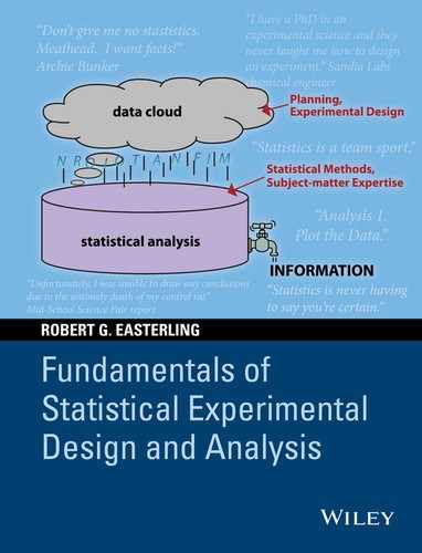
Probability theory tells us the following: under the assumption of n “independent trials,” each with probability p of a particular outcome, the probability of observing exactly x of these outcomes is given by what is called the binomial probability distribution (Wikipedia 2014a and numerous statistical texts). (Independent trials mean that the outcome of one trial does not affect the outcome of other trials.) This probability distribution is a mathematical function that gives the probability of all of the possible outcomes, x = 0, 1, 2, …, n − 1, n. The mathematical expression for the binomial probability distribution is given in many statistical texts, and the distribution is available in spreadsheet software such as Excel and in statistical packages such as Minitab. Appendix 3.A to this chapter gives the formula for the binomial distribution and discusses statistical aspects of the distribution. For our present purposes, we will rely on software and forego the mathematics. Trust us.
For the fair coin-tossing case of n = 10 and p = .5, the binomial probability distribution of the number of heads is tabulated and plotted in Figure 3.4. Figure 3.4 shows that the probability of all heads (or all tails) is .001 (actually .510 = 1/1024 = .00098). The most likely outcome, 5 heads and 5 tails, has a probability of almost 25%. This means that if a fair coin was fairly flipped 10 times, over and over, the proportion of cases in which five heads and five tails would result is .246. Other outcomes have lower probabilities that decrease as possible outcomes differ more and more from the most likely outcome of five heads and five tails. The probabilities of the 11 possible outcomes sum to 1.0. (It is a property of probability distributions that the sum of the probabilities for all possible outcomes must equal 1.0.) Note also that this distribution is symmetric: the probability of, say, 3 heads and 7 tails is the same as the probability of 7 heads and 3 tails, namely, .117. For a biased coin, in which case the probability of a head on a single toss is not .5, the distribution would not be symmetric.

Figure 3.4 Binomial Distribution. B(x:10, .5) denotes the probability of x heads in 10 fair tosses of a fair coin.
Sign test
Why do we care about this particular binomial distribution? Our interest is comparing shoe sole materials, not flipping coins. Well, if there really is NO difference between materials, the outcome, “A wears less than B,” would be expected to occur half the time, like the heads outcome for a fair coin toss. In this case, the wear test results for 10 boys would then be analogous to, or comparable to, 10 fair tosses of a fair coin. To evaluate the viability of the “hypothesis” of no difference between materials, it is thus appropriate to compare the experimental outcome (“the data we got”), namely, that eight of 10 cases had the result, A wears less than B, to the “probability distribution of data we might have gotten under the assumption of no real difference in materials.” This distribution is the binomial probability distribution with p = .5 portrayed in Figure 3.4.
Figure 3.5 shows the comparison. In statistical terminology, the binomial distribution to which the experimental outcome is compared is called the “reference distribution.” We “refer” the data (we got) to this probability distribution (of data we might have gotten) to evaluate the degree of agreement of the data with the situation of no real difference between materials.
Figure 3.5 Comparison of Shoe Experiment Results to the Binomial Distribution for n = 10, p = .5.
The message from the comparison in Figure 3.5 is that the outcome, A wins eight times in 10 trials, is fairly unlikely, just by chance, if there was no underlying difference between A and B. In particular, the probability of that particular outcome is only .044.
So, have we proved that A is better than B, beyond a reasonable doubt, as is required in jury trials? No, not at all. The evidence supporting that claim is strong, but not absolute. If A had won nine of the comparisons, the evidence would be stronger; if A had won all 10 comparisons, we would still not be absolutely certain that A was better—just by chance there is still a .001 probability of that extreme result just by chance. This is the sort of uncertainty we have to cope with in interpreting experimental data and making decisions based on the data and our subject-matter knowledge (statistics means never having to say you’re certain). In spite of this uncertainty, we are obviously more informed having done the experiment than if we had not.
Figure 3.5 shows the comparison of data we got to the distribution of data we might have gotten. The picture tells the story. The picture is a little indefinite, with respect to an unequivocal decision about the equality of the materials, but that’s because of the limited amount of data available to test the hypothesis of equality. As shown in the following subsections, by other analyses, we can sharpen the comparison substantially, but not eliminate all uncertainty.
Graphical comparisons of the data we got to a reference distribution of data we might have gotten can become a little unwieldy and take up too much space in a report or text. Statistical convention is to summarize this picture by a number called the “P-value.” The P-value tells the reader how far out on one tail or the other of the reference distribution that the data we got fall. (Most distributions we deal with, such as the upcoming “bell-shaped curve” and the Normal distribution, are shaped so that the occurrence probability of possible outcomes decreases in the tails of the distribution.) More technically:
- The P-value equals the probability of an outcome that disagrees with the hypothesis, or assumption, used to construct the reference distribution, by as much as or more than the observed data do.
In our case, the outcomes that define the P-value are the cases when A wins 8, 9, or 10 of the comparisons. The outcome of 8 wins for A is what was observed; 9 and 10 are the other outcomes that define the upper tail: more decisive wins for A. Thus, the probability of these outcomes, by Figure 3.8, is P = .044 + .010 + .001 = .055. Because we considered only those cases for eight or more wins by A, which corresponds to the upper tail of the probability distribution in Figure 3.8, this would be called an upper one-tail P-value. The P-value tells us that the data we got correspond to the outcome that defines the upper .055 (or 5.5%) tail of its reference distribution. That is, reporting that the upper-tail P-value is .055, in this case, is numerical shorthand for the picture showing that the data we got fell at the .055 point of the upper tail of its reference distribution of possible data, calculated under the assumption of no real difference between the two materials.
In this situation, subject-matter knowledge (presumably) tells us that A should wear better than the cheaper material, B. That’s why B is cheaper. So, it is appropriate to focus our interest and analysis on the cases in which A won eight cases or more—the upper tail of the reference distribution. (If A had won only two of the 10 comparisons, or fewer, the message would be that B is cheaper and wears better. Changing to B is then a win–win situation.)
The process we have just gone through is called a “significance test” in statistical literature. Because this analysis only considered the direction, or sign (positive or negative) of the A versus B comparisons, the particular test used here is called the “sign test” (Wikipedia 2014b). The reference distribution for the sign test, in this example, is the binomial distribution of positive or negative outcomes, or heads and tails by analogy, for the case of n = 10 and p = .5.
Misinterpretation of P-values
There is a tendency to misinterpret a P-value as the probability, in this example, that the A and B shoe sole materials wear the same. However, “A and B shoe sole materials wear the same” is not a random variable, like the outcome of 10 tosses of a fair coin. This proposition doesn’t have a probability distribution, so you cannot make probability statements about it.
The P-value is simply a numerical summary of the comparison of the data we got (8 wins out of 10 trials for A) to the binomial distribution of data we might have gotten, if the proposition of no difference was true, in which case that distribution is the binomial distribution with p = .5. The P-value summarizes that comparison by telling us how far out on the tail of that distribution that the experiment’s outcome fell. The smaller the P-value, the sharper the level of disagreement between the data we got and the distribution of data we might have gotten.
As will be seen in the following sections, there can be more than one way to summarize the data we got and make the comparison to data we might have gotten, under the situation in which A and B wear the same.
Also, a P-value does not tell one anything about the magnitude of the effect that is being estimated from the data. For example, the small P-value for the boys’ shoes sign test does not indicate how much difference there is between the underlying probability that A wears better than B and the hypothesized value of p = .5. Statistically significant and practically meaningful are not the same thing. P-values have been a subject of much discussion in the scientific literature. For a good summary of the issues, see Nuzzo (2014).
Randomization test
The sign test we just carried out was based on considering only the sign of the B–A differences, case by case. In eight of the 10 cases, that difference was positive; B wore more than A. Summarizing the data in this way ignores the sizes of the differences in wear percentages. A large difference is not distinguished from a small difference with the same sign. The magnitudes of the differences tell us more about the A versus B difference. As we saw in the data plots, material A generally won by a larger margin in its eight wins than B did in its two wins. We can make a more sensitive comparison of the two materials if we consider the sizes of the differences. Size matters.
Think again about the hypothesis (assumption) of no real difference between the two materials. If that assumption is true, then the observed differences just reflect the random outcomes of assigning A and B to left and right feet. Boy 1 had A on his left foot and recorded 13.2% wear for A and 14.0% for B on his right foot. If the randomization had put B on his left foot, then, assuming no difference between materials, boy 1’s data would have been 14.0% for A and 13.2% for B. That is, his observed B–A difference in wear could have been either .8 or −.8%, each with probability .5. Similarly, for the rest of the 10 boys, each of their B–A differences would have been changed in sign if the foot assignment had been reversed. There are thus 210 = 1024 possible (and equally likely) outcomes for the signed differences between B and A under the assumption of no real difference between materials.
To compare the data we got to the distribution of data we might have gotten, if there was no difference between materials A and B, we need a summary statistic that reflects the size of the difference. A natural statistic is the average difference. For the observed data, the average difference between the B and A wear percentages (taking B–A) is .41%. We will call this average difference dbar. Now, for each of the 1024 possible A/B foot assignments, we can calculate the resulting d-values and their average, dbar. For example, if all 10 assignments were the opposite of the assignments in this experiment, dbar would equal −.41%. BHH (2005) did the full set of calculations to create the probability distribution of possible dbar’s, compared the “dbar we got” to this reference distribution, and found that only three of the 1024 possible average differences were greater than .41%; four of them were exactly .41%. With a “continuity correction,” they counted half of the latter four outcomes to obtain a (one-tail) P-value of 5/1024 = .005. The picture that this P-value summarizes is a histogram of all 1024 possible dbars, under the assumption of no difference between A and B materials, with the outcome we got, dbar = .41%, corresponding to an upper-tail probability of .005. This P-value is substantially stronger evidence of a real difference than the P-value of .055 for the sign test. This smaller P-value tells us that the data we got are more extreme with respect to the randomization test than they were with respect to the sign test. This smaller P-value means that the evidence against the assumption of no real difference between materials is stronger using the randomization test than it is using the sign test.
This calculation of the randomization test (Wikipedia 2014c) is particularly appropriate when in fact the experiment was conducted by randomly assigning materials to feet, as was the case here. Random assignment of treatments to experimental units establishes the validity of the randomization test. That’s important. It justifies comparing “the data we got” to a reference distribution of “data we might have gotten” based on the assumption of random treatment assignments. Similarly, randomization established the validity of the sign test. The two tests gave different result because two different summary statistics and corresponding reference distributions were used in the analyses.
The small P-value of .005 means that the observed outcome is in the extreme upper tail of the distribution of average differences generated under the assumption (hypothesis) that there is no difference between materials A and B. So, it is quite unusual (though still not impossible) to get a result, just by chance, in which the average B–A difference is as large as or larger than the experiment’s result of dbar = .41%. We have quite strong evidence that there is a real difference, on average, between the sole materials. Whether that average difference is important in selling shoes, the question that motivated this experiment, remains to be determined. We’ll get to it. But first, let’s consider one other approach to choosing the distribution of “data we might have gotten.”
Normal distribution theory t-test
The Normal distribution is a mathematical function that defines a “bell-shaped curve.” This curve, shown in Figure 3.6, is an example of a probability density function. The vertical axis is probability density. The density function has the property that the total area under the curve is 1.0, just as the sum of the probabilities of the eleven discrete outcomes of the binomial distribution in Figure 3.4 is 1.0. (The vertical axis for the other probability density functions illustrated in this text will not be labeled because it is not of intrinsic interest.) The Normal distribution, however, pertains to the distribution of a continuous variable, x. If you draw, or generate, a random value of x from a Normal distribution, the probability that x falls in a particular interval, say, from a to b, is given by the area under the curve between a and b. Software or the use of widely available tables of the Normal distribution can be used to calculate these probabilities.

Figure 3.6 The Standard Normal Distribution. Statistical convention is to denote a variable that has the standard normal distribution by z.
The Normal distribution is a mathematical ideal, but real-world populations may be adequately approximated by it. The more important characteristic, though, for analyzing real-world data is that random samples from a Normal distribution (e.g., computer generated) often look like real data, whether small numbers of observations or large. There are gaps, clusters, apparent outliers, longer tails in one direction or the other, etc. That is, real data we get from experiments and other sources can often look like a “random sample” from a Normal distribution (meaning independent observations generated, e.g., by a computer programmed to do so; see Appendix 3.B for a demonstration of random sampling from a Normal distribution). This is quite fortunate because an awful lot of statistical theory has been built on the model (assumption) of data obtained by random sampling from a Normal distribution. So, random samples from a Normal distribution can serve as a frame of reference and source of reference distributions for the “data we got.”
The Normal distribution, as a mathematical function, is characterized by two parameters—two quantities in the mathematical expression for the distribution. These parameters determine where the curve is centered and how spread out it is. Conventional symbols used for these parameters are μ (mu) for the distribution mean (center) and σ (sigma) for the distribution standard deviation (spread). The standard Normal distribution in Figure 3.6 corresponds to μ = 0 and σ = 1.0. (By way of comparison, the two parameters of the binomial distribution are n and p, and they define a particular binomial distribution and together determine the center and spread and shape of a particular binomial distribution.)
The Normal distribution is symmetric about its center, which is the distribution mean, μ. The Normal distribution also has the properties that 95% of the distribution falls in the interval, μ ± 1.96σ (typically rounded to μ ± 2σ), and 68% of the distribution falls in the interval, μ ± 1.0σ. Thus, the larger σ is, the more spread out the distribution is. As mentioned, software can calculate any probabilities of interest for a Normal distribution, given input values of μ and σ. Textbooks generally have a table of standard Normal distribution probabilities and percentiles. Much more extensive discussions of the Normal distribution can be found in many statistical texts. My focus in this chapter is on how the Normal distribution can help us evaluate the difference between shoe sole materials and, still to come, tomato fertilizers.
Figure 3.7 shows an individual value plot (from Minitab) of the 10 differences—yet another way to display this experiment’s data. As we have noted before, two of the differences are negative; the other eight are positive. The pattern of variability among these 10 data points is not at all unusual when sampling from a Normal distribution (see Appendix 3.A), so to develop a reference distribution based on the Normal distribution model is a reasonable thing to do. (Ties, which are unusual for a continuous variable, result from the resolution of the measurements—rounded to one-tenth of a percent.)

Figure 3.7 Individual Value Plot of Shoe-Wear Differences (%). The average difference is indicated by the blue symbol.
Now, if there is no real difference between materials A and B, the appropriate Normal distribution model for measured differences would have a mean of zero. Thus, to address the question whether it is real or random, we will compare the data in Figure 3.7 to data that could have come from a Normal distribution with a mean of zero (but with unspecified standard deviation).
Eyeball-wise, is it easy to imagine a Normal distribution centered at zero yielding a random sample as off-centered from zero as the data in Figure 3.7? I don’t think so, but that’s a subjective impression based on my vast experience. The following analysis calibrates this visual impression.
As in the previous two analyses (the sign test and the randomization test), the comparison of the data we got to the distribution of data we might have gotten from a Normal distribution will be done using a summary statistic. In this case (theory tells us—Trust me!), the appropriate summary statistic is what statisticians call the t-statistic. This statistic is a function of the sample size, n, the data average, dbar, and s, the standard deviation of the observed differences. The sample standard deviation is equal to

where di represents the ith wear difference, B–A, for the ith boy. For a random sample of data from a Normal distribution, s is an estimate of σ.
In particular, Normal distribution theory tells us that in random sampling from a Normal distribution with mean μ, the statistic
has a known probability distribution, known as the “Student’s t-distribution.” This relationship is what links the data we got to the distribution of data we might have gotten for a particular value of μ. The t-distribution depends only on a parameter called the degrees of freedom (generally abbreviated df) associated with the standard deviation, s, namely, n − 1. That is, the distribution does not depend on the Normal distribution’s unknown mean, μ, or standard deviation, σ. For moderately large n (say, n > 30), the t-distribution is closely approximated by the standard Normal distribution.
The term “degrees of freedom” needs some explanation. The deviation of the ith difference from dbar is di − dbar. The above formula for s involves the sum of the squares of these deviations. A mathematical property of the unsquared deviations is that they sum to zero. This means that if you arbitrarily specified n − 1 of these deviations, the remaining deviation would be determined by subtraction (because the sum of all the deviations has to be zero). Hence, in engineering terminology applied to statistics, there are n − 1 degrees of freedom associated with the standard deviation, s.
If there is no real, underlying, difference between the two materials, then μ = 0. Substituting 0 for μ in the above expression for t leads to the test statistic, ![]() . The distribution of t-values we might have gotten when μ = 0 is the t-distribution with n − 1 degrees of freedom. Thus, calculating the t-statistic based on the data we got and comparing calculated t to the t-distribution with n − 1 df provide another significance test for the comparison of the wear qualities of the two materials.
. The distribution of t-values we might have gotten when μ = 0 is the t-distribution with n − 1 degrees of freedom. Thus, calculating the t-statistic based on the data we got and comparing calculated t to the t-distribution with n − 1 df provide another significance test for the comparison of the wear qualities of the two materials.
For the shoe data,


The t-distribution, more appropriately the family of t-distributions, is widely tabulated and available in software. Figure 3.8 displays the t-distribution with 9 df and shows where our observed t-value of 3.4 falls on this distribution and the corresponding tail probability, the P-value. Under this distribution, the probability of a t-value greater than or equal to 3.4 is .004. This one-tail P-value summarizes the graphical comparison in Figure 3.8 and indicates that the t-value we got is rather unusual if there is no difference between shoe materials. This t-test P-value is quite close to the .005 obtained under the randomization test, which hints at another reason that an analysis based on the Normal distribution can often be used: the t-test based on Normal distribution theory often provides a good approximation to the “exact” randomization test, a test which depended only on the assumption of random assignment of treatments to experimental units. Thus, we can often use the extensive Normal distribution-based analysis methods in place of the less available and sometimes complex randomization analyses.

Figure 3.8 Comparison of the Observed t-Value (3.4) to the t-Distribution with 9 df.
Figure 3.8 and the P-value summarizing that comparison tell us that the evidence is strongly against concluding that the observed (average) difference between materials is purely random. The evidence strongly indicates that the difference is real because it is very rare that a random sample from a Normal distribution with a mean of zero could yield data as far offset from zero as our observed shoe material differences (see Fig. 3.7).
This analysis is known as the “paired t-test analysis,” and it can be carried out by various statistical software packages. Table 3.2 shows the Minitab output for this analysis.
Table 3.2 Minitab Output for Paired t-Test: Boys’ Shoes.
| Paired T for B–A | ||||
| N | Mean | StDev | SE Mean | |
| B | 10 | 11.04 | 2.52 | .796 |
| A | 10 | 10.63 | 2.45 | .775 |
| Difference | 10 | .41 | .387 | .122 |
| 95% CI for mean difference: (.13, .69). | ||||
| t-test of mean difference = 0 (vs. not = 0): t-value = 3.35, P-value = .009. | ||||
Table 3.2 introduces some new terminology: the column labeled SE Mean, which denotes the standard error of the mean, discussed in more detail below and in Appendix 3.B. The mean of interest in this analysis is the average wear difference, dbar = .41. The standard error associated with dbar is simply the denominator of the above t-statistic: ![]() .
.
The ratio of dbar to its standard error is t = .41/.122 = 3.4. The t-value of 3.4 means that the difference between the observed average wear difference of .41% and zero is equal to 3.4 standard errors.
(For reasons to be discussed later, Table 3.2 pertains to the case of a two-tailed significance test: the P-value is the tail above t = 3.4 and below t = −3.4. Thus, the P-value in Table 3.2 is twice the upper-tail P-value, rounded. Minitab’s two-tail analysis also includes a 95% confidence interval on the underlying average difference which will be discussed in the following and used in subsequent analyses.)
Excel’s® analysis of the shoe data is shown in Table 3.3.
Table 3.3 Excel Paired t-Test Analysis of the Boys’ Shoe Data.
| t-Test: Paired Two Samples for Means | ||
| B | A | |
| Mean | 11.04 | 10.63 |
| Variance | 6.34 | 6.01 |
| Observations | 10 | 10 |
| Pearson correlation | .99 | |
| Hypothesized mean diff. | 0 | |
| df | 9 | |
| t Stat | 3.35 | |
| P(T ≤ t) one tail | .004 | |
| P(T ≤ t) two tail | .009 | |
In Table 3.3, Pearson’s correlation is a summary statistic that measures the linear association of the A and B results. Graphically, it measures the linearity of the A–B data scatter plot in Figure 3.1. If the data points fell exactly on a straight line with a positive slope, the correlation coefficient would be 1.0. Perfect linearity with a negative slope would have a correlation coefficient of −1.0.
Summary and discussion: Significance tests
For the boys’ shoes experiment, we have illustrated the process of comparing “the data we got” to the distribution of “data we might have gotten” in three ways—three summary statistics giving rise to three reference distributions.
Sign test
The summary statistic used was the number of boys (eight), out of 10, for which B had more wear than A. The reference distribution was the binomial distribution based on the assumption (hypothesis) that the underlying probability of A winning the wear comparison was p = .5. This comparison is shown in Figure 3.5 and the test’s P-value was .055.
Randomization test
The summary statistic was the average wear difference, B–A, of .41%. The reference distribution was the collection of all 1024 possible average differences corresponding to all possible random assignments of plus or minus signs to the observed 10 differences between left and right shoe wear. BHH generated that distribution and this test’s one-tail P-value was .005.
t-Test
The summary statistic was the t-statistic, calculated under the hypothesis that the underlying mean difference in wear was μ = 0. The reference distribution was the t-distribution with nine degrees of freedom, generated from the assumption of an underlying Normal distribution of wear differences, centered on μ = 0, and the resulting one-tail P-value was .004.
Now, it should not be surprising or a concern that three ways of summarizing the data and creating corresponding reference distributions yield different answers. The messages, though, are all complementary: the experimental data all point to the conclusion that, for different ways of looking at the data, the apparent differences between materials are not just due to chance.
Nor is there any reason to expect or insist that only one answer is “right.” Theory would dictate a best answer only under specific assumptions. If it is assumed that the boys were a random sample from an assumed population and that the wear differences for that population have a Normal distribution, then the t-test is optimum. But, as has been discussed, the boys were likely a “judgment sample,” not a random sample from a defined population. Also, the assumption of Normality, while plausible, is at best an approximation to the ill-defined population’s actual distribution. If it is assumed that the shoe wear on the boys’ left and right feet would have been the same as they were in this experiment, even if the shoe was on the other foot, so to speak, then the randomization test is valid. The sign test rests on the weakest assumptions: nothing is assumed about the magnitude of the shoe-wear percentages; only the A or B winner on each boy is considered. So, this test ignores pertinent information, which is not an optimum thing to do. Nevertheless, the sign test is an easy, readily communicated, first way to look at the data and that is a valuable asset.
One further point is that in all three analyses, the conclusions apply just to the boys in the experiment: the shoe-wear differences among these 10 boys are unusual just due to chance; there must be a real underlying difference and that difference is large enough to stand out from the inherent variability of the experimental units. Any inference that these results apply to the general population of shoe-wearing boys depends on knowledge about these boys relative to that population. That knowledge is subject-matter knowledge, not statistical inference or magic. It is based on the way the boys were selected and what a shoe manufacturing company knows about their shoe-wearing habits relative to those of the general population. This dependence of the experiment’s meaningfulness and utility on subject-matter knowledge puts pressure on the experimental design to assure that the experiment involves meaningful experimental units—both in number and nature—as we discussed in Chapter 2. Good statistics relies on good subject-matter involvement. Understanding this interaction creates buy-in from all involved in planning and conducting experiments, interpreting the results, and acting on the information obtained.
The reader should not despair. This example and its analyses do not support the old saw that “Statisticians can get any answer you want.” Statistics is about dealing with uncertainty. It must be recognized, as just illustrated, that there can generally be more than one way to measure uncertainty. But, nevertheless, we learn from data; we advance the state of knowledge. We have learned that it would be unusual for the observed differences in this experiment to occur “just by chance.” We need to examine the implications of that difference. Should we switch to the cheaper material? Will the customer notice the difference and stop buying our shoes? Is it right to sacrifice quality for profits? These questions, which are much more important than whether we should use a randomization test or a t-test, are addressed in the following.
The data analysis process illustrated here, at some length, is generally called “significance testing” and sometimes “hypothesis testing.” The formal approach to hypothesis testing (well covered in many statistical texts) is to express the problem in terms of decision-making. A “null hypothesis” is stated (such as μ = 0) and, in essence, the decision rule is that if the resulting test statistic falls in a particular region of the reference distribution (generally either one selected tail or two tails) having a specified occurrence probability (often .05), the hypothesis will be rejected. Some regulatory or quality control applications, in which the “false-positive” probability must be controlled, call for this formality. Information-gathering, knowledge-generating experiments have a less prescribed objective. It’s what we learn from the comparisons of data we got to the distribution of data we might have gotten that is the objective in this context. Decisions, such as what shoe sole material to use, require (in Archie Bunker’s terminology) “facts,” not just “statistics.”
Economic analysis: The bigger picture
Material B is cheaper than A and it doesn’t wear as well. If the shoe manufacturer switches to B, the company will save money but may lose customers if it becomes apparent that the shoes do not wear as well as what customers have come to expect. Let’s examine that trade-off.
In the experiment, the average percent wear over the duration of the experiment was about 10%, and the B–A average difference was about .4%. Suppose that shoe wear-out is operationally defined as 50% wear. That amount of wear, according to shoe lore, let us say, is the approximate condition that would prompt a boy’s parents to buy new shoes. Let’s project forward and suppose that the B–A average difference would at that level of wear would also be a factor of five larger, namely, 5 × (.4%) = 2%. Thus, if material A would provide 1 year of wear, material B would wear out 2% sooner, that is, by .02(365) = 7 days sooner. Surely, no one would notice that difference (“Don’t call me Shirley,” Airplane 1980). Let’s tell the boss to go with the cheaper material and expect a nice bonus from the cost savings achieved.
But don’t be hasty. There are other characteristics of a shoe that are important to customers. What if material B soles don’t sound as good (I once had a pair of sneakers that were so squeaky I donated them to charity), look as good, or feel as good as material A soles? (Were the boys asked to score these attributes? Careful planning before the experiment would have seen that they were.) If the new sole has any of these characteristics, we may lose customers for these reasons.
One other consideration is that the difference in wear-out times for the two materials varies. For some boys, the difference in shoe lifetimes (50% wear-out times) would be larger than the average value of 2%. Suppose we’re willing to make the working assumption that the differences would vary among our customer population with approximately the standard deviation observed among the 10 boys in the experiment. That standard deviation was about .4%. Thus, for the “plus two-sigma” person (only about 2.5% of the distribution exceeds the mean plus two-sigma point on the Normal distribution), the wear difference at a nominal 10% wear would be .4 + 2(.4) = 1.2%. Projecting forward to 50% wear-out by multiplying by five means that wear-out time in such instances would be about 6% less for B than for A. For a 1-year life, this means material B would wear out about 3 weeks sooner. That may be noticeable and cost us some customers. The bottom line is that manufacturing cost savings and increased profits could be wiped out by the loss of customers. One can envision further cost/benefit analysis that would address this possibility.
Note further that this sort of back-of-the-envelope economic analysis is based on the observed mean and standard deviation of wear differences for only 10 boys. Even without dealing with this additional uncertainty technically (by methods discussed later), it’s apparent that this limited amount of data raises the risk of making a wrong decision.
Then there’s ethics. Suppose the shoe company’s slogan is “Always the best,” meaning they pride themselves on using the best available materials and methods to produce shoes. If they cut corners on shoe sole material, what’s next? More cheap substitutes for other parts of the shoe, nearly as good as the original material? The product could gradually lose its quality, lose its reputation, lose business, go bankrupt!! (Schlitz beer experienced just this sort of decline in the early 1970s: “The reformulated product resulted in a beer that not only lost much of the flavor and consistency of the traditional formula but spoiled more quickly, rapidly losing public appeal” Wikipedia 2014d). Does the shoe design team want to risk starting the company down this slippery slope? Maybe the prudent thing is a larger, more informative experiment that is capable of resolving some of the questions arising from this experiment. Maybe the boss wants a decision right now, though. What’s a body to do?
This may be an overly dramatic turn in my story, but it makes this point: there are often more than mere technical issues involved in designing, conducting, and analyzing the data from an experiment. Bosses, customers, thesis advisors, regulators, and others can all have a stake in the outcome and can all have agendas. For example, if the suppliers of sole materials A and B knew about the experiment being planned to compare their materials, they would want to assure that the experiment was not in some subtle or inadvertent way biased against their material. When the Department of Defense tests a proposed new multimillion dollar system to determine its combat readiness, there will be many interested parties with a stake in how the experiment is designed, conducted, and analyzed. Such interest is not sinister, only realistic. In fact, you want people to be interested in the experiment. That’s the best way to assure that subject-matter knowledge is fully engaged in the project. The humble statistician working this project has to know how to work ethically, intelligently, and effectively in this environment, not just crunch numbers.
Statistical confidence intervals
A significance test can tell you whether an observed difference, for example, between means, is real or could easily be random, but it doesn’t tell you how large or small an actual underlying difference could be. For example, for the 10 boys in the shoe sole experiment, the average wear difference was .4%. The significance test told us that an underlying average difference (this underlying difference being the parameter, μ, in the “distribution of data we might have gotten”) of zero would not be consistent with the data. But how large or how small might that underlying difference be, consistent with the data? There is uncertainty in drawing conclusions based on data. We need to look at that uncertainty before deciding which sole material to use.
The degree of agreement of the data with any hypothesized or conjectured value of μ, not just zero, can be evaluated using the t-statistic:
For example, if the supplier of material B claimed, “We think our material will wear more than material A, on average, by only .5%,” then we would evaluate the data against that claim by the statistic

By comparing this t-value to the t-distribution with 9 df (shown in Fig. 3.8), we can see that this t-value is not far from the middle of the distribution; the software for the t-distribution shows that it falls at the lower .24 point, not particularly unusual. There is no evidence in the data to contradict the supplier’s claim.
Someone representing the shoe manufacturer might say, “If material B wears more than 1% more than material A, though, we wouldn’t like that.” (Perhaps this person has already done the cost/benefit study mentioned earlier.) Is it possible to get the data we got if indeed the underlying value of μ was 1.0? The t-statistic for evaluating this conjecture is

This value is far out on the lower tail of the t(9) distribution (P-value <.001), so the data put to rest the shoe rep’s worry about a 1% increase in wear using material B.
These calculations show that values of μ of 0 or 1% are not at all consistent with the data. But μ = .5% is. In general, and intuitively, values of μ close to .41, the data average, are more consistent with the data than values of μ further away from .41. This notion of closeness, or consistency, is characterized in statistics by the calculation of statistical confidence intervals. The objective of confidence intervals is to define a “ballpark” of values of μ that are consistent (in agreement) with the observed data to a specified degree.
To derive a confidence interval, we start with the test statistic for characterizing the agreement of the data with any possible value of μ:
Values of μ that are consistent with the data are those that lead to a t-value in the middle of the t-distribution with n − 1 df. To be specific about “middle,” let’s consider the question: What values of μ lead to a t-value in the middle 95% of the t-distribution? The answer, algebraically, is given by this inequality:
where t .025 is the upper .025 point on the t-distribution with n − 1 df. Rearranging this inequality leads to the following inequality for μ:
This inequality on μ defines what is called a 95% statistical confidence interval on μ, the underlying mean of the Normal distribution used as a reference model for our experimental data. The end points of this interval are the “confidence limits.” By changing the percentile of the distribution used to characterize “middle” and thus changing the t-value in the inequality, we can obtain 90%, 75%, etc. confidence intervals.
For the shoe data, with n = 10, there are 9 df, so from tables or software, we find that t .025 = 2.26. Thus, the 95% confidence interval on μ for the shoe data is given by

In round numbers, we can summarize this calculation by saying that the data indicate that the average wear difference between the materials is about .4%, but it could be as low as .1% or as high as .7%, at the 95% confidence level.
This confidence interval is shown graphically in Figure 3.9. The t-statistic, as a function of μ, is given by

so t is a linear function of μ.

Figure 3.9 Illustration of Confidence Interval: Boys’ Shoes Experiment.
The solid line in Figure 3.9 plots t versus μ. At the right side of the figure is the t-distribution with 9 df. Its center 95% is the interval from −2.26 to 2.26. The two horizontal arrows in the figure correspond to these end points. These arrows intersect the line at μ = .13 and μ = .69. Thus, as defined earlier in this section, for mu between these two values, the resulting t-statistic is in the middle 95% of the t(9) distribution. The interval (.13%, .69%) is the 95% confidence interval on μ. Values of μ in this interval are consistent with the data to the extent that corresponding t-values are in the middle 95% of the t(9) distribution.
Discussion
The denominator of the t-statistic is ![]() , which is equal to .12% in this case. This quantity, as discussed earlier with respect to Table 3.2, is called the “standard error of the difference” and might be denoted by SE(dbar). (Technically, a standard error is the estimate of the standard deviation of the distribution of the estimate. That is, the distribution of an average difference, dbar, has a standard deviation of
, which is equal to .12% in this case. This quantity, as discussed earlier with respect to Table 3.2, is called the “standard error of the difference” and might be denoted by SE(dbar). (Technically, a standard error is the estimate of the standard deviation of the distribution of the estimate. That is, the distribution of an average difference, dbar, has a standard deviation of ![]() , where σ is standard deviation of the distribution of differences. Replacing the unknown σ by its estimate, s, provides the standard error.) The standard error pretty well determines the width of the confidence interval on the underlying difference, μ, because the t-value multiplier, for a given confidence level, for at least moderate degrees of freedom is fairly constant. For example, for 95% confidence and a sample size of 30 or more, the half-width of the confidence interval is essentially 2.0 times the standard error of the difference.
, where σ is standard deviation of the distribution of differences. Replacing the unknown σ by its estimate, s, provides the standard error.) The standard error pretty well determines the width of the confidence interval on the underlying difference, μ, because the t-value multiplier, for a given confidence level, for at least moderate degrees of freedom is fairly constant. For example, for 95% confidence and a sample size of 30 or more, the half-width of the confidence interval is essentially 2.0 times the standard error of the difference.
Algebraically and graphically, we have found that an underlying average wear difference, μ, between .13 and .69% is consistent with the data to the degree that a calculated t-value for μ in this interval will fall in the middle 95% of the t(9) distribution. In statistical terminology, the 95% confidence interval for μ, based on this experiment’s data, is the interval (.13%, .69%). Now, what do we do with this information?
Earlier (p. 48), to analyze the effect of the findings of this experiment, we multiplied the average wear difference in this experiment (.4%) by a factor of 5.0 to estimate the average wear difference in a shoe’s lifetime. To get a conservative upper bound on the average lifetime wear difference, we multiply the upper end of the confidence interval, .69%, by 5.0 to get 3.5%. Thus, the average wear difference could be as high as 3.5% at the 97.5% confidence level (the upper end of a two-sided 95% confidence interval is an upper 97.5% confidence limit). Applied to a year’s time, this means that the average difference could be .035 × 365 = 13 days, essentially two weeks. One might suppose this average wear difference would still not be too noticeable by customers.
Earlier (p. 49), we also considered an upper percentile on the wear difference distribution as another way to interpret this experiment’s results. It is possible, by the method known as statistical tolerance limits, to obtain a confidence interval on a percentile of interest, but doing so is beyond the scope of this chapter. The essential point is that statistical confidence limits can be used to characterize the uncertainty with which this experiment can estimate characteristics of the underlying wear difference distribution.
The selected confidence level in this example was the 95% level for the two-sided interval. Other choices are, of course, possible. It is sometimes useful to calculate confidence intervals at a variety of confidence levels. Choice of confidence level corresponds to how conservative one wants to be in defining the range of plausible parameter values to consider. There are no definitive rules for choosing a confidence level, but subject-matter considerations, like the cost of adopting a seriously unsatisfactory material, should help make the determination. Conventional confidence levels are 90, 95, and 99%.
Why calculate statistical confidence limits?
Confidence limits are not just for perfunctory reporting—the “statistically correct” thing to do. They are to be used to help guide subsequent decisions. In particular, they provide a ballpark for economic or other analyses. Here, we found that, nominally, B would wear out about a week sooner than A. Using the upper end of a 95% confidence interval on the underlying average wear difference led to the conclusion that, conservatively, B would wear out 2 weeks sooner than A. If management’s view is that neither of these differences is likely to affect sales, the nominal and the conservative analysis would lead to the same conclusion and action: switch to the cheaper material.
In general, confidence intervals provide limits for subsequent parametric analyses pertaining to subsequent actions or decisions. If the same decision would be reached for any value of μ in its confidence interval, then this decision is robust to the uncertainty inherent in the limited amount of data from the experiment. If the same decision would not be made at both ends of the confidence interval, then management is either faced with a risky decision they may not want to make or a decision that more data are needed in order to reduce the risk to a tolerable level.
Sample size determination
Because of the small number of subjects (boys) in this experiment and the resulting uncertainty about what the underlying average wear difference between materials B and A might be, one possible course of action would be to run a follow-up experiment designed to provide more definitive information. More precision will also require a larger number of participants. How many subjects do we need and how do we decide?
Consider the 95% confidence limits on the underlying mean difference, μ:
For our 10 boys, that confidence interval was (.13%, .69%). Suppose a cost/benefit analysis by the company’s green-eyeshade analysts and lawyers led to the conclusion that if the underlying mean difference in wear (B–A) was no more than .5%, then the company would be comfortable replacing material A by B: the risk of the reduced wear leading to loss of customers would be minimal.
Let’s translate that objective into this statistical criterion: if the data from this follow-up experiment result in the upper end of the 95% confidence interval on μ being .5% or less, we will conclude the case for changing materials is adequately made. That is, we want to choose n so that
Of course, we don’t know what values of dbar and s will result in the follow-up experiment. For planning purposes, though, let’s use the results from the first experiment (I’m assuming that the second experiment follows basically the same protocol as the first): dbar = .41% and s = .39%. How large would n have to be so that the upper 97.5% confidence limit on μ would be equal to .5%?
To answer this question, we need to solve for n in the equation

For a first cut, set the t-value, which is a function of n, equal to 2.0. Then, the equation to solve is

which leads to n = 75. For 74 df, t .025 = 1.99, close enough to 2.0 that there is no need to refine the analysis.
Thus, by the objective we set, our follow-up experiment would require 75 boys. Of course, there is no guarantee that the same dbar and s would be obtained, so we might want to repeat this sample size analysis with somewhat conservative working values of these summary statistics. We might also want to consider other confidence levels. Out of a suite of such analyses, we could arrive at the number of boys to recruit. Also, while we’re at it, we ought to fix the shortcomings in the original experiment—collect data on boy characteristics and evaluate other characteristics of the shoe materials. We also want to be careful on how we select the boys to assure that they will fairly represent the customer population.
Of course, some bright engineer might say, “Why go to all the trouble to recruit a bunch of unruly, unreliable boys whose shoe-wearing habits we can’t really control. Give me your budget and I’ll build a shoe-wear testing machine and we’ll control the variables that affect shoe sole wear.” Never discount technology. Never underestimate, though, the value of realistic testing.
There are more detailed ways to address sample size determination, but I will defer those to the next experiment.
Tomato Fertilizer Experiment
Experimental design
In another example from BHH (1978, 2005), an experiment to compare two fertilizers was conducted as follows: the experimental units were 11 tomato plants (presumably all of the same variety, approximate size, and health), planted in one row of a garden. The experimenter randomly assigned five of the plants to get Fertilizer A and six to get a possibly improved Fertilizer B. Experimental protocol and plant spacing, let us further assume, assured that the fertilizer used on one plant would not bleed into the adjacent plant sites. The tomatoes were harvested when ripe and weighed resulting in the total weight of tomatoes, by plant, given in Table 3.4. The question of interest is whether these data suggest choosing one fertilizer over the other. Analysis 1: Let’s plot the data.

Table 3.4 Results of Tomato Fertilizer Experiment.
| Position | Fertilizer | Yield (lbs.) |
| 1 | A | 29.9 |
| 2 | A | 11.4 |
| 3 | B | 26.6 |
| 4 | B | 23.7 |
| 5 | A | 25.3 |
| 6 | B | 28.5 |
| 7 | B | 14.2 |
| 8 | B | 17.9 |
| 9 | A | 16.5 |
| 10 | A | 21.1 |
| 11 | B | 24.3 |
Box, Hunter, and Hunter (2005, p. 78); reproduced with permission from John Wiley & Sons.
Analysis 1: Plot the data
How should these data be plotted? We cannot plot A yields versus B yields, a la the boys’ shoes, because the experimental units are not paired and they’re randomly distributed along the row. In this case, each yield is associated with a fertilizer and, thanks to BHH(!), a row position. (I applaud that inclusion because some experimenters do not keep track of such ancillary information. Recall in Chapter 1 that ancillary data pertaining to wire bonding led to Ed Thomas finding and then helping to correct problems in the integrated circuit bonding and testing processes.) As we will soon see, having this ancillary variable recorded is a key to interpreting the data and to extracting (kicking and screaming) the message in these data. There is a tendency in textbooks not to record such information. Never ignore ancillary data.
A straightforward way to display (all) the data in a way that captures all the dimensions in the data is shown in Figure 3.10, which is a scatter plot of yield versus position, with different plotting symbols for the two fertilizers. This plot shows all three dimensions of the data: yield, fertilizer, and row position. Right away, as should be the case with a good display, we “see” important information about the relationship of yield to fertilizer and row position: there appears to be a distinct trend in soil quality or fertility, resulting in tomato yield that generally drops off from left to right along the row. If we had not kept track of the tomato yields by position as well as fertilizer, we would not have learned about the fertility trend. Further, the plant in position 2 had unusually low yield, relative to its neighbors. Perhaps tomato worms or disease infected that plant; perhaps there was a recording error—the actual yield might have been 21.4 lbs., not 11.4. If we had not been able to associate the yields with position, this “outlier” would have not been detected: the yield on that plant would look consistent with the variability among all the plants that got Fertilizer A, similar to the case of the Opel and Chevette in the car data in Chapter 1.

Figure 3.10 Data from Tomato Fertilizer Experiment. Yield, in pounds, is plotted versus row position, by fertilizer.
There is a principle involved here:
- Outliers need to be explained, if possible.
Statistical techniques such as plotting the data and statistical significance tests for outliers (see, e.g., Barnett and Lewis 1994) can identify apparent outliers; subject-matter insight is needed to explain them. Note that in this case, plotting the yields versus position allowed the possible outlier to be identified. Plots of the A and B data that ignore position would not (could not) identify position 2 as a possible outlier. If an outlier cannot be explained, my practice is to analyze the data with and without the outlier(s) to see if it makes a difference in the conclusions and subsequent actions.
Now, with respect to the reason the experiment was run—Fertilizer A versus B—the yields from the two fertilizers are pretty well intermingled in Figure 3.10 (setting aside position 2 from this assessment). There’s no evidence of an advantage of one fertilizer over the other. The message from this experiment in this garden is that:
- It is more important where you plant your tomatoes than what fertilizer you use!
And note that we arrived at this finding from just the picture, no number crunching required. The experiment is not a failure, though, unless you are the developer of Fertilizer B who expected it to do better than the competition, Fertilizer A. The gardener has learned that she could increase yield by improving and equalizing the soil quality in her garden and that she can choose fertilizer next year based on other considerations, such as cost or environmental impact.
The value of randomization
One further important point to make is the value of randomization. If the gardener had run a convenient experiment, such as Fertilizer A on the left half of the row and Fertilizer B on the right half, misleading results would have been obtained. The soil-quality trend would have been wrongly interpreted as a fertilizer difference. In statistical terminology, row position would be confounded with fertilizer type. Randomization mixed up the fertilizer assignments so that we had an essentially fair comparison of the two fertilizers. (Note though that randomization could have resulted in the convenient allocation, but with small probability. A prudent experimenter would have rerandomized the assignments just to provide protection against possible soil-quality trends.)
If the experimenter had suspected a fertility trend beforehand, the experiment could have been designed differently to minimize the effect of such a trend. For example, as Box, Hunter, and Hunter (2005) suggest, fertilizer assignment could have been done randomly within each adjacent pair of plants (which would require an even number of plants). Such a design approach would be based on subject-matter knowledge that fertility generally varies gradually over an area such as a garden, not erratically from plot to plot. Thus, if there is a trend, adjacent plots would be more similar than nonadjacent plots. The resulting experiment would then have been structured like the boys’ shoes example. There would be five or six pairs (blocks) of experimental units in the experiment, based on proximity.
The importance of ancillary data
There is a lesson in both the boys’ shoes experiment and the tomato fertilizer experiment—the need to think about and record ancillary data (also called concomitant data) pertaining to the experimental units and experimental conditions, in addition to the treatments and responses of primary interest. Row position and L/R foot assignment are two such ancillary variables in these two examples. Then, such data need to be used in investigating possible, perhaps unanticipated, relationships—relationships that could either enhance understanding or invalidate findings. In the shoe example, we were left wondering if boy variables, such as age and weight, influenced shoe wear. Better to have thought of these possibilities before the experiment was run, recorded the data, and then did an analysis to see if such factors contribute to shoe wear.
A New Tomato Experiment
Back to the tomato story: suppose that the gardener rototills nutrients into her garden, works the soil, and then has soil testing done that confirms that she has achieved improved and more uniform soil quality in her garden. Suppose she also expands her tomato patch so that the following year she can plant 16 plants and then, being a good scientist, always looking for ways to improve things, she conducts an experiment to compare Fertilizer A to a new candidate, Fertilizer C.

Analysis 1: Plot the data
Data (randomly generated by the author’s computer) from the gardener’s year 2 experiment are given in Table 3.5 and plotted in Figure 3.11. Note the larger and more consistent yields than were obtained in Experiment 1. She learned from her experience—the previous year’s data. Her designed experiment was the basis for that learning.
Table 3.5 Results of Year 2 Tomato Experiment.
| Position | Fertilizer | Yield |
| 1 | A | 30.5 |
| 2 | A | 28.8 |
| 3 | C | 32.0 |
| 4 | A | 29.0 |
| 5 | A | 27.1 |
| 6 | A | 30.1 |
| 7 | C | 26.6 |
| 8 | C | 34.2 |
| 9 | C | 28.7 |
| 10 | C | 32.8 |
| 11 | C | 30.6 |
| 12 | A | 30.8 |
| 13 | A | 26.9 |
| 14 | C | 32.8 |
| 15 | C | 29.4 |
| 16 | A | 28.8 |
Yield in Pounds.

Figure 3.11 Tomato Yield by Position and Fertilizer: Experiment 2.
Figure 3.11 (in contrast to Fig. 3.10) shows no evidence of a fertility trend along the row of tomato plants (but it’s good that we could check this). There is some (visual) evidence that Fertilizer C produces higher yield than A: the top four yields are all from Fertilizer C (but so was the lowest single yield). There is substantial overlap among plant yields for the two fertilizers, though, so it remains to be seen whether these results indicate a real difference in fertilizers or could easily be due only to the variability of tomato yields in this garden. Stay tuned.
Figure 3.11 shows that tomato yield is not associated with position, so the data display can be simplified by ignoring position. Figure 3.12 displays a “side-by-side dot plot” of the tomato yields—the yields are simply plotted along a single axis, with separate plots for the two fertilizers. The average yields for the two fertilizers are also indicated and connected. Figure 3.12 tells us that Fertilizer C apparently leads to higher yields, on average by about two pounds, but with more variability. The A data are covered by the C data. Are these apparent differences between A and C real or could they just be random? It is now time to carry out some quantitative analyses—to calibrate our eyeball impression by evaluating the extent to which the observed difference between fertilizers could be “real or random.”

Figure 3.12 Dot Plot of Yields by Fertilizer: Experiment 2.
Significance tests
As with the boys’ shoes experiment, there are a variety of significance tests that are appropriate for the second tomato fertilizer experiment. In Experiment 2, the experimental units were more homogeneous: yield was not a function of row position as it was in Experiment 1. The analysis methods we will illustrate are based on models that assume we have homogeneous data, as would occur in independent random samples from each of two distributions. The Experiment 1 data were not consistent with this model. Instead, tomato yield depended on location as well as, possibly, fertilizer. Thus, in a model for this situation, there would be a different distribution of possible yields at each position in the row. The yields would be position dependent, not random across positions. It is possible to construct a model and analysis for this situation, called the “analysis of covariance,” but that analysis is beyond the scope of this text. It should be noted, however, that the randomization test is valid even in the presence of a fertility trend and the t-test is still valid as a useful approximation to the randomization test, even though the assumptions on which it is based are not a particularly good model for these data.
One’s intent in a statistical analysis should go beyond conducting a significance test and finding a P-value. (Statistical) life does not end with a P-value. The analysis goal, as with the boys’ shoes, is a more general description of the relationships found in the data and the implications of those relationship for further actions. Our graphical analysis of Experiment 1 showed that yield was dependent on position, an important finding that led to further spadework and experimentation.
The above plot of the Experiment 2 data (Fig. 3.12) shows some evidence of a real difference between fertilizers. Similar to the boys’ shoes experiment, the analysis objective is to compare the data we got with a reference distribution of data we might have gotten, if there was no difference in fertilizers.
If there is no difference between fertilizers, then the 16 yields obtained would have been obtained regardless of what fertilizer was used—the observed yields reflect only the intrinsic quality of the soil and plant at each site. Any additional effect of fertilizer (it is assumed) would be the same for the two fertilizers, so a different random assignment would have resulted in the same 16 yields, but with different labels corresponding to the two fertilizers. Thus, we can choose a summary statistic that measures the difference between fertilizers and then generate the reference distribution of that statistic by calculating it for all the 12 870 (= the number of combinations of 16 objects selected 8 at a time = 16!/(8!8!)) possible random assignments of fertilizers to experimental units. As with the boys’ shoes experiment, we will consider three summary statistics: one that reflects just the ordering of the yields and two that consider the magnitudes of the yields for the two fertilizers.
Rank sum test
The rank sum significance test, like the sign test for paired data, is based only on the data ordering, not the yields themselves. To do this test, first rank the combined data (the 16 tomato yields in Table 3.5) from low to high, with the smallest observation having rank 1 and the largest observation having rank 16. The summary statistic is then the sum of the ranks of the observations in one of the groups. (The summed ranks of one group determine the summed ranks of the other group, so there is no need to sum the ranks of the second group; it can be determined by subtraction.) If, for example, the group being counted generally has the smallest yields, the rank sum will be small relative to the sum of the ranks of the other group. For the tomato fertilizer data, the ranks of the eight Fertilizer A results are 2, 3, 4, 6, 7, 9, 10, and 12, which sum to 53. Is this unusually small or large? Don’t know. We need a reference (probability) distribution against which to compare this result.
As a reference distribution for the rank sum statistic for Experiment 2, consider a random selection of eight integers, without replacement, from the numbers 1, 2, …, 16. For example, one could shuffle 16 cards numbered one through 16, then deal the top eight cards (physically or via computer simulation), and calculate their sum. Carrying out this randomization repeatedly would generate a reference distribution for the rank sum statistic. If there is no difference between fertilizers, then “the data we got,” as summarized by the “rank sum” statistic for those data, should be like data we could get from this random selection and summing of eight ranks.
Let n A denote the number of observations in the selected group and n C denote the number of observations in the other group. Theory can tell us the probability of each possible rank sum result, if this randomization was done repeatedly (analogous to the way theory provides the binomial distribution for the sign test). For our purposes here, though, it suffices to note that this rank sum distribution would have:
- Mean = n A(n A + n C + 1)/2
- Standard deviation = √[(n A n C(n A + n C + 1)/12]
(See, e.g., Hollander and Wolfe 1999 .) For our case of n A = 8 and n C = 8, the mean rank sum is

and the standard deviation is

(Some intuition about these results: the average of the ranks, 1 to 16, is 8.5. Thus, the sum of eight randomly selected ranks in this case would be expected to have an average of 8 × 8.5 = 68. The standard deviation takes a little more theory to derive.)
Theory or computer simulation could be used to obtain or estimate the exact reference distribution of rank sums in this situation, under the assumption of no difference between groups. The Normal distribution, though, provides an adequate approximation for our case. Figure 3.13 shows this distribution and compares the observed rank sum of 53 to it. The (one-tail) P-value that summarizes this comparison is about .06.

Figure 3.13 Reference Distribution for the Rank Sum Statistic: Tomato Experiment 2.
The significance test we have just done is called the Mann–Whitney test (Wikipedia 2014e). Software can carry out this analysis, so don’t worry about the above formulas. Minitab’s calculation of a P-value applies a “continuity correction” (because the rank sum statistic is limited to integers) by calculating the area under the reference distribution to the left of 53.5 and thus obtains P = .064 (not importantly different from the uncorrected calculation). There is appreciable evidence that Fertilizer C increases tomato yield relative to Fertilizer A. Whether the data justify switching to Fertilizer C will be addressed later.
Randomization test
A natural summary statistic for comparing the two fertilizers, based on the observed yields, is the difference between average yields. For Experiment 2, the average yield for A was 29 lbs. and for C was 31 lbs., for an average difference, for C–A, of 2.0 lbs.
As mentioned earlier, there are 12 870 ways the eight A and C labels can be mixed up on the 16 yields. For each of these assignments, the resulting average difference could be calculated. Rather than attempt to (ask a computer to) enumerate all the possibilities, I used the Stat101 software (Simon 1997) to randomly select eight of the 16 yields and assign them to A and the other eight to C and then calculated the average difference. This can be done quickly so I ran 100 000 cases. The resulting randomization distribution of the average yield difference is shown in Figure 3.14. The observed average difference of 2.0 lbs. falls fairly far out on the upper tail. The upper-tail P-value is .04, which is slightly stronger evidence of a real difference than the rank sum test indicated (P = .06). More information, the actual yields, as opposed to their ranks, provides a bit more precision in our findings. (Note: We know the randomization distribution of the C–A averages is symmetric, so the histogram in Figure 3.14 could have been refined by averaging mirror-image frequencies (e.g., averaging the proportions in the intervals (−1.2, −.8) and (.8, 1.2)), but we don’t really require more precision, so that was not done).

Figure 3.14 Randomization Distribution of Average Difference Between Fertilizers in Tomato Experiment 2: C–A. Plot produced by Stat101 software (Simon 1997).
Normal theory t-test
For the boys’ shoes data, which were paired (by boy), the Normal distribution theory significance test was based on a t-distribution derived from the model of a Normal distribution of differences between materials A and B. In the tomato experiment, the experimental units are unpaired—they are not linked, for example, by location. In this case, it may not surprise you that a reference distribution for the situation of “no real difference” between fertilizers will be based on the statistical model of two Normal distributions that have the same mean. Two cases will be considered:
- Assume the two distributions have the same (but unknown) standard deviations.
- Assume the two distributions have unequal (unknown) standard deviations.
The two analyses are available in software and often provide similar results. In general, the more you assume, the more precise the conclusions you can draw. In this case, assuming equal variances provides more precision. Context and experience can sometimes justify one or the other assumption. Also, as we shall see, the choice of assumption does not have to be made blindly. A significance test can be done to evaluate whether an apparent difference between the data standard deviations is “real or random.”
Analysis a: Assume equal underlying standard deviations
Consider the situation of two independent random samples from the same Normal distribution. Denote the common unknown standard deviation by σ. Let n A and n C denote the number of samples from the two distributions. Further, let the mean and standard deviation of each data set be denoted by ybar A and s A and ybar C and sC. Because the two standard deviations are assumed to be independent estimates of the common unknown standard deviation, σ, they can be combined to obtain a “pooled” estimate of σ. That estimate is

The subscript p denotes “pooled.” This formula says that the pooled variance, ![]() , is equal to a weighted average of the variances in the two sets of data and that the weights are proportional to the respective degrees of freedom.
, is equal to a weighted average of the variances in the two sets of data and that the weights are proportional to the respective degrees of freedom.
Theory then tells us that the following statistic, for the case of two independent random samples from the same Normal distribution, has a known probability distribution:

That distribution is again a t-distribution, this time with (n A + n C − 2) degrees of freedom. Comparing the value of t calculated from the data to this distribution provides a graphical and quantitative indication of the extent to which the data are consistent with the assumption of equal underlying means. The statistical theory underlying this analysis is discussed in Appendix 3.B.
I used Minitab to calculate and summarize the t-test for the Experiment 2 data. The results are given in Table 3.6. In the table of results, the data means and standard deviations are given for each fertilizer, then the estimated underlying difference in average yield, namely, 2.0 lbs. (rounded), which is simply the difference between the two data means (C–A), then a lower 95% confidence limit on the underlying average difference (to be discussed later), and then the t-test results. The last line in Table 3.6 is the pooled standard deviation calculated via (3.2) above.
Table 3.6 Minitab Output: Tomato Fertilizer Experiment 2: Two-Sample t-Test Assuming Equal Variances.
| Two-Sample t for C versus A | ||||
| N | Mean | StDev | SE Mean | |
| C | 8 | 31.0 | 2.66 | .94 |
| A | 8 | 29.0 | 1.46 | .52 |
| Difference = μ (C) − μ (A) | ||||
| Estimate for difference: 2.0 | ||||
| 95% lower bound for difference: .15 | ||||
| t-test of difference = 0 (vs. >): t-value = 1.90 P-value = .039 df = 14 | ||||
| Pooled StDev = 2.15 | ||||
The graphical comparison summarized by this output is given in Figure 3.15. We see that the difference between average yields for the two fertilizers, as gauged via the t-statistic, is fairly unlikely compared to the probability distribution of t-values that results when there is no difference between the underlying means. The (one-tail) P-value of .039 indicates that there is only about a 4% probability of a t-value as large as or larger than the observed 2.0. Thus, there is fairly strong, though not conclusive, evidence—statistics means never having to say you’re certain—of a real difference between fertilizers: Fertilizer C has about a two pounds per plant better yield than does Fertilizer A. In a subsequent section, we will consider the uncertainty of this estimated difference and the subsequent actions a tomato grower might take based on this result.

Figure 3.15 Tomato Experiment 2. Comparison of the observed t-statistic to the t(14)-distribution.
Analysis b: Assume unequal standard deviations
When it is assumed that the underlying standard deviations are (possibly) unequal, the test statistic and its reference distribution change. The t-statistic is calculated as in (3.2) but with a different denominator:

In this statistic, because there is no assumption that the underlying variances (the σ 2 s) are equal, the variances of the two groups are estimated separately; they are not pooled. The squared denominator of (3.3) is an estimate of the variance of the numerator.
There is one potential problem for the t-statistic in (3.3): its probability distribution, theory tells us, depends on the ratio of the unknown standard deviations and is not a t-distribution. That being the case, there are no (exact) reference distribution and no exact yardstick against which to evaluate the calculated t-value. But that doesn’t stop us. Theory and empirical investigations lead to the operating assumption that the reference distribution is approximately a t-distribution with degrees of freedom calculated from the data—by a somewhat messy function of the standard deviations and sample sizes of the two sets of data (Satterthwaite’s method; Wikipedia 2014f). Minitab, Excel, and other software calculate an “effective degrees of freedom” to be used to specify the reference distribution for our observed t-value. For the Experiment 2 data, the Minitab output in Table 3.7 shows that calculated df to be 10, in contrast to the 14 df for the case of assumed equal variances (Table 3.6).
Table 3.7 Minitab Analysis of Tomato Experiment 2: Two-Sample t-Test Assuming Unequal Variances.
| Two-Sample t for C versus A | ||||
| N | Mean | StDev | SE Mean | |
| C | 8 | 31.01 | 2.66 | .94 |
| A | 8 | 28.98 | 1.46 | .52 |
| Difference = μ (C) − μ (A) | ||||
| Estimate for difference: 2.04 | ||||
| 95% lower bound for difference: .09 | ||||
| t-test of difference = 0 (vs. >): t-value = 1.90; P-value = .044; df = 10 | ||||
For the case of equal sample sizes, the denominators in the two t-statistics, (3.2) and (3.3), are identical, so the calculated t-values are the same, namely, t = 1.90. The reference t-distributions differ, though, in their degrees of freedom. The calculated df for the unequal variance case will always be less than or equal to the pooled df in the equal variance case. This inequality means the significance test based on unequal variances is conservative—it will lead to a larger P-value, and it will lead to wider confidence intervals. In this example, the P-values are .039 and .044—not appreciably or importantly different. The difference in df and P-values increases as the ratio of the data standard deviations increasingly exceeds or is less than 1.0.
For the case of unequal sample sizes, the t-statistics will be different for the two analyses, and the analysis based on the assumption of equal variances will generally lead to a smaller P-value because it will be based on more df than is the case when unequal variances are assumed. The intuitive reason for this conservatism is that the assumption of equal underlying variances injects additional information into the analysis—only one sigma has to be estimated, rather than two. More information, or stronger assumptions, means more precision in evaluating the difference between means.
Confidence intervals
All we have learned so far is that C may produce a greater yield than A. The observed difference in Experiment 2 of two pounds per plant is an imprecise estimate of what the long-run average yield difference would be. The cost-effectiveness of changing fertilizers will depend on the unknown underlying difference, (μ C − μ A), in tomato yields for the two fertilizers. If Fertilizer C is more expensive than A, the additional cost may not be offset by the increased yield. To do trade-off calculations, one needs to conduct the economic analysis over a plausible range of possible long-run yield differences—say, a best-case and a worst-case analysis. Statistical confidence limits provide the bounds for such an analysis.
For our gardener, who is only raising tomatoes for herself and a few friends, there is no real trade-off to consider. She’s not selling tomatoes, so it’s just a matter of how much she is willing to spend for fertilizer, not whether she will cover the cost by selling more tomatoes. For a commercial grower, however, the cost and income trade-off is vitally important.
The experimental results were that plants with Fertilizer C averaged about two pounds higher yield, per plant, than plants with Fertilizer A. At this average difference, suppose that it would be profitable for the grower to switch to Fertilizer C. However, there is uncertainty in the finding of roughly a two-pound average difference; there were only eight plants in each fertilizer group, and there was substantial variability of yields among these eight plants. A confidence interval for the underlying average difference, (μ C − μ A), will convey this uncertainty.
Following the same logic as in the boys’ shoes example, the 95% confidence interval for (μ C − μ A), for the case in which it is assumed that the underlying variances of the two groups are unequal, is the range of (μ C − μ A) values such that

is in the center 95% of the t-distribution with specified degrees of freedom. This requirement leads to the result that the 95% confidence interval on (μ C − μ A) is given by
For the Tomato Experiment 2 data, the df was found to be 10. The value of t .025, which defines the middle 95% of the t-distribution with 10 df is 2.23. The square-root quantity that is multiplied by this t-value to obtain the confidence interval, called the “standard error of the difference,” is equal to 1.07 lbs. Thus, the 95% confidence interval on the underlying mean difference between fertilizer yields, namely, (μ C − μ A), is
Thus, all we can claim (with 95% confidence) is that, based on this small experiment and its attendant variability of yields, Fertilizer C could increase average yield by as much as 4.4 pounds per plant, or Fertilizer A could actually provide as much as .4 pounds per plant higher yield than Fertilizer C, or anything in between these extremes. The data do not provide a definitive conclusion about the difference between fertilizers A and C favoring one fertilizer or the other. When conclusions and actions would change as a parameter ranges over its confidence interval, this is a message from the data telling us that more data are needed. If more data, though, are out of the question, then the message is that a risky decision must be made. Here, the confidence interval is telling us on the one hand that switching to C could actually decrease yield in the long run. On the other hand (once again, statistics means never having to say you’re certain), it’s plausible that the average yield could be in the neighborhood of four pounds greater per plant.
Note: If the preceding analysis is conducted under the assumption of equal underlying variances, the standard error of the difference is still 1.07 lbs., but the associated degrees of freedom, in this case, is 14. The t .025(14) value is 2.14, so the 95% confidence interval becomes (−.3 lbs., 4.3 lbs.), which is negligibly different from the more conservative analysis based on unequal underlying variances.
To continue the story, let’s suppose we’re a commercial grower not yet willing to gamble on switching to Fertilizer C. “I need more data!” the grower says. How much? Next section.
Determining the size of an experiment
The structure of the tomato experiments is different from that of the boys’ shoes experiment, so the analyses required to answer questions about the size of an experiment are different in the details, though similar in concept. We first consider sizing the experiment based on confidence interval width and then introduce and illustrate the concept of a power curve and its role in sizing an experiment.
Confidence interval width
Suppose the commercial tomato grower’s financial advisors do some calculations and tell the grower: “If you can get at least 1.5 lbs. additional yield, per plant, it will be cost-effective to switch to Fertilizer C.” Clearly, the current garden-size experiment says we can’t claim that minimum difference has been established. A further experiment is required. How many tomato plants should be in this experiment?
Consider, for example, the lower 97.5% confidence limit on the underlying difference, for the case in which equal variances are assumed:
Suppose that for planning purposes, it is assumed that the follow-up experiment will result in the same average yield difference of 2.0 lbs. and pooled standard deviation of 2.15 lbs. that resulted in Experiment 2. Then, in order for the lower confidence limit to be at least 1.5 lbs., the following inequality must hold:
Substituting 2.0 lbs. for ybar C − ybar A, 2.15 for s p, and 2.0 for t .025 (because the sample size is apt to be large) leads to the requirement to choose n A and n C such that
(The solutions to sample size problems are generally “rough” numbers so exactitude is not called for.)
The total sample size is minimized by having equal sample sizes in the two groups (proving this is an exercise left for the reader), so let n denote the number of plants in each fertilizer group. The equation to be solved for n is

The solution is that at least n = 148 plants should be included in each fertilizer group in the follow-up experiment. We might do some further calculations with different assumed average differences and pooled standard deviations and confidence levels to provide some additional margin.
Power curve sample size analysis
A decision made on either the basis of the small garden-scale experiment or a commercial grower-scale experiment is risky. Consider the commercial grower’s situation. Even in a large follow-up experiment, it is possible, just due to random variation, that the experiment’s data might lead to a decision (i) to switch to Fertilizer C when you shouldn’t (because the underlying average difference in yields is not high enough to offset the higher cost of Fertilizer C) or (ii) to the decision not to switch to Fertilizer C when you should (the underlying average yield difference more than offsets its higher cost). These erroneous decisions cannot be totally avoided, but it is possible to specify a sample size and decision criterion such that the probabilities of erroneous decisions are limited. The decision is akin to deciding how much automobile or home insurance to buy.
Let’s set up the decision problem more formally. The experiment will be done with n plants in each fertilizer group. Summary statistics from the resulting data will be calculated, namely, ybar
C, ybar
A, and s
p (for planning purposes, and based on our previous data, we work the problem by assuming the underlying standard deviations for the two fertilizers are equal). To simplify the notation, I will denote the observed average difference in yields as d (=ybar
C − ybar
A) and let the standard error of d be denoted by ![]() . The degrees of freedom associated with this standard error is df = 2n − 2.
. The degrees of freedom associated with this standard error is df = 2n − 2.
If d is “big enough,” we will decide to switch to Fertilizer C. How big? The economic analysts said the break-even mean difference in yields is 1.5 lbs. per plant. We wouldn’t want to switch fertilizers if the underlying average difference, call it δ (delta), was that small or smaller. As a starting point, let’s say we will choose C only if the lower 90% confidence limit (one sided) exceeds 1.5 lbs. We want to have 90% confidence that δ exceeds 1.5 lbs. If δ happened to be 1.5 lbs., right at the crossover point, we would only have a 10% chance on deciding to switch to C. This choice of decision criterion controls the probability of choosing C when we shouldn’t (δ < 1.5 lbs.) to 10% or less.
On the other hand, suppose the economic analysts say the grower will have a handsome profit if δ is 2.0 lbs. or more. Suppose we translate this economic context into numbers and say that we want our sample size and decision rule to have a .99 probability of deciding to switch to C when the underlying δ is 2.0 lbs. (we really want to reap a handsome profit if C is that much better than A). These two criteria—specified decision probabilities at δ-values of 1.5 and 2.0 lbs.—will determine the sample size, n, by math we don’t need to get into. Minitab and other software can solve for the sample size and decision threshold that satisfy these criteria. Catalogs of test plans also exist that can be used if you find yourself without the necessary software.
Some terminology
The error of deciding to switch to C when you shouldn’t, that is, when δ ≤ 1.5, is called a type I error, and its specified probability is usually denoted by α (alpha). Type I error is also called the “significance level” of the decision rule (or test of hypothesis). The probability of not switching to C when you should (i.e., when δ ≥ 2.0) is called a type II error, and its specified probability is denoted by β (beta). Power, which is the probability of switching to Fertilizer C when δ = 2.0, is equal to 1 − β.
The Minitab output for solving this sample size problem is given in Table 3.8.
Table 3.8 Minitab Output: Power and Sample Size.
| Power and Sample Size | |||
| 2-sample t-test | |||
| Testing mean 1 = mean 2 (vs. >) | |||
| Calculating power for mean 1 = mean 2 + difference | |||
| Alpha = .1 Assumed standard deviation = 2.15 | |||
| Sample target | |||
| Difference | Size | Power | Actual power |
| .5 | 482 | .99 | .99 |
| The sample size is for each group | |||
The result in Table 3.8 is that we need nearly 500 plants in each fertilizer group to control the error probabilities as specified.
The (Minitab-generated) power curve in Figure 3.16 displays the error probabilities and other characteristics of this test plan graphically.

Figure 3.16 Power Curve for the Plan Determined in Table 3.8.
The horizontal axis in Figure 3.16 is the difference between the actual δ and the threshold δ-value of 1.5 lbs. Thus, Difference = 0 corresponds to the threshold average yield difference, δ = 1.5 lbs. We see, as one of the design criteria specified, that at Difference = 0, the power, the probability of deciding to choose Fertilizer C, is equal to the specified alpha value of .10. At Difference = .5, corresponding to δ = 2.0 lbs., the power is .99, so the type II error probability is beta = .01, as the other design criterion specified. Furthermore, the power curve tells us the probability of switching to C as a function of the underlying δ. For example, if the actual underlying average difference in yields was 1.7 lbs. per plant (a difference in Fig. 3.16 of .2 lbs.), there is about a 55% chance that the experiment would lead to the conclusion that C is economically preferable to A.
Now, an experiment with 1000 plants may be prohibitive even for a commercial grower. What if we run a smaller experiment? How much power will we sacrifice? Let’s consider the cases of n = 200, 300, 400, and 500. The power curves for these sample sizes are given in Figure 3.17. The power values at Difference = .5 lbs. are shown in the figure. Conceptually, larger sample sizes result in greater power, or greater sensitivity or resolution, in being able to use the data to discriminate between a 1.5 lbs. and a 2.0 lbs. increased yield of C versus A. The power curves quantify this relationship.

Figure 3.17 Power Curves for Different Sample Sizes.
(Note: A future boys’ shoes paired experiment could have been sized via power considerations as well. The appropriate menu selection from Minitab’s Power and Sample Size menu would be the “one-sample t” analysis. The input planning value of sigma would be the assumed standard deviation of the distribution of shoe-wear differences.)
Let’s say the tomato grower ponders the costs and risks and settles on an experiment with 400 plants in each fertilizer group. How should the experiment be designed? The analysis we have just done to derive and evaluate the grower’s potential experiments is based on the statistical model of independent random samples from two Normal distributions. The experimental design that matches the concept of independent random samples from two distributions is the completely randomized design, the subject of the next chapter. In this design, we would first set aside and plant 800 tomato plants for the experiment—perhaps in one corner of a large field. The plants would be separated enough so that the fertilizer applied to one plant would not affect its neighbors. Then, we would randomly assign 400 plants to be fertilized with Fertilizer A and the other 400 plants with Fertilizer C. This could become a logistical and time-consuming nightmare. What are some alternative designs?
Plan A. A logistically tempting design would be to set out the plants in a 40 by 20 grid and then divide the grid in half: one randomly selected half to get Fertilizer A and the other half to get Fertilizer C. A conceptually similar design would be to have two rows of 400 plants each and then randomly assign one row to A and one to C. But these designs change the experimental unit from a single plant to a group of 400 plants. The problem with this is that we would only have one experimental unit for each fertilizer—that is, no replication and no way to legitimately test whether an apparent difference in yields for the two fertilizers is real or random or fertilizer caused or location related.
Now, the grower might argue (express his subject-matter knowledge by saying) that the field in which this experiment will be run is so uniform in soil quality that randomly assigning a fertilizer to individual plants really won’t be different from either of these logistically simpler designs. Plant-to-plant yield differences, he would claim, will be the same among 400 plants in a single row, say, as they would be among 400 randomly selected individual plants out of a field of 800 plants. Well, maybe, but the prudent experimenter is leery of such arguments. As the gardener found a surprise fertility trend in her little garden in Experiment 1, so might the commercial grower in his large field. Rather than insist on the purity of a completely randomized design, though, I would propose a compromise.
Plan B. Set out the tomato plants in 32 groups of 25 plants, each group perhaps in a 5 × 5 grid, perhaps in a single row. Then randomly assign 16 of the groups to get Fertilizer A and 16 to get C. The groups would be separated enough so that the fertilizer of one group would not bleed onto its neighboring groups. Now, the experimental unit is a group of 25 plants, and with 16 replications, we would have the ability to test for a statistical difference between fertilizers. I would still measure the yield on individual plants, though, in order to test the grower’s conjecture of a homogeneous field.
There are other obvious alternative designs: 20 groups of 40 plants, 40 groups of 20 plants, etc. Deciding among these is apt to be more a matter of logistical convenience than of statistical properties.
One further point is that if there is group-to-group variability that exceeds what would be expected from the plant-to-plant variability within a group, this means that the standard error for comparing the average yields for the two fertilizers will be larger than what was assumed in this planning analysis. One might want to consider a more conservative assumed sigma in the analysis.
Now, let’s look at the perspective of the manufacturer of Fertilizer C. He, of course, will be gratified if the grower’s experiment shows a substantially better yield for Fertilizer C than for A. He can advertise this result. But the grower’s results just apply to that grower’s field. A broader inference, based on agronomy, not statistics, is that the grower’s findings would apply to other fields with similar soil and growing conditions. But will a grower in a different county, or a different state, with substantially different soil and growing conditions also find Fertilizer C to be a winner? The manufacturer needs an experiment that spans some appropriate spectrum of growing conditions to answer this question. This broader inference would require doing experiments something like the grower’s at multiple locations. (A scientifically/statistically astute fertilizer manufacturer would already have done this broader experiment and used its results to advertise the breadth of conditions in which its new Fertilizer C outyields old Fertilizer A.) When “treatments” are compared via experiments on multiple groups, or blocks, of experimental units (see Fig. 2.1), the design is a “randomized block design.” This design is the topic of Chapter 6.
Comparing Standard Deviations
One choice in an analysis comparing the means of two sets of data is whether to make the assumption of equal variances in the statistical model of independent Normal distributions for “data we might have gotten.” Sometimes, previous data or subject-matter context help us make the choice. For example, we might know that adjusting one knob in a production process can be expected to move a process characteristic up or down, but not affect its variability. In other situations, we may suspect that changing a product or process may also affect its variability, so we will be just as interested in comparing standard deviations as in comparing means. In other situations, we will just want to compare standard deviations, statistically, as a preliminary to a comparison of means.
The two sets of tomato yields in Experiment 2 gave us two standard deviations—Fertilizer A: s A = 1.46 lbs. and Fertilizer C: s C = 2.66 lbs., each based on eight tomato-plant yields. Is this apparent difference of nearly a factor of two “real” or could it just be due to the random variation inherent in sampling eight observations from two Normal distributions that have the same underlying standard deviations? Theory to the rescue, once again.
What theory tells us is that the optimum way to compare two standard deviations is via their ratio. Further, the ratio of two independent estimates of the same variance (the standard deviation squared) has a probability distribution that has been derived, named, tabulated, and captured in software. This distribution is called the F-distribution, and this family of distributions has two parameters: the degrees of freedom associated with the two estimated standard deviations. By comparing the F-statistic calculated from “the data we got” to its appropriate F-distribution, we can evaluate the extent to which the data conform to the assumption of equal underlying standard deviations.
For the Experiment 2 data, the F-ratio is (2.66/1.46)2 = 3.33. (It is conventional to take the ratio of the larger standard deviation to the smaller.) Is this unusually large? Figure 3.18 provides the graphical comparison.

Figure 3.18 Comparison of F-Statistic for Experiment 2 to the F(7, 7) Distribution.
For samples of eight observations for each fertilizer group, there are seven degrees of freedom associated with each data standard deviation. Thus, the calculated F-ratio is compared to the F-distribution with 7 df in both numerator and denominator. The appropriate F-ratio is denoted by F(7, 7) in Figure 3.18. The one-tail P-value is .07, so a ratio this large is fairly unusual, though not “statistically significant” at a conventional threshold of .05. Moreover, because we had no prior reason to suppose that Fertilizer C would lead to increased variability, it is appropriate to double the P-value and thus report P = .14. (The F-distribution is not “ratio independent” in the case of unequal numerator and denominator degrees of freedom, but this doubling of the upper-tail P-value is generally an adequate summary of the comparison.) A two-tail plot is shown in Figure 3.19. The lower tail is defined by F = 1/3.33 = .30.

Figure 3.19 Two-Tail F-Test for Comparing Variances for Fertilizers A and C.
The conclusion is that there is some, but not overwhelming, evidence of greater variability in yield from tomato plants fertilized with C. The future planned experiments could address this question with much more precision. For the case of Experiment 2, we saw a negligible difference between the conclusions drawn about the yield difference from the two analyses: one assuming equal standard deviations and the other not. So, for this purpose, it’s a nonissue. Minitab and other software can perform the F-test for comparing two variance estimates.
Economic considerations, however, could lead to a further consideration of the consequences of unequal variances. Suppose tomatoes are sorted by weight and the price per pound of heavier tomatoes is greater than that of lighter tomatoes. In this case, the difference in return for the two fertilizers would be a function of both the difference in the average weights and the standard deviations of weights. The analysis could get complicated. We also might need to reconsider our data collection, and instead of measuring just the total weight of tomatoes from each plant, we might need to weigh individual tomatoes.
Discussion
Some statistical textbooks dispose of the paired t-test and the two-sample t-test in a few pages. I have tried to show that there is (much) more to the story of experiments, data analysis, conclusions, and consequences than those bare-bones analyses. Thank you for your patience. Subsequent chapters will deal with more involved experimental designs, but less-developed stories and alternative analyses. The reader should be aware, though, that real-world experiments are apt to raise numerous issues, experimental, economic, statistical, scientific, ethical, cosmic, and contextual, as these two simple two-treatment experiments have illustrated.
Conventional texts also relegate “nonparametric tests,” tests not based on an assumed distribution such as the Normal distribution, to a separate chapter from the conventional Normal distribution-based analyses, or to separate books. The implication is that the experimenter should do only the one analysis that is somehow best for the data. I have tried to show that there is more than one way to evaluate data and that these analyses can be complementary and collectively informative, not conflicting.
The following appendices provide some of the theoretical background to the analyses illustrated in this chapter.
Appendix 3.A The Binomial Distribution
The binomial probability distribution was used in the sign test comparison of the two boys’ shoe sole materials. In that application, the particular binomial distribution considered was the case of 10 “trials” (boys wearing one shoe of each material), each of which was scored a win for material A if material A wore less than did material B. The assumption being tested by the sign test was that there was no real difference between materials, in which case the probability of a win for A on each trial was .5. Thus, the analogy was that of coin tossing. If there was no real difference between materials, then the experimental outcome should be comparable to the result of 10 fair tosses of a fair coin. It was found that the outcome of eight wins for A fell at the .055 point on the upper tail of the pertinent binomial distribution.
Let’s now generalize the situation to n independent trials in which the binary outcome of interest, let’s call it a failure, has a constant probability, p, of occurring on each trial. Theory leads to the following result: the probability of x failures in n trials, denoted by B(x: n, p), is given by
where ![]() is the number of ways to order x failures and n − x successes.
is the number of ways to order x failures and n − x successes.
This is the binomial probability distribution. Figure 3.5, earlier in the chapter, shows this distribution for the case of n = 10, p = .5.
As noted in the chapter, software, such as Excel and Minitab, can calculate binomial distribution probabilities and tail areas.
In some experimental situations, such as reliability, n items are tested and f failures are observed. Statistical analyses for significance tests for hypothesized values of p can be carried out and statistical confidence intervals on p determined. See, for example, Meeker and Escobar (1998).
As an example, in the boys’ shoe experiment, material A lost 2 out of 10 trials (paired comparisons). Thus, the natural and statistically preferred point estimate of the underlying probability of A failing to win such trials is p^ = 2/10 = .20. For a binomial distribution with n = 10 and p = .20, this is the most likely outcome. This is shown in Figure 3.A.1 which plots the binomial distribution with n = 10 and p = .20.
Figure 3.A.1 Binomial Distribution for n = 10, p = .2. The observed outcome, x = 2, is the most likely value in this distribution.
Of course, with this small amount of data, we cannot pin down p exactly. Other values of p are consistent with the data to a lesser extent than is p = .20. We can adapt the approach used earlier to define confidence limits on the underlying average wear difference to the binomial distribution and confidence limits on p. For example, we can ask: For what values of p is the observed outcome (the data we got) of two failures in 10 tests not in either of the .05 tails of the corresponding binomial distribution? The resulting confidence limits can be calculated but also illustrated graphically. We can move up and down the p scale and plot the corresponding binomial distribution. By trial and error, we can find the interval on p that answers the question. Figure 3.A.2a and b shows that at p = .037, the observed outcome, x = 2, defines the upper .05 tail of the distribution and at p = .51 the observed outcome defines the lower .05 tail of the distribution. Thus, the interval (.037, .51) is the 90% confidence interval on the failure probability, p, based on binomial data of two failures in 10 trials. This limited amount of data does not pin p down very precisely—the interval spans slightly more than a factor of 10, upper limit versus lower limit, for p.

Figure 3.A.2 (a) Binomial Distribution for n = 10, p = .037. (b) Binomial Distribution for n = 10, p = .051.
Appendix 3.B Sampling from a Normal Distribution
In the Normal distribution-based analysis of the boys’ shoes data, the “data we got,” namely, the wear differences for the two sole materials for the 10 boys in the experiment, were compared to “data we might have gotten” by sampling from a Normal distribution. The Normal distribution, the bell-shaped curve, is an idealized probability distribution. Real data, particularly for small to moderate sample sizes, cannot and will not look like the ideal. But, less stringently, real data might look like, or be comparable to, random samples from a Normal distribution. Let’s examine that notion.
Figure 3.B.1 is a side-by-side dot plot of 10 random samples of size 10 from a standard Normal distribution (generated by Minitab). Note how different samples from the same Normal distribution can be. There are asymmetries, clusters, gaps, and outlying points. Variability happens—in nature and in computer generation.

Figure 3.B.1 Ten Random Samples of 10 Observations from a Normal Distribution.
By way of comparison, Figure 3.B.2 gives a dot plot of the boys’ shoe-wear differences. The patterns in the data we got are not unlike the patterns seen in Figure 3.B.1. (The shoe data are rounded to two significant figures, but the computer-generated data are not.)

Figure 3.B.2 Dot Plot of Boys’ Shoe Data.
It is conventional in statistical textbook analyses to start out by assuming the data we got are a random sample from a Normal distribution. That’s a very strong assumption. My view is that is more justifiable just to say that the “data we got” are comparable to (or can be modeled as) data from a Normal distribution. Then, I can use Normal distribution theory to gauge the extent, in the shoe experiment, to which the data support or contradict the hypothesis of no real underlying difference between the two shoe sole materials. I can use Normal distribution methods to set the bounds on this underlying difference for economic trade-off studies. The support for making this comparison can be evaluated by looking at the data. In addition to visual comparisons, as previously mentioned, there are quantitative significance tests by which one can gauge the extent to which the data look like a sample from a Normal distribution. Additionally, empirical studies have shown that Normal distribution-based methods often work reasonably well when the underlying distribution is not a Normal distribution. The Normal distribution provides analysis tools; it is not a binding assumption about nature or populations.
Choosing to evaluate the “data we got” by comparing them to data we might have gotten from one or two Normal distributions does not have to be an arbitrary or blind choice. Plots of the data help justify such analyses. Here, seeing that our data plot in Figure 3.A.4 is similar to data plots of computer-generated samples from a Normal distribution (Fig. 3.A.3) tells us that the significance tests and confidence intervals we obtained via Normal distribution theory are plausible—they’re useful. Additionally, we can quantify the “goodness of fit” of a Normal distribution to a set of data by a statistical significance test.
A special data plot for assessing goodness of fit of a Normal distribution is called the Normal probability plot. This plot plots the ordered data versus cumulative probability (the proportion of the probability distribution less than a given value) on a special scale. The scale is chosen so that the cumulative Normal distribution plotted on this scale is a straight line. The extent to which the “data we got” are grouped about a straight line provides a visual assessment of goodness of fit. Additionally, a goodness-of-fit statistic can be calculated that quantifies the degree to which the data fit a straight line and a significance test can be carried out.
Figure 3.B.2 gives the Minitab output for this graphical and quantitative analysis for the shoe-wear differences. The straight line in the plot is the Normal distribution with μ equal to the data mean (.41) and σ = to the data standard deviation (.39). This line is the estimated cumulative probability distribution. For example, at a value of diff-shoes = 0, the corresponding cumulative probability is about .15 (15%). At a value of diff-shoes = .5, the corresponding cumulative probability is about 60%. The red diamonds in the plot are value of what is termed the empirical cumulative probability distribution plotted versus the ordered data values. There is some technical tweaking in all of this that we don’t need to go into. An eyeball assessment is that the red diamonds are fairly well grouped around the straight line, so graphically, there is no reason to rule out the Normal distribution as a model underlying these data.
The curved lines in Figure 3.B.3 are point-wise 95% confidence intervals on the cumulative probability at each value of diff-shoes. They illustrate the imprecision with which cumulative probabilities can be estimated based on this small sample of 10 observed differences. For example, at a diff-shoes value of .0, for which the estimated cumulative probability was 15%, the 95% confidence interval on the cumulative probability ranges from about 1 to 35%. Estimating tail probabilities with small samples is very imprecise.

Figure 3.B.3 Probability Plot of Boys’ Shoes Data.
Various goodness-of-fit statistics can be used to measure the agreement of data with the Normal distribution. Minitab uses the Anderson–Darling statistic, denoted by AD in Figure 3.B.3. The formula for this statistic (Wikipedia 2014g and references therein) is unimportant, but it can be thought of as a weighted sum of squares of the vertical difference between the red dots in Figure 3.B.3 and the straight line; the poorer the fit the larger the AD value. Here, AD = .26. We don’t know whether this value is large or small until we compare it to its reference distribution. That distribution has been derived, or approximated, and tabulated, and the Minitab software makes the comparison. The P-value in Figure 3.A.5 of .62 tells us that the AD of .26 corresponds to an upper-tail probability of .62. This means that, for our data, the AD value is fairly near the middle of the distribution—no evidence against the use of the Normal distribution in analyzing these data. Whew!
Appendix 3.C Statistical Underpinnings
The analyses in this chapter, based on the Normal distribution as a model for “data we might have gotten,” went straight to t-test statistics and t-distribution-based confidence intervals on underlying average differences. This appendix describes the statistical basis for those results. Many statistical texts and online resources provide more extensive derivations for those readers who are interested.
Single sample
As a starting point, consider a random sample of n observations from any probability distribution. The fundamental problem in mathematical statistics is that we don’t know the underlying probability distribution, but we know that the data provide information from which we can infer something about that probability distribution. Let’s consider the situation in which we’re interested in the mean of the underlying distribution, call it μ. (The symbol, μ, is often used, as here, to denote a probability distribution mean in general, not just the mean of a Normal distribution.)
A natural estimate for μ, and one that has desirable statistical properties, is the data mean, ybar. Suppose, conceptually, that we could repeatedly take samples of size n from the unknown distribution of interest and for each of these samples calculate ybar. The data mean, ybar, would vary from sample to sample—it has a probability distribution. Theory shows, not surprisingly, that the mean of that distribution is μ. This means that ybar has the property that it is an unbiased estimate of μ. That’s a good property, but it does not tell us how close ybar might be to μ.
Next, theory tells us that the standard deviation of the distribution of ybar is ![]() , where σ is the standard deviation of the distribution underlying the data (there are unusual distributions in which the standard deviation does not exist, but we won’t worry about those pathological cases). The standard deviation of a distribution reflects its spread. Thus, the larger n is, the smaller
, where σ is the standard deviation of the distribution underlying the data (there are unusual distributions in which the standard deviation does not exist, but we won’t worry about those pathological cases). The standard deviation of a distribution reflects its spread. Thus, the larger n is, the smaller ![]() is, which means that the larger the sample size is, the more precise ybar becomes as an estimate of μ: the larger n is, the closer ybar is likely to be to μ. That’s an intuitive result; the square root of n divisor expresses it mathematically.
is, which means that the larger the sample size is, the more precise ybar becomes as an estimate of μ: the larger n is, the closer ybar is likely to be to μ. That’s an intuitive result; the square root of n divisor expresses it mathematically.
Another important property of ybar is what is called the central limit theorem effect. Theory tells us that for almost any underlying data distribution, the distribution of ybar approaches the Normal distribution as n gets very large. Empirical studies show us, though, that even for small n from fairly unusual distributions, ybar has a distribution that is well approximated by a Normal distribution. Thus, to answer questions such as to what extent is the observed ybar consistent with a conjectured, or hypothesized distribution mean, say, μ
0, we can compare the observed ybar to the Normal distribution with mean μ
0 and standard deviation ![]() , if we happened to “know” σ. We could calculate a P-value that characterizes that comparison. With a known σ, we could also calculate statistical confidence limits on μ.
, if we happened to “know” σ. We could calculate a P-value that characterizes that comparison. With a known σ, we could also calculate statistical confidence limits on μ.
The more general situation is unknown σ. For any underlying probability distribution (not just the Normal distribution), the sample standard deviation, s, is an estimate of σ. It has the property that s
2 is an unbiased estimate of σ
2. For large n, we can generally make adequate inferences (significance tests and confidence intervals) about the distribution mean, μ, by assuming that the probability distribution of t = (ybar − μ)/![]() is approximately the standard Normal distribution. In one special case, though, we can do better. In the case of sampling from a Normal distribution, we know that the exact probability distribution of t for any n, large or small, is the Student’s t-distribution with n − 1 degrees of freedom. This result enables us to characterize what ybar tells us about μ without having to know, or pretend to know, the standard deviation, σ, underlying the data. The case of the boys’ shoes, in which the wear differences were treated as a random sample from a Normal distribution, illustrates these analyses.
is approximately the standard Normal distribution. In one special case, though, we can do better. In the case of sampling from a Normal distribution, we know that the exact probability distribution of t for any n, large or small, is the Student’s t-distribution with n − 1 degrees of freedom. This result enables us to characterize what ybar tells us about μ without having to know, or pretend to know, the standard deviation, σ, underlying the data. The case of the boys’ shoes, in which the wear differences were treated as a random sample from a Normal distribution, illustrates these analyses.
Two samples
Consider random samples from two Normal distributions: n 1 observations from a Normal distribution with mean μ 1 and standard deviation σ 1 and n 2 observations from a Normal distribution with mean μ 2 and standard deviation σ 2. Denote the data means and standard deviations by ybar 1 and ybar 2 and s 1 and s 2. What do these statistics tell us about the underlying distributions?
As noted earlier, theory tells us that the distribution of ybari
is a Normal distribution with mean μi
and standard deviation ![]() , i = 1 and 2. Let’s say we’re interested in the difference μ
1 − μ
2. The conventional, intuitive, theory-blessed, and data-based estimate of that difference is ybar
1 − ybar
2. What are the properties of this estimate?
, i = 1 and 2. Let’s say we’re interested in the difference μ
1 − μ
2. The conventional, intuitive, theory-blessed, and data-based estimate of that difference is ybar
1 − ybar
2. What are the properties of this estimate?
Conceptually, if we took repeated samples from the two underlying Normal distributions and calculated this difference of data means, these differences would vary; they would have a probability distribution. This distribution is a Normal distribution with mean μ 1 − μ 2. Thus, the difference between data means is an unbiased estimate of the difference between the underlying distribution means. The standard deviation of the distribution of mean differences is based on the following result from theory.
The variance of the sum or difference of two independent random variables is the sum of the variances of the two random variables.
Thus,

The standard deviation of ybar 1 − ybar 2 is the square root of this variance. If these two underlying sigmas were known, then we could use these properties of the distribution of ybar 1 − ybar 2 to obtain confidence intervals on μ 1 − μ 2 and to do a significance test gauging the agreement of the data to a hypothesized value, typically zero, of the difference between underlying means. In general, though, not knowing the two sigmas, we’ll do what we did in the case of a single sample: replace the unknown sigmas by suitable estimates obtained from the data.
Suppose first that it is reasonable to assume that σ 1 = σ 2 = σ, say. Then, theory says that the best way to estimate this common sigma is by

where the subscript p denotes “pooled.” This formula says to first calculate a weighted average of the sample variances with the weights being proportional to the degrees of freedom associated with the sample variances. The degrees of freedom associated with this pooled estimate is the sum of the degrees of freedom associated with the two sample variances, namely, (n 1 − 1) + (n 2 − 1) = n 1 + n 2 − 2. The square root of the pooled variance is the pooled standard deviation.
Next, theory tells us that the quantity

has a t-distribution with n 1 + n 2 − 2 degrees of freedom. The mathematical formula for this distribution is known and is incorporated in statistical software so the t-distribution can be used, as in our analysis of the tomato yield data, to obtain significance tests for hypothesized values of (μ 1 − μ 2) and to obtain confidence intervals on the underlying (μ 1 − μ 2).
The assumption of equal underlying standard deviations can oftentimes be unwarranted. If that assumption is not made, then it is natural to estimate the variance of (ybar 1 − ybar 2) by replacing the two sigmas in the above variance equation by the sample standard deviations. This leads to an estimated standard deviation for (ybar 1 − ybar 2) of

where the subscript u denotes the assumption of unequal variances. This leads to the “t-like” quantity

from which to obtain significance tests and confidence intervals for (μ 1 − μ 2). This t does not have a t-distribution, and in fact, its exact distribution depends on the ratio of the two unknown underlying standard deviations. Nevertheless, in what is generally an adequate approximation, the t-distribution with degrees of freedom calculated from a function of the ni ’s and si ’s (see Wikipedia 2014f) can be used for significance tests and confidence intervals. This approximation is used in Excel, Minitab, and other software.
Assignment
To address a topic of interest to you, design two experiments to compare two treatments. In one case, make the design a paired experiment, and in the other case, a two-sample (unpaired) experiment.
For each experiment, describe the design: the experimental units, the random assignment of treatments, the response measurements, other measurements, and experimental protocol.
Discuss potential analyses: data displays, significance tests, confidence intervals, and the use of these statistical results.
Discuss the pros and cons of the two designs.
References
- Barnett, V., and Lewis, T. (1994) Outliers in Statistical Data, 3rd ed., John Wiley & Sons, Inc., New York.
- Box, G. E. P., Hunter, W. G., and Hunter, J. S. (1978, 2005) Statistics for Experimenters, 1st and 2nd eds., John Wiley & Sons, New York.
- Hollander, M., and Wolfe, D. (1999) Nonparametric Statistical Methods, 2nd ed., John Wiley & Sons, Inc., New York.
- Meeker, W., and Escobar, L. (1998) Statistical Methods for Reliability Data, John Wiley & Sons, Inc., New York.
- Nuzzo, R. (2014) Scientific method: Statistical Errors, http://www.nature.com/news/scientific-method-statistical-errors-1.14700.
- Simon, J. (1997) Resampling: The New Statistics, http://www.statistics101.net/index.htm.
- Wikipedia (2014a) Binomial Distribution, http://en.wikipedia.org/wiki/Binomial_distribution.
- Wikipedia (2014b) Sign Test, http://en.wikipedia.org/wiki/Sign_test.
- Wikipedia (2014c) Randomization Test, http://en.wikipedia.org/wiki/Randomization_test.
- Wikipedia (2014d) Joseph Schlitz Brewing Company, http://en.wikipedia.org/wiki/Joseph_Schlitz_Brewing_Company.
- Wikipedia (2014e) Mann–Whitney U, http://en.wikipedia.org/wiki/Mann-Whitney_U.
- Wikipedia (2014f) Welch–Satterthwaite Equation, http://en.wikipedia.org/wiki/Welch%E2%80%93Satterthwaite_equation.
- Wikipedia (2014g) Anderson–Darling Statistic, http://en.wikipedia.org/wiki/Anderson%E2%80%93Darling_test.