
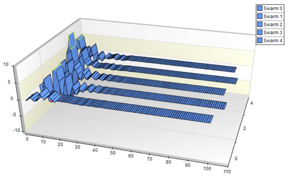
In my opinion, the three-dimensional view is the easiest to interpret and the most intuitive, especially if it is a part of your model verification package that you will show to someone else. You can easily see in the following when each particle arrives (if it arrives) at a global optimum. The result is a flat line indicated by one or more line segments at the 0 axis:
There are several toolbars available for working with the three-dimensional view, of which you have rotational options, placement options, color options, and more:

You can use the Trackball to rotate the chart to see the view from virtually any direction:

Just select the Trackball, and then select the chart, click on the left mouse button and drag the chart to your new view like this:

You can change the lighting of the chart by changing the Predefined Light Model:

You can then select from any of the predefined models, as follows:

The depth and width controls allow you to change both dimensions on the chart to suit your needs:

Simply click on the button you desire and continue to click to apply the transformation, as follows:

Nudging allows you to make minor adjustments to the chart area and location. You can Nudge up, down, left, or right, as well as any combination of these, by simply clicking on the button(s) you desire, as follows:

In the main toolbar, you can open, save, and print charts, a valuable feature if you need to have images for a report based upon your testing. You can also use the Chart editor and Chart Wizard, as shown here:

Simply select the button you desire, in this case Show Chart Wizard, and the wizard dialog will appear:

You can also use the 3D button to switch between two and three-dimensional views of the same chart.
The two dimensional view:

This can change to 3D with the click of a single button:
