
Web Parts are the most common type of control created by Microsoft SharePoint developers. However, they are not the only type. In fact, there are several other control types that can be beneficial to create and reuse to extend SharePoint sites. We will begin this chapter with a quick primer on developing custom controls and demonstrate several examples of when and where they can be used in a SharePoint project. Along the way, we will discuss where user controls and delegate controls fit into the overall SharePoint developer story.
The second half of the chapter focuses on Web Part development, where you will learn the role of the Web Part Manager and the Web Part Gallery. We will demonstrate several different styles for Web Parts rendering, including using an Extensible Stylesheet Language for Transformations (XSLT) transform to generate Hypertext Markup Language (HTML) output. We will show you how to extend Web Parts using persistent properties and custom Editor Parts. We will also discuss taking advantage of the Web Part framework support for Web Part verbs and Web Part connections, as well as using asynchronous processing when retrieving data from across the network.
An ASP.NET control is a reusable user interface component that is used on pages in ASP.NET development and in SharePoint development. In the ASP.NET programming model, a control is defined as a class that inherits from the Control class in the System.Web.UI namespace. For example, you could use the following class definition as the starting point for creating a custom control class.
namespace WingtipControls {
  public class WingtipCustomControl : System.Web.UI.Control {
    // control class implementation
  }
}
The ASP.NET Framework provides many specialized control classes that can be used in SharePoint development. For example, there are built-in controls such as Button, Label, TextBox, and CheckBox. All these control classes inherit—either directly or indirectly—from the Control class, forming a large inheritance hierarchy. Figure 6-1 shows how the ASP.NET control classes discussed in this chapter fit into this hierarchy.

The downloadable .zip archive of companion code for this book contains a sample SharePoint project named WingtipControls, which contains working samples of the custom controls and user controls shown over the next few sections. You can see the high-level structure of this project by examining Figure 6-2.

Figure 6-2. The WingtipControls project demonstrates using custom controls and user controls in SharePoint development.
Note that the WingtipControls project has been configured as a farm solution. This is a requirement because this project relies on several techniques that cannot be used in sand-boxed solutions. In general, developing any type of custom control other than a Web Part in SharePoint development will force you to deploy your project as a farm solution.
You create a custom control using a new class that inherits from the Control class. In most cases, you then override selected methods of the Control class to handle events in the ASP.NET page life cycle. You can also add public properties to a custom control class, which can be used as initialization parameters. The following listing shows a simple custom control class named WingtipCustomControl.
using System;
using System.Web;
using System.Web.UI;

namespace WingtipControls {
  public class WingtipCustomControl : Control {

    public string UserGreeting { get; set; }

    protected override void Render(HtmlTextWriter writer) {
      writer.AddStyleAttribute(HtmlTextWriterStyle.Color, "Blue");
      writer.AddStyleAttribute(HtmlTextWriterStyle.FontSize, "18pt");
      writer.RenderBeginTag(HtmlTextWriterTag.Div);
      writer.Write(UserGreeting);
      writer.RenderEndTag(); // </div>
    }
  }
}
The WingtipCustomControl class includes a public property named UserGreeting and overrides the Render method. The Render method of the Control class is called by the ASP.NET run time once the hosting page has entered the rendering phase, providing the control with an opportunity to write HTML content into the page. The Render method in this case has been implemented to generate an HTML div element with inner text containing the value of the UserGreeting property.
The Render method accepts a parameter named writer, which is based on the HtmlTextWriter class. The HtmlTextWriter class provides a RenderBeginTag method and RenderEndTag method, which can be used to generate HTML tags such as a div element. The HtmlTextWriter class also provides an AddStyleAttribute method, which can be called just before the RenderBeginTag method to add attributes in an HTML element. For example, the two calls to AddStyleAttribute in this example produce an opening div tag that looks like this.
<div style="color: blue; font-size: 18pt;">
Once you have created a control class such as WingtipCustomControl, you can begin to use it within application pages, site pages, or master pages. This is accomplished by adding control tags to create page-level instances of the control class. However, before you can add a control tag, you must first add a Register directive. The Register directive should be added at the top of the page under the Page directive, and it should contain three attributes: the Tagprefix attribute, the Namespace attribute, and the Assembly attribute.
<%@ Register Tagprefix="WingtipControls"
             Namespace="WingtipControls"
             Assembly=" WingtipControls, [4-part assembly name]" %>
Once you have added the Register directive to a page, you can add a control tag to create an instance of the control. The control tag is created by combining Tagprefix and the control class name separated by a colon. Here is an example of adding a control tag to create an instance of the WingtipCustomControl class.
<WingtipControls:WingtipCustomControl
    runat="server"
    Id="WingtipControl1"
    UserGreeting="Hello World" />
When creating a control tag, you must always include the runat=“server” attribute to let the ASP.NET run time know that this should be processed as a server-side control. You should also include the Id attribute and assign it a unique value. When you create a control tag, you can also include attributes to initialize public properties. In this example, the control tag adds an attribute to initialize the UserGreeting property.
In SharePoint development, you can use custom controls on several different types of pages, including application pages, site pages, and master pages. However, it is important to understand that there is a potential problem when adding custom controls to site pages and master pages. The problem is that site pages and master pages can be customized, which leads Microsoft SharePoint Foundation to process them in safe mode.
The reasons that SharePoint Foundation incorporates safe mode processing was initially discussed in Chapter 5. As you remember, the primary motivation for safe mode is based on the fact that ordinary users can customize the contents of a site page or a master page. The concern here is that users without farm-level permissions should not be able to add server-side code to pages. Safe mode protects the farm by prohibiting any inline code on customized pages that would run on the Web server.
Safe mode processing goes further by adding restrictions on what types of controls can be used on a customized page. At first, you might wonder why safe mode poses this restriction. The reason has to do with a scenario in which a malicious user tries to mount an attack by customizing a site page using a server-side control that has been installed on the Web server. For example, imagine that Web servers in a SharePoint farm have also been configured to run an older application built using the ASP.NET Framework. A malicious user might attempt to exploit a custom control from the older application by adding it to a customized page and parameterizing the control tag.
Safe mode prevents this type of attack by requiring any control class used on a customized page to be registered as a safe control. A control class is registered as a safe control by adding a SafeControl entry into a Web application’s web.config file. Note that the standard web.config file that SharePoint Foundation creates for new Web applications already includes SafeControl entries for the standard controls and Web Parts included with ASP.NET and SharePoint 2010.
The key point here is that any custom controls that you create cannot be used on customized pages unless they are deployed from within a SharePoint project that is configured to add the required safe control entries into the web.config file. Fortunately, the SharePoint developer tools in Microsoft Visual Studio 2010 makes adding these safe control entries very easy.
If you examine the web.config file for a Web application, you will find a SafeControls section inside the SharePoint section. Registering a custom control as a safe control requires adding a new SafeControl element with three attributes: the Assembly attribute, the Namespace attribute, and the TypeName attribute. It is a common practice to register all the custom controls in an assembly using a single SafeControl entry that includes the root namespace and an * character for the type name.
<SafeControls>
  <SafeControl
    Assembly=" WingtipControls, [4-part assembly name]"
    Namespace="WingtipControls"
    TypeName="*" />
</SafeControls>
Now we will examine how the SharePoint Developer Tools assist you with adding SafeControl entries. As you know, SharePoint projects are built by adding SharePoint project items. You should notice that each SharePoint project item exposes a standard set of properties that can be seen and modified through the standard property sheet in Visual Studio. One of these properties is the Safe Control Entries collection. If you choose to modify this collection, the SharePoint Developer Tools provide the Safe Control Entries dialog, shown in Figure 6-3, which allows you to add Safe Control Entry members in a declarative fashion.

Figure 6-3. The SharePoint Developer Tools make it easy to add a Safe Control Entry, which allows a custom control to run on customized pages.
In the WingtipControls project, there is a SharePoint project item named WingtipControls. The Safe Control Entries collection for this SharePoint project item contains a Safe Control Entry member with the root namespace for the project and a type name based on the * character. This Safe Control Entry member effectively registers every public control class in the current project.
Note that when you are developing Web Parts, you are not usually required to add Safe Control Entry members explicitly to the Safe Control Entries collection. That’s because the SharePoint Developer Tools automatically add the required Safe Control Entry member whenever you create a Web Part project item. However, there is no dedicated SharePoint project item for creating a custom control. Therefore, you are typically required to add at least one Safe Control Entry member by hand when developing custom controls.
Now it’s time to discuss how the SharePoint Developer Tools deal with Safe Control Entry members. When you build a SharePoint project into a solution package, the SharePoint Developer Tools add a SafeControl entry into the manifest.xml file for each Safe Control Entry member. For example, when you build the WingtipControls project into a solution package, the SharePoint Developer Tools generate the manifest.xml file with the following SafeControl entry.
<Solution>
  <Assembly Location="WingtipControls.dll" DeploymentTarget="GlobalAssemblyCache">
    <SafeControls>
      <SafeControl Assembly="WingtipControls, [4-part assembly name]"
                   Namespace="WingtipControls"
                   TypeName="*" />
    </SafeControls>
  </Assembly>
  <!-other elements removed for brevity -->
</Solution>
Once the SharePoint Developer Tools have added the SafeControl entry into the manifest.xml file, the rest of the safe control registration process is automated by SharePoint Foundation. More specifically, when SharePoint Foundation deploys a farm solution, it propagates each SafeControl entry from the manifest.xml file into the web.config file.
Now we have walked through the entire process of registering a custom control as a safe control. It is very convenient that the SharePoint Developer Tools do a great job at making the entire process transparent to the developer. However, one last key point must be emphasized: It still requires a farm administrator to deploy a solution package in a production farm. Therefore, the farm administrator is still ultimately in charge of what custom controls and Web Parts are registered as safe controls.
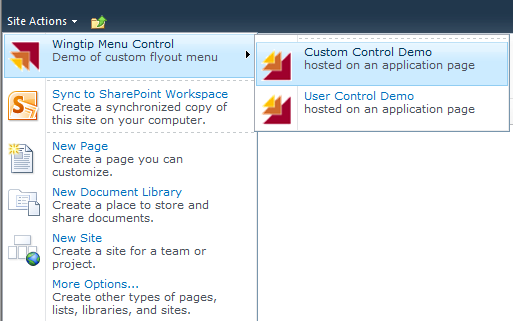
Now we will examine a useful scenario where you can take advantage of custom controls in SharePoint development. Imagine that you would like to create a custom menu with custom menu commands and have it appear as a fly out menu on the site actions menu. This can be accomplished by creating a custom menu control that will appear like the one shown in Figure 6-4.
To create a custom menu control within a SharePoint project, you begin by referencing the primary ASP.NET assembly named System.Web. Next, you create a public class that inherits from the Control class and you override the CreateChildControls method. Inside your implementation of CreateChildControls, you will be required to create instances of control classes defined in the Microsoft.SharePoint assembly inside the Microsoft.SharePoint.WebControls namespace. These control classes are SubMenuTemplate and ItemTemplate.
public class WingtipMenuControl : Control {

  protected override void CreateChildControls() {

    // create fly out  menu
    SubMenuTemplate smt = new SubMenuTemplate();

    // create fly out menu commands
    MenuItemTemplate mit1 = new MenuItemTemplate();
    MenuItemTemplate mit2 = new MenuItemTemplate();

    // add menu commands to Controls collection of fly out menu
    smt.Controls.Add(mit1);
    smt.Controls.Add(mit2);

    // add fly out menu to Controls collection of of menu control
    this.Controls.Add(smt);
  }
}
You must create an instance of the SubMenuTemplate control to serve as the top-level menu command, which triggers the fly out menu. After creating an instance of the SubMenuTemplate control, you then must create an instance of the MenuItemTemplate control for each menu command you want to add to the fly out menu. Each instance of the MenuItemTemplate control must also be added to the Controls collection of the SubMenuTemplate control. Finally, the instance of the SubMenuTemplate control must be added to the Controls collection of the custom menu control. A complete implementation of a simple menu control is shown in Example 6-1.
Example 6-1. The code required to create a custom menu control with a fly out menu
public class WingtipMenuControl : Control {

  string SubMenuIconUrl = @"/_layouts/images/WingtipControls/SubMenuIcon.gif";
  string MenuIconUrl = @"/_layouts/images/WingtipControls/MenuIcon.gif";
  string AppPage1Url = @"/_layouts/WingtipControls/CustomControlDemo.aspx";
  string AppPage2Url = @"/_layouts/WingtipControls/UserControlDemo.aspx";

  protected override void CreateChildControls() {
    SPWeb site = SPContext.Current.Web;

    // create fly out  menu
    SubMenuTemplate smt = new SubMenuTemplate();
    smt.ID = "CustomSubMenu";
    smt.Text = "Wingtip Menu Control";
    smt.Description = "Demo of custom fly out menu";
    smt.MenuGroupId = 1;
    smt.Sequence = 1;
    smt.ImageUrl = site.Url + SubMenuIconUrl;

    // create fly out menu command 1
    MenuItemTemplate mit1 = new MenuItemTemplate();
    mit1.ID = "FlyoutMenu1";
    mit1.Text = "Custom Control Demo";
    mit1.Description = "hosted on an application page";
    mit1.Sequence = 1;
    mit1.ClientOnClickNavigateUrl = site.Url + AppPage1Url;
    mit1.ImageUrl = site.Url + MenuIconUrl;

    // create fly out menu command 2
    MenuItemTemplate mit2 = new MenuItemTemplate();
    mit2.ID = "FlyoutMenu2";
    mit2.Text = "User Control Demo";
    mit2.Description = "hosted on an application page";
    mit2.Sequence = 2;
    mit2.ClientOnClickNavigateUrl = site.Url + AppPage2Url;
    mit2.ImageUrl = site.Url + MenuIconUrl;

    // add menu commands to Controls collection of fly out menu
    smt.Controls.Add(mit1);
    smt.Controls.Add(mit2);

    // add fly out menu to Controls collection of of menu control
    this.Controls.Add(smt);
  }
}
Once you have created the class for the custom menu control, you must create a CustomAction element in a feature that is used to add the fly out menu somewhere inside the SharePoint user interface. The easiest way to create a CustomAction element with the SharePoint Developer Tools is to create a new SharePoint project item based on the Empty Element type and then by adding the following CustomAction element into the elements.xml file.
<CustomAction Id="WingtipMenuControl"
  GroupId="SiteActions"
  Location="Microsoft.SharePoint.StandardMenu"
  Sequence="1"
  ControlAssembly="$SharePoint.Project.AssemblyFullName$"
  ControlClass="WingtipControls.WingtipMenuControl"
  Title="Wingtip Control Demos"
  Description="Wingtip Controls Menu Control Demo"
/>
Note that SharePoint Foundation requires a safe control entry for each custom menu control. Therefore, you must ensure that you have added the proper safe control entry using the Safe Control Entries collection, as discussed in the previous section.
While this particular example added a fly out menu to the Site Actions menu, you can use the exact same technique to create a fly out menu for other locations in the SharePoint user interface. For example, you could use this custom menu control to supply a fly out menu to the Actions menu for a list of document library or the Edit Control Block (ECB) menu for a list item or document.
Also, remember that you have quite a bit of flexibility in terms of a feature’s activation scope. You can add the CustomAction element to a feature that activates at the site scope or site collection scope, which would make it possible for site collection owners and site administrators to activate the feature and begin using the fly out menu. Alternatively, you could add the CustomAction element to a feature that is activated at the Web Application scope or farm scope, which would allow you to enable or disable the fly out menu on a larger scale.
The ASP.NET Framework provides user controls as an alternative to creating custom controls. Developing with user controls can yield higher levels of productivity in SharePoint Development because it provides the only supported technique where you can use a visual designer to create a user interface component. For example, you can drag ASP.NET controls, such as Label, TextBox, and Button, onto a user control from the Visual Studio 2010 toolbox, making it much faster to develop user input forms.
Once you get comfortable working with user controls, you will find that they provide the fastest way to create user interface components for a SharePoint solution. This is especially true when you want to use specialized ASP.NET controls such as the validation controls or data bound controls, which are much easier to configure using Visual Studio 2010 wizards and the standard property sheet. Also, keep in mind that you can add a user control to an application page, a site page, or a master page. Later in this chapter, in the section entitled Creating Visual Web Parts, you will see that a user control can also be used to provide the user interface for a custom Web Part.
At the physical level, a user control is a text file with an .ascx extension that is deployed directly to the file system of the Web server. The ASP.NET Framework provides the functionality to parse .ascx files at run time and to compile them into assembly dynamic-link libraries (DLLs), just as it does for .aspx files such as application pages.
In Chapter 5, we introduced the LAYOUTS directory and explained why SharePoint Foundation uses this directory to deploy application pages. SharePoint Foundation provides a similar directory inside the 14/TEMPLATES directory named CONTROLTEMPLATES, which is used to deploy the user controls. For example, the CONTROLTEMPLATES directory contains the standard user controls that are deployed during the installation of SharePoint Foundation and SharePoint Server 2010, such as Welcome.ascx.
SharePoint Foundation provides access to user controls in each Web Application using a virtual directory named _controltemplates, which is mapped to the CONTROLTEMPLATES directory. This mapping makes it possible to reference a user control file from any site within the farm using a standard path. For example, you can reference the standard user control named Welcome.ascx from any site using the following site-relative path.
~/_controltemplates/Welcome.ascx
The fact that each user control is accessible using a standard path makes it possible to reference them from application pages, site pages, and master pages. For example, the user control named Welcome.ascx is used on the v4.master page by adding a Register directive with three attributes: the Tagprefix attribute, the TagName attribute, and the src attribute.
<%@ Register
    TagPrefix="wssuc"
    TagName="Welcome"
    src="~/_controltemplates/Welcome.ascx"
%>
Once the Register directive for a user control has been added to a page, it is possible to create an instance of the user control using a control tag that combines TagPrefix and TagName separated by a colon.
<wssuc:Welcome id="IdWelcome" runat="server" />
User controls are like application pages in the sense that they must be deployed inside the SharePoint root directory. This means that user controls that are deployed in the standard fashion cannot be used in sandboxed solutions. Also, user controls are similar to application pages because they do not support any form of user customization. Therefore, user controls are assumed to be trusted by the Web server and, consequently, their contents are never inspected by the safe mode parser.
A user control is similar to a custom control because it requires a safe control entry to run properly on a customized page. However, this does not require your attention so long as you deploy your user controls at any location inside the CONTROLTEMPLATES directory. The reason for this is that SharePoint Foundation adds the following SafeControl entry to the web.config file for every Web application, which simply trusts the CONTROLTEMPLATES folder.
<SafeControl Src="~/_controltemplates/*" IncludeSubFolders="True" Safe="True" />
Now that you understand the details of how user controls are deployed in SharePoint Foundation, it’s time to discuss using them to develop a SharePoint solution. The SharePoint Developer Tools provide a SharePoint project item template named User Control, which you can use to add new user controls to your project.
While the CONTROLTEMPLATES directory is the proper place to deploy custom user control files, it is typically recommended that you do not deploy them directly inside this directory. Instead, it is recommended that you deploy custom user controls in a child directory nested inside the CONTROLTEMPLATES directory to avoid potential file name conflicts with Microsoft user control files. The SharePoint Developer Tools adhere to this practice by adding user controls to a solution-specific child directory nested inside the CONTROLTEMPLATES directory. For example, if you add a new User Control project item to a project named WingtipControls, the SharePoint Developer Tools add the .ascx file at the location CONTROLTEMPLATESWingtipControls.
Once you have added a user control to a SharePoint project, you can edit the contents of the .ascx file in Design view, which makes it quick and easy to create user input forms and other types of user interface components because you can drag server-side controls from the standard Visual Studio toolbox. You also have the option of working in Source view or in a hybrid mode known as Split view, which is shown in Figure 6-5. While you are working in any view, you also get the convenience of being able to edit the properties of each control using a standard Visual Studio property sheet.

Figure 6-5. Visual Studio 2010 provides SharePoint developers with a visual design experience when working with user controls.
While SharePoint Foundation permits you to add inline code directly inside the .ascx file using C# or Visual Basic, this is not the recommended approach. It provides a much better development experience when you write your code for a user control in a code-behind file with an extension of either .cs or .vb. Fortunately, the SharePoint Developer Tools take care of all the necessary details behind the scenes to create and configure a code-behind file whenever you add a new user control to a SharePoint project.
In the WingtipControls project, there is a user control file named WingtipUserControl.ascx. When this user control was added to the project, the SharePoint Developer Tools automatically created an associated code-behind file named WingtipUserControl.ascx.cs, which had an initial class definition that looked like this.
using System;
using System.Web.UI;
using System.Web.UI.WebControls;
using System.Web.UI.WebControls.WebParts;

namespace WingtipControls.ControlTemplates.WingtipControls {
  public partial class WingtipUserControl : UserControl {
    protected void Page_Load(object sender, EventArgs e) {
    }
  }
}
You will find that it’s easy to work with a user control and its code-behind file. For example, you can drag a command button onto the visual designer and then name it using its property sheet. If you double-click a command button in design view, Visual Studio 2010 will automatically create and wire up an event handler method in the code-behind file and place your cursor in the new event handler method so that you can begin typing the code that will execute when a user clicks that button.
While the SharePoint Developer Tools do everything that’s required to create a new user control, they do not provide the same convenience when you need to add a user control to an application page, a site page template, or a master page template. Therefore, you must learn how to create the required Register directive and the control tag by hand. However, this is actually easy to do.
The WingtipControls project adds the user control named WingtipUserControl.ascx to an application page named UserControlDemo.aspx. This application page contains the following Register directive.
<%@ Register
  TagPrefix="wtuc"
  TagName="WingtipUserControl"
  src="~/_controltemplates/WingtipControls/WingtipUserControl.ascx"
%>
Note that the src attribute has a value of the standard path to the .ascx file where it has been deployed inside the _controltemplates virtual directory. This allows the hosting page to find and load the user control when executing from any site within the farm. Once you have added the Register directive, the final part of creating an instance of the user control is adding a control tag to the page. The application page named UserControlDemo.aspx contains the proper control tag to create an instance of the user control.
<wtuc:WingtipUserControl runat="server" />
Note that you would create the exact same Register directive and control tag to add this user control to a site page or a master page. You could also take this example further by adding public properties to the user control, which can provide extra flexibility. Just as with custom controls, the public properties of a user control can be initialized in a control tag. This makes it possible to develop a single user control that can be parameterized differently across control tags to produce different appearances and behaviors.
SharePoint Foundation provides a powerful extensibility mechanism known as delegate controls. A delegate control is a control placeholder that allows you to substitute in one or more control instances during the processing of a page. It’s actually easy to get started because SharePoint Foundation provides a useful set of delegate controls in its standard master pages such as v4.master. As you will see, the built-in delegate controls provide a simple and effective technique for adding elements such as HTML meta tags, Cascading Style Sheets (CSS) rules, and client-side JavaScript code across many pages at once.
Let’s begin by examining one of the delegate controls that has been added to v4.master. If you open the v4.master template file and look inside the head section, you will see a delegate control with a ControlId attribute of AdditionalPageHead, which is located right after the placeholder control with an id attribute of PlaceHolderAdditionalPageHead.
<head runat="server">

  <asp:ContentPlaceHolder id="PlaceHolderAdditionalPageHead" runat="server"/>

  <SharePoint:DelegateControl
              runat="server"
              ControlId="AdditionalPageHead"
              AllowMultipleControls="true"/>

</head>
Now, let’s consider how delegates really work from a design perspective. In some ways, a delegate control is similar to a placeholder control because it defines a named region inside a master page that a developer can use to substitute in unique content. Like a placeholder control, a delegate control can supply default content that is used until a substitution is performed.
While delegate controls have similarities to placeholder controls, they also have their differences. One major difference is that the substitution mechanism used for replacing the contents of a delegate control is driven by feature activation. Therefore, you can replace what’s defined inside a delegate control in v4.master without requiring any changes to v4.master or any of the site pages or application pages that link to it. All you need to do is define a feature with a Control element and then activate that feature.
A significant aspect of using delegate controls involves the scope of the feature that is being used to drive substitution. When you design a feature to substitute the contents of a delegate control, the feature can be scoped at any of the four supported levels, which are site scope, site collection scope, Web application scope, and farm scope. This dimension of delegate controls provides a powerful mechanism for enabling and disabling branding elements or functionality behind pages on a wide-scale basis.
To work with delegate controls, you must be working in a SharePoint solution that is deployed using a farm solution. In other words, the techniques involved with delegate controls cannot be used inside the sandbox. The examples presented in this chapter are part of the WingtipControls project, which has been designed for deployment as a farm solution.
The easiest way to substitute content into a delegate control is with a custom user control. For example, the WingtipControls project contains a user control named WingtipDelegateUserControl.ascx, which contains a two HTML meta tags and a few CSS rules that add a header image to the page body.
<%@ Control %>
<meta name='author' content='Wingtip Toys' />
<meta name='copyright' content='© 2010 Wingtip Toys, Inc.' />
<style type="text/css" media="screen">
body {
background-image: url('/_layouts/images/WingtipControls/WingtipHeader.gif'),
background-repeat: repeat-x;
margin-top: 20px;
}
</style>Once you have created the user control and added the content inside it, your next step is to create a new SharePoint project item using the Empty Element type. Then you can open the elements.xml file for this new SharePoint project item and add the following Control element.
<Control
 Id="AdditionalPageHead"
 ControlSrc="~/_controltemplates/WingtipControls/WingtipDelegateUserControl.ascx"
 Sequence="101"
/>
Now let’s look at how delegate controls really work. When the feature with the Control element has been activated, SharePoint Foundation knows that whenever it processes a page that links to v4.master, it must create an instance of the user control named WingtipDelegateUserControl.ascx. SharePoint Foundation also knows to add the user control instance to the page in the location where the delegate control is defined. In this case, the user control instance is added to the head section of the page because that’s where the delegate control with a ControlId of AdditionalPageHead is located.
Note that v4.master defines the delegate control with the ControlId of AdditionalPageHead with an attribute named AllowMultipleControls, which has a value of true. This means that SharePoint Foundation makes it possible for multiple features to add control instances into this delegate control at the same time.
In a scenario where a delegate control has an AllowMultipleControls attribute with a value of true, the Control element can be defined with a Sequence attribute that dictates which delegate control instances are processed first. For example, imagine two features both added controls to the AdditionalPageHead delegate control. The delegate control instance created by the Control element with the lower Sequence number would be processed first, and the delegate control instance with the larger Sequence number would be processed last, which can provide benefits when working with CSS.
If you examine some of the other delegate controls inside v4.master, you will notice that they are defined without the AllowMultipleControls attribute. This means that these types of delegate control can accept only a single control instance. In this case, the feature that has the Control element with the lowest Sequence number wins, and it becomes the only feature to add a control instance to the delegate control as pages are processed.
You should observe that the MainSite feature of the WingtipControls project is designed to activate at the site collection scope. That means activating this feature will add the HTML meta tags and CSS rules to every page within the current site collection. Also, remember that delegate controls can be substituted at any scope supported by features. You can create a feature with a Control element scoped at the Web application or farm level to add HTML meta tags, CSS rules, or JavaScript code to every page on a larger scale.
While it is easy to create user controls to work with delegate controls, SharePoint Foundation also supports delegate control substitution with custom controls. This provides an alternative that can be more lightweight and powerful from a programming perspective. The WingtipControls project contains a custom control class named WingtipDelegateCustomControl, which overrides the OnLoad event handler method and uses the ClientScriptManager class of the ASP.NET Framework to register a client-side startup script.
public class WingtipDelegateCustomControl : Control {

  protected override void OnLoad(EventArgs e) {
    // register startup script using JavaScript code in string literal
    ClientScriptManager CSM = this.Page.ClientScript;
    string key = "WingtipScript";
    string script = @"
            ExecuteOrDelayUntilScriptLoaded(SayHello, 'sp.js'),
            function SayHello() {
              var message = 'Hello from a delegate custom control';
              SP.UI.Notify.addNotification(message);
            }";
    CSM.RegisterStartupScript(this.GetType(), key, script, true);
  }
}
As you can see, a delegate control makes it easy to add client-side JavaScript code across many pages at once. The example that you have just seen relies on a string variable named script, which holds the JavaScript code that is registered as a startup script within the browser. However, another approach is to add a JavaScript source file to the current project. This approach can offer a better development experience because Visual Studio 2010 provides color coding and extra convenience when you write your JavaScript code inside a source file with a .js extension. Using JavaScript source files makes it easier to write and maintain large JavaScript libraries that you plan to include across all pages on a sitewide or even a farmwide basis.
The WingtipControls project contains a JavaScript source file named WingtipDelegateCustomControl.js. This file has been configured as an embedded resource as well as added to the project’s resources as a file resource named WingtipDelegateCustomControl_js. This makes it possible to retrieve the contents of that JavaScript source file and register it as a startup script using the following code.
// register startup script using JavaScript code inside WingtipDelegateCustomControl.js
CSM.RegisterStartupScript(this.GetType(), key, script, true);
string key2 = "WingtipScript2";
string script2 = Properties.Resources.WingtipDelegateCustomControl_js;
CSM.RegisterStartupScript(this.GetType(), key2, script2, true);
While these examples demonstrate calling the RegisterStartupScript method, the ClientScriptManager class provides other useful methods for managing client-side scripts, including RegisterClientScriptBlock, RegisterClientScriptInclude, RegisterArrayDeclaration, and RegisterExpandoAttribute. If you are building a SharePoint solution that includes a custom library of JavaScript functions, you must decide how you are going to push this JavaScript code out to the browser. An approach that involves delegate control substitution with a custom control that programs against the ClientScriptManager class provides a simple and effective strategy for managing custom JavaScript libraries across many pages on a sitewide or even farmwide basis.
Once you have created a custom control to substitute into a specific delegate control, you must create a Control element to perform the substitution. Like a Control element created for a user control, the Control element for a custom control must provide an Id attribute that matches the ControlId attribute of the target delegate control. However, you do not use the src attribute, as you do when working with user controls. Instead, you must use the ControlAssembly and ControlClass attributes to reference a specific control type within a target assembly. When using the SharePoint Developer Tools, you can also use a dynamic token for the ControlAssembly property so that you do not have to hard-code the four-part assembly name into your source file.
<Control
  Id="AdditionalPageHead"
  ControlAssembly="$SharePoint.Project.AssemblyFullName$"
  ControlClass="WingtipControls.WingtipDelegateCustomControl"
  Sequence="102"
/>
Web Parts are the most popular type of component created by SharePoint developers. One reason for this is that SharePoint technologies have supported the development of custom Web Parts since the release of SharePoint 2003. A second reason is that Web Parts give SharePoint Foundation one of its greatest strengths. More specifically, Web Parts provide business users with the ability to customize pages and shape their work environment in a way that suits their work style.
While a Web Part is a control, it is a specialized type of control designed to support user customization. The support for customization is the main characteristic that separates Web Parts from other types of controls. For example, a user can add Web Parts to a page as well as delete them. A user can modify an existing Web Part to change its appearance or behavior. Furthermore, all this work can be done using the browser without customizing the content of the underlying page. An important observation for developers is that a Web Part page remains in a ghosted state even when users are adding, customizing, and deleting Web Parts.
When you begin working with Web Parts, you must differentiate between customization and personalization. Customization refers to a change by a privileged user, such as a site collection owner, that is seen by all users. Personalization refers to a change by an individual user that is seen only by that user. One of the most valuable aspects of the Web Part infrastructure is that it provides the developer with automatic support to save and retrieve customization data as well as personalization data.
A Web Part is a class that inherits from the WebPart class defined by the ASP.NET Framework in the System.Web.UI.WebControls.WebParts namespace. A Web Part is a special type of control that can be created inside the context of a Web Part Zone that has been defined inside a Web Part page. Web Parts are different from other types of controls because of the manner in which they are created and managed. Standard controls are created by adding control tags to a hosting page. Creating a new Web Part instance, on the other hand, doesn’t require a modification to the hosting page. Instead, Web Part instances are created and tracked inside a database behind the scenes using dedicated tables. This is valuable from a design perspective because it allows Web Part classes to be loosely coupled with the Web Part pages that host them. It also allows users to add Web Part instances to Web Part pages that remain running in a ghosted state, which is a key factor in scalability.
The downloadable .zip archive of companion code for this book contains a sample SharePoint project named WingtipWebParts. This project contains working samples of the custom Web Parts that are shown throughout the remainder of this chapter. You can see the high-level structure of this project by examining Figure 6-6.

To test the WingtipWebParts project, you should create a new site collection with either a team site or a blank site as the top-level site. When you deploy the WingtipWebParts project and activate the MainSite feature in this site collection, the project will create a set of Web Part pages and prepopulate them with sample Web Parts automatically. The MainSite feature has also been implemented to add a drop-down menu to the TopNav bar, making it easy to navigate from page to page.
The Web Part infrastructure of the ASP.NET Framework relies on a special control known as the Web Part Manager, which is responsible for creating and managing Web Parts instances each time a Web Part page is processed. Any page that contains Web Parts must have exactly one instance of the Web Part Manager control. In SharePoint Foundation, the implementation of the Web Part Manager is provided by the SPWebPartManager class, which is defined inside the Microsoft.SharePoint assembly.
You rarely have to worry about creating the required instance of the SPWebPartManager control in SharePoint 2010 development. That’s because all the standard master pages in SharePoint Foundation such as v4.master already contain the control tag for the SPWebPartManager control. However, when creating your own custom master pages, you should ensure that they contain an instance of the SPWebPartManager control as well.
To really understand how Web Parts work, you must understand the role of the SPWebPartManager control. Early in the life cycle of a Web Part page, the SPWebPartManager control queries the content database to determine what Web Part instances need to be created. The Web Part Manager control acts as a director for the page, adding each Web Part instance to the appropriate Web Part zone and ensuring that each Web Part instance is initialized with the proper customization data and personalization data. Whenever a user creates a new Web Part instance using the browser, the SPWebPartManager control coordinates writing the new serialized Web Part instance into the content database.
To help you avoid confusion when you get started with Web Parts, we need to give you a quick history lesson. The SharePoint team created the first Web Part infrastructure, which debuted in the 2003 release. This was back before ASP.NET supported Web Parts. All the custom Web Parts that were created for SharePoint 2003 were developed using this older format, which was part of the Microsoft.SharePoint namespace.
After the release of SharePoint 2003, Microsoft made a strategic decision to move the Web Part infrastructure from the SharePoint development platform down a layer into the ASP.NET Framework. When ASP.NET 2.0 was released in 2005, it contained a similar yet separate Web Part infrastructure.
What’s important (and somewhat confusing, unfortunately) is that SharePoint 2007 and SharePoint 2010 are both built on the newer ASP.NET Web Part infrastructure, not the older SharePoint 2003 Web Part infrastructure. When you create Web Parts for SharePoint 2010, you inherit from the WebPart base class in the ASP.NET Framework, not the older class of the same name defined inside the Microsoft.SharePoint assembly.
Both SharePoint 2007 and SharePoint 2010 provide backward compatibility for older Web Parts developed under the SharePoint 2003 format. However, it is likely that the backward compatibility support will be dropped in a future version of SharePoint technologies. When this happens, any Web Parts developed under the SharePoint 2003 format will have to be written using the ASP.NET Web Part format.
The Web Part infrastructure was designed to enable users to create new Web Parts on demand using the browser. However, this poses a problem. How does a user discover which types of Web Parts are available for creating new Web Part instances? This problem is solved in SharePoint Foundation by the Web Part Gallery.
The Web Part Gallery is a special type of document library that is created automatically by SharePoint Foundation in the top-level site of every new site collection. It is important to understand that there is exactly one Web Part Gallery per site collection. There is not one per site.
The Web Part Gallery contains Extensible Markup Language (XML) files known as Web Part template files. Each Web Part template file in the Web Part Gallery represents a creatable Web Part type within the current site collection. If you look inside a Web Part template file, you will find XML data that can be used to create a new Web Part instance. The XML format includes an assembly name and a class name for the Web Part class, as well as initialization data for various Web Part properties.
<webParts>
  <webPart xmlns="http://schemas.microsoft.com/WebPart/v3">
    <metaData>
      <type name="WingtipWebParts.WebPart1.WebPart1, [4-part assembly name]" />
      <importErrorMessage>
      There has been an error importing this Web Part
      </importErrorMessage>
    </metaData>
    <data>
      <properties>
        <property name="Title" type="string">Web Part 1</property>
        <property name="Description" type="string">A simple description</property>
        <property name="AllowEdit" type="bool">True</property>
        <property name="AllowZoneChange" type="bool">True</property>
        <property name="AllowClose" type="bool">False</property>
      </properties>
    </data>
  </webPart>
</webParts>
Web Part template files that are created using the ASP.NET Web Part format have a .webpart extension. However, you will also see Web Part template files created using the older SharePoint 2003 format, and those files have a .dwp extension. When you develop Web Parts for SharePoint 2010, you will be creating Web Part template files with an extension of .webpart.
When you develop Web Parts in a SharePoint project, it is recommended that you create a feature designed to provision a .webpart file for each Web Part into the Web Part Gallery. Because there is only one Web Part Gallery per site collection, the feature to provision .webpart files should be scoped at the site collection level instead of at the site level. Fortunately, the SharePoint Developer Tools do a great job of automating all this work behind the scenes each time you create a new Web Part using one of their SharePoint project item templates.
When you want to create a new Web Part in a SharePoint project, the SharePoint Developer Tools assist you by providing two different SharePoint project item templates, as shown in Figure 6-7. The Web Part project item is used to create standard Web Parts. The Visual Web Part project item is used to create a Web Part whose user interface is supplied by a user control. In this chapter, we will examine how to create both standard Web Parts and Visual Web Parts.
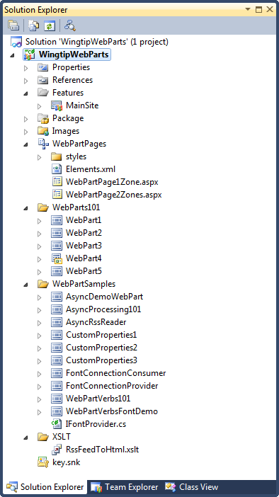
Figure 6-7. The SharePoint Developer Tools provide two SharePoint project item templates for adding Web Parts to a SharePoint project.
Whenever you add a new Web Part to a SharePoint project, the SharePoint Developer Tools create a new Web Part project item already configured with the required Safe Control Entries collection member. The SharePoint Developer Tools also add a Web Part template file and an elements.xml file, as shown in Figure 6-8. The elements.xml file contains a Module element configured to provision an instance of the Web Part template file into the Web Part Gallery. It is this Web Part template file that makes the new Web Part creatable.

Figure 6-8. Each Web Part project item is created with a Web Part template file and an elements.xml file.
When you add new Web Parts to a project, the SharePoint Developer Tools automatically manage your features for you. If you add a new Web Part to a project that already contains a site collection scoped feature, the SharePoint Developer Tools automatically associate the Web Part’s elements.xml file with this feature. If the current SharePoint project does not contain a feature scoped to the level of the site collection, the SharePoint Developer Tools will create a new feature and associate the Web Part’s elements.xml file with it automatically.
For example, think through what would happen if you create a new SharePoint project using the Empty SharePoint Project template and then you add three new Web Part project items. The SharePoint Developer Tools will create a site collection scoped feature when you add the first Web Part project item. However, there is no need to create another feature after that. The SharePoint Developer Tools associate the second and third Web Part project items with the same feature that was created for the first Web Part project item.
Let’s say that you have just added a new Web Part project item to a SharePoint project. The first thing that you should do is to modify the Web Part template file and the elements.xml file. Start by opening the Web Part template file and locating the two properties named Title and Description. You should modify these properties because they will be seen by users who are looking through the list of creatable Web Parts in the Web Part Gallery. There are also quite a few other standard Web Part properties that you might consider explicitly initializing, as shown in the following example.
<property name="Title" type="string">Web Part 1</property>
<property name="Description" type="string">A simple description</property>

<property name="ChromeState" type="chromestate">Normal</property>
<property name="ExportMode" type="exportmode">All</property>

<property name="AllowMinimize" type="bool">True</property>
<property name="AllowHide" type="bool">True</property>
<property name="AllowEdit" type="bool">True</property>
<property name="AllowClose" type="bool">True</property>
<property name="AllowZoneChange" type="bool">True</property>
<property name="AllowConnect" type="bool">True</property>
Next, open the elements.xml file. You will find that it contains a Module element with a List attribute and a URL attribute, which are preconfigured to target the Web Part Gallery. Inside the Module element is a File element that contains a Path attribute, a Url attribute, and a Type attribute. Inside the File element, you will also find a Property element that defines a property named Group with a preconfigured value of Custom.
<Elements xmlns="http://schemas.microsoft.com/sharepoint/" >
  <Module Name="WebPart1" List="113" Url="_catalogs/wp">
    <File Path="WebPart1WebPart1.webpart"
          Url=" WebPart1.webpart"
          Type="GhostableInLibrary">
      <Property Name="Group" Value="Custom" />
    </File>
  </Module>
</Elements>
There is no need to modify any attributes of the Module element. Likewise, there is no need to modify the Path attribute or the Type attribute of the File element. However, it is recommended that you modify the Url attribute of the File element because it determines the name given to the Web Part template file as it is created in the Web Part Gallery. Why is the modification necessary?
The problem with the default value for the Url attribute of the File element is file name conflicts in the Web Part Gallery. A critical point is that the Web Part Gallery can contain only one Web Part template file, named WebPart1.webpart. There will be a problem with file name conflicts if two different features both attempt to provision a Web Part template file named WebPart1.webpart into the Web Part Gallery. In such a scenario, the first feature to be activated will succeed, but the second feature will fail silently during activation because it is not able to provision its copy of WebPart1.webpart. The key to avoiding this problem is to ensure that your Web Part template files have unique names.
We recommend that you add the project name as a prefix to the file name of each Web Part template file. For example, our sample project is named WingtipWebParts. The Url attribute for each Web Part template file has been modified to include the project name prefix, resulting in Web Part template files with names such as WingtipWebParts_WebPart1.webpart. These modifications serve to reduce the risk of problems caused by file name conflicts in the Web Part Gallery.
The second modification you should make to the elements.xml file involves the Property element that defines the Group property with a default value of Custom. The Group property determines which category the Web Part is added to when the user is examining the list of creatable Web Parts. You should replace the default value of Custom with the name of the category in which you want your Web Parts to appear. In most cases, the Group property value should be the same for all the Web Parts within the same project. Here is an example of an elements.xml file from the WingtipWebPart project, with the updated values shown in bold.
<Elements xmlns="http://schemas.microsoft.com/sharepoint/" >
  <Module Name="WebPart1" List="113" Url="_catalogs/wp">
    <File Path="WebPart1WebPart1.webpart"
          Url="WingtipWebParts_WebPart1.webpart"
          Type="GhostableInLibrary">
      <Property Name="Group" Value="Wingtip Web Parts" />
    </File>
  </Module>
</Elements>When a privileged user, such as a site collection owner, activates the feature associated with your Web Parts, the feature automatically creates instances of your Web Part template files inside the Web Part Gallery. However, nothing is built into either the SharePoint development platform or the SharePoint Developer Tools that assist you with deleting these Web Part template files during feature deactivation.
When developing Web Parts, it’s recommended that you write code in the FeatureDeactivating event handler to delete all the Web Part template files that were created during feature activation. You will find that the recommendation that we made earlier for creating Web Part template file names that begin with the project name also simplifies writing the cleanup code. You can simply inspect the first part of the file name as you enumerate through the Web Part Gallery looking for the correct files to delete. Here is code from the WingtipWebParts project that demonstrates the proper technique.
public override void FeatureDeactivating(properties) {
  SPSite siteCollection = (SPSite)properties.Feature.Parent;
  SPWeb site = siteCollection.RootWeb;

  // figure out which Web Part template files need to be deleted
  List<SPFile> FilesToDelete = new List<SPFile>();
  SPList WebPartGallery = site.Lists["Web Part Gallery"];
  foreach (SPListItem WebPartTemplateFile in WebPartGallery.Items) {
    if (WebPartTemplateFile.File.Name.Contains("WingtipWebParts")) {
      FilesToDelete.Add(WebPartTemplateFile.File);
    }
  }

  // delete Web Part template files
  foreach (SPFile file in FilesToDelete) {
    file.Delete();
  }
}There are several different ways in which a Web Part can be created and placed on a page. The most common technique is by adding a Web Part template file into the Web Part Gallery and allowing the user to create the Web Part using the browser. In Chapter 5, you also saw that it was possible to prepopulate a Web Part page with Web Parts in a declarative fashion by adding an AllUsersWebPart element containing a serialized Web Part instance to the File element used to provision a Web Part page. Now, we will examine a third technique of doing this.
The server-side object model provides a class named SPLimitedWebPartManager, which provides the developer with direct access to the collection of Web Parts on a Web Part page. Programming against the SPLimitedWebPartManager class makes it possible to add, customize, personalize, and delete Web Part instances. Note that the SPLimitedWebPartManager is available in SharePoint solutions deployed at the farm level, but it cannot be used in sand-boxed solutions.
To program using the SPLimitedWebPartManager class, you must first access a Web Part page as an SPFile object. You can accomplish this by calling the GetFile method of the SPWeb class and passing a site-relative path. The SPFile class provides a method named GetLimitedWebPartManager, which returns an instance of the SPLimitedWebPartManager class.
Think about a scenario where you need a feature that’s been implemented to delete all the existing Web Parts from a site’s home page automatically and replace them with a single instance of the Image Web Part. Here is an example of how you could implement the FeatureActivated method in a site-scoped feature to accomplish this.
public override void FeatureActivated(SPFeatureReceiverProperties properties) {

  // Get Web Part Manager for home page
  SPWeb site = (SPWeb)properties.Feature.Parent;
  SPFile homePage = site.GetFile("default.aspx");
  SPLimitedWebPartManager wpm;
  wpm = homePage.GetLimitedWebPartManager(PersonalizationScope.Shared);

  // delete all Web Parts on page
  while (wpm.WebParts.Count > 0) {
    wpm.DeleteWebPart(wpm.WebParts[0]);
  }

  // add Image Web Part to Right zone
  ImageWebPart wp = new ImageWebPart();
  wp.ChromeType = PartChromeType.None;
  wp.ImageLink = "_layouts/images/IPVW.GIF";
  wpm.AddWebPart(wp, "Right", 0);
}
Note that the call to GetLimitedWebPartManager in this example passes a parameter of PersonalizationScope.Shared when retrieving the SPLimitedWebPartManager object. This allows you to make customization changes to Web Part instances that are seen by all users. Alternatively, you could pass a parameter of PersonalizationScope.User, which then leads the SPLimitedWebPartManager object to make personalization changes that would be seen only by the current user.
There are several different styles commonly used to render the output for a Web Part. The WingtipWebParts project contains examples of each style. For example, WebPart1 demonstrates the simplest rendering technique, which involves overriding the RenderContents method and calling methods on writer, an HtmlTextWriter-based parameter.
using System.Web;
using System.Web.UI;
using System.Web.UI.WebControls;
using System.Web.UI.WebControls.WebParts;

namespace WingtipWebParts.WebPart1 {
  public class WebPart1 : WebPart {
    protected override void RenderContents(HtmlTextWriter writer) {
      writer.AddStyleAttribute(HtmlTextWriterStyle.Color, "Blue");
      writer.AddStyleAttribute(HtmlTextWriterStyle.FontSize, "18px");
      writer.RenderBeginTag(HtmlTextWriterTag.Div);
      writer.Write("Hello World");
      writer.RenderEndTag(); // </div>
    }
  }
}
You might notice that this example is very similar to the implementation of the custom control named WingtipCustomControl discussed at the beginning of the chapter. The one key difference is that a custom Web Part class overrides the RenderContents method, while the custom control class overrides the Render method. What’s important to understand is that you can override the RenderContents method in a Web Part but should never override the Render method, as you might do in a custom control. Why is this so?
Web Parts render inside chrome. Web Part chrome refers to the common user interface elements, such as a formatted title bar and borders around the Web Part’s body. The rendering of the chrome is handled by the underlying ASP.NET Framework inside implementation of the Render method within the WebPart base class. You should never override the Render method of a Web Part because you want to leave the responsibility of rendering the Web Part chrome with the ASP.NET Framework. When you override the RenderContents method, you are able to generate HTML output that is safely written inside the chrome.
There is an alternative style for rendering Web Parts that involves creating child controls. The motivation for creating child controls within a Web Part is that it relieves the developer from parsing together HTML tags. Instead, you just create child controls and you let them generate the HTML tags for you. An example of this approach can be seen in WebPart2, as shown in the following code.
public class WebPart2 : WebPart {

  protected Label lbl;

  protected override void CreateChildControls() {
    lbl = new Label();
    lbl.Text = "Hello Child Controls";
    lbl.Font.Size = new FontUnit(18);
    lbl.ForeColor = Color.Blue;
    this.Controls.Add(lbl);
  }
}
To create child controls from a Web Part properly, you should override the CreateChildControls method. As you can see from this example, this technique requires the developer to create child control instances explicitly in code using the new operator. When creating a child control, you should also be sure to add it to the Controls collection of the Web Part.
Tip
The WingtipWebParts project manages the font size and font color in child controls by programming against types inside the System.Drawing namespace, such as the FontUnit class and the Color class. However, these types are defined inside an assembly named System.Drawing, which is not automatically referenced in a new SharePoint project. If you want to use these classes in a new SharePoint project, be sure to add a project reference to the System.Drawing assembly, as well as a using statement to import the System.Drawing namespace.
In a scenario in which a Web Part creates only one child control, there’s no need to override the RenderContents method. That’s because the base class implementation of the RenderContents method enumerates through the Controls collection and renders the HTML for each child control using code that looks something like this.
protected override void RenderContents(HtmlTextWriter writer) {
  foreach (Control control in this.Controls) {
    control.RenderControl(writer);
  }
}
Now, let’s examine a more complicated scenario in which a Web Part creates several child controls and adds them to its Controls collection. If this Web Part does not override the RenderContents method, the Web Part will render all the child controls in the order in which they were added to the Controls collection. But the child controls appear one after another, without any line breaks between them. Therefore, you might elect to override RenderContents so that you can render the child controls explicitly inside an HTML table element or inside a set of custom div elements. The development style of creating child controls and explicitly rendering them into a HTML table element is demonstrated by the WebPart3 class, which is shown in Example 6-2.
Example 6-2. Overriding CreateChildControls and RenderContents in a Web Part with multiple child controls
public class WebPart3 : WebPart {

  protected TextBox txtFirstName;
  protected TextBox txtLasttName;
  protected Button cmdAddSalesLead;

  protected override void CreateChildControls() {
    txtFirstName = new TextBox();
    Controls.Add(txtFirstName);

    txtLasttName = new TextBox();
    Controls.Add(txtLasttName);

    cmdAddSalesLead = new Button();
    cmdAddSalesLead.Text = "Add Sales Lead";
    cmdAddSalesLead.Click += new EventHandler(cmdAddSalesLead_Click);
    Controls.Add(cmdAddSalesLead);
  }

  void cmdAddSalesLead_Click(object sender, EventArgs e) {
    // left as an exercise for the reader
  }

  protected override void RenderContents(HtmlTextWriter writer) {
    writer.RenderBeginTag(HtmlTextWriterTag.Table);
    writer.RenderBeginTag(HtmlTextWriterTag.Tr);
    writer.RenderBeginTag(HtmlTextWriterTag.Td);
    writer.Write("First Name:");
    writer.RenderEndTag(); // </td>
    writer.RenderBeginTag(HtmlTextWriterTag.Td);
    txtFirstName.RenderControl(writer);
    writer.RenderEndTag(); // </td>
    writer.RenderEndTag(); // </tr>

    writer.RenderBeginTag(HtmlTextWriterTag.Tr);
    writer.RenderBeginTag(HtmlTextWriterTag.Td);
    writer.Write("Last Name:");
    writer.RenderEndTag(); // </td>
    writer.RenderBeginTag(HtmlTextWriterTag.Td);
    txtLasttName.RenderControl(writer);
    writer.RenderEndTag(); // </td>
    writer.RenderEndTag(); // </tr>

    writer.RenderBeginTag(HtmlTextWriterTag.Tr);
    writer.AddAttribute(HtmlTextWriterAttribute.Colspan, "2");
    writer.RenderBeginTag(HtmlTextWriterTag.Td);
    cmdAddSalesLead.RenderControl(writer);
    writer.RenderEndTag(); // </td>

    writer.RenderEndTag(); // </table>
  }
}
You should observe that the code in WebPart3 creates a new command button instance and wires it up to a server-side event handler. This is accomplished by adding a method with the correct signature for a command button click event such as cmdAddSalesLead_Click, and then by wiring it up by assigning a new delegate to the button’s Click event. Note that Visual Studio 2010 provides a handy shortcut in the C# editor for this scenario to create the event handler method. For example, once you type in the event name and then the plus sign (+) and equals sign (=), as shown here, you can simply type the Tab key twice and Visual Studio 2010 will create the event handler method body and wire it up automatically.
// press the TAB key twice after typing the text below
cmdAddSalesLead.Click +=
It can get pretty tedious creating standard Web Parts when you are required to create user input forms that contain many child controls. For example, imagine you need to create a Web Part that has 10 text boxes and 5 drop-down controls on it. When working with a standard Web Part, you would have to create and initialize 15 different control instances using code. Fortunately, the Visual Web Part project item type can provide a much more productive alternative.
A Visual Web Part is simply a Web Part whose user interface is created with an ASP.NET user control. When you create a new Visual Web Part project item, the SharePoint Developer Tools add a user control and an associated code-behind file in addition to the other files created in a standard Web Part project item. The SharePoint Developer Tools also create a Web Part class with a boilerplate implementation that creates an instance of the user control using the LoadControl method supplied by the Page class of the ASP.NET Framework.
public class WebPart4 : WebPart {
  private const string _ascxPath =
    @"~/_CONTROLTEMPLATES/WingtipWebParts/WebPart4/WebPart4UserControl.ascx";

    protected override void CreateChildControls() {
      Control control = Page.LoadControl(_ascxPath);
      Controls.Add(control);
    }
  }
When you create a new Visual Web Part project item, you should first modify the .webpart file and the elements.xml file just as you would in a standard Web Part project item. However, you do not need to make any modifications to the Web Part class. Instead, you do all your work in the source files for the user control. You can begin by opening the User Control in Design view where you can drag controls from the toolbox and modify their properties using the standard property sheet of Visual Studio 2010.
Look inside the WingtipWebPart project and compare the Web Parts named WebPart3 and WebPart4. While these two Web Parts produce the exact same output, WebPart4 is created using a Visual Web Part, which makes it less complicated and easier to maintain. The child controls are laid out using an HTML table element in the .ascx file.
<table>
  <tr>
    <td>First Name:</td>
    <td><asp:TextBox ID="txtFirstName" runat="server" /></td>
  </tr>
  <tr>
    <td>Last Name:</td>
    <td><asp:TextBox ID="txtLastName" runat="server" /></td>
  </tr>
  <tr>
    <td>Email:</td>
    <td><asp:TextBox ID="txtEmail" runat="server" /></td>
  </tr>
  <tr>
    <td colspan="2">
      <asp:Button ID="cmdAddSalesLead" runat="server" Text="Add Sales Lead"
        onclick="cmdAddSalesLead_Click" />
    </td>
  </tr>
</table>
There are many scenarios where using Visual Web Parts will make your life easier. The obvious case is when you are required to build a Web Part that involves many child controls in a complicated layout.
In some scenarios, you might be able to write all the code you need in the code-behind files of the user control, which means that you do not have to modify the Web Part class at all. When you write code for a user control, you will need to access the server-side object model of SharePoint Foundation frequently. You can use the SPContext class to obtain a reference to the current site collection or the current site.
SPSite siteCollection = SPContext.Current.Site;
SPWeb site = SPContext.Current.Web;
While the Visual Web Part makes some things easier, it is important to understand that it can also make other designs more complicated. For example, you will still be required to modify the Web Part class if you want your Visual Web Part to support persistent properties, Web Part verbs, or Web Part connections. In such designs, you often have to create additional methods so that the Web Part class and the code-behind class for the user control can communicate with one another.
You have seen four different styles of rendering the output for a Web Part. Now it is time to examine one more using an XSLT transform. This can be a very handy approach if your Web Parts have XML that needs to be converted into HTML for display on a Web page. The WingtipWebPart project contains a sample Web Part named WebPart5, which performs an XSLT transform on a Really Simple Syndication (RSS) feed. The following XSLT transform has been created to convert the XML from a generic RSS feed into HTML that can be rendered as the output for a Web Part.
<?xml version="1.0" encoding="us-ascii" ?>
<xsl:stylesheet version="1.0" xmlns:xsl="http://www.w3.org/1999/XSL/Transform" >
  <xsl:output method="html"/>
  <xsl:template match="/">
    <xsl:apply-templates select="/rss/channel"/>
  </xsl:template>
  <xsl:template match="/rss/channel">
    <h3><xsl:value-of select="title"/></h3>
    <ul><xsl:apply-templates select="item"/></ul>
  </xsl:template>
  <xsl:template match="/rss/channel/item">
    <li>
      <a href="{link}"><xsl:value-of select="title"/></a>
      <p><xsl:value-of select="description" disable-output-escaping="yes" /></p>
    </li>
  </xsl:template>
</xsl:stylesheet>
This XSLT transform has been added to the WingtipWebParts project in a source file named RssFeedToHtml.xslt. Note that the Build Action property of this source file has been configured to a setting of Embedded Resource so that its contents will be compiled into the project’s output assembly. Finally, the source file has also been added as a project resource, making it possible to retrieve string-based content for the XSLT transform using the following code.
string xsltContent = Properties.Resources.RssFeedToHtml;
Now that you have seen how to retrieve the contents of an XSLT transform from an embedded resource, it’s time to walk through the code in WebPart5. The RenderContents method has been written to reach across the network and retrieve an RSS feed using classes from the System.Net namespace such as WebRequest and WebResponse. Once the Web Part has retrieved the XML for an RSS feed from across the network, it then performs the transform using the XslCompiledTransform class in the Microsoft .NET Framework and renders the HTML as its output.
protected override void RenderContents(HtmlTextWriter writer) {

  // add URL to RSS feed of your favorite blogging hero
  string urlRSS = "http://feeds.feedburner.com/AndrewConnell";

  // call across network to get XML from an RSS feed
  WebRequest request = WebRequest.CreateDefault(new Uri(urlRSS));
  WebResponse response = request.GetResponse();
  Stream responseStream = response.GetResponseStream();

  // retreive text for XSLT transform from embedded resource
  string xsltContent = Properties.Resources.RssFeedToHtml;

  // create XslCompiledTransform object and perform transform
  XslCompiledTransform transform = new XslCompiledTransform();
  XmlReader xslt = XmlReader.Create(new StringReader(xsltContent));
  transform.Load(xslt);
  XmlReader reader = new XmlTextReader(responseStream);
  XmlTextWriter results = new XmlTextWriter(writer.InnerWriter);
  transform.Transform(reader, results);

  // close reader to release resources
  reader.Close();
}
Now you have seen that it is relatively simple to use the XSTL transform engine built into the .NET Framework to render the output for a Web Part. However, there is a caveat. While this example might seem elegant and powerful, it has a serious flaw. The problem with this code is that it is making the call across the network using a synchronous programming technique. Calling across the network in a synchronous fashion can lead to problems with scalability and response times.
When you call across the network to retrieve data from a Web service or a database, it’s recommended that you do so using an asynchronous technique. We will revisit this example later in the chapter, in the section entitled The AsynchRssReader Web Part, and revise the code shown in WebPart5 to use an asynchronous programming technique. This will be particularly important when developing Web Parts that are required to scale in high-traffic environments.
Much of the excitement about Web Parts revolves around their ability to support customization and personalization. As you recall, customization refers to a change that is shared by all users, whereas personalization refers to a change specific to an individual user.
When you are developing Web Parts, it often makes sense to take advantage of the built-in support for customization and personalization. This can be done by adding public properties to a Web Part class and making them persistent. You can make a public property in a Web Part class persistent by applying the Personalizable attribute.
public class CustomProperties1 : WebPart {
  [ Personalizable ]
  public string UserGreeting { get; set; }
}
When you apply the Personalizable attribute to a Web Part property, you are really giving the Web Part Manager an instruction to begin tracking the associated property value in the content database along with the other serialized properties for a Web Part instance. It’s remarkable how much extra work the Web Part framework does for you when you add that one little attribute.
When you add a persistent property to a Web Part class, it is recommended that you take the required steps to initialize the property value properly when a Web Part instance is created. This is achieved by adding a new property element to the Web Part template file. For example, the persistent Web Part property named UserGreeting can be initialized by adding the following property element to the Web Part template file.
<property name="UserGreeting" type="string">It was the best of times</property>
When you apply the Personalizable attribute, you can set the personalization scope explicitly to a value of either Shared or User.
[ Personalizable(PersonalizationScope.Shared) ]
public string Prop1 { get; set; }

[ Personalizable(PersonalizationScope.User) ]
public string Prop2 { get; set; }
A persistent property with a personalization scope of Shared supports customization but not personalization. A persistent property with a personalization scope of User supports both customization and personalization. When a property with a personalization scope of User is customized, it creates a default value shared by all users. However, this default value can be overridden by any user who makes a personalization change.
Now that you have seen how to make Web Part properties persistent, the next step is deciding how you want to configure a persistent property so that its value can be seen and updated by users. You have to decide whether you want SharePoint Foundation to build the user interface experience or if you want to take the extra steps to build the user interface experience yourself using a custom Editor Part. We will begin by walking through the easier procedure, in which you let SharePoint Foundation build the user interface experience for you. This is accomplished by adding a few more attributes to the persistent property. Here is an example of a persistent property named UserGreeting defined in the sample Web Part named CustomProperties1.
[ Personalizable(PersonalizationScope.User),
  WebBrowsable(true),
  WebDisplayName("User Greeting"),
  WebDescription("Supplies text content for Web Part"),
  Category("Wingtip Web Parts")]
public string UserGreeting { get; set; }
When you assign the WebBrowsable attribute a value of true, SharePoint Foundation automatically displays the property name and property value in a generic Editor Part whenever the user is customizing or personalizing an instance of the Web Part. The WebDisplayName attribute and the WebDescription attribute allow you to configure the captions and tooltips seen by the user. The Category attribute controls the section in which the property will appear.
The sample Web Part named CustomProperties1 is defined with three persistent properties named UserGreeting, TextFontSize, and TextFontColor. Each of these three properties has been defined using the WebBrowsable attribute, the WebDisplayName attribute, the WebDescription attribute, and the Category attribute just like the example that you have just seen. When a user runs an action to edit a Web Part of this type, SharePoint Foundation creates the user interface experience that is shown in Figure 6-9.
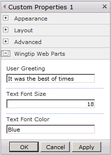
While this technique provides a quick and easy solution, it doesn’t always provide the level of control that you need. For example, you cannot add any custom validation to constrain the types of values entered by users. You cannot provide a drop-down box that’s been populated from items in a SharePoint list or from a Web service across the network. For any persistent property based on a string or a numeric type, SharePoint Foundation provides nothing more than a simple text box to accept the user’s input.
There are a few helpful tricks that you should know about when you create WebBrowsable properties. First, if you create a WebBrowsable property based on the bool type, SharePoint Foundation creates its input control using a check box instead of a text box. Also, if you create a WebBrowsable property based on a public enumeration type, SharePoint Foundation will create a drop-down list that is populated using enumeration type values. For example, the WingtipWebParts project defines two enumerations named TextFontSizeEnum and TextFontColorEnum.
public enum TextFontSizeEnum {
  Fourteen = 14,
  Eighteen = 18,
  TwentyFour = 24,
  ThirtyTwo = 32
}

public enum TextFontColorEnum {
  Purple,
  Green,
  Blue,
  Black
}
The sample Web Part named CustomProperties2 defines its properties named TextFontSize and TextFontColor in terms of these two enumeration types. This approach provides a better user experience, as well as built-in validation, because the user is forced to select a value from a drop-down box, as shown in Figure 6-10.
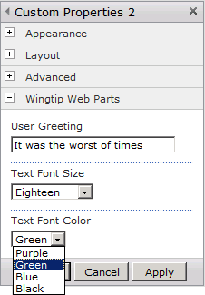
For some Web Parts, you will find that it is sufficient to define persistent properties with the WebBrowsable attribute so that SharePoint Foundation automatically displays them for editing in the generic Editor Part. However, this will not be sufficient for all scenarios. There will be times when you will want to create your own custom Editor Parts for the tool pane. This section will step through what’s required to accomplish this.
To create a custom Editor Part, you must create a new class that inherits from the EditorPart class defined inside the System.Web.UI.WebControls.WebParts namespace. The sample Web Part named CustomProperties3 has an associated Editor Part named CustomProperties3Editor.
In addition to creating and implementing a new class to create the Editor Part, you must also make a few changes to the Web Part class itself. First, you should modify the attributes of your persistent properties so that they do not appear in the generic Editor Part. This can be done by applying the WebBrowsable attribute with a value of false.
[ Personalizable(PersonalizationScope.User),
  WebBrowsable(false) ]
public string UserGreeting { get; set; }

[ Personalizable(PersonalizationScope.User),
  WebBrowsable(false) ]
public int TextFontSize { get; set; }

[ Personalizable(PersonalizationScope.User),
  WebBrowsable(false) ]
public string TextFontColor { get; set; }
Next, you must override the CreateEditorParts method within the Web Part class to instruct SharePoint Foundation to load your custom Editor Part when it loads the standard Editor Parts that are displayed for all Web Parts.
When you override CreateEditorParts, you must first create an object from your Editor Part class. When you create and initialize this Editor Part object, it is critical that you assign a unique value to its ID property. If you forget to do this, you will get an ambiguous exception with very little debugging detail. A common technique for creating a unique Editor Part ID is to append a string to the end of the Web Part’s ID that is guaranteed to be unique. You then must create the return value for CreateEditorParts by creating a new instance of the EditorPartCollection class, which can be initialized using an array of EditorPart references.
public override EditorPartCollection CreateEditorParts() {
  EditorPart editor = new CustomProperties3Editor();
  editor.ID = this.ID + "_editor";
  EditorPart[] parts = { editor };
  return new EditorPartCollection(parts);
}
Now we have finished updating the Web Part class to support a custom Editor Part. Therefore, it’s time to move on to implementing the Editor Part class. This usually involves overriding three methods in the Editor Part class named CreateChildControls, SyncChanges, and ApplyChanges.
As in the case of creating a Web Part class, you override the CreateChildControls method to create the child controls that will allow the user to see and update property values. The sample Editor Part class named CustomProperties3Editor has code in the CreateChildControls method, which creates a multi-line Textbox control and two RadioButtonList controls to provide an enhanced user interface experience, as shown in Figure 6-11.
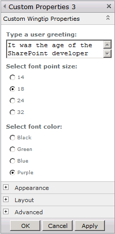
The two other methods that you must override in addition to CreateChildControls are SyncChanges and ApplyChanges, which are defined as abstract methods inside the EditorPart class. SyncChanges is called when the user clicks the Edit Web Part menu command, which provides an opportunity to retrieve the current property values from the Web Part and use them to initialize user input controls in the Editor Part. Note that the EditorPart class provides a protected property named WebPartToEdit, which makes it possible to obtain a reference to the correct Web Part. Here is the implementation of the SyncChanges method in the sample Editor Part named CustomProperties3Editor.
public override void SyncChanges() {
  EnsureChildControls();
  CustomProperties3 webpart = this.WebPartToEdit as CustomProperties3;
  // initialize text box with UserGreeting property
  txtUserGreeting.Text = webpart.UserGreeting;
  // initialize RadioButtonList to select current font size
  ListItem FontItem = lstFontSizes.Items.FindByText(webpart.TextFontSize.ToString());
  FontItem.Selected = true;
  // initialize RadioButtonList to select current font color
  lstFontColors.Items.FindByText(webpart.TextFontColor).Selected = true;
}
The first thing you should notice in this implementation of SyncChanges is that it begins with a call to EnsureChildControls. This is required because there are times when SyncChanges is executed before CreateChildControls. This can cause problems because the CreateChildControls method is where you create the child controls. The call to EnsureChildControls forces the execution of the CreateChildControls method before any work is done in the SyncChanges method. As a rule, you should always start with a call to EnsureChildControls whenever you override SyncChanges or ApplyChanges.
While the SyncChanges method is used to take property values from the Web Part and initialize user input controls, ApplyChanges does the opposite. The ApplyChanges method fires whenever the user clicks the OK button or Apply button in the task pane, giving you a chance to retrieve user input from the Editor Part and write it back to the Web Part. After you have written the updated property values to the Web Part, you must return a value of true, which instructs the Web Part Manager to save your changes back to the content database. A typical implementation of the ApplyChanges method can be seen in the sample Editor Part named CustomProperties3Editor.
public override bool ApplyChanges() {
  EnsureChildControls();
  CustomProperties3 webpart = this.WebPartToEdit as CustomProperties3;
  webpart.UserGreeting = txtUserGreeting.Text;
  webpart.TextFontSize = Convert.ToInt32(lstFontSizes.Text);
  webpart.TextFontColor = lstFontColors.Text;
  // return true to force Web Part Manager to persist changes
  return true;
}A Web Part Verb is a user command that is rendered in the Web Part menu as part of the chrome that is rendered on the right side of the title bar. There are several built-in Web Part verbs, such as Minimize, Close, and Edit Web Part. These built-in Web Part verbs can be disabled in display mode by initializing a Web Part instance with the following property settings.
<property name="AllowMinimize" type="bool">False</property>
<property name="AllowClose" type="bool">False</property>
<property name="AllowEdit" type="bool">False</property>
Note that initializing a Web Part with these property settings affects display mode but not edit mode. For example, when a site collection owner enters edit mode on a Web Part page, SharePoint Foundation will always provide the Edit Web Part menu for each Web Part. The key point here is that there are some menu commands in the Web Part menu that cannot be removed or disabled.
The Web Part framework provides a way for a developer to add Web Part verbs. This allows you to extend the Web Part menu with custom commands to a particular business scenario. The menu command behind a Web Part verb can be configured as either a client-side event handler or a server-side event handler. SharePoint 2010 also allows you to combine a client-side event handler and a server-side handler using a single Web Part verb.
To add one or more Web Part verbs to a Web Part class, you must override the read-only Verbs property. Inside the get block of the Verbs property, you must create an instance of the WebPartVerb class for each Web Part verb that you want to create. The WebPartVerb class provides several different constructors, giving you the ability to create a client-side verb, a server-side verb, or a combo verb that combines a client-side handler and a server-side handler.
To create a client-side verb, you should use the constructor that accepts two string parameters. The first string parameter is used to pass the verb’s ID and the second string parameter is used to pass in the JavaScript code that should be executed when the user invokes the verb.
string ClientSideScript = "alert('hello from a client-side handler')";
WebPartVerb verb1 = new WebPartVerb(this.ID + "_verb1", ClientSideScript);
To create a server-side verb, you should use the constructor that accepts a string parameter followed by a delegate-based parameter. The second parameter is used to pass a delegate reference to the server-side method with the following signature.
void OnVerbExecuted(object sender, WebPartEventArgs e) {
  // this method is executed when the user invokes the server-side verb
}
Here is a complete implementation of the Verbs property that creates both a client-side verb and a server-side verb and adds them to a new WebPartVerbCollection object, which is passed as the property’s return value.
public override WebPartVerbCollection Verbs {
  get {
    // create client-side verb
    string ClientSideScript = "alert('hello from a client-side handler')";
    WebPartVerb verb1 = new WebPartVerb(this.ID + "_verb1", ClientSideScript);
    verb1.Text = "Client-side Verb";

    // create server-side verb
    WebPartVerb verb2 = new WebPartVerb(this.ID + "_verb2", OnVerbExecuted);
    verb2.Text = "Server-side verb";

    // return collection with new verbs
    WebPartVerb[] verbs = new WebPartVerb[] { verb1, verb2 };
    return new WebPartVerbCollection(verbs);
  }
}

void OnVerbExecuted(object sender, WebPartEventArgs e) {
  // this method is executed when the user invokes the server-side verb
}
If you want to create a combo verb, there is a third constructor that takes three parameters, allowing you to pass both a delegate to a server-side method and a string with client-side JavaScript.
The WingtipWebParts project contains a sample Web Part named WebPartVerbsFontDemo, which demonstrates several useful techniques that you can employ when creating Web Part verbs. Each Web Part verb instance exposes properties that allow you to enable or disable it, as well as give it a check mark or a custom image. This makes it possible to create Web Part menus that change dynamically according to the current context. Figure 6-12 shows how the Web Part menu for the WebPartVerbsFontDemo Web Part appears to the user.

Figure 6-12. The menu command for a Web Part verb that can be disabled, checked, or given a custom image.
Another useful technique demonstrated in the WebPartVerbsFontDemo Web Part is creating a server-side verb that updates a persistent Web Part property. For example, when a user clicks the Web Part menu with the Make Font Green caption, the Web Part verb issues a Hypertext Transfer Protocol (HTTP) postback, which fires a server-side method in the Web Part class named OnMakeFontGreen. But how would you actually write the code in this server-side event handler to change the value of the persistent property named TextFontColor? Perhaps you would start by writing the event handler code like this.
void OnMakeFontGreen(object sender, WebPartEventArgs e) {
  this.TextFontColor = "Green";
}
As it turns out, this code will not produce the desired effect. It updates the Web Part inside the scope of a single request, but it does not write the change back to the content database. What you need to do is create an instance of SPLimitedWebPartManager for the current page, which makes it possible to update the Web Part and save the changes back to the content database. The following implementation uses the SPLimitedWebPartManager class to produce the desired effect.
void OnMakeFontGreen(object sender, WebPartEventArgs e) {
  this.TextFontColor = "Green";
  SPWeb site = SPContext.Current.Web;
  SPFile page = site.GetFile(Context.Request.Url.AbsolutePath);
  SP.SPLimitedWebPartManager wpm = page.GetLimitedWebPartManager(PersonalizationScope.User);
  WebPartVerbsFontDemo webpart = wpm.WebParts[this.ID] as WebPartVerbsFontDemo;
  webpart.TextFontColor = "Green";
  wpm.SaveChanges(webpart);
}The Web Part Framework allows Web Parts to be connected together using Web Part connections. A Web Part connection represents a communications channel between two Web Parts where one Web Part plays the role of the connection provider and the other plays the role of the connection consumer.
One key point is that developers create Web Parts that are connectable. However, users are typically the ones who actually create Web Part connections. The Web Part Manager plays an essential role because it allows users to discover which pairs of Web Parts on a page are connectable and to establish connections between them. Once a pair of Web Parts has been connected, the Web Part Manager also takes on the responsibility of creating the communications channel between them early in the life cycle of a Web Part page.
Note
Earlier versions of SharePoint technologies supported Web Part connections that worked across pages. However, the support for creating cross-page connections was dropped because it caused problems with reliability and maintainability. The support for Web Part connections in SharePoint 2010 is based on connecting Web Part instances that are running on the same Web Part page. Anything you see or read about cross-page connections is either deprecated or unsupported and can be safely ignored.
Each Web Part connection is based on an interface definition known as the connection interface. Once two Web Parts are connected, the consumer is able to access the provider using the method and properties defined in the connection interface. The WingtipWebParts project provides an example of two Web Parts named FontConnectionProvider and FontConnectionConsumer, which demonstrate how to pass font formatting data in a Web Part connection. For example, when you change the font size and color in the provider Web Part, the consumer Web Part changes its font size and color along with it. The connection between these two Web Parts is based on a public interface named IFontProvider.
public interface IFontProvider {
  FontUnit FontSize { get; }
  Color FontColor { get; }
}
Let’s start by discussing how to implement the FontConnectionProvider class. We will start by implementing the connection interface in the Web Part class itself. For example, the FontConnectionProvider class implements the IFontProvider interface and uses its persistent properties, named TextFontColor and TextFontSize, to provide a consumer with its current setting for font formatting.
public class FontConnectionProvider : WebPart, IFontProvider {

  public FontUnit FontSize {
    get { return new FontUnit(this.TextFontSize); }
  }

  public Color FontColor {
    get { return Color.FromName(this.TextFontColor); }
  }

  // other class members omited for brevity
}
The second thing that you need to do in the provider Web Part is to create a special method known as a connection point. A connection point is a method that serves as an entry point into a connectable Web Part instance. The Web Part Manager uses connection points to connect the provider to the consumer after a connection has been established. The Web Part Manager also uses connection points to discover the potential connections that could be established between any pair of Web Parts on the current page. When the Web Part Manager determines that there is a potential connection between two Web Parts on the current page, it lights up the Connections menu in both Web Parts, giving the user the ability to create a connection in the browser.
When you create a method to serve as a provider connection point, it does not matter what you name it. What does matter is that the method is defined without parameters and with a return type based on the connection interface. You must also apply the ConnectionProvider attribute to the method, which makes it a discoverable connection point to the Web Part Manager. This is how the connection point method is defined in the FontConnectionProvider class.
[ConnectionProvider("Font Formatting", AllowsMultipleConnections = true)]
public IFontProvider FontProviderConnectionPoint() {
  return this;
}
As you can see, the implementation of this method is pretty simple, apart from having the ConnectionProvider attribute and the correct signature. Because the Web Part class implements the connection interface, the method simply needs to return a reference to the current Web Part instance using the C# this reference.
The ConnectionProvider attribute is applied using two parameters. The first parameter is a Display Name for a connection that will be shown to the user through the Connections fly out menu. The AllowsMultipleConnections parameter is a named parameter that allows you to control whether users can create additional connections after the first connection has been established. In this case, it does make sense to allow for multiple connections because there could be a scenario in which the users would want two or more consumer Web Parts to synchronize on the same font formatting used by a single provider.
Now, let’s discuss implementing a consumer Web Part to support an IFontProvider connection. The consumer Web Part must supply a method for a consumer connection point with a signature that is different than the method for a provider connection point. The method for the consumer connection point takes a single parameter based on the interface type and has a void return type. The method also requires the ConnectionConsumer attribute, which takes the same parameters as the ConnectionProvider attribute. Examine the following definition for the FontConnectionConsumer class.
public class FontConnectionConsumer : WebPart {

    protected IFontProvider FontProvider;

    [ConnectionConsumer("Font Formatting", AllowsMultipleConnections=false)]
    public void FontProviderConnectionPoint(IFontProvider provider) {
      FontProvider = provider;
    }

    // other class members omited for brevity
}
The ConnectionConsumer attribute is applied passing the Display Name parameter and the AllowsMultipleConnections parameter. As you can see, the AllowsMultipleConnections parameter is assigned a value of false. That’s because it doesn’t make sense given the scenario of connecting a font consumer to more than one font provider. By assigning the AllowsMultipleConnections parameter a value of false, you are telling the Web Part Manager to disallow additional connections through the current connection point once a single connection has been established.
The other thing that you should notice about the previous listing of the FontConnectionConsumer class is that it contains a protected field named FontProvider, which is based on the connection interface type. This is used so that the consumer Web Part can track a connection to the provider Web Part. Let’s discuss what happens when a page is processed to give you an understanding of how the connection is established.
When a Web Part page with a connected pair of Web Parts is being processed, the Web Part Manager calls the provider’s connection point method to obtain an IFontProvider reference. Then the Web Part Manager passes that reference to the consumer by calling its connection point method. The consumer’s connection point method copies this reference to the protected field named FontProvider to provide a way to access the provider Web Part in other methods.
One thing that you must keep in mind is that a consumer Web Part often will execute in a disconnected state, so you cannot always assume that the FontProvider field has a valid reference. Instead, you should implement a consumer Web Part to handle gracefully scenarios in which it is not connected. Here is an example of a method in the FontConnectionConsumer class that is written to test whether the current Web Part instance is connected before attempting to access its properties.
protected override void OnPreRender(EventArgs e) {
  if (FontProvider != null) {
    lbl.ForeColor = FontProvider.FontColor;
    lbl.Font.Size = FontProvider.FontSize;
  }
}
Now that we have reviewed how to implement the provider Web Part and the consumer Web Part, it’s time to discuss how the user connects these Web Parts once they have been created on a Web Part page. Imagine a scenario where a Web Part page has one instance of the FontConnectionProvider Web Part and two instances of the FontConnectionConsumer Web Part. The Web Part Manager discovers that two possible connections can be created. If you enter edit mode for the Web Part page and access the Web Part drop-down menu of the provider Web Part, you will see that the Web Part Manager has provided an option for the user to create connections by adding fly out menus to the Connections menu, as shown in Figure 6-13.

Figure 6-13. The Web Part Manager enables the Connections menu when it discovers connectable Web Parts.
If you take a closer look at the Connections fly out menu shown in Figure 6-13, you will notice that the Web Part Manager uses the Display Name that was added to the ConnectionProvider attribute. The Display Name of Font Formatting is parsed together in a string between the words Send and To. This is something that you should keep in mind when creating the Display Name values for connection points.
On the right side of Figure 6-13, you can see selectable menu commands containing the title of consumer Web Parts that can be connected to this provider Web Part. If you click one of those consumer Web Part titles, you will create a Web Part connection between the two. After you have made a connection, the same menu will still appear, but with a check mark on it to show that there is an established connection. You can also click the checked menu item to delete the Web Part connection as well.
While Figure 6-13 shows a provider Web Part that is connected to a consumer, it is also possible to create the same type of connection in the other direction. In other words, the two consumer Web Parts will provide fly out menus in their Connections menu, which allows a user to establish a connection to a consumer. Also, keep in mind that there is no difference between connecting a provider to a consumer and connecting a consumer to a provider. The connection, once established, behaves the same way in either case.
In many scenarios, users will connect Web Parts using the Connections menu, as was shown in the previous section. However, there are occasionally scenarios in which it makes sense to prepopulate a Web Part page with two connectable Web Parts and to also preestablish a connection between them.
The WingtipWebParts project contains a feature receiver that uses the SPLimitedWebPartManager class to create an instance of both the provider Web Part and the consumer Web Part on a Web Part page named WebPartsPreconnected.aspx. The code then calls a method of the SPLimitedWebPartManager class named SPConnectWebParts, which is used to create a connection between the two Web Part instances, as shown in Example 6-3.
Example 6-3. Web Parts connected with code using SPLimitedWebPartManager
public override void FeatureActivated(SPFeatureReceiverProperties properties) {

  SPSite siteCollection = (SPSite)properties.Feature.Parent;
  SPWeb site = siteCollection.RootWeb;

  SPFile page = site.GetFile("WebPartPages/WebPartsPreconnected.aspx");
  SPLimitedWebPartManager mgr =
    page.GetLimitedWebPartManager(PersonalizationScope.Shared);

  // create provider Web Part in Left zone
  FontConnectionProvider.FontConnectionProvider ProviderWebPart =
    new FontConnectionProvider.FontConnectionProvider();
  ProviderWebPart.Title = "Font Provider 1";
  ProviderWebPart.UserGreeting = "I look pretty";
  ProviderWebPart.TextFontSize = 18;
  ProviderWebPart.TextFontColor = "Blue";
  mgr.AddWebPart(ProviderWebPart, "Left", 0);

  // create consumer Web Part in Right zone
  FontConnectionConsumer.FontConnectionConsumer ConsumerWebPart =
    new FontConnectionConsumer.FontConnectionConsumer();
  ConsumerWebPart.Title = " Font Consumer 1";
  ConsumerWebPart.UserGreeting = "And so do I";
  mgr.AddWebPart(ConsumerWebPart, "Right", 0);

  // create connection between Web Parts
  mgr.SPConnectWebParts(
    ProviderWebPart,
    mgr.GetProviderConnectionPoints(ProviderWebPart).Default,
    ConsumerWebPart,
    mgr.GetConsumerConnectionPoints(ConsumerWebPart).Default
  );
}We have now reached the final topic of this chapter, which is creating Web Parts that use asynchronous processing. If you develop Web Parts that retrieve data from across the network without using asynchronous processing, your Web Parts will have serious limitations when it comes to scaling and optimizing page response times. Learning to write Web Parts that use the asynchronous processing support provided by the ASP.NET Framework is a key factor in achieving scalability in SharePoint farms that experience high levels of traffic.
Let’s begin by discussing the core problem. By default, the ASP.NET Framework processes each page request using a single thread. This is true even for Web Part pages that contain several Web Parts. Now consider a scenario where two Web Parts on the same page both call across the network to remote Web services to retrieve data. When the first Web Part calls across the network, it has the effect of blocking the primary request thread that is processing the page. That means that all page processing halts until the call from the first Web Part returns from across the network.
A key point is that the second Web Part is not able to begin its call across the network until the call sent by the first Web Part returns. In other words, the two Web Parts have to conduct their calls across the network in a serialized fashion, as opposed to being able to send them in parallel. You can see that a Web Part page in this scenario has a response time that gets longer each time you add another Web Part that calls across the network. Now consider a scenario where a Web Part page has 10 Web Parts calling across the network instead of 2 Web Parts. The response time for processing the page would become unacceptably long.
The use of asynchronous processing provides a much better solution when developing Web Parts that call across the network. A key factor is that each Web Part is able to call across the network on a secondary thread that doesn’t block other Web Parts. Therefore, all the Web Parts on a page can make calls across the network in parallel, which can reduce response times significantly. The total page response time is reduced from the sum of network call times to the time of the network call that takes the longest.
A second motivation for using asynchronous processing involves automatic time-out support. Think about a scenario where your Web Part calls across the network to a Web service that is experiencing problems with availability or responsiveness. How long should your Web Part wait for a response from the troubled Web service before giving up and returning with an error? Furthermore, how would you write the code in your Web Part to cancel a pending call across the network. Without assistance from the ASP.NET Framework, you would be forced to program at a very low level to terminate a thread blocking on a remote method call. Fortunately, this is not a concern because the asynchronous processing support in the ASP.NET Framework provides automatic time-out detection, which shields the developer from the low-level programming details of cancelling a network call in progress.
The third motivation for using asynchronous processing has to do with the way in which the ASP.NET Framework manages threads. The ASP.NET Framework manages a thread pool of primary request threads, which it uses to process incoming page requests. What is important to understand is that this thread pool never changes in size. In other words, the primary request threads used to process ASP.NET pages are a finite resource.
If you rely on primary request threads to call across the network, you cause blocking, which effectively reduces the number of primary request threads available to service incoming requests. This type of blocking can compromise Web application responsiveness in high-traffic farms. When you use asynchronous processing, the ASP.NET Framework uses secondary threads drawn from a separate thread pool that grows and shrinks dynamically in response to traffic increasing and decreasing. This has a positive effect on both responsiveness and scalability.
Before we examine the programming details, let’s take a moment to discuss the high-level architecture that allows the ASP.NET Framework to provide support for asynchronous processing. By default, each page request is processed by a primary request thread from the main thread pool. The primary request thread creates and initializes the page object and then begins executing page life cycle methods such as OnInit, OnLoad, and CreateChildControls. After the primary request thread has completed executing the other page-level methods and event handlers, it enters the final rendering phase of the page request, where it executes the methods associated with output rendering, such as Render and RenderContents.
The technique for using asynchronous processing support in Web Parts involves creating and registering asynchronous tasks. Whenever you create and register an asynchronous task, you are in effect making a request to the ASP.NET Framework to execute code on a secondary thread. It is recommended that you create and register asynchronous tasks as late as possible in the page life cycle, but you must do it before the page enters the rendering phase. Therefore, you should add the code to perform this work in the OnPreRender method. While it is most common for Web Parts to create and register a single asynchronous task per request, you can also write a single Web Part that creates and registers two or three asynchronous tasks per request if the scenario calls for it.
When the ASP.NET Framework detects one or more asynchronous tasks have been registered, it changes the thread processing model for the current page request. Let’s now look at what happens in a page request in which asynchronous tasks have been registered. The page process begins in the usual fashion, where the primary request thread creates and initializes the page object and then executes methods and event handlers in the page life cycle. However, the primary request thread executes methods only up to and including the OnPreRender method. After the OnPreRender method completes, the primary request thread returns to its thread pool, where it becomes available to serve other incoming page requests.
After the OnPreRender method completes and the primary request thread has been returned to its thread pool, the ASP.NET Framework begins to execute each asynchronous task on its own secondary thread. For example, within a page request that involves three asynchronous tasks, the ASP.NET Framework will employ three secondary threads, allowing each asynchronous task to progress at its own pace without being blocked by any of the other asynchronous tasks. As noted earlier, the ASP.NET Framework draws these secondary threads from a separate thread pool, which grows and shrinks dynamically according to traffic levels.
Once the asynchronous tasks for a page request begin to execute, the ASP.NET Framework monitors their progress. A key point is that every asynchronous task in a page request must finish before the page request can enter the rendering phase. The ASP.NET Framework adds value in page processing by providing the automatic blocking behavior, which patiently waits until each asynchronous task has either completed its execution or has timed out.
Once all the asynchronous tasks have either completed their work or have timed out, the ASP.NET Framework transitions the page request into the rendering phase by executing methods such as Render and RenderContents. Note that the ASP.NET Framework processes the rendering methods using primary request threads from the main thread pool as opposed to using the secondary threads that are used to execute asynchronous tasks.
Asynchronous processing support is enabled by creating and registering an instance of the PageAsyncTask class. The code that creates and registers the PageAsyncTask instance should be added to the OnPreRender method. Here is a starting point for a Web Part class that is written to support asynchronous processing.
public class AsyncProcessing101 : WebPart {
  protected override void OnPreRender(EventArgs e) {
    PageAsyncTask task1 = new PageAsyncTask(Task1Begin, Task1End, Task1Timeout, null);
    this.Page.RegisterAsyncTask(task1);
  }

  IAsyncResult Task1Begin(object sender, EventArgs args,
                          AsyncCallback callback, object state){
    // access data across network on secondary thread
    // return IAsyncResult object for ASP.NET to monitor progress
  }

  void Task1End(IAsyncResult result) {
    // perform required work after async task has completed
  }

  void Task1Timeout(IAsyncResult result) {
    // handle case where async task to cancelled due to time-out
  }
}
To create a new PageAsyncTask instance, you must call a constructor that accepts four parameters. The first three parameters are based on delegate types that are used to reference three different methods. In the Web Part class named AsyncProcessing101, these methods have the names Task1Begin, Task1End, and Task1Timeout. The fourth parameter in the constructor is based on the System.Object type and can be used to pass any arbitrary data to the secondary thread that is processing the asynchronous task.
Once you have created the PageAsyncTask instance, you must then register it with the ASP.NET Framework. You register a PageAsyncTask instance by calling the RegisterAsyncTask method supplied by the Page class.
Let’s discuss the method named Task1Begin. This is the method that executes on a secondary thread where you should make your call across the network. Note that this method is defined with an IAsyncResult return type, which represents a common asynchronous programming pattern in the .NET Framework. The ASP.NET Framework uses the IAsyncResult object to monitor the progress of the asynchronous task and to determine when the work has been completed. The .NET Framework provides quite a few classes that implement the IAsyncResult design pattern. Some examples of these classes include Web Requests, Web Service Proxies, and ADO.NET database classes.
If you need to call across the network using an application programming interface (API) or library that does not support the IAsyncResult design pattern, you can also factor the code for your asynchronous task into a separate method and then execute that method using a .NET delegate. The value of employing a .NET delegate is that it automatically provides a BeginInvoke method that is defined with an IAsyncResult return type. Here is an example of using the built-in .NET Framework delegate named Action, which allows you to execute a method and return an IAsyncResult object.
IAsyncResult Task1Begin(object sender, EventArgs args,
                        AsyncCallback callback, object state) {
  Action func1 = new Action(GetDataFromNetwork);
  return func1.BeginInvoke(callback, state);
}

void GetDataFromNetwork(){
  // call across network
}
Now let’s discuss the method named Task1End. The ASP.NET Framework executes this method after the asynchronous processing is finished. For example, the ASP.NET Framework will not execute Task1End until Task1Begin has completed its work. Moreover, the ASP.NET Framework will not execute Task1End until every other asynchronous task has completed its work. If three different PageAsyncTask instances have been created and registered during the processing of a page, the ASP.NET Framework waits until each of the three asynchronous tasks have finished executing their Begin methods before it executes any of their End methods.
The ASP.NET Framework executes the last method, named Task1Timeout, in the event that a time-out occurs. When a time-out occurs, you can assume that the associated asynchronous task did not complete successfully. Therefore, you should add time-out logic to the Web Part to provide some type of error message to the user indicating that there has been a problem.
Note that SharePoint Foundation provides a default time-out value of 7 seconds. SharePoint Foundation provides a default time-out value that is configured in the web.config file inside the pages element within the system.web section.
<configuration>
  <system.web>
    <pages asyncTimeout="7" >
  </system.web>
</configuration>
Note that there is only one time-out value per page request. An asynchronous task does not have its own independent time-out value. If you believe that you need a time-out value that is longer or shorter than seven seconds, you can modify the AsyncTimeout property of the Page class in the OnPreRender method.
this.Page.AsyncTimeout = new TimeSpan(0, 0, 10);
The AsynchRssReader Web Part provides a real-world example of a Web Part that uses an asynchronous task to make a Web service call across the network. The complete definition for this Web Part class is shown in Example 6-4. By examining this listing, you can get a better picture of how all the pieces fit together.
Example 6-4. The AsyncRssReader Web Part
public class AsyncRssReader : WebPart {

  [ Personalizable(PersonalizationScope.User),
    WebBrowsable(true),
    WebDisplayName("RSS Source URL:"),
    WebDescription("provides address for RSS feed"),
    Category("Wingtip Web Parts")]
  public string RssSourceUrl { get; set; }

  private WebRequest request;
  private Stream response;
  private bool requestTimedOut;

  protected override void OnPreRender(EventArgs e) {
    // do not register async task if in design mode
    if (this.WebPartManager.DisplayMode.AllowPageDesign) { return; }

    // ensure valid URL for RSS Feed
    if (string.IsNullOrEmpty(RssSourceUrl))
      RssSourceUrl = "http://feeds.feedburner.com/AndrewConnell";

    // create WebRequest and register async task
    request = WebRequest.CreateDefault(new Uri(RssSourceUrl));
    PageAsyncTask task1 =
      new PageAsyncTask(Task1Begin, Task1End, Task1Timeout, null);
      this.Page.AsyncTimeout = new TimeSpan(0, 0, 10);
      this.Page.RegisterAsyncTask(task1);
   }

   IAsyncResult Task1Begin(object sender, EventArgs args,
                           AsyncCallback callback, object state) {
     return request.BeginGetResponse(callback, state);
   }

   void Task1End(IAsyncResult result) {
     response = request.EndGetResponse(result).GetResponseStream();
   }

   void Task1Timeout(IAsyncResult result) {
     requestTimedOut = true;
   }

   protected override void RenderContents(HtmlTextWriter writer) {
     if (this.WebPartManager.DisplayMode.AllowPageDesign) {
        writer.Write("No RSS Reading while in design mode");
     }
     else if (requestTimedOut || response == null) {
       writer.Write("Request for RSS feed timed out");
     }
     else{
       XslCompiledTransform transform = new XslCompiledTransform();
       string xsltRssFeedToHtml = Properties.Resources.RssFeedToHtml'
       XmlReader xslt = XmlReader.Create(new StringReader(xsltRssFeedToHtml));
       transform.Load(xslt);
       XmlReader reader = new XmlTextReader(response);
       XmlTextWriter results = new XmlTextWriter(writer.InnerWriter);
       transform.Transform(reader, results);
       reader.Close();
     }
   }
}
When designing Web Parts, you should consider only registering asynchronous tasks when a Web Part is in display mode. In other words, you should avoid expensive trips across the network when the user has the hosting Web Part page in design mode. Before registering an asynchronous task to call across the network, the AsynchRssReader Web Part runs a simple test to verify that the current page is not in design mode. This test can be accomplished by inspecting the Web Part Manager’s DisplayMode property.
protected override void OnPreRender(EventArgs e) {
  if (this.WebPartManager.DisplayMode.AllowPageDesign) {
    // return without registering asynchronous task
    return;
  }
  // continue with registering asynchronous task...
}
The AsynchRssReader Web Part calls to a Web service using the WebRequest class and the WebResponse class, which are defined by the .NET Framework inside the System.Net namespace. Note that the WebRequest class provides a method named BeginGetResponse, which returns an IAsyncResult object. The Task1Begin method calls the BeginGetResponse method to begin the call across the network. You can also observe that the Task1Begin method uses the IAsyncResult object returned from BeginGetResponse as its own return value.
While the Task1Begin method calls BeginGetResponse, there is also a need to call a corresponding method of the WebRequest class named EndGetResponse. The call to EndGetResponse is in the Task1End method, which takes the Stream-based return value and assigns it to the protected field named response.
void Task1End(IAsyncResult result) {
  response = request.EndGetResponse(result).GetResponseStream();
}
RenderContents begins its execution after the asynchronous task has completed. Note that the implementation of RenderContents begins by checking to ensure that the page is not in design mode and that a time-out has not occurred. RenderContents then completes its work by extracting the contents of the RSS feed from the Stream object referenced by the response field, as shown in Example 6-4.
This chapter began by covering the fundamentals of creating and using custom controls. There were several examples of creating and using custom controls, such as the case of adding a custom fly out menu to a SharePoint site. The text also covered when it makes sense to employ user controls in SharePoint development to increase your productivity, and how to use the power of delegate controls in scenarios where you need to add CSS rules and JavaScript code across many pages on a sitewide or farmwide basis.
The second part of this chapter took a detailed look at Web Part development. You learned about the role of the Web Part Manager and the function of the Web Part Gallery. We demonstrated several different styles for rendering the output of a Web Part and discussed scenarios where each style is most appropriate. In addition, the text examines essential Web Part development skills, such as adding persistent properties and custom Editor Parts. The chapter demonstrated taking advantage of Web Part verbs, Web Part connections, and asynchronous processing support, which is critical when retrieving data from across the network.