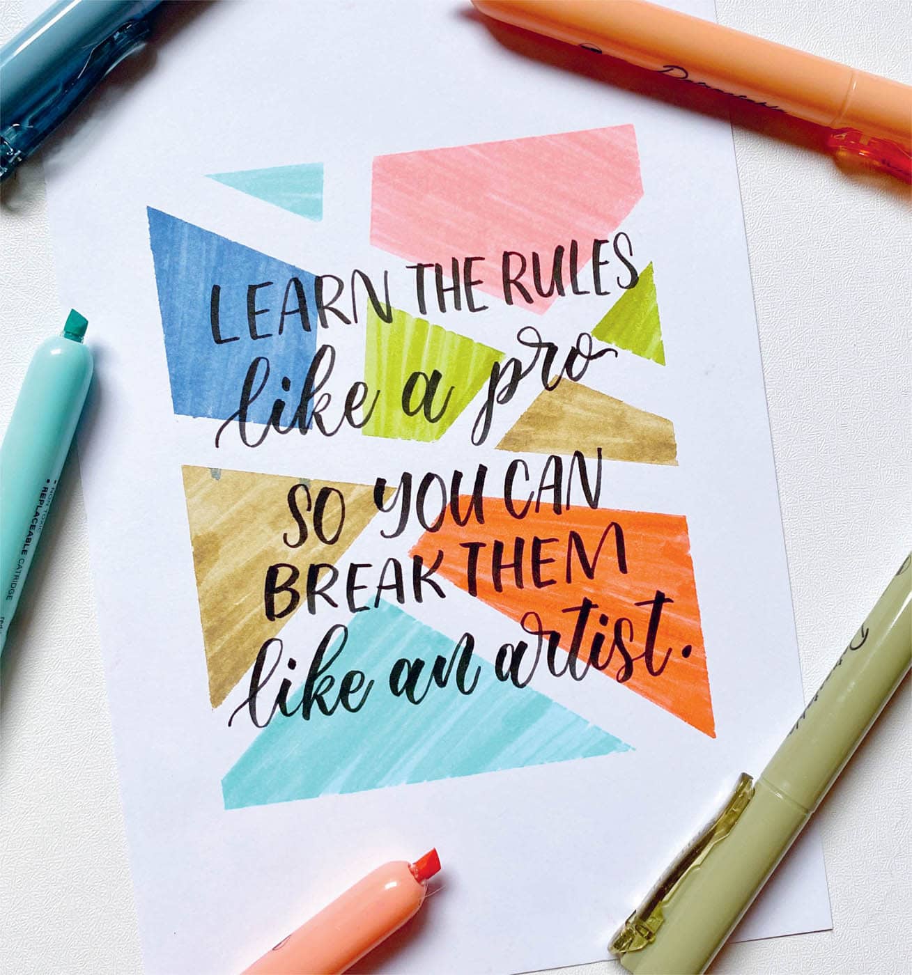
FINDING YOUR OWN LETTERING STYLE
“How do I find my own lettering style?”
This is a common question that I see in the lettering community. Lots of people struggle to find their own style, but don’t forget that we all have unique styles and that there are many ways to discover your own lettering preferences.
You can use books or watch tutorials to learn how to create different lettering techniques, or you can simply experiment on your own and come up with one-of-a-kind style that will eventually become your signature lettering look. Whatever works for you, follow your instincts and be confident with what you can do. Let go of any thoughts of comparing yourself with others.
Throughout my journey, I have also experienced comparing myself with other artists. If you’ve encountered this feeling, know that you are not alone and that it is OK to feel this way. But it’s also necessary to remember that in the process of finding your own style as an artist, it’s not about comparing yourself with other artists. It’s about finding the unique voice that you can express in your calligraphy or lettering artworks.
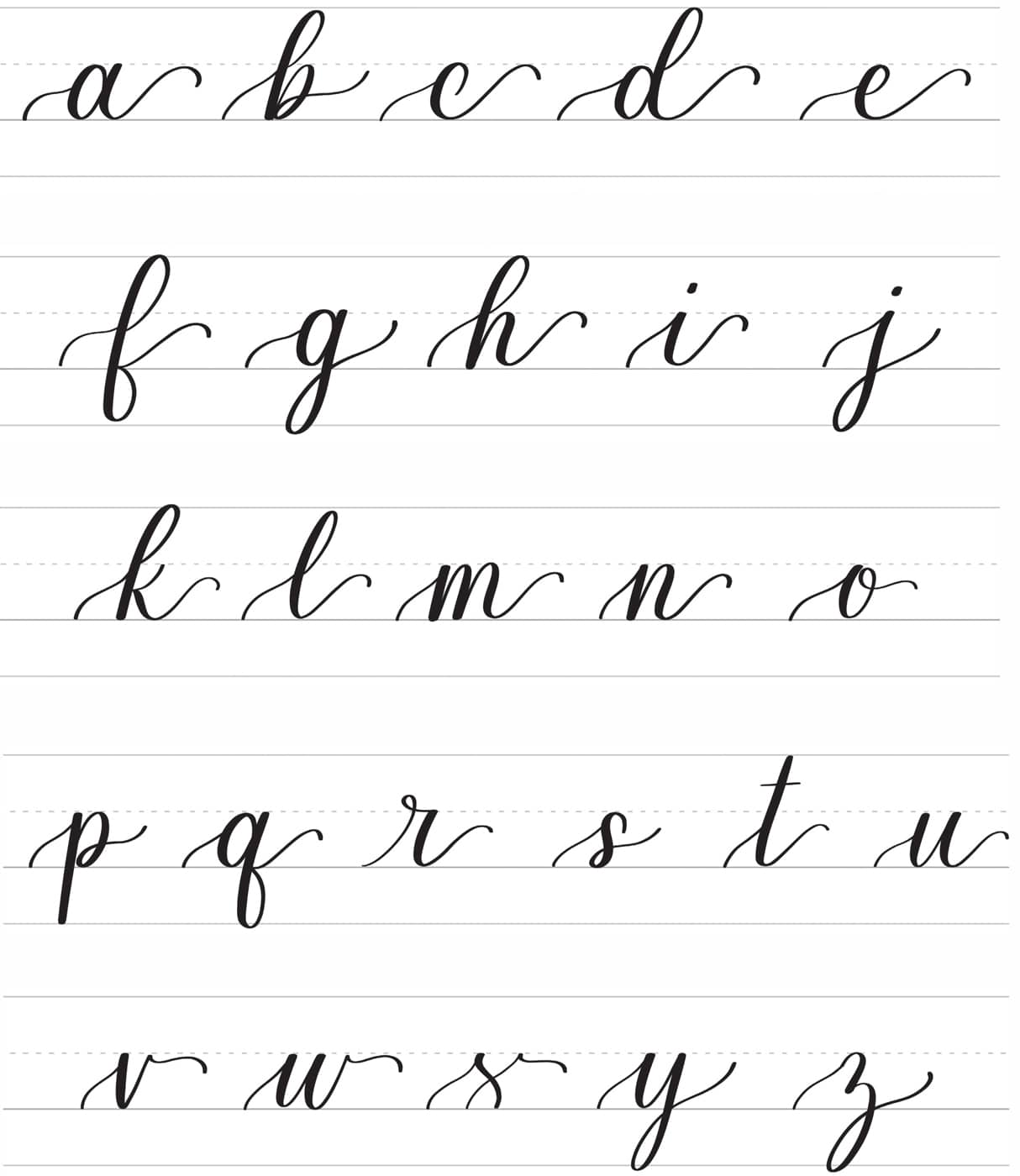
As a beginner in calligraphy, it’s OK if you don’t have a defined style yet since you’re still learning. To help you on your journey, here are a few questions to ask yourself:
1. What topics do you enjoy talking about?
If you enjoy reading poems, you can practice doing calligraphy with poem excerpts. This makes you a calligrapher who loves lettering poems!
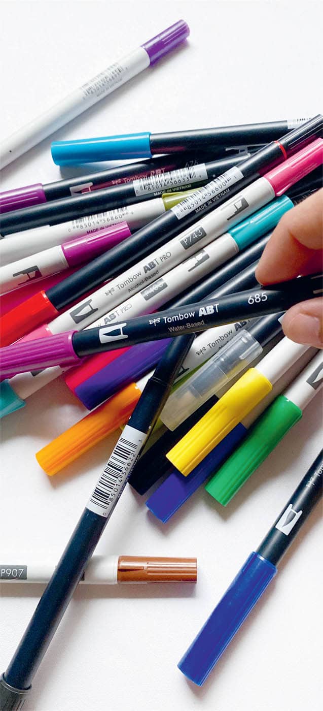
2. What medium do you love using?
Maybe you prefer using fine-tipped brush pens like me?
3. What colors do you like to see in your art?
Some people love to use colorful pens for their designs, while others prefer to use a single color throughout the whole piece.
You can also choose the texture of your paper, do a specific lettering technique that you enjoy, or write the alphabet in different ways. Experiment until you find something you like and that speaks to you as an artist.
Once you discover what makes your art yours, you’ll start to notice a pattern since you’re more likely to do it repeatedly. Then it will be easier to commit to creating work in this style without getting discouraged by comparison.
Now let’s look at some favorite lettering techniques to help you on your quest to find your own style.
BOUNCE LETTERING
Once you’ve mastered the basics and are comfortable with calligraphy, you can break the rules and explore a new style of modern calligraphy.
Bounce lettering is one of the most popular styles of modern calligraphy and can help you up your calligraphy skills. You’ve probably seen this style a lot on social media channels, such as when browsing for DIY lettering projects.
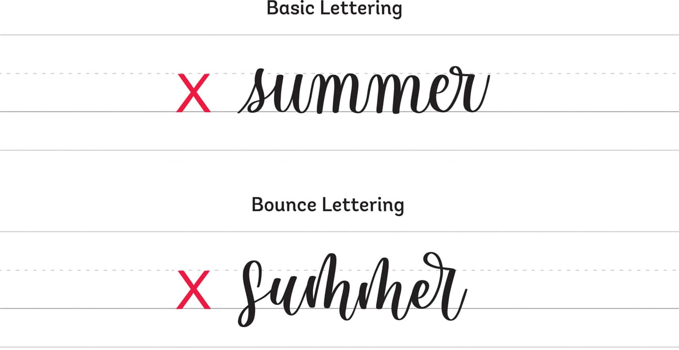
The difference between basic lettering and bounce lettering is that bounce lettering gives you more freedom.
The basic style of the word “summer” follows the guidelines strictly, and the letters are within the x-height. Next to it, the bounce lettering looks playful and unrestricted. You can see that the letters go beyond the x-height, which adds a more aesthetic vibe to the word.
It might seem easy to write your letters beyond the guidelines, but it can also lead to frustration when you don’t get it the way you want it to be, as well as confuse readers by adding only random bounce to your lettering.
Here are my techniques for bounce calligraphy.
These are not rules—just guidelines that you can follow to ensure that your words are legible.
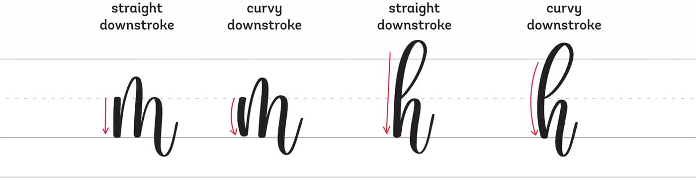
- Keep the ovals at the baseline or make them smaller than the usual x-height.
- Let your underturn go below the baseline and vary the heights of letters with overturns and compound curves.
- Emphasize loops in letters.
- Modify the sizes of the letters from their normal x-heights.
- Add simple flourishes.
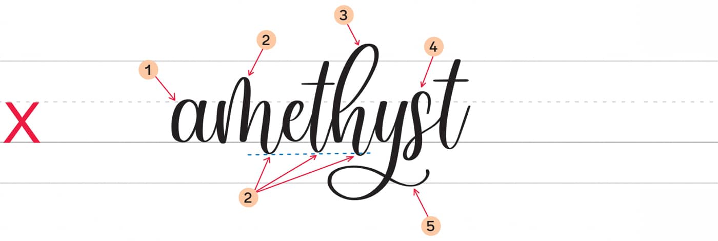
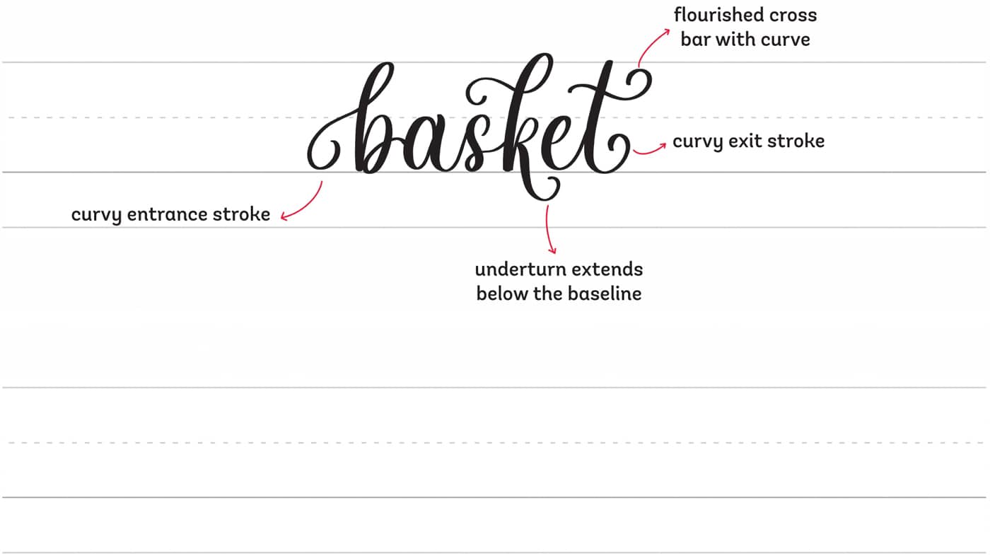
Let’s discuss our sample word: amethyst.
- The letters with ovals, a and e, remain at the baseline.
- The overturn of the letter m goes above the waistline, while the compound curve of the letters m and h and the underturn of the letter t have different dips below the baseline.
- The ascending stem loop of the letter h is bigger so that it exceeds the ascender line.
- The letter s is bigger than the x-height.
- The descending stem loop of the letter y has a simple flourish on its tail.
It’s not necessary to add bounce to every letter in a word. Just follow the simple guidelines that I’ve shared and look for balance in the word.
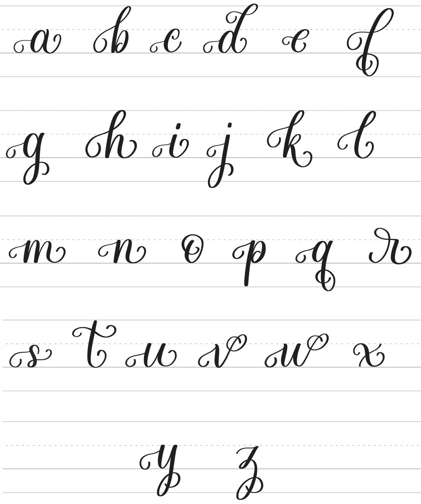
Lowercase Bounce Letters
Uppercase Bounce Letters
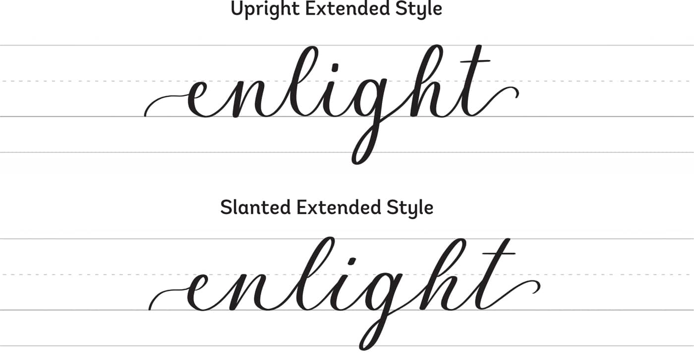
EXTENDED LETTERING
With the extended lettering style, all the exit strokes of the letters are extended, making the spaces between the letters wider than you see with basic and bouncy styles. You can do this style in an upright or a slanted version, but I prefer doing it on a slant since it feels more elegant and dramatic.
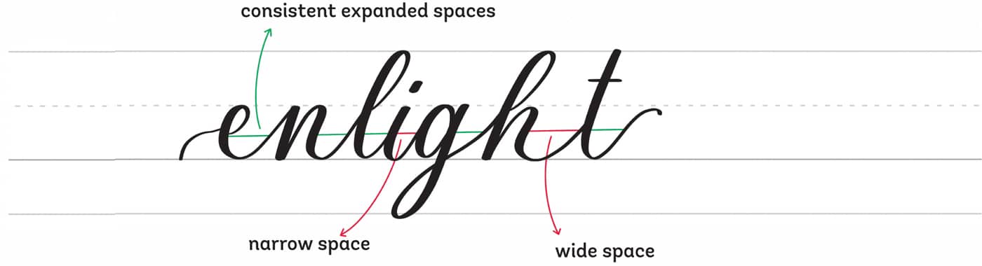
The key to extended lettering is to ensure that the stretched spaces will look approximately equal and consistent. You don’t have to perfect the expanded spacing between each letter, but don’t vary it too much.
Your lettering style will look uneven if one of the spaces is narrower or wider than the expanded space.
As with basic brush lettering, extended lettering follows the guidelines, so the letters sit within the x-height. But you can also try mixing extended and bouncy lettering! Try it and see if you love the result.
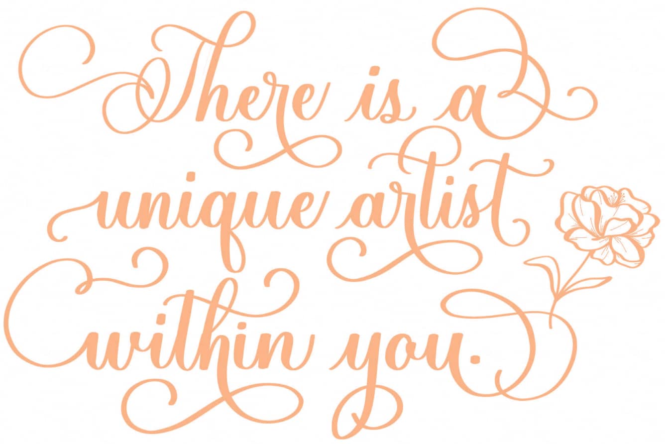
WHIMSICAL LETTERING
Whimsical lettering can look different for every artist. Here I’m sharing my interpretation of whimsical lettering. Remember that with modern calligraphy, you can come up with your own style, and I’m simply providing some inspiration to use as a starting point.
This style of lettering is simple and just requires curves in the words. Here’s how I practice whimsical lettering.
- Add curves to the entrance and exit strokes of a word.
- If the word has an underturn stroke, adjust its form to go below the baseline while still adding a curve to it.
- Flourish the crossbar of the letter t with a curve.
The letters are within the x-height, but you can try modifying the letter forms to bounce style, but with added curves.
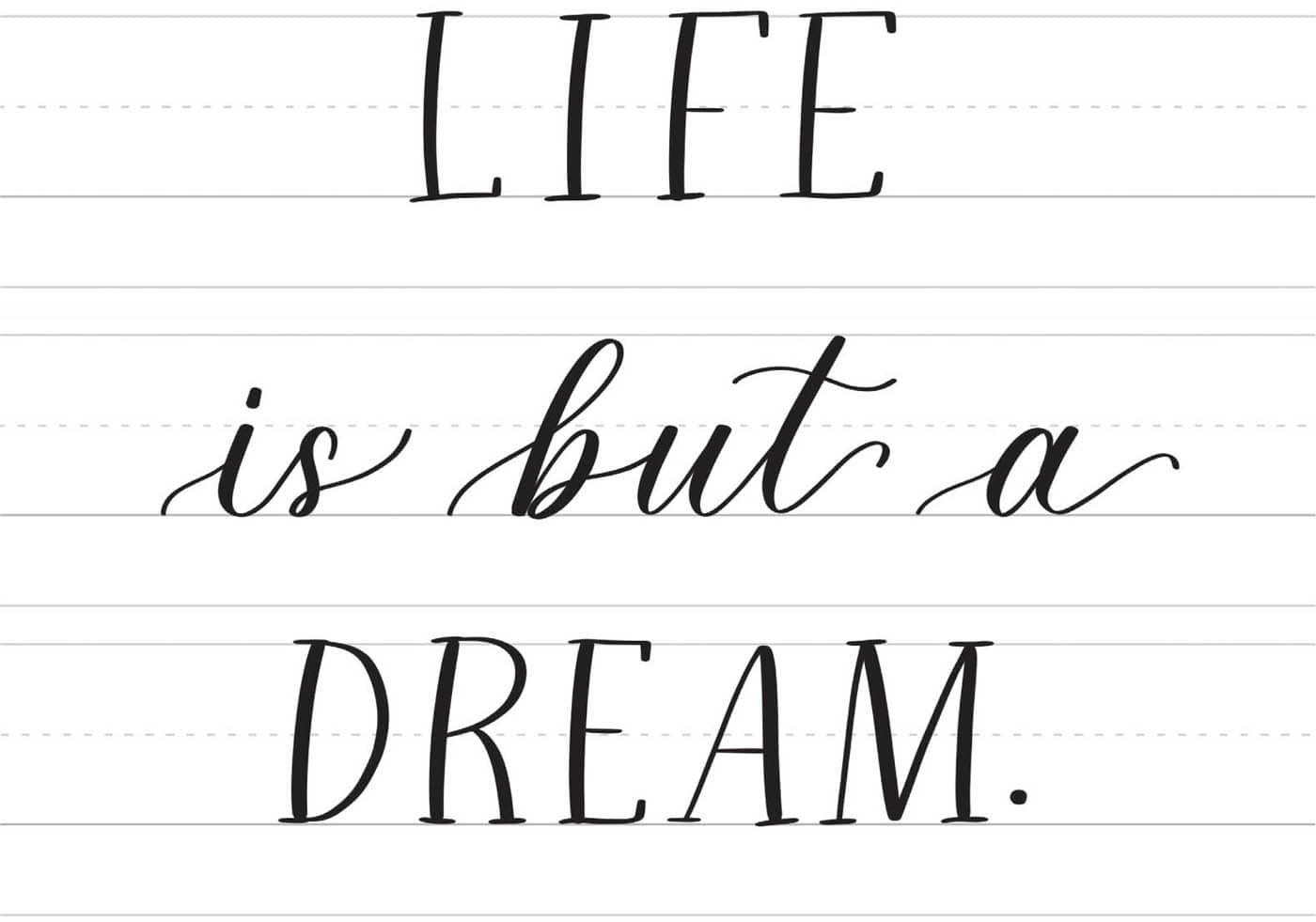
COMBINING BRUSH SCRIPT WITH SERIF AND SANS SERIF
You may have seen lettering compositions that feature mixed lettering styles. Combining brush script with block letters is a popular way to do this.
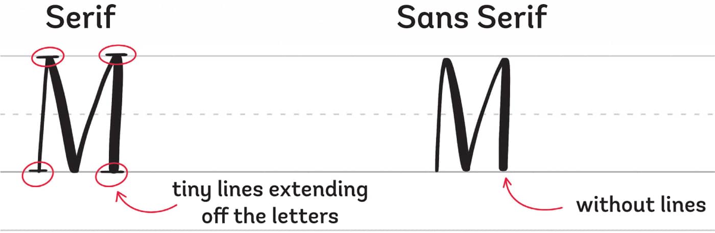
Before we jump into writing, let’s look at the difference between serif and sans serif fonts.
Serif letters have tiny lines extending off them, and sans serif letters don’t have those lines. If you get confused, remember that sans is a French word that means “without,” so sans serif letters are letters without lines.
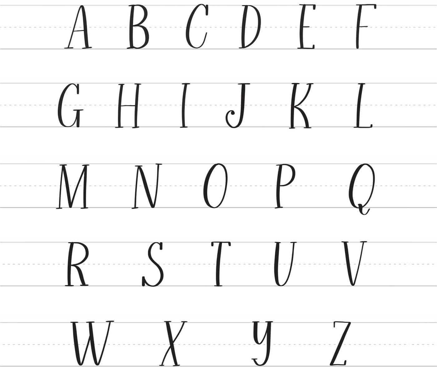
Serif Letters
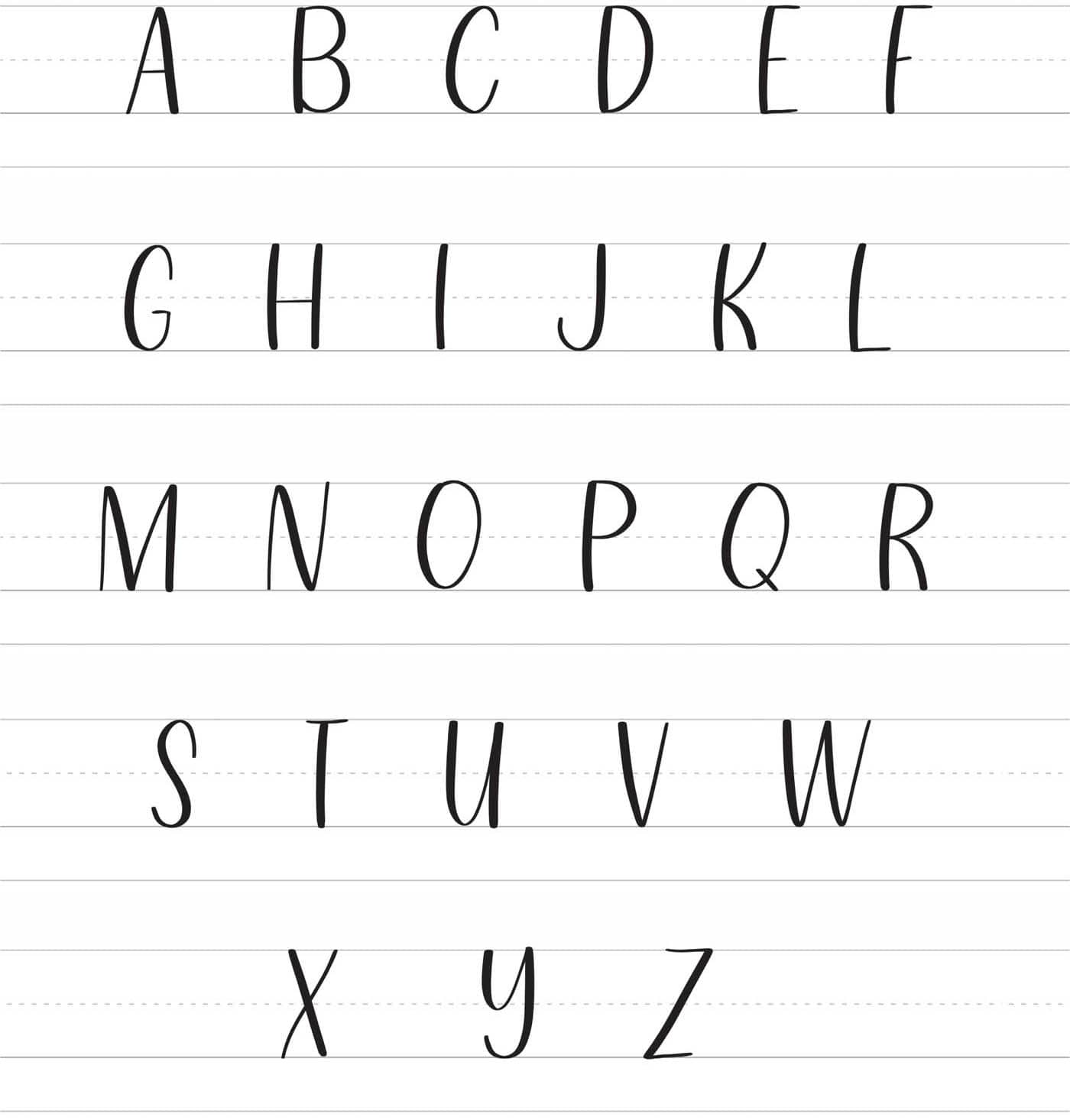
Sans Serif Letters
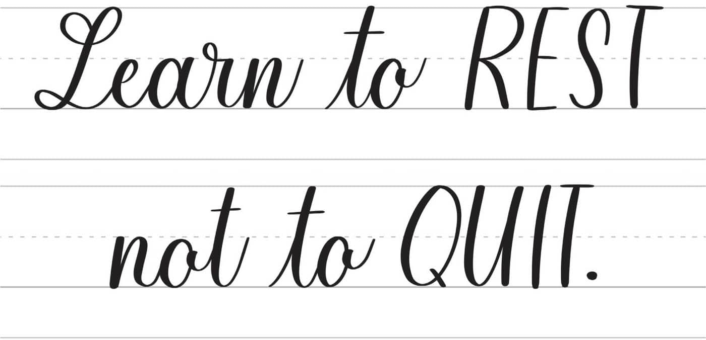
Now, let’s see how we can combine these with brush script using the example to the left.
I’ve written the words “rest” and “quit” using sans serif to emphasize these words, while the remaining words use the basic lettering style.
Now look at the second example, which combines extended lettering with serif. I love how the flowy look of extended lettering complements the meaning of the quote.