5
Exploratory Data Analysis
Introduction
In this chapter, we will dive more into Exploratory Data Analysis (EDA). This is the process of sifting through the data and trying to make sense of the individual columns and the relationships between them.
This activity can be time-consuming, but can also have big payoffs. The better you understand the data, the more you can take advantage of it. If you intend to make machine learning models, having insight into the data can lead to more performant models and understanding why predications are made.
We are going to use a dataset from www.fueleconomy.gov that provides information about makes and models of cars from 1984 through 2018. Using EDA we will explore many of the columns and relationships found in this data.
Summary statistics
Summary statistics include the mean, quartiles, and standard deviation. The .describe method will calculate these measures on all of the numeric columns in a DataFrame.
How to do it…
- Load the dataset:
>>> import pandas as pd >>> import numpy as np >>> fueleco = pd.read_csv("data/vehicles.csv.zip") >>> fueleco barrels08 barrelsA08 ... phevHwy phevComb 0 15.695714 0.0 ... 0 0 1 29.964545 0.0 ... 0 0 2 12.207778 0.0 ... 0 0 3 29.964545 0.0 ... 0 0 4 17.347895 0.0 ... 0 0 ... ... ... ... ... ... 39096 14.982273 0.0 ... 0 0 39097 14.330870 0.0 ... 0 0 39098 15.695714 0.0 ... 0 0 39099 15.695714 0.0 ... 0 0 39100 18.311667 0.0 ... 0 0 - Call individual summary statistics methods such as
.mean,.std, and.quantile:>>> fueleco.mean() barrels08 17.442712 barrelsA08 0.219276 charge120 0.000000 charge240 0.029630 city08 18.077799 ... youSaveSpend -3459.572645 charge240b 0.005869 phevCity 0.094703 phevHwy 0.094269 phevComb 0.094141 Length: 60, dtype: float64 >>> fueleco.std() barrels08 4.580230 barrelsA08 1.143837 charge120 0.000000 charge240 0.487408 city08 6.970672 ... youSaveSpend 3010.284617 charge240b 0.165399 phevCity 2.279478 phevHwy 2.191115 phevComb 2.226500 Length: 60, dtype: float64 >>> fueleco.quantile( ... [0, 0.25, 0.5, 0.75, 1] ... ) barrels08 barrelsA08 ... phevHwy phevComb 0.00 0.060000 0.000000 ... 0.0 0.0 0.25 14.330870 0.000000 ... 0.0 0.0 0.50 17.347895 0.000000 ... 0.0 0.0 0.75 20.115000 0.000000 ... 0.0 0.0 1.00 47.087143 18.311667 ... 81.0 88.0 - Call the
.describemethod:>>> fueleco.describe() barrels08 barrelsA08 ... phevHwy phevComb count 39101.00... 39101.00... ... 39101.00... 39101.00... mean 17.442712 0.219276 ... 0.094269 0.094141 std 4.580230 1.143837 ... 2.191115 2.226500 min 0.060000 0.000000 ... 0.000000 0.000000 25% 14.330870 0.000000 ... 0.000000 0.000000 50% 17.347895 0.000000 ... 0.000000 0.000000 75% 20.115000 0.000000 ... 0.000000 0.000000 max 47.087143 18.311667 ... 81.000000 88.000000 - To get summary statistics on the object columns, use the
.includeparameter:>>> fueleco.describe(include=object) drive eng_dscr ... modifiedOn startStop count 37912 23431 ... 39101 7405 unique 7 545 ... 68 2 top Front-Wh... (FFS) ... Tue Jan ... N freq 13653 8827 ... 29438 5176
How it works…
I've done data analysis trainings where the client literally slapped their head after teaching them about the .describe method. When I asked what the problem was, they replied that they had spent the last couple of weeks implementing that behavior for their database.
By default, .describe will calculate summary statistics on the numeric columns. You can pass the include parameter to tell the method to include non-numeric data types. Note that this will show the count of unique values, the most frequent value (top), and its frequency counts for the object columns.
There's more…
One tip that often makes more data appear on the screen is transposing a DataFrame. I find that this is useful for the output of the .describe method:
>>> fueleco.describe().T
                count         mean  ...       75%          max
barrels08     39101.0    17.442712  ...    20.115    47.087143
barrelsA08    39101.0     0.219276  ...     0.000    18.311667
charge120     39101.0     0.000000  ...     0.000     0.000000
charge240     39101.0     0.029630  ...     0.000    12.000000
city08        39101.0    18.077799  ...    20.000   150.000000
...               ...          ...  ...       ...          ...
youSaveSpend  39101.0 -3459.572645  ... -1500.000  5250.000000
charge240b    39101.0     0.005869  ...     0.000     7.000000
phevCity      39101.0     0.094703  ...     0.000    97.000000
phevHwy       39101.0     0.094269  ...     0.000    81.000000
phevComb      39101.0     0.094141  ...     0.000    88.000000
Column types
You can glean information about the data in pandas simply by looking at the types of the columns. In this recipe, we will explore the column types.
How to do it…
- Inspect the
.dtypesattribute:>>> fueleco.dtypes barrels08 float64 barrelsA08 float64 charge120 float64 charge240 float64 city08 int64 ... modifiedOn object startStop object phevCity int64 phevHwy int64 phevComb int64 Length: 83, dtype: object - Summarize the types of columns:
>>> fueleco.dtypes.value_counts()
float64    32
int64      27
object     23
bool        1
dtype: int64
How it works…
When you read a CSV file in pandas, it has to infer the types of the columns. The process looks something like this:
- If all of the values in a column look like whole numeric values, convert them to integers and give the column the type
int64 - If the values are float-like, give them the type
float64 - If the values are numeric, float-like, or integer-like, but missing values, assign them to the type
float64because the value typically used for missing values,np.nan, is a floating-point type - If the values have
falseortruein them, assign them to Booleans - Otherwise, leave the column as strings and give it the
objecttype (these can be missing values with thefloat64type)
Note that if you use the parse_dates, parameter, it is possible that some of the columns were converted to datetimes. Chapters 12 and 13 show examples of parsing dates.
By just looking at the output of .dtypes I can divine more about the data than just the data types. I can see if something is a string or missing values. Object types may be strings or categorical data, but they could also be numeric-like values that need to be nudged a little so that they are numeric. I typically leave integer columns alone. I tend to treat them as continuous values. If the values are float values, this indicates that the column could be:
- All floating-point values with no missing values
- Floating-point values with missing values
- Integer values that were missing some values and hence converted to floats
There's more…
When pandas converts columns to floats or integers, it uses the 64-bit versions of those types. If you know that your integers fail into a certain range (or you are willing to sacrifice some precision on floats), you can save some memory by converting these columns to columns that use less memory.
>>> fueleco.select_dtypes("int64").describe().T
                count         mean  ...     75%     max
city08        39101.0    18.077799  ...    20.0   150.0
cityA08       39101.0     0.569883  ...     0.0   145.0
co2           39101.0    72.538989  ...    -1.0   847.0
co2A          39101.0     5.543950  ...    -1.0   713.0
comb08        39101.0    20.323828  ...    23.0   136.0
...               ...          ...  ...     ...     ...
year          39101.0  2000.635406  ...  2010.0  2018.0
youSaveSpend  39101.0 -3459.572645  ... -1500.0  5250.0
phevCity      39101.0     0.094703  ...     0.0    97.0
phevHwy       39101.0     0.094269  ...     0.0    81.0
phevComb      39101.0     0.094141  ...     0.0    88.0
We can see that the city08 and comb08 columns don't go above 150. The iinfo function in NumPy will show us the limits for integer types. We can see that we would not want to use an int8 for this column, but we can use an int16. By converting to that type, the column will use 25% of the memory:
>>> np.iinfo(np.int8)
iinfo(min=-128, max=127, dtype=int8)
>>> np.iinfo(np.int16)
iinfo(min=-32768, max=32767, dtype=int16)
>>> fueleco[["city08", "comb08"]].info(memory_usage="deep")
<class 'pandas.core.frame.DataFrame'>
RangeIndex: 39101 entries, 0 to 39100
Data columns (total 2 columns):
 #   Column  Non-Null Count  Dtype
---  ------  --------------  -----
 0   city08  39101 non-null  int64
 1   comb08  39101 non-null  int64
dtypes: int64(2)
memory usage: 611.1 KB
>>> (
...     fueleco[["city08", "comb08"]]
...     .assign(
...         city08=fueleco.city08.astype(np.int16),
...         comb08=fueleco.comb08.astype(np.int16),
...     )
...     .info(memory_usage="deep")
... )
<class 'pandas.core.frame.DataFrame'>
RangeIndex: 39101 entries, 0 to 39100
Data columns (total 2 columns):
 #   Column  Non-Null Count  Dtype
---  ------  --------------  -----
 0   city08  39101 non-null  int16
 1   comb08  39101 non-null  int16
dtypes: int16(2)
memory usage: 152.9 KB
Note that there is an analogous finfo function in NumPy for retrieving float information.
An option for conserving memory for string columns is to convert them to categories. If each value for a string column is unique, this will slow down pandas and use more memory, but if you have low cardinality, you can save a lot of memory. The make column has low cardinality, but the model column has a higher cardinality, and there is less memory saving for that column.
Below, we will show pulling out just these two columns. But instead of getting a Series, we will index with a list with just that column name in it. This will gives us back a DataFrame with a single column. We will update the column type to categorical and look at the memory usage. Remember to pass in memory_usage='deep' to get the memory usage for object columns:
>>> fueleco.make.nunique()
134
>>> fueleco.model.nunique()
3816
>>> fueleco[["make"]].info(memory_usage="deep")
<class 'pandas.core.frame.DataFrame'>
RangeIndex: 39101 entries, 0 to 39100
Data columns (total 1 columns):
 #   Column  Non-Null Count  Dtype
---  ------  --------------  -----
 0   make    39101 non-null  object
dtypes: object(1)
memory usage: 2.4 MB
>>> (
...     fueleco[["make"]]
...     .assign(make=fueleco.make.astype("category"))
...     .info(memory_usage="deep")
... )
<class 'pandas.core.frame.DataFrame'>
RangeIndex: 39101 entries, 0 to 39100
Data columns (total 1 columns):
 #   Column  Non-Null Count  Dtype
---  ------  --------------  -----
 0   make    39101 non-null  category
dtypes: category(1)
memory usage: 90.4 KB
>>> fueleco[["model"]].info(memory_usage="deep")
<class 'pandas.core.frame.DataFrame'>
RangeIndex: 39101 entries, 0 to 39100
Data columns (total 1 columns):
 #   Column  Non-Null Count  Dtype
---  ------  --------------  -----
 0   model   39101 non-null  object
dtypes: object(1)
memory usage: 2.5 MB
>>> (
...     fueleco[["model"]]
...     .assign(model=fueleco.model.astype("category"))
...     .info(memory_usage="deep")
... )
<class 'pandas.core.frame.DataFrame'>
RangeIndex: 39101 entries, 0 to 39100
Data columns (total 1 columns):
 #   Column  Non-Null Count  Dtype
---  ------  --------------  -----
 0   model   39101 non-null  category
dtypes: category(1)
memory usage: 496.7 KB
Categorical data
I broadly classify data into dates, continuous values, and categorical values. In this section, we will explore quantifying and visualizing categorical data.
How to do it…
- Pick out the columns with data types that are
object:>>> fueleco.select_dtypes(object).columns Index(['drive', 'eng_dscr', 'fuelType', 'fuelType1', 'make', 'model', 'mpgData', 'trany', 'VClass', 'guzzler', 'trans_dscr', 'tCharger', 'sCharger', 'atvType', 'fuelType2', 'rangeA', 'evMotor', 'mfrCode', 'c240Dscr', 'c240bDscr', 'createdOn', 'modifiedOn', 'startStop'], dtype='object') - Use
.nuniqueto determine the cardinality:>>> fueleco.drive.nunique() 7 - Use
.sampleto see some of the values:>>> fueleco.drive.sample(5, random_state=42) 4217 4-Wheel ... 1736 4-Wheel ... 36029 Rear-Whe... 37631 Front-Wh... 1668 Rear-Whe... Name: drive, dtype: object - Determine the number and percent of missing values:
>>> fueleco.drive.isna().sum() 1189 >>> fueleco.drive.isna().mean() * 100 3.0408429451932175 - Use the
.value_countsmethod to summarize a column:>>> fueleco.drive.value_counts() Front-Wheel Drive 13653 Rear-Wheel Drive 13284 4-Wheel or All-Wheel Drive 6648 All-Wheel Drive 2401 4-Wheel Drive 1221 2-Wheel Drive 507 Part-time 4-Wheel Drive 198 Name: drive, dtype: int64 - If there are too many values in the summary, you might want to look at the top 6 and collapse the remaining values:
>>> top_n = fueleco.make.value_counts().index[:6] >>> ( ... fueleco.assign( ... make=fueleco.make.where( ... fueleco.make.isin(top_n), "Other" ... ) ... ).make.value_counts() ... ) Other 23211 Chevrolet 3900 Ford 3208 Dodge 2557 GMC 2442 Toyota 1976 BMW 1807 Name: make, dtype: int64 - Use pandas to plot the counts and visualize them:
>>> import matplotlib.pyplot as plt
>>> fig, ax = plt.subplots(figsize=(10, 8))
>>> top_n = fueleco.make.value_counts().index[:6]
>>> (
...     fueleco.assign(
...         make=fueleco.make.where(
...             fueleco.make.isin(top_n), "Other"
...         )
...     )
...     .make.value_counts()
...     .plot.bar(ax=ax)
... )
>>> fig.savefig("c5-catpan.png", dpi=300)
pandas categorical
- Use
seabornto plot the counts and visualize them:>>> import seaborn as sns >>> fig, ax = plt.subplots(figsize=(10, 8)) >>> top_n = fueleco.make.value_counts().index[:6] >>> sns.countplot( ... y="make", ... data=( ... fueleco.assign( ... make=fueleco.make.where( ... fueleco.make.isin(top_n), "Other" ... ) ... ) ... ), ... ) >>> fig.savefig("c5-catsns.png", dpi=300)
Seaborn categorical
How it works…
When we are examining a categorical variable, we want to know how many unique values there are. If this is a large value, the column might not be categorical, but either free text or a numeric column that pandas didn't know how to store as numeric because it came across a non-valid number.
The .sample method lets us look at a few of the values. With most columns, it is important to determine how many are missing. It looks like there are over 1,000 rows, or about 3% of the values, that are missing. Typically, we need to talk to an SME to determine why these values are missing and whether we need to impute them or drop them.
Here is some code to look at the rows where the drive is missing:
>>> fueleco[fueleco.drive.isna()]
       barrels08  barrelsA08  ...  phevHwy  phevComb
7138    0.240000         0.0  ...        0         0
8144    0.312000         0.0  ...        0         0
8147    0.270000         0.0  ...        0         0
18215  15.695714         0.0  ...        0         0
18216  14.982273         0.0  ...        0         0
...          ...         ...  ...      ...       ...
23023   0.240000         0.0  ...        0         0
23024   0.546000         0.0  ...        0         0
23026   0.426000         0.0  ...        0         0
23031   0.426000         0.0  ...        0         0
23034   0.204000         0.0  ...        0         0
My favorite method for inspecting categorical columns is the .value_counts method. This is my goto method and I usually start with it, as I can divine answers to many of the other questions with the output of this method. By default, it does not show missing values, but you can use the dropna parameter to fix that:
>>> fueleco.drive.value_counts(dropna=False)
Front-Wheel Drive             13653
Rear-Wheel Drive              13284
4-Wheel or All-Wheel Drive     6648
All-Wheel Drive                2401
4-Wheel Drive                  1221
NaN                            1189
2-Wheel Drive                   507
Part-time 4-Wheel Drive         198
Name: drive, dtype: int64
Finally, you can visualize this output using pandas or seaborn. A bar plot is an appropriate plot to do this. However, if this is a higher cardinality column, you might have too many bars for an effective plot. You can limit the number of columns as we do in step 6, or use the order parameter for countplot to limit them with seaborn.
I use pandas for quick and dirty plotting because it is typically a method call away. However, the seaborn library has various tricks up its sleeve that we will see in later recipes that are not easy to do in pandas.
There's more…
Some columns report object data types, but they are not really categorical. In this dataset, the rangeA column has an object data type. However, if we use my favorite categorical method, .value_counts, to examine it, we see that it is not really categorical, but a numeric column posing as a category.
This is because, as seen in the output of .value_counts, there are slashes (/) and dashes (-) in some of the entries and pandas did not know how to convert those values to numbers, so it left the whole column as a string column.
>>> fueleco.rangeA.value_counts()
290        74
270        56
280        53
310        41
277        38
           ..
328         1
250/370     1
362/537     1
310/370     1
340-350     1
Name: rangeA, Length: 216, dtype: int64
Another way to find offending characters is to use the .str.extract method with a regular expression:
>>> (
...     fueleco.rangeA.str.extract(r"([^0-9.])")
...     .dropna()
...     .apply(lambda row: "".join(row), axis=1)
...     .value_counts()
... )
/    280
-     71
Name: rangeA, dtype: int64
This is actually a column that has two types: float and string. The data type is reported as object because that type can hold heterogenous typed columns. The missing values are stored as NaN and the non-missing values are strings:
>>> set(fueleco.rangeA.apply(type))
{<class 'str'>, <class 'float'>}
Here is the count of missing values:
>>> fueleco.rangeA.isna().sum()
37616
According to the fueleconomy.gov website, the rangeA value represents the range for the second fuel type of dual fuel vehicles (E85, electricity, CNG, and LPG). Using pandas, we can replace the missing values with zero, replace dashes with slashes, then split and take the mean value of each row (in the case of a dash/slash):
>>> (
...     fueleco.rangeA.fillna("0")
...     .str.replace("-", "/")
...     .str.split("/", expand=True)
...     .astype(float)
...     .mean(axis=1)
... )
0        0.0
1        0.0
2        0.0
3        0.0
4        0.0
        ...
39096    0.0
39097    0.0
39098    0.0
39099    0.0
39100    0.0
Length: 39101, dtype: float64
We can also treat numeric columns as categories by binning them. There are two powerful functions in pandas to aid binning, cut and qcut. We can use cut to cut into equal-width bins, or bin widths that we specify. For the rangeA column, most of the values were empty and we replaced them with 0, so 10 equal-width bins look like this:
>>> (
...     fueleco.rangeA.fillna("0")
...     .str.replace("-", "/")
...     .str.split("/", expand=True)
...     .astype(float)
...     .mean(axis=1)
...     .pipe(lambda ser_: pd.cut(ser_, 10))
...     .value_counts()
... )
(-0.45, 44.95]     37688
(269.7, 314.65]      559
(314.65, 359.6]      352
(359.6, 404.55]      205
(224.75, 269.7]      181
(404.55, 449.5]       82
(89.9, 134.85]        12
(179.8, 224.75]        9
(44.95, 89.9]          8
(134.85, 179.8]        5
dtype: int64
Alternatively, qcut (quantile cut) will cut the entries into bins with the same size. Because the rangeA column is heavily skewed, and most of the entries are 0, we can't quantize 0 into multiple bins, so it fails. But it does (somewhat) work with city08. I say somewhat because the values for city08 are whole numbers and so they don't evenly bin into 10 buckets, but the sizes are close:
>>> (
...     fueleco.rangeA.fillna("0")
...     .str.replace("-", "/")
...     .str.split("/", expand=True)
...     .astype(float)
...     .mean(axis=1)
...     .pipe(lambda ser_: pd.qcut(ser_, 10))
...     .value_counts()
... )
Traceback (most recent call last):
  ...
ValueError: Bin edges must be unique: array([  0. ,   0. ,   0. ,   0. ,   0. ,   0. ,   0. ,   0. ,   0. ,
         0. , 449.5]).
>>> (
...     fueleco.city08.pipe(
...         lambda ser: pd.qcut(ser, q=10)
...     ).value_counts()
... )
(5.999, 13.0]    5939
(19.0, 21.0]     4477
(14.0, 15.0]     4381
(17.0, 18.0]     3912
(16.0, 17.0]     3881
(15.0, 16.0]     3855
(21.0, 24.0]     3676
(24.0, 150.0]    3235
(13.0, 14.0]     2898
(18.0, 19.0]     2847
Name: city08, dtype: int64
Continuous data
My broad definition of continuous data is data that is stored as a number, either an integer or a float. There is some gray area between categorical and continuous data. For example, the grade level could be represented as a number (ignoring Kindergarten, or using 0 to represent it). A grade column, in this case, could be both categorical and continuous, so the techniques in this section and the previous section could both apply to it.
We will examine a continuous column from the fuel economy dataset in this section. The city08 column lists the miles per gallon that are expected when driving a car at the lower speeds found in a city.
How to do it…
- Pick out the columns that are numeric (typically
int64orfloat64):>>> fueleco.select_dtypes("number") barrels08 barrelsA08 ... phevHwy phevComb 0 15.695714 0.0 ... 0 0 1 29.964545 0.0 ... 0 0 2 12.207778 0.0 ... 0 0 3 29.964545 0.0 ... 0 0 4 17.347895 0.0 ... 0 0 ... ... ... ... ... ... 39096 14.982273 0.0 ... 0 0 39097 14.330870 0.0 ... 0 0 39098 15.695714 0.0 ... 0 0 39099 15.695714 0.0 ... 0 0 39100 18.311667 0.0 ... 0 0 - Use
.sampleto see some of the values:>>> fueleco.city08.sample(5, random_state=42) 4217 11 1736 21 36029 16 37631 16 1668 17 Name: city08, dtype: int64 - Determine the number and percent of missing values:
>>> fueleco.city08.isna().sum() 0 >>> fueleco.city08.isna().mean() * 100 0.0 - Get the summary statistics:
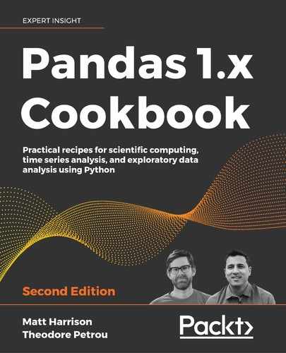
>>> fueleco.city08.describe() count 39101.000000 mean 18.077799 std 6.970672 min 6.000000 25% 15.000000 50% 17.000000 75% 20.000000 max 150.000000 Name: city08, dtype: float64 - Use pandas to plot a histogram:
>>> import matplotlib.pyplot as plt
>>> fig, ax = plt.subplots(figsize=(10, 8))
>>> fueleco.city08.hist(ax=ax)
>>> fig.savefig(
...     "c5-conthistpan.png", dpi=300
... )
pandas histogram
- This plot looks very skewed, so we will increase the number of bins in the histogram to see if the skew is hiding behaviors (as skew makes bins wider):
>>> import matplotlib.pyplot as plt
>>> fig, ax = plt.subplots(figsize=(10, 8))
>>> fueleco.city08.hist(ax=ax, bins=30)
>>> fig.savefig(
...     "c5-conthistpanbins.png", dpi=300
... )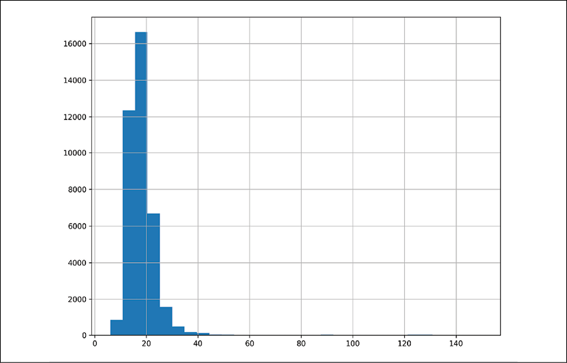
pandas histogram
- Use seaborn to create a distribution plot, which includes a histogram, a kernel density estimation (KDE), and a rug plot:
>>> fig, ax = plt.subplots(figsize=(10, 8))
>>> sns.distplot(fueleco.city08, rug=True, ax=ax)
>>> fig.savefig(
...     "c5-conthistsns.png", dpi=300
... )
Seaborn histogram
How it works…
It is good to get a feel for how numbers behave. Looking at a sample of the data will let you know what some of the values are. We also want to know whether values are missing. Recall that pandas will ignore missing values when we perform operations on columns.
The summary statistics provided by .describe are very useful. This is probably my favorite method for inspecting continuous values. I like to make sure I check the minimum and maximum values to make sure that they make sense. It would be strange if there was a negative value as a minimum for the miles per gallon column. The quartiles also give us an indication of how skewed the data is. Because the quartiles are reliable indicators of the tendencies of the data, they are not affected by outliers.
Another thing to be aware of is infinite values, either positive or negative. This column does not have infinite values, but these can cause some math operations or plots to fail. If you have infinite values, you need to determine how to handle them. Clipping and removing them are common options that are easy with pandas.
I'm a huge fan of plotting, and both pandas and seaborn make it easy to visualize the distribution of continuous data. Take advantage of plots because, as the cliché goes, a picture tells a thousand words. I've found that platitude to be true in my adventures with data.
There's more…
The seaborn library has many options for summarizing continuous data. In addition to the distplot function, there are functions for creating box plots, boxen plots, and violin plots.
A boxen plot is an enhanced box plot. The R folks created a plot called a letter value plot, and when the seaborn author replicated it, the name was changed to boxen. The median value is the black line. It steps half of the way from the median 50 to 0 and 100. So the tallest block shows the range from 25-75 quantiles. The next box on the low end goes from 25 to half of that value (or 12.5), so the 12.5-25 quantile. This pattern repeats, so the next box is the 6.25-12.5 quantile, and so on.
A violin plot is basically a histogram that has a copy flipped over on the other side. If you have a bi-model histogram, it tends to look like a violin, hence the name:
>>> fig, axs = plt.subplots(nrows=3, figsize=(10, 8))
>>> sns.boxplot(fueleco.city08, ax=axs[0])
>>> sns.violinplot(fueleco.city08, ax=axs[1])
>>> sns.boxenplot(fueleco.city08, ax=axs[2])
>>> fig.savefig("c5-contothersns.png", dpi=300)

A boxplot, violin plot, and boxen plot created with seaborn
If you are concerned with whether the data is normal, you can quantify this with numbers and visualizations using the SciPy library.
The Kolmogorov-Smirnov test can evaluate whether a distribution is normal. It provides us with a p-value. If this value is significant (< 0.05), then the data is not normal:
>>> from scipy import stats
>>> stats.kstest(fueleco.city08, cdf="norm")
KstestResult(statistic=0.9999999990134123, pvalue=0.0)
We can plot a probability plot to see whether the values are normal. If the samples track the line, then the data is normal:
>>> from scipy import stats
>>> fig, ax = plt.subplots(figsize=(10, 8))
>>> stats.probplot(fueleco.city08, plot=ax)
>>> fig.savefig("c5-conprob.png", dpi=300)

A probability plot shows us if the values track the normal line
Comparing continuous values across categories
The previous sections discussed looking at a single column. This section will show how to compare continuous variables in different categories. We will look at mileage numbers in different brands: Ford, Honda, Tesla, and BMW.
How to do it…
- Make a mask for the brands we want and then use a group by operation to look at the mean and standard deviation for the
city08column for each group of cars:>>> mask = fueleco.make.isin( ... ["Ford", "Honda", "Tesla", "BMW"] ... ) >>> fueleco[mask].groupby("make").city08.agg( ... ["mean", "std"] ... ) mean std make BMW 17.817377 7.372907 Ford 16.853803 6.701029 Honda 24.372973 9.154064 Tesla 92.826087 5.538970 - Visualize the
city08values for each make with seaborn:>>> g = sns.catplot( ... x="make", y="city08", data=fueleco[mask], kind="box" ... ) >>> g.ax.figure.savefig("c5-catbox.png", dpi=300)

Box plots for each make
How it works…
If the summary statistics change for the different makes, that is a strong indicator that the makes have different characteristics. The central tendency (mean or median) and the variance (or standard deviation) are good measures to compare. We can see that Honda gets better city mileage than both BMW and Ford but has more variance, while Tesla is better than all of them and has the tightest variance.
Using a visualization library like seaborn lets us quickly see the differences in the categories. The difference between the four car makes is drastic, but you can see that there are outliers for the non-Tesla makes that appear to have better mileage than Tesla.
There's more…
One drawback of a boxplot is that while it indicates the spread of the data, it does not reveal how many samples are in each make. You might naively think that each boxplot has the same number of samples. We can quantify that this is not the case with pandas:
>>> mask = fueleco.make.isin(
...     ["Ford", "Honda", "Tesla", "BMW"]
... )
>>> (fueleco[mask].groupby("make").city08.count())
make
BMW      1807
Ford     3208
Honda     925
Tesla      46
Name: city08, dtype: int64
Another option is to do a swarm plot on top of the box plots:
>>> g = sns.catplot(
...     x="make", y="city08", data=fueleco[mask], kind="box"
... )
>>> sns.swarmplot(
...     x="make",
...     y="city08",
...     data=fueleco[mask],
...     color="k",
...     size=1,
...     ax=g.ax,
... )
>>> g.ax.figure.savefig(
...     "c5-catbox2.png", dpi=300
... )
A seaborn boxplot with a swarm plot layered on top
Additionally, the catplot function has many more tricks up its sleeves. We are showing two dimensions right now, city mileage and make. We can add more dimensions to the plot.
You can facet the grid by another feature. You can break each of these new plots into its own graph by using the col parameter:
>>> g = sns.catplot(
...     x="make",
...     y="city08",
...     data=fueleco[mask],
...     kind="box",
...     col="year",
...     col_order=[2012, 2014, 2016, 2018],
...     col_wrap=2,
... )
>>> g.axes[0].figure.savefig(
...     "c5-catboxcol.png", dpi=300
... )

A seaborn boxplot with hues for makes and faceted by year
Alternatively, you can embed the new dimension in the same plot by using the hue parameter:
>>> g = sns.catplot(
...     x="make",
...     y="city08",
...     data=fueleco[mask],
...     kind="box",
...     hue="year",
...     hue_order=[2012, 2014, 2016, 2018],
... )
>>> g.ax.figure.savefig(
...     "c5-catboxhue.png", dpi=300
... )

A seaborn boxplot for every make colored by year
If you are in Jupyter, you can style the output of the groupby call to highlight the values at the extremes. Use the .style.background_gradient method to do this:
>>> mask = fueleco.make.isin(
...     ["Ford", "Honda", "Tesla", "BMW"]
... )
>>> (
...     fueleco[mask]
...     .groupby("make")
...     .city08.agg(["mean", "std"])
...     .style.background_gradient(cmap="RdBu", axis=0)
... )

Using the pandas style functionality to highlight minimum and maximum values from the mean and standard deviation
Comparing two continuous columns
Evaluating how two continuous columns relate to one another is the essence of regression. But it goes beyond that. If you have two columns with a high correlation to one another, often, you may drop one of them as a redundant column. In this section, we will look at EDA for pairs of continuous columns.
How to do it…
- Look at the covariance of the two numbers if they are on the same scale:
>>> fueleco.city08.cov(fueleco.highway08) 46.33326023673625 >>> fueleco.city08.cov(fueleco.comb08) 47.41994667819079 >>> fueleco.city08.cov(fueleco.cylinders) -5.931560263764761 - Look at the Pearson correlation between the two numbers:
>>> fueleco.city08.corr(fueleco.highway08) 0.932494506228495 >>> fueleco.city08.corr(fueleco.cylinders) -0.701654842382788 - Visualize the correlations in a heatmap:
>>> import seaborn as sns
>>> fig, ax = plt.subplots(figsize=(8, 8))
>>> corr = fueleco[
...     ["city08", "highway08", "cylinders"]
... ].corr()
>>> mask = np.zeros_like(corr, dtype=np.bool)
>>> mask[np.triu_indices_from(mask)] = True
>>> sns.heatmap(
...     corr,
...     mask=mask,
...     fmt=".2f",
...     annot=True,
...     ax=ax,
...     cmap="RdBu",
...     vmin=-1,
...     vmax=1,
...     square=True,
... )
>>> fig.savefig(
...     "c5-heatmap.png", dpi=300, bbox_inches="tight"
... )
A seaborn heatmap
- Use pandas to scatter plot the relationships:
>>> fig, ax = plt.subplots(figsize=(8, 8))
>>> fueleco.plot.scatter(
...     x="city08", y="highway08", alpha=0.1, ax=ax
... )
>>> fig.savefig(
...     "c5-scatpan.png", dpi=300, bbox_inches="tight"
... )
A pandas scatter plot to view the relationships between city and highway mileage
>>> fig, ax = plt.subplots(figsize=(8, 8))
>>> fueleco.plot.scatter(
...     x="city08", y="cylinders", alpha=0.1, ax=ax
... )
>>> fig.savefig(
...     "c5-scatpan-cyl.png", dpi=300, bbox_inches="tight"
... )
Another pandas scatter to view the relationship between mileage and cylinders
- Fill in some missing values. From the cylinder plot, we can see that some of the high-end values for mileage are missing. This is because these cars tend to be electric and not have cylinders. We will fix that by filling those values in with 0:
>>> fueleco.cylinders.isna().sum()
145
>>> fig, ax = plt.subplots(figsize=(8, 8))
>>> (
...     fueleco.assign(
...         cylinders=fueleco.cylinders.fillna(0)
...     ).plot.scatter(
...         x="city08", y="cylinders", alpha=0.1, ax=ax
...     )
... )
>>> fig.savefig(
...     "c5-scatpan-cyl0.png", dpi=300, bbox_inches="tight"
... )
Another pandas scatter to view the relationship between mileage and cylinders, with missing numbers for cylinders filled in with 0
- Use seaborn to add a regression line to the relationships:
>>> res = sns.lmplot(
...     x="city08", y="highway08", data=fueleco
... )
>>> res.fig.savefig(
...     "c5-lmplot.png", dpi=300, bbox_inches="tight"
... )

A seaborn scatter plot with a regression line
How it works…
Pearson correlation tells us how one value impacts another. It is between -1 and 1. In this case, we can see that there is a strong correlation between city mileage and highway mileage. As you get better city mileage, you tend to get better highway mileage.
Covariance lets us know how these values vary together. Covariance is useful for comparing multiple continuous columns that have similar correlations. For example, correlation is scale-invariant, but covariance is not. If we compare city08 to two times highway08, they have the same correlation, but the covariance changes.
>>> fueleco.city08.corr(fueleco.highway08 * 2)
0.932494506228495
>>> fueleco.city08.cov(fueleco.highway08 * 2)
92.6665204734725
A heatmap is a great way to look at correlations in aggregate. We can look for the most blue and most red cells to find the strongest correlations. Make sure you set the vmin and vmax parameters to -1 and 1, respectively, so that the coloring is correct.
Scatter plots are another way to visualize the relationships between continuous variables. It lets us see the trends that pop out. One tip that I like to give students is to make sure you set the alpha parameter to a value less than or equal to .5. This makes the points transparent and tells a different story than scatter plots with markers that are completely opaque.
There's more…
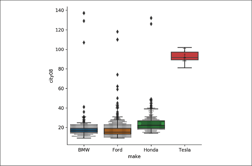
If we have more variables that we want to compare, we can use seaborn to add more dimensions to a scatter plot. Using the relplot function, we can color the dots by year and size them by the number of barrels the vehicle consumes. We have gone from two dimensions to four!
>>> res = sns.relplot(
...     x="city08",
...     y="highway08",
...     data=fueleco.assign(
...         cylinders=fueleco.cylinders.fillna(0)
...     ),
...     hue="year",
...     size="barrels08",
...     alpha=0.5,
...     height=8,
... )
>>> res.fig.savefig(
...     "c5-relplot2.png", dpi=300, bbox_inches="tight"
... )
A seaborn scatter plot showing the mileage relationships colored by year and sized by the number of barrels of gas a car uses
Note that we can also add in categorical dimensions as well for hue. We can also facet by column for categorical values:
>>> res = sns.relplot(
...     x="city08",
...     y="highway08",
...     data=fueleco.assign(
...         cylinders=fueleco.cylinders.fillna(0)
...     ),
...     hue="year",
...     size="barrels08",
...     alpha=0.5,
...     height=8,
...     col="make",
...     col_order=["Ford", "Tesla"],
... )
>>> res.fig.savefig(
...     "c5-relplot3.png", dpi=300, bbox_inches="tight"
... )

A seaborn scatter plot showing the mileage relationships colored by year, sized by the number of barrels of gas a car uses, and faceted by make
Pearson correlation is intended to show the strength of a linear relationship. If the two continuous columns do not have a linear relationship, another option is to use Spearman correlation. This number also varies from -1 to 1. It measures whether the relationship is monotonic (and doesn't presume that it is linear). It uses the rank of each number rather than the number. If you are not sure whether there is a linear relationship between your columns, this is a better metric to use.
>>> fueleco.city08.corr(
...     fueleco.barrels08, method="spearman"
... )
-0.9743658646193255
Comparing categorical values with categorical values
In this section, we will focus on dealing with multiple categorical values. One thing to keep in mind is that continuous columns can be converted into categorical columns by binning the values.
In this section, we will look at makes and vehicle class.
How to do it…
- Lower the cardinality. Limit the
VClasscolumn to six values, in a simple class column,SClass. Only use Ford, Tesla, BMW, and Toyota:>>> def generalize(ser, match_name, default): ... seen = None ... for match, name in match_name: ... mask = ser.str.contains(match) ... if seen is None: ... seen = mask ... else: ... seen |= mask ... ser = ser.where(~mask, name) ... ser = ser.where(seen, default) ... return ser >>> makes = ["Ford", "Tesla", "BMW", "Toyota"] >>> data = fueleco[fueleco.make.isin(makes)].assign( ... SClass=lambda df_: generalize( ... df_.VClass, ... [ ... ("Seaters", "Car"), ... ("Car", "Car"), ... ("Utility", "SUV"), ... ("Truck", "Truck"), ... ("Van", "Van"), ... ("van", "Van"), ... ("Wagon", "Wagon"), ... ], ... "other", ... ) ... ) - Summarize the counts of vehicle classes for each make:
>>> data.groupby(["make", "SClass"]).size().unstack() SClass Car SUV ... Wagon other make ... BMW 1557.0 158.0 ... 92.0 NaN Ford 1075.0 372.0 ... 155.0 234.0 Tesla 36.0 10.0 ... NaN NaN Toyota 773.0 376.0 ... 132.0 123.0 - Use the
crosstabfunction instead of the chain of pandas commands:>>> pd.crosstab(data.make, data.SClass) SClass Car SUV ... Wagon other make ... BMW 1557 158 ... 92 0 Ford 1075 372 ... 155 234 Tesla 36 10 ... 0 0 Toyota 773 376 ... 132 123 - Add more dimensions:
>>> pd.crosstab( ... [data.year, data.make], [data.SClass, data.VClass] ... ) SClass Car ... other VClass Compact Cars Large Cars ... Special Purpose Vehicle 4WD year make ... 1984 BMW 6 0 ... 0 Ford 33 3 ... 21 Toyota 13 0 ... 3 1985 BMW 7 0 ... 0 Ford 31 2 ... 9 ... ... ... ... ... 2017 Tesla 0 8 ... 0 Toyota 3 0 ... 0 2018 BMW 37 12 ... 0 Ford 0 0 ... 0 Toyota 4 0 ... 0 - Use Cramér's V measure (https://stackoverflow.com/questions/46498455/categorical-features-correlation/46498792#46498792) to indicate the categorical correlation:
>>> import scipy.stats as ss
>>> import numpy as np
>>> def cramers_v(x, y):
...     confusion_matrix = pd.crosstab(x, y)
...     chi2 = ss.chi2_contingency(confusion_matrix)[0]
...     n = confusion_matrix.sum().sum()
...     phi2 = chi2 / n
...     r, k = confusion_matrix.shape
...     phi2corr = max(
...         0, phi2 - ((k - 1) * (r - 1)) / (n - 1)
...     )
...     rcorr = r - ((r - 1) ** 2) / (n - 1)
...     kcorr = k - ((k - 1) ** 2) / (n - 1)
...     return np.sqrt(
...         phi2corr / min((kcorr - 1), (rcorr - 1))
...     )
>>> cramers_v(data.make, data.SClass)
0.2859720982171866
The
.corrmethod accepts a callable as well, so an alternative way to invoke this is the following:>>> data.make.corr(data.SClass, cramers_v) 0.2859720982171866 - Visualize the cross tabulation as a bar plot:
>>> fig, ax = plt.subplots(figsize=(10, 8))
>>> (
...     data.pipe(
...         lambda df_: pd.crosstab(df_.make, df_.SClass)
...     ).plot.bar(ax=ax)
... )
>>> fig.savefig("c5-bar.png", dpi=300, bbox_inches="tight")
A pandas bar plot
- Visualize the cross tabulation as a bar chart using seaborn:
>>> res = sns.catplot(
...     kind="count", x="make", hue="SClass", data=data
... )
>>> res.fig.savefig(
...     "c5-barsns.png", dpi=300, bbox_inches="tight"
... )
A seaborn bar plot
- Visualize the relative sizes of the groups by normalizing the cross tabulation and making a stacked bar chart:
>>> fig, ax = plt.subplots(figsize=(10, 8))
>>> (
...     data.pipe(
...         lambda df_: pd.crosstab(df_.make, df_.SClass)
...     )
...     .pipe(lambda df_: df_.div(df_.sum(axis=1), axis=0))
...     .plot.bar(stacked=True, ax=ax)
... )
>>> fig.savefig(
...     "c5-barstacked.png", dpi=300, bbox_inches="tight"
... )
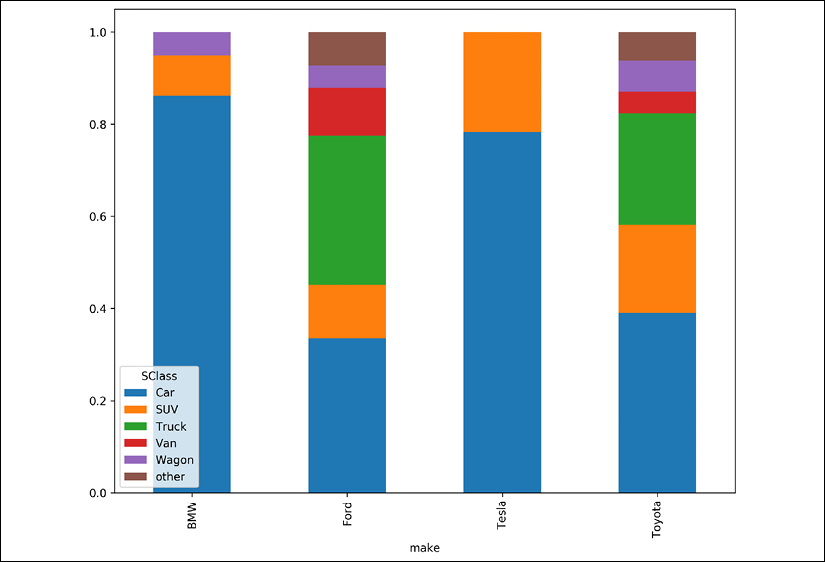
pandas bar plot
How it works…
I reduced the cardinality of the VClass column by using the generalize function that I created. I did this because bar plots need spacing; they need to breathe. I typically will limit the number of bars to fewer than 30. The generalize function is useful for cleaning up data, and you might want to refer back to it in your own data analyses.
We can summarize the counts of categorical columns by creating a cross-tabulation. You can build this up using group by semantics and unstacking the result, or take advantage of the built-in function in pandas, crosstab. Note that crosstab fills in missing numbers with 0 and converts the types to integers. This is because the .unstack method potentially creates sparsity (missing values), and integers (the int64 type) don't support missing values, so the types are converted to floats.
You can add arbitrary depths to the index or columns to create hierarchies in the cross-tabulation.
There exists a number, Cramér's V, for quantifying the relationship between two categorical columns. It ranges from 0 to 1. If it is 0, the values do not hold their value relative to the other column. If it is 1, the values change with respect to each other.
For example, if we compare the make column to the trany column, this value comes out larger:
>>> cramers_v(data.make, data.trany)
0.6335899102918267
What that tells us is that as the make changes from Ford to Toyota, the trany column should change as well. Compare this to the value for the make versus the model. Here, the value is very close to 1. Intuitively, that should make sense, as model could be derived from make.
>>> cramers_v(data.make, data.model)
0.9542350243671587
Finally, we can use various bar plots to view the counts or the relative sizes of the counts. Note that if you use seaborn, you can add multiple dimensions by setting hue or col.
Using the pandas profiling library
There is a third-party library, pandas Profiling (https://pandas-profiling.github.io/pandas-profiling/docs/), that creates reports for each column. These reports are similar to the output of the .describe method, but include plots and other descriptive statistics.
In this section, we will use the pandas Profiling library on the fuel economy data. Use pip install pandas-profiling to install the library.
How to do it…
- Run the
profile_reportfunction to create an HTML report:>>> import pandas_profiling as pp >>> pp.ProfileReport(fueleco)
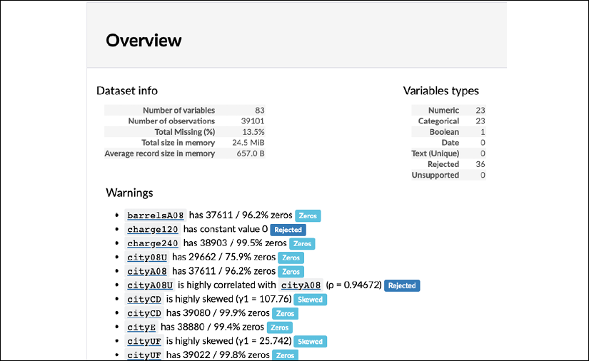
pandas profiling summary
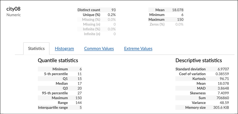
pandas profiling details
How it works…
The pandas Profiling library generates an HTML report. If you are using Jupyter, it will create it inline. If you want to save this report to a file (or if you are not using Jupyter), you can use the .to_file method:
>>> report = pp.ProfileReport(fueleco)
>>> report.to_file("fuel.html")
This is a great library for EDA. Just make sure that you go through the process of understanding the data. Because this can overwhelm you with the sheer amount of output, it can be tempting to skim over it, rather than to dig into it. Even though this library is excellent for starting EDA, it doesn't do intra-column comparisons (other than correlation), as some of the examples in this chapter have shown.